The Cup Noodle Museum, Ramen Museum, and Gundam Factory in Yokohama offer interactive exhibits, immersive experiences, and hands-on activities for noodle lovers, anime fans, and history enthusiasts. The museums feature colorful displays, nostalgic atmospheres, and opportunities to design cup noodles, make ramen, and interact with life-sized Gundam sculptures.

1. Overall Rating (0–10) — 6.0
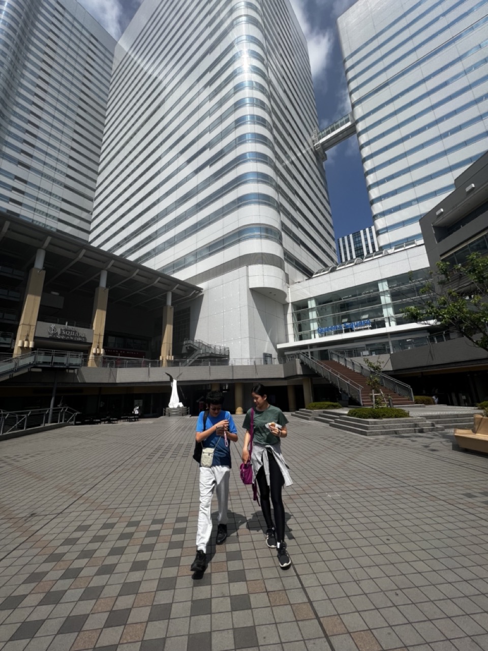
This photograph captures a moment of urban life with a strong sense of place, where towering modern architecture frames the everyday movement of pedestrians. The diagonal lines of the buildings and the checkered pavement create a dynamic visual rhythm, while the casual posture of the two figures grounds the scene in relatability. However, the image’s potential is slightly diminished by a lack of atmospheric depth and a somewhat sterile color balance, which keeps the mood functional rather than evocative.
2. Composition (0–10) — 6.5
The low-angle perspective emphasizes the scale of the skyscrapers, creating a sense of awe and immersion. The two individuals are well-placed along the leading lines of the pavement, guiding the eye into the frame, though the composition feels slightly unbalanced due to the heavy architectural presence on the right.
3. Lighting (0–10) — 6.0
Bright, direct sunlight creates sharp shadows and high contrast, enhancing the geometric precision of the architecture. However, the harsh lighting flattens detail in the highlights and shadows, reducing the scene’s tonal richness and atmospheric depth.
4. Color & Tone (0–10) — 5.5
The palette is dominated by cool grays and whites, reflecting the modern, industrial aesthetic of the environment. While clean and coherent, the lack of warmth or color variation gives the image a sterile, almost clinical feel that undercuts emotional resonance.
5. Creativity (0–10) — 6.0
The photograph successfully captures the interplay between human scale and architectural grandeur, a common theme in urban photography. While the concept is familiar, the framing and perspective offer a fresh vantage point, particularly in how the subjects are integrated into the larger environment.
6. Technical Quality (0–10) — 7.0
The image is sharp and well-focused, with clear detail in both the foreground and background. The exposure is generally balanced, though some overexposed areas in the sky and reflections on the glass reduce overall tonal range.
7. Emotional Impact (0–10) — 5.0
The scene feels observational rather than emotional—there’s a sense of quiet movement and routine, but little to provoke deeper connection or contemplation. The vastness of the buildings dwarfs the human figures, evoking a subtle sense of alienation that may resonate with viewers familiar with urban life.

1. Overall Rating (0–10) — 7.0
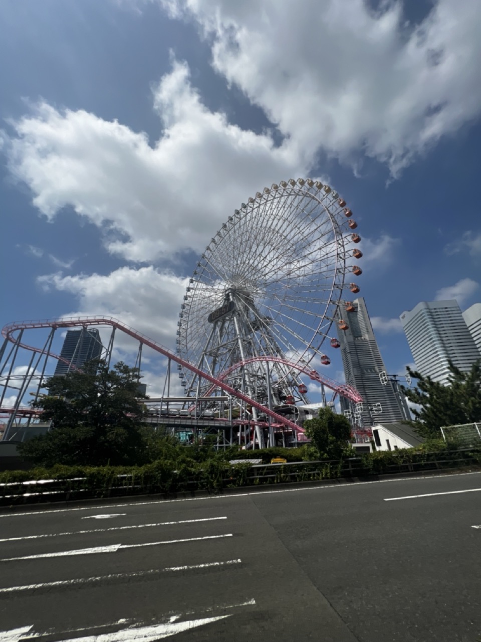
This photograph captures a dynamic juxtaposition of urban modernity and playful recreation, where the towering Ferris wheel and roller coaster stand as bold symbols against a dramatic sky. The low-angle perspective emphasizes the scale of the structures, while the contrast between the mechanical forms and the natural clouds adds a sense of grandeur. Though the composition is strong, the slightly cluttered foreground and muted color treatment prevent it from feeling fully immersive.
2. Composition (0–10) — 7.5
The low-angle shot effectively emphasizes the height and scale of the Ferris wheel and roller coaster, with the road in the foreground providing a sense of depth. However, the placement of the roller coaster track slightly disrupts the visual flow, drawing attention away from the central subject.
3. Lighting (0–10) — 7.0
The bright daylight and clear sky create strong contrast and highlight the intricate structure of the Ferris wheel. The clouds add texture and depth, while the shadows on the road provide grounding. The lighting is natural and well-balanced, though it lacks the warmth or softness that could enhance the mood.
4. Color & Tone (0–10) — 6.5
The dominant blues and grays of the sky and buildings create a cool, urban palette, punctuated by the red of the roller coaster. While the colors are clear and well-defined, the overall tone is somewhat flat, with a slight lack of vibrancy in the mid-tones.
5. Creativity (0–10) — 7.5
The image successfully captures a unique blend of leisure and urban architecture, creating a visually engaging narrative. The contrast between the playful amusement rides and the modern skyline adds a layer of storytelling, making the scene feel both familiar and strikingly contemporary.
6. Technical Quality (0–10) — 7.0
The image is sharp and well-focused, with clean lines and clear details visible in the Ferris wheel’s structure and surrounding buildings. The exposure is balanced, though there’s a slight loss of detail in the brightest areas of the sky.
7. Emotional Impact (0–10) — 6.5
The photograph evokes a sense of awe and nostalgia, blending the excitement of amusement parks with the imposing presence of city life. While the emotional resonance is strong, the lack of human presence or personal connection keeps the viewer at a slight remove from the experience.

1. Overall Rating (0–10) — 6.0
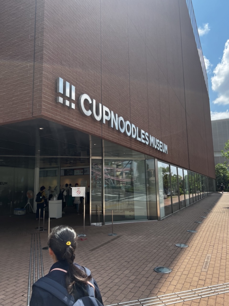
This photograph captures a candid moment outside the Cup Noodles Museum, blending urban architecture with a quiet human presence. The bright daylight and clean lines of the building lend a sense of modernity, while the lone figure in the foreground adds a narrative layer of curiosity and exploration. The image succeeds in documenting a place of cultural interest, but its visual impact is tempered by a lack of compositional dynamism and emotional depth.
2. Composition (0–10) — 6.0
The low-angle perspective emphasizes the building’s scale, while the person in the foreground provides a sense of scale and narrative. However, the diagonal line of the building edges and the walkway create a slightly disjointed balance, and the framing feels more like a snapshot than a carefully constructed image.
3. Lighting (0–10) — 7.0
Bright, natural sunlight enhances clarity and texture, casting sharp shadows that define the brick and glass surfaces. The contrast between the sunlit facade and the shaded entrance adds dimension, though the high contrast slightly flattens the scene’s tonal range.
4. Color & Tone (0–10) — 6.5
The warm brown of the brick and the cool blue of the sky create a balanced, natural palette. The white signage stands out clearly, but the overall tone is somewhat neutral, lacking a strong color mood or atmospheric richness.
5. Creativity (0–10) — 5.5
The concept of photographing the Cup Noodles Museum is inherently playful and quirky, but the execution remains straightforward and observational. The image captures a moment without pushing into artistic interpretation or visual storytelling.
6. Technical Quality (0–10) — 7.5
The image is sharp and well-focused, with clean detail in both the building and the foreground. The exposure is generally well-handled, though slight overexposure in the sky and highlights reduces some tonal nuance.
7. Emotional Impact (0–10) — 5.0
The photograph evokes a mild sense of wanderlust and curiosity, but the emotional connection is limited. The subject matter is intriguing, yet the composition and lighting keep the viewer at a distance, preventing a deeper resonance.

1. Overall Rating (0–10) — 6.8
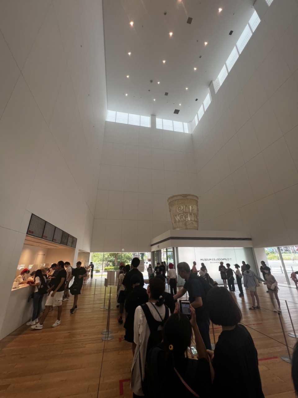
This photograph captures the serene yet bustling atmosphere of a modern museum lobby, where architectural minimalism meets human activity. The soaring white walls and natural light create a sense of openness and calm, while the crowd adds a layer of liveliness that grounds the space in everyday experience. While the image effectively conveys the scale and mood of the environment, its straightforward documentation lacks a strong narrative focus or emotional punch.
2. Composition (0–10) — 7.0
The low-angle perspective emphasizes the grandeur of the high ceiling and vertical lines, drawing the eye upward. The placement of the crowd and the large cup sculpture creates a balanced flow from foreground to background, though the left-side queue slightly disrupts symmetry.
3. Lighting (0–10) — 7.5
Natural light streams in from the clerestory windows, complemented by soft ceiling fixtures, creating a bright and airy ambiance. The even, diffused illumination enhances the clean lines of the architecture and keeps the scene well-exposed.
4. Color & Tone (0–10) — 6.5
The palette is dominated by whites and warm wood tones, contributing to a minimalist and neutral aesthetic. While harmonious, the lack of vivid color limits visual dynamism, making the image feel more documentary than expressive.
5. Creativity (0–10) — 6.0
The concept of capturing a museum interior with a striking architectural feature is compelling, but the execution remains conventional. The large cup sculpture adds a unique element, yet it’s underutilized in terms of narrative or symbolic emphasis.
6. Technical Quality (0–10) — 7.5
The image is sharp and well-focused, with clear details in both the foreground and background. The exposure is balanced, and there are no visible technical flaws such as blur or noise.
7. Emotional Impact (0–10) — 6.0
The photograph evokes a sense of quiet awe and curiosity, inviting the viewer to imagine the experience of entering such a space. However, the emotional resonance is tempered by the impersonal nature of the crowd and the lack of a singular focal point.
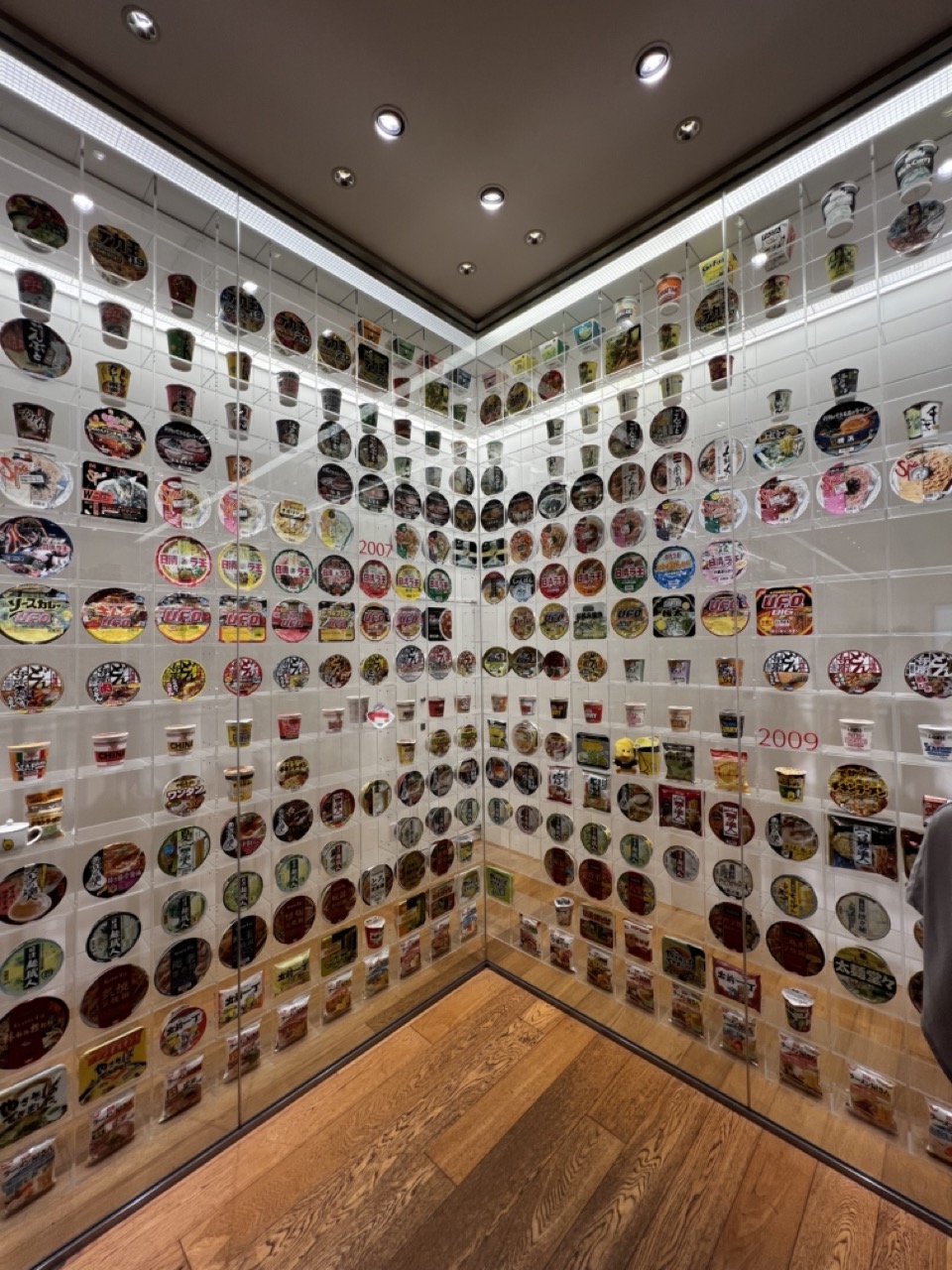

1. Overall Rating (0–10) — 7.5
This photograph captures a visually striking and conceptually rich display of instant noodle packaging, transforming a mundane product into an immersive art installation. The meticulous arrangement of colorful cups and lids creates a sense of rhythm and cultural celebration, while the clean, minimalist setting enhances the visual impact. Though the scene feels slightly sterile due to the uniform lighting, the sheer volume and variety of the collection evoke a sense of nostalgia and innovation, making the image both engaging and thought-provoking.
2. Composition (0–10) — 8.0
The corner framing effectively uses the two walls to create a sense of depth and enclosure, drawing the viewer’s eye into the grid-like pattern. The symmetry of the display is balanced by subtle variations in packaging and the inclusion of year markers, adding visual interest and narrative structure.
3. Lighting (0–10) — 7.0
Even, overhead lighting ensures all elements are clearly visible, though the cool tone of the fixtures gives the space a clinical feel. The recessed spotlights and linear strip lighting create a modern, gallery-like ambiance, but could benefit from warmer tones to enhance the inviting quality of the colorful display.
4. Color & Tone (0–10) — 8.0
The vibrant, diverse palette of the noodle packages contrasts beautifully with the neutral white tiles and warm wooden floor. The repetition of reds, yellows, and blues creates a dynamic visual rhythm, while the clean white background allows the colors to pop without distraction.
5. Creativity (0–10) — 9.0
The concept of showcasing instant noodle packaging as a curated art installation is highly original and culturally resonant. It elevates a mass-produced commodity into a celebration of design, branding, and consumer culture, inviting viewers to reflect on the intersection of food, art, and memory.
6. Technical Quality (0–10) — 8.5
The image is sharp and well-focused, with excellent clarity in both the foreground and background. The wide-angle perspective captures the full scope of the display without significant distortion, and the clean lines of the glass and tiles contribute to a polished, professional look.
7. Emotional Impact (0–10) — 7.5
The photograph evokes a sense of wonder and curiosity, particularly for viewers familiar with instant noodles as a cultural staple. It blends nostalgia with modern design, creating a quiet emotional resonance that speaks to both personal memories and broader societal trends.
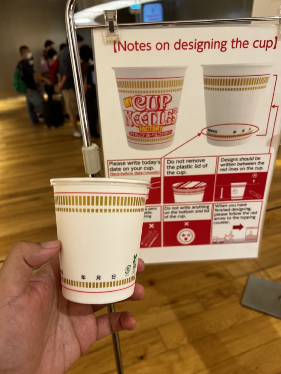

1. Overall Rating (0–10) — 6.0
This photograph captures a candid moment within the My Cup Noodles Factory, where personalization and industrial charm intersect. The hand holding the blank cup in front of the instructional sign creates a sense of participation and narrative, inviting viewers into a playful, interactive experience. While the composition feels slightly cluttered and the lighting is flat, the image succeeds in conveying the whimsical, hands-on nature of the attraction—its charm lies in its authenticity rather than its aesthetic polish.
2. Composition (0–10) — 5.5
The cup is centered in the foreground, drawing immediate attention, but the background elements—especially the blurred crowd and the sign—create visual competition. A tighter focus on the hand and cup would improve clarity and narrative cohesion.
3. Lighting (0–10) — 5.0
The lighting is functional and even, typical of indoor commercial spaces, but it lacks warmth and dimension. The overhead light creates a sterile feel that undermines the playful tone of the setting.
4. Color & Tone (0–10) — 5.5
The dominant white and red of the cup and sign are balanced by the warm wood floor, but the overall palette feels muted and slightly washed out. The color contrast is present but not dynamic enough to create visual excitement.
5. Creativity (0–10) — 7.0
The image captures a unique cultural experience—the ability to design your own cup of instant noodles—offering a blend of novelty and consumer engagement. The narrative potential is strong, though the execution feels more observational than artistic.
6. Technical Quality (0–10) — 6.5
The focus is sharp on the cup and sign, and the image is free of major technical flaws. However, the depth of field is shallow, and the background blur is uneven, which slightly disrupts the visual flow.
7. Emotional Impact (0–10) — 6.0
The photograph evokes a sense of curiosity and mild nostalgia, tapping into the universal appeal of customization and shared experiences. While it doesn’t elicit strong emotion, it invites viewers to imagine themselves in the moment, making it relatable and mildly engaging.
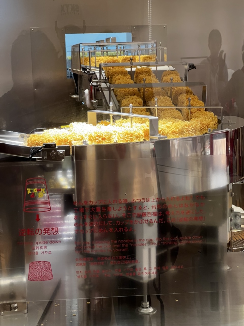

1. Overall Rating (0–10) — 6.0
This photograph captures the industrial charm of a noodle production line, blending mechanical precision with a sense of cultural storytelling. The reflective surfaces and layered machinery create a dynamic depth, while the bilingual signage adds narrative intrigue. However, the image feels slightly overexposed and cluttered, with reflections and text competing for attention, which dilutes its visual impact.
2. Composition (0–10) — 5.5
The diagonal flow of the noodle conveyor draws the eye through the frame, but the foreground signage and reflections disrupt balance. A tighter crop could improve focus on the machinery and reduce visual noise.
3. Lighting (0–10) — 5.0
Harsh overhead lighting creates strong reflections on the stainless steel surfaces, which both highlights the industrial aesthetic and obscures finer details. The lighting is functional but lacks mood or subtlety.
4. Color & Tone (0–10) — 6.0
The dominant metallic silver and golden yellow of the noodles create a cohesive industrial palette. However, the overexposure flattens contrast and reduces the richness of the tones, giving the image a slightly sterile appearance.
5. Creativity (0–10) — 7.0
The juxtaposition of mechanical process and cultural narrative—highlighted by the “thinking upside down” concept—adds conceptual depth. The image successfully blends documentary realism with a playful, intellectual twist.
6. Technical Quality (0–10) — 6.5
Sharp focus and clean detail are present in the machinery, but the reflections and slight overexposure detract from overall clarity. The camera appears to have captured the scene accurately, though post-processing could have improved balance.
7. Emotional Impact (0–10) — 5.5
The image conveys a sense of curiosity and wonder about food production, but the viewer is kept at a distance by the technical and reflective barriers. It invites contemplation more than emotional resonance.
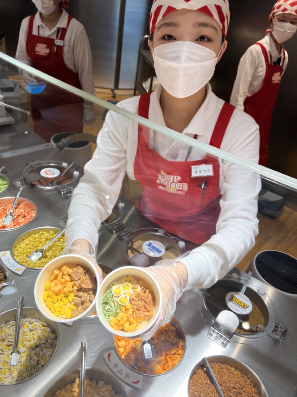

1. Overall Rating (0–10) — 7.0
This photograph captures the vibrant energy of a fast-casual noodle bar, where precision and enthusiasm converge in a single frame. The central figure, a staff member in a crisp uniform, presents two bowls with pride, embodying the brand’s commitment to customization and quality. While the image effectively conveys the lively atmosphere of the setting, the busy background and reflective surface slightly dilute the visual focus, preventing it from achieving a more polished, editorial feel.
2. Composition (0–10) — 6.5
The subject is well-centered and framed by the glass barrier, creating a sense of immediacy and interaction. However, the cluttered array of toppings and the presence of other staff members in the background introduce visual distractions, weakening the compositional harmony.
3. Lighting (0–10) — 7.0
Bright, even lighting illuminates the scene without harsh shadows, enhancing the clarity of the food and uniforms. The indoor lighting feels functional yet warm enough to highlight the colors of the ingredients, supporting the image’s inviting tone.
4. Color & Tone (0–10) — 7.5
The dominant reds of the aprons contrast sharply with the neutral stainless steel and soft whites, creating a visually striking palette. The vibrant yellows, greens, and oranges of the toppings add energy and appeal, while the overall tone remains clean and appetizing.
5. Creativity (0–10) — 7.0
The image successfully blends documentary realism with promotional intent, capturing both the process and personality of the brand. The choice to include the staff member’s direct gaze through the mask adds a humanizing touch, elevating the photo beyond mere product display.
6. Technical Quality (0–10) — 8.0
Sharp focus on the bowls and hands, with appropriate depth of field, ensures clarity in the key subjects. The glass reflection is present but does not significantly detract from the image’s technical integrity.
7. Emotional Impact (0–10) — 7.0
The photograph conveys a sense of care, pride, and accessibility—inviting viewers into a world of fresh, customizable food. The staff member’s expression, though partially obscured, suggests warmth and attentiveness, fostering a connection with the brand.
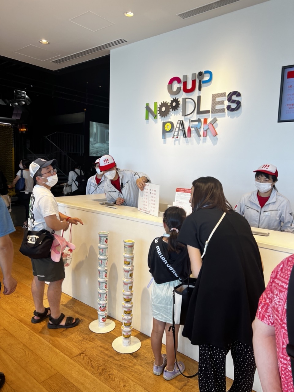

1. Overall Rating (0–10) — 6.8
This photograph captures a lively, everyday moment at Cup Noodles Park, where visitors engage with a playful, interactive experience. The vibrant signage and stacked cup noodle displays inject a sense of whimsy and brand identity, while the masked staff and guests ground the scene in contemporary reality. Though the image feels slightly cluttered and candid, it effectively conveys the energy of a public attraction—informative, accessible, and full of subtle narrative.
2. Composition (0–10) — 6.0
The framing centers on the counter and signage, creating a clear focal point, but the overlapping figures and uneven depth create visual congestion. A tighter crop would improve balance and focus on the interaction between guests and staff.
3. Lighting (0–10) — 7.0
Even, overhead lighting illuminates the space effectively, highlighting the colorful signage and ensuring clarity across the scene. While not dramatic, the lighting supports the bright, commercial atmosphere of the venue.
4. Color & Tone (0–10) — 7.5
The palette is energetic and playful, with the multicolored logo and branded cup stacks adding visual interest. The neutral tones of the walls and wood floor serve as a clean backdrop, allowing the brand’s colors to pop.
5. Creativity (0–10) — 7.0
The image captures a unique, branded cultural space with a sense of place and purpose. The juxtaposition of everyday visitors with the stylized cup noodle displays adds a layer of conceptual charm, suggesting both fun and cultural pride.
6. Technical Quality (0–10) — 7.5
Sharp focus and good exposure ensure that details—such as the text on the cups and the expressions of the people—are clear. The camera angle is stable, though some motion blur in the background suggests a moment captured in real time.
7. Emotional Impact (0–10) — 6.5
The scene evokes a sense of curiosity and lightheartedness, inviting viewers to imagine themselves in the queue. The universal appeal of instant noodles and the family-friendly setting foster a mild emotional connection, though the masks and formal setup keep the mood somewhat detached.
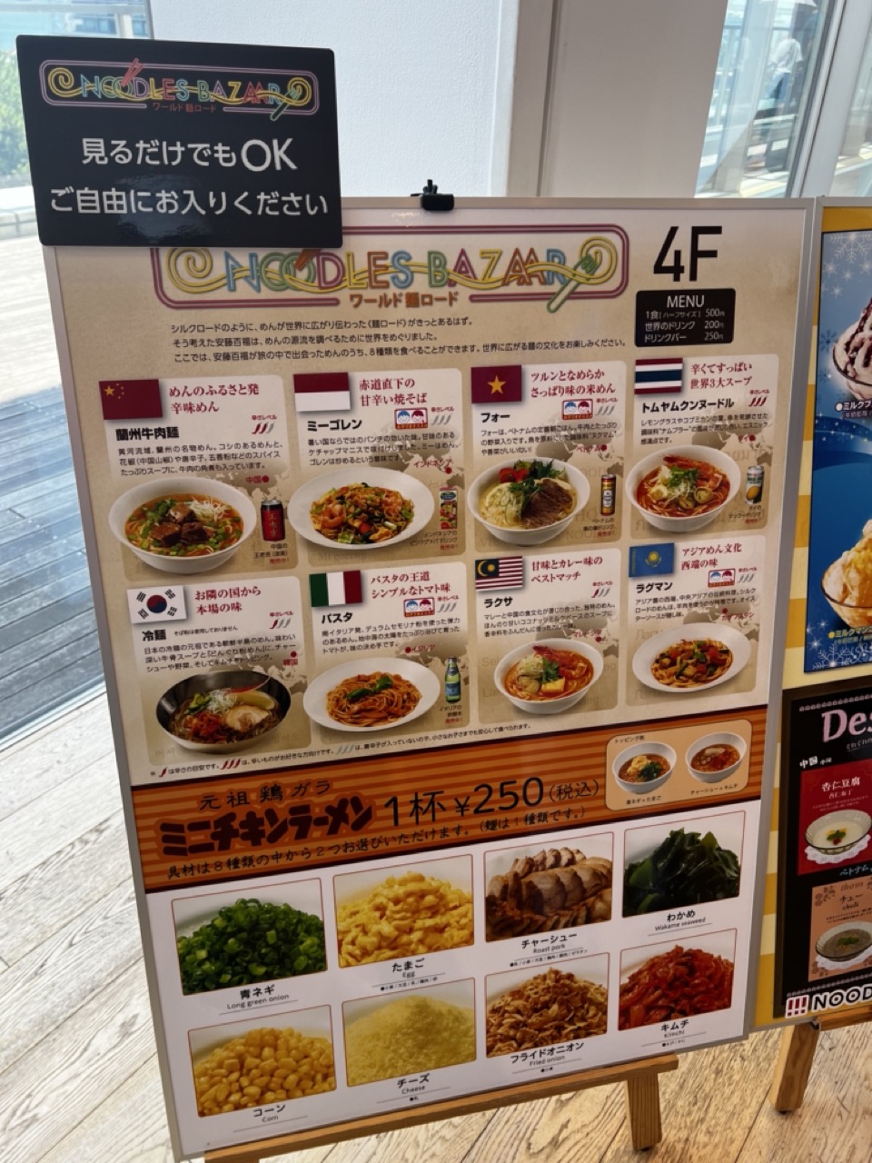

1. Overall Rating (0–10) — 6.0
This photograph captures the vibrant, information-dense atmosphere of a noodle restaurant’s menu display, where global flavors are presented with playful clarity. The composition is functional and inviting, emphasizing accessibility and variety, though it lacks a strong visual focal point. While the image succeeds in conveying the menu’s purpose—promoting a diverse selection of international dishes—it feels more like a straightforward documentation than a compelling visual narrative.
2. Composition (0–10) — 6.5
The menu is framed diagonally, creating a dynamic yet slightly unbalanced perspective. The top sign and lower ingredient section create visual weight, while the central dish images form a clear grid, guiding the eye across the page. A tighter crop would improve focus and reduce distractions from the surrounding environment.
3. Lighting (0–10) — 7.0
Natural light from the window illuminates the scene evenly, enhancing the visibility of the text and images. The soft, diffused quality of the light prevents harsh shadows and preserves the clarity of the menu’s colors and details.
4. Color & Tone (0–10) — 6.5
The palette is bright and varied, with the warm orange and red tones of the menu contrasting against the cooler background. The use of national flag icons adds pops of color that emphasize the global theme, though the overall tone is slightly flattened by the fluorescent indoor lighting.
5. Creativity (0–10) — 6.0
The layout is conceptually strong, merging cultural diversity with food presentation in an engaging way. However, the execution is more utilitarian than artistic, with the focus on readability and information over aesthetic innovation.
6. Technical Quality (0–10) — 7.5
The image is sharp and well-focused, with clean details visible in the text and food photography. The depth of field is appropriate, keeping the menu in focus while softly blurring the background to minimize distractions.
7. Emotional Impact (0–10) — 5.5
The image evokes a sense of curiosity and appetite, inviting viewers to explore the variety of flavors. However, the lack of human presence or personal connection keeps the emotional resonance at a surface level, making it more informative than evocative.
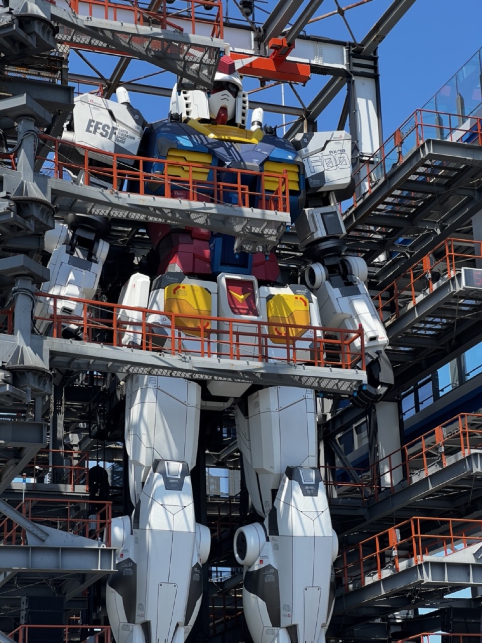

1. Overall Rating (0–10) — 7.5
This photograph captures the awe-inspiring scale and intricate engineering of the life-sized Gundam statue, transforming a pop culture icon into a monumental work of mechanical art. The low-angle perspective amplifies the robot’s imposing presence, while the bright sunlight enhances the bold colors and metallic textures. While the surrounding industrial framework adds context, it slightly competes with the subject, diluting the focus on the Gundam itself.
2. Composition (0–10) — 7.0
The low-angle shot emphasizes the statue’s towering stature, with strong vertical lines guiding the eye upward. The placement of the Gundam near the center balances the frame, though the complex scaffolding and walkways create visual noise on the periphery.
3. Lighting (0–10) — 8.0
Bright, direct sunlight creates crisp highlights and deep shadows, accentuating the Gundam’s form and mechanical details. The clear blue sky provides a clean backdrop that enhances contrast and makes the robot’s colors pop.
4. Color & Tone (0–10) — 8.5
The iconic red, blue, yellow, and white palette is vibrant and well-saturated, conveying the energy of the original anime. The cool metallic tones of the surrounding structure contrast effectively with the warm colors of the Gundam, creating visual interest.
5. Creativity (0–10) — 8.0
The image successfully merges pop culture with architectural scale, transforming a fictional character into a tangible, immersive landmark. The perspective and framing elevate the subject beyond mere fan art into a statement of engineering and design.
6. Technical Quality (0–10) — 8.5
Sharp focus and high resolution capture fine details on the robot’s surface and surrounding structures. The exposure is well-balanced, with no blown-out highlights despite the bright conditions.
7. Emotional Impact (0–10) — 7.5
The photograph evokes a sense of wonder and nostalgia, appealing to fans and casual viewers alike. The sheer size and realism of the Gundam inspire awe, making the image both visually and emotionally engaging.
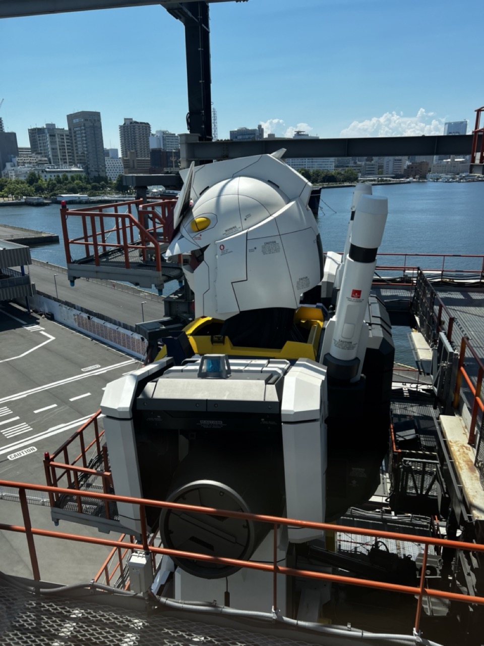

1. Overall Rating (0–10) — 7.0
This photograph captures a striking juxtaposition of pop culture and urban reality, with the iconic Gundam statue standing as a bold centerpiece against the backdrop of a bustling city and waterfront. The bright daylight enhances the mechanical details and clean lines of the robot, while the surrounding infrastructure grounds it in a tangible, real-world context. While the framing feels slightly cluttered and the perspective lacks a clear focal point, the image succeeds in conveying the awe and scale of the installation, inviting viewers to marvel at the fusion of fiction and reality.
2. Composition (0–10) — 6.0
The composition is somewhat unbalanced, with the Gundam positioned off-center and surrounded by foreground elements like railings and machinery that distract from the subject. A tighter framing and more deliberate use of leading lines could better guide the viewer’s eye toward the statue.
3. Lighting (0–10) — 8.5
Bright, natural sunlight creates strong contrast and sharp definition, highlighting the white and yellow panels of the Gundam and casting clean shadows. The clear blue sky adds depth and enhances the overall vibrancy of the scene.
4. Color & Tone (0–10) — 7.5
The palette is dominated by crisp whites, metallic grays, and the deep blue of the water, creating a clean, high-contrast visual. The yellow accents on the Gundam add a pop of color that draws attention, while the urban backdrop maintains a neutral, realistic tone.
5. Creativity (0–10) — 7.5
The image creatively juxtaposes a fictional, larger-than-life character with a mundane urban environment, offering a unique commentary on how anime and pop culture permeate everyday life. The choice to photograph the statue from a slightly elevated, oblique angle adds a sense of scale and dynamism.
6. Technical Quality (0–10) — 8.0
The photograph is sharp and well-focused, with clear details visible on the Gundam’s surface and in the background. The exposure is well-managed, capturing the bright daylight without overexposing key areas.
7. Emotional Impact (0–10) — 6.5
The image evokes a sense of wonder and nostalgia, particularly for fans of the Gundam franchise, while also reflecting the quiet grandeur of public art in a modern city. However, the emotional resonance is slightly tempered by the cluttered framing and lack of a more intimate human element.
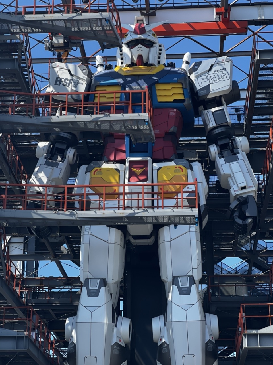

1. Overall Rating (0–10) — 7.5
This photograph captures the awe-inspiring scale and intricate detail of the RX-78-2 Gundam statue, standing as a monumental tribute to Japanese pop culture. The low-angle perspective amplifies the robot’s imposing presence, while the industrial scaffolding surrounding it grounds the scene in a real-world context. While the composition is strong, the overcast lighting and cluttered background slightly dilute the visual impact, preventing the image from achieving full artistic cohesion.
2. Composition (0–10) — 7.0
The low-angle framing effectively emphasizes the statue’s massive scale, with the robot centered and dominating the frame. However, the surrounding scaffolding and railings create a visually busy environment that competes for attention, slightly disrupting the clean symmetry of the subject.
3. Lighting (0–10) — 6.5
Natural daylight provides even illumination across the statue, minimizing harsh shadows and allowing the iconic color scheme—white, blue, red, and yellow—to remain vibrant. However, the overcast sky softens the contrast and reduces the dramatic effect that stronger sunlight might have created.
4. Color & Tone (0–10) — 7.0
The bold primary colors of the Gundam are rendered with high fidelity, creating a striking visual contrast against the industrial steel and red railings. The tonal balance is clean, though the muted sky tempers the overall vibrancy.
5. Creativity (0–10) — 7.5
The image successfully merges pop culture iconography with an industrial setting, creating a compelling juxtaposition between the fantastical and the real. The choice to frame the robot as a functional, almost mechanical presence within a construction zone adds a layer of narrative depth.
6. Technical Quality (0–10) — 8.0
Sharp focus and high resolution capture the fine details of the robot’s armor and structural components. The exposure is well-balanced, and the image remains clear and noise-free.
7. Emotional Impact (0–10) — 7.0
The photograph evokes a sense of wonder and reverence, capturing the iconic status of the Gundam as both a cultural symbol and a physical landmark. The viewer is drawn into the scale and craftsmanship, prompting a moment of reflection on the intersection of art and engineering.
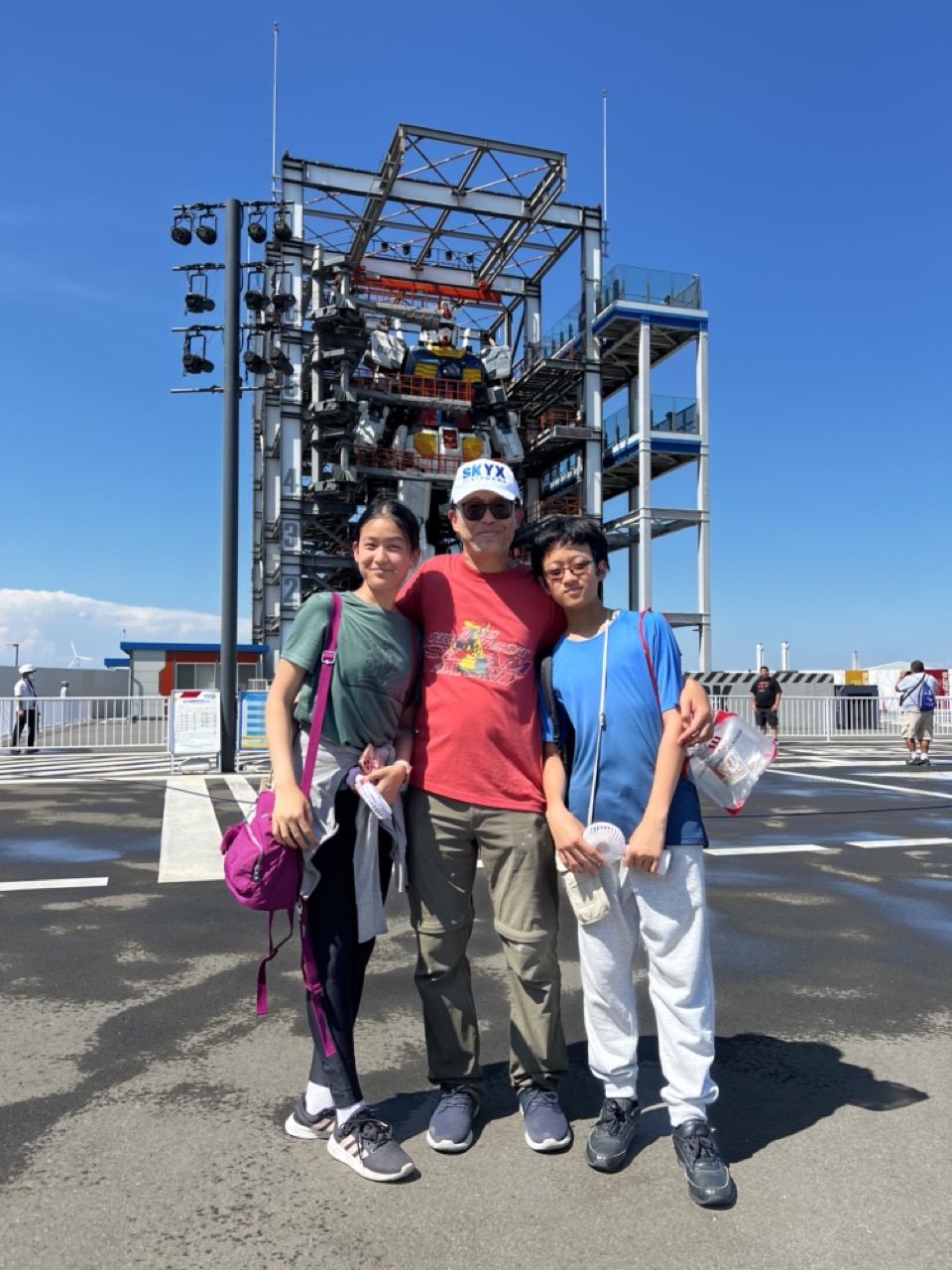

1. Overall Rating (0–10) — 7.0
This photograph captures a warm, candid moment of a family posing in front of a towering amusement park structure under a brilliant blue sky. The bright sunlight and expansive setting lend a sense of joy and adventure, while the subjects’ relaxed expressions convey genuine connection. The composition is slightly hindered by the cluttered background and uneven framing, but the image successfully preserves a memorable, sun-drenched vacation memory.
2. Composition (0–10) — 6.0
The subjects are centered but slightly low in the frame, leaving an overabundance of negative space at the top. The towering structure behind them dominates the background, creating visual tension and drawing attention away from the family.
3. Lighting (0–10) — 8.5
Strong, direct sunlight creates crisp shadows and enhances the vibrancy of the colors, emphasizing the clarity and warmth of the day. The high contrast adds depth and dimension to the scene.
4. Color & Tone (0–10) — 7.5
The palette is dominated by bright, saturated blues and vivid reds, which contrast effectively with the neutral pavement and steel structure. The color balance feels natural and enhances the cheerful, summery mood.
5. Creativity (0–10) — 6.5
While the image is a classic travel portrait, its strength lies in its authenticity rather than technical innovation. The inclusion of the large, thematic structure adds narrative context, elevating it beyond a simple snapshot.
6. Technical Quality (0–10) — 8.0
The image is sharp and well-exposed, with clean details in both the subjects and background. Focus is consistent across the frame, and the camera captured the scene without noticeable noise or distortion.
7. Emotional Impact (0–10) — 7.5
The photograph evokes a strong sense of familial bond and shared joy, amplified by the bright, open setting. It invites the viewer to imagine the excitement of the day, creating a relatable and emotionally resonant moment.
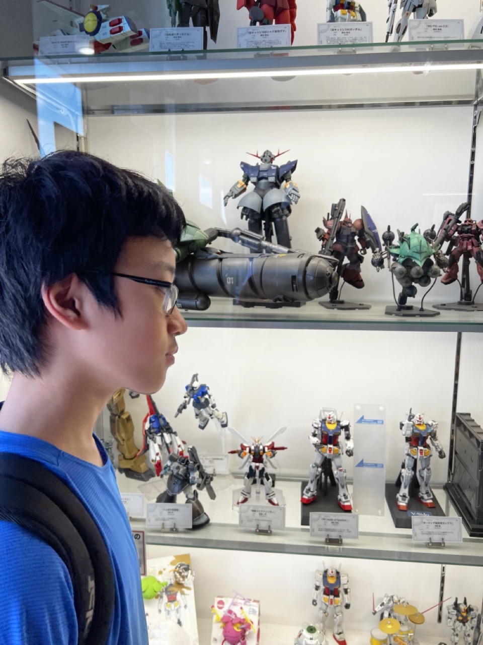

1. Overall Rating (0–10) — 7.0
This photograph captures a quiet moment of wonder, where a young observer is absorbed in a world of meticulously crafted mecha models. The display case, filled with iconic Gundam figures, serves as a visual narrative of fandom and craftsmanship, while the subject’s contemplative gaze adds emotional depth. Though the image is grounded in realism, its strength lies in the subtle storytelling—what is not said is as compelling as what is seen.
2. Composition (0–10) — 7.0
The subject is positioned off-center, creating a natural visual path from his profile to the collection behind him. The layered shelves provide depth and context, guiding the eye through the display, though the glass reflections slightly disrupt the clarity of the background.
3. Lighting (0–10) — 6.5
Even, fluorescent lighting illuminates the scene effectively, preserving detail in the models. However, the overhead lights create glare on the glass, softening the visual clarity of some figures and reducing the overall atmosphere.
4. Color & Tone (0–10) — 7.0
The palette is dominated by the metallic grays and vibrant primary colors of the mecha models, which contrast nicely with the subject’s blue shirt. The cool, neutral tones of the display enhance the technological aesthetic, while the warm skin tones add a human touch.
5. Creativity (0–10) — 7.5
The image successfully blends documentary realism with emotional resonance, capturing a personal moment within a larger cultural context. The interplay between the observer and the objects he admires gives the photo a quiet narrative power.
6. Technical Quality (0–10) — 7.5
The focus is sharp on the subject’s face and the mid-ground models, with good clarity throughout. The camera’s depth of field is well-managed, though minor reflections and slight overexposure in the light sources detract slightly from the overall polish.
7. Emotional Impact (0–10) — 7.5
There is a strong sense of reverence and immersion, evoking nostalgia and the joy of discovery. The viewer is drawn into the subject’s quiet awe, making the image feel intimate and relatable, even to those unfamiliar with the franchise.
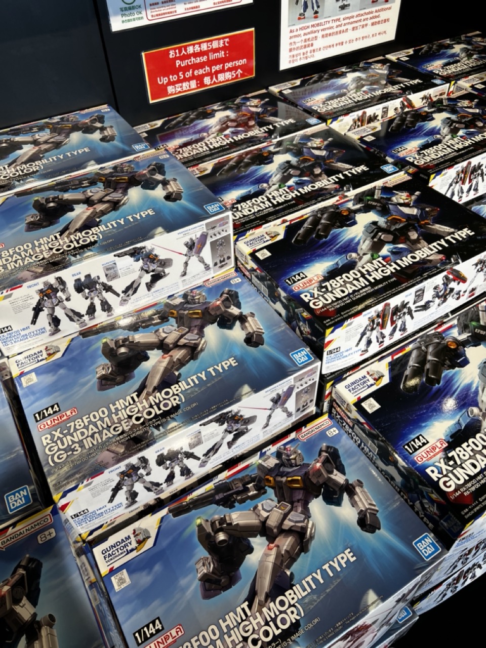

1. Overall Rating (0–10) — 6.0
This photograph captures the vibrant energy of a retail display dedicated to Gundam model kits, showcasing a sea of colorful boxes that reflect both the popularity and visual appeal of the franchise. The composition effectively conveys the sense of abundance and organized chaos typical of a hobby store aisle, though the lack of a clear focal point slightly dilutes its impact. While the image succeeds in documenting the product's presentation, it feels more like a straightforward snapshot than a compelling visual narrative.
2. Composition (0–10) — 6.0
The diagonal arrangement of the boxes creates a sense of movement, but the overlapping layers and cluttered framing reduce visual clarity. A tighter crop or more deliberate angle would enhance focus on the central subject.
3. Lighting (0–10) — 7.0
Even, overhead lighting illuminates the scene clearly, preserving the details on the packaging and ensuring that text and graphics remain legible. The brightness supports the commercial nature of the image, though it lacks atmospheric depth.
4. Color & Tone (0–10) — 7.0
The dominant blue and metallic tones of the packaging create a cohesive, futuristic palette that aligns with the Gundam aesthetic. The contrast between the bright boxes and the dark background enhances visual pop, though the repetition of colors can feel visually overwhelming.
5. Creativity (0–10) — 6.0
The image is functional and informative, capturing a real-world retail moment with authenticity. However, it lacks originality in framing and perspective, relying on the inherent appeal of the subject rather than artistic interpretation.
6. Technical Quality (0–10) — 7.0
Sharp focus and clean detail allow for easy reading of text and identification of the models. The image is technically sound, though the high level of visual noise from repeated elements slightly detracts from overall clarity.
7. Emotional Impact (0–10) — 5.5
While fans of the Gundam franchise may feel a sense of nostalgia or excitement, the image remains largely neutral in emotional resonance. It communicates information effectively but does not evoke a strong emotional response in a broader audience.
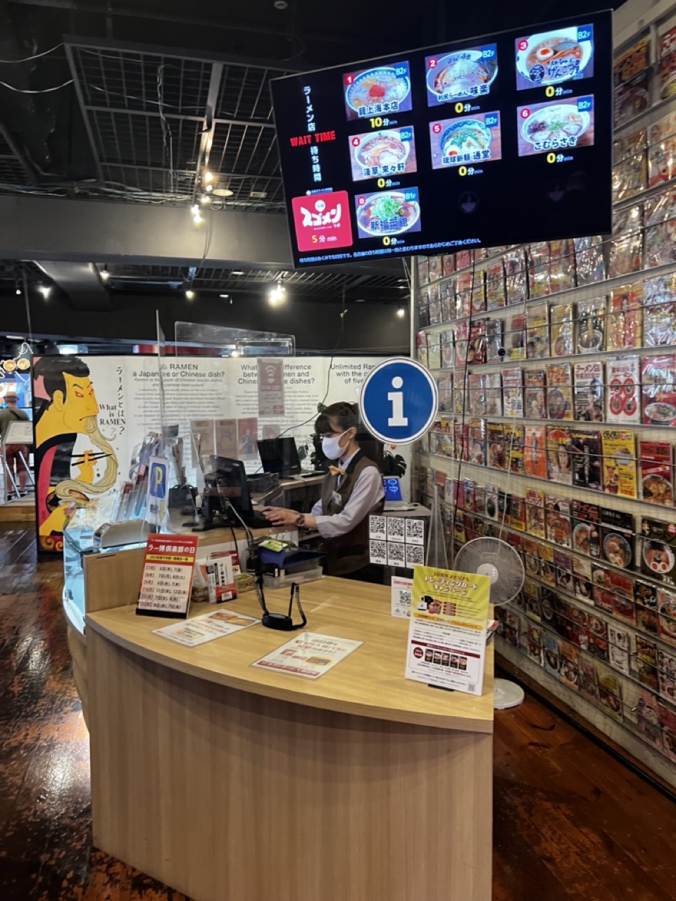

1. Overall Rating (0–10) — 6.0
This photograph captures the energetic, information-dense atmosphere of a modern ramen chain’s ordering area, where digital screens and product displays create a sense of organized chaos. The composition effectively conveys the rhythm of a busy eatery, though the clutter of signs and text risks overwhelming the viewer. While the image succeeds in documenting a specific cultural moment in Japanese food service, its visual harmony is compromised by a lack of intentional focus and a slightly chaotic arrangement.
2. Composition (0–10) — 5.5
The framing is wide and functional, capturing the full context of the ordering station. However, the overlapping elements—signs, screen, and wall display—create visual competition, and the central subject (the staff member) is slightly off-center, weakening the sense of balance.
3. Lighting (0–10) — 6.0
The lighting is bright and utilitarian, typical of commercial interiors, with overhead fixtures providing even illumination. While the digital screen glows vividly, the ambient lighting lacks warmth, contributing to a sterile, transactional mood.
4. Color & Tone (0–10) — 6.5
The image features a vibrant, varied palette dominated by the reds, yellows, and blues of the ramen packaging and signage. These colors create visual energy, but the overall tone is uneven, with the screen’s cool blue contrasted against the warm wood tones of the counter, resulting in a slightly disjointed color harmony.
5. Creativity (0–10) — 6.0
The photograph functions more as a documentary record than an artistic statement, capturing the essence of a high-volume ramen restaurant with authenticity. The use of the digital queue display adds a layer of modernity, but the approach lacks narrative depth or a unique visual perspective.
6. Technical Quality (0–10) — 7.0
The image is sharp and well-exposed, with clear details in the signage and textures of the counter and floor. The focus is consistent, though the high level of detail in the background elements can distract from the main subject.
7. Emotional Impact (0–10) — 5.0
The image conveys the efficiency and speed of a modern ramen chain but feels emotionally distant. The masked staff member, absorbed in their task, offers a subtle human touch, but the overwhelming presence of information and branding limits the viewer’s emotional connection to the scene.
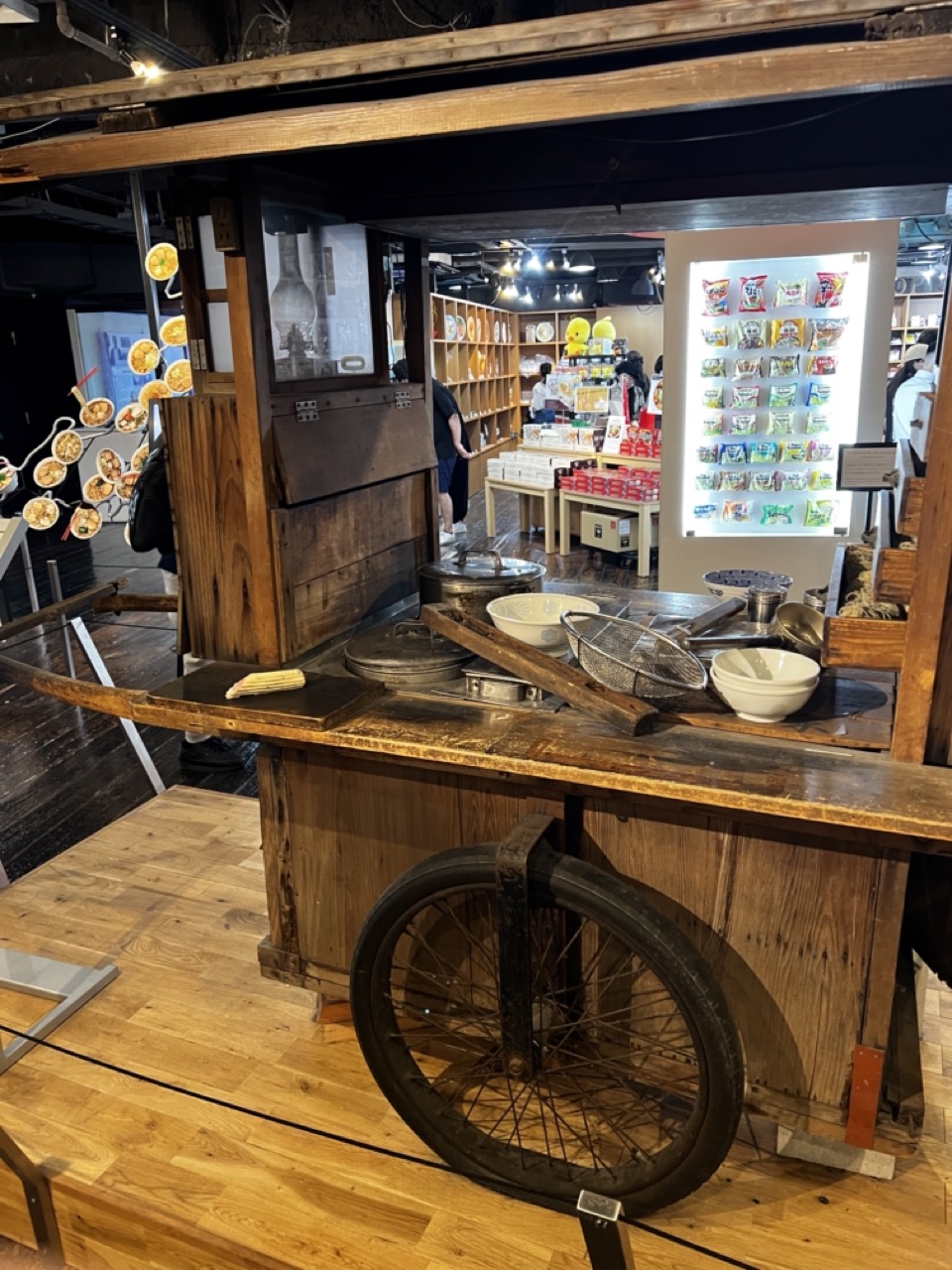

1. Overall Rating (0–10) — 6.8
This photograph captures the nostalgic charm of a traditional Japanese food cart, evoking a sense of cultural history within a modern retail space. The blend of aged wood, vintage cookware, and ambient lighting creates a compelling contrast between past and present. While the scene is rich in detail and texture, the surrounding commercial elements slightly dilute its authenticity, creating a tension between authenticity and exhibition.
2. Composition (0–10) — 6.5
The framing centers on the food cart, with the wheel in the foreground adding depth, but the background clutter and scattered objects—such as the display shelf and signage—distract from the main subject. A tighter crop would enhance focus and narrative cohesion.
3. Lighting (0–10) — 6.0
The lighting is functional and even, with a mix of overhead spotlights and ambient glow from the display case. While it highlights the textures of the wood and metal, the lack of directional or dramatic lighting limits the image’s mood and visual drama.
4. Color & Tone (0–10) — 6.5
The warm, earthy tones of the wood and aged metal dominate, creating a cohesive and nostalgic palette. The cool white of the product display provides a subtle contrast, but the overall color balance feels slightly flat and underexposed, reducing vibrancy.
5. Creativity (0–10) — 7.0
The image successfully captures a cultural artifact in a contemporary context, suggesting a story of preservation and adaptation. The juxtaposition of traditional tools with modern retail elements adds conceptual depth, though it leans more toward documentation than artistic interpretation.
6. Technical Quality (0–10) — 7.5
The image is sharp and well-focused, with clear details in the wood grain, metal surfaces, and background products. There is minimal noise, and the exposure is balanced, though slight underexposure in the shadows reduces detail in darker areas.
7. Emotional Impact (0–10) — 6.0
The photograph evokes a quiet sense of nostalgia and respect for tradition, but the presence of modern retail elements tempers its emotional resonance. The viewer is reminded of a bygone era, yet the setting distances them from a fully immersive experience.
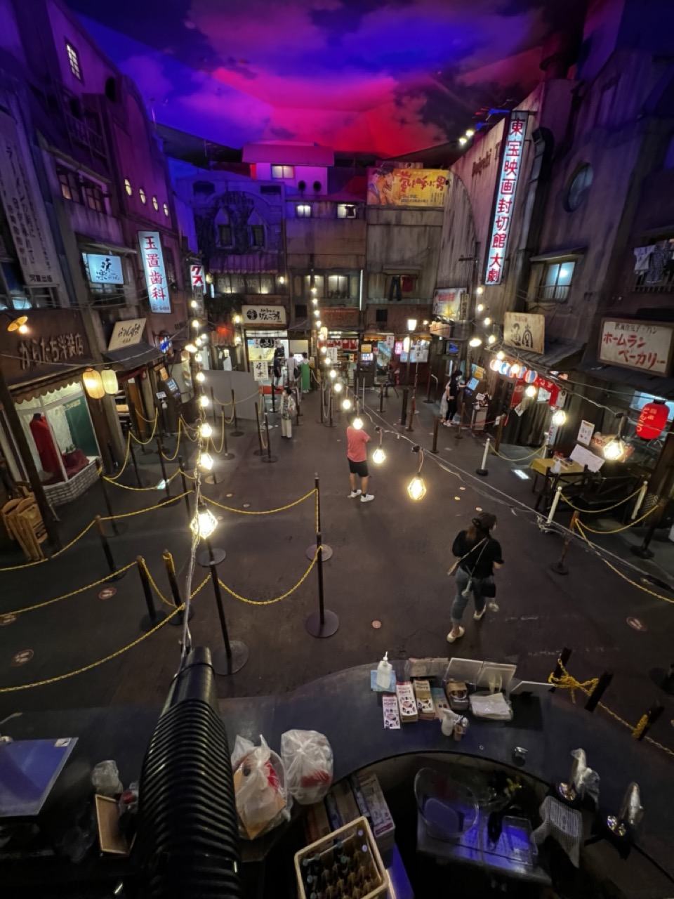

1. Overall Rating (0–10) — 7.5
This photograph captures the immersive atmosphere of a recreated Japanese street scene, blending realism with theatrical lighting to evoke a sense of nostalgia and urban energy. The vibrant, dramatic sky and glowing signage create a cinematic mood, while the presence of visitors grounds the scene in lived experience. Though the image is rich in detail and mood, the cluttered composition and slightly overexposed lights risk overwhelming the viewer’s focus.
2. Composition (0–10) — 6.5
The high-angle perspective provides a comprehensive view of the space, but the foreground elements and scattered rope barriers disrupt visual flow. The central alley draws the eye, yet the asymmetry and multiple focal points create a slightly chaotic impression.
3. Lighting (0–10) — 8.0
The interplay of warm string lights and the dramatic purple-red sky creates a striking contrast, enhancing the scene’s theatricality. The lighting is intentional and moody, effectively simulating a nighttime urban atmosphere, though some areas are slightly overexposed.
4. Color & Tone (0–10) — 8.0
The rich, saturated hues of the sky and signage stand out against the muted tones of the buildings, creating a dynamic and visually engaging palette. The contrast between warm yellows and cool purples adds depth and emotional resonance.
5. Creativity (0–10) — 8.5
The scene’s design and execution demonstrate strong imaginative vision, transforming a man-made environment into a compelling narrative space. The fusion of real-world textures with artificial lighting suggests a carefully curated experience, evoking both realism and fantasy.
6. Technical Quality (0–10) — 7.0
The image is sharp and well-exposed overall, with clear details in both the foreground and background. However, slight noise and uneven lighting control in the darker areas suggest limitations in low-light capture.
7. Emotional Impact (0–10) — 7.5
The photograph evokes a sense of wonder and nostalgia, inviting the viewer into a world that feels both familiar and dreamlike. The presence of people adds a human element, enhancing the feeling of shared experience within this staged urban landscape.
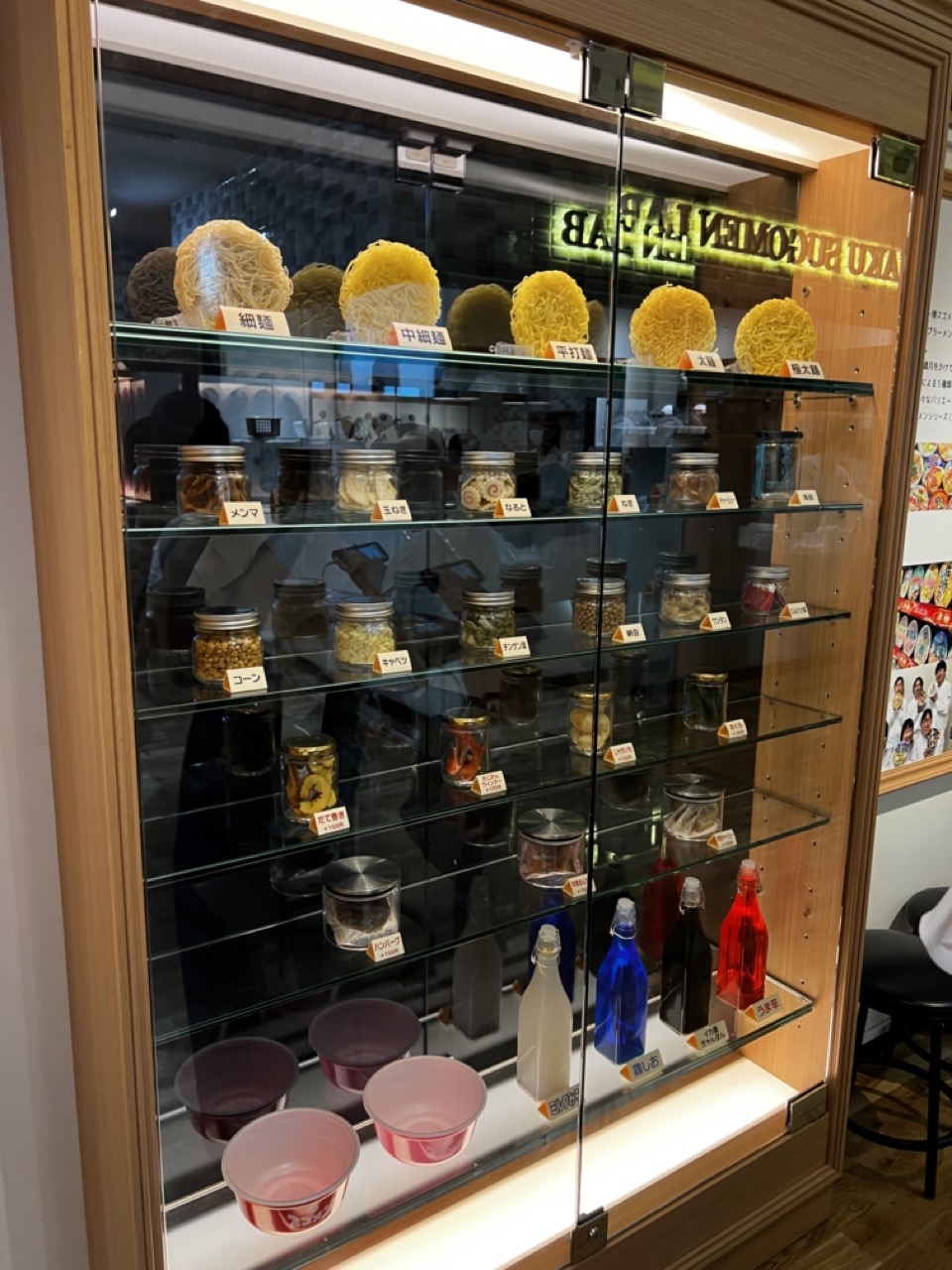

1. Overall Rating (0–10) — 6.0
This photograph presents a clean, informative display of ramen ingredients and noodle varieties, offering a window into the craftsmanship behind a Japanese noodle shop. The organized shelves and clear labeling communicate purpose and precision, though the image feels more like a functional documentation than an evocative portrait. A warmer lighting tone and more dynamic composition could elevate its visual appeal beyond mere utility.
2. Composition (0–10) — 6.5
The framing captures the full display case with balanced depth, emphasizing the layers of ingredients. The diagonal line of the glass and the stacked shelves create visual rhythm, but the reflection in the glass slightly disrupts focus on the central elements.
3. Lighting (0–10) — 6.0
Even, bright lighting highlights the contents clearly, though the overhead fluorescent source creates a slightly clinical glow. The backlighting of the sign adds a subtle glow, but the overall lighting lacks warmth and atmospheric depth.
4. Color & Tone (0–10) — 6.5
The palette is largely neutral—wood tones, glass, and metallic jars—punctuated by the vibrant red and blue bottles at the bottom. These pops of color provide visual interest, but the overall tonal range is limited, resulting in a somewhat flat aesthetic.
5. Creativity (0–10) — 5.5
The image functions as a straightforward showcase of ingredients and menu offerings, prioritizing clarity over artistic interpretation. While the concept is engaging, the execution remains conventional, lacking a distinctive visual voice.
6. Technical Quality (0–10) — 7.5
The image is sharp and well-focused, with clean lines and readable labels. The reflections in the glass are present but do not significantly impair clarity, showing good technical control.
7. Emotional Impact (0–10) — 5.0
The photo conveys order and attention to detail, but it remains emotionally distant. It invites curiosity about the food, but doesn’t evoke a strong sense of warmth, nostalgia, or culinary passion.
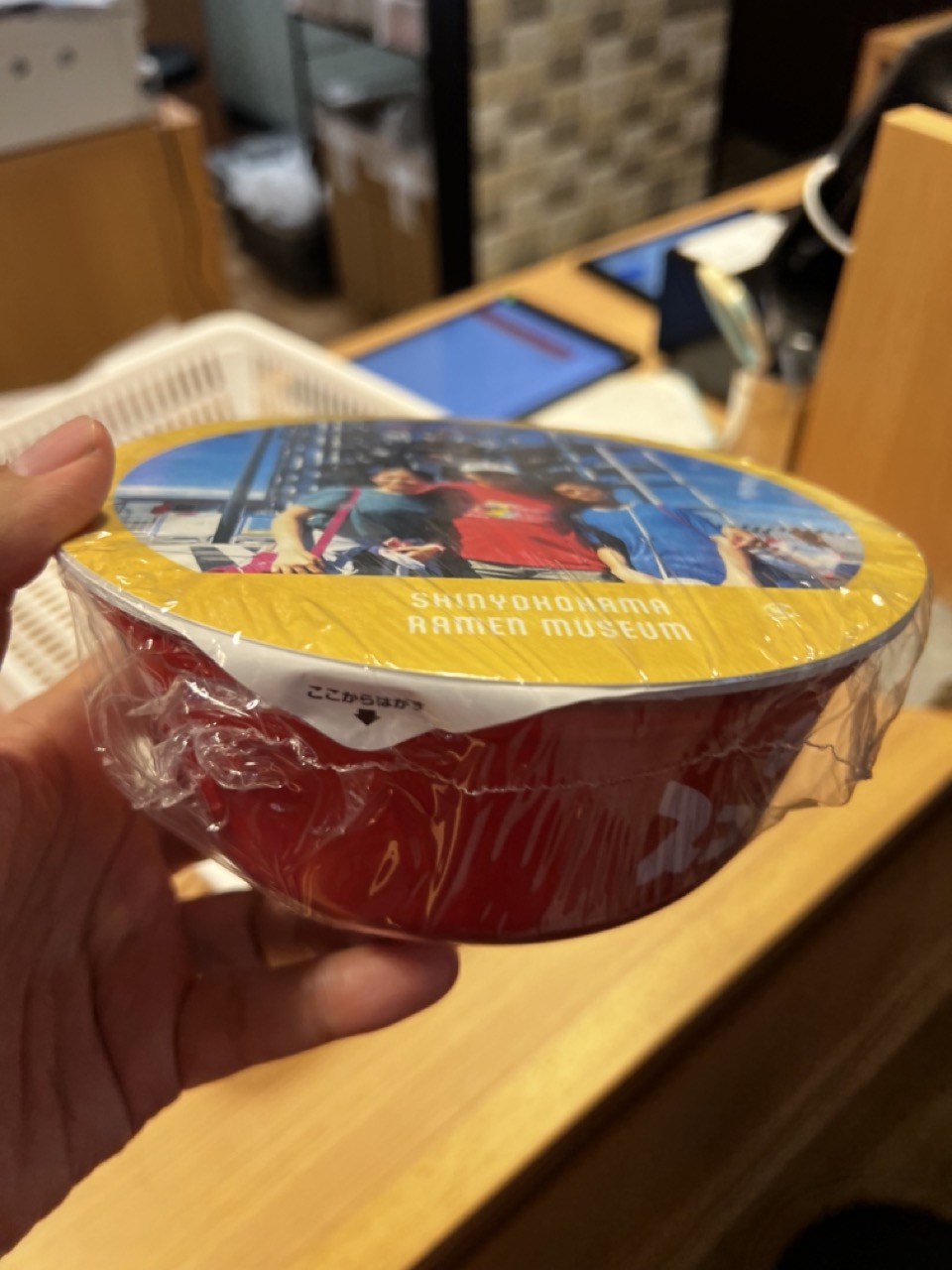

1. Overall Rating (0–10) — 5.5
This image captures a candid, everyday moment—a hand holding a branded ramen cup from the Shin Yokohama Ramen Museum—evoking a sense of personal experience and travel. The focus on the product and its packaging tells a simple story of culinary tourism, but the shallow depth of field and casual framing limit its visual impact. While the subject is clear and relatable, the image feels more like a snapshot than a composed photograph, lacking the polish and narrative cohesion to stand out.
2. Composition (0–10) — 5.0
The subject is centered but slightly tilted, and the background clutter—tablets, baskets, and indistinct objects—distracts from the main focus. A tighter crop and cleaner background would improve balance and clarity.
3. Lighting (0–10) — 6.0
The indoor lighting is warm and even, casting soft shadows that highlight the plastic wrap and the cup’s texture. However, the light lacks directionality, resulting in a somewhat flat appearance that diminishes depth.
4. Color & Tone (0–10) — 6.5
The red of the ramen cup contrasts with the yellow lid and the neutral wood tones, creating a visually engaging palette. The colors are vibrant but slightly oversaturated, giving the image a slightly artificial quality.
5. Creativity (0–10) — 5.5
The concept is grounded in a real-world experience—food as cultural souvenir—but the execution is straightforward and lacks originality. The photograph documents rather than interprets, offering little beyond the literal.
6. Technical Quality (0–10) — 7.0
The focus is sharp on the ramen cup, and the image is free of noticeable noise or blur. However, the shallow depth of field and slight motion blur in the hand reduce overall clarity.
7. Emotional Impact (0–10) — 5.0
The image conveys a sense of personal memory and travel, but the lack of emotional depth or storytelling limits its resonance. It feels more like a casual memento than an emotionally compelling portrait of a moment.
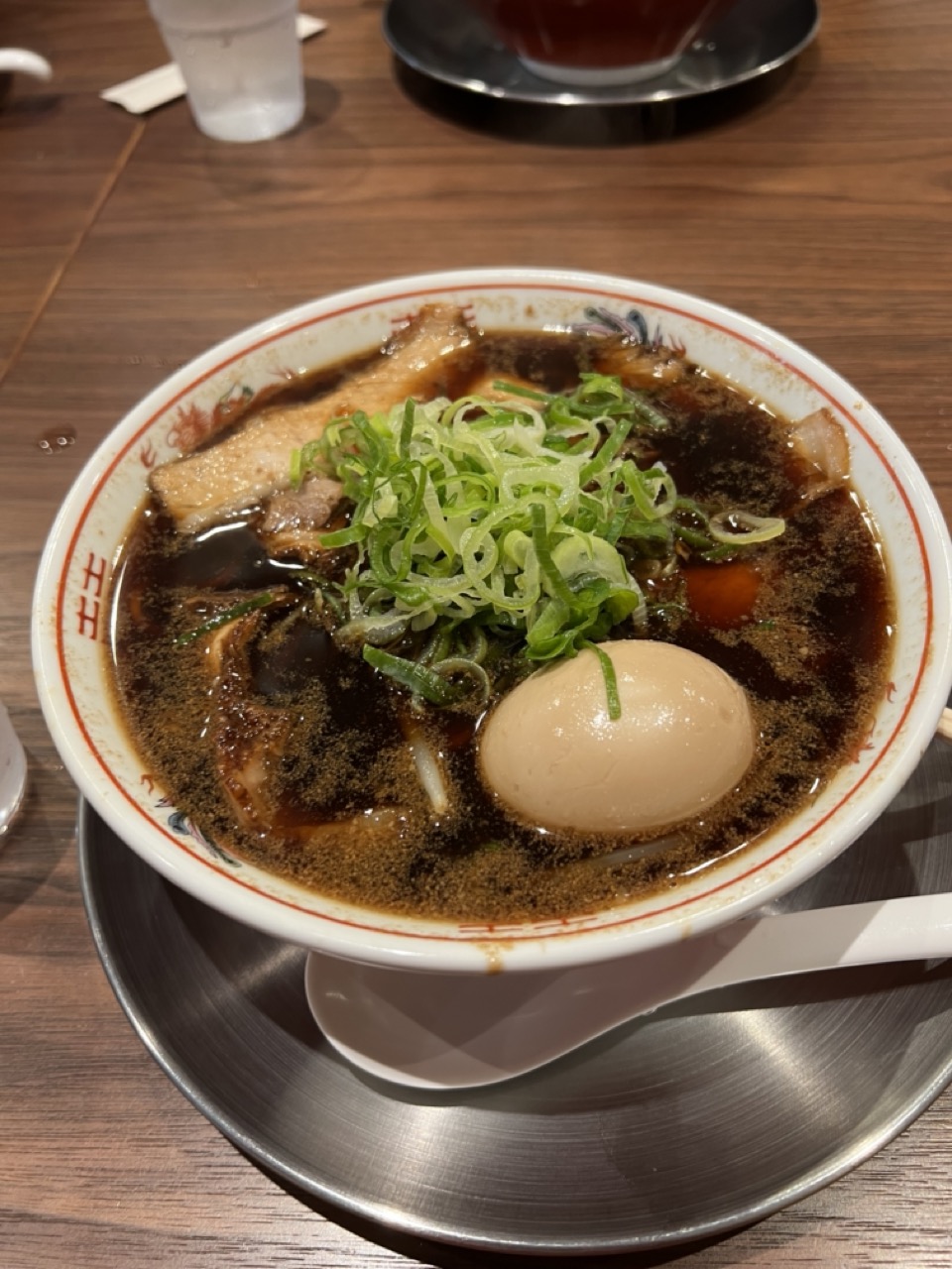

1. Overall Rating (0–10) — 7.0
This photograph captures the comforting richness of a steaming bowl of ramen, evoking warmth and indulgence through its carefully arranged components. The deep, glossy broth and vibrant green scallions create an inviting focal point, while the soft lighting enhances the dish’s tactile appeal. Though the composition feels slightly cluttered by the surrounding table elements, the image successfully conveys the soul of a satisfying meal, balancing authenticity with visual appeal.
2. Composition (0–10) — 6.5
The bowl is centered and well-framed, drawing immediate attention to the ramen, but the background clutter—particularly the glass and saucer—distracts from the main subject and disrupts visual harmony.
3. Lighting (0–10) — 7.0
The warm, ambient lighting enhances the richness of the broth and gives the scene a cozy, intimate feel, though the shadows are slightly soft and could benefit from more directional definition.
4. Color & Tone (0–10) — 7.5
The deep brown of the broth contrasts beautifully with the bright green of the scallions and the pale egg, creating a rich and appetizing palette. The overall tone is warm and cohesive, enhancing the dish’s appeal.
5. Creativity (0–10) — 6.0
While the subject is familiar and the approach is straightforward, the image succeeds in capturing the sensory experience of ramen with a sense of immediacy and authenticity. It’s more observational than conceptual, but still effective in its storytelling.
6. Technical Quality (0–10) — 7.5
The image is sharp and well-focused, particularly on the bowl and its contents. The depth of field isolates the subject well, and the detail in the textures of the broth and toppings is clear.
7. Emotional Impact (0–10) — 7.0
The photograph evokes a strong sense of comfort and satisfaction, tapping into the universal appeal of a hearty meal. It invites the viewer to imagine the taste, aroma, and warmth of the ramen, creating a quiet emotional connection.
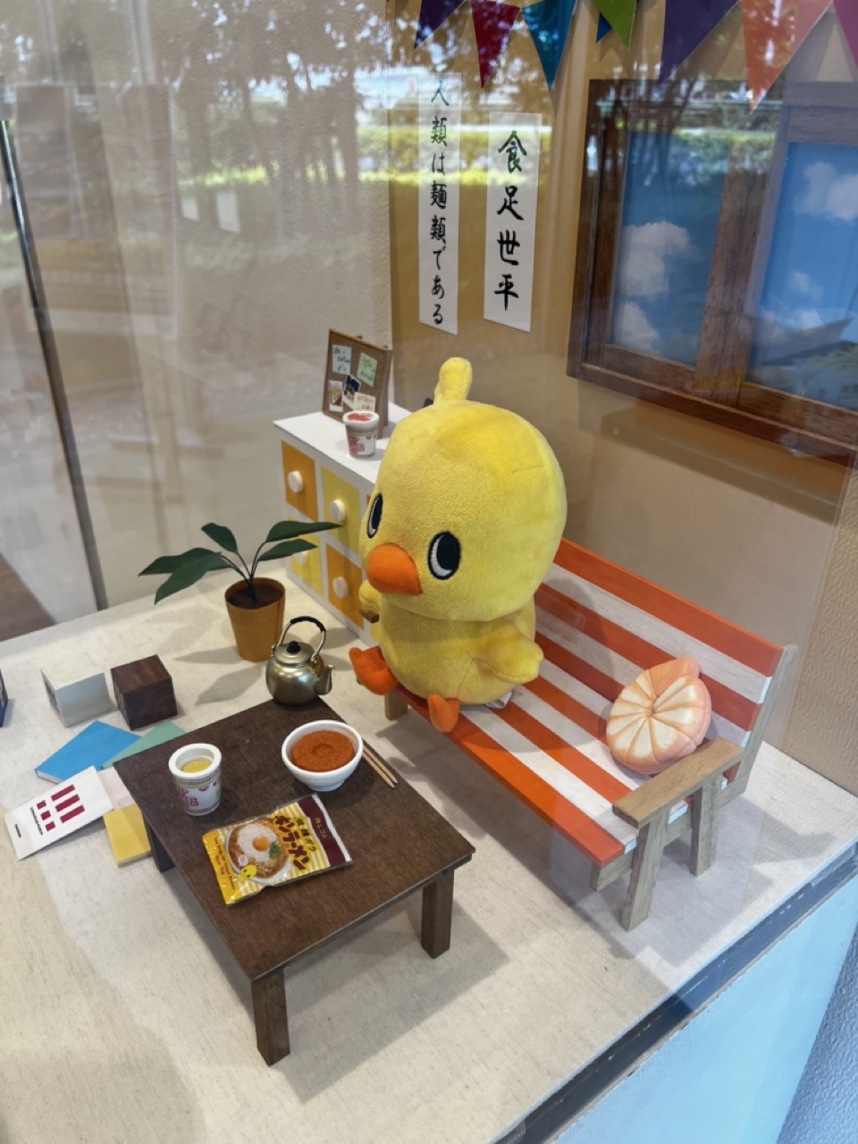

1. Overall Rating (0–10) — 7.0
This photograph captures a whimsical, miniature diorama that blends playful charm with cultural specificity, evoking a cozy, domestic moment with a touch of absurdity. The oversized yellow chick plush and the carefully arranged ramen-themed props create a narrative of comfort and humor, while the Japanese calligraphy and traditional elements ground the scene in cultural context. The image succeeds in blending kitsch and sincerity, though the reflections in the glass slightly disrupt the intimacy of the moment.
2. Composition (0–10) — 7.0
The subject is well-centered with a balanced arrangement of objects, guiding the eye from the table to the plush figure and beyond. The use of depth—foreground, midground, and background—creates a layered, immersive feel, though the reflection on the glass slightly distracts from the composition's clarity.
3. Lighting (0–10) — 7.5
Soft, diffused natural light enhances the scene’s warmth and depth, highlighting textures in the plush, wood, and ceramic without creating harsh shadows. The ambient glow supports the cozy, inviting mood of the display.
4. Color & Tone (0–10) — 7.5
The palette is harmonious, with warm yellows, oranges, and browns complemented by the green of the plant and the subtle pops of color from the bunting. The overall tone is light and cheerful, reinforcing the playful yet nostalgic atmosphere.
5. Creativity (0–10) — 8.0
The concept is highly original and engaging—merging miniature art, pop culture, and Japanese food traditions into a single narrative. The use of a plush as a character in a domestic scene adds a layer of storytelling that is both clever and emotionally resonant.
6. Technical Quality (0–10) — 7.0
The image is sharp and well-focused, with clear details in the textures of the objects and the fabric of the plush. The reflections in the glass are a minor technical flaw but do not significantly detract from the overall quality.
7. Emotional Impact (0–10) — 7.5
The photograph evokes a sense of warmth, nostalgia, and gentle humor, inviting the viewer into a miniature world that feels both familiar and delightfully strange. The combination of cultural elements and playful design creates a connection that is both personal and universally appealing.
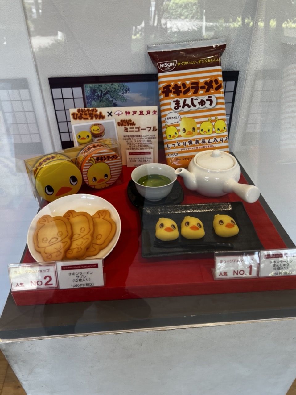

1. Overall Rating (0–10) — 7.0
This photograph captures a charming and whimsical display of themed merchandise, blending Japanese pop culture with traditional tea service in a playful yet cohesive way. The duck motif unifies the scene, from the snacks to the packaging, creating a lighthearted narrative that feels both curated and inviting. While the cluttered arrangement slightly undermines visual harmony, the image succeeds in conveying the joy of novelty and cultural fusion, making it a compelling piece of commercial storytelling.
2. Composition (0–10) — 6.0
The arrangement is dense and somewhat busy, with multiple objects competing for attention. The central teapot and tea bowl provide a focal point, but the surrounding items, especially the packaging and signage, create visual noise that disrupts balance.
3. Lighting (0–10) — 6.5
The lighting is even and bright, likely from overhead display lights, which clearly illuminates the scene. However, it lacks depth and warmth, giving the image a flat, commercial quality that diminishes the potential for atmospheric richness.
4. Color & Tone (0–10) — 7.5
The warm yellows of the duck-themed items contrast nicely with the red base and white ceramics, creating a cheerful and energetic palette. The green tea adds a natural accent, while the overall tone remains vibrant without appearing over-saturated.
5. Creativity (0–10) — 8.0
The fusion of instant ramen branding with traditional Japanese tea culture is highly original and conceptually engaging. The use of a duck mascot across multiple products and settings demonstrates clever branding and a strong narrative thread.
6. Technical Quality (0–10) — 7.5
The image is sharp and well-focused, with clear details visible on the packaging and food items. The reflection on the glass case is minimal, preserving legibility and clarity.
7. Emotional Impact (0–10) — 7.0
The image evokes a sense of playful delight and nostalgia, particularly for fans of Japanese pop culture. The combination of familiar food items with cute character design creates a warm, affectionate connection, making the viewer feel invited into a fun and whimsical world.
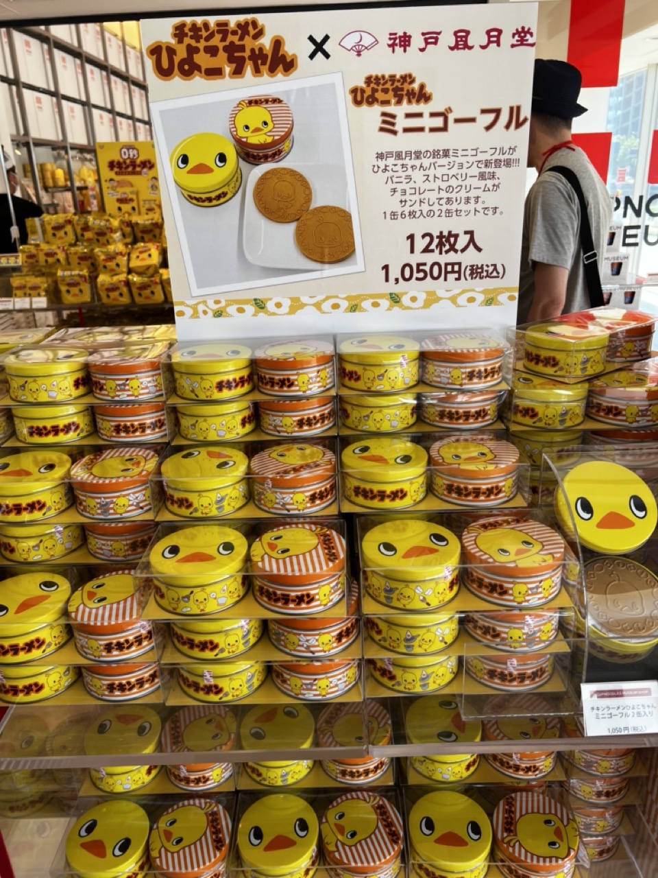

1. Overall Rating (0–10) — 6.0
This photograph captures a vibrant and playful product display, where the bright yellow duck-themed tins create an immediate sense of fun and commercial charm. The visual energy is driven by repetition and bold branding, but the composition feels slightly cluttered, with too much information competing for attention. While the image effectively conveys the product’s appeal and retail context, it lacks the visual refinement to elevate it beyond a straightforward commercial snapshot.
2. Composition (0–10) — 5.5
The framing is centered on the product display, but the inclusion of a person in the background and the overlapping signage creates visual noise. The repetition of the yellow tins provides rhythm, but the lack of clear focal point or leading lines weakens the overall balance.
3. Lighting (0–10) — 6.0
The lighting is bright and even, typical of a retail environment, which ensures clarity and highlights the product colors. However, the flat, overhead illumination lacks depth and fails to create dramatic contrast or mood.
4. Color & Tone (0–10) — 7.5
The dominant yellow and orange hues are vibrant and eye-catching, creating a cheerful and cohesive palette. The use of white and red in the signage adds contrast, though the color scheme leans heavily toward commercial branding, limiting artistic subtlety.
5. Creativity (0–10) — 6.5
The image leverages a popular character design and a clever product concept, but the execution is more documentary than artistic. The playful theme is engaging, yet the composition lacks originality in its approach to capturing a retail scene.
6. Technical Quality (0–10) — 7.0
The image is sharp and well-focused, with clear details visible in the product labels and packaging. The resolution is adequate, though the depth of field is shallow, causing some of the background elements to appear slightly soft.
7. Emotional Impact (0–10) — 6.0
The image evokes a sense of nostalgia and whimsy, particularly for fans of the character or Japanese confectionery. While it succeeds in conveying the joy and excitement of a themed product launch, it remains emotionally distant due to its commercial nature and lack of personal narrative.
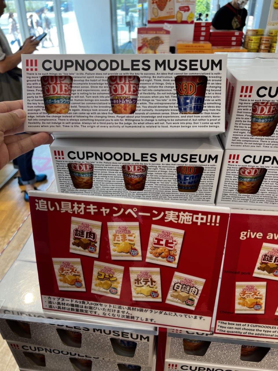

1. Overall Rating (0–10) — 5.5
This image captures a promotional display for the Cup Noodles Museum, emphasizing its quirky branding and playful marketing. The layered packaging and bilingual text create a sense of commercial authenticity, yet the composition feels cluttered and visually disjointed. While the concept is engaging and the museum’s theme is clearly communicated, the lack of visual hierarchy and overuse of repetitive elements detracts from its aesthetic appeal.
2. Composition (0–10) — 4.5
The frame is crowded with overlapping boxes and text, resulting in a chaotic arrangement. The subject is centered but surrounded by distracting elements, weakening the focus and creating visual noise.
3. Lighting (0–10) — 6.0
The lighting is bright and even, typical of an indoor retail or museum environment. It clearly illuminates the product details but lacks direction or mood, contributing to a flat, transactional feel.
4. Color & Tone (0–10) — 5.0
The dominant red and white palette is bold and attention-grabbing, but the repetition across multiple layers reduces visual distinction. The color contrast is strong, yet the overall tone feels commercial and overexposed.
5. Creativity (0–10) — 6.0
The concept of integrating a museum theme with product packaging is clever and playful. However, the execution leans heavily on repetition and text, limiting artistic innovation and narrative depth.
6. Technical Quality (0–10) — 7.0
The image is sharp and in focus, with clear legibility of text and product details. The camera is steady, and the exposure is well-managed, though the framing limits the overall impact.
7. Emotional Impact (0–10) — 5.0
The image evokes mild curiosity and amusement due to the novelty of the concept, but the cluttered presentation and lack of emotional resonance prevent a deeper connection. It feels more like an advertisement than a compelling visual story.
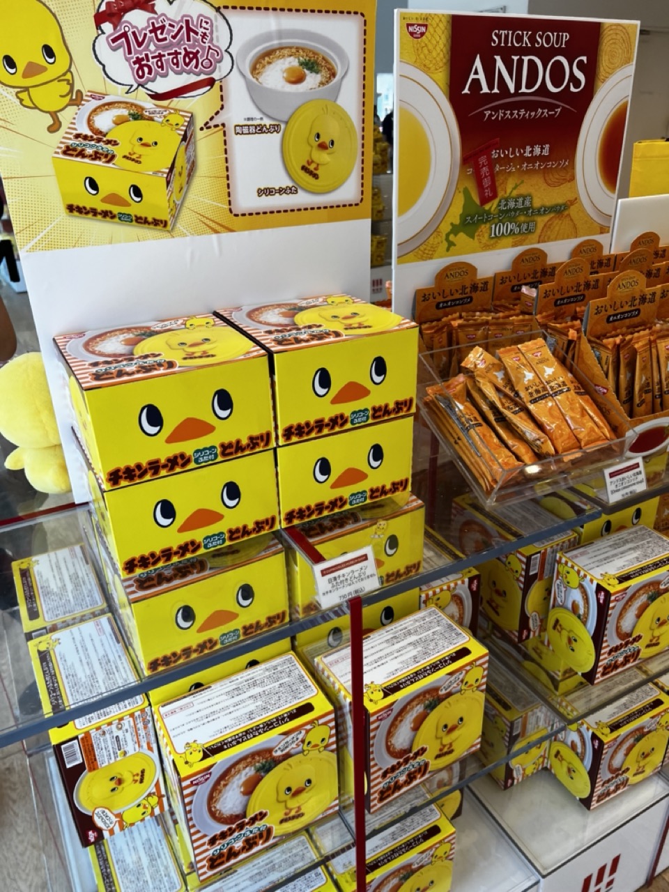

1. Overall Rating (0–10) — 6.0
This photograph captures a vibrant retail display of chicken ramen and soup products, where playful branding and bright colors create an immediately engaging, almost whimsical atmosphere. The cheerful yellow duck motif dominates the scene, drawing attention to the products with commercial appeal, yet the composition feels cluttered and lacks the visual harmony needed to elevate it beyond a simple promotional snapshot. While the image succeeds in conveying the product’s charm and market presence, it falls short in creating a cohesive or aesthetically refined narrative.
2. Composition (0–10) — 5.5
The frame is filled with stacked boxes and signage, creating a dense, layered arrangement that feels crowded. The central focus on the yellow duck boxes is strong, but the overlapping elements and lack of negative space reduce visual clarity and balance.
3. Lighting (0–10) — 6.5
Bright, even overhead lighting illuminates the display effectively, highlighting the colors and text. However, the light is somewhat flat and lacks directionality, resulting in minimal shadowing and a slightly sterile, commercial feel.
4. Color & Tone (0–10) — 7.5
The dominant yellow hue of the duck branding creates a bold, cheerful palette that enhances the playful tone. The contrast between the bright yellow, warm orange, and neutral white background gives the image energy and visual appeal, though the saturation feels slightly oversaturated.
5. Creativity (0–10) — 7.0
The use of a mascot-driven design and product placement as the central theme is clever and market-savvy, turning a commercial display into a visually engaging scene. The repetition of the duck face adds a sense of rhythm and charm, suggesting a creative approach to branding and retail storytelling.
6. Technical Quality (0–10) — 7.0
The image is sharp and clear, with well-defined text and product details. The focus is consistent across the frame, and there is little evidence of blur or distortion, though the depth of field could have been more selective to emphasize a specific product.
7. Emotional Impact (0–10) — 6.5
The image evokes a sense of fun and nostalgia, particularly for fans of Japanese convenience food and cute branding. The cheerful design and familiar product lines may spark delight or curiosity, but the commercial context keeps the emotional connection at a surface level.
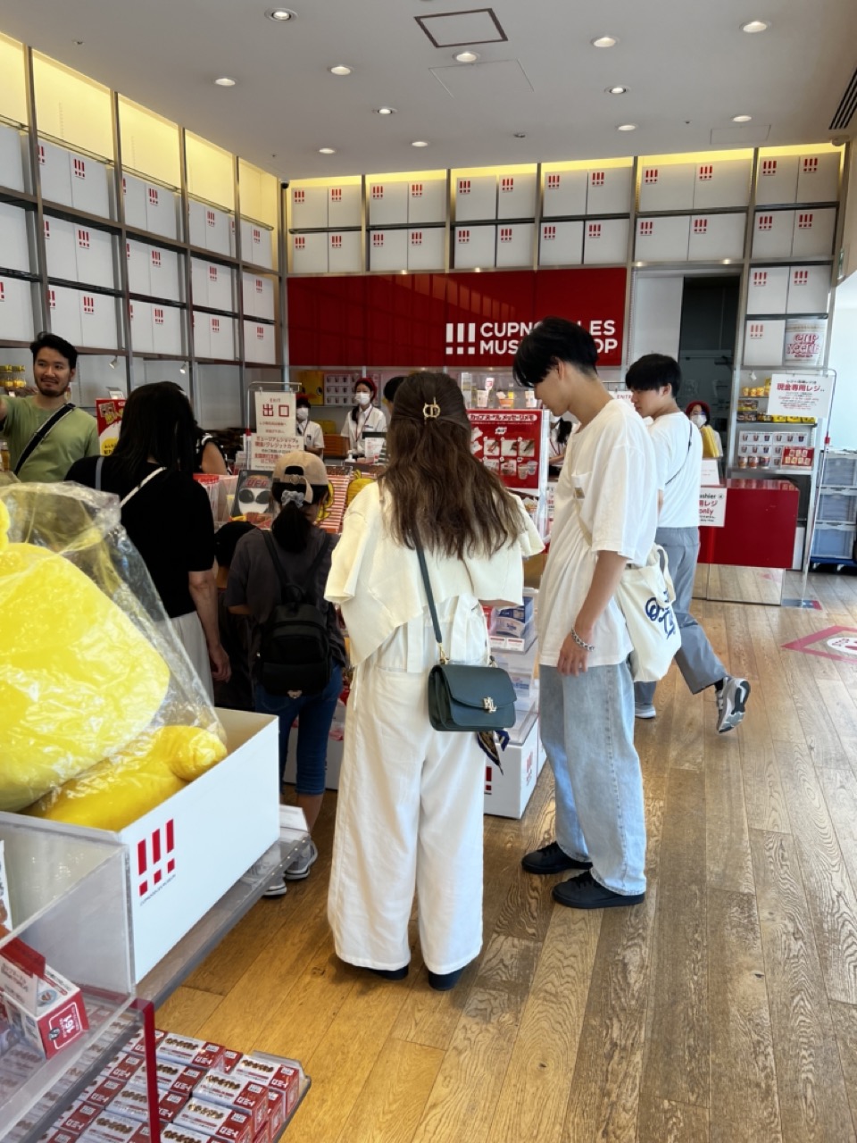

1. Overall Rating (0–10) — 6.0
This photograph captures the bustling energy of a modern retail space, where the interplay of brand identity and human interaction creates a sense of everyday commerce. The bright, uniform lighting and clean architectural lines reflect the store’s minimalist design, while the presence of customers adds life and movement to the scene. However, the image feels slightly overexposed and lacks a strong focal point, diffusing its visual impact and making it feel more like a snapshot than a curated moment.
2. Composition (0–10) — 6.0
The central figures are well-placed, drawing the eye toward the checkout area, but the cluttered foreground and off-center framing create visual distraction. A tighter composition would emphasize the human element and strengthen the narrative.
3. Lighting (0–10) — 6.5
Even, bright overhead lighting illuminates the space effectively, ensuring clarity and visibility. However, the lack of directional shadows or contrast diminishes depth and gives the scene a flat, commercial feel.
4. Color & Tone (0–10) — 6.5
The dominant red and white branding creates a bold, energetic palette, complemented by the warm tones of the wooden floor. While the colors are vibrant, the overall tone is slightly washed out due to the bright lighting, reducing richness and emotional resonance.
5. Creativity (0–10) — 5.5
The image is observational rather than expressive, capturing a real-world moment without a strong artistic vision. The repetition of the brand’s logo and packaging reinforces commercial identity but limits originality.
6. Technical Quality (0–10) — 7.0
Sharp focus and clear detail are present throughout, particularly in the foreground and midground. The exposure is generally well-managed, though slight overexposure in the ceiling and upper walls detracts from overall balance.
7. Emotional Impact (0–10) — 5.0
The scene conveys a sense of routine and familiarity, but the lack of intimacy or narrative depth keeps the viewer at a distance. The emotional connection is weak, as the image functions more as documentation than storytelling.
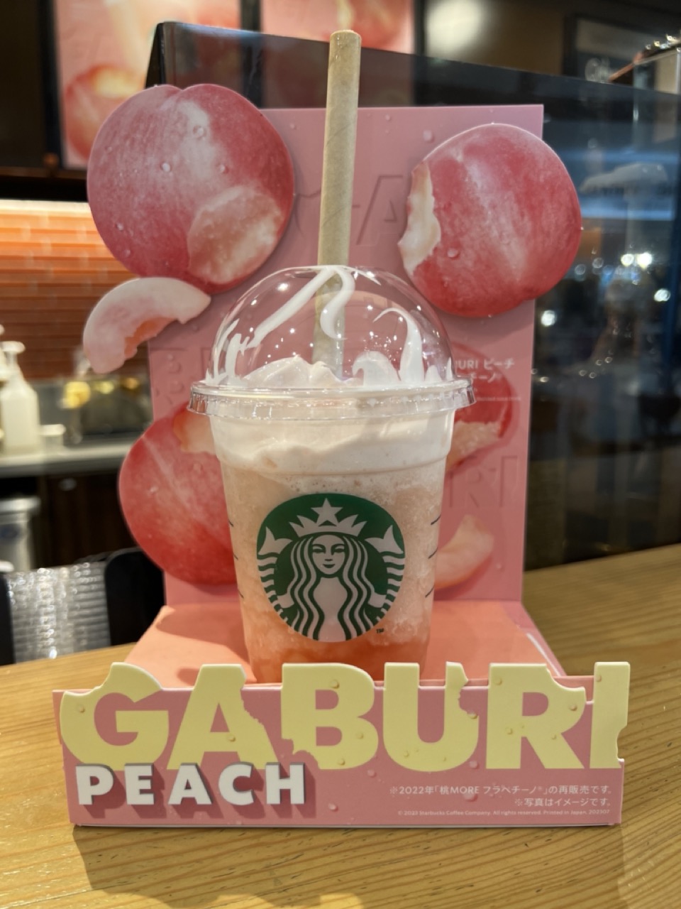

1. Overall Rating (0–10) — 7.0
This image captures the vibrant, playful essence of a seasonal beverage with striking commercial appeal. The soft pink tones and fresh peach imagery create a cohesive, inviting aesthetic that speaks to the product’s flavor and branding. While the composition is visually engaging and well-staged, the background clutter slightly undermines the image’s overall polish, keeping it from achieving a more refined artistic presence.
2. Composition (0–10) — 7.5
The drink is centered and framed by the promotional display, creating a clear focal point. The use of layered elements—peach graphics, signage, and the cup—adds depth, though the background’s reflections and objects introduce minor visual distraction.
3. Lighting (0–10) — 7.0
Bright, even lighting highlights the drink’s texture and color, enhancing the creamy foam and dewy fruit imagery. The indoor lighting is functional and flattering, though slightly harsh, creating some glare on the plastic lid.
4. Color & Tone (0–10) — 8.0
The dominant pink and peach tones are harmonious and evoke a sense of sweetness and freshness. The contrast between the soft pastels and the green Starbucks logo adds visual pop, while the warm wood surface grounds the scene.
5. Creativity (0–10) — 7.5
The image successfully merges product promotion with aesthetic appeal, using the display as both a storytelling and compositional device. The choice of a close-up with branding elements creates a narrative of limited-time indulgence, though it remains within the bounds of commercial photography.
6. Technical Quality (0–10) — 8.0
Sharp focus on the cup and foreground elements ensures clarity, while the depth of field effectively blurs the background. The image is well-exposed, with clean details and no noticeable noise.
7. Emotional Impact (0–10) — 7.0
The image evokes a sense of delight and seasonal anticipation, appealing to fans of both Starbucks and Japanese-inspired flavors. The bright colors and fresh ingredients create a mood of lighthearted pleasure, though the commercial intent keeps the emotional resonance from feeling deeply personal.
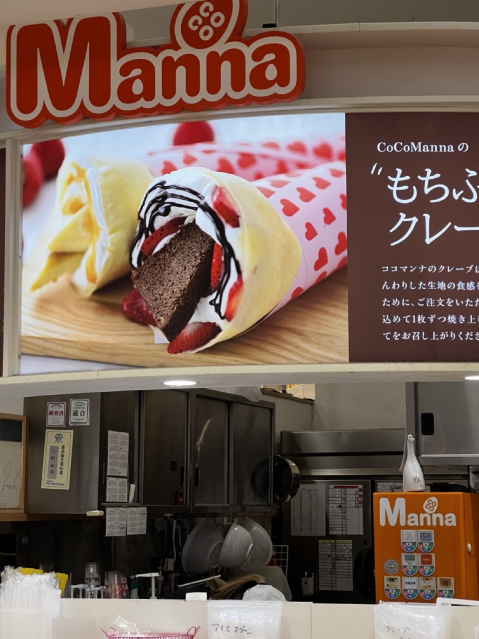

1. Overall Rating (0–10) — 5.5
This image captures the juxtaposition of idealized food advertising and the gritty reality of a commercial kitchen, creating a subtle commentary on consumerism and authenticity. The oversized, appetizing crepe advertisement dominates the frame, promising indulgence, while the mundane, functional workspace below—cluttered with utensils and stainless steel—reveals the labor behind the illusion. While the contrast is conceptually interesting, the image lacks visual cohesion and emotional depth, feeling more like a snapshot than a deliberate composition.
2. Composition (0–10) — 4.5
The framing is split between the promotional display and the kitchen workspace, creating a disjointed balance. The large advertisement overshadows the lower half, drawing attention away from the human and functional elements below.
3. Lighting (0–10) — 5.0
Harsh, overhead fluorescent lighting dominates the scene, flattening textures and creating a sterile atmosphere. The advertisement appears brighter due to its own internal lighting, further emphasizing the artificiality of the display.
4. Color & Tone (0–10) — 5.5
The warm, saturated tones of the crepe ad contrast sharply with the cool, muted grays and metallic tones of the kitchen. This contrast is visually striking but lacks harmony, reinforcing the divide between fantasy and reality.
5. Creativity (0–10) — 6.0
The image leverages the contrast between marketing and reality as a narrative device, suggesting a deeper commentary on food culture. However, the execution feels more observational than intentional, limiting its artistic impact.
6. Technical Quality (0–10) — 7.0
The image is sharp and clear, with legible text and identifiable details. The focus is consistent, and the exposure is adequate, though not particularly refined.
7. Emotional Impact (0–10) — 4.5
The emotional resonance is limited—while the contrast evokes a sense of irony, the lack of human presence or narrative closure keeps the viewer at a distance, preventing deeper engagement.
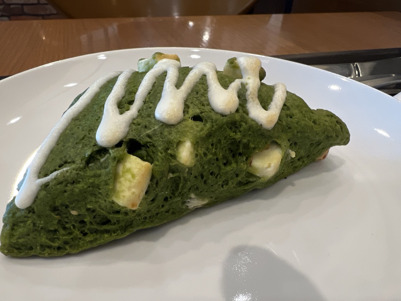

1. Overall Rating (0–10) — 7.0
This image presents a vivid and appetizing close-up of a matcha scone, its vibrant green hue and creamy drizzle immediately drawing the eye. The composition balances detail and context, allowing the texture and ingredients to shine while hinting at a cozy café setting. While the lighting and framing are solid, the scene lacks a deeper sense of atmosphere, making it feel more like a snapshot than a fully realized food portrait.
2. Composition (0–10) — 7.5
The scone is well-placed on a white plate, creating a clean diagonal that guides the eye through the frame. The shallow depth of field keeps the focus sharp on the subject while softly blurring the background, enhancing the sense of intimacy.
3. Lighting (0–10) — 6.5
The light is bright and even, likely from overhead indoor fixtures, which highlights the scone’s texture without creating harsh shadows. However, the flatness of the illumination reduces the sense of depth and warmth, making the scene feel somewhat clinical.
4. Color & Tone (0–10) — 8.0
The rich, saturated green of the scone contrasts beautifully with the white glaze and plate, creating a visually striking palette. The warm wood tones in the background add a subtle complement, enhancing the overall harmony.
5. Creativity (0–10) — 6.5
While the subject itself is visually engaging, the approach is conventional—focusing on clarity and detail rather than a unique perspective or narrative. The image captures a moment of indulgence but doesn’t push beyond the expected.
6. Technical Quality (0–10) — 8.0
The focus is sharp on the scone’s surface, capturing the porous texture and embedded chunks with clarity. The exposure is well-balanced, and there are no visible artifacts or noise.
7. Emotional Impact (0–10) — 7.0
The image evokes a sense of comfort and simple pleasure, tapping into the universal appeal of a freshly baked treat. The warm tones and inviting subject create a subtle emotional pull, suggesting a quiet moment of enjoyment.
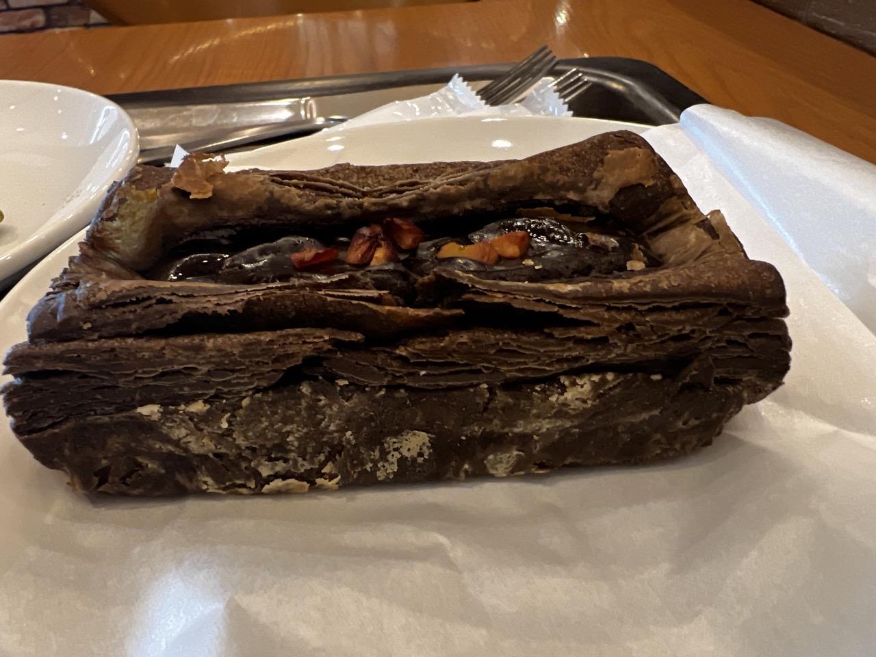

1. Overall Rating (0–10) — 6.0
This photograph captures a rich, layered chocolate pastry with a tactile, rustic quality, emphasizing its decadent texture and indulgent ingredients. The composition leans heavily into food photography’s strengths—detail, texture, and mouthwatering appeal—though the lighting and framing slightly undercut its visual impact. While the subject is inherently engaging, the image feels more like a casual snapshot than a carefully composed portrait, missing the polish needed to elevate it beyond mere documentation.
2. Composition (0–10) — 6.0
The pastry is centered but slightly low in the frame, leaving an awkward amount of negative space at the top. The surrounding elements—plate, tray, and napkin—create a cluttered backdrop that distracts from the main subject, though the close-up angle helps emphasize texture.
3. Lighting (0–10) — 5.5
The lighting is flat and diffused, likely from overhead indoor sources, which flattens the shadows and reduces the depth of the pastry’s layered structure. While adequate for clarity, it fails to highlight the glossy sheen of the chocolate or the crispness of the crust.
4. Color & Tone (0–10) — 6.5
The dominant dark browns of the pastry are well-represented, with subtle pops of color from the nuts and glaze. However, the overall tone is muted and slightly desaturated, giving the image a dull, uninviting warmth that detracts from the dessert’s appeal.
5. Creativity (0–10) — 6.0
The focus on texture and layered structure shows a clear intent to highlight the pastry’s craftsmanship. While not particularly original in approach, the image successfully conveys the sensory pleasure of a rich, handcrafted treat.
6. Technical Quality (0–10) — 7.0
The image is sharp and in focus, capturing fine details in the pastry’s layers and filling. The white paper and plate provide contrast, though the slight blur in the background suggests a narrow depth of field that could have been better managed.
7. Emotional Impact (0–10) — 5.5
The image evokes a sense of indulgence and comfort, but the lack of dramatic lighting and composition keeps the emotional resonance at a distance. It feels more like a personal memento than a universally appealing visual.
Loading map...