The blog post is about Hakone, Japan, a charming destination known for its hot springs, natural beauty, and unique experiences. The author shares their adventures, including visiting Mount Fuji, soaking in onsen culture, sailing pirate ships on Lake Ashi, and trying local cuisine like sushi, soba noodles, and ice cream with unique flavors.
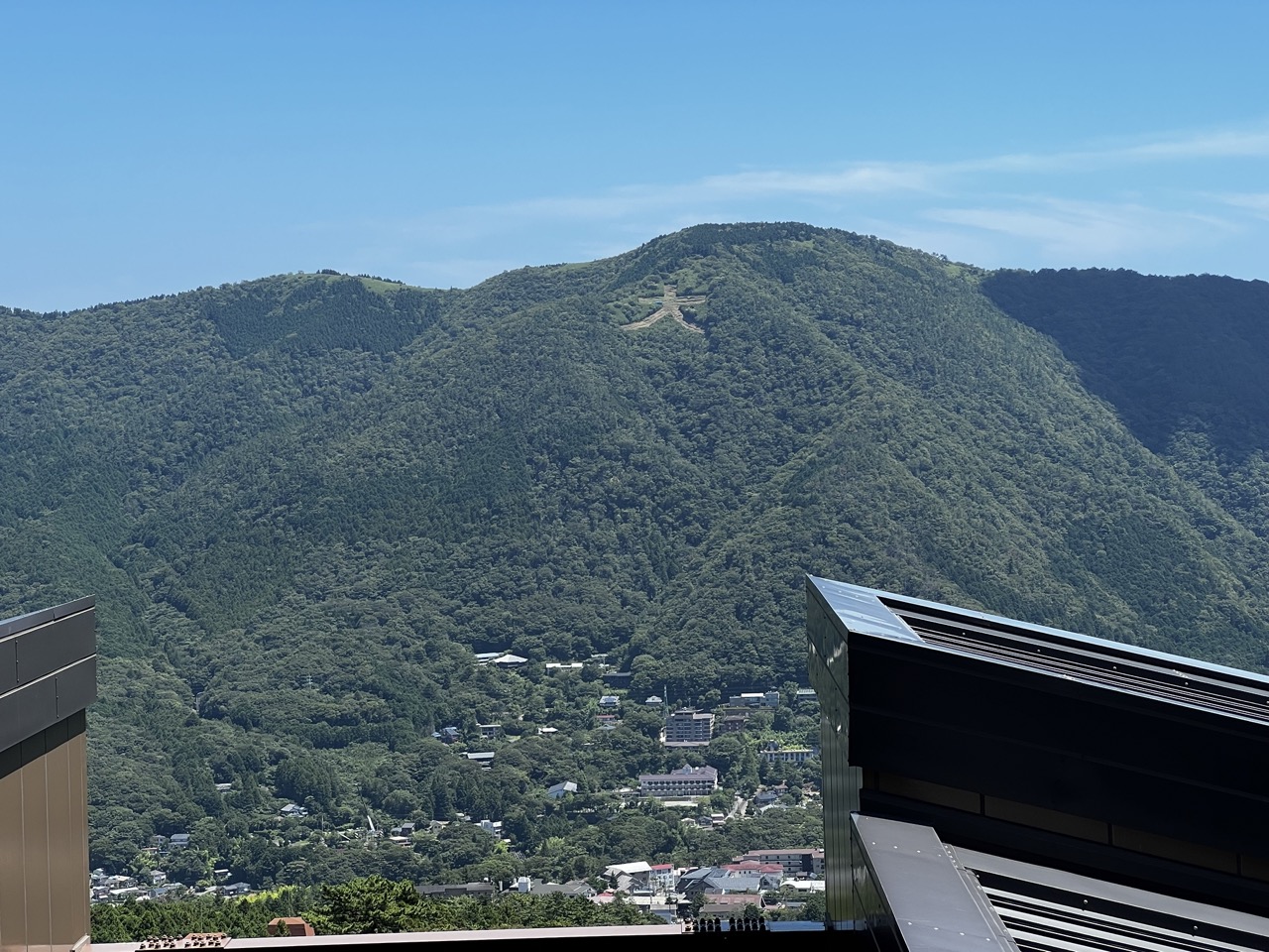

1. Overall Rating (0–10) — 7.0
This photograph captures a serene and expansive view of a forested mountain under a clear blue sky, with a striking man-made feature—a large cross—carved into the slope. The image balances natural grandeur with subtle human presence, creating a contemplative mood. While the composition is strong and the scene inherently beautiful, the foreground elements slightly disrupt the visual flow, and the lighting, though bright, lacks dramatic contrast, tempering its emotional punch.
2. Composition (0–10) — 7.5
The framing effectively uses the foreground architecture to anchor the image and provide depth, leading the eye toward the mountain and the cross. The cross is placed slightly off-center, creating visual interest, though the asymmetry of the building elements on the right introduces a slight imbalance.
3. Lighting (0–10) — 7.0
Bright, even daylight illuminates the scene, highlighting the lush greenery and the texture of the mountain. The strong overhead light minimizes shadows, lending clarity to the landscape but reducing atmospheric depth.
4. Color & Tone (0–10) — 7.5
The vibrant greens of the forest contrast beautifully with the deep blue sky, creating a rich and harmonious palette. The tones are well-balanced, with natural saturation that enhances the sense of vitality without appearing over-processed.
5. Creativity (0–10) — 6.5
The inclusion of the cross adds a layer of narrative and cultural significance, transforming a scenic landscape into a symbol-laden image. While the concept is compelling, the execution remains largely observational, with little emphasis on stylized or interpretive techniques.
6. Technical Quality (0–10) — 8.0
The image is sharp and clear, with excellent detail in both the distant mountain and the foreground architecture. The focus is consistent across the frame, and the exposure is well-managed, capturing the full range of light without blown highlights or lost shadows.
7. Emotional Impact (0–10) — 6.5
The image evokes a sense of peace and awe, enhanced by the vastness of the landscape and the quiet presence of the cross. However, the distance created by the wide shot and the lack of human figures limits the immediacy of emotional connection, leaving the viewer as an observer rather than a participant.
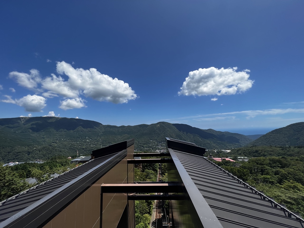

1. Overall Rating (0–10) — 8.0
This photograph captures a serene and expansive vista where modern architecture harmonizes with the natural grandeur of rolling green mountains and a vast blue sky. The clean lines of the foreground structure frame the view with purpose, drawing the eye toward the distant horizon where land meets sea. While the image is striking in its clarity and balance, its emotional resonance is slightly tempered by the clinical precision of the composition, which prioritizes structure over intimacy.
2. Composition (0–10) — 8.5
The diagonal lines of the roof guide the viewer’s gaze into the landscape, creating a dynamic yet balanced frame. The foreground structure anchors the image while allowing the mountains and sky to dominate, resulting in a well-organized and visually engaging composition.
3. Lighting (0–10) — 9.0
Bright, natural daylight illuminates the scene with clarity and depth, accentuating the textures of the clouds and foliage. The high contrast between the dark roof and the vibrant blue sky enhances visual drama, while the even illumination preserves detail across the landscape.
4. Color & Tone (0–10) — 9.0
The rich, saturated blues of the sky and the deep greens of the forest create a striking and harmonious palette. The tonal contrast between the dark roof and the luminous background gives the image a crisp, cinematic quality.
5. Creativity (0–10) — 7.5
The perspective—viewed from a modern structure overlooking a traditional landscape—offers a compelling juxtaposition of human design and natural beauty. While the concept is strong, the execution leans toward conventional scenic photography, limiting its conceptual boldness.
6. Technical Quality (0–10) — 9.0
The image is sharp, well-focused, and free of noise, with excellent resolution that captures fine details in both the foreground and background. The exposure is balanced, preserving detail in highlights and shadows.
7. Emotional Impact (0–10) — 7.5
The photograph evokes a sense of peace and awe, inviting contemplation of nature’s scale and human place within it. The clarity and openness of the scene foster a quiet optimism, though the lack of human presence keeps the emotional connection from deepening.
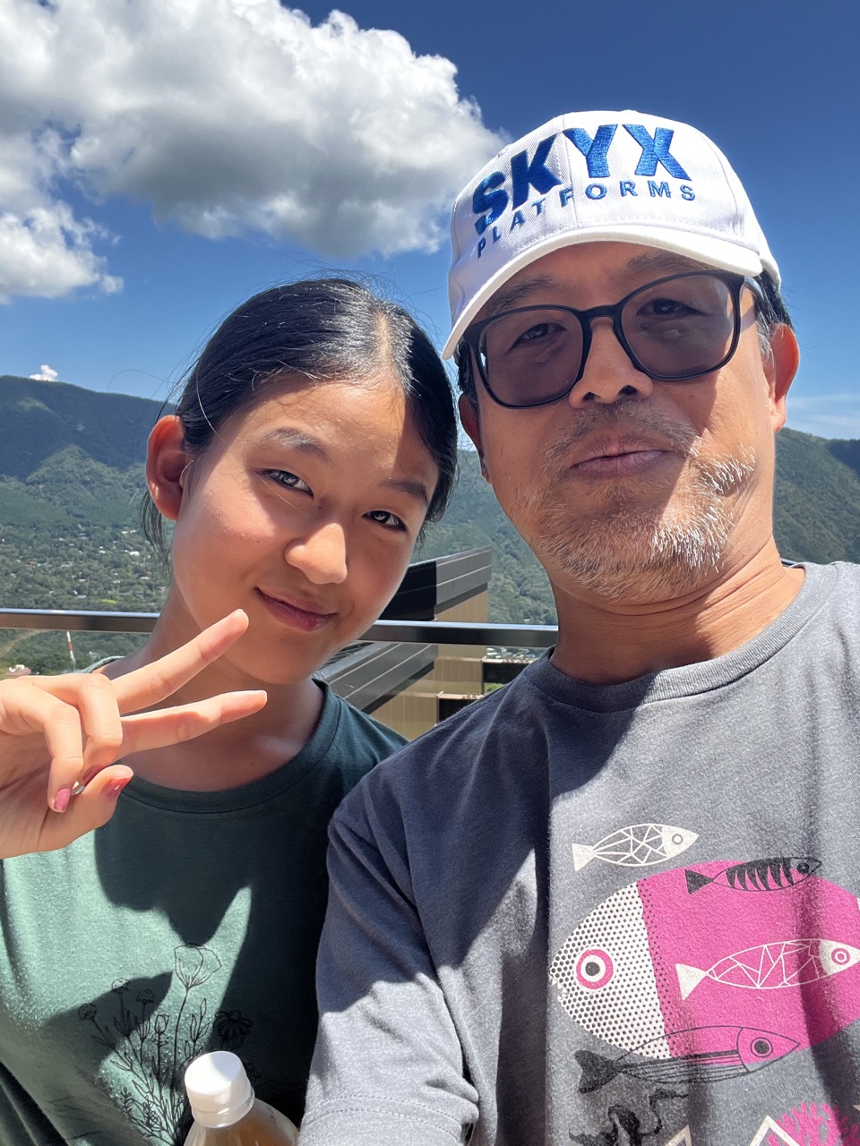

1. Overall Rating (0–10) — 7.5
This selfie captures a warm, candid moment between a man and a young girl against a vibrant natural backdrop, evoking a sense of shared joy and connection. The bright sky and rolling green hills lend a picturesque quality, while the subjects’ relaxed expressions and casual poses enhance the image’s authenticity. Though the composition is slightly unbalanced and the lighting is harsh, the emotional resonance and spontaneity elevate it beyond a simple snapshot.
2. Composition (0–10) — 6.5
The subjects are positioned off-center, with the man dominating the right side, creating an uneven visual weight. The girl’s gesture adds a dynamic element, but the framing feels slightly rushed, with the railing and building edge intruding into the space.
3. Lighting (0–10) — 7.0
Strong, direct sunlight creates vivid contrast and sharp shadows, emphasizing the sunny, outdoor setting. While the harsh light flattens some facial details, it enhances the sky’s depth and contributes to the image’s lively atmosphere.
4. Color & Tone (0–10) — 7.5
The palette is rich and natural, with the deep blue sky and lush green mountains providing a striking backdrop. The contrast between the bright whites and the warm tones of the subjects’ clothing adds visual interest, though the color saturation leans slightly toward the cool side.
5. Creativity (0–10) — 7.0
The image succeeds as a personal, narrative-driven photograph, capturing a genuine moment rather than a staged scene. The juxtaposition of the modern cap and casual clothing against the timeless landscape adds subtle depth and context.
6. Technical Quality (0–10) — 7.5
The image is sharp and clear, with good focus on the subjects. The camera’s resolution captures fine details, such as the texture of the cap and the girl’s nail polish, despite the challenging lighting conditions.
7. Emotional Impact (0–10) — 8.0
There is a strong sense of intimacy and affection between the two individuals, conveyed through their relaxed body language and the girl’s playful gesture. The viewer is drawn into a personal memory, creating a lasting emotional connection.
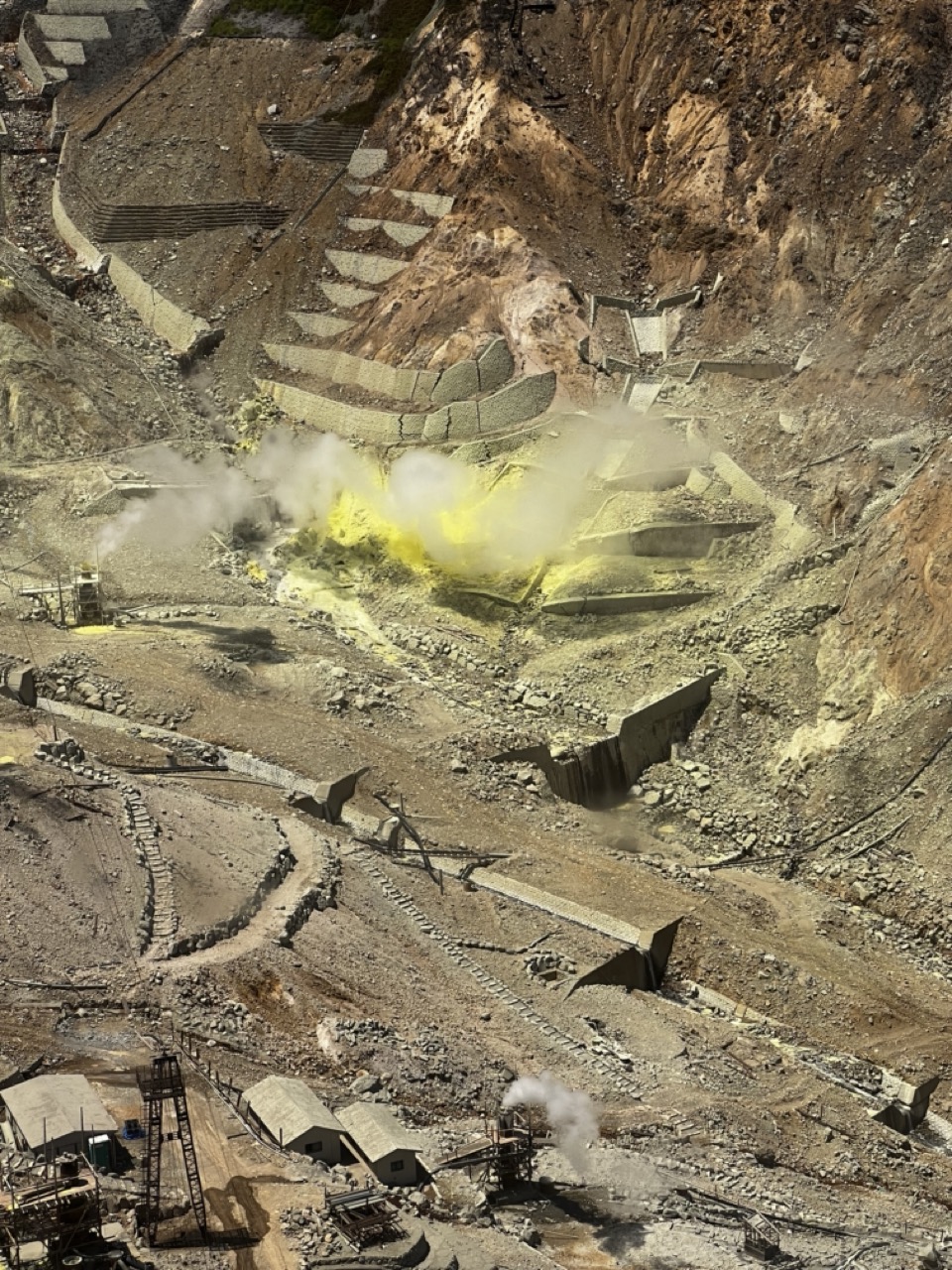

1. Overall Rating (0–10) — 7.0
This photograph captures the raw, industrial intensity of a sulfur mining operation with striking visual clarity and dramatic tension. The vibrant yellow sulfur contrasts sharply against the muted earth tones, drawing the eye to the heart of the activity. While the scene is inherently powerful, the image's emotional weight is slightly diminished by the lack of human presence, which limits the narrative depth. Still, it succeeds as a compelling document of human extraction and environmental transformation.
2. Composition (0–10) — 6.5
The high-angle perspective offers a sweeping view of the landscape, emphasizing the scale and complexity of the excavation. However, the composition feels slightly unbalanced, with the central explosion of sulfur drawing attention away from the surrounding infrastructure. A more deliberate framing could enhance the visual flow and guide the viewer’s gaze more effectively.
3. Lighting (0–10) — 7.0
Natural daylight illuminates the scene evenly, allowing for clear visibility of textures and details across the rugged terrain. The interplay of light and shadow accentuates the depth of the excavation, while the bright yellow sulfur stands out against the subdued background, creating a focal point that feels both natural and dramatic.
4. Color & Tone (0–10) — 7.5
The color palette is dominated by earthy browns and grays, punctuated by the vivid yellow of the sulfur and the white of the steam. This contrast enhances the image’s visual impact, while the muted tones lend a sense of realism and grit. The overall tonal range is well-managed, with no areas of overexposure or loss of detail.
5. Creativity (0–10) — 7.0
The image presents a compelling and unusual subject, capturing the intersection of industry and nature in a visually arresting way. The choice to focus on the sulfur emission as a central element adds a sense of motion and energy, elevating the photograph beyond a mere documentation into a more evocative portrayal of human intervention.
6. Technical Quality (0–10) — 8.0
The photograph is sharp and detailed, with excellent clarity across the entire frame. The focus is consistent, allowing for fine textures in the rock and machinery to be clearly visible. There are no noticeable technical flaws, and the image appears to be well-executed in terms of exposure and resolution.
7. Emotional Impact (0–10) — 6.5
The image evokes a sense of awe at the scale of human industrial effort, but also a subtle unease about environmental impact. The absence of people creates a sense of detachment, making the viewer feel like an observer rather than a participant. While the visual power is strong, the emotional resonance is tempered by the impersonal nature of the scene.
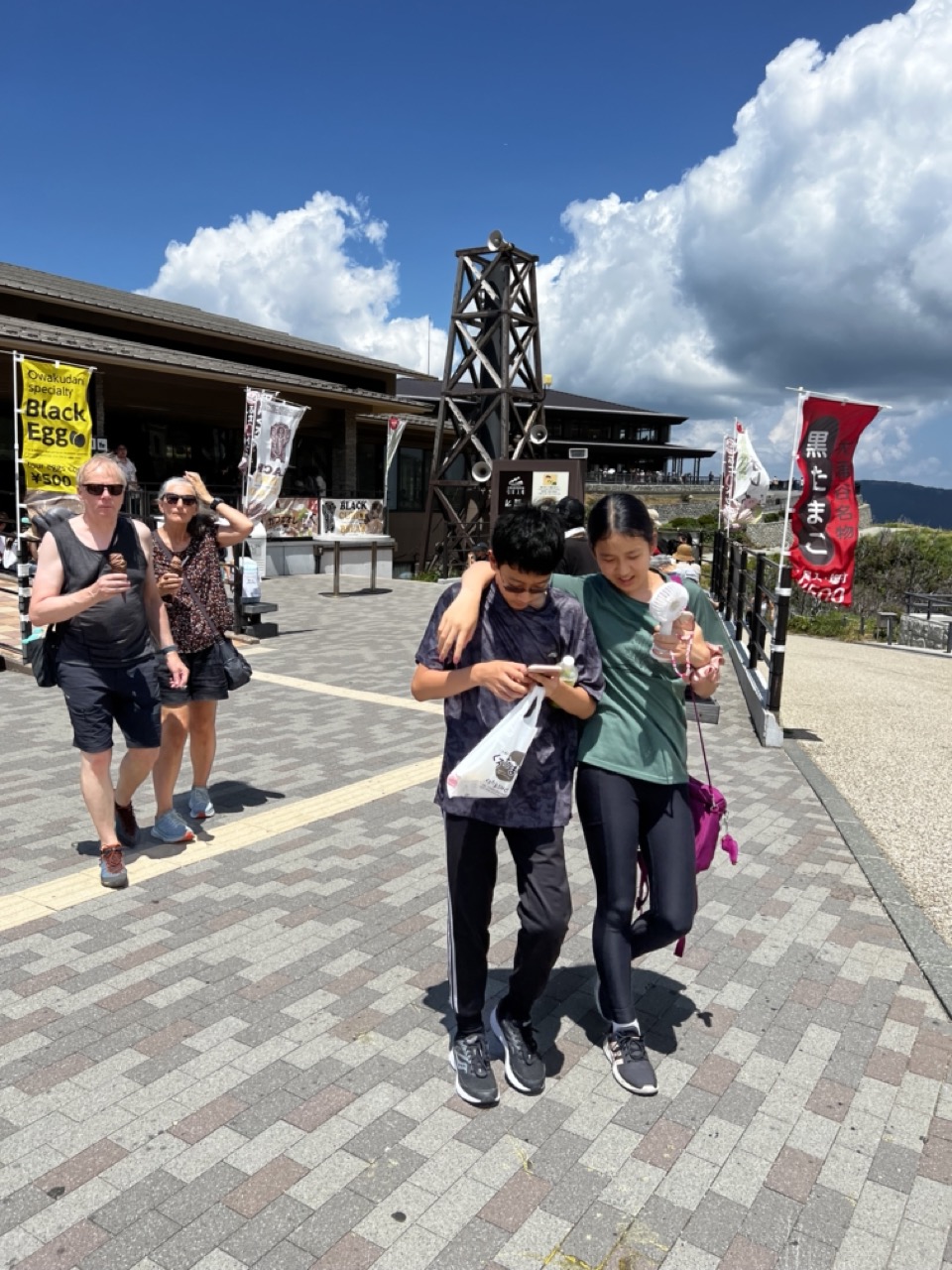

1. Overall Rating (0–10) — 6.0
This photograph captures a candid moment of youthful connection amidst a bustling tourist setting, where the intimacy of a shared glance and embrace contrasts with the surrounding commercialism. The bright sunlight and dynamic composition convey a sense of movement and authenticity, though the scene feels slightly cluttered by signage and background distractions. While the emotional warmth of the central pair is palpable, the image’s potential is held back by a lack of visual refinement and narrative focus.
2. Composition (0–10) — 6.0
The subjects are well-placed in the foreground, drawing the eye, but the diagonal walkway and scattered background elements create a somewhat chaotic frame. A tighter crop could enhance focus on the central interaction.
3. Lighting (0–10) — 8.0
Strong, natural daylight creates crisp shadows and vibrant colors, highlighting the textures of the pavement and the subjects’ clothing. The contrast between the sunlit foreground and the darker clouds adds depth.
4. Color & Tone (0–10) — 6.5
The palette is dominated by bright blues and earthy tones, with pops of red and yellow from banners. While visually energetic, the colors are slightly oversaturated and compete for attention.
5. Creativity (0–10) — 6.0
The image captures a genuine moment of affection and shared experience, but its strength lies in documentation rather than artistic interpretation. The juxtaposition of personal intimacy against a commercial backdrop hints at deeper storytelling potential.
6. Technical Quality (0–10) — 7.5
The image is sharp and well-exposed, with clear focus on the main subjects. The camera's dynamic range handles the bright sky and shadows effectively, though some fine details in the background are lost.
7. Emotional Impact (0–10) — 7.0
The warmth of the embrace and the shared attention on the phone create a quiet, relatable moment of connection. The viewer is drawn into the intimacy of the scene, despite the surrounding distractions.
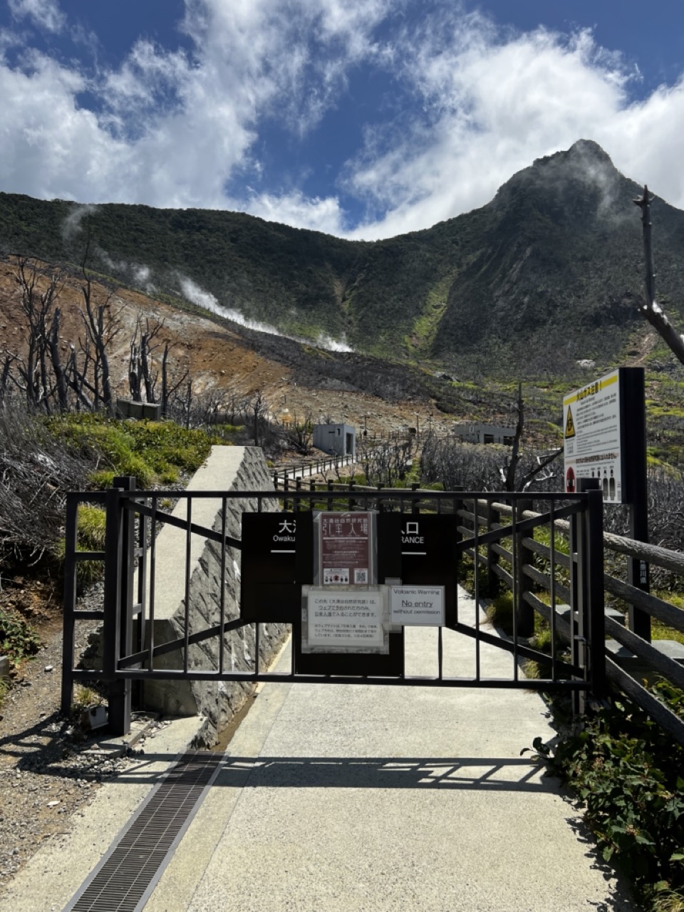

1. Overall Rating (0–10) — 7.0
This photograph captures the dramatic tension between natural power and human restriction, framing a volcanic landscape as both awe-inspiring and forbidding. The contrast between the lush green mountain and the barren, steam-emitting slopes creates a compelling visual narrative of geological forces at work. While the image effectively conveys the site’s raw energy and danger, the foreground signage and gate, though informative, slightly disrupt the sense of wild beauty.
2. Composition (0–10) — 7.5
The gate and pathway create a strong leading line, drawing the eye into the frame toward the smoking mountain. The placement of the gate in the lower third balances the composition, while the diagonal path adds dynamism. The natural elements—bare trees, steam, and the peak—fill the upper frame, creating a layered sense of depth.
3. Lighting (0–10) — 8.0
The bright, natural daylight enhances the vividness of the blue sky and the texture of the landscape. The sunlight highlights the steam and the contours of the mountain, creating a sense of movement and scale. Shadows cast by the gate and railings add depth without obscuring key details.
4. Color & Tone (0–10) — 7.0
The palette is striking, with the deep blue sky contrasting against the earthy browns and greens of the terrain. The white steam adds a cool, ethereal tone that complements the volcanic atmosphere. While the colors are rich and natural, the overall tone leans slightly neutral, reducing the image’s emotional intensity.
5. Creativity (0–10) — 7.5
The image successfully juxtaposes the man-made barrier with the untamed natural world, suggesting themes of access, danger, and human curiosity. The inclusion of signage adds narrative context, turning the photograph into a story of boundaries and exploration.
6. Technical Quality (0–10) — 8.0
The image is sharp and well-exposed, with clear detail in both the foreground and background. The focus is consistent across the frame, and there are no noticeable technical flaws such as blur or noise.
7. Emotional Impact (0–10) — 7.0
The image evokes a sense of awe and caution, capturing the sublime power of nature while reminding viewers of its dangers. The steam and barren landscape suggest an otherworldly presence, while the “No Entry” sign adds a layer of tension and intrigue.


1. Overall Rating (0–10) — 6.8
This photograph captures a moment of collective anticipation as a crowd gathers on a ferry deck, their attention fixed on a whimsical, pirate-themed ship anchored in the distance. The dramatic sky, with its brooding clouds and patches of blue, lends a cinematic quality to the scene, suggesting a story of adventure and travel. While the image effectively conveys the energy of a shared experience, the composition's crowded nature and lack of clear focal depth slightly diminish its visual impact.
2. Composition (0–10) — 6.0
The framing places the viewer within the crowd, creating an immersive perspective, but the density of people and overlapping figures creates visual clutter. The pirate ship, though a strong focal point, feels slightly distant and underemphasized by the mid-ground congestion.
3. Lighting (0–10) — 7.0
The natural light is dynamic, with sunlight breaking through the clouds to illuminate parts of the scene, creating contrast and depth. The interplay of light and shadow across the water and sky enhances the mood, though some areas of the crowd are slightly underexposed.
4. Color & Tone (0–10) — 6.5
The palette is rich with natural tones—deep blues of the water and sky, earthy browns of the ship, and muted clothing colors—creating a cohesive outdoor atmosphere. The contrast between the dark clouds and bright sunlight adds visual drama.
5. Creativity (0–10) — 7.0
The juxtaposition of a playful pirate ship against a real-world ferry setting introduces a touch of whimsy and storytelling. The scene feels both authentic and slightly fantastical, suggesting a themed tour or cultural attraction.
6. Technical Quality (0–10) — 7.5
The image is sharp and well-focused, with clear detail in the crowd and the distant ship. The camera appears to have handled the dynamic lighting well, preserving texture and clarity across the frame.
7. Emotional Impact (0–10) — 7.0
The photograph evokes a sense of shared excitement and wonder, particularly through the crowd’s collective gaze toward the ship. The overcast sky adds a layer of anticipation, making the moment feel both ordinary and extraordinary.


1. Overall Rating (0–10) — 6.0
This photograph captures the bustling energy of a themed pirate ship attraction, with a crowd gathered to witness the spectacle. The dramatic rigging and ornate details of the vessel suggest a sense of adventure, though the overcast sky and busy foreground detract from the scene’s visual cohesion. While the image effectively conveys the atmosphere of a tourist destination, it lacks the compositional refinement and emotional depth to feel truly compelling.
2. Composition (0–10) — 5.0
The foreground crowd obstructs the view and creates visual clutter, while the framing cuts off the top of the ship and leaves the horizon indistinct. The vertical mast in the center disrupts balance, drawing attention away from the ship’s decorative features.
3. Lighting (0–10) — 4.5
Diffuse, flat lighting from the overcast sky washes out the scene, reducing contrast and obscuring texture. The lack of directional light diminishes the three-dimensionality of the ship’s structure and creates a muted, grayish tone.
4. Color & Tone (0–10) — 5.5
The bold blue and gold of the ship stand out, but the dull lighting dulls the vibrancy of the palette. The overall tone is muted, with a lack of dynamic contrast between the bright accents and the surrounding environment.
5. Creativity (0–10) — 6.0
The image captures a moment of playful spectacle, leveraging the theme of a pirate ship for visual interest. However, the approach is more documentary than artistic, with little attempt to elevate the scene through unique perspective or narrative framing.
6. Technical Quality (0–10) — 7.0
The focus is sharp on the ship’s midsection, and details are clear despite the lighting conditions. However, the presence of the foreground crowd and the framing issue reduce overall technical impact.
7. Emotional Impact (0–10) — 5.0
The photograph evokes a sense of shared excitement and curiosity, but the viewer’s connection is limited by the cluttered composition and lack of emotional focus. The mood feels more like a snapshot than an immersive experience.
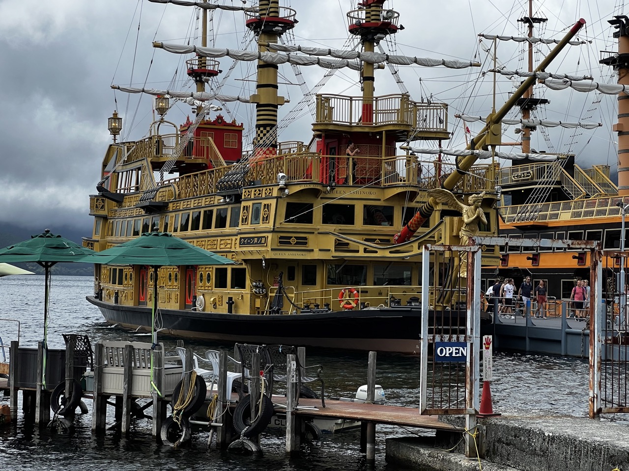

1. Overall Rating (0–10) — 6.8
This photograph captures the striking, almost theatrical presence of the *Queen Ashinoko*, a golden-hued riverboat that evokes a sense of whimsical grandeur against a brooding, overcast sky. The ship’s ornate, baroque-inspired design stands in vivid contrast to the utilitarian dock and muted surroundings, creating a compelling juxtaposition of fantasy and reality. While the image succeeds in conveying the spectacle of the vessel, its emotional resonance is slightly tempered by the flat lighting and cluttered foreground, which dilute the visual impact.
2. Composition (0–10) — 6.0
The ship dominates the frame, but the foreground clutter—tires, umbrellas, and signage—distracts from the main subject. The diagonal lines of the masts and railings add dynamism, but the framing feels slightly unbalanced, with the gate and cone in the lower right drawing attention away from the boat.
3. Lighting (0–10) — 5.5
Diffused light from the overcast sky flattens the image, reducing contrast and depth. While it evenly illuminates the ship, it also mutes the rich gold tones and obscures finer details in the shadows.
4. Color & Tone (0–10) — 6.5
The dominant yellow of the ship contrasts sharply with the gray sky and dark water, creating a visually striking palette. However, the overall tone is subdued, and the lack of warmth in the lighting prevents the colors from truly populating the frame.
5. Creativity (0–10) — 7.0
The image leverages the inherent theatricality of the ship, transforming a simple dockside scene into something fantastical. The juxtaposition of the ornate vessel with the mundane environment suggests a narrative of escapism, adding a layer of imaginative storytelling.
6. Technical Quality (0–10) — 7.5
The photograph is sharp and well-focused, with clear detail visible on the ship’s structure and railings. The exposure is balanced, with no blown highlights or crushed shadows, despite the challenging lighting conditions.
7. Emotional Impact (0–10) — 6.0
The image evokes a sense of curiosity and mild wonder, but the somber sky and lack of human engagement limit its emotional depth. The viewer is invited to observe rather than feel, creating a detached sense of spectacle.


1. Overall Rating (0–10) — 6.8
This photograph captures the bustling energy of a train station platform, where the rhythm of daily transit unfolds in a tightly packed crowd. The vivid red structural beams create a dynamic contrast against the muted tones of the passengers’ clothing, drawing the eye upward and adding a sense of architectural rhythm. While the scene feels authentic and alive, the lack of a clear focal point and the crowded composition slightly dilute the visual impact, leaving the viewer with a sense of movement rather than a singular narrative.
2. Composition (0–10) — 6.5
The frame is filled with a dense crowd moving toward the train, creating a strong sense of forward motion. However, the lack of a clear subject or leading line results in a slightly chaotic feel, with the eye wandering across multiple figures rather than being guided to a focal point.
3. Lighting (0–10) — 6.0
The overhead fluorescent lighting provides even illumination across the scene, ensuring clarity and detail. However, it lacks warmth or direction, contributing to a sterile, documentary feel that undercuts the potential drama of the moment.
4. Color & Tone (0–10) — 7.0
The bright orange of the overhead framework stands out against the neutral tones of the platform and passengers, creating a visually engaging contrast. The overall palette is balanced and natural, with the red adding energy and visual interest without overwhelming the scene.
5. Creativity (0–10) — 6.5
The image captures a familiar urban moment with a strong sense of place, emphasizing the rhythm of public transit. While the concept is grounded in realism, the composition and color choices lend it a slightly artistic edge, elevating it beyond a simple snapshot.
6. Technical Quality (0–10) — 7.5
The image is sharp and well-exposed, with clear details in both the foreground and background. The focus is consistent across the frame, and there are no visible technical flaws such as blur or noise.
7. Emotional Impact (0–10) — 6.0
The photograph conveys the quiet intensity of everyday life—commuters on the move, absorbed in their routines. While it evokes a sense of connection to urban life, the lack of individual expression or narrative depth keeps the emotional resonance at a moderate level.


1. Overall Rating (0–10) — 5.5
This image captures the mechanical heart of a cable car station, where industrial function meets public transit, but the scene feels more like a documentation than an evocation. The central machinery—gondolas suspended beneath a rotating wheel—offers a compelling focal point, yet the sterile interior and rigid queue system flatten the atmosphere, leaving the viewer with a sense of routine rather than wonder. While the composition hints at the rhythm of movement and transition, the lack of human engagement or visual drama keeps the image from resonating emotionally.
2. Composition (0–10) — 6.0
The frame is centered on the cable car mechanism, creating a strong focal point, but the foreground queue stanchions disrupt the visual flow and add clutter. The symmetry of the red ropes and tiles provides structure, though the overhead lighting and ceiling cut into the top edge, slightly compressing the sense of space.
3. Lighting (0–10) — 5.0
The lighting is functional and even, dominated by the overhead bulb and ambient fluorescent light, which flattens textures and shadows. The light lacks warmth or directionality, resulting in a clinical atmosphere that undermines the potential drama of the mechanical system.
4. Color & Tone (0–10) — 5.5
The palette is muted, with earthy tile tones, black stanchions, and a green ceiling creating a subdued, institutional feel. The red ropes offer a bold contrast, but the overall tonal range is narrow, limiting visual depth and emotional impact.
5. Creativity (0–10) — 5.0
The image is observational and straightforward, capturing a place of transit with clarity but little artistic interpretation. While the juxtaposition of human infrastructure and mechanical complexity is inherently interesting, the execution remains conventional, lacking a unique perspective or conceptual layer.
6. Technical Quality (0–10) — 7.0
The image is sharp and well-focused, with clean details visible in the machinery and signage. The exposure is balanced, and there are no major technical flaws, though the framing and composition reduce the overall visual impact.
7. Emotional Impact (0–10) — 4.5
The photograph feels detached and impersonal—more like a snapshot than a story. The quiet absence of people in motion and the sterile environment create distance, making it difficult to connect with the scene on a human level. It conveys function over feeling.


1. Overall Rating (0–10) — 7.5
This photograph captures the exhilarating perspective of a cable car journey, offering a vivid contrast between the man-made structure and the lush, untamed landscape below. The vibrant green of the forested hills and the deep blue sky create a striking natural palette, while the inclusion of interior details—like the warning signs and window frame—grounds the image in a sense of real-time experience. The composition is strong, though slightly hindered by the intrusion of the cabin’s elements, which compete for attention with the expansive scenery.
2. Composition (0–10) — 7.0
The diagonal sweep of the cable car window and railing guides the eye into the frame, leading toward the distant mountains. The foreground elements, while slightly distracting, frame the landscape effectively, creating depth and a sense of immersion.
3. Lighting (0–10) — 9.0
Bright, natural sunlight enhances the vividness of the scene, casting crisp highlights on the treetops and creating a dynamic contrast between light and shadow. The clear sky and even illumination contribute to a crisp, inviting atmosphere.
4. Color & Tone (0–10) — 8.5
The dominant greens of the forest and the deep blue of the sky form a harmonious and naturally rich palette. The warm yellow of the warning sign adds a subtle pop of color, while the overall tone remains balanced and vibrant.
5. Creativity (0–10) — 7.5
The image successfully blends travel documentation with scenic beauty, capturing both the experience of movement and the majesty of the natural environment. The choice to include cabin details adds narrative depth, transforming a simple landscape shot into a moment of personal journey.
6. Technical Quality (0–10) — 8.0
Sharp focus across the landscape, with clear details in both the foreground and background. The reflection on the glass is minimal and does not detract significantly from the image’s clarity.
7. Emotional Impact (0–10) — 8.0
The photograph evokes a sense of awe and tranquility, inviting the viewer to imagine the peaceful ascent above a verdant valley. The perspective fosters a feeling of connection to nature, while the subtle human elements suggest adventure and discovery.


1. Overall Rating (0–10) — 7.0
This image captures the serene majesty of a mountainous landscape from the vantage point of a cable car, offering a sense of movement and elevation. The lush greenery and distant lake under a brooding sky create a contemplative mood, though the composition’s naturalism slightly limits its artistic punch. The perspective is immersive, but the image feels more like a candid travel snapshot than a carefully constructed photograph.
2. Composition (0–10) — 6.5
The diagonal cables draw the eye into the frame, creating a sense of depth and motion. However, the overabundance of foreground foliage and cluttered midground slightly distract from the broader landscape, reducing visual clarity and balance.
3. Lighting (0–10) — 6.0
The diffused light from the overcast sky softens the scene, minimizing harsh shadows and allowing for even exposure across the landscape. While this creates a moody atmosphere, it also flattens some of the terrain’s texture and depth.
4. Color & Tone (0–10) — 6.5
The palette is dominated by rich, verdant greens and muted grays, creating a naturalistic harmony. The subtle contrast between the dark cables and the lighter sky adds visual interest, though the lack of vibrant color limits the image’s emotional resonance.
5. Creativity (0–10) — 6.0
The perspective is engaging and offers a unique point of view, but the image relies heavily on the inherent beauty of the landscape rather than intentional artistic manipulation. It feels more observational than interpretive.
6. Technical Quality (0–10) — 7.5
The image is sharp and clear, with well-defined details in both the foreground and background. The focus is consistent, and there are no noticeable technical flaws, though the slight grain suggests a high ISO or compression.
7. Emotional Impact (0–10) — 6.5
The photograph evokes a sense of calm and awe, inviting the viewer to imagine the quiet journey through the mountains. The overcast sky lends a reflective, introspective tone, though the lack of human presence keeps the emotional connection subtle.


1. Overall Rating (0–10) — 6.0
This photograph captures a quiet moment of scientific curiosity in what appears to be an educational or museum setting, where two individuals engage with microscopes in a hands-on learning environment. The scene feels authentic and grounded, with natural interactions that suggest discovery and shared interest. However, the image’s visual impact is tempered by a slightly cluttered composition and a lack of dramatic lighting or framing, which keeps it from feeling fully polished or emotionally resonant.
2. Composition (0–10) — 5.5
The framing is slightly off-center, with the foreground subject partially cut off and the background activity slightly distracting. While the diagonal line of the counter creates some visual movement, the composition feels more like a candid snapshot than a deliberately composed image.
3. Lighting (0–10) — 5.0
The lighting is functional and even, relying on overhead fluorescent sources that cast a neutral, flat tone. The illuminated microscope stage provides a small point of visual interest, but the overall lack of contrast or directional light limits atmospheric depth.
4. Color & Tone (0–10) — 5.5
The color palette is muted, dominated by greys, blacks, and whites, with a subtle blue glow from the microscope light offering a small contrast. The overall tone is clinical and unembellished, which suits the setting but limits visual warmth or emotional richness.
5. Creativity (0–10) — 6.0
The image successfully documents an educational moment with a sense of authenticity. The use of a smartphone to capture or record the microscope view adds a contemporary, layered dimension, suggesting a blend of traditional science and modern technology. However, the concept is more observational than expressive.
6. Technical Quality (0–10) — 7.0
The focus is sharp on the hands and the microscope, and the image is free from major technical flaws like blur or noise. The smartphone screen’s reflection is slightly distracting but not damaging to clarity.
7. Emotional Impact (0–10) — 5.5
The photograph conveys a sense of quiet engagement and intellectual curiosity, but the lack of strong emotional cues or personal connection keeps the viewer at a distance. The intimacy of the moment is implied but not fully communicated.
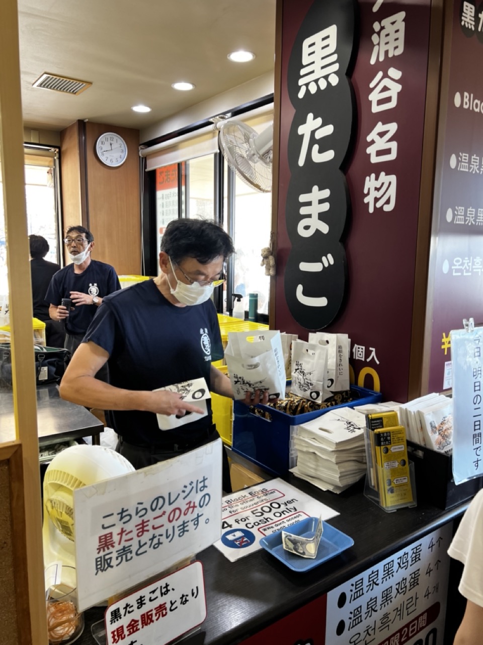

1. Overall Rating (0–10) — 6.0
This photograph captures the bustling authenticity of a Japanese specialty food stall, where tradition meets daily commerce in a compact, lived-in space. The candid moment of a vendor preparing black eggs for sale is grounded in cultural specificity, with signage and packaging reinforcing the product’s regional identity. While the image conveys a sense of place and routine, its technical and compositional elements hold it back from greater visual impact—feeling more like a snapshot than a polished narrative.
2. Composition (0–10) — 5.5
The frame is crowded and slightly unbalanced, with signage and objects competing for attention. The central figure is slightly off-center, and the overlapping elements—especially the signage and foreground objects—create visual clutter that distracts from the main subject.
3. Lighting (0–10) — 5.5
The lighting is functional and flat, relying on overhead fluorescent fixtures that produce a neutral, clinical tone. While it clearly illuminates the scene, it lacks warmth or directional quality that could add depth or mood.
4. Color & Tone (0–10) — 5.0
The color palette is dominated by muted tones—blacks, grays, and yellows—with the maroon sign providing a bold contrast. However, the overall tone feels slightly washed out, and the colors lack vibrancy, reducing the image’s visual energy.
5. Creativity (0–10) — 6.5
The photograph succeeds in capturing a slice of everyday life with cultural specificity, particularly through the use of multilingual signage and the focus on a regional specialty. The scene feels genuine and unposed, though the approach is more documentary than artistic.
6. Technical Quality (0–10) — 6.5
The image is reasonably sharp and in focus, with clear detail in the signage and the vendor’s actions. However, the framing and slight overexposure in the window area detract from the overall clarity.
7. Emotional Impact (0–10) — 5.5
The image evokes a sense of place and routine, inviting viewers into a quiet moment of local commerce. While it conveys authenticity, the lack of emotional depth or strong visual storytelling keeps the connection with the viewer at a distance.
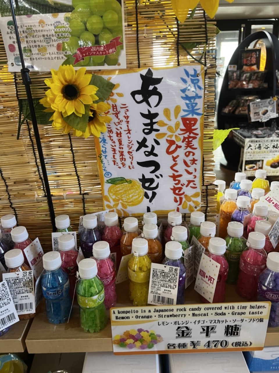

1. Overall Rating (0–10) — 6.0
This photograph captures the vibrant chaos of a Japanese confectionery display, where color and text compete for attention in a way that feels both energetic and slightly overwhelming. The bright bottles of konpeito and the bold signage create an immediate sense of cultural specificity and commercial appeal, but the lack of visual hierarchy makes the scene feel cluttered rather than inviting. While the image succeeds in conveying the abundance and variety of the product, it struggles to present a cohesive or aesthetically pleasing moment.
2. Composition (0–10) — 5.0
The framing is tight and busy, with overlapping elements and a lack of clear focal point. The central sign and sunflower draw attention, but the surrounding bottles and signs compete for visual weight, creating a disjointed arrangement.
3. Lighting (0–10) — 6.0
The lighting is even and functional, likely from overhead fluorescent sources, which flattens the scene but ensures legibility. The bright colors pop under this illumination, though there’s little sense of mood or directionality.
4. Color & Tone (0–10) — 7.5
The palette is rich and varied, with vivid hues from the candy bottles and the sunflower adding warmth and vibrancy. The contrast between the bright colors and the neutral bamboo backdrop helps the products stand out, though the sheer number of colors creates visual noise.
5. Creativity (0–10) — 6.0
The image is more documentary than artistic, capturing a real-world retail scene with authenticity. The inclusion of both Japanese and English text, along with the decorative sunflower, adds a layer of cultural storytelling, but the composition lacks intentional framing or conceptual depth.
6. Technical Quality (0–10) — 7.0
The image is sharp and well-focused, with clear detail on the labels and text. The depth of field is adequate, though some background elements are slightly soft. The exposure is balanced, with no significant over- or underexposed areas.
7. Emotional Impact (0–10) — 5.5
The photograph evokes a sense of playful abundance and sensory delight, but the crowded composition limits emotional resonance. It feels more like a snapshot than an evocative image, offering a glimpse into a cultural moment without drawing the viewer into a deeper experience.
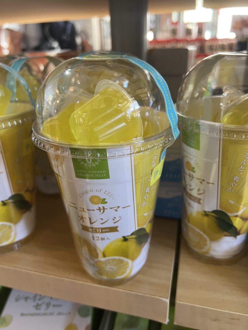

1. Overall Rating (0–10) — 6.0
This image captures a vibrant and refreshing product display, with the bright yellow jelly and citrus branding immediately drawing the eye. The composition feels casual and commercial, emphasizing the product's appeal through color and clarity, though it lacks the narrative depth or visual sophistication to feel truly artistic. The shallow depth of field and slightly cluttered background keep the focus on the subject, but the overall execution feels more like a snapshot than a deliberate photograph.
2. Composition (0–10) — 6.5
The central cup is well-placed and framed, with surrounding products creating a sense of abundance. However, the off-center alignment and overlapping elements introduce slight visual clutter, reducing the overall harmony.
3. Lighting (0–10) — 6.0
The lighting is bright and even, likely from overhead store fixtures, which enhances the product’s vivid yellow hue. While it clearly illuminates the subject, the flat quality of the light limits texture and dimension.
4. Color & Tone (0–10) — 7.5
The dominant yellow creates a cheerful, summery mood, with the white and green accents adding balance. The color palette is cohesive and appealing, effectively communicating the product’s citrus theme.
5. Creativity (0–10) — 5.5
The image is straightforward and functional, prioritizing product visibility over artistic interpretation. While the color choice is strong, the lack of a unique perspective or conceptual layer keeps it from feeling inventive.
6. Technical Quality (0–10) — 7.0
The focus is sharp on the central cup, with sufficient detail in the label and packaging. The image is clear and free of major technical flaws, though the shallow depth of field leads to a slightly soft background.
7. Emotional Impact (0–10) — 6.0
The image evokes a sense of refreshment and sweetness, appealing to the viewer’s senses through its bright colors and food-related subject. However, it remains emotionally distant, functioning more as a commercial image than a compelling visual story.
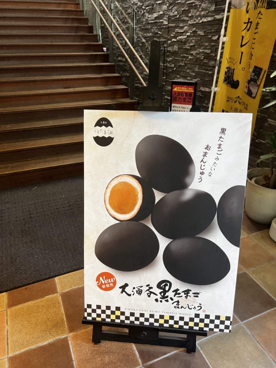

1. Overall Rating (0–10) — 6.0
This photograph presents a straightforward promotional display for a Japanese food item, balancing commercial clarity with a subtle sense of place. The poster’s clean design and bold imagery draw attention to the product, while the surrounding environment—wooden stairs, stone wall, and warm tiles—adds a grounded, authentic atmosphere. However, the image feels more like a casual snapshot than a composed photograph, lacking the visual tension or emotional depth that would elevate it beyond mere documentation.
2. Composition (0–10) — 6.5
The poster is centered and well-framed, with the stairs and wall providing a natural leading line that guides the eye toward the subject. The diagonal of the staircase adds subtle dynamism, though the composition is slightly off-kilter, with the poster positioned slightly to the right and the banner on the right edge creating visual imbalance.
3. Lighting (0–10) — 6.0
Even, ambient indoor lighting illuminates the scene without harsh shadows or overexposure. The warm tone of the lights enhances the earthy textures of the floor and wall, but the flatness of the illumination limits depth and mood.
4. Color & Tone (0–10) — 6.5
The poster’s stark black-and-white contrast with the orange yolk creates a strong focal point, while the warm terracotta tiles and muted stone wall contribute to a cohesive, natural palette. The yellow banner introduces a bright accent, though it slightly disrupts the overall tonal harmony.
5. Creativity (0–10) — 6.0
The image functions as a functional advertisement with a clear message, but its creativity lies more in its narrative context—showcasing a traditional product in a contemporary setting—than in its visual execution. The juxtaposition of the modern poster with the rustic interior offers a quiet cultural contrast.
6. Technical Quality (0–10) — 7.0
The image is sharp and well-focused, with clean details on the poster and surrounding textures. There are no visible technical flaws, though the lack of depth of field and slightly uneven framing hold back its overall impact.
7. Emotional Impact (0–10) — 5.5
The photograph evokes a sense of curiosity and mild nostalgia, inviting viewers to consider the story behind the product and its place in everyday life. However, the lack of human presence and emotional resonance keeps the experience more observational than intimate.


1. Overall Rating (0–10) — 6.0
This photograph captures an intimate, candid moment of a meal shared at a casual eatery, where the focus on the hand-held egg draws the viewer into a personal experience. The shallow depth of field isolates the egg, creating a sense of immediacy, while the background elements—drinks, food, and a menu—suggest a relaxed, everyday atmosphere. While the image feels authentic and relatable, its technical execution and visual storytelling lack the polish to elevate it beyond a simple snapshot.
2. Composition (0–10) — 5.0
The foreground egg dominates the frame, but the cluttered background and uneven framing distract from the subject. A more deliberate composition would better guide the eye and enhance narrative clarity.
3. Lighting (0–10) — 5.5
Even, ambient indoor lighting provides adequate exposure but lacks direction or mood. The flat light emphasizes the scene’s casual nature but diminishes depth and texture.
4. Color & Tone (0–10) — 5.5
The palette is restrained, with muted browns, grays, and a pop of green from the bottle. While cohesive, the colors feel washed out and lack vibrancy, reducing visual impact.
5. Creativity (0–10) — 6.5
The focus on the partially peeled egg creates an unusual point of interest, offering a moment of curiosity. The inclusion of cultural elements like the green tea bottle and curry bread menu adds narrative depth, though the overall concept remains grounded in everyday documentation.
6. Technical Quality (0–10) — 7.0
The image is sharp where it matters, particularly on the egg and hand, with good focus control. However, the overall image lacks refinement in exposure and depth management.
7. Emotional Impact (0–10) — 5.5
The photo evokes a quiet sense of shared experience and comfort, but the lack of emotional resonance keeps the viewer at a distance. It feels more like a memory captured than a moment truly felt.


1. Overall Rating (0–10) — 6.0
This image presents a vibrant, inviting display of fresh fruit and juice, capturing the essence of a small, local shop with a playful, handcrafted charm. The handwritten sign and neatly arranged produce evoke a sense of authenticity and care, though the slightly cluttered composition and flat lighting prevent it from feeling fully polished. The scene is pleasant and approachable, but lacks the visual depth to elevate it beyond a simple snapshot.
2. Composition (0–10) — 6.5
The central placement of the basket and sign creates a natural focal point, while the foreground crates provide visual balance. However, the overlapping elements and slight angle of the shot create a sense of visual clutter, slightly disrupting the harmony.
3. Lighting (0–10) — 5.5
The lighting is functional and even, likely from overhead fluorescent sources, which flattens the scene and minimizes texture. While it clearly illuminates the subject, it lacks warmth or direction, giving the image a sterile, commercial feel.
4. Color & Tone (0–10) — 6.0
The color palette is lively, with bright yellows, reds, and greens that reflect the freshness of the fruit. However, the overall tone is somewhat muted due to the harsh lighting and lack of contrast, reducing the vibrancy of the colors.
5. Creativity (0–10) — 7.0
The mix of hand-drawn signage, natural textures, and curated produce creates a charming, personalized aesthetic. The bilingual text and whimsical illustrations add a layer of cultural storytelling, making the image feel both local and welcoming.
6. Technical Quality (0–10) — 6.5
The image is sharp and clear, with good focus on the main elements. However, the framing and angle suggest a casual, unrefined capture, and the background lacks depth, contributing to a slightly unbalanced technical execution.
7. Emotional Impact (0–10) — 6.5
The image evokes a sense of warmth and community, inviting viewers into a cozy, everyday moment. While not emotionally overwhelming, it effectively communicates the simple joy of fresh, honest food and the charm of small-scale commerce.


1. Overall Rating (0–10) — 6.0
This image captures the everyday vibrancy of a Japanese market stall, where fresh produce is displayed with care and cultural specificity. The juxtaposition of neatly packed watermelons and mandarins in plastic crates speaks to a sense of order and abundance, while the handwritten signs add a touch of authenticity. Though the composition is straightforward and functional, it lacks the visual flair to transcend mere documentation—its charm lies in its realism rather than its artistry.
2. Composition (0–10) — 6.5
The two crates are balanced side by side, creating a strong horizontal symmetry. However, the slightly high camera angle and the cluttered foreground edges reduce the sense of depth and immersion.
3. Lighting (0–10) — 6.0
Even, diffused lighting highlights the textures of the fruit and packaging without harsh shadows. The lighting is practical and clear, but it lacks the warmth or drama that could elevate the scene.
4. Color & Tone (0–10) — 7.0
The contrast between the bright green crates, deep green watermelons, and vibrant orange mandarins creates a lively palette. The yellow signs add a pop of color that draws the eye, while the neutral background keeps the focus on the produce.
5. Creativity (0–10) — 6.5
The photograph is conceptually grounded in cultural authenticity, showcasing a slice of daily life in Japan. While not overtly artistic, the attention to detail—such as the branded stickers and packaging—gives it narrative depth and local character.
6. Technical Quality (0–10) — 7.5
The image is sharp and well-focused, with clean details on the fruit and labels. The depth of field is adequate, and there are no visible flaws in exposure or noise.
7. Emotional Impact (0–10) — 6.0
The image evokes a sense of quiet satisfaction and familiarity, reminiscent of a routine visit to a local market. While it doesn’t stir strong emotion, it offers a moment of calm and connection to place.
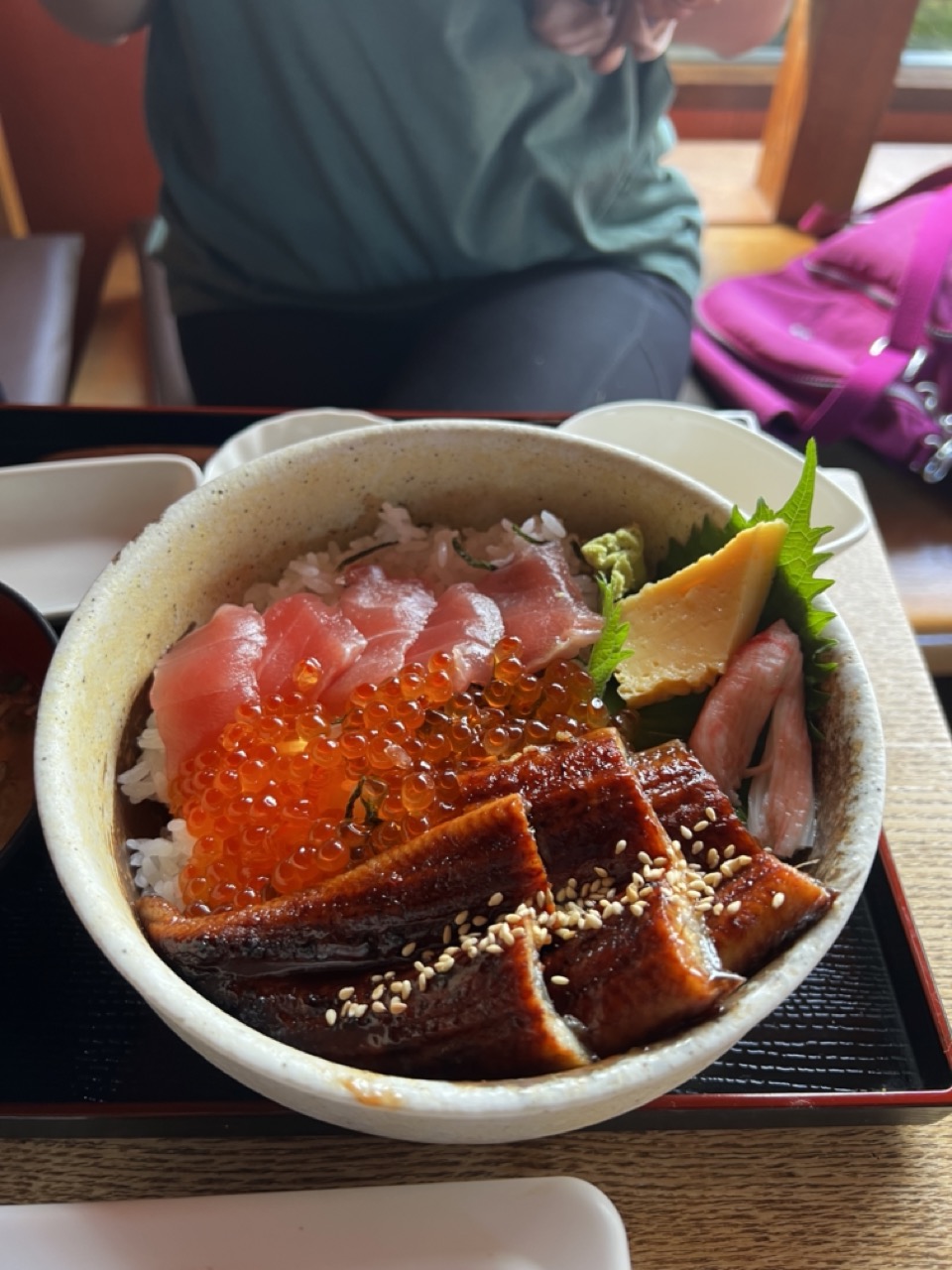

1. Overall Rating (0–10) — 7.0
This photograph captures the vibrant allure of a Japanese unagi donburi with inviting clarity, where the rich textures and colors of the toppings draw the eye. While the composition feels slightly candid and unpolished, the image succeeds in conveying the dish’s freshness and abundance. The shallow depth of field isolates the bowl effectively, but the background clutter and casual framing keep it from feeling fully refined.
2. Composition (0–10) — 6.5
The bowl is centered but slightly off-kilter, with the background elements—person, bag, and chair—creating visual noise. A tighter crop would emphasize the dish and improve balance.
3. Lighting (0–10) — 7.0
Natural light from the side enhances the glistening sauce on the eel and the translucency of the fish and roe, creating a warm, appetizing glow. The exposure is well-handled, preserving detail in both highlights and shadows.
4. Color & Tone (0–10) — 8.0
The palette is rich and harmonious, with the deep orange of the tobiko, the pink of the tuna, and the dark glaze of the eel creating a dynamic contrast against the neutral rice and bowl. The tones feel natural and appetizing.
5. Creativity (0–10) — 6.5
The shot captures a moment of everyday indulgence with authenticity, but it leans more toward documentation than artistic interpretation. The focus on the food is strong, but the surrounding context limits its conceptual impact.
6. Technical Quality (0–10) — 8.0
The image is sharp on the main subject, with clean focus and minimal noise. The depth of field is effectively used to isolate the dish, though the background blur is not perfectly smooth.
7. Emotional Impact (0–10) — 7.5
The photograph evokes a sense of comfort and culinary delight, tapping into the universal appeal of a satisfying meal. The viewer is invited to savor the textures and flavors, even through the lens.


1. Overall Rating (0–10) — 7.5
This image captures the inviting warmth of a traditional Japanese salmon rice bowl, with vibrant ingredients that evoke freshness and indulgence. The rustic ceramic bowl and natural wood table create a tactile, authentic atmosphere, while the careful arrangement of salmon, tamago, and wasabi speaks to a thoughtful culinary presentation. While the composition is slightly cluttered, the richness of color and texture makes the dish feel alive and appetizing.
2. Composition (0–10) — 6.5
The bowl is centered but slightly off-kilter, with background elements like the side dishes and chopsticks creating a sense of casual realism. The framing is tight, emphasizing the food but sacrificing some spatial balance and visual flow.
3. Lighting (0–10) — 7.0
Natural, soft light enhances the organic textures and rich salmon hue, casting gentle shadows that add depth without overpowering the scene. The warm ambient tone complements the meal’s cozy, inviting mood.
4. Color & Tone (0–10) — 8.0
The color palette is harmonious, with the bright orange salmon, pale yellow tamago, and green wasabi creating a vivid yet balanced contrast against the earthy tones of the bowl and table. The saturation is natural and appealing, enhancing the food’s freshness.
5. Creativity (0–10) — 7.0
The image captures a familiar subject with a sense of warmth and authenticity. While not radically original, it successfully conveys the pleasure of a simple, well-prepared meal, with attention to detail that elevates it beyond a mere snapshot.
6. Technical Quality (0–10) — 8.0
The image is sharp and well-focused, with clear detail in the fish’s marbling and the texture of the rice. The depth of field is appropriate, keeping the main subject crisp while softly blurring the background.
7. Emotional Impact (0–10) — 8.0
The photograph evokes a sense of comfort and satisfaction, tapping into universal feelings of warmth and nourishment. The inviting presentation and natural lighting make the viewer almost taste the meal, creating a strong emotional resonance with food and tradition.


1. Overall Rating (0–10) — 7.5
This photograph captures the vibrant abundance of a Japanese seafood bowl with appetizing clarity, showcasing a feast of textures and colors that speak to both culinary tradition and visual indulgence. The composition feels inviting and authentic, though the framing slightly prioritizes quantity over harmony, leaving the surrounding elements somewhat disjointed. With its rich variety of ingredients and warm, natural lighting, the image conveys a sense of genuine dining experience, even if it lacks the refined elegance of a staged food portrait.
2. Composition (0–10) — 6.5
The main subject—the bowl—is centered and well-framed, but the surrounding side dishes and tray edges create a cluttered foreground. A tighter crop would enhance focus on the bowl’s intricate arrangement.
3. Lighting (0–10) — 8.0
Natural, diffused light enhances the textures and colors of the ingredients, casting soft shadows that add depth without overpowering the scene. The warm tone complements the food’s appeal.
4. Color & Tone (0–10) — 8.5
The palette is rich and varied—vibrant orange roe, deep pink tuna, bright yellow tamagoyaki, and green wasabi create a dynamic contrast. The earthy tones of the ceramic bowl and wooden table provide a grounding backdrop.
5. Creativity (0–10) — 7.0
The image celebrates the sensory richness of a traditional Japanese meal, presenting it as a feast for the eyes. While not highly conceptual, it captures the cultural and culinary essence with sincerity and visual appeal.
6. Technical Quality (0–10) — 8.0
Sharp focus on the bowl’s contents, with good detail in the textures of fish, rice, and garnishes. The depth of field is appropriate, keeping the main subject clear while softly blurring the background.
7. Emotional Impact (0–10) — 8.0
The photograph evokes a strong sense of hunger and delight, inviting the viewer into a moment of sensory indulgence. Its authenticity and warmth foster a connection to the pleasure of a shared meal.


1. Overall Rating (0–10) — 6.8
This close-up captures the tactile richness of a vintage green glass bottle, its embossed details glowing with a quiet, organic life. The interplay of light through the textured glass creates a mesmerizing play of reflections and shadows, drawing attention to the craftsmanship of the label. While the image’s focus on detail is compelling, the composition feels slightly cluttered, and the ambient lighting lacks the refinement to fully elevate the subject into a moment of visual poetry.
2. Composition (0–10) — 6.0
The tight framing centers on the bottle’s embossed design, but the hand and background elements encroach on the visual space, creating a sense of informality. A more deliberate arrangement or tighter crop would enhance focus and elegance.
3. Lighting (0–10) — 7.0
Natural light filters through the glass, highlighting the texture and depth of the embossing with soft, directional highlights. The green hue of the bottle is accentuated by the ambient glow, creating a layered and dynamic effect.
4. Color & Tone (0–10) — 7.5
The dominant emerald green is rich and vibrant, with subtle shifts in tone due to the glass’s curvature and lighting. The warm skin tones of the hand and the wooden surface provide a complementary contrast, enhancing the image’s earthy, tactile feel.
5. Creativity (0–10) — 7.0
The image transforms an everyday object into a study of texture and light, emphasizing the beauty in mundane details. The choice to focus on the bottle’s embossed branding and the interplay of reflection suggests a narrative of memory and craftsmanship.
6. Technical Quality (0–10) — 8.0
The focus is sharp on the embossed details, capturing fine textures clearly. The image is well-exposed, with no noticeable noise, and the depth of field effectively isolates the bottle from the background.
7. Emotional Impact (0–10) — 6.5
The photograph evokes a sense of nostalgia and quiet appreciation for craftsmanship, inviting the viewer to pause and consider the story behind the bottle. While intimate, the emotional resonance is slightly muted by the casual context and framing.
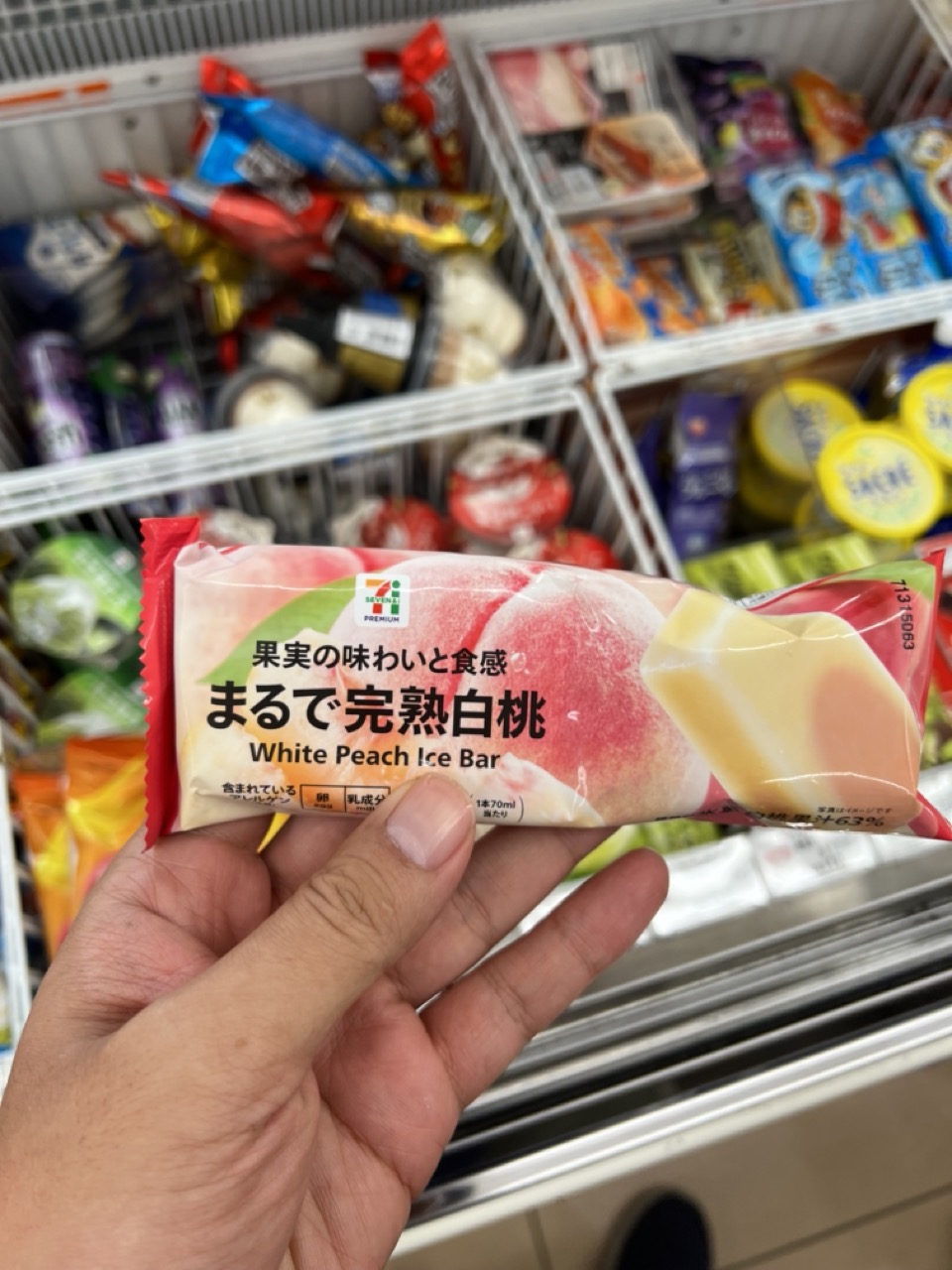

1. Overall Rating (0–10) — 6.0
This photograph captures a candid, everyday moment in a convenience store, where the focus on a White Peach Ice Bar feels both relatable and slightly impersonal. The composition emphasizes consumer choice, but the lack of visual depth and emotional resonance keeps the image from feeling truly engaging. While the subject is clear and the context immediate, the image remains more documentary than artistic—functional but not compelling.
2. Composition (0–10) — 6.0
The hand and ice bar are centered, drawing attention, but the cluttered background and shallow depth of field create visual noise. A tighter focus on the product would enhance clarity and narrative.
3. Lighting (0–10) — 5.5
Bright, even fluorescent lighting illuminates the scene clearly but flattens texture and mood. The lack of directional light or shadow reduces visual interest and depth.
4. Color & Tone (0–10) — 6.5
The soft pinks and reds of the ice bar packaging stand out against the muted, varied colors of the background. The palette is functional, with a slight warmth that suggests the product’s flavor, though it lacks tonal richness.
5. Creativity (0–10) — 5.5
The image is straightforward and observational, capturing a slice of daily life without stylistic embellishment. Its strength lies in its realism, but it lacks originality or conceptual depth.
6. Technical Quality (0–10) — 7.5
The focus on the ice bar is sharp, with clean details on the packaging and hand. The depth of field is appropriately shallow, though the background remains distracting.
7. Emotional Impact (0–10) — 5.0
The image evokes mild nostalgia and curiosity, but the clinical environment and lack of human expression keep emotional engagement at a distance. It feels like a snapshot rather than a story.
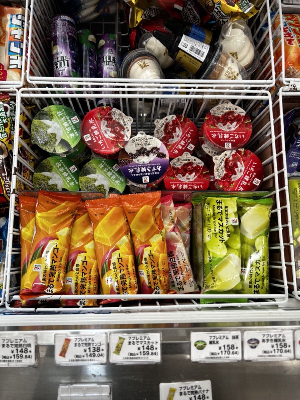

1. Overall Rating (0–10) — 6.0
This photograph captures the vibrant, organized chaos of a convenience store freezer, showcasing a variety of Japanese frozen desserts with striking clarity. The colorful packaging and neatly arranged products create a visually engaging display that reflects the culture of curated convenience. While the image is technically sound and rich in detail, it lacks a strong emotional or artistic narrative, feeling more like a commercial catalog than a compelling visual statement.
2. Composition (0–10) — 6.5
The frame is tightly focused on the product shelf, with strong horizontal lines from the wire baskets guiding the eye across the display. The arrangement is busy but balanced, with the colorful ice bars and cups creating visual rhythm. However, the lack of a clear focal point or depth reduces the image’s compositional strength.
3. Lighting (0–10) — 7.0
Bright, even fluorescent lighting illuminates the scene effectively, highlighting the vivid packaging and ensuring legibility of text and pricing. The light is functional and clean, though it flattens the image slightly, lacking the warmth or contrast that could enhance mood.
4. Color & Tone (0–10) — 7.5
The palette is rich and varied, with bold yellows, greens, reds, and purples creating a dynamic and appetizing visual effect. The colors are well-saturated and consistent with the commercial nature of the subject, though the overall tone remains neutral due to the lighting.
5. Creativity (0–10) — 6.0
The image is observational and documentary in nature, capturing a slice of everyday life with precision. While the arrangement of products is visually interesting, the lack of a unique perspective or artistic intervention limits its originality.
6. Technical Quality (0–10) — 8.0
The photograph is sharp and clear, with excellent focus on the products and price tags. The depth of field is appropriate, capturing both foreground and background details with precision. There are no visible flaws in exposure or noise.
7. Emotional Impact (0–10) — 5.5
The image evokes a sense of familiarity and routine, appealing to viewers who recognize the brands or have experienced similar store environments. However, it does not elicit strong emotional responses, feeling more like a factual record than an evocative moment.


1. Overall Rating (0–10) — 6.0
This photograph captures a candid, joyful moment of a young girl posing with a mascot card in what appears to be an educational or museum setting. Her playful expression and peace sign convey genuine enthusiasm, while the surrounding exhibits add context and authenticity. The image feels slightly underexposed and compositionally unbalanced, but its charm lies in its spontaneity and the warmth of the subject’s personality.
2. Composition (0–10) — 5.5
The subject is slightly off-center, with a cluttered background that distracts from the main focus. The framing cuts off the top of her head and includes unnecessary elements like the backpack and red chair, reducing visual clarity.
3. Lighting (0–10) — 5.0
The lighting is flat and ambient, likely from overhead fluorescent fixtures, which casts a neutral tone and creates little depth. Shadows are minimal, and the overall exposure is slightly dim, giving the image a muted feel.
4. Color & Tone (0–10) — 6.0
The palette is soft and natural, dominated by greens, whites, and grays, with the pink strap and card adding subtle pops of color. The tone is consistent but lacks vibrancy, which slightly dampens the image’s energy.
5. Creativity (0–10) — 7.0
The image succeeds in capturing a personal, lighthearted moment with a sense of narrative. The inclusion of the mascot card and educational posters suggests a story of learning and fun, offering a glimpse into a cultural experience.
6. Technical Quality (0–10) — 6.5
The focus is sharp on the subject’s face and card, and detail is clear in the foreground. However, the background is slightly soft, and the overall image lacks dynamic range and crispness.
7. Emotional Impact (0–10) — 7.0
The girl’s playful expression and gesture evoke warmth and joy, creating a relatable and affectionate connection with the viewer. Despite technical limitations, the emotional authenticity makes the image memorable.
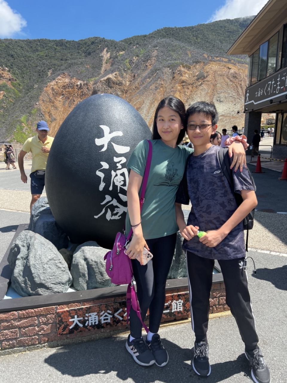

1. Overall Rating (0–10) — 7.0
This photograph captures a bright, sun-drenched moment of two individuals posing at a scenic tourist site, with the iconic black egg sculpture and rugged mountain backdrop adding cultural and geographic context. The natural lighting enhances the vividness of the scene, and the subjects’ relaxed expressions convey genuine joy. While the image is well-composed and clearly documented, it leans toward the conventional tourist snapshot, lacking the subtle artistic tension that might elevate it beyond mere memory.
2. Composition (0–10) — 7.0
The subjects are centered and framed well against the large egg sculpture, which acts as a strong visual anchor. The background elements—mountain, building, and passersby—add depth without overwhelming the main focus.
3. Lighting (0–10) — 9.0
Bright, direct sunlight creates crisp shadows and vivid contrast, enhancing textures and colors. The clear blue sky and natural illumination contribute to the image’s energetic, summery feel.
4. Color & Tone (0–10) — 8.0
The palette is vibrant, with the deep black of the egg, the rich greens of the mountain, and the bright blue sky creating a dynamic visual contrast. The tones are well-balanced, with natural saturation that feels authentic and lively.
5. Creativity (0–10) — 6.0
The image is conceptually straightforward, capturing a classic travel moment. While the setting is visually compelling, the approach is conventional, relying on familiar tourist-photography tropes rather than innovative framing or storytelling.
6. Technical Quality (0–10) — 8.0
The image is sharp, with clear focus on the subjects and fine detail visible in the background. The exposure is well-managed, avoiding harsh overexposure despite the bright conditions.
7. Emotional Impact (0–10) — 7.0
The warmth and ease of the subjects’ interaction evoke a sense of shared joy and travel adventure. The setting enhances the feeling of exploration and discovery, making the moment feel personal and memorable.
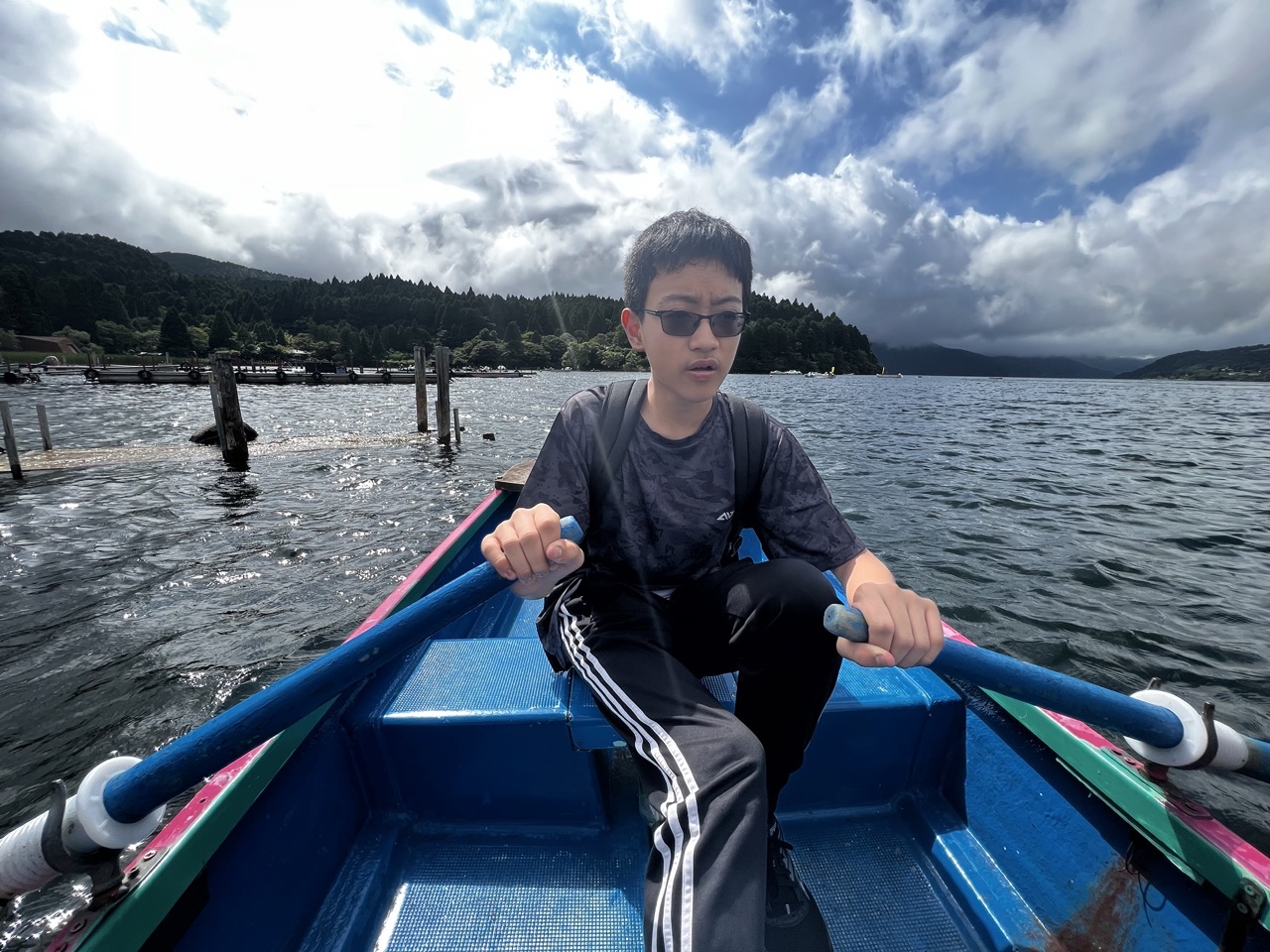

1. Overall Rating (0–10) — 7.0
This photograph captures a moment of quiet introspection amid a dynamic natural setting, where the subject’s pensive expression contrasts with the vastness of the lake and sky. The dramatic clouds and textured water convey a sense of movement and mood, while the boy’s sunglasses and casual attire ground the scene in authenticity. While the composition feels slightly unbalanced and the lighting is uneven, the image succeeds in conveying a contemplative journey—both literal and emotional—through its atmospheric tension and personal focus.
2. Composition (0–10) — 6.0
The subject is centered but slightly low in the frame, creating an awkward balance with the expansive water and sky. The rowboat’s diagonal lines draw the eye toward the subject, but the cluttered foreground and distant docks distract from the focal point.
3. Lighting (0–10) — 6.5
The lighting is mixed, with bright sunlight breaking through clouds and casting harsh highlights on the water, while the subject remains partially in shadow. This creates a dramatic contrast but reduces detail in the boy’s face and clothing.
4. Color & Tone (0–10) — 7.0
The deep blue of the boat and water contrasts with the gray and white clouds, creating a visually striking palette. The overall tone is cool and moody, which enhances the contemplative atmosphere, though the colors lack vibrancy in the shaded areas.
5. Creativity (0–10) — 7.5
The image stands out for its narrative potential—the solitary figure in motion, framed by nature’s grandeur—suggesting a story of travel, reflection, or transition. The choice of a low-angle, first-person perspective adds intimacy and immediacy.
6. Technical Quality (0–10) — 7.5
The image is sharp and well-focused, particularly on the subject and the boat’s details. The water’s texture and cloud formations are clearly rendered, and the camera appears to have tracked the movement effectively.
7. Emotional Impact (0–10) — 7.0
The combination of the boy’s thoughtful expression, the vast landscape, and the dramatic sky evokes a sense of quiet introspection and solitude. There’s a subtle melancholy and wonder that resonates, inviting the viewer to consider the journey—both seen and unseen.
Loading map...