Kyoto is offering a dynamic blend of traditional arts, crafts, and modern entertainment. Visitors can immerse themselves in the refined world of geiko and maiko performances in traditional tea houses, witnessing centuries-old dance and music. The city also offers unexpected delights like the Yamazaki Whisky Distillery Museum, showcasing Japan's mastery in adapting foreign techniques with a local touch. For those seeking contemporary experiences, the Nintendo Center highlights the gaming giant's Kyoto origins and its fusion of traditional Japanese design with modern entertainment.
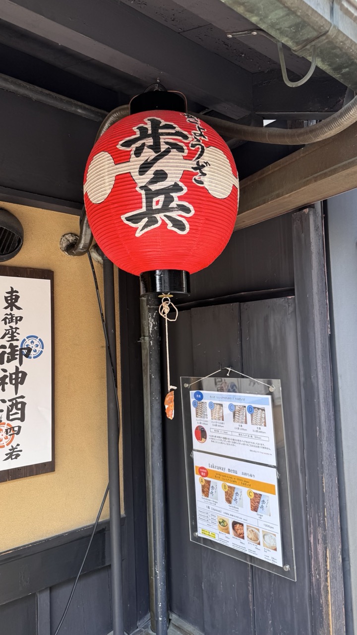

1. Overall Rating (0–10) — 6.8
This photograph captures the inviting charm of a traditional Japanese eatery, with its bold red lantern and rustic wooden façade evoking a sense of authenticity and local culture. The composition draws the eye naturally to the lantern, yet the surrounding clutter—wires, signs, and a slightly askew menu—distracts from the image’s potential elegance. While it succeeds in documenting a moment of everyday life, it lacks the refined balance needed to elevate it beyond a simple snapshot.
2. Composition (0–10) — 6.0
The lantern is well-centered and dominant, but the framing feels slightly tight and unbalanced, with the sign and menu competing for attention. A more deliberate crop could emphasize the lantern while minimizing distractions.
3. Lighting (0–10) — 6.5
Natural daylight provides even illumination, highlighting the lantern’s vibrant red and the textures of the wood and paper. However, the overhead shadows and muted tones of the surrounding structure slightly flatten the scene’s depth.
4. Color & Tone (0–10) — 7.0
The bold red of the lantern creates a striking contrast against the dark wood and pale wall, making it the focal point. The overall palette is subdued, but the choice of colors enhances the traditional aesthetic without appearing over-processed.
5. Creativity (0–10) — 6.5
The image leverages cultural elements effectively, capturing a slice of Japanese street life. While not particularly original in concept, it conveys a genuine sense of place and atmosphere through its subject and context.
6. Technical Quality (0–10) — 7.5
The focus is sharp, especially on the lantern, and the details in the text and signage are clear. The image is free of noticeable noise or blur, though the lighting and framing hold it back from technical excellence.
7. Emotional Impact (0–10) — 6.0
The photograph evokes a quiet sense of nostalgia and warmth, inviting the viewer to imagine stepping into the shop. While the emotional resonance is present, it is somewhat muted by the clutter and lack of compositional finesse.
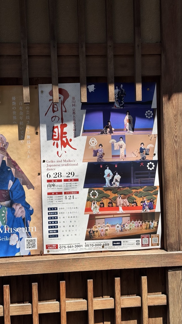

1. Overall Rating (0–10) — 5.5
This image captures a traditional Japanese dance poster mounted in a wooden setting, blending cultural promotion with architectural context. While the poster itself is rich in detail and content, the photograph’s execution is hindered by awkward framing and uneven lighting, which distract from the visual harmony of the scene. The composition feels more like a casual snapshot than a deliberate artistic statement, lacking the balance and refinement needed to elevate the subject.
2. Composition (0–10) — 4.5
The poster is slightly off-center, and the wooden slats create a disjointed, fragmented frame that disrupts visual flow. The overlapping elements and inconsistent angles reduce the image's structural coherence.
3. Lighting (0–10) — 6.0
Natural sunlight creates strong highlights and shadows, emphasizing texture but also casting distracting glare on the poster’s surface. The lighting is uneven, with parts of the image overexposed while others fall into shadow.
4. Color & Tone (0–10) — 5.5
The palette is a mix of warm wood tones and the poster’s bold reds, blues, and whites, but the contrast is muddled by lighting inconsistencies. The colors are vibrant but not fully resolved, with some areas appearing washed out.
5. Creativity (0–10) — 5.0
The concept of juxtaposing a modern cultural announcement against traditional architecture is promising, but the execution lacks subtlety. The image feels more like documentation than creative interpretation.
6. Technical Quality (0–10) — 6.5
The image is generally sharp, with clear text and detail visible on the poster. However, focus and exposure issues reduce overall clarity, particularly in the highlighted and shadowed areas.
7. Emotional Impact (0–10) — 4.5
The photograph conveys a sense of place and cultural continuity, but the technical and compositional flaws prevent a deeper emotional connection. It informs rather than inspires, leaving the viewer with a sense of observation rather than immersion.
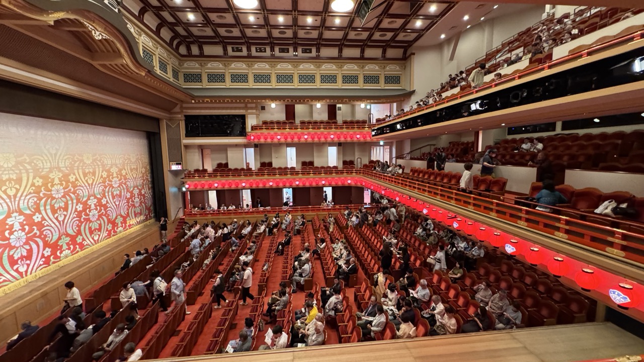

1. Overall Rating (0–10) — 7.5
This photograph captures the grandeur and cultural richness of a traditional Japanese theater, where ornate design and human presence converge in a moment of shared anticipation. The vibrant reds and intricate patterns of the stage curtain and balconies create a sense of opulence and heritage, while the audience’s scattered presence adds a layer of lived experience. Though the image feels slightly overexposed and the framing lacks a clear focal point, it succeeds in conveying the theater’s atmosphere and scale with warmth and authenticity.
2. Composition (0–10) — 6.5
The wide-angle perspective emphasizes the theater’s scale, but the lack of a strong central subject creates a sense of visual dispersion. The sweeping curves of the balconies and the diagonal lines of the seating lead the eye through the space, though the cluttered foreground slightly detracts from the overall harmony.
3. Lighting (0–10) — 6.0
The lighting is functional and evenly distributed, with overhead fixtures illuminating the space clearly. However, the harsh white glow diminishes the warmth of the red and gold tones, flattening the ambiance and reducing the dramatic effect that such a venue could otherwise convey.
4. Color & Tone (0–10) — 7.0
The dominant reds and golds evoke a sense of tradition and festivity, while the warm tones of the wooden railings and seats add depth. The contrast between the rich stage curtain and the cooler tones of the audience area creates visual interest, though some color saturation appears slightly unnatural due to lighting.
5. Creativity (0–10) — 7.0
The image captures a moment of cultural resonance, blending architectural beauty with human presence. The choice to photograph from a high vantage point offers a rare, comprehensive view of the theater’s layout and atmosphere, elevating it beyond a simple documentation into a narrative of place and occasion.
6. Technical Quality (0–10) — 7.5
The photograph is sharp and well-focused, with clean details throughout the theater’s interior. The wide-angle lens effectively captures the vastness of the space, and the exposure is generally balanced, though some highlights on the ceiling and railings show slight overexposure.
7. Emotional Impact (0–10) — 7.0
There’s a quiet sense of anticipation and reverence in the image, as if the audience is waiting for a performance to begin. The blend of tradition, architecture, and human presence evokes a feeling of belonging and shared cultural experience, drawing the viewer into the moment.
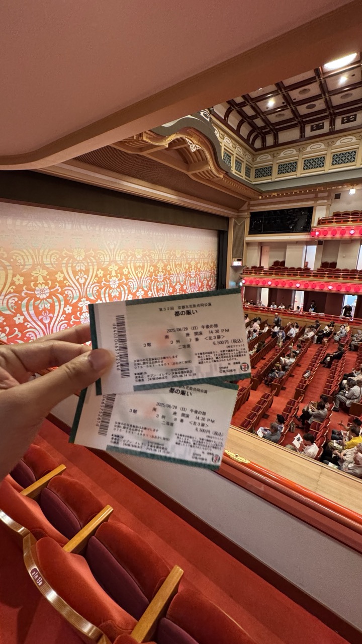

1. Overall Rating (0–10) — 7.0
This photograph captures the intimate anticipation of a live performance, blending personal memory with the grandeur of a traditional theater. The hand holding the tickets creates a sense of immediacy and participation, while the ornate interior of the venue adds a layer of cultural richness. Though the image is slightly cluttered by the tickets and the foreground, the composition successfully conveys both the excitement of attending a show and the elegance of the space.
2. Composition (0–10) — 6.5
The foreground placement of the tickets draws attention but slightly disrupts the visual flow. The diagonal line of the hand and tickets leads the eye into the theater, though the framing feels slightly off-center and could benefit from tighter focus on the stage area.
3. Lighting (0–10) — 6.0
The warm, ambient lighting enhances the rich reds and golds of the theater’s interior, creating a welcoming and theatrical mood. However, the lighting is uneven, with bright spots from overhead fixtures that distract from the overall atmosphere.
4. Color & Tone (0–10) — 7.0
The dominant reds and golds evoke a sense of tradition and celebration, with the soft orange of the stage curtain adding depth. The color palette is harmonious and evocative, though some areas appear slightly overexposed, reducing tonal subtlety.
5. Creativity (0–10) — 7.5
The photograph tells a story—of personal experience within a larger cultural event. The inclusion of the tickets as a focal point is a clever narrative device, grounding the scene in a specific moment and adding authenticity.
6. Technical Quality (0–10) — 7.5
The image is sharp and well-focused, with clean details visible in the tickets and theater architecture. The depth of field is adequate, though the foreground elements slightly obscure the background.
7. Emotional Impact (0–10) — 7.0
The photograph evokes a sense of nostalgia and excitement, inviting the viewer to imagine the performance about to unfold. The personal touch of the tickets enhances the emotional resonance, making the moment feel both private and shared.
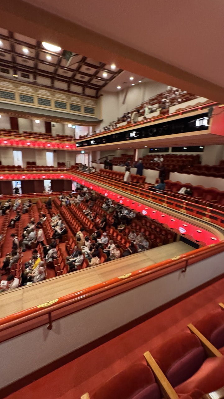

1. Overall Rating (0–10) — 6.8
This photograph captures the grandeur and intimacy of a traditional theater, offering a sweeping view of its layered balconies and rich red upholstery. The composition draws the eye through the cascading rows of seats, conveying both the scale and the warmth of the space. While the image feels slightly unbalanced due to the tilted perspective and cluttered foreground, it successfully communicates the atmosphere of anticipation before a performance—though it could benefit from tighter framing and more intentional lighting control to elevate its artistic impact.
2. Composition (0–10) — 6.0
The diagonal sweep of the balcony railing guides the eye through the frame, but the tilted angle and foreground obstruction disrupt visual harmony. A more centered perspective and tighter crop would enhance balance and focus.
3. Lighting (0–10) — 6.5
The ambient lighting is functional, with warm overhead fixtures illuminating the space evenly. However, the lack of dramatic contrast and the presence of harsh overhead glare reduce the depth and mood, making the scene feel more documentary than atmospheric.
4. Color & Tone (0–10) — 7.0
The dominant red of the seats creates a bold, theatrical palette, complemented by the warm wood tones and soft beige walls. The color harmony is strong, though the overall tone leans slightly flat due to the uniform lighting.
5. Creativity (0–10) — 6.5
The image captures a familiar scene with a sense of place, but the lack of a strong conceptual or emotional hook limits its originality. The viewer is invited to observe, not to interpret.
6. Technical Quality (0–10) — 7.5
The image is sharp and well-exposed, with clear details in the seats and architectural features. The focus is consistent, and there is minimal noise, despite the low-light conditions.
7. Emotional Impact (0–10) — 6.0
The photograph evokes a sense of quiet anticipation, with the scattered audience members suggesting a moment of pause before a performance. However, the slightly awkward framing and lack of a focal point prevent a deeper emotional connection.
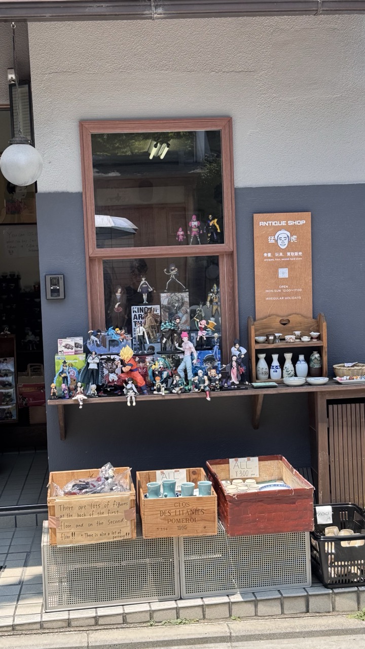

1. Overall Rating (0–10) — 6.8
This photograph captures a charming juxtaposition of traditional Japanese aesthetics and modern pop culture, where an antique shop’s facade becomes a playful stage for anime figurines. The window display, cluttered yet deliberate, tells a story of cultural blending and quiet rebellion against expectations of what an antique shop should be. While the composition is visually engaging, the overabundance of objects risks overwhelming the eye, and the daylight flattens the scene’s potential for mood.
2. Composition (0–10) — 6.5
The central window serves as a natural focal point, framed by the shop’s signage and wooden display. However, the lower third is dominated by a cluttered arrangement of crates and baskets, creating a visual imbalance. A tighter crop or more deliberate framing could enhance the narrative focus on the figurines.
3. Lighting (0–10) — 6.0
Natural daylight provides even illumination, but lacks depth and direction. The flat lighting diminishes shadows and texture, making the scene feel more like a snapshot than a carefully composed image.
4. Color & Tone (0–10) — 6.5
The palette is a mix of earthy tones—browns, grays, and muted blues—punctuated by the bright colors of the anime figures. While the contrast between the traditional shop and the vibrant toys is visually striking, the colors appear slightly washed out, reducing their impact.
5. Creativity (0–10) — 7.5
The image is highly original, merging the expected with the unexpected. The deliberate placement of pop culture figures in a traditional setting creates a witty commentary on modern Japanese culture, making it both visually and conceptually engaging.
6. Technical Quality (0–10) — 7.0
The image is sharp and clear, with well-defined details in the figurines and signage. The focus is consistent across the frame, and there are no obvious technical flaws, though the slight overexposure in the sky reduces overall tonal range.
7. Emotional Impact (0–10) — 6.0
The photograph evokes a sense of curiosity and amusement, inviting the viewer to ponder the story behind the shop and its owner. While it doesn’t elicit strong emotion, it succeeds in creating a moment of quiet delight and cultural reflection.
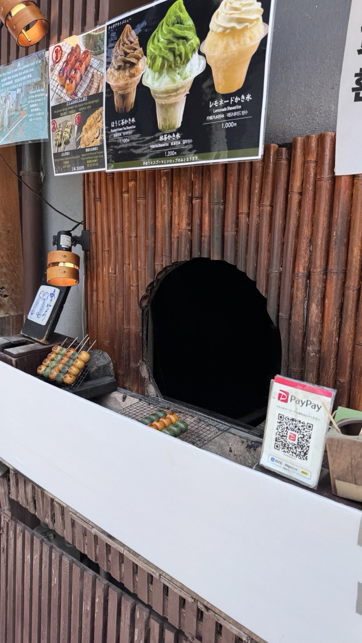

1. Overall Rating (0–10) — 6.0
This photograph captures the rustic charm of a traditional Japanese snack stall, blending cultural authenticity with modern convenience. The composition balances natural textures—bamboo, wood, and charcoal—with commercial elements like digital payment signs and menu posters. While the scene feels genuine and rich in detail, the clutter of signage and the slightly awkward framing reduce its visual cohesion, making it feel more like a snapshot than a curated image.
2. Composition (0–10) — 5.5
The frame is cluttered with signage and objects, creating visual noise. The central archway draws the eye, but the placement of the PayPay sign and skewers disrupts balance and flow.
3. Lighting (0–10) — 6.0
Natural daylight illuminates the scene evenly, highlighting textures without harsh shadows. The warm glow of the hanging lamp adds subtle contrast but doesn’t significantly alter the overall brightness.
4. Color & Tone (0–10) — 6.5
The earthy browns of the bamboo and wood dominate, complemented by the vibrant green of the matcha ice cream in the poster. The color palette feels authentic and culturally grounded, though slightly muted by the daylight.
5. Creativity (0–10) — 6.0
The image successfully documents a slice of everyday Japanese street culture, blending tradition with modernity. However, the lack of a strong visual narrative or artistic framing limits its originality.
6. Technical Quality (0–10) — 7.0
The image is sharp and well-focused, with clear details in textures and text. The exposure is balanced, and the depth of field is appropriate for the scene.
7. Emotional Impact (0–10) — 5.5
The scene evokes a sense of quiet authenticity and cultural immersion, but the busy composition and lack of human presence keep the viewer at a distance, limiting emotional resonance.
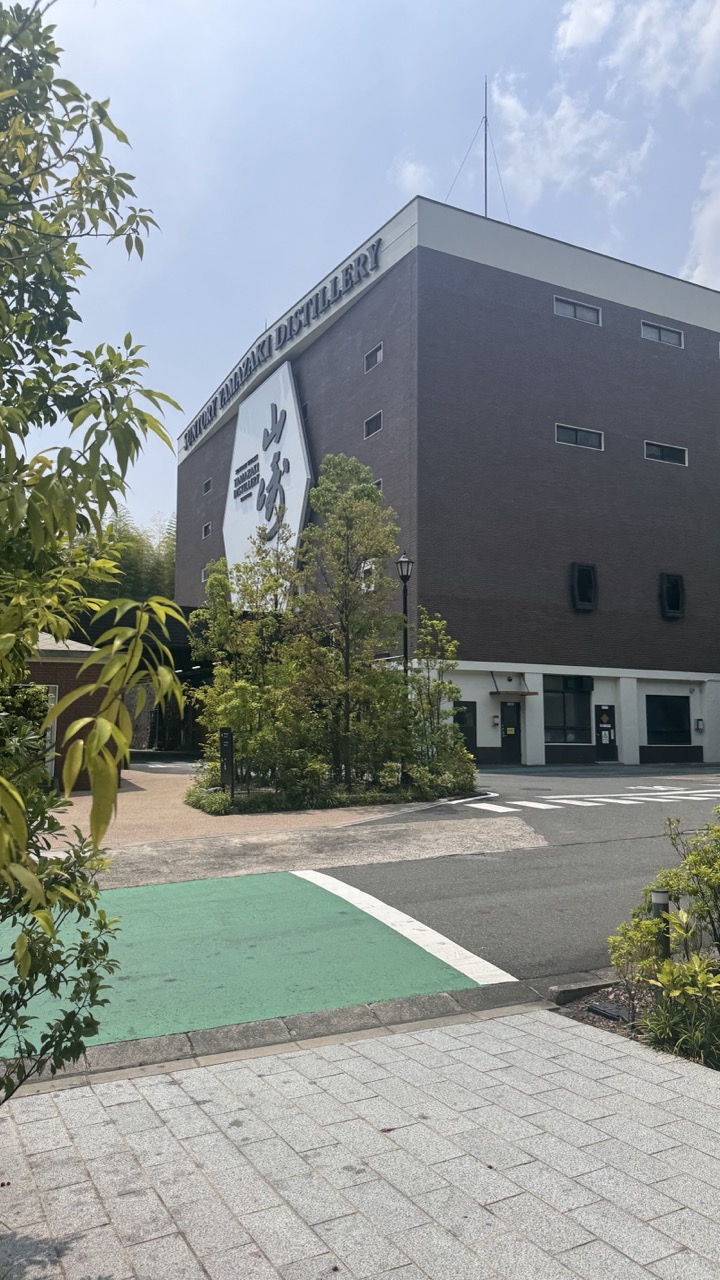

1. Overall Rating (0–10) — 6.8
This image captures the serene presence of the Suntory Yamazaki Distillery, blending industrial architecture with natural elements in a calm, balanced composition. The interplay of green foliage, clean lines, and soft daylight creates a sense of quiet pride in craftsmanship. While the scene is visually pleasing and well-framed, it lacks a strong emotional hook, feeling more like a documentation than a compelling narrative.
2. Composition (0–10) — 7.0
The diagonal path and green-painted area lead the eye toward the distillery, creating a sense of movement. The framing is slightly off-center, with foliage in the foreground adding depth, though the large blank sky slightly dilutes focus.
3. Lighting (0–10) — 7.5
Natural daylight provides even illumination, with soft shadows that enhance texture without overpowering the scene. The bright sky adds a gentle contrast, highlighting the building’s form without creating harsh glare.
4. Color & Tone (0–10) — 7.0
The palette is harmonious, with earthy browns, soft greens, and the white of the signage creating a natural, grounded tone. The green pavement adds a subtle pop of color that draws attention without disrupting the calm aesthetic.
5. Creativity (0–10) — 6.5
The composition is straightforward and functional, emphasizing clarity over artistic expression. The use of foliage and angle adds a touch of naturalism, but the image leans toward conventional architectural documentation rather than bold creative interpretation.
6. Technical Quality (0–10) — 8.0
Sharp focus, clean details, and accurate exposure contribute to a technically sound image. The textures of the brick and pavement are clearly rendered, and there is minimal noise despite the bright conditions.
7. Emotional Impact (0–10) — 6.0
The image evokes a sense of calm and respect for tradition, but its emotional resonance is moderate. It invites contemplation rather than stirring strong feelings, making it more informative than deeply moving.
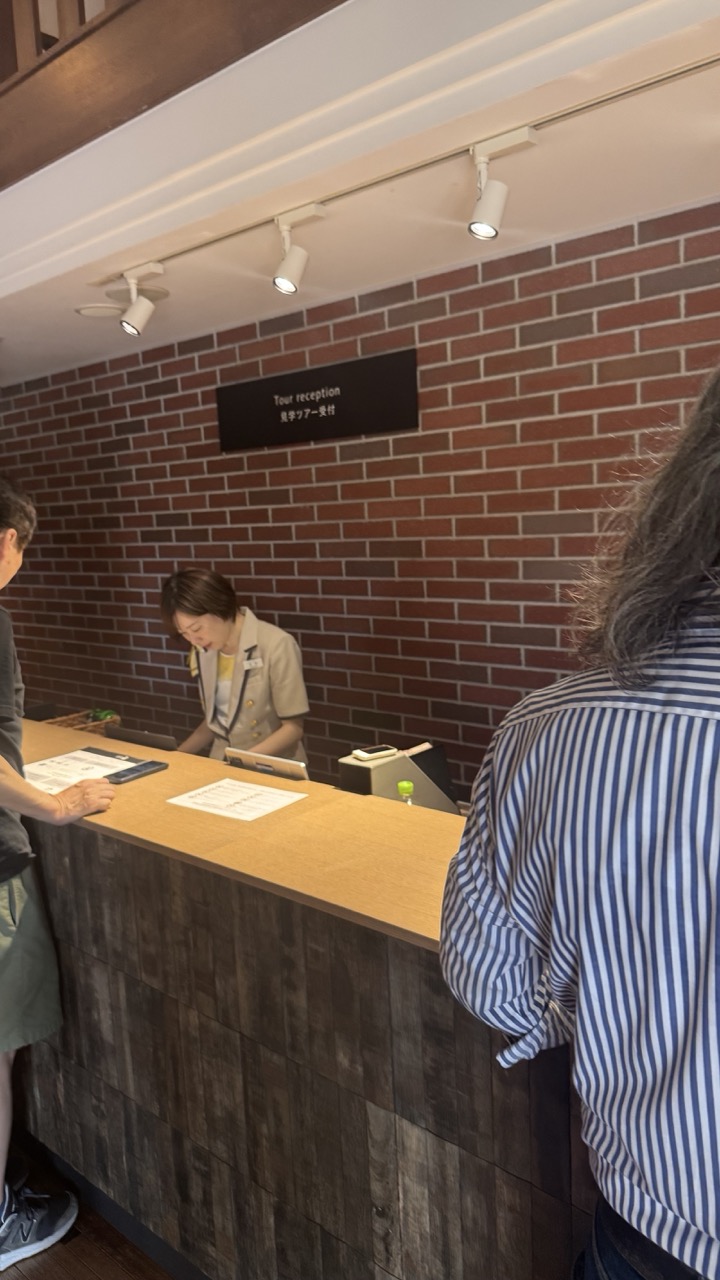

1. Overall Rating (0–10) — 6.0
This photograph captures a quiet moment at a tour reception desk, conveying a sense of routine and hospitality. The warm brick wall and natural wood counter create a welcoming atmosphere, while the candid interaction suggests authenticity. However, the image feels slightly flat and unpolished, with awkward framing and a lack of visual focus that undermines its potential to feel like a compelling narrative moment.
2. Composition (0–10) — 5.0
The framing is uneven, with partial figures on both sides creating a sense of intrusion rather than inclusion. The subject, the receptionist, is slightly off-center and partially obscured, weakening the visual hierarchy and drawing attention away from the focal point.
3. Lighting (0–10) — 6.0
The overhead track lighting provides adequate illumination, but the light is flat and functional, lacking directional warmth or shadow to add depth. The overhead glare and slight overexposure on the ceiling detract from the overall mood.
4. Color & Tone (0–10) — 6.0
The palette is grounded and natural, with earthy tones from the brick and wood creating a cohesive look. However, the colors are somewhat muted, and the lack of contrast gives the image a slightly washed-out appearance.
5. Creativity (0–10) — 5.5
The image is observational and documentary in nature, capturing a real-life moment without stylized interpretation. While it conveys a genuine atmosphere, it lacks a distinctive visual voice or conceptual twist to elevate it beyond a simple snapshot.
6. Technical Quality (0–10) — 7.0
The focus is reasonably sharp on the central subject, and the image is free from major technical flaws like blur or noise. However, the angle and framing suggest a casual, unedited capture rather than a carefully composed shot.
7. Emotional Impact (0–10) — 5.0
The scene feels familiar and relatable, but the emotional distance created by the framing and lack of dynamic lighting keeps the viewer from fully connecting with the moment. There is a sense of quiet professionalism, but little emotional resonance or storytelling depth.
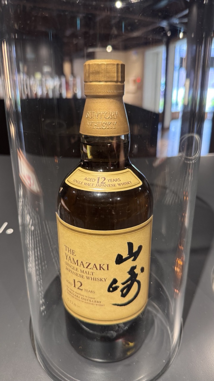

1. Overall Rating (0–10) — 7.0
This photograph presents a refined and elegant portrayal of The Yamazaki 12 Years Single Malt Japanese Whisky, capturing its premium identity through careful composition and lighting. The bottle, framed within a glass dome, exudes luxury and craftsmanship, while the soft reflections and warm tones enhance its artisanal appeal. Though the image is technically sound, it leans slightly toward commercial documentation, lacking the narrative depth to feel truly immersive.
2. Composition (0–10) — 7.5
The centered placement of the bottle within the glass dome creates a strong focal point, with the vertical lines of the label and cap guiding the eye downward. The surrounding reflections and subtle depth of field add dimension without distracting from the subject, though the background’s slight clutter slightly undermines the clean, minimalist aesthetic.
3. Lighting (0–10) — 8.0
The lighting is soft and directional, highlighting the golden hues of the label and cap while creating gentle reflections on the glass dome. The warm tone enhances the whisky’s premium character, and the exposure is well-balanced, preserving detail in both highlights and shadows.
4. Color & Tone (0–10) — 7.5
The palette is harmonious, with warm golds, deep amber, and neutral grays creating a sophisticated contrast. The golden label stands out against the darker bottle and background, while the overall tone feels rich and inviting, reinforcing the product’s luxury positioning.
5. Creativity (0–10) — 7.0
The image is conceptually strong, using the glass dome to evoke a sense of preservation and value. While the approach is standard for product photography, the attention to detail and atmospheric lighting elevate it beyond mere advertisement into a visually compelling presentation.
6. Technical Quality (0–10) — 8.5
The focus is sharp on the label and bottle, with fine detail visible in the text and texture of the glass. The image is free of noise, and the reflections are rendered clearly, indicating a high level of technical control.
7. Emotional Impact (0–10) — 7.0
The photograph conveys a sense of craftsmanship and tradition, evoking quiet appreciation for the art of whisky-making. The warm, refined aesthetic invites the viewer to pause and consider the quality and heritage behind the product, though the emotional connection remains subtle and restrained.
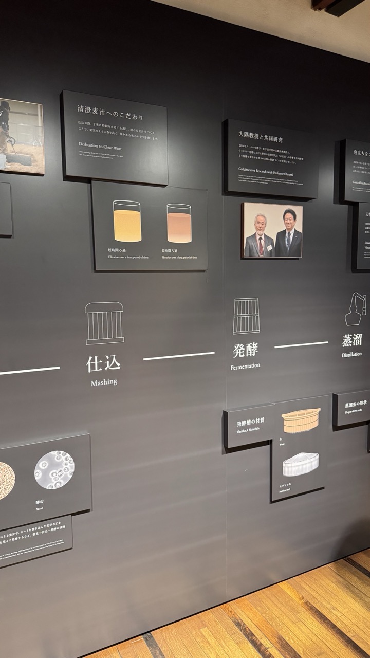

1. Overall Rating (0–10) — 7.0
This image captures the quiet precision of an educational exhibition, where information is structured with clarity and purpose. The clean layout, neutral tones, and deliberate spacing evoke a sense of scholarly restraint, emphasizing the process of sake brewing as both science and tradition. While the composition is informative and well-organized, it lacks the dynamic energy to feel visually compelling, leaning more toward functional documentation than artistic expression.
2. Composition (0–10) — 6.5
The framing is slightly off-center, with a tilted perspective that disrupts visual balance. The arrangement of panels follows a logical progression, but the asymmetry and uneven spacing create a slightly cluttered feel, especially in the upper right.
3. Lighting (0–10) — 6.0
Soft, ambient lighting highlights the wall panels without glare, but the overall illumination is flat and uniform, failing to create depth or mood. The wooden floor reflects a faint warmth, offering a subtle contrast to the cool gray wall.
4. Color & Tone (0–10) — 6.5
The monochromatic palette of dark gray and white creates a cohesive, professional tone, with subtle accents of warm beige in the rice and wooden textures. The limited color range supports clarity but sacrifices visual richness.
5. Creativity (0–10) — 6.0
The design is conceptually sound and informative, with a clear narrative flow. However, the approach is conventional and lacks bold visual or conceptual risks, making it more didactic than imaginative.
6. Technical Quality (0–10) — 7.5
The image is sharp and well-focused, with clean lines and readable text. The camera angle captures the full scope of the display without distortion, though the slight tilt suggests a casual, unrefined framing.
7. Emotional Impact (0–10) — 5.5
The image conveys respect and reverence for tradition, but its clinical presentation keeps the viewer at a distance. The emotional resonance lies in the subject matter rather than the visual execution.
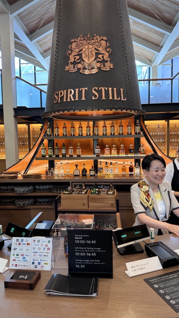

1. Overall Rating (0–10) — 7.0
This photograph captures the inviting atmosphere of a premium whisky tasting lounge, where industrial design meets warm hospitality. The towering spirit still serves as a powerful focal point, while the smiling staff member adds a human touch, making the space feel welcoming and authentic. Though the image is rich in detail and context, the composition's busyness slightly dilutes the visual impact, keeping it from feeling fully cohesive.
2. Composition (0–10) — 6.5
The central placement of the spirit still creates a strong vertical anchor, but the foreground clutter—payment signs, menus, and devices—distracts from the main subject. A tighter framing would enhance focus and improve balance.
3. Lighting (0–10) — 7.5
Warm ambient lighting highlights the wooden shelves and bottles, creating a cozy, inviting glow that contrasts nicely with the cool natural light from the windows. The lighting enhances the product display and contributes to the luxurious mood.
4. Color & Tone (0–10) — 7.0
The palette is dominated by warm browns and golds, complemented by the metallic tones of the still and the soft white of the staff’s uniform. The color harmony is strong, though the overall tone leans slightly neutral, missing a bit of vibrancy.
5. Creativity (0–10) — 7.0
The image effectively blends commercial and artistic elements, using the spirit still as both a structural and symbolic centerpiece. The narrative of craftsmanship and hospitality is clearly conveyed, with thoughtful attention to branding and atmosphere.
6. Technical Quality (0–10) — 8.0
Sharp focus and even exposure across the frame ensure clarity in both the foreground and background. The image is well-lit and free of noticeable noise, showcasing a high level of technical execution.
7. Emotional Impact (0–10) — 7.5
The warmth of the staff’s smile and the inviting interior design evoke a sense of comfort and hospitality. The image successfully conveys a welcoming environment, inviting viewers to imagine themselves enjoying a tasting experience.
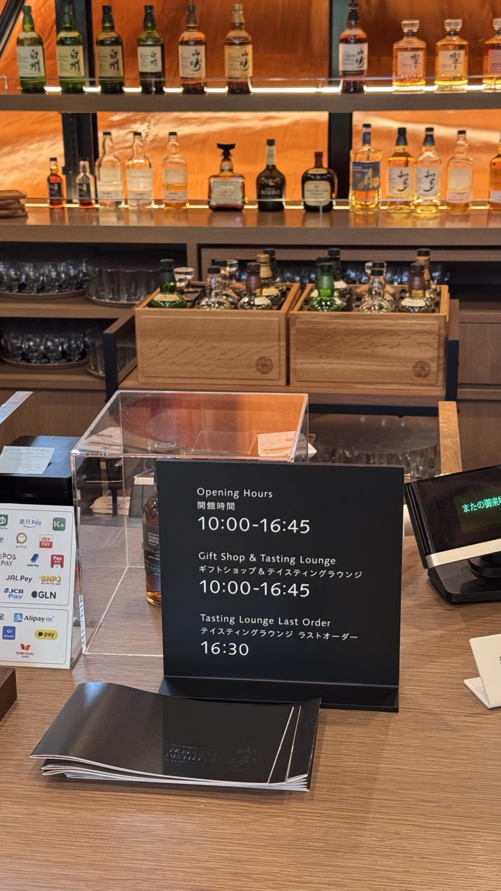

1. Overall Rating (0–10) — 7.0
This photograph presents a clean, well-organized bar or tasting lounge with a strong sense of place and branding. The warm wood tones and curated bottle display evoke a premium, inviting atmosphere, while the clear signage grounds the scene in practicality. The image succeeds in conveying both the aesthetic and functional aspects of the space, though it feels slightly staged, lacking the candid energy that might deepen its narrative.
2. Composition (0–10) — 7.5
The shot is balanced with a strong central focus on the sign, flanked by the payment options and product displays. The layered shelves create depth, and the diagonal line of bottles draws the eye upward, enhancing visual interest. The slight clutter in the foreground adds authenticity but slightly disrupts the clean symmetry.
3. Lighting (0–10) — 8.0
Warm, even lighting enhances the rich wood textures and creates a welcoming ambiance. The backlighting on the shelves accentuates the bottles, giving them a subtle glow that adds depth and highlights the product display. The overall lighting is soft and deliberate, contributing to a calm, upscale mood.
4. Color & Tone (0–10) — 7.5
The palette is cohesive, dominated by warm browns, blacks, and golds, with a restrained use of white and silver. The contrast between the dark sign and the lighter wood enhances readability while maintaining visual harmony. The color temperature supports the inviting, sophisticated tone of the space.
5. Creativity (0–10) — 7.0
The image is conceptually strong, effectively blending branding, functionality, and atmosphere. The bilingual signage adds cultural specificity, and the inclusion of modern payment options grounds the scene in contemporary reality. While not overtly experimental, the approach is thoughtful and purposeful.
6. Technical Quality (0–10) — 8.5
The focus is sharp on the sign and foreground elements, with a clear depth of field that gradually softens into the background. The image is well-exposed, with no blown highlights or lost shadows, and the camera angle is steady and intentional.
7. Emotional Impact (0–10) — 7.0
The photograph evokes a sense of quiet sophistication and curated experience, suggesting a place where visitors can relax and savor quality. The warmth of the space invites curiosity and comfort, though the lack of human presence keeps the emotional connection somewhat distant.
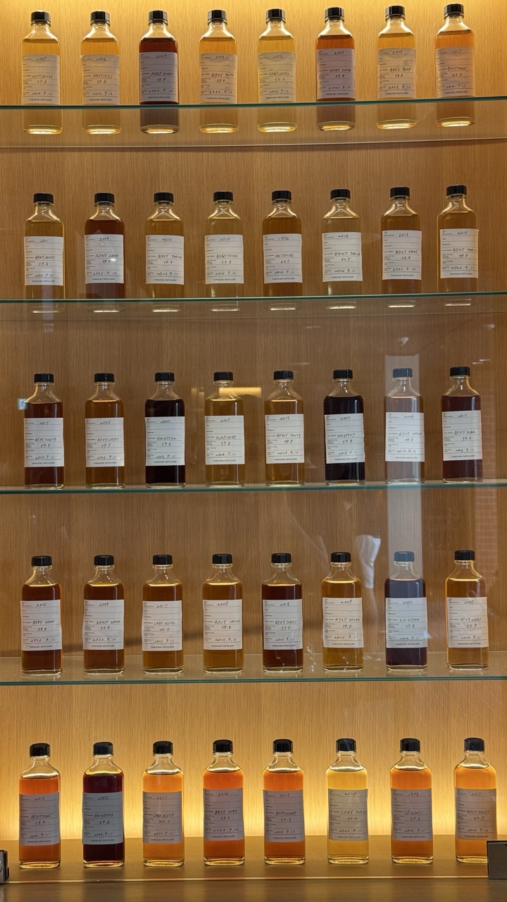

1. Overall Rating (0–10) — 7.0
This photograph presents a meticulously arranged collection of whisky samples, evoking a sense of precision and craftsmanship. The orderly rows and warm lighting create a refined, almost museum-like atmosphere, while the subtle variations in liquid color offer a quiet narrative of diversity within uniformity. The image excels in its clean composition and atmospheric depth, though it slightly lacks the emotional punch to feel truly immersive.
2. Composition (0–10) — 7.5
The vertical symmetry and grid-like arrangement of bottles create a strong sense of order and rhythm. The consistent spacing and alignment enhance visual harmony, while the slight depth provided by the glass shelves adds dimension. A tighter framing could further emphasize the repetition, but the current perspective effectively balances detail and context.
3. Lighting (0–10) — 8.0
Warm, diffused backlighting enhances the golden hues of the whisky and casts a soft glow on the wooden shelving. The lighting is even and flattering, emphasizing the clarity of the bottles and the legibility of the handwritten labels. The absence of harsh shadows contributes to the image’s calm, contemplative mood.
4. Color & Tone (0–10) — 7.5
The palette is dominated by warm amber and golden tones, with subtle variations in hue that suggest different ages and cask types. The natural wood backdrop complements the colors of the liquid, creating a cohesive and inviting aesthetic. While the tonal range is limited, it reinforces the image’s quiet, refined character.
5. Creativity (0–10) — 7.0
The concept is straightforward but effective—highlighting the beauty in repetition and subtle variation. The handwritten labels add a personal, artisanal touch, grounding the image in authenticity. While not overtly experimental, the photograph successfully conveys the quiet elegance of a whisky collection.
6. Technical Quality (0–10) — 8.5
The image is sharp and well-focused, with clean detail visible in the labels and liquid levels. The exposure is balanced, capturing both the transparency of the bottles and the warmth of the wood. The glass reflections are controlled, contributing to the image’s polished look.
7. Emotional Impact (0–10) — 6.5
The photograph evokes a sense of reverence and quiet appreciation, appealing to those with an interest in whisky or craftsmanship. While it is visually pleasing and intellectually engaging, it remains somewhat detached, allowing the viewer to observe rather than feel.
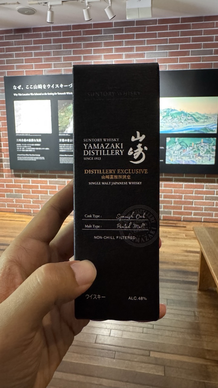

1. Overall Rating (0–10) — 6.0
This image captures a moment of quiet pride in a distillery setting, with the hand-held box of Yamazaki whisky serving as both product and personal memento. The composition is straightforward and functional, emphasizing the authenticity of the experience, though it lacks the visual dynamism to feel truly compelling. The muted tones and busy background slightly distract from the subject, but the image succeeds as a personal document of a visit to a storied distillery.
2. Composition (0–10) — 5.5
The subject is centered and clearly framed, but the hand and fingers partially obscure the lower portion of the box. The background, while thematically relevant, introduces visual clutter that competes for attention.
3. Lighting (0–10) — 6.0
Even, overhead lighting illuminates the scene without harsh shadows, allowing the details on the box to be legible. However, the flat quality of the light lacks depth and fails to highlight the texture of the packaging or the brick wall.
4. Color & Tone (0–10) — 6.5
The deep black of the box contrasts well with the warm tones of the brick and wood, creating a balanced palette. The color temperature is neutral, slightly cool, which enhances the clean, modern feel of the distillery space.
5. Creativity (0–10) — 5.5
The image is observational and narrative-driven, capturing a personal moment rather than aiming for artistic innovation. While the context adds meaning, the execution remains conventional and unremarkable in terms of visual storytelling.
6. Technical Quality (0–10) — 7.5
The focus is sharp on the box, with clear legibility of the text. The image is free from noticeable blur or noise, and the framing, while not ideal, remains clean and well-executed.
7. Emotional Impact (0–10) — 5.0
The photograph conveys a sense of quiet satisfaction and appreciation for craftsmanship, but the emotional resonance is muted by the lack of expressive composition and the impersonal quality of the setting. It feels more like a snapshot than an evocative image.
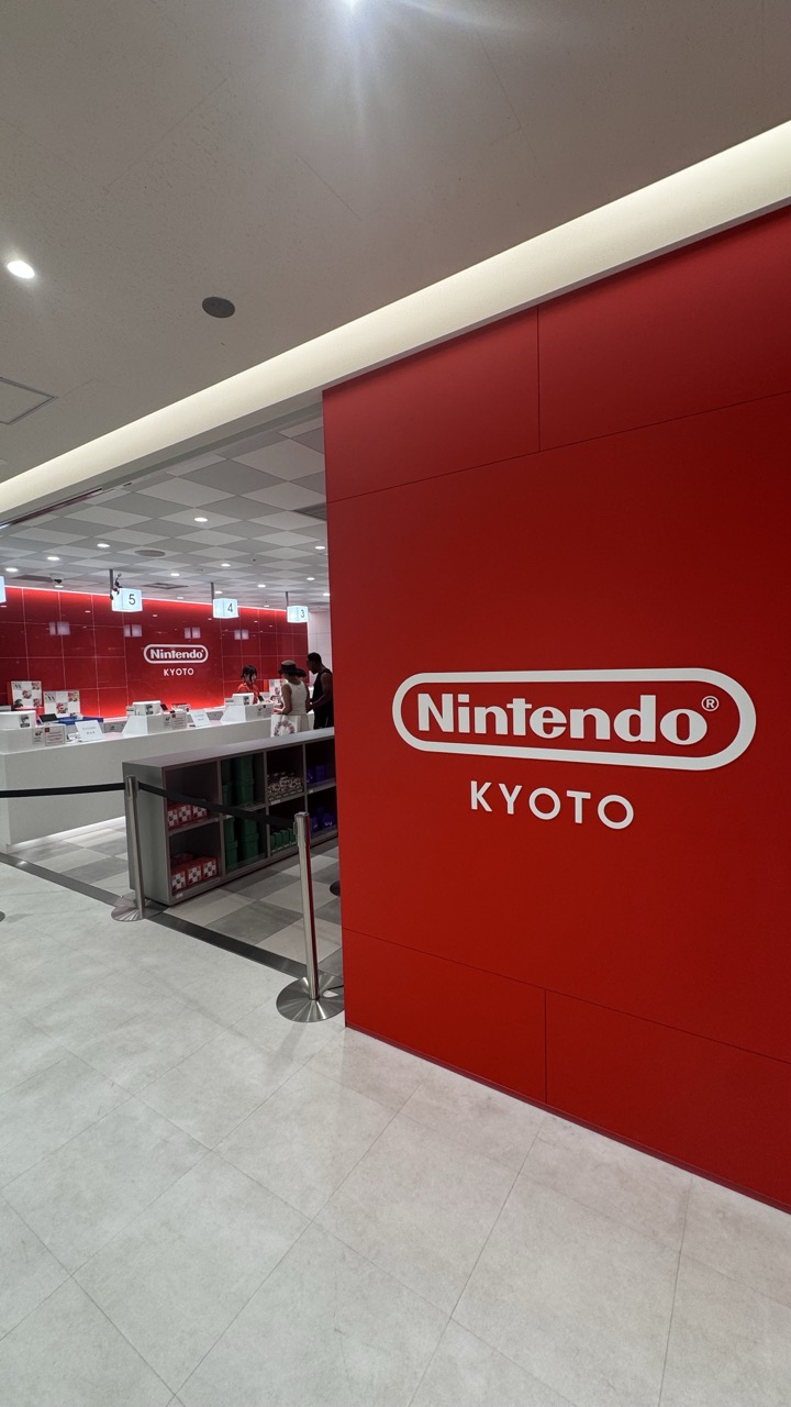

1. Overall Rating (0–10) — 7.0
This image captures the clean, energetic atmosphere of the Nintendo Kyoto store with striking visual clarity. The bold red branding dominates the frame, immediately establishing the location’s identity, while the glimpse into the retail space behind adds depth and context. While the composition is strong and the lighting is effective, the scene feels more like a straightforward documentation than a compelling narrative, slightly limiting its artistic impact.
2. Composition (0–10) — 7.5
The diagonal placement of the red wall creates a dynamic leading line that guides the eye toward the interior of the store. The framing balances the dominant logo with the visible retail environment, though the inclusion of the stanchion and floor details introduces minor visual clutter.
3. Lighting (0–10) — 8.0
Even, bright overhead lighting ensures clarity and highlights the clean architectural lines. The glow along the top of the red wall adds a subtle accent, enhancing the sense of depth without creating harsh shadows.
4. Color & Tone (0–10) — 8.5
The bold red of the Nintendo branding contrasts sharply with the neutral gray floor and white ceiling, creating a visually striking palette. The monochromatic red walls in the background reinforce brand identity, while the limited color range lends a cohesive and modern feel.
5. Creativity (0–10) — 6.5
While the image effectively communicates the setting and brand, its approach is conventional and documentary in nature. The creativity lies in the strong use of color and form, but the storytelling remains functional rather than imaginative.
6. Technical Quality (0–10) — 8.5
The image is sharp, well-focused, and free of noise. The lighting and exposure are consistent, and the clean lines of the architecture are rendered with precision.
7. Emotional Impact (0–10) — 6.0
The photograph evokes a sense of order and excitement associated with the Nintendo brand, but it remains emotionally distant. The lack of a human focal point or narrative moment keeps the viewer in a passive, observational role.
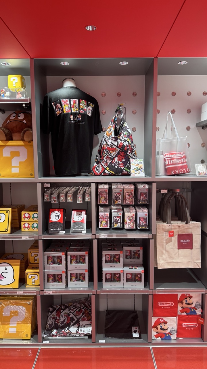

1. Overall Rating (0–10) — 7.0
This photograph captures the vibrant energy of a Nintendo-themed retail space, where playful design and brand identity converge in a visually cohesive display. The bold red ceiling and iconic yellow question blocks create an immediate sense of place, while the curated merchandise reflects the brand’s playful nostalgia. While the image successfully communicates the atmosphere of the store, its tight framing and uniform lighting slightly flatten the visual depth, preventing it from feeling truly dynamic.
2. Composition (0–10) — 7.0
The grid-like shelving provides a structured, balanced layout that guides the eye across the scene. The central t-shirt and bag serve as focal points, with surrounding products reinforcing the theme without overwhelming the composition.
3. Lighting (0–10) — 7.0
Even, overhead lighting illuminates the display clearly, ensuring all products are visible. The recessed spotlights add subtle emphasis to key items, enhancing visual hierarchy without creating harsh shadows.
4. Color & Tone (0–10) — 8.0
The dominant red and yellow hues create a strong, energetic palette that aligns perfectly with the Nintendo brand. The contrast between the bright colors and the neutral gray shelves keeps the focus on the merchandise while maintaining visual harmony.
5. Creativity (0–10) — 7.0
The display leverages recognizable branding elements—like the question blocks and Mario imagery—to create an instantly recognizable environment. The integration of character motifs into the packaging and accessories adds a layer of playful storytelling.
6. Technical Quality (0–10) — 8.0
Sharp focus and clean detail allow for clear visibility of product designs and text. The image is well-exposed, with minimal noise, showcasing the scene with clarity and precision.
7. Emotional Impact (0–10) — 7.5
The image evokes a sense of joy and nostalgia, particularly for fans of the Nintendo franchise. The familiar characters and playful design elements create an emotional connection, making the viewer feel as though they’ve stepped into a world of fun and imagination.
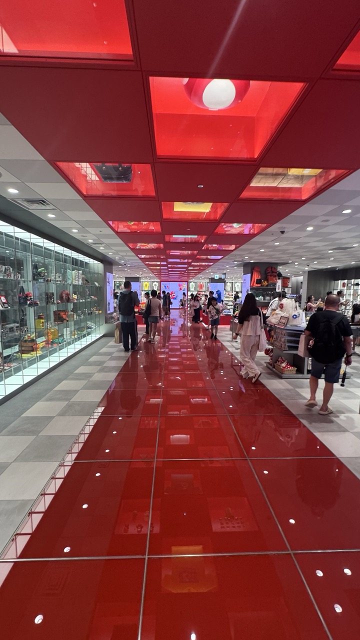

1. Overall Rating (0–10) — 7.0
This photograph captures the vibrant energy of a modern retail space, where bold red dominates both floor and ceiling to create a dynamic, immersive environment. The repetition of geometric shapes and reflections generates a sense of rhythm and movement, drawing the eye down the corridor. While the scene is visually striking and well-composed, the commercial nature of the space tempers its artistic depth, making it more a document of place than a profound visual statement.
2. Composition (0–10) — 7.5
The symmetrical perspective and strong leading lines create a powerful sense of depth, with the red floor acting as a visual guide toward the vanishing point. The placement of people adds scale and life, though some foreground elements slightly disrupt the clean geometry.
3. Lighting (0–10) — 8.0
The overhead red lighting is both functional and atmospheric, casting a warm glow that enhances the space’s identity. The combination of artificial lights and reflections on the glossy floor adds dimension and visual interest without overexposure.
4. Color & Tone (0–10) — 8.5
The dominant red creates a bold, unified palette, contrasted effectively by the neutral gray and white tiles. The tonal balance is strong, with the reflective surfaces amplifying the color’s intensity while maintaining clarity.
5. Creativity (0–10) — 7.0
The use of color and repetition is highly intentional, transforming a commercial space into a visually engaging environment. The creative approach lies in the design’s ability to turn a retail corridor into a memorable experience, though the narrative remains rooted in branding rather than personal expression.
6. Technical Quality (0–10) — 8.0
The image is sharp and well-focused, with clean lines and minimal noise. The reflections are captured with precision, showcasing a high level of technical control in both exposure and framing.
7. Emotional Impact (0–10) — 6.5
The scene evokes excitement and curiosity, drawing the viewer into the lively atmosphere. While the energy is palpable, the impersonal nature of the space limits deeper emotional resonance, leaving the viewer more impressed than moved.


1. Overall Rating (0–10) — 6.8
This photograph captures the playful charm of a Nintendo merchandise store, where nostalgia meets retail design. The oversized Toad plush takes center stage with bold, cartoonish appeal, drawing the eye through its vibrant green and expressive features. While the composition feels slightly cluttered by background items and a distant figure, the image succeeds in conveying the whimsical energy of a fan-focused space—its strength lies in its authenticity and relatability rather than formal elegance.
2. Composition (0–10) — 6.0
The framing centers on the Toad plush, but the depth of field is shallow, leaving the background slightly distracting. The diagonal shelf edge adds dynamism, though the cluttered arrangement of products and a partially visible person detracts from visual focus.
3. Lighting (0–10) — 7.5
Bright, even retail lighting highlights the plush’s texture and colors without harsh shadows. The illumination enhances the product’s appeal while maintaining clarity, though it lacks atmospheric warmth.
4. Color & Tone (0–10) — 7.0
The dominant green of the Toad plush contrasts vividly with the red mushroom and neutral store tones. The palette is lively and playful, reflecting the brand’s identity, though the overall tone remains slightly flat due to uniform lighting.
5. Creativity (0–10) — 6.5
The image captures a moment of pop culture retail with a sense of fun and recognition. While not artistically ambitious, it effectively uses familiar iconography to evoke nostalgia and connection.
6. Technical Quality (0–10) — 7.5
Sharp focus on the Toad plush ensures clear detail, and the image is free from noticeable noise. The shallow depth of field isolates the subject, though background distractions remain.
7. Emotional Impact (0–10) — 6.0
The photograph evokes a sense of childhood delight and fan enthusiasm, particularly for Mario enthusiasts. While it resonates emotionally with its target audience, the candid nature of the scene keeps the viewer at a slight remove.
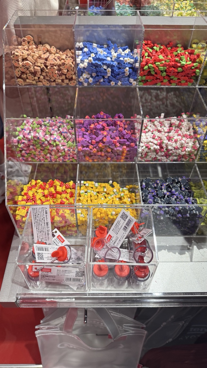

1. Overall Rating (0–10) — 6.0
This photograph captures the playful chaos of a retail display, where vibrant, miniature erasers and keychains are arranged in a grid of transparent containers. The sheer density of color and pattern creates a visually stimulating, almost overwhelming effect that speaks to consumer culture and the joy of small, tactile objects. While the image is rich in detail and color, its lack of a clear focal point and the cluttered composition slightly diminish its aesthetic cohesion, leaving it feeling more like a snapshot than a refined visual statement.
2. Composition (0–10) — 5.5
The grid layout provides structure, but the overlapping elements and cluttered foreground create visual noise. A tighter crop would improve focus and balance.
3. Lighting (0–10) — 6.0
Bright, even overhead lighting illuminates the scene clearly, but it flattens the depth and reduces the sense of dimensionality in the transparent bins.
4. Color & Tone (0–10) — 8.0
A vivid and diverse palette dominates, with bright, saturated colors that pop against the neutral background. The contrast between the individual hues enhances visual energy and captures the whimsical nature of the products.
5. Creativity (0–10) — 6.5
The image leverages the inherent playfulness of the subject matter, but the approach is observational rather than interpretive—more documentation than artistic exploration.
6. Technical Quality (0–10) — 7.5
Sharp focus and clean detail are evident throughout, particularly in the foreground elements. The clarity of the labels and QR codes adds to the image’s precision.
7. Emotional Impact (0–10) — 5.0
While the colors evoke a sense of fun and nostalgia, the image feels more like a catalog shot than an emotionally resonant piece. The viewer is invited to observe, but not to feel.
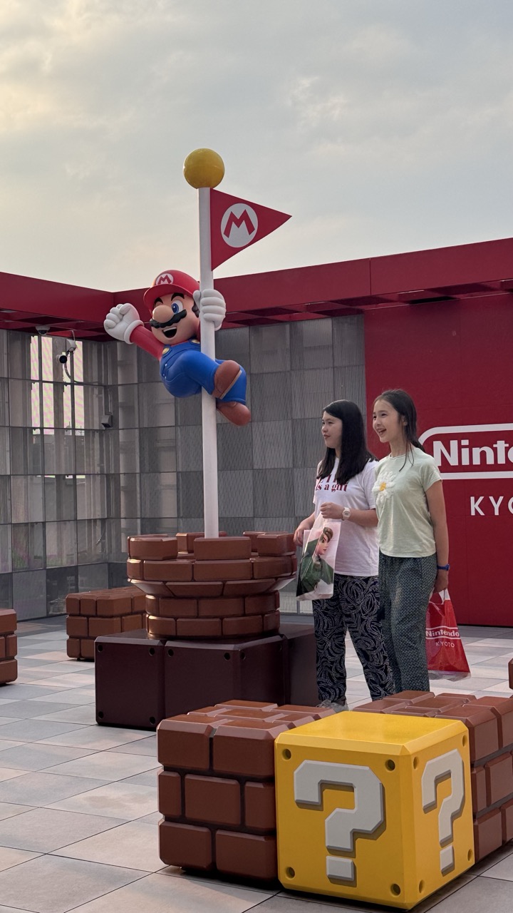

1. Overall Rating (0–10) — 6.8
This photograph captures the playful energy of a themed attraction, where pop culture and real-world interaction converge in a vibrant, nostalgic setting. The oversized Mario figure and iconic game elements create an immediate sense of joy and recognition, while the two girls’ genuine smiles lend warmth and authenticity. Though the image is slightly overexposed and compositionally uneven, it effectively conveys the excitement of a fan experience, balancing whimsy with candid human connection.
2. Composition (0–10) — 6.0
The framing feels slightly off-center, with the Mario figure positioned too high and the foreground blocks dominating the lower right. A tighter crop would better balance the visual weight and draw focus to the subjects and their interaction with the environment.
3. Lighting (0–10) — 6.5
The soft, diffused light from the overcast sky evenly illuminates the scene, minimizing harsh shadows and allowing the colors to pop. However, the flat lighting reduces depth and dimension, giving the image a slightly washed-out quality.
4. Color & Tone (0–10) — 7.5
The bold reds, yellows, and blues of the Mario-themed elements stand out vividly against the neutral pavement and muted sky. The color palette is energetic and faithful to the source material, enhancing the playful tone of the scene.
5. Creativity (0–10) — 7.0
The image leverages a strong pop culture reference in a real-world setting, creating a fun, narrative-driven moment. The juxtaposition of familiar game icons with real people adds a layer of creativity, though it remains a straightforward documentary-style capture.
6. Technical Quality (0–10) — 7.0
The image is sharp and well-focused, with clean detail on the subjects and props. The exposure is mostly balanced, though slight overexposure in the sky reduces some detail in the upper portion.
7. Emotional Impact (0–10) — 7.5
The genuine smiles of the two girls and their engagement with the Mario figure evoke a sense of wonder and childhood joy. The image resonates emotionally by capturing a fleeting moment of delight in a shared cultural experience.
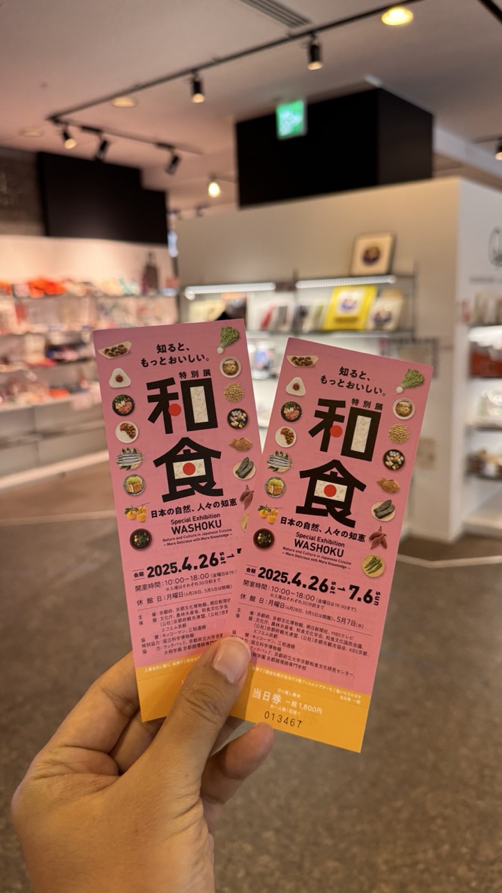

1. Overall Rating (0–10) — 6.0
This photograph captures a candid moment of cultural engagement, with the hand-held tickets for a Japanese exhibition serving as both subject and narrative device. The focus on the vibrant pink tickets contrasts with the softly blurred gallery background, creating a sense of personal experience within a public space. While the image successfully conveys the context of a visit, its composition and lighting feel more documentary than artistic, lacking the visual polish to elevate it beyond a simple souvenir snapshot.
2. Composition (0–10) — 6.0
The tickets are centered and clearly legible, but the framing feels slightly off-kilter, with the hand entering from the lower left and creating an asymmetrical balance. The background shelves, while adding context, are too out of focus to contribute meaningfully to the visual depth.
3. Lighting (0–10) — 6.5
The indoor lighting is functional and even, typical of a museum or gallery space. It illuminates the tickets well without harsh shadows, though the overhead spotlights create a slight glare and a yellowish cast that flattens the image’s tonal range.
4. Color & Tone (0–10) — 7.0
The dominant pink of the tickets provides a bold visual anchor, complemented by the warm yellow accents and the neutral background tones. The color palette is cohesive and culturally resonant, though the lack of dynamic contrast slightly dulls the overall vibrancy.
5. Creativity (0–10) — 6.0
The image relies on a familiar concept—visiting an exhibition—rather than presenting a unique visual interpretation. The choice to focus on the tickets as the main subject suggests a personal, reflective intent, but the execution remains conventional and literal.
6. Technical Quality (0–10) — 7.5
The focus is sharp on the tickets, with clear legibility of text and design elements. The depth of field is appropriately shallow, isolating the subject from the background. The image is free of noticeable noise or distortion, suggesting good camera control.
7. Emotional Impact (0–10) — 5.5
There is a quiet sense of anticipation and personal connection in the image, as if capturing a memory before the experience begins. However, the lack of emotional intensity or narrative depth keeps the viewer at a distance, making the moment feel more transactional than meaningful.
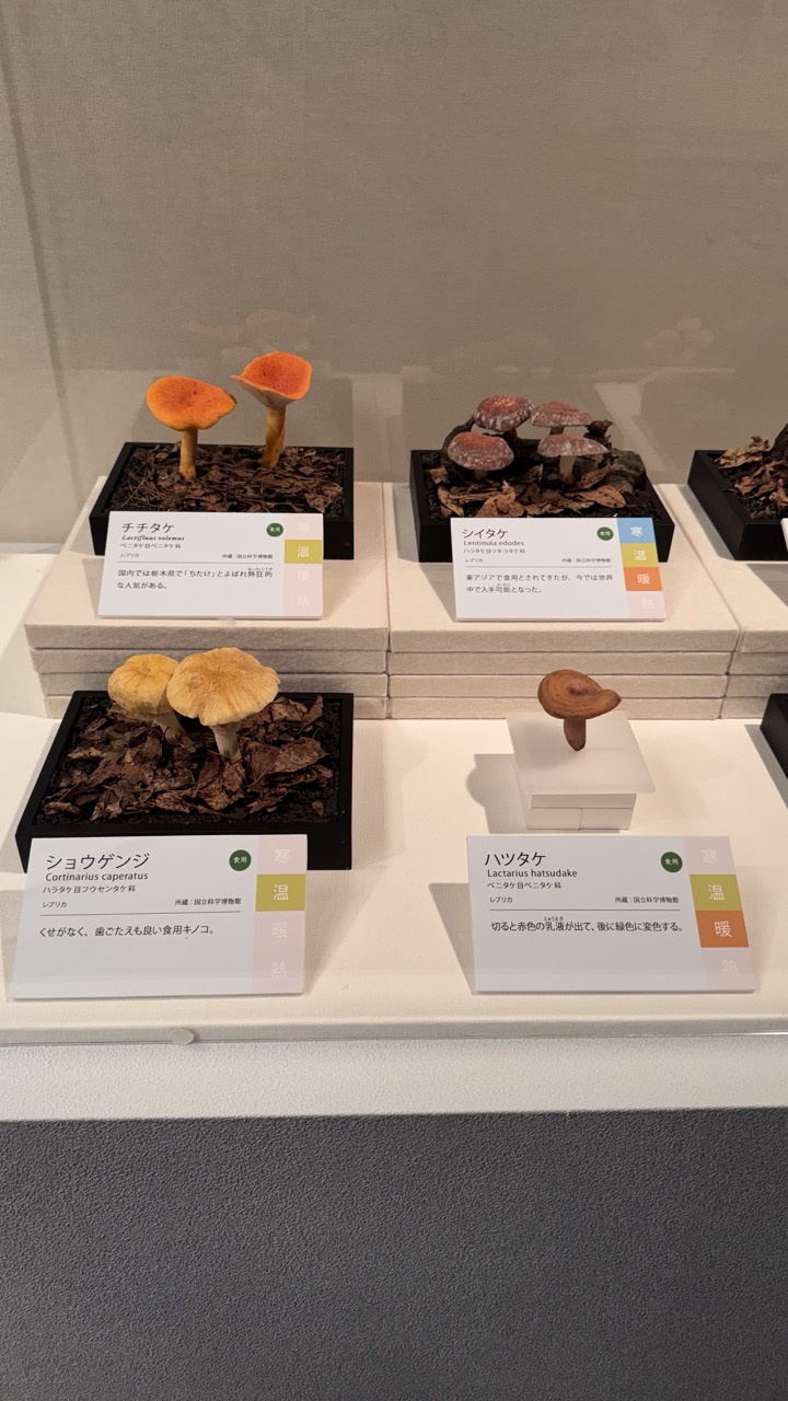

1. Overall Rating (0–10) — 7.0
This photograph presents a clean, educational display of fungi specimens, capturing the quiet precision of a museum exhibit. The arrangement emphasizes clarity and scientific detail, with each specimen carefully labeled and set against a neutral backdrop. While the image is informative and well-organized, it lacks the visual dynamism to evoke strong emotional engagement—its strength lies in documentation rather than artistry.
2. Composition (0–10) — 7.5
The balanced, symmetrical layout creates a sense of order, with the four specimens evenly distributed across the display. The use of tiered platforms adds depth and guides the eye across the frame. A slightly tighter crop could enhance focus, but the overall framing effectively captures the full context of the exhibit.
3. Lighting (0–10) — 8.0
Even, diffused lighting illuminates the specimens clearly without harsh shadows, allowing the natural textures and colors of the fungi to stand out. The soft illumination enhances the educational tone of the display and supports accurate visual identification.
4. Color & Tone (0–10) — 7.0
The palette is restrained, dominated by earthy browns, muted whites, and the subtle pops of orange and red from the fungi. While the colors are natural and appropriate for the subject, they lack vibrancy, contributing to a somewhat clinical atmosphere.
5. Creativity (0–10) — 6.5
The approach is functional and observational, prioritizing clarity over artistic expression. The use of layered platforms and uniform presentation demonstrates thoughtful curation, but the image remains largely conventional in its execution.
6. Technical Quality (0–10) — 8.0
The image is sharp and well-focused, with clean details visible in both the fungi and the text on the placards. There is minimal noise, and the exposure is balanced, ensuring that all elements are clearly rendered.
7. Emotional Impact (0–10) — 5.5
The photograph conveys a sense of quiet curiosity and scientific wonder, but it maintains a detached, objective tone. While it invites study and contemplation, it does not strongly resonate on an emotional level, keeping the viewer in the role of observer rather than participant.
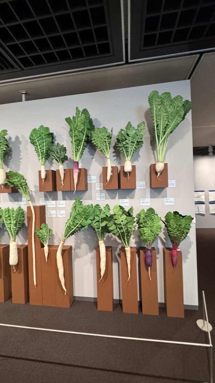

1. Overall Rating (0–10) — 6.0
This photograph captures a curated display of root vegetables, evoking a sense of agricultural diversity and quiet order. The arrangement is methodical and visually engaging, with the variety of shapes and colors offering a subtle rhythm across the wall. While the image effectively communicates its subject—likely an exhibit on heirloom or regional produce—it feels more like a straightforward documentation than a compelling artistic statement. The sterile gallery lighting and slightly off-center framing keep the viewer at a distance, preventing deeper emotional engagement.
2. Composition (0–10) — 6.0
The composition is balanced with a horizontal alignment of vegetables, but the uneven spacing and partial framing of the left edge create a slight visual imbalance. The low angle and visible railing in the foreground distract from the central focus, which is the orderly display of produce.
3. Lighting (0–10) — 5.5
The lighting is functional and even, typical of a museum or exhibition space, but it lacks directionality or warmth. The overhead illumination flattens the textures and shadows, reducing the visual richness of the green leaves and earth-toned roots.
4. Color & Tone (0–10) — 6.5
The palette is harmonious, with the earthy brown of the pedestals complementing the white and purple roots and vibrant green foliage. However, the overall tone is muted, with a neutral white wall and subdued lighting that dampen the natural vibrancy of the vegetables.
5. Creativity (0–10) — 6.0
The display itself is creative—presenting vegetables as art objects on individual plinths—but the photograph fails to fully capture the conceptual intent. The lack of a dynamic angle or narrative framing limits its expressive potential, making it feel more like a record than a reinterpretation.
6. Technical Quality (0–10) — 7.0
The image is sharp and well-focused, with clean detail on the vegetables and labels. The exposure is correct, and there is no noticeable noise, indicating strong technical execution despite compositional limitations.
7. Emotional Impact (0–10) — 5.5
The image conveys a quiet appreciation for agricultural diversity and human cultivation, but its clinical presentation and lack of emotional contrast prevent a deeper resonance. The viewer is informed but not moved.
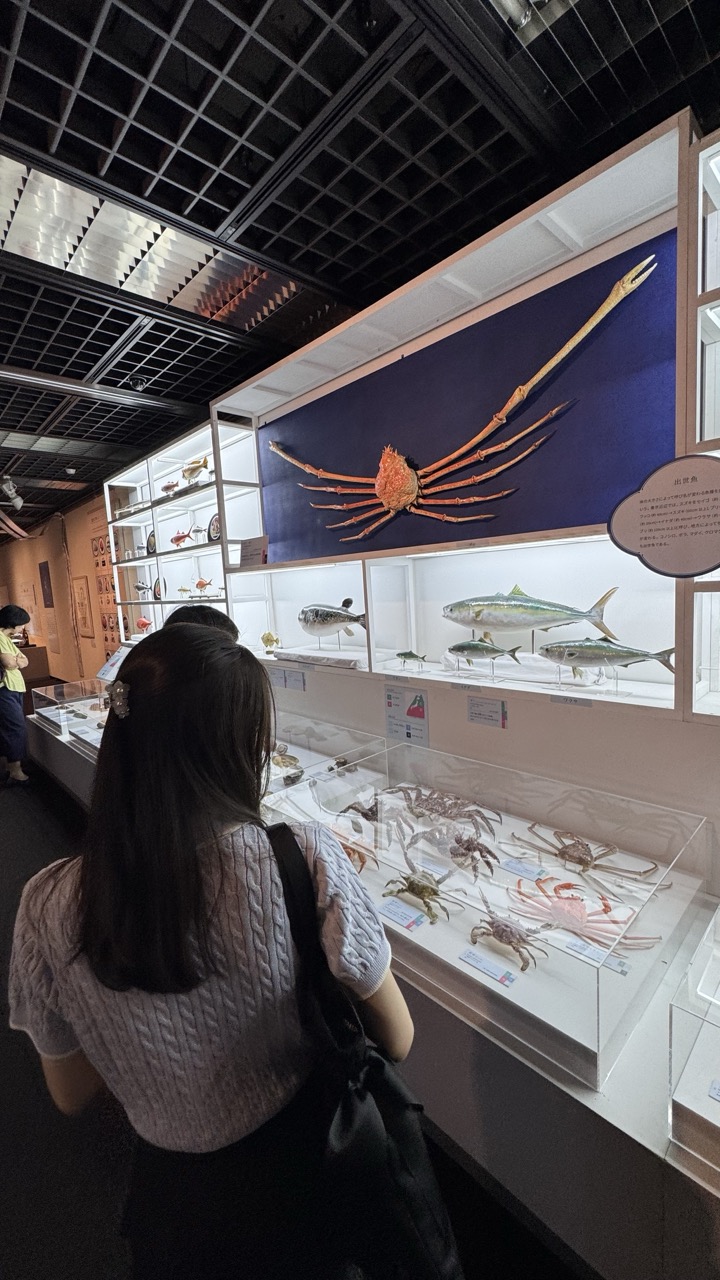

1. Overall Rating (0–10) — 6.8
This photograph captures a quiet, contemplative moment in a natural history exhibit, where the interplay between human curiosity and scientific display creates a sense of discovery. The subject’s back turned toward the viewer draws us into the scene, inviting us to share in the experience of observing marine life. While the lighting and composition are functional, they lack a compelling visual rhythm, and the overall mood feels more observational than emotionally resonant.
2. Composition (0–10) — 6.5
The framing places the viewer behind the subject, creating a sense of inclusion in the scene. The diagonal line of the display case and the upward gaze toward the mounted crab create visual movement, though the composition is slightly unbalanced due to the cluttered background and uneven spacing of elements.
3. Lighting (0–10) — 6.0
The overhead fluorescent lighting provides even illumination, ensuring clarity of the specimens, but it flattens the scene and suppresses atmospheric depth. The reflective ceiling adds visual noise, detracting from the focus on the exhibits.
4. Color & Tone (0–10) — 6.5
The palette is dominated by cool whites and grays from the display cases, contrasted with the deep blue background and warm tones of the crab. While the colors are accurate, the overall tone feels sterile, lacking the richness needed to elevate the visual experience.
5. Creativity (0–10) — 6.0
The image is grounded in documentary realism, capturing a genuine moment in a museum setting. However, it lacks a distinctive artistic vision—its strength lies in its narrative context rather than in innovative framing or interpretation.
6. Technical Quality (0–10) — 7.5
The focus is sharp, particularly on the foreground subject and the display cases. The image is well-exposed with minimal noise, and the details of the specimens are clearly visible, indicating strong technical execution.
7. Emotional Impact (0–10) — 5.5
The photograph evokes a sense of quiet wonder and intellectual engagement, but the lack of emotional depth or personal connection limits its resonance. The viewer is an observer rather than an emotional participant.
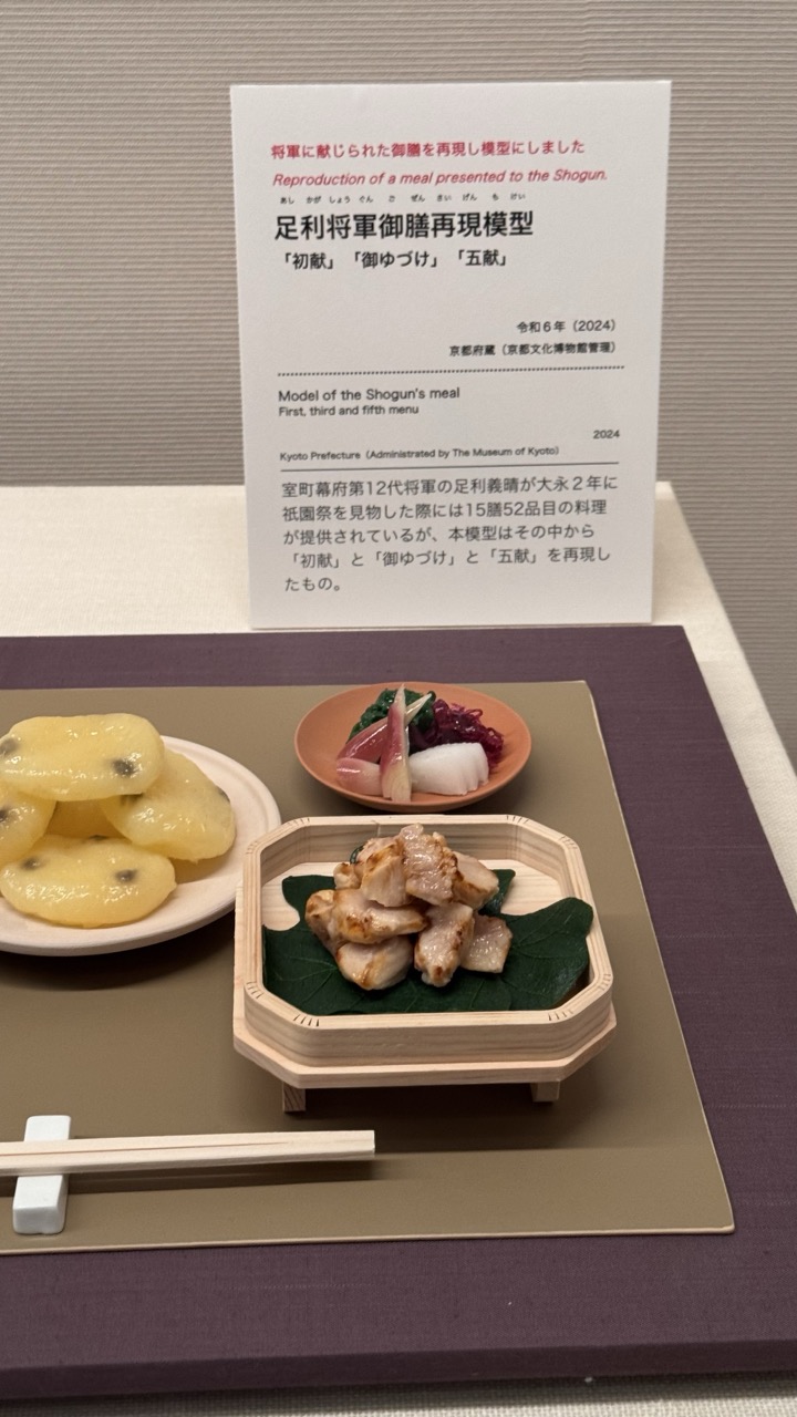

1. Overall Rating (0–10) — 7.0
This photograph presents a meticulously crafted reproduction of a Shogun’s meal, capturing the elegance and historical weight of a bygone era. The careful arrangement of food and the informative placard combine to create a narrative that is both educational and visually respectful. While the composition is deliberate and clean, the lighting and color palette slightly dull the vibrancy of the dishes, holding back the full emotional resonance of the scene.
2. Composition (0–10) — 7.5
The arrangement balances the food items and the sign with a sense of purposeful asymmetry. The diagonal placement of the chopsticks and the layered depth created by the plates and placard guide the eye naturally through the scene, emphasizing both the meal and its historical context.
3. Lighting (0–10) — 6.0
The lighting is even and functional, suitable for a museum display, but it lacks warmth and directional depth. The flat, diffuse light flattens the textures of the food and gives the scene a sterile, documentary quality rather than a rich, atmospheric presence.
4. Color & Tone (0–10) — 6.5
The palette is subdued, dominated by earthy browns, soft yellows, and muted purples, which reflect the traditional Japanese aesthetic. While harmonious, the colors feel slightly washed out, reducing the visual appeal of the food’s textures and natural tones.
5. Creativity (0–10) — 7.0
The image successfully blends historical documentation with artistic presentation. Replicating a meal from the Shogun era in this way is conceptually strong, transforming a simple food display into a cultural artifact, though the execution leans more toward accuracy than expressive innovation.
6. Technical Quality (0–10) — 8.0
The image is sharp and well-focused, with clear detail in both the food and the text. The depth of field is appropriately managed, keeping the foreground elements crisp while allowing the background sign to remain legible without distraction.
7. Emotional Impact (0–10) — 6.5
The photograph evokes a sense of reverence and curiosity, inviting the viewer to imagine the lives of those who once dined in such splendor. However, the clinical presentation and lack of dramatic lighting prevent a deeper emotional connection, leaving the viewer more informed than moved.
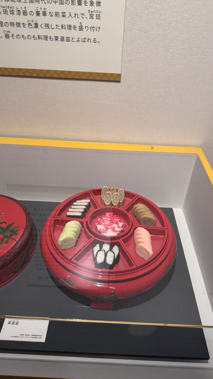

1. Overall Rating (0–10) — 6.0
This photograph captures a traditional Japanese bento-style dish displayed in a museum setting, emphasizing cultural heritage through its meticulous arrangement and vibrant colors. The composition is functional and informative, but the reflective glass and surrounding signage create visual distractions that diminish its aesthetic impact. While the subject is rich in cultural detail, the framing feels more like a documentation than an artistic statement, lacking a compelling narrative beyond its factual presentation.
2. Composition (0–10) — 5.5
The circular red tray is centrally framed, creating a balanced focal point, but the inclusion of the exhibit label, glass reflections, and background signage disrupts visual harmony. The tight crop feels slightly awkward, with too much emphasis on the surrounding display elements.
3. Lighting (0–10) — 6.0
Even, diffused lighting highlights the colors of the food and the red tray without harsh shadows, though the reflective surface of the glass introduces glare and slightly mutes the overall clarity.
4. Color & Tone (0–10) — 6.5
The rich red of the tray and the soft pastels of the food create a pleasing contrast against the neutral background. The color palette is culturally resonant, though the overall tone feels slightly flat due to the lighting and reflections.
5. Creativity (0–10) — 6.0
The subject matter—traditional Japanese cuisine in a museum exhibit—is inherently evocative, but the photograph approaches it with a straightforward, documentary style. There is little visual innovation or interpretive flair.
6. Technical Quality (0–10) — 7.0
The image is sharp and well-focused, with clear details in the food and tray. However, the reflections on the glass and the slightly cluttered foreground reduce the overall technical refinement.
7. Emotional Impact (0–10) — 5.5
The image conveys a sense of cultural appreciation and tradition, but the distance created by the display case and signage prevents a deeper emotional connection. It feels more informative than moving.
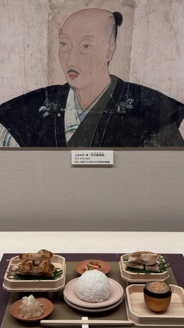

1. Overall Rating (0–10) — 7.0
This photograph presents a compelling juxtaposition between historical art and modern culinary tradition, creating a narrative that bridges time and culture. The portrait of the samurai, solemn and meticulously rendered, looms over a carefully arranged meal that echoes the aesthetics of traditional Japanese dining. While the composition is rich in context, the visual balance is slightly disrupted by the placement of the label and the clutter of the food items, which compete for attention. Still, the image succeeds in evoking a sense of continuity and reverence for heritage.
2. Composition (0–10) — 6.0
The subject is split between the upper historical painting and the lower food display, creating a vertical divide. The label and various plates occupy the lower half, leading to a cluttered foreground that distracts from the central narrative.
3. Lighting (0–10) — 7.0
The lighting is even and neutral, typical of a museum setting, which preserves the details of both the painting and the food without casting harsh shadows. The soft illumination enhances the texture of the paper and the rice.
4. Color & Tone (0–10) — 6.5
The palette is subdued and restrained, dominated by earth tones and muted blacks and whites. While the rice and green garnishes provide subtle pops of color, the overall tone leans toward clinical, which may diminish the warmth of the scene.
5. Creativity (0–10) — 7.5
The conceptual pairing of a historical portrait with a traditional meal is imaginative and thoughtfully curated. The image suggests a dialogue between past and present, inviting viewers to consider cultural continuity in a modern context.
6. Technical Quality (0–10) — 8.0
The image is sharp and well-focused, with clear details visible in both the painting and the food. The depth of field is appropriate, capturing the entire scene with clarity.
7. Emotional Impact (0–10) — 6.5
The image conveys a quiet reverence for tradition and history, but the emotional resonance is held back by the clinical presentation. The viewer is more likely to appreciate the intellectual connection than feel a deep emotional pull.
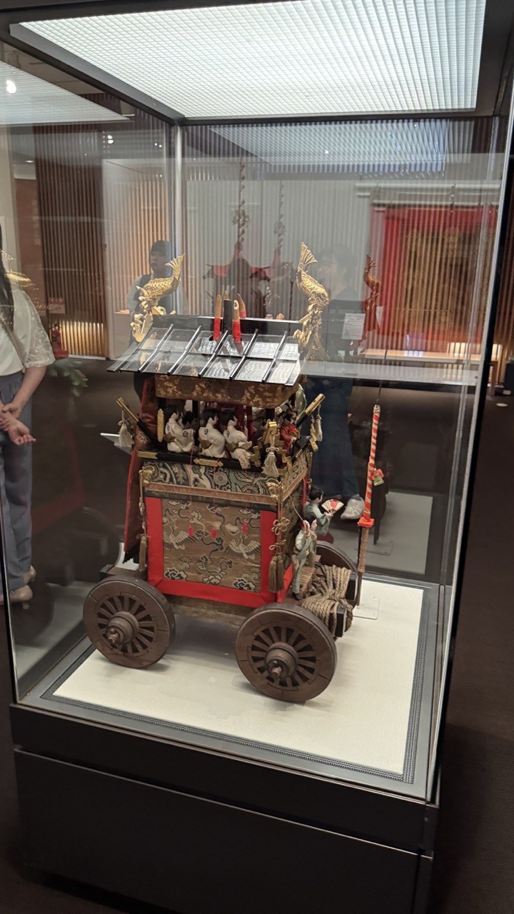

1. Overall Rating (0–10) — 6.8
This photograph captures a traditional Japanese festival float displayed in a museum setting, where cultural heritage is preserved with meticulous detail. The intricate craftsmanship of the miniature cart—adorned with ornate carvings, golden embellishments, and symbolic figures—stands out against the modern, minimalist backdrop of the gallery. While the image effectively conveys the artistry of the object, reflections in the glass and a slightly cluttered environment detract from the visual clarity and emotional focus.
2. Composition (0–10) — 6.0
The subject is centrally framed, but reflections of the surrounding space and visitors obscure parts of the display. A more deliberate angle or lighting control would reduce distractions and sharpen the focus on the float.
3. Lighting (0–10) — 6.5
Even, diffused overhead lighting illuminates the object clearly, but the glass case creates glare and reflection, diminishing the visibility of finer details. The lighting is functional rather than atmospheric.
4. Color & Tone (0–10) — 7.0
The warm reds, golds, and deep wood tones of the float contrast with the neutral gray and black of the display case, creating visual interest. The palette is rich and culturally resonant, though slightly muted by reflections and ambient lighting.
5. Creativity (0–10) — 6.5
The image captures a moment of cultural preservation, but its approach is documentary rather than interpretive. The juxtaposition of tradition and modernity offers subtle narrative potential, though it remains underexplored.
6. Technical Quality (0–10) — 7.5
The image is sharp and well-focused, with clean detail visible in the textures of the wood, fabric, and metalwork. The camera’s resolution and depth of field are adequate for capturing the intricacies of the exhibit.
7. Emotional Impact (0–10) — 6.0
The photograph evokes a sense of reverence for tradition and craftsmanship, but the reflections and lack of a strong compositional narrative keep the viewer at a distance, preventing deeper emotional engagement.
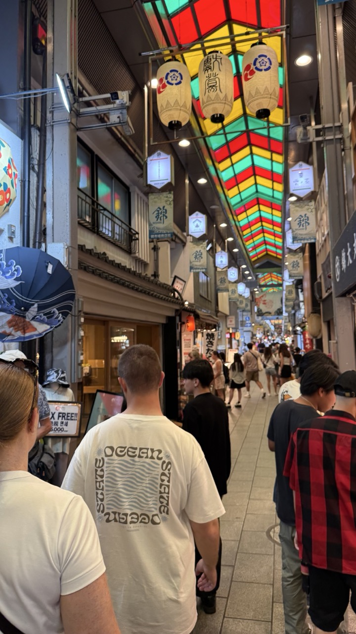

1. Overall Rating (0–10) — 7.0
This photograph captures the vibrant energy of a traditional Japanese shopping arcade, where modern life flows beneath a kaleidoscopic canopy of lanterns and stained glass. The composition draws the viewer into the bustling alley, with a mix of local culture and tourist presence creating a dynamic, lived-in atmosphere. While the image feels slightly overexposed and cluttered, the rich color and layered details give it a compelling sense of place and movement.
2. Composition (0–10) — 7.0
The perspective from behind the crowd creates a strong sense of immersion, guiding the eye down the narrow passage toward the glowing overhead canopy. The central alignment of the path and the repeating lanterns provide visual rhythm, though the left-side umbrella and signage slightly disrupt balance.
3. Lighting (0–10) — 6.5
The overhead lanterns and stained glass create a warm, festive glow, contrasting with the cooler, artificial lighting of the surrounding buildings. While the ambient light is adequate, some areas of the frame appear slightly overexposed, softening the detail in the brightest zones.
4. Color & Tone (0–10) — 8.0
The rich, saturated colors of the stained glass roof and the traditional lanterns stand out vividly against the more neutral tones of the pavement and buildings. The palette feels festive and alive, with warm yellows, reds, and greens creating a sense of celebration and cultural vibrancy.
5. Creativity (0–10) — 7.5
The photographer captures a moment of everyday life with a strong sense of place, using the unique architectural elements of the covered walkway as a natural frame. The blend of tradition and modernity—seen in the clothing, signage, and lighting—adds depth and storytelling potential.
6. Technical Quality (0–10) — 7.0
The image is sharp and well-focused, with clear detail in the foreground subjects and background elements. However, slight overexposure in the highlights and minor noise in the darker areas reduce overall technical polish.
7. Emotional Impact (0–10) — 7.5
The photograph evokes a sense of wonder and exploration, inviting the viewer to imagine walking through the alley themselves. The combination of cultural richness and human activity creates a feeling of connection to a living, breathing community.
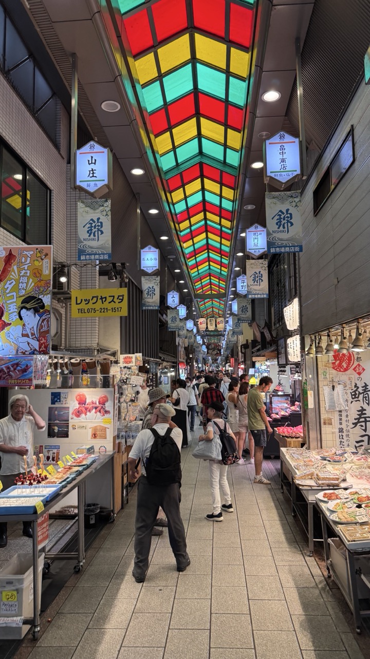

1. Overall Rating (0–10) — 8.0
This photograph captures the vibrant energy of a bustling Japanese market alley, where tradition and commerce collide beneath a dazzling canopy of stained glass. The rich colors and dynamic crowd create a sense of movement and cultural authenticity, while the strong perspective draws the eye deep into the scene. While the visual density risks overwhelming the viewer, the image succeeds in conveying both the sensory richness and architectural charm of the space.
2. Composition (0–10) — 8.5
The strong leading lines of the corridor and the overhead stained-glass ceiling create a powerful sense of depth and symmetry. The placement of the figures guides the eye naturally toward the vanishing point, while the overhead signage adds layers of visual interest without distracting from the central axis.
3. Lighting (0–10) — 7.5
The overhead fluorescent lights provide even illumination, but the stained-glass ceiling introduces a dynamic play of color and soft diffusion that enhances the mood. The interplay of artificial light and colored glass gives the scene a warm, theatrical glow, though some areas remain slightly underlit.
4. Color & Tone (0–10) — 9.0
The palette is striking—vibrant reds, yellows, and greens from the ceiling contrast beautifully with the neutral tones of the tiled floor and walls. The color harmony is intentional and evocative, with the bright signage and food displays adding splashes of warmth and life.
5. Creativity (0–10) — 8.0
The photograph leverages both architectural and cultural elements to create a narrative of place and daily life. The choice to emphasize the ceiling’s design as a framing device adds a creative, almost painterly quality to the scene.
6. Technical Quality (0–10) — 8.0
The image is sharp and well-focused, with clean details visible in both the foreground and background. The wide-angle lens is used effectively to capture the full scale of the alley without excessive distortion.
7. Emotional Impact (0–10) — 8.5
The photograph evokes a sense of wonder and immersion, inviting the viewer to step into the lively rhythm of the market. The combination of color, motion, and cultural detail fosters a strong emotional connection to place and tradition.
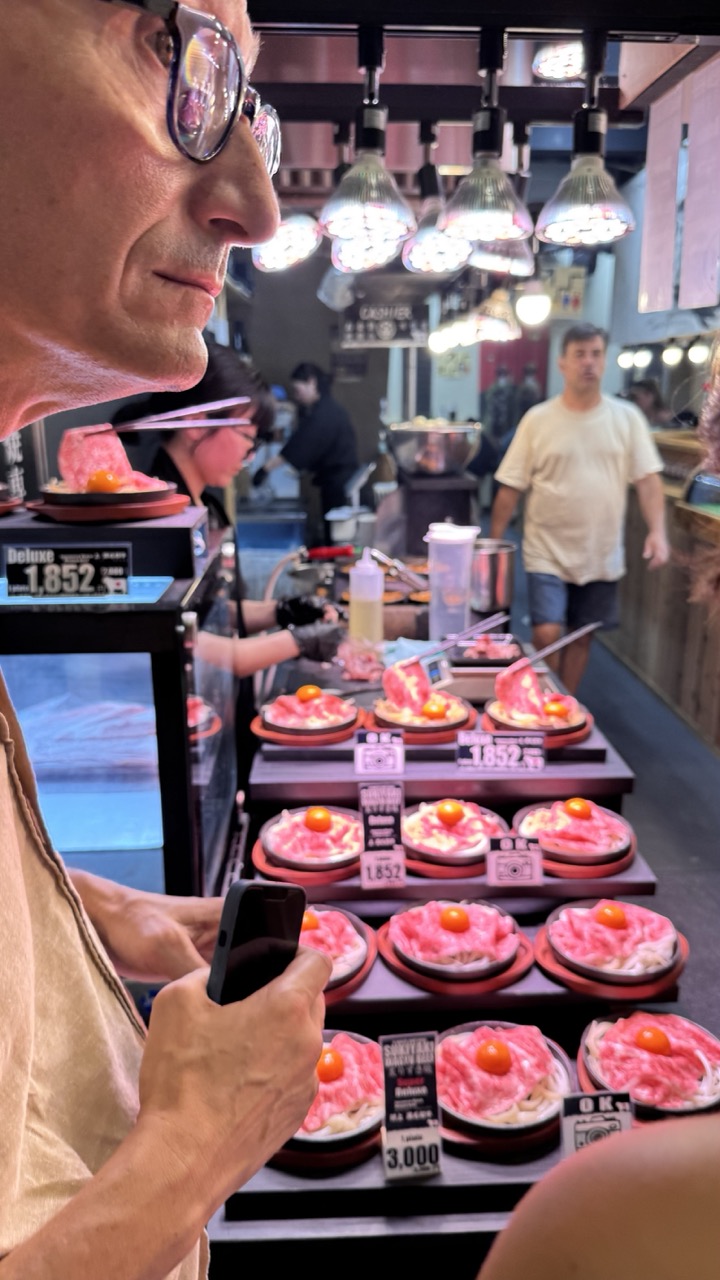

1. Overall Rating (0–10) — 6.8
This photograph captures the vibrant, sensory energy of a bustling Japanese yakiniku restaurant, where the interplay of light, texture, and human presence creates a compelling sense of place. The man in the foreground, absorbed in his phone, offers a personal lens into the experience, while the array of raw meat dishes and warm overhead lights evoke the ritual of dining. Though the image is rich in detail, the depth of field and framing slightly undermine its compositional cohesion, preventing it from fully transcending a snapshot into a more refined visual narrative.
2. Composition (0–10) — 6.0
The tight framing and diagonal placement of the man’s profile create a dynamic entry point, but the cluttered background and uneven depth of field dilute focus. A more deliberate composition would better guide the eye through the layers of activity.
3. Lighting (0–10) — 7.5
The warm, overhead incandescent lights create an inviting glow that highlights the glistening meat and enhances the scene’s intimacy. While slightly harsh in some areas, the lighting effectively establishes the mood of a lively, late-night eatery.
4. Color & Tone (0–10) — 7.0
The rich reds of the raw meat contrast strikingly with the neutral tones of the restaurant interior, while the warm yellow light lends a golden hue that enhances the appetizing quality of the food. The overall palette is balanced, though slightly oversaturated in the midtones.
5. Creativity (0–10) — 7.0
The image successfully blends documentary realism with subtle storytelling, capturing a fleeting moment of everyday life in a culturally specific setting. The juxtaposition of personal distraction and communal dining adds narrative depth.
6. Technical Quality (0–10) — 7.5
Sharp focus on the foreground subject and phone, with a shallow depth of field that softly blurs the background, demonstrates competent technical execution. The image is clear and well-exposed, though minor noise is visible in the darker areas.
7. Emotional Impact (0–10) — 6.5
The photograph evokes a sense of immersion and curiosity, inviting the viewer to imagine the sizzle of the grill and the taste of the meat. While emotionally engaging, the detachment of the main subject slightly limits the connection to the viewer.
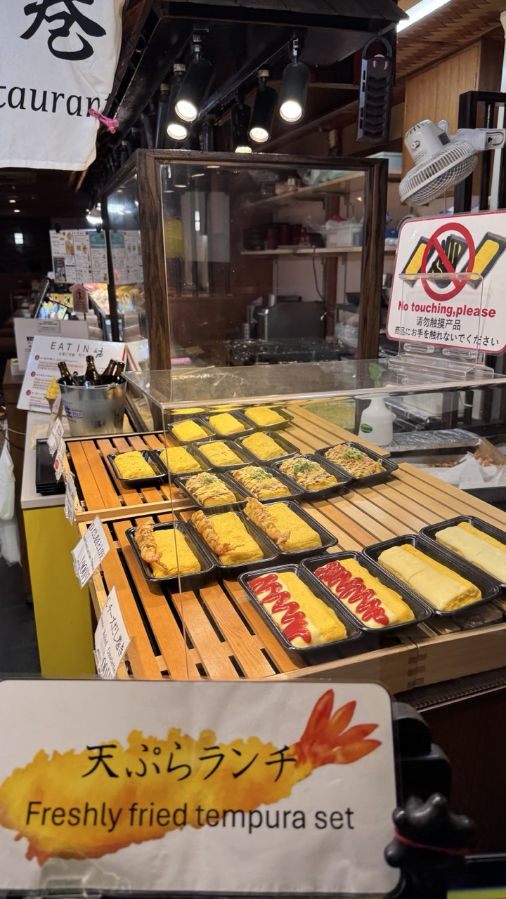

1. Overall Rating (0–10) — 7.0
This photograph captures the inviting chaos of a bustling Japanese tempura lunch counter, where freshly prepared dishes are displayed with a sense of immediate, appetizing readiness. The warm lighting and vibrant colors enhance the food’s appeal, while the signage and clutter lend an authentic, unpolished charm. Though slightly busy in composition, the image succeeds in conveying the energy and sensory appeal of a traditional eatery.
2. Composition (0–10) — 6.5
The frame is densely packed with food trays and signage, creating a layered, almost crowded feel. The foreground sign draws the eye, but the diagonal arrangement of the trays and the glass display case add visual rhythm, guiding the viewer through the scene. A tighter crop might improve focus, but the current framing effectively conveys the environment’s authenticity.
3. Lighting (0–10) — 7.5
Warm overhead spotlights highlight the golden tempura and emphasize texture, while ambient light from the surrounding space adds depth. The lighting creates a cozy, inviting atmosphere, though slight glare on the glass case softens the overall clarity.
4. Color & Tone (0–10) — 7.0
The palette is rich with warm yellows and browns from the tempura and wooden counter, contrasted by the bright red of the ketchup and the crisp white of the signage. The tones are cohesive and appetizing, with a slight color cast that reinforces the warmth of the setting.
5. Creativity (0–10) — 6.5
The image is more documentary than conceptual, capturing a moment of everyday life in a Japanese food stall. While not highly original in its approach, it effectively tells a story of culinary craft and cultural context through its details and atmosphere.
6. Technical Quality (0–10) — 7.5
Sharp focus on the food trays and signage ensures clarity, and the exposure is well-balanced despite the mixed lighting. The depth of field is adequate, with the foreground sign slightly soft but still legible.
7. Emotional Impact (0–10) — 7.0
The image evokes a sense of comfort and anticipation, tapping into the universal appeal of freshly made food. The presence of the “No touching, please” sign adds a touch of humor and realism, creating a relatable, human moment that feels both immediate and nostalgic.
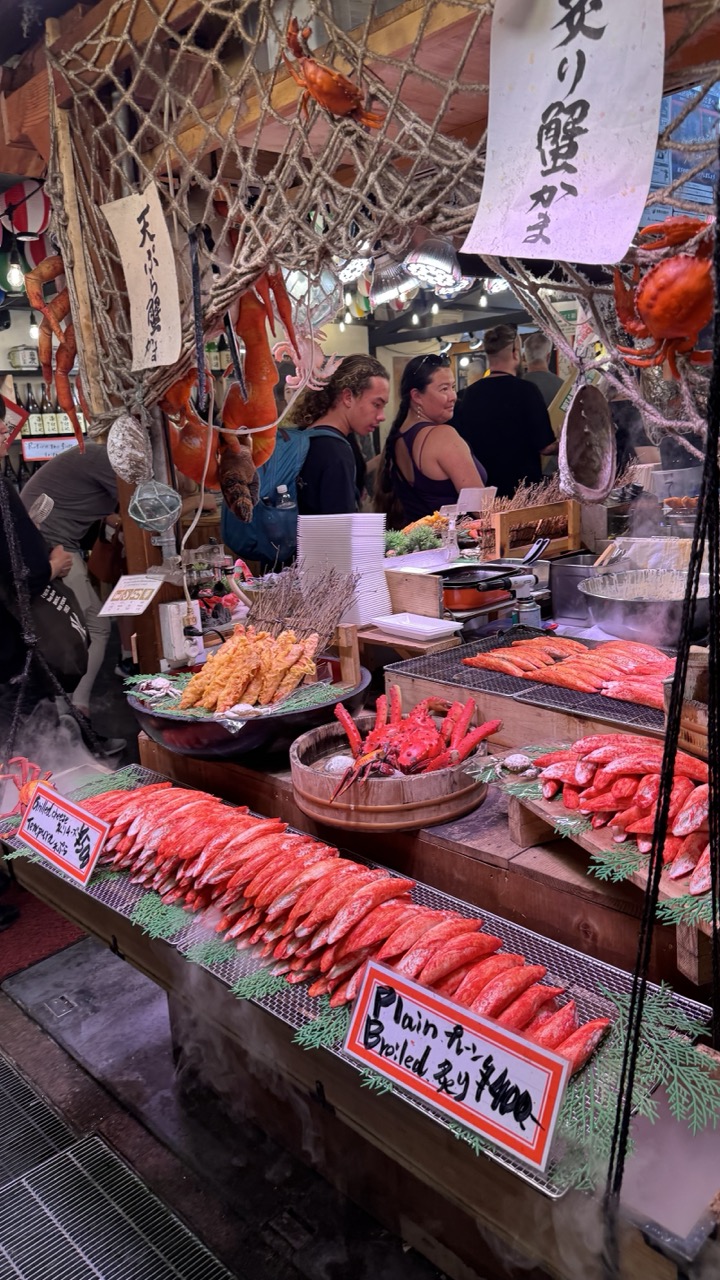

1. Overall Rating (0–10) — 7.5
This photograph captures the vibrant, chaotic energy of a Japanese seafood market stall, where color, texture, and motion converge to evoke a sensory experience. The rich reds of boiled crab legs and the steam rising from cooking stations create an immediate sense of warmth and authenticity. While the scene is visually dense and engaging, the composition’s clutter risks overwhelming the viewer, slightly diluting the clarity of the main subject.
2. Composition (0–10) — 6.5
The framing is dynamic but busy, with overlapping elements—signs, nets, people—creating visual noise. The foreground seafood display draws the eye, but the background activity distracts from a cohesive focal point. A tighter crop or better use of negative space would enhance visual hierarchy.
3. Lighting (0–10) — 7.0
The mixed lighting—warm overhead bulbs and cool ambient light—creates a layered, naturalistic glow that highlights the steam and glistening seafood. While slightly uneven, the lighting effectively enhances the scene’s liveliness and authenticity, particularly the steam’s soft diffusion.
4. Color & Tone (0–10) — 8.0
The vivid reds of the crab and fish contrast beautifully against the muted wood and green garnishes, creating a rich, appetizing palette. The warm tones dominate, reinforcing the feeling of a bustling, freshly cooked meal. The color balance feels natural and evocative of a lively market atmosphere.
5. Creativity (0–10) — 7.5
The image succeeds in capturing the spirit of a traditional Japanese fish market—authentic, unfiltered, and full of life. The use of cultural details like the hanging nets and Japanese signage adds narrative depth, transforming a simple street scene into a cultural vignette.
6. Technical Quality (0–10) — 7.5
The photo is sharp and detailed, with good focus on the foreground elements. The depth of field is appropriately managed, though some background elements appear slightly soft. The exposure is well-handled, preserving detail in both shadows and highlights despite the complex lighting.
7. Emotional Impact (0–10) — 8.0
The image evokes a strong sense of place—warm, active, and deliciously sensory. The steam, the colors, and the presence of people create a palpable connection to the culture of fresh seafood and communal dining. It invites the viewer to step into the scene and smell the salt and smoke, making it emotionally engaging and immersive.
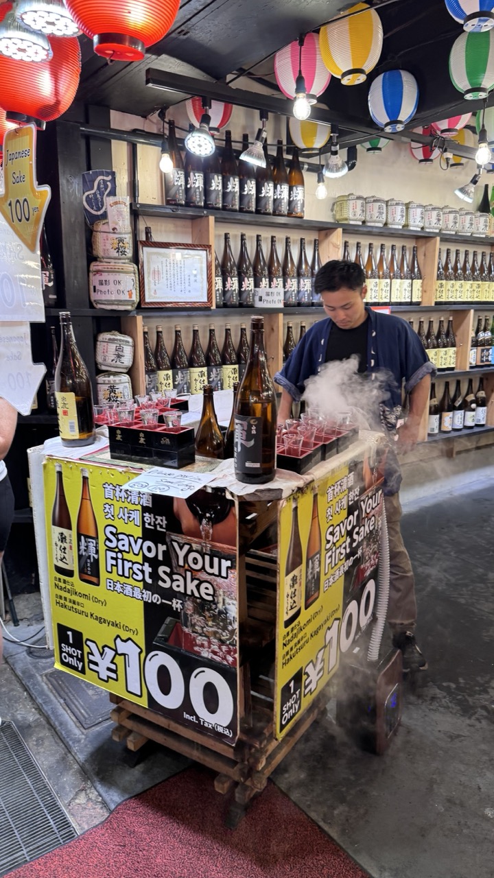

1. Overall Rating (0–10) — 7.0
This photograph captures the vibrant energy of a traditional Japanese sake stall, where steam, color, and cultural detail converge to evoke a sense of place. The composition is rich with visual texture—lanterns, bottles, and signage—all contributing to an authentic, bustling atmosphere. While the scene feels slightly crowded and the lighting is uneven, the image succeeds in conveying the sensory experience of a sake tasting in a lively market.
2. Composition (0–10) — 6.5
The subject is centered but partially obscured by foreground elements, creating a layered, immersive feel. The angled perspective draws the eye into the scene, though the clutter risks overwhelming the focal point.
3. Lighting (0–10) — 6.0
Mixed lighting from overhead fixtures and lanterns creates a dynamic but inconsistent exposure. The steam adds atmospheric depth, but some areas remain underexposed, softening detail.
4. Color & Tone (0–10) — 7.5
The warm glow of the lanterns contrasts with the cool tones of the steam and dark bottles, creating a lively palette. The bold yellow signage adds a pop of color that draws attention, enhancing the visual appeal.
5. Creativity (0–10) — 7.0
The image effectively blends cultural authenticity with a sense of movement and atmosphere. The steam rising from the cups adds a dynamic, almost theatrical element, elevating the scene beyond a simple snapshot.
6. Technical Quality (0–10) — 7.0
Sharp focus on the vendor and signage ensures clarity in key areas, though the background details are slightly softer. The image is well-captured, with minimal noise despite low-light conditions.
7. Emotional Impact (0–10) — 7.5
The photograph evokes a sense of warmth, tradition, and sensory delight, inviting the viewer to imagine the taste and aroma of hot sake. The steam and lively setting create a palpable connection to the moment, making the experience feel immediate and engaging.
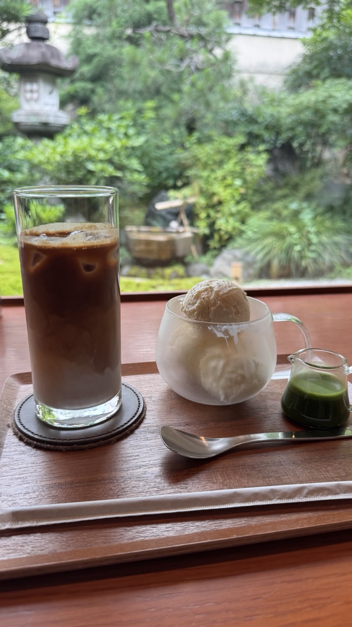

1. Overall Rating (0–10) — 7.5
This photograph captures a serene moment of indulgence, where the quiet elegance of a Japanese garden frames a simple yet luxurious pairing of iced coffee and ice cream. The soft focus on the lush greenery enhances the tranquil mood, while the warm wood tones and carefully arranged items lend a sense of mindful stillness. Though the composition is balanced and inviting, the slightly muted lighting and lack of dramatic contrast keep it from feeling fully immersive.
2. Composition (0–10) — 7.0
The arrangement of the drink and dessert on the tray creates a natural diagonal flow, drawing the eye from the iced coffee to the ice cream and finally to the small pitcher of matcha. The window acts as a natural frame, placing the garden in the background and adding depth. However, the foreground tray occupies a large portion of the frame, slightly crowding the composition.
3. Lighting (0–10) — 6.5
Soft, diffused natural light filters through the window, creating a calm and even exposure. The light enhances the textures of the wooden tray and the condensation on the glass, but the overall brightness is subdued, giving the scene a slightly flat quality.
4. Color & Tone (0–10) — 7.0
The palette is harmonious, with earthy browns, soft greens, and the creamy beige of the ice cream creating a soothing, natural balance. The vibrant green of the matcha provides a subtle pop of color that draws attention without disrupting the tranquil mood.
5. Creativity (0–10) — 7.5
The image successfully blends everyday indulgence with a sense of cultural context, evoking the quiet rituals of Japanese tea culture. The juxtaposition of modern iced coffee with traditional elements like the stone lantern adds a layer of thoughtful contrast.
6. Technical Quality (0–10) — 7.5
The focus is sharp on the foreground objects, with a pleasing bokeh effect blurring the garden in the background. The image is clear and well-exposed, with no visible noise or artifacts, showcasing a well-executed balance between detail and atmosphere.
7. Emotional Impact (0–10) — 8.0
The photograph evokes a sense of peace and mindful enjoyment, inviting the viewer to pause and savor a quiet moment. The combination of sensory elements—cool drinks, lush greenery, and warm wood—creates a deeply calming and relatable experience.
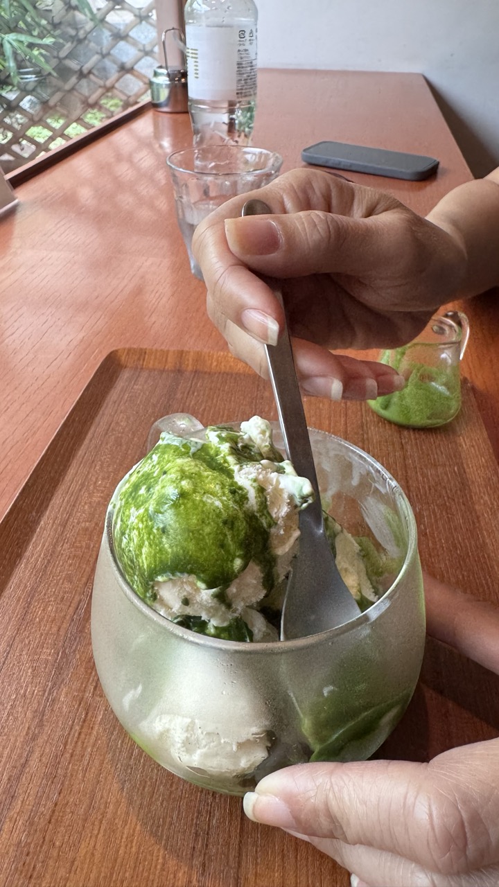

1. Overall Rating (0–10) — 6.8
This image captures a moment of quiet indulgence, where the tactile pleasure of eating matcha ice cream is rendered with intimate clarity. The warm wood tones and soft natural light lend a cozy, lived-in feel, though the composition’s informality slightly undermines its visual cohesion. While the image succeeds in conveying a sensory experience, its casual framing and lack of deliberate staging keep it from feeling like a fully realized photograph.
2. Composition (0–10) — 6.0
The hand and spoon create a strong diagonal leading into the bowl, but the cluttered background and off-center framing reduce focus. A tighter crop would better emphasize the subject.
3. Lighting (0–10) — 7.5
Soft, diffused natural light from the side enhances the texture of the ice cream and gives the scene a calm, inviting mood.
4. Color & Tone (0–10) — 7.0
The vibrant green of the matcha contrasts beautifully with the warm wood and muted tones of the surroundings, creating a balanced and harmonious palette.
5. Creativity (0–10) — 6.5
The image feels candid and personal, capturing a genuine moment rather than staging a perfect shot. The focus on texture and interaction adds a layer of intimacy.
6. Technical Quality (0–10) — 7.5
Sharp focus on the ice cream and hand, with clean detail and no noticeable noise, demonstrates solid technical execution.
7. Emotional Impact (0–10) — 7.0
The photograph evokes a sense of comfort and pleasure, drawing the viewer into the simple joy of a treat enjoyed in a quiet space.
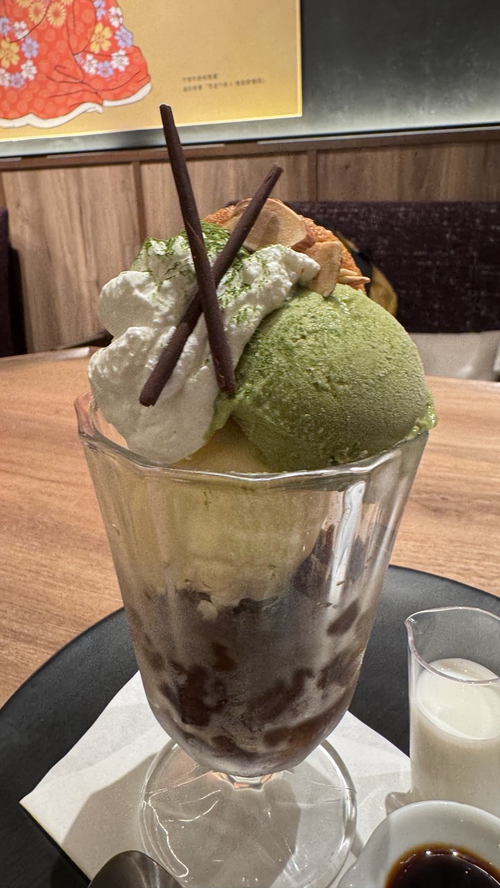

1. Overall Rating (0–10) — 7.0
This dessert photograph captures the indulgent layers of a matcha parfait with inviting clarity, where textures and ingredients are presented with appetizing detail. The warm, ambient lighting enhances the richness of the green tea ice cream and whipped cream, while the background hints at a cozy, Japanese-inspired setting. Though the composition is slightly cluttered, the focus on the dessert remains strong, making it a visually satisfying and tempting image.
2. Composition (0–10) — 6.5
The subject is well-centered, but the cluttered foreground and background elements, including the small side containers and the poster, slightly distract from the main focus. A tighter crop would improve balance and emphasize the dessert’s details.
3. Lighting (0–10) — 7.0
Soft, warm lighting enhances the dessert’s textures and colors, creating a cozy, inviting atmosphere. The slight shadows add depth without obscuring any key details.
4. Color & Tone (0–10) — 7.5
The contrast between the vibrant green matcha ice cream, creamy white whipped cream, and the dark chocolate syrup creates a rich, appetizing palette. The warm wood tones and golden background accentuate the overall warmth of the scene.
5. Creativity (0–10) — 6.5
The image is straightforward and functional, capturing a popular dessert in a realistic, appealing way. While it lacks a strong artistic twist, the attention to detail and context adds a touch of narrative charm.
6. Technical Quality (0–10) — 8.0
The focus is sharp on the parfait, with clear detail in the ice cream, syrup, and toppings. The glass shows natural reflections, and the image is free from noticeable noise or blur.
7. Emotional Impact (0–10) — 7.0
The photograph evokes a sense of indulgence and comfort, making the viewer feel as though they are about to enjoy a delicious treat. The warm tones and familiar subject create a welcoming, pleasant mood.
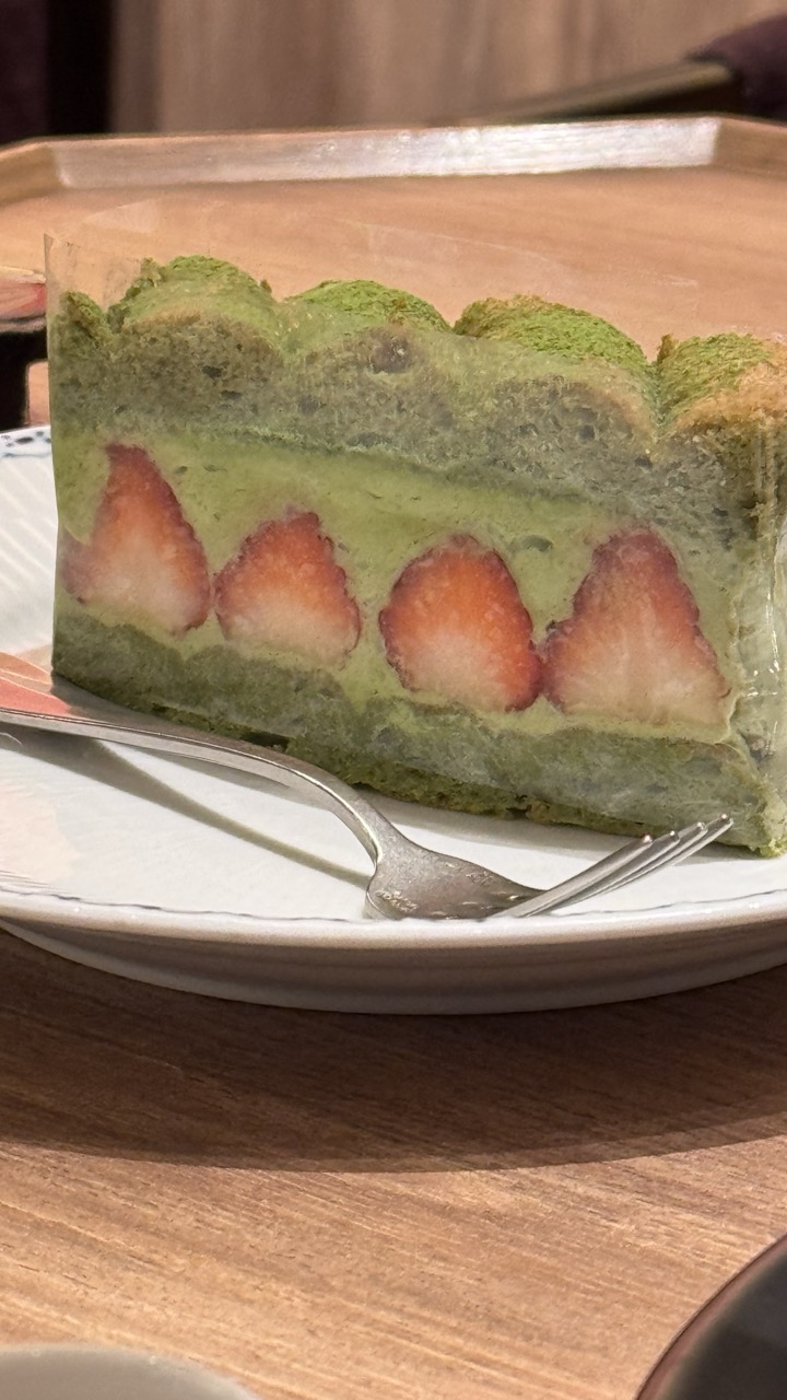

1. Overall Rating (0–10) — 7.0
This image captures a slice of matcha strawberry cake with a delicate balance of color and texture, evoking a sense of quiet indulgence. The interplay between the vibrant green layers and the deep red strawberries creates a visually pleasing contrast, while the soft focus and warm lighting lend a cozy, intimate atmosphere. Though the composition feels slightly cluttered, the image succeeds in conveying the sensory appeal of a dessert moment—rich in flavor and mood.
2. Composition (0–10) — 6.0
The slice is positioned slightly off-center, with the fork and plate edges creating a busy foreground that competes for attention. A tighter crop would better emphasize the cake’s layered structure.
3. Lighting (0–10) — 7.0
Warm, ambient lighting enhances the cake’s texture and color, casting soft shadows that add depth. The glow feels natural and inviting, complementing the cozy setting.
4. Color & Tone (0–10) — 7.5
The harmonious contrast between the green matcha and red strawberries is striking, supported by a warm, neutral tone that enhances the food’s appeal. The palette feels cohesive and appetizing.
5. Creativity (0–10) — 6.5
The image captures a familiar subject with thoughtful detail, but lacks a strong conceptual or stylistic twist. It leans more toward documentation than artistic interpretation.
6. Technical Quality (0–10) — 7.0
Sharp focus on the cake’s cross-section reveals fine textures, while the shallow depth of field effectively isolates the subject. The exposure is balanced, with minimal noise.
7. Emotional Impact (0–10) — 7.0
The image evokes a sense of comfort and indulgence, inviting the viewer to savor a quiet moment of pleasure. The warmth and detail foster a gentle emotional connection to the experience.
Loading map...