This blog post highlights the top spots to visit in Shinjuku, Tokyo's bustling district. The Tokyo Metropolitan Government Building Observation Deck offers panoramic views of the city and Mount Fuji. The Love Sign and Godzilla Statue are iconic attractions that capture the essence of love and pop culture. Other unique experiences include a gaming arcade center, cat cafe, sensory wonderland (Mooosh Squishy), Rainbow Cotton Candy, and Pokémon Center, making Shinjuku a vibrant fusion of modernity and tradition.


1. Overall Rating (0–10) — 7.0
This photograph captures a comforting, indulgent moment in food photography, where the golden-brown toast, topped with melted cheese and speckled herbs, feels both inviting and meticulously prepared. The shallow depth of field draws focus to the textures of the cheese and crust, while the soft ambient lighting enhances the warmth of the dish. Though the composition is simple and the background slightly distracting, the image successfully conveys a sense of homemade satisfaction and sensory appeal.
2. Composition (0–10) — 6.5
The subject is well-centered but slightly angled, creating a dynamic diagonal that guides the eye. The wooden tray and paper liner add context, though the background’s reflections and lack of negative space reduce visual clarity.
3. Lighting (0–10) — 7.5
Natural, diffused light highlights the glistening cheese and crisp edges of the toast, creating soft shadows and a warm, inviting glow. The lighting enhances texture without harshness.
4. Color & Tone (0–10) — 7.0
The warm golden yellows and browns of the cheese and bread are rich and appetizing, complemented by the green herbs and the neutral wood tones. The overall tone is harmonious and cohesive, evoking comfort and flavor.
5. Creativity (0–10) — 6.5
While the concept is familiar—baked toast with cheese and ham—the execution feels intentional, with a focus on texture and warmth. The use of shallow depth of field elevates the image beyond a simple snapshot, though the subject remains conventional.
6. Technical Quality (0–10) — 7.5
The focus is sharp on the toast, with clear detail in the melted cheese and crust. The image is free of noise, and the exposure is well-balanced, capturing the scene with clarity and precision.
7. Emotional Impact (0–10) — 7.5
The image evokes a strong sense of comfort and indulgence, appealing to the viewer’s senses and triggering associations with warmth, home-cooked meals, and simple pleasures. It feels intimate and inviting.


1. Overall Rating (0–10) — 7.0
This image presents a richly textured slice of French toast, inviting the viewer into a moment of indulgent breakfast delight. The composition effectively highlights the dish’s warm, golden-brown crust and vibrant toppings, while the soft dusting of powdered sugar adds a touch of elegance. Though the background remains functional and unobtrusive, the photograph’s appeal lies in its tactile quality and appetizing detail—what’s missing is a stronger sense of atmosphere to elevate it beyond a simple food snapshot.
2. Composition (0–10) — 7.0
The subject is centered and well-framed, with the French toast occupying the foreground to emphasize texture and detail. The diagonal placement of the banana and berries creates visual movement, drawing the eye across the dish. Slight overhang of the plate edge adds depth, though a tighter crop could enhance focus.
3. Lighting (0–10) — 7.5
Soft, diffused lighting highlights the dish’s texture without harsh shadows, creating a warm and inviting mood. The subtle reflections on the background surface suggest ambient indoor lighting, which complements the food’s natural tones and enhances its appeal.
4. Color & Tone (0–10) — 8.0
The color palette is rich and harmonious, with the deep reds of the strawberries, dark blue of the blueberries, and creamy yellow of the banana creating a vibrant contrast against the golden-brown toast and white powdered sugar. The overall tone is warm and appetizing, with balanced saturation that feels natural.
5. Creativity (0–10) — 6.5
While the image captures a familiar subject with clarity and care, it leans toward conventional food photography. The presentation is appealing but lacks a distinctive artistic or narrative twist—its strength is in realism rather than innovation.
6. Technical Quality (0–10) — 8.0
The image is sharp and well-focused, with fine detail visible in the bread’s crust and the fruit’s surface. The depth of field is appropriately managed, keeping the main subject crisp while softly blurring the background. Exposure is balanced, with no blown highlights or lost shadows.
7. Emotional Impact (0–10) — 7.5
The photograph evokes a sense of comfort and indulgence, appealing to the viewer’s senses with its warm tones and appetizing textures. It successfully conveys the pleasure of a satisfying breakfast, creating a moment of quiet delight that feels both personal and universally relatable.
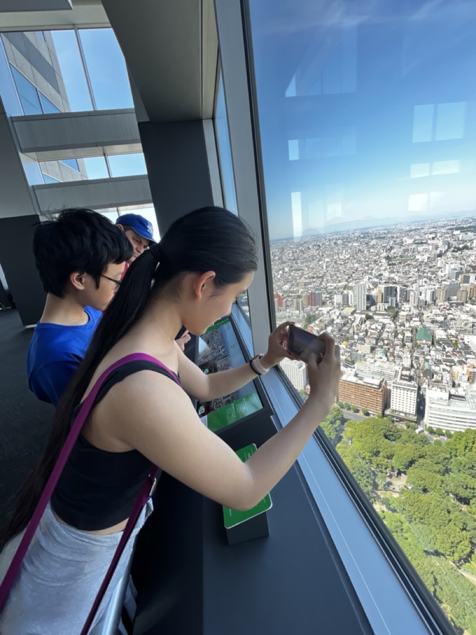

1. Overall Rating (0–10) — 7.0
This photograph captures a moment of quiet wonder as visitors gaze out over a sprawling urban landscape from a high vantage point. The contrast between the intimate, focused foreground and the vast city below creates a compelling sense of scale and perspective. While the composition is grounded in realism and feels candid, a more deliberate framing and richer tonal depth could elevate its emotional resonance.
2. Composition (0–10) — 6.5
The diagonal line of the window frame guides the eye toward the city, while the subjects are positioned to create a natural focal point. However, the slight overexposure in the window and the cluttered foreground elements detract from the visual harmony.
3. Lighting (0–10) — 7.5
Bright, natural daylight enhances the clarity of the scene, with the sun casting a crisp glow over the cityscape. The light is strong but balanced, allowing for rich detail in both the interior and the view outside.
4. Color & Tone (0–10) — 7.0
The vibrant blue sky and lush green trees provide a striking contrast to the urban sprawl, while the cool tones of the building interior complement the overall atmosphere. The color palette is clean and harmonious, though the saturation is slightly subdued.
5. Creativity (0–10) — 6.5
The image effectively juxtaposes human presence with the grandeur of the city, suggesting themes of exploration and perspective. While the concept is strong, the execution remains conventional, with little stylistic risk.
6. Technical Quality (0–10) — 8.0
Sharp focus on the foreground subjects, with clear detail in both the people and the distant city. The exposure is well-handled, and there are no obvious technical flaws.
7. Emotional Impact (0–10) — 7.0
The image evokes a sense of awe and contemplation, inviting the viewer to share in the quiet moment of observation. The connection between the individuals and the vast cityscape creates a subtle emotional pull, suggesting shared wonder and the fleeting nature of such views.
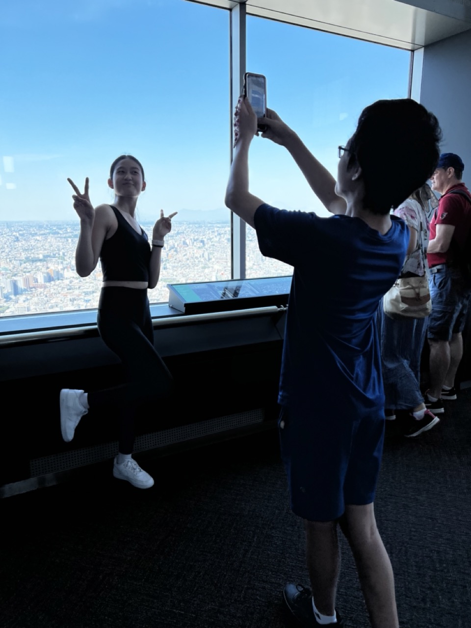

1. Overall Rating (0–10) — 6.0
This photograph captures a candid moment of joy and connection at a high vantage point, where the vast city sprawls beneath a clear blue sky. The contrast between the brightly lit window and the dark interior creates a dramatic visual tension, though the silhouetted figures feel somewhat disconnected from the scene’s emotional core. While the composition suggests a shared experience, the technical imbalance between light and shadow slightly undermines the image’s narrative clarity.
2. Composition (0–10) — 6.0
The framing places the photographer in the foreground, creating a layered perspective that draws the eye toward the woman posing at the window. However, the composition feels slightly unbalanced due to the off-center placement and the strong diagonal of the window frame, which competes with the subject’s pose.
3. Lighting (0–10) — 5.0
The intense backlighting from the window creates strong silhouettes, obscuring detail in the foreground and rendering the subjects in shadow. While the natural light enhances the sense of height and openness, it results in a lack of tonal range and depth in the interior space.
4. Color & Tone (0–10) — 5.5
The dominant cool blue of the sky and the dark tones of the interior create a cohesive but somewhat flat color palette. The lack of warmth in the lighting and the muted tones of the clothing and carpet contribute to a cool, detached atmosphere.
5. Creativity (0–10) — 6.5
The image captures a genuine, spontaneous moment within a tourist setting, and the dual focus—on both the act of photographing and the subject being photographed—adds a layer of meta-narrative. This self-referential quality is creatively engaging, though it doesn’t fully transcend the casual snapshot aesthetic.
6. Technical Quality (0–10) — 6.5
The image is sharp and clear in the areas of high contrast, particularly along the window edges. However, the underexposure of the foreground and the overexposure of the background indicate a challenge in managing dynamic range, which affects overall clarity.
7. Emotional Impact (0–10) — 6.0
There’s a sense of lightheartedness and connection in the woman’s pose and smile, but the silhouetting of the subjects creates a subtle emotional distance. The viewer is invited to observe the moment rather than fully engage with it, limiting the photograph’s emotional resonance.
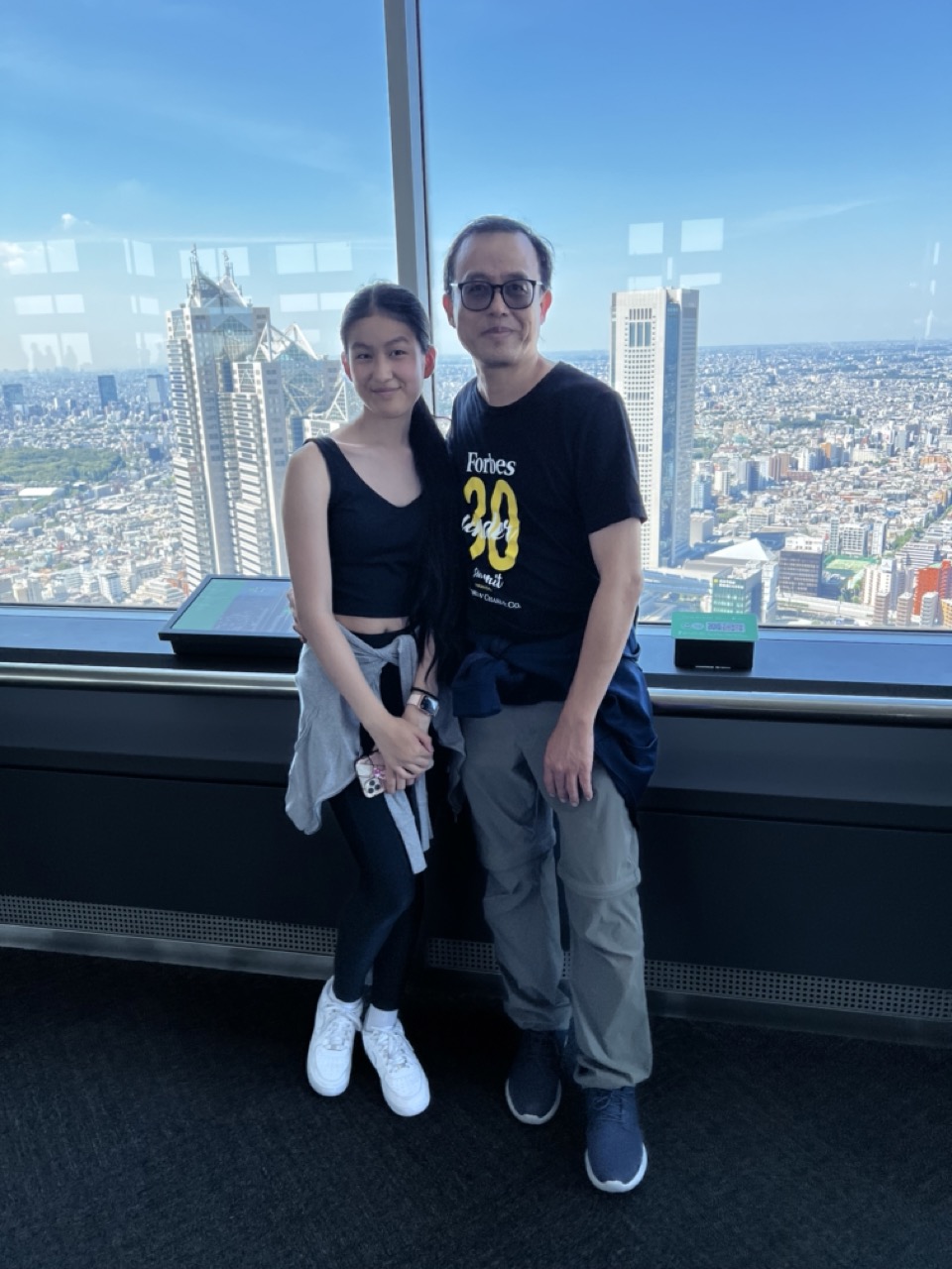

1. Overall Rating (0–10) — 6.8
This photograph captures a tender moment between two individuals against the sweeping backdrop of a bustling metropolis, where intimacy meets urban grandeur. The expansive cityscape and bright daylight lend a sense of occasion and clarity, though the composition’s casual framing and slightly awkward spacing temper its visual impact. While the image succeeds in documenting a shared experience, its emotional resonance is held back by a lack of deliberate staging and visual cohesion.
2. Composition (0–10) — 6.0
The subjects are placed slightly off-center, with the man’s body partially obscuring the woman, creating a subtle imbalance. The strong horizontal lines of the window ledge and the cityscape help anchor the frame, but the tight crop and lack of negative space diminish the sense of scale and grandeur.
3. Lighting (0–10) — 8.0
Natural daylight floods the scene from the expansive window, creating even, bright illumination that enhances clarity and reveals fine details in both the subjects and the distant city. The strong backlighting from the sky adds depth and emphasizes the height of the vantage point.
4. Color & Tone (0–10) — 7.0
The palette is dominated by the crisp blue of the sky and the cool grays of the urban sprawl, which contrast nicely with the warm skin tones and the black and yellow of the man’s t-shirt. While the colors are vivid and well-balanced, the overall tone leans slightly clinical, lacking a more expressive or atmospheric filter.
5. Creativity (0–10) — 6.5
The image is conceptually strong in juxtaposing personal connection with urban vastness, but its execution feels more like a candid snapshot than a carefully composed portrait. The inclusion of the “Forbes 30 Under 30” shirt adds narrative intrigue, though it remains understated.
6. Technical Quality (0–10) — 7.5
The focus is sharp on the subjects, and the exposure is well-handled despite the high-contrast environment. The image is free of noticeable noise or blur, and the resolution allows for clear detail in both the foreground and background.
7. Emotional Impact (0–10) — 6.5
The photograph conveys a quiet sense of pride and connection, enhanced by the shared moment and the panoramic backdrop. However, the emotional weight is somewhat diluted by the casual posture and lack of direct engagement with the camera, leaving the viewer with a sense of observation rather than intimacy.
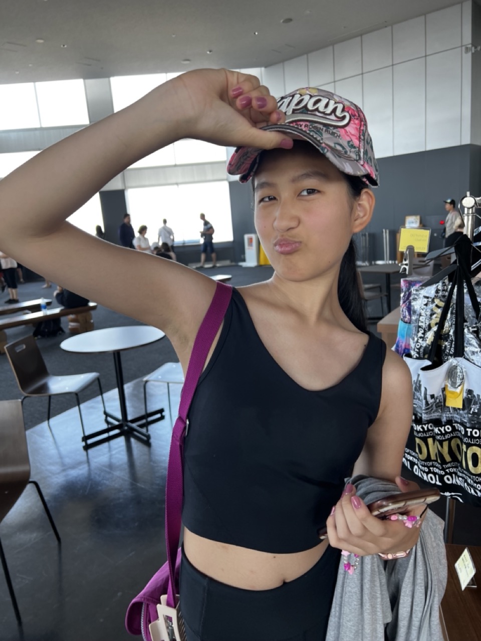

1. Overall Rating (0–10) — 6.0
This candid portrait captures a playful, youthful moment with a sense of spontaneity and charm. The subject’s pose and expression convey confidence and joy, grounding the image in a personal, lived-in atmosphere. While the composition feels informal and the background slightly distracting, the authenticity of the gesture and the subject’s engagement with the camera lend it a warm, relatable energy.
2. Composition (0–10) — 5.5
The subject is well-placed but slightly off-center, with a busy background that competes for attention. A tighter crop would focus more on the subject’s expression and gesture.
3. Lighting (0–10) — 6.5
Natural light from large windows illuminates the scene evenly, creating soft shadows and a balanced exposure. The overhead lighting adds a slight flatness, but the overall clarity is strong.
4. Color & Tone (0–10) — 6.0
The image features a muted palette dominated by black, white, and gray, punctuated by the vibrant pink of the cap and strap. The color contrast is engaging but not fully harmonized, with the magenta strap drawing attention more than the subject’s expression.
5. Creativity (0–10) — 6.5
The playful pout and hand-on-cap gesture convey personality and humor, offering a snapshot of individuality. The composition feels spontaneous rather than staged, lending it a candid, authentic edge.
6. Technical Quality (0–10) — 7.0
The image is sharp and well-focused on the subject, with clean details in the fabric and skin texture. The depth of field is adequate, though the background remains partially in focus.
7. Emotional Impact (0–10) — 6.5
The subject’s expression and body language create a sense of fun and self-assurance, inviting the viewer into a lighthearted, personal moment. The emotional resonance is strong in its simplicity and sincerity.
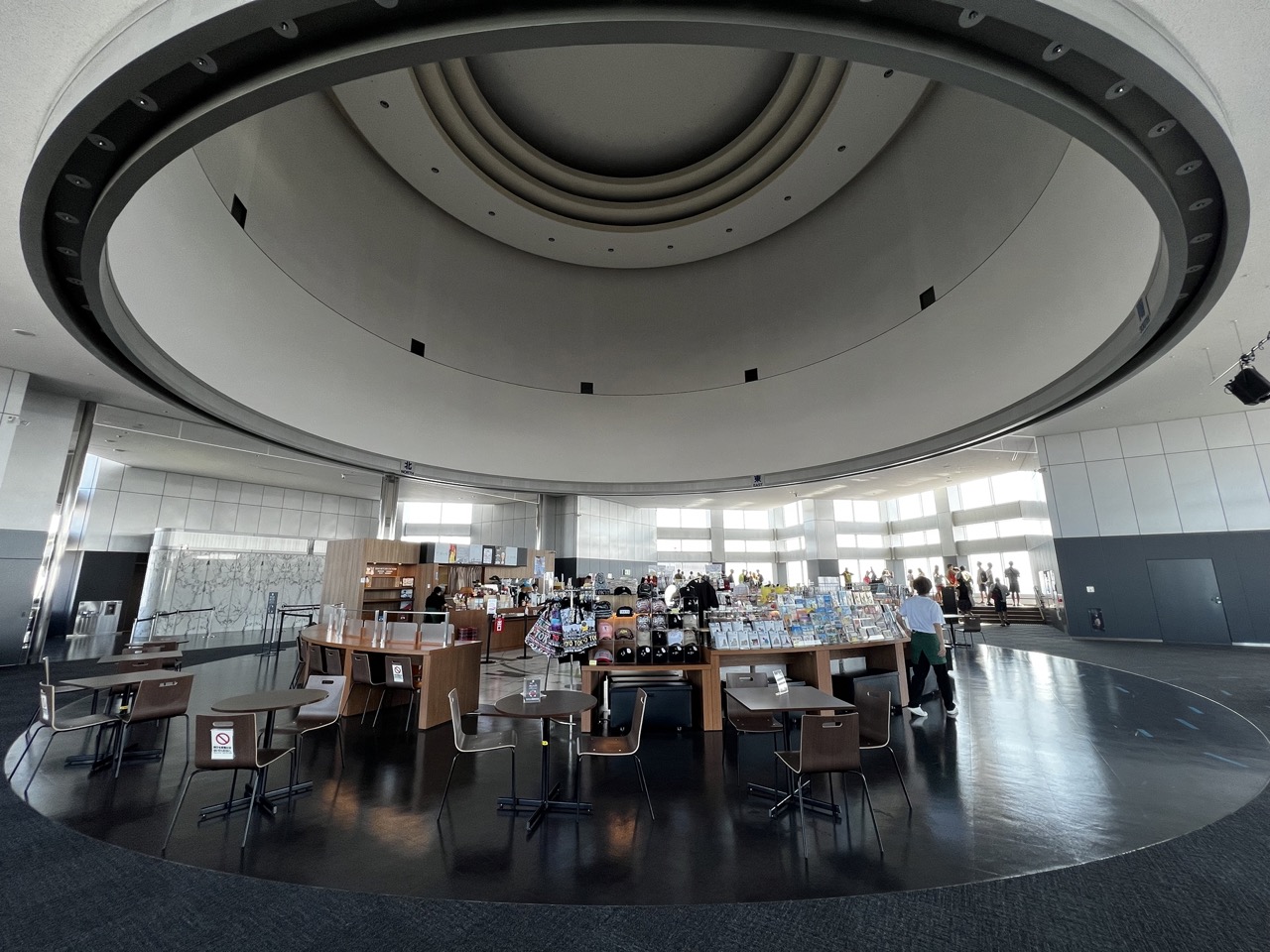

1. Overall Rating (0–10) — 7.0
This photograph captures the grand, circular architecture of a modern public space with a sense of spatial harmony and quiet elegance. The sweeping curves of the ceiling and the reflective floor create a strong visual rhythm, drawing the eye toward the central activity of the room. While the scene is well-composed and technically sound, the lack of a compelling focal point and the neutral atmosphere prevent it from feeling truly immersive or emotionally resonant.
2. Composition (0–10) — 7.5
The wide-angle perspective emphasizes the building’s circular form, with the concentric rings of the ceiling creating a natural frame. The placement of tables, chairs, and people provides a sense of scale and activity, though the arrangement feels slightly scattered, disrupting the visual flow.
3. Lighting (0–10) — 6.5
Natural light floods in from the large windows, creating a bright, even illumination that highlights the space’s clean lines. However, the flat quality of the light reduces depth and shadow, giving the scene a somewhat sterile feel.
4. Color & Tone (0–10) — 6.0
The palette is dominated by neutral grays, blacks, and whites, which reinforces the modern, minimalist aesthetic. While cohesive, the lack of color variation makes the image feel subdued and slightly monotonous.
5. Creativity (0–10) — 6.5
The photograph effectively showcases the architectural design, but the approach is largely documentary. The wide-angle distortion adds a slight sense of drama, but the image remains more observational than expressive.
6. Technical Quality (0–10) — 8.0
The image is sharp and well-exposed, with clear details throughout the frame. The wide-angle lens is used effectively to capture the full scope of the space without significant distortion.
7. Emotional Impact (0–10) — 5.5
The atmosphere is calm and orderly, but lacks emotional warmth or narrative depth. The presence of people adds life, but they remain small and detached, keeping the viewer at a distance from the scene.
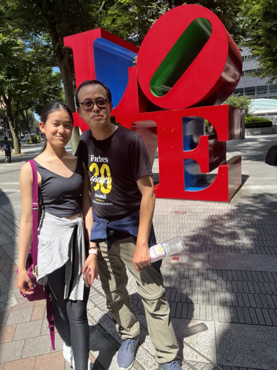

1. Overall Rating (0–10) — 6.8
This photograph captures a candid moment of connection between two individuals in front of a well-known public sculpture, evoking a sense of shared experience and urban exploration. The bright sunlight and bold colors of the "LOVE" sculpture create an energetic backdrop, while the natural expressions of the subjects lend authenticity. However, the composition feels slightly unbalanced, and the strong shadows reduce visual harmony, preventing the image from achieving a more polished aesthetic.
2. Composition (0–10) — 6.0
The subjects are placed slightly off-center, with the sculpture dominating the right side, creating an uneven visual weight. The diagonal lines of the pavement and shadows add dynamism but disrupt the sense of balance.
3. Lighting (0–10) — 7.5
Strong, direct sunlight creates sharp, defined shadows and highlights the sculpture’s glossy surface. While the lighting is bright and clear, the harshness results in overexposed areas and deep contrast, which slightly diminishes the image’s subtlety.
4. Color & Tone (0–10) — 7.0
The vibrant red of the "LOVE" sculpture stands out against the muted grays and greens of the surroundings, creating a strong focal point. The overall palette is vivid, though the high contrast slightly flattens the tonal range.
5. Creativity (0–10) — 6.5
The image leverages a recognizable landmark to tell a personal story, blending pop culture with human narrative. The choice of subject and setting is engaging, though the execution remains fairly conventional for a travel snapshot.
6. Technical Quality (0–10) — 7.5
The image is sharp and well-focused, with clear details in both the subjects and the sculpture. The camera appears to handle the bright conditions well, despite some overexposure in highlights.
7. Emotional Impact (0–10) — 6.0
The photograph conveys a sense of joy and companionship, but the direct, posed nature of the subjects limits deeper emotional resonance. The viewer is invited into a moment, but not fully drawn into its emotional core.
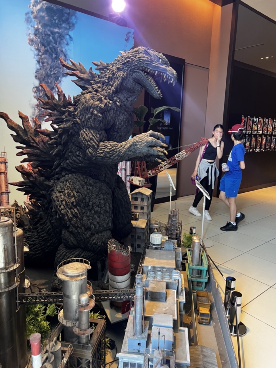

1. Overall Rating (0–10) — 7.0
This photograph captures the thrilling juxtaposition of a massive Godzilla model towering over a detailed miniature city, evoking the iconic scale and chaos of the monster’s rampage. The dynamic pose of the creature and the presence of visitors add a sense of awe and scale, grounding the fantastical in a real-world setting. While the lighting and composition are effective, the scene feels slightly cluttered, and the emotional impact is tempered by the overtly commercial context of the exhibit.
2. Composition (0–10) — 6.5
The framing emphasizes the dominance of Godzilla, with the miniature city leading the eye toward the creature’s massive form. However, the inclusion of the two visitors on the right introduces a slight imbalance, and the background elements—such as the wall display and merchandise—distract from the central focus.
3. Lighting (0–10) — 6.0
The overhead spotlight enhances the texture and presence of Godzilla, creating dramatic shadows that emphasize his form. However, the ambient lighting in the surrounding space is flat and artificial, contributing to a mixed atmosphere that lacks cohesion.
4. Color & Tone (0–10) — 6.5
The palette is dominated by muted grays and metallic tones of the model and city, punctuated by the red of the crane and the bright blue of the boy’s shirt. The contrast between the dark Godzilla and the lighter background helps the subject stand out, though the overall tone feels slightly washed out due to the fluorescent lighting.
5. Creativity (0–10) — 7.5
The image successfully merges the fantastical with the real, capturing a moment where pop culture spectacle meets public engagement. The scale of the model and the visitors’ reactions convey a sense of wonder, making it a compelling visual narrative of cinematic legacy.
6. Technical Quality (0–10) — 7.0
The photograph is sharp and clear, with good focus on the Godzilla model and the foreground elements. The depth of field is adequate, though minor lens distortion and slight overexposure in the background slightly reduce the overall clarity.
7. Emotional Impact (0–10) — 7.0
The image evokes a sense of nostalgia and excitement, particularly for fans of the Godzilla franchise. The contrast between the monstrous scale and the ordinary setting creates a moment of shared awe, though the commercial setting tempers the emotional resonance.
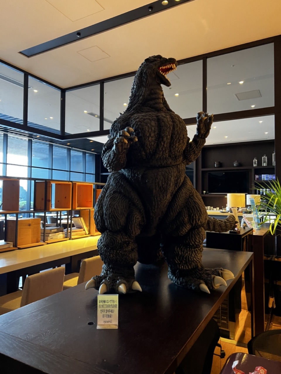

1. Overall Rating (0–10) — 7.0
This photograph captures a bold and playful juxtaposition of pop culture and modern interior design, where a towering Godzilla figure commands attention in a sleek, contemporary space. The contrast between the monstrous, textured statue and the clean lines of the room creates a striking visual narrative, blending whimsy with architectural precision. While the composition is strong and the subject undeniably engaging, the image’s charm lies more in its novelty than in its technical mastery.
2. Composition (0–10) — 7.5
The Godzilla figure is centered and dominates the frame, creating a powerful focal point. The surrounding architectural elements—glass partitions, shelving, and furniture—frame the subject effectively, guiding the eye toward the statue while adding layers of depth. The slight diagonal angle of the table and the placement of the sign enhance visual interest without disrupting balance.
3. Lighting (0–10) — 7.0
The ambient lighting is warm and evenly distributed, with recessed ceiling lights and natural light filtering through the windows. This creates a soft glow that highlights the texture of the Godzilla model without harsh shadows. The lighting enhances the scene’s inviting atmosphere while maintaining clarity across the image.
4. Color & Tone (0–10) — 6.5
The palette is dominated by neutral browns, blacks, and grays, with the dark Godzilla figure blending into the surroundings yet standing out due to its form and texture. The warm wood tones and yellowish ceiling light add subtle warmth, but the overall color scheme is restrained, which keeps the focus on the subject rather than the environment.
5. Creativity (0–10) — 8.0
The image is highly creative in its conceptual contrast—placing a symbol of destruction in a serene, modern setting. The juxtaposition evokes humor and curiosity, inviting viewers to consider the unexpected harmony between the monstrous and the mundane. The inclusion of the “Do Not Touch” sign adds a layer of irony and narrative depth.
6. Technical Quality (0–10) — 7.5
The image is sharp and well-focused, with clear details visible on the Godzilla figure and surrounding elements. The depth of field is sufficient to keep both the subject and background reasonably clear, and the exposure is balanced, with no significant over- or underexposed areas.
7. Emotional Impact (0–10) — 6.5
The image elicits amusement and intrigue, tapping into nostalgia and the absurdity of seeing a kaiju in a hotel lobby or lounge. While it doesn’t evoke deep emotion, it successfully creates a moment of lighthearted surprise and visual delight, leaving a lasting impression of playful creativity.
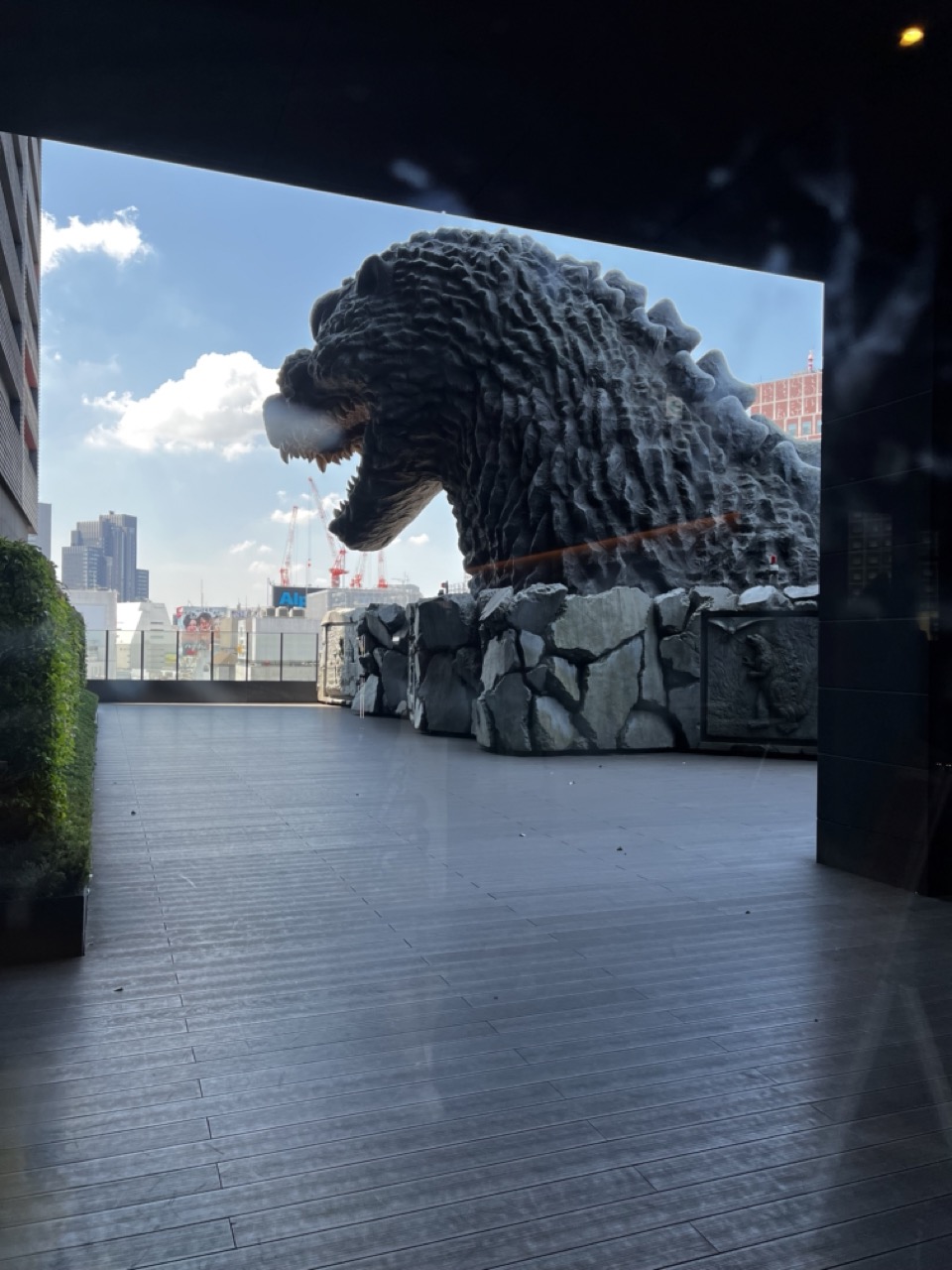

1. Overall Rating (0–10) — 7.0
This photograph captures a striking juxtaposition between urban modernity and pop-culture iconography, with the colossal Godzilla head emerging from a cityscape like a mythic intrusion. The framing through the dark overhang creates a dramatic, almost cinematic entrance, while the bright daylight enhances the statue’s imposing texture. The image is compelling not only for its subject but also for the way it balances scale and perspective—though the reflective glass and visible interior elements slightly disrupt the immersion.
2. Composition (0–10) — 7.5
The shot is framed effectively by the dark architectural overhang, creating a natural vignette that directs the eye toward the Godzilla head. The leading lines of the wooden deck guide the viewer’s gaze toward the central subject, while the distant skyline provides context and depth.
3. Lighting (0–10) — 8.0
Natural daylight illuminates the scene with strong clarity and contrast, highlighting the rugged texture of the Godzilla sculpture. The shadows cast by the overhang add depth, and the bright blue sky enhances the contrast with the dark, imposing figure.
4. Color & Tone (0–10) — 7.0
The palette is dominated by cool grays and blues, reinforcing the urban and monumental mood. The muted tones of the structure and deck complement the metallic sheen of the Godzilla sculpture, though a touch of warmth might have added more visual contrast.
5. Creativity (0–10) — 8.0
The image leverages a bold, recognizable pop-culture symbol in a real-world setting, creating a surreal and engaging visual narrative. The perspective and framing suggest a deliberate artistic intent, transforming a promotional display into something resembling a cinematic moment.
6. Technical Quality (0–10) — 7.5
The focus is sharp on the Godzilla head, with good clarity in the textures. The image is well-exposed, though slight reflections on the glass and minor lens flare reduce the overall crispness.
7. Emotional Impact (0–10) — 7.5
There’s a sense of awe and playful wonder in the image, evoking nostalgia and excitement for fans of the franchise. The scale and positioning of the statue create a feeling of confrontation between the ordinary and the extraordinary, leaving a memorable impression.
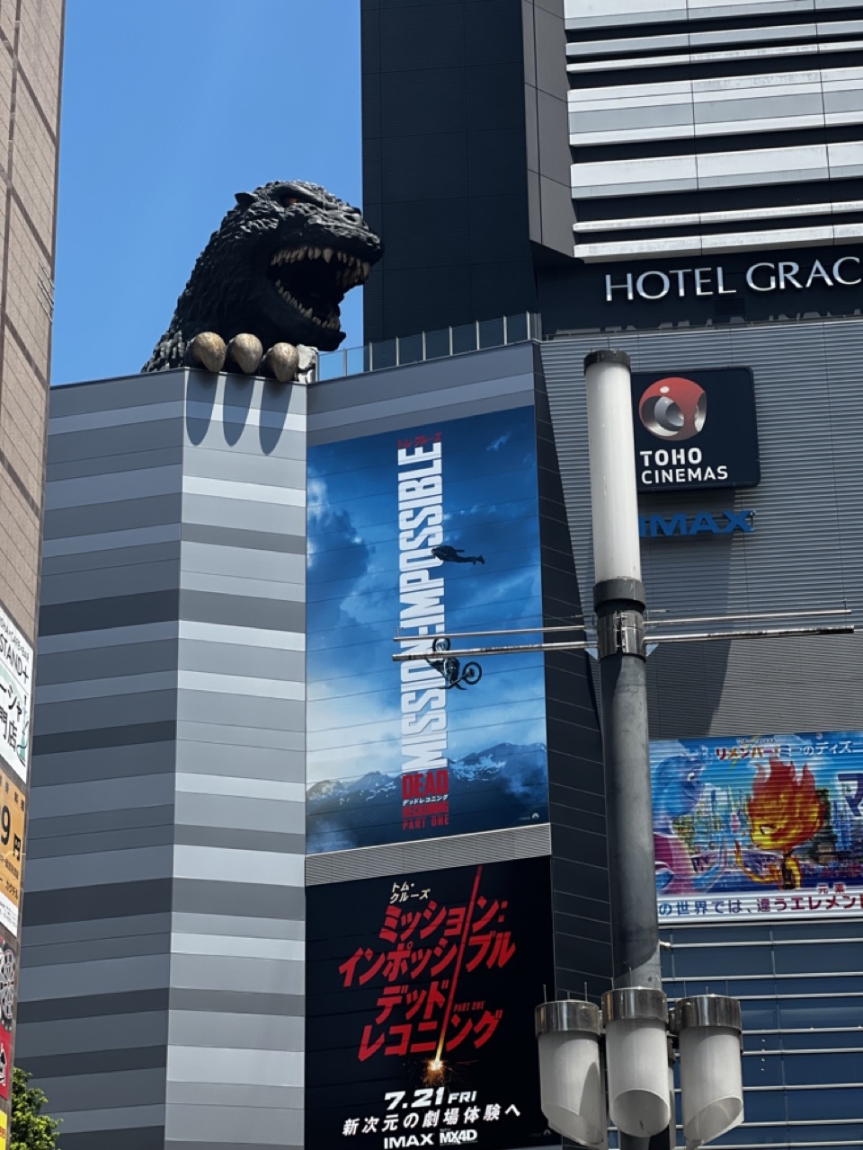

1. Overall Rating (0–10) — 7.0
This photograph captures a striking urban juxtaposition: the monstrous head of Godzilla perched atop a modern cinema complex, looming over a bustling cityscape under a clear blue sky. The image balances pop culture spectacle with architectural realism, creating a surreal yet visually engaging moment. While the framing is slightly cluttered by signage and street elements, the bold presence of the creature and the vibrant movie posters lend it a sense of playful energy and cinematic grandeur.
2. Composition (0–10) — 6.5
The Godzilla head dominates the upper left, creating a strong focal point, but the vertical orientation and dense signage disrupt visual flow. The placement of the IMAX and Toho Cinemas signs adds context but contributes to a busy foreground.
3. Lighting (0–10) — 8.0
Bright, direct sunlight enhances the contrast and clarity of the scene, casting sharp shadows and emphasizing the textures of the Godzilla sculpture and building façade. The clear blue sky provides a clean backdrop that highlights the subject.
4. Color & Tone (0–10) — 7.5
The vivid blue sky contrasts sharply with the dark tones of the Godzilla head and the building’s grey stripes. The red and white of the movie posters inject energetic pops of color, while the overall palette remains balanced and visually engaging.
5. Creativity (0–10) — 8.0
The image leverages a unique cultural fusion—Japanese monster iconography meeting modern cinema advertising—resulting in a visually rich and conceptually layered scene. The inclusion of both English and Japanese text adds authenticity and narrative depth.
6. Technical Quality (0–10) — 7.5
The image is sharp and well-focused, with clean details on the Godzilla sculpture and signage. The exposure is well-managed, though some glare is present on reflective surfaces.
7. Emotional Impact (0–10) — 7.0
The photograph evokes a sense of playful awe and nostalgia, appealing to fans of both Godzilla and cinema. The towering monster feels both menacing and whimsical, inviting viewers to reflect on the intersection of myth and modern entertainment.
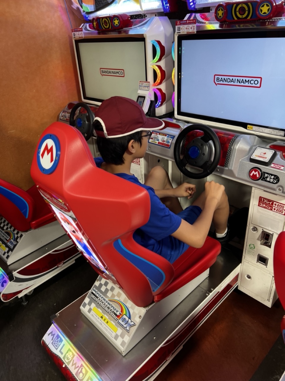

1. Overall Rating (0–10) — 7.0
This photograph captures the immersive energy of an arcade environment, where a young player is fully absorbed in a Mario Kart racing game. The vibrant red of the Mario-themed seat and the surrounding lights inject a sense of playful excitement, while the Bandai Namco branding grounds the scene in authentic gaming culture. The image effectively conveys a moment of joyful concentration, though the slightly cluttered background and casual framing prevent it from feeling fully polished or cinematic.
2. Composition (0–10) — 6.5
The subject is well-centered, with the boy and the red seat forming a strong focal point. However, the overlapping arcade machines and uneven framing create visual noise, pulling attention away from the emotional core of the moment.
3. Lighting (0–10) — 7.0
The ambient lighting is bright and even, with colorful neon accents from the machines enhancing the arcade atmosphere. The glow from the screens adds depth and highlights the subject, though some areas remain underlit due to the enclosed space.
4. Color & Tone (0–10) — 7.5
The palette is lively and dynamic, with bold reds, blues, and whites dominating the frame. The contrast between the bright gaming elements and the muted wall background creates visual interest, and the overall tone feels energetic and youthful.
5. Creativity (0–10) — 7.0
The image captures a candid, authentic moment of childhood engagement with pop culture. While not highly conceptual, the choice to frame the scene through the lens of a familiar arcade experience adds narrative charm and relatability.
6. Technical Quality (0–10) — 7.5
The focus is sharp on the subject, and the image is free from motion blur or grain. The details on the arcade machine and the boy’s clothing are clear, though the overall lighting and exposure are slightly uneven.
7. Emotional Impact (0–10) — 7.5
The photograph evokes a sense of nostalgia and innocence, capturing the simple joy of a child immersed in a game. The viewer is drawn into the experience, feeling both the excitement of the moment and the warmth of shared cultural memory.
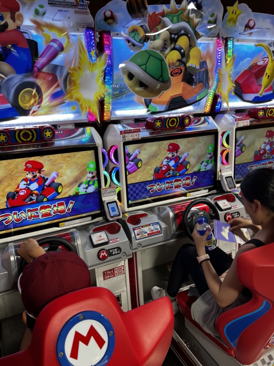

1. Overall Rating (0–10) — 7.0
This photograph captures the vibrant energy of a Japanese arcade, where the bright lights and iconic characters of Mario Kart create an immersive, playful atmosphere. The juxtaposition of real people engaged in the game with the animated world on screen generates a sense of nostalgia and shared fun. While the scene is visually rich, the cluttered arrangement and overexposed highlights slightly diminish its compositional clarity.
2. Composition (0–10) — 6.5
The framing captures the arcade's dynamic environment, but the overlapping elements—arcade machines, screens, and players—create a busy visual hierarchy. A tighter focus on one or two players would enhance narrative clarity and balance.
3. Lighting (0–10) — 7.0
The bright, multicolored lights of the arcade machines dominate the scene, creating a lively, energetic mood. The glow from the screens enhances the sense of motion and immersion, though some areas are slightly overexposed, washing out finer details.
4. Color & Tone (0–10) — 8.0
The vivid reds, blues, and greens of the Mario Kart branding create a bold and cohesive palette. The contrast between the bright game graphics and the darker arcade surroundings enhances visual depth and reinforces the theme of digital play.
5. Creativity (0–10) — 7.5
The image successfully blends reality and fantasy by placing real people within a hyper-stylized gaming environment. This juxtaposition adds a layer of storytelling, suggesting both the appeal of the game and the joy of shared experience.
6. Technical Quality (0–10) — 7.5
The photo is sharp and clear, with good detail in the screens and game controls. The focus is well-managed, though the depth of field could be tighter to isolate the subjects from the surrounding clutter.
7. Emotional Impact (0–10) — 7.0
The image evokes a sense of joy and nostalgia, particularly for fans of the Mario franchise. The players’ engagement, combined with the colorful, high-energy setting, creates a warm, inviting atmosphere that resonates with the universal appeal of arcade gaming.
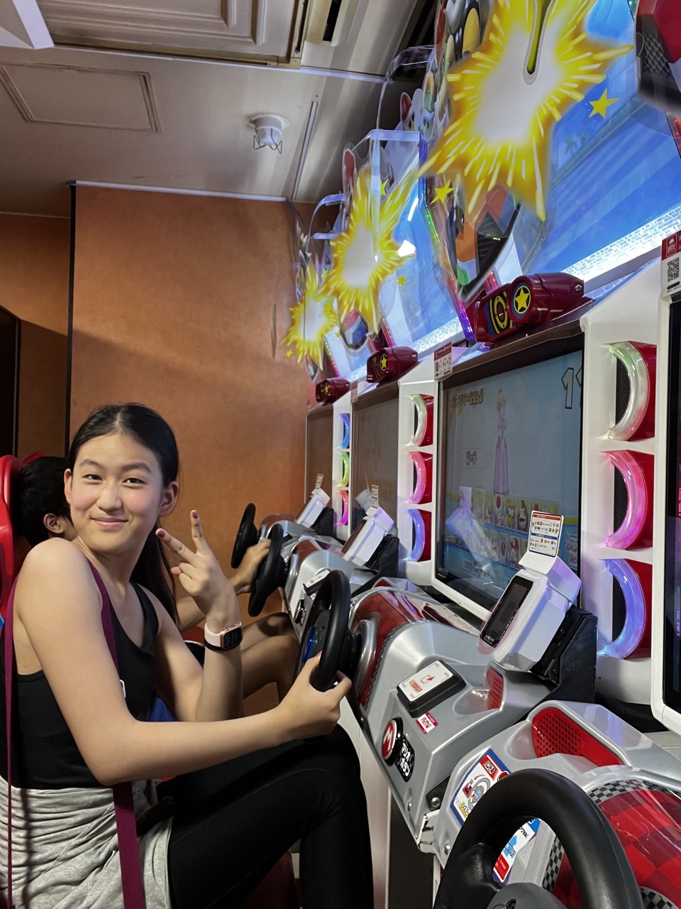

1. Overall Rating (0–10) — 6.8
This photograph captures a candid moment of joy and playfulness in a vibrant arcade setting, where the energy of the game and the subject’s genuine smile combine to create a lively atmosphere. The colorful lights and dynamic game graphics add excitement, though the image feels slightly cluttered, with competing visual elements that dilute focus. Despite this, the warmth of the moment and the subject’s engaging presence give the photo a strong sense of authenticity and personal connection.
2. Composition (0–10) — 6.0
The subject is well-placed on the left, creating a balanced visual flow toward the arcade machine, but the background is busy and distracting. A tighter crop would improve focus and reduce visual noise.
3. Lighting (0–10) — 6.5
The mixed lighting—fluorescent overheads and bright arcade displays—creates a dynamic but uneven exposure. The screen’s glow adds vibrancy, but some areas remain underlit, reducing depth.
4. Color & Tone (0–10) — 7.0
The palette is rich with bold reds, blues, and yellows from the game, enhancing the playful tone. The contrast between the warm skin tones and the cool electronic glow adds visual interest.
5. Creativity (0–10) — 7.5
The image effectively captures a moment of youthful fun, blending narrative and environment. The inclusion of the game’s animated graphics adds a layer of whimsy and context that elevates the photo beyond a simple snapshot.
6. Technical Quality (0–10) — 7.0
The focus is sharp on the subject, and the details in the arcade machine are clear. However, slight overexposure from the screen and minor noise in darker areas affect overall clarity.
7. Emotional Impact (0–10) — 7.5
The subject’s genuine smile and relaxed pose convey a sense of happiness and nostalgia, making the viewer feel invited into a lighthearted, fun-filled moment.
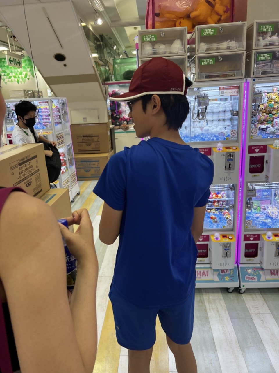

1. Overall Rating (0–10) — 6.0
This photograph captures a candid moment in a bustling arcade, where the energy of a child’s focus on a claw machine contrasts with the surrounding chaos. The composition feels spontaneous and unposed, offering a glimpse into a slice of everyday leisure, though it lacks visual cohesion due to cluttered surroundings and a slightly awkward framing. While the scene is relatable and filled with subtle narrative potential, it doesn’t fully transcend its documentary nature to feel like a compelling artistic statement.
2. Composition (0–10) — 5.0
The subject is framed off-center with a partial view of another person in the foreground, which disrupts visual balance. The background is cluttered with machines and boxes, pulling attention away from the main subject.
3. Lighting (0–10) — 5.5
Bright, even fluorescent lighting illuminates the space clearly but flattens depth and shadows, resulting in a sterile, commercial atmosphere that doesn’t enhance the mood.
4. Color & Tone (0–10) — 6.0
The dominant blue of the boy’s outfit contrasts with the warm red cap and the multicolored toys in the claw machines, creating visual interest. However, the overall tone is muted, with a slight yellow cast from the overhead lighting.
5. Creativity (0–10) — 6.5
The image captures a relatable, unguarded moment, offering a narrative of childhood fascination. The juxtaposition of the focused child against the chaotic arcade environment adds a layer of storytelling, though it's executed in a straightforward, observational manner.
6. Technical Quality (0–10) — 7.0
The image is sharp and in focus, with clean detail visible in the textures of clothing and the arcade machines. However, the framing and composition limit its overall impact.
7. Emotional Impact (0–10) — 6.0
The photograph evokes a sense of quiet anticipation and youthful engagement, allowing viewers to recall their own experiences in similar settings. While emotionally resonant, it doesn’t deeply stir the viewer due to the lack of dramatic tension or intimacy.
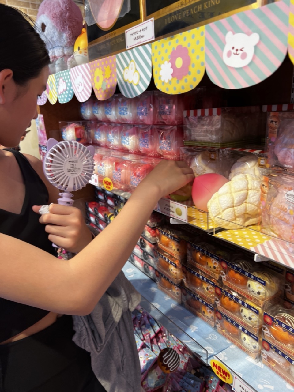

1. Overall Rating (0–10) — 6.0
This photograph captures the playful chaos of a Japanese novelty store, where vibrant colors and whimsical merchandise create a sense of childlike wonder. The subject’s interaction with the shelf adds a candid, human element, grounding the scene in everyday delight. While the composition is energetic and full of character, the lack of visual focus and slight clutter reduce its overall aesthetic cohesion.
2. Composition (0–10) — 5.5
The frame is crowded and diagonally angled, with the subject partially cropped and the eye drawn to the chaotic array of products. A tighter crop and more deliberate subject placement would improve balance and narrative clarity.
3. Lighting (0–10) — 6.0
Bright, even fluorescent lighting illuminates the scene clearly but flattens depth and detail. The harshness of the light contrasts with the soft, pastel tones of the merchandise, creating a slightly clinical feel that undermines the whimsy.
4. Color & Tone (0–10) — 7.0
A lively palette of pinks, yellows, and pastels dominates, reflecting the playful nature of the setting. The color harmony is strong, though the overuse of red and white in the packaging slightly overwhelms the composition.
5. Creativity (0–10) — 6.5
The image captures a moment of genuine curiosity in a visually rich environment. While not particularly original in concept, it effectively conveys the sensory overload and joy of exploring a kawaii-themed store.
6. Technical Quality (0–10) — 6.5
The image is sharp and well-focused, with clear details in both the subject and the products. However, the depth of field is shallow, and some background elements are slightly out of focus, reducing clarity in the busier areas.
7. Emotional Impact (0–10) — 6.0
The photograph evokes a sense of lightheartedness and nostalgia, inviting viewers to recall the joy of discovering quirky, adorable items. The emotional connection is subtle but present, particularly for those familiar with Japanese pop culture.
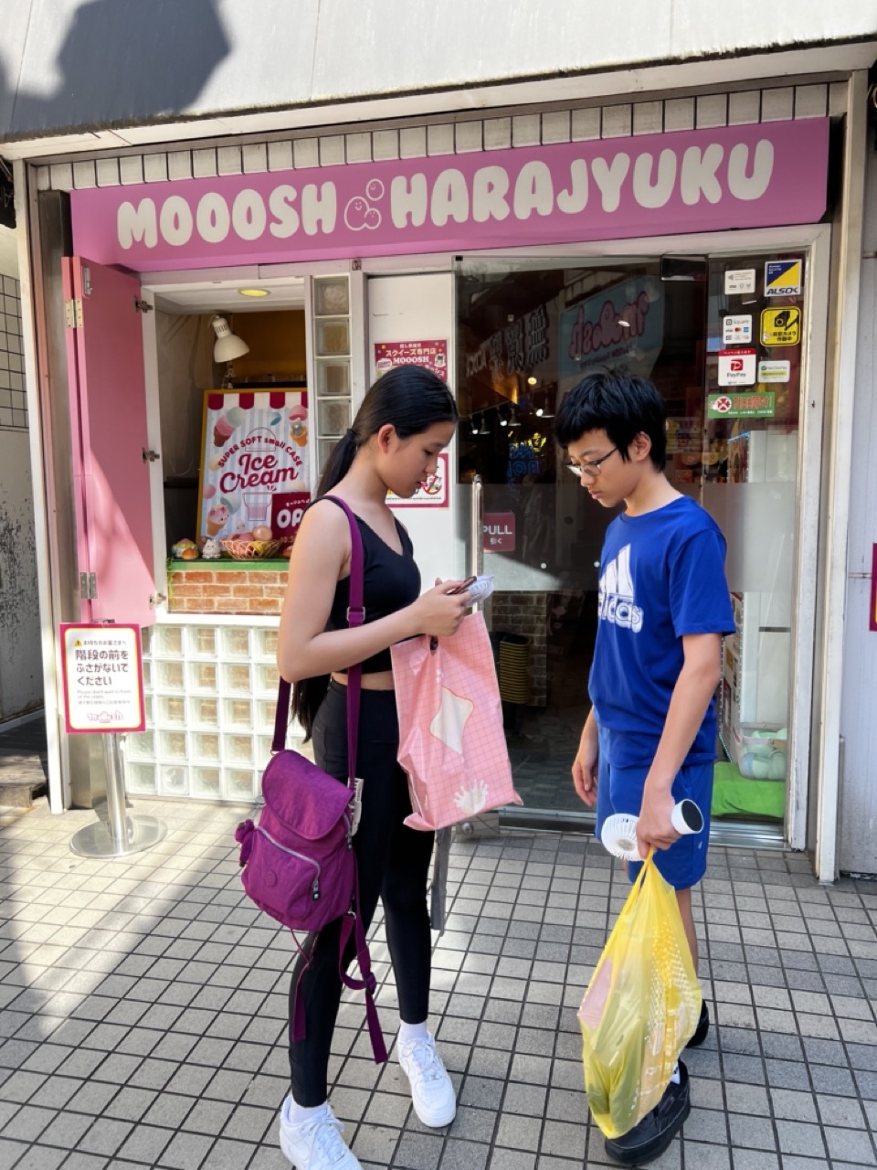

1. Overall Rating (0–10) — 6.8
This photograph captures a candid moment of two individuals outside a vibrant ice cream shop, exuding a sense of everyday life and youthful spontaneity. The bright pink signage and casual attire lend a playful energy, while the natural daylight enhances the scene’s authenticity. However, the composition feels slightly unbalanced and the framing lacks a stronger focal point, preventing the image from achieving greater visual cohesion.
2. Composition (0–10) — 6.0
The subjects are placed off-center, creating a dynamic but uneven balance. The open door and glass block wall add depth, but the cluttered foreground and lack of clear leading lines reduce compositional focus.
3. Lighting (0–10) — 7.0
Natural daylight provides even illumination with soft shadows, enhancing the scene’s clarity and realism. The contrast between the bright storefront and shaded sidewalk adds subtle dimension.
4. Color & Tone (0–10) — 7.5
The dominant pink of the signage creates a cheerful, playful mood, complemented by the vivid blue and yellow of the subjects’ clothing. The color palette is lively and harmonious, though slightly over-saturated, giving the image a slightly commercial feel.
5. Creativity (0–10) — 6.5
The image captures a slice of urban life with authenticity, but the concept remains conventional. The candid nature of the moment is its strength, yet it lacks a distinctive artistic vision or narrative depth.
6. Technical Quality (0–10) — 7.5
The image is sharp and well-focused, with clean detail throughout. The exposure is balanced, and the camera settings effectively capture the scene without noticeable flaws.
7. Emotional Impact (0–10) — 6.0
The image evokes a sense of casual joy and youthful connection, but the emotional resonance is muted by the lack of intimacy or storytelling. It feels more like a snapshot than a deeply moving moment.
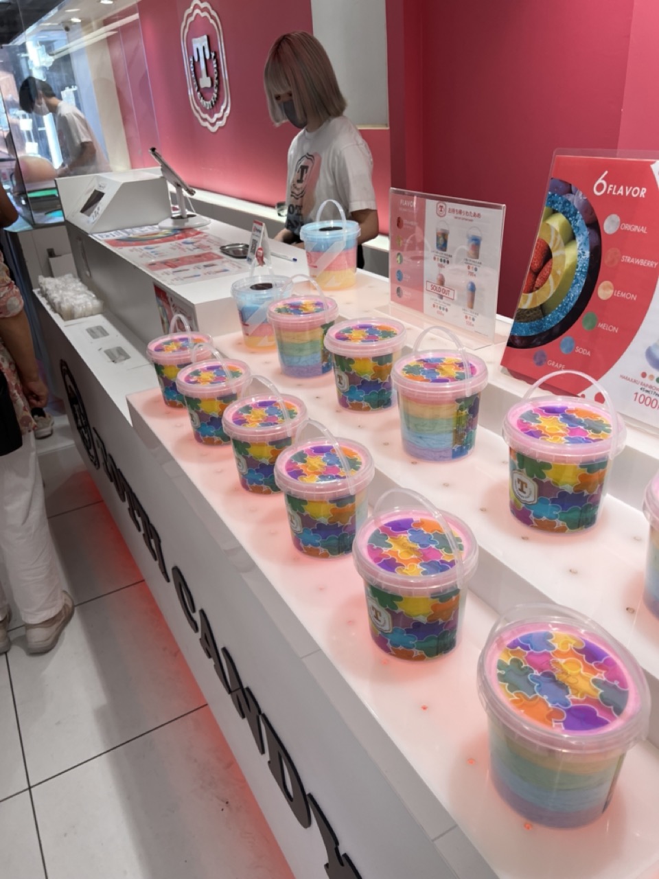

1. Overall Rating (0–10) — 6.8
This photograph captures the vibrant energy of a modern candy shop, where playful design and bright colors create an inviting, almost whimsical atmosphere. The rainbow-hued layers in the jars and the bold pink backdrop work together to evoke a sense of fun and indulgence, though the composition feels slightly overwhelmed by the number of elements competing for attention. While the image successfully conveys the shop’s playful aesthetic, it lacks the visual cohesion to feel truly polished or artistically intentional.
2. Composition (0–10) — 6.0
The diagonal line of candy jars leads the eye through the frame, but the cluttered counter and overlapping signage create a busy, disorganized feel. A tighter crop and more deliberate framing would improve balance and focus.
3. Lighting (0–10) — 7.5
Bright, even overhead lighting illuminates the scene clearly, highlighting the vivid colors of the candy. The light is functional and clean, though it lacks the warmth or directional quality that might add depth or mood.
4. Color & Tone (0–10) — 8.5
The palette is striking, with saturated pinks, purples, and blues creating a dynamic and playful visual harmony. The contrast between the colorful jars and the clean white counter enhances the vibrancy, though the overall tone leans slightly cool and artificial.
5. Creativity (0–10) — 7.0
The concept is inherently creative—layered, colorful candy in a branded setting—but the execution feels more like documentation than storytelling. The inclusion of signage and background activity adds context, but the image remains largely observational rather than evocative.
6. Technical Quality (0–10) — 7.5
The image is sharp and well-focused, with clear details in the candy layers and signage. The exposure is balanced, and there are no noticeable technical flaws, though the angle and depth of field could be more refined.
7. Emotional Impact (0–10) — 7.0
The photograph evokes a sense of joy and nostalgia, tapping into the childlike delight associated with candy. The bright colors and playful presentation resonate emotionally, though the lack of human interaction or narrative detail keeps the connection to the viewer from being fully immersive.
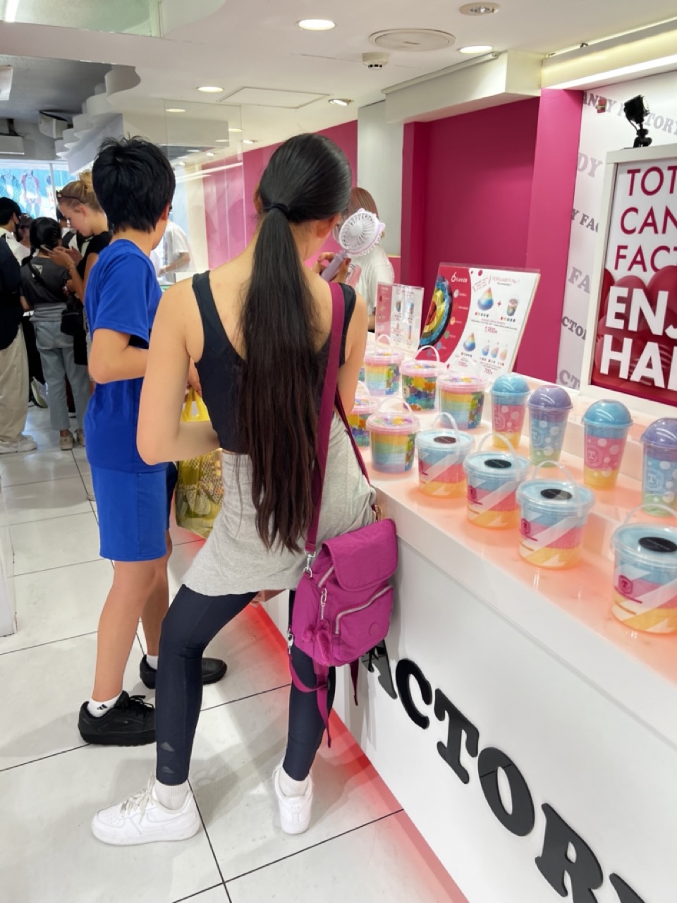

1. Overall Rating (0–10) — 6.0
This image captures a lively moment at a candy store, where the vibrant pink backdrop and colorful products create an energetic, playful atmosphere. The composition is candid and immersive, drawing the viewer into the scene, but the lack of a clear focal point and the cluttered background slightly dilute its visual impact. While the mood is engaging and authentic, the photograph feels more like a snapshot than a polished composition.
2. Composition (0–10) — 5.5
The framing is slightly off-center, with the main subject partially obscured by the person in front. The diagonal line of the counter adds visual interest, but the crowded background and overlapping figures create a sense of visual chaos.
3. Lighting (0–10) — 6.0
Bright, even overhead lighting illuminates the scene clearly, typical of a retail environment. While it ensures visibility, the harshness of the light flattens depth and washes out some of the color vibrancy.
4. Color & Tone (0–10) — 7.5
The bold pink walls and multicolored candy cups create a cheerful, high-contrast palette. The colors pop against the neutral floor and clothing, enhancing the playful tone, though some saturation feels slightly overdone.
5. Creativity (0–10) — 6.0
The image leverages a fun, commercial setting to convey energy and youthfulness. While the concept is strong and the environment is visually engaging, the execution remains straightforward and lacks a unique artistic perspective.
6. Technical Quality (0–10) — 7.0
The image is sharp and in focus, with clean details on the products and subjects. The white balance is accurate, and the camera seems to have handled the mixed lighting well, though some noise is present in the background.
7. Emotional Impact (0–10) — 6.5
The photograph evokes a sense of joy and lightheartedness, tapping into the universal appeal of candy and shared experiences. It feels relatable and nostalgic, though the lack of a strong narrative or emotional anchor keeps the connection at a surface level.
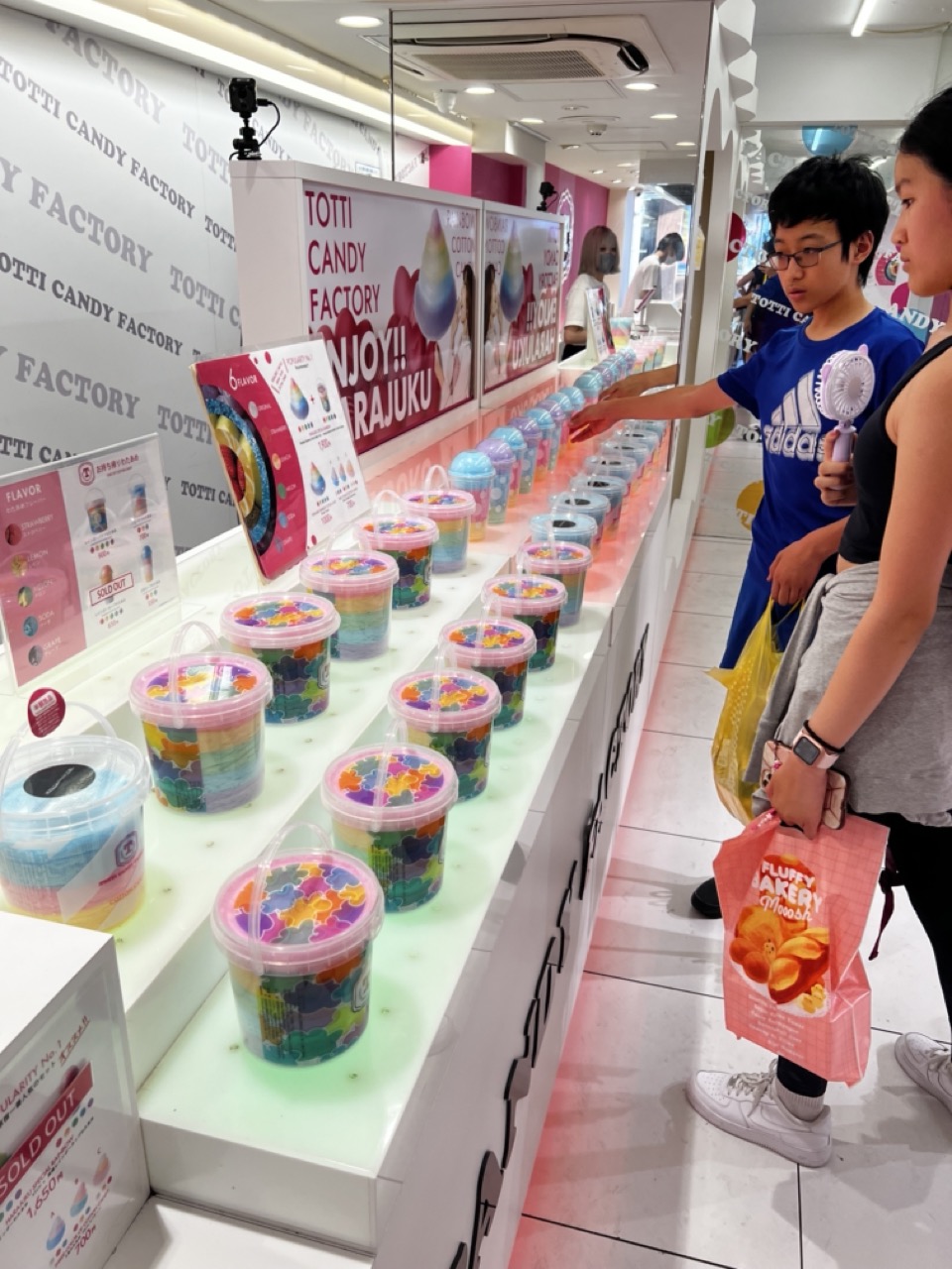

1. Overall Rating (0–10) — 6.0
This photograph captures a vibrant, playful moment inside a cotton candy shop, where the bright colors and curious customers evoke a sense of youthful delight. The scene is lively and candid, but the composition feels slightly cluttered, and the lighting, while functional, lacks the subtlety needed to elevate the image into something more artistically compelling.
2. Composition (0–10) — 5.5
The diagonal arrangement of the candy display leads the eye through the frame, but the foreground elements—particularly the plastic bag and the child’s arm—create visual noise. A tighter crop or repositioning of the subjects would improve balance and focus.
3. Lighting (0–10) — 5.0
Bright, even fluorescent lighting illuminates the scene clearly but flattens textures and casts a sterile glow. The lack of directional light or shadow reduces depth and mood, making the image feel more like a snapshot than a thoughtfully composed photograph.
4. Color & Tone (0–10) — 7.5
The vivid rainbow hues of the cotton candy provide a joyful, energetic palette that contrasts nicely with the neutral white interior. The color saturation enhances the playful tone, though the overall tone remains somewhat flat due to the lighting.
5. Creativity (0–10) — 6.5
The image captures a moment of genuine curiosity and delight, with the child’s gesture suggesting a narrative of choice and wonder. While not groundbreaking, it successfully conveys the whimsy of a candy shop experience.
6. Technical Quality (0–10) — 7.0
The image is sharp and well-focused, with clean details in the candy containers and signage. However, the wide-angle perspective introduces slight distortion, and the framing feels slightly rushed.
7. Emotional Impact (0–10) — 6.5
There’s a subtle warmth in the interaction between the child and the display, evoking nostalgia and the simple joy of choosing a treat. While not deeply moving, the image resonates with a quiet sense of childhood wonder.
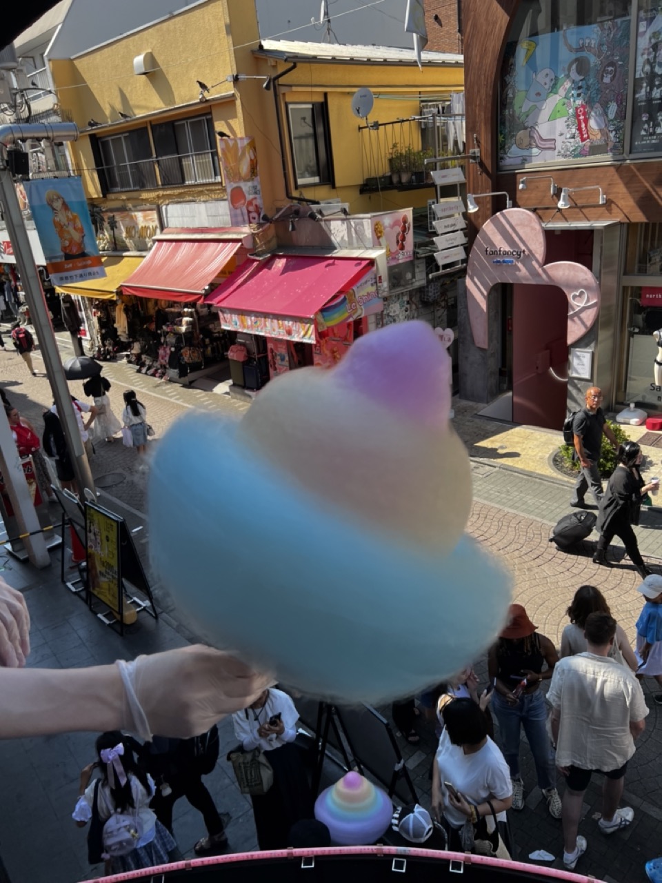

1. Overall Rating (0–10) — 6.8
This image captures the vibrant energy of a bustling Japanese street market, with the colorful cotton candy serving as a playful focal point. The shallow depth of field isolates the candy from the busy background, creating a sense of whimsy and immediacy. While the scene is lively and well-framed, the cluttered environment and slightly overexposed highlights reduce the overall visual cohesion.
2. Composition (0–10) — 7.0
The cotton candy is well-placed in the foreground, drawing the eye immediately, while the diagonal street and crowd create dynamic leading lines. The high-angle perspective offers a broad view of the scene, though the busy background slightly distracts from the main subject.
3. Lighting (0–10) — 6.5
Bright, natural daylight illuminates the scene, but the intense sun creates harsh highlights and blown-out areas in the background. The soft, diffused light on the cotton candy enhances its texture and color, though some details in the shadows are lost.
4. Color & Tone (0–10) — 7.5
The vibrant blue and pink cotton candy stands out against the more muted tones of the street, creating a strong contrast. The warm yellow of the buildings and the pops of red and pink from awnings add to the playful, energetic palette.
5. Creativity (0–10) — 7.0
The use of a close-up, foreground subject against a lively urban backdrop creates a compelling contrast between personal indulgence and public life. The choice to focus on a simple, joyful moment within a chaotic environment adds a layer of narrative charm.
6. Technical Quality (0–10) — 7.0
The focus on the cotton candy is sharp, with good detail in the foreground. The background is appropriately blurred, though some areas show slight overexposure and loss of detail due to the bright conditions.
7. Emotional Impact (0–10) — 7.5
The image evokes a sense of joy and spontaneity, capturing a fleeting moment of delight in a busy, colorful setting. The viewer is drawn into the scene, feeling the energy of the crowd and the sensory pleasure of the treat.


1. Overall Rating (0–10) — 7.0
This photograph captures a quiet, intimate moment between two cats in a cozy domestic setting, where the contrast between the white and ginger felines adds visual interest. The white cat in the foreground commands attention with its serene posture, while the blurred background figure adds depth and narrative intrigue. The natural lighting and candid composition lend authenticity, though the image could benefit from more intentional framing to elevate its artistic impact.
2. Composition (0–10) — 6.5
The white cat is well-placed in the foreground, drawing the viewer’s eye, while the orange cat in the background provides depth. However, the cluttered background and slightly off-center framing reduce compositional harmony.
3. Lighting (0–10) — 7.0
Soft, natural light illuminates the scene evenly, enhancing the texture of the cats’ fur and the warm tones of the wooden surface. The lighting feels authentic and enhances the calm mood.
4. Color & Tone (0–10) — 7.0
The palette is harmonious, with the white and ginger fur complementing the warm wood and muted background tones. The overall tonal balance is pleasing, with gentle contrast that emphasizes the subjects.
5. Creativity (0–10) — 6.5
The image captures a natural, unposed moment, offering a glimpse into feline life with a quiet narrative. While not highly experimental, it conveys warmth and personality through its subject and setting.
6. Technical Quality (0–10) — 8.0
Sharp focus on the white cat’s face and fur is clear, with good detail throughout. The depth of field effectively separates foreground from background, though slight motion blur in the background is noticeable.
7. Emotional Impact (0–10) — 7.5
The image evokes a sense of calm and companionship, with the white cat’s gentle gaze inviting quiet contemplation. Its serene demeanor resonates emotionally, creating a moment of quiet connection.
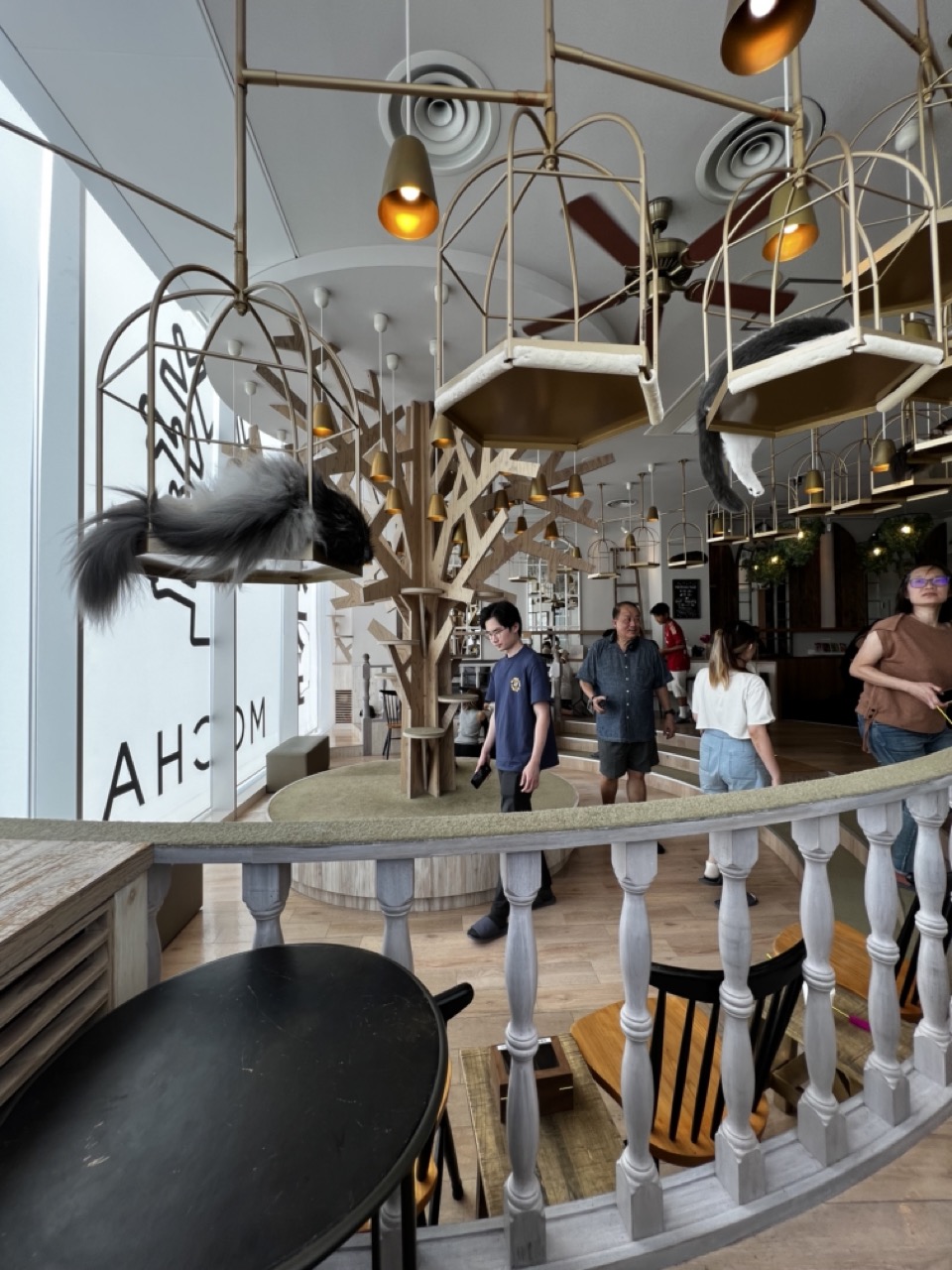

1. Overall Rating (0–10) — 7.0
This photograph captures the playful, whimsical atmosphere of a cat-themed café with striking architectural detail and a sense of lively motion. The suspended cat perches and sculptural tree structure create a dreamlike environment that feels both curated and inviting. While the image is rich in visual texture and narrative potential, the composition’s busyness slightly undermines clarity, and the natural lighting, though bright, doesn’t fully accentuate the scene’s warmth and depth.
2. Composition (0–10) — 6.5
The diagonal railing and layered depth create a dynamic entry into the scene, but the frame feels crowded with overlapping elements—people, structures, and light fixtures—that compete for attention. A tighter crop or adjusted vantage point could improve visual flow.
3. Lighting (0–10) — 6.0
The mix of natural light from the left and warm artificial pendant lights creates a balanced, ambient glow, though the overhead fixtures cast subtle shadows that flatten some details. The lighting supports the space’s playful mood but lacks dramatic contrast.
4. Color & Tone (0–10) — 6.5
The palette leans on neutral tones—beige, wood, white—with soft gold accents from the lights and metal fixtures. While harmonious, the colors are somewhat subdued, missing a pop of vibrancy that could elevate the image’s energy.
5. Creativity (0–10) — 8.0
The concept of integrating cat perches into the café’s architecture is imaginative and visually engaging. The use of scale, repetition, and suspended forms gives the image a unique, story-driven quality that feels both inventive and thematic.
6. Technical Quality (0–10) — 7.5
Sharp focus and clean detail are evident throughout, particularly in the foreground and central elements. The camera’s exposure is well-balanced, preserving detail in both highlights and shadows.
7. Emotional Impact (0–10) — 7.0
The scene evokes a sense of curiosity and delight, inviting the viewer into a world where cats and people coexist in a cozy, imaginative space. The subtle human interactions and the cats’ relaxed presence lend a warm, welcoming tone that resonates emotionally.
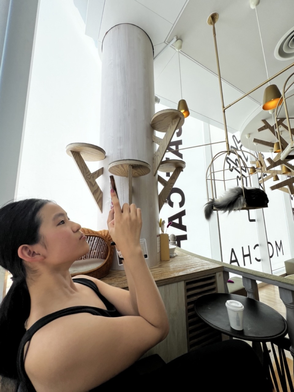

1. Overall Rating (0–10) — 7.0
This image captures a serene moment in a modern cat café, where human and feline coexist in a shared space of quiet observation. The woman’s upward gaze and the cat perched in a suspended cage create a subtle narrative of connection and curiosity. While the composition and lighting are strong, the scene feels slightly staged, and the busy background detracts from the emotional intimacy. Still, it conveys a peaceful, contemporary mood with a gentle sense of wonder.
2. Composition (0–10) — 6.5
The subject is placed off-center, creating a dynamic diagonal flow toward the cat and the architectural elements. However, the cluttered background and overlapping structures distract from the main focal point, reducing visual clarity.
3. Lighting (0–10) — 7.0
Natural light floods the space from the left, creating soft, even illumination that enhances the calm atmosphere. The warm glow of the pendant lamps adds depth and warmth, balancing the coolness of the white walls and glass.
4. Color & Tone (0–10) — 6.5
The palette is dominated by neutral whites, grays, and warm wood tones, creating a clean, modern aesthetic. While harmonious, the lack of vibrant color limits the image’s visual impact, giving it a slightly muted feel.
5. Creativity (0–10) — 7.0
The juxtaposition of the woman and the cat, both looking upward, suggests a shared moment of wonder. The inclusion of the cat in the suspended cage and the layered architectural design adds a unique, whimsical quality to the scene.
6. Technical Quality (0–10) — 7.5
The image is sharp and well-focused, with clear details in the subject’s face, clothing, and the surrounding environment. The exposure is balanced, and there are no visible technical flaws.
7. Emotional Impact (0–10) — 6.5
The photograph evokes a sense of quiet contemplation and gentle connection between human and animal. While the emotion is present, the busy background and lack of intimate framing keep the viewer from fully immersing in the moment.


1. Overall Rating (0–10) — 7.0
This intimate close-up captures the quiet serenity of a sleeping cat, where soft fur and closed eyes convey a deep sense of peace. The composition draws the viewer into a moment of tender stillness, though the tight framing and slightly soft focus limit the image’s visual clarity. While not technically polished, the photo succeeds in evoking warmth and comfort through its gentle subject and tactile detail.
2. Composition (0–10) — 7.5
The close-up framing emphasizes the cat’s peaceful expression, with the paw in the foreground adding depth and a sense of intimacy. The diagonal placement of the paw guides the eye toward the face, creating a natural flow, though the slight tilt introduces a subtle imbalance.
3. Lighting (0–10) — 7.0
Soft, diffused light enhances the delicate texture of the fur and highlights the cat’s peaceful features. The gentle illumination avoids harsh shadows and supports the tranquil mood, though a touch more contrast would add dimension.
4. Color & Tone (0–10) — 7.5
The monochromatic palette of white, black, and soft pink creates a harmonious and soothing visual. The subtle warmth in the tones enhances the feeling of coziness, and the contrast between the dark nose and paw pads adds visual interest.
5. Creativity (0–10) — 7.0
The image leverages a common subject—sleeping cat—with a personal, affectionate approach. The tight framing and focus on texture elevate it beyond a simple snapshot, offering a quiet, contemplative moment that feels both familiar and intimate.
6. Technical Quality (0–10) — 6.5
The image is sharp in the mid-ground but slightly soft in focus, particularly on the nose and whiskers. Depth of field is shallow, which helps isolate the subject, but minor blur in key areas detracts from overall clarity.
7. Emotional Impact (0–10) — 8.0
The photograph radiates calm and contentment, evoking a strong sense of affection and tranquility. The viewer is invited into a private, peaceful moment, making the image emotionally resonant and deeply relatable.
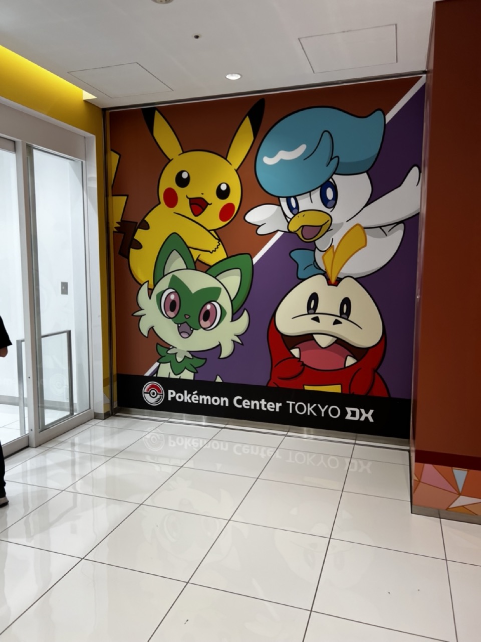

1. Overall Rating (0–10) — 6.0
This image captures the vibrant, playful energy of the Pokémon Center Tokyo DX with bold character art and a clean, modern setting. While the composition and lighting effectively highlight the mural’s colorful design, the scene feels more like a promotional snapshot than a compelling photograph—lacking depth and narrative tension. The reflection on the floor adds a touch of realism, but the overall effect remains functional rather than evocative.
2. Composition (0–10) — 6.0
The mural is centered and fills the frame well, with the glass doors on the left adding visual balance. However, the inclusion of the person’s leg on the far left creates a slight distraction, pulling focus from the main subject.
3. Lighting (0–10) — 7.0
Even, overhead lighting illuminates the space clearly, preserving the vivid colors of the mural without harsh shadows. The brightness enhances the cheerful tone of the scene, though the flatness of the light reduces atmospheric depth.
4. Color & Tone (0–10) — 8.0
The palette is rich and dynamic, with bold primary and secondary colors in the mural contrasting against the neutral white tiles and warm brown wall. The color harmony is strong, reinforcing the energetic, child-friendly brand identity.
5. Creativity (0–10) — 6.5
The image leverages familiar characters and a recognizable location to create immediate recognition, but it lacks originality in framing or perspective. It functions more as documentation than artistic interpretation.
6. Technical Quality (0–10) — 7.5
Sharp focus and clean detail throughout, with no visible noise or blur. The reflections on the polished floor are captured clearly, adding subtle visual interest.
7. Emotional Impact (0–10) — 5.5
While the image conveys a sense of fun and nostalgia for fans of the franchise, it doesn’t evoke a strong emotional response in a broader audience. The emotional resonance is limited to those familiar with Pokémon, and the lack of human interaction or storytelling keeps the viewer at a distance.


1. Overall Rating (0–10) — 6.0
This photograph captures a candid moment in a brightly lit toy store, where two children pause amid shelves of Pokémon plushies. The scene feels authentic and unposed, with the children’s natural gestures lending a sense of everyday life. However, the image is held back by a lack of visual focus and an overabundance of background distractions, which dilute the emotional resonance and narrative clarity.
2. Composition (0–10) — 5.0
The subjects are slightly off-center and partially cropped, creating a sense of imbalance. The busy background and cluttered shelves compete for attention, weakening the visual hierarchy and making it difficult to focus on the children.
3. Lighting (0–10) — 7.0
Even, bright overhead lighting illuminates the scene clearly, allowing for sharp detail across the frame. While functional, the light is flat and lacks directionality, contributing to a sterile, commercial atmosphere.
4. Color & Tone (0–10) — 6.0
The palette is vibrant, with the bold colors of the Pokémon toys adding visual energy. However, the dominance of primary colors and the reflective black floor create a somewhat chaotic and visually noisy effect, reducing tonal cohesion.
5. Creativity (0–10) — 5.5
The image captures a slice of life with a sense of spontaneity, but it lacks a strong artistic vision or narrative intent. The setting is recognizable and familiar, but the photograph remains more observational than expressive.
6. Technical Quality (0–10) — 7.5
The image is sharp and well-exposed, with good detail in both the foreground and background. Focus is consistent, and the camera’s handling of motion and light is competent, though framing and composition limit its impact.
7. Emotional Impact (0–10) — 5.0
While the moment is relatable, the emotional connection is muted by the lack of focus and the overwhelming commercial environment. The viewer is more likely to see a snapshot of a shopping trip than to feel a deeper resonance with the children’s experience.
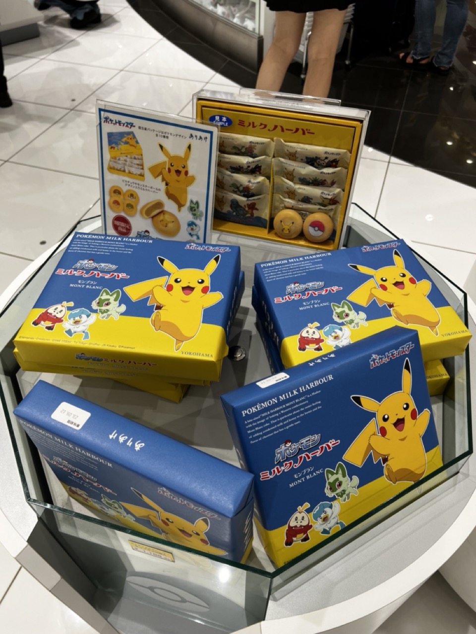

1. Overall Rating (0–10) — 6.0
This photograph captures a vibrant display of Pokémon-themed confectionery in a retail setting, where playful branding and colorful packaging create an immediate sense of whimsy. The bright yellow and blue hues pop against the neutral tiled floor, drawing attention to the products, but the composition feels slightly cluttered and lacks a cohesive visual narrative. While the image effectively documents a moment of commercial appeal, it falls short of artistic refinement, feeling more like a casual snapshot than a thoughtfully composed scene.
2. Composition (0–10) — 5.5
The arrangement of boxes is slightly haphazard, with overlapping elements and uneven spacing. The central display case provides structure, but the off-center framing and partial view of the background figures disrupt visual balance.
3. Lighting (0–10) — 6.0
Bright, even overhead lighting illuminates the scene clearly, preserving the vivid colors of the packaging. However, the lack of directional or dramatic lighting gives the image a flat, commercial quality.
4. Color & Tone (0–10) — 7.0
The dominant blue and yellow palette is energetic and visually engaging, with the bright yellow Pikachu creating a strong focal point. The contrast between the colorful product and the muted white floor enhances the vibrancy, though the overall tone leans toward the artificial.
5. Creativity (0–10) — 6.5
The concept of merging pop culture with food packaging is inherently creative, and the playful design of the boxes adds charm. However, the execution feels more illustrative than interpretive, limiting the image’s originality.
6. Technical Quality (0–10) — 7.0
The image is sharp and in focus, with clean details on the packaging text and characters. The glass reflections are minimal and do not distract significantly.
7. Emotional Impact (0–10) — 6.0
The image evokes a sense of nostalgia and delight, particularly for fans of Pokémon. While it captures a moment of joy and consumer culture, it doesn’t elicit a deeper emotional resonance, remaining largely surface-level.
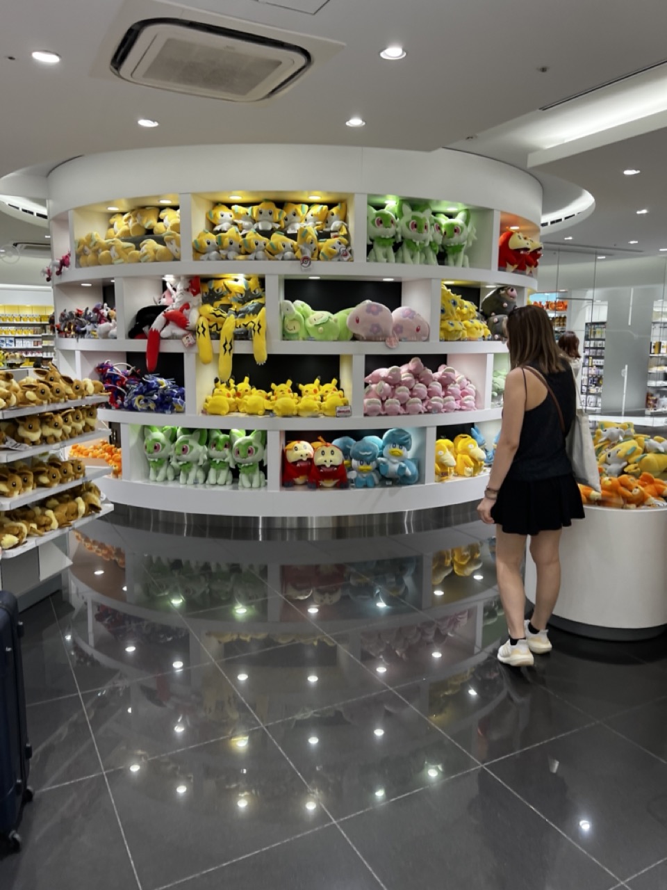

1. Overall Rating (0–10) — 6.0
This photograph captures the vibrant energy of a Pokémon-themed retail space, where color and repetition create a playful, immersive atmosphere. The circular display and glossy floor amplify the sense of abundance, while the woman’s contemplative stance grounds the scene in human experience. While the image is visually engaging and well-composed, its straightforward documentation lacks a deeper narrative or emotional resonance, feeling more like a snapshot than a crafted moment.
2. Composition (0–10) — 7.0
The circular shelving draws the eye naturally, creating a strong focal point, while the woman’s placement on the right balances the frame. The reflection on the polished floor adds depth and symmetry, though the left side feels slightly cluttered with shelves extending into the background.
3. Lighting (0–10) — 7.0
Even, bright overhead lighting highlights the plush toys effectively, with subtle accent lighting beneath each shelf enhancing color and detail. The reflections on the floor add visual interest, though the lighting remains functional rather than atmospheric.
4. Color & Tone (0–10) — 8.0
The palette is rich with bold, saturated hues—yellow, green, pink, and blue—evoking a sense of joy and nostalgia. The contrast between the colorful toys and the neutral white shelving and dark floor creates a dynamic visual rhythm.
5. Creativity (0–10) — 6.0
The concept is grounded in commercial photography, capturing a familiar retail environment with clear intent. While the arrangement is visually pleasing, the lack of a unique perspective or artistic manipulation limits its originality.
6. Technical Quality (0–10) — 8.0
The image is sharp and well-focused, with clean details throughout. The reflections are clear and well-integrated into the composition, indicating strong technical execution.
7. Emotional Impact (0–10) — 6.5
The scene evokes a sense of wonder and nostalgia, particularly for fans of Pokémon, but the emotional connection remains surface-level. The viewer is invited to observe rather than feel, with the human element serving more as a scale than a narrative anchor.


1. Overall Rating (0–10) — 6.0
This photograph captures a candid moment of quiet indulgence, where a young person savors a vibrant fruit parfait in a softly lit café. The layered dessert draws the eye with its vivid colors and textures, while the subject’s focused expression adds a sense of intimacy and authenticity. Though the composition feels slightly cluttered and the lighting is unremarkable, the image succeeds in conveying a simple, relatable pleasure—its charm lies in its unpolished honesty rather than technical finesse.
2. Composition (0–10) — 5.5
The subject is slightly off-center, and the frame includes distracting elements like the phone and napkin, which clutter the foreground. A tighter crop would better emphasize the dessert and the subject’s engagement with it.
3. Lighting (0–10) — 5.0
The indoor lighting is flat and warm, likely from overhead fixtures, which casts soft shadows but lacks depth or directionality. While it illuminates the scene clearly, it does little to enhance mood or highlight texture.
4. Color & Tone (0–10) — 6.5
The bright, saturated colors of the fruit—pink dragon fruit, yellow mango, green kiwi—create a joyful contrast against the blue shirt and neutral table. The overall tone is warm but slightly muted, with a lack of dynamic range that dulls the vibrancy of the dessert.
5. Creativity (0–10) — 6.0
The image is observational and personal, capturing a genuine moment rather than a staged or conceptual scene. The focus on the dessert as a visual centerpiece adds a touch of whimsy, though the composition and lighting remain conventional.
6. Technical Quality (0–10) — 7.0
The image is sharp and well-focused on the dessert and subject, with clear detail in the textures of the fruit and glass. The camera appears to have handled the indoor lighting adequately, with no major flaws in exposure or noise.
7. Emotional Impact (0–10) — 6.5
There’s a gentle sense of contentment and quiet joy in the subject’s expression, which makes the moment feel personal and relatable. The viewer is drawn into the experience of savoring something delightful, even if the emotional resonance is restrained by the image’s straightforward execution.
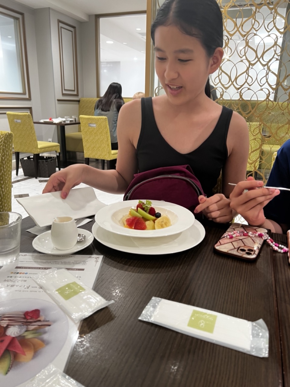

1. Overall Rating (0–10) — 6.0
This photograph captures a candid moment of a young girl enjoying a meal in a bright, upscale dining setting, evoking a sense of everyday luxury and familial comfort. The scene is rich in detail—textured tableware, a carefully arranged fruit plate, and soft ambient lighting—yet the composition feels slightly disjointed, as if the moment was captured more for documentation than for aesthetic storytelling. While the image conveys warmth and intimacy, it lacks a stronger visual narrative to elevate it beyond a simple snapshot.
2. Composition (0–10) — 5.5
The subject is slightly off-center, with a cluttered foreground that competes for attention. The diagonal placement of the table and background elements creates a dynamic but uneven balance, and the framing cuts into the subject’s upper body, limiting emotional connection.
3. Lighting (0–10) — 6.5
Soft, ambient lighting fills the space evenly, enhancing the clean, polished atmosphere of the restaurant. The light is diffused and flattering, though it lacks directional warmth or contrast that might deepen the mood.
4. Color & Tone (0–10) — 6.0
The palette is balanced, with the white tableware and yellow chairs creating a bright, cheerful contrast against the dark wood table and the girl’s black top. The colors are natural but not particularly vibrant, with a neutral tone that reflects the setting’s understated elegance.
5. Creativity (0–10) — 5.5
The image is observational rather than interpretive, capturing a realistic moment without a strong artistic vision. The inclusion of personal items—like the beaded phone strap and menu—adds authenticity but doesn’t contribute to a cohesive concept.
6. Technical Quality (0–10) — 7.0
Sharp focus on the subject and foreground, with clear detail in the food and table elements. The exposure is well-managed, and there are no visible artifacts or blurring issues.
7. Emotional Impact (0–10) — 6.5
The image evokes a quiet sense of contentment and shared experience, especially through the girl’s gentle expression and the intimate setting. While it doesn’t elicit strong emotion, it succeeds in conveying a slice-of-life moment that feels genuine and relatable.
Loading map...