Hover your mouse over the image and see the AI genereated caption and rating. Have fun!

AI Summary: The Jardin d'Acclimatation is a blend of natural beauty, entertainment, and cultural history in Paris, featuring a modern masterpiece, the Louis Vuitton Foundation. The garden, originally established in 1860, offers rides, attractions, art installations, and animal enclosures, making it a delightful time capsule with something for everyone.
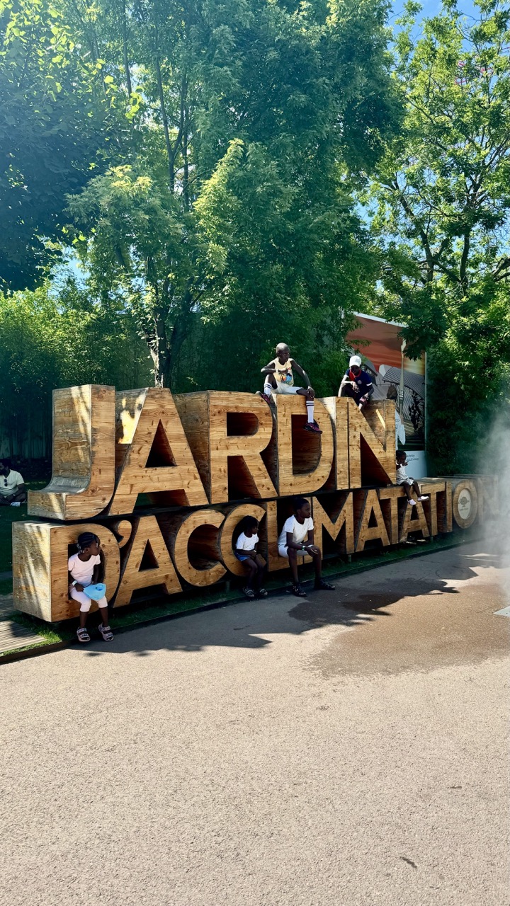

Title: Jungle Gym of Letters
Rating: 7/10
Well, someone clearly mistook the "JARDIN D'ACCLIMATATION" sign for a custom-built playground! The main subjects are a bunch of kids who've decided this monumental piece of typography is the perfect spot to hang out, sit, and generally make themselves at home among the giant wooden letters. The mood is distinctly summery and playful, capturing that carefree energy only children possess when faced with a large, climbable object. You can almost hear the shouts and laughter echoing under the bright blue sky. There's also a lone adult chilling in the shaded background, perhaps wisely observing the "acclimatization" process from a safe distance.
From a photography standpoint, the composition is dominated by the large wooden sign, which takes up a significant portion of the frame. The kids add crucial points of interest, breaking up the bulk of the sign and drawing the eye across the image. The lighting is typical of a bright sunny day – strong, direct sunlight creating high contrast, vibrant greens in the surrounding trees, and warm tones on the wood. While the harsh light can be challenging, here it enhances the feeling of a hot summer day. The background is filled with lush, sun-drenched trees, creating a natural canopy, and a hint of what looks like a large mural or advertisement peeking from behind the 'TION' part of the sign on the right, adding a touch of the park's other attractions. The spontaneous nature of the kids interacting with the sign gives this snapshot a genuine, lively feel, even if the technical aspects aren't studio perfect – it's a real moment captured in the wild.
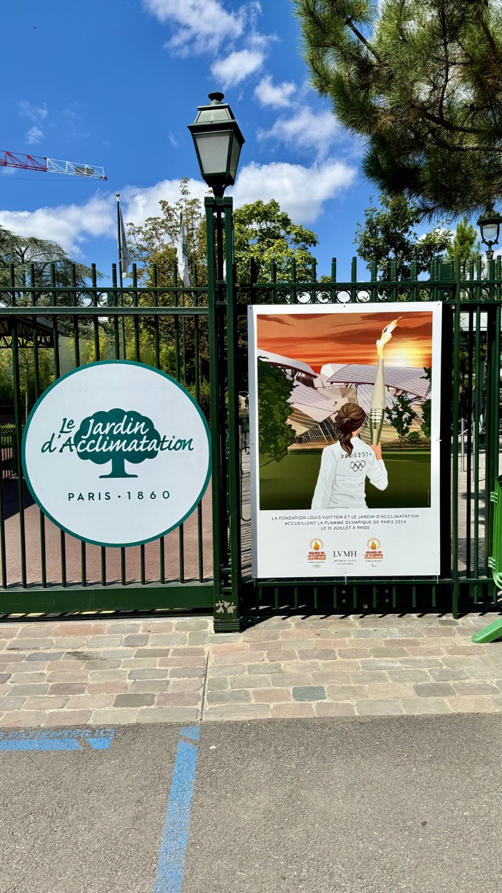

Gateway to Glee: Olympic Fever at the Jardin d'Acclimatation
Rating: 7/10
Behold, a photograph capturing a perfectly pleasant day at the entrance of the Jardin d'Acclimatation in Paris, circa 1860... well, the entrance itself dates back that far, apparently, according to the rather charming circular sign. But smack-dab in the middle of the classic green iron gate, a much more contemporary subject demands attention: a large poster advertising the Paris 2024 Olympic Flame Relay passing through. What a time to be alive (and a gate)! The composition feels a bit like a "here's what I saw" snapshot, using the gate bars almost like a cage, which might not be the most inviting look for a public park, but it certainly frames the main subjects effectively. The left side features the garden's elegant historical branding, while the right is dominated by the vibrant, illustrated Olympic poster featuring a person holding the torch against the backdrop of the Fondation Louis Vuitton. It’s a fascinating juxtaposition of Parisian history and future sporting glory.
The lighting is bright and sunny, casting sharp shadows on the cobblestones and asphalt below, typical of a clear day. The blue sky with scattered clouds adds a pleasant backdrop. The color palette is dominated by the deep green of the gate and sign, the muted tones of the pavement, and the striking oranges and whites of the Olympic poster. While the subject matter of the two signs is strong, the overall photographic style leans towards straightforward documentation rather than artistic flair. We've got a bit of blue painted line on the ground for some unintentional leading line fun, and a peek of a construction crane in the distance on the left, adding a touch of unglamorous reality to the otherwise cheerful scene. The mood is definitely one of anticipation and perhaps a touch of playful contrast between the grand old dame of Parisian parks and the flashy modern spectacle of the Olympics. It's a competent shot that tells a story, even if it won't win any awards for groundbreaking technique.
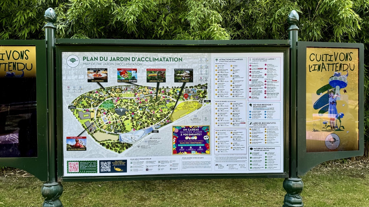

A Green Beacon of Bureaucracy
Rating: 6/10
Here we have the undisputed star of any park visit: the humble information board. Standing stoically amidst a sea of luscious green foliage, this large, dark green structure promises enlightenment about the "Jardin d'Acclimatation" in Paris. What's happening? Well, it's standing there, being maximally informative, displaying maps, lists of attractions, places to eat, and even QR codes for the modern explorer. The mood is purely functional; this sign means business, despite the park's aim for fun and unexpectedness ("Cultivons l'inattendu," says the panel on the right, a slightly ironic message for a map). The dense, leafy background provides a pleasant, soft green contrast to the sharp lines and text of the board, while the grass at the bottom anchors the scene. It’s a pragmatic subject, rated a 6 for its essential role in avoiding getting lost and grumpy.
From a photography perspective, the composition is straightforward and centered, giving the board pride of place. The lighting, however, is a classic outdoor challenge: bright sun hitting the reflective surface creates noticeable glare, obscuring parts of the map and text – a perfect example of why polarized filters exist! The color palette is dominated by various shades of green, with pops of color from the map graphics. The style is documentary; it captures the subject as found, complete with real-world issues like glare. While not a breathtaking artistic shot, it effectively communicates the presence and content of the sign. It’s a reminder that even the most helpful objects can be tricky photographic subjects, especially when they insist on reflecting half the sky.
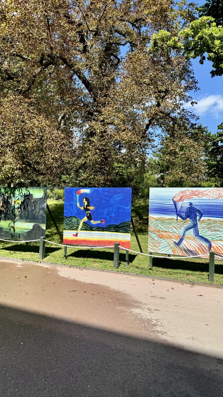

Guardians of the Flame: An Outdoor Art Exhibit
Rating: 8/10
Ah, the majesty of art meeting nature! We're treated to an outdoor exhibition featuring three dynamic panels depicting runners carrying torches. It looks like an Olympic rally got a gallery showing, or perhaps a very determined group is making their way through a symbolic obstacle course. Each piece has its own distinct style, from what looks like a more painterly, almost classical approach on the left with lush green foliage, to a vibrant, graphic pop on the central blue panel where a figure sprints with determined strides, and finally, a striking, linear energy on the right, depicting a figure against a textured landscape. They're proudly displayed on stands, guarded by a humble white rope barrier tied to green posts, reminding onlookers to admire from a respectful distance, though one wonders if even the most enthusiastic art lover could resist the urge for a closer peek over that modest line. The grand backdrop of a mature tree, its leaves a glorious autumnal mix of gold and brown, provides a perfect, natural canvas for this rather athletic array of artwork, making the park feel less like a casual stroll and more like a cultural sprint.
From a photographer's perspective, this scene offers some interesting challenges and successes. The composition, while framing the art nicely against the natural background, is somewhat bisected by the prominent asphalt path in the foreground and the strong, diagonal shadow cutting across it – a classic sunny day dilemma that adds a touch of unsolicited abstract art to the scene. The vertical format works reasonably well to capture the height of the tree and the sky, emphasizing the scale of the natural backdrop, but perhaps a slightly lower angle or wider horizontal shot could have balanced the foreground and subjects more effectively, reducing the dominance of the path. The lighting is bright and cheerful, ideal for illuminating the vibrant colors of the artwork and making them pop against the more subdued natural tones, though it does create those strong shadows and potentially harsh highlights on the ground. The contrast between the vivid blues, reds, and greens of the panels and the earthy tones of the tree and path is visually appealing. Overall, it's a candid snapshot of an engaging outdoor display, capturing the spirit of the artwork even if the technical execution is more documentary than dramatically posed – proving even spontaneous shots can capture compelling subjects, shadow lines and all.
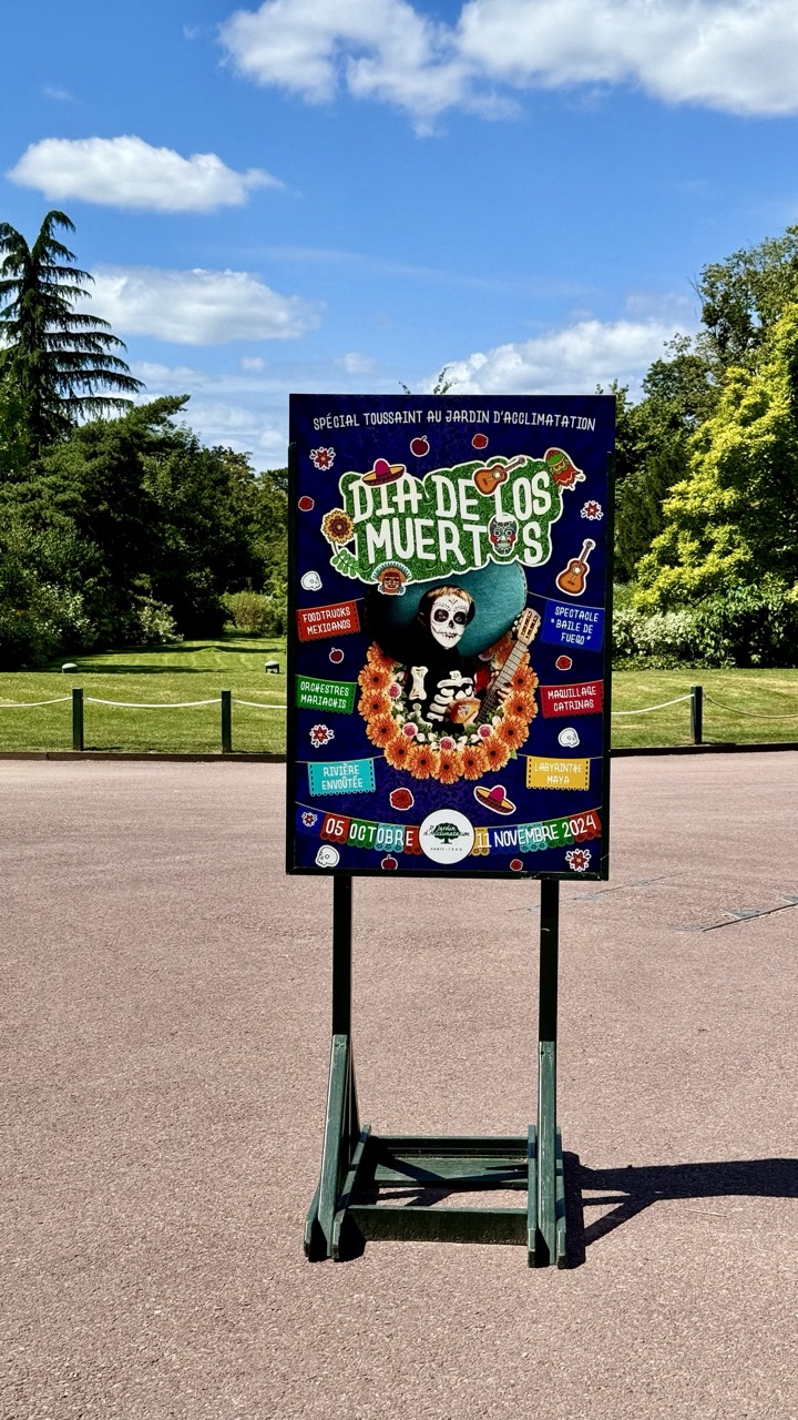

Dia de los Muertos Promo in the Park
7/10
This photo focuses squarely on a vibrant sign promoting a "Spécial Toussaint au Jardin d'Acclimatation: Dia de los Muertos" event, earning the sign itself a solid 7/10 for its engaging and colorful design. Resting on a practical but not particularly stylish green wooden stand, the sign is the star of this otherwise tranquil scene. What's happening is simple: an eye-catching advertisement has been placed outdoors to attract visitors. The mood is a quirky mix; the sign is exploding with the festive energy of Day of the Dead – skeletons, bright flowers, guitars – while the surrounding environment is a picture of peaceful park serenity on a sunny day.
From a photography standpoint, the composition centers the sign effectively, making it the undisputed subject, though it leans slightly off-center to the right. The vertical format emphasizes the height of the sign. Lighting is courtesy of bright natural sunlight, which makes the sign's colors pop beautifully but also casts a rather prominent shadow of the stand onto the asphalt foreground – a minor distraction perhaps unavoidable at midday. The color palette is dominated by the sign's intense blues, oranges, and greens, creating a strong contrast with the natural greens of the park and the blue sky. While the background of trees and sky provides a pleasant setting, the large expanse of textured asphalt in the foreground feels a bit heavy and could perhaps have been minimized for a more impactful frame focused solely on the festive sign against the nature.
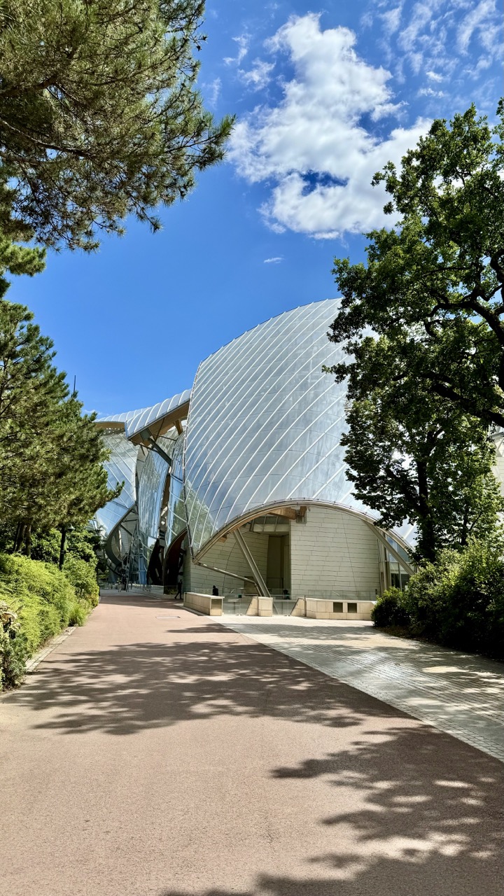

The Glass Cloud and the Path of Shadows
Subject: 8/10
Behold, a building that clearly had a midlife crisis and decided it wanted to be a sailboat or possibly just float away like a giant glass cloud. The subject itself is a solid 8/10 on the 'Whoa, what is that?' scale, making it a compelling focal point. It's a bright day, judging by the enthusiastic shadows on the pathway and the squint-inducing sparkle off the facade. A few brave souls are milling about near the entrance, presumably trying to figure out which entrance isn't disguised as a structural support beam. The mood is decidedly bright and modern, tempered slightly by the classic elegance of the surrounding park foliage and the comforting familiarity of a sun-drenched walkway.
From a photography perspective, this shot has some good bones but also the challenges of a sunny day. The composition uses the reddish path effectively as a leading line drawing the eye towards the architectural marvel, while the trees on either side provide a nice natural frame – though perhaps they could have been less enthusiastic with their framing on the left, they do add depth. The lighting is classic mid-day sun: high contrast, sharp shadows, and the kind of highlights that make you wonder if you need to upgrade your camera or just invest in a better lens hood for the next visit. The way the shadows from the unseen trees dance across the path adds an unexpected layer of visual interest, almost upstaging the building itself. The colors are vibrant, reflecting the clear blue sky and lush greenery, creating a scene that feels inviting despite the potentially blinding reflections. It’s a good attempt at capturing a challenging subject in difficult light, highlighting the building's form while inadvertently showcasing the beauty of light and shadow play.
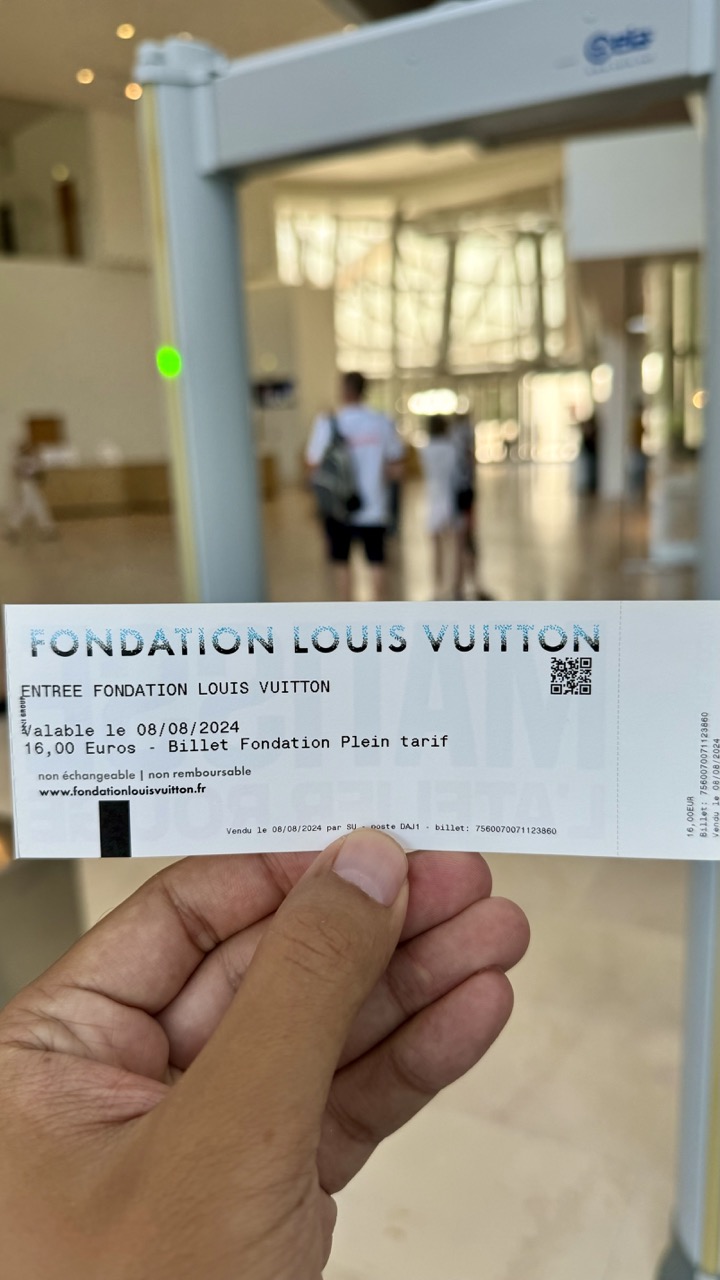

Proof of Entry: Fondation Louis Vuitton (Security Check Included)
Rating: 5/10
The image captures a hand holding a ticket for the Fondation Louis Vuitton, prominently displaying the name, date (valable le 08/08/2024), and price (16,00 Euros for a 'Billet Fondation Plein tarif'). The ticket also notes it is non-exchangeable and non-refundable, along with the website and a QR code. The foreground is dominated by the hand and ticket, held horizontally. The background is a heavily blurred shot of what appears to be the entrance hall of the Fondation, complete with large windows or glass walls casting bright light, blurry figures of people, and a prominent metal detector security gate slightly to the left, complete with a green light illuminated. It's a classic "I am here, and I have proof" photo, setting the scene just before entering the cultural space.
From a photographic perspective, this is a functional snapshot rather than an artistic endeavor. The composition places the main subject, the ticket, centrally in the lower half, creating a clear focal point. The shallow depth of field effectively isolates the ticket from the busy background, though the blur is significant enough that details of the building's architecture are lost, only conveying the sense of a large, bright space. The lighting is natural and ample from the background windows, providing decent illumination for the ticket, though a slight shadow from the hand is present. While the focus is sharp on the ticket, the overall execution feels quick and informal, typical of a travel photo taken before plunging into the experience – documenting the necessary transaction before the anticipated cultural immersion, albeit through the slightly less glamorous lens of a security checkpoint.
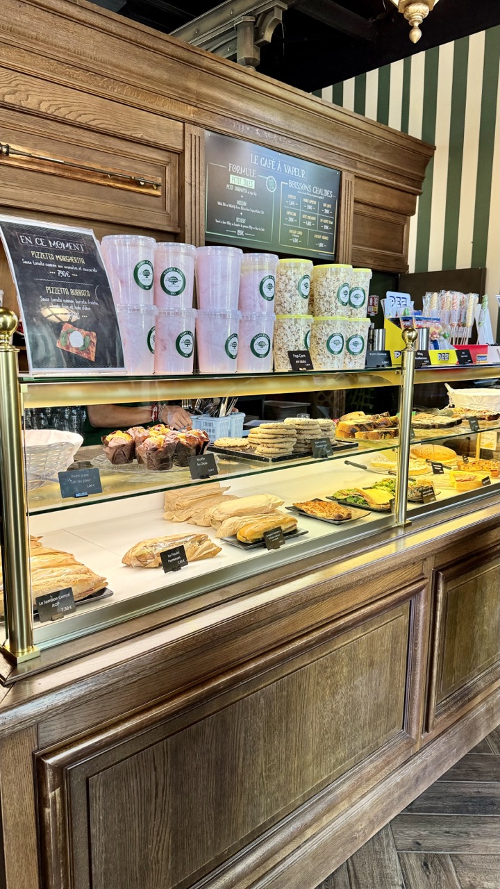

Bakery Bonanza Behind Glass
Rating: 8/10
This image plunges us headfirst into the sugary, savory abyss of a bustling bakery display case. What's happening? Pure, unadulterated temptation laid out on multiple tiers, promising a delightful caloric adventure. We see everything from hefty loaves and baguettes that look ready for a picnic to delicate tarts, muffins, cookies, and even some rather intriguing cups of what appears to be pink cotton candy and buckets of popcorn – a truly eclectic mix! The mood is one of overwhelming abundance and delicious possibilities, slightly chaotic but undeniably inviting. It’s a snapshot of a moment frozen in time, likely during peak hours, showcasing the day's tempting offerings behind polished glass.
From a photographer's standpoint, the composition is a straightforward, functional shot of the display, capturing the width and depth of the case effectively, albeit with a slight upward tilt that emphasizes the upper wooden paneling. Lighting is typical for a commercial setting – bright but potentially harsh, leading to some predictable reflections on the glass (the bane of food display photography!). The color palette is rich and warm, dominated by the golden-browns of the pastries and the dark wood, punctuated by the vibrant greens of the menu board and the unexpected pink of the cotton candy. The background features classic dark wood paneling and intriguing green and white striped wallpaper, adding a touch of vintage charm. While the image does its job of showcasing the goods, it’s a documentary style shot; it lacks a strong artistic focus beyond the sheer volume of subject matter, making you almost want to grab a pastry *just* to clear some space for a cleaner shot.
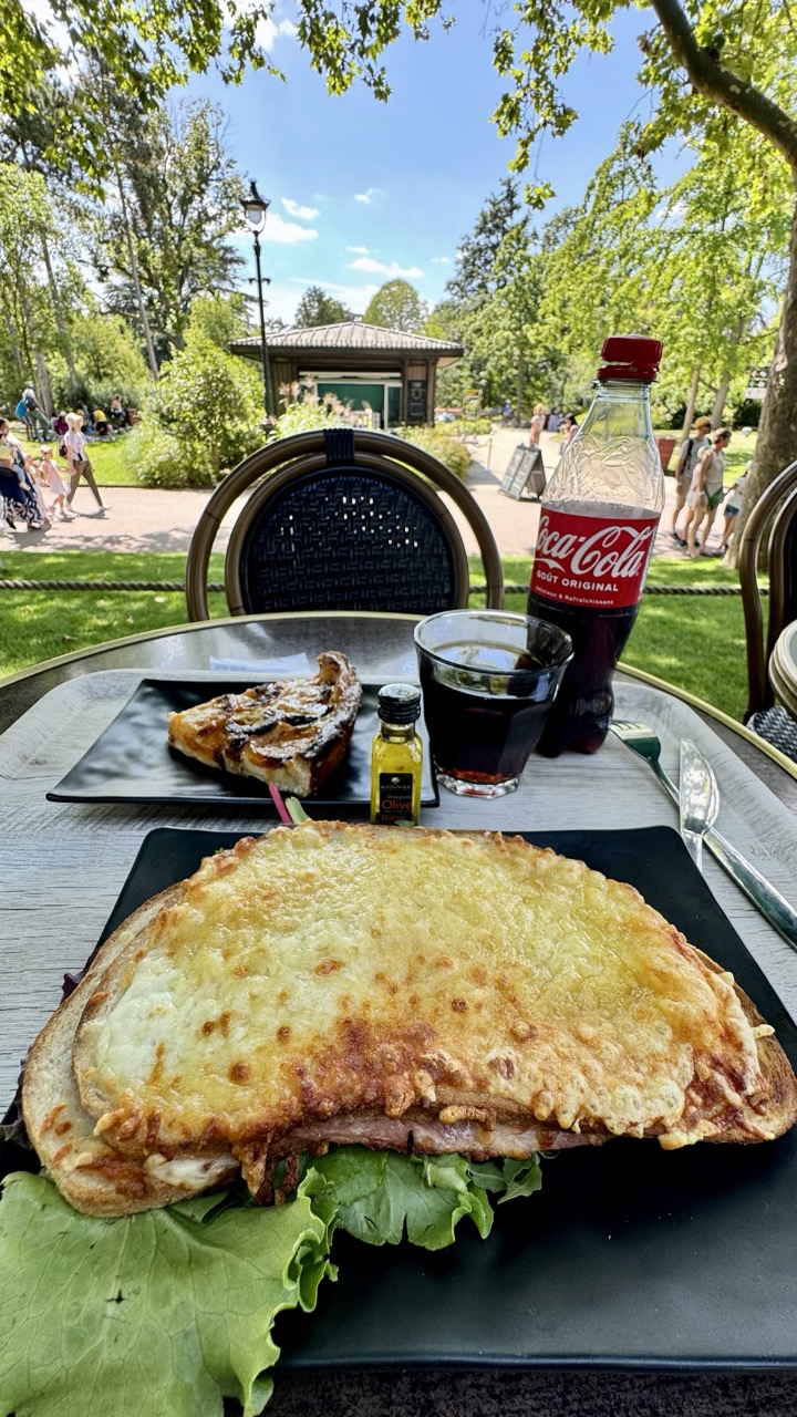

Title: Parisian Park Picnic of Cheesy Glory
Rating: Subject Matter 9/10
Here we have a delightfully classic scene of park-side dining, where the true subject, a magnificent, golden-brown Croque Monsieur, takes center stage, demanding its well-deserved 9 out of 10 for sheer deliciousness potential. This is peak summer indulgence – melting cheese, ham, and bread, artfully placed on a black plate with a verdant bed of lettuce, hinting at a *slightly* healthier angle (we won't tell if you ignore the lettuce). Beside it, a slice of what appears to be a fruit tart offers a sweet counterpoint, accompanied by a mini bottle of olive oil (a slightly puzzling condiment choice, perhaps for a side salad not pictured, or maybe it's just fancy?). A glass of dark liquid and a classic bottle of Coca-Cola complete the feast. The mood is undeniably relaxed and pleasurable, capturing a moment of culinary enjoyment amidst a bustling, vibrant public space.
From a photographic perspective, the composition places the food prominently in the foreground, using the table as a natural framing device. The lighting is typical of a bright, sunny day, which provides strong illumination but also creates high contrast – notice the bright highlights on the cheese and bottle, and the shadows in the background park. The colors are rich and inviting, with the warm tones of the food contrasting nicely with the cool greens of the park and the bright red of the Coke bottle. The background opens up to reveal a lively park scene with people strolling, sitting on the grass, and a charming kiosk structure, adding depth and context to the image. Despite the challenges of shooting in harsh sunlight, the image successfully conveys the atmosphere of an enjoyable outdoor meal on a beautiful day, making you almost feel the warmth and hear the distant chatter of the parkgoers.
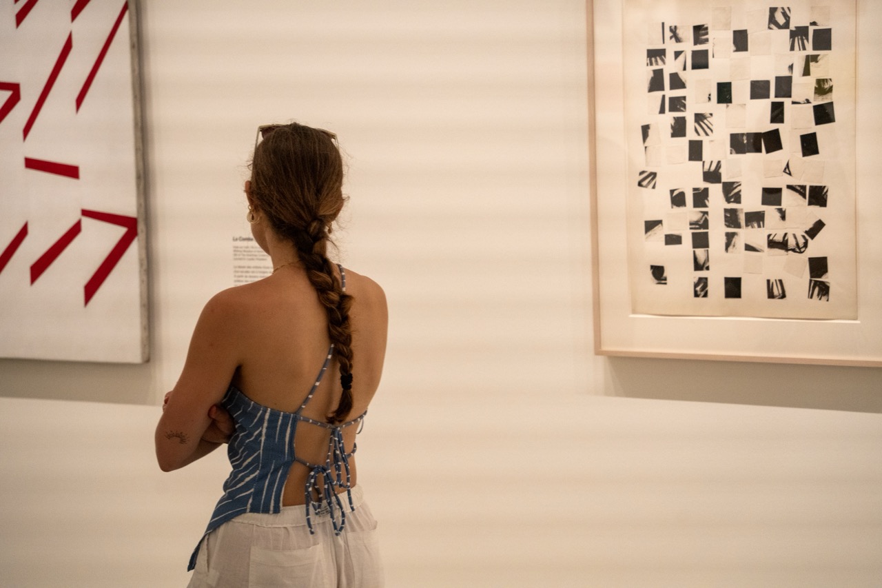

Museum Musings (Rear View Edition)
Subject Rating: 8/10
This capture drops us into the classic museum scene, featuring a lone figure engrossed (presumably) in the art. Our main subject, viewed squarely from the back, is a woman sporting a rather stylish braided ponytail and a fascinating blue and white striped top with an intricate lace-up back. She stands before two pieces of art on a plain white wall, creating a sense of quiet contemplation and detachment. The mood is serene, perhaps even a touch academic, as she seems to be considering the piece on the left which features bold red geometric shapes against a white background, complete with a descriptive label that adds a layer of intellectual pursuit to the scene. The presence of the second, more abstract artwork on the right, composed of many small black and white squares, offers a visual counterpoint to the starkness of the first. Her pose, arms crossed, adds to the thoughtful, slightly guarded posture, a common stance for the dedicated gallery-goer.
From a photographic perspective, the composition places the subject off-center, drawing the eye towards the artworks while still maintaining her as the primary focus. The negative space of the large white wall is a dominant element, giving the scene room to breathe but perhaps verging on slightly too much emptiness. The lighting is soft and even, typical of interior ambient light, effectively illuminating the subject and the art without harsh shadows, though it doesn't add much dramatic flair. The color palette is anchored by the woman's vibrant top and the striking red of the left artwork, contrasting with the muted tones of the wall and the monochrome piece on the right. This feels like a candid documentary style shot, capturing a real moment, which is often its strength, relying on the inherent interest of the scene rather than complex technical manipulation. One can't help but wonder if she's truly lost in artistic reverie or just admiring the view of the braid herself.
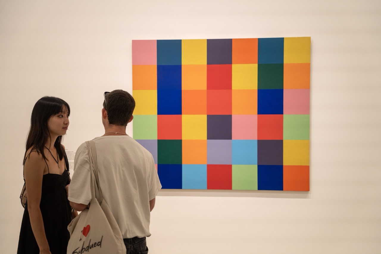

Gallery Gazers: A Study in Contrasting Hues and Human Observation
Rating: 7/10
This image captures a classic gallery scene: two individuals paused before a large, abstract painting composed of a grid of brightly colored squares. The mood is quiet and contemplative, embodying the typical atmosphere of an art exhibition. What's happening is simple yet profound – people engaging with art, perhaps finding meaning in the vibrant pattern or simply enjoying the visual spectacle. The painting itself is the dominant visual subject, a bold statement of color and form, while the two figures provide a human element, grounding the abstract art in the context of human experience. Their presence adds a narrative layer, making the viewer wonder about their connection to the piece and to each other.
From a photographic perspective, the composition feels slightly candid, with the two viewers positioned off-center to the left, their backs or profiles towards the viewer. This framing choice pulls focus away from the potentially distracting facial expressions and places emphasis on their shared interaction with the artwork. The lighting is standard gallery illumination – soft, even, and primarily designed to showcase the art, which it does effectively, allowing the intense colors of the grid to pop against the stark white wall. The color palette is dominated by the painting's kaleidoscope of shades contrasted with the neutral tones of the wall and the viewers' clothing. The inclusion of the "Subdued" tote bag offers a touch of unexpected humor and contrast against the visually loud artwork, almost ironically commenting on the viewing experience. While the composition isn't perfectly balanced, its slightly informal nature contributes to the feeling of a moment captured rather than meticulously staged.
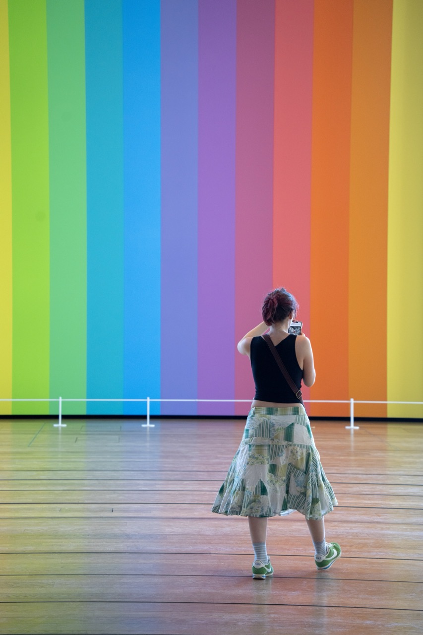

A Study in Rainbow and Rhapsody
Rating: 7/10
Ah, the classic museum pose: back to the viewer, phone held aloft, documenting the masterpiece. Here, our intrepid photographer captures a stunning display of vertical rainbow stripes, a true feast for the eyes (and seemingly, the phone's camera roll). Dressed in a rather fetching skirt that cleverly echoes the green tones of the wall, she stands contemplating the vibrant spectrum, perhaps debating which filter will truly capture its essence. The mood is one of quiet appreciation, a digital pilgrimage to the altar of pure color, reminding us that even in a gallery dedicated to visual splendor, sometimes the most compelling subject is someone else appreciating it. The prominent white barrier, presumably there to prevent eager admirers from licking the paint, adds a touch of practical reality to the otherwise ethereal scene.
From a photographic standpoint, the composition is well-balanced, placing the subject slightly off-center against the overwhelming backdrop of the rainbow wall, which acts as both a vibrant canvas and a leading line to the viewer's eye. The lighting is even and soft, perfectly illuminating the saturated hues without harsh reflections – a true blessing in museum photography. The focus is sharp on the subject and the immediate background, allowing the texture of the wooden floor to add depth to the foreground. While the subject facing away is often considered a no-no, here it works, creating a sense of anonymity and inviting the viewer to imagine themselves in the same position. The repetition of vertical lines in the rainbow and horizontal lines in the floor creates a pleasing geometric structure. The subject's green sneakers and skirt are a nice touch, subtly linking her to the vibrant colors she's observing. A solid shot capturing a common modern museum experience with a burst of cheerful color. Just try not to wonder how many takes it took to get the perfect phone angle.
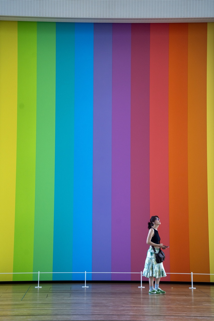

Lost in the Spectrum
Rating: 8/10
A solitary figure, a woman dressed in a black tank top and a flared skirt adorned with green and white patterns, stands captivated before an enormous, vibrantly painted wall. The wall is a breathtaking display of the rainbow spectrum, featuring wide vertical stripes transitioning smoothly from yellow, green, and blue on the left, through purple and red, to orange and yellow on the right. The woman looks upwards, her attention seemingly fixed on the upper reaches of the colorful installation, perhaps lost in contemplation or simply appreciating the overwhelming scale and brilliance. A simple white railing runs horizontally in the foreground, delineating a viewing area, while a polished wooden floor reflects the subtle ambient light of the space. She holds a phone in one hand, adding a touch of contemporary reality to the timeless appeal of color.
From a photographic standpoint, the image is a fantastic study in color and scale. The composition masterfully uses the strong vertical lines of the rainbow wall, counterbalanced by the horizontal line of the white railing, though the railing does feel slightly intrusive. The woman is positioned effectively off-center, providing crucial human scale against the grandeur of the artwork and creating visual interest. The lighting is beautifully diffused and even, allowing the intense saturation of the colors to truly sing without distracting hot spots or shadows – essential for showcasing such a vibrant subject. While the pose of looking up at large art might be a common trope, it works here to convey the immersive experience. Plus, the contrast between her playfully patterned skirt and bright green sneakers against the graphic power of the wall adds a delightful, slightly humorous, and very human element to the scene.
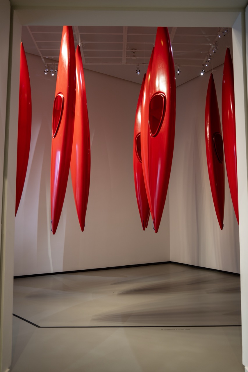

The Crimson Commute
Subject: 8/10 (High visual impact)
This shot captures a visually arresting art installation where vibrant red kayaks, looking like oversized, glossy scarlet beans or perhaps very sporty missiles, hang in orderly (mostly) rows from the ceiling. Seriously, who needs garage storage when you can turn your ceiling into a avant-garde boat rack? The scene unfolds within a spacious, minimalist gallery setting, framed quite neatly by a doorway or opening. The subject, these suspended vessels of potential adventure, dominates the frame with their bold, almost alarming, hue against the muted beige walls and darker floor. The mood is undeniably striking and modern, perhaps even a little dramatic, begging the question: are they waiting for a flood, or is this just a really extreme anti-gravity yoga class for boats? The composition uses the strong vertical lines of the boats to lead the eye, contrasted effectively with the subtle horizontals of the room structure and ceiling grid.
From a photography perspective, the use of high-contrast color is key here; that intense red just pops right off the neutral background, making the subject the undisputed star of the show. The lighting, likely soft gallery illumination, does a great job of highlighting the sleek, glossy finish of the boats, creating attractive specular highlights that emphasize their form. Pay attention to the floor below, which features diffused reflections or possibly projected shadows, adding another layer of abstract interest that almost mimics the ripples of water these boats are built for. The photographer has wisely used the framing of the doorway to add depth and context, inviting us to step into this unusual space. While the symmetrical framing is clean, a slightly different vantage point might have created more dynamic negative space or played more with the overlapping forms of the boats. Overall, it's a well-executed shot that effectively documents the impact of this peculiar, yet captivating, red kayak performance art piece.
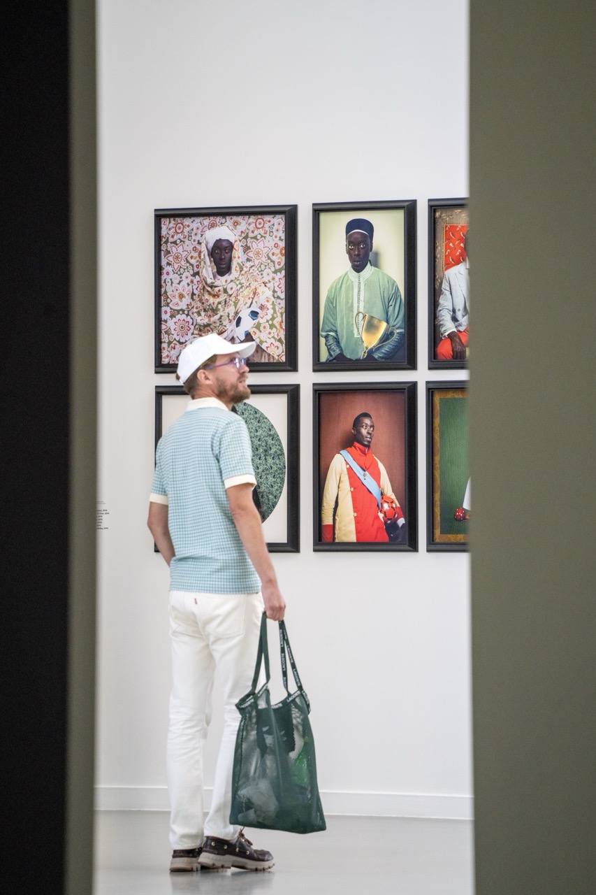

Gallery Observer Extraordinaire
Rating: 8/10 (He's clearly taking his art appreciation seriously, plus bonus points for the coordinated outfit)
Here we find a gentleman, sharply dressed in white pants and a checkered blue polo, engrossed in the vibrant world of framed portraits on a gallery wall. He stands attentively, half-turned towards the camera but eyes fixed on the art, clutching a stylish dark green mesh tote bag – likely filled with equally stylish gallery pamphlets or perhaps just some very chic snacks. The mood is one of quiet contemplation, a classic gallery scene captured with a clean, bright aesthetic. The surrounding space is minimalist perfection: stark white walls showcasing the artwork, a plain grey floor reflecting the soft, even light, and subtle architectural elements on the sides framing the shot like discreet observers.
From a photographic standpoint, the composition cleverly places our subject slightly off-center, drawing the viewer's eye along with his gaze towards the wall of striking portraits. The lighting is soft and natural, beautifully illuminating the artwork's colors and textures without harsh shadows, while giving a nice highlight to the man's white cap and shirt. The subject matter is a compelling mix: the modern, perhaps slightly curated presence of the gallery visitor against the rich, culturally resonant imagery in the framed pieces. The portraits themselves are fascinating, depicting figures in unique attire, some holding unexpected objects like a soccer ball or a golden trophy, suggesting a commentary on identity, tradition, and contemporary life. It's a moment frozen in time, capturing the silent dialogue between viewer and art, all while our subject's impeccable style suggests he might be a carefully curated exhibit himself.
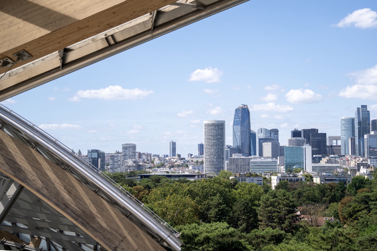

Framed by the City's Edge
Rating: 7/10
This image presents a compelling view of a modern city skyline, dominated by sleek skyscrapers and dense urban structures, all framed rather dramatically by a wooden and metallic architectural element in the foreground. It feels like peeking out from under a giant eyelid or through a futuristic greenhouse roof, offering a select window onto the bustling world below. What's happening is essentially a clever juxtaposition: the organic, textured diagonal of the foreground structure contrasts sharply with the geometric, distant city, softened by a band of lush green trees in the middle ground. The mood is one of contemplation and perspective, highlighting the different layers and textures of the environment, from the rustic wood to the shimmering glass towers.
From a photography standpoint, the composition is the star here. Using the foreground as a leading line and a natural frame adds significant depth and interest, pulling the viewer's eye towards the urban landscape beyond. While the framing element is strong, it does occupy a substantial portion of the image, which could be a pro or con depending on your taste – it's certainly not a traditional unobstructed view. The lighting is fairly even daylight, which is great for capturing detail across the wide scene but perhaps lacks strong shadows or highlights to give the city itself more dramatic form. The color palette is pleasant, with the warm browns of the wood playing nicely against the cool blues of the sky and greys of the buildings, punctuated by the vibrant green buffer zone of trees. Overall, it's a well-executed shot that uses a dynamic composition to turn a standard cityscape into something more intriguing and layered, almost as if saying, "This is the city, but look at how I'm seeing it."


The Glass Cloud and the Path of Shadows
Subject: 8/10
Behold, a building that clearly had a midlife crisis and decided it wanted to be a sailboat or possibly just float away like a giant glass cloud. The subject itself is a solid 8/10 on the 'Whoa, what is that?' scale, making it a compelling focal point. It's a bright day, judging by the enthusiastic shadows on the pathway and the squint-inducing sparkle off the facade. A few brave souls are milling about near the entrance, presumably trying to figure out which entrance isn't disguised as a structural support beam. The mood is decidedly bright and modern, tempered slightly by the classic elegance of the surrounding park foliage and the comforting familiarity of a sun-drenched walkway.
From a photography perspective, this shot has some good bones but also the challenges of a sunny day. The composition uses the reddish path effectively as a leading line drawing the eye towards the architectural marvel, while the trees on either side provide a nice natural frame – though perhaps they could have been less enthusiastic with their framing on the left, they do add depth. The lighting is classic mid-day sun: high contrast, sharp shadows, and the kind of highlights that make you wonder if you need to upgrade your camera or just invest in a better lens hood for the next visit. The way the shadows from the unseen trees dance across the path adds an unexpected layer of visual interest, almost upstaging the building itself. The colors are vibrant, reflecting the clear blue sky and lush greenery, creating a scene that feels inviting despite the potentially blinding reflections. It’s a good attempt at capturing a challenging subject in difficult light, highlighting the building's form while inadvertently showcasing the beauty of light and shadow play.


Proof of Entry: Fondation Louis Vuitton (Security Check Included)
Rating: 5/10
The image captures a hand holding a ticket for the Fondation Louis Vuitton, prominently displaying the name, date (valable le 08/08/2024), and price (16,00 Euros for a 'Billet Fondation Plein tarif'). The ticket also notes it is non-exchangeable and non-refundable, along with the website and a QR code. The foreground is dominated by the hand and ticket, held horizontally. The background is a heavily blurred shot of what appears to be the entrance hall of the Fondation, complete with large windows or glass walls casting bright light, blurry figures of people, and a prominent metal detector security gate slightly to the left, complete with a green light illuminated. It's a classic "I am here, and I have proof" photo, setting the scene just before entering the cultural space.
From a photographic perspective, this is a functional snapshot rather than an artistic endeavor. The composition places the main subject, the ticket, centrally in the lower half, creating a clear focal point. The shallow depth of field effectively isolates the ticket from the busy background, though the blur is significant enough that details of the building's architecture are lost, only conveying the sense of a large, bright space. The lighting is natural and ample from the background windows, providing decent illumination for the ticket, though a slight shadow from the hand is present. While the focus is sharp on the ticket, the overall execution feels quick and informal, typical of a travel photo taken before plunging into the experience – documenting the necessary transaction before the anticipated cultural immersion, albeit through the slightly less glamorous lens of a security checkpoint.