Winter in Amsterdam offers a unique charm with twinkling lights on canals, cozy cafes, and fewer crowds. Explore historic houses, festive markets, and iconic attractions like the Amsterdam Light Festival and Eye Filmmuseum, which transforms into a dazzling outdoor gallery during winter. Enjoy Dutch pancakes, stroopwafels, and burgers, and discover traditional activities like wooden shoe-making and visiting Zaanse Schans windmill village.
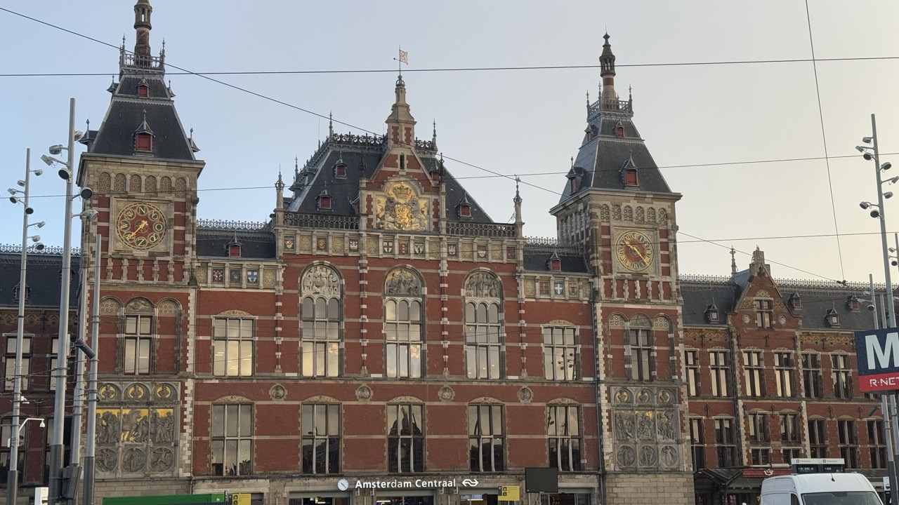

1. Overall Rating (0–10) — 7.0
This photograph captures the grandeur of Amsterdam Central Station with a balanced blend of architectural detail and urban context. The rich red brick and ornate spires stand out against the soft, overcast sky, conveying a sense of historical weight and civic pride. While the composition is strong and the subject compelling, the presence of modern elements like overhead wires and signage slightly disrupts the timeless aesthetic, creating a subtle tension between past and present.
2. Composition (0–10) — 7.5
The symmetrical framing emphasizes the central tower and clock faces, creating a strong focal point. The inclusion of surrounding structures and street elements adds depth and context, though the slightly off-center alignment of the building and the intrusion of utility poles introduce a minor imbalance.
3. Lighting (0–10) — 6.5
The diffuse light of the overcast sky provides even illumination, minimizing harsh shadows and highlighting the building’s intricate textures. However, the lack of strong directional light results in a somewhat flat appearance, reducing the dramatic contrast that could enhance the architectural details.
4. Color & Tone (0–10) — 7.0
The warm reds of the brickwork contrast effectively with the cool grays of the sky and structural elements, creating a visually harmonious palette. The muted tones lend a subdued, contemplative mood, though the absence of vibrant color limits the image’s dynamic appeal.
5. Creativity (0–10) — 6.5
The photograph successfully captures a recognizable landmark with a clear sense of place, but it leans toward documentation rather than artistic interpretation. The inclusion of modern urban elements adds a layer of narrative, suggesting the intersection of history and contemporary life, though the approach remains conventional.
6. Technical Quality (0–10) — 8.0
The image is sharp and well-focused, with clear details visible in the building’s facade. The exposure is balanced, and the camera’s resolution captures the textures of the brick and stonework effectively. There are no noticeable technical flaws, though the slightly low contrast could be improved.
7. Emotional Impact (0–10) — 6.0
The photograph evokes a sense of quiet reverence for a historic landmark, but the overcast conditions and urban clutter temper the emotional resonance. The viewer is left with a respectful observation of the station’s majesty, yet the connection to the place feels more intellectual than deeply personal.
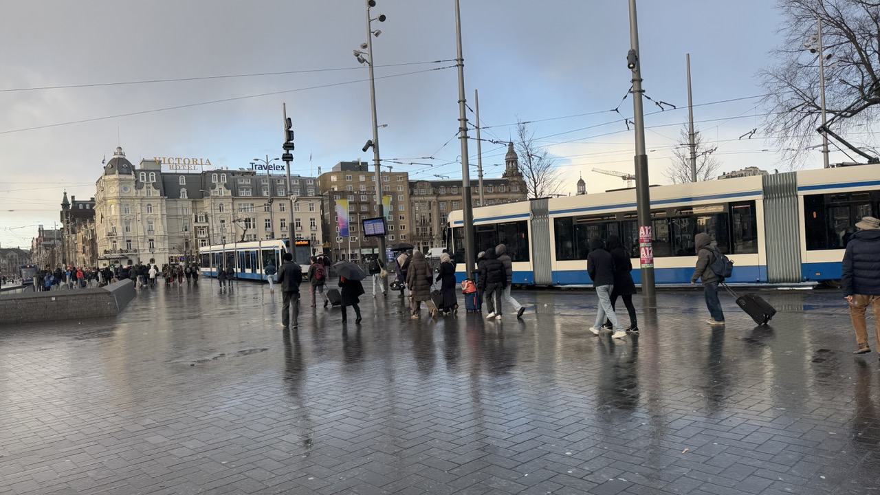

1. Overall Rating (0–10) — 6.0
This photograph captures the quiet bustle of a rainy urban square, where the damp pavement reflects the muted light and movement of daily life. The scene feels authentic and grounded, with the wet surfaces and overcast sky enhancing the atmosphere of a gray, transitional moment. While the image effectively conveys a sense of place, its visual energy is restrained by a lack of strong focal direction and a somewhat flat emotional tone.
2. Composition (0–10) — 5.5
The wide frame includes too much extraneous detail, creating a scattered feel. The diagonal lines of the tram and wires draw the eye, but the lack of a clear subject or leading line diminishes compositional strength.
3. Lighting (0–10) — 5.0
The overcast sky provides soft, even light that minimizes harsh shadows, but it also flattens the scene. The reflective surface of the wet pavement adds some visual interest, but the overall lighting lacks warmth or contrast.
4. Color & Tone (0–10) — 5.5
The palette is dominated by cool grays and muted blues, which suit the rainy atmosphere but result in a somewhat monotonous tone. The blue and white tram offers a touch of contrast, but the colors lack vibrancy.
5. Creativity (0–10) — 6.0
The image succeeds in capturing a moment of urban life with a documentary feel. While not particularly original in concept, the reflection on the wet ground adds a subtle layer of visual poetry.
6. Technical Quality (0–10) — 7.0
The image is sharp and clear, with good detail in the architecture and foreground. The focus is consistent, and the exposure is balanced, though the low-contrast lighting limits depth.
7. Emotional Impact (0–10) — 5.0
The mood is contemplative and subdued, evoking a sense of transience and quiet routine. However, the emotional resonance is muted, leaving the viewer more as an observer than an engaged participant.
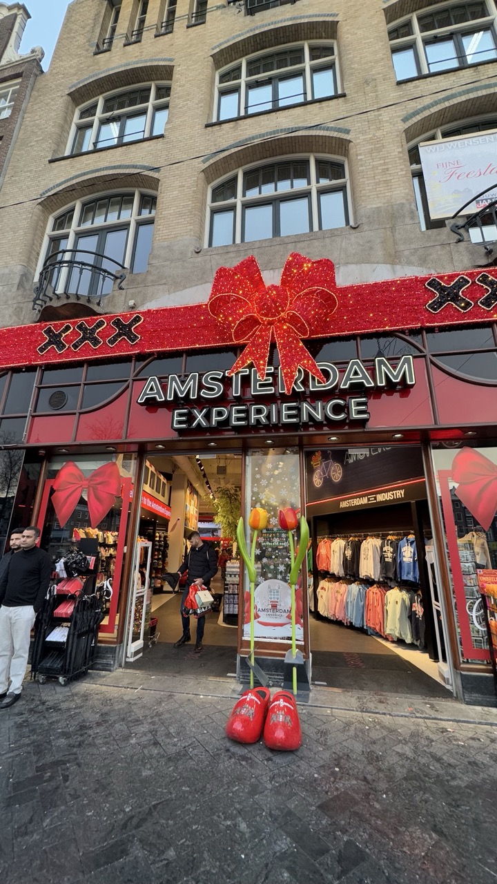

1. Overall Rating (0–10) — 6.0
This photograph captures a quintessential Amsterdam street scene, blending cultural symbolism with commercial tourism in a visually busy but recognizable setting. The festive red bow and oversized clogs anchor the image in local identity, while the cluttered storefront and pedestrian presence lend it a candid, lived-in quality. Though the composition feels slightly over-staged and the lighting is flat, the image succeeds in conveying the energy of a tourist hub without pretense.
2. Composition (0–10) — 5.5
The framing is slightly off-center, with the storefront dominating the lower half and the building’s architecture overwhelming the upper frame. The large red bow draws the eye, but the cluttered foreground and asymmetrical placement of people and props create visual tension rather than harmony.
3. Lighting (0–10) — 5.0
Natural daylight provides even illumination, but the overcast sky results in a flat, diffused light that dulls the vibrancy of the reds and reduces depth. The lack of strong shadows weakens the sense of dimensionality.
4. Color & Tone (0–10) — 6.5
The bold reds of the bow and clogs create a strong focal point against the muted beige of the building and gray pavement. While the palette is thematically cohesive, the overall tone feels slightly washed out, and the saturation lacks the punch needed to make the scene pop.
5. Creativity (0–10) — 6.0
The image leverages familiar Dutch icons—clogs, tulips, and the Amsterdam Experience branding—to craft a recognizable cultural tableau. It’s more documentary than artistic, but the inclusion of everyday elements like the passing pedestrian adds a layer of realism.
6. Technical Quality (0–10) — 7.0
The focus is sharp across the frame, and the details in the storefront and signage are clear. The wide-angle perspective captures the scene effectively, though slight distortion near the edges is noticeable.
7. Emotional Impact (0–10) — 5.5
The image evokes a sense of place and tourism, but the commercialism and busy atmosphere prevent a deeper emotional connection. It feels more like a snapshot than a moment of reflection or storytelling.
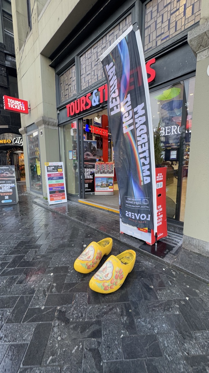

1. Overall Rating (0–10) — 6.0
This photograph captures a quintessential Amsterdam scene with a pair of bright yellow clogs placed on a wet cobblestone street, evoking a sense of local culture and tourism. The contrast between the vivid clogs and the muted, overcast surroundings creates visual interest, though the image feels more like a casual snapshot than a composed photograph. The clutter of signage and the lack of a strong focal point slightly dilute its artistic impact.
2. Composition (0–10) — 5.5
The clogs are well-placed in the foreground, drawing attention, but the composition is weakened by the busy background and uneven framing. The diagonal lines of the pavement and signage create visual tension without leading the eye effectively.
3. Lighting (0–10) — 5.0
The lighting is flat and diffused, typical of an overcast day, which flattens the scene and reduces depth. While the wet pavement reflects light and adds texture, it does little to enhance mood or drama.
4. Color & Tone (0–10) — 6.0
The bright yellow of the clogs stands out against the dark, gray-toned environment, creating a strong focal point. The color palette is restrained, but the saturated yellow provides a pop of warmth and cultural identity.
5. Creativity (0–10) — 6.5
The use of clogs as a cultural symbol is clever and immediately recognizable. The placement suggests a narrative—perhaps a tourist’s memento left behind—but the concept is executed in a straightforward, observational way.
6. Technical Quality (0–10) — 7.0
The image is sharp and clear, with good detail in the clogs and signage. The wet surface adds texture, and the focus is consistent throughout the frame.
7. Emotional Impact (0–10) — 5.5
The scene conveys a quiet, everyday moment in Amsterdam, but the emotional resonance is limited by the lack of human presence and narrative depth. It feels more like a travel photo than an evocative image.
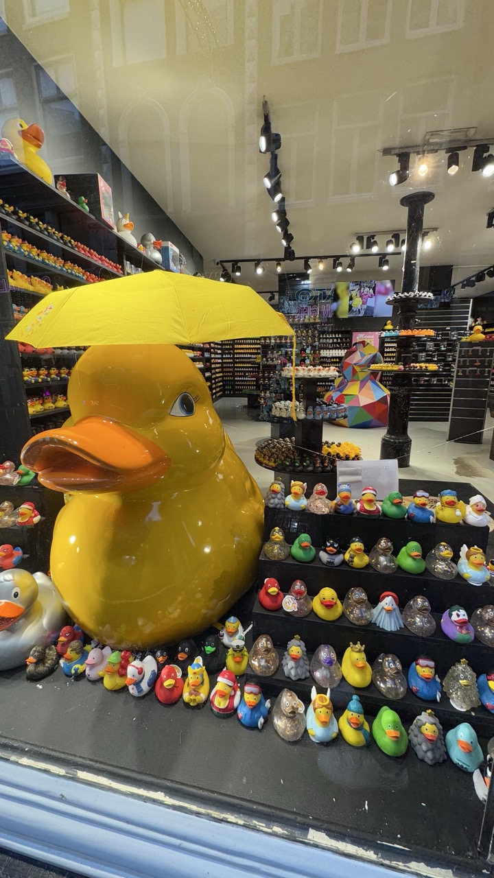

1. Overall Rating (0–10) — 7.0
This photograph captures the whimsical charm of a rubber duck-themed store with playful energy and vibrant detail. The oversized yellow duck holding a matching umbrella serves as a bold focal point, drawing the eye through the colorful array of collectibles. While the scene is visually engaging, the cluttered display and reflections in the glass slightly detract from the clarity and cohesion of the composition.
2. Composition (0–10) — 6.0
The large duck dominates the left foreground, creating a strong visual anchor, but the background shelves and reflections create a sense of visual noise. The diagonal arrangement of smaller ducks leads the eye downward, but the framing feels slightly unbalanced due to the overlapping elements and the intrusion of the window frame.
3. Lighting (0–10) — 6.5
The store’s overhead track lighting provides even illumination, highlighting the glossy surfaces of the ducks and enhancing their vibrant colors. However, the reflections on the glass window disrupt the scene and add a layer of glare, reducing the overall visual clarity.
4. Color & Tone (0–10) — 7.5
The palette is rich and varied, with bright yellows, reds, blues, and greens creating a cheerful, playful atmosphere. The warm tone of the lighting enhances the colors, and the glossy finish of the ducks contributes to a lively, engaging aesthetic.
5. Creativity (0–10) — 7.0
The concept of a duck-themed retail space is inherently creative and fun, and the display effectively celebrates the theme with a wide variety of designs and characters. The oversized duck with an umbrella adds a humorous, narrative touch, suggesting a story of protection or whimsy.
6. Technical Quality (0–10) — 7.0
The image is sharp and detailed, with clear focus on the foreground ducks and the large yellow figure. The depth of field is adequate, though some background elements appear slightly soft. The reflections on the glass are the primary technical flaw, slightly compromising the overall clarity.
7. Emotional Impact (0–10) — 7.5
The photograph evokes a sense of joy and nostalgia, appealing to both children and adults with its playful, quirky subject matter. The abundance of colorful ducks and the imaginative display invite curiosity and delight, creating a lighthearted and memorable visual experience.
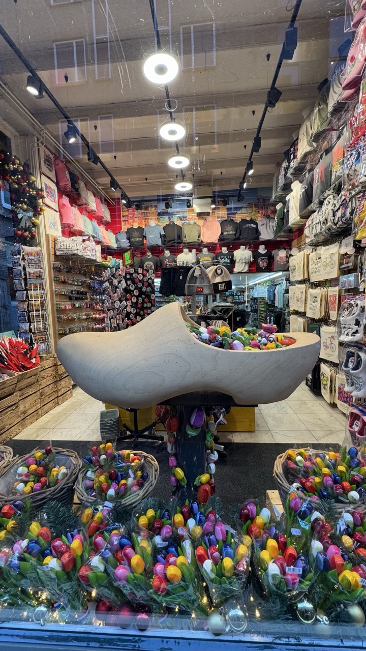

1. Overall Rating (0–10) — 7.0
This photograph captures the vibrant, kitschy charm of a Dutch souvenir shop with a playful, almost whimsical energy. The oversized clog filled with colorful trinkets and the surrounding array of tulips create a strong sense of place, evoking the tourist-friendly atmosphere of Amsterdam. While the scene is rich in detail and cultural symbolism, the composition feels slightly cluttered, and the reflection in the glass disrupts the visual flow. Still, the image successfully conveys a lively, tactile sense of Dutch tradition and commercial delight.
2. Composition (0–10) — 6.0
The central clog draws the eye, but the crowded shelves and foreground elements create visual noise. The reflection in the glass adds a layer of complexity, slightly undermining the clarity of the subject.
3. Lighting (0–10) — 7.0
Bright, even overhead lighting illuminates the space effectively, highlighting the vivid colors of the merchandise. The reflections from the glass windows add a layer of realism but also soften the overall impact.
4. Color & Tone (0–10) — 8.0
The palette is rich and varied, with bright primary colors from the tulips and trinkets creating a cheerful, engaging tone. The contrast between the natural wood of the clog and the synthetic brightness of the souvenirs enhances visual interest.
5. Creativity (0–10) — 7.0
The juxtaposition of the oversized clog and the sea of colorful souvenirs offers a clever, culturally resonant narrative. The image functions as both a product display and a visual celebration of Dutch identity, though it leans heavily on familiar tropes.
6. Technical Quality (0–10) — 7.5
The image is sharp and clear, with good focus on the central clog and surrounding items. The depth of field is adequate, though the reflection in the glass slightly reduces overall clarity.
7. Emotional Impact (0–10) — 7.0
The image evokes a sense of nostalgia and playful curiosity, inviting the viewer to imagine the bustling streets of Amsterdam and the joy of selecting a keepsake. The vibrant colors and familiar symbols create a warm, accessible emotional connection.
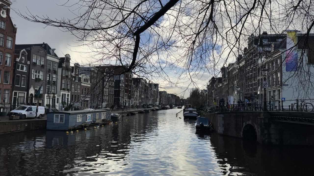

1. Overall Rating (0–10) — 7.0
This photograph captures the quiet melancholy of a winter day in Amsterdam, where bare branches frame a canal flanked by historic homes. The moody sky and subdued lighting evoke a sense of stillness and urban intimacy, though the image’s emotional depth is slightly restrained by its flat exposure and lack of visual focus. While the scene is undeniably atmospheric, it feels more like a snapshot than a fully realized composition.
2. Composition (0–10) — 6.5
The diagonal lines of the canal and the framing branches create a sense of depth and guide the eye into the scene. However, the off-center placement of the bridge and the scattered boats disrupt visual harmony, making the composition feel slightly unbalanced.
3. Lighting (0–10) — 5.5
The overcast sky produces soft, diffused light that minimizes shadows and flattens the scene’s tonal range. While this creates a consistent mood, it also reduces contrast and diminishes the texture of the buildings and water.
4. Color & Tone (0–10) — 6.0
The palette is muted, dominated by grays, browns, and dark blues, which suit the somber atmosphere. A touch of warmth in the sky could have added contrast and visual interest, but the overall tonal balance is coherent.
5. Creativity (0–10) — 6.5
The framing with the bare branches adds a natural, painterly element, enhancing the image’s contemplative mood. The choice to shoot in overcast light and include the canal’s quiet activity suggests a narrative of daily life, though the approach remains conventional.
6. Technical Quality (0–10) — 7.0
The image is sharp and free of noticeable flaws, with clean detail in the architecture and reflections. However, the exposure is slightly underexposed, and the lack of dynamic range limits the richness of the final image.
7. Emotional Impact (0–10) — 6.5
The photograph evokes a quiet, introspective mood—appropriate for a cold, overcast day in a canal city. While it captures the essence of the location, the emotional resonance is somewhat muted, leaving the viewer with a sense of observation rather than connection.
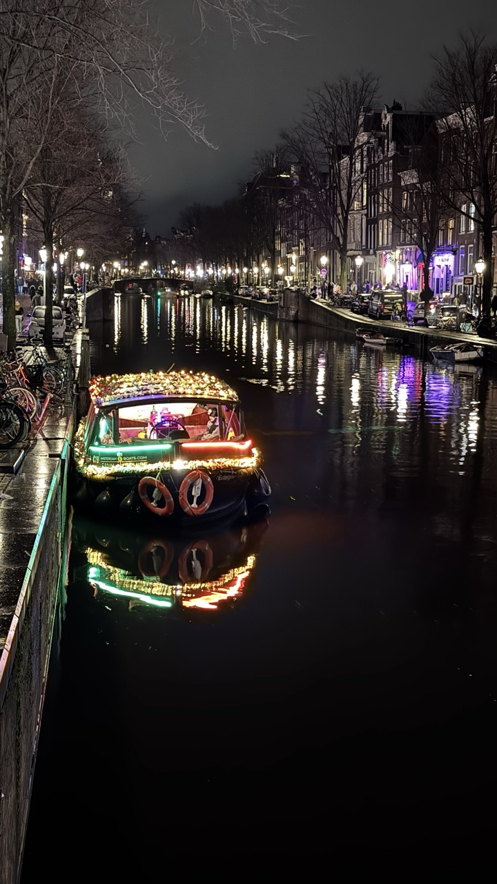

1. Overall Rating (0–10) — 7.5
This nighttime canal scene captures the magic of a festive Amsterdam evening, where the glowing boat becomes a radiant centerpiece against the dark water and silhouetted cityscape. The reflections ripple across the surface, doubling the luminous energy and creating a dreamlike atmosphere. While the image successfully conveys the charm of the location, the heavy shadows and slight overexposure in the lights prevent it from achieving a more refined balance between clarity and mood.
2. Composition (0–10) — 7.0
The boat is well-placed in the lower-left quadrant, drawing the eye along the canal’s leading lines toward the distant bridge and glowing buildings. The bare tree branches in the foreground add depth, though their faint presence slightly disrupts the visual flow.
3. Lighting (0–10) — 8.0
The interplay of artificial lights—on the boat, along the canal, and from the buildings—creates a rich tapestry of warm glows and cool reflections. The dark water acts as a natural mirror, enhancing the luminosity and adding depth to the scene.
4. Color & Tone (0–10) — 7.5
The palette is dominated by warm yellows and oranges from the string lights, contrasted by the cool purples and blues of the ambient city glow. The deep blacks of the canal and night sky provide strong tonal contrast, making the lights pop without appearing oversaturated.
5. Creativity (0–10) — 8.0
The image transforms a familiar urban scene into something celebratory and almost cinematic. The choice to highlight the decorated boat as the focal point gives the photo a narrative quality—suggesting a holiday parade or private celebration on the water.
6. Technical Quality (0–10) — 7.0
The image is sharp and detailed, with clean focus on the boat and its reflections. However, some highlights in the lights appear slightly blown out, and the overall contrast could be more balanced for a more refined look.
7. Emotional Impact (0–10) — 8.0
There’s a strong sense of warmth, festivity, and quiet wonder in the scene. The combination of light, reflection, and stillness evokes a cozy, intimate mood, inviting the viewer to imagine the sounds of water and distant music.
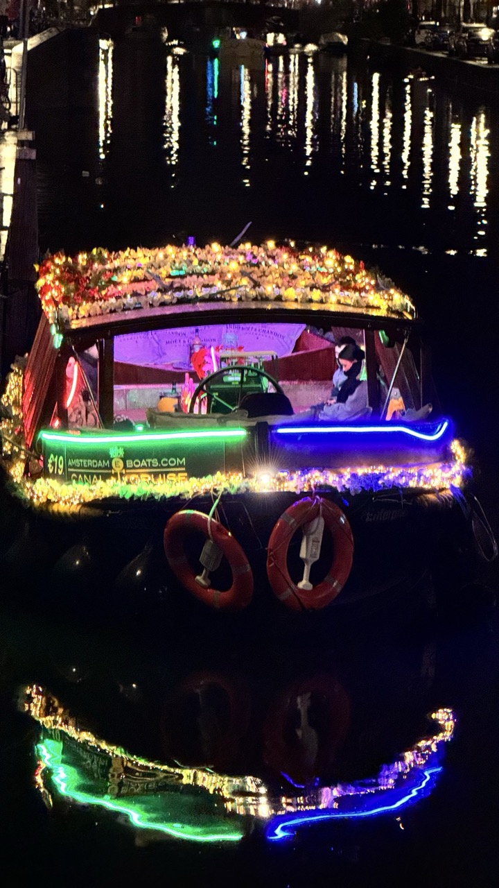

1. Overall Rating (0–10) — 7.0
This photograph captures the enchanting glow of a canal boat at night, where vibrant lights transform a simple vessel into a festive spectacle. The reflections on the water add depth and magic, creating a dreamlike atmosphere that feels both lively and intimate. While the image is visually rich, the cluttered arrangement of lights and signage slightly detracts from its elegance, giving it a more commercial than artistic feel.
2. Composition (0–10) — 6.5
The boat is centered, drawing immediate attention, but the surrounding clutter—life rings, signage, and garlands—creates visual noise. A tighter crop would enhance focus on the glowing elements and their reflections.
3. Lighting (0–10) — 8.5
The interplay of artificial lights—neon green, blue, and warm gold—creates a striking contrast against the dark water and night sky. The reflections amplify the luminosity, adding a sense of movement and depth.
4. Color & Tone (0–10) — 7.5
The palette is rich and varied, with bold neon hues complemented by warm golden tones. The cool and warm contrasts create visual excitement, though the colors are slightly over-saturated, giving the image a digitally enhanced feel.
5. Creativity (0–10) — 7.0
The photograph successfully captures the festive spirit of a canal cruise in Amsterdam, blending realism with a touch of whimsy. The use of reflections and layered lights demonstrates creative intent, though the composition leans more toward documentation than artistic interpretation.
6. Technical Quality (0–10) — 7.5
The image is sharp and clear, with well-defined details in the lights and reflections. The long exposure is well-executed, capturing the smooth motion of the water and the steady glow of the lights.
7. Emotional Impact (0–10) — 7.0
The image evokes a sense of wonder and celebration, inviting the viewer into a magical nighttime scene. The warm lights and serene water create a feeling of joy and tranquility, making it emotionally engaging despite its commercial context.
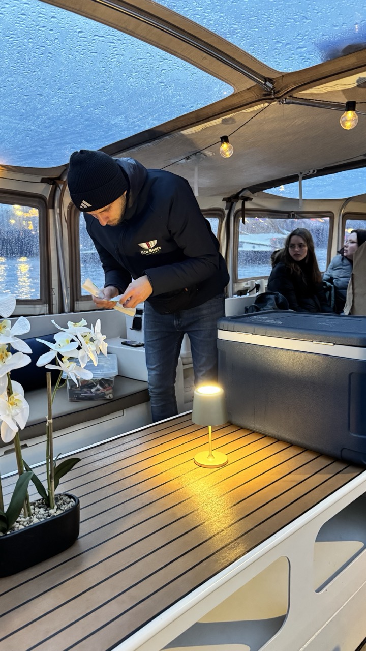

1. Overall Rating (0–10) — 6.0
This photograph captures an intimate, candid moment aboard a boat during what appears to be a rainy evening, blending natural and artificial light to evoke a sense of quiet activity. The warm glow of the table lamp contrasts with the cool, bluish exterior, creating a subtle mood of coziness amid a damp, overcast setting. While the scene feels authentic and grounded in a real-life moment, the composition and lighting lack the refinement to elevate it into a truly compelling image—its strength lies in its narrative potential rather than its visual polish.
2. Composition (0–10) — 5.5
The framing is slightly off-center, with the main subject positioned too far to the left, leaving an unbalanced amount of negative space on the right. The diagonal lines of the wooden deck and the overhead canopy provide some directional flow, but the cluttered foreground and overlapping elements—particularly the orchid and the cooler—distract from the central action.
3. Lighting (0–10) — 6.0
The warm, soft glow of the table lamp creates a cozy focal point and helps draw the eye into the scene, while the ambient light from the overhead bulbs adds subtle depth. However, the cool, diffused light from the rain-streaked windows lacks definition, contributing to a flat, slightly murky atmosphere that dampens the image’s overall clarity.
4. Color & Tone (0–10) — 5.5
The color palette is dominated by cool blues and grays from the rainy exterior, contrasted with the warm yellow glow of the lamp. While this creates a natural tonal balance, the overall color temperature is somewhat muted, and the lack of rich saturation gives the image a slightly washed-out appearance.
5. Creativity (0–10) — 6.5
The photograph captures a quiet, unposed moment that feels both personal and atmospheric. The juxtaposition of the warm interior lighting against the cold, rainy exterior suggests a story of shelter and human connection, lending it a narrative quality. While not particularly original in concept, the image succeeds in conveying mood through its environmental details.
6. Technical Quality (0–10) — 7.0
The image is sharp and well-focused, particularly in the foreground where the lamp and orchid are clearly defined. The exposure is balanced, with no obvious overexposed highlights or crushed shadows. However, the slightly grainy texture and soft focus on the background subjects suggest a trade-off between clarity and atmospheric depth.
7. Emotional Impact (0–10) — 6.0
The image evokes a sense of calm and quiet intimacy, with the soft lighting and subdued colors creating a reflective, almost meditative mood. The presence of people engaged in a simple, everyday activity invites the viewer to imagine their story, though the emotional connection is restrained by the image’s somewhat distant and observational perspective.
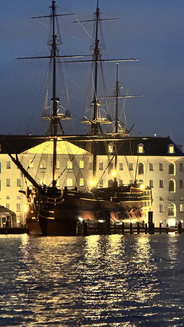

1. Overall Rating (0–10) — 7.5
This photograph captures a striking nocturnal scene where history and light converge, evoking a sense of quiet grandeur. The illuminated ship, with its towering masts and intricate rigging, stands as a powerful silhouette against the softly lit building behind it. While the composition is rich in atmosphere and narrative potential, the image feels slightly restrained by a lack of dynamic contrast and a muted emotional punch.
2. Composition (0–10) — 7.0
The ship is centered with strong vertical lines that draw the eye upward, creating a sense of scale and presence. The building in the background provides symmetry and balance, while the water in the foreground adds depth and reflection. A tighter crop could enhance focus on the ship’s details and reduce the visual clutter of the distant dock.
3. Lighting (0–10) — 8.0
The interplay of artificial light on the ship and building creates a warm, inviting glow against the cool twilight sky. The lighting is well-balanced, with the golden highlights on the vessel and the building contrasting beautifully with the dark hull and deep blue sky. The reflections on the water add a shimmering effect that enhances the mood.
4. Color & Tone (0–10) — 7.5
The palette is dominated by warm yellows and golds from the lights, set against a deep blue twilight sky and dark water. The tonal contrast between the illuminated elements and the shadows is effective, though the overall color temperature leans slightly cool, which slightly dampens the warmth of the scene.
5. Creativity (0–10) — 8.0
The image successfully blends historical elements with a contemporary nighttime aesthetic, creating a visually compelling narrative. The juxtaposition of the old sailing ship with the modern lighting and architecture offers a creative dialogue between past and present.
6. Technical Quality (0–10) — 7.0
The image is sharp and well-focused, with clear details visible in the rigging and building. The exposure is accurate, capturing both the highlights and shadows without significant loss of detail. The slight grain suggests a higher ISO setting, but it doesn’t detract significantly from the overall clarity.
7. Emotional Impact (0–10) — 7.5
The photograph evokes a sense of nostalgia and wonder, inviting the viewer to imagine the ship’s storied past. The quiet stillness of the scene and the warm glow of the lights create a contemplative mood, though the emotional resonance could be stronger with more dynamic lighting or a more intimate perspective.
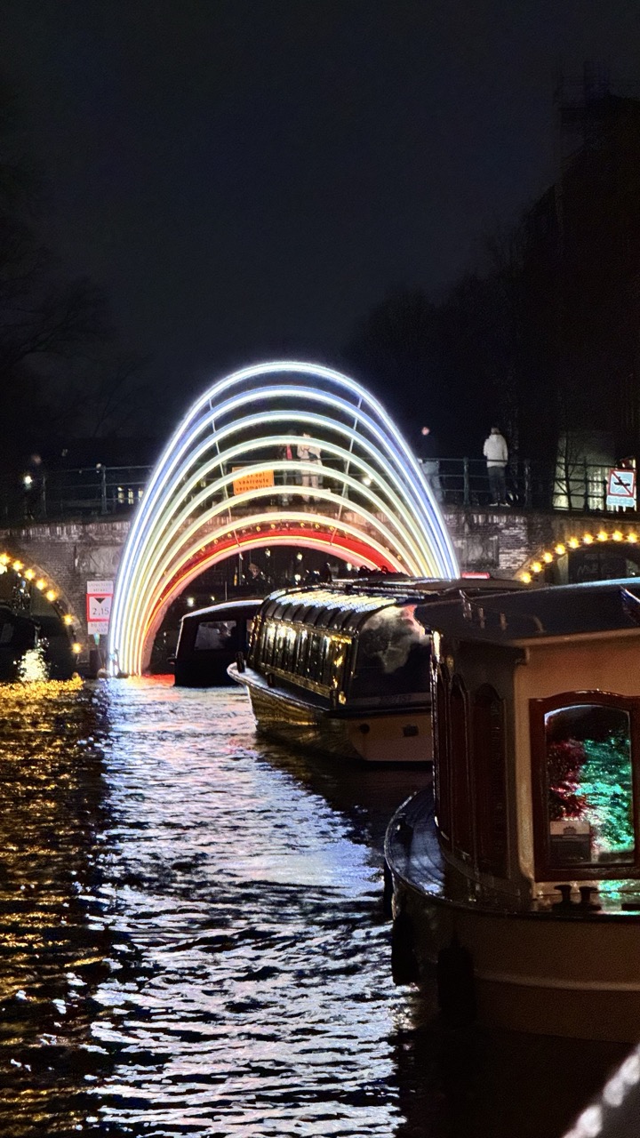

1. Overall Rating (0–10) — 7.0
This photograph captures a serene nocturnal scene on a canal, where the interplay of light and water creates a dreamlike atmosphere. The glowing arch bridge serves as a striking focal point, its layered illumination reflecting beautifully across the rippling surface. While the composition is visually compelling, the slightly cluttered foreground and muted background details prevent it from achieving a more refined aesthetic.
2. Composition (0–10) — 6.5
The frame is anchored by the glowing arch, drawing the eye toward the center, though the boats in the foreground slightly disrupt the visual flow. The low angle and diagonal waterline create a sense of depth, but the composition feels slightly unbalanced due to the asymmetrical placement of the vessels.
3. Lighting (0–10) — 8.0
The interplay of artificial light—especially the luminous arch and the warm glow of the canal-side lamps—creates a dynamic and atmospheric scene. The reflections on the water enhance the luminosity, while the dark sky provides a strong contrast that accentuates the lights.
4. Color & Tone (0–10) — 7.0
The palette is dominated by cool blues and whites from the arch, contrasted with warm yellows and reds from the ambient lights. The color harmony is strong, with the cool and warm tones complementing each other, though the overall image leans slightly toward a cool, nighttime tone that limits vibrancy.
5. Creativity (0–10) — 7.5
The use of the illuminated arch as a central visual motif demonstrates strong artistic intent, transforming a simple canal scene into something magical and whimsical. The perspective and timing suggest a deliberate effort to capture the interplay of light and water, resulting in a visually engaging narrative.
6. Technical Quality (0–10) — 7.5
The image is sharp, with clear detail in both the foreground and background. The exposure is well-managed, preserving the brightness of the lights without overexposing key areas. However, some minor noise is visible in the darker regions of the sky.
7. Emotional Impact (0–10) — 7.5
The photograph evokes a sense of calm and wonder, inviting the viewer into a quiet, enchanted urban night. The soft reflections and glowing architecture create a feeling of intimacy and stillness, making the scene feel both familiar and magical.
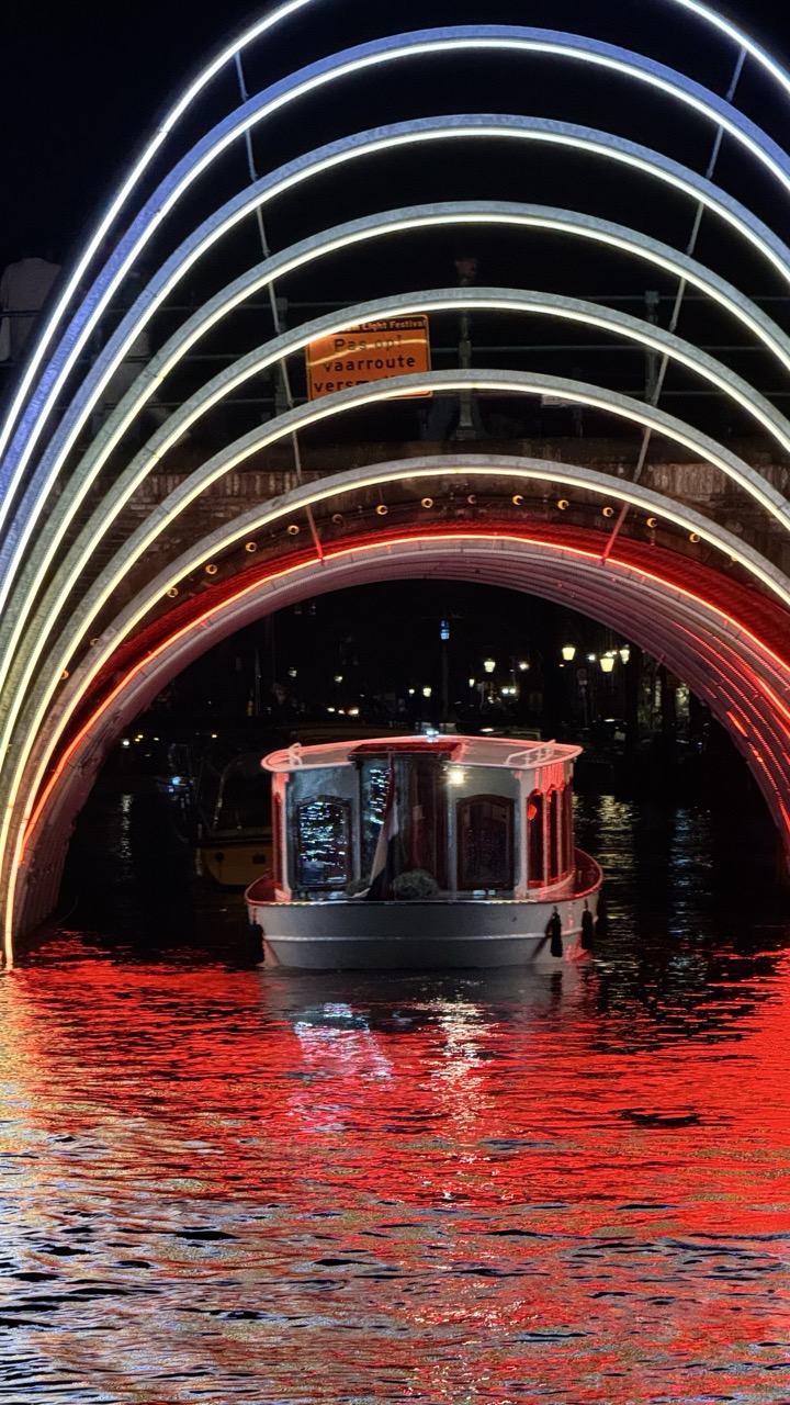

1. Overall Rating (0–10) — 8.0
This photograph captures a mesmerizing interplay of light and architecture, transforming a simple canal passage into a luminous, almost futuristic portal. The glowing arches and their vivid red reflections create a dynamic, immersive atmosphere that draws the eye into the scene. While the composition is strong and the lighting dramatic, the presence of the sign slightly disrupts the visual harmony, hinting at the image’s documentary origin rather than a fully curated aesthetic.
2. Composition (0–10) — 8.0
The symmetrical framing of the boat beneath the glowing arches creates a powerful visual anchor, while the layered arches guide the viewer’s gaze into the distance. The low angle enhances the grandeur of the structure and emphasizes the reflections on the water, though the central placement of the boat feels slightly static.
3. Lighting (0–10) — 9.0
The use of artificial lighting is masterful—warm white and red LEDs create a striking contrast against the dark night sky and water. The light sources are well-balanced, casting vivid reflections and defining the form of the arches with clarity and depth.
4. Color & Tone (0–10) — 8.5
The palette is dominated by bold reds and whites, which stand out against the deep black background, creating a high-contrast, visually arresting scene. The warm tones evoke energy and celebration, while the cool white accents lend a modern, almost sci-fi quality.
5. Creativity (0–10) — 8.0
The image demonstrates strong creative vision by transforming an urban landscape into a spectacle of light and reflection. The integration of architecture, water, and illumination tells a story of urban festivity and technological artistry, though the inclusion of the sign tempers its poetic abstraction.
6. Technical Quality (0–10) — 8.5
The image is sharp and well-exposed, with clear details in both the illuminated structures and the water’s surface. The long exposure enhances the smoothness of the reflections and captures the ambient light effectively.
7. Emotional Impact (0–10) — 8.0
The photograph evokes a sense of wonder and quiet excitement, reminiscent of a nighttime festival or city celebration. The interplay of light and water creates a dreamlike mood that resonates emotionally, inviting contemplation of urban beauty and human creativity.
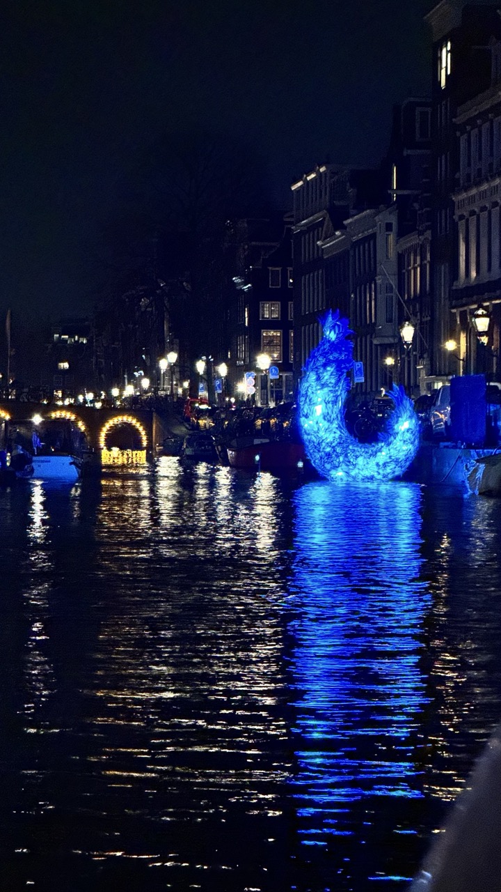

1. Overall Rating (0–10) — 7.0
This nighttime photograph captures a striking interplay between urban architecture and luminous art, evoking a dreamlike atmosphere along a canal. The glowing blue sculpture, its reflection shimmering on the water, becomes a focal point of quiet wonder, while the warm lights of the bridge and buildings add depth and contrast. Though the image feels slightly overexposed in the highlights, the composition effectively balances realism and fantasy, inviting the viewer into a moment of nocturnal enchantment.
2. Composition (0–10) — 6.5
The sculpture is placed slightly off-center, drawing the eye toward the right while allowing the bridge and canal to provide context. The diagonal line of the canal and the arch of the bridge create a sense of depth, though the cluttered foreground and background slightly disrupt the visual flow.
3. Lighting (0–10) — 7.5
The interplay of artificial light—cool blue from the sculpture and warm yellow from the street lamps—creates a rich, layered lighting effect. The reflections on the water enhance the sense of luminosity, though some highlights on the buildings appear slightly blown out.
4. Color & Tone (0–10) — 7.0
The dominant blue of the sculpture contrasts beautifully with the warm amber tones of the surrounding lights, creating a visually engaging palette. The dark background enhances the vibrancy of the colors, while the reflections add a sense of movement and depth.
5. Creativity (0–10) — 8.0
The use of a large, illuminated sculpture as a central element transforms the familiar canal scene into something surreal and poetic. The juxtaposition of modern art with historic architecture suggests a narrative of tradition meeting innovation.
6. Technical Quality (0–10) — 7.0
The image is sharp and clear, with minimal noise despite the low-light conditions. The focus is well-managed, capturing both the sculpture and the reflections with precision, though slight overexposure in the brightest areas detracts from tonal balance.
7. Emotional Impact (0–10) — 7.5
The photograph evokes a sense of quiet awe and wonder, inviting contemplation of light, water, and urban beauty. The combination of stillness and movement in the reflections creates a meditative mood, making the viewer feel present in a magical, fleeting moment.
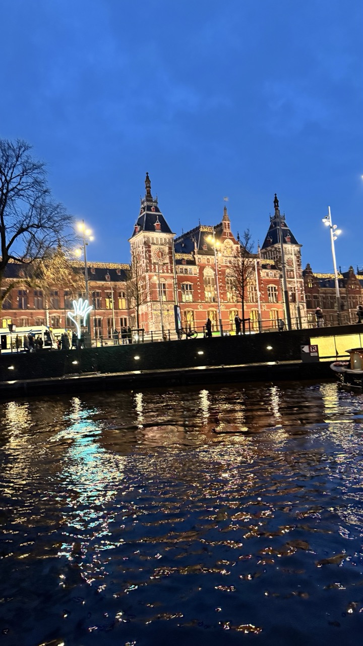

1. Overall Rating (0–10) — 7.5
This photograph captures the serene elegance of a historic European canal at twilight, where the grand architecture of Amsterdam’s Central Station meets the reflective stillness of water. The interplay of warm artificial light against the cool blue sky creates a compelling contrast, while the gentle ripples distort the reflections in a painterly way. Though the image is visually rich, its potential is slightly diminished by a lack of compositional refinement and a cluttered foreground.
2. Composition (0–10) — 6.0
The framing includes a busy foreground with railings and a small boat that distract from the main subject. A tighter crop would better emphasize the symmetry of the building and its reflection.
3. Lighting (0–10) — 8.0
The ambient twilight provides a deep, moody blue backdrop that beautifully contrasts with the warm glow of the building’s lights and streetlamps. The reflections on the water add depth and luminosity.
4. Color & Tone (0–10) — 7.5
The cool blue of the sky harmonizes with the golden warmth of the lights, creating a balanced and atmospheric palette. The water’s shimmering surface enhances the tonal richness and adds visual interest.
5. Creativity (0–10) — 7.0
The image captures a moment of quiet beauty with a strong sense of place, but it leans more toward documentation than conceptual expression. The inclusion of the glowing hand sculpture adds a subtle narrative layer, though it remains underdeveloped.
6. Technical Quality (0–10) — 8.0
The image is sharp and well-exposed, with clear detail in both the architecture and the water’s surface. The focus is consistent, and there’s minimal noise despite the low-light conditions.
7. Emotional Impact (0–10) — 7.0
The scene evokes a sense of calm and nostalgia, inviting the viewer to pause and reflect on the harmony between urban life and natural elements. The mood is intimate and contemplative, though the emotional pull is slightly tempered by the visual clutter.


1. Overall Rating (0–10) — 6.0
This image presents a playful fusion of indulgence, with waffle pastries topped with caramel and whole Snickers bars, evoking a sense of whimsical excess. The bold branding of the candy bar draws immediate attention, while the glossy caramel and rich chocolate create a visually tempting texture. However, the composition feels slightly cluttered, and the reflection in the glass adds a layer of visual noise that detracts from the clarity of the subject.
2. Composition (0–10) — 5.5
The framing is tight and centered, focusing on the pastries, but the arrangement lacks balance. The Snickers bars are placed asymmetrically, and the partial view of additional pastries on the edges creates a sense of overcrowding. A more deliberate layout would enhance visual harmony.
3. Lighting (0–10) — 5.0
The lighting is functional but flat, likely from overhead fluorescent sources, which minimizes shadows and depth. While the subject is clearly visible, the lack of directional light prevents the textures of the caramel and chocolate from truly standing out.
4. Color & Tone (0–10) — 6.5
The warm tones of the caramel and the rich brown of the chocolate create a visually appealing palette, with the red and blue of the Snickers wrapper adding a pop of contrast. However, the overall color balance is slightly muted, with the metallic tray and glass reflection dulling the vibrancy.
5. Creativity (0–10) — 7.5
The concept of combining a classic waffle with a Snickers bar is inventive and memorable, playing on the intersection of sweet treats and snack culture. The image taps into a sense of fun and indulgence, making it visually engaging and conceptually strong.
6. Technical Quality (0–10) — 7.0
The focus is sharp on the foreground pastries, and the details of the caramel and chocolate are well-captured. However, the reflection in the glass and minor lens flare reduce overall clarity, slightly diminishing technical polish.
7. Emotional Impact (0–10) — 6.5
The image evokes a sense of nostalgia and pleasure, appealing to the viewer’s desire for comfort and indulgence. While it doesn’t deeply stir emotion, it successfully captures the joy and decadence of a sweet, oversized treat.


1. Overall Rating (0–10) — 6.0
This photograph captures a tempting display of chocolate-covered waffles topped with Oreo cookies, offering a playful fusion of textures and indulgence. While the subject is inherently appealing and the composition leans into a sense of abundance, the image is held back by a lack of visual refinement and a somewhat cluttered presentation. The reflections in the glass and the overexposed packaging detract from the overall aesthetic, making the scene feel more like a casual snapshot than a curated moment.
2. Composition (0–10) — 5.5
The subject is centered and fills the frame, but the composition is slightly unbalanced by the prominent Oreo package on the right and the distracting reflections in the glass. The close-up framing emphasizes texture but limits context.
3. Lighting (0–10) — 5.0
The lighting is flat and even, likely from overhead fluorescent sources, which flattens the depth and diminishes the richness of the chocolate and cream textures. Harsh reflections on the glass further disrupt the visual flow.
4. Color & Tone (0–10) — 5.5
The color palette is dominated by the bold blue of the Oreo wrapper, which contrasts with the brown and white of the dessert, but the overall tone is muted. The lack of dynamic range and the slightly oversaturated blue reduce the image’s visual harmony.
5. Creativity (0–10) — 6.0
The concept of combining waffles, chocolate, and Oreos is playful and indulgent, suggesting a creative dessert idea. However, the execution feels more opportunistic than intentional, lacking a strong artistic vision.
6. Technical Quality (0–10) — 6.5
The focus is sharp on the waffles and packaging, and the details of the chocolate drizzle and cookie texture are clear. However, the reflections and slight glare on the glass reduce overall clarity.
7. Emotional Impact (0–10) — 5.0
The image evokes a sense of sweet temptation and nostalgia, particularly for fans of Oreo and comfort food. However, the lack of atmosphere and emotional depth keeps the viewer from fully connecting with the indulgence.
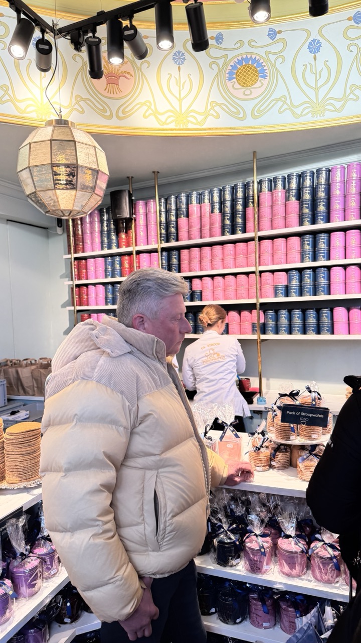

1. Overall Rating (0–10) — 7.0
This photograph captures the vibrant charm of a Dutch pastry shop, where ornate art nouveau details meet the everyday ritual of purchasing stroopwafels. The rich colors and layered textures—shiny tins, delicate pastries, and intricate ceiling patterns—create a lively, inviting atmosphere. While the composition feels slightly cluttered, the image successfully conveys the joy and sensory richness of the experience, making it both visually engaging and culturally evocative.
2. Composition (0–10) — 6.5
The man in the foreground provides a human anchor, but his placement slightly disrupts the visual flow. The shelves of colorful tins create a strong diagonal, drawing the eye upward, though the cluttered foreground and off-center subject reduce compositional harmony.
3. Lighting (0–10) — 7.0
The combination of overhead track lighting and the warm glow from the decorative lantern creates a balanced, inviting ambiance. The lighting highlights the textures and colors of the products while preserving the ornate ceiling details.
4. Color & Tone (0–10) — 8.0
The palette is rich and harmonious, with the soft pinks and deep blues of the tins contrasting beautifully against the pale yellow and gold of the art nouveau ceiling. The warm tones of the lantern and pastries add depth and a sense of indulgence.
5. Creativity (0–10) — 7.5
The image captures a moment of cultural authenticity with a strong sense of place. The blend of commercial detail and artistic design reflects a unique narrative—traditional craftsmanship meeting modern retail. The creative choice to frame the scene through a customer’s perspective adds a layer of intimacy.
6. Technical Quality (0–10) — 7.5
The image is sharp and clear, with well-managed focus on the central subject. The depth of field appropriately emphasizes the man and the display, while the background details remain discernible without distraction.
7. Emotional Impact (0–10) — 7.0
The photograph evokes a sense of delight and nostalgia, inviting the viewer to imagine the taste of warm stroopwafels and the quiet joy of a specialty shop. The human element grounds the scene, making it feel personal and relatable.
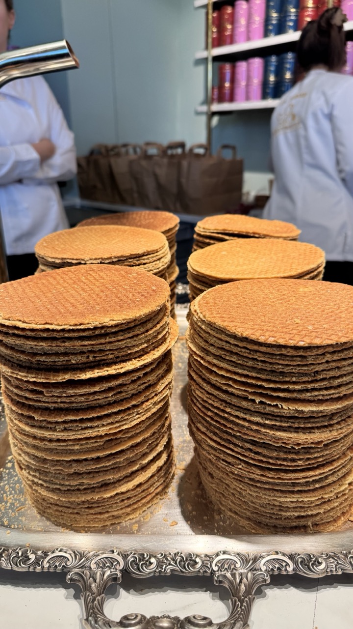

1. Overall Rating (0–10) — 7.0
This photograph captures the inviting warmth of a traditional Dutch waffle shop, where golden stroopwafels take center stage with their rich, textured layers. The contrast between the ornate silver tray and the rustic stacks of waffles adds a touch of elegance, while the blurred background hints at a bustling, authentic environment. Though the composition leans slightly cluttered, the image successfully conveys a sense of artisanal craftsmanship and sensory delight.
2. Composition (0–10) — 6.5
The foreground stacks dominate the frame, creating a strong visual anchor, but the background elements—staff, shelves, and bags—introduce visual noise. A tighter crop would enhance focus on the waffles and improve overall balance.
3. Lighting (0–10) — 7.0
Soft, even lighting highlights the texture and golden hue of the stroopwafels, enhancing their appetizing appeal. The ambient light, likely from overhead fixtures, casts gentle shadows that add depth without overpowering the scene.
4. Color & Tone (0–10) — 7.5
The warm golden tones of the waffles contrast beautifully with the cool blue wall and the metallic sheen of the tray. The color palette is harmonious and inviting, with a natural warmth that emphasizes the food’s freshness and appeal.
5. Creativity (0–10) — 6.0
While the subject is inherently appealing, the approach is straightforward and documentary in nature. The image tells a clear story but lacks a distinctive artistic twist or conceptual layering.
6. Technical Quality (0–10) — 8.0
The focus is sharp on the waffles, with fine detail visible in the texture of the layers. The depth of field is appropriate, softly blurring the background to draw attention to the subject, and the image is free of noticeable technical flaws.
7. Emotional Impact (0–10) — 7.0
The photograph evokes a sense of comfort, nostalgia, and indulgence, tapping into the universal appeal of freshly baked treats. The viewer is invited to imagine the smell of caramel and the satisfying crunch, making the image emotionally resonant and appetizing.


1. Overall Rating (0–10) — 7.0
This photograph captures the indulgent, chaotic beauty of a gourmet burger, bursting with textures and flavor. The close-up framing emphasizes the richness of the ingredients, from the glistening cheese to the crispy bacon, creating an almost tactile sense of decadence. While the image is visually compelling, the slightly cluttered background and shallow depth of field limit its overall polish, preventing it from feeling fully refined.
2. Composition (0–10) — 6.5
The burger is centered and fills the frame, drawing immediate attention. However, the cluttered background and scattered condiments slightly distract from the main subject, creating a sense of visual noise.
3. Lighting (0–10) — 6.0
The lighting is warm and directional, enhancing the glistening textures of the cheese and sauce. However, the shadows are somewhat harsh, and the ambient light lacks the softness needed to elevate the image’s overall mood.
4. Color & Tone (0–10) — 7.5
The warm golden tones of the bun and cheese contrast beautifully with the deep reds of the bacon and sauce, creating a rich, appetizing palette. The slightly muted background tones help the subject stand out.
5. Creativity (0–10) — 7.0
The image successfully conveys the indulgent nature of the burger through its focus on texture and detail. While the approach is straightforward, the choice to highlight the messiness adds authenticity and visual interest.
6. Technical Quality (0–10) — 7.5
The focus is sharp on the burger’s front edge, with good detail in the textures. The depth of field is appropriately shallow, but the background remains slightly distracting due to lack of blur.
7. Emotional Impact (0–10) — 8.0
The image evokes a strong sense of hunger and satisfaction, tapping into the universal appeal of a hearty, flavorful meal. The viewer is drawn in by the visual abundance and tactile richness, creating an immediate emotional connection.


1. Overall Rating (0–10) — 6.8
This image captures the indulgent appeal of a gourmet burger with a playful, almost theatrical flair, centered around a charred patty and a dramatic pickled pepper skewer. The warm, low-light setting enhances the dish’s rustic charm, while the slightly cluttered background grounds it in a casual dining atmosphere. Though the composition is visually engaging, the lack of sharp focus and uneven lighting temper its overall impact, making it more of a candid snapshot than a polished culinary portrait.
2. Composition (0–10) — 6.0
The burger is well-centered, but the off-kilter angle and cluttered background distract from the subject. The wooden board provides a natural frame, yet the shallow depth of field causes some parts of the burger to blur, weakening visual clarity.
3. Lighting (0–10) — 5.5
The lighting is dim and uneven, likely from overhead ambient sources, casting soft shadows and creating a moody, intimate feel. However, the lack of directional light results in flat highlights and muted contrast, which diminishes the texture of the food.
4. Color & Tone (0–10) — 6.5
The warm, earthy tones of the wooden board and toasted bun complement the deep browns and greens of the burger. The color palette feels cohesive and appetizing, though the low saturation slightly dulls the vibrancy of the pickled pepper.
5. Creativity (0–10) — 7.0
The inclusion of the skewered pepper adds a whimsical, almost sculptural element, elevating the burger beyond a simple meal. The informal, handheld framing suggests authenticity and personality, lending the image a narrative quality.
6. Technical Quality (0–10) — 6.0
The image is slightly soft in focus, particularly around the edges of the burger, and shows minor noise due to low-light conditions. While the subject is recognizable, the lack of crisp detail limits technical refinement.
7. Emotional Impact (0–10) — 6.5
The photo evokes a sense of indulgence and casual joy, inviting the viewer to imagine the flavors and textures. The personal touch of the skewer and the intimate setting create a relatable, almost nostalgic moment of comfort food enjoyed in a relaxed environment.
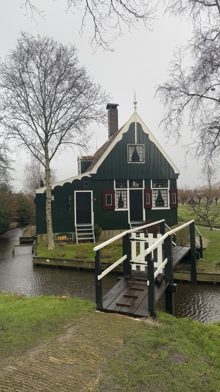

1. Overall Rating (0–10) — 6.0
This photograph captures the quiet charm of a traditional Dutch house nestled beside a canal, evoking a sense of rural tranquility. The muted palette and overcast sky lend a melancholic stillness to the scene, while the classic architectural details—like the stepped gable and red shutters—anchor the image in cultural specificity. While the composition is visually balanced and the subject is clearly defined, the lack of dynamic light and a compelling focal point keeps the image from feeling truly immersive.
2. Composition (0–10) — 7.0
The house is centered with a natural leading line created by the bridge and canal, guiding the eye into the frame. The bare trees on either side frame the scene effectively, though the foreground path slightly disrupts the visual flow.
3. Lighting (0–10) — 4.5
Diffused, flat light from the overcast sky creates a soft, even exposure but diminishes texture and depth. The lack of shadows prevents the house from standing out, giving the scene a subdued, almost muted quality.
4. Color & Tone (0–10) — 6.0
The deep green of the house contrasts well with the white trim and red shutters, but the overall tone is dampened by the gray sky and muted grass. The color palette feels restrained, enhancing the quiet mood but lacking vibrancy.
5. Creativity (0–10) — 5.5
The image is straightforward and documentary in nature, capturing a recognizable cultural landscape without attempting to reinterpret or stylize it. While the subject is inherently picturesque, the approach is conventional and lacks a strong artistic voice.
6. Technical Quality (0–10) — 7.5
The image is sharp and well-focused, with clear details visible in the wood grain of the bridge and the texture of the house’s siding. The exposure is balanced, though the overall image appears slightly underexposed.
7. Emotional Impact (0–10) — 5.0
The photograph conveys a sense of calm and solitude, but the lack of dramatic lighting and emotional contrast keeps the viewer at a distance. It invites appreciation for the scene rather than evoking a strong emotional response.
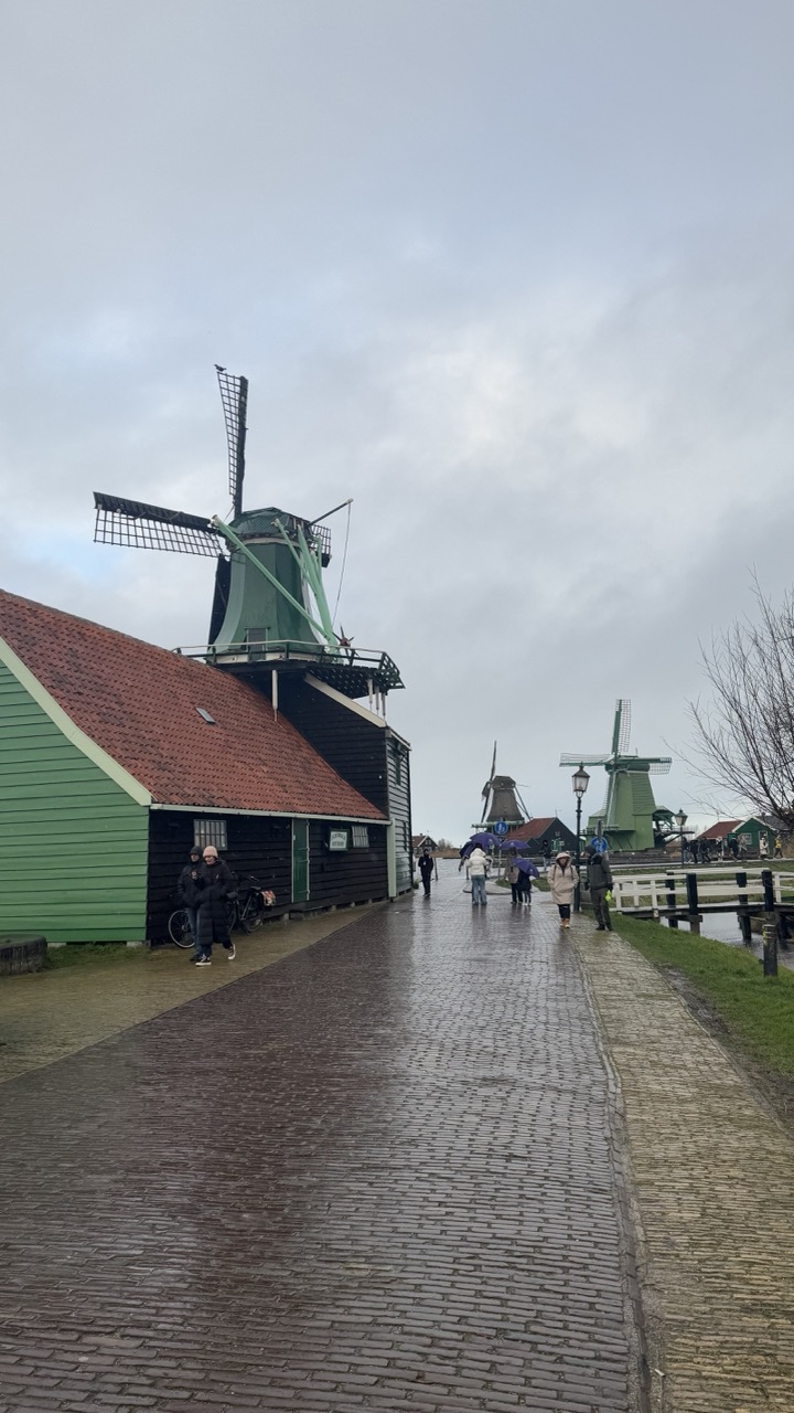

1. Overall Rating (0–10) — 6.0
This photograph captures the timeless charm of a Dutch windmill village on an overcast day, where wet cobblestones and muted tones evoke a sense of quiet melancholy. While the iconic green windmills and traditional architecture create a strong sense of place, the image’s emotional resonance is tempered by a lack of dynamic lighting and a slightly cluttered foreground. The scene feels authentic and atmospheric, but it stops short of transcending into a truly compelling visual narrative.
2. Composition (0–10) — 6.5
The diagonal path draws the eye into the frame, creating a sense of depth and guiding the viewer toward the distant windmills. However, the inclusion of pedestrians and bicycles in the foreground introduces visual noise, slightly disrupting the balance and weakening the focus on the central subject.
3. Lighting (0–10) — 5.5
The diffuse, overcast light flattens the scene, reducing contrast and minimizing texture. While this soft illumination suits the moody atmosphere, it also diminishes the richness of the colors and the dramatic potential of the windmills.
4. Color & Tone (0–10) — 5.5
The palette is dominated by muted greens, grays, and earthy browns, which, while harmonious, lack vibrancy. The green of the windmill and building stands out slightly, but the overall tone feels subdued, reinforcing the gloomy weather rather than enhancing the scene’s natural beauty.
5. Creativity (0–10) — 6.0
The image is grounded in a familiar, picturesque subject, but its strength lies in its ability to convey a sense of place rather than in bold artistic innovation. The composition and mood are well-executed, but the approach is conventional, relying on the iconic nature of the location rather than a unique visual perspective.
6. Technical Quality (0–10) — 7.0
The image is sharp and clear, with good detail in the cobblestones and architecture. The focus is consistent across the frame, and there are no noticeable technical flaws. However, the lack of dynamic lighting limits the overall visual impact.
7. Emotional Impact (0–10) — 5.5
The photograph evokes a quiet, contemplative mood, suggesting a moment of stillness in a familiar landscape. While the atmosphere is palpable, the emotional connection is somewhat restrained, as the viewer is kept at a distance by the flat lighting and the everyday activity of the scene.
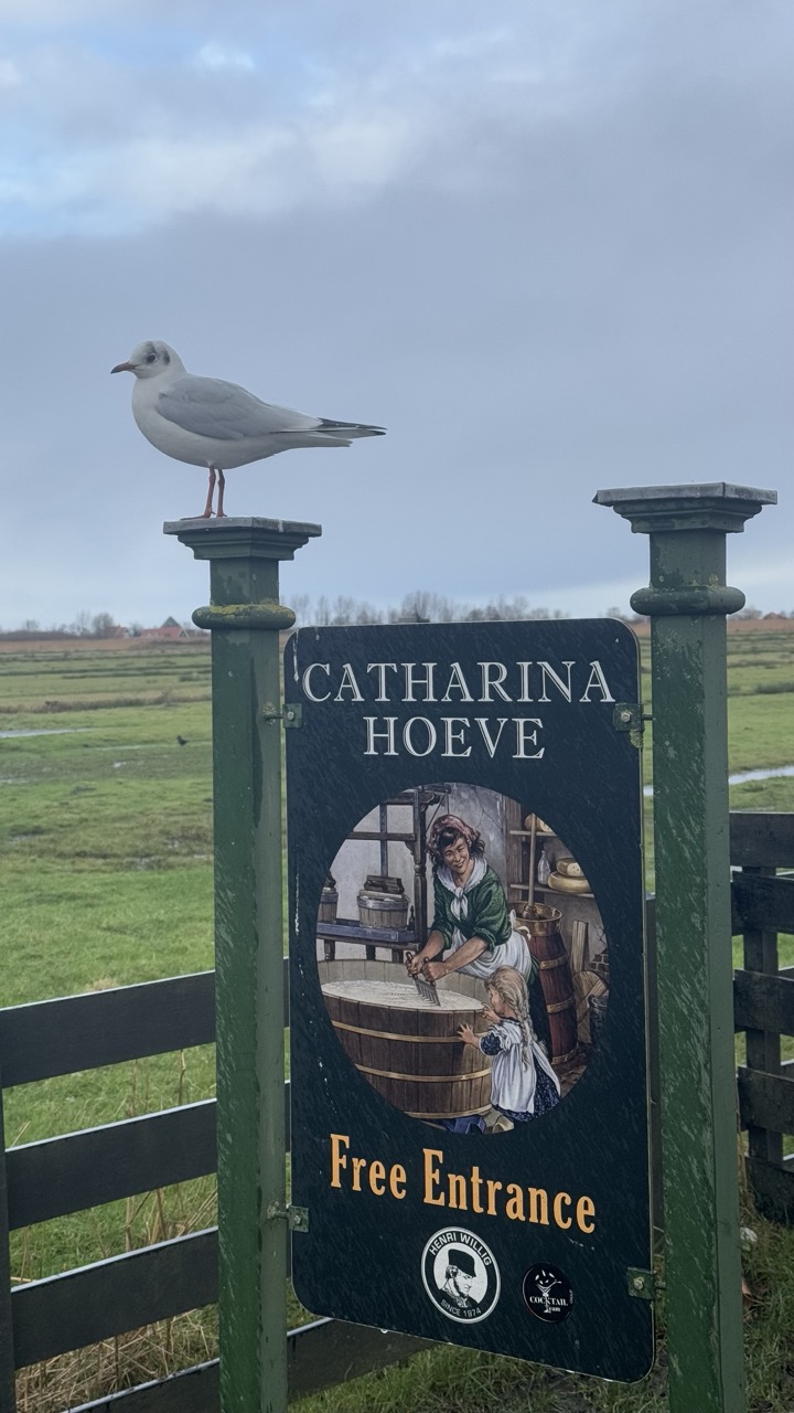

1. Overall Rating (0–10) — 7.0
This photograph captures a whimsical juxtaposition between nature and human narrative, where a seagull perches atop a sign for Catharina Hoeve like a silent guardian of tradition. The overcast sky and muted tones lend a contemplative mood, while the historical illustration on the sign adds a layer of storytelling that contrasts with the bird’s modern presence. Though the composition is slightly unbalanced, the image succeeds in evoking a quiet charm and a sense of place, blending documentary realism with subtle poetic resonance.
2. Composition (0–10) — 6.0
The seagull’s placement on the upper left creates visual tension, drawing the eye upward, but the sign’s central position and the off-center framing of the illustration disrupt harmony. The open field in the background provides context but lacks depth, leaving the image feeling somewhat static.
3. Lighting (0–10) — 5.5
Diffuse, overcast light softens shadows and flattens the scene, creating a somber, uniform tone. While this suits the mood, it reduces texture and detail, particularly in the greenery and the sign’s surface.
4. Color & Tone (0–10) — 6.0
The palette is restrained, dominated by muted greens, grays, and the dark blue of the sign. The warm orange of the “Free Entrance” text provides a slight contrast, but the overall tone feels subdued, limiting visual dynamism.
5. Creativity (0–10) — 7.5
The interplay between the live bird and the historical illustration is imaginative and subtly ironic, suggesting a dialogue between past and present. The image’s quiet humor and layered meaning elevate it beyond a simple snapshot.
6. Technical Quality (0–10) — 7.0
The image is sharp and well-focused, with clear details on the sign and the seagull. The exposure is balanced, though the lack of contrast slightly dulls the overall impact.
7. Emotional Impact (0–10) — 6.5
The photograph evokes a sense of quiet wonder and nostalgia, inviting reflection on time, memory, and the persistence of life in rural landscapes. While not emotionally overwhelming, it lingers with a gentle, contemplative warmth.
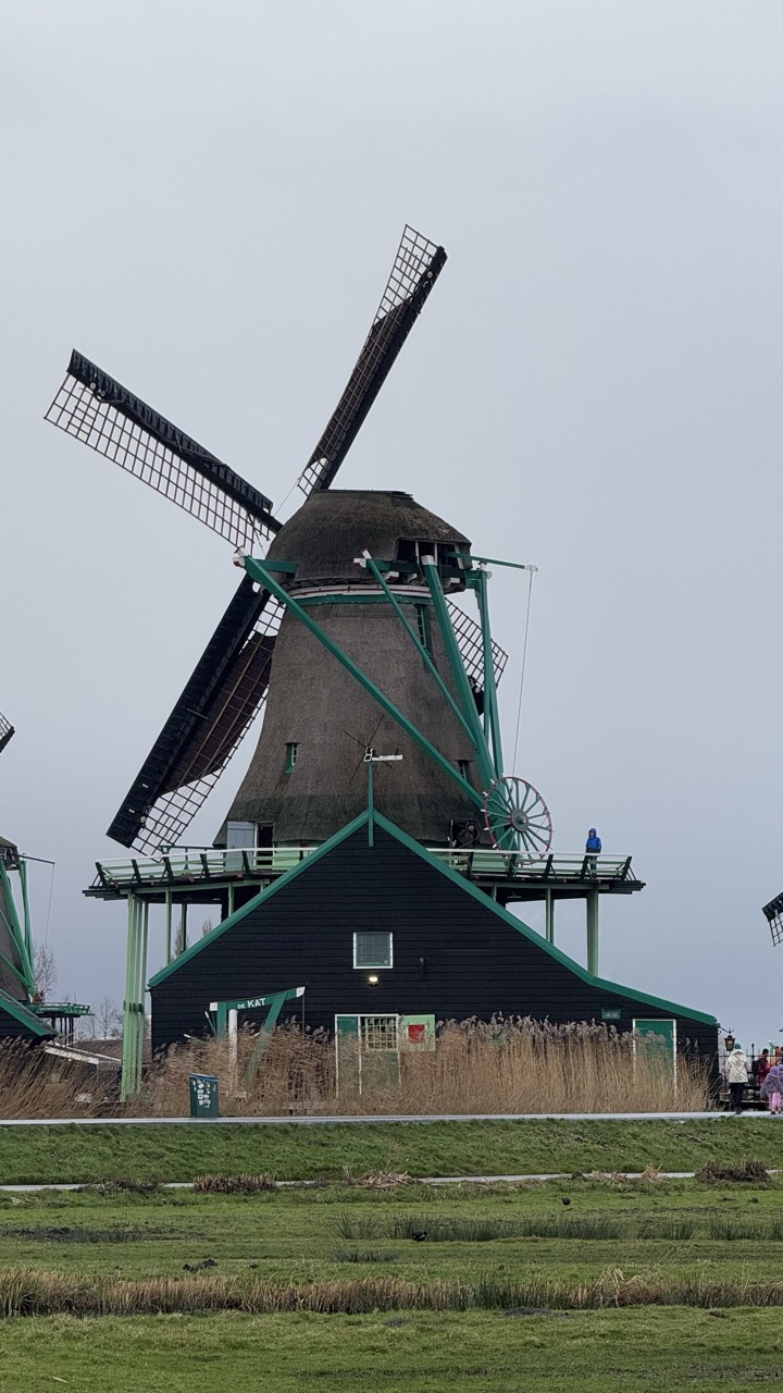

1. Overall Rating (0–10) — 6.0
This photograph captures the iconic silhouette of a Dutch windmill under a muted sky, evoking a sense of timeless rural charm. While the subject is visually compelling and rich in cultural context, the overcast lighting and lack of dynamic contrast temper its emotional resonance. The image succeeds as a documentary record but falls short of transcending into a more poetic or atmospheric statement.
2. Composition (0–10) — 6.5
The windmill is well-centered and dominates the frame, creating a strong focal point. However, the inclusion of background elements like the adjacent mill and distant figures slightly disrupts visual harmony, and the wide foreground of grass and reeds adds weight without enhancing narrative depth.
3. Lighting (0–10) — 5.5
The flat, diffused light from the overcast sky evenly illuminates the scene but suppresses texture and shadow, resulting in a somewhat lifeless quality. While it ensures clarity, it also flattens the mood and diminishes the potential for dramatic contrast.
4. Color & Tone (0–10) — 6.0
The palette is restrained, dominated by muted greens, grays, and browns, which align with the somber weather. The green accents on the mill’s framework provide a subtle pop, but the overall tonal range lacks vibrancy, giving the image a subdued, almost monochromatic feel.
5. Creativity (0–10) — 6.0
The choice to frame the windmill in its natural setting is traditional and effective, but the execution is straightforward and lacks a unique artistic perspective. The composition leans more toward documentation than interpretation, limiting its creative impact.
6. Technical Quality (0–10) — 7.5
The image is sharp and well-focused, with clear detail in the mill’s structure and surrounding textures. The exposure is balanced, and there are no noticeable flaws in resolution or noise, indicating strong technical execution.
7. Emotional Impact (0–10) — 5.5
While the windmill evokes a sense of nostalgia and cultural heritage, the lack of atmospheric lighting and emotional depth keeps the viewer at a distance. The scene feels observed rather than experienced, offering quiet recognition but little emotional pull.


1. Overall Rating (0–10) — 7.0
This photograph immerses the viewer in the rustic charm of a traditional clog-making workshop, where history and craftsmanship converge in a tactile, lived-in space. The warm wood tones and dense arrangement of tools and materials evoke a sense of authenticity and continuity, though the cluttered composition risks overwhelming the eye. The scene feels alive with the legacy of handcraft, but a more refined balance between detail and clarity would elevate its storytelling power.
2. Composition (0–10) — 6.0
The frame is crowded with objects, creating a sense of depth but sacrificing visual clarity. The central pathway draws the eye inward, yet the foreground elements compete for attention, disrupting the flow.
3. Lighting (0–10) — 6.5
Warm, ambient lighting enhances the wood textures and gives the space a cozy, inviting feel. However, the lighting is uneven, with shadows obscuring details in the background and highlights from the skylight creating a slightly harsh contrast.
4. Color & Tone (0–10) — 6.5
The palette is dominated by earthy browns and muted yellows, creating a cohesive and organic atmosphere. The tonal range is rich, but the overall color temperature leans slightly warm, softening the scene’s sharpness and reducing contrast.
5. Creativity (0–10) — 7.0
The image captures a niche cultural craft with authenticity and depth, offering a glimpse into a fading tradition. The composition feels documentary in intent, emphasizing realism over stylization.
6. Technical Quality (0–10) — 7.5
Sharp focus and clear detail are present throughout, particularly in the foreground. The camera captures fine textures like wood grain and sawdust, though slight noise in the darker areas suggests low-light conditions.
7. Emotional Impact (0–10) — 6.5
The image evokes nostalgia and respect for artisanal labor, inviting contemplation of craftsmanship. While the mood is warm and inviting, the visual density prevents a deeper emotional connection, keeping the viewer at a slight remove.
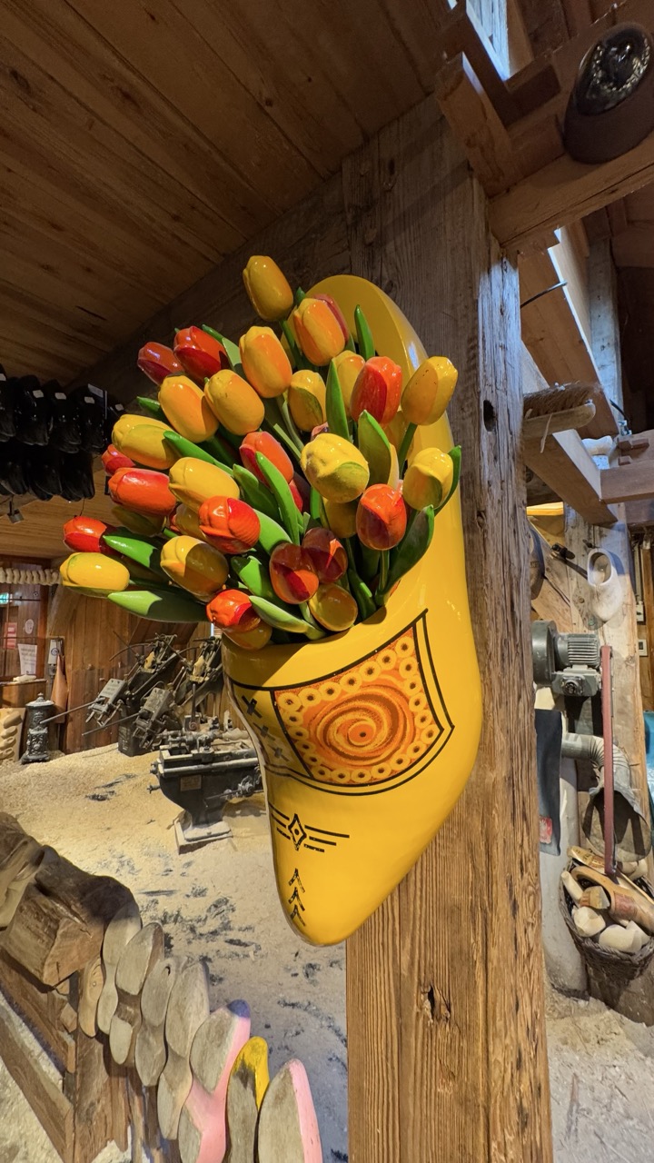

1. Overall Rating (0–10) — 7.0
This photograph captures a vibrant and whimsical nod to Dutch culture, with a painted clog overflowing with colorful tulips serving as a playful centerpiece. The rustic wooden interior enhances the authenticity of the scene, grounding the bright, eye-catching subject in a tangible, traditional context. While the composition is strong and the colors pop, the background clutter slightly distracts from the focal point, preventing the image from achieving a more refined visual harmony.
2. Composition (0–10) — 7.0
The clog is well-placed and centered, drawing immediate attention with its bold shape and color. The surrounding wooden textures and tools create a layered depth, though the background elements compete for focus and could benefit from tighter framing.
3. Lighting (0–10) — 6.5
The lighting is warm and ambient, highlighting the clog’s vivid yellow and the tulips’ rich tones. However, the uneven exposure in the background—particularly in the upper right—creates minor shadows that obscure details and reduce overall visual clarity.
4. Color & Tone (0–10) — 8.0
The palette is rich and celebratory, with the bright yellows, reds, and greens of the tulips creating a lively contrast against the natural wood tones. The warm color temperature enhances the cozy, cultural atmosphere of the setting.
5. Creativity (0–10) — 8.0
The choice to display tulips in a clog is both clever and culturally resonant, transforming a simple souvenir into a symbolic and artistic statement. The image blends folk tradition with a modern, almost theatrical flair, offering a fresh take on cultural representation.
6. Technical Quality (0–10) — 7.5
The image is sharp and well-focused on the clog, with clear detail in the painted patterns and tulip textures. The depth of field is appropriate, though slight motion blur in the background suggests a modest aperture choice.
7. Emotional Impact (0–10) — 7.5
The photograph evokes a sense of joy, nostalgia, and cultural pride. The combination of familiar symbols—tulips and clogs—creates an instant emotional connection for viewers familiar with Dutch heritage, while the warmth of the setting invites curiosity and delight.
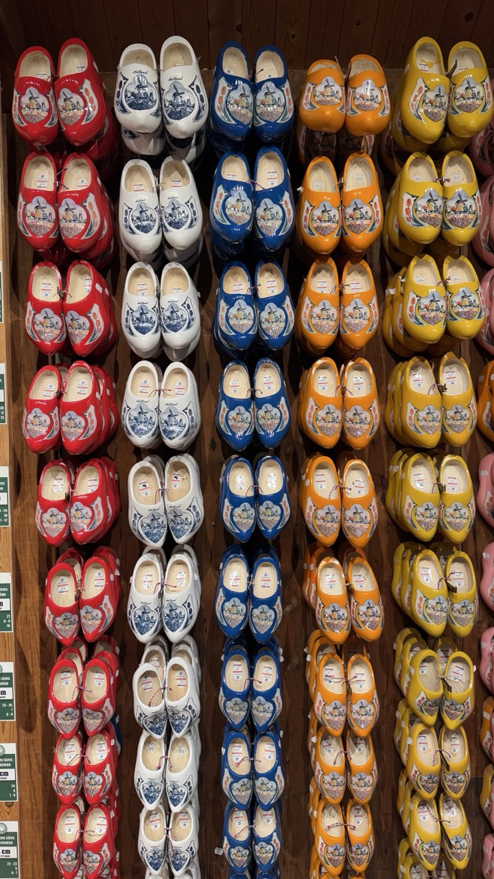

1. Overall Rating (0–10) — 7.0
This photograph captures the vibrant, orderly display of traditional Dutch clogs in a richly textured wooden setting, evoking a sense of cultural heritage and artisanal craftsmanship. The repetition of color and form creates a visually rhythmic pattern, while the warm wood and glossy finish of the clogs lend depth and warmth. Though the image is striking in its composition and cultural specificity, it leans slightly toward the documentary rather than the emotive, lacking a stronger focal point to draw the viewer deeper into the scene.
2. Composition (0–10) — 7.5
The vertical alignment of clog pairs creates a strong sense of rhythm and order, with the color blocks forming a visually engaging grid. The slight asymmetry in the frame and the presence of price tags on the left edge introduce a subtle sense of realism, grounding the image in a retail context. A tighter crop could enhance focus, but the full view effectively conveys the scale and variety of the display.
3. Lighting (0–10) — 6.5
The lighting is even and functional, illuminating the clogs clearly without harsh shadows or glare. However, it lacks the warmth and directionality that might have accentuated the wood grain and glossy surfaces, resulting in a somewhat flat, commercial appearance.
4. Color & Tone (0–10) — 8.0
The bold, saturated colors—red, white, blue, orange, and yellow—pop against the warm brown wood, creating a lively and harmonious palette. The use of primary and secondary hues enhances the visual appeal, while the consistent tone across the clogs unifies the composition.
5. Creativity (0–10) — 7.0
The image leverages the inherent pattern and cultural symbolism of the clogs to create a visually compelling document. While the concept is straightforward, the repetition and color arrangement demonstrate a thoughtful approach to composition. The image functions well as a cultural artifact, though it doesn't push beyond traditional representation.
6. Technical Quality (0–10) — 7.5
The image is sharp and clear, with good focus across the frame. The fine details of the clog designs and the wood grain are well-preserved, indicating strong technical execution. There is minimal noise or distortion, contributing to a clean and professional look.
7. Emotional Impact (0–10) — 6.0
The photograph evokes a sense of nostalgia and cultural pride, particularly for those familiar with Dutch traditions. However, the lack of a human presence or narrative context keeps the emotional connection somewhat distant. The viewer is invited to observe, but not to feel.
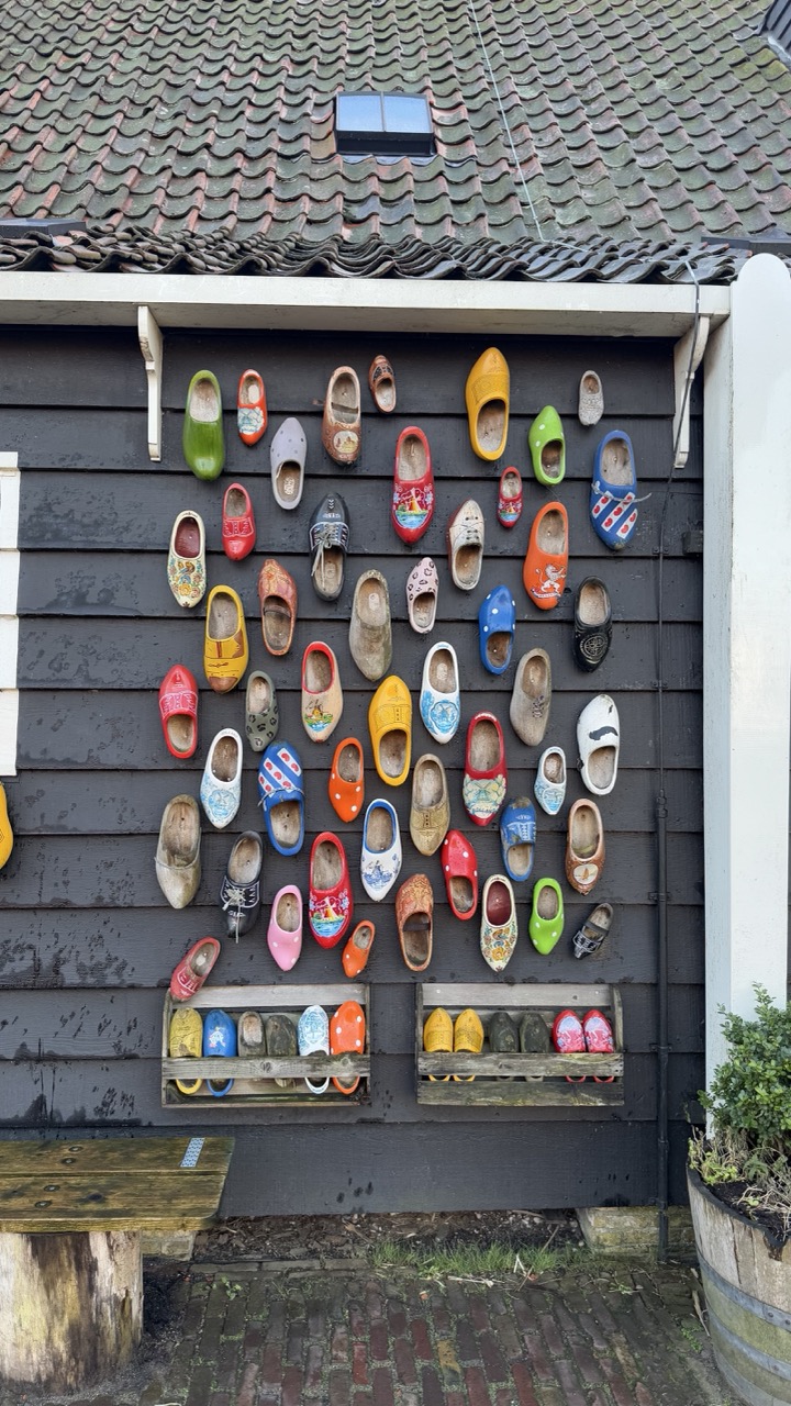

1. Overall Rating (0–10) — 7.0
This photograph captures the vibrant charm of traditional Dutch clogs displayed against a weathered dark wood wall, creating a visually engaging and culturally rich scene. The colorful array of clogs contrasts beautifully with the muted background, drawing the eye to the intricate details and variety of designs. While the composition is lively and expressive, the slightly cluttered arrangement and lack of a clear focal point slightly diminish its overall impact.
2. Composition (0–10) — 6.5
The image is framed with a central focus on the clogs, but the scattered arrangement and overlapping shapes create visual noise. A more deliberate layout or tighter crop could enhance balance and guide the viewer’s gaze more effectively.
3. Lighting (0–10) — 7.0
Natural, diffused daylight evenly illuminates the scene, highlighting the colors of the clogs without harsh shadows. The soft light enhances texture and detail, contributing to a calm, authentic atmosphere.
4. Color & Tone (0–10) — 8.0
The palette is rich and varied, with the bright, saturated hues of the clogs standing out against the dark, neutral wall. The contrast enhances visual interest and gives the image a cheerful, folk-art quality.
5. Creativity (0–10) — 7.5
The display of clogs as both functional objects and artistic elements reflects a strong cultural narrative. The arrangement, while not perfectly ordered, feels organic and celebrates the diversity of traditional Dutch footwear.
6. Technical Quality (0–10) — 8.0
The image is sharp and well-focused, with clear detail in the clogs and textures of the wood and tiles. The exposure is balanced, and the camera’s depth of field effectively keeps the main subject in focus.
7. Emotional Impact (0–10) — 7.0
The photograph evokes a sense of nostalgia and cultural pride, inviting viewers to appreciate the craftsmanship and heritage behind the clogs. The warm, human-scale display creates a connection to everyday life in a traditional Dutch setting.


1. Overall Rating (0–10) — 7.0
This photograph captures a candid moment of cultural exploration in a picturesque Dutch setting, where the vibrant yellow clogs and traditional architecture create an instant sense of place. The subjects’ winter attire and engaged expressions lend authenticity to the scene, though the framing feels slightly rushed and the focus could be more deliberate. The image succeeds in conveying a quiet joy and connection to heritage, even if it lacks the polished elegance of a staged portrait.
2. Composition (0–10) — 6.0
The large clogs in the foreground dominate the frame, creating a strong visual anchor, but they also partially obscure the subjects and disrupt the natural flow of the scene. The placement of the people feels slightly off-center, and the background, while rich in detail, introduces visual noise that competes for attention.
3. Lighting (0–10) — 7.0
Soft, diffused daylight enhances the natural colors and textures of the scene, with gentle shadows that add depth without overpowering the image. The overcast sky provides even illumination, allowing details in both the foreground and background to remain visible.
4. Color & Tone (0–10) — 7.0
The bold yellow of the clogs contrasts strikingly with the muted greens and grays of the landscape, drawing the eye and reinforcing the cultural theme. The overall palette is harmonious, with warm tones in the wooden buildings and cool tones in the sky creating a balanced, seasonal atmosphere.
5. Creativity (0–10) — 7.0
The image blends cultural symbolism with personal narrative, using the iconic clogs and windmill backdrop to tell a story of travel and discovery. The candid nature of the moment adds authenticity, making it feel both personal and universally relatable.
6. Technical Quality (0–10) — 7.0
The image is sharp and well-focused, particularly on the central figure, with good detail in the textures of the clothing and clogs. The exposure is balanced, with no significant over- or underexposed areas, though the depth of field could be tighter to emphasize the subjects.
7. Emotional Impact (0–10) — 6.5
There’s a quiet warmth in the scene, conveyed through the subjects’ smiles and the inviting setting, but the emotional resonance is slightly muted by the composition’s clutter and lack of strong focal clarity. Still, the image evokes a sense of peaceful travel and cultural appreciation.


1. Overall Rating (0–10) — 6.0
This photograph captures a whimsical and slightly absurd moment, blending cultural symbolism with everyday realism. The oversized clogs and the man’s bemused expression create a playful narrative, though the image’s candid nature limits its artistic polish. The composition feels more like a spontaneous snapshot than a carefully staged portrait, yet it conveys a sense of lighthearted humor and cultural pride.
2. Composition (0–10) — 5.5
The subject is slightly off-center, with the large clogs drawing immediate attention but creating visual imbalance. The background benches and wall provide context but do not enhance the framing. A tighter crop would focus more on the interaction between the man and the clogs.
3. Lighting (0–10) — 5.5
Natural daylight provides even illumination, though it’s somewhat flat and overcast, lacking dramatic shadows or highlights. The light suits the scene’s casual tone but doesn’t add depth or mood.
4. Color & Tone (0–10) — 6.5
The vibrant yellow clogs stand out against the muted grays and browns of the surroundings, creating a strong visual contrast. The warm tones of the coat and clogs provide a sense of cohesion, though the overall palette remains subdued.
5. Creativity (0–10) — 7.0
The juxtaposition of a man in traditional Dutch attire with oversized clogs is conceptually playful and culturally resonant. The image tells a small story—perhaps a festival, a tourist attraction, or a local tradition—giving it a layer of narrative charm.
6. Technical Quality (0–10) — 7.0
The image is sharp and well-focused, with clear detail in the textures of the coat, clogs, and wooden siding. The depth of field is adequate, keeping the subject in focus while softly blurring the background.
7. Emotional Impact (0–10) — 6.0
The image evokes amusement and curiosity, with the man’s expression hinting at quiet bemusement or patience. While it doesn’t provoke deep emotion, it leaves a lingering sense of warmth and cultural whimsy.
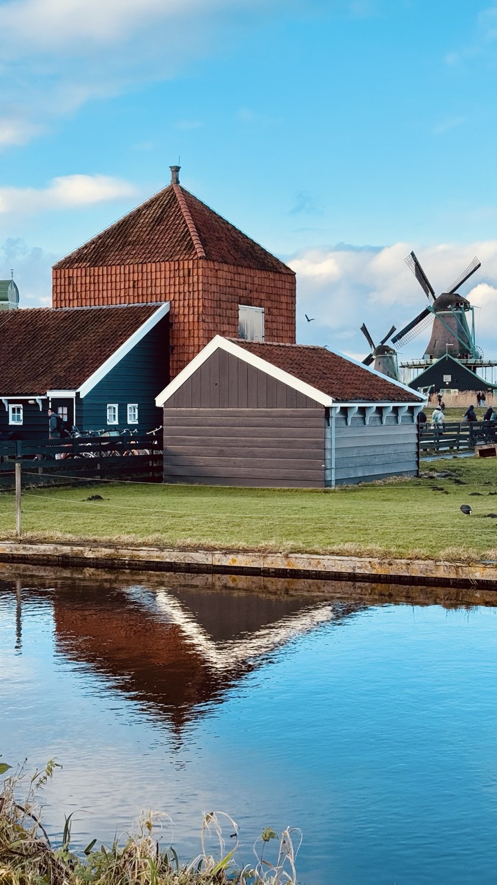

1. Overall Rating (0–10) — 8.0
This photograph captures the serene charm of a Dutch countryside, where tradition and tranquility converge in a harmonious frame. The reflection in the water adds depth and symmetry, while the vibrant blue sky and warm-toned buildings create a visually rich palette. Though the composition is slightly crowded by the windmills in the distance, the image succeeds in evoking a sense of place with quiet elegance and subtle storytelling.
2. Composition (0–10) — 8.0
The scene is well-balanced, with the buildings anchored in the middle ground and the canal in the foreground guiding the eye. The diagonal line of the water’s edge and the reflection create a natural leading line, while the windmills in the background provide depth without overwhelming the frame.
3. Lighting (0–10) — 8.5
Soft, natural light enhances the textures of the wooden structures and the smooth surface of the water. The sun, likely low in the sky, casts gentle shadows and enriches the warm tones of the roofs, creating a peaceful and inviting atmosphere.
4. Color & Tone (0–10) — 8.5
The palette is rich and harmonious, with deep reds and browns of the buildings contrasting beautifully against the cool blues of the sky and water. The color temperature is warm and inviting, contributing to the image’s nostalgic and tranquil mood.
5. Creativity (0–10) — 7.5
The image is grounded in realism but elevated by thoughtful composition and the inclusion of reflection, which adds a layer of visual interest. The juxtaposition of traditional architecture and open space conveys a quiet narrative of rural life.
6. Technical Quality (0–10) — 8.0
Sharp focus across the frame ensures clarity in both the foreground and background. The exposure is well-managed, preserving detail in both the highlights and shadows without signs of over-processing.
7. Emotional Impact (0–10) — 8.0
The photograph evokes a sense of calm and nostalgia, inviting the viewer to imagine life in a quiet village where time moves slowly. The combination of natural light, reflection, and cultural elements creates a deeply resonant and contemplative mood.
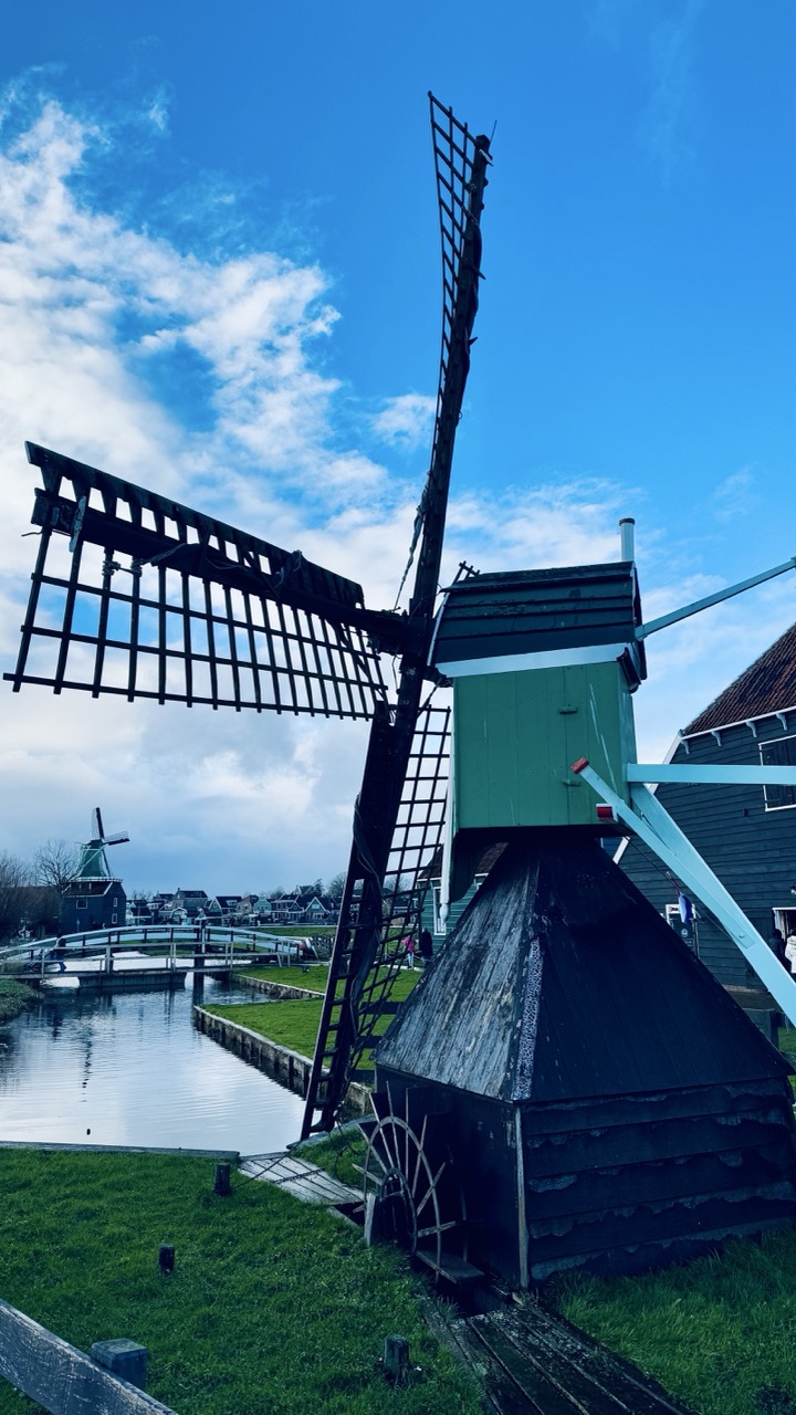

1. Overall Rating (0–10) — 7.5
This photograph captures the timeless charm of a Dutch windmill with striking clarity and a vivid sense of place. The bold contrast between the deep blue sky and the green-and-black structure creates an instantly recognizable image of rural Dutch life. While the composition leans slightly toward the literal, the strong visual elements and atmospheric lighting lend it a quiet elegance that resonates with both cultural nostalgia and natural beauty.
2. Composition (0–10) — 7.0
The low-angle perspective emphasizes the windmill’s height and presence, while the inclusion of the canal, bridge, and distant mill adds depth and narrative context. The framing feels balanced, though the slightly off-center subject and visible background elements create a modest sense of visual clutter.
3. Lighting (0–10) — 8.0
Natural daylight enhances the scene with bright, even illumination that accentuates textures and shapes. The strong contrast between the sunlit sky and the shadowed parts of the windmill creates a dramatic effect, enhancing the image’s visual impact.
4. Color & Tone (0–10) — 8.0
The vibrant blue sky and rich green of the windmill cabin stand out against the dark wood, creating a harmonious and striking palette. The overall tone is crisp and vivid, with excellent contrast that gives the image a lively, almost painted quality.
5. Creativity (0–10) — 7.0
The image is conceptually straightforward—celebrating a classic Dutch landscape—but its strength lies in the effective use of perspective and color to elevate the familiar into something visually compelling. There’s a subtle storytelling quality in the layered depth and quiet atmosphere.
6. Technical Quality (0–10) — 8.5
Sharp focus, clear detail, and well-managed exposure contribute to high technical quality. The image is free of noise and artifacts, with excellent clarity in both the foreground and background elements.
7. Emotional Impact (0–10) — 7.5
The photograph evokes a sense of peace, nostalgia, and quiet wonder—qualities often associated with rural Dutch landscapes. The expansive sky and serene canal invite contemplation, creating a calm emotional resonance that lingers with the viewer.
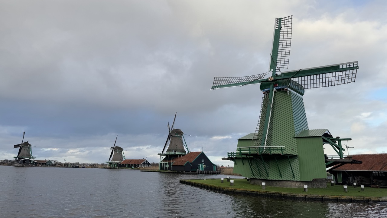

1. Overall Rating (0–10) — 7.0
This photograph captures the serene and iconic charm of a Dutch windmill village, where history and landscape converge in quiet harmony. The muted sky and reflective water lend a contemplative mood, while the arrangement of windmills across the frame offers a sense of depth and tradition. Though the image is visually coherent, it lacks the dramatic lighting or compositional tension to elevate it beyond a competent travel snapshot.
2. Composition (0–10) — 6.5
The windmills are arranged diagonally across the frame, creating a sense of movement and perspective. The foreground mill dominates, drawing the eye, while the background mills recede naturally. However, the wide shot includes excess space and a slightly cluttered shoreline, which slightly dilutes the focus.
3. Lighting (0–10) — 5.5
The overcast sky casts a flat, diffused light across the scene, minimizing shadows and reducing visual contrast. While this lighting is consistent with the atmospheric mood, it also softens textures and tones, giving the image a somewhat subdued quality.
4. Color & Tone (0–10) — 6.0
The palette is dominated by the green of the windmills and the gray of the sky, with warm terracotta roofs providing subtle contrast. The tones are balanced and natural, but the lack of vibrancy and dynamic range keeps the image from feeling rich or striking.
5. Creativity (0–10) — 6.5
The image is a straightforward representation of a well-known cultural landscape, relying on the inherent beauty and symbolism of the windmills rather than bold artistic interpretation. Its strength lies in its authenticity and clarity, though it doesn't push creative boundaries.
6. Technical Quality (0–10) — 7.5
The image is sharp and well-focused, with clean detail in the windmill structures and water surface. The exposure is balanced, and there is no visible noise or distortion, indicating strong technical execution.
7. Emotional Impact (0–10) — 6.0
The scene evokes a sense of calm and nostalgia, inviting reflection on tradition and landscape. While it captures the quiet dignity of the setting, the lack of dramatic lighting or personal perspective limits its ability to deeply resonate with the viewer.
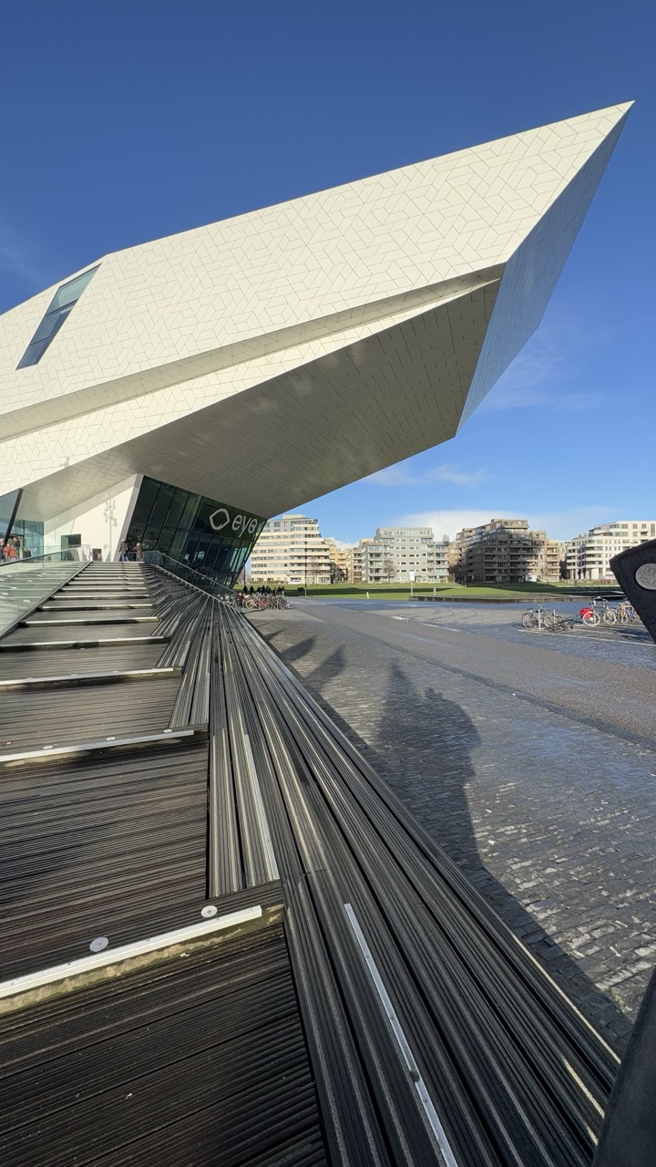

1. Overall Rating (0–10) — 7.5
This photograph captures the bold architectural drama of a modern structure under a vast, clear sky, where geometric precision meets urban context. The low-angle perspective emphasizes the building’s imposing form, while the interplay of light and shadow enhances its sculptural quality. The image succeeds in conveying both the grandeur of the design and the quiet vitality of the surrounding space, though its documentary clarity slightly limits its emotional resonance.
2. Composition (0–10) — 8.0
The diagonal lines of the walkway and the tilted plane of the building create a dynamic leading line that draws the eye into the frame. The asymmetrical balance and low-angle perspective amplify the structure’s scale and movement, while the distant cityscape provides a sense of place without overwhelming the subject.
3. Lighting (0–10) — 9.0
Strong, directional sunlight from the upper left highlights the texture and facets of the building’s surface, creating crisp shadows that define its three-dimensional form. The bright, clear blue sky enhances contrast and depth, giving the scene a clean, vivid quality.
4. Color & Tone (0–10) — 7.5
The palette is dominated by crisp whites and deep grays, punctuated by the vibrant blue of the sky. The cool, neutral tones reinforce the modern aesthetic, though a subtle warmth in the sunlight adds a touch of life and balance to the otherwise stark environment.
5. Creativity (0–10) — 8.0
The composition and angle transform an architectural subject into a visually compelling narrative, emphasizing form, movement, and perspective. The use of shadow and reflection adds a layer of depth and visual intrigue, elevating the image beyond mere documentation.
6. Technical Quality (0–10) — 8.5
Sharp focus and high detail are evident throughout, particularly in the textured facade and the linear elements of the walkway. The exposure is well-balanced, preserving detail in both highlights and shadows.
7. Emotional Impact (0–10) — 7.0
The image evokes a sense of awe and quiet contemplation, inviting the viewer to appreciate the intersection of human design and urban space. While the emotion is restrained and intellectual, the visual power of the architecture creates a lasting impression of modernity and ambition.
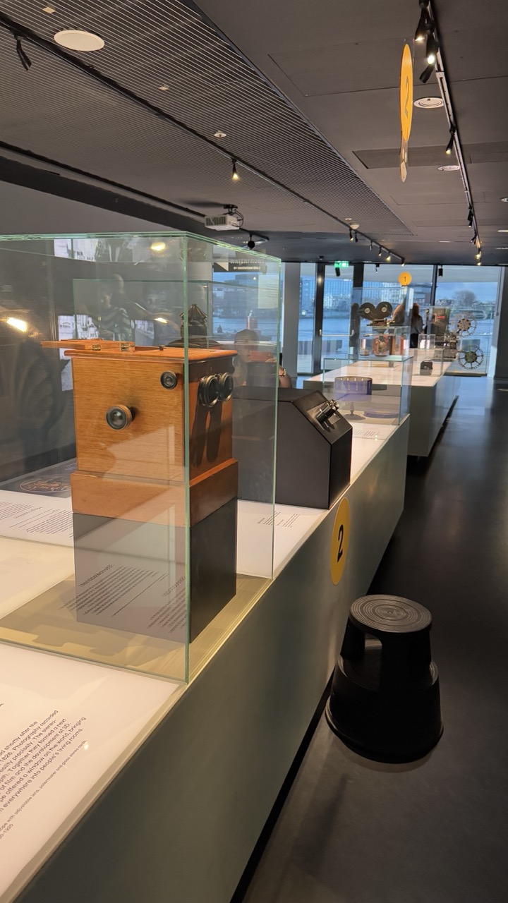

1. Overall Rating (0–10) — 7.0
This photograph captures the quiet dignity of a museum exhibit, where historical artifacts are presented with reverence and clarity. The warm wood of the vintage camera contrasts beautifully with the sleek, modern gallery space, creating a subtle tension between past and present. While the scene is well-composed and informative, it feels slightly distant—more like a documentary record than an emotionally charged moment—leaving room for deeper storytelling.
2. Composition (0–10) — 7.5
The diagonal line of the display case guides the eye smoothly through the space, creating depth and rhythm. The foreground camera is well-framed, and the placement of the stool adds balance and scale, though the distant background elements risk visual distraction.
3. Lighting (0–10) — 7.0
Directional track lighting highlights the exhibits effectively, casting soft shadows that enhance texture and form. The ambient light from the windows complements the interior illumination, though the overall tone remains neutral, lacking a strong mood.
4. Color & Tone (0–10) — 6.5
The palette is restrained—muted greys, warm wood tones, and black accents—creating a cohesive, professional look. However, the colors lack vibrancy, and the lighting flattens the tonal range, slightly diminishing the visual richness.
5. Creativity (0–10) — 6.0
The image is conceptually sound and functional, presenting the exhibit with clarity. It captures the essence of a museum environment but offers little surprise or artistic reinterpretation, leaning toward the observational rather than the imaginative.
6. Technical Quality (0–10) — 8.0
Sharp focus and clean detail are evident, especially on the glass case and the wooden camera. The exposure is well-balanced, and the depth of field is appropriate for the scene, maintaining clarity throughout the frame.
7. Emotional Impact (0–10) — 6.5
There’s a quiet reverence in the image, evoking curiosity about the history behind the objects. While it doesn’t stir strong emotion, it invites contemplation—offering a sense of timelessness and intellectual engagement.
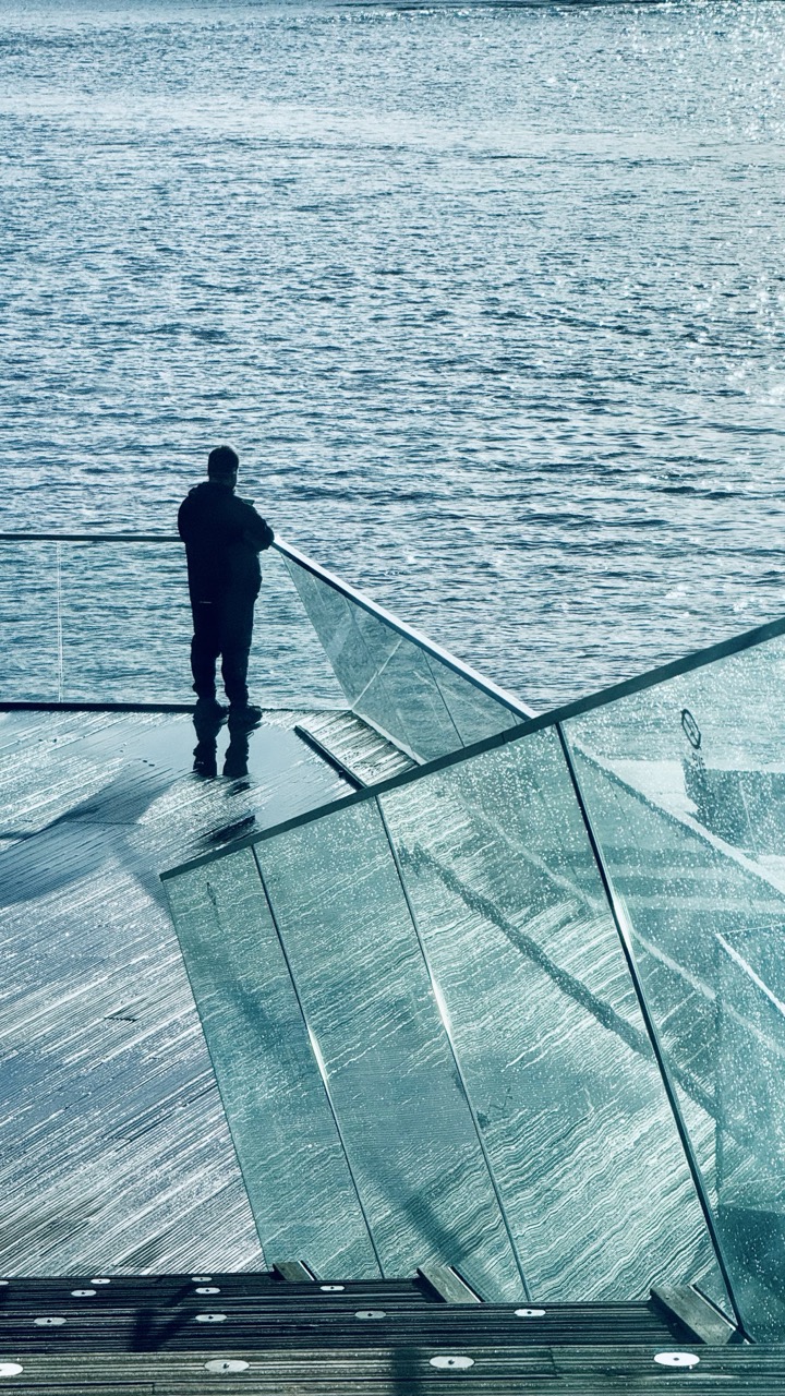

1. Overall Rating (0–10) — 7.5
This photograph captures a moment of quiet contemplation, where the solitary figure stands at the edge of a modern structure, gazing out over the water. The cool blue palette and reflective surfaces create a meditative, almost cinematic atmosphere, while the interplay between the man and the expansive water evokes a sense of introspection. The image is strong in mood and composition, though the slightly overcast lighting and muted tones temper its emotional punch.
2. Composition (0–10) — 8.0
The diagonal lines of the glass railing and deck draw the eye toward the figure, creating a dynamic yet balanced frame. The subject is placed off-center, enhancing the sense of space and solitude.
3. Lighting (0–10) — 6.5
The diffuse, overcast light produces soft shadows and even exposure, lending a calm, muted tone to the scene. While the light is even and flattering, it lacks the warmth or contrast that would heighten the image’s dramatic potential.
4. Color & Tone (0–10) — 7.0
A monochromatic cool blue dominates the frame, reinforcing the contemplative mood. The subtle variations in tone across the water and glass add depth, though the lack of color vibrancy keeps the image from feeling fully immersive.
5. Creativity (0–10) — 7.5
The juxtaposition of the human figure against the vast, modern architectural structure and open water creates a compelling narrative of solitude and scale. The use of reflection and transparency adds a layer of visual complexity and emotional resonance.
6. Technical Quality (0–10) — 8.0
The image is sharp and well-focused, with clean detail visible in the textures of the glass and wood. The exposure is balanced, and the grain is minimal, suggesting strong technical execution.
7. Emotional Impact (0–10) — 7.0
The scene evokes a quiet melancholy and introspection, inviting the viewer to share in the moment of stillness. The solitude of the figure and the vastness of the water create a poignant emotional undercurrent, though the cool tone keeps the viewer slightly detached.
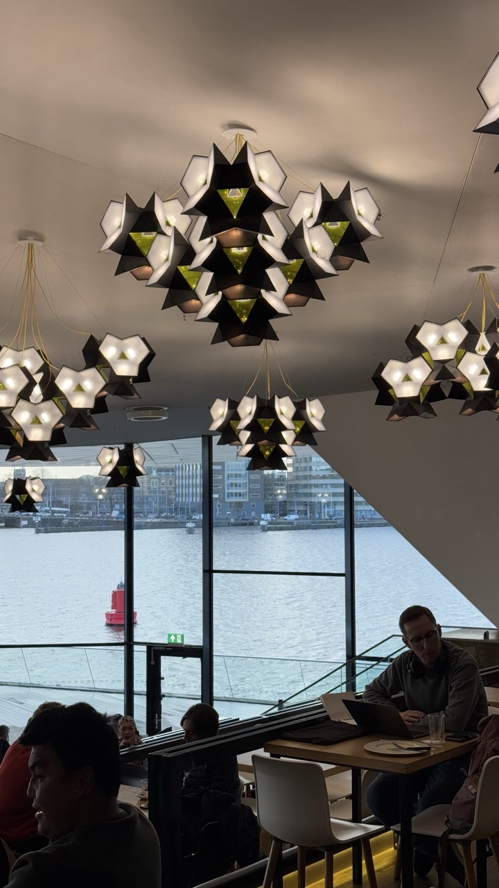

1. Overall Rating (0–10) — 7.0
This photograph captures a serene, modern café space where architecture and atmosphere merge seamlessly. The striking geometric chandeliers create a visual rhythm that draws the eye upward, while the expansive window frames a calm waterfront scene, offering a quiet contrast to the interior’s design intensity. Though the image succeeds in conveying a sense of place and mood, the dim interior lighting and slightly cluttered foreground reduce its overall polish, keeping it from feeling fully cohesive.
2. Composition (0–10) — 7.0
The composition balances the dynamic forms of the chandeliers with the horizontal lines of the water and window, creating a layered depth. The placement of the seated figures adds narrative context, though the left foreground slightly distracts from the central visual focus.
3. Lighting (0–10) — 6.0
The chandeliers provide warm, directional light that highlights their sculptural form, but the ambient interior remains dim, casting deep shadows on the patrons. The natural light from the window is soft and diffused, contributing to a subdued, contemplative mood.
4. Color & Tone (0–10) — 6.5
The palette is restrained, dominated by blacks, whites, and grays, punctuated by the soft glow of the chandeliers and the muted blue-gray of the water. The lack of vibrant color gives the image a modern, almost clinical feel, though the warm tones within the lamps add a touch of warmth.
5. Creativity (0–10) — 7.5
The juxtaposition of industrial design with a tranquil urban waterscape is compelling. The photograph captures not just a place, but a moment of quiet modernity—where function, design, and environment coexist in harmony.
6. Technical Quality (0–10) — 7.5
The image is sharp and well-focused, with clean details in both the foreground and background. The camera’s exposure manages the challenging contrast between the bright window and the dim interior reasonably well, though some loss of detail in the shadows is evident.
7. Emotional Impact (0–10) — 6.5
The scene evokes a sense of calm introspection, underscored by the solitary figure at the laptop and the stillness of the water. While the mood is peaceful, the low-light conditions and lack of emotional warmth in the subjects keep the viewer from fully connecting with the moment.
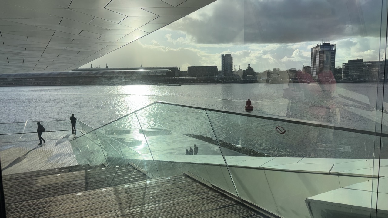

1. Overall Rating (0–10) — 6.0
This photograph captures a contemplative urban waterfront scene, where architecture, reflection, and human presence converge in a layered composition. The interplay of glass, water, and sky creates a sense of depth and introspection, though the image’s emotional resonance is tempered by a lack of visual clarity. While the architectural lines and the play of light on the water are compelling, the reflections and overcast sky lend a somewhat flat and muted atmosphere that keeps the viewer at a distance.
2. Composition (0–10) — 6.5
The diagonal lines of the glass railing and the wooden deck guide the eye toward the distant cityscape, creating a dynamic sense of movement. The placement of figures adds scale and life, though the reflection of the photographer disrupts the scene’s cohesion and introduces visual noise.
3. Lighting (0–10) — 5.5
The sun glares off the water, creating a bright reflection that competes with the darker tones of the architecture and sky. The overcast clouds diffuse the light, resulting in a soft but flat illumination that lacks dramatic contrast.
4. Color & Tone (0–10) — 5.0
The palette is dominated by cool grays and muted blues, with the wooden deck providing a subtle warmth. The overall tone is subdued, and the reflections slightly muddy the color integrity, reducing the vibrancy of the scene.
5. Creativity (0–10) — 6.0
The image explores the intersection of interior and exterior space through reflection and transparency, a conceptually strong idea. However, the execution feels more observational than expressive, with the photographer’s reflection acting as a distraction rather than a narrative element.
6. Technical Quality (0–10) — 7.0
The image is sharp and well-exposed in key areas, particularly the water and architecture. However, the reflections and glare on the glass reduce overall clarity and introduce technical imperfections.
7. Emotional Impact (0–10) — 5.5
The photograph evokes a quiet, introspective mood, suggesting solitude and urban contemplation. Yet, the visual clutter and lack of emotional focus prevent a deeper connection, leaving the viewer with a sense of distance rather than immersion.
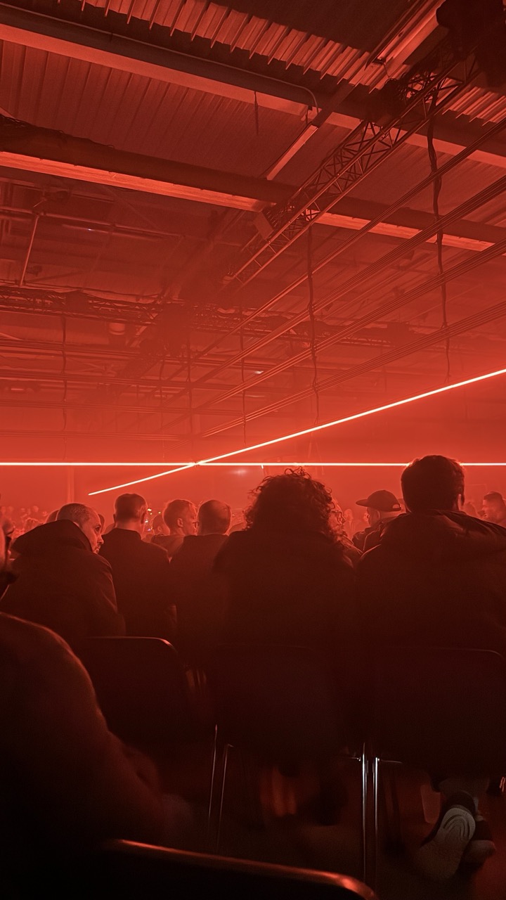

1. Overall Rating (0–10) — 7.0
This image captures the immersive intensity of a live event bathed in an overwhelming red glow, evoking a sense of mystery and technological unease. The dominance of red light creates a unified, almost dystopian atmosphere, while the silhouetted audience grounds the scene in human presence. While the visual cohesion is strong, the extreme color cast and lack of detail in the subjects limit the image’s emotional depth and narrative clarity.
2. Composition (0–10) — 6.0
The low-angle perspective emphasizes the industrial ceiling and the expansive red lighting, creating a sense of scale. However, the crowded, overlapping figures in the foreground lack clear focal points, and the composition feels slightly cluttered due to the lack of visual hierarchy.
3. Lighting (0–10) — 8.0
The dramatic use of red lighting dominates the scene, casting long, linear beams across the space and creating a striking interplay of light and shadow. The lighting is intentionally theatrical, enhancing the mood and atmosphere, though it sacrifices detail and tonal range in favor of a bold, singular effect.
4. Color & Tone (0–10) — 7.0
The monochromatic red palette is both powerful and cohesive, lending the image a unified, cinematic quality. The deep reds and near-black shadows create a stark contrast, though the absence of color variation limits tonal complexity and visual interest.
5. Creativity (0–10) — 7.5
The photographer has made a bold artistic choice in embracing the red lighting as the central visual theme, transforming a potentially mundane event into a stylized, atmospheric moment. The use of light as a narrative device demonstrates strong conceptual intent.
6. Technical Quality (0–10) — 6.5
The image is sharp enough to discern the architectural elements and silhouettes, but the extreme lighting conditions result in some loss of detail in the shadows and highlights. The camera appears to have struggled with exposure, leading to a slightly underexposed and grainy appearance.
7. Emotional Impact (0–10) — 6.5
The image conveys a sense of anticipation and immersion, drawing the viewer into a charged, almost otherworldly environment. While the mood is compelling, the anonymity of the crowd and the overwhelming light prevent a deeper emotional connection, leaving the viewer as an observer rather than an participant.
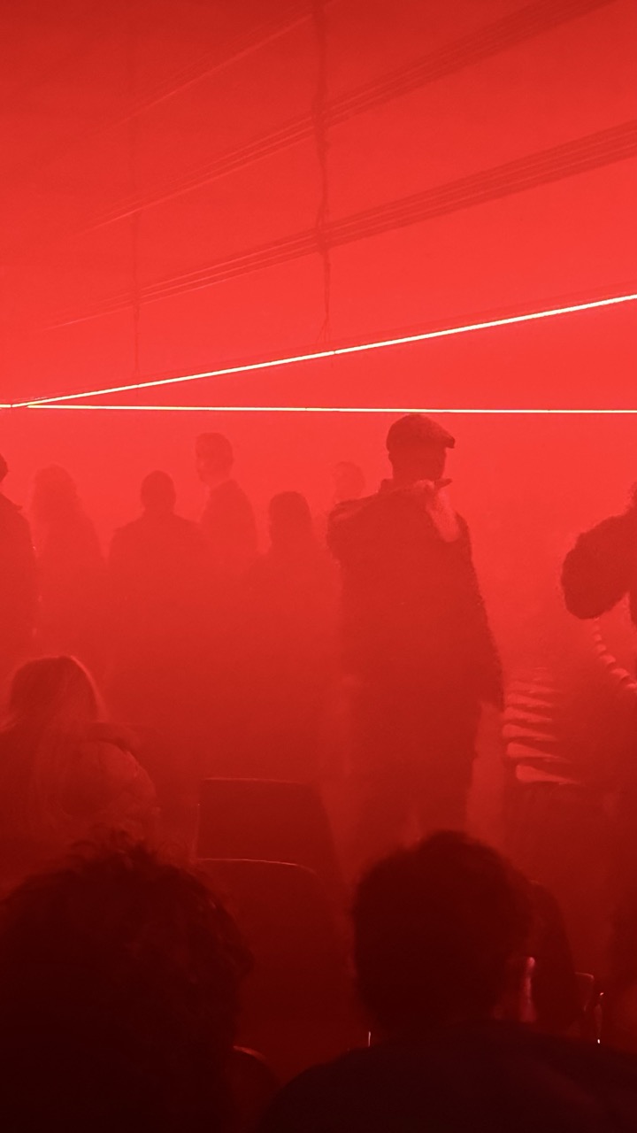

1. Overall Rating (0–10) — 6.0
This photograph captures an immersive, atmospheric moment, where a dominant red wash envelops a crowd in a hazy, almost otherworldly glow. The intense color saturation and diffused light create a powerful sense of mood and tension, suggesting a performance or installation space. While the image succeeds in conveying a visceral emotional atmosphere, its lack of clarity and detail undermines its visual impact, leaving the viewer slightly disoriented by the overwhelming monochromatic tone.
2. Composition (0–10) — 5.0
The composition is crowded and unbalanced, with figures clustered in the middle ground and foreground that obscure focus. The strong horizontal line of light cuts across the frame, but its placement feels arbitrary, failing to guide the eye or provide structure.
3. Lighting (0–10) — 7.0
The dominant red lighting is dramatic and intentional, creating a sense of immersion and emotional intensity. However, the lack of contrast and overexposure in the ambient glow washes out detail, reducing the scene to silhouettes and diminishing visual depth.
4. Color & Tone (0–10) — 6.5
The monochromatic red palette is bold and evocative, reinforcing a sense of urgency or intensity. While the color choice is thematically strong, the lack of tonal variation and subtle gradients results in a flat, one-dimensional appearance.
5. Creativity (0–10) — 7.5
The image demonstrates a clear artistic intent, using light and atmosphere to evoke a specific mood. The choice to embrace a single color and obscure figures suggests a conceptual approach, making it more than a mere snapshot—it feels like a captured moment in a larger sensory experience.
6. Technical Quality (0–10) — 5.5
The image suffers from a lack of sharpness and clarity, likely due to low light and atmospheric haze. Focus is soft, and the heavy red filter creates a loss of detail, making it difficult to discern individual features or context.
7. Emotional Impact (0–10) — 7.0
The overwhelming red hue and obscured figures generate a powerful sense of mystery and unease, drawing the viewer into an emotional space of anticipation or tension. The mood is palpable, though the lack of clear narrative elements keeps the emotional resonance somewhat abstract.


1. Overall Rating (0–10) — 7.0
This photograph captures a vibrant and indulgent meal with rich textures and bold flavors implied through its visual composition. The golden fried chicken, bright orange sauce, and purple slaw create a feast for the eyes, while the warm lighting enhances the dish’s appeal. While the image is visually engaging, the tight framing and slight overexposure of the sauce detract from its overall refinement.
2. Composition (0–10) — 7.5
The subject is well-centered and fills the frame, emphasizing the dish’s abundance. The slightly tilted angle adds dynamism, though the cluttered background of the dark shirt and table edge slightly disrupts visual focus.
3. Lighting (0–10) — 7.0
Warm, diffused lighting enhances the appetizing tones of the food, especially the golden crust and creamy sauce. The light is soft and flattering, though a touch of overexposure on the sauce reduces some detail.
4. Color & Tone (0–10) — 8.0
The color palette is striking, with the vibrant orange sauce, purple slaw, and pale waffle creating a harmonious contrast. The pink plate adds a subtle warmth that complements the overall tone, making the dish pop.
5. Creativity (0–10) — 7.5
The composition celebrates the dish’s indulgent nature with a playful, foodie aesthetic. The interplay of textures and colors suggests storytelling through cuisine, elevating it beyond a simple snapshot.
6. Technical Quality (0–10) — 7.0
The focus is sharp on the main subject, and the image is clear, though minor noise and slight overexposure in the sauce detract from the overall technical polish.
7. Emotional Impact (0–10) — 7.5
The photograph evokes a sense of indulgence and comfort, appealing to the viewer’s appetite and sensory memory. The rich textures and bold colors create an immediate emotional pull toward enjoyment and satisfaction.
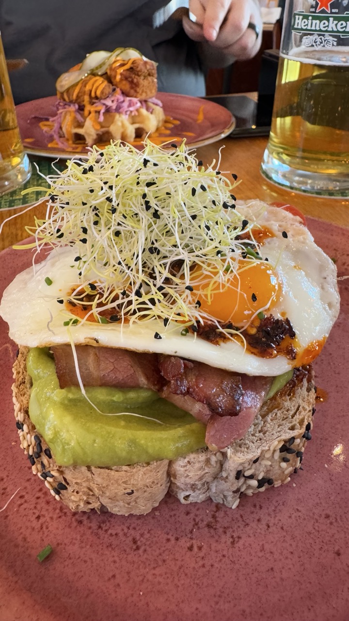

1. Overall Rating (0–10) — 7.5
This image captures a vibrant, mouthwatering breakfast sandwich with rich textures and layers that invite the viewer to taste it. The interplay of colors—golden egg yolk, deep green avocado, and the earthy tones of the seeded bread—creates a dynamic and appetizing scene. While the background elements add context, they slightly distract from the main subject, which could be more clearly isolated for greater visual impact.
2. Composition (0–10) — 7.0
The sandwich is well-centered and fills the frame effectively, drawing immediate attention. The use of shallow depth of field blurs the background, though the second plate and beer glass in the back add narrative context. A tighter crop would emphasize the sandwich’s textures and composition more powerfully.
3. Lighting (0–10) — 8.0
Natural, soft lighting enhances the food’s freshness and highlights the glistening egg yolk and sprouts. The warm ambient light gives the scene a cozy, inviting atmosphere, complementing the casual dining setting.
4. Color & Tone (0–10) — 8.5
The palette is rich and harmonious, with the vibrant green of the avocado and the bright yellow of the egg yolk standing out against the warm brown of the bread and the muted pink of the plate. The contrast between the fresh ingredients and the deep red plate adds visual excitement.
5. Creativity (0–10) — 7.5
The image presents a modern, elevated take on a classic breakfast sandwich, emphasizing texture and layering in a way that feels both artisanal and approachable. The choice to include the surrounding environment adds storytelling, suggesting a relaxed, enjoyable meal.
6. Technical Quality (0–10) — 8.0
The focus is sharp on the sandwich’s top layer, capturing fine details like the sprouts and sesame seeds. The image is clear and well-exposed, with no visible noise or distortion, showcasing the subject with precision.
7. Emotional Impact (0–10) — 8.0
The photograph evokes a sense of indulgence and comfort, making the viewer feel the warmth of a satisfying meal. The textures and colors stir appetite and nostalgia, creating a strong emotional connection to the experience of enjoying a hearty, delicious breakfast.
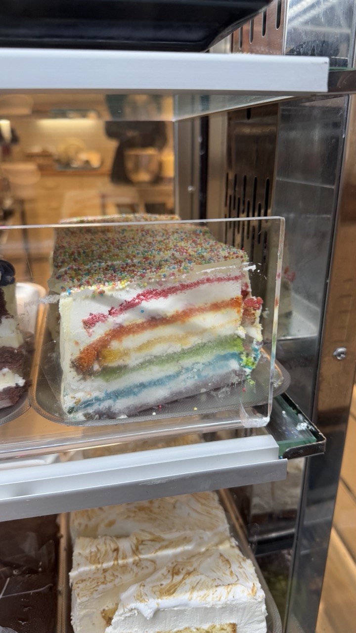

1. Overall Rating (0–10) — 7.0
This photograph captures the vibrant allure of a rainbow-layered cake, its colorful strata inviting and playful, nestled within the reflective confines of a bakery display. The image succeeds in highlighting the cake’s whimsical design and intricate layers, though the surrounding clutter and reflections slightly diminish its visual clarity. The composition balances commercial realism with a touch of artistic charm, making the dessert feel both accessible and delightful.
2. Composition (0–10) — 6.5
The cake is centered but partially obscured by the glass and shelf edges, creating a layered, almost candid feel. The reflections and surrounding elements add depth but also clutter the frame, pulling focus from the main subject.
3. Lighting (0–10) — 6.0
Soft, ambient interior lighting enhances the cake’s colors without harsh shadows, though reflections on the glass interfere with clarity and reduce contrast.
4. Color & Tone (0–10) — 8.0
The rainbow layers pop with vivid, saturated hues against the neutral backdrop of the display case. The palette is lively and celebratory, with a well-balanced tonal range that emphasizes the cake’s visual appeal.
5. Creativity (0–10) — 7.0
The concept is straightforward—showcasing a colorful dessert—but the layered composition and reflections introduce a subtle narrative of a busy bakery environment, adding context and charm.
6. Technical Quality (0–10) — 7.5
The focus is sharp on the cake’s cross-section, and detail is well-preserved. However, minor reflections and slight blurring from the glass reduce overall crispness.
7. Emotional Impact (0–10) — 7.5
The image evokes a sense of joy and indulgence, tapping into the universal appeal of sweet treats. Its warmth and vibrancy invite a smile, making it emotionally engaging despite its modest technical flaws.
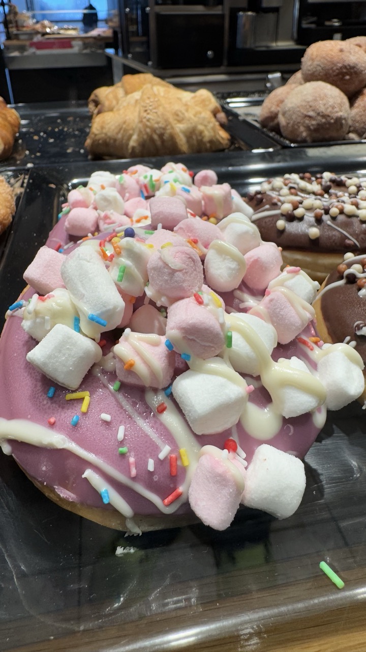

1. Overall Rating (0–10) — 6.8
This photograph captures the playful indulgence of a dessert donut, its vibrant toppings creating a visually stimulating centerpiece. The pink glaze, marshmallows, and sprinkles evoke a sense of joyful excess, while the surrounding bakery setting grounds the image in a familiar, everyday context. Though the composition leans slightly chaotic and the lighting is functional rather than evocative, the image succeeds in conveying the sensory appeal of a sweet treat, making it both inviting and slightly nostalgic.
2. Composition (0–10) — 6.0
The foreground donut dominates the frame, but the cluttered background and uneven depth of field create a sense of visual noise. A tighter crop and more intentional framing would emphasize the subject and reduce distractions.
3. Lighting (0–10) — 5.5
Harsh overhead lighting flattens the scene and washes out the colors, creating a commercial, snapshot-like quality. The lack of directional light diminishes the texture of the glaze and marshmallows, limiting the image's atmospheric depth.
4. Color & Tone (0–10) — 7.0
The palette is lively and engaging, with the soft pink glaze and colorful sprinkles standing out against the neutral tones of the bakery. However, the vibrancy is somewhat muted by the flat lighting, preventing the colors from truly popping.
5. Creativity (0–10) — 7.0
The image leverages a familiar subject—sweet, indulgent pastries—but presents it with a whimsical, almost celebratory arrangement. The abundance of toppings and the playful color scheme suggest a narrative of treat and joy, making the image feel both fun and slightly surreal.
6. Technical Quality (0–10) — 6.5
The focus is sharp on the foreground donut, and detail is well-preserved in the textures of the glaze and marshmallows. However, minor distractions in the background and a lack of depth control reduce the overall technical polish.
7. Emotional Impact (0–10) — 7.5
The image evokes a strong sense of delight and nostalgia, tapping into the universal appeal of sugary treats and childhood indulgence. The visual abundance and bright colors create an immediate emotional pull, inviting the viewer to savor the moment—both visually and metaphorically.
Loading map...