Giverny, France is a treasure trove for art lovers and nature enthusiasts, where Claude Monet spent the last 43 years of his life. The iconic Claude Monet House offers a glimpse into Monet's personal world, while the gardens are an explosion of color and tranquility, showcasing Monet's skill as a painter and horticulturist.
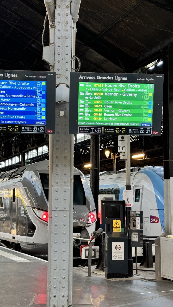

1. Overall Rating (0–10) — 6.0
This photograph captures the bustling energy of a major French train station, where modern technology and industrial architecture converge in a moment of transit. The digital arrival and departure boards provide a narrative of movement and connectivity, while the sleek TGV trains emphasize speed and progress. However, the image feels slightly overexposed and cluttered, with too many informational elements competing for attention, which detracts from its visual harmony and emotional resonance.
2. Composition (0–10) — 6.0
The central pole divides the frame, creating a natural vertical line that guides the eye but also disrupts the flow. The trains are framed asymmetrically, with the left train more prominent, giving a sense of depth but also creating an imbalance. The digital displays dominate the upper portion, drawing focus away from the trains themselves.
3. Lighting (0–10) — 5.5
The overhead fluorescent lights cast a cool, flat illumination that flattens the scene’s depth and creates harsh reflections on the trains’ metallic surfaces. While functional for visibility, the lighting lacks warmth and fails to enhance the mood of the station’s industrial grandeur.
4. Color & Tone (0–10) — 5.5
The palette is dominated by cool grays, whites, and blues, with the green and red of the digital displays offering brief pops of color. The overall tone is clinical and utilitarian, reflecting the functional nature of the space, but the lack of tonal variation gives the image a somewhat sterile feel.
5. Creativity (0–10) — 6.5
The image captures a contemporary urban scene with a clear sense of place and purpose. The juxtaposition of modern trains, digital interfaces, and historic station architecture offers a subtle commentary on progress and continuity. While not artistically daring, the composition successfully conveys the rhythm of daily travel.
6. Technical Quality (0–10) — 7.0
The image is sharp and well-focused, with clear legibility of the text on the signs. The camera’s exposure is adequate, though some highlights on the trains’ surfaces are slightly blown out. The framing is intentional, though the central pole remains a minor distraction.
7. Emotional Impact (0–10) — 5.0
The photograph conveys a sense of routine and movement, but it lacks a deeper emotional pull. The viewer is positioned as an observer rather than an participant, and the scene’s impersonal nature limits the sense of connection or wonder. It feels more like documentation than storytelling.
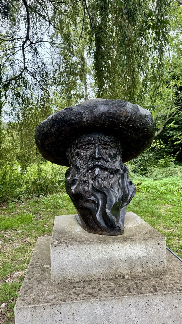

1. Overall Rating (0–10) — 7.0
This photograph captures a striking bronze bust of a bearded figure beneath a wide-brimmed hat, set against the soft, dappled green of a weeping willow. The sculpture’s textured surface and dramatic silhouette stand out with quiet dignity against the natural backdrop, evoking a sense of timelessness and contemplation. While the composition is strong and the subject compelling, the slightly overcast lighting and modest framing limit its visual impact, keeping it from fully transcending documentary to become truly poetic.
2. Composition (0–10) — 7.5
The bust is centered and well-framed, with the weeping willow arching over it to create a natural canopy. The concrete pedestal grounds the subject, while the surrounding foliage adds depth and context. A tighter crop could enhance focus, but the current balance works well to convey the sculpture’s presence in its environment.
3. Lighting (0–10) — 6.0
Diffused daylight provides even illumination, minimizing harsh shadows and allowing the sculpture’s texture to be visible. However, the flatness of the overcast sky drains some atmospheric depth and reduces contrast, giving the scene a slightly muted quality.
4. Color & Tone (0–10) — 6.5
The palette is dominated by the dark, earthy tones of the bronze and the soft greens of the foliage, creating a harmonious natural balance. The tonal range is somewhat limited by the flat lighting, but the contrast between the dark sculpture and the lighter background helps the subject stand out.
5. Creativity (0–10) — 7.0
The juxtaposition of the monumental sculpture with the delicate, organic lines of the willow creates a compelling narrative—suggesting a dialogue between human legacy and nature. The choice to capture it in a quiet, unposed moment adds a layer of authenticity and contemplative stillness.
6. Technical Quality (0–10) — 7.5
The image is sharp and clear, with good detail in the sculpture’s surface and the surrounding foliage. Focus is consistent across the frame, and the exposure is well-managed despite the overcast conditions.
7. Emotional Impact (0–10) — 6.5
The image evokes a sense of quiet reverence and reflection, inviting the viewer to consider the figure’s story and the passage of time. While it is not emotionally overwhelming, the stillness and natural setting lend a meditative quality that resonates subtly.
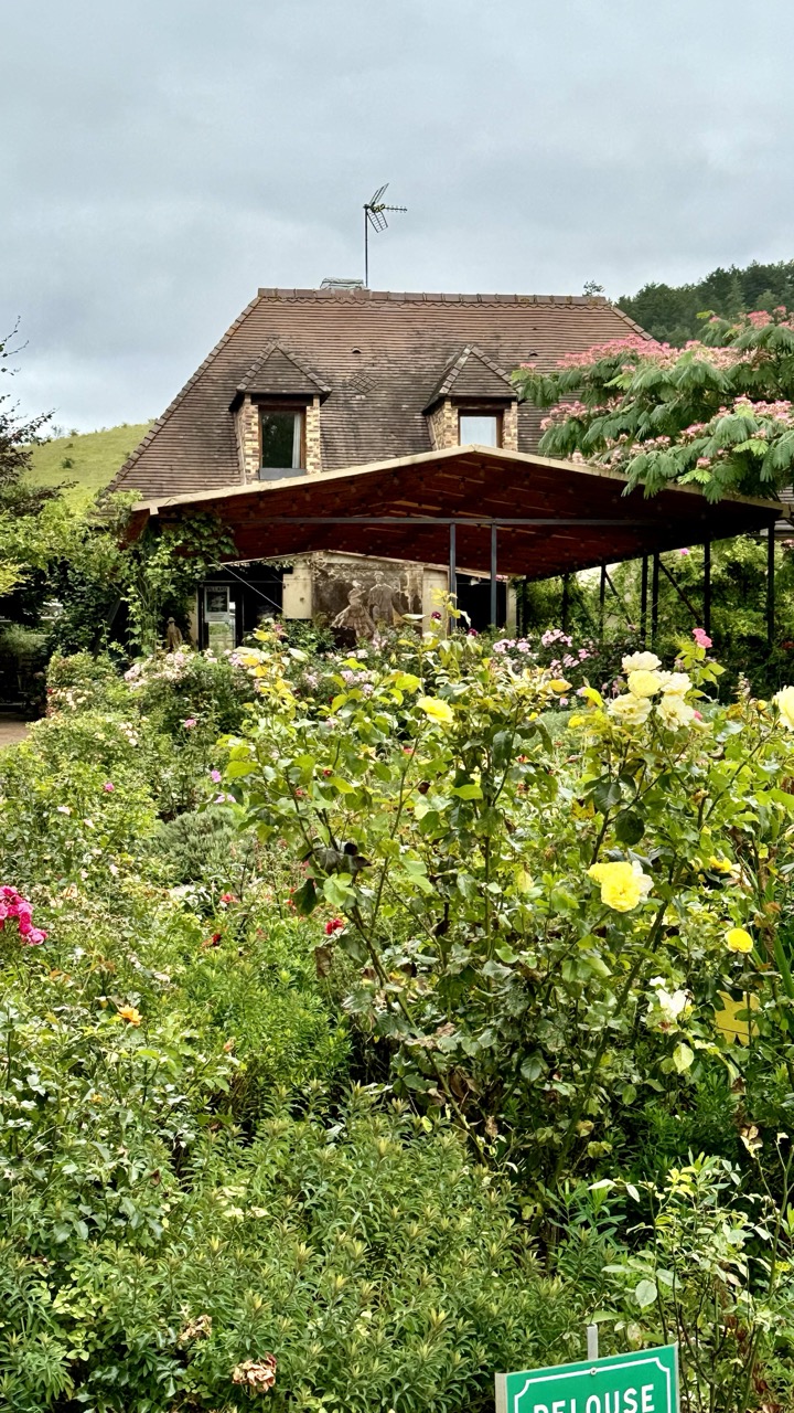

1. Overall Rating (0–10) — 6.8
This photograph captures the tranquil charm of a rustic garden house, where nature gently encroaches upon human habitation. The overcast sky lends a soft, melancholic mood, while the lush greenery and blooming roses evoke a sense of quiet abundance. Though the image feels slightly cluttered and lacks a strong focal point, its natural beauty and atmospheric restraint make it a compelling snapshot of rural serenity.
2. Composition (0–10) — 6.0
The house is framed by dense foliage, which creates depth but also obscures key architectural details. The diagonal line of the awning and the scattered blooms lead the eye inconsistently, resulting in a composition that feels more organic than intentional.
3. Lighting (0–10) — 6.5
Diffused light from the overcast sky evenly illuminates the scene, minimizing harsh shadows and enhancing the soft textures of leaves and petals. While the lighting is even and suitable for the mood, it lacks drama and depth, giving the image a slightly flat quality.
4. Color & Tone (0–10) — 6.5
The palette is dominated by earthy greens and muted yellows, punctuated by soft pinks and whites in the flowers. The colors are natural and harmonious, though slightly desaturated due to the cloudy conditions, which tempers their vibrancy.
5. Creativity (0–10) — 6.0
The image succeeds in capturing a moment of peaceful coexistence between nature and structure, but it leans more toward documentation than artistic expression. The unposed, candid feel gives it authenticity, but the lack of strong visual narrative or unique perspective limits its creative impact.
6. Technical Quality (0–10) — 7.5
The image is sharp and well-focused, with clear detail in the foliage and architectural elements. The exposure is balanced, and there are no noticeable technical flaws, though the depth of field is somewhat shallow, causing parts of the foreground to blur.
7. Emotional Impact (0–10) — 6.5
The photograph evokes a sense of calm and nostalgia, inviting the viewer to imagine a quiet life immersed in nature. While the emotional resonance is gentle and understated, it is nonetheless effective in conveying a peaceful, contemplative atmosphere.


1. Overall Rating (0–10) — 7.0
This vibrant roadside signpost captures the whimsical spirit of travel and global connection, with each painted arrow telling a story of distance and desire. The variety of styles and colors creates a playful, almost folk-art quality, while the lush green backdrop grounds the scene in a sense of natural serenity. Though the sheer number of signs risks visual clutter, the composition ultimately feels charming and inviting, like a visual love letter to wanderlust.
2. Composition (0–10) — 7.5
The vertical arrangement creates a strong sense of upward movement, drawing the eye from bottom to top. The signs are layered with slight overlap, creating depth and rhythm, though the varying angles and sizes introduce a mild sense of disarray.
3. Lighting (0–10) — 6.5
Soft, diffused daylight evenly illuminates the scene, allowing the colors and details of each sign to be clearly visible. The overcast sky prevents harsh shadows, contributing to a calm, even mood, though it slightly mutes the vibrancy of the painted surfaces.
4. Color & Tone (0–10) — 8.0
The palette is rich and diverse, with bold, saturated hues on each sign—blues, reds, greens, and yellows—creating a lively contrast against the natural greenery. The tonal balance is well-managed, with no single color overpowering the others, allowing each destination to stand out.
5. Creativity (0–10) — 8.5
The concept is highly original, transforming a simple signpost into a narrative of global travel and personal connection. Each sign’s unique design—ranging from graffiti to hand-painted script—adds character and personality, making the image feel both playful and deeply expressive.
6. Technical Quality (0–10) — 7.0
The image is sharp and detailed, with clear focus on the signs and sufficient depth of field to keep the background softly blurred. The camera appears to have captured the textures and lettering with precision, though a slight overexposure in the sky slightly flattens the top edge of the frame.
7. Emotional Impact (0–10) — 7.5
The photograph evokes a sense of adventure, nostalgia, and human connection, inviting the viewer to imagine the stories behind each destination. It resonates with the universal longing for travel and the joy of discovery, creating a quiet emotional warmth that lingers.


1. Overall Rating (0–10) — 6.0
This photograph captures the rustic charm of Claude Monet’s house in Giverny, with its textured stone wall and institutional signage grounding the scene in historical authenticity. The composition feels functional and informational, prioritizing clarity over aesthetic refinement. While the visual narrative is strong in its documentation of place, the lack of dynamic framing and emotional depth keeps it from feeling like a compelling artistic statement.
2. Composition (0–10) — 5.5
The image is vertically oriented with the signs centered, but the intrusion of the blue pole and green bracket on the left disrupts visual harmony. The stone wall’s texture provides interest, but the framing feels slightly off-balance due to the partial inclusion of the person on the far left.
3. Lighting (0–10) — 6.0
Natural daylight provides even illumination across the scene, though the overcast sky results in soft, diffused light that flattens the texture of the wall. The lack of strong shadows reduces depth but ensures legibility of the text.
4. Color & Tone (0–10) — 6.5
The palette is restrained—grays, whites, and muted greens dominate—conveying a calm, scholarly atmosphere. The green of the sign and bracket adds a subtle pop, but the overall tone remains subdued and slightly monotonous.
5. Creativity (0–10) — 5.5
The image functions as a straightforward documentary record, with little effort toward artistic interpretation or narrative framing. The inclusion of the person’s silhouette hints at human presence, but it’s understated and unexplored.
6. Technical Quality (0–10) — 7.5
The photograph is sharp and clear, with crisp text and well-defined textures in the stone. Focus is consistent across the frame, and the exposure is well-managed, though the lighting limits tonal range.
7. Emotional Impact (0–10) — 5.0
The image evokes a sense of reverence for a cultural landmark, but its clinical presentation and lack of personal or atmospheric detail prevent a deeper emotional connection. It informs rather than inspires.
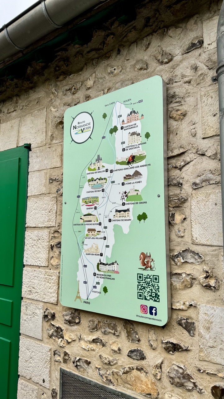

1. Overall Rating (0–10) — 6.0
This photograph presents a functional yet visually engaging informational sign mounted on a rustic stone wall, capturing the charm of rural Normandy. The contrast between the weathered texture of the wall and the clean, illustrative design of the sign creates a pleasing juxtaposition of old and new. While the composition is straightforward and the image clearly communicates its purpose, it lacks a strong artistic narrative, feeling more like a travel snapshot than a crafted photograph.
2. Composition (0–10) — 6.5
The sign is well-framed and centered, with the stone wall and green door providing natural framing and color contrast. The slight angle of the shot adds a subtle dynamic quality, though the composition could benefit from tighter cropping to emphasize the sign's details.
3. Lighting (0–10) — 6.0
Natural, diffused daylight evenly illuminates the scene, preserving the clarity of the sign’s text and illustrations. The soft lighting minimizes harsh shadows, though it also tempers the visual richness of the stone texture.
4. Color & Tone (0–10) — 6.5
The pale green of the sign harmonizes with the muted tones of the stone and the pop of green from the door, creating a cohesive, earthy palette. The color temperature is neutral, supporting the image’s documentary feel without adding emotional emphasis.
5. Creativity (0–10) — 6.0
The image is conceptually sound, blending cultural information with a sense of place. The inclusion of the QR code and social media handles suggests a modern, interactive intent, but the overall execution remains conventional and unexceptional.
6. Technical Quality (0–10) — 7.5
The image is sharp and in focus, with clear text and well-defined details on the sign. The exposure is balanced, and the depth of field effectively isolates the subject from the background.
7. Emotional Impact (0–10) — 5.5
The photograph evokes a quiet sense of discovery and wanderlust, inviting viewers to imagine a journey through the Norman countryside. However, the lack of human presence or dramatic lighting limits its emotional resonance.
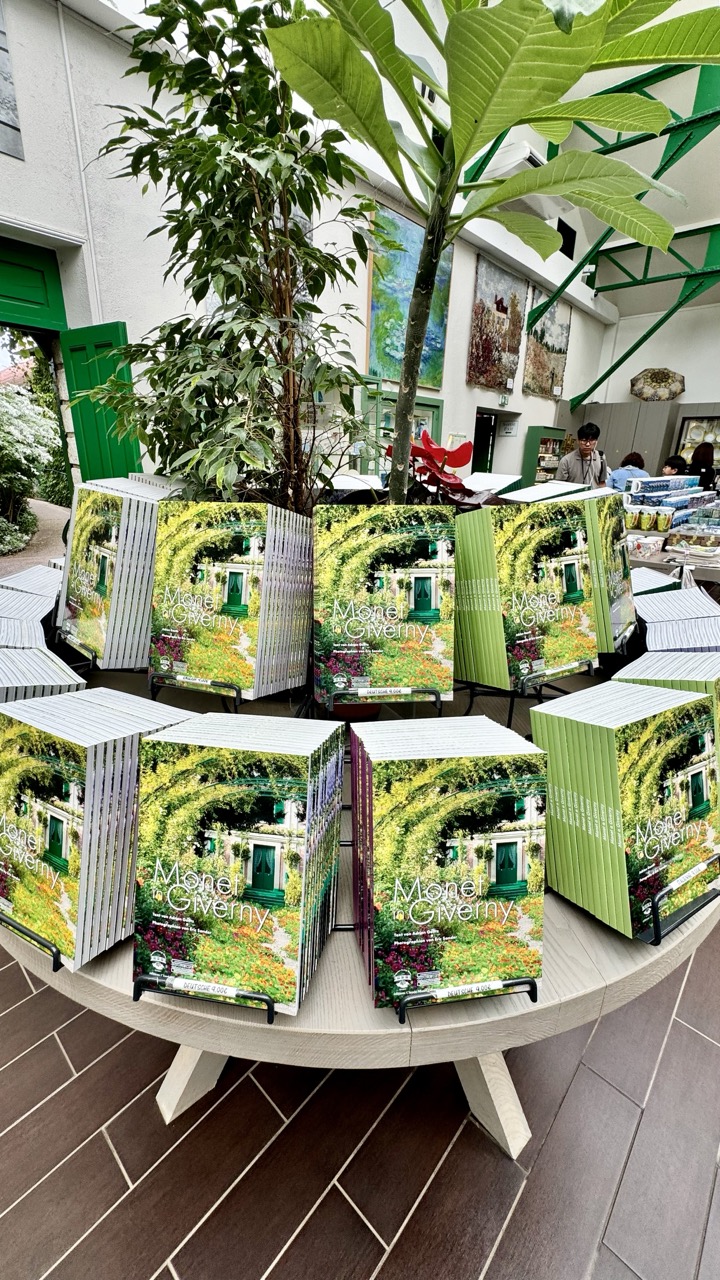

1. Overall Rating (0–10) — 7.0
This photograph captures the inviting atmosphere of a Monet-themed gift shop, where the repetition of the book cover creates a visually harmonious rhythm. The lush greenery and soft natural light enhance the tranquil, artistic mood, while the arrangement of books invites quiet contemplation. Though the scene is well-composed and thematically rich, it feels slightly staged, lacking the spontaneity that would elevate it beyond a simple promotional image.
2. Composition (0–10) — 7.5
The circular arrangement of books creates a strong focal point, drawing the eye inward. The tall plant adds vertical balance, while the background elements—artwork, green shutters, and visitors—provide context without distracting from the central display.
3. Lighting (0–10) — 7.0
Soft, diffused daylight fills the space, casting gentle shadows and enhancing the natural tones of the scene. The light feels authentic and complements the organic textures of the plants and book covers.
4. Color & Tone (0–10) — 7.5
The dominant greens and earthy tones create a cohesive, calming palette that mirrors the Monet aesthetic. The vibrant colors on the book covers add pops of brightness without disrupting the overall harmony.
5. Creativity (0–10) — 6.5
While the concept is grounded in thematic consistency, the execution leans toward commercial documentation rather than artistic innovation. The repetition of the book cover is effective but predictable.
6. Technical Quality (0–10) — 8.0
Sharp focus, clean details, and well-balanced exposure contribute to a technically strong image. The clarity of the book covers and surrounding textures is impressive.
7. Emotional Impact (0–10) — 6.5
The photograph evokes a sense of calm and cultural appreciation, inviting viewers to imagine themselves in a serene garden or museum space. However, the emotional resonance is subtle, resting more on atmosphere than narrative depth.
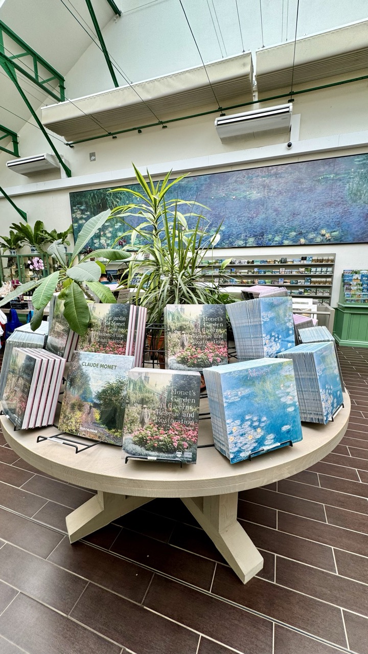

1. Overall Rating (0–10) — 7.0
This photograph captures a serene and thoughtfully curated display within what appears to be a Monet-themed gift shop or museum store. The arrangement of books and lush greenery evokes the tranquil beauty of Monet’s gardens, creating a harmonious blend of art and nature. While the scene is visually pleasing and thematically coherent, the flat lighting and slightly cluttered background detract from the overall elegance, preventing it from achieving a truly immersive aesthetic.
2. Composition (0–10) — 6.5
The round table and central plant create a strong focal point, drawing the eye inward. However, the surrounding shelves and architectural elements slightly disrupt the balance, creating visual noise that competes with the main subject.
3. Lighting (0–10) — 6.0
The lighting is functional but lacks depth, with a flat, even quality that fails to accentuate textures or create atmospheric contrast. The overhead lights contribute to a commercial, retail feel rather than an artistic ambiance.
4. Color & Tone (0–10) — 7.5
The palette is rich with calming blues and greens, echoing Monet’s iconic water lily paintings. The warm wooden tones of the table and floor provide a pleasing contrast, enhancing the natural and artistic theme.
5. Creativity (0–10) — 7.0
The concept of integrating Monet’s art with a physical display of books and live plants is clever and thematically resonant. It effectively communicates the artist’s connection to nature, though the execution remains more literal than imaginative.
6. Technical Quality (0–10) — 7.5
The image is sharp and well-focused, with clean lines and clear details in the book covers and foliage. The camera angle and framing are competent, though minor composition choices limit its visual impact.
7. Emotional Impact (0–10) — 6.5
The photograph evokes a sense of calm and cultural appreciation, inviting the viewer into a quiet space of artistic reflection. While it doesn’t stir strong emotion, it succeeds in creating a contemplative mood that aligns with Monet’s legacy.
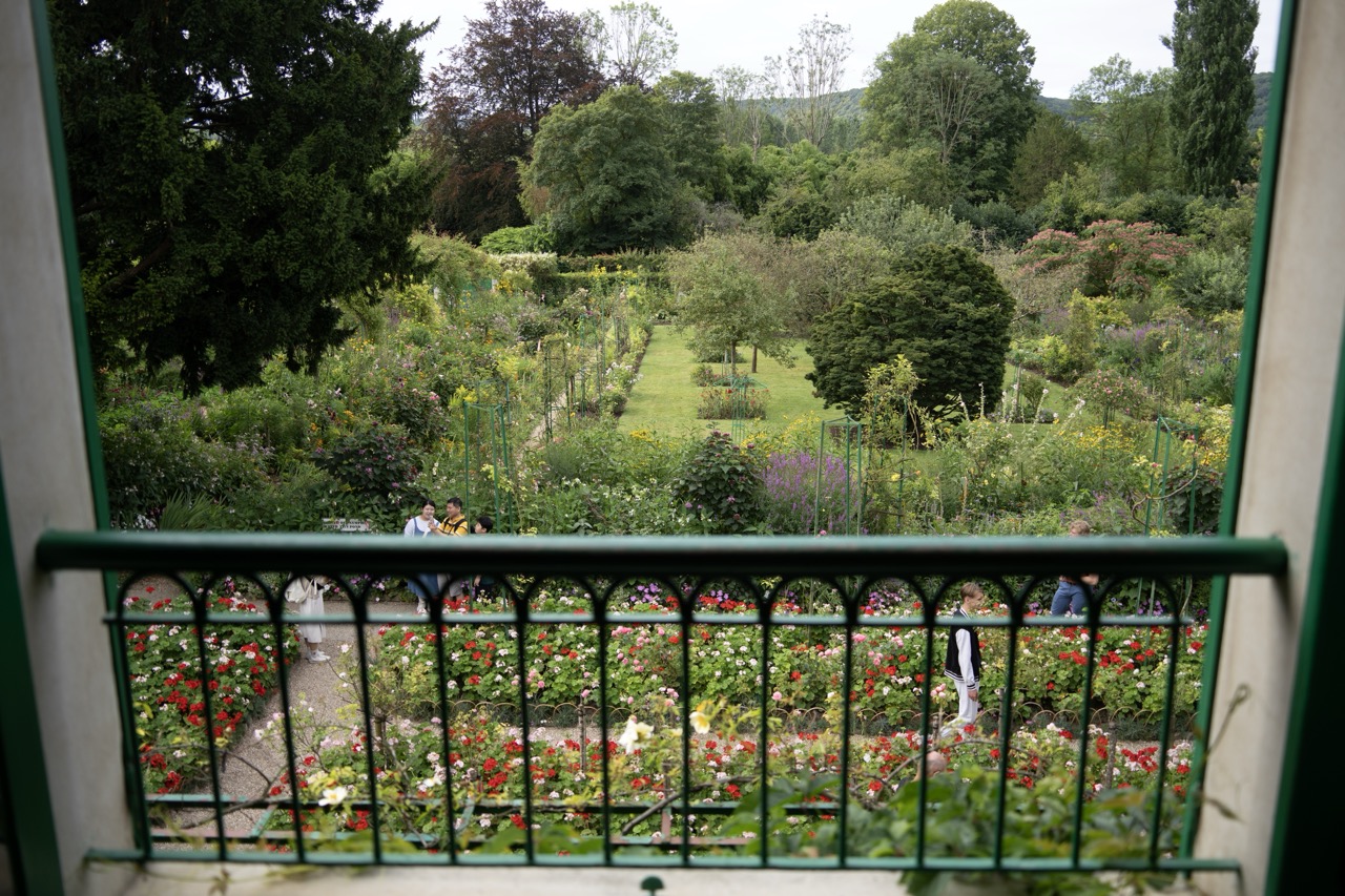

1. Overall Rating (0–10) — 7.0
This photograph captures the serene complexity of a lush garden viewed from a vantage point, offering a layered and immersive perspective. The green railing in the foreground frames the scene like a window into a living tapestry of color and texture, while the scattered visitors add a sense of scale and quiet human presence. Though the image is rich in detail and composition, the overcast lighting tempers its vibrancy, lending a subdued tone that slightly limits its emotional pull.
2. Composition (0–10) — 7.5
The framing through the green railing creates a strong sense of depth and perspective, drawing the eye from the foreground through the midground garden to the distant treeline. The diagonal path and asymmetrical placement of figures guide the viewer’s gaze naturally, while the balanced arrangement of floral beds enhances visual harmony.
3. Lighting (0–10) — 6.0
The soft, diffused light of an overcast day evenly illuminates the garden, minimizing harsh shadows and allowing subtle textures and colors to emerge. While this creates a calm and cohesive mood, it also flattens the scene’s dynamic range, slightly dulling the vibrancy of the flowers.
4. Color & Tone (0–10) — 7.0
A lush palette of greens, reds, and purples is rendered with natural fidelity, enhanced by the soft tonal transitions. The dominant green of the railing and foliage creates a cohesive color scheme, while the bursts of red and pink in the flowerbeds provide effective visual contrast.
5. Creativity (0–10) — 7.0
The framing through the railing adds a unique narrative element—inviting the viewer into the scene as an observer. This perspective transforms a simple garden view into a more intimate, contemplative moment, suggesting both beauty and quiet human connection.
6. Technical Quality (0–10) — 7.5
The image is sharp and clear, with fine detail visible in the foliage and flower petals. The focus is well-managed across the depth of field, allowing both the foreground railing and distant garden to remain distinct without technical flaws.
7. Emotional Impact (0–10) — 6.5
The photograph evokes a sense of peaceful observation and quiet appreciation for nature’s complexity. The presence of people adds a gentle human element, suggesting a shared moment of tranquility, though the muted lighting and distance slightly reduce the intimacy of the connection.
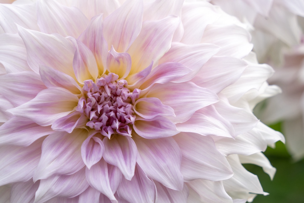

1. Overall Rating (0–10) — 8.0
This photograph captures the delicate complexity of a dahlia in exquisite detail, evoking a sense of quiet elegance and natural grace. The soft gradient of pink and cream, combined with the intricate layering of petals, creates a visual harmony that feels both intimate and expansive. While the image is technically strong, a slightly more dynamic background could elevate its emotional resonance beyond mere beauty.
2. Composition (0–10) — 8.5
The centered framing draws the eye directly into the flower’s core, emphasizing its radial symmetry and layered structure. The soft blur of surrounding petals creates a gentle depth, enhancing focus on the central bloom without distracting from its form.
3. Lighting (0–10) — 9.0
Soft, diffused light bathes the flower evenly, highlighting the subtle textures and color transitions without harsh shadows or overexposure. The illumination enhances the translucency of the petals, giving the image a luminous, almost ethereal quality.
4. Color & Tone (0–10) — 8.5
The pastel palette of lavender, cream, and golden yellow blends seamlessly, creating a harmonious and soothing visual experience. The tonal range is rich yet restrained, with a delicate contrast that enhances depth without disrupting the image’s serene mood.
5. Creativity (0–10) — 7.5
While the subject is classic, the execution demonstrates a thoughtful approach to capturing botanical beauty. The focus on texture and subtle color gradations elevates the image beyond a simple floral portrait into a meditative study of form and light.
6. Technical Quality (0–10) — 9.0
Exceptional sharpness and clarity in the foreground, with precise focus on the flower’s center. The shallow depth of field is used effectively to isolate the subject while maintaining a soft, natural backdrop.
7. Emotional Impact (0–10) — 8.0
The image evokes calmness and wonder, inviting the viewer to pause and appreciate the quiet intricacy of nature. There’s a gentle warmth and intimacy in the composition that fosters a deep sense of connection with the subject.


1. Overall Rating (0–10) — 8.0
This photograph captures a delicate moment of natural harmony, where a bumblebee engages with a vibrant orange flower in a scene rich with life and color. The shallow depth of field isolates the subject with elegance, creating a soft, dreamlike backdrop that enhances the focus on the bee’s intricate details. While the image is visually striking and emotionally resonant, its success lies in its simplicity—there’s little room for narrative complexity, but it excels as a quiet celebration of nature’s beauty.
2. Composition (0–10) — 8.5
The bee is positioned slightly off-center, following the rule of thirds, which draws the eye naturally across the frame. The circular form of the flower provides a strong compositional anchor, while the blurred green background creates a pleasing contrast that emphasizes the subject without distraction.
3. Lighting (0–10) — 8.0
Soft, diffused natural light highlights the textures of the bee’s fuzzy body and the flower’s petals, avoiding harsh shadows. The even illumination enhances the warm tones of the flower and gives the scene a gentle, inviting quality.
4. Color & Tone (0–10) — 9.0
The bold orange of the flower contrasts beautifully with the green background, while the yellow center and black-and-yellow bee create a harmonious triad. The saturation is rich but not overdone, allowing the natural colors to feel vibrant and authentic.
5. Creativity (0–10) — 7.5
While the subject is common in nature photography, the photographer’s use of shallow depth of field and careful framing elevates the image beyond a simple snapshot. The choice to focus on the interaction between bee and flower suggests an intent to capture a fleeting, intimate moment.
6. Technical Quality (0–10) — 9.0
The image is sharp on the bee and flower center, with a beautifully smooth bokeh that demonstrates precise focus and lens control. The exposure is well-balanced, and there are no visible artifacts or noise.
7. Emotional Impact (0–10) — 8.5
The image evokes a sense of calm and wonder, inviting the viewer to pause and appreciate the small, often overlooked moments in nature. The close-up perspective fosters a connection with the bee and its environment, creating a quiet but powerful emotional resonance.
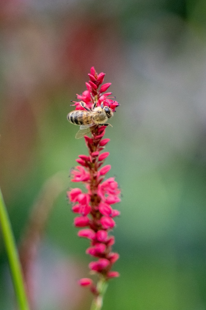

1. Overall Rating (0–10) — 7.5
This image captures a delicate moment of natural harmony, where the bee’s intricate form contrasts beautifully with the vibrant, clustered blossoms. The shallow depth of field isolates the subject with painterly precision, creating a sense of intimacy and quiet focus. While the composition is strong and the colors rich, the lighting remains somewhat flat, limiting the image’s emotional depth and visual dynamism.
2. Composition (0–10) — 8.0
The vertical framing emphasizes the elongated flower spike, drawing the eye upward to the bee at the apex. The subject is well-placed along the central axis, creating a balanced and focused composition, though the slight tilt of the flower adds subtle asymmetry that enhances naturalism.
3. Lighting (0–10) — 6.0
The light is soft and diffused, evenly illuminating the scene without harsh shadows. However, the absence of directional highlights or contrast diminishes the three-dimensionality of the bee and the texture of the petals, lending a slightly muted quality to the image.
4. Color & Tone (0–10) — 8.0
The rich magenta of the flowers creates a striking contrast against the soft green and brown background, enhancing visual appeal. The warm tones of the bee’s body complement the floral palette, while the shallow depth of field contributes to a harmonious, painterly tone.
5. Creativity (0–10) — 7.5
The photographer captures a fleeting moment of pollination with clarity and grace, transforming a common natural scene into an intimate portrait. The use of selective focus and color harmony elevates the image beyond mere documentation into something more contemplative and artistic.
6. Technical Quality (0–10) — 8.5
The focus is sharp on the bee and the upper flowers, with a smooth, creamy bokeh that separates the subject from the background. The image is free of noise, and the detail in the bee’s legs and wings is well-preserved, indicating strong technical execution.
7. Emotional Impact (0–10) — 7.0
The image evokes a sense of tranquility and reverence for small, unnoticed moments in nature. The viewer is invited to pause and appreciate the quiet diligence of the bee, creating a gentle emotional connection to the natural world.
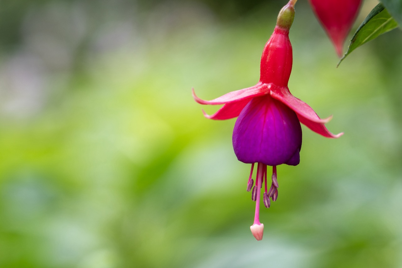

1. Overall Rating (0–10) — 8.0
This photograph captures the delicate elegance of a fuchsia flower with striking clarity and color, transforming a simple botanical subject into a moment of quiet beauty. The soft, blurred green background enhances the flower’s vivid form, drawing the eye to its intricate structure and rich gradients. While the composition is visually pleasing, it leans slightly toward conventional floral photography, lacking a deeper narrative or emotional tension to elevate it beyond aesthetic appeal.
2. Composition (0–10) — 7.5
The flower is placed slightly off-center, creating a natural, balanced composition that guides the eye gently across the frame. The shallow depth of field effectively isolates the subject, though the framing could be tighter to emphasize the flower’s form.
3. Lighting (0–10) — 8.0
Soft, diffused light enhances the flower’s natural tones without harsh shadows, allowing the subtle gradients from pink to deep purple to emerge with clarity. The even illumination supports the delicate texture of the petals and the fine detail of the stamens.
4. Color & Tone (0–10) — 9.0
The vibrant magenta and deep purple of the fuchsia contrast beautifully with the soft green background, creating a harmonious and richly saturated palette. The color transitions are smooth and natural, evoking a sense of freshness and vitality.
5. Creativity (0–10) — 7.0
While the image is technically well-executed, its approach is more observational than inventive. The focus is on capturing the flower’s inherent beauty rather than reinterpreting it through a unique conceptual lens.
6. Technical Quality (0–10) — 9.0
Exceptionally sharp focus on the flower, with precise control over depth of field. The sensor detail renders fine textures in the petals and stamens clearly, and the exposure is balanced and clean.
7. Emotional Impact (0–10) — 7.5
The image evokes a sense of calm and wonder, inviting the viewer to pause and appreciate the quiet intricacy of nature. Its beauty is immediate and soothing, though it doesn’t provoke a deeper emotional resonance.
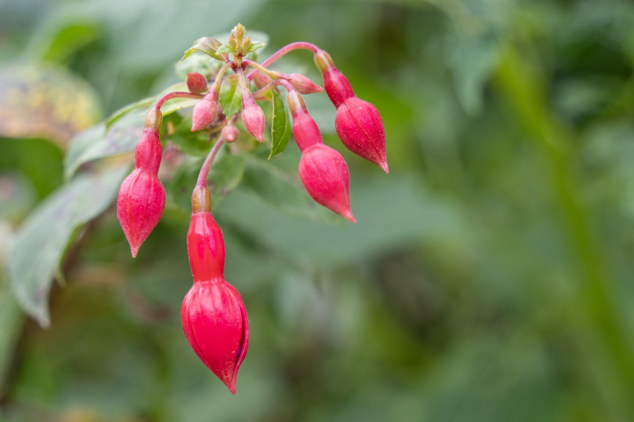

1. Overall Rating (0–10) — 7.5
This image captures the delicate elegance of fuchsia blossoms in soft, natural light, where the vibrant reds contrast beautifully against a lush green backdrop. The shallow depth of field isolates the flowers with a painterly softness, creating a serene and intimate moment in nature. While the composition is strong and the colors are rich, the simplicity of the subject leaves room for greater narrative or emotional complexity.
2. Composition (0–10) — 7.0
The flowers are arranged diagonally, leading the eye naturally through the frame, while the off-center placement adds visual interest. The use of negative space on the right balances the composition and enhances the sense of organic flow.
3. Lighting (0–10) — 8.0
Soft, diffused light highlights the texture and translucency of the petals without harsh shadows, creating a gentle glow that enhances the natural beauty of the blossoms.
4. Color & Tone (0–10) — 8.5
The vivid magenta of the fuchsia flowers pops against the muted greens, creating a harmonious and visually striking contrast. The color palette feels natural and balanced, with rich saturation that draws the viewer in.
5. Creativity (0–10) — 7.0
While the subject is classic and well-executed, the approach is conventional, relying on the inherent beauty of the flowers rather than a bold artistic vision. The image succeeds through sensitivity to detail and light rather than innovation.
6. Technical Quality (0–10) — 9.0
The focus is sharp on the foreground blooms, with a smooth, intentional bokeh that separates the subject from the background. The image is clean, well-exposed, and free of distracting artifacts.
7. Emotional Impact (0–10) — 7.5
The photograph evokes a sense of calm and quiet wonder, inviting the viewer to pause and appreciate the delicate intricacies of nature. It feels peaceful and contemplative, with a subtle warmth that resonates emotionally.
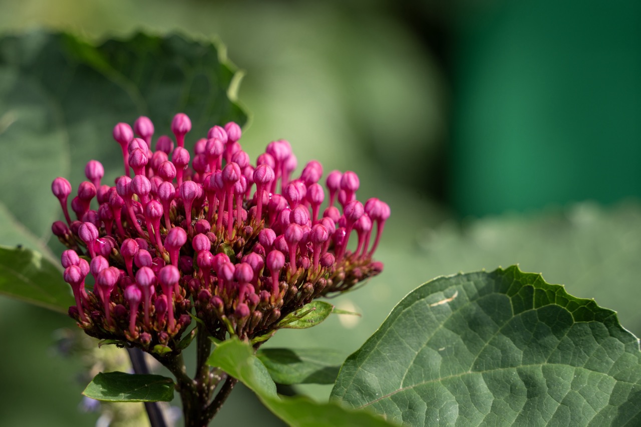

1. Overall Rating (0–10) — 8.0
This image captures the delicate vibrancy of a blooming flower cluster with striking clarity, where the vivid magenta buds contrast beautifully against the soft, green backdrop. The shallow depth of field draws attention to the intricate textures of the blossoms, while the natural lighting enhances their organic form. A subtle warmth in the tones adds a sense of life and freshness, though the composition could benefit from slightly more intentional framing to elevate its visual narrative.
2. Composition (0–10) — 7.5
The subject is well-centered with strong visual weight, and the diagonal placement of the leaf adds dynamic balance. The shallow depth of field isolates the flower effectively, though a tighter crop might emphasize the cluster’s complexity.
3. Lighting (0–10) — 8.5
Natural, diffused sunlight highlights the flower’s texture and color without harsh shadows, creating a soft glow that enhances the subject’s delicate form.
4. Color & Tone (0–10) — 8.0
The contrast between the rich magenta buds and the deep green foliage is visually striking, with a natural, harmonious palette that feels both vivid and balanced.
5. Creativity (0–10) — 7.0
While the subject is classic and well-executed, the approach leans toward traditional nature photography. The focus on texture and color offers subtle artistic expression, but the concept remains conventional.
6. Technical Quality (0–10) — 9.0
Exceptionally sharp focus on the flower, with clean detail and minimal noise. The depth of field is precisely managed, showcasing technical mastery.
7. Emotional Impact (0–10) — 7.5
The image evokes a sense of quiet beauty and natural wonder, inviting the viewer to pause and appreciate the delicate intricacy of life in a single moment.
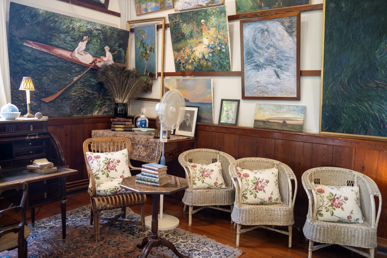

1. Overall Rating (0–10) — 7.0
This photograph captures the cozy, artistic atmosphere of a gallery or private collection room, where paintings and personal artifacts converge in a richly layered narrative. The room’s warmth is enhanced by the interplay of vintage furniture, floral textiles, and the soft glow of a lamp, creating a sense of lived-in history. While the composition is dense and somewhat cluttered, the scene feels authentic and inviting, offering a glimpse into a space where art and daily life intersect.
2. Composition (0–10) — 6.5
The frame is filled with visual elements, creating a sense of depth and narrative density. The arrangement of chairs, paintings, and furniture feels deliberate yet slightly uneven, with the central table and fan drawing the eye but disrupting the symmetry. A tighter framing might have improved balance and focus.
3. Lighting (0–10) — 6.0
Natural light from the left gently illuminates the room, complemented by the warm glow of the table lamp. The lighting is soft and even, enhancing the textures of the wicker, wood, and fabric, though some areas remain underexposed, particularly in the corners.
4. Color & Tone (0–10) — 7.0
The palette is rich and harmonious, with earthy browns, soft whites, and pops of red from the floral pillows that echo the colors in the paintings. The contrast between the dark wood paneling and the lighter wicker chairs adds visual interest, while the overall tone feels warm and cohesive.
5. Creativity (0–10) — 7.5
The image successfully conveys a narrative of artistic devotion and domestic intimacy, with the paintings serving as both decoration and storytelling elements. The juxtaposition of classical art with vintage furnishings creates a layered, introspective mood that feels both personal and timeless.
6. Technical Quality (0–10) — 7.5
The image is sharp and well-focused, with clear detail in the textures of the wicker, rug, and paintbrush strokes on the canvases. The exposure is balanced, and the depth of field effectively draws attention to the central seating area while still including contextual background elements.
7. Emotional Impact (0–10) — 7.0
The photograph evokes a sense of nostalgia and quiet contemplation, inviting the viewer to imagine the stories behind the artworks and the people who inhabited this space. The warmth of the room and the personal touches lend it emotional resonance, making it feel like a sanctuary of creativity and memory.
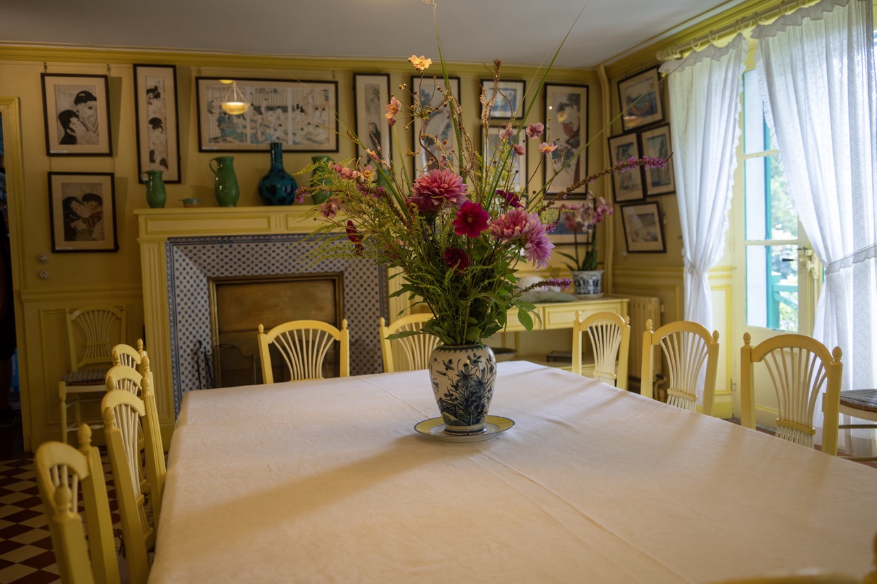

1. Overall Rating (0–10) — 7.5
This photograph captures the quiet charm of a sun-drenched dining room, where vintage decor and natural light converge in a harmonious, almost nostalgic tableau. The composition draws the eye to the vibrant floral centerpiece, while the surrounding details—framed art, patterned tiles, and soft sunlight—add layers of texture and story. Though the scene is rich in atmosphere, a slight overexposure on the right diminishes the subtlety of the shadows, tempering its overall visual depth.
2. Composition (0–10) — 8.0
The long table anchors the frame, leading the viewer’s gaze toward the fireplace and the array of framed artwork. The bouquet, placed slightly off-center, adds dynamism, while the repeating lines of chairs and the diagonal light from the window create a sense of rhythm and depth.
3. Lighting (0–10) — 7.5
Natural light floods in from the right, casting soft, diffused illumination that enhances the room’s warmth and highlights the textures of the tablecloth and floral arrangement. The slight overexposure near the window softens the contrast, but the overall effect remains inviting and airy.
4. Color & Tone (0–10) — 8.0
The yellow walls and chairs provide a warm, cohesive backdrop, complemented by the rich purples and pinks of the flowers and the blue-and-white porcelain. The color palette is harmonious, with a gentle contrast between the cool tones of the vase and the warm ambient light.
5. Creativity (0–10) — 7.0
The image evokes a sense of domestic elegance and timelessness, with a strong narrative of lived-in beauty. While not radically original, the thoughtful arrangement of objects and the interplay of light and pattern elevate it beyond a simple snapshot.
6. Technical Quality (0–10) — 8.5
Sharp focus across the frame ensures clarity in both the foreground and background. The exposure is well-handled overall, though the highlights near the window verge on blown-out, slightly reducing detail in that area.
7. Emotional Impact (0–10) — 8.0
The photograph conveys a sense of tranquility and warmth, inviting the viewer to imagine a quiet afternoon spent in this charming room. The combination of light, color, and composition fosters a feeling of comfort and nostalgia, making it emotionally resonant.
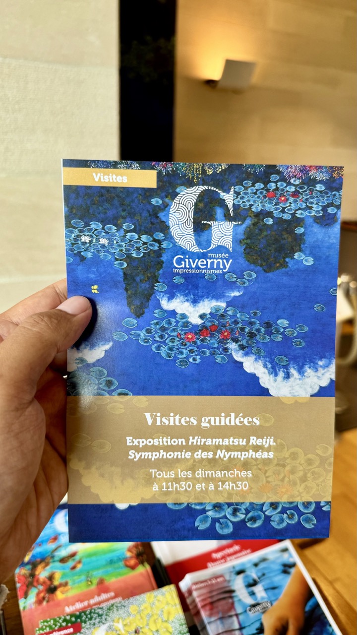

1. Overall Rating (0–10) — 6.0
This photograph captures a quiet, personal moment of cultural engagement, with the hand holding a museum brochure serving as a subtle narrative anchor. The brochure itself, featuring vibrant artwork and clear text, draws the eye, while the softly lit interior background adds a sense of intimacy. However, the composition feels slightly candid and unpolished, with distracting elements in the foreground and a lack of visual depth that prevents the image from feeling fully composed.
2. Composition (0–10) — 5.5
The hand and brochure dominate the left side, creating an off-center focus that feels slightly unbalanced. The overlapping brochures in the foreground distract from the main subject, while the shallow depth of field isolates the brochure but fails to unify the scene.
3. Lighting (0–10) — 6.0
Warm ambient lighting from a wall sconce creates a soft glow, enhancing the cozy atmosphere. However, the light is uneven, casting subtle shadows and leaving the background slightly underexposed, which reduces clarity.
4. Color & Tone (0–10) — 7.0
The brochure’s rich blue and gold palette stands out against the neutral tones of the background. The warm lighting adds a golden cast to the scene, enhancing the mood, though the overall color balance is slightly muted due to indoor lighting.
5. Creativity (0–10) — 6.0
The image tells a simple story—visiting a museum and engaging with art—through a relatable, everyday moment. While not artistically groundbreaking, the choice to frame the brochure as the focal point gives it a narrative quality.
6. Technical Quality (0–10) — 7.0
The focus is sharp on the brochure, and the image is free of major technical flaws. However, the shallow depth of field and slight motion blur in the hand suggest a casual, handheld capture.
7. Emotional Impact (0–10) — 6.5
There’s a quiet sense of anticipation and appreciation for art, conveyed through the subject’s gentle hold and the inviting brochure design. The viewer is drawn into a moment of personal discovery, though the emotional resonance remains restrained by the image’s informal framing.
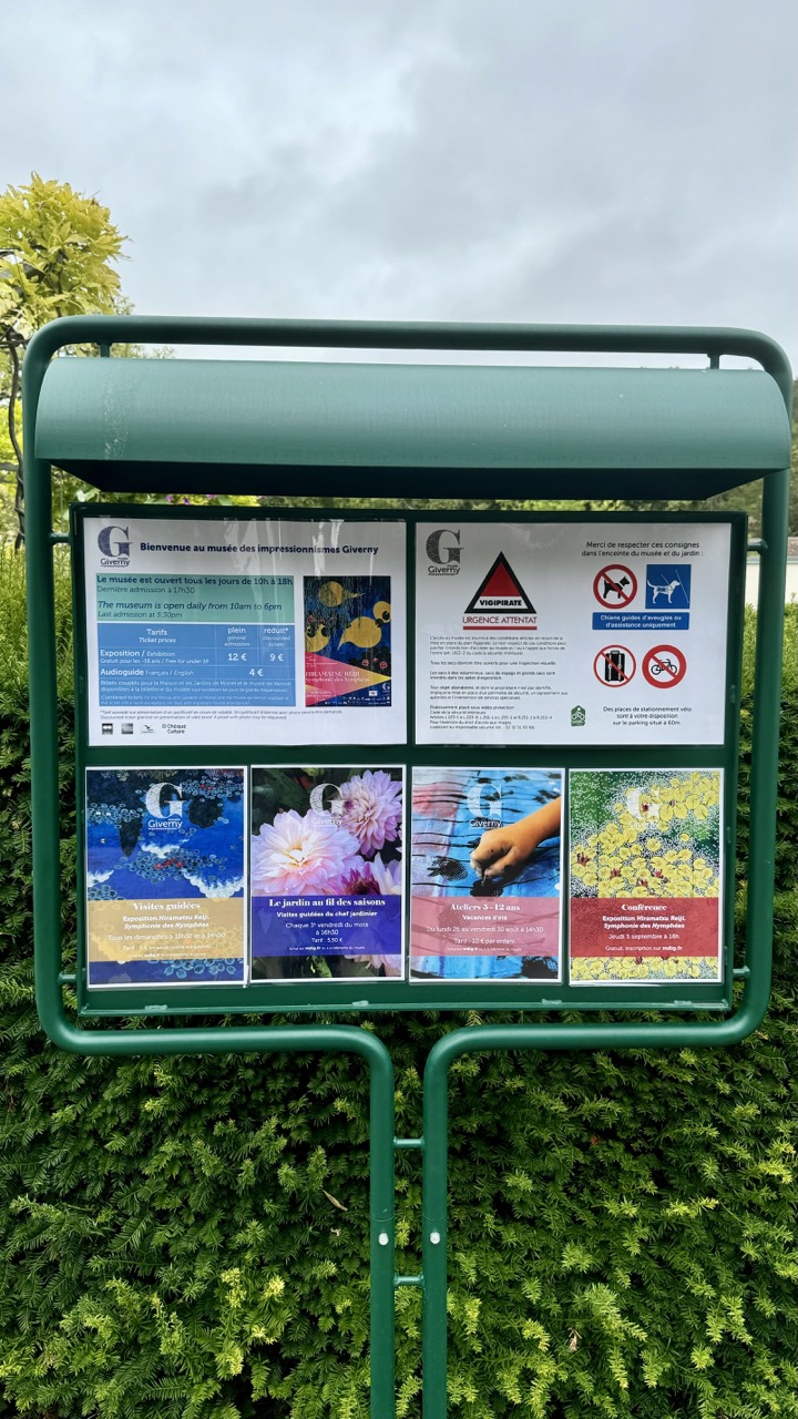

1. Overall Rating (0–10) — 5.0
This photograph captures a functional yet visually cluttered information board at the Giverny Impressionism Museum, where practicality outweighs aesthetic appeal. The dense arrangement of text and images, combined with a flat, overcast sky and a uniformly green hedge, creates a passive, documentary feel. While the image successfully conveys the museum’s offerings and rules, it lacks visual rhythm or emotional resonance, feeling more like a record than a photograph.
2. Composition (0–10) — 5.5
The frame centers the sign with a straightforward, eye-level perspective, but the composition is weakened by the crowded layout of the posters and the lack of negative space. The hedge below fills the lower third without adding visual interest, creating a heavy, grounded base that doesn’t balance the visual weight of the top-heavy signage.
3. Lighting (0–10) — 4.5
The overcast sky produces soft, diffused light that minimizes shadows and flattens the scene. While this ensures even exposure across the sign, it also dulls the colors and reduces contrast, contributing to a muted and somewhat lifeless atmosphere.
4. Color & Tone (0–10) — 5.0
The dominant green of the sign and hedge dominates the palette, creating a natural but monotonous backdrop. The poster colors—blues, pinks, and yellows—are vibrant but feel disconnected from the overall tone, failing to unify the image. The color temperature is neutral, lacking warmth or coolness to evoke mood.
5. Creativity (0–10) — 4.0
The image is purely informational, with little artistic intent beyond documentation. The juxtaposition of colorful art posters against a utilitarian green sign hints at the museum’s creative mission, but the composition does not interpret or elevate the subject—it simply records it.
6. Technical Quality (0–10) — 7.5
The focus is sharp across the sign, and the details of the text and images are clearly legible. The camera’s handling of the scene is technically sound, with no obvious flaws in exposure or focus, though the image’s visual appeal is constrained by its content.
7. Emotional Impact (0–10) — 4.0
The photograph evokes a sense of quiet routine and practicality, but it fails to stir emotion. The viewer is left with a sense of obligation—information to be read rather than a story to be felt—making the image more functional than evocative.
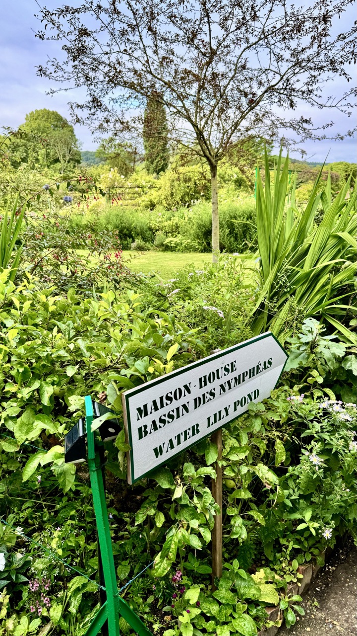

1. Overall Rating (0–10) — 7.0
This photograph captures the tranquil charm of a lush garden, where nature and human design coexist in gentle harmony. The verdant foliage and layered greenery evoke a sense of peaceful seclusion, while the bilingual sign adds a touch of cultural specificity and narrative depth. Though the image is rich in texture and life, the composition feels slightly overgrown and unrefined, limiting its visual cohesion.
2. Composition (0–10) — 6.5
The sign acts as a strong focal point, but the surrounding foliage crowds the frame, creating visual clutter. The diagonal placement of the sign draws the eye, yet the lack of negative space reduces the image’s balance and clarity.
3. Lighting (0–10) — 7.0
Soft, diffused daylight enhances the lushness of the garden, with even illumination that avoids harsh shadows. The overcast sky contributes to a calm, muted mood, allowing the greens to dominate without being washed out.
4. Color & Tone (0–10) — 7.5
The palette is dominated by rich, varying shades of green, punctuated by subtle pops of purple and white from flowers. The color harmony is natural and cohesive, with a balanced contrast between the bright sign and the organic background.
5. Creativity (0–10) — 7.0
The bilingual sign introduces a narrative layer, suggesting a place where cultural identity and natural beauty intersect. The photograph functions as both a documentary record and a poetic invitation into a private garden world.
6. Technical Quality (0–10) — 7.5
The image is sharp and well-focused, with fine detail visible in the leaves and text. The exposure is accurate, and the camera’s resolution captures the textures of the plants effectively.
7. Emotional Impact (0–10) — 7.0
The scene evokes a quiet sense of serenity and discovery, inviting the viewer to wander deeper into the garden. The combination of natural abundance and cultural markers creates a subtle emotional resonance, suggesting a place of care, memory, and belonging.
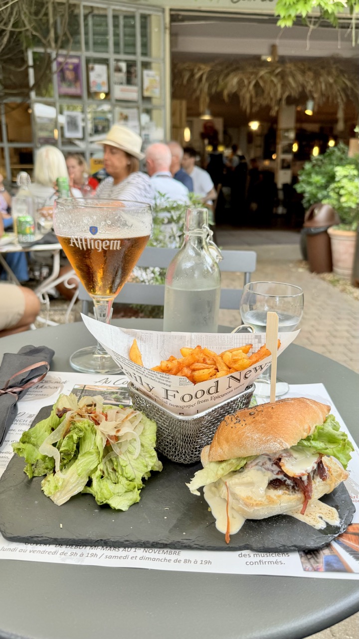

1. Overall Rating (0–10) — 7.0
This photograph captures a relaxed, sun-drenched moment at an outdoor café, where the meal feels both indulgent and authentically lived-in. The composition draws the eye to the delicious spread—burger, fries, and beer—while the blurred background of patrons and greenery adds a sense of place and atmosphere. Though the image is rich in detail and mood, it’s slightly hindered by a lack of intentional framing and a touch of visual clutter that distracts from the main subject.
2. Composition (0–10) — 6.0
The foreground meal is well-framed, but the background elements—people, signage, and foliage—create a busy backdrop that competes for attention. A tighter crop or shallow depth of field would better emphasize the food as the central focus.
3. Lighting (0–10) — 7.5
Natural daylight bathes the scene in soft, even light, enhancing the textures of the food and the golden hue of the beer. The light feels warm and inviting, perfectly suited to the casual outdoor setting.
4. Color & Tone (0–10) — 7.0
The palette is balanced, with the golden beer and orange fries contrasting nicely against the green lettuce and neutral slate. The tones are natural and cohesive, though slightly muted by the bright daylight.
5. Creativity (0–10) — 6.5
The use of newspaper-lined fries and the handwritten menu adds a charming, informal narrative. While the concept is familiar, the details lend authenticity and a sense of place, elevating the image beyond a simple snapshot.
6. Technical Quality (0–10) — 7.5
The image is sharp and clear, with good focus on the foreground elements. The depth of field is adequate, though not strong enough to fully isolate the subject from the background.
7. Emotional Impact (0–10) — 7.0
The photograph evokes a sense of leisure and pleasure—a satisfying meal enjoyed in a relaxed, social environment. It captures a fleeting moment of simple joy that many viewers will find relatable and appealing.
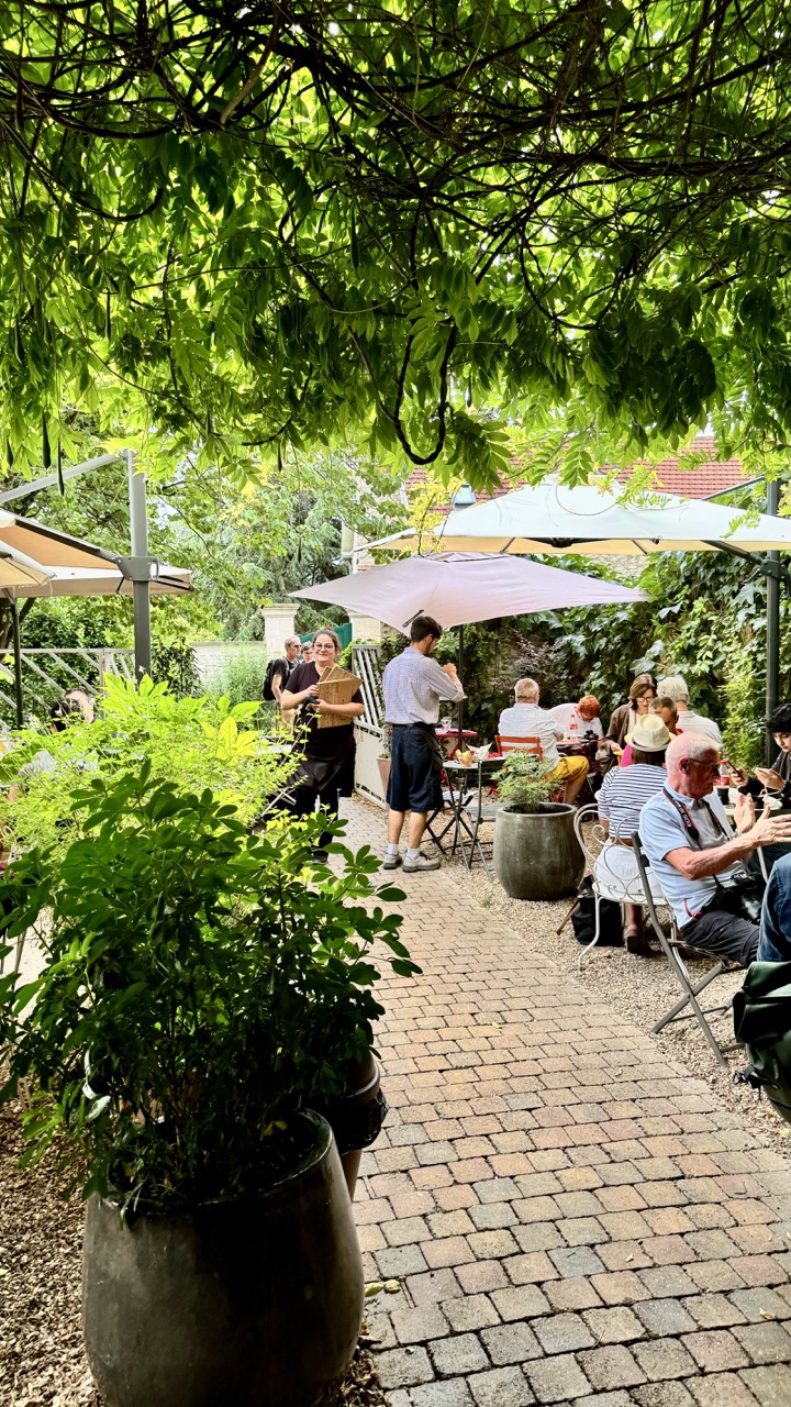

1. Overall Rating (0–10) — 7.0
This photograph captures the serene, sun-dappled ambiance of an outdoor café nestled beneath a leafy canopy, where life unfolds in quiet rhythm. The interplay of natural light and greenery creates a sense of intimacy and escape, while the candid interactions among patrons lend authenticity to the scene. Though the image is rich in atmosphere, its slightly cluttered foreground and soft focus temper its visual clarity, keeping it from achieving full artistic cohesion.
2. Composition (0–10) — 6.5
The composition is anchored by the large potted plant in the foreground, which frames the scene but slightly obstructs the viewer’s entry. The diagonal path draws the eye into the depth of the garden, while the overlapping umbrellas and figures create a layered, dynamic arrangement.
3. Lighting (0–10) — 7.5
Soft, diffused sunlight filters through the tree canopy, casting dappled light and gentle shadows that enhance the tranquil mood. The lighting is natural and evocative, creating depth and texture without harsh contrasts.
4. Color & Tone (0–10) — 7.0
The palette is dominated by lush greens and warm earth tones, harmonizing beautifully with the garden setting. The subtle variation in light and shadow gives the image a natural richness, though the overall tone leans slightly flat in the midtones.
5. Creativity (0–10) — 6.5
The image succeeds in capturing a fleeting moment of everyday life with a painterly quality, but its strength lies more in observation than in bold artistic vision. The framing and subject matter feel authentic, yet not particularly innovative.
6. Technical Quality (0–10) — 7.0
The focus is soft overall, particularly in the background, and the image lacks the crispness needed to fully resolve fine details. Still, the exposure is well-balanced, and the natural grain adds to the organic feel.
7. Emotional Impact (0–10) — 7.5
There’s a quiet warmth and nostalgia in the image—evidence of shared meals, conversation, and the simple pleasure of a sunlit afternoon. It invites the viewer to pause and imagine themselves in the scene, making it emotionally resonant despite its technical imperfections.
Loading map...