The Musée d'Orsay museum was originally built as the Gare d'Orsay railway station in 1900. It narrowly escaped demolition due to its architectural beauty and historical significance, and was converted into a museum by 1986. The building boasts an extensive collection of art from the 19th and early 20th centuries, including works by Monet, Van Gogh, and Renoir, with notable highlights in a gallery dedicated to Van Gogh and a striking clock still ticking today.
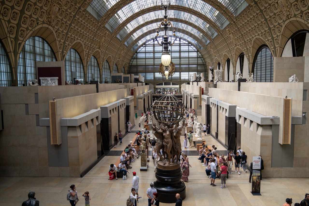

1. Overall Rating (0–10) — 7.5
This photograph captures the grandeur and bustling energy of a historic museum hall, where architectural splendor meets human curiosity. The sweeping arched ceiling and central sculpture create a powerful sense of scale and reverence, while the presence of visitors grounds the space in lived experience. Though the composition is rich in detail, the density of people and objects slightly dilutes the visual clarity, preventing the image from achieving a more refined harmony.
2. Composition (0–10) — 8.0
The symmetrical framing emphasizes the architectural symmetry and draws the eye toward the central sculpture and distant arches. The placement of the sculpture at the visual midpoint anchors the scene, while the rows of galleries on either side create a sense of depth and rhythm.
3. Lighting (0–10) — 7.5
Natural light floods in through the expansive glass roof, casting a soft, diffused glow that highlights the ornate details of the vaulted ceiling. The interplay of light and shadow enhances the three-dimensional quality of the space, while the chandelier adds a warm, focal point that balances the coolness of the daylight.
4. Color & Tone (0–10) — 7.0
The palette is dominated by warm beige and cream tones of the stone architecture, complemented by the dark bronze of the central sculpture and the varied colors of visitors’ clothing. The contrast between the neutral background and the vibrant human activity adds visual interest, though the overall tone leans slightly toward the muted side.
5. Creativity (0–10) — 7.5
The image successfully captures both the architectural majesty and the human element of the space, blending documentary realism with a sense of narrative. The choice to frame the scene from an elevated perspective offers a comprehensive view that conveys both scale and intimacy.
6. Technical Quality (0–10) — 8.5
The image is sharp and well-focused, with fine detail visible in the architecture, sculptures, and crowd. The exposure is balanced, capturing both the bright areas of the ceiling and the darker recesses of the galleries without loss of detail.
7. Emotional Impact (0–10) — 8.0
The photograph evokes a sense of awe and reverence for both art and history, while the presence of visitors adds a layer of warmth and accessibility. The viewer is invited to step into the scene and experience the quiet drama of cultural engagement.
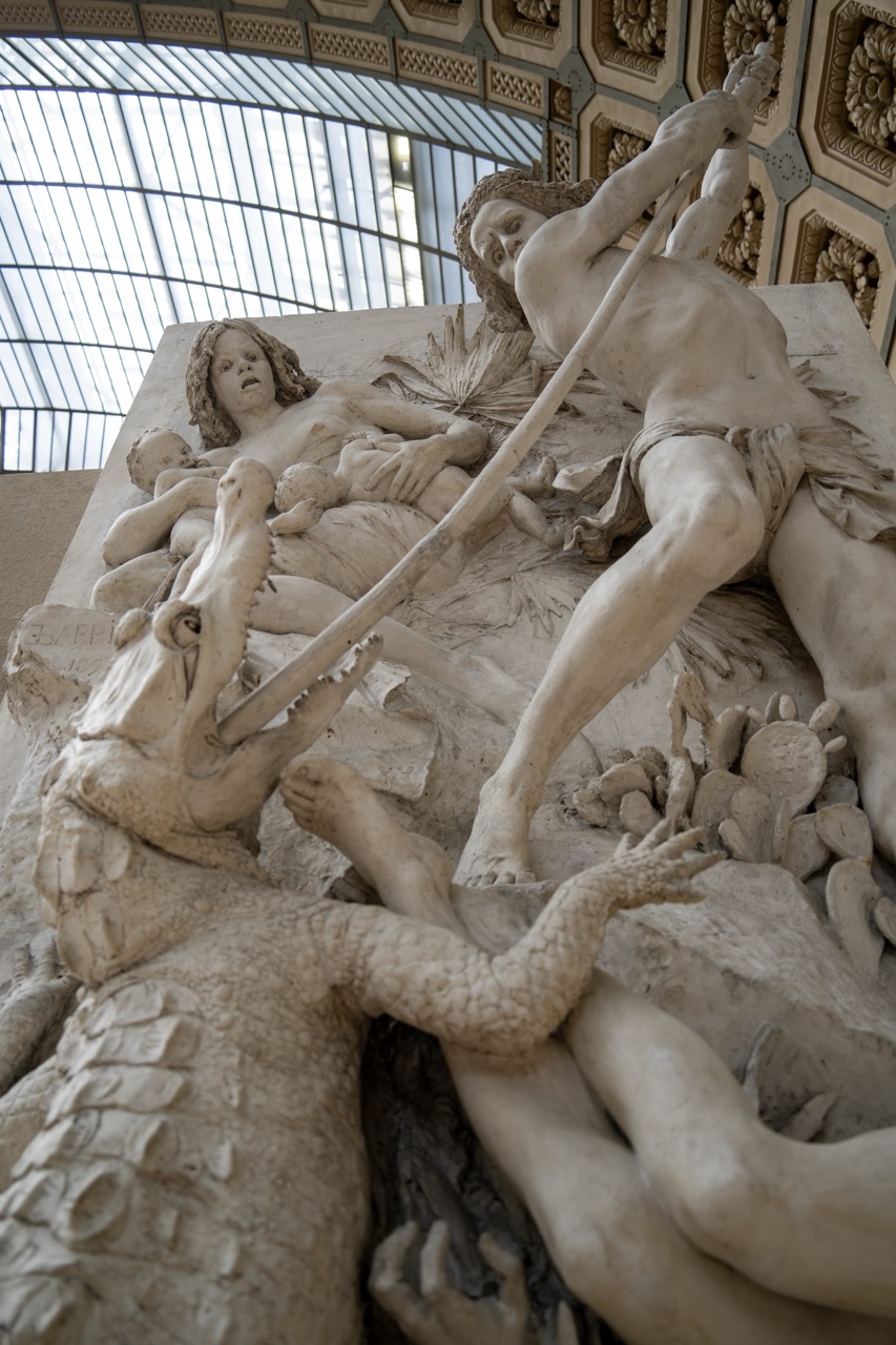

1. Overall Rating (0–10) — 8.0
This photograph captures the dramatic intensity of a marble relief with remarkable clarity and emotional weight, drawing the viewer into a moment of mythic struggle. The low-angle perspective amplifies the monumentality of the sculpture, while the interplay of light and shadow accentuates its intricate textures and dynamic forms. Though the architectural setting is slightly distracting, the image succeeds in conveying both the craftsmanship and the narrative urgency of the piece.
2. Composition (0–10) — 8.0
The low-angle framing emphasizes the sculpture’s grandeur and creates a sense of immersion. The diagonal thrust of the spear and the sprawling limbs guide the eye across the composition, reinforcing the action and chaos of the scene.
3. Lighting (0–10) — 7.5
Natural light from the arched glass ceiling casts soft, directional illumination that enhances the three-dimensionality of the relief. The subtle contrast between light and shadow adds depth and drama, though some areas remain slightly underexposed.
4. Color & Tone (0–10) — 7.0
The monochromatic palette of creamy white marble is unified and restrained, allowing the form and texture to take center stage. The warm, slightly yellowed tone of the stone lends a sense of age and gravitas, though a touch more contrast could elevate the visual impact.
5. Creativity (0–10) — 8.5
The choice of angle and framing transforms a static sculpture into a dynamic visual narrative. By capturing the tension between the human and the crocodile, the photograph evokes a sense of mythic struggle and survival, suggesting a deeper story beyond the surface.
6. Technical Quality (0–10) — 8.0
The image is sharp and detailed, with excellent focus on the sculptural elements. The depth of field is appropriately managed, preserving clarity in both the foreground and background. The slight digital noise in the shadows is minimal and does not detract from the overall quality.
7. Emotional Impact (0–10) — 8.5
The photograph conveys a powerful sense of urgency and vulnerability, particularly in the expressions of the figures. The viewer is drawn into the scene’s emotional core—fear, desperation, and defiance—making the moment feel both timeless and deeply human.
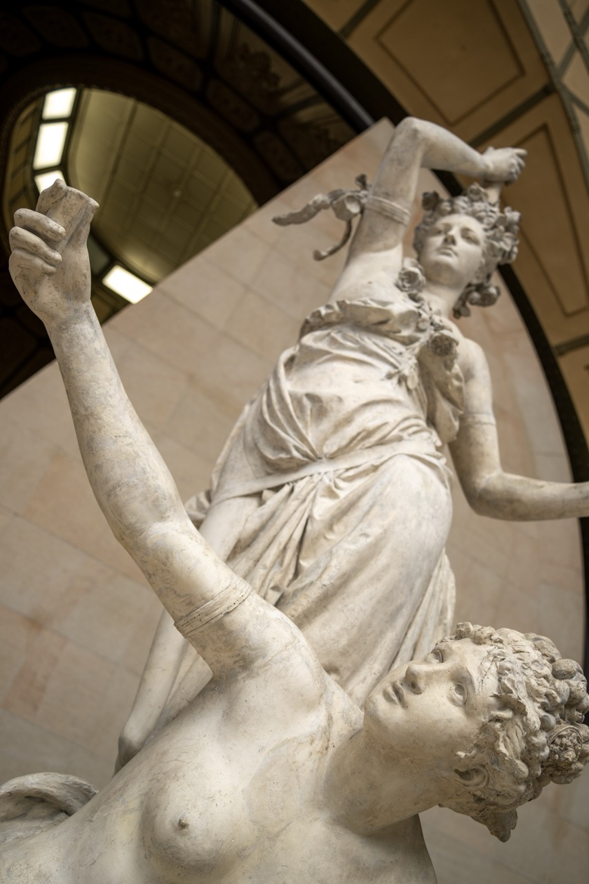

1. Overall Rating (0–10) — 7.5
This photograph captures the dynamic tension and classical elegance of a marble sculpture with striking clarity and reverence. The upward angle emphasizes the drama of the figures’ movement, while the interplay of light and shadow enhances the sculpture’s three-dimensional form. While the architectural backdrop adds context, the composition occasionally feels slightly cluttered, diluting the sculpture’s commanding presence.
2. Composition (0–10) — 7.0
The low-angle perspective creates a sense of grandeur, drawing the eye upward along the figures’ limbs. The diagonal lines of the arms guide the viewer’s gaze effectively, though the inclusion of the arch and ceiling edges introduces visual distractions that slightly disrupt the focus on the sculpture.
3. Lighting (0–10) — 7.5
Soft, diffused light from the overhead skylight illuminates the sculpture evenly, accentuating the texture of the marble and the subtle contours of the figures. The gentle shadows enhance depth and volume without creating harsh contrasts.
4. Color & Tone (0–10) — 8.0
The monochromatic palette of creamy white and warm beige tones is harmonious and appropriate for a classical sculpture. The subtle variations in tone across the marble surface add richness and realism, while the warm ambient light enhances the organic feel of the stone.
5. Creativity (0–10) — 7.5
The choice of a low-angle shot imbues the sculpture with a sense of motion and monumentality, transforming a static subject into a moment of narrative intensity. The framing suggests a story of struggle and triumph, aligning well with the sculpture’s likely mythological themes.
6. Technical Quality (0–10) — 8.5
The image is sharp and well-focused, with fine detail visible in the carving of the drapery and facial features. The depth of field is appropriate, keeping the central figures crisp while softly blurring the background.
7. Emotional Impact (0–10) — 8.0
The sculpture evokes a sense of awe and emotional resonance through its expressive poses and classical beauty. The viewer is drawn into the narrative, feeling the tension and grace of the moment captured in stone, making it both visually and emotionally compelling.
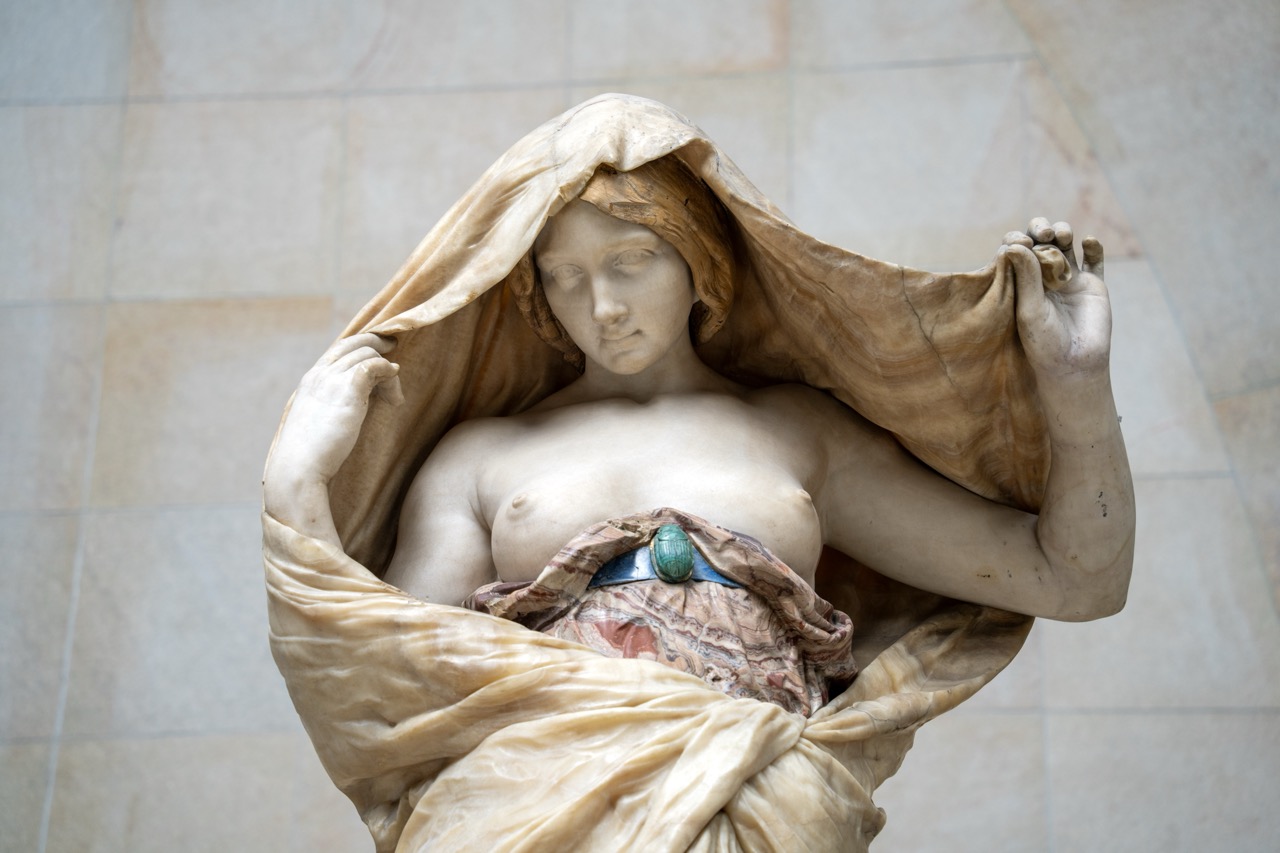

1. Overall Rating (0–10) — 8.0
This photograph captures the serene elegance of a marble sculpture, where draped fabric and delicate features convey a sense of quiet vulnerability. The soft lighting and refined detail highlight the artist’s mastery of texture and form, though the neutral background slightly diminishes the statue’s dramatic presence. The image succeeds as both a documentation and a contemplative portrait of classical beauty.
2. Composition (0–10) — 8.0
The subject is centered with a balanced arrangement, drawing the eye to the figure’s face and the flowing drapery. The slight tilt of the head and the gesture of the hands create a dynamic diagonal, adding subtle movement within the stillness.
3. Lighting (0–10) — 8.5
Soft, diffused light enhances the sculpture’s contours and surface texture, casting gentle shadows that emphasize the folds of the fabric and the smoothness of the skin. The lighting feels natural and respectful, allowing the marble’s subtleties to emerge.
4. Color & Tone (0–10) — 7.5
The warm, creamy tones of the marble are complemented by the cool green of the brooch, creating a harmonious contrast. The muted background allows the sculpture to stand out, though the overall palette remains restrained, reflecting the classical subject.
5. Creativity (0–10) — 7.0
The photograph captures a timeless subject with a clear artistic intent—celebrating the form and emotion of the sculpture. While not overtly experimental, it conveys a quiet reverence for the work, elevating it beyond mere documentation.
6. Technical Quality (0–10) — 9.0
Sharp focus and high resolution reveal fine details in the marble, from the delicate strands of hair to the intricate folds of fabric. The depth of field is well-managed, keeping the subject crisp while softly blurring the background.
7. Emotional Impact (0–10) — 8.0
The statue’s downward gaze and tender pose evoke introspection and fragility, inviting the viewer into a moment of quiet contemplation. The emotional resonance is strong, rooted in the universal themes of vulnerability and grace.
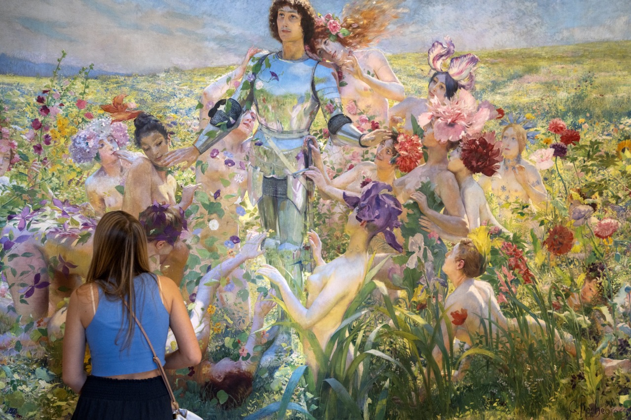

1. Overall Rating (0–10) — 7.0
This photograph captures a striking juxtaposition between the viewer’s modern presence and a lush, dreamlike painting, evoking a dialogue between contemporary observation and romantic artistry. The painting’s rich detail and vibrant color palette draw the eye, while the woman in the foreground grounds the scene in reality, creating a layered narrative. Though the image’s depth is slightly diminished by the flatness of the photograph’s capture, the emotional resonance of the moment—between art, identity, and contemplation—remains compelling.
2. Composition (0–10) — 7.0
The woman in the foreground frames the painting, creating a natural focal point that guides the viewer’s gaze into the artwork. The diagonal placement of the viewer and the central positioning of the knight figure in the painting create a dynamic balance, though the crowded composition of the painting itself slightly overwhelms the viewer’s perspective.
3. Lighting (0–10) — 6.5
The lighting is even and ambient, likely from indoor gallery sources, which preserves the painting’s colors but lacks dramatic contrast. The soft illumination enhances the dreamy quality of the artwork, though it doesn’t create strong shadows or highlights to emphasize texture or depth.
4. Color & Tone (0–10) — 8.0
The painting bursts with vibrant, saturated hues—rich purples, reds, and golden yellows—that contrast beautifully with the cool blue of the woman’s top. The tonal range is well-balanced, with the luminous quality of the painting standing out against the more subdued surroundings.
5. Creativity (0–10) — 8.0
The photograph’s strength lies in its conceptual framing: a real person observing a fantastical scene, creating a meta-narrative about art, perception, and time. This layered storytelling elevates the image beyond mere documentation into a commentary on the viewer’s relationship with art.
6. Technical Quality (0–10) — 7.5
The image is sharp and clear, with fine detail visible in both the painting and the woman’s clothing. The focus is well-managed, though slight noise in the darker areas suggests a higher ISO or lower light conditions in the gallery space.
7. Emotional Impact (0–10) — 7.5
There’s a quiet contemplative mood that invites the viewer to consider the connection between the observer and the observed. The woman’s posture suggests deep engagement, and the painting’s ethereal beauty evokes wonder, creating a moment of shared reflection between viewer and artwork.
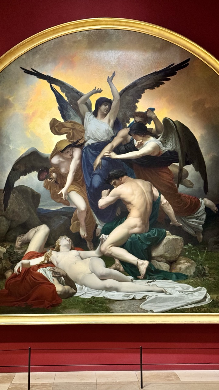

1. Overall Rating (0–10) — 8.0
This photograph captures the dramatic intensity of a grand historical painting, where mythological figures collide in a storm of emotion and movement. The composition of the artwork itself is masterfully dynamic, with swirling drapery and outstretched wings creating a sense of divine chaos. While the museum setting—redundant barriers and neutral lighting—slightly dilutes the painting’s sublime power, the image succeeds in conveying the artwork’s emotional weight and technical brilliance.
2. Composition (0–10) — 7.5
The painting’s diagonal energy is well-framed, with the arched canvas drawing the eye into the central struggle. The museum’s red wall provides a rich contrast, though the foreground railing slightly disrupts the visual flow.
3. Lighting (0–10) — 6.5
Even, ambient gallery lighting illuminates the painting clearly but lacks the dramatic contrast seen in the original artwork. The diffuse light softens the chiaroscuro, muting the sense of divine revelation.
4. Color & Tone (0–10) — 8.0
The painting’s rich, warm palette—gold-tinged skies, deep reds, and luminous flesh tones—is vividly preserved. The tonal range captures the drama of the scene, with strong contrasts between light and shadow enhancing the sense of movement.
5. Creativity (0–10) — 7.0
The photograph is a straightforward documentation, but it effectively highlights the painting’s narrative depth and classical grandeur. The framing allows the viewer to appreciate both the artwork and its architectural context.
6. Technical Quality (0–10) — 8.5
Sharp focus and high resolution preserve fine details in the brushwork and textures. The camera captures the painting’s complexity without distortion.
7. Emotional Impact (0–10) — 8.0
The painting’s themes of struggle, redemption, and divine intervention resonate powerfully. The viewer is drawn into the emotional turbulence, even through the lens of a photograph.
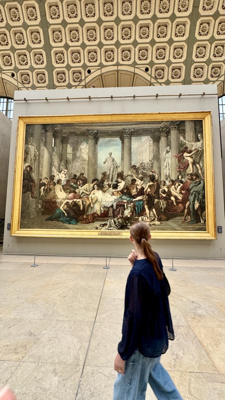

1. Overall Rating (0–10) — 7.0
This photograph captures a quiet moment of contemplation within a grand museum space, where the scale of history looms over the individual viewer. The juxtaposition of the modern visitor against the monumental 19th-century painting creates a layered narrative of time, culture, and personal reflection. While the image succeeds in conveying a sense of place and atmosphere, its emotional resonance is slightly muted by a lack of compositional dynamism and a somewhat flat lighting approach.
2. Composition (0–10) — 6.5
The subject is placed off-center, creating a sense of movement and narrative progression as she walks toward the painting. The large artwork dominates the background, while the ceiling’s ornate pattern adds visual rhythm and depth. However, the framing feels slightly unbalanced, with too much empty space on the left and a partial hand in the foreground that distracts from the central focus.
3. Lighting (0–10) — 6.0
The lighting is even and diffuse, typical of museum interiors, which ensures the painting is clearly visible but lacks dramatic contrast. The ambient light is functional rather than expressive, softening the scene’s emotional edge and flattening the depth of the space.
4. Color & Tone (0–10) — 6.5
The palette is muted and earthy, dominated by the gold of the frame, the beige of the marble floor, and the dark navy of the visitor’s clothing. The tonal harmony works well with the classical subject matter, but the overall desaturation gives the image a subdued, almost documentary quality.
5. Creativity (0–10) — 7.0
The image is conceptually strong, using the visitor as a point of entry into the world of the painting, creating a dialogue between past and present. The choice to capture the scene in motion—rather than a static pose—adds a layer of authenticity and spontaneity that elevates it beyond a simple tourist snapshot.
6. Technical Quality (0–10) — 7.5
The image is sharp and well-focused, with clean detail in both the painting and the surrounding architecture. The camera’s perspective is steady, and the exposure is balanced, though slight motion blur in the subject suggests a slightly slow shutter speed.
7. Emotional Impact (0–10) — 6.5
There is a quiet reverence in the scene, evoked by the visitor’s contemplative posture and the weight of the historical artwork. While the emotional pull is not overwhelming, it is genuine—inviting the viewer to reflect on the continuity of human experience across time.
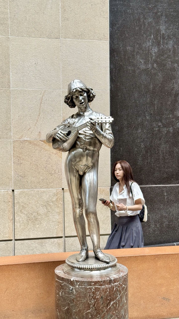

1. Overall Rating (0–10) — 6.0
This photograph captures a quiet, almost theatrical juxtaposition between a gleaming silver statue and a contemplative woman passing by, evoking a sense of urban stillness. The reflective surface of the sculpture draws the eye, while the woman’s neutral expression adds a layer of introspection, suggesting a fleeting moment of connection between art and observer. However, the composition feels slightly passive, with the subjects not fully engaging the frame’s potential, and the lighting flattens the scene’s emotional depth.
2. Composition (0–10) — 6.0
The statue is well-centered, creating a focal point, but the woman’s placement on the right edge creates imbalance. The vertical lines of the wall and the statue’s form provide structure, yet the lack of leading lines or dynamic tension keeps the image from feeling cohesive.
3. Lighting (0–10) — 5.5
The lighting is even and diffused, likely from an indoor source, which minimizes shadows and enhances the reflective quality of the statue. However, this flat illumination lacks direction or drama, muting the visual impact of the metallic surface.
4. Color & Tone (0–10) — 5.5
The palette is restrained, dominated by cool grays and muted beige tones, which harmonize with the metallic sheen of the statue. While the color scheme is cohesive, it lacks vibrancy, contributing to the image’s subdued, almost documentary feel.
5. Creativity (0–10) — 6.5
The conceptual pairing of the classical statue with a modern observer offers a subtle narrative about time, memory, and public space. The choice to capture this candid moment adds an element of narrative depth, though it remains understated and observational.
6. Technical Quality (0–10) — 7.5
The image is sharp and clear, with precise focus on the statue and sufficient detail in the textures of the marble base and surrounding walls. The exposure is well-managed, avoiding harsh highlights or deep shadows.
7. Emotional Impact (0–10) — 5.0
The image conveys a quiet, contemplative mood, but the emotional resonance is limited by the passive interaction between the subjects. The viewer is invited to observe rather than feel, resulting in a sense of detachment.
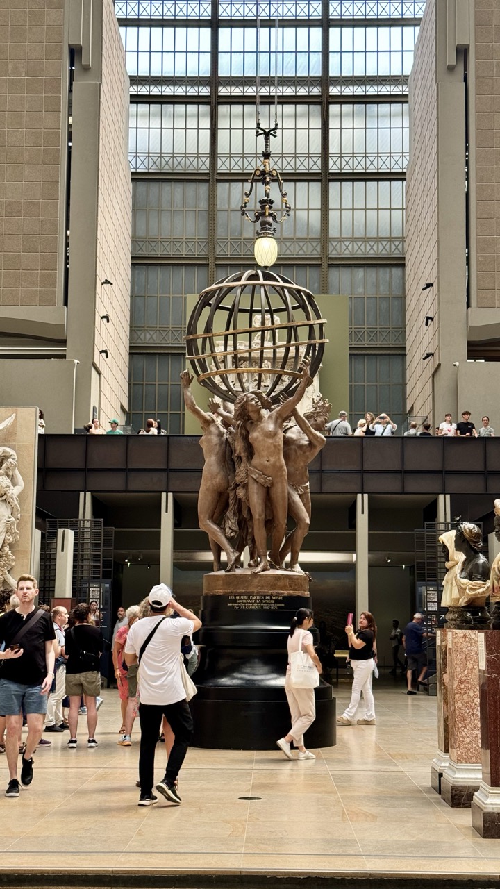

1. Overall Rating (0–10) — 6.8
This photograph captures the grandeur of a museum atrium, where the interplay of architecture, sculpture, and human presence evokes a sense of cultural reverence. The central bronze sculpture, *The Four Continents*, commands attention with its dramatic pose, while the expansive glass ceiling and surrounding visitors lend the scene a lively, almost ceremonial atmosphere. Though the composition is strong in its narrative of public engagement with art, the image’s realism—while documentarian—lacks the subtle visual refinement that would elevate it beyond a simple snapshot.
2. Composition (0–10) — 7.0
The sculpture is well-centered, drawing the eye upward through the verticality of the frame. The inclusion of visitors in the foreground and on the mezzanine adds depth and scale, though the left side feels slightly crowded, slightly disrupting balance.
3. Lighting (0–10) — 6.5
Natural light from the glass ceiling bathes the space in soft, even illumination, highlighting the sculpture’s form without harsh shadows. The overhead chandelier adds a warm focal point, though its glow is slightly overexposed.
4. Color & Tone (0–10) — 6.0
The palette is restrained—dominated by earthy browns, neutral grays, and muted tones—which reflects the museum’s classical atmosphere. While cohesive, the lack of vibrant contrast limits the image’s visual energy.
5. Creativity (0–10) — 6.5
The image succeeds in capturing a moment of cultural immersion, blending art, architecture, and everyday life. Its strength lies in its narrative richness, though it does not push creative boundaries in terms of perspective or editing.
6. Technical Quality (0–10) — 7.5
Sharp focus across the scene ensures clarity, particularly in the sculpture’s details. The exposure is well-managed, though the background glass panes show slight overexposure due to backlighting.
7. Emotional Impact (0–10) — 6.5
The photograph conveys a quiet awe, inviting the viewer to consider the enduring power of art in public life. The presence of people engaging with the space adds warmth and relatability, making the experience feel both intimate and monumental.
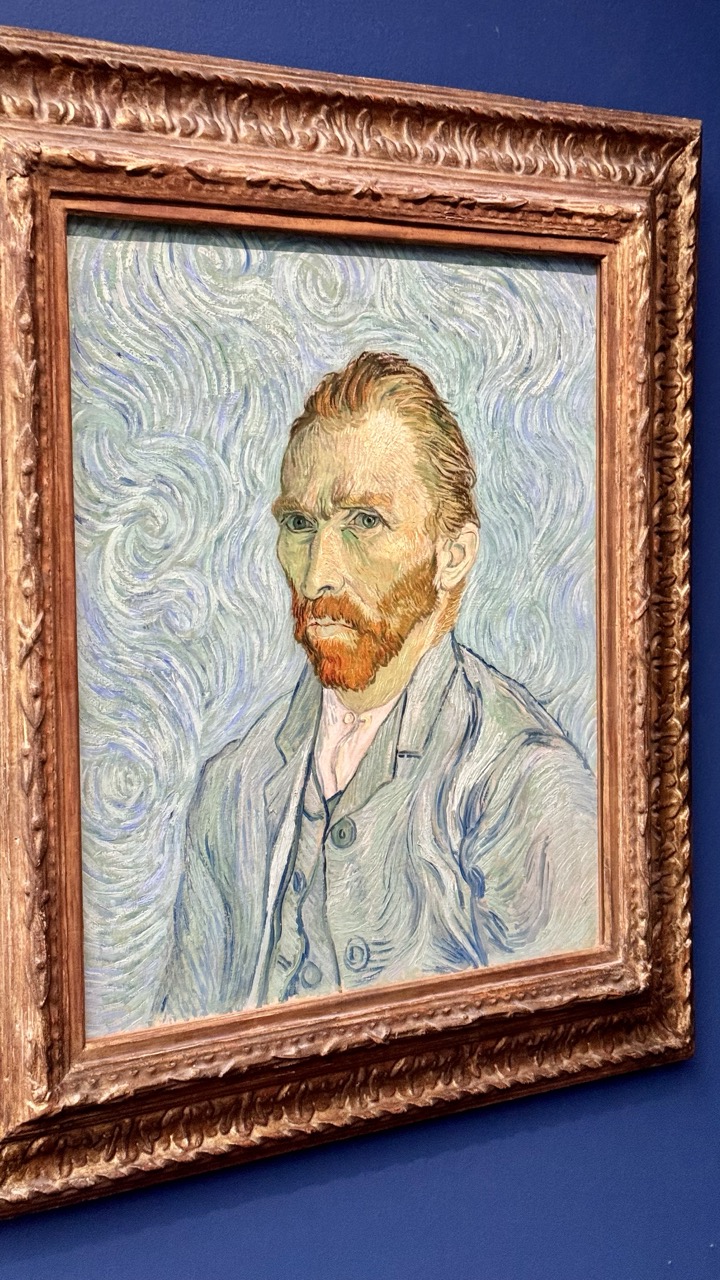

1. Overall Rating (0–10) — 8.0
This photograph captures the iconic self-portrait of Vincent van Gogh with striking clarity and reverence, framing the painting as both a masterpiece and a cultural artifact. The rich, swirling brushwork of the painting contrasts beautifully with the deep blue wall and ornate gold frame, creating a visually harmonious and contemplative presentation. While the image is technically sound and emotionally resonant, its straightforward documentation slightly limits its artistic impact, making it more of a respectful record than a bold reinterpretation.
2. Composition (0–10) — 8.0
The painting is centered within the frame, with the ornate gold frame adding a sense of grandeur and balance. The slight angle of the photograph adds depth and prevents the image from feeling flat, while the deep blue background isolates the subject and emphasizes the painting’s prominence.
3. Lighting (0–10) — 8.5
Soft, even lighting illuminates the painting without glare or harsh shadows, preserving the delicate textures and colors of Van Gogh’s brushstrokes. The light enhances the luminosity of the canvas while maintaining a calm, gallery-like atmosphere.
4. Color & Tone (0–10) — 8.0
The cool blue background creates a strong contrast with the warm golden frame and the earthy tones of the painting, allowing the subject to stand out. The palette is rich and cohesive, with the swirling blues and greens of the background complementing the reds and yellows of Van Gogh’s beard and skin.
5. Creativity (0–10) — 7.0
While the photograph is technically excellent and respects the original artwork, its approach is conventional—more a faithful documentation than a creative reinterpretation. The choice to frame the image with the painting’s surroundings adds context but does not push the visual narrative beyond the expected.
6. Technical Quality (0–10) — 9.0
The image is sharp, well-focused, and free of distortion or noise. The depth of field is appropriate, capturing both the painting and the frame with clarity, and the lighting ensures accurate color rendition.
7. Emotional Impact (0–10) — 8.5
There is a quiet reverence in the image that mirrors the introspective nature of Van Gogh’s self-portrait. The viewer is invited to reflect on the artist’s inner turmoil and genius, evoking a sense of awe and connection to a timeless work of art.
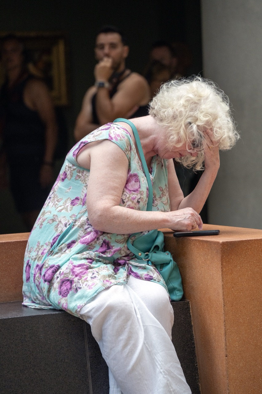

1. Overall Rating (0–10) — 7.0
This photograph captures a quiet moment of emotional weight, where a woman’s posture conveys a sense of fatigue or distress as she leans over her phone. The candid nature of the scene, combined with the blurred background of gallery visitors, creates a poignant contrast between public space and private emotion. While the image is compelling in its narrative, the lighting and framing hold it back from true artistic resonance.
2. Composition (0–10) — 6.5
The subject is well-framed, with her slumped form drawing immediate attention, though the background figures, though out of focus, slightly clutter the space. The diagonal line of the bench adds visual interest, but the composition feels slightly unbalanced due to the asymmetrical placement of the subject.
3. Lighting (0–10) — 6.0
Soft, ambient lighting highlights the subject’s features and clothing without harsh shadows, yet it lacks dramatic contrast. The overall flatness of the light contributes to the subdued mood but diminishes depth.
4. Color & Tone (0–10) — 6.5
The floral pattern of the dress introduces a gentle contrast of turquoise and purple against the neutral background, adding visual texture. The muted tones overall support the somber mood, though the colors remain somewhat subdued and not fully saturated.
5. Creativity (0–10) — 7.0
The image succeeds in capturing a raw, unposed moment that suggests a story beyond the frame. The juxtaposition of personal emotion against a public setting adds narrative depth and a sense of social observation.
6. Technical Quality (0–10) — 7.5
The focus is sharp on the woman, with the background appropriately blurred to emphasize the subject. The image is clear and well-exposed, with no visible noise or technical flaws.
7. Emotional Impact (0–10) — 7.5
The body language of the woman—head bowed, hand to face—evokes a strong sense of weariness or sorrow. The viewer is drawn into a private moment, creating a quiet but powerful emotional connection.
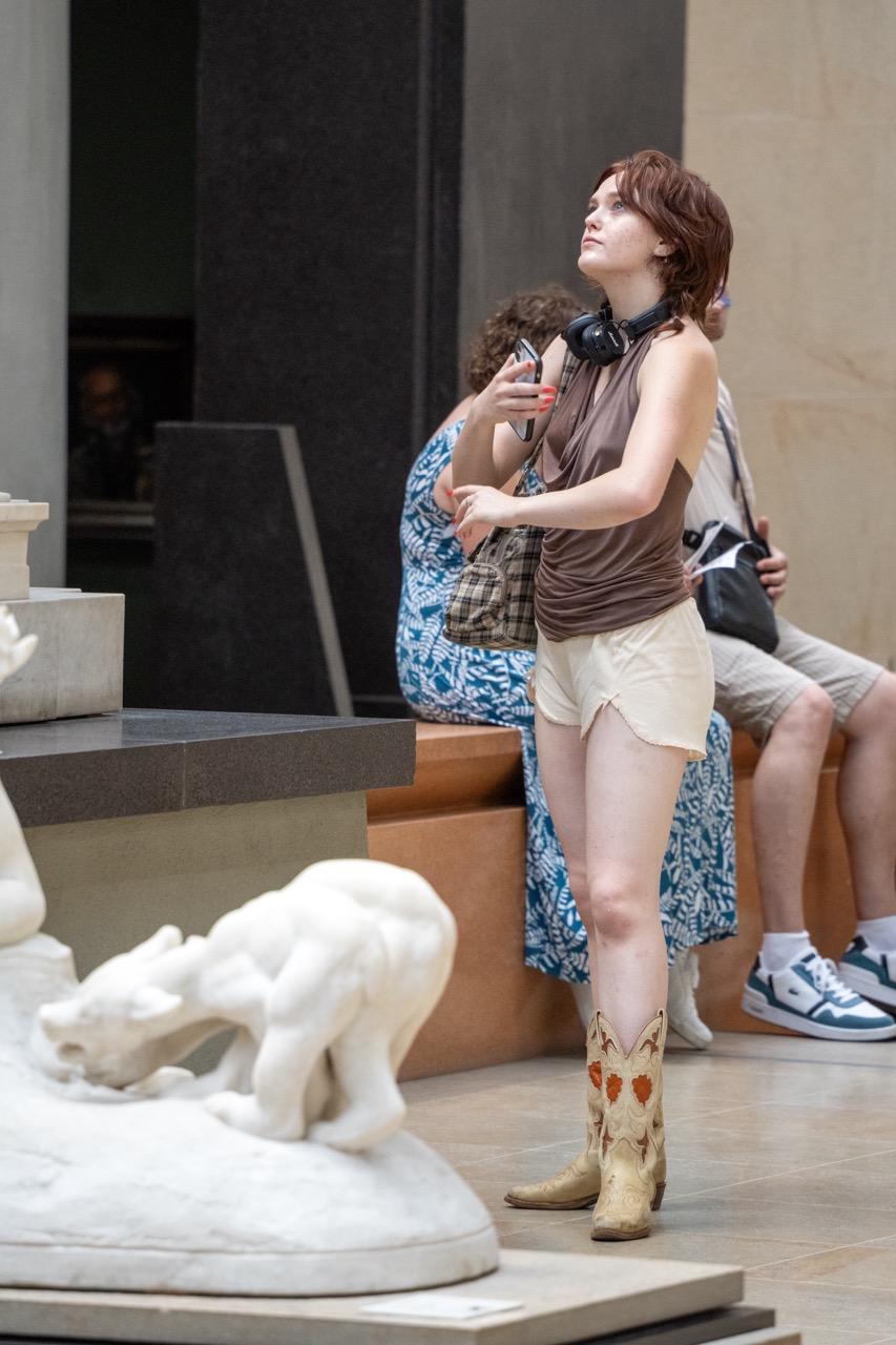

1. Overall Rating (0–10) — 6.8
This photograph captures a candid moment in a museum gallery, where the subject’s upward gaze and poised stance suggest quiet contemplation amid cultural surroundings. The juxtaposition of the woman’s casual, eclectic style—particularly the cowboy boots—against the refined marble sculpture and architectural backdrop creates a subtle tension between the everyday and the timeless. While the image feels authentic and well-composed, it lacks a stronger narrative thread or emotional intensity to elevate it beyond a pleasant snapshot.
2. Composition (0–10) — 6.5
The subject is well-placed off-center, drawing the eye upward and creating a dynamic diagonal with her gaze. The foreground sculpture adds depth and context, though its partial framing slightly distracts from the main subject. The background figures provide environmental context without overwhelming the composition.
3. Lighting (0–10) — 6.0
Even, ambient museum lighting illuminates the scene clearly but without dramatic contrast or mood. The light is functional and naturalistic, enhancing the documentary quality of the image but limiting its atmospheric potential.
4. Color & Tone (0–10) — 6.5
The palette is subdued, dominated by neutral beiges, browns, and the cool white of the sculpture. The warm tones of the boots offer a subtle point of visual interest, while the blue patterned dress adds a touch of vibrancy. The overall tonal range is balanced, though not particularly rich or evocative.
5. Creativity (0–10) — 6.0
The image is observational and grounded in realism, capturing a quiet moment of cultural engagement. While the contrast between modern attire and classical art hints at a deeper theme, the execution remains relatively straightforward, lacking a strong conceptual twist.
6. Technical Quality (0–10) — 7.5
Sharp focus on the subject, clean detail in the sculpture and textures, and a well-managed depth of field contribute to a technically proficient image. The exposure is balanced, with no noticeable flaws in clarity or noise.
7. Emotional Impact (0–10) — 6.0
The photograph evokes a sense of quiet introspection and curiosity, inviting the viewer to wonder about the subject’s thoughts as she engages with the art. However, the emotional resonance is restrained, held back by the image’s candid, unmediated nature.
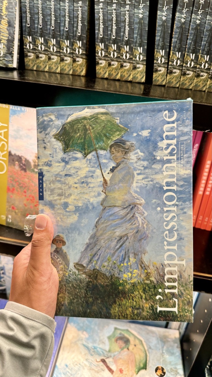

1. Overall Rating (0–10) — 6.0
This photograph captures a quiet, intimate moment of discovery in a bookstore, where the viewer’s gaze is drawn to a book about Impressionism held gently in hand. The juxtaposition of the iconic Monet-style cover against the mundane backdrop of shelves filled with other titles creates a subtle narrative of cultural curiosity. While the image is visually grounded and conceptually layered, it lacks the emotional resonance and compositional polish to feel truly compelling—its strength lies in its relatable context rather than its artistic execution.
2. Composition (0–10) — 6.0
The book is centered and well-framed, drawing attention to the cover’s impressionistic artwork. However, the cluttered background and slight angle of the hand introduce visual noise, disrupting the balance.
3. Lighting (0–10) — 5.5
Even, ambient lighting illuminates the scene clearly, but it lacks directionality and mood. The flat illumination flattens depth and reduces the vibrancy of the book’s cover.
4. Color & Tone (0–10) — 6.5
The palette is rich with the soft blues and greens of the book’s cover, which contrast subtly with the warm reds and yellows of surrounding spines. However, the overall color balance feels slightly muted, dampening the visual impact.
5. Creativity (0–10) — 7.0
The image plays with layers of art and observation—presenting a book about Impressionism held in a real-world setting, creating a meta-narrative about art, memory, and the act of reading. It’s conceptually thoughtful, though not overtly original.
6. Technical Quality (0–10) — 7.5
The focus is sharp on the book cover, with clear text and visible brushstrokes in the artwork. The hand and background are slightly less defined, but this adds to the candid, documentary feel.
7. Emotional Impact (0–10) — 5.0
The photograph evokes a quiet sense of intellectual curiosity and nostalgia, but it remains emotionally distant. The viewer is an observer, not an emotional participant.


1. Overall Rating (0–10) — 7.0
This photograph captures a moment of indulgence in a lively restaurant setting, where the carefully plated dessert becomes the focal point amid the ambient energy of diners. The composition balances the intimate focus on the dessert with the subtle suggestion of a bustling environment, creating a narrative of shared experience. While the lighting and depth of field work well to highlight the subject, the image’s strength lies in its candid warmth rather than technical polish.
2. Composition (0–10) — 7.5
The dessert is centered and sharply framed, drawing immediate attention, while the background activity adds context without overwhelming. The beer glass in the mid-ground creates a diagonal line that guides the eye toward the subject, enhancing depth and narrative flow.
3. Lighting (0–10) — 6.5
The ambient lighting is soft and warm, creating a welcoming atmosphere that complements the cozy restaurant setting. While adequate for the scene, the light lacks directional definition, resulting in a slightly flat appearance in the background.
4. Color & Tone (0–10) — 7.0
The contrast between the rich red sauce, golden beer, and creamy white dessert creates a vibrant and appetizing palette. The warm tones enhance the inviting mood, though the background colors are muted, preventing them from competing with the foreground.
5. Creativity (0–10) — 7.5
The clever use of the chocolate cutout to form a silhouette adds a touch of whimsy and branding, elevating the dessert from mere food to a story. The juxtaposition of the intimate dessert shot with the bustling background creates a compelling narrative.
6. Technical Quality (0–10) — 7.0
The focus on the dessert is sharp, and the image is free of motion blur or noise. However, the background is slightly out of focus, which is intentional but could be refined for greater clarity in the mid-ground.
7. Emotional Impact (0–10) — 7.5
The image evokes a sense of comfort and celebration—of a special dessert, a shared meal, and the joy of being in a lively space. The viewer is invited into a personal moment that feels both intimate and connected to the larger world around it.
Loading map...