The Tower of London has a 1,000-year history as a royal palace, prison, armory, and zoo. It's where notorious prisoners like Anne Boleyn and Lady Jane Grey met their end in gruesome executions. The Tower also boasts a ravens population that's kept at all times to prevent the kingdom's downfall according to legend. Visitors can explore the White Tower, Crown Jewels display, and learn from Yeoman Warders about its dark history and captivating stories.
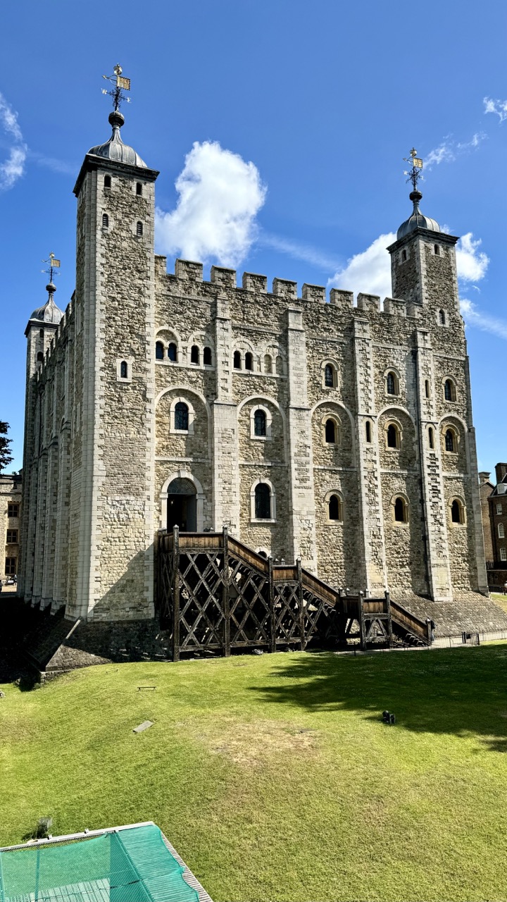

1. Overall Rating (0–10) — 8.0
This photograph captures the imposing grandeur of the Tower of London under a vibrant blue sky, where historical weight meets the clarity of a bright day. The strong contrast between the ancient stone and the crisp clouds gives the image a sense of timelessness, while the expansive green lawn adds a touch of serenity. The composition feels slightly off-center, but the commanding architecture holds the viewer’s attention with quiet authority.
2. Composition (0–10) — 7.5
The low-angle perspective emphasizes the tower’s verticality and scale, though the placement of the wooden drawbridge and foreground elements slightly disrupts the symmetry. A more centered framing would enhance balance, but the diagonal lines of the bridge guide the eye naturally toward the structure.
3. Lighting (0–10) — 9.0
The bright, direct sunlight enhances the texture of the stonework and casts deep, defined shadows that give the building dimension. The clear blue sky and soft white clouds provide a dramatic backdrop, creating a luminous and dynamic atmosphere.
4. Color & Tone (0–10) — 8.5
The palette is rich yet harmonious—warm stone tones contrast beautifully with the cool blue sky and lush green grass. The natural saturation feels authentic, and the tonal range is well-balanced, with no areas of overexposure or crushed shadows.
5. Creativity (0–10) — 7.0
The image is a strong architectural portrait rather than a conceptual or narrative statement. While it captures the Tower’s iconic presence effectively, it relies more on the subject’s inherent drama than on inventive visual storytelling.
6. Technical Quality (0–10) — 9.0
Sharp focus, excellent clarity, and precise exposure make this a technically strong image. The fine detail in the stonework and the crispness of the clouds demonstrate high-resolution capture and thoughtful composition.
7. Emotional Impact (0–10) — 8.0
The photograph evokes a sense of awe and historical contemplation, inviting the viewer to imagine centuries of stories within the walls. The combination of grandeur and sunlight creates a mood that is both majestic and peaceful.
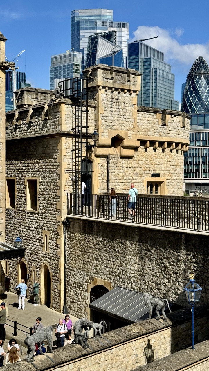

1. Overall Rating (0–10) — 7.5
This photograph masterfully juxtaposes centuries of London’s history, contrasting the ancient stone of the Tower of London with the sleek glass towers of the modern financial district. The inclusion of the iconic monkey sculptures adds a whimsical, narrative layer, grounding the image in cultural context. While the composition is rich with detail, the visual weight of the modern skyline slightly overshadows the historic foreground, creating a tension between past and present that could be more balanced.
2. Composition (0–10) — 7.0
The framing effectively layers the old and new, with the Tower’s battlements leading the eye upward to the skyscrapers. The monkeys and visitors provide scale and life, though the placement of the modern buildings on the right edge creates a slight imbalance.
3. Lighting (0–10) — 8.5
Bright, natural sunlight enhances texture and depth, casting crisp shadows that define the stonework and highlight the reflective surfaces of the glass towers. The high contrast between light and shadow adds drama without losing detail.
4. Color & Tone (0–10) — 7.5
The warm beige of the stone contrasts beautifully with the cool blues and grays of the modern skyline, creating a dynamic palette. The vibrant blue sky adds depth and energy, though the overall tone leans slightly toward neutrality due to the dominance of neutral architectural colors.
5. Creativity (0–10) — 8.0
The image captures a unique dialogue between history and modernity, enhanced by the playful presence of the monkey sculptures. The composition is both conceptually and visually engaging, offering a layered commentary on urban evolution.
6. Technical Quality (0–10) — 8.0
Sharp focus and clear detail across the frame, with no noticeable noise or distortion. The exposure is well-managed, preserving both highlights and shadows.
7. Emotional Impact (0–10) — 7.0
The image evokes a sense of awe at the endurance of history amid relentless change. It invites reflection on time, identity, and progress, creating a quiet but powerful emotional resonance.
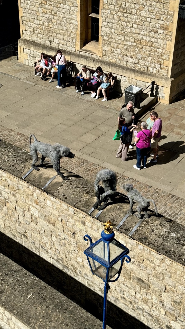

1. Overall Rating (0–10) — 7.0
This photograph captures a lively, sun-drenched moment at the Tower of London, where historical architecture meets contemporary art and human interaction. The high-angle perspective offers a dynamic view of the iconic monkey sculptures and visitors, creating a layered narrative of tradition, tourism, and public engagement. While the scene feels slightly crowded and the lighting creates harsh shadows, the image succeeds in conveying the energy and cultural richness of the location.
2. Composition (0–10) — 7.5
The elevated viewpoint creates a strong sense of depth, with the stone wall and sculptures forming a natural diagonal leading the eye toward the group of people below. The blue lamppost in the foreground adds a pop of color and anchors the lower frame, while the arrangement of figures and sculptures creates a balanced, almost choreographed composition.
3. Lighting (0–10) — 7.0
Bright, direct sunlight enhances the textures of the stone and wire-mesh sculptures, casting sharp shadows that emphasize form and depth. The contrast between light and shadow adds drama and dimension, though the intense overhead light flattens some details in the mid-ground.
4. Color & Tone (0–10) — 6.5
The palette is dominated by warm, earthy tones of the stonework and the muted colors of the visitors’ clothing, creating a natural and grounded atmosphere. The blue lamppost provides a vibrant accent, but the overall tonal range is somewhat limited, with few highlights or deep shadows to create visual contrast.
5. Creativity (0–10) — 7.0
The juxtaposition of the whimsical, handcrafted monkey sculptures against the historic setting and the casual presence of tourists offers a unique and playful commentary on tradition and modernity. The framing captures a candid moment that feels both spontaneous and thoughtfully composed.
6. Technical Quality (0–10) — 7.5
The image is sharp and clear, with good focus on the sculptures and the foreground elements. The high resolution captures fine textures, and the exposure is well-managed despite the challenging lighting conditions.
7. Emotional Impact (0–10) — 6.0
The photograph evokes a sense of curiosity and delight, inviting viewers to imagine the stories behind the sculptures and the visitors’ experiences. While it captures a lively scene, the emotional resonance is somewhat restrained by the impersonal nature of the high-angle shot and the lack of direct human connection.
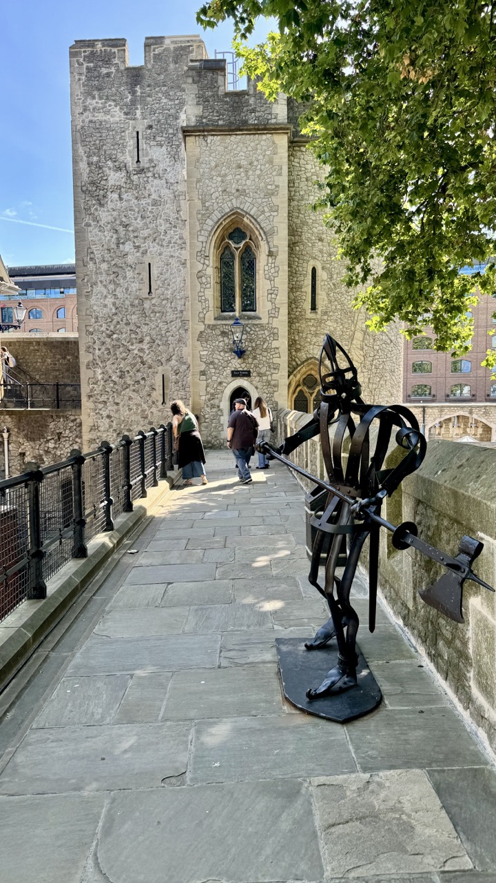

1. Overall Rating (0–10) — 7.0
This photograph captures a striking juxtaposition of medieval architecture and modern sculpture, set against the backdrop of a sunlit historic walkway. The interplay between the ancient stone tower and the dynamic, angular metal figure creates a compelling narrative of time and transformation. While the composition is strong and the scene rich in detail, the presence of tourists slightly disrupts the sense of historical gravitas, and the framing could better emphasize the sculpture’s narrative role.
2. Composition (0–10) — 7.5
The diagonal path leads the eye toward the tower, creating a natural sense of depth, while the sculpture in the foreground provides a dramatic counterpoint. The framing includes both the historical and the contemporary, though the right side feels slightly crowded by the overhanging tree.
3. Lighting (0–10) — 8.0
Bright, natural sunlight enhances the textures of the stone and metal, casting sharp shadows that add dimension. The contrast between light and shade accentuates the architectural details and gives the scene a crisp, vivid clarity.
4. Color & Tone (0–10) — 7.0
The palette is grounded in earthy tones—gray stone, dark metal, and green foliage—creating a cohesive, natural look. The blue sky provides a subtle pop of color, enhancing the sense of openness and daytime energy.
5. Creativity (0–10) — 7.5
The image successfully blends history and modern art, inviting interpretation. The placement of the sculpture as a sentinel-like figure adds a layer of storytelling, suggesting a guardian of the past or a bridge between eras.
6. Technical Quality (0–10) — 8.0
The image is sharp and well-exposed, with clear focus on both the foreground sculpture and the background architecture. The dynamic range is well-managed, preserving detail in both highlights and shadows.
7. Emotional Impact (0–10) — 7.0
The scene evokes a sense of timelessness and continuity, blending the weight of history with contemporary expression. The viewer is drawn into a moment of quiet reflection, though the presence of tourists tempers the image’s solemnity.
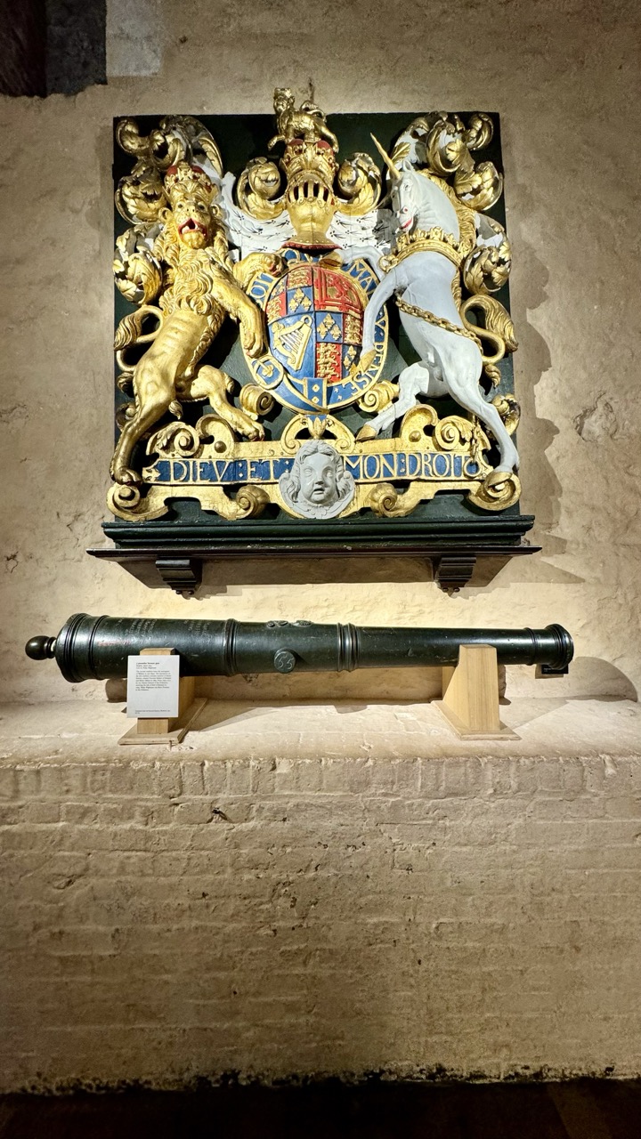

1. Overall Rating (0–10) — 7.0
This photograph captures a richly detailed heraldic shield and a historic cannon in a way that evokes the weight of history and institutional power. The ornate crest, with its gilded lion and unicorn, commands attention, while the cannon below grounds the scene in tangible military legacy. The lighting, though somewhat flat, highlights the textures of the stone wall and the craftsmanship of the objects, though the image’s narrative depth is slightly diminished by a lack of atmospheric contrast.
2. Composition (0–10) — 6.5
The central placement of the coat of arms creates a strong focal point, balanced by the horizontal line of the cannon below. However, the lower third of the frame is dominated by empty wall space, which dilutes visual tension and draws focus away from the objects. A tighter crop would enhance compositional cohesion.
3. Lighting (0–10) — 6.0
The lighting is functional and even, illuminating the details of the crest and cannon without harsh shadows. However, the lack of directional light or dramatic contrast limits the sense of depth and atmosphere, resulting in a somewhat clinical presentation of historically charged objects.
4. Color & Tone (0–10) — 7.0
The warm, earthy tones of the stone wall provide a muted backdrop that allows the gold and blue of the crest to stand out. The dark green of the cannon adds a grounding contrast. While the palette is harmonious, it lacks vibrancy, which slightly diminishes the visual impact of the ornate details.
5. Creativity (0–10) — 7.5
The juxtaposition of the heraldic symbol and the cannon suggests a narrative of power, defense, and legacy. The image is conceptually strong, capturing a moment where art and warfare converge. The choice to frame both objects within a single shot enhances the historical context, offering a layered story without needing external explanation.
6. Technical Quality (0–10) — 7.5
The image is sharp and well-focused, with clear detail visible in the carvings of the crest and the texture of the cannon’s metal. The exposure is balanced, and there is minimal noise, indicating a well-executed capture in a low-light environment.
7. Emotional Impact (0–10) — 6.5
The photograph conveys a sense of reverence and historical weight, inviting the viewer to contemplate the institutions and events represented. While the emotional resonance is present, the lack of dynamic lighting and the wide framing keep the experience somewhat detached, preventing a deeper emotional connection.
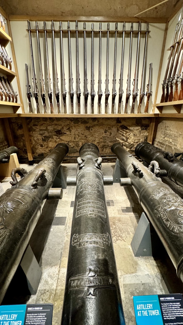

1. Overall Rating (0–10) — 7.0
This photograph captures the imposing presence of historic artillery within a museum setting, where the weight of history is palpable in the weathered metal and stone surroundings. The arrangement of cannons and muskets creates a sense of organized grandeur, though the low-angle perspective slightly overwhelms the viewer with scale. While the image successfully conveys the gravity of the collection, its composition and lighting hold back a more compelling narrative, leaving room for greater emotional resonance.
2. Composition (0–10) — 7.0
The low-angle perspective emphasizes the cannons’ dominance and scale, while the symmetry of the muskets on the wall provides visual balance. The arrangement guides the eye toward the center, but the foreground cannons slightly disrupt the flow, creating a busy entry point.
3. Lighting (0–10) — 6.0
The lighting is functional and even, illuminating the cannons and inscriptions clearly. However, the artificial overhead light lacks depth, producing flat highlights and minimal shadows, which slightly diminishes the texture and dimensionality of the metal.
4. Color & Tone (0–10) — 6.5
The palette is subdued, dominated by dark metallic grays and earthy stone tones, which enhances the historical mood. The blue informational signs provide a subtle pop of color without disrupting the overall somber tone.
5. Creativity (0–10) — 6.0
The image is more documentary than artistic, relying on the inherent drama of the subject matter. The low angle and framing are intentional, but the lack of stylistic experimentation limits its originality.
6. Technical Quality (0–10) — 7.5
The image is sharp and clear, with good detail in the engravings on the cannons and the textures of the stone walls. Focus is consistent across the frame, and there are no visible technical flaws.
7. Emotional Impact (0–10) — 6.5
The photograph evokes a sense of reverence and historical weight, drawing the viewer into the quiet dignity of a preserved arsenal. However, the lack of dramatic lighting and personal connection tempers its emotional reach.
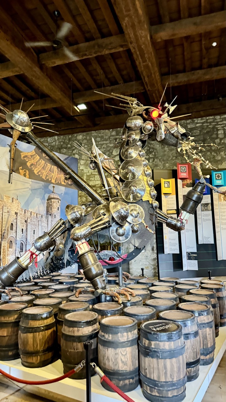

1. Overall Rating (0–10) — 7.0
This photograph captures a striking and imaginative sculpture of a mechanical dragon, constructed from reclaimed armor and weaponry, standing proudly atop a sea of wooden barrels. The interplay between medieval craftsmanship and industrial reclamation evokes a sense of fantastical history, while the surrounding museum setting grounds the piece in cultural narrative. Though the composition is strong and the subject compelling, the slightly cluttered background and overhead fan distract from the sculpture’s full dramatic impact.
2. Composition (0–10) — 7.0
The sculpture is well-centered and dominates the frame, drawing the eye upward through its towering form. The surrounding barrels create a rhythmic base, while the stone wall and banners in the background provide context without overwhelming the subject. The low-angle perspective enhances the dragon’s imposing presence.
3. Lighting (0–10) — 6.5
The lighting is functional and evenly distributed, typical of an indoor exhibition space. While sufficient to reveal detail, it lacks dramatic contrast or directional flair, resulting in a somewhat flat and neutral atmosphere that diminishes the sculpture’s dynamic energy.
4. Color & Tone (0–10) — 7.0
The palette is rich in earthy browns from the barrels and stone, contrasted by the metallic silver and gold of the armor, with subtle pops of red from the dragon’s eye and banner. The tone is cohesive and evocative of a historical yet fantastical theme, though the overall warmth is slightly muted by the artificial lighting.
5. Creativity (0–10) — 8.5
The sculpture itself is a brilliant fusion of art, history, and engineering, transforming discarded armor into a mythical creature. The concept is original and deeply symbolic, blending storytelling with craftsmanship in a way that feels both whimsical and thoughtfully curated.
6. Technical Quality (0–10) — 7.5
The image is sharp and clear, with well-defined textures on the metal and wood. Focus is consistent across the sculpture and foreground, and the camera’s wide-angle perspective captures the full scale of the installation without significant distortion.
7. Emotional Impact (0–10) — 7.5
The piece evokes a sense of wonder and reverence for both the past and human ingenuity. The juxtaposition of ancient armor with modern artistry creates a powerful emotional resonance, inviting viewers to reflect on transformation, legacy, and imagination.
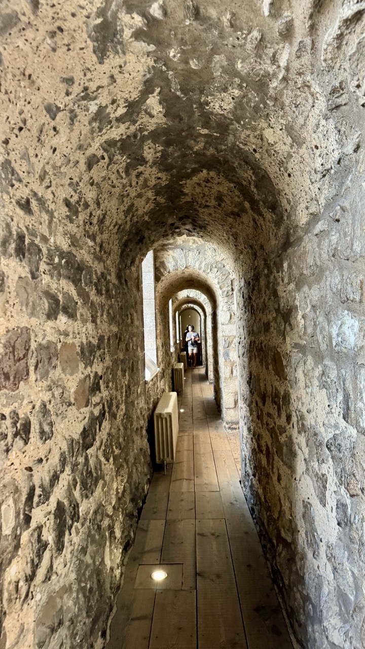

1. Overall Rating (0–10) — 7.0
This photograph captures the timeless gravity of a medieval stone corridor, where ancient architecture meets modern visitors. The rhythmic repetition of arches draws the eye deep into the space, creating a sense of quiet exploration. While the composition is strong and the textures rich, the presence of modern elements like the radiator and floor lights slightly disrupts the historical ambiance, grounding the scene in the present with a subtle jarring effect.
2. Composition (0–10) — 8.0
The strong leading lines of the arches create a powerful sense of depth and perspective, guiding the viewer’s gaze toward the figure at the far end. The central alignment of the hallway and the balanced placement of the person enhance the image’s symmetry and visual harmony.
3. Lighting (0–10) — 6.5
The lighting is functional but uneven—natural light from the side windows illuminates the corridor, while recessed floor lights provide artificial glow. The combination creates a mix of shadows and highlights that emphasize texture but also introduce some visual clutter, slightly diminishing the atmosphere.
4. Color & Tone (0–10) — 6.0
The palette is largely monochromatic, dominated by earthy tones of gray, beige, and brown. The warm wood of the floor provides a subtle contrast, but the overall tone feels muted and slightly flat, lacking the richness that could elevate the image’s mood.
5. Creativity (0–10) — 7.0
The image successfully blends historical context with human presence, creating a narrative of time and continuity. The use of perspective and repetition is both deliberate and effective, offering a contemplative take on space and memory.
6. Technical Quality (0–10) — 7.5
The image is sharp and well-focused, with clear detail in the stone textures and wooden floor. The exposure is generally balanced, though slight overexposure in the windows and underexposure in the shadows suggest room for refinement.
7. Emotional Impact (0–10) — 6.5
The photograph evokes a sense of quiet awe and introspection, inviting the viewer to imagine the stories embedded in the ancient walls. While the emotional resonance is strong, the modern intrusions prevent it from fully transporting the viewer to another era.
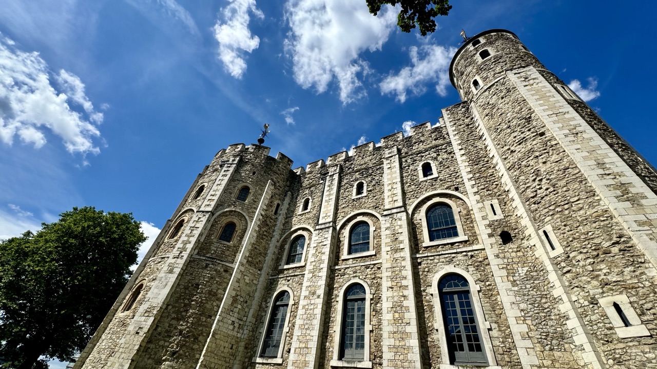

1. Overall Rating (0–10) — 8.0
This photograph captures the imposing grandeur of the Tower of London with striking clarity and dramatic perspective, evoking a sense of historical weight and architectural resilience. The low-angle view enhances the monumentality of the stone structure, while the vibrant blue sky and scattered clouds provide a dynamic backdrop that contrasts beautifully with the aged masonry. A subtle presence of green foliage in the frame softens the composition and adds depth, though the image could benefit from a slightly more refined balance between the architectural and natural elements.
2. Composition (0–10) — 8.5
The low-angle perspective emphasizes the verticality and scale of the tower, drawing the viewer’s eye upward along the stonework. The placement of the cylindrical tower on the right and the crenellated walls on the left create a strong diagonal flow, while the tree in the lower-left corner provides a natural counterpoint to the rigid geometry. The framing feels intentional, though the overhang of the tree in the top right slightly distracts from the sky’s clarity.
3. Lighting (0–10) — 9.0
The bright, natural sunlight illuminates the facade with clarity and depth, highlighting the texture of the stone and the contrast between light and shadow. The sun’s position enhances the three-dimensionality of the architecture, casting subtle shadows that accentuate the details of the windows and masonry. The clear blue sky, lit evenly, adds a sense of openness and timelessness.
4. Color & Tone (0–10) — 8.5
The rich blue of the sky provides a vivid contrast to the warm, earthy tones of the stone, creating a visually striking palette. The colors are well-saturated without appearing overprocessed, with the deep blue and soft grays forming a harmonious, historically evocative atmosphere. The slight warmth in the stone tones enhances the sense of age and permanence.
5. Creativity (0–10) — 8.0
The choice of a low-angle perspective and the inclusion of the sky as a dominant element elevate the image beyond a simple architectural document. The composition suggests a narrative of endurance and history, inviting the viewer to feel the weight of centuries. The inclusion of natural elements like the tree and clouds adds a poetic layer to the otherwise rigid structure.
6. Technical Quality (0–10) — 9.0
The image is sharp and well-focused, with excellent detail in the stonework and glass. The exposure is balanced, capturing both the bright sky and the darker recesses of the architecture without losing detail. The dynamic range is handled effectively, and the camera angle and lens choice contribute to a polished, professional appearance.
7. Emotional Impact (0–10) — 8.5
The photograph evokes a powerful sense of awe and reverence, capturing the majesty of a historic landmark at its most imposing. The interplay of light, scale, and time creates a contemplative mood, allowing the viewer to feel both the grandeur and the solemnity of the site. The image resonates emotionally by connecting the viewer to a tangible piece of history.


1. Overall Rating (0–10) — 7.0
This photograph captures a striking juxtaposition of medieval architecture and modern sculpture, set against the backdrop of a sunlit historic walkway. The interplay between the ancient stone tower and the dynamic, angular metal figure creates a compelling narrative of time and transformation. While the composition is strong and the scene rich in detail, the presence of tourists slightly disrupts the sense of historical gravitas, and the framing could better emphasize the sculpture’s narrative role.
2. Composition (0–10) — 7.5
The diagonal path leads the eye toward the tower, creating a natural sense of depth, while the sculpture in the foreground provides a dramatic counterpoint. The framing includes both the historical and the contemporary, though the right side feels slightly crowded by the overhanging tree.
3. Lighting (0–10) — 8.0
Bright, natural sunlight enhances the textures of the stone and metal, casting sharp shadows that add dimension. The contrast between light and shade accentuates the architectural details and gives the scene a crisp, vivid clarity.
4. Color & Tone (0–10) — 7.0
The palette is grounded in earthy tones—gray stone, dark metal, and green foliage—creating a cohesive, natural look. The blue sky provides a subtle pop of color, enhancing the sense of openness and daytime energy.
5. Creativity (0–10) — 7.5
The image successfully blends history and modern art, inviting interpretation. The placement of the sculpture as a sentinel-like figure adds a layer of storytelling, suggesting a guardian of the past or a bridge between eras.
6. Technical Quality (0–10) — 8.0
The image is sharp and well-exposed, with clear focus on both the foreground sculpture and the background architecture. The dynamic range is well-managed, preserving detail in both highlights and shadows.
7. Emotional Impact (0–10) — 7.0
The scene evokes a sense of timelessness and continuity, blending the weight of history with contemporary expression. The viewer is drawn into a moment of quiet reflection, though the presence of tourists tempers the image’s solemnity.
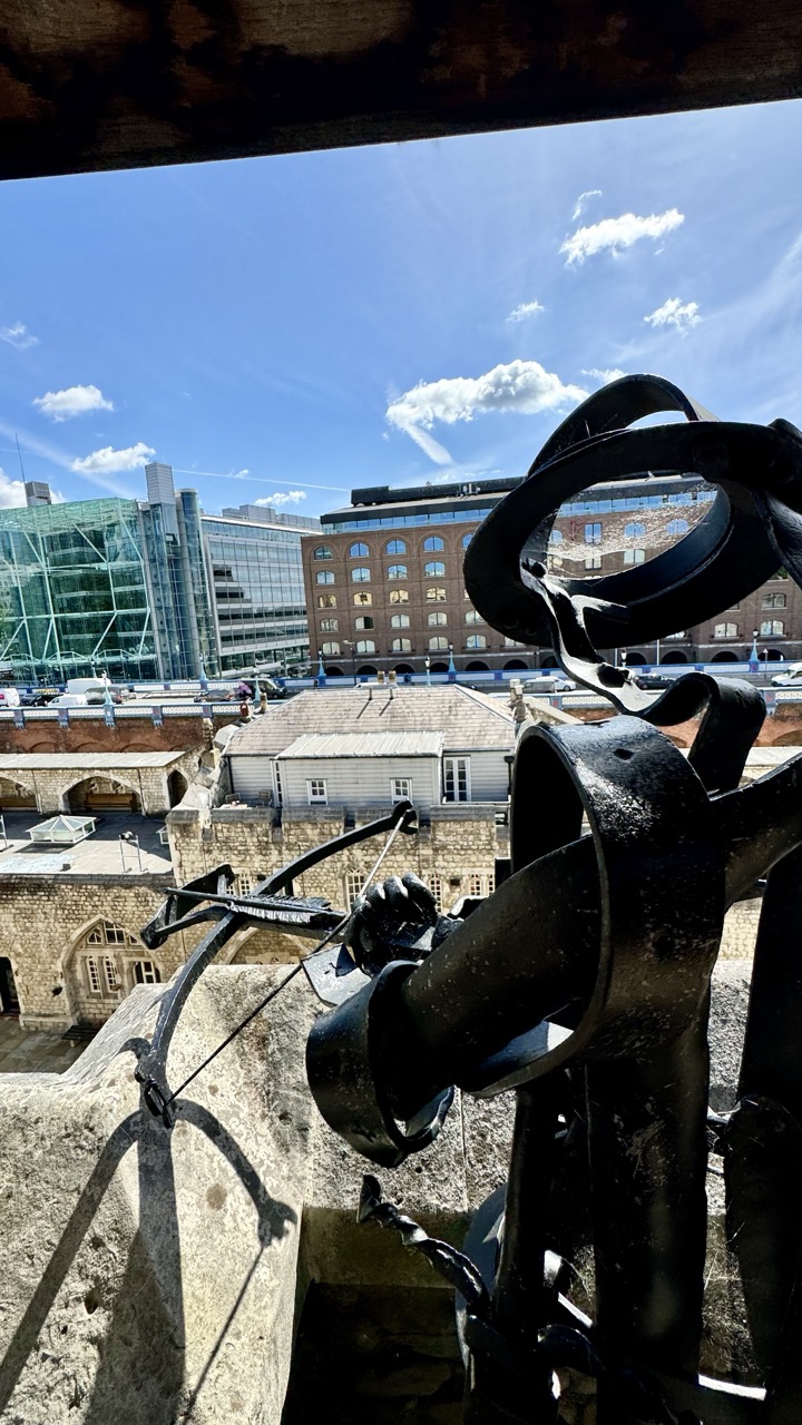

1. Overall Rating (0–10) — 7.0
This photograph masterfully juxtaposes the ancient and the modern, using a medieval siege engine as a framing device to reveal a vibrant cityscape beneath a bright blue sky. The contrast between the weathered stone, the dark iron mechanism, and the sleek glass buildings creates a compelling visual dialogue across time. While the image is rich in narrative potential, the framing feels slightly cluttered, and the foreground elements, though dramatic, risk overwhelming the viewer's focus on the broader urban vista.
2. Composition (0–10) — 6.5
The cross-shaped iron structure dominates the right and lower portions of the frame, creating a strong visual anchor but slightly obstructing the view. The diagonal lines of the siege engine lead the eye toward the distant buildings, though the left side feels underutilized, resulting in an asymmetrical balance that leans more toward documentary than artistic intent.
3. Lighting (0–10) — 8.0
Bright, natural sunlight enhances the textures of the stone and metal, casting deep, defined shadows that add depth and dimension. The clear blue sky and scattered clouds provide a vivid backdrop, amplifying the contrast between the historical foreground and the modern city.
4. Color & Tone (0–10) — 7.5
The palette is rich and balanced, with the warm tones of the brick buildings complementing the cool blues of the sky. The dark, weathered metal provides a strong contrast, while the muted grays of the stone lend a sense of time-worn authenticity. A slight overexposure in the sky’s highlights slightly reduces tonal range but does not detract significantly.
5. Creativity (0–10) — 8.0
The conceptual framing of a historical siege engine overlooking a modern city is striking and thought-provoking. It evokes themes of continuity, defense, and urban evolution, transforming a simple viewpoint into a layered commentary on history and progress.
6. Technical Quality (0–10) — 8.0
The image is sharp and well-focused, with clear detail in both the foreground and background. The exposure is well-handled overall, though the bright sky shows minor loss of detail in the highlights, likely due to high dynamic range.
7. Emotional Impact (0–10) — 7.0
The photograph evokes a sense of awe and contemplation, inviting the viewer to reflect on the passage of time and the resilience of urban life. The juxtaposition of old and new creates a quiet tension, making the image feel both grounded and expansive.
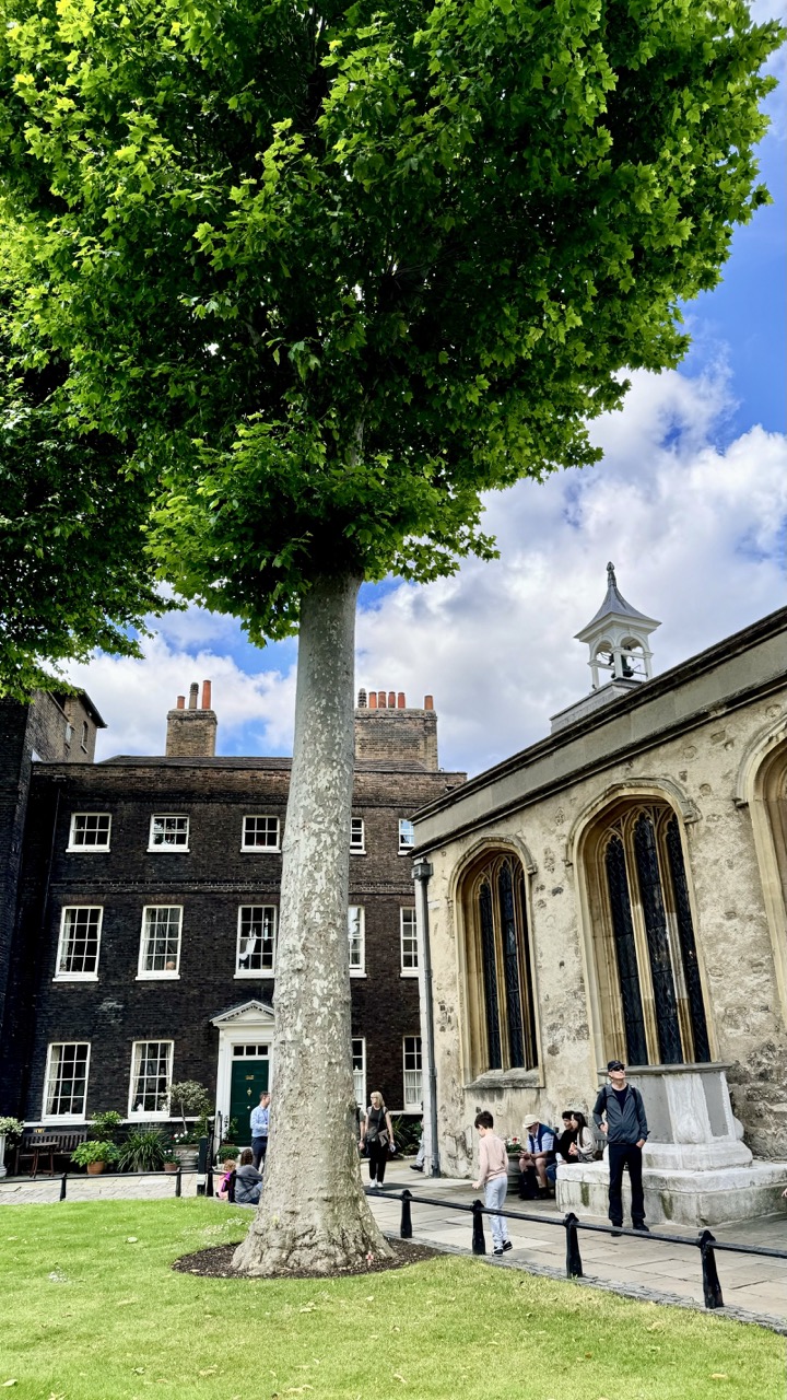

1. Overall Rating (0–10) — 7.0
This photograph captures a serene moment in a historic courtyard, where nature and architecture coexist in quiet harmony. The towering tree dominates the frame with its lush canopy, while the surrounding stone buildings and scattered visitors lend a sense of timelessness and lived-in charm. Though the composition is strong and the colors vibrant, the image feels slightly overexposed and lacks a focal point, preventing it from achieving deeper visual impact.
2. Composition (0–10) — 7.0
The tree serves as a powerful vertical anchor, drawing the eye upward and creating a natural balance with the horizontal lines of the buildings. The inclusion of people adds scale and narrative, though their placement is somewhat scattered, slightly disrupting the scene’s cohesion.
3. Lighting (0–10) — 6.5
Natural daylight illuminates the scene evenly, with soft shadows suggesting a bright but overcast sky. While the light is clear and bright, it lacks directional warmth, giving the image a flat, slightly washed-out quality that diminishes texture.
4. Color & Tone (0–10) — 7.5
The rich green of the tree contrasts beautifully with the deep blue sky and the earthy tones of the stone and brick. The color palette is natural and harmonious, with a subtle warmth in the sunlight enhancing the scene’s peaceful atmosphere.
5. Creativity (0–10) — 7.0
The image presents a compelling juxtaposition of nature and history, using the tree as a symbolic bridge between past and present. The low-angle perspective adds drama and scale, elevating a simple courtyard scene into something more contemplative.
6. Technical Quality (0–10) — 7.0
The image is sharp and well-focused, with clean detail in both the tree’s bark and the architectural features. However, the slight overexposure in the sky and highlights reduces dynamic range and detail.
7. Emotional Impact (0–10) — 7.5
There’s a quiet, reflective mood that invites the viewer to pause and appreciate the stillness of the moment. The presence of people adds a subtle human element, suggesting continuity and connection across time.


1. Overall Rating (0–10) — 6.0
This photograph captures a candid moment of tourists gathered around a historical marker, evoking the quiet curiosity of a public heritage site. The composition balances human activity with architectural and natural elements, but the scene feels slightly overexposed and lacks a compelling focal point. While the image succeeds in documenting a slice of daily life, it falls short of emotional resonance or visual cohesion.
2. Composition (0–10) — 5.5
The frame is crowded with people and objects, creating visual clutter. The large tree trunk and glass memorial disrupt the flow, while the diagonal lines of the railing and cobblestones offer some structure, though the central focus remains diffuse.
3. Lighting (0–10) — 6.5
Bright, natural daylight illuminates the scene evenly, but the harsh sun creates blown-out highlights on the glass and overexposed areas in the background. The light enhances the sense of a sunny day but reduces detail in the brighter zones.
4. Color & Tone (0–10) — 5.5
The color palette is dominated by neutral tones—brick, green foliage, and gray pavement—with pops of color from clothing. While the hues are natural, they lack vibrancy and contrast, giving the image a flat, documentary feel.
5. Creativity (0–10) — 5.0
The image is observational rather than interpretive, capturing a moment without a clear narrative or artistic vision. The juxtaposition of modern visitors with a historical setting hints at deeper themes, but the execution remains straightforward and unremarkable.
6. Technical Quality (0–10) — 7.0
The image is sharp and well-focused, with clean details in the brickwork and foliage. The exposure is mostly balanced, though some highlights are lost in the sunlit areas, and the glass surface reflects glare, reducing clarity.
7. Emotional Impact (0–10) — 5.0
The photograph conveys a sense of place and routine, but the emotional connection is weak. The crowd’s anonymity and the lack of a dominant subject prevent a strong viewer engagement, leaving the scene feeling more like a snapshot than a story.
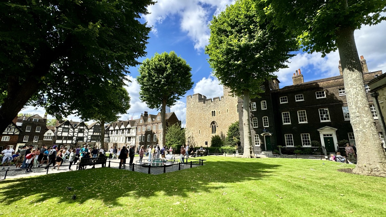

1. Overall Rating (0–10) — 7.0
This photograph captures a vibrant urban park framed by historic architecture, where the energy of daily life meets centuries of heritage. The lush green lawn and scattered crowds convey a sense of leisure and community, while the juxtaposition of Tudor-style buildings and the imposing stone tower adds narrative depth. Though the composition feels slightly unbalanced by the framing, the image succeeds in conveying the atmosphere of a living, breathing historic space—its strength lies in its authenticity and the interplay of light and shadow across the scene.
2. Composition (0–10) — 6.5
The image uses foreground trees to frame the scene, but the off-center placement of the castle and the uneven distribution of people create a slightly cluttered feel. A more balanced arrangement would enhance visual harmony.
3. Lighting (0–10) — 8.0
Bright, natural sunlight enhances the vividness of the green grass and the texture of the stone architecture. The shadows cast by the trees add depth and contrast, while the blue sky with scattered clouds contributes to a lively, open atmosphere.
4. Color & Tone (0–10) — 7.5
The palette is rich with contrasting greens, earthy browns, and the deep blue of the sky. The colors feel natural and vibrant, with a balanced warmth that enhances the summery mood.
5. Creativity (0–10) — 7.0
The photograph captures a compelling blend of history and modern life, using the juxtaposition of old and new to tell a story. While not radically original in concept, it effectively conveys a sense of place and time.
6. Technical Quality (0–10) — 8.0
The image is sharp and well-focused, with excellent clarity in both the foreground and background. The exposure is well-managed, preserving detail in highlights and shadows alike.
7. Emotional Impact (0–10) — 7.0
There’s a sense of calm and leisure that resonates with the viewer, evoking feelings of nostalgia and connection to place. The presence of people enjoying the space adds a layer of warmth and human engagement.
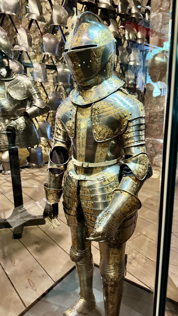

1. Overall Rating (0–10) — 7.0
This photograph captures the grandeur and meticulous craftsmanship of a historical suit of armor, its ornate gold inlays gleaming under museum lighting. The reflective glass and surrounding armor create a layered, almost theatrical depth, emphasizing the artifact’s status as both weapon and art. While the image succeeds in conveying the armor’s opulence and historical weight, the reflections and cluttered background slightly distract from the central figure’s commanding presence.
2. Composition (0–10) — 6.5
The armor is well-centered, drawing the eye naturally, but the reflections in the glass and the partially visible armorer in the background introduce visual noise. A tighter crop or better positioning could enhance focus and reduce distractions.
3. Lighting (0–10) — 7.0
The lighting is warm and directional, highlighting the metallic textures and golden embellishments effectively. It creates a sense of reverence, enhancing the armor’s intricate details while casting subtle shadows that add dimension.
4. Color & Tone (0–10) — 7.5
The dominant palette of silver and gold contrasts beautifully with the muted tones of the stone wall and wooden floor. The warm lighting deepens the metallic hues, creating a cohesive and rich tonal harmony that emphasizes the armor’s regal character.
5. Creativity (0–10) — 7.0
The image captures a compelling interplay between history and display, using the museum environment to frame the armor as a relic of power. The inclusion of reflections and surrounding pieces adds narrative depth, suggesting a broader collection and context.
6. Technical Quality (0–10) — 8.0
The image is sharp and clear, with fine detail visible in the armor’s engravings and joints. Focus is well-managed, and the exposure is balanced, preserving texture and light without overexposure.
7. Emotional Impact (0–10) — 7.5
The armor evokes a sense of awe and timelessness, inviting contemplation of the warriors who once wore it and the craftsmanship behind its creation. The museum setting adds a layer of solemnity, enhancing the emotional resonance of the piece.
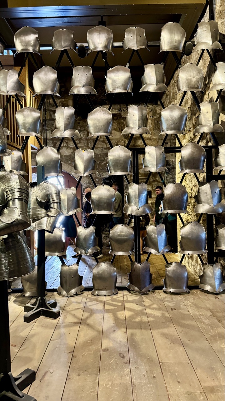

1. Overall Rating (0–10) — 7.0
This photograph captures the imposing grandeur of a medieval armor collection, where rows of gleaming helmets and breastplates create a rhythmic, almost architectural display. The interplay of metallic sheen and rustic stone walls evokes a sense of historical weight and craftsmanship. While the composition is strong and the subject inherently dramatic, the presence of visitors and the slightly cluttered foreground detract from the image’s overall cohesion and visual purity.
2. Composition (0–10) — 6.5
The symmetrical arrangement of armor creates a strong visual rhythm, but the inclusion of people and the partial view of the left-side suit disrupts the balance and draws attention away from the central display.
3. Lighting (0–10) — 6.0
The lighting is functional and even, highlighting the metallic surfaces without harsh glare. However, the overhead fixtures cast subtle shadows that reduce the sense of depth and diminish the reflective quality of the armor.
4. Color & Tone (0–10) — 6.5
The dominant silver and gray tones of the armor contrast effectively with the warm, earthy tones of the wooden floor and stone wall, creating a balanced palette. The overall tone is subdued, which suits the historical atmosphere but lacks vibrancy.
5. Creativity (0–10) — 7.0
The arrangement of armor on display is inherently compelling, and the photograph captures the essence of a museum or historic site. The perspective offers a sense of scale and immersion, but the composition leans toward documentation rather than artistic interpretation.
6. Technical Quality (0–10) — 7.5
The image is sharp and well-focused, with clean details visible on the armor surfaces. The exposure is accurate, and the depth of field is sufficient to keep the main subject clear.
7. Emotional Impact (0–10) — 6.0
The photograph evokes a quiet reverence for history and craftsmanship, but the presence of modern visitors and the lack of a singular focal point prevent a deeper emotional connection. The scene feels more like a snapshot than a narrative moment.
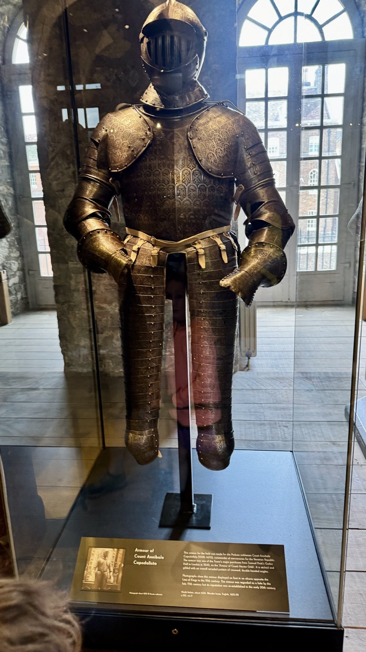

1. Overall Rating (0–10) — 7.0
This photograph captures the imposing presence of a historical suit of armor, standing as a silent testament to medieval craftsmanship and martial tradition. The interplay of light through the arched windows enhances the metallic texture and intricate details of the armor, while the museum setting grounds it in authenticity. Though the image is strong in atmosphere and detail, the foreground reflection and slight distraction from the viewer’s head slightly diminish its visual purity.
2. Composition (0–10) — 7.0
The armor is centered and dominates the frame, creating a strong focal point. The use of the glass case adds depth and context, though the reflection on the surface introduces minor compositional clutter.
3. Lighting (0–10) — 7.5
Natural light from the arched windows illuminates the armor from the side and back, creating dynamic highlights and shadows that emphasize its three-dimensional form. The soft, diffused quality of the light enhances the metallic texture without harsh glare.
4. Color & Tone (0–10) — 7.0
The palette is subdued, dominated by the warm, aged tones of the steel and the earthy browns of the stone and wood. The contrast between the dark armor and the bright window light adds visual interest, though the overall tone remains somewhat muted.
5. Creativity (0–10) — 6.5
The image functions as a respectful documentation of a museum artifact, with a clear intent to showcase the armor’s historical and aesthetic significance. While not overtly experimental, the framing and lighting choices reflect a thoughtful approach to capturing the object’s dignity.
6. Technical Quality (0–10) — 8.0
The image is sharp and clear, with excellent detail visible in the armor’s engravings and construction. The focus is precise, and the depth of field appropriately isolates the subject.
7. Emotional Impact (0–10) — 7.0
The armor evokes a sense of awe and reverence, inviting contemplation of the past and the lives of those who wore such gear. The quiet, contemplative mood of the space enhances the emotional resonance of the piece.


1. Overall Rating (0–10) — 7.5
This photograph captures the imposing presence of a full suit of medieval armor with a striking sense of historical gravity. The polished metal reflects light dramatically, emphasizing the craftsmanship and weight of the piece, while the stone wall backdrop enhances the medieval atmosphere. The image succeeds in conveying both the aesthetic and narrative power of the armor, though the composition feels slightly static and could benefit from more dynamic framing to fully engage the viewer.
2. Composition (0–10) — 6.5
The armor is centered and well-framed, creating a strong focal point, but the surrounding space feels underutilized. The partial view of the horse to the right introduces an awkward imbalance, and the inclusion of the wooden edge on the left slightly disrupts the visual flow.
3. Lighting (0–10) — 7.0
The lighting is directional, casting soft highlights along the armor’s contours and emphasizing its texture and form. The interplay of light and shadow enhances the three-dimensionality of the suit, though some areas, particularly the lower legs, are slightly underexposed.
4. Color & Tone (0–10) — 7.0
The palette is largely monochromatic, dominated by metallic silver and the warm brown of the wooden floor, with the cool gray of the stone providing contrast. The tonal range is rich and balanced, contributing to the image’s historical and solemn mood.
5. Creativity (0–10) — 7.0
The photograph effectively combines historical subject matter with a visually compelling presentation, using light and texture to elevate the armor from mere artifact to symbolic figure. The inclusion of the horse hints at narrative context, suggesting a larger story beyond the frame.
6. Technical Quality (0–10) — 8.0
Sharp focus and clean detail are evident throughout, especially in the reflective surfaces of the armor. The exposure is well-managed, with good clarity in both highlights and shadows.
7. Emotional Impact (0–10) — 7.5
The image evokes a sense of reverence and awe, inviting the viewer to contemplate the power, discipline, and vulnerability of the knight. The stillness of the pose and the somber setting create a contemplative mood that resonates with the historical weight of the subject.
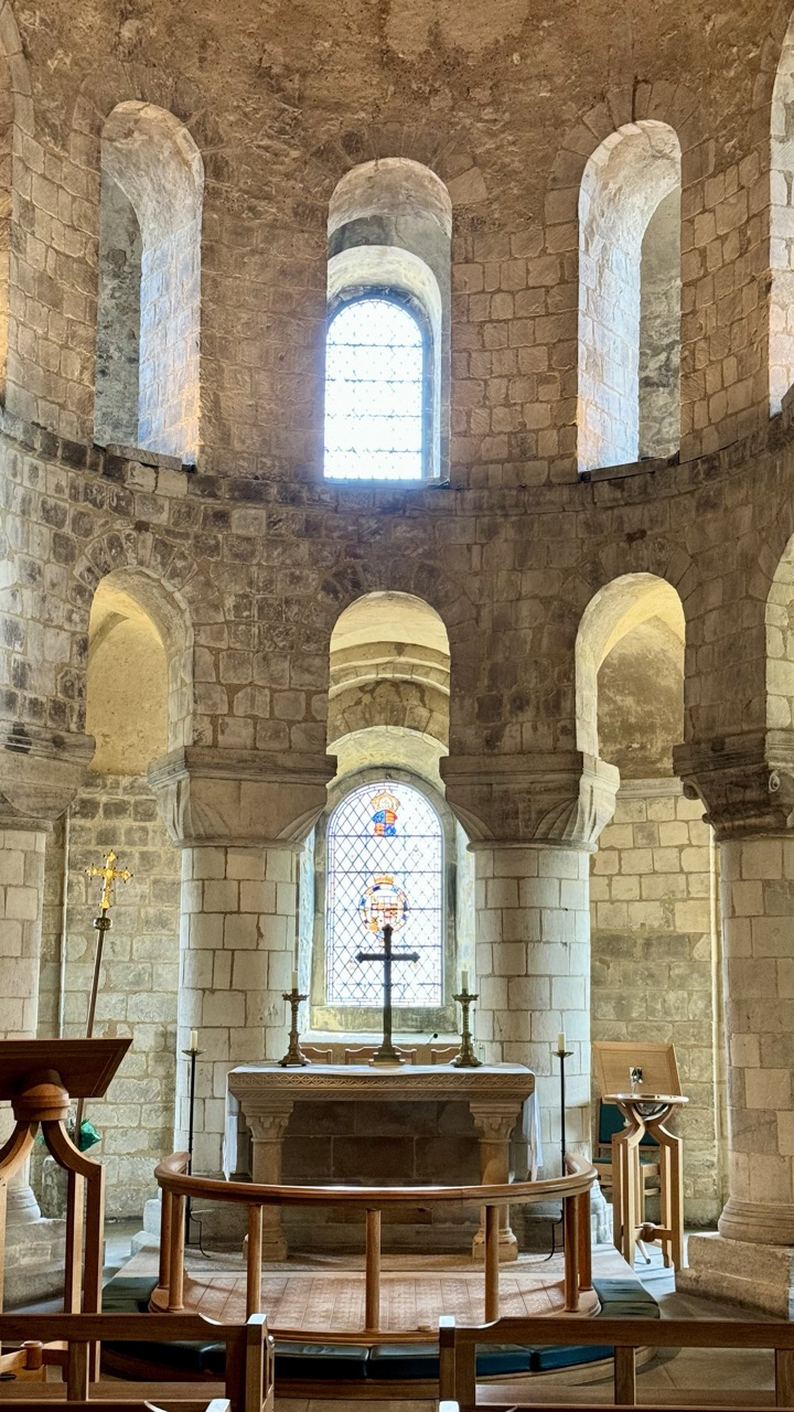

1. Overall Rating (0–10) — 8.0
This photograph captures the solemn grandeur of a Romanesque chapel, where ancient stone and soft light converge to evoke centuries of quiet devotion. The composition draws the eye upward through layered arches and toward the stained glass, creating a sense of spiritual ascent. While the scene is rich in architectural detail and mood, the lighting's neutrality slightly dampens the emotional resonance, keeping the image from achieving full transcendence.
2. Composition (0–10) — 8.5
The symmetrical arrangement of the arches and central altar creates a balanced, harmonious frame. The circular structure draws the viewer’s gaze toward the focal point—the altar and stained glass—enhancing the sense of sacred space. The foreground rail and pews anchor the image without disrupting the visual flow.
3. Lighting (0–10) — 7.0
Natural light filters through the upper and central windows, creating a soft, diffused glow that highlights the texture of the stone. The stained glass adds a subtle warmth and color, though the overall lighting remains flat, lacking strong directional contrast or dramatic chiaroscuro.
4. Color & Tone (0–10) — 7.5
The palette is dominated by the warm, earthy tones of the limestone, punctuated by the soft hues of the stained glass. The tonal range is moderate, with a balanced contrast between light and shadow that preserves architectural detail without overexposure.
5. Creativity (0–10) — 7.5
The image captures a timeless, contemplative atmosphere with a clear sense of place. The photographer’s choice to frame the scene from a slightly low angle enhances the verticality of the space, lending a sense of reverence. While the approach is traditional, it effectively conveys the spiritual weight of the environment.
6. Technical Quality (0–10) — 8.0
The image is sharp and well-focused, with fine detail visible in the stonework and wood elements. The exposure is well-managed, and there is no noticeable noise or distortion, reflecting strong technical execution.
7. Emotional Impact (0–10) — 8.0
The photograph evokes a deep sense of stillness and reverence, inviting the viewer to pause and reflect. The quiet dignity of the space, combined with the interplay of light and stone, creates a powerful emotional connection to history and faith.
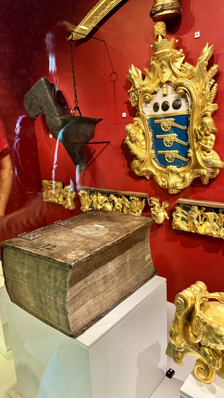

1. Overall Rating (0–10) — 7.0
This photograph captures the opulent and historically rich atmosphere of a museum exhibit, where the contrast between aged artifacts and gilded ornamentation creates a compelling visual narrative. The dramatic red backdrop amplifies the regal presence of the objects, while the reflective glass introduces a subtle layer of complexity through faint reflections of visitors. Though the composition is slightly cluttered, the image succeeds in conveying the weight of history and craftsmanship, inviting the viewer to contemplate the stories behind each piece.
2. Composition (0–10) — 6.5
The arrangement of objects is visually dense, with the large book in the foreground anchoring the frame and the crest and hanging artifact creating vertical and diagonal lines. However, the reflection of the photographer and surrounding elements in the glass disrupts the clarity and balance of the scene.
3. Lighting (0–10) — 7.0
The lighting is well-distributed, highlighting the textures and metallic sheen of the gold elements while casting a warm glow on the red wall. The illumination enhances the richness of the materials, though the reflections on the glass slightly interfere with the overall clarity.
4. Color & Tone (0–10) — 7.5
The dominant red background creates a bold, regal mood, complemented by the warm gold and the muted brown of the ancient book. The contrast between the vibrant backdrop and the subdued tones of the artifact adds visual depth and emotional resonance.
5. Creativity (0–10) — 7.0
The image captures a moment of historical storytelling, emphasizing the interplay between decay and grandeur. The inclusion of reflections adds a layer of contemporary presence, subtly connecting past and present.
6. Technical Quality (0–10) — 7.5
The photograph is sharp and well-focused, particularly on the book and crest. The depth of field is appropriate, though the reflections on the glass introduce minor technical distractions.
7. Emotional Impact (0–10) — 7.0
The image evokes a sense of reverence and awe, drawing the viewer into a world of historical significance. The combination of age, craftsmanship, and dramatic presentation creates a contemplative and immersive experience.
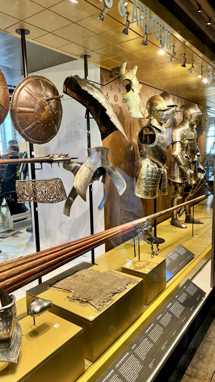

1. Overall Rating (0–10) — 7.0
This photograph captures the grandeur of a historical arms and armour exhibit, where intricate craftsmanship and martial history converge. The warm lighting and rich textures of metal and wood evoke a sense of timelessness, though the cluttered arrangement slightly undermines the visual harmony. The composition balances detail and narrative, offering a glimpse into a world of medieval warfare and artistry.
2. Composition (0–10) — 6.5
The framing includes a wide array of artifacts, creating a sense of abundance, but the overlapping objects and reflections in the glass introduce visual noise. The diagonal line of the spear in the foreground provides a strong leading line, guiding the eye through the display.
3. Lighting (0–10) — 7.5
The warm, directional spotlights enhance the metallic sheen of the armour and highlight the textures of the artifacts. The lighting creates depth and drama, though some reflections on the glass obscure parts of the display.
4. Color & Tone (0–10) — 7.0
The golden and bronze tones of the metal pieces are rich and harmonious, complemented by the warm yellow of the display case. The overall palette is cohesive, though slightly muted by the fluorescent ambient light in the background.
5. Creativity (0–10) — 7.0
The photograph successfully captures the narrative of a museum exhibit, blending historical significance with visual storytelling. The interplay of light, texture, and scale gives the image a dynamic, almost cinematic quality.
6. Technical Quality (0–10) — 8.0
The image is sharp and well-focused, with clear detail on the metal surfaces and inscriptions. The depth of field is appropriate, keeping the foreground elements crisp while softly blurring the background.
7. Emotional Impact (0–10) — 7.5
The image evokes a sense of awe and reverence for the craftsmanship of past eras, inviting the viewer to reflect on the history and ritual of warfare. The warmth of the lighting and the careful arrangement lend a dignified atmosphere to the scene.
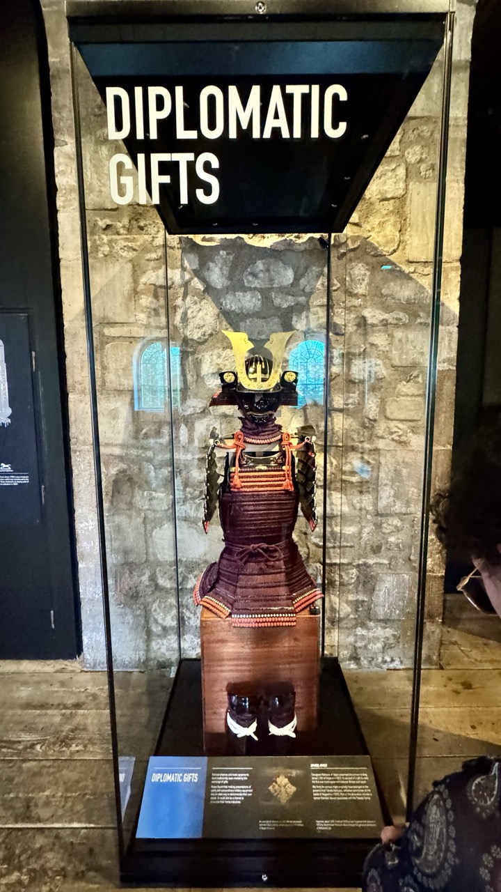

1. Overall Rating (0–10) — 6.0
This photograph captures a compelling museum display of a Japanese samurai armor within a historic stone-walled gallery, where the juxtaposition of tradition and architecture creates a layered narrative. The exhibit’s labeling and presentation are clear, but the image feels slightly cluttered by foreground elements and the flat lighting diminishes the visual drama. While the cultural significance of the piece is evident, the photograph itself lacks the polish and emotional resonance needed to fully convey its importance.
2. Composition (0–10) — 5.5
The central placement of the armor draws focus, but the inclusion of the person’s shoulder and the partial view of the display case edge disrupts the balance. A tighter crop would enhance visual clarity and emphasize the subject.
3. Lighting (0–10) — 5.0
The lighting is functional but flat, with strong reflections on the glass that obscure details. The ambient light from the stone wall adds texture, but the lack of directional or dramatic lighting limits depth and mood.
4. Color & Tone (0–10) — 5.5
The palette is dominated by muted browns and grays, punctuated by the gold of the helmet and the blue of the background stained glass. While the colors are harmonious, they lack vibrancy, resulting in a somewhat dull and unengaging tone.
5. Creativity (0–10) — 6.0
The image succeeds in documenting a historical artifact within its cultural context, but the approach is largely documentary rather than artistic. The contrast between the traditional armor and the medieval setting offers narrative potential that isn’t fully realized.
6. Technical Quality (0–10) — 7.0
The focus is sharp on the armor, and the details are well-captured. However, reflections on the glass and slight overexposure in the signage reduce overall clarity.
7. Emotional Impact (0–10) — 5.0
The photograph conveys a sense of reverence for the object, but the viewer remains distanced by the clinical presentation and lack of emotional lighting or framing. It informs more than it moves.
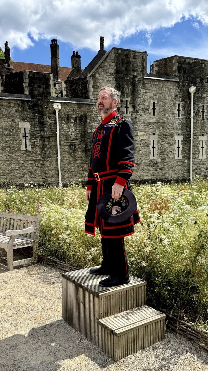

1. Overall Rating (0–10) — 7.0
This photograph captures a striking juxtaposition between tradition and nature, with a Yeoman Warder standing solemnly atop a wooden platform against the historic backdrop of the Tower of London. The contrast between the formal, ornate uniform and the wild, overgrown garden creates a compelling visual narrative of continuity and decay. While the image is strong in concept and composition, the slightly awkward framing and flat lighting keep it from achieving a more profound aesthetic impact.
2. Composition (0–10) — 7.5
The subject is well-placed off-center, creating a balanced diagonal that draws the eye from the bench on the left to the figure and up toward the sky. The verticality of the man and the stone wall contrasts with the soft, organic lines of the overgrown flowers, enhancing visual interest.
3. Lighting (0–10) — 7.0
Natural daylight provides even illumination, with soft shadows suggesting a slightly overcast sky. The lighting is clear and functional, though it lacks the dramatic contrast or golden hour warmth that could deepen the mood.
4. Color & Tone (0–10) — 7.5
The bold red of the uniform pops against the muted grays of the stone and the soft greens and whites of the wildflowers. The palette is rich and harmonious, with the red acting as a strong focal point and the cool tones of the sky and walls providing balance.
5. Creativity (0–10) — 8.0
The image is conceptually strong, using the juxtaposition of formal tradition and untamed nature to suggest themes of time, preservation, and change. The choice to photograph the Yeoman Warder in this setting—half in ceremony, half in a garden—feels deliberate and thoughtfully staged.
6. Technical Quality (0–10) — 8.0
The focus is sharp on the subject, with clear detail in the uniform and facial expression. The resolution and clarity are high, and the exposure is well-managed, capturing both highlights and shadows without significant loss of detail.
7. Emotional Impact (0–10) — 7.5
The image evokes a sense of reverence and quiet contemplation, inviting the viewer to reflect on the passage of time and the enduring presence of ceremonial life. The subject’s thoughtful expression and the serene setting create a moment that feels both grounded and poignant.
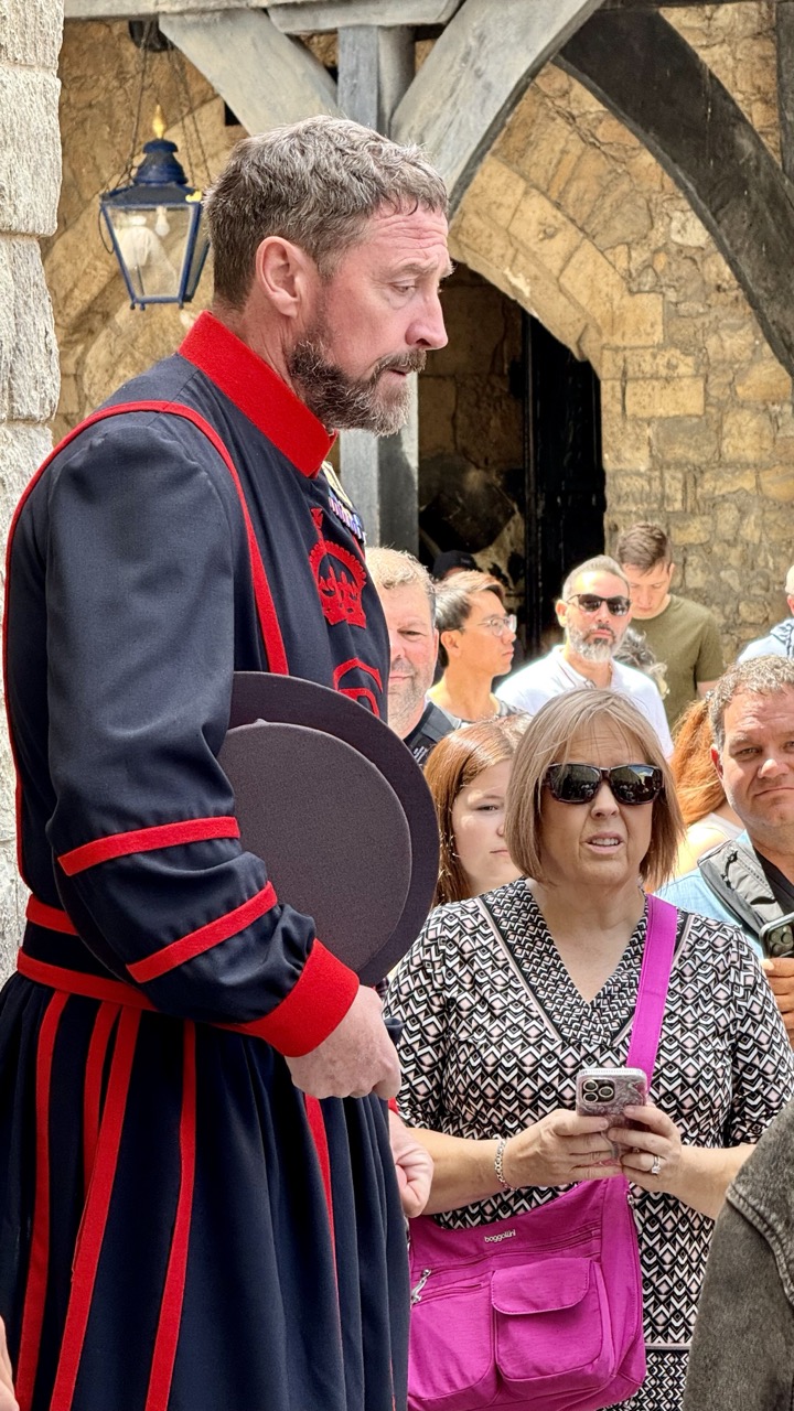

1. Overall Rating (0–10) — 6.8
This photograph captures a candid moment at a themed attraction, where the contrast between the costumed guide and the casually dressed游客 creates a subtle narrative of performance and reality. The guide’s focused expression and traditional attire stand out against the modern, relaxed crowd, grounding the scene in a specific cultural context. While the image effectively conveys a slice of everyday tourism, it lacks the compositional finesse to elevate it beyond a mere snapshot.
2. Composition (0–10) — 6.5
The subject is well-framed on the left, creating a sense of depth with the stone archway behind, but the cluttered background and overlapping figures disrupt visual clarity. A tighter crop would emphasize the guide and reduce distractions.
3. Lighting (0–10) — 7.0
Natural daylight provides even illumination, highlighting textures in the stone and fabric. The soft shadows enhance dimension without overpowering the scene.
4. Color & Tone (0–10) — 7.5
The bold red accents on the uniform pop against the neutral tones of the stone and clothing, drawing attention to the guide. The color palette feels balanced, with a slightly warm tone that enhances the outdoor setting.
5. Creativity (0–10) — 6.0
The image captures a real-world moment with narrative potential, but it leans toward documentation rather than artistic interpretation. The juxtaposition of costume and modern life is present, but underdeveloped.
6. Technical Quality (0–10) — 8.0
Sharp focus on the guide, clean detail in the fabric and facial features, and well-managed exposure contribute to strong technical execution.
7. Emotional Impact (0–10) — 6.5
There’s a quiet charm in the scene’s authenticity—the guide’s earnestness and the audience’s relaxed engagement evoke a sense of shared experience. While not emotionally charged, the image resonates with a subtle nostalgia for themed storytelling.
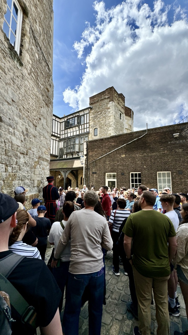

1. Overall Rating (0–10) — 7.0
This photograph captures the lively energy of a guided tour within a historic courtyard, where the weight of centuries meets the pulse of modern tourism. The composition draws the eye toward the central figure in ceremonial dress, anchoring the scene with a sense of narrative and tradition. While the image effectively conveys the atmosphere of a bustling heritage site, the slightly cluttered framing and overexposed sky reduce its visual elegance, leaving it more documentary than artistic.
2. Composition (0–10) — 6.5
The low-angle perspective emphasizes the towering stone walls and creates a sense of enclosure, but the crowded foreground and uneven distribution of people create visual noise. A tighter crop or more deliberate subject placement would enhance focus and balance.
3. Lighting (0–10) — 7.0
Bright, natural daylight illuminates the scene, casting soft shadows that accentuate the texture of the ancient stonework. The sky’s scattered clouds introduce dynamic contrast, though the overexposure in the upper portion slightly flattens the tonal range.
4. Color & Tone (0–10) — 6.5
The palette is grounded in earthy tones—beige stone, muted greens, and dark brick—punctuated by the red and black of the guide’s uniform, which serves as a strong focal point. While the colors are natural and harmonious, they lack vibrancy, giving the image a slightly washed-out quality.
5. Creativity (0–10) — 6.0
The photograph documents a moment of cultural interaction with authenticity, but its strength lies in observation rather than conceptual innovation. The contrast between historical architecture and contemporary visitors offers a subtle narrative, but it remains largely unexplored.
6. Technical Quality (0–10) — 7.5
The image is sharp and well-focused, with fine detail visible in the stonework and clothing. The exposure is generally balanced, though the sky’s brightness slightly compromises dynamic range.
7. Emotional Impact (0–10) — 6.5
The scene evokes a sense of shared experience and curiosity, capturing the quiet excitement of discovery. While it doesn’t stir deep emotion, it succeeds in conveying the atmosphere of a living history site—where past and present converge in a single moment.
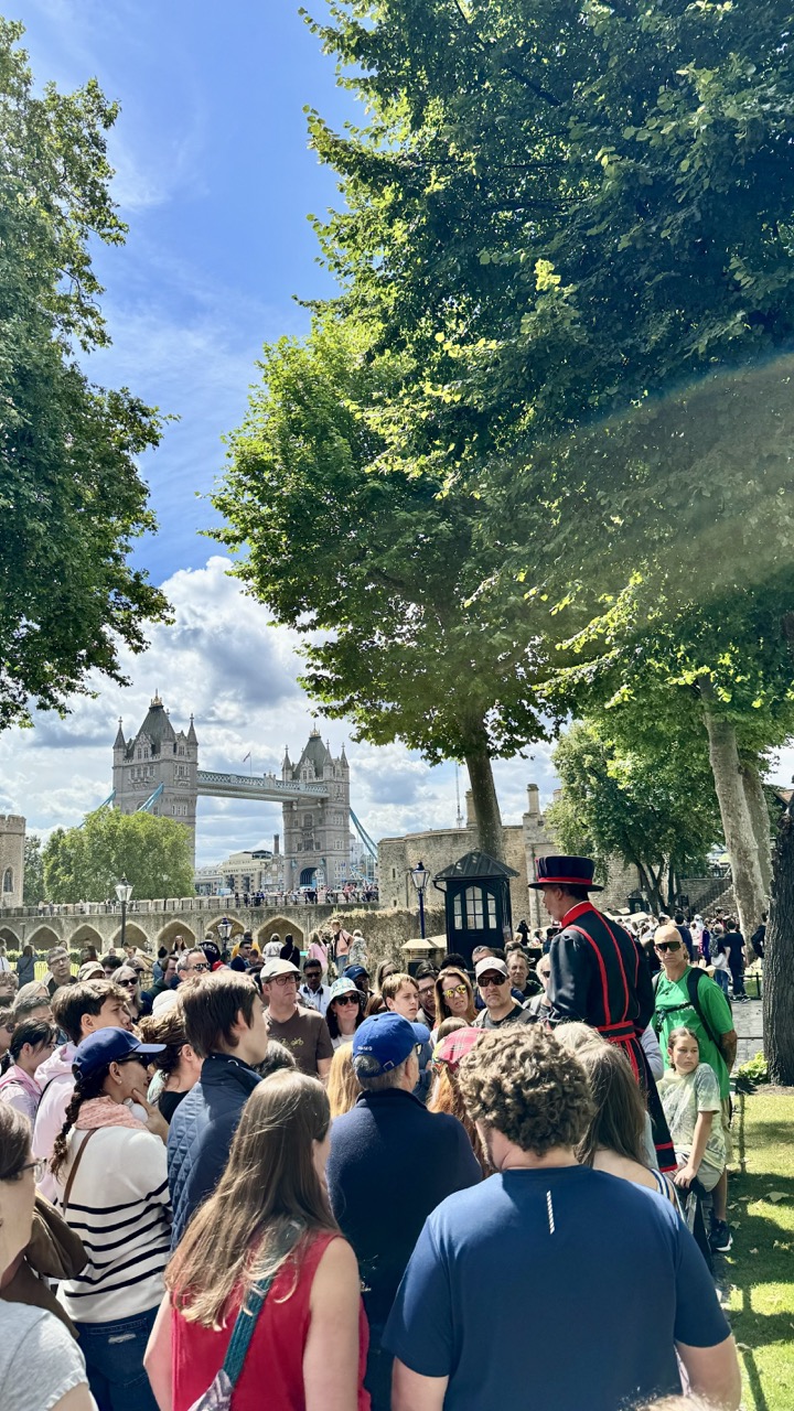

1. Overall Rating (0–10) — 7.0
This photograph captures a vibrant, sunlit moment at Tower Hill, where the energy of a bustling tourist crowd converges with the historic grandeur of Tower Bridge in the distance. The juxtaposition of modern visitors and timeless architecture creates a dynamic narrative of place and time, though the sheer number of people slightly dilutes the scene’s clarity. The bright daylight and natural framing by trees lend a lively, immersive quality that invites the viewer into the moment.
2. Composition (0–10) — 6.5
The image uses the trees as a natural frame, guiding the eye toward the distant bridge, but the crowded foreground creates visual noise. The subject placement is strong, with the Beefeater adding a cultural anchor, though the lack of clear focal point risks overwhelming the viewer.
3. Lighting (0–10) — 8.0
Bright, natural sunlight enhances the scene with vivid clarity and depth, casting soft shadows that define the forms of the crowd and foliage. The high contrast between the sunlit trees and the shaded areas adds dimension, while the clear blue sky contributes to the overall crispness.
4. Color & Tone (0–10) — 7.5
The palette is rich and balanced, with the deep greens of the trees, the warm tones of the stone bridge, and the cool blue sky creating a harmonious contrast. The saturation feels natural, with the sunlight enhancing the vibrancy without overexposing highlights.
5. Creativity (0–10) — 6.5
While the composition is grounded in a traditional travel photograph, the inclusion of the Beefeater adds a layer of cultural specificity. The image captures a recognizable moment of urban tourism, but the lack of a unique perspective limits its artistic originality.
6. Technical Quality (0–10) — 8.0
The image is sharp and well-focused, with clean detail in both the foreground and background. Exposure is well-managed, preserving texture in the foliage and architecture, and the camera’s angle maintains a balanced depth of field.
7. Emotional Impact (0–10) — 6.0
The photograph evokes a sense of place and shared experience, capturing the excitement and chaos of a popular tourist destination. While it conveys the energy of the moment, the crowded nature of the scene tempers the emotional intimacy, leaving the viewer as an observer rather than a participant.
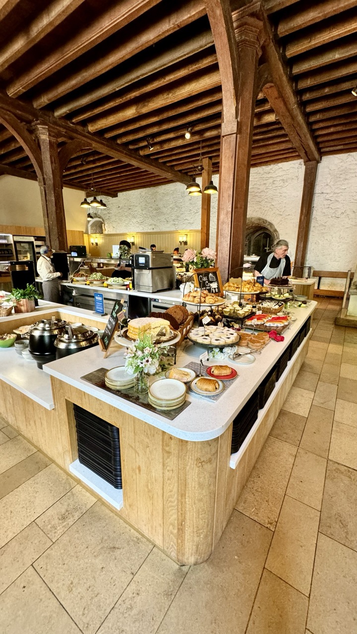

1. Overall Rating (0–10) — 7.0
This photograph captures the warm, inviting atmosphere of a rustic café or bakery, where tradition and hospitality converge. The exposed wooden beams and stone walls lend a timeless charm, while the abundance of pastries and the presence of staff create a sense of lively, authentic service. While the scene is rich in detail, the composition’s slight clutter and flat lighting prevent it from achieving greater visual harmony.
2. Composition (0–10) — 6.5
The long diagonal of the buffet counter guides the eye through the frame, but the wide perspective introduces visual noise. The placement of the central cake display works well as a focal point, though the background activity and scattered elements slightly disrupt the balance.
3. Lighting (0–10) — 6.0
The lighting is functional and even, relying on overhead fixtures that provide adequate illumination without creating dramatic shadows. While it clearly reveals the scene, the lack of directional warmth or contrast softens the mood, making the space feel more like a snapshot than an evocative portrait.
4. Color & Tone (0–10) — 6.5
The palette is dominated by earthy browns and creamy whites, with subtle pops of color from the pastries and flowers. The tones are cohesive and natural, though the overall warmth is restrained, preventing the image from feeling particularly inviting or vibrant.
5. Creativity (0–10) — 6.0
The image is grounded in realism, capturing a moment of daily life with authenticity. While the setting is visually rich and the narrative clear, the approach is conventional—there’s little sense of artistic reinterpretation or unique perspective.
6. Technical Quality (0–10) — 7.5
The image is sharp and well-focused, with clean details in the food, wood grain, and stonework. The camera’s handling of depth and exposure is competent, preserving clarity across the scene.
7. Emotional Impact (0–10) — 6.5
The photograph evokes a quiet sense of comfort and nostalgia, suggesting a place where time slows down and quality matters. The presence of people and the abundance of food create a feeling of connection and care, though the lack of intimacy in the framing keeps the viewer at a slight remove.
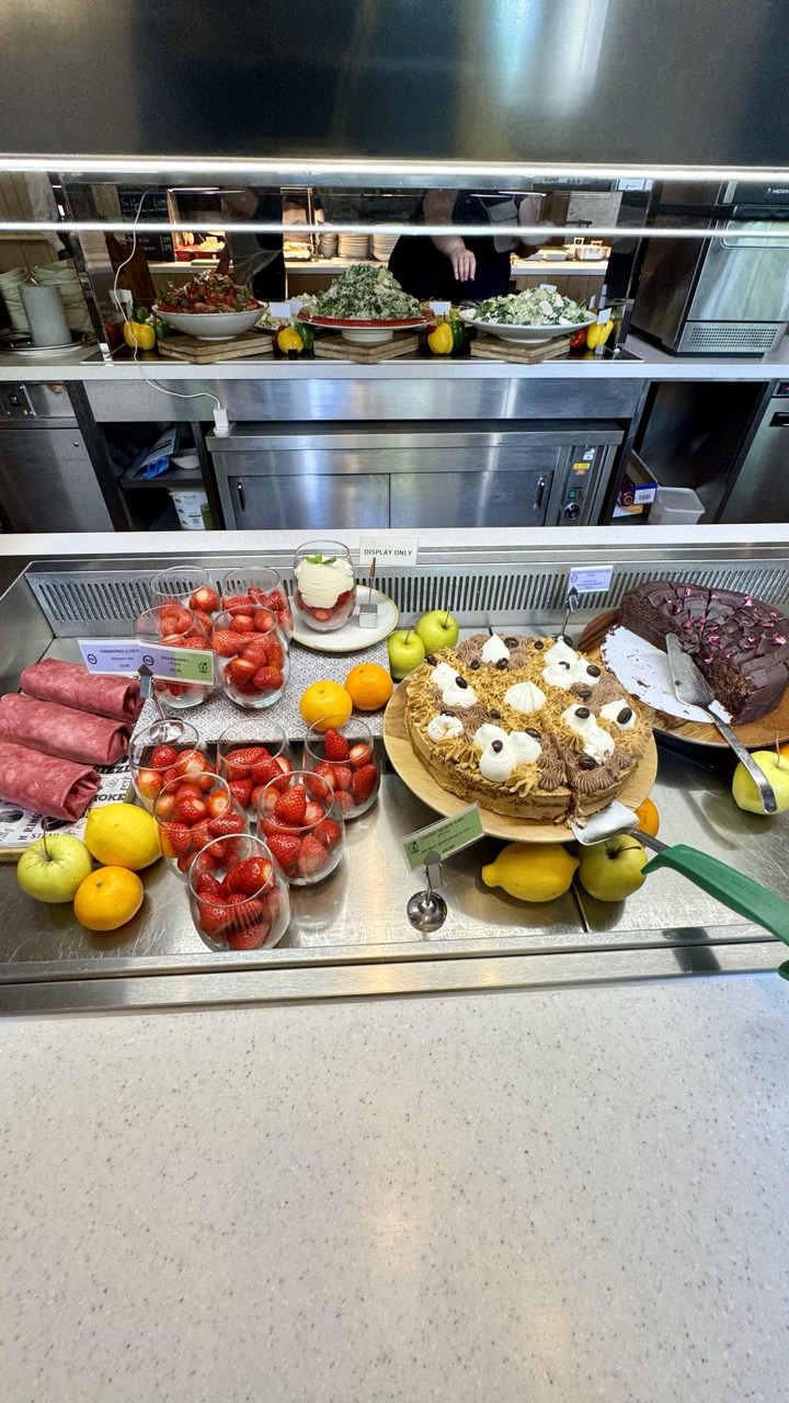

1. Overall Rating (0–10) — 6.8
This photograph presents a vibrant and inviting buffet display, capturing the abundance and variety of a modern café or hotel breakfast spread. The composition is rich with textures and colors, from the glossy strawberries to the decadent chocolate cake, yet the flat overhead lighting and clinical stainless steel environment temper its emotional warmth. While the scene feels authentic and appetizing, it lacks the artistic refinement to transcend mere documentation.
2. Composition (0–10) — 7.0
The image is well-framed with a clear focal point on the desserts and fruit, balanced by the background kitchen activity. The horizontal lines of the counter and the reflection in the mirror create a sense of depth, though the clutter of labels and tools slightly disrupts visual harmony.
3. Lighting (0–10) — 5.5
The lighting is functional and even, typical of a commercial kitchen, but it lacks direction and warmth. The overhead fluorescent light flattens the scene, reducing the natural appeal of the food and giving it a sterile quality.
4. Color & Tone (0–10) — 7.5
The palette is rich and varied, with bright reds, yellows, and greens providing a lively contrast against the neutral stainless steel. The color saturation enhances the visual appeal of the food, though the overall tone is slightly cool and clinical.
5. Creativity (0–10) — 6.0
The image captures a familiar scene with a straightforward, observational approach. While the arrangement of food is appealing, the lack of a unique perspective or narrative limits its originality, making it more of a snapshot than a creative statement.
6. Technical Quality (0–10) — 7.5
The image is sharp and clear, with good focus across the foreground. The details in the food and labels are well-defined, and there is minimal noise, suggesting a high-quality capture.
7. Emotional Impact (0–10) — 6.5
The photograph evokes a sense of comfort and indulgence, inviting the viewer to imagine the taste and aroma of the fresh fruit and pastries. However, the impersonal setting and lack of human interaction keep the emotional connection at a moderate level.
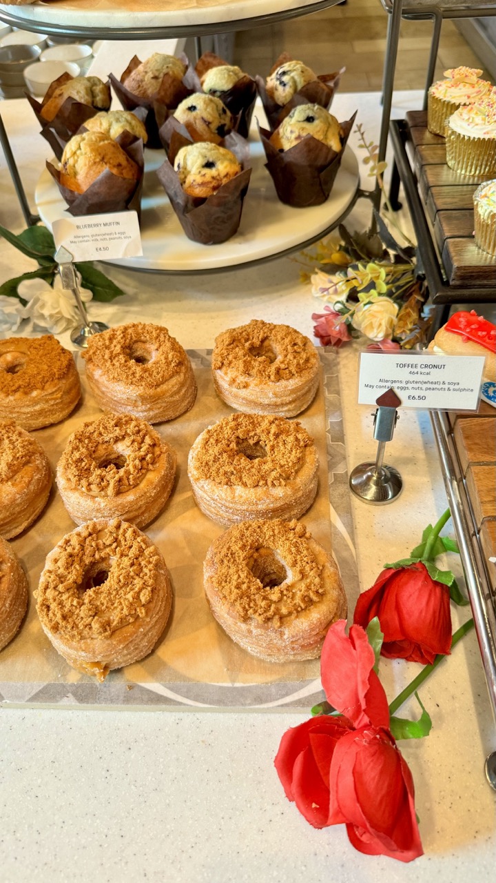

1. Overall Rating (0–10) — 7.0
This photograph captures the inviting warmth of a bakery display, where golden pastries and vibrant red roses create a harmonious blend of indulgence and elegance. The arrangement balances commercial appeal with aesthetic charm, though the cluttered composition slightly undermines its visual clarity. While the image effectively conveys the allure of freshly baked goods, it could benefit from tighter framing and more intentional staging to elevate its artistic impact.
2. Composition (0–10) — 6.0
The frame includes multiple elements—muffins, cronuts, flowers, and signage—creating a busy scene. The diagonal placement of the cronuts draws the eye, but the overlapping items and off-center roses disrupt visual flow.
3. Lighting (0–10) — 7.0
Bright, even lighting highlights the textures of the pastries and the rich red of the roses. The light appears natural and flattering, enhancing the appeal of the food without harsh shadows.
4. Color & Tone (0–10) — 7.5
The warm golden tones of the baked goods contrast beautifully with the deep red roses and soft cream background. The palette feels inviting and cohesive, with sufficient contrast to make the key elements stand out.
5. Creativity (0–10) — 6.5
The juxtaposition of indulgent pastries with romantic roses adds a whimsical, curated touch. While the concept is effective, the execution leans toward commercial documentation rather than bold artistic expression.
6. Technical Quality (0–10) — 8.0
Sharp focus and clean detail capture the textures of the crumbly tops and flaky layers. The image is well-exposed, with no significant technical flaws.
7. Emotional Impact (0–10) — 7.0
The image evokes a sense of comfort and celebration—perfect for a special treat or a cozy café moment. The combination of food and flowers taps into feelings of warmth and delight, though the busy layout slightly dilutes the emotional focus.
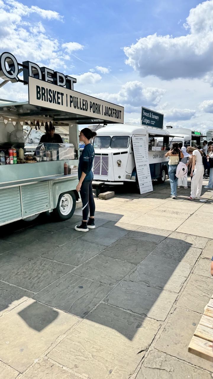

1. Overall Rating (0–10) — 6.0
This photograph captures the lively energy of a food market under a bright, expansive sky, where the interplay of light and shadow enhances the scene’s spontaneity. The composition draws the eye across a variety of food trucks and people, suggesting a vibrant public gathering, though the lack of a clear focal point slightly dilutes the visual impact. While the image effectively conveys a sense of place and movement, it remains more documentary than artistic, with a casual framing that feels more like a snapshot than a composed shot.
2. Composition (0–10) — 6.0
The wide-angle perspective creates a sense of space but results in a cluttered foreground and uneven subject distribution. The shadow of the food truck on the pavement adds depth, yet the diagonal lines of the stone tiles compete with the horizontal flow of the scene.
3. Lighting (0–10) — 7.5
Natural daylight creates strong contrast and vividness, with the bright blue sky and fluffy clouds enhancing the scene’s energy. The shadows are well-defined and add dimension, though some areas of the image are slightly overexposed.
4. Color & Tone (0–10) — 6.5
The palette is balanced, with the mint green of the truck and the crisp white of the sky providing visual harmony. The colors are vibrant but not oversaturated, and the overall tone feels authentic and unfiltered.
5. Creativity (0–10) — 6.0
The image captures a moment of everyday life with a sense of authenticity, but it lacks a unique conceptual angle or stylistic approach. The narrative is straightforward—food, people, and place—without deeper visual storytelling.
6. Technical Quality (0–10) — 7.0
The image is sharp and well-focused, with clean details in the signage and textures of the pavement. The exposure is generally balanced, though some highlights in the sky are slightly blown out.
7. Emotional Impact (0–10) — 6.0
The photograph evokes a sense of casual joy and urban vitality, capturing the rhythm of a busy food market. While it resonates with a familiar feeling of summer days and shared meals, it doesn’t elicit a strong emotional response beyond mild nostalgia.
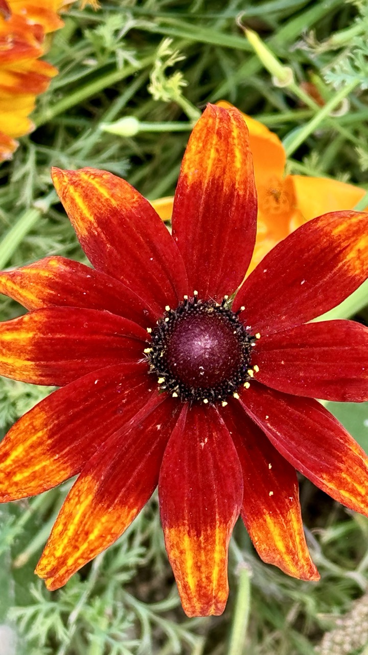

1. Overall Rating (0–10) — 7.5
This photograph captures the vibrant energy of a bold flower in full bloom, its rich red and yellow hues drawing the eye with immediacy and warmth. The close-up perspective emphasizes texture and detail, giving the image a tactile quality that feels both intimate and alive. While the background is slightly busy, the strong central subject holds the viewer’s attention, making the composition feel dynamic and engaging.
2. Composition (0–10) — 7.0
The flower is centered and fills the frame, creating a strong focal point. The slightly off-center placement of the stem and surrounding foliage adds subtle asymmetry, enhancing visual interest without disrupting balance.
3. Lighting (0–10) — 8.0
Natural, diffused light enhances the flower’s color depth and highlights the delicate texture of the petals. The soft shadows preserve detail in the center while allowing the warm tones to glow with natural vibrancy.
4. Color & Tone (0–10) — 8.5
The warm reds and yellows of the flower contrast beautifully with the cool green foliage, creating a visually striking palette. The saturation is rich but not oversaturated, lending a natural yet vivid tone to the image.
5. Creativity (0–10) — 7.5
The close-up perspective and emphasis on color and texture offer a fresh, almost painterly view of a common flower. The choice to focus on the interplay of color and form gives the image a contemplative, almost abstract quality.
6. Technical Quality (0–10) — 8.0
The image is sharp and clear, with excellent detail in the flower’s center and petals. The depth of field is well-controlled, keeping the subject in focus while softly blurring the background to enhance separation.
7. Emotional Impact (0–10) — 8.0
The vivid colors and intimate framing evoke a sense of warmth and vitality, inviting the viewer to pause and appreciate the quiet beauty of nature. The image feels alive, evoking joy and serenity in equal measure.
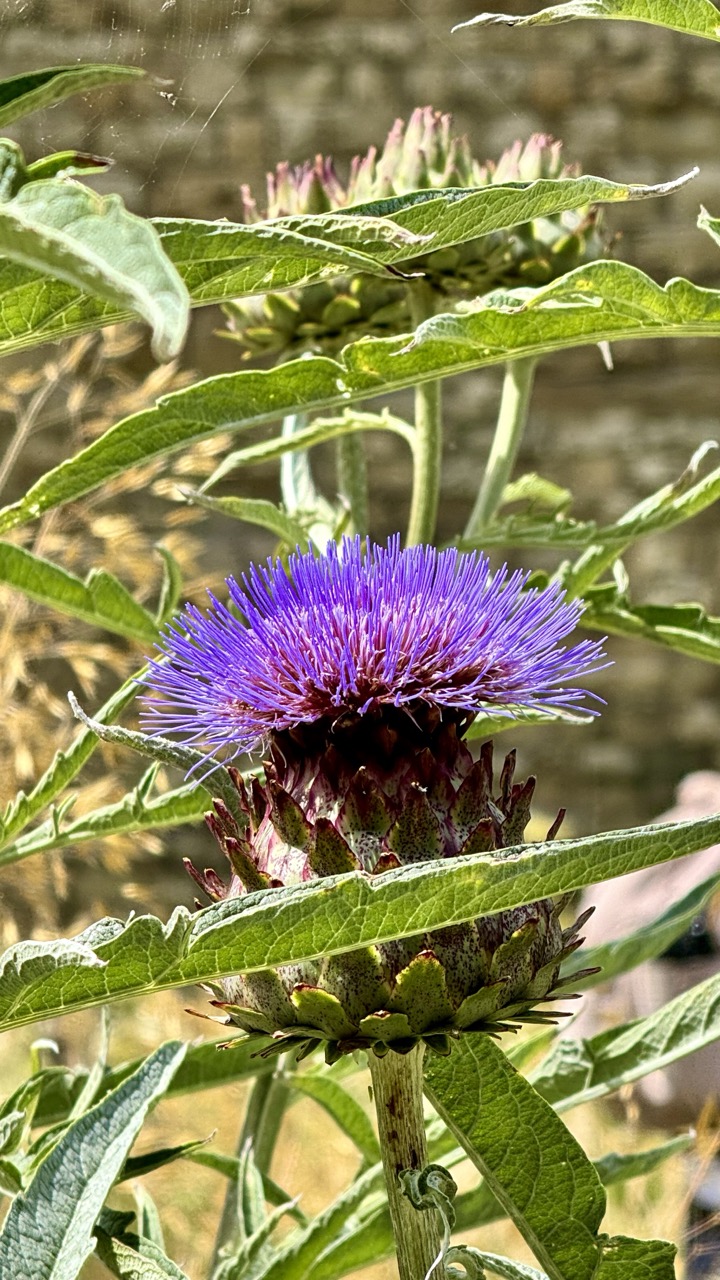

1. Overall Rating (0–10) — 7.5
This photograph captures the bold, spiky beauty of a blooming artichoke flower with striking clarity and vivid color. The vibrant purple of the blossoming florets contrasts sharply with the deep green leaves, creating a dynamic natural composition. While the framing feels slightly busy due to overlapping foliage, the image successfully conveys the raw, untamed elegance of the plant in its natural habitat.
2. Composition (0–10) — 7.0
The subject is centered and well-framed, with surrounding leaves creating a natural border that draws the eye inward. However, some foreground elements partially obscure the base of the flower, slightly disrupting visual flow.
3. Lighting (0–10) — 8.0
Natural sunlight highlights the texture and fine details of the flower’s bracts and petals, creating a soft glow that enhances the purple tones. The light is directional, casting subtle shadows that add depth and dimension.
4. Color & Tone (0–10) — 8.5
The rich purple of the flower stands out against the lush green foliage, with warm golden highlights in the background adding tonal contrast. The color palette is harmonious and vibrant, enhancing the image’s natural appeal.
5. Creativity (0–10) — 7.5
The focus on a less commonly photographed subject—artichoke in bloom—adds an element of discovery. The composition captures both the plant’s intricate structure and its wild, architectural beauty.
6. Technical Quality (0–10) — 8.5
The image is sharp and detailed, with precise focus on the flower’s center. Depth of field is well-managed, isolating the subject while softly blurring the background.
7. Emotional Impact (0–10) — 7.0
The photograph evokes a sense of wonder at the complexity of nature, with the bold form of the flower suggesting resilience and vitality. It invites quiet contemplation of the beauty in overlooked plants.
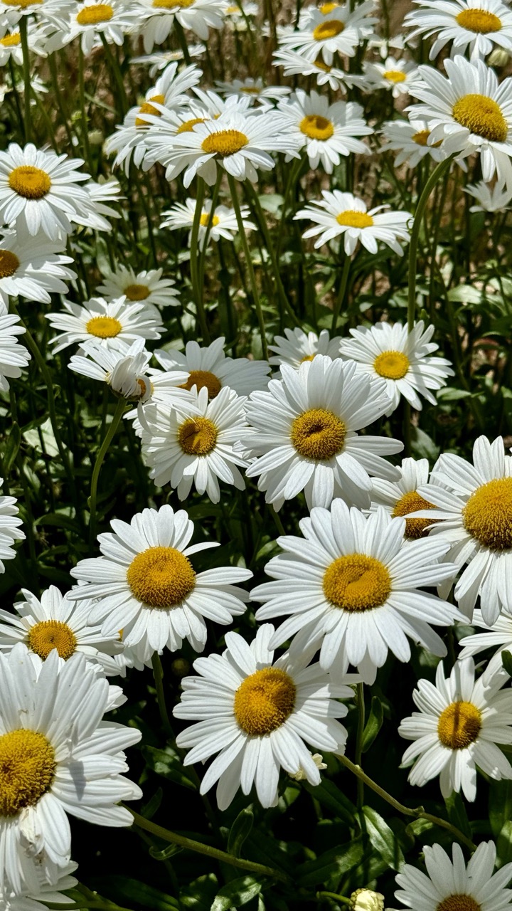

1. Overall Rating (0–10) — 7.5
This photograph captures the joyful simplicity of a sunlit daisy field, where the repetition of white petals and golden centers creates a visually soothing rhythm. The natural light enhances the flowers’ delicate textures, evoking a sense of warmth and renewal. While the image is pleasing and well-composed, it leans toward the conventional, lacking a compelling narrative or striking contrast to elevate it beyond a pleasant snapshot.
2. Composition (0–10) — 7.0
The frame is densely filled with daisies, creating a sense of abundance and natural rhythm. The diagonal lines of the stems guide the eye through the scene, though the lack of a clear focal point slightly diminishes the visual hierarchy.
3. Lighting (0–10) — 8.5
Bright, direct sunlight enhances the vibrancy of the white petals and golden centers, creating natural highlights and soft shadows that give depth to the composition. The lighting feels authentic and contributes to the image’s cheerful mood.
4. Color & Tone (0–10) — 8.0
The palette of white and yellow is clean and harmonious, with rich, saturated tones that pop against the green foliage. The contrast between the bright flowers and the darker background adds visual interest and balance.
5. Creativity (0–10) — 6.5
While the subject is timeless and universally appealing, the approach is straightforward and lacks a unique perspective. The image captures beauty but doesn’t push artistic boundaries or challenge the viewer’s perception.
6. Technical Quality (0–10) — 8.5
The image is sharp and well-focused, with fine detail visible in the petals and centers. The exposure is well-managed, and the color reproduction is accurate and vivid.
7. Emotional Impact (0–10) — 7.5
The photograph evokes a sense of peace and nostalgia, reminiscent of warm summer days and open fields. It invites the viewer to pause and appreciate the quiet beauty of nature, though the emotional resonance is gentle rather than profound.
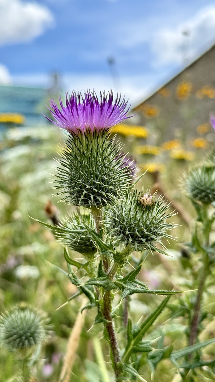

1. Overall Rating (0–10) — 7.5
This photograph captures the quiet resilience of a thistle blooming amidst a wild, overgrown field, its vibrant purple head standing out against a soft blue sky. The shallow depth of field draws the eye to the intricate textures of the flower, while the blurred background hints at a forgotten roadside verge, rich with life. While the composition is strong, the slightly hazy sky and scattered distractions in the background prevent the image from achieving full visual harmony.
2. Composition (0–10) — 7.0
The thistle is well-centered and the shallow focus isolates the subject effectively, creating a natural focal point. However, the diagonal line of the building in the background slightly disrupts the balance, drawing attention away from the flower.
3. Lighting (0–10) — 8.0
Natural daylight enhances the vividness of the purple petals and casts subtle highlights along the spines of the thistle. The soft, diffused light avoids harsh shadows, lending a gentle quality to the scene.
4. Color & Tone (0–10) — 8.0
The contrast between the rich purple of the thistle and the bright blue sky creates a striking visual harmony. The warm yellows of the background wildflowers add depth and warmth, while the green tones remain natural and balanced.
5. Creativity (0–10) — 7.5
The image captures a moment of quiet beauty in an overlooked natural setting, transforming a common weed into a symbol of strength and persistence. The photographer’s choice to emphasize texture and color over traditional floral aesthetics adds a fresh, poetic quality.
6. Technical Quality (0–10) — 8.5
Sharp focus on the thistle’s head, with smooth bokeh in the background, demonstrates strong technical control. The image is clean, well-exposed, and free of noise or artifacts.
7. Emotional Impact (0–10) — 7.0
There’s a sense of quiet dignity in the thistle’s persistence, evoking feelings of resilience and hope. The viewer is invited to appreciate beauty in the unassuming and the overlooked, though the emotional pull is subtle rather than overwhelming.
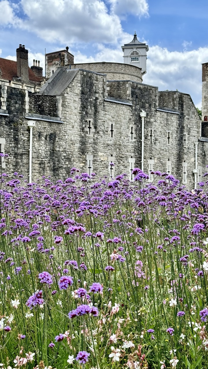

1. Overall Rating (0–10) — 7.5
This photograph masterfully juxtaposes the enduring stone of the Tower of London with the delicate, untamed bloom of wildflowers, creating a poetic contrast between history and nature. The vibrant purple and white blossoms in the foreground draw the eye into the frame, while the ancient walls rise with solemn dignity, evoking a sense of timelessness. While the image is visually striking, the slightly over-saturated colors and busy composition risk overwhelming the viewer’s focus on the historical subject.
2. Composition (0–10) — 7.0
The low-angle perspective emphasizes the height and grandeur of the stone walls, while the wildflowers in the foreground create a natural frame that leads the eye upward. The placement of the clock tower slightly off-center adds visual interest, though the dense floral foreground introduces a degree of visual clutter.
3. Lighting (0–10) — 8.0
Natural daylight enhances the scene’s clarity, with soft shadows defining the texture of the stonework. The bright sky and scattered clouds add depth and contrast, illuminating the flowers while preserving the historic tones of the architecture.
4. Color & Tone (0–10) — 8.0
The vivid purples of the verbena and the lush green foliage create a striking contrast against the gray stone, while the blue sky adds a sense of openness. The color palette is rich and harmonious, with a slight saturation boost enhancing the vibrancy without appearing unnatural.
5. Creativity (0–10) — 8.5
The conceptual pairing of wildflowers with a symbol of medieval power is both imaginative and evocative, suggesting renewal and resilience. The composition transforms a familiar landmark into a scene of quiet poetic beauty, blending history with the organic flow of nature.
6. Technical Quality (0–10) — 8.0
The image is sharp and well-focused, with clear detail in both the foreground blooms and the architectural elements. The depth of field is appropriately managed, allowing the flowers to be crisp while maintaining a sense of spatial connection to the background.
7. Emotional Impact (0–10) — 8.0
The image evokes a contemplative mood, inviting reflection on the passage of time and the quiet persistence of life amid human structures. The juxtaposition of nature reclaiming space feels both serene and poignant, leaving a lasting impression of beauty in impermanence.


1. Overall Rating (0–10) — 8.0
This photograph masterfully juxtaposes the enduring stone of the Tower of London with the delicate, vibrant wildflowers in the foreground, creating a powerful contrast between history and nature. The dynamic sky adds drama and depth, while the composition draws the eye from the lush flora to the ancient architecture, evoking a sense of timelessness and renewal. The image is both visually striking and emotionally resonant, though a slightly more refined balance between the flowers and the structure might enhance its narrative clarity.
2. Composition (0–10) — 8.5
The low-angle perspective emphasizes the wildflowers, creating a strong foreground that leads the viewer’s gaze toward the Tower. The placement of the castle along the horizon line provides stability, while the diagonal sweep of the clouds adds movement and visual interest.
3. Lighting (0–10) — 8.0
Natural daylight enhances the vividness of the flowers and the texture of the stonework. The interplay of light and shadow under the dramatic clouds adds depth and dimension, creating a dynamic and atmospheric scene.
4. Color & Tone (0–10) — 8.5
The rich purples and whites of the wildflowers contrast beautifully with the deep blue sky and the muted grays of the stone. The color palette is both vibrant and harmonious, with a strong sense of natural balance and seasonal warmth.
5. Creativity (0–10) — 8.5
The concept of pairing ancient ruins with wild, untamed flora is both original and poetic, suggesting themes of resilience and rebirth. The framing transforms a familiar landmark into a moment of quiet contemplation, elevating it beyond mere documentation.
6. Technical Quality (0–10) — 9.0
The image is sharp, well-focused, and exhibits excellent clarity across the frame. The depth of field is managed effectively, keeping both the flowers and the Tower in focus, while the high resolution captures fine details in texture and color.
7. Emotional Impact (0–10) — 8.0
The photograph evokes a sense of wonder and serenity, inviting the viewer to reflect on the passage of time and the enduring beauty of nature reclaiming history. The emotional resonance lies in its quiet contrast and the hopeful symbolism of life flourishing amid stone.
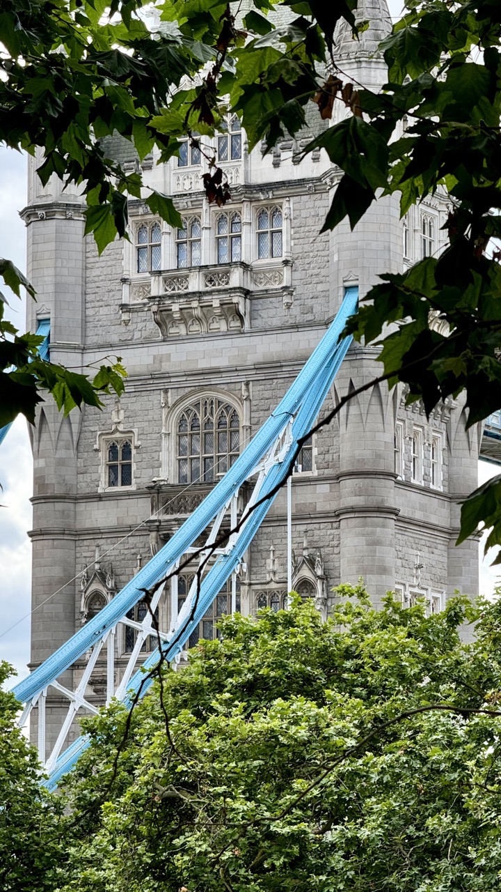

1. Overall Rating (0–10) — 7.0
This photograph captures the iconic grandeur of Tower Bridge through a natural, leaf-framed lens, creating a compelling juxtaposition between historic architecture and organic growth. The vibrant blue of the suspension cables adds a modern pop of color against the stonework, while the foliage introduces a sense of intimacy and discovery. Though the composition feels slightly over-framed, the image succeeds in conveying a quiet moment of urban beauty, where nature and engineering coexist in quiet harmony.
2. Composition (0–10) — 6.5
The framing by tree branches creates a natural vignette, drawing the eye toward the central tower, but the overhang of leaves at the top and bottom slightly obstructs the view, reducing the visual clarity of the structure.
3. Lighting (0–10) — 6.0
Diffused daylight softly illuminates the scene, avoiding harsh shadows and allowing the textures of the stone and leaves to be clearly visible, though the overall lighting is somewhat flat and lacks dramatic contrast.
4. Color & Tone (0–10) — 7.0
The contrast between the cool gray of the stone and the vivid blue of the cables is striking, while the lush green foliage adds warmth and depth. The natural tones feel balanced and harmonious, enhancing the image’s visual appeal.
5. Creativity (0–10) — 7.5
The use of foliage as a natural frame is a thoughtful and poetic choice, offering a fresh perspective on a well-known landmark. The interplay of man-made structure and natural elements adds narrative depth and originality.
6. Technical Quality (0–10) — 7.5
The image is sharp and well-focused, with clean detail in both the architectural elements and the leaves. The exposure is well-managed, with no significant over- or underexposed areas.
7. Emotional Impact (0–10) — 6.5
The photograph evokes a sense of peaceful contemplation, inviting the viewer to pause and appreciate the quiet beauty of London’s iconic landmarks nestled within nature. It feels intimate and reflective, though the emotional resonance is slightly restrained by the framing.
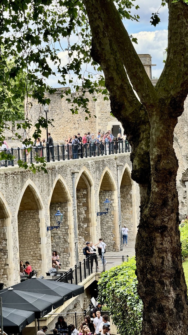

1. Overall Rating (0–10) — 7.0
This photograph captures a lively, sun-dappled scene at the Tower of London, where historic architecture blends with modern tourism. The interplay of natural foliage and ancient stone creates a layered narrative of time and place, while the crowd adds a sense of energy and movement. Though slightly cluttered, the image succeeds in conveying both the grandeur of the location and the casual intimacy of a day out.
2. Composition (0–10) — 6.5
The framing uses the tree trunk as a strong vertical element, drawing the eye through the arches and toward the people on the upper walkway. The overlapping layers create depth, but the composition feels slightly unbalanced due to the large tree dominating the right side and the lower portion being visually crowded.
3. Lighting (0–10) — 7.0
Natural daylight filters through the trees, creating a soft, dappled effect that enhances texture in the stone and foliage. The sky is bright but not overexposed, and the shadows under the arches add depth without obscuring detail.
4. Color & Tone (0–10) — 6.5
The palette is dominated by earthy tones—stone grays, green leaves, and muted clothing—creating a natural harmony. However, the colors are somewhat subdued, lacking vibrancy, which slightly diminishes the image’s visual impact.
5. Creativity (0–10) — 7.0
The use of the tree as a framing device adds a unique, organic layer to the historic setting, creating a juxtaposition between nature and architecture. The candid presence of tourists gives the image a narrative quality, suggesting a moment caught in time.
6. Technical Quality (0–10) — 7.5
The image is sharp and well-focused, particularly on the central arches and the people. The depth of field is appropriately managed, with the foreground tree slightly soft, which enhances the sense of perspective.
7. Emotional Impact (0–10) — 6.5
The photograph evokes a sense of place and time—tourists exploring a historic landmark on a pleasant day. The mood is peaceful yet active, with a subtle nostalgia for the past interwoven with the present. While engaging, it doesn’t elicit a strong emotional reaction, leaning more toward observation than connection.
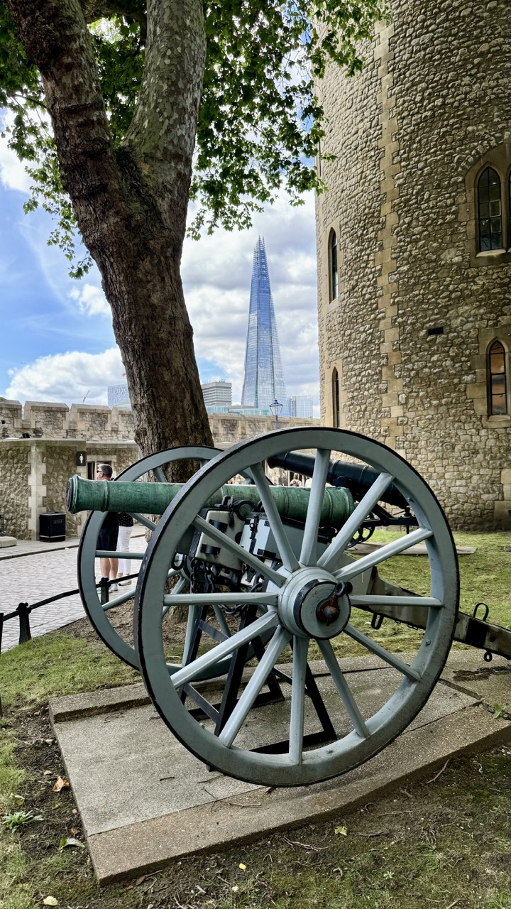

1. Overall Rating (0–10) — 7.5
This photograph masterfully juxtaposes the ancient and the modern, using a historic cannon and the Tower of London as a frame for the futuristic Shard. The composition draws the eye through layers of time, from the weathered stone and leafy tree to the sleek glass skyscraper in the distance. While the scene is visually rich and conceptually strong, the slightly cluttered foreground and overexposed sky slightly diminish the image’s elegance, keeping it from reaching its full potential.
2. Composition (0–10) — 7.0
The cannon in the foreground anchors the image, creating a strong diagonal leading line toward the Shard. The tree on the left balances the frame, while the tower on the right provides structural weight. The framing is effective, though the inclusion of the passerby and the trash bin in the background introduces minor distractions.
3. Lighting (0–10) — 6.5
Natural daylight illuminates the scene with soft, even light, though the sky is slightly overexposed, washing out some of the cloud detail. The contrast between the shaded stone wall and the bright sky adds depth, but the harshness of the sun on the Shard’s glass creates a glare that detracts from its architectural elegance.
4. Color & Tone (0–10) — 7.0
The palette is harmonious, blending earthy tones of stone and green with the cool blue of the Shard and the bright white of the clouds. The green patina of the cannon adds a touch of historical character. The contrast between the warm, organic textures and the cool, metallic structure enhances the visual narrative of time and change.
5. Creativity (0–10) — 8.0
The image is highly creative in its conceptual framing, using the past as a lens to view the future. The juxtaposition of old and new is not only visually striking but also rich in metaphor, suggesting continuity and transformation. The photographer’s choice to frame the modern skyline through the lens of history adds a layer of narrative depth.
6. Technical Quality (0–10) — 7.5
The image is sharp and clear, with good focus on the cannon and the tower. The depth of field is appropriate, keeping the foreground and background elements in view. The exposure is mostly balanced, though the sky’s brightness slightly compromises detail in the upper portion.
7. Emotional Impact (0–10) — 7.0
The photograph evokes a sense of wonder and reflection, inviting the viewer to contemplate the passage of time and the evolution of a city. The contrast between the ancient cannon and the modern skyscraper creates a subtle tension—between tradition and progress, permanence and change—that resonates emotionally and intellectually.
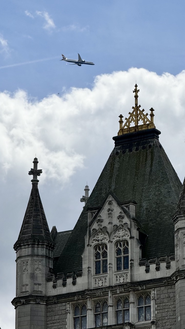

1. Overall Rating (0–10) — 7.0
This photograph strikingly juxtaposes the timeless elegance of Gothic architecture with the fleeting presence of modern aviation, creating a narrative of contrast between past and present. The composition balances the ornate stonework and dramatic sky with the sleek silhouette of the airplane, evoking a sense of movement and transition. While the image captures a compelling visual dialogue, its emotional resonance is slightly tempered by the neutral lighting and lack of dynamic interaction between the elements.
2. Composition (0–10) — 7.5
The low-angle framing emphasizes the grandeur of the building, while the airplane’s diagonal trajectory adds visual tension. The placement of the aircraft above the central spire creates a strong focal point, though the composition feels slightly unbalanced due to the asymmetrical cloud distribution.
3. Lighting (0–10) — 6.0
Natural daylight provides even illumination, but the overcast sky results in diffused light that softens textures and reduces depth. The lack of strong shadows diminishes the architectural details, lending a flatness to the stone façade.
4. Color & Tone (0–10) — 6.5
The muted palette of grays, blues, and whites enhances the historical tone of the structure, while the golden accents on the spire provide a subtle point of visual interest. The overall tone is calm and subdued, with moderate contrast that fails to fully highlight the building’s intricacy.
5. Creativity (0–10) — 8.0
The conceptual pairing of historical architecture with modern air travel is highly original and thought-provoking. The image functions as a visual metaphor for the intersection of tradition and progress, elevating it beyond a simple architectural snapshot.
6. Technical Quality (0–10) — 7.5
Sharp focus and clear detail are evident in both the building and the airplane. The image is free from noticeable noise or distortion, and the exposure is well-balanced despite the challenging lighting conditions.
7. Emotional Impact (0–10) — 7.0
The photograph evokes a contemplative mood, inviting reflection on time, change, and human achievement. The contrast between the enduring stone and the transient flight creates a quiet sense of wonder, though the emotional pull is restrained by the image’s formal distance.
Loading map...