Kraków, a UNESCO World Heritage city in Poland, offers a rich cultural experience with cobblestone streets, medieval architecture, and a vibrant arts scene. Visitors can explore the Rynek Główny market square, St. Mary's Basilica, Wawel Royal Castle, and Vistula River for a glimpse into Poland's history and resilience.


1. Overall Rating (0–10) — 7.0
This photograph captures the inviting allure of freshly made mascarpone desserts, their creamy swirls and vibrant fruit toppings drawing the eye with a sense of indulgence. The composition balances detail and context, showcasing the pastries in a realistic retail setting, though the slightly cluttered foreground and flat lighting prevent it from feeling truly elevated. The image succeeds as a mouthwatering document of a bakery display, but it lacks the artful restraint to transcend mere product photography.
2. Composition (0–10) — 6.5
The arrangement of pastries fills the frame, creating a dense, appetizing pattern. The price tag in the foreground adds context but slightly disrupts the visual flow, while the diagonal lines of the display shelf guide the eye toward the center.
3. Lighting (0–10) — 5.5
The lighting is functional and even, likely from overhead fluorescent fixtures, which flattens the textures of the meringue and cream. While it ensures clarity, it lacks the warmth and dimension that would enhance the desserts’ appeal.
4. Color & Tone (0–10) — 7.0
The palette is rich and inviting, with the red strawberries, dark blueberries, and creamy white frosting creating a natural contrast against the pale meringue. The neutral tones of the display case and sign keep the focus on the food, though the overall coolness of the light slightly dulls the vibrancy.
5. Creativity (0–10) — 6.0
The image is straightforward and observational, capturing a moment in a bakery with a focus on realism. While the arrangement is visually engaging, it doesn’t push creative boundaries—there’s no unique angle, lighting treatment, or conceptual twist to distinguish it from typical commercial food photography.
6. Technical Quality (0–10) — 7.5
The focus is sharp across the central row of pastries, and the details of the meringue’s texture and fruit toppings are well-defined. The image is free of technical flaws like noise or blur, though the depth of field is limited, leaving the background slightly soft.
7. Emotional Impact (0–10) — 6.5
The photograph evokes a sense of comfort and desire, tapping into the universal appeal of sweet treats. The abundance of fresh ingredients suggests care and quality, but the clinical setting and neutral presentation keep the emotional connection at a moderate level, inviting curiosity rather than deep resonance.
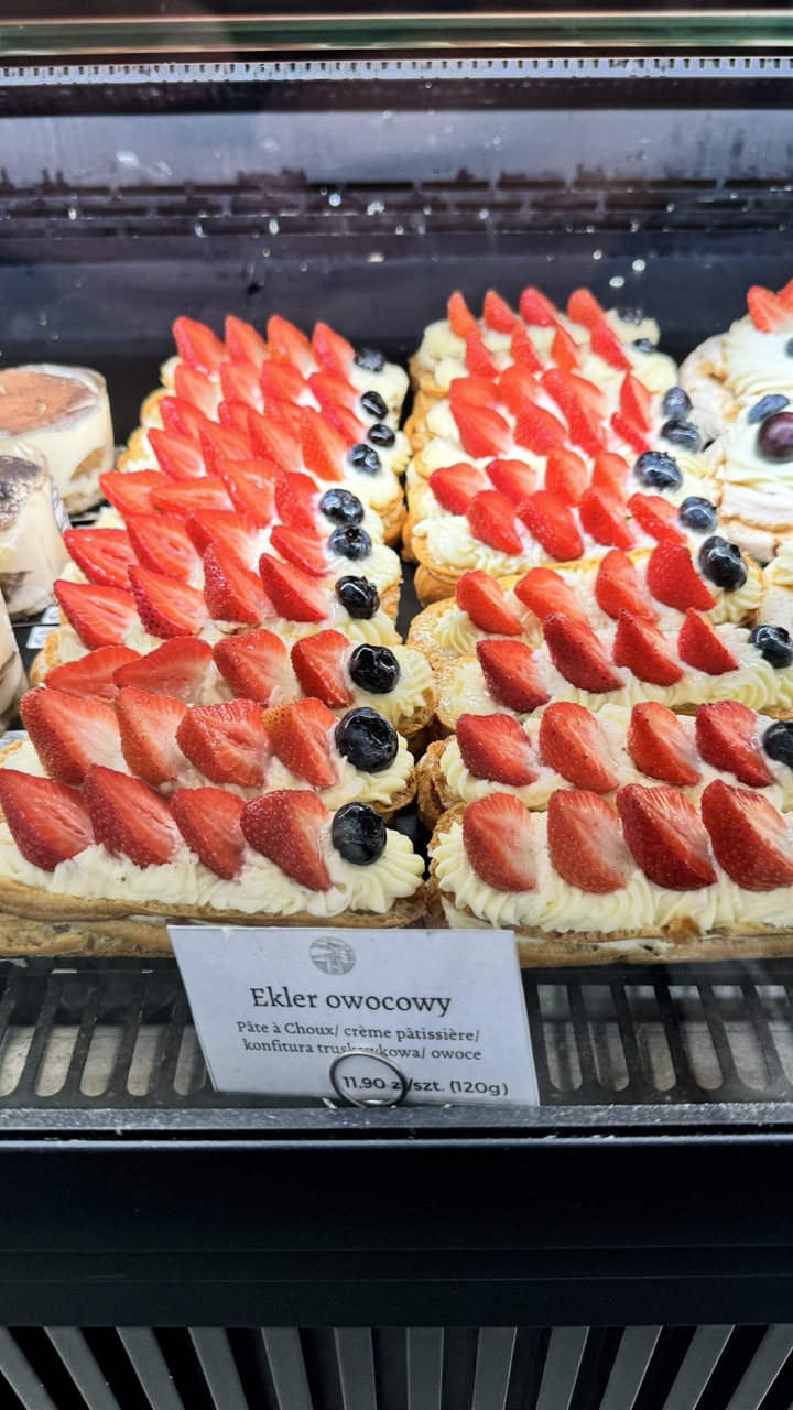

1. Overall Rating (0–10) — 7.0
This photograph captures the inviting allure of a pastry display with a strong emphasis on texture and color, evoking a sense of indulgence and artisanal care. The vibrant reds of the strawberries and the deep purples of the blueberries create a visually rich palette, while the clean presentation of the éclairs suggests a well-maintained bakery. However, the image's potential is slightly restrained by a lack of atmospheric depth and a somewhat clinical lighting tone that keeps the scene from feeling truly immersive.
2. Composition (0–10) — 7.5
The arrangement of the éclairs creates a strong diagonal rhythm, leading the eye across the frame with visual continuity. The price tag adds a point of narrative interest and anchors the scene, though its placement slightly disrupts the uniformity of the pastry rows. The framing is tight enough to emphasize detail while still conveying the full context of the display case.
3. Lighting (0–10) — 6.0
The lighting is functional and even, typical of a retail environment, but it lacks warmth and directionality. While the subjects are well-lit, the flat, overhead illumination flattens the texture of the cream and reduces the depth of the fruit, giving the image a sterile quality that detracts from the inherent appeal of the food.
4. Color & Tone (0–10) — 8.0
The color palette is rich and appetizing, with the bright red strawberries and deep blueberries creating a striking contrast against the pale cream and golden pastry. The tones are natural and well-balanced, enhancing the visual appeal without appearing oversaturated or manipulated.
5. Creativity (0–10) — 6.5
The image succeeds in capturing a moment of everyday beauty—confectionery as both craft and commerce. While the composition is deliberate and the subject is inherently engaging, the execution remains observational rather than interpretive, lacking a unique artistic vision or emotional narrative.
6. Technical Quality (0–10) — 8.0
The image is sharp and clear, with fine detail visible in the texture of the cream, the sheen of the berries, and the crispness of the pastry. Focus is consistent across the frame, and there are no noticeable flaws in exposure or noise.
7. Emotional Impact (0–10) — 6.5
The photograph evokes a mild sense of delight and craving, appealing to the viewer’s senses through its focus on food. However, the impersonal setting and even lighting keep the emotional connection at a surface level—inviting but not deeply resonant.
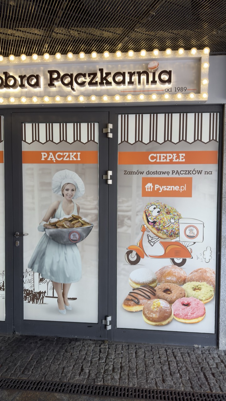

1. Overall Rating (0–10) — 6.0
This photograph captures the inviting facade of a Polish bakery, blending commercial branding with a touch of whimsy through its vibrant signage and playful imagery. The warm glow of the marquee lights and the colorful donut advertisements create a cheerful, approachable atmosphere, though the composition feels slightly cluttered and the image lacks a strong focal point. While it effectively communicates the shop’s identity and offerings, it falls short of visual elegance, leaning more toward functional documentation than artistic expression.
2. Composition (0–10) — 5.5
The framing centers the storefront, but the split between the two glass doors creates a divided composition. The placement of the woman and the animated donut on separate panels disrupts visual harmony, and the cobblestone foreground adds a layer of texture without enhancing the overall balance.
3. Lighting (0–10) — 6.5
The warm incandescent lights of the marquee provide a soft, inviting glow that enhances the nighttime ambiance. The lighting is functional and highlights the signage effectively, though the overall scene remains somewhat flat due to the lack of dramatic contrast or directional depth.
4. Color & Tone (0–10) — 6.0
The palette combines neutral grays of the pavement and door frames with vibrant oranges, pinks, and browns from the signage and donuts. While the colors are lively and appetizing, they appear slightly oversaturated, giving the image a slightly artificial feel that detracts from its authenticity.
5. Creativity (0–10) — 6.5
The use of playful graphics—like the animated donut on a scooter—adds a sense of fun and modernity. The juxtaposition of a traditional baker with a digital delivery message (Pyszne.pl) reflects contemporary branding strategies, making the image both informative and slightly humorous.
6. Technical Quality (0–10) — 7.0
The image is sharp and well-focused, with clear details in the signage and textures of the cobblestones. The exposure is balanced, and there is no visible noise, indicating a strong technical execution despite the challenging lighting conditions.
7. Emotional Impact (0–10) — 5.5
The image evokes a sense of familiarity and comfort, appealing to those who associate bakeries with warmth and community. However, the commercial nature of the scene keeps the emotional connection at a surface level, lacking the depth to stir nostalgia or personal resonance.
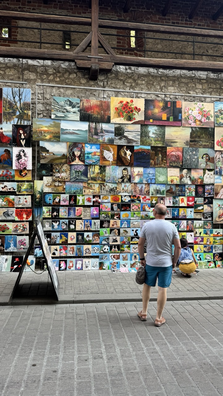

1. Overall Rating (0–10) — 6.8
This photograph captures a vibrant street-side art display with a quiet sense of discovery, where a man and child pause before a wall of colorful paintings. The juxtaposition of the rustic stone and wood architecture against the eclectic array of artworks creates a compelling visual rhythm, though the sheer density of the pieces risks overwhelming the viewer. The scene feels candid and authentic, suggesting a moment of cultural engagement, yet the composition lacks a stronger focal point to elevate it beyond a simple snapshot.
2. Composition (0–10) — 6.0
The framing centers on the man and child, placing them as observers within a richly detailed environment. However, the wall of paintings dominates the frame, creating visual clutter and diminishing the sense of balance. The diagonal lines of the brickwork and wooden beams offer structure, but they are not fully leveraged to guide the eye through the scene.
3. Lighting (0–10) — 6.5
Natural daylight illuminates the scene evenly, allowing the colors of the paintings to stand out against the muted stone wall. The light is soft and diffused, avoiding harsh shadows and creating a calm, inviting atmosphere. However, the lack of strong directional light limits the depth and dimensionality of the image.
4. Color & Tone (0–10) — 7.0
The palette is rich and varied, with the vivid hues of the paintings contrasting sharply against the neutral tones of the brick and pavement. The warmth of the earthy wall and the cool grays of the stone create a pleasing contrast, enhancing the vibrancy of the artwork. While the colors are lively, the sheer number of subjects leads to visual fragmentation.
5. Creativity (0–10) — 7.0
The image captures a unique cultural moment—art on display in a public space—offering a glimpse into local creativity and commerce. The diversity of subjects in the paintings, from landscapes to portraits and whimsical figures, adds narrative depth. The composition, while not perfectly balanced, reflects a spontaneous and authentic street scene.
6. Technical Quality (0–10) — 7.5
The photograph is sharp and well-focused, with clean detail in both the foreground and background. The exposure is balanced, preserving details in both the shadows and highlights. There are no noticeable technical flaws, and the image maintains clarity throughout.
7. Emotional Impact (0–10) — 6.5
The scene evokes a sense of quiet curiosity and cultural appreciation, as the viewer is invited to consider the stories behind the artworks and the people who make and view them. The presence of the child suggests wonder and discovery, adding a layer of emotional warmth. However, the image’s documentary nature keeps the emotional connection from feeling deeply personal.
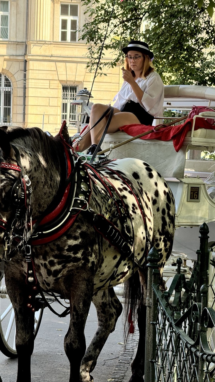

1. Overall Rating (0–10) — 7.0
This photograph captures a striking contrast between the elegant, dappled horse and the casual, modern posture of the woman in the carriage, creating a compelling juxtaposition of old-world charm and contemporary life. The warm sunlight enhances the textures and patterns, lending a nostalgic, almost cinematic quality. While the image is visually engaging, the slight clutter and off-center framing prevent it from achieving greater compositional harmony.
2. Composition (0–10) — 6.5
The horse dominates the foreground, drawing the eye, but the woman’s placement slightly off-center and the cluttered background create a sense of imbalance. A tighter crop or repositioning would improve visual flow.
3. Lighting (0–10) — 8.0
Soft, golden-hour light bathes the scene, highlighting the horse’s unique coat and the woman’s relaxed expression. The natural light adds depth and warmth, enhancing the mood without harsh shadows.
4. Color & Tone (0–10) — 7.0
The rich black-and-white pattern of the horse contrasts beautifully with the white carriage and the red accents. The warm tones of the sunlight and the muted building backdrop create a balanced palette that feels both vintage and alive.
5. Creativity (0–10) — 7.5
The combination of a classic carriage with a modern, casual rider offers a fresh narrative twist. The dappled horse adds a natural element of visual interest, making the image feel both timeless and contemporary.
6. Technical Quality (0–10) — 7.5
Sharp focus on the horse and carriage, with clean details in the harness and facial features. The exposure is well-managed, preserving detail in both highlights and shadows.
7. Emotional Impact (0–10) — 6.5
The image evokes a sense of quiet contemplation and urban leisure. The woman’s absorbed expression and relaxed pose suggest a moment of pause, inviting viewers to imagine the story behind the scene.
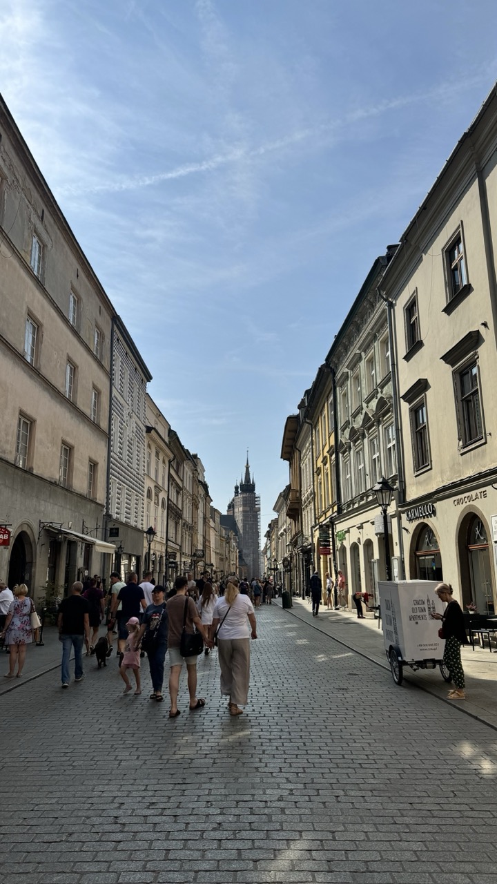

1. Overall Rating (0–10) — 7.0
This photograph captures the vibrant pulse of a historic European street, where daily life unfolds beneath a wide, open sky. The composition draws the eye toward the distant spire, creating a sense of depth and journey, while the cobblestone path and pastel facades lend a timeless charm. Though the scene feels authentic and immersive, the lack of a clear focal point or emotional anchor prevents it from transcending mere documentation.
2. Composition (0–10) — 7.5
The strong leading lines of the cobblestone street and flanking buildings create a natural vanishing point, guiding the viewer’s gaze toward the spire. The central placement of pedestrians adds rhythm and movement, while the balanced asymmetry of the architecture enhances visual interest.
3. Lighting (0–10) — 8.0
Natural daylight bathes the scene in soft, even illumination, highlighting textures in the stone and stucco without harsh shadows. The bright sky and subtle contrast between light and shade enhance the clarity and openness of the atmosphere.
4. Color & Tone (0–10) — 7.0
The palette is composed of warm, earthy tones—beiges, ochres, and muted yellows—complemented by the blue sky and dark window frames. The colors are harmonious and reflective of a sunny day, though they lack vibrancy, giving the image a slightly muted, documentary feel.
5. Creativity (0–10) — 6.5
The image is a strong example of urban storytelling, capturing a moment of everyday life with a sense of place. However, the approach is conventional, relying on classic street photography tropes rather than offering a unique perspective or conceptual twist.
6. Technical Quality (0–10) — 8.5
The image is sharp and well-exposed, with excellent detail in the textures of the cobblestones and building facades. The focus is consistent across the frame, and there is no noticeable distortion or noise.
7. Emotional Impact (0–10) — 6.0
While the photograph conveys a sense of calm and continuity, it remains somewhat detached. The viewer is invited to observe rather than feel, as the crowd and setting function more as context than as emotional conduits.
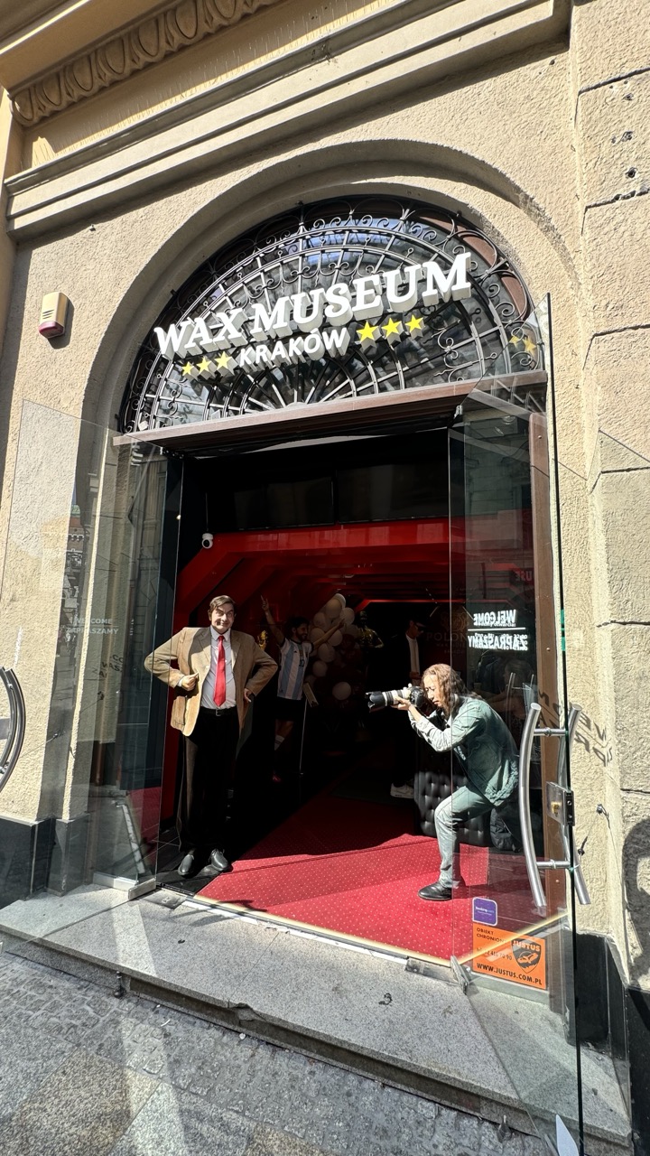

1. Overall Rating (0–10) — 6.8
This photograph captures a lively, layered moment outside the Wax Museum in Kraków, where reality and illusion intersect through the lens of a photographer. The juxtaposition of the wax figure, the real person posing beside it, and the photographer capturing the scene creates a self-referential narrative about art, identity, and documentation. While the composition is engaging and rich in detail, the visual clutter slightly detracts from the clarity of the central theme.
2. Composition (0–10) — 6.5
The arched entrance frames the scene effectively, guiding the eye toward the central action. However, the overlapping figures and reflections in the glass create a sense of visual congestion, and the framing feels slightly off-center, which disrupts the balance.
3. Lighting (0–10) — 7.0
Natural daylight illuminates the scene evenly, enhancing the textures of the stone facade and the vibrant red carpet. The contrast between the bright exterior and the darker interior adds depth and draws attention to the doorway as a threshold between reality and display.
4. Color & Tone (0–10) — 7.5
The bold red of the carpet and the warm tones of the wax figure’s suit create a strong visual anchor, while the neutral beige stone and dark glass provide a balanced backdrop. The color palette is cohesive, with the white lettering and yellow stars offering pops of contrast that enhance readability and visual interest.
5. Creativity (0–10) — 8.0
The image is conceptually rich, capturing the meta-photographic moment of one artist photographing another’s creation. The layered narrative—wax figure, real person, photographer—adds a playful, self-aware quality that elevates the image beyond a simple snapshot.
6. Technical Quality (0–10) — 7.0
The image is sharp and well-exposed, with clear details in both the foreground and background. The focus is consistent across the scene, though the reflections in the glass slightly soften the crispness of the subject on the right.
7. Emotional Impact (0–10) — 6.5
The photograph evokes a sense of curiosity and amusement, inviting viewers to reflect on the boundaries between authenticity and representation. While it doesn’t elicit a strong emotional response, it succeeds in creating a thought-provoking and engaging visual story.
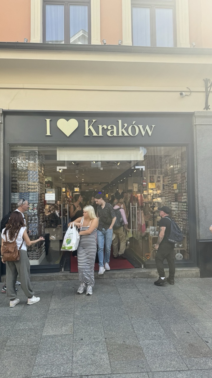

1. Overall Rating (0–10) — 6.0
This photograph captures a lively street scene in Kraków, centered on a souvenir shop that serves as both a commercial hub and a cultural marker. The candid movement of pedestrians and the warm, sun-drenched glow lend a sense of everyday authenticity. While the image effectively documents a moment in time, its composition feels slightly scattered and lacks a stronger visual anchor, diminishing its overall aesthetic cohesion.
2. Composition (0–10) — 5.5
The frame includes too much extraneous space above the storefront, drawing attention away from the main subject. The placement of people creates a sense of motion, but the lack of a clear focal point weakens the visual narrative.
3. Lighting (0–10) — 6.5
Natural daylight illuminates the scene evenly, with a soft golden hue suggesting late afternoon. The light enhances the warmth of the building’s facade, though some areas remain slightly overexposed, reducing detail in the highlights.
4. Color & Tone (0–10) — 6.0
The palette is dominated by muted earth tones—beige, gray, and soft orange—creating a harmonious but subdued atmosphere. The black-and-white signage stands out, but the lack of vibrant contrast keeps the image from feeling dynamic.
5. Creativity (0–10) — 5.5
The image is observational and straightforward, capturing a slice of urban life without strong artistic interpretation. The “I ♥ Kraków” sign adds a touch of thematic identity, but the execution remains largely documentary.
6. Technical Quality (0–10) — 7.0
The image is sharp and clear, with good focus on the storefront and people. However, the slight overexposure and uneven framing reduce its technical polish.
7. Emotional Impact (0–10) — 5.0
While the photograph conveys a sense of place and movement, it doesn’t evoke a deep emotional response. The viewer is left with a snapshot of a moment rather than a resonant experience.
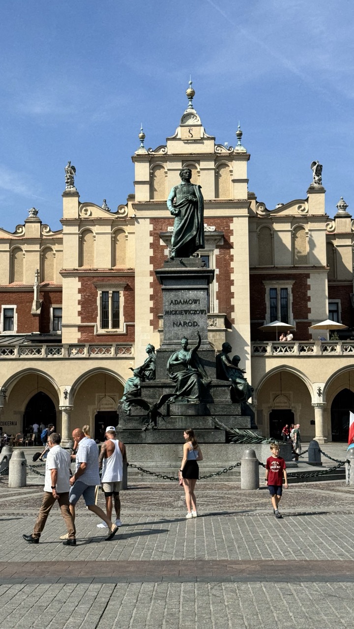

1. Overall Rating (0–10) — 7.0
This photograph captures the grandeur of a historic European square with a striking sense of place and movement. The central monument, flanked by ornate architecture and bustling with pedestrians, conveys both cultural weight and everyday life. While the composition is strong and the lighting is clear, the image feels slightly overexposed and lacks the nuanced tonal depth that would elevate it into a more compelling visual narrative.
2. Composition (0–10) — 7.5
The statue is well-centered, creating a strong focal point, and the leading lines of the cobblestone pavement and arches guide the eye toward the monument. The inclusion of people adds scale and dynamism, though their placement is somewhat scattered, creating a minor imbalance in the lower third.
3. Lighting (0–10) — 8.0
Bright, natural daylight enhances the textures of the stone and the crispness of the sky. The shadows are well-defined, indicating a high-angle sun that adds depth and clarity to the architectural details.
4. Color & Tone (0–10) — 6.5
The palette is dominated by warm beige and terracotta tones, punctuated by the deep green of the bronze statue and the vibrant blue of the sky. While the colors are clear and harmonious, the overall tone is slightly washed out, reducing the richness of the scene.
5. Creativity (0–10) — 6.0
The image is a solid documentary capture, successfully conveying the atmosphere of a public square. However, it lacks a distinctive visual concept or artistic interpretation, relying more on the inherent beauty of the location than on creative manipulation.
6. Technical Quality (0–10) — 7.5
The image is sharp and well-focused, with good resolution and minimal noise. The exposure is largely accurate, though the bright sky and pavement show slight overexposure, indicating a narrow dynamic range.
7. Emotional Impact (0–10) — 6.5
The photograph evokes a sense of civic pride and historical continuity, with the statue symbolizing cultural identity. The presence of visitors adds a human element, but the emotional resonance remains moderate, as the scene is more observational than deeply evocative.
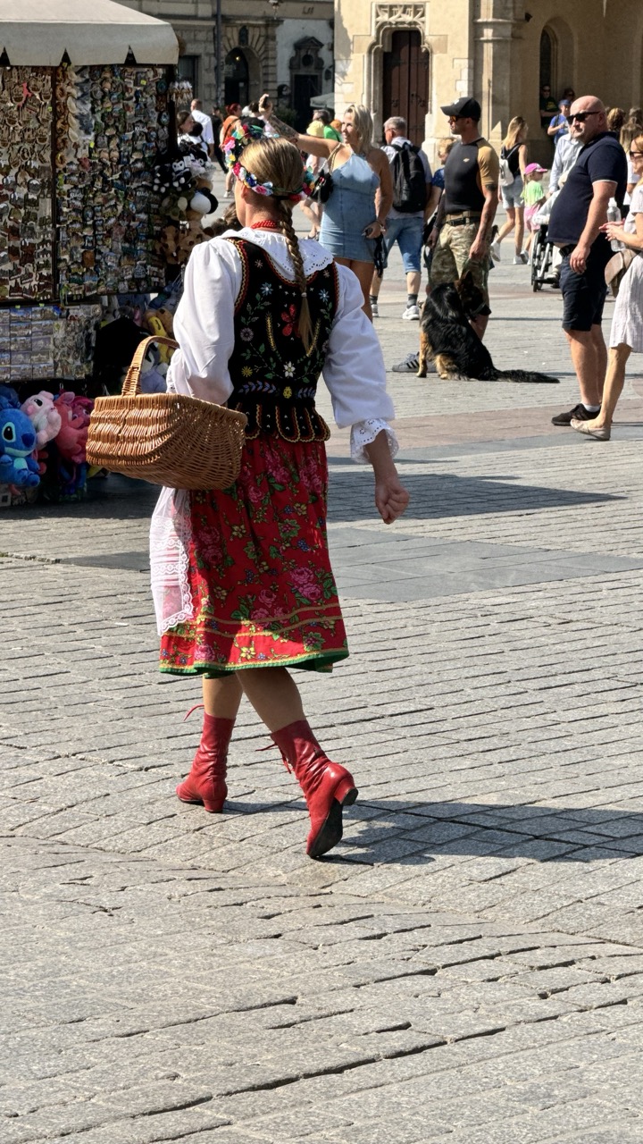

1. Overall Rating (0–10) — 7.0
This photograph captures a vibrant moment in a bustling European square, where tradition and modernity intersect in a single frame. The woman in the folk costume stands out as a vivid anchor against the neutral backdrop of cobblestones and tourists, her red boots and embroidered dress drawing the eye with cultural richness. While the scene is lively and authentic, the composition's busy background slightly dilutes the focus, keeping the image from feeling fully cohesive.
2. Composition (0–10) — 6.0
The subject is well-placed off-center, creating a sense of movement, but the cluttered background and overlapping figures distract from the central narrative. A tighter crop or more deliberate framing would enhance visual clarity.
3. Lighting (0–10) — 8.0
Strong, direct sunlight casts sharp shadows and highlights the textures of the cobblestones and the woman’s costume, enhancing depth and realism. The bright daylight gives the image a crisp, vivid quality.
4. Color & Tone (0–10) — 8.0
The rich reds and floral patterns of the dress contrast beautifully with the muted tones of the surroundings. The color palette is warm and lively, effectively emphasizing the cultural vibrancy of the subject.
5. Creativity (0–10) — 7.0
The juxtaposition of traditional dress against a contemporary tourist setting offers a compelling narrative about cultural preservation in modern life. The image feels candid and spontaneous, lending it a natural storytelling quality.
6. Technical Quality (0–10) — 7.5
The image is sharp and well-exposed, with clear detail in both the subject and the environment. Focus is accurate on the woman, though the background remains slightly busy.
7. Emotional Impact (0–10) — 7.0
There’s a quiet dignity in the woman’s confident stride and traditional attire, evoking a sense of pride and continuity. The viewer is invited to reflect on cultural identity within a globalized world, though the emotional resonance is tempered by the surrounding distractions.
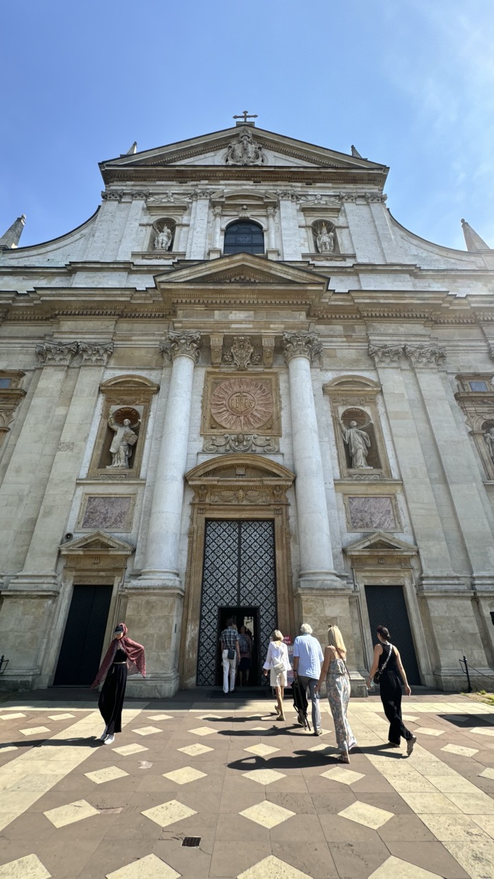

1. Overall Rating (0–10) — 7.0
This photograph captures the grandeur of a Baroque church facade under a clear blue sky, with pedestrians adding life and scale to the scene. The low-angle perspective emphasizes the architectural majesty, while the patterned pavement draws the eye toward the entrance. Though the composition feels slightly overexposed and the figures are somewhat scattered, the image successfully conveys both the historical weight of the structure and the rhythm of everyday life.
2. Composition (0–10) — 7.5
The low-angle framing enhances the verticality of the building, creating a sense of awe. The diagonal lines of the patterned pavement guide the viewer’s gaze toward the central doorway, while the placement of figures adds natural balance and movement.
3. Lighting (0–10) — 7.0
Bright, direct sunlight highlights the architectural details and casts sharp shadows, adding depth and texture. However, the harshness of the light slightly flattens the sky and overexposes the upper facade.
4. Color & Tone (0–10) — 6.5
The warm stone tones of the church contrast beautifully with the cool blue sky, creating a balanced palette. The neutral grays and beiges of the pavement lend a classic, timeless feel, though the overall tone leans slightly cool due to the bright daylight.
5. Creativity (0–10) — 6.0
The image is a strong architectural document, but its creativity lies more in observation than in conceptual interpretation. The inclusion of people adds narrative, but the approach remains conventional.
6. Technical Quality (0–10) — 8.0
The image is sharp and clear, with fine detail visible in the stonework and ironwork. The focus is consistent across the frame, and the exposure is generally well-managed despite some highlights being blown out.
7. Emotional Impact (0–10) — 6.5
The photograph evokes a sense of reverence and historical continuity, with the interplay of light, shadow, and movement suggesting the passage of time. While not deeply emotive, it invites quiet contemplation of place and purpose.
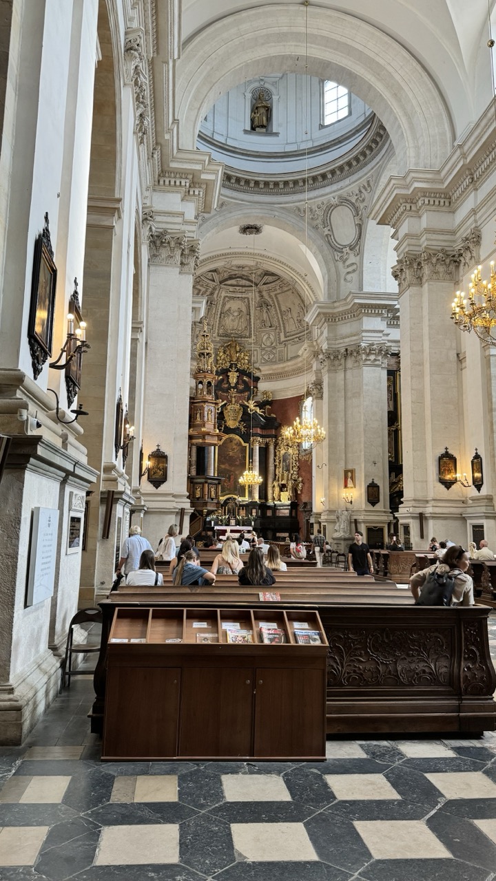

1. Overall Rating (0–10) — 7.0
This photograph captures the grandeur and serenity of a Baroque church interior, where light and architecture converge to evoke reverence and awe. The composition draws the eye through the nave toward the ornate altar, with the interplay of light and shadow enhancing the space’s verticality and spiritual weight. While the presence of visitors grounds the scene in everyday life, it slightly disrupts the timeless atmosphere that might otherwise dominate.
2. Composition (0–10) — 7.5
The strong leading lines of the pews and columns guide the viewer’s gaze toward the altar, creating a sense of depth and order. The central framing and symmetrical balance enhance the architectural harmony, though the foreground bookshelf introduces a slight visual interruption.
3. Lighting (0–10) — 7.0
Natural light filters through high windows, casting soft illumination across the marble and gilded surfaces. The chandeliers add warm accents, contributing to the sacred ambiance, though some areas remain underlit, reducing overall contrast.
4. Color & Tone (0–10) — 7.5
The palette is restrained and elegant—creams, golds, and deep blacks create a sophisticated contrast. The checkered floor adds a geometric rhythm, while the muted tones lend a timeless, solemn quality to the space.
5. Creativity (0–10) — 6.5
The image is more observational than interpretive, capturing the church’s beauty with clarity rather than through a distinctive artistic lens. The inclusion of people adds a narrative layer, but the approach remains documentary in nature.
6. Technical Quality (0–10) — 8.0
Sharp focus, accurate exposure, and clean detail highlight the textures of stone, wood, and metal. The wide-angle perspective is controlled, avoiding distortion while preserving the space’s scale.
7. Emotional Impact (0–10) — 7.0
The image evokes a quiet contemplative mood, inviting the viewer to feel the weight of history and devotion. The combination of grandeur and human presence creates a subtle emotional resonance, though it remains restrained rather than deeply moving.
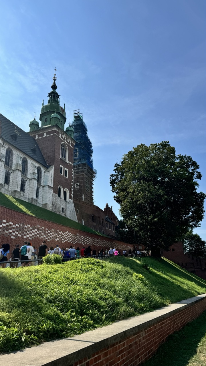

1. Overall Rating (0–10) — 7.0
This photograph captures the grandeur of a historic castle under a bright blue sky, with a lively crowd adding a sense of scale and life to the scene. The juxtaposition of ancient stone architecture and modern restoration scaffolding tells a story of continuity and preservation. While the composition is strong and the lighting is natural and vibrant, the image feels slightly unbalanced due to the large tree on the right, which partially obscures the castle’s silhouette.
2. Composition (0–10) — 6.5
The low-angle perspective emphasizes the height of the castle, but the right side feels crowded by the tree, creating visual imbalance. The diagonal line of the grassy slope leads the eye well, though the placement of the crowd slightly disrupts the visual flow.
3. Lighting (0–10) — 8.0
Bright, natural sunlight enhances the textures of the brick and stone, casting crisp shadows that add depth. The clear blue sky provides a clean backdrop, allowing the architectural details to stand out.
4. Color & Tone (0–10) — 7.5
The palette is vibrant, with rich greens from the grass and tree, deep reds in the brick, and the bright blue sky creating strong contrast. The tones feel natural and well-balanced, though the saturation could be slightly reduced to avoid overexposure in highlights.
5. Creativity (0–10) — 7.0
The image effectively captures a moment of historical presence in a contemporary setting, with the scaffolding adding a layer of narrative about restoration. The use of human figures grounds the scale and brings the scene to life.
6. Technical Quality (0–10) — 8.0
The image is sharp and well-focused, with clean details in both the foreground and background. The exposure is well-handled, though there is slight overexposure in the sky.
7. Emotional Impact (0–10) — 7.5
The photograph evokes a sense of awe and timelessness, inviting the viewer to imagine the castle’s history while also appreciating its ongoing preservation. The presence of people adds a touch of warmth and continuity, enhancing the emotional resonance.
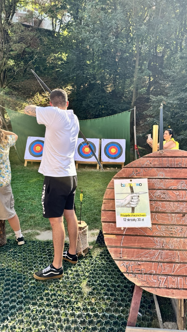

1. Overall Rating (0–10) — 6.0
This photograph captures a lively outdoor archery session with a sense of motion and casual engagement, but it feels more like a snapshot than a composed image. The central figure’s focused posture and the surrounding activity convey energy and recreation, yet the framing and technical execution hold it back from greater impact. While the scene is relatable and grounded in a moment of leisure, the lack of visual refinement prevents it from feeling truly compelling.
2. Composition (0–10) — 5.5
The subject is placed off-center, creating a sense of candid action, but the inclusion of the large wooden sign in the foreground disrupts the visual flow. The diagonal placement of the archer and the scattered elements—target, observer, foliage—create a slightly cluttered feel, reducing compositional harmony.
3. Lighting (0–10) — 6.5
Natural daylight illuminates the scene evenly, with soft shadows suggesting late afternoon. The light is clear and functional, but lacks the warmth or directionality that would enhance mood or depth. Overexposure in the sky and underexposed areas in the trees further limit the lighting’s impact.
4. Color & Tone (0–10) — 6.0
The palette is dominated by greens and earth tones, with the bright target rings offering a pop of color. However, the overall tone is muted, with washed-out highlights and a lack of rich contrast. The yellow of the woman’s top provides a subtle accent, but the colors don’t coalesce into a cohesive or striking visual scheme.
5. Creativity (0–10) — 5.5
The image captures a unique activity in a casual setting, but the approach is conventional and observational rather than expressive. The inclusion of the wooden sign and the informal setup suggest authenticity, yet the photographer does not push beyond documentation to create a more narrative or artistic interpretation.
6. Technical Quality (0–10) — 7.0
The image is sharp and well-focused, with clean detail in the subject and background. The exposure is mostly balanced, though some areas show slight overexposure. The camera appears to have captured the moment effectively, but there is little evidence of post-processing or intentional technique to elevate the image.
7. Emotional Impact (0–10) — 5.5
The photograph evokes a sense of fun and outdoor activity, but the emotional resonance is limited by its candid, unrefined presentation. While viewers may recognize the scene and feel a connection to the activity, the image stops short of inspiring deeper reflection or emotional engagement.
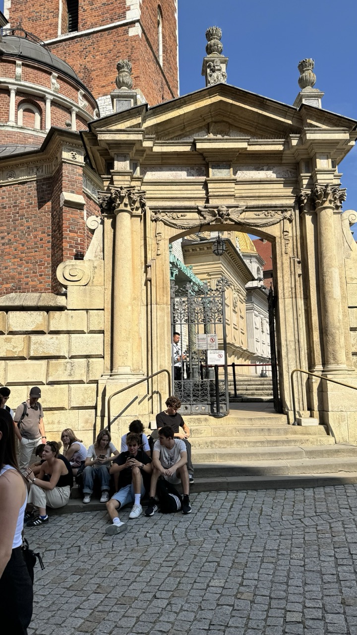

1. Overall Rating (0–10) — 6.8
This photograph captures a vibrant moment of urban life framed by historic architecture, where the juxtaposition of ancient stone and modern travelers creates a compelling narrative. The warm sunlight enhances the texture of the brick and stonework, lending the scene a timeless quality, while the casual posture of the people introduces a sense of spontaneity. Though the composition is slightly cluttered, the image succeeds in conveying both place and moment with authenticity.
2. Composition (0–10) — 6.0
The central archway acts as a strong focal point, drawing the eye into the depth of the scene, but the foreground group of people slightly disrupts the balance. A tighter crop might have improved the visual flow.
3. Lighting (0–10) — 8.0
Bright, direct sunlight highlights the architectural details and creates crisp shadows, enhancing the three-dimensionality of the structures and adding depth to the image.
4. Color & Tone (0–10) — 7.0
The warm golden tones of the stone contrast beautifully with the deep blue sky, while the neutral grays of the cobblestones ground the scene. The palette feels natural and harmonious.
5. Creativity (0–10) — 6.5
The image captures a candid, slice-of-life moment within a grand historical setting, offering a subtle commentary on the intersection of past and present. While not overtly experimental, it tells a quiet story through its context and composition.
6. Technical Quality (0–10) — 8.0
The photograph is sharp and well-exposed, with clear details in both the foreground and background. The focus is accurate, and the dynamic range handles the bright sky and shaded areas effectively.
7. Emotional Impact (0–10) — 6.5
The image evokes a sense of calm observation and connection to place—there's a quiet dignity in the architecture and a relaxed intimacy among the people. It invites the viewer to pause and reflect on the rhythm of daily life in a historic city.
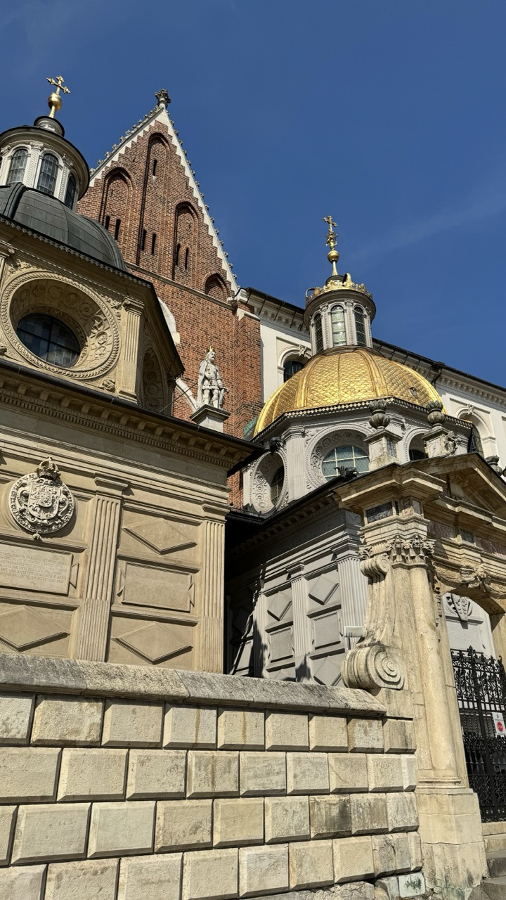

1. Overall Rating (0–10) — 8.0
This photograph captures the grandeur of a historic European church with striking clarity and reverence, where architectural detail and golden ornamentation stand out against a vivid blue sky. The low-angle perspective amplifies the monumentality of the structure, while the interplay of light and shadow enhances its three-dimensional form. A slightly tighter composition would further elevate the image, but as it stands, it successfully conveys the awe-inspiring presence of the building.
2. Composition (0–10) — 7.5
The low-angle shot emphasizes verticality and scale, drawing the eye upward through the layered architectural elements. The foreground stone wall grounds the image, while the placement of the golden dome and brick tower creates a balanced yet dynamic arrangement. A slight shift in angle could improve symmetry and reduce visual clutter on the right.
3. Lighting (0–10) — 9.0
Strong, direct sunlight enhances textures and highlights the reflective gold of the dome, creating a luminous effect. The crisp shadows define the building’s intricate carvings and structural lines, while the clear blue sky provides a clean, contrasting backdrop that makes the subject pop.
4. Color & Tone (0–10) — 8.5
The rich golden dome contrasts beautifully with the deep blue sky and warm tones of the brickwork, creating a vibrant and harmonious palette. The natural tones of the stone and the subtle variations in light and shadow add depth and visual interest, with the golden elements serving as a compelling focal point.
5. Creativity (0–10) — 8.0
The photographer captures a moment of architectural splendor with a strong sense of place and historical weight. The choice to frame the shot from below adds a sense of reverence and drama, elevating a standard architectural view into something more evocative and majestic.
6. Technical Quality (0–10) — 8.5
The image is sharp and well-focused, with excellent clarity in the fine details of the stonework, domes, and crosses. The exposure is well-balanced, preserving highlights in the gold and shadows in the architectural recesses, resulting in a technically strong and visually compelling photograph.
7. Emotional Impact (0–10) — 8.0
The image evokes a sense of awe and reverence, inviting the viewer to appreciate both the craftsmanship and spiritual significance of the structure. The bright, clear day and radiant light contribute to a feeling of hope and grandeur, making the building feel both timeless and present.
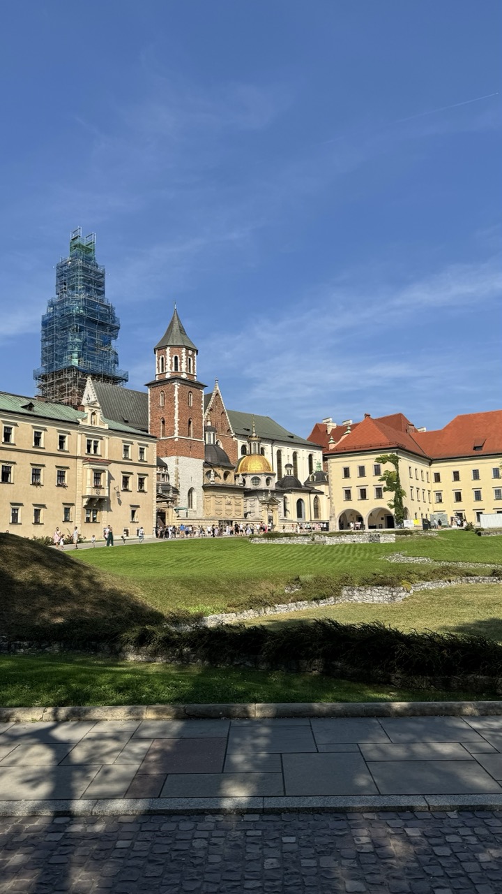

1. Overall Rating (0–10) — 7.0
This photograph captures the historic grandeur of Wawel Castle under a vast, clear sky, balancing architectural majesty with a sense of everyday life. The vibrant blue of the sky contrasts beautifully with the warm tones of the buildings and the lush green lawn, creating a scene that feels both timeless and alive. While the scaffolding on the tower introduces a modern intrusion, it also adds a layer of narrative about preservation and continuity, grounding the image in the present moment.
2. Composition (0–10) — 7.0
The wide-angle perspective effectively frames the full breadth of the castle complex, with the cobblestone foreground guiding the eye toward the central architecture. The diagonal line of the grassy slope adds dynamic movement, while the placement of the tower slightly off-center creates visual interest without disrupting balance.
3. Lighting (0–10) — 8.0
The bright, natural daylight enhances the textures of the stone and brick, casting soft shadows that define the architectural forms. The clear sky and even illumination give the scene a crisp, open feel, emphasizing the clarity of the day and the scale of the site.
4. Color & Tone (0–10) — 7.5
The palette is rich and harmonious, with warm yellows and reds of the buildings complementing the deep blue of the sky. The green lawn provides a fresh, natural contrast, while the subtle shadows add depth without overwhelming the tonal balance.
5. Creativity (0–10) — 6.5
The image is a strong documentary capture of a well-known landmark, with a clear emphasis on realism and context. The inclusion of the scaffolding adds a narrative element, but the overall approach remains conventional rather than artistically inventive.
6. Technical Quality (0–10) — 8.0
The image is sharp and well-exposed, with clean details throughout the architecture and landscape. The focus is consistent, and the dynamic range handles the bright sky and shaded areas effectively.
7. Emotional Impact (0–10) — 7.0
The photograph evokes a sense of awe and reverence for history, inviting the viewer to imagine centuries of stories unfolding within these walls. The presence of people adds a human scale, making the grandeur feel accessible and relatable.
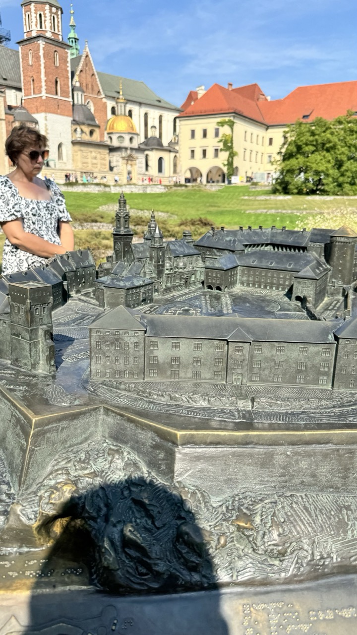

1. Overall Rating (0–10) — 6.8
This photograph captures a layered moment where history and presence intersect, with a detailed bronze model of a historic cityscape set against the real backdrop of its architectural twin. The juxtaposition of the miniature and the monumental evokes a sense of time and memory, though the composition’s cluttered foreground and the woman’s casual stance slightly disrupt the image’s narrative cohesion. The scene feels like a candid snapshot of tourism, yet it carries a quiet dignity in its documentation of cultural heritage.
2. Composition (0–10) — 6.0
The frame is cluttered by the foreground model and the woman’s shadow, which partially obscure the sculpture’s details. The woman’s placement on the left creates visual imbalance, and the strong diagonal of the model’s edge competes with the horizontal lines of the background buildings.
3. Lighting (0–10) — 7.5
Bright, natural daylight enhances the textures of the bronze model and illuminates the historic buildings in the background. The clear blue sky and even lighting contribute to a vivid, sunlit atmosphere.
4. Color & Tone (0–10) — 6.5
The palette is dominated by earthy browns and grays of the bronze and stone, contrasted by the vibrant green of the lawn and the blue sky. The colors are natural and well-balanced, though the lack of saturation in the bronze tones slightly dampens the overall vibrancy.
5. Creativity (0–10) — 7.0
The concept of photographing a model alongside its real-world counterpart is clever and evocative, creating a dialogue between past and present. The inclusion of the human figure adds a sense of scale and relatability, enhancing the storytelling potential.
6. Technical Quality (0–10) — 7.0
The image is sharp and clear, with good focus on the bronze model and sufficient detail in the background. The exposure is well-managed, though the shadow of the photographer in the foreground slightly detracts from the composition’s clarity.
7. Emotional Impact (0–10) — 6.0
The image conveys a sense of reverence for history and a quiet contemplation of time’s passage. While the emotional resonance is present, it is tempered by the casual, tourist-like context, which keeps the viewer from fully immersing in the deeper narrative.
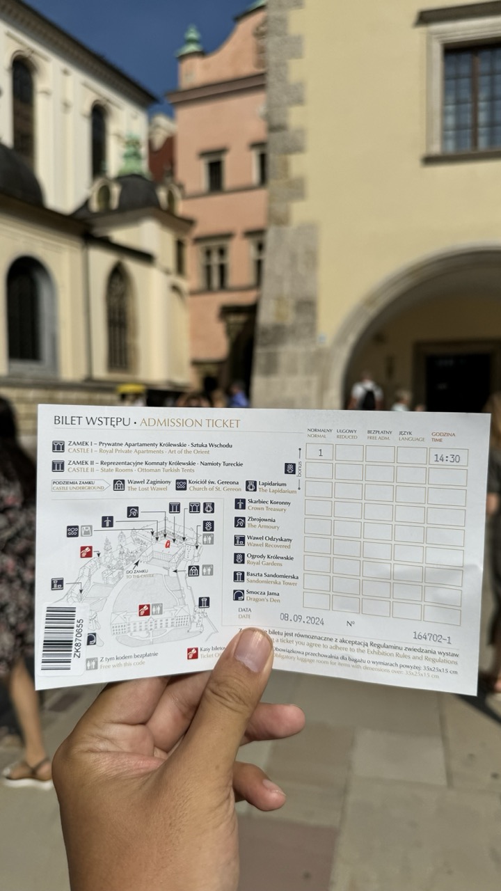

1. Overall Rating (0–10) — 6.0
This photograph captures a moment of travel and memory, with the admission ticket serving as both a document and a memento of a visit to Wawel Castle. The blurred historical backdrop adds context and atmosphere, grounding the ticket in its place, though the shallow depth of field and slightly cluttered framing keep the image from feeling fully cohesive. While the concept is strong—juxtaposing a personal artifact with its iconic setting—the composition and technical execution hold it back from greater visual impact.
2. Composition (0–10) — 5.5
The ticket is centered but slightly tilted, with the background architecture softly out of focus. While the hand holding the ticket provides a sense of presence, the composition feels casual and unbalanced, with too much empty space on the left and a distracting foreground element.
3. Lighting (0–10) — 7.0
Natural daylight illuminates the scene evenly, highlighting the ticket’s details without harsh shadows. The soft focus on the background complements the bright, even lighting, though the lack of directional light limits depth and mood.
4. Color & Tone (0–10) — 6.0
The palette is muted and natural, with earthy tones in the background and the white of the ticket creating contrast. While the colors are true to life, the overall tone lacks vibrancy and emotional warmth, giving the image a slightly flat appearance.
5. Creativity (0–10) — 6.5
The idea of photographing a ticket as a narrative device is thoughtful and personal. It transforms a simple souvenir into a story of travel and place, though the execution remains more documentary than artistic.
6. Technical Quality (0–10) — 7.5
The ticket is sharp and legible, with clear text and a readable barcode. The focus is well-placed on the ticket, while the background blur effectively separates subject from context. Minor framing issues prevent it from being technically flawless.
7. Emotional Impact (0–10) — 5.5
The image evokes a sense of nostalgia and personal experience, but the lack of emotional intensity or visual drama keeps the viewer at a distance. It feels like a snapshot rather than a moment of reflection.
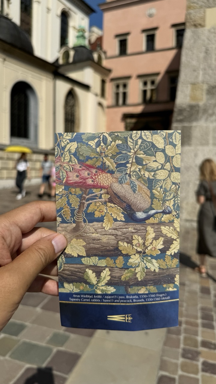

1. Overall Rating (0–10) — 6.0
This photograph captures a moment of personal connection to art and history, with the hand holding a postcard featuring a richly detailed tapestry as the focal point. The background, though softly blurred, provides a compelling context of a historic European square, grounding the image in place and time. While the composition is grounded in authenticity and narrative, it lacks the visual polish and intentional framing that would elevate it beyond a casual snapshot.
2. Composition (0–10) — 5.5
The postcard is centered and clearly legible, but the framing feels slightly awkward—too much negative space in the foreground and background distracts from the subject. A tighter crop would emphasize the tapestry and enhance visual cohesion.
3. Lighting (0–10) — 7.0
Natural daylight illuminates the scene evenly, with soft shadows that suggest a sunny but overcast day. The light highlights the texture and colors of the postcard while keeping the background softly out of focus, creating a pleasing depth.
4. Color & Tone (0–10) — 6.5
The warm, earthy tones of the tapestry—gold, deep blue, and rust red—stand out against the muted pastel backdrop of the buildings. The overall palette feels balanced, though the slightly desaturated background tempers the vibrancy of the postcard’s design.
5. Creativity (0–10) — 6.0
The image succeeds in blending the personal with the historical, using the postcard as a narrative device to connect the viewer to a broader cultural context. While not groundbreaking, it demonstrates thoughtful intention in its storytelling approach.
6. Technical Quality (0–10) — 7.0
The image is sharp where it matters—on the postcard—with good focus and clarity. The shallow depth of field effectively isolates the subject, though the slight motion blur in the background suggests a modestly fast shutter speed.
7. Emotional Impact (0–10) — 5.5
There's a quiet sense of discovery and travel in the image, evoking the feeling of a tourist capturing a meaningful memento. It invites reflection on art and memory, but the emotional resonance remains modest due to the lack of strong visual drama.
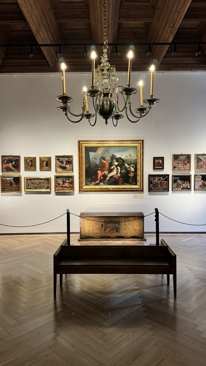

1. Overall Rating (0–10) — 7.5
This photograph captures the solemn elegance of a museum gallery, where historical art and architecture converge to create a sense of timelessness. The warm glow of the chandelier contrasts beautifully with the cool white walls, enhancing the richness of the artworks and the wooden textures. While the scene is visually cohesive and well-composed, the lack of human presence lends a quiet detachment, preventing the image from fully engaging the viewer’s emotional curiosity.
2. Composition (0–10) — 8.0
The central placement of the large painting and the symmetrical arrangement of surrounding works create a balanced, gallery-like harmony. The bench and rope barrier in the foreground guide the eye toward the focal point while adding depth and context.
3. Lighting (0–10) — 8.0
The chandelier casts a soft, warm light that enhances the golden tones of the frames and the ornate chest, while track lighting subtly illuminates the paintings. The interplay of light and shadow adds dimension and drama without overexposing the scene.
4. Color & Tone (0–10) — 7.5
The palette is dominated by warm browns, golds, and deep reds, complemented by the neutral white walls and herringbone floor. The tonal contrast is rich but restrained, lending a refined and cohesive atmosphere.
5. Creativity (0–10) — 7.0
The image successfully captures the narrative of a curated space, emphasizing the art’s historical context. While not overtly experimental, it demonstrates thoughtful curation and a clear artistic intent to highlight the gallery as a sacred space of cultural memory.
6. Technical Quality (0–10) — 8.5
The image is sharp, with excellent detail in the textures of the wood, paint, and metal. The focus is consistent across the frame, and the exposure is well-balanced, preserving both highlights and shadows.
7. Emotional Impact (0–10) — 7.0
The photograph evokes a sense of reverence and quiet contemplation, inviting the viewer to step into a world of history and art. The stillness of the space allows for introspection, though the absence of people tempers the emotional resonance.
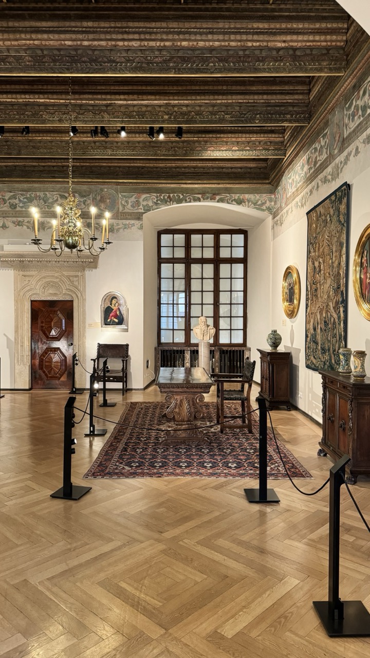

1. Overall Rating (0–10) — 8.0
This photograph captures the solemn grandeur of a historic gallery space, where centuries of artistry converge in a harmonious still life. The interplay of architectural detail, classical objects, and warm light creates a sense of timelessness and reverence. While the scene is rich in texture and narrative, a slightly more dynamic composition and intentional lighting contrast could elevate its emotional resonance.
2. Composition (0–10) — 8.0
The symmetrical framing centers the viewer’s gaze on the table and bust, creating a balanced and formal arrangement. The herringbone floor guides the eye toward the archway, while the rope barriers subtly define space without disrupting the visual flow.
3. Lighting (0–10) — 7.5
The combination of natural light from the window and the warm glow of the chandelier creates a layered, inviting atmosphere. The overhead track lighting enhances detail on the ceiling and artworks, though some areas remain underlit, softening the overall clarity.
4. Color & Tone (0–10) — 8.0
The warm, earthy palette of wood, terracotta, and gold tones harmonizes beautifully with the muted greens and blues of the tapestry and frescoes. The tonal contrast between the polished floor and darker accents adds depth without overwhelming the scene.
5. Creativity (0–10) — 7.5
The image successfully conveys a narrative of cultural preservation, capturing a moment of quiet stillness within a living museum. While not overtly experimental, the thoughtful inclusion of both historical and modern elements—like the stanchions—adds a subtle contemporary layer.
6. Technical Quality (0–10) — 8.5
Sharp focus and clean detail throughout, particularly in the ceiling carvings and rug pattern. The exposure is well-managed, with no blown highlights or lost shadows, showcasing the room’s textures with clarity.
7. Emotional Impact (0–10) — 8.0
The room evokes a contemplative hush, inviting quiet reflection on history and art. The viewer feels as though they’ve stepped into a preserved moment—still, dignified, and deeply human.
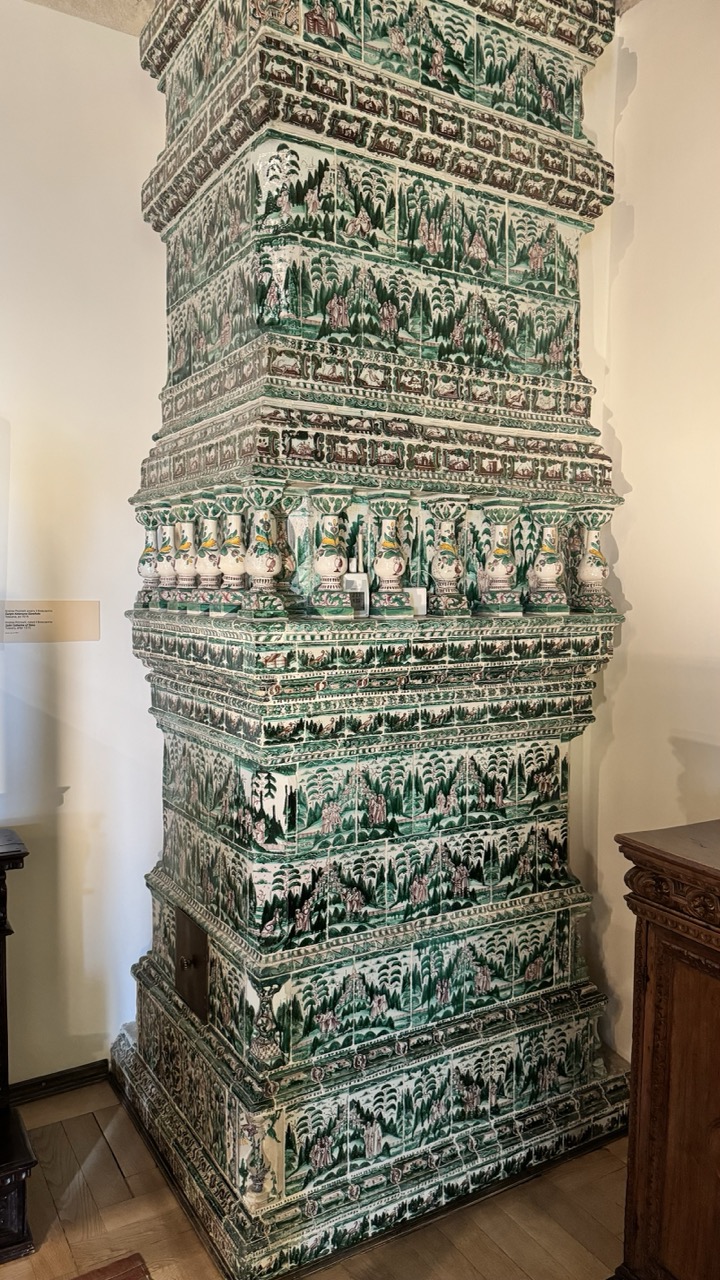

1. Overall Rating (0–10) — 7.0
This photograph captures the intricate artistry of a historic tiled stove, showcasing its elaborate green and white ceramic patterns with a sense of reverence. The composition emphasizes the structure’s verticality and ornate details, though the surrounding museum setting feels slightly sterile, dampening the object’s cultural richness. A more dynamic angle or lighting could elevate the image from documentation to storytelling.
2. Composition (0–10) — 7.5
The vertical framing aligns well with the stove’s towering form, drawing the eye upward through its layered narrative panels. The placement feels balanced, with the surrounding furniture and wall providing context without distracting from the central subject.
3. Lighting (0–10) — 6.0
Soft, ambient light evenly illuminates the stove but lacks depth, resulting in a somewhat flat appearance. The absence of directional light prevents shadows that could accentuate the tilework’s texture and three-dimensionality.
4. Color & Tone (0–10) — 7.0
The green and white palette is rich and harmonious, with the earthy tones of the wood floor and cabinet complementing the ceramic hues. The tone is subdued, appropriate for a museum setting, but could benefit from slightly more contrast to enhance visual impact.
5. Creativity (0–10) — 7.5
The image successfully highlights the stove’s narrative quality—each tile panel tells a story. The choice to photograph it as a standalone object in a gallery context is effective, allowing the craftsmanship to speak for itself.
6. Technical Quality (0–10) — 8.0
Sharp focus and clean detail allow the viewer to appreciate the fine lines and patterns of the tiles. The image is technically sound, with no noticeable flaws in exposure or clarity.
7. Emotional Impact (0–10) — 6.5
While the photograph conveys respect for the artifact, it remains somewhat detached. The viewer is invited to admire, but not to feel—there’s a quiet dignity in the object, yet the emotional resonance is held back by the clinical setting.
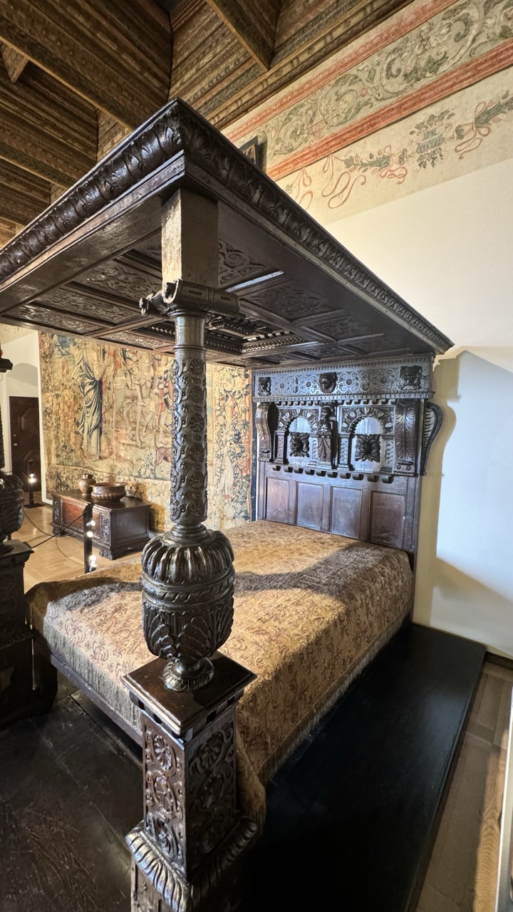

1. Overall Rating (0–10) — 8.0
This photograph captures the grandeur and meticulous craftsmanship of a historic bedroom, where every detail—from the carved canopy bed to the ornate tapestry—speaks of a bygone era. The composition draws the viewer into a world of opulence and narrative, with rich textures and deep shadows enhancing the sense of time and place. While the image is powerful in its authenticity, a slightly warmer tone and more dynamic lighting could elevate its emotional resonance.
2. Composition (0–10) — 8.0
The low-angle perspective emphasizes the scale and intricacy of the four-poster bed, with the diagonal lines of the canopy guiding the eye toward the tapestry and headboard. The framing feels deliberate, though the slight clutter of the left foreground slightly disrupts the visual harmony.
3. Lighting (0–10) — 7.0
The lighting is soft and ambient, with natural light filtering in from an unseen source, creating gentle shadows that accentuate the woodwork’s relief. While the illumination is adequate, it lacks dramatic contrast, leaving some of the finer carvings slightly obscured.
4. Color & Tone (0–10) — 7.5
The palette is warm and earthy, dominated by deep browns, golds, and muted reds, which harmonize beautifully with the historical setting. The tones are rich but slightly subdued, with a naturalistic quality that enhances authenticity.
5. Creativity (0–10) — 8.5
The image successfully captures the narrative potential of the space, emphasizing both its architectural beauty and cultural significance. The choice to focus on the bed as the central subject, framed by surrounding artifacts, feels both intentional and evocative.
6. Technical Quality (0–10) — 8.0
Sharp focus and clean detail are evident throughout, particularly in the carved wood and fabric textures. The image is well-exposed, with no obvious technical flaws, though a slight adjustment in contrast could enhance depth.
7. Emotional Impact (0–10) — 8.0
The photograph evokes a quiet reverence for history and craftsmanship, inviting contemplation of the lives once lived in this space. The atmosphere is intimate yet majestic, creating a strong emotional connection to the past.
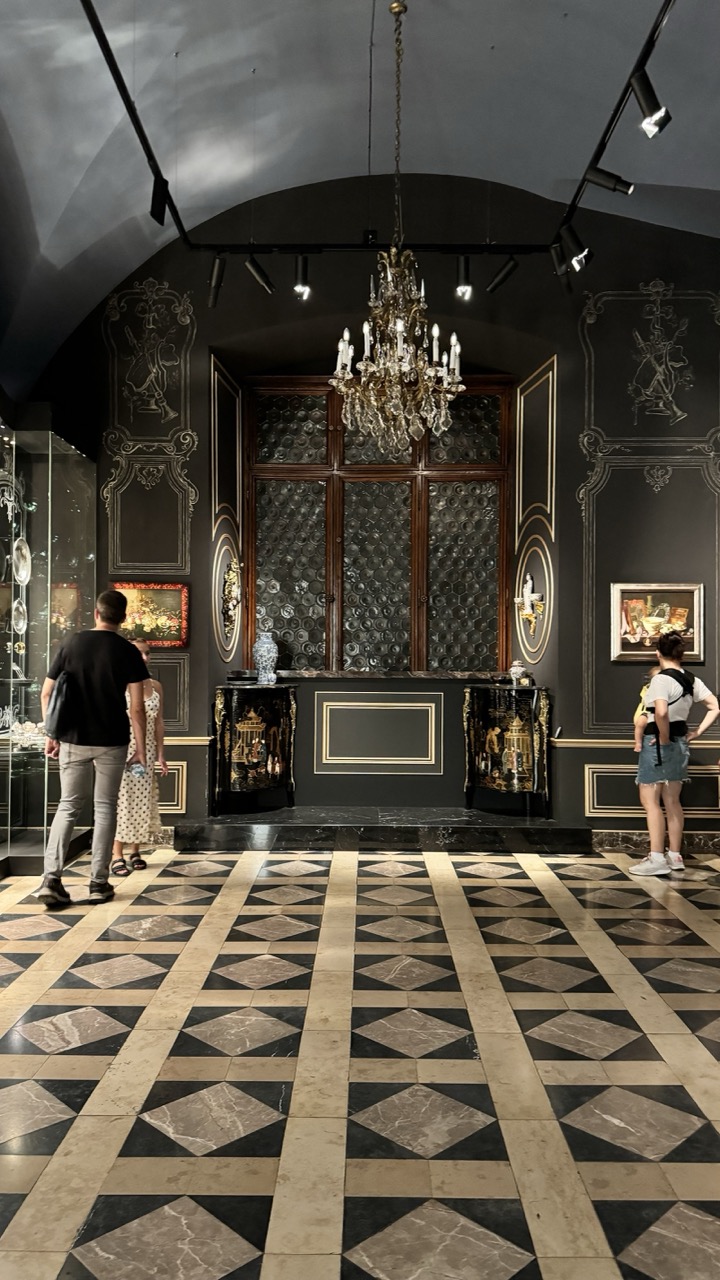

1. Overall Rating (0–10) — 7.5
This photograph captures the opulent grandeur of a museum or gallery space, where historical craftsmanship meets modern exhibition design. The interplay of dark walls, ornate detailing, and the geometric floor creates a visually rich environment that draws the eye toward the central chandelier and display. While the composition is strong, the presence of visitors slightly disrupts the sense of timelessness, grounding the scene in the present moment.
2. Composition (0–10) — 7.0
The symmetry of the central chandelier and the arched alcove anchors the frame, with the geometric floor leading the viewer’s gaze toward the focal point. The placement of the visitors on either side adds balance, though their casual presence slightly offsets the formal composition.
3. Lighting (0–10) — 8.0
The combination of the chandelier’s warm glow and the directional track lighting creates a dramatic interplay of light and shadow, emphasizing architectural details and enhancing the space’s luxurious atmosphere. The lighting is well-controlled, with highlights and shadows contributing to depth.
4. Color & Tone (0–10) — 8.0
The palette of deep black, gold, and marble tones evokes a sense of refined elegance, with the warm lighting adding subtle richness to the cool marble. The contrast between light and dark enhances the visual drama without overwhelming the scene.
5. Creativity (0–10) — 7.0
The photograph successfully juxtaposes historical opulence with contemporary museum aesthetics, creating a narrative of preservation and display. The inclusion of visitors adds a layer of social context, suggesting the space as both a cultural artifact and a living environment.
6. Technical Quality (0–10) — 8.5
The image is sharp and well-exposed, with clear detail in both the foreground and background. The focus is consistent across the scene, and the dynamic range effectively captures both the bright highlights of the chandelier and the deeper shadows of the walls.
7. Emotional Impact (0–10) — 7.5
The image evokes a sense of awe and reverence, inviting the viewer to imagine the history behind the ornate space. The quiet presence of the visitors adds a human element, making the grandeur feel accessible and relatable.
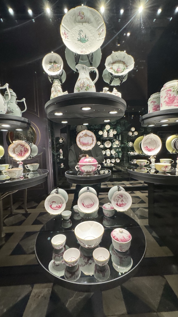

1. Overall Rating (0–10) — 7.0
This photograph captures the opulent elegance of a porcelain exhibition, where delicate ceramics are elevated into a visual symphony of form and reflection. The layered arrangement of plates, cups, and teapots on mirrored surfaces creates a sense of depth and luxury, while the dark, theatrical setting enhances the richness of the designs. Though the composition is visually dense, it succeeds in conveying a sense of refined craftsmanship and curated beauty, even if the sheer abundance risks overwhelming the viewer.
2. Composition (0–10) — 7.0
The circular display and mirrored surfaces create a strong sense of symmetry and repetition, guiding the eye through multiple planes. The central arrangement draws focus, though the overlapping elements and reflections introduce a slight visual clutter.
3. Lighting (0–10) — 8.0
The spotlights highlight the porcelain with precision, emphasizing the intricate details and glossy finishes. The contrast between the bright, focused light and the dark background enhances the drama and luxury of the display.
4. Color & Tone (0–10) — 7.0
The palette is dominated by soft whites and pastel pinks, with subtle hints of gold and green in the painted motifs. The dark surroundings deepen the contrast, allowing the colors to appear luminous and refined.
5. Creativity (0–10) — 7.5
The use of reflective surfaces and layered displays transforms a traditional porcelain showcase into a dynamic, almost sculptural installation. The interplay of reflections and repetition adds a modern, artistic sensibility to a classic subject.
6. Technical Quality (0–10) — 8.0
Sharp focus and high detail capture the fine craftsmanship of the porcelain. The clarity of reflections and the clean handling of light indicate strong technical execution.
7. Emotional Impact (0–10) — 7.0
The image evokes a sense of wonder and admiration for both artistry and luxury. The theatrical presentation invites contemplation, suggesting a reverence for tradition and beauty, though the lack of a human presence tempers the emotional warmth.
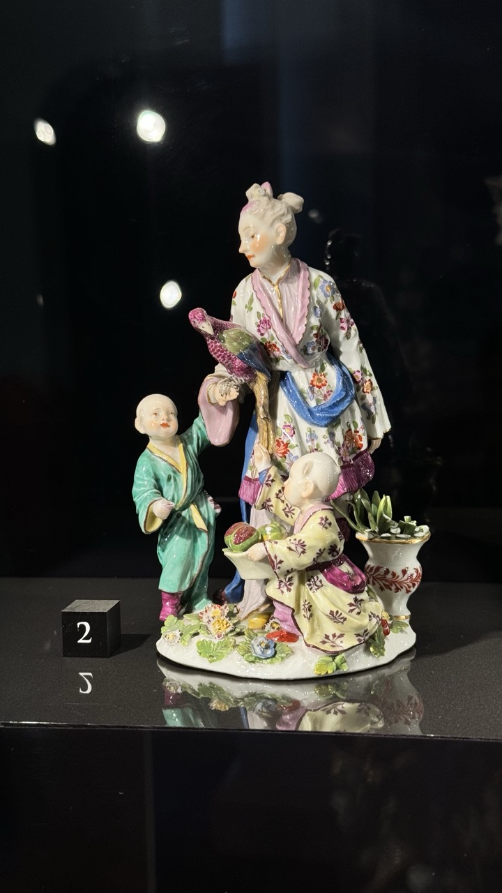

1. Overall Rating (0–10) — 7.5
This porcelain figurine radiates the delicate craftsmanship and cultural fusion of 18th-century European Chinoiserie, capturing a moment of playful interaction between a woman and two children with exquisite detail. The vibrant, hand-painted floral patterns and lifelike poses convey a sense of narrative richness, while the museum lighting enhances the glossy finish of the porcelain. The dark, reflective display case provides a dramatic contrast that elevates the piece, though the presence of a numbered block slightly disrupts the aesthetic harmony.
2. Composition (0–10) — 7.0
The figurine is centered with a balanced arrangement of figures, drawing the eye naturally to the central woman and her interaction with the children. The slight tilt of the base and the inclusion of the numbered block introduce a minor compositional imbalance, but the overall framing remains effective in showcasing the sculpture’s intricate design.
3. Lighting (0–10) — 8.0
The soft, directional lighting from above highlights the glossy surface of the porcelain and accentuates the fine details of the painted garments and facial features. The reflections on the dark, polished surface add depth, while the dark background ensures the figurine remains the focal point.
4. Color & Tone (0–10) — 8.5
The rich, varied palette—featuring soft pinks, vibrant greens, and deep blues—creates a visually engaging and harmonious composition. The contrast between the colorful figurine and the dark, neutral background enhances the vibrancy of the hues, while the warm tones lend an inviting, almost theatrical quality.
5. Creativity (0–10) — 8.0
The figurine embodies a creative blend of European craftsmanship and East Asian-inspired aesthetics, a hallmark of Chinoiserie art. The narrative composition—featuring a woman with a bird and children engaged with fruit and plants—suggests a story of domestic intimacy, evoking a sense of charm and cultural exchange.
6. Technical Quality (0–10) — 9.0
The image is sharp and well-focused, capturing the fine textures of the porcelain and the intricate paintwork with clarity. The exposure is well-balanced, preserving detail in both the highlights and shadows without overexposure or loss of detail.
7. Emotional Impact (0–10) — 7.5
The figurine evokes a sense of nostalgia and quiet joy, inviting the viewer to imagine the story behind the characters. The delicate expressions and tender gestures convey warmth and familial connection, creating an emotional resonance that lingers despite the object’s artificial nature.
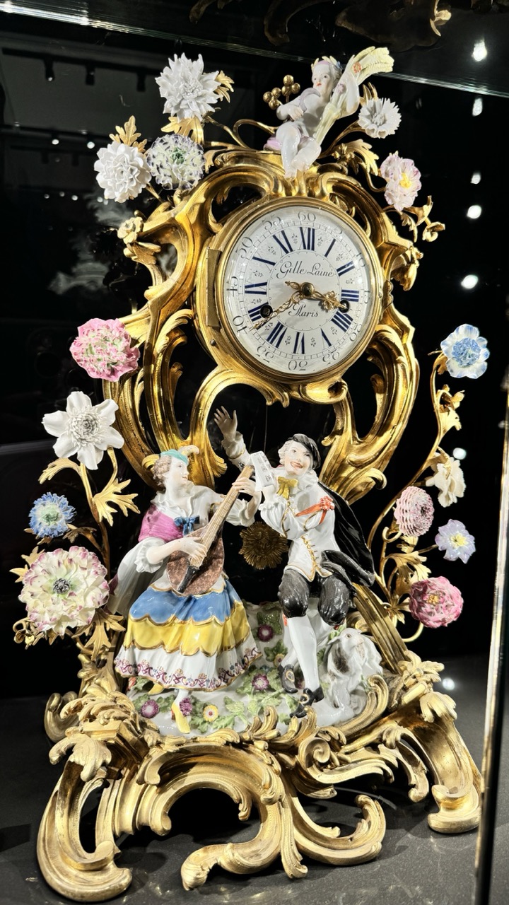

1. Overall Rating (0–10) — 8.0
This photograph captures the opulent elegance of a Galle-Laine Paris clock, where baroque ornamentation and delicate porcelain figures converge in a dazzling display of craftsmanship. The intricate details—gilded curves, floral embellishments, and expressive figurines—are illuminated with a rich, theatrical glow that enhances the object’s luxurious character. While the dark background effectively isolates the subject, a slightly more balanced exposure could further elevate the visual harmony without losing the dramatic mood.
2. Composition (0–10) — 8.0
The central placement of the clock draws immediate attention, with its symmetrical yet dynamic arrangement of figures and florals creating a balanced and engaging composition. The slight tilt of the camera adds a subtle sense of movement, preventing the image from feeling static.
3. Lighting (0–10) — 8.5
The lighting is carefully directed, highlighting the gilded surfaces and porcelain details with a warm, reflective glow. The contrast between the illuminated clock and the dark background enhances depth and emphasizes the three-dimensional quality of the object.
4. Color & Tone (0–10) — 8.0
The palette is rich and harmonious, with the golden tones of the frame complementing the soft pastels of the flowers and the vibrant hues of the figurines’ attire. The tonal contrast between the bright elements and the deep black background creates a visually striking effect.
5. Creativity (0–10) — 8.5
The image captures not just an object, but a narrative of artistry and time. The choice to frame this piece in a museum-like setting, with focused lighting and a reflective surface, evokes a sense of reverence and historical continuity.
6. Technical Quality (0–10) — 8.0
The image is sharp and detailed, with clear focus on the clock’s intricate elements. The reflections on the glass case and the subtle lens flare add a layer of realism, though the reflections could be slightly distracting if not for the overall clarity.
7. Emotional Impact (0–10) — 7.5
There is a sense of wonder and admiration evoked by the craftsmanship and artistry on display. The viewer is invited to appreciate both the mechanical precision and the artistic expression, creating a moment of quiet awe and appreciation for fine art.
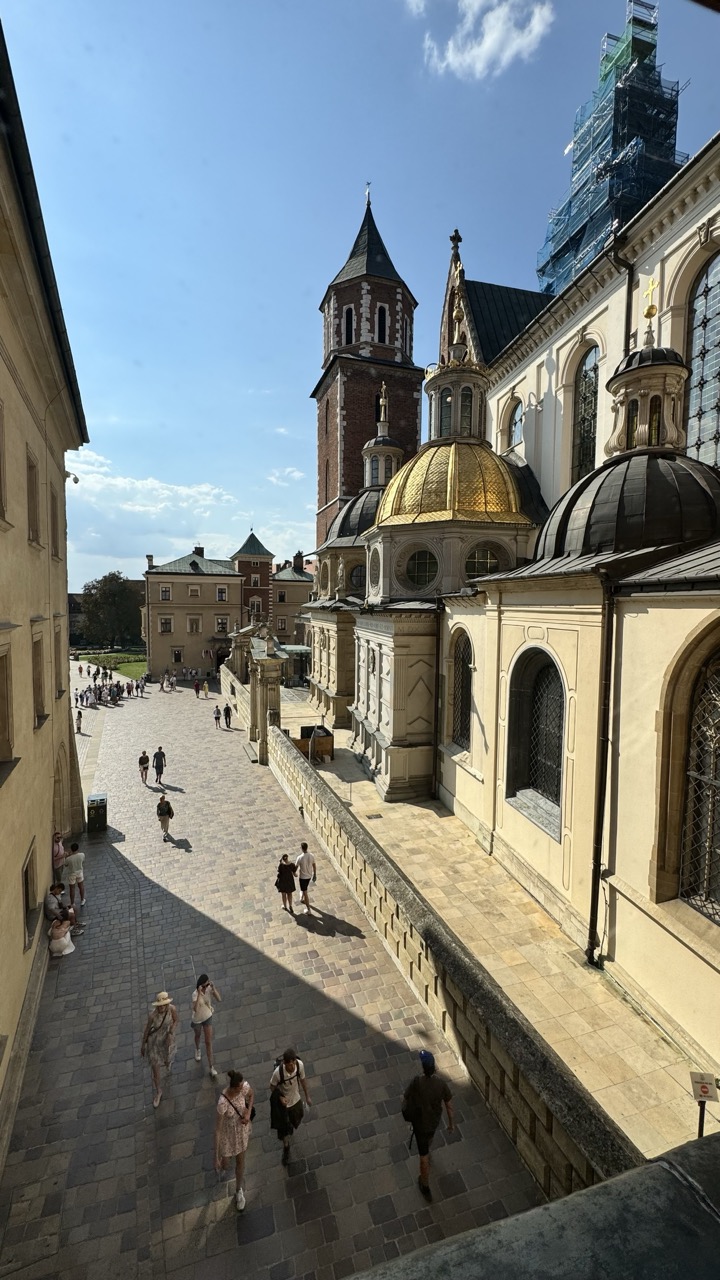

1. Overall Rating (0–10) — 7.0
This photograph captures the vibrant energy of a historic European courtyard under a bright, clear sky, where architecture and human movement converge in dynamic harmony. The golden dome and gothic spire stand as commanding focal points, while the interplay of light and shadow adds depth and rhythm to the scene. Though the composition feels slightly crowded by the presence of tourists, the image successfully conveys the lively atmosphere of a well-trodden cultural landmark.
2. Composition (0–10) — 7.5
The diagonal path leads the eye naturally into the frame, creating a sense of depth and guiding the viewer toward the central architectural elements. The placement of the golden dome and the tower creates visual balance, while the scattered figures add scale and life without overwhelming the scene.
3. Lighting (0–10) — 8.0
Strong, directional sunlight enhances the textures of the stone and creates crisp, elongated shadows that add dimension. The contrast between sunlit areas and shaded pathways enriches the visual narrative and emphasizes the time of day.
4. Color & Tone (0–10) — 7.0
The warm golden tones of the dome and stone contrast beautifully with the deep blue sky, creating a rich and inviting palette. While the colors are vibrant, the slightly cool white balance of the sky slightly tempers the warmth of the scene.
5. Creativity (0–10) — 7.5
The elevated perspective offers a fresh, panoramic view of the site, transforming a familiar scene into something more contemplative and expansive. The juxtaposition of historic architecture with modern-day visitors adds a subtle layer of timelessness and continuity.
6. Technical Quality (0–10) — 8.5
The image is sharp and well-focused, with fine detail visible in both the architectural elements and the people in the foreground. The exposure is balanced, capturing highlights and shadows without loss of information.
7. Emotional Impact (0–10) — 7.0
The photograph evokes a sense of wonder and exploration, inviting the viewer to imagine strolling through the courtyard and absorbing the rich history surrounding them. The presence of people adds a human touch, grounding the grandeur in relatable experience.
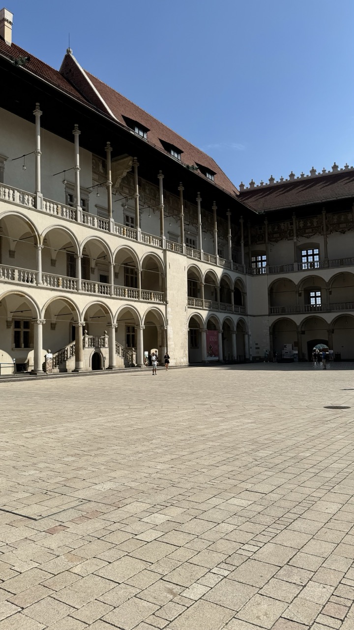

1. Overall Rating (0–10) — 7.0
This photograph captures the grandeur of a Renaissance courtyard under a clear blue sky, evoking a sense of historical permanence and architectural harmony. The expansive stone pavement and elegant arcades convey both scale and serenity, while the sparse presence of visitors adds a subtle human element without disrupting the composition’s balance. The image is strong in its clarity and structure but lacks a compelling focal point or emotional tension to elevate it beyond a mere architectural record.
2. Composition (0–10) — 7.5
The low-angle perspective emphasizes the height and rhythm of the colonnades, while the diagonal lines of the courtyard draw the eye toward the building’s corner. The open space in the foreground provides visual breathing room, though the wide framing slightly dilutes the impact of the central architectural features.
3. Lighting (0–10) — 8.0
Bright, natural sunlight enhances the textures of the stone and casts subtle shadows that define the depth of the arches. The clear blue sky creates a clean, high-contrast backdrop that complements the warm tones of the building, contributing to a crisp and inviting atmosphere.
4. Color & Tone (0–10) — 7.0
The palette is composed of warm beige stone, deep terracotta roof tiles, and a vibrant blue sky—colors that work well together and evoke a Mediterranean or Central European aesthetic. Slight underexposure in the shadows reduces tonal richness, but the overall harmony is effective.
5. Creativity (0–10) — 6.5
The image is straightforward and observational, capturing the scene with clarity and respect for its historical context. While it doesn’t take bold compositional or stylistic risks, it successfully conveys the architectural beauty and quiet dignity of the space.
6. Technical Quality (0–10) — 8.0
Sharp focus, accurate exposure, and clean detail throughout the frame indicate strong technical execution. The resolution is sufficient to appreciate the textures of the stonework and the intricate balustrades.
7. Emotional Impact (0–10) — 6.5
The photograph conveys a calm, contemplative mood, inviting the viewer to imagine the passage of time within these walls. While it is aesthetically pleasing and well-composed, the lack of narrative or emotional depth limits its resonance, leaving it as a beautiful but distant observation.
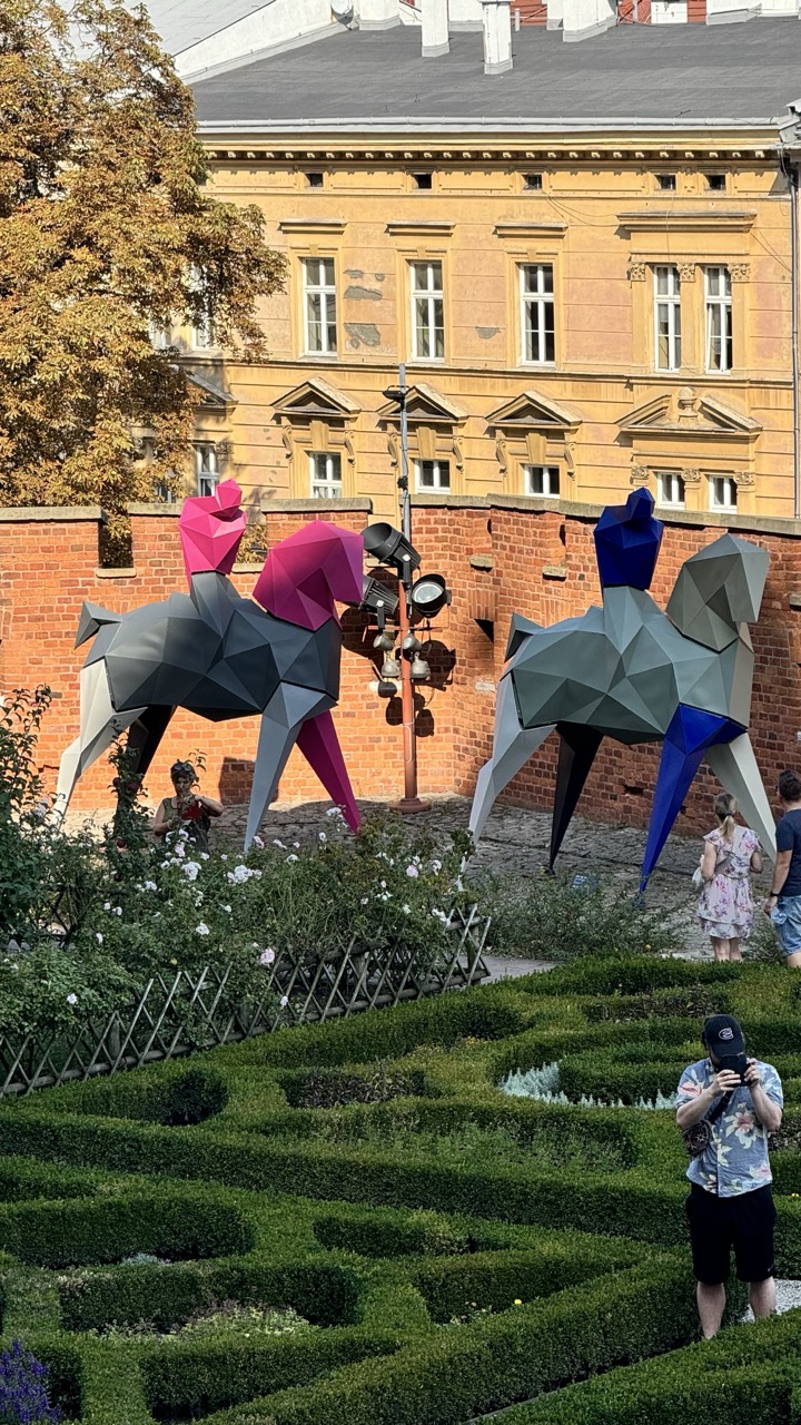

1. Overall Rating (0–10) — 6.8
This photograph captures a striking juxtaposition between classical garden design and bold, contemporary art, creating a visually engaging narrative of contrast. The geometric sculptures, with their vibrant magenta and blue accents, command attention against the warm, historic backdrop of the yellow building and red brick wall. While the composition is layered and rich in detail, the scattered placement of people and elements slightly dilutes the focus, leaving the image feeling more like a snapshot than a cohesive statement. Still, it succeeds in conveying a sense of urban life intersecting with artistic expression.
2. Composition (0–10) — 6.5
The layered framing—from the manicured hedges in the foreground to the sculptures and building in the mid- and background—creates depth. However, the inclusion of multiple figures and a cluttered center, including the lamp post and scattered visitors, weakens the visual hierarchy and draws attention away from the primary subjects.
3. Lighting (0–10) — 7.0
Natural daylight bathes the scene evenly, enhancing the textures of the brick, foliage, and metal sculptures. The soft, diffused light prevents harsh shadows and allows the colors of the sculptures to stand out without overpowering the historical context.
4. Color & Tone (0–10) — 7.5
The warm golden tones of the building and the lush green of the hedges create a harmonious backdrop, allowing the vivid magenta and blue of the sculptures to pop with visual energy. The contrast between organic and geometric forms is further accentuated by the color choices, lending a playful, modern edge to the scene.
5. Creativity (0–10) — 7.0
The fusion of classical landscape architecture with abstract, colorful sculptures is inherently inventive, suggesting a dialogue between tradition and innovation. The choice to capture people interacting with the art adds a layer of narrative, grounding the scene in real-world experience.
6. Technical Quality (0–10) — 7.5
The image is sharp and well-focused, with clear details in the sculptures, hedges, and background architecture. The exposure is balanced, and the depth of field effectively isolates the main subjects from the background while retaining context.
7. Emotional Impact (0–10) — 6.5
The photograph evokes a sense of curiosity and wonder, inviting the viewer to reflect on the relationship between art, space, and human interaction. While the emotional resonance is present, it remains subtle—more observational than deeply moving—due to the scattered composition and lack of a single focal point.
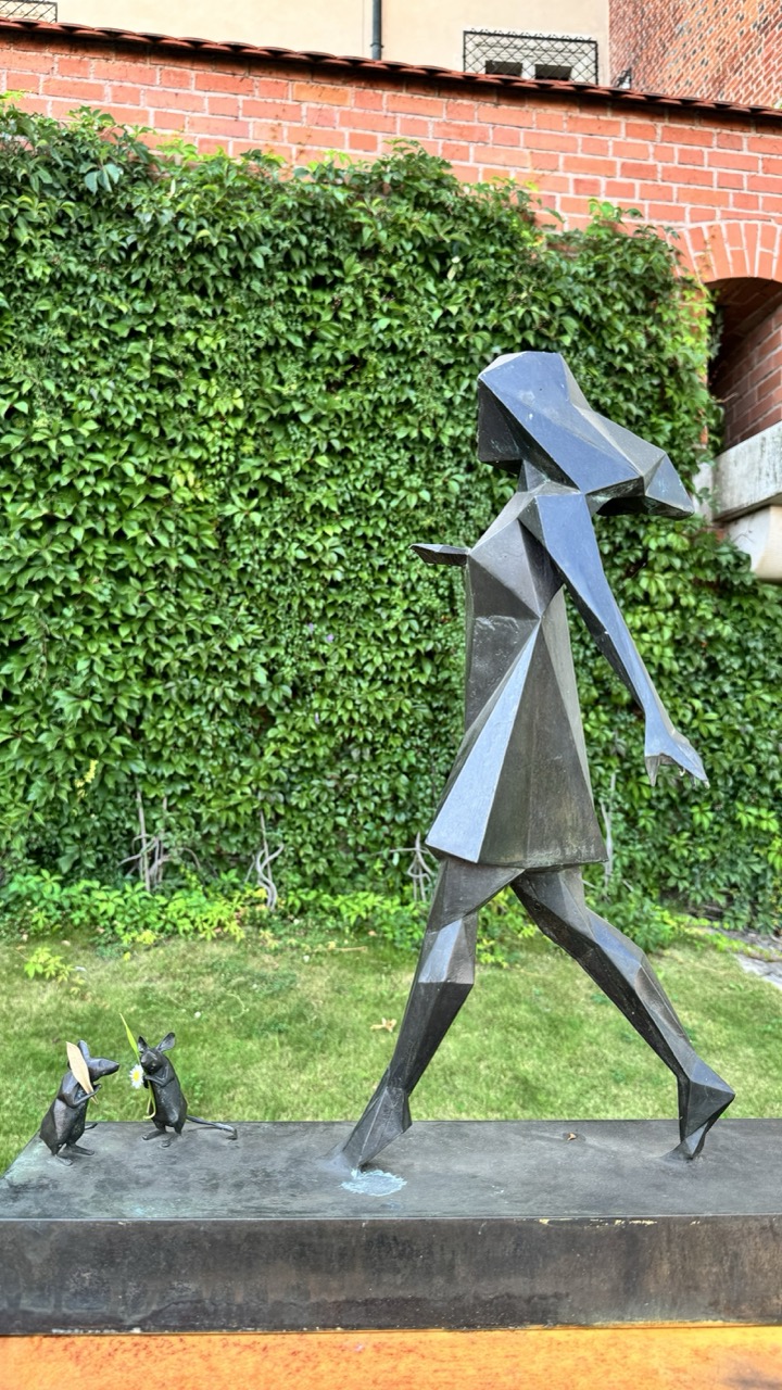

1. Overall Rating (0–10) — 7.0
This photograph captures a striking juxtaposition between geometric abstraction and organic nature, where a bold, angular sculpture stands in quiet dialogue with a lush ivy-covered wall. The composition balances the starkness of the metallic figure with the soft, textured greenery, creating a sense of narrative tension and visual intrigue. While the image succeeds in highlighting the sculpture’s form and context, it feels slightly underlit and lacks the dynamic contrast needed to fully elevate the scene.
2. Composition (0–10) — 7.0
The sculpture is well-placed, with the diagonal stride creating a sense of movement across the frame. The ivy wall provides a rich, textured backdrop, while the two smaller figures at the base add narrative depth. The framing is slightly off-center, but the composition remains balanced and engaging.
3. Lighting (0–10) — 5.5
The light is soft and diffused, likely from an overcast sky, which minimizes harsh shadows and allows the sculpture’s facets to reflect light subtly. However, the overall illumination lacks warmth and depth, contributing to a somewhat flat appearance.
4. Color & Tone (0–10) — 6.5
The contrast between the deep, dark tones of the sculpture and the vibrant green of the ivy is visually compelling. The muted earth tones of the brick and grass ground the image, but the overall palette feels restrained, with limited tonal variation.
5. Creativity (0–10) — 7.5
The conceptual pairing of a stylized human figure with miniature rodent figures evokes a whimsical, allegorical narrative. The choice of a geometric form against a natural backdrop enhances the artistic tension, suggesting themes of urban life, nature, and storytelling.
6. Technical Quality (0–10) — 7.5
The image is sharp and clear, with good focus on the sculpture and its base. The texture of the metal and the foliage is well captured, though the lower portion of the frame appears slightly darker, possibly due to lighting or exposure balance.
7. Emotional Impact (0–10) — 6.5
The photograph invites quiet contemplation, evoking a sense of curiosity about the sculpture’s meaning and its relationship to the environment. The mood is serene and slightly mysterious, though the lack of dramatic lighting prevents a stronger emotional resonance.
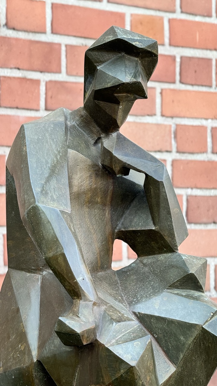

1. Overall Rating (0–10) — 7.0
This photograph captures a striking geometric sculpture in deep contemplation, its angular form echoing the iconic "The Thinker" while asserting its own modern identity. The interplay between the dark, faceted bronze and the warm, textured brick wall creates a compelling contrast that enhances the sculpture’s presence. While the composition is strong and the subject compelling, a more deliberate framing could better emphasize the sculpture’s form and narrative weight.
2. Composition (0–10) — 7.0
The sculpture is centered with a clear focus, but the tight crop cuts into the lower portion, slightly disrupting the sense of balance. The diagonal lines of the brickwork subtly complement the sculpture’s geometry, enhancing visual cohesion.
3. Lighting (0–10) — 7.0
Soft, directional light highlights the facets of the sculpture, creating dynamic contrasts between light and shadow that accentuate its three-dimensional form. The light appears natural and even, enhancing texture without creating harsh glare.
4. Color & Tone (0–10) — 7.0
The muted, earthy tones of the bronze sculpture harmonize with the warm reds of the brick, creating a cohesive palette. The subtle tonal variations across the sculpture’s surface add depth and visual interest.
5. Creativity (0–10) — 7.5
The choice to photograph a modern reinterpretation of a classic theme demonstrates strong artistic intent. The juxtaposition of geometric abstraction against a traditional backdrop invites reflection on continuity and evolution in art.
6. Technical Quality (0–10) — 8.0
Sharp focus, clean detail, and well-balanced exposure contribute to a technically strong image. The texture of both the sculpture and the brick wall is clearly rendered.
7. Emotional Impact (0–10) — 7.0
The sculpture’s introspective pose evokes a quiet sense of thoughtfulness and solitude. The viewer is drawn into a contemplative mood, prompted by the stillness and form of the subject.
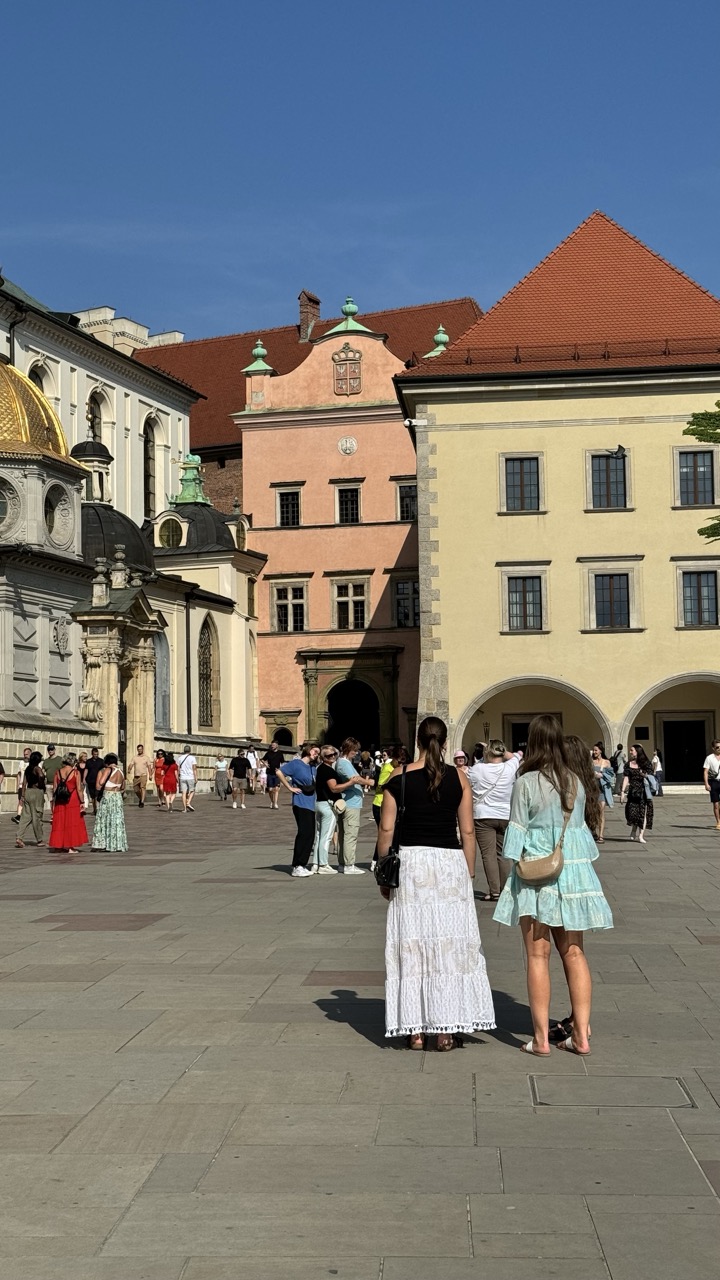

1. Overall Rating (0–10) — 7.0
This photograph captures the vibrant energy of a historic European square under a clear blue sky, where architecture and human movement converge in a moment of everyday life. The warm sunlight enhances the rich textures of the stone buildings and the varied colors of the crowd, creating a lively yet harmonious scene. While the image is strong in atmosphere and authenticity, its slightly cluttered composition and flat lighting reduce its visual impact, keeping it more documentary than transcendent.
2. Composition (0–10) — 6.0
The framing includes a wide expanse of the square, but the central focus is divided between the two women in the foreground and the architectural elements in the background. A tighter composition or more deliberate subject placement would better guide the viewer’s eye.
3. Lighting (0–10) — 7.0
Bright, direct sunlight illuminates the scene evenly, enhancing the clarity and detail of the buildings and clothing. The clear sky adds depth, though the harshness of the midday light creates strong shadows that slightly flatten the tonal range.
4. Color & Tone (0–10) — 7.0
The warm palette of terracotta roofs and pastel facades contrasts beautifully with the deep blue sky and the varied hues of the crowd’s clothing. The overall tone is bright and summery, with natural saturation that feels true to the scene.
5. Creativity (0–10) — 6.5
The image captures a candid, authentic moment in a historically rich setting, offering a glimpse into daily life. While it is observational rather than conceptually driven, its strength lies in its ability to convey place and atmosphere with minimal staging.
6. Technical Quality (0–10) — 7.5
The image is sharp and well-focused, with clean detail across the frame. The exposure is balanced, and the resolution is high, allowing for clear visibility of textures and architectural features.
7. Emotional Impact (0–10) — 6.0
The photograph evokes a sense of calm curiosity and wanderlust, inviting the viewer to imagine themselves in the scene. The presence of people adds life and movement, but the emotional resonance remains restrained, more suggestive than deeply moving.
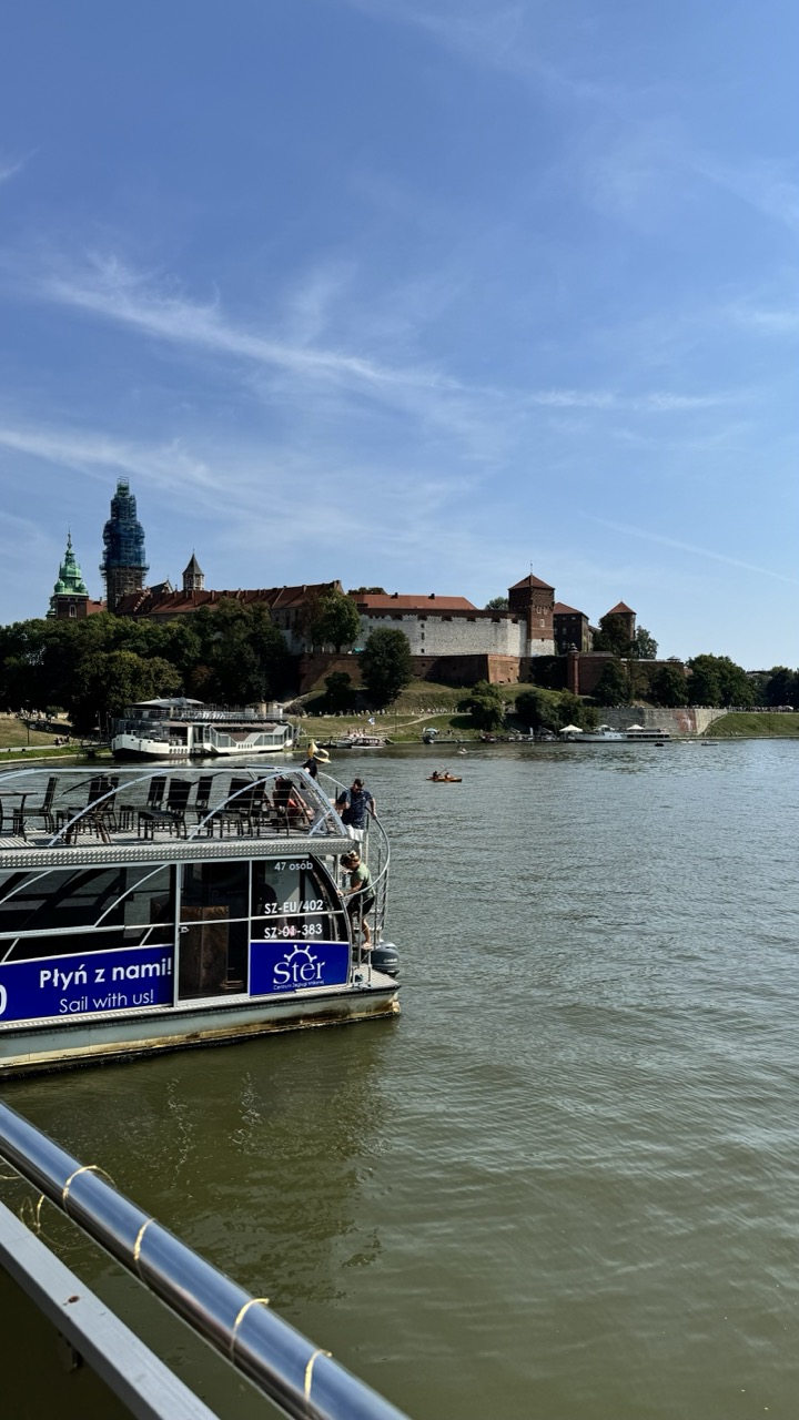

1. Overall Rating (0–10) — 7.0
This photograph captures a serene riverside scene with the historic Wawel Castle under a vast blue sky, evoking a sense of peaceful travel and cultural richness. The composition balances the modern riverboat in the foreground with the timeless architecture in the distance, creating a narrative of movement through history. While the image is visually engaging and well-framed, it slightly lacks depth due to the flat lighting and the cluttered foreground railing, which subtly distract from the grandeur of the castle.
2. Composition (0–10) — 7.5
The boat in the foreground provides a natural leading line toward the castle, with the river guiding the eye through the scene. The placement of the castle slightly off-center adds visual interest, while the railing in the bottom-left corner grounds the image. However, the railing and the boat’s signage create a slight visual interruption.
3. Lighting (0–10) — 8.0
Bright, natural daylight illuminates the scene evenly, enhancing the clarity of the castle’s details and the vibrant blue sky. The soft shadows under the boat and trees suggest midday sun, contributing to a clean and open atmosphere.
4. Color & Tone (0–10) — 7.5
The palette is dominated by the deep blue of the sky, the greenish-brown of the river, and the warm reds and browns of the castle, creating a harmonious and balanced color scheme. The contrast between the natural tones and the modern blue signage on the boat adds a subtle contemporary layer.
5. Creativity (0–10) — 7.0
The image effectively juxtaposes modern tourism with historical heritage, telling a quiet story of travel and place. The perspective from a moving boat enhances the sense of journey, offering a personal viewpoint that feels both intimate and expansive.
6. Technical Quality (0–10) — 8.0
The image is sharp and well-focused, with clear details in the castle, boat, and surrounding environment. The exposure is balanced, and the resolution captures fine textures in the architecture and water.
7. Emotional Impact (0–10) — 7.5
The photograph evokes a sense of calm exploration and wonder, inviting the viewer to imagine a leisurely river cruise past one of Poland’s most iconic landmarks. The combination of motion, history, and open space creates a reflective and uplifting mood.
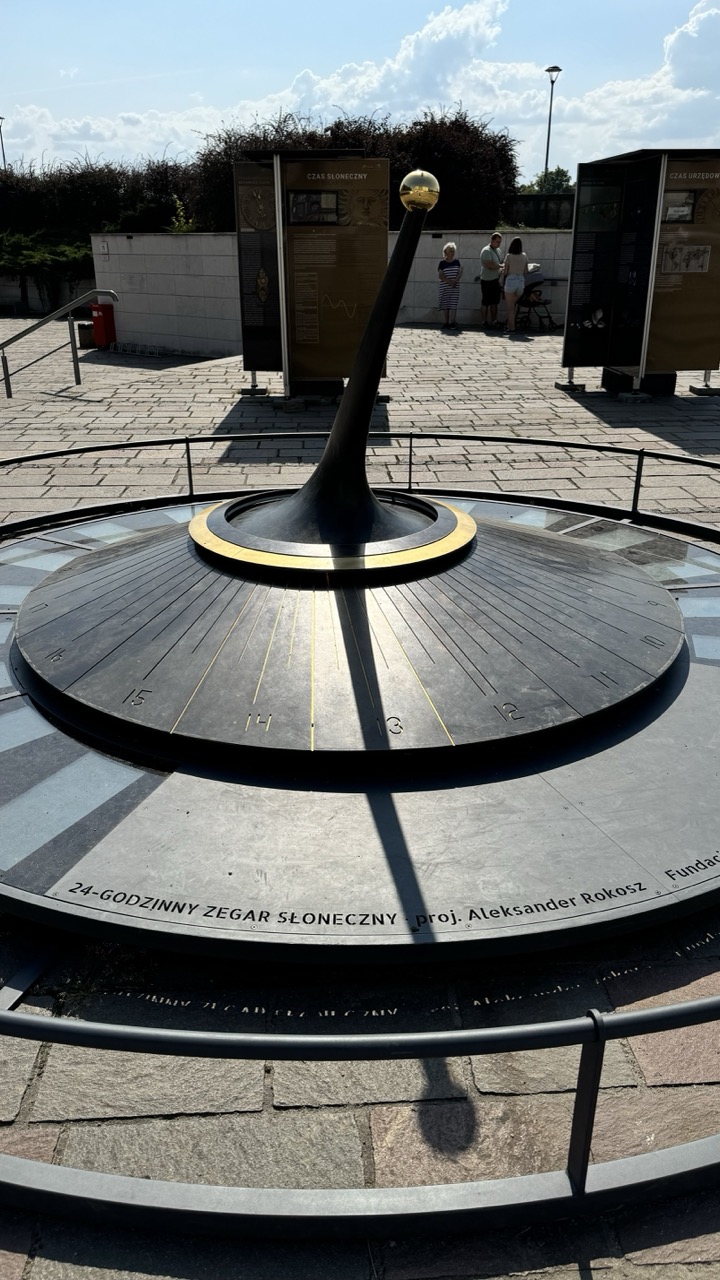

1. Overall Rating (0–10) — 7.0
This photograph captures a striking public sundial installation under bright daylight, where the interplay of shadow and structure evokes both scientific precision and artistic elegance. The composition draws the eye to the central gnomon, while the background details of visitors and informational panels lend context and scale. Though the scene is visually compelling, the slightly cluttered background and harsh shadows slightly diminish the image’s overall refinement.
2. Composition (0–10) — 6.5
The low-angle perspective emphasizes the sundial’s scale and geometric design, with the gnomon leading the viewer’s eye toward the sky. However, the inclusion of people and signage in the mid-ground creates visual distraction, slightly disrupting the clean symmetry of the central subject.
3. Lighting (0–10) — 7.5
Strong, direct sunlight creates crisp, elongated shadows that highlight the sundial’s functionality and form. The contrast between light and shadow enhances the three-dimensionality of the gnomon and the radial markings, though some areas are overexposed due to the bright sky.
4. Color & Tone (0–10) — 6.5
The palette is dominated by metallic grays and blacks of the sundial, accented by the warm gold of the gnomon’s sphere and the neutral tones of the stone pavement. While the colors are cohesive, the overall tone is somewhat flat due to the high contrast and lack of atmospheric depth.
5. Creativity (0–10) — 7.0
The image successfully merges scientific instrumentation with public art, capturing both the educational intent and aesthetic appeal of the installation. The framing and perspective offer a fresh view of a familiar object, emphasizing its role as both a timepiece and a sculpture.
6. Technical Quality (0–10) — 8.0
Sharp focus and clear detail are evident throughout, particularly on the engraved numbers and the polished surface of the gnomon. The exposure is well-managed, with no significant loss of detail in the highlights or shadows.
7. Emotional Impact (0–10) — 6.0
The photograph conveys a sense of quiet contemplation and human curiosity, as visitors observe the device. However, the impersonal nature of the setting and the lack of intimate human interaction limit the emotional resonance, leaving the viewer more as an observer than a participant.
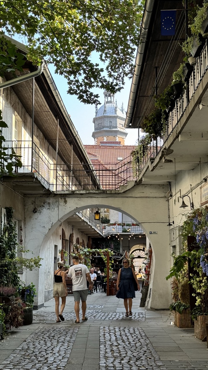

1. Overall Rating (0–10) — 7.5
This photograph captures a serene, sun-dappled alleyway that feels both timeless and lived-in, where architecture and nature intertwine in quiet harmony. The archway frames the scene like a portal, drawing the eye toward the distant tower and infusing the composition with a sense of depth and discovery. While the image's charm lies in its authenticity and layered textures, it slightly lacks visual punch due to muted lighting and a somewhat flat color palette.
2. Composition (0–10) — 8.0
The arch creates a strong leading line, guiding the viewer through the frame toward the distant tower, while the cobblestone path and converging lines enhance depth. The placement of figures adds scale and narrative, though the symmetry is slightly off-center, lending a natural, candid feel.
3. Lighting (0–10) — 6.5
Soft, diffused daylight filters through the tree canopy, creating dappled shadows that add texture and mood. However, the overall exposure is slightly flat, with a lack of contrast that diminishes the vibrancy of the scene.
4. Color & Tone (0–10) — 6.0
The palette is dominated by muted whites, greens, and earthy tones, which reflect the aged architecture and natural surroundings. While harmonious, the colors lack richness and saturation, giving the image a subdued, almost washed-out quality.
5. Creativity (0–10) — 7.0
The photograph succeeds in capturing a moment of quiet urban life with a sense of place and atmosphere. The framing through the arch and the inclusion of the European Union flag add subtle layers of cultural context, suggesting a narrative beyond mere aesthetics.
6. Technical Quality (0–10) — 7.5
The image is sharp and clear, with good detail in the textures of the cobblestones, stonework, and foliage. Focus is consistent, and there are no visible technical flaws, though the dynamic range could be improved.
7. Emotional Impact (0–10) — 7.0
The scene evokes a sense of calm and wanderlust, inviting the viewer to imagine strolling through this historic alley. The interplay of light, architecture, and life creates a gentle nostalgia, though the emotional resonance is slightly tempered by the subdued lighting and color.
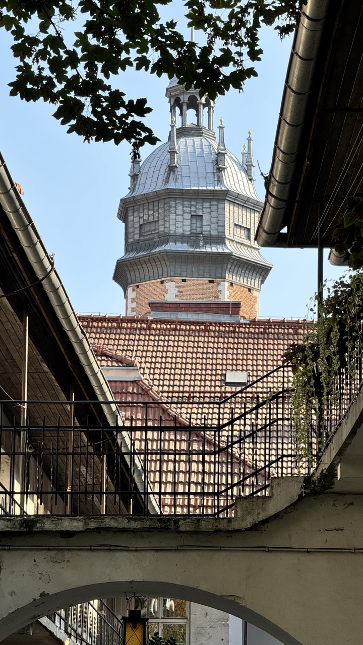

1. Overall Rating (0–10) — 7.0
This photograph captures a quiet, layered moment in an urban courtyard, where historical architecture rises above the everyday. The framing through the arch and railing creates a sense of discovery, drawing the eye toward the ornate dome as a focal point. While the image is rich in texture and context, it is held back by a slightly flat exposure and a composition that feels more opportunistic than deliberate.
2. Composition (0–10) — 6.5
The use of architectural framing—archway, railing, and overhanging foliage—creates depth and guides the viewer’s gaze. However, the off-center placement of the dome and the cluttered foreground slightly disrupt the visual harmony.
3. Lighting (0–10) — 6.0
Natural daylight illuminates the scene clearly, but the strong overhead sun creates harsh highlights on the dome and shadows that flatten some details. The sky is slightly overexposed, losing subtle gradations.
4. Color & Tone (0–10) — 6.5
The palette is dominated by earthy reds and muted grays, with a cool blue sky providing contrast. The tones are largely natural but lack vibrancy, and the green foliage adds a soft, organic counterpoint to the rigid architecture.
5. Creativity (0–10) — 7.0
The perspective is inventive, using the courtyard’s structures to frame the historic tower as if it’s being revealed. The juxtaposition of old and new, nature and stone, adds narrative depth.
6. Technical Quality (0–10) — 7.5
The image is sharp and well-focused, with clear detail in the brickwork and metal railings. The exposure is mostly balanced, though minor overexposure in the sky suggests a slight lack of dynamic range control.
7. Emotional Impact (0–10) — 6.5
The photograph evokes a sense of quiet contemplation and historical continuity. The viewer feels like a visitor discovering a hidden gem, which lends the image a subtle emotional warmth and curiosity.
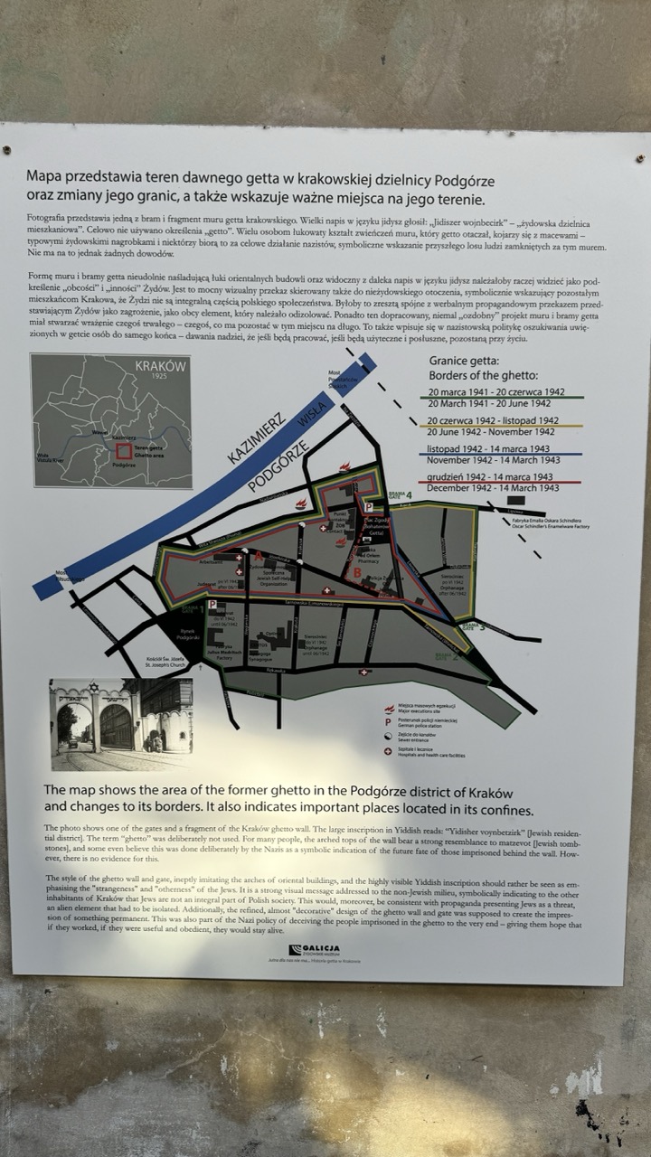

1. Overall Rating (0–10) — 7.0
This photograph captures a historically significant informational plaque, presenting a poignant narrative about the Kraków Ghetto with clarity and solemnity. The composition effectively balances textual detail and visual elements, allowing the viewer to absorb both the historical context and the symbolic weight of the site. While the lighting is functional, the image’s emotional resonance is slightly diminished by a lack of visual drama, which prevents it from fully conveying the gravity of the subject.
2. Composition (0–10) — 7.5
The plaque is centered and well-framed, with the map and text arranged in a logical hierarchy that guides the eye from top to bottom. The inclusion of the photograph of the wall fragment at the bottom adds a human element, grounding the historical data in a tangible artifact. The slight angle of the shot adds a sense of realism, as if the viewer is standing before the actual memorial.
3. Lighting (0–10) — 6.0
The lighting is even and diffused, likely from an overcast sky or indirect indoor source, which ensures legibility of the text and map. However, the flat quality of the light minimizes shadows and texture, giving the image a somewhat sterile appearance that detracts from its emotional depth.
4. Color & Tone (0–10) — 6.5
The palette is muted and neutral, dominated by whites, grays, and the dark tones of the printed text and map. This subdued color scheme reflects the somber tone of the subject matter, though it lacks vibrancy or contrast, which could have heightened the visual impact.
5. Creativity (0–10) — 7.0
The image is primarily documentary in intent, but the thoughtful arrangement of text, map, and photograph demonstrates a clear narrative purpose. The inclusion of the wall fragment photo adds a layer of storytelling, transforming a simple informational sign into a moment of reflection on memory and loss.
6. Technical Quality (0–10) — 7.5
The image is sharp and in focus, with clear resolution of the text and map details. The edges of the plaque are well-defined, and there is no significant distortion or blur, indicating good technical execution.
7. Emotional Impact (0–10) — 7.0
The photograph evokes a sense of reverence and historical awareness, particularly through the juxtaposition of the map, the Yiddish inscription, and the wall fragment. While not overtly dramatic, the image invites contemplation, allowing the viewer to connect with the weight of the past through its carefully curated details.
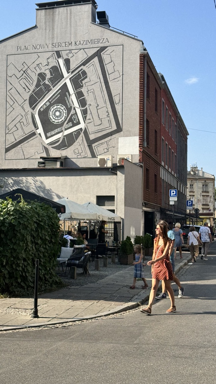

1. Overall Rating (0–10) — 7.0
This photograph captures a vibrant urban moment where history and daily life intersect, anchored by a striking mural that transforms a plain building into a narrative canvas. The interplay between the static, detailed map and the dynamic movement of pedestrians creates a compelling contrast between past and present. While the image’s clarity and composition are strong, the muted color palette and slightly cluttered foreground soften its visual impact, preventing it from achieving a more powerful presence.
2. Composition (0–10) — 7.0
The mural dominates the upper half of the frame, drawing the eye with its intricate design, while the diagonal flow of pedestrians across the lower third adds movement and balance. The inclusion of outdoor seating and greenery grounds the scene in everyday life, though the right side feels slightly crowded, pulling focus from the mural’s central message.
3. Lighting (0–10) — 8.0
Bright, natural daylight enhances the clarity of the mural and casts soft shadows that add depth to the architecture and figures. The high sun angle provides even illumination, allowing fine details in the drawing to be visible while keeping the scene lively and open.
4. Color & Tone (0–10) — 6.0
The palette is largely neutral—grays, beiges, and muted reds—creating a subdued urban tone. While the white of the mural and the blue sky offer contrast, the lack of vibrant hues tempers the image’s emotional energy, lending it a documentary rather than expressive quality.
5. Creativity (0–10) — 8.0
The choice to photograph the mural within its urban context—showing people passing by—adds narrative depth and a sense of time. The juxtaposition of historical mapping with modern life suggests a meditation on memory and place, making the image both informative and thought-provoking.
6. Technical Quality (0–10) — 8.0
The image is sharp and well-exposed, with clear focus on both the mural and the foreground subjects. The camera appears to have captured fine details without noticeable noise, and the perspective is stable and well-framed.
7. Emotional Impact (0–10) — 6.5
The photograph evokes a sense of quiet contemplation, inviting viewers to reflect on the layers of history embedded in the cityscape. While the emotional resonance is subtle, it lingers in the contrast between the permanence of the mural and the fleeting nature of the passersby.
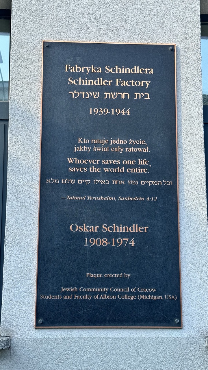

1. Overall Rating (0–10) — 7.0
This plaque commemorates the Schindler Factory with solemn dignity, its layered text and multilingual inscriptions conveying both historical weight and moral gravity. The composition is straightforward and respectful, though the slightly uneven lighting and flat background detract from its visual presence. While the message is powerful and the craftsmanship deliberate, the image feels more like a documentary record than a compelling photograph.
2. Composition (0–10) — 6.5
The plaque is centered and fills the frame, emphasizing its importance. However, the off-center framing and slight tilt introduce visual imbalance, and the surrounding architectural elements distract from the text’s clarity.
3. Lighting (0–10) — 6.0
Natural daylight illuminates the plaque evenly, but a subtle shadow on the left and overexposed highlights on the top edge reduce tonal harmony. The light is functional, not atmospheric.
4. Color & Tone (0–10) — 6.5
The dark bronze plaque contrasts sharply with the light wall, creating strong visual separation. The warm tones of the lettering stand out, though the overall palette remains muted, reinforcing the somber tone.
5. Creativity (0–10) — 6.0
The multilingual presentation and layered text reflect a thoughtful approach to memorialization, but the execution is conventional. The image prioritizes clarity over artistic interpretation.
6. Technical Quality (0–10) — 7.5
The image is sharp and well-focused, with legible text throughout. The exposure is mostly accurate, though minor flare and uneven lighting slightly reduce technical polish.
7. Emotional Impact (0–10) — 7.0
The weight of the message—honoring Schindler’s legacy and the Holocaust—resonates deeply. The plaque’s simplicity and gravity evoke reflection, though the lack of human presence limits emotional intimacy.
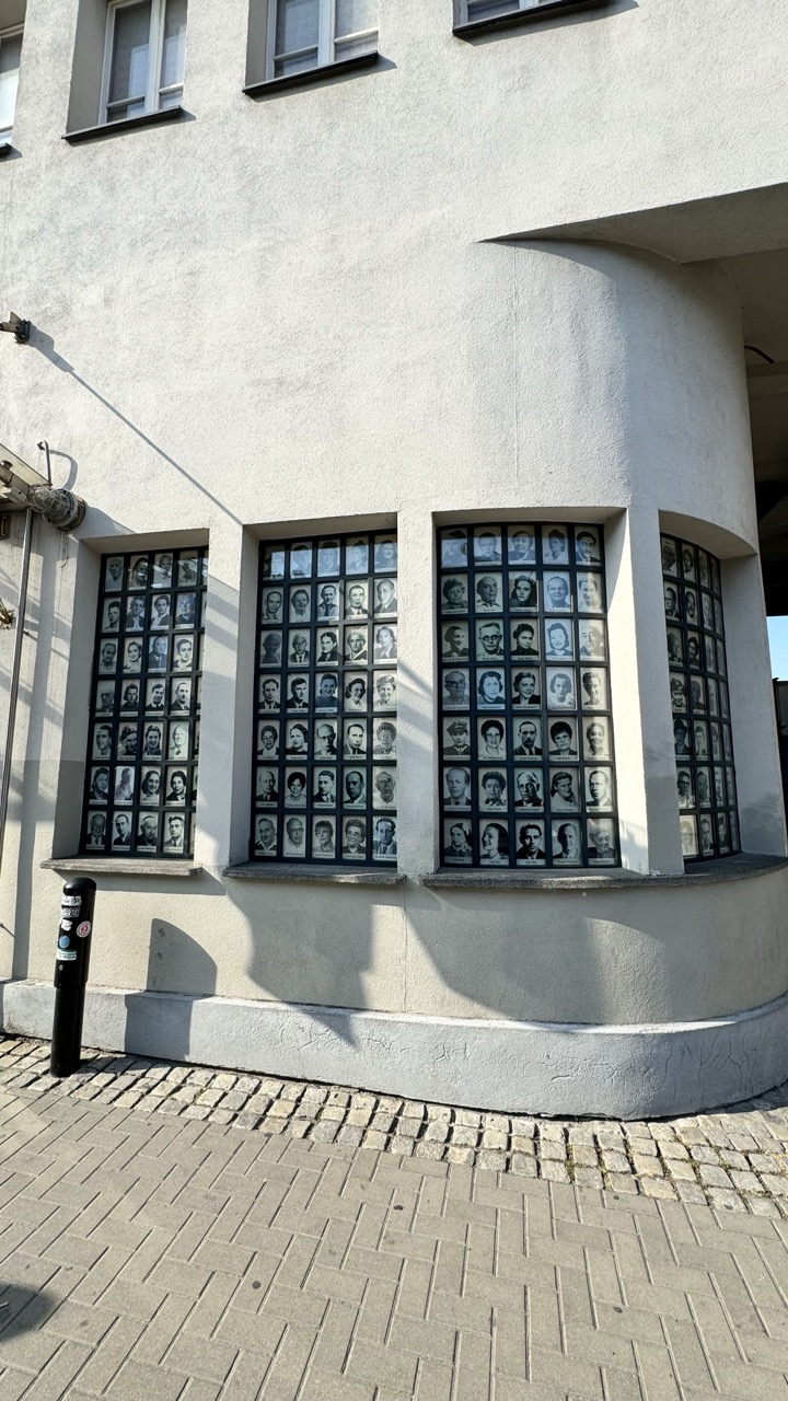

1. Overall Rating (0–10) — 7.0
This photograph captures a solemn and powerful memorial embedded in the architecture of a building, where rows of black-and-white portraits serve as a poignant tribute to individuals lost. The juxtaposition of the stark, uniform faces against the curved, textured wall creates a quiet tension between memory and the passage of time. While the composition is strong and the subject matter deeply resonant, the lack of human presence and the flat lighting slightly diminish the emotional pull, leaving the image more as a document than a visceral experience.
2. Composition (0–10) — 7.5
The curved facade and the alignment of the window panels create a rhythmic, almost architectural symmetry. The placement of the portraits within the recessed windows draws the eye across the frame, while the diagonal shadow and the bollard on the left add visual interest and balance. The low angle grounds the image, emphasizing the memorial’s scale and permanence.
3. Lighting (0–10) — 6.5
The bright, direct sunlight creates strong shadows that add depth and texture to the wall, enhancing the contrast between light and dark. However, the harshness of the light flattens the facial details in the portraits and casts sharp, distracting shadows across the lower portion of the frame, reducing the subtlety of the memorial’s emotional weight.
4. Color & Tone (0–10) — 6.0
The palette is muted and monochromatic—dominated by the gray of the concrete, the black of the frames, and the white of the portraits—reinforcing the somber tone. While the lack of color is appropriate for the subject, the absence of tonal variation and subtle warmth gives the image a slightly sterile quality.
5. Creativity (0–10) — 7.0
The integration of personal portraits into the building’s windows is a striking and original approach to public memory. It transforms an ordinary urban space into a living archive, merging architecture with history in a way that is both respectful and visually compelling.
6. Technical Quality (0–10) — 7.5
The image is sharp and well-focused, with clear detail in the portraits and the texture of the wall. The exposure is balanced, though the bright highlights and deep shadows suggest a narrow dynamic range, which slightly compromises the tonal richness.
7. Emotional Impact (0–10) — 7.5
The image evokes a sense of reverence and reflection, with the silent faces of the portraits creating a powerful emotional anchor. The absence of people in the scene amplifies the weight of remembrance, inviting contemplation on loss and identity, though the distance created by the architectural framing keeps the viewer in a more observational role.
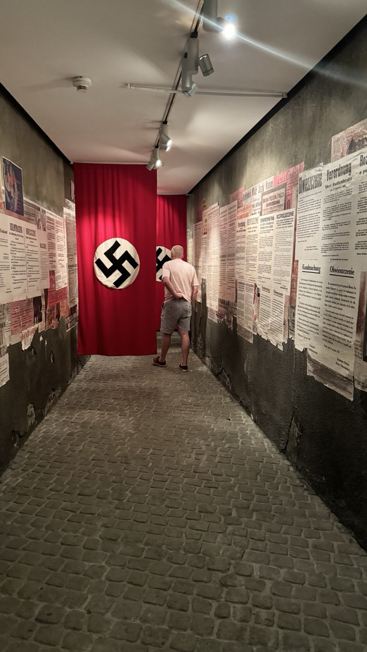

1. Overall Rating (0–10) — 7.0
This photograph captures a somber and immersive museum exhibit, where the stark design and historical weight of the display evoke a deep sense of gravity. The red curtain with the swastika symbol serves as a powerful focal point, while the surrounding propaganda posters create a layered narrative of oppression. The viewer is drawn into the scene through the man’s contemplative stance, though the image’s emotional impact is tempered by the clinical, observational quality of the lighting and framing.
2. Composition (0–10) — 7.5
The long, narrow corridor creates strong leading lines that guide the eye toward the central red curtain, emphasizing its symbolic importance. The man’s placement adds scale and human context, while the asymmetrical arrangement of posters enhances visual interest. The cobblestone floor grounds the composition, adding texture and historical authenticity.
3. Lighting (0–10) — 6.0
Overhead track lighting provides functional illumination but lacks subtlety, casting harsh glares and shadows that disrupt the mood. While it highlights the exhibits clearly, the clinical quality of the light diminishes the somber atmosphere that the subject matter demands.
4. Color & Tone (0–10) — 7.0
The dominant red of the curtain creates a striking contrast against the muted, gray tones of the walls and floor, drawing immediate attention to the central symbol. The aged, sepia-toned posters contribute to a historical atmosphere, while the overall tonal range remains subdued, reinforcing the gravity of the scene.
5. Creativity (0–10) — 7.5
The conceptual strength of the exhibit is effectively communicated through the juxtaposition of historical artifacts and modern museum design. The use of a real-life visitor adds a layer of narrative, transforming the image from a simple documentation into a commentary on memory and remembrance.
6. Technical Quality (0–10) — 7.0
The image is sharp and clear, with good detail in the textures of the walls, floor, and paper. The focus is consistent, and the exposure is balanced despite the challenging lighting conditions. The camera angle and perspective are well-chosen, enhancing the sense of depth.
7. Emotional Impact (0–10) — 8.0
The image carries a powerful emotional resonance, evoking reflection on history, propaganda, and the dangers of authoritarianism. The presence of the individual adds a personal dimension, inviting the viewer to consider their own relationship to the past. The combination of visual and symbolic elements creates a lasting impression.
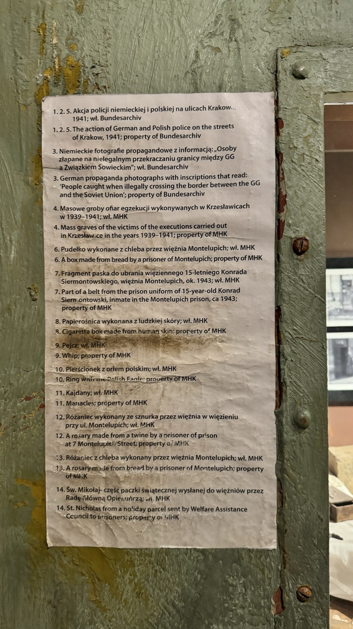

1. Overall Rating (0–10) — 6.0
This photograph captures a solemn, historically charged display within a museum setting, where the weight of memory is conveyed through carefully curated artifacts. The aged paper and weathered metal frame evoke a sense of authenticity and timelessness, grounding the viewer in the gravity of the past. While the image succeeds in presenting a factual, documentary-like record, its emotional resonance is tempered by a lack of visual dynamism and the distraction of overgrown text, which limits its ability to draw the viewer into deeper contemplation.
2. Composition (0–10) — 5.5
The frame is slightly off-center, with the document occupying the left and center of the image, while the right side is dominated by the textured metal door. This creates a sense of imbalance, and the cluttered text overwhelms the visual focus, making it difficult to discern the narrative without reading. A tighter crop would improve focus and clarity.
3. Lighting (0–10) — 6.0
The lighting is even and functional, likely from overhead museum fixtures, which ensures the text is legible but lacks depth. The soft, diffuse light minimizes glare and shadows, preserving the document’s legibility, though it does little to enhance the mood or highlight the texture of the surrounding metal.
4. Color & Tone (0–10) — 5.5
The palette is muted, dominated by the gray-green of the metal and the off-white of the paper, creating a somber and restrained tone. The lack of color vibrancy reflects the serious subject matter, but the overall tonal flatness detracts from visual engagement.
5. Creativity (0–10) — 5.0
The image functions more as a documentation than an artistic statement. While the juxtaposition of the artifact with its industrial surroundings suggests a deliberate context, the execution is straightforward and lacks inventive framing or interpretive depth.
6. Technical Quality (0–10) — 7.5
The focus is sharp on the document, with clear legibility of the text, and the camera appears steady, resulting in a clean and well-exposed image. The slight motion blur or noise in the background suggests a low-light environment, but it does not detract significantly from the overall clarity.
7. Emotional Impact (0–10) — 5.0
The emotional weight is largely conveyed through the content of the text rather than the image itself. The visual presentation, while informative, remains distant and clinical, preventing a strong emotional connection with the viewer.
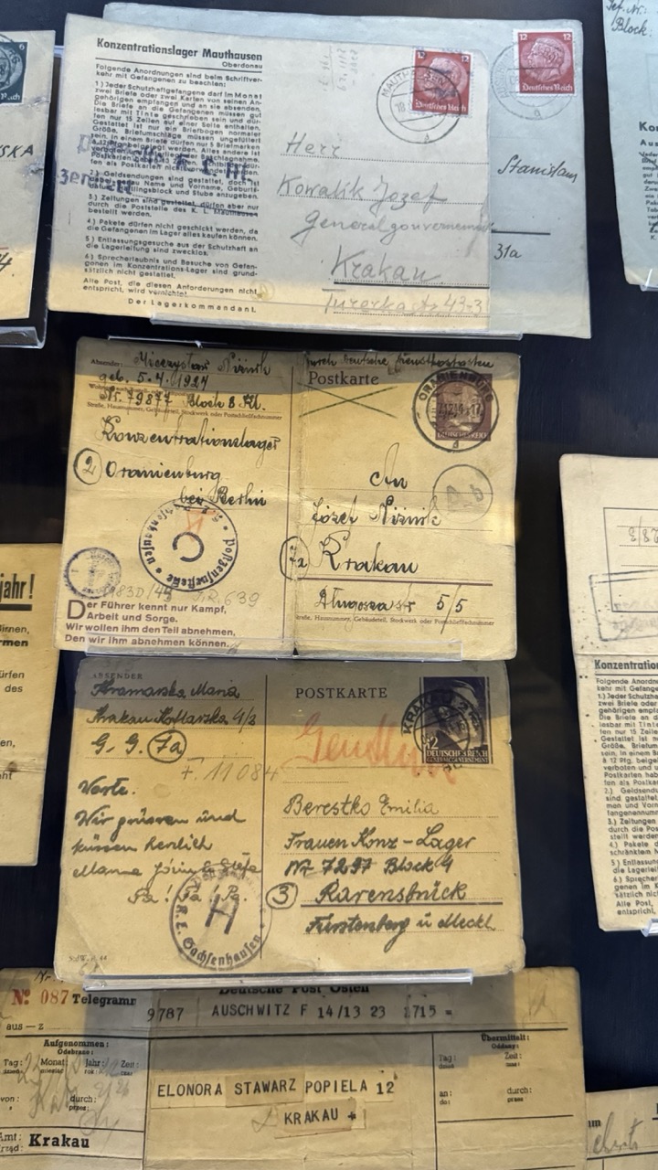

1. Overall Rating (0–10) — 7.5
This photograph presents a powerful and somber archive of wartime correspondence, capturing the raw intimacy of letters from Nazi concentration camps. The overlapping postcards and telegrams, marked with official stamps and handwritten notes, evoke a profound sense of history and human resilience. While the visual density creates a compelling narrative, the lack of clear focal depth slightly dilutes the emotional impact. The authenticity of the documents, however, gives the image a weight that transcends mere composition.
2. Composition (0–10) — 6.0
The arrangement feels deliberate yet cluttered, with overlapping letters creating a layered effect. While the central postcard draws the eye, the surrounding elements compete for attention, resulting in a composition that feels more like a historical display than a cohesive visual narrative.
3. Lighting (0–10) — 6.5
The lighting is even and functional, allowing the text and stamps to remain legible. However, it lacks atmospheric depth, with no dramatic shadows or highlights to elevate the mood. The flat illumination serves the purpose of documentation but does little to enhance the emotional gravity.
4. Color & Tone (0–10) — 6.0
The palette is dominated by aged yellows, browns, and faded inks, conveying a sense of decay and time. The muted tones reinforce the historical weight of the documents, though the lack of color contrast limits visual engagement.
5. Creativity (0–10) — 7.0
The image is conceptually strong, using historical artifacts to tell a poignant story of survival and communication under oppression. The arrangement, while dense, suggests a curated archive, turning raw documentation into a form of memorial.
6. Technical Quality (0–10) — 7.5
The focus is sharp, with clear details on the stamps, handwriting, and printed text. The exposure is well-balanced, and the image is free of distracting noise, allowing the viewer to engage with the content.
7. Emotional Impact (0–10) — 8.0
The emotional resonance is powerful, rooted in the knowledge of the letters’ origins. The handwritten messages and official stamps speak of humanity amid inhumanity, evoking sorrow, empathy, and reflection. The viewer is left with a quiet but deep sense of connection to the past.
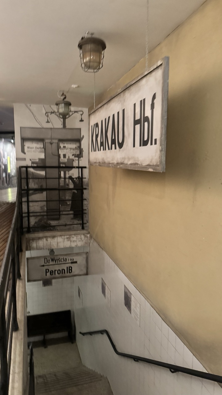

1. Overall Rating (0–10) — 6.0
This photograph captures the quiet nostalgia of a preserved historical transit space, where time seems to have paused at the edge of a bygone era. The worn signage and vintage lighting evoke a sense of history, yet the image feels slightly detached, as if it's documenting a memory rather than inviting an emotional response. The muted tones and utilitarian design lend authenticity, but the composition lacks a compelling focal point to draw the viewer deeper into the scene.
2. Composition (0–10) — 6.0
The diagonal lines of the staircase and railings guide the eye downward, creating a sense of movement, but the framing feels slightly off-center and unbalanced. The large sign on the right dominates the frame, leaving the left side underdeveloped and visually weighted.
3. Lighting (0–10) — 5.5
The overhead lamps cast a soft, diffused glow, emphasizing the aged textures of the walls and signage. However, the lighting is flat and functional, lacking dramatic contrast or directional warmth, which limits the atmospheric depth.
4. Color & Tone (0–10) — 5.5
The palette is dominated by beige, off-white, and black, creating a subdued, monochromatic mood. While this choice reinforces the historical tone, it also results in a lack of visual richness and vibrancy.
5. Creativity (0–10) — 6.5
The image successfully captures a historical moment with a sense of authenticity, and the juxtaposition of old signage and modern railings hints at a layered narrative. However, the approach is more observational than imaginative, relying on realism rather than reinterpretation.
6. Technical Quality (0–10) — 7.0
The image is sharp and clear, with good focus on the signage and architectural details. The depth of field is adequate, and there are no visible technical flaws, though minor digital noise is present in the darker areas.
7. Emotional Impact (0–10) — 5.5
The photograph evokes a quiet sense of melancholy and nostalgia, but the emotional resonance remains distant. The viewer is invited to observe the past, but not to feel it—there’s a subtle disconnect between the subject’s history and the image’s emotional delivery.
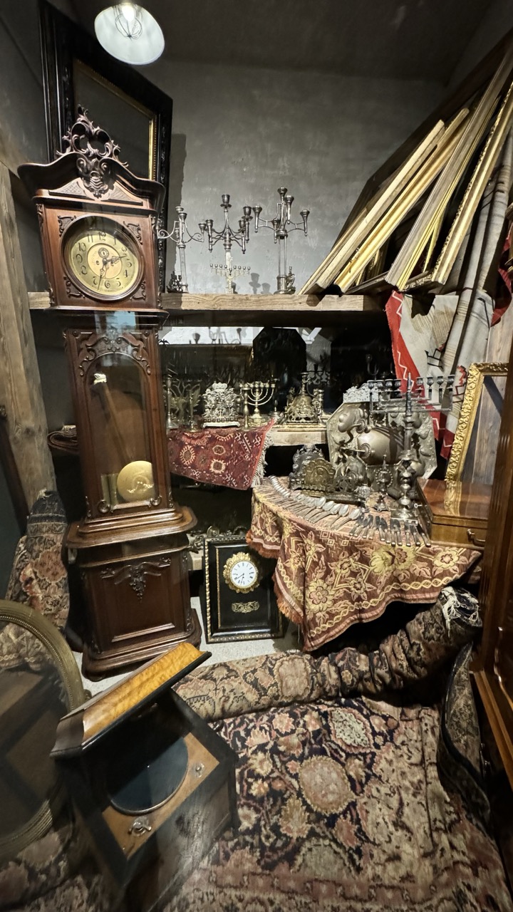

1. Overall Rating (0–10) — 7.0
This photograph immerses the viewer in a densely packed, antique-filled room that feels both chaotic and richly layered with history. The arrangement of ornate clocks, religious artifacts, and patterned textiles creates a sense of time suspended, where every object tells a story. While the visual clutter risks overwhelming the eye, the careful interplay of textures and shapes lends a compelling, almost cinematic quality to the scene—though a more refined balance might elevate it from curio to art.
2. Composition (0–10) — 6.5
The frame is tightly packed, with the grandfather clock anchoring the left side and a cascade of objects leading the eye toward the back. The diagonal placement of picture frames and the low-angle perspective add dynamism, but the clutter slightly disrupts visual flow and creates a sense of disorientation.
3. Lighting (0–10) — 6.0
A single overhead light casts a warm, diffused glow that highlights the textures of the wood, metal, and fabric. However, the lighting is uneven, creating deep shadows in the corners and under the shelves, which obscures some details and gives the image a slightly dim, cavernous feel.
4. Color & Tone (0–10) — 7.0
The palette is rich and earthy—deep browns, golds, and muted reds dominate, creating a cohesive, vintage atmosphere. The contrast between the dark wood and the ornate, patterned textiles adds visual interest, though the overall tone leans slightly toward the muddy due to low lighting.
5. Creativity (0–10) — 7.5
The image captures a unique, almost narrative environment—evoking a private collection or a forgotten storeroom. The juxtaposition of religious objects, antique clocks, and framed art suggests layers of cultural and personal history, making the scene feel deeply personal and inventive in its storytelling.
6. Technical Quality (0–10) — 7.5
The image is sharp and detailed, with clear focus on the foreground objects. The depth of field is appropriate, allowing key elements like the grandfather clock and the table setting to stand out. There’s minimal noise, and the camera handles the low-light conditions well.
7. Emotional Impact (0–10) — 7.0
The photograph evokes a sense of nostalgia and mystery, inviting the viewer to imagine the lives of those who once surrounded these objects. It feels intimate and slightly melancholic—like a glimpse into a world preserved but no longer lived in—creating a quiet emotional resonance.
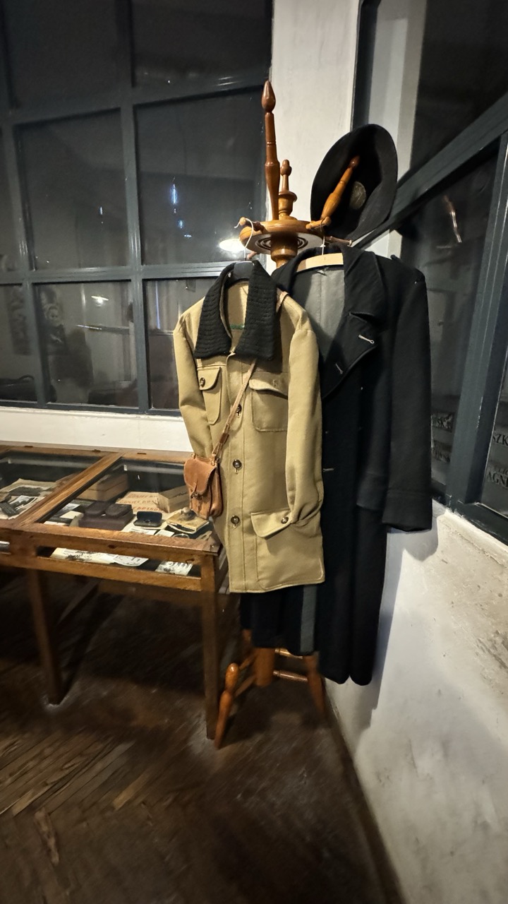

1. Overall Rating (0–10) — 6.8
This photograph captures a quiet, contemplative display of vintage attire and artifacts, evoking a sense of history and personal narrative. The arrangement feels authentic and museum-like, with the coats and hat suggesting a life once lived. While the image successfully conveys mood, it is held back by uneven lighting and a slightly awkward composition that distract from the subject’s emotional weight.
2. Composition (0–10) — 6.0
The subject is placed off-center, with the coat stand and table creating a diagonal flow, but the composition feels unbalanced due to the large negative space on the left and the tilted perspective. A tighter crop and straighter angle would improve visual harmony.
3. Lighting (0–10) — 5.5
The lighting is dim and directional, likely from an overhead source, casting harsh shadows and leaving parts of the scene in deep shadow. While this adds to the moody atmosphere, it also obscures detail and creates uneven exposure.
4. Color & Tone (0–10) — 6.5
The palette is muted, dominated by earth tones and deep blacks, which enhances the vintage feel. The lack of vibrancy is intentional and fits the subject, but a touch more contrast would help separate the garments from the background.
5. Creativity (0–10) — 7.0
The scene is thoughtfully staged, suggesting a curated narrative rather than a casual snapshot. The inclusion of personal items in the display case adds layers of storytelling, making the image feel more like a historical vignette than a simple portrait of clothing.
6. Technical Quality (0–10) — 6.0
The image is reasonably sharp, though some softness is present, likely due to low light and potential motion blur. The focus is on the coats, but the overall clarity is compromised by the lighting and slight camera shake.
7. Emotional Impact (0–10) — 7.0
There’s a quiet melancholy in the stillness of the display, as if the objects hold memories of a person who once wore them. The viewer is invited to imagine the life behind the clothes, creating a subtle but meaningful emotional resonance.
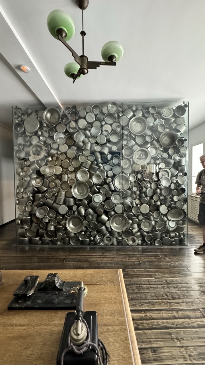

1. Overall Rating (0–10) — 7.0
This photograph captures a striking juxtaposition of industrial texture and domestic nostalgia, centered on a dense, metallic wall of repurposed cookware encased in glass. The vintage telephone in the foreground grounds the scene in a bygone era, while the green-tinted chandelier adds a touch of retro elegance. Though the composition feels slightly cluttered, the interplay of reflective surfaces and muted tones evokes a quiet, contemplative mood—suggesting both memory and material transformation.
2. Composition (0–10) — 6.5
The frame balances foreground and background elements effectively, with the telephone drawing the eye toward the central installation. However, the inclusion of the person on the right and the scattered objects slightly disrupts visual harmony, creating a sense of candidness over intentionality.
3. Lighting (0–10) — 6.0
Soft, diffused indoor lighting highlights the metallic sheen of the pots and pans without harsh glare, enhancing texture. The chandelier’s green glass casts a subtle hue, adding character, though the lighting lacks dramatic contrast or directional emphasis.
4. Color & Tone (0–10) — 6.5
The palette is dominated by cool metallic grays and the warm brown of the wooden floor, creating a restrained, almost monochromatic mood. The green lampshade introduces a gentle accent, lending a vintage warmth that complements the nostalgic subject matter.
5. Creativity (0–10) — 7.5
The use of everyday objects as an art installation is both inventive and evocative, transforming mundane materials into a visually compelling statement. The photograph captures not just the artwork, but the atmosphere of a space where history and memory are preserved.
6. Technical Quality (0–10) — 7.0
Sharp focus across the frame allows for clear detail in the metal surfaces and the telephone. The image is well-exposed, though slight noise in the darker areas suggests a high ISO setting in low light.
7. Emotional Impact (0–10) — 6.5
The image conveys a sense of quiet reverence for the past, inviting viewers to reflect on the stories embedded in ordinary objects. While the emotional resonance is present, it remains understated, leaving the interpretation open to the viewer.
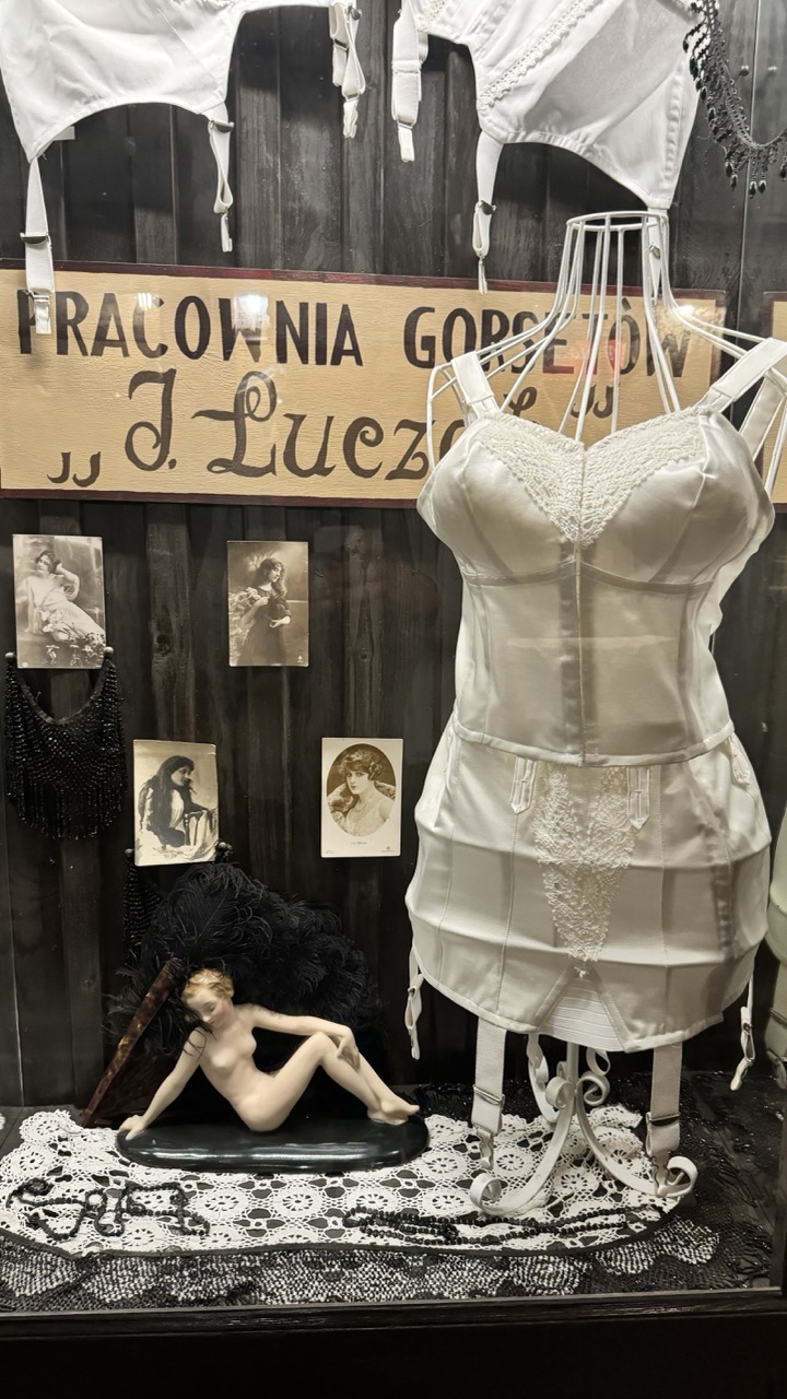

1. Overall Rating (0–10) — 7.5
This photograph captures a richly textured and historically evocative display of vintage lingerie and artifacts, creating a sense of nostalgia and quiet intimacy. The arrangement feels deliberate and curated, with a strong narrative pull that invites the viewer into a bygone era of craftsmanship and sensuality. While the composition is visually dense, the cohesive monochromatic palette and period details lend it a compelling, almost cinematic quality—though a more dynamic lighting approach could heighten its emotional resonance.
2. Composition (0–10) — 7.0
The central mannequin draws the eye with its poised silhouette, while the surrounding elements—photographs, lace, and the reclining figurine—create a layered, balanced tableau. The slight asymmetry adds visual interest, though the lower-left clutter risks distracting from the main subject.
3. Lighting (0–10) — 6.0
The lighting is functional but flat, casting soft shadows that fail to emphasize texture or depth. A more directional or dramatic light source would better highlight the satin sheen of the corset and the delicate lacework, enhancing the vintage mood.
4. Color & Tone (0–10) — 7.5
The monochromatic palette—dominated by whites, blacks, and grays—lends a timeless, elegant quality, reinforcing the historical theme. The contrast between the luminous white garments and the dark wood backdrop creates a striking visual hierarchy, though a subtle tonal warmth might add emotional depth.
5. Creativity (0–10) — 8.0
The conceptual framing of a lingerie workshop display is both evocative and original, blending fashion, history, and art in a compelling narrative. The inclusion of vintage photographs and a sculptural figurine elevates the scene beyond mere product display into a thoughtful homage to early 20th-century femininity and craftsmanship.
6. Technical Quality (0–10) — 7.5
The image is sharp and detailed, with clean focus across the key elements. The slight digital noise and compression artifacts in the darker areas are minor, but the overall clarity supports the intricate textures of lace, fabric, and wood.
7. Emotional Impact (0–10) — 7.0
The photograph evokes a quiet reverence for history and artistry, stirring curiosity and a touch of melancholy. The stillness of the scene and the soft gaze of the vintage photographs create a contemplative mood, inviting reflection on time, identity, and the passage of fashion.
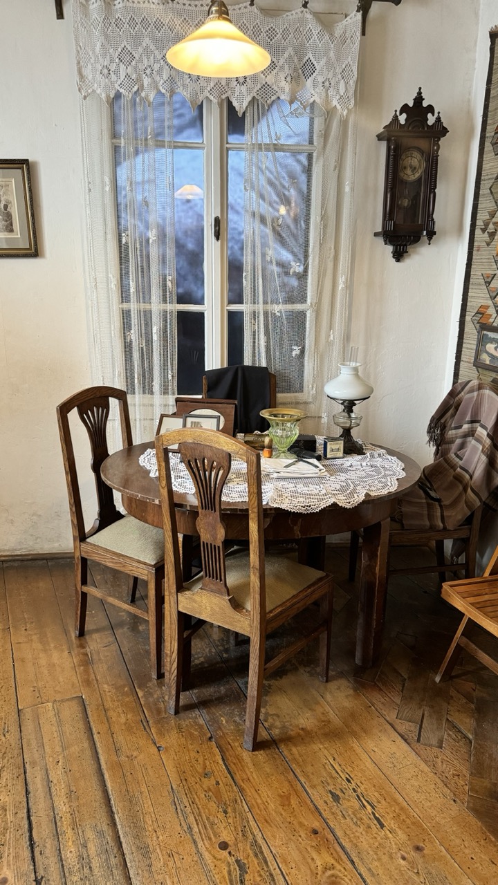

1. Overall Rating (0–10) — 7.0
This photograph evokes a quiet, nostalgic charm, capturing a warmly lit domestic corner that feels both lived-in and reverently preserved. The interplay of vintage furniture, lace details, and soft lighting creates a strong sense of time and place, though the slightly cluttered arrangement tempers its visual cohesion. The image succeeds as a quiet narrative of domestic life, inviting the viewer into a world that feels authentic and deeply personal.
2. Composition (0–10) — 6.0
The round table is centered but slightly off-kilter, with chairs and objects extending into the frame unevenly. While the arrangement feels natural, a tighter crop could enhance focus on the central narrative of the table setting.
3. Lighting (0–10) — 7.5
The warm glow from the overhead lamp creates a soft, inviting ambiance that beautifully highlights the textures of wood and lace. The natural light from the window provides subtle contrast, enhancing depth without overpowering the scene.
4. Color & Tone (0–10) — 6.5
The palette is subdued, dominated by earthy browns, creamy whites, and soft grays. While harmonious, the lack of vibrancy slightly dampens the emotional richness, giving the image a slightly muted, almost faded quality.
5. Creativity (0–10) — 7.0
The composition feels intentionally curated, suggesting a deliberate effort to preserve a moment in time. The use of layered textures and period details adds narrative depth, transforming a simple interior into a story-rich tableau.
6. Technical Quality (0–10) — 7.5
Sharp focus and clear detail are evident throughout, particularly in the wood grain and lace patterns. The exposure is well-balanced, with no harsh shadows or blown highlights.
7. Emotional Impact (0–10) — 7.0
There’s a gentle melancholy and warmth in the scene—like a memory preserved in amber. The viewer is drawn into a quiet, reflective space, evoking feelings of comfort, nostalgia, and quiet longing.
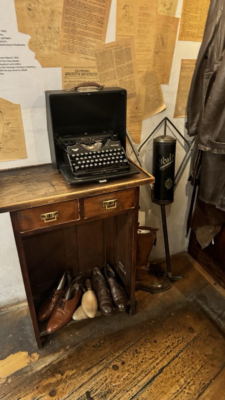

1. Overall Rating (0–10) — 7.0
This photograph captures a poignant slice of historical authenticity, evoking the intimate atmosphere of a clandestine wartime workspace. The vintage typewriter, worn boots, and aged documents create a narrative of resistance and quiet defiance, while the warm, dim lighting enhances the sense of time and place. Though the composition feels slightly cluttered, the image succeeds in conveying a powerful emotional weight through its carefully chosen artifacts.
2. Composition (0–10) — 6.5
The subject is well-centered, but the cluttered background and overlapping elements create visual noise. A tighter crop could improve focus on the typewriter and boots, enhancing narrative clarity.
3. Lighting (0–10) — 7.0
The soft, directional lighting enhances texture and depth, casting gentle shadows that emphasize the worn surfaces of the desk, floor, and typewriter. The ambient warmth supports the historical mood without overpowering the scene.
4. Color & Tone (0–10) — 7.5
The muted, earthy palette—dominated by browns, yellows, and faded blacks—reinforces the aged and solemn tone. Subtle tonal contrasts highlight the textures of the wood, leather, and paper, giving the image a tactile quality.
5. Creativity (0–10) — 7.0
The arrangement tells a story without needing words, using period-specific objects to evoke a larger historical context. The choice to frame this as a still life of resistance is both thoughtful and evocative.
6. Technical Quality (0–10) — 7.5
The image is sharp and detailed, with good focus on the typewriter and surrounding objects. The lighting and exposure are well-balanced, though slight noise is visible in the darker areas.
7. Emotional Impact (0–10) — 7.5
The scene resonates with quiet dignity and resilience, inviting the viewer to reflect on the human stories behind the artifacts. The combination of tangible relics and intimate framing fosters a strong emotional connection to the past.
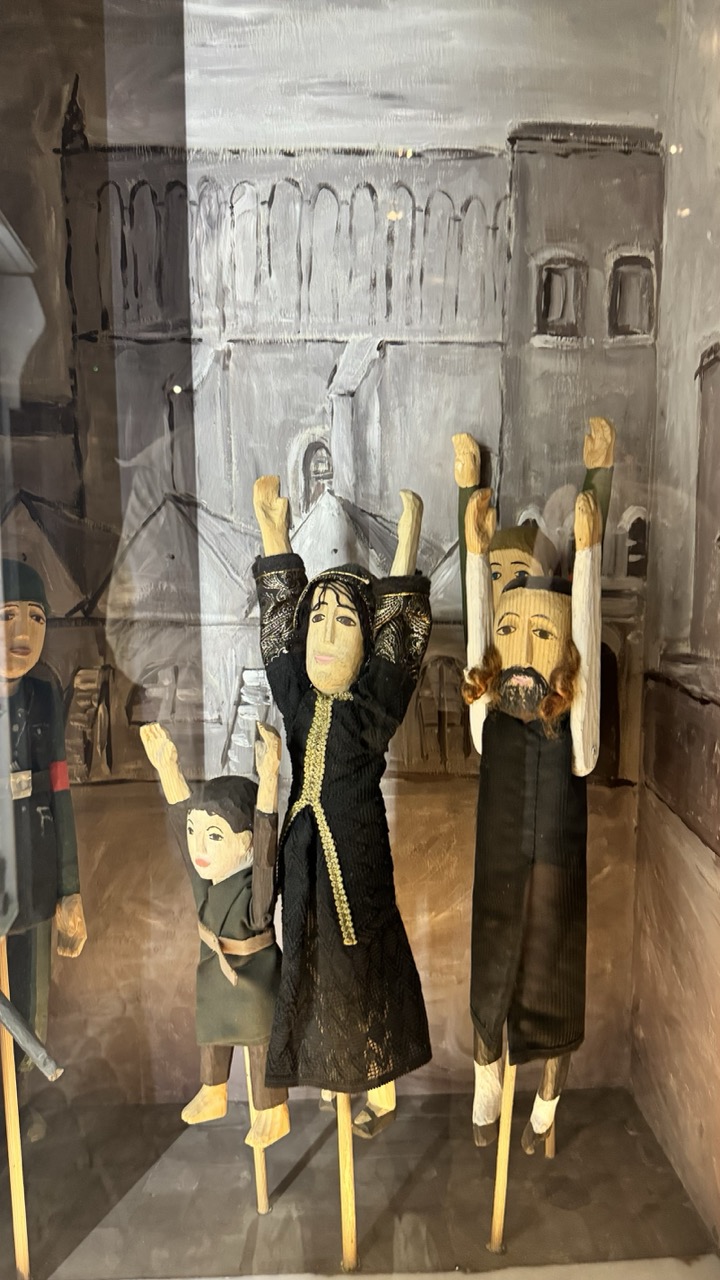

1. Overall Rating (0–10) — 7.0
This photograph captures a poignant tableau of traditional puppetry, framed within a museum display that underscores its cultural weight. The puppets, with their solemn expressions and raised arms, evoke a sense of ritual or protest, their wooden forms imbued with narrative gravity. While the glass reflection and muted lighting slightly obscure the scene’s clarity, the image succeeds in conveying the artistry and emotional resonance of the performance, offering a quiet glimpse into a living tradition.
2. Composition (0–10) — 6.5
The central figures are well-placed, drawing focus, but the reflection in the glass and the cluttered background disrupt visual harmony. A tighter crop would enhance the composition’s clarity.
3. Lighting (0–10) — 5.5
The lighting is flat and functional, typical of museum display cases, which softens the textures and shadows. While it ensures visibility, it diminishes the dramatic potential of the scene.
4. Color & Tone (0–10) — 6.0
The palette is subdued, dominated by earthy browns, blacks, and grays, which enhances the somber mood. However, the lack of vibrant contrast limits visual dynamism.
5. Creativity (0–10) — 7.5
The arrangement of the puppets—raised hands, solemn faces—suggests a powerful narrative moment, possibly a protest or prayer. The painted backdrop adds a layer of storytelling, blending performance with historical context.
6. Technical Quality (0–10) — 6.5
The image is sharp and clear, though reflections from the glass slightly degrade the overall quality. Focus is well-managed, preserving detail in the puppets' features.
7. Emotional Impact (0–10) — 7.0
The stillness of the puppets, combined with their expressive postures, evokes a quiet intensity. There is a sense of collective yearning or defiance that resonates beyond the glass case, inviting reflection on the stories behind the figures.
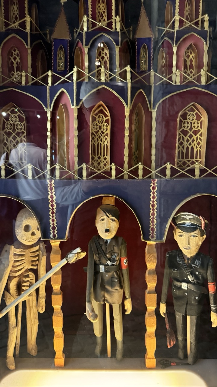

1. Overall Rating (0–10) — 6.8
This photograph presents a striking and unsettling tableau of wooden puppets arranged within a gothic-style diorama, evoking a dark theatricality that is both macabre and politically charged. The craftsmanship of the figures—particularly the caricatured depictions of historical figures—adds a layer of satirical commentary, while the layered architectural backdrop enhances the sense of a staged, ritualistic performance. Though the image is compelling in concept, the glare from the glass and the slightly awkward framing detract from its visual cohesion, preventing it from achieving a more immersive and polished impact.
2. Composition (0–10) — 6.0
The puppets are arranged in a balanced, tripartite composition, but the reflection in the glass disrupts the foreground, and the tight framing cuts into the lower edges of the figures, reducing their full presence.
3. Lighting (0–10) — 5.5
The lighting is flat and direct, likely from overhead museum lights, which causes glare on the glass and flattens the depth of the scene. The warm glow at the bottom adds a subtle contrast but does little to enhance the mood.
4. Color & Tone (0–10) — 6.5
The deep purples and maroons of the backdrop contrast with the golden accents and pale wood tones of the puppets, creating a rich, theatrical palette. However, the muted lighting dulls the vibrancy, making the colors feel somewhat lifeless.
5. Creativity (0–10) — 8.0
The concept is highly original, merging folk art with historical satire in a way that feels both provocative and thoughtfully constructed. The use of puppetry to represent political figures adds a layer of irony and commentary that is both daring and conceptually strong.
6. Technical Quality (0–10) — 6.0
The image is sharp and in focus, but the reflection in the glass and slight overexposure at the bottom diminish technical clarity and distract from the subject.
7. Emotional Impact (0–10) — 7.0
The image evokes unease and fascination, drawing the viewer into a darkly whimsical world where history is reimagined through grotesque caricature. The combination of the skeletal figure, the authoritarian figures, and the gothic architecture creates a powerful sense of foreboding and critique.
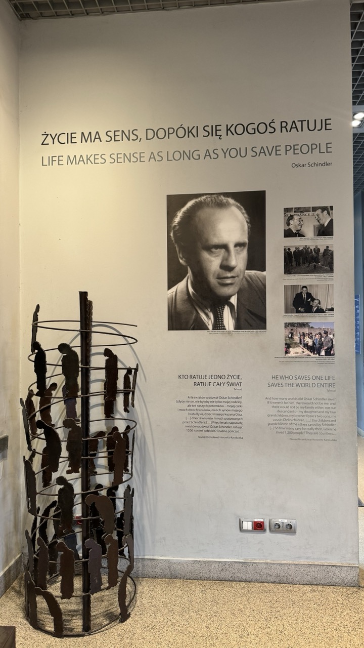

1. Overall Rating (0–10) — 7.0
This photograph captures a poignant museum exhibit dedicated to Oskar Schindler, blending historical narrative with symbolic artistry. The interplay between the stark wall text, the somber portrait, and the sculptural installation of human silhouettes creates a reflective and emotionally charged atmosphere. While the lighting and framing are functional, they slightly diminish the impact of the powerful subject matter, which could be more dramatically conveyed with stronger visual focus.
2. Composition (0–10) — 6.0
The subject is centered but partially obstructed by the sculpture in the foreground, which draws attention away from the main text and portrait. The composition feels balanced yet cluttered, with the sculpture competing for focus rather than enhancing the narrative.
3. Lighting (0–10) — 5.5
The lighting is even and utilitarian, typical of an exhibition space, but lacks directional emphasis or mood. The flat illumination flattens the scene and fails to highlight key elements like the portrait or the sculpture’s silhouette.
4. Color & Tone (0–10) — 6.0
The palette is muted and monochromatic—dominated by grays, blacks, and off-white—which supports the solemn tone. However, the lack of tonal contrast and subtle color variation reduces visual depth and emotional resonance.
5. Creativity (0–10) — 7.5
The juxtaposition of text, photo, and symbolic sculpture demonstrates strong conceptual intent, particularly the use of silhouetted figures to evoke the lives saved. The bilingual presentation adds cultural and historical weight, making the piece both informative and thoughtfully curated.
6. Technical Quality (0–10) — 7.5
The image is sharp and well-focused, with clean details in both the text and the sculpture. The exposure is balanced, though the ambient lighting limits dynamic range and contrast.
7. Emotional Impact (0–10) — 7.0
The exhibit’s message—of one man’s moral courage and its far-reaching consequences—resonates deeply. The visual elements, while not cinematic, effectively support the emotional gravity of the story, inviting quiet reflection.
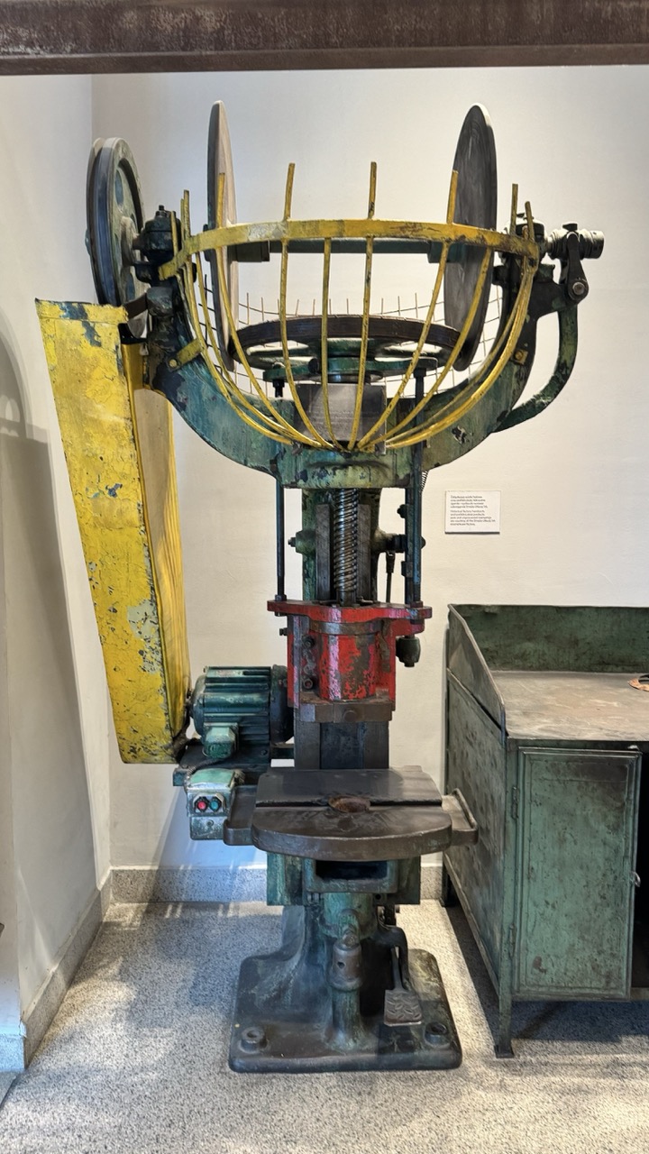

1. Overall Rating (0–10) — 6.0
This photograph captures a vintage industrial machine with a palpable sense of mechanical history, its weathered surfaces and exposed mechanisms telling a story of decades of labor. The composition is straightforward and functional, emphasizing the machine’s intricate design and aged patina, though the sterile museum setting tempers its emotional resonance. While the image effectively documents the object, it lacks the dramatic lighting or dynamic angle to elevate it into something more evocative.
2. Composition (0–10) — 6.5
The machine is centered and fills the frame, creating a balanced, documentary-style shot. However, the inclusion of the cabinet and wall signage adds visual clutter, slightly disrupting the focus on the main subject.
3. Lighting (0–10) — 5.5
Even, ambient lighting illuminates the machine clearly but without depth or mood. The lack of directional light results in flat highlights and muted shadows, diminishing the texture of the rust and paint.
4. Color & Tone (0–10) — 6.0
The palette is dominated by the machine’s faded yellow, red, and green, which, while visually interesting, appear dull due to the flat lighting. The contrast between the worn metal and the neutral background is present but underdeveloped.
5. Creativity (0–10) — 5.5
The image functions as a straightforward archival record rather than a creative interpretation. While the subject matter is inherently compelling, the approach lacks originality in framing or perspective.
6. Technical Quality (0–10) — 7.0
The image is sharp and well-focused, with clear detail visible in the machine’s components. The camera settings appear appropriate for a museum environment, capturing the subject without motion blur or noise.
7. Emotional Impact (0–10) — 5.0
The photograph conveys a sense of nostalgia and industrial heritage, but the clinical setting and lack of narrative depth keep the viewer at a distance, preventing a strong emotional connection.
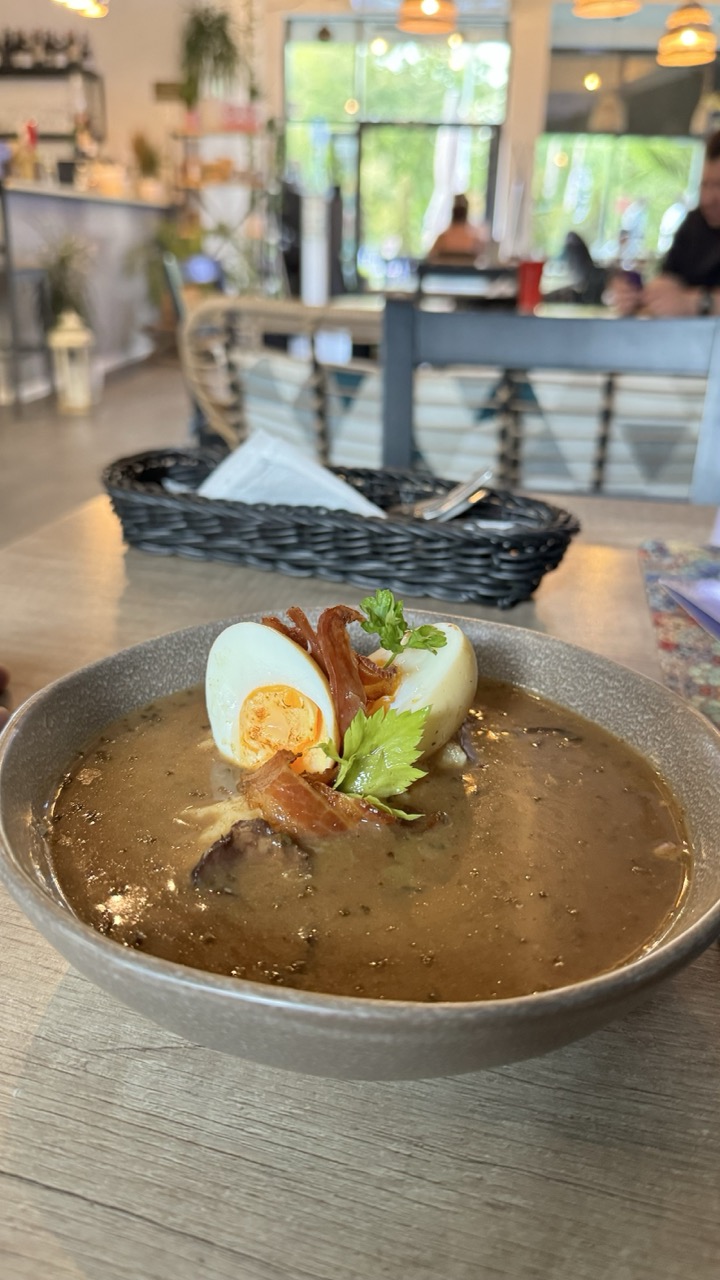

1. Overall Rating (0–10) — 7.0
This photograph captures a comforting bowl of soup in a bright, airy café setting, where the focus on the dish feels both inviting and authentic. The warm lighting and soft background blur enhance the dish’s appeal, making it the clear protagonist. While the composition is strong and the food is artfully arranged, the slightly cluttered background and overexposed window detract from the image’s overall polish, keeping it from feeling fully refined.
2. Composition (0–10) — 7.5
The bowl is centered and fills the frame effectively, drawing the eye immediately. The shallow depth of field isolates the subject, while the basket and background elements add context without distracting.
3. Lighting (0–10) — 7.0
Natural light from the window creates a soft, warm glow, enhancing the soup’s rich tones. The overhead lamps add subtle highlights, though the bright exterior slightly overexposes the background.
4. Color & Tone (0–10) — 7.5
The earthy brown of the soup contrasts beautifully with the green parsley and golden yolk, while the warm wood tones and muted grey bowl ground the palette. The overall tone is inviting and cohesive.
5. Creativity (0–10) — 6.5
The image tells a simple story of a satisfying meal in a relaxed environment. While not groundbreaking, the thoughtful presentation and ambient mood convey a sense of calm and comfort.
6. Technical Quality (0–10) — 8.0
Sharp focus on the bowl, clean detail in the food, and well-managed depth of field demonstrate solid technical execution. The slight noise in the background is minimal and acceptable.
7. Emotional Impact (0–10) — 7.0
The image evokes a sense of warmth and quiet satisfaction—like a peaceful pause during a busy day. The inviting food and calm setting encourage the viewer to imagine the taste and comfort of the moment.
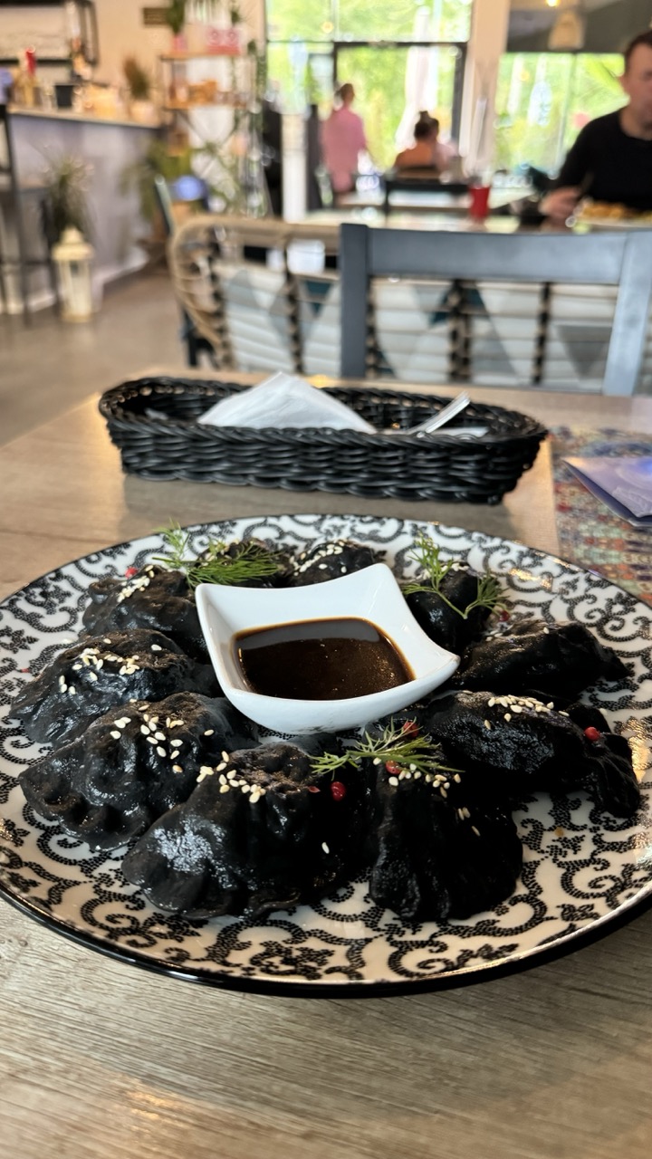

1. Overall Rating (0–10) — 7.0
This photograph captures a striking and visually compelling dish—black dumplings artfully arranged on a patterned plate, with a glossy dipping sauce at the center. The contrast between the dark dumplings and the white ceramic creates a bold, graphic quality, while the soft background blur adds depth and context. While the composition is strong and the subject is engaging, the overall image feels slightly overexposed and lacks a more dramatic interplay of light and shadow to elevate it beyond a simple food snapshot.
2. Composition (0–10) — 7.5
The central placement of the plate draws immediate attention, with the basket and background elements framing the scene naturally. The shallow depth of field effectively isolates the subject, though the slightly off-center angle of the plate and the cluttered background edges slightly diminish the balance.
3. Lighting (0–10) — 6.0
Bright, even lighting highlights the dish clearly but flattens the image’s dimensionality. The natural light from the windows creates a soft glow, yet the lack of directional shadows reduces texture and mood, giving the scene a somewhat clinical feel.
4. Color & Tone (0–10) — 7.0
The monochromatic palette of black and white dominates the plate, creating a bold visual contrast. The subtle red of the berries and the green of the dill provide small but effective pops of color. The overall tone is clean and modern, though the slightly cool white balance gives the image a neutral, restrained quality.
5. Creativity (0–10) — 8.0
The use of black dumplings is a striking and original choice, transforming a familiar dish into a visually dramatic presentation. The combination of ornate plate, rustic basket, and modern restaurant setting adds narrative depth and suggests a fusion of tradition and contemporary design.
6. Technical Quality (0–10) — 7.5
The image is sharp and well-focused on the plate, with good detail in the texture of the dumplings and the sauce. The exposure is generally balanced, though slight overexposure in the background slightly compromises the overall technical finesse.
7. Emotional Impact (0–10) — 6.5
The photograph evokes curiosity and appetite, inviting the viewer to imagine the taste and texture of the dish. While the emotional resonance is present through the aesthetic appeal, the lack of a more intimate or atmospheric touch keeps the connection to the viewer from feeling deeply personal or immersive.
Loading map...