San Jose offers a mix of modern architecture, historic landmarks, and vibrant public art for photographers to capture. Visit the San Jose Museum of Art, Center for the Performing Arts, Adobe Headquarters, and tech museums like the Tech Museum of Innovation to take in its unique sights, from sleek designs to whimsical installations, and explore its rich history and cultural narratives through sculptures, memorials, and historic theaters.
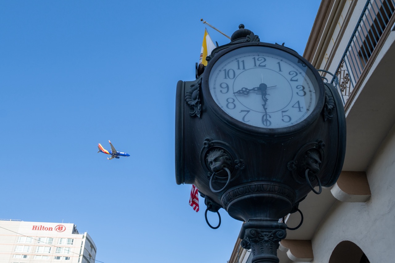

1. Overall Rating (0–10) — 7.0
This photograph captures a striking juxtaposition between the timeless elegance of a vintage street clock and the dynamic motion of a modern airplane, set against a crisp blue sky. The low-angle perspective emphasizes the clock’s ornate structure while the distant plane adds a sense of narrative and scale. While the image is visually engaging and rich in contrast, the composition feels slightly unbalanced, with the clock dominating the frame and the plane appearing almost incidental.
2. Composition (0–10) — 6.5
The low-angle framing creates a dramatic sense of scale, but the clock’s placement on the right edge leaves the left side underutilized. The airplane’s diagonal flight path adds visual interest, though it feels slightly disconnected from the main subject. A tighter crop could better integrate the elements.
3. Lighting (0–10) — 8.0
Bright, even daylight enhances clarity and contrast, with the clear blue sky providing a clean backdrop that makes both the clock and the plane stand out. The sunlight highlights the clock’s textures and casts subtle shadows that add depth.
4. Color & Tone (0–10) — 7.5
The dominant blue of the sky and the airplane’s livery create a cohesive, vibrant palette, while the black and white of the clock provide strong contrast. The Hilton sign adds a touch of warm red, grounding the scene in an urban context without disrupting the color harmony.
5. Creativity (0–10) — 7.0
The image successfully captures a moment of convergence between old and new, tradition and progress. The juxtaposition is conceptually strong, though the narrative could be more deliberate to elevate the scene beyond a simple snapshot.
6. Technical Quality (0–10) — 8.0
Sharp focus on the clock face ensures clarity, and the exposure is well-balanced, preserving detail in both the foreground and background. The image is free of noise and distortion, showcasing strong technical execution.
7. Emotional Impact (0–10) — 6.5
The photograph evokes a quiet sense of wonder at the coexistence of history and modernity, but the emotional resonance is tempered by the lack of human presence or deeper storytelling. It invites contemplation but doesn’t fully draw the viewer into a personal or emotional experience.


1. Overall Rating (0–10) — 8.0
This photograph masterfully juxtaposes historical architecture with bold modern art, creating a dialogue between past and present under a flawless blue sky. The low-angle perspective amplifies the sculpture’s dynamism while grounding it in the cultural context of the San Jose Museum of Art. While the composition leans slightly toward the abstract, the clarity and balance of elements lend the image a strong sense of place and purpose.
2. Composition (0–10) — 8.5
The low-angle shot emphasizes the sculpture’s towering presence, while the clock tower and museum facade provide structural balance and narrative depth. The diagonal sweep of the sculpture leads the eye naturally toward the museum sign, creating a cohesive visual journey.
3. Lighting (0–10) — 9.0
Bright, direct sunlight enhances the sculpture’s vibrant colors and casts crisp shadows that define its geometric forms. The clear blue sky provides a clean, uncluttered backdrop, allowing the subject to stand out with striking clarity.
4. Color & Tone (0–10) — 9.0
The vivid primary and secondary hues of the sculpture contrast beautifully with the warm stone tones of the historic building and the deep blue of the sky. The color harmony is strong, with each element contributing to a balanced and visually engaging palette.
5. Creativity (0–10) — 8.5
The image captures a compelling narrative about artistic evolution, blending architectural heritage with contemporary expression. The choice of framing and timing reflects thoughtful artistic intent, turning a simple landmark photo into a statement about cultural continuity.
6. Technical Quality (0–10) — 9.0
Sharp focus, precise exposure, and excellent resolution highlight both the sculpture’s intricate details and the texture of the stone architecture. The clean, well-exposed image reflects strong technical execution.
7. Emotional Impact (0–10) — 8.0
The image evokes a sense of pride and optimism, celebrating the fusion of tradition and innovation. The uplifting sky and bold forms inspire awe and curiosity, inviting viewers to contemplate the relationship between art, time, and place.
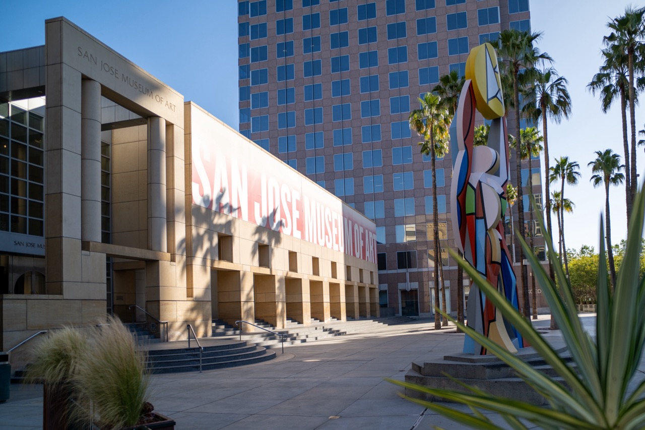

1. Overall Rating (0–10) — 7.0
This photograph captures the San Jose Museum of Art with a crisp, sunlit clarity that highlights its modern architecture and urban context. The bold signage and vibrant sculpture add visual interest, while the interplay of light and shadow gives the scene a sense of depth and time. While the composition is strong, the foreground elements slightly disrupt the visual flow, and the image feels more documentary than evocative.
2. Composition (0–10) — 7.0
The building is framed effectively, with the sculpture on the right creating a dynamic counterpoint to the structured lines of the museum. The use of leading lines from the steps and the diagonal of the palm shadows guides the eye, though the overgrowth in the foreground slightly distracts from the main subject.
3. Lighting (0–10) — 8.0
Bright, natural sunlight enhances the textures of the stone facade and casts sharp, defining shadows. The warm morning or late afternoon light adds depth and dimension, while the clear blue sky provides a clean backdrop that emphasizes the building’s geometry.
4. Color & Tone (0–10) — 7.5
The palette balances warm beige tones of the building with the cool blues of the sky and glass, creating a harmonious contrast. The colorful sculpture introduces a bold splash of vibrancy, adding energy without overwhelming the scene.
5. Creativity (0–10) — 7.0
The image successfully blends architectural documentation with artistic expression through the inclusion of the sculpture and natural elements. While not radically original, it presents a compelling urban narrative that celebrates both art and place.
6. Technical Quality (0–10) — 8.5
The image is sharp, well-exposed, and free from noticeable noise. The focus is consistent across the frame, and the camera’s perspective captures the grandeur of the structure without distortion.
7. Emotional Impact (0–10) — 6.5
The photograph conveys a sense of calm and order, evoking a quiet appreciation for public art and civic design. It invites contemplation but does not elicit a strong emotional response, remaining more observational than immersive.
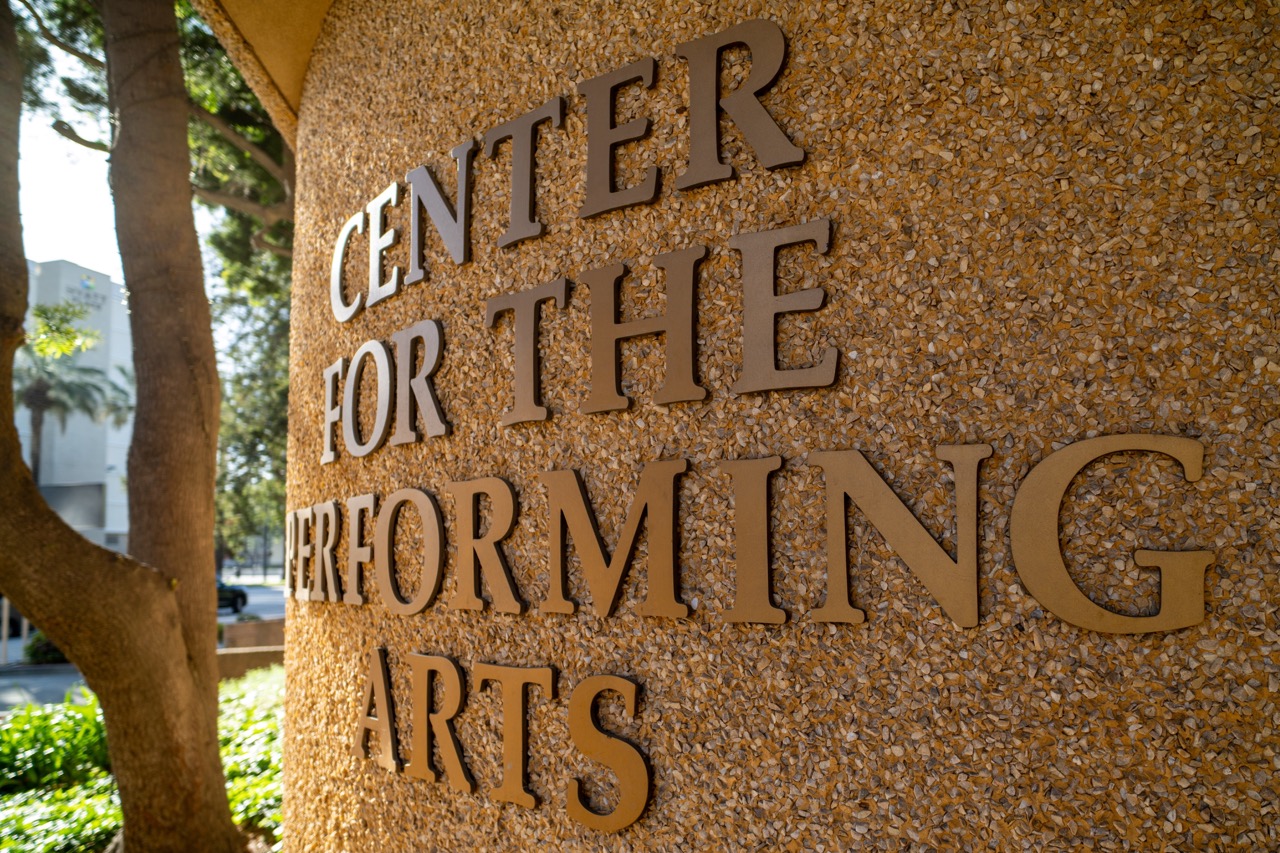

1. Overall Rating (0–10) — 7.0
This photograph captures the dignified presence of a cultural institution with a strong sense of place and purpose. The textured stone surface and bold lettering convey permanence and gravitas, while the natural light and surrounding foliage add warmth and context. Though the composition is straightforward, it effectively communicates the identity of the Center for the Performing Arts with clarity and quiet confidence.
2. Composition (0–10) — 7.0
The angled framing draws the eye along the text, creating a diagonal rhythm that guides the viewer through the sign. The tree on the left adds natural balance, though its inclusion slightly interrupts the clean geometry of the lettering.
3. Lighting (0–10) — 8.0
Soft, natural daylight highlights the texture of the stone and casts gentle shadows beneath the letters, enhancing depth and dimension. The bright but diffused light avoids harsh glare, allowing the details of the surface to shine.
4. Color & Tone (0–10) — 7.5
The warm, earthy tones of the stone and bronze lettering create a cohesive palette, complemented by the green of the foliage. The contrast between the warm background and cool white of the distant building adds visual interest without disrupting harmony.
5. Creativity (0–10) — 6.5
While the image is visually grounded and conceptually clear, it leans toward documentary realism rather than artistic interpretation. The strength lies in its clarity and intentionality, not in bold creative risk.
6. Technical Quality (0–10) — 8.5
Sharp focus and fine detail across the surface of the sign demonstrate strong technical execution. The depth of field is well-managed, keeping the text crisp while softly blurring the background.
7. Emotional Impact (0–10) — 6.0
The photograph evokes a sense of cultural pride and permanence, but its emotional resonance is restrained by its straightforward, functional presentation. It invites appreciation for the institution rather than stirring deeper emotional engagement.


1. Overall Rating (0–10) — 7.0
This photograph captures the bold, mid-century modern architecture of a cultural venue under a clear blue sky, evoking a sense of civic pride and timeless design. The building’s circular form and golden accents stand out against the crisp backdrop, while the foreground elements—palm trees, lamppost, and signage—ground the scene in a real-world context. While the image is visually strong, the composition’s slight asymmetry and overexposed sky slightly detract from its overall harmony.
2. Composition (0–10) — 7.0
The low-angle perspective emphasizes the building’s grandeur, and the diagonal line of the lamppost adds dynamic energy. However, the framing feels slightly off-center, with the building's left side cut off, creating an imbalance.
3. Lighting (0–10) — 8.0
Bright, direct sunlight enhances the textures of the building’s concrete and glass, casting sharp shadows that define its form. The deep blue sky provides excellent contrast, though the sun’s intensity slightly overexposes the upper portion of the frame.
4. Color & Tone (0–10) — 7.5
The warm beige and gold tones of the architecture harmonize beautifully with the deep blue sky, creating a balanced and inviting palette. The green of the palm trees and foliage adds a natural accent, though the overall color saturation is restrained, preserving a realistic feel.
5. Creativity (0–10) — 7.0
The image effectively highlights the architectural character of the building, blending urban design with natural elements. While not highly experimental, it offers a compelling and grounded interpretation of the structure’s aesthetic.
6. Technical Quality (0–10) — 8.0
Sharp focus across the scene ensures clarity in both the foreground and background. The exposure is well-handled overall, though the sky shows signs of slight overexposure.
7. Emotional Impact (0–10) — 6.5
The photograph conveys a sense of calm civic beauty and architectural confidence, inviting the viewer to appreciate the building as a cultural landmark. The bright, sunny day enhances a feeling of optimism, though the lack of human presence keeps the emotional connection somewhat detached.


1. Overall Rating (0–10) — 7.0
This photograph captures a striking interplay between modernist architecture and sculptural form, where the bold silhouette of the stone figure anchors the composition against the sweeping curves of the building. The bright sunlight enhances the textures and geometry, lending the scene a sense of timelessness and civic dignity. While the framing is strong, the image's emotional depth is slightly restrained by its straightforward documentation of place.
2. Composition (0–10) — 7.5
The sculpture dominates the foreground with a dynamic diagonal, guiding the eye toward the building’s arched entryway. The low angle emphasizes the monumentality of both the sculpture and the structure, while the balanced placement of the background elements creates a harmonious visual rhythm.
3. Lighting (0–10) — 8.0
The clear, overhead sunlight casts crisp, defined shadows that accentuate texture and form. The bright illumination enhances the grain of the stone and the architectural details, while the blue sky provides a clean, high-contrast backdrop that enhances the scene’s clarity.
4. Color & Tone (0–10) — 7.0
The warm, earthy tones of the concrete and stone create a cohesive palette, complemented by the cool blue of the sky. The limited color range lends a restrained, architectural feel, though a touch more vibrancy in the midtones could add visual interest.
5. Creativity (0–10) — 7.0
The image succeeds in highlighting the relationship between art and architecture, using the sculpture as a narrative device to frame the building. The choice of angle and timing reflects a thoughtful approach, capturing the site’s character without overstatement.
6. Technical Quality (0–10) — 8.0
Sharp focus across the frame, clean exposure, and accurate color reproduction demonstrate strong technical execution. The details in the sculpture and building are well-preserved, with minimal noise despite the bright conditions.
7. Emotional Impact (0–10) — 6.5
The photograph evokes a sense of quiet reverence and civic pride, but the lack of human presence or narrative context keeps the viewer at a distance. The scene feels more observational than emotionally resonant, though its composed beauty offers a contemplative stillness.


1. Overall Rating (0–10) — 7.0
This photograph captures a solemn memorial installation, where the stark white flags and translucent panels create a contemplative dialogue between memory and the modern city. The juxtaposition of the quiet, reflective monument with the towering glass skyscraper behind it speaks to the tension between history and progress. While the image is strong in its thematic resonance, the bright daylight and flat shadows slightly diminish the emotional weight, making the scene feel more documentary than poetic.
2. Composition (0–10) — 7.5
The low-angle framing emphasizes the verticality of the flags and the scale of the memorial, while the row of panels creates a strong horizontal base. The placement of the modern building in the background adds depth and narrative contrast, though the composition feels slightly unbalanced due to the asymmetry of the trees and flags.
3. Lighting (0–10) — 7.0
Bright, direct sunlight creates sharp shadows and enhances the clarity of the memorial’s details. The strong light highlights the transparency of the panels and the texture of the fabric flags, though it also flattens some of the subtler tonal variations, reducing atmospheric depth.
4. Color & Tone (0–10) — 6.5
The palette is dominated by cool whites, grays, and blues, creating a restrained and formal tone. The green of the trees provides a natural counterpoint, but the overall color scheme feels somewhat muted, lacking the richness that would elevate the emotional resonance of the scene.
5. Creativity (0–10) — 7.5
The conceptual pairing of a memorial with a modern urban backdrop is both powerful and thoughtfully executed. The use of translucent panels to display figures and text adds a layer of visual storytelling, inviting viewers to engage with the history embedded in the space.
6. Technical Quality (0–10) — 8.0
The image is sharp and well-exposed, with clear detail in both the foreground and background. The focus is consistent across the frame, and the digital clarity allows the viewer to read the inscriptions and discern the textures of the flags and panels.
7. Emotional Impact (0–10) — 7.0
The photograph evokes a quiet reverence, prompting reflection on sacrifice and remembrance. The visual tension between the memorial and the corporate skyline amplifies the emotional weight, though the bright, open atmosphere tempers the sense of solemnity.
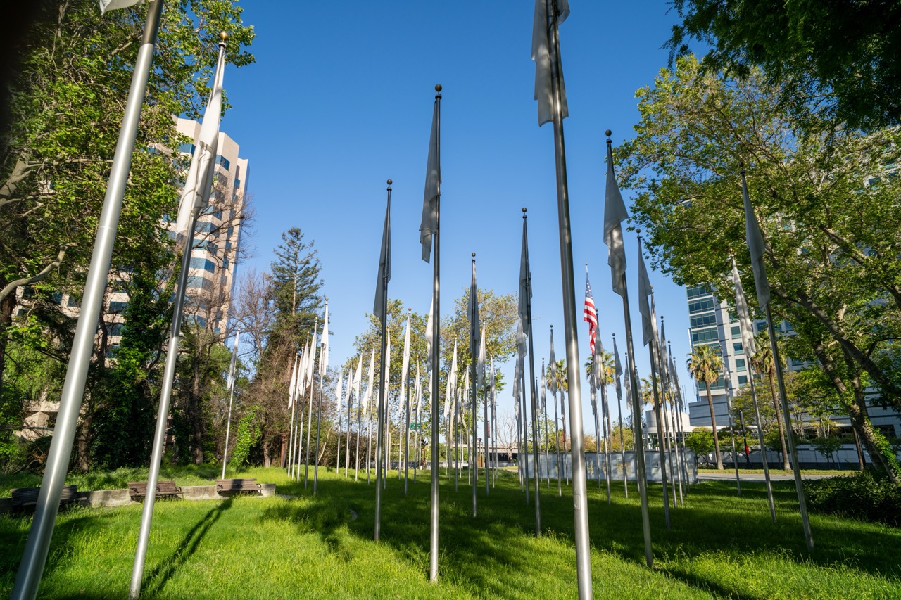

1. Overall Rating (0–10) — 7.0
This photograph captures a contemplative urban park installation, where rows of flagpoles stretch into a clear blue sky, evoking both order and quiet reverence. The interplay of natural greenery, modern architecture, and the solitary American flag introduces a subtle narrative of memory and civic space. While the image is visually striking, the repetitive pattern of the flags risks feeling monotonous, and the composition's depth could be more dynamically directed.
2. Composition (0–10) — 7.5
The low-angle perspective emphasizes the height and repetition of the flagpoles, creating a strong leading line that draws the eye toward the center. The arrangement feels intentional, though the foreground poles slightly disrupt balance, creating a slightly uneven visual rhythm.
3. Lighting (0–10) — 8.0
Bright, direct sunlight enhances the crispness of the scene, casting defined shadows that add depth and texture to the grass and poles. The clear blue sky provides a clean backdrop, allowing the white flags to stand out with clarity and contrast.
4. Color & Tone (0–10) — 7.5
The palette is vibrant and harmonious, with rich green grass, deep blue sky, and the red, white, and blue of the American flag providing focal color. The overall tone is bright and clean, though the dominance of white and gray in the flags tempers the visual intensity.
5. Creativity (0–10) — 7.0
The concept of a field of flagpoles suggests a memorial or symbolic installation, offering a quiet, reflective tone. The use of repetition and contrast between the natural and built environment adds narrative weight, though the execution leans toward the observational rather than the deeply conceptual.
6. Technical Quality (0–10) — 8.5
Sharp focus throughout the frame, excellent detail in the grass and flagpoles, and balanced exposure under bright daylight conditions demonstrate strong technical control. The depth of field is well-managed, keeping both foreground and background elements clear.
7. Emotional Impact (0–10) — 6.5
The image evokes a sense of solemnity and civic reflection, particularly due to the lone American flag among the otherwise blank ones. While the mood is subdued and respectful, the emotional resonance is somewhat restrained by the lack of human presence or narrative context.
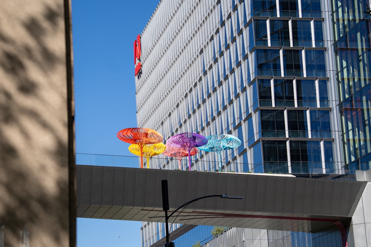

1. Overall Rating (0–10) — 7.5
This photograph captures a striking juxtaposition of urban architecture and playful public art, where vibrant, mushroom-like sculptures stand in bold contrast against the sleek, geometric facade of a modern skyscraper. The composition benefits from strong color contrast and a clear sense of scale, though the framing feels slightly obstructed by the foreground wall, which reduces the image’s immediacy. The interplay of light, color, and form creates a visually engaging moment that balances the industrial with the whimsical.
2. Composition (0–10) — 7.0
The diagonal lines of the building and the canopy create a dynamic visual flow, while the colorful sculptures serve as focal points. The left edge of the frame is partially obscured by a shadowed wall, which slightly disrupts the balance and draws attention away from the central subject.
3. Lighting (0–10) — 8.5
Bright, natural sunlight enhances the vividness of the colors and casts sharp, clean shadows, accentuating the textures of both the sculpture and the building’s reflective surface. The clear blue sky provides a clean backdrop that allows the colors to pop.
4. Color & Tone (0–10) — 8.0
The palette is rich and vibrant, with the saturated hues of the sculptures—orange, purple, yellow, and blue—creating a lively contrast against the neutral grays and blues of the architecture. The tonal range is well-balanced, with the bright highlights and deep shadows contributing to visual depth.
5. Creativity (0–10) — 8.0
The image succeeds in highlighting an unexpected fusion of art and urban design, transforming a cityscape into a playful, almost surreal environment. The choice to frame the scene through the narrow gap between buildings adds a sense of discovery and narrative.
6. Technical Quality (0–10) — 8.5
The image is sharp and well-focused, with clean details in both the foreground and background. The exposure is accurate, and the camera’s resolution captures the intricate textures of the sculptures and the building’s facade.
7. Emotional Impact (0–10) — 7.0
The photograph evokes a sense of wonder and delight, inviting viewers to appreciate the unexpected beauty in everyday urban spaces. The juxtaposition of playful art against a rigid architectural backdrop creates a subtle emotional lift, suggesting optimism and creativity within the city.
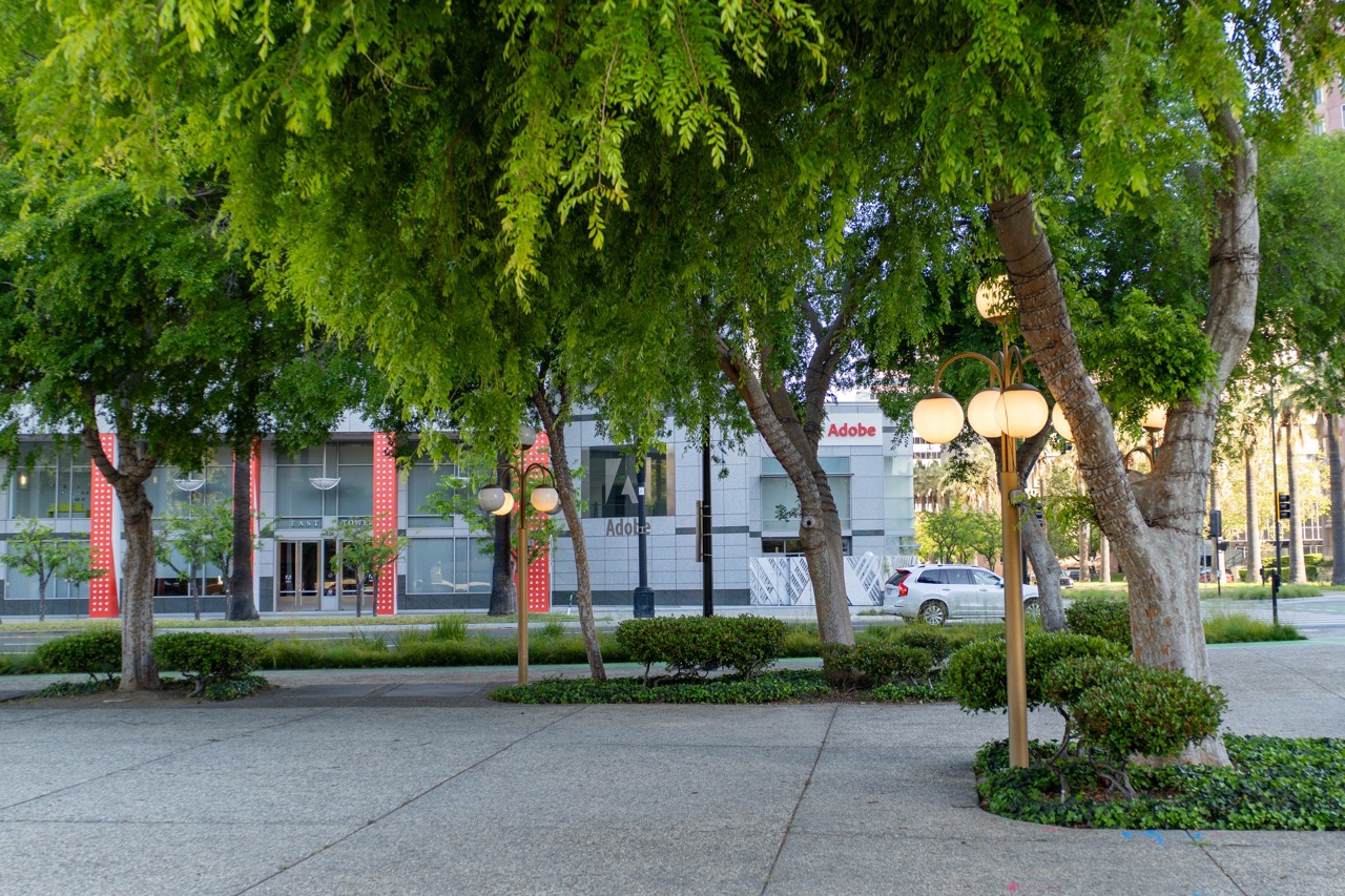

1. Overall Rating (0–10) — 7.0
This photograph captures a serene urban moment where nature and architecture coexist in quiet harmony. The lush green canopy of the trees frames the modern Adobe building in a way that feels both balanced and inviting. While the image successfully conveys a calm, contemplative atmosphere, its narrative depth is limited by the lack of a compelling focal point or human presence, leaving it slightly passive in its storytelling.
2. Composition (0–10) — 7.5
The frame is well-balanced, with the trees and lampposts creating a natural leading line toward the Adobe building. The diagonal placement of the tree trunks and the curve of the sidewalk guide the eye through the scene, while the symmetry of the red vertical accents adds visual rhythm.
3. Lighting (0–10) — 8.0
The soft, diffused light of early morning or late afternoon enhances the scene’s tranquility. The warm glow of the street lamps contrasts gently with the cool daylight, adding depth and a subtle sense of time. Exposure is well-managed, preserving detail in both highlights and shadows.
4. Color & Tone (0–10) — 7.5
The palette is dominated by vibrant greens and the clean gray of the building, with the red accents providing a striking pop. The tonal range is harmonious, with natural contrast that gives the image a fresh, clean look. The color temperature supports the peaceful mood without appearing overly stylized.
5. Creativity (0–10) — 6.5
While the scene is aesthetically pleasing, the approach is largely observational rather than conceptual. The image captures a moment of urban beauty but does not push creative boundaries in terms of perspective, abstraction, or narrative intent.
6. Technical Quality (0–10) — 8.0
The photograph is sharp and well-focused throughout, with excellent detail in the foliage and building facade. The depth of field is appropriately managed, allowing both foreground and background to remain clear without distractions.
7. Emotional Impact (0–10) — 6.0
The image evokes a sense of calm and order, suggesting a moment of quiet in a bustling city. However, the absence of people or movement limits its emotional resonance, making it more of a visual document than an emotionally charged experience.
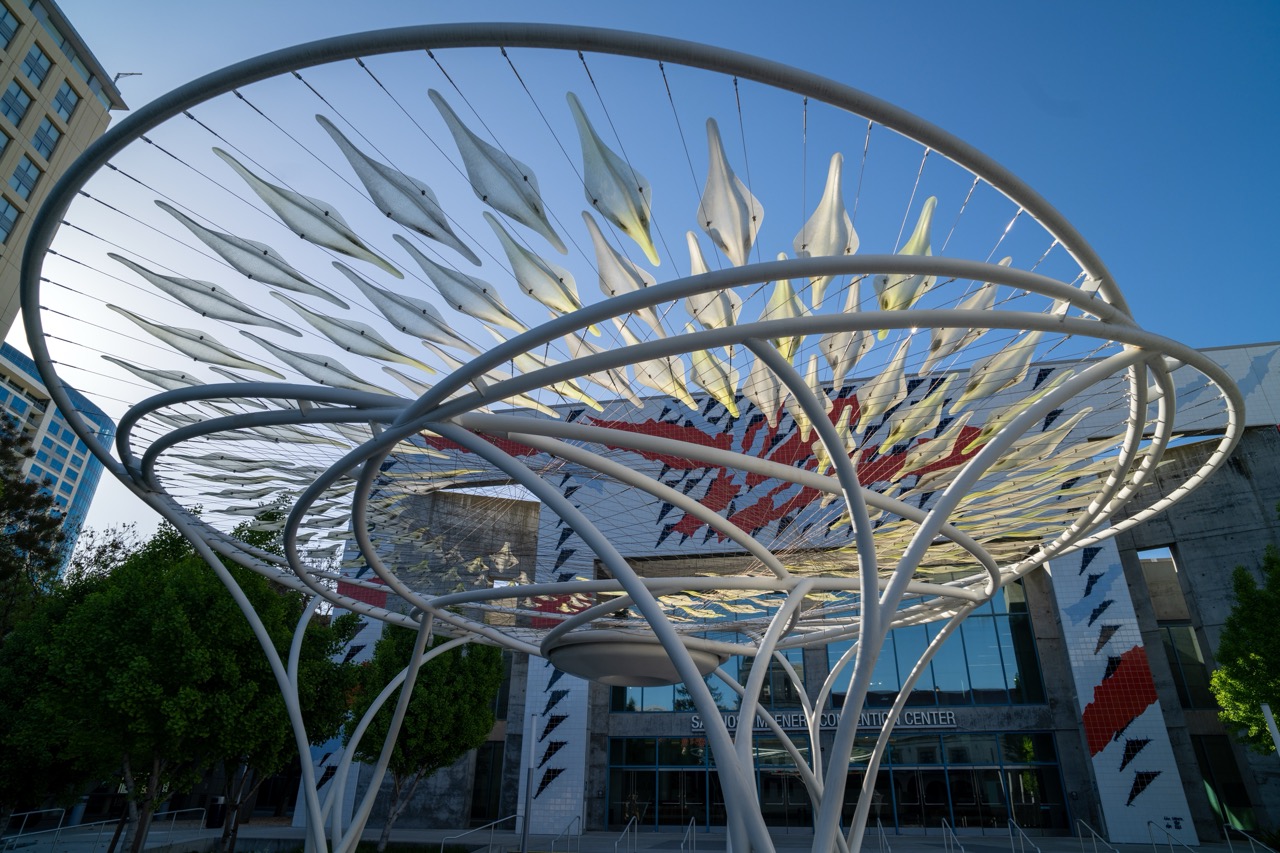

1. Overall Rating (0–10) — 8.0
This photograph captures a striking interplay between architectural sculpture and urban environment, where the dynamic, spiraling form of the installation becomes a visual metaphor for movement and energy. The low-angle perspective emphasizes the sculpture’s scale and intricacy, while the bold mural behind it adds cultural depth and vibrancy. The image succeeds in blending modern design with public art, though the composition feels slightly overbalanced by the building’s graphic elements, which compete for attention.
2. Composition (0–10) — 7.5
The low-angle framing enhances the sculpture’s grandeur, drawing the eye upward through its curving forms. The overlapping lines create a sense of depth, though the building’s graphic mural slightly disrupts visual harmony by introducing a competing pattern.
3. Lighting (0–10) — 8.5
Bright, natural daylight enhances the sculpture’s white surfaces, casting soft shadows that define its three-dimensional form. The clear blue sky provides a crisp, contrasting backdrop that accentuates the sculpture’s lightness and elegance.
4. Color & Tone (0–10) — 7.0
The palette is dominated by crisp whites and cool blues, creating a clean, modern aesthetic. The red and black accents in the mural inject energy and contrast, though they risk clashing with the sculpture’s minimalism.
5. Creativity (0–10) — 8.0
The fusion of organic sculpture with urban architecture and public art is conceptually strong, suggesting themes of innovation and community. The photographer’s choice to frame the sculpture against the vibrant mural adds narrative layers and visual interest.
6. Technical Quality (0–10) — 8.5
Sharp focus and high resolution capture fine details in both the sculpture and the building. The exposure is well-balanced, preserving detail in highlights and shadows without overprocessing.
7. Emotional Impact (0–10) — 7.5
The image evokes a sense of optimism and forward motion, inviting the viewer to appreciate the intersection of art, design, and civic space. Its bold composition and clean aesthetics inspire curiosity and wonder.


1. Overall Rating (0–10) — 7.0
This photograph captures a harmonious blend of nature and modern architecture, where lush greenery softens the sharp lines of a contemporary public space. The framing through the trees creates a sense of depth and invites the viewer into a peaceful urban moment, though the composition’s clarity is slightly diluted by the overexposed sky and busy background elements. The image succeeds in conveying calm and order, with a quiet elegance that feels both inviting and thoughtfully composed.
2. Composition (0–10) — 7.5
The trees in the foreground create a natural frame, guiding the eye toward the building and sculpture. The placement of the white sculptural forms adds visual rhythm, while the asymmetry of the branches and architectural elements contributes to a balanced yet dynamic arrangement.
3. Lighting (0–10) — 7.0
Bright, natural daylight enhances the vibrancy of the foliage and highlights the clean lines of the architecture. The shadows cast by the trees add texture and depth, though the sky is slightly overexposed, losing detail in the upper portion.
4. Color & Tone (0–10) — 7.5
The rich greens of the ginkgo leaves contrast beautifully with the white structures and the bold red and black mural, creating a visually engaging palette. The overall tone is fresh and airy, with a balanced color temperature that complements the daytime setting.
5. Creativity (0–10) — 7.0
The interplay between organic forms and geometric design offers a thoughtful narrative about urban life and nature. The inclusion of the mural adds a layer of cultural context, elevating the image beyond a simple architectural portrait.
6. Technical Quality (0–10) — 8.0
The image is sharp and well-focused, with clear details in both the foreground and background. The exposure is generally well-managed, aside from minor overexposure in the sky, and the camera settings appear to have been chosen to preserve detail in the foliage and architecture.
7. Emotional Impact (0–10) — 7.0
The photograph evokes a sense of tranquility and civic pride, capturing a moment of stillness in a public space. The viewer is invited to pause and appreciate the quiet harmony between design, nature, and community.


1. Overall Rating (0–10) — 8.0
This photograph captures the grandeur of a classical church facade with a sense of reverence and architectural clarity. The low-angle perspective emphasizes the monumentality of the structure, while the interplay of light and shadow enhances its ornate details. The inclusion of the modern building to the left creates a subtle contrast between old and new, adding depth to the narrative. While the composition is strong, the image could benefit from slightly more dynamic lighting to elevate its emotional resonance.
2. Composition (0–10) — 8.0
The low-angle framing emphasizes the verticality and scale of the columns, drawing the eye upward toward the pediment. The symmetry of the facade is well-balanced, with the central rose window and inscription acting as focal points. The partial inclusion of the modern building on the left adds visual interest and contextual contrast without disrupting the composition’s harmony.
3. Lighting (0–10) — 7.5
The warm, directional sunlight highlights the texture and depth of the stone, casting long shadows that accentuate the architectural details. The light appears to come from the side, creating a gentle gradient across the façade and enhancing the three-dimensionality of the columns and entablature. The sky remains a clean, clear blue, providing a crisp backdrop that makes the structure stand out.
4. Color & Tone (0–10) — 7.0
The palette is dominated by warm, creamy whites and soft golds from the sunlight, complemented by the deep blue of the sky. The tones are harmonious and evocative of a serene, sunlit afternoon. The dark stained glass and shadows provide contrast, though the overall tonal range could be slightly expanded to enhance depth and vibrancy.
5. Creativity (0–10) — 7.5
The image successfully blends architectural documentation with artistic expression, using perspective and light to emphasize the building’s spiritual and historical weight. The juxtaposition of the classical church and modern structure adds a layer of contemporary relevance, suggesting a dialogue between tradition and progress.
6. Technical Quality (0–10) — 8.5
The image is sharp and detailed, with excellent focus across the entire façade. The exposure is well-managed, preserving detail in both the highlights and shadows. The camera’s resolution captures the fine textures of the stone and the intricacy of the carvings, demonstrating strong technical execution.
7. Emotional Impact (0–10) — 7.5
The photograph evokes a sense of awe and quiet contemplation, inviting the viewer to appreciate both the craftsmanship of the building and the passage of time. The interplay of light and shadow, combined with the imposing architecture, conveys a feeling of permanence and dignity, resonating with viewers on both an aesthetic and emotional level.


1. Overall Rating (0–10) — 8.0
This photograph captures the grandeur and spiritual serenity of a sacred space during a communal gathering, where light and architecture converge to evoke reverence. The richly decorated dome and stained glass infuse the scene with warmth and history, while the congregation’s presence grounds the image in human connection. Though slightly obstructed by a foreground element, the composition successfully balances architectural splendor with quiet intimacy, making it both visually striking and emotionally resonant.
2. Composition (0–10) — 8.0
The view is framed from within the nave, creating a sense of immersion and perspective that draws the eye toward the altar. The central aisle leads the gaze through rows of pews, enhancing depth, while the ornate ceiling and arches provide a harmonious visual rhythm. The slight obstruction on the left adds a candid, documentary feel, though it slightly disrupts the symmetry.
3. Lighting (0–10) — 8.5
Warm, ambient light bathes the interior, enhanced by natural illumination filtering through the stained glass and soft artificial fixtures. The interplay of golden tones and subtle shadows highlights the intricate ceiling frescoes and architectural details, creating a luminous and reverent atmosphere.
4. Color & Tone (0–10) — 8.0
The palette is dominated by rich golds, creams, and warm wood tones, punctuated by the soft blues and reds of the stained glass. This cohesive, luminous color scheme enhances the sense of sacred space, while the tonal contrast between light and shadow adds depth and dimension.
5. Creativity (0–10) — 7.5
The image captures a moment of quiet devotion within a highly ornate setting, offering a narrative of faith and community. The choice to photograph from within the congregation, rather than from a formal vantage point, lends authenticity and emotional immediacy to the scene.
6. Technical Quality (0–10) — 8.5
The image is sharp and well-focused, with excellent detail in the ceiling, stained glass, and wooden pews. The exposure is balanced, preserving highlights and shadows without overexposure, and the depth of field effectively keeps the main subject—both the space and the people—in focus.
7. Emotional Impact (0–10) — 8.5
The photograph conveys a profound sense of peace, tradition, and shared purpose. The warmth of the light, the solemnity of the architecture, and the presence of a gathered community combine to evoke deep emotional resonance, inviting the viewer into a moment of spiritual reflection.
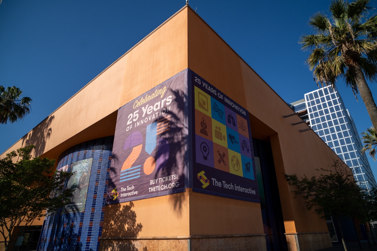

1. Overall Rating (0–10) — 7.0
This photograph captures the vibrant energy of a modern cultural institution under a clear blue sky, with bold graphics and warm sunlight enhancing its celebratory tone. The dynamic angle and vivid colors give the image a sense of forward motion and excitement, though the composition feels slightly unbalanced due to the large banner dominating the frame. The interplay of architecture, nature, and branding creates a compelling urban narrative, but the visual weight of the signage risks overshadowing the building’s architectural character.
2. Composition (0–10) — 6.5
The low-angle perspective emphasizes the building’s scale and the banner’s prominence, but the off-center framing and diagonal lines create a slightly cluttered feel. The palm trees and modern skyscraper in the background add depth, though they compete for attention with the main subject.
3. Lighting (0–10) — 8.0
Strong, direct sunlight creates crisp shadows and enhances the rich, warm tones of the building’s facade. The contrast between light and shadow adds dimension, while the clear blue sky provides a clean, high-contrast backdrop.
4. Color & Tone (0–10) — 8.5
The warm terracotta of the building complements the vibrant purples, yellows, and blues of the banner, creating a lively and cohesive palette. The color saturation is strong without appearing oversaturated, enhancing the celebratory mood.
5. Creativity (0–10) — 7.5
The image effectively combines architectural documentation with a celebration of innovation, using the banner as both a narrative and visual focal point. The juxtaposition of the organic palm trees and the sleek glass skyscraper adds a layer of urban storytelling.
6. Technical Quality (0–10) — 8.0
Sharp focus and clean detail across the frame, with excellent exposure control. The lens choice and angle enhance the image’s dynamism while maintaining clarity.
7. Emotional Impact (0–10) — 7.0
The photograph evokes a sense of pride and progress, inviting the viewer to feel part of a community celebrating achievement. The bright colors and open sky contribute to an uplifting mood, though the image remains more informative than deeply personal.


1. Overall Rating (0–10) — 7.5
This photograph captures the graceful tension of a bronze sculpture in dialogue with its architectural surroundings, where light and shadow sculpt the scene with quiet elegance. The statue’s dynamic pose contrasts beautifully with the grounded, stately lines of the San Jose Civic, creating a moment of artistic resonance. While the composition is strong, the slightly cluttered foreground and overcast lighting temper its overall visual power.
2. Composition (0–10) — 7.0
The sculpture is well-placed off-center, creating a dynamic diagonal that draws the eye toward the building’s entrance. However, the foreground greenery and fire pit slightly disrupt the visual flow, introducing a minor compositional imbalance.
3. Lighting (0–10) — 7.5
The late afternoon sun casts long, soft shadows that enhance the texture of the bronze and the building’s stucco facade. The directional light adds depth and dimension, though the sky’s brightness slightly flattens the upper portion of the frame.
4. Color & Tone (0–10) — 7.0
The warm beige of the building harmonizes with the verdigris patina of the sculpture, while the greenery and purple flowers provide subtle color accents. The overall palette is cohesive, though slightly muted by the ambient light.
5. Creativity (0–10) — 7.5
The juxtaposition of the soaring, human-like figure against the civic architecture suggests themes of aspiration and cultural expression. The image feels both documentary and poetic, elevating a public space into a moment of contemplative beauty.
6. Technical Quality (0–10) — 8.0
The image is sharp and well-focused, with clean detail in both the sculpture and the building. The depth of field is appropriate, keeping the subject clear while softly blurring the background.
7. Emotional Impact (0–10) — 7.0
The photograph evokes a sense of quiet dignity and artistic reverence, inviting the viewer to pause and reflect. The interplay of movement and stillness creates a contemplative mood, though the lack of human presence keeps the emotional connection at a respectful distance.
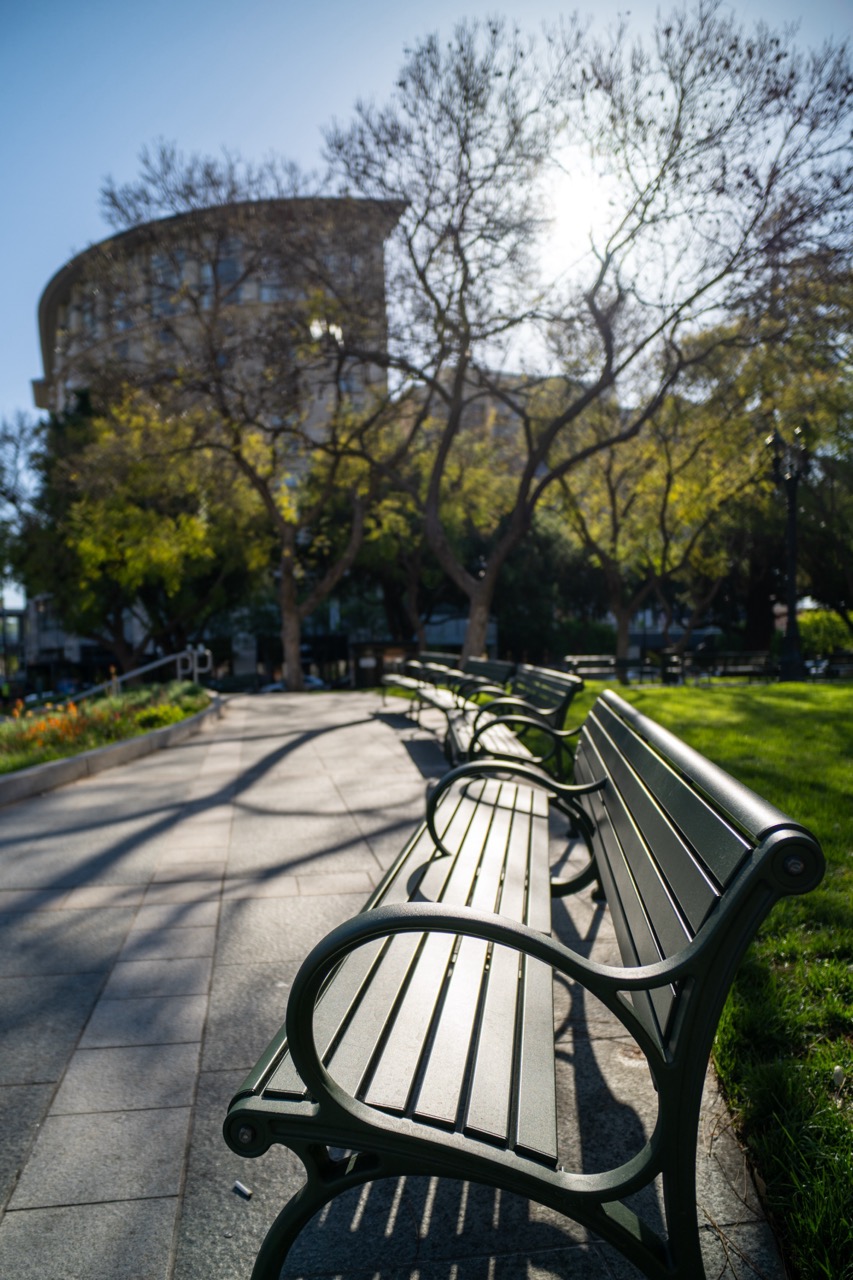

1. Overall Rating (0–10) — 7.0
This photograph captures a serene urban park scene, where the interplay of light and shadow evokes a quiet, contemplative mood. The shallow depth of field draws the eye along the row of benches, creating a sense of depth and inviting the viewer to imagine a peaceful stroll. While the image is visually pleasing, its emotional resonance is slightly muted by the overexposed sun flare, which detracts from the overall subtlety of the moment.
2. Composition (0–10) — 7.5
The diagonal line of benches guides the viewer’s gaze into the frame, creating strong leading lines. The low-angle perspective enhances the sense of space and draws attention to the interplay between the foreground bench and the background architecture. The framing is balanced, with the curved building and trees forming a natural backdrop that adds architectural interest.
3. Lighting (0–10) — 6.5
The bright sunlight creates dramatic shadows that add texture and depth to the scene. However, the sun is positioned directly behind the trees, causing a harsh glare that washes out detail in the upper portion of the image. While the lighting emphasizes the contours of the benches and the path, the overexposure in the sky reduces the overall tonal range.
4. Color & Tone (0–10) — 7.0
The color palette is natural and cohesive, with the deep green of the benches and grass contrasting against the warm stone tones of the building and the cool gray of the pavement. The sunlight enhances the vibrancy of the foliage, and the overall tone is bright and airy, though the overexposed highlights slightly flatten the color dynamics.
5. Creativity (0–10) — 7.0
The use of shallow depth of field and leading lines demonstrates a thoughtful approach to composition, transforming an ordinary urban scene into a visually engaging image. The interplay between man-made structures and natural elements adds narrative depth, suggesting themes of stillness and transition.
6. Technical Quality (0–10) — 7.5
The image is sharp in the foreground, with clear detail on the bench and pavement. The focus is well-placed, and the camera’s resolution captures fine textures. However, the overexposed sky and slight lens flare indicate a minor technical limitation in exposure control.
7. Emotional Impact (0–10) — 6.5
The photograph conveys a sense of calm and solitude, inviting reflection on the quiet moments of city life. While the mood is peaceful, the harsh sun and lack of human presence give the scene a slightly detached, almost melancholic quality, limiting its emotional immediacy.


1. Overall Rating (0–10) — 7.0
This photograph captures a vibrant urban plaza with a striking sense of modern design, where bold orange umbrellas create a rhythmic visual pattern against the neutral backdrop of city life. The warm sunlight enhances the color’s vibrancy and casts long, clean shadows, giving the scene a sense of quiet energy. While the composition is strong and the color is compelling, the wide-angle perspective slightly distorts the forms, and the background remains somewhat underdeveloped, limiting the image’s overall depth.
2. Composition (0–10) — 7.5
The leading line of umbrellas draws the eye into the frame, creating a sense of movement and rhythm. The low angle emphasizes the scale and repetition of the structures, while the diagonal path and scattered benches provide visual balance. However, the inclusion of distant background elements slightly dilutes the focus on the primary subject.
3. Lighting (0–10) — 8.0
Bright, direct sunlight creates strong contrast and definition, highlighting the texture of the umbrellas and casting crisp shadows that add depth. The golden hour glow enhances the warmth of the orange tones and contributes to a cheerful, inviting atmosphere.
4. Color & Tone (0–10) — 8.5
The bold orange of the umbrellas stands out vividly against the muted earth tones and pale blue sky, creating a visually striking palette. The color harmony is strong, with the warm tones complementing the natural green of the trees and the neutral architecture in the background.
5. Creativity (0–10) — 7.0
The image effectively uses color and repetition to create a modern, design-focused aesthetic. While the concept is grounded in real-world urban design, the photographer's framing and timing lend it a creative edge, transforming a public space into a visually engaging composition.
6. Technical Quality (0–10) — 7.5
The image is sharp and well-exposed, with clear detail in both the foreground and background. The wide dynamic range captures the bright sky without overexposing the highlights, and the focus is consistent across the umbrella row.
7. Emotional Impact (0–10) — 6.5
The photograph evokes a sense of calm urban renewal and playful design, inviting viewers to imagine a leisurely day in a thoughtfully curated public space. The emptiness of the plaza adds a touch of serenity, though the lack of human presence keeps the emotional connection somewhat restrained.


1. Overall Rating (0–10) — 7.2
This photograph captures a vibrant urban plaza with a striking contrast between the bold orange Adirondack chairs and the muted tones of the surrounding architecture. The warm sunlight enhances the chairs’ color, creating a sense of inviting leisure in a city environment. While the composition is visually engaging, the shallow depth of field and slightly cluttered background prevent it from achieving a more cohesive, artistic presence.
2. Composition (0–10) — 6.8
The low-angle perspective emphasizes the chairs, drawing the viewer into the scene, but the off-center framing and scattered background elements slightly disrupt visual harmony. A more deliberate arrangement or tighter crop could improve balance.
3. Lighting (0–10) — 8.0
Strong, directional sunlight creates sharp shadows and highlights the texture of the sand and the chairs’ surfaces, adding depth and dimension. The golden hour glow enhances the warmth and vibrancy of the scene.
4. Color & Tone (0–10) — 8.5
The vivid orange of the chairs stands out dramatically against the neutral backdrop of sand and beige buildings, creating a powerful visual contrast. The overall tone is bright and sunny, with excellent color saturation that feels both natural and dynamic.
5. Creativity (0–10) — 7.5
The use of bold color in an urban setting is both eye-catching and thoughtfully staged. The image suggests a narrative of relaxation in a bustling city, but the concept remains largely observational rather than deeply conceptual.
6. Technical Quality (0–10) — 7.8
The image is sharp and well-focused on the foreground chair, with a clean depth of field that isolates the subject. The exposure is balanced, and the camera’s resolution captures fine details without noise.
7. Emotional Impact (0–10) — 6.5
The scene evokes a sense of calm and leisure, inviting the viewer to imagine sitting in one of the chairs and enjoying a sunny afternoon. However, the lack of human presence keeps the emotional connection somewhat detached.


1. Overall Rating (0–10) — 8.0
This vibrant mural radiates pride and community, transforming a city corner into a powerful statement of inclusivity and identity. The bold use of color and diverse figures creates an uplifting, celebratory atmosphere, while the integration of real-world elements—like the rainbow flags and urban surroundings—grounds the artwork in its context. Though the composition is slightly cluttered by the surrounding architecture, the mural’s emotional resonance and visual impact make it a compelling piece of public art.
2. Composition (0–10) — 7.0
The mural dominates the frame, with a diagonal rainbow stripe guiding the eye across the composition. The placement of the figures creates a sense of depth and unity, though the inclusion of the sidewalk and storefront on the right introduces visual tension, slightly disrupting the mural’s cohesive presence.
3. Lighting (0–10) — 8.0
Bright, natural daylight enhances the mural’s vivid colors and casts subtle shadows that give the figures dimension. The sun’s angle highlights the rainbow tones and adds a sense of warmth and optimism to the scene.
4. Color & Tone (0–10) — 9.0
The palette is rich and intentional, with a spectrum of saturated hues that reflect the diversity and joy of the LGBTQ+ community. The contrast between the dark background and the luminous figures makes the mural pop, while the rainbow motif ties the composition together with symbolic coherence.
5. Creativity (0–10) — 9.0
The mural’s fusion of collective representation and symbolic imagery—such as the raised flag and the inclusion of a gender-fluid prince—demonstrates thoughtful storytelling. The integration of social media tags adds a contemporary layer, bridging art and community engagement.
6. Technical Quality (0–10) — 8.0
The image is sharp and well-exposed, with clear details in both the mural and the surrounding environment. The focus is consistent across the frame, allowing the viewer to appreciate both the artwork and its urban context.
7. Emotional Impact (0–10) — 9.0
The mural evokes a strong sense of pride, belonging, and celebration. Its presence in a public space invites reflection and connection, transforming a simple street scene into a moment of shared identity and hope.


1. Overall Rating (0–10) — 7.5
This vibrant mural captures the energy and pride of San José with bold, dynamic visuals that leap from the wall. The juxtaposition of the athletic figure and the city’s name creates a sense of movement and celebration, while the backdrop of the hotel grounds the piece in its urban context. Though the composition is strong, the mural’s scale and the surrounding environment slightly dilute its impact, leaving room for more focused storytelling.
2. Composition (0–10) — 7.0
The low-angle shot emphasizes the mural’s grandeur, with the skater’s diagonal pose guiding the eye across the frame. However, the expansive parking lot and the distant building create visual weight that pulls focus away from the central artwork.
3. Lighting (0–10) — 8.5
Bright, direct sunlight enhances the mural’s colors and clarity, casting sharp shadows that add depth and dimension. The clear blue sky provides a clean, high-contrast backdrop that makes the artwork pop.
4. Color & Tone (0–10) — 8.0
The palette is rich and energetic, with strong primary tones—red, blue, and yellow—contrasting against the neutral wall. The color choices reflect both patriotism and artistic dynamism, reinforcing the mural’s celebratory tone.
5. Creativity (0–10) — 8.5
The fusion of athletic motion and urban identity is inventive and culturally resonant. The stylized figure and layered composition suggest a narrative of community, pride, and aspiration, making the mural both visually striking and conceptually meaningful.
6. Technical Quality (0–10) — 8.0
The image is sharp and well-exposed, with excellent detail in the mural’s textures and lines. The clarity of the lettering and the figure’s form demonstrates strong technical execution.
7. Emotional Impact (0–10) — 7.5
The mural evokes a sense of pride and vitality, connecting viewers to the city’s spirit through its bold visuals and dynamic energy. While the setting tempers its intimacy, the piece still inspires a strong emotional connection to place and identity.
Loading map...