

1. Overall Rating (0–10) — 7.0
This image captures the precision and ritual of Peking duck preparation with a strong sense of authenticity and cultural context. The chef’s focused posture and the gleaming roasted duck convey a moment of culinary mastery, while the warm interior and traditional elements enhance the scene’s immersive quality. The lighting and framing are effective, though the slightly cluttered background and over-the-shoulder perspective limit the image’s visual elegance.
2. Composition (0–10) — 6.5
The chef is well-positioned, with the duck and plating elements forming a natural diagonal flow. However, the tight framing and visible microphone cable disrupt visual harmony, and the background elements distract slightly from the central action.
3. Lighting (0–10) — 7.0
The warm, ambient lighting enhances the richness of the duck’s glaze and the chef’s uniform, creating a cozy, inviting atmosphere. The light direction is soft and even, though a touch more directional contrast could add depth.
4. Color & Tone (0–10) — 7.0
The warm golden tones of the duck and interior complement the chef’s white uniform, creating a cohesive palette. The red accents on the plate and background add visual interest without overwhelming the composition.
5. Creativity (0–10) — 7.0
The image successfully captures a culturally significant culinary moment with a sense of narrative. The inclusion of the chef’s tools and the restaurant’s decor grounds the scene in authenticity, elevating it beyond a simple documentation.
6. Technical Quality (0–10) — 7.5
The image is sharp and well-focused, with clear details on the duck’s skin and the chef’s hands. The depth of field is appropriate, though the microphone cable and background elements introduce minor distractions.
7. Emotional Impact (0–10) — 7.5
There is a quiet dignity in the chef’s concentration, and the image evokes appreciation for tradition and craftsmanship. The viewer is drawn into the experience, feeling the weight of a time-honored culinary art.


1. Overall Rating (0–10) — 6.8
This image captures the rich, glistening appeal of sliced Peking duck, its golden-brown skin and tender meat arranged with a sense of culinary care. The bold yellow plate enhances the dish’s visual warmth, making it feel inviting and indulgent, though the slightly cluttered background and soft focus detract from its overall refinement. While the photograph successfully conveys the dish’s appetizing quality, it falls short of the polished aesthetic that could elevate it to a true food portrait.
2. Composition (0–10) — 6.0
The central placement of the duck draws attention, but the overlapping slices and surrounding clutter create visual noise. A tighter crop and more deliberate framing would improve balance and focus.
3. Lighting (0–10) — 6.5
Warm, ambient lighting enhances the sheen on the duck’s skin, emphasizing its crisp texture. However, the shadows are soft and uneven, reducing depth and contrast.
4. Color & Tone (0–10) — 7.0
The vibrant yellow of the plate creates a striking contrast with the rich browns of the duck, making the dish pop. The overall tone is warm and inviting, though slightly oversaturated.
5. Creativity (0–10) — 6.5
The choice to highlight the duck’s textures and colors feels deliberate, but the composition and background lack originality, leaning more toward casual documentation than artistic interpretation.
6. Technical Quality (0–10) — 7.0
The image is reasonably sharp with clear detail in the duck’s skin and meat. Depth of field is shallow, but the focus is appropriately placed on the main subject.
7. Emotional Impact (0–10) — 7.0
The photograph evokes a sense of indulgence and sensory pleasure, tapping into the universal appeal of a beloved dish. It invites the viewer to imagine the taste and aroma, though it stops short of emotional depth.
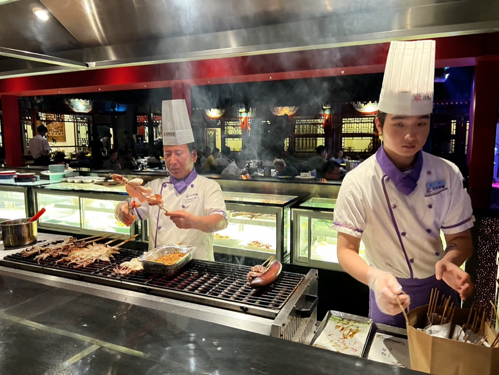

1. Overall Rating (0–10) — 7.0
This photograph captures the vibrant energy of a live cooking station in a bustling Asian restaurant, where the sizzle of the grill and the haze of steam create a dynamic sensory atmosphere. The chefs’ focused expressions and the organized chaos of the grill convey authenticity and culinary craftsmanship. While the image successfully conveys the atmosphere of a live kitchen, the composition and lighting prevent it from achieving a more refined visual impact.
2. Composition (0–10) — 6.0
The framing is slightly off-center, with the foreground chef partially cropped and the background chef slightly more dominant. The depth of field is shallow, but the cluttered foreground and midground create a sense of visual noise that distracts from the main subject.
3. Lighting (0–10) — 6.0
Harsh overhead lighting casts a sterile glow, while the steam adds a soft diffusion that partially obscures details. The contrast between the bright grill area and the darker dining space creates some depth, but the lighting lacks warmth and mood.
4. Color & Tone (0–10) — 6.5
The white and purple uniforms stand out against the darker background, but the overall palette is dominated by neutral grays and whites, with the red accents in the background adding only limited vibrancy. The color temperature is cool and clinical, which tempers the warmth of the cooking process.
5. Creativity (0–10) — 6.5
The image captures a moment of real-time action, emphasizing the live cooking experience that is central to the restaurant’s appeal. The inclusion of steam and motion adds a layer of authenticity, but the execution remains more documentary than artistic.
6. Technical Quality (0–10) — 7.5
The focus is sharp on the central grill and the chefs, and the image is free from obvious technical flaws. The high ISO and ambient lighting result in some noise, but the detail remains clear enough to appreciate the textures of the food and uniforms.
7. Emotional Impact (0–10) — 6.0
The photograph evokes a sense of immediacy and activity, drawing the viewer into the kitchen’s rhythm. However, the lack of emotional warmth and the slightly awkward framing keep the viewer at a distance, limiting the image’s ability to fully engage on a personal level.
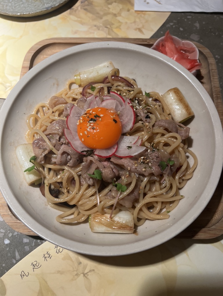

1. Overall Rating (0–10) — 7.0
This photograph captures a beautifully composed noodle dish with a rich interplay of textures and colors, centered around a vibrant, unbroken egg yolk that draws the eye. The warm, ambient lighting enhances the dish’s appeal, giving it a cozy, inviting quality. While the composition is strong and the subject well-presented, the slightly cluttered background and lack of intentional depth reduce its overall visual sophistication.
2. Composition (0–10) — 6.5
The dish is centered well, with the egg yolk serving as a natural focal point. However, the surrounding elements—such as the wooden tray and the text on the napkin—create visual distractions, pulling attention from the main subject and slightly disrupting the balance.
3. Lighting (0–10) — 7.0
The warm, soft lighting enhances the richness of the ingredients, creating a cozy and appetizing atmosphere. The light falls evenly across the dish, highlighting textures without harsh shadows or overexposure.
4. Color & Tone (0–10) — 7.5
The color palette is harmonious, with the bright orange yolk providing a striking contrast against the pale noodles, earthy meats, and soft pink radish. The warm tones complement the food’s rustic appeal, and the color saturation feels natural and inviting.
5. Creativity (0–10) — 6.5
The presentation is traditional yet visually engaging, with a focus on natural beauty and food texture. While the concept is straightforward, the careful arrangement and use of color show thoughtful styling, though it lacks a distinctive artistic twist.
6. Technical Quality (0–10) — 7.5
The image is sharp and clear, with good focus on the central dish. The depth of field is appropriate, keeping the main elements in focus while softly blurring the background. The exposure is well-balanced, with no significant noise or loss of detail.
7. Emotional Impact (0–10) — 7.0
The photograph evokes a sense of comfort and indulgence, appealing to the viewer’s senses and appetite. The warmth of the lighting and the inviting presentation create a feeling of quiet pleasure, making it feel like a moment worth savoring.
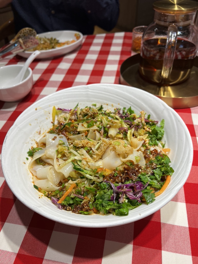

1. Overall Rating (0–10) — 7.0
This photograph captures a vibrant, freshly prepared noodle dish with an inviting mix of textures and colors, evoking the warmth of a casual meal shared at a lively restaurant. The red-and-white checkered tablecloth adds a nostalgic, almost cinematic charm, while the composition draws the eye naturally to the dish. Though the image feels slightly cluttered and underlit, its authenticity and sensory richness make it compelling and appetizing.
2. Composition (0–10) — 6.5
The dish is centered and fills the frame well, but the background elements—such as the second plate and the teapot—create visual noise and distract from the main subject. A tighter crop would enhance focus and balance.
3. Lighting (0–10) — 5.5
The lighting is flat and warm, likely from indoor sources, which creates soft shadows and a slightly dim atmosphere. While it conveys a cozy mood, it also reduces contrast and detail in the food.
4. Color & Tone (0–10) — 7.0
The rich greens, purples, and oranges of the toppings pop against the white bowl and red tablecloth, creating a lively palette. The warm tone enhances the sense of comfort, though some colors appear slightly oversaturated.
5. Creativity (0–10) — 6.5
The image captures a moment of everyday dining with a sense of narrative, suggesting a meal in progress. The choice of setting and angle lends it a candid, documentary-like quality, though it lacks a bold artistic twist.
6. Technical Quality (0–10) — 7.5
The focus is sharp on the foreground dish, and the details of the noodles and garnishes are clear. The depth of field is appropriate, but the image shows mild noise and softness in the background.
7. Emotional Impact (0–10) — 7.0
The photograph evokes a strong sense of hunger and comfort, inviting the viewer to imagine the flavors and textures. The warmth of the scene and the presence of a shared meal create a feeling of connection and enjoyment.
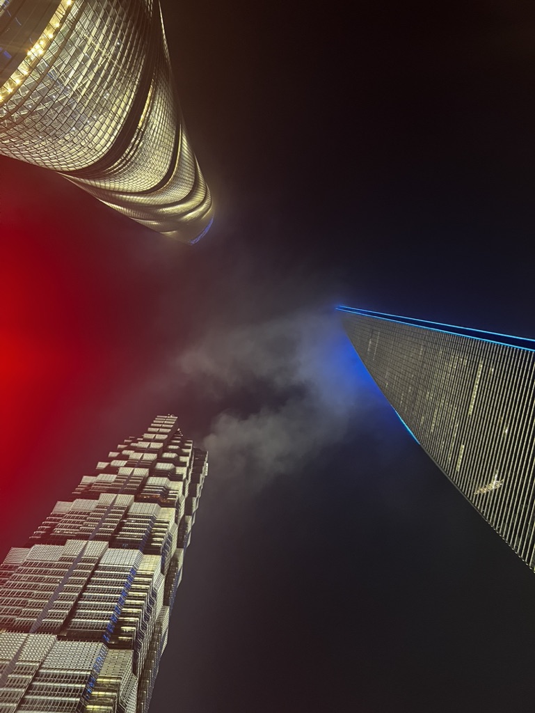

1. Overall Rating (0–10) — 7.0
This nighttime cityscape captures the bold geometry and luminous energy of modern skyscrapers, evoking a sense of awe through its dramatic perspective and vibrant lighting. The interplay of red, blue, and golden tones creates a dynamic visual tension, though the composition’s intensity borders on overwhelming. While the image successfully conveys urban grandeur, its slightly chaotic arrangement tempers its overall aesthetic cohesion.
2. Composition (0–10) — 7.5
The low-angle perspective emphasizes the towering scale of the buildings, with diagonal lines converging toward the center to create a sense of depth. The asymmetrical arrangement of the structures adds dynamism, though the framing feels slightly unbalanced due to the prominent red glow on the left.
3. Lighting (0–10) — 8.0
The artificial lighting on the buildings is vivid and purposefully dramatic, with warm golds, cool blues, and a bold red flare that injects energy into the scene. The contrast between the bright structures and the dark sky enhances the nighttime mood, though the red light appears slightly overexposed.
4. Color & Tone (0–10) — 7.5
The palette is striking, with a high-contrast blend of warm gold, cool blue, and a saturated red that creates a visually engaging, almost cinematic effect. The tonal range is well-defined, though the red and blue hues occasionally clash, slightly disrupting the visual harmony.
5. Creativity (0–10) — 8.0
The upward-looking perspective and bold use of color demonstrate a strong artistic vision, transforming a familiar urban scene into something futuristic and immersive. The inclusion of the smoke or fog adds texture and mystery, enhancing the photo’s storytelling potential.
6. Technical Quality (0–10) — 7.0
The image is sharp and detailed, capturing the intricate facade textures of the buildings. However, the exposure on the red area suggests slight overexposure, and the smoke introduces a softness that slightly reduces clarity.
7. Emotional Impact (0–10) — 7.5
The photograph evokes a sense of wonder and technological power, drawing the viewer into a futuristic cityscape. The interplay of light, scale, and motion creates an immersive, almost cinematic atmosphere that resonates with urban energy and ambition.
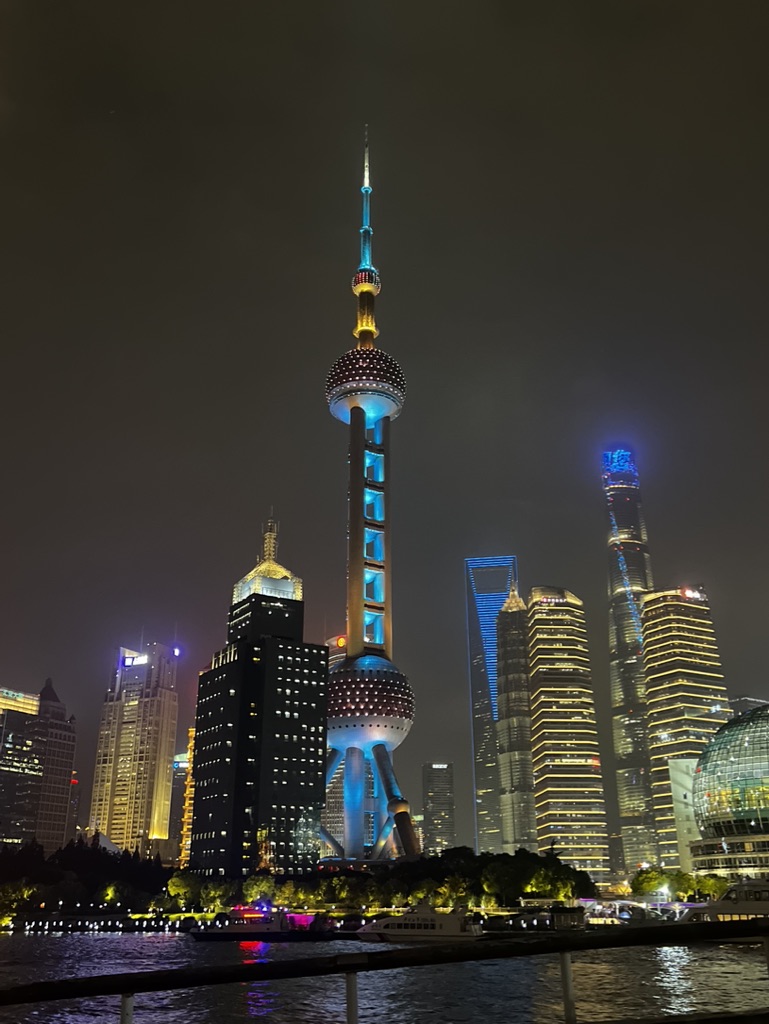

1. Overall Rating (0–10) — 7.5
This nighttime cityscape captures the vibrant energy of Shanghai’s skyline with striking clarity, where the Oriental Pearl Tower stands as a luminous centerpiece. The interplay of cool blue and warm golden lights creates a dynamic contrast that reflects the city’s modernity and ambition. While the image is visually compelling, the slightly overexposed reflections and cluttered foreground detract from its overall refinement, preventing it from achieving a truly immersive quality.
2. Composition (0–10) — 7.0
The Oriental Pearl Tower is well-centered, drawing the eye upward, while the surrounding skyscrapers create a balanced, layered skyline. The inclusion of the river and railings in the foreground adds depth, though the railing slightly interrupts the visual flow.
3. Lighting (0–10) — 8.0
The lighting is strong and intentional, with the illuminated buildings and tower creating a dramatic contrast against the dark sky. The mix of cool and warm tones enhances the urban atmosphere, and the reflections on the water add subtle texture.
4. Color & Tone (0–10) — 7.5
The color palette blends cool blues and crisp whites with golden yellows, creating a visually rich and harmonious nighttime scene. The tonal range is well-managed, with deep blacks and bright highlights contributing to a sense of depth.
5. Creativity (0–10) — 7.0
The image successfully captures a recognizable urban icon with a sense of grandeur, but it remains a conventional cityscape rather than a bold reinterpretation. The perspective is familiar, offering little surprise in its execution.
6. Technical Quality (0–10) — 8.0
The photograph is sharp and well-focused, with clean details visible in the buildings and reflections. The exposure is well-balanced, though minor overexposure in the brightest areas slightly reduces detail.
7. Emotional Impact (0–10) — 7.0
The image evokes a sense of awe and modernity, capturing the pulse of a global metropolis. While it is visually engaging, the emotional resonance is tempered by the lack of a personal or narrative element, keeping the viewer in a state of observation rather than deep connection.
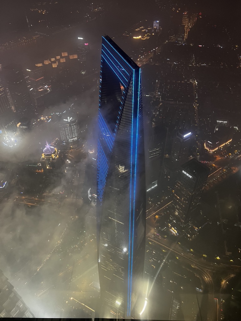

1. Overall Rating (0–10) — 7.5
This image captures a dramatic, elevated view of a towering skyscraper piercing through misty night skies, its blue-lit facade glowing like a beacon above the urban sprawl. The composition balances the monumental scale of the architecture with the atmospheric haze and the soft glow of distant city lights, creating a sense of awe and mystery. While the image is visually compelling, its slightly overexposed highlights and muted contrast slightly dull the impact of the otherwise striking scene.
2. Composition (0–10) — 8.0
The skyscraper is centered with strong vertical lines that draw the eye upward, emphasizing its height. The surrounding cityscape recedes into the fog, creating depth and scale, though the lower-left corner feels slightly cluttered with light trails and obscured details.
3. Lighting (0–10) — 8.5
The blue accent lighting on the tower is sharp and intentional, contrasting beautifully with the warm city lights below. The interplay of artificial illumination and natural fog enhances the mood, with the light beams cutting through the mist to create a sense of ethereal presence.
4. Color & Tone (0–10) — 7.5
The dominant cool blue of the skyscraper contrasts effectively with the golden yellows and oranges of the city lights, creating a dynamic yet harmonious palette. However, the overall tone leans slightly flat due to the hazy conditions, which mute some of the deeper color saturation.
5. Creativity (0–10) — 8.0
The perspective offers a bold, elevated view that emphasizes both the technological ambition of the structure and the dreamlike quality of the urban environment. The use of fog as a compositional element adds mystery and elevates the image beyond a simple architectural shot.
6. Technical Quality (0–10) — 7.0
The image is sharp enough to reveal fine details on the building’s facade, but slight overexposure in the brightest areas and a subtle loss of detail in the shadows suggest a challenge with dynamic range in the high-contrast night setting.
7. Emotional Impact (0–10) — 8.0
The photograph evokes a sense of wonder and isolation, capturing the beauty of human achievement against the backdrop of a vast, sleeping city. The mist and darkness lend a contemplative, almost cinematic quality that resonates emotionally with the viewer.
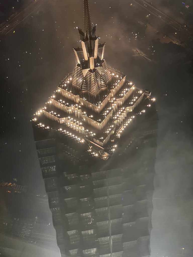

1. Overall Rating (0–10) — 7.5
This aerial night view of a towering, illuminated skyscraper captures a moment of architectural grandeur piercing through a misty urban haze. The building’s intricate, tiered design glows with warm light, creating a striking contrast against the dark, fog-laden surroundings. While the atmospheric conditions lend a dreamlike quality, the image’s potential for emotional resonance is slightly muted by the lack of foreground depth and a somewhat distant perspective.
2. Composition (0–10) — 7.0
The central placement of the tower creates a strong focal point, with the upward angle emphasizing its verticality and dominance. However, the surrounding fog and dark sky reduce visual contrast and limit spatial context, making the frame feel slightly empty despite the architectural complexity.
3. Lighting (0–10) — 8.0
The warm, golden illumination of the building’s crown and stepped levels creates a dramatic, almost ceremonial glow. The interplay between the bright lights and the diffused fog enhances depth and mood, while the subtle ambient city lights in the background add a sense of scale and realism.
4. Color & Tone (0–10) — 7.0
The palette is dominated by deep blacks and warm yellows, with a cool, muted gray fog that softens the scene. While the contrast between light and shadow is effective, the overall tone leans toward a monochromatic warmth that slightly limits tonal richness.
5. Creativity (0–10) — 8.0
The choice to capture the structure from above, shrouded in mist, imbues the image with a sense of mystery and reverence. The lighting design of the building itself becomes a key storytelling element, transforming a modern architectural feat into a visual spectacle.
6. Technical Quality (0–10) — 7.5
The image is sharp enough to reveal fine details in the building’s structure, and the exposure is well-balanced despite the challenging low-light conditions. Minor grain and softness in the fogged areas suggest a high ISO setting, but overall clarity remains strong.
7. Emotional Impact (0–10) — 7.0
The image evokes a sense of awe and solitude, as the luminous tower rises above the obscured city. The atmospheric conditions create a contemplative mood, inviting the viewer to reflect on human achievement and the quiet beauty of urban nights.
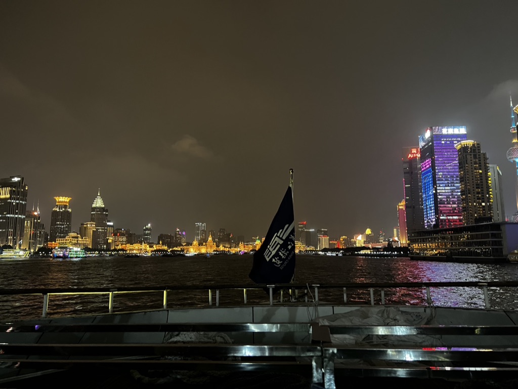

1. Overall Rating (0–10) — 7.0
This nighttime cityscape captures the vibrant energy of a modern metropolis from the perspective of a river cruise, blending historical architecture with contemporary skyscrapers. The composition is grounded by the foreground railing and flag, lending a sense of immediacy and personal viewpoint. While the lighting and color are rich, the image’s emotional pull is slightly diminished by a lack of dynamic contrast and a somewhat flat exposure that underplays the scene’s luminous potential.
2. Composition (0–10) — 6.5
The flag and railing in the foreground create a strong sense of place and scale, anchoring the viewer within the scene. However, the horizon is slightly off-center and the visual weight of the brightly lit buildings on the right feels imbalanced, drawing the eye too abruptly to the side.
3. Lighting (0–10) — 6.0
The city lights provide a warm glow, with the colorful illumination on the modern towers creating visual interest. However, the overall lighting is somewhat flat and evenly distributed, lacking depth and dramatic contrast between the dark sky and the vibrant buildings.
4. Color & Tone (0–10) — 7.0
The palette is rich with warm yellows and oranges from the older buildings, contrasted against the cool purples and blues of the modern towers. The reflections on the water add depth, though the overall tone is slightly muted, reducing the impact of the color contrast.
5. Creativity (0–10) — 6.5
The image successfully captures a familiar urban vista from a unique perspective, offering a narrative of movement and observation. The inclusion of the flag adds a personal touch, but the overall execution remains within the realm of standard travel photography.
6. Technical Quality (0–10) — 7.5
The image is sharp and free of noticeable noise, with clear details in both the foreground and background. The focus is consistent, and the exposure is well-handled despite the challenging lighting conditions.
7. Emotional Impact (0–10) — 6.5
The photograph evokes a sense of awe and wonder at the city’s scale and beauty, especially the juxtaposition of old and new. While the scene is visually compelling, the emotional resonance is tempered by the image’s slightly generic feel and lack of atmospheric depth.
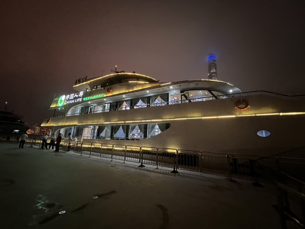

1. Overall Rating (0–10) — 6.0
This nighttime photograph captures a sleek river cruise vessel illuminated against a dark, hazy sky, evoking a sense of urban stillness and quiet activity. The warm lighting along the hull contrasts with the cool blue glow of the distant skyscraper, creating a subtle visual rhythm. While the scene is visually engaging, the lack of sharp focus and overcast atmosphere slightly dampen its impact, leaving the image feeling more like a candid snapshot than a polished composition.
2. Composition (0–10) — 5.5
The low-angle perspective emphasizes the vessel’s scale, but the off-center framing and visible railing in the foreground disrupt visual flow. The distant tower adds depth, yet the composition feels slightly unbalanced due to the asymmetrical placement of light and shadow.
3. Lighting (0–10) — 6.0
The warm ambient lighting along the boat’s side creates a welcoming glow, while the cool blue accent on the skyscraper introduces a contrasting focal point. However, the hazy atmosphere diffuses the light, softening edges and reducing overall contrast.
4. Color & Tone (0–10) — 5.5
The palette is dominated by muted golds and deep blues, with a generally flat tone due to the overcast night. The contrast between the warm vessel and cool background is effective, but the lack of vibrancy tempers the image’s visual energy.
5. Creativity (0–10) — 6.0
The juxtaposition of modern architecture and river transport offers a contemporary urban narrative. While the concept is familiar, the image captures a quiet moment of city life with a sense of place, though it lacks a strong artistic twist.
6. Technical Quality (0–10) — 6.5
The image is reasonably sharp, with clear details on the boat’s signage and railings. However, the low-light conditions introduce some noise and a lack of crispness in the background, limiting overall technical refinement.
7. Emotional Impact (0–10) — 5.0
The photograph conveys a calm, contemplative mood, but the hazy lighting and lack of dynamic subjects prevent a deeper emotional connection. It feels more observational than evocative, leaving the viewer with a sense of distance rather than immersion.
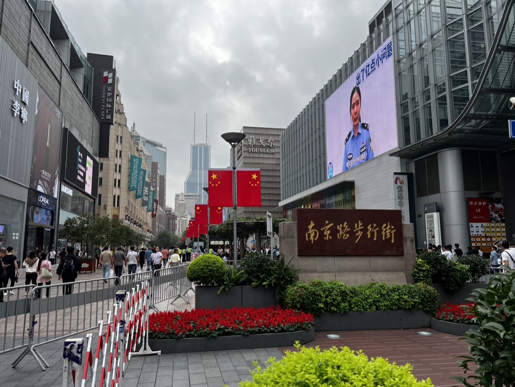

1. Overall Rating (0–10) — 6.0
This photograph captures the vibrant energy of a bustling urban thoroughfare, where modern commerce and civic identity converge under an overcast sky. The mix of commercial signage, national symbols, and public messaging creates a layered narrative of contemporary Chinese city life. While the scene is rich in context, the flat lighting and cluttered visual elements prevent the image from achieving a stronger aesthetic cohesion.
2. Composition (0–10) — 6.0
The wide-angle framing captures the breadth of the street, but the composition feels slightly unbalanced due to the prominent signage and crowd density on the left. The central sign and flags provide a focal anchor, though the diagonal barrier railing disrupts visual flow.
3. Lighting (0–10) — 5.0
The overcast sky produces soft, diffused light that minimizes shadows and reduces visual contrast. While this allows for even exposure across the scene, it also flattens the image’s depth and mood.
4. Color & Tone (0–10) — 5.5
The dominant reds of the flowers and flags stand out against the muted grays and beiges of the architecture, creating a subtle pop of national color. However, the overall palette lacks vibrancy, with the digital screen’s cool blue tones introducing a competing hue.
5. Creativity (0–10) — 6.0
The image succeeds in documenting a specific cultural moment—urban life, public safety messaging, and national pride—all in one frame. Its strength lies in its observational authenticity, though it stops short of poetic or conceptual interpretation.
6. Technical Quality (0–10) — 7.0
The image is sharp and well-exposed, with clear detail in both the foreground and background. The wide-angle perspective is handled well, though some lens distortion is evident at the edges.
7. Emotional Impact (0–10) — 5.5
The photograph evokes a sense of everyday urban rhythm—functional, busy, and familiar—but lacks an emotional hook that invites deeper viewer engagement or reflection.
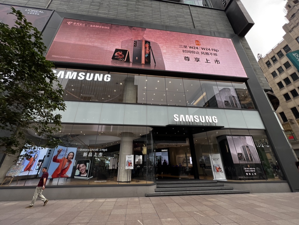

1. Overall Rating (0–10) — 6.0
This photograph captures a modern urban retail scene with a strong commercial presence, where the Samsung storefront commands attention through bold branding and digital display. The composition effectively communicates the energy of a bustling city, though the image lacks emotional depth, feeling more like a documentary snapshot than a compelling visual narrative. While the clean lines and prominent signage convey a sense of corporate precision, the overall mood is somewhat sterile and impersonal.
2. Composition (0–10) — 6.5
The frame is well-balanced, with the Samsung store centered and the pedestrian adding a sense of scale and movement. The diagonal lines of the steps and the tree on the left guide the eye toward the storefront, but the clutter of signage and the overcast sky slightly distract from the focal point.
3. Lighting (0–10) — 5.5
The lighting is even and diffused, likely due to overcast conditions, which softens shadows and allows for clear visibility of the storefront. However, the lack of strong contrast or directional light diminishes the visual drama and gives the image a flat, neutral quality.
4. Color & Tone (0–10) — 6.0
The dominant pink hue of the digital billboard creates a striking contrast against the muted grays and whites of the building, drawing immediate attention. The color palette is modern and clean, though the overall tone feels slightly washed out, reducing the vibrancy of the scene.
5. Creativity (0–10) — 5.5
The image is conceptually straightforward, focusing on commercial architecture and product promotion. While the digital display and branding are visually engaging, the lack of narrative or conceptual depth limits its artistic originality.
6. Technical Quality (0–10) — 7.0
The photograph is sharp and well-focused, with clear details in both the building and the signage. The exposure is balanced, and the resolution is high, allowing for legible text and crisp edges throughout the frame.
7. Emotional Impact (0–10) — 5.0
The image evokes a sense of urban routine and consumer culture, but it fails to elicit a strong emotional response. The impersonal nature of the scene and the absence of human connection or storytelling keep the viewer at a distance, making the image more informative than affecting.
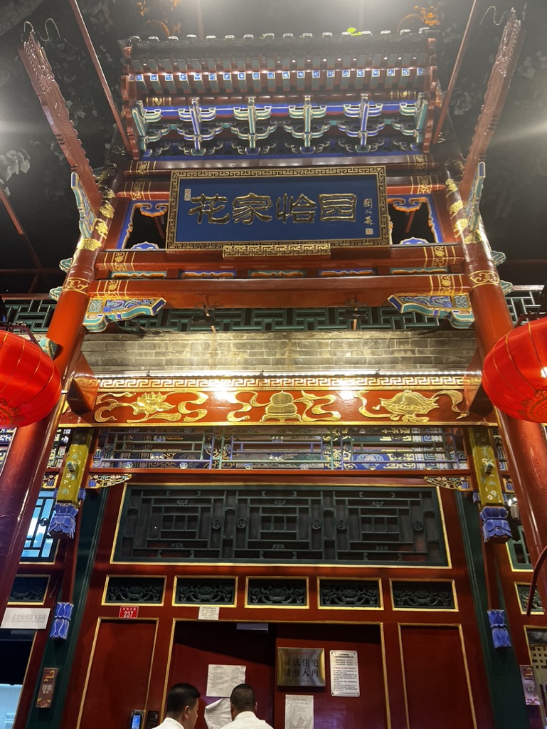

1. Overall Rating (0–10) — 7.0
This photograph captures the ornate grandeur of a traditional Chinese architectural entrance, where intricate woodwork and bold colors convey a sense of cultural richness and ceremonial weight. The composition emphasizes the verticality of the structure, drawing the eye upward to the carved eaves and calligraphic plaque, though the presence of modern signage and people at the bottom slightly disrupts the historical ambiance. While the image effectively communicates the space’s ceremonial function, the lighting and framing feel more documentary than artistic, limiting its emotional resonance.
2. Composition (0–10) — 6.5
The low-angle perspective enhances the monumentality of the structure, but the inclusion of the two men and the signage at the bottom introduces visual clutter, disrupting the symmetry and balance of the frame.
3. Lighting (0–10) — 6.0
Artificial overhead lighting highlights the details of the structure, creating strong contrasts and shadows that emphasize texture. However, the harshness of the light flattens some areas and casts uneven illumination on the red lanterns and wooden elements.
4. Color & Tone (0–10) — 7.5
The rich reds, golds, and deep blues create a vibrant and culturally resonant palette, enhanced by the contrast between the bright lanterns and the dark night sky. The warm tones evoke a festive, ceremonial mood, though some color saturation appears slightly oversaturated.
5. Creativity (0–10) — 6.0
The image successfully documents a culturally significant space, but the approach is more observational than interpretive. The juxtaposition of tradition and modernity adds narrative depth, but the execution remains conventional.
6. Technical Quality (0–10) — 7.0
The image is sharp and clear, with well-defined details in the carvings and lettering. Focus is consistent across the frame, though minor noise is visible in the darker areas.
7. Emotional Impact (0–10) — 6.5
The photograph evokes a sense of awe and reverence for traditional Chinese design, but the presence of everyday elements—people, signs, and a smartphone—grounds the scene in the present, creating a subtle tension between historical grandeur and contemporary life.
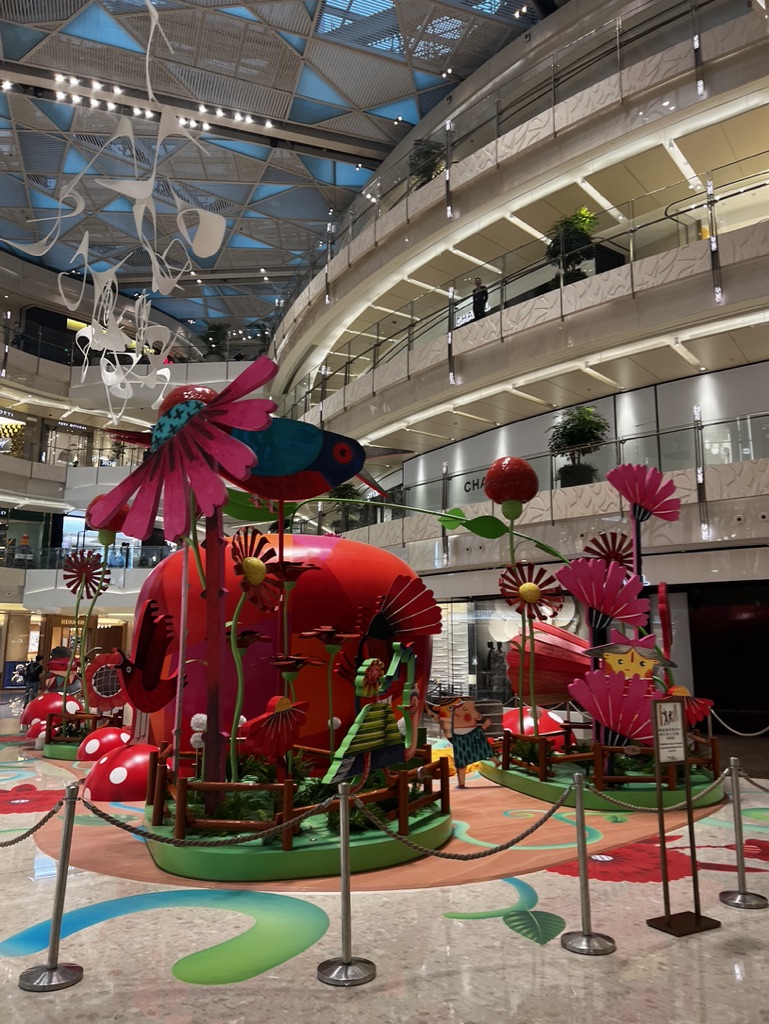

1. Overall Rating (0–10) — 6.8
This vibrant installation transforms a mall atrium into a whimsical, storybook garden, where oversized flowers and playful creatures invite wonder and delight. The bold colors and imaginative scale create an engaging spectacle, though the surrounding commercial environment tempers its artistic impact. While the scene feels slightly over-staged, its charm lies in its ability to momentarily suspend reality and bring joy to passersby.
2. Composition (0–10) — 6.5
The central floral sculpture is well-framed, drawing the eye upward into the multi-level space. However, the cluttered foreground and overabundance of visual elements create a sense of imbalance, with the stanchions and signage disrupting the narrative flow.
3. Lighting (0–10) — 7.0
The bright, even illumination from the glass ceiling enhances the vivid colors of the installation, while the ambient lighting on the upper floors adds depth and dimension. The lighting supports the cheerful tone without casting harsh shadows.
4. Color & Tone (0–10) — 8.0
A rich, saturated palette of reds, pinks, and greens dominates the scene, creating a lively and inviting atmosphere. The color harmony is strong, with the bold hues complementing each other and reinforcing the playful theme.
5. Creativity (0–10) — 8.0
The installation demonstrates strong imaginative vision, blending sculpture, color, and scale to create an immersive, childlike fantasy. Its originality lies in its ability to transform a public space into a moment of whimsy and visual delight.
6. Technical Quality (0–10) — 7.5
The image is sharp and well-focused, capturing fine details in the sculpture and surrounding architecture. The wide-angle perspective effectively conveys the scale of the space, though slight distortion is present at the edges.
7. Emotional Impact (0–10) — 7.0
The scene evokes a sense of joy and nostalgia, appealing to both children and adults. The whimsical design invites smiles and photo opportunities, creating a brief but meaningful emotional connection in a typically transactional environment.


1. Overall Rating (0–10) — 7.0
This photograph captures a compelling urban juxtaposition, where the sleek, modern interior of a glass-walled structure frames a vibrant, bustling city street. The interplay between the clean, curved architecture and the lively, chaotic energy outside creates a dynamic tension, while the soft twilight glow lends a contemplative mood. Though the scene is rich in narrative potential, the slightly cluttered reflection and uneven light distribution temper its visual cohesion.
2. Composition (0–10) — 6.5
The curved glass and strong vertical lines create a natural frame, drawing the eye toward the historic building and the street beyond. However, the reflection of the interior on the glass slightly disrupts the clarity of the scene, creating a layered effect that can feel distracting rather than harmonious.
3. Lighting (0–10) — 6.0
The ambient twilight provides a soft, cool tone that enhances the urban atmosphere, but the artificial lighting within the building casts a purple hue across the glass, creating a mixed color temperature that feels slightly unnatural and disrupts the mood.
4. Color & Tone (0–10) — 6.5
The cool blue and purple tones dominate the image, creating a moody, almost futuristic aesthetic. While the palette is cohesive, the lack of warm accents and the slightly overcast sky limit the richness of the tonal range.
5. Creativity (0–10) — 7.5
The image succeeds in capturing a layered urban narrative, blending modern architecture with historical context and everyday life. The use of reflections and perspective adds a conceptual depth, making the photograph feel more like a moment of urban meditation than a simple snapshot.
6. Technical Quality (0–10) — 7.0
The focus is sharp, particularly on the glass and the buildings in the background. The exposure is well-handled, capturing detail in both the bright sky and the darker areas of the street, though minor noise is visible in the shadows.
7. Emotional Impact (0–10) — 6.5
The image evokes a sense of quiet observation, inviting the viewer to reflect on the contrast between public space and private experience. The human activity outside adds a subtle warmth, but the cool tones and reflective surfaces create a slight emotional distance, leaving the viewer as a silent observer rather than an engaged participant.
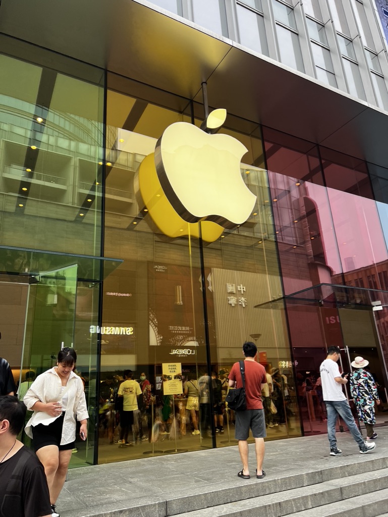

1. Overall Rating (0–10) — 6.0
This photograph captures the sleek, modern presence of an Apple store in a bustling urban environment, where the interplay of glass, light, and movement creates a sense of contemporary consumer culture. The iconic Apple logo dominates the frame, asserting brand identity, while the reflections and passersby add layers of social context. While the image is visually engaging and well-framed, it lacks a deeper narrative or emotional pull, feeling more like a snapshot than a compelling statement. The lighting and composition are competent but not particularly dynamic.
2. Composition (0–10) — 6.5
The central placement of the Apple logo draws the eye, while the diagonal lines of the steps and glass facade guide the viewer’s gaze through the scene. The inclusion of pedestrians adds life and scale, though some figures appear slightly out of focus or awkwardly cropped, reducing compositional harmony.
3. Lighting (0–10) — 7.0
Natural daylight enhances the transparency of the glass and the glow of the illuminated logo. The reflections on the facade add complexity, though some areas are slightly overexposed, losing detail in the bright highlights.
4. Color & Tone (0–10) — 6.5
The palette is dominated by the warm yellow of the logo and the cool tones of the glass and surrounding architecture, creating a subtle contrast. The overall tone is neutral and balanced, though the color vibrancy is moderate, giving the image a slightly flat quality.
5. Creativity (0–10) — 6.0
The image is conceptually straightforward, capturing a recognizable moment in a familiar setting. The reflections and layered depth offer some visual interest, but the approach is conventional, lacking a unique perspective or artistic twist.
6. Technical Quality (0–10) — 7.5
The focus is sharp on the Apple logo and the people in the foreground, with good clarity throughout. The exposure is well-managed, though some minor overexposure in the glass reflections slightly detracts from detail.
7. Emotional Impact (0–10) — 5.5
The image conveys a sense of everyday urban life and brand presence, but it doesn’t evoke strong emotion. It feels observational rather than evocative, offering a glimpse into a moment without inviting deeper reflection or connection.
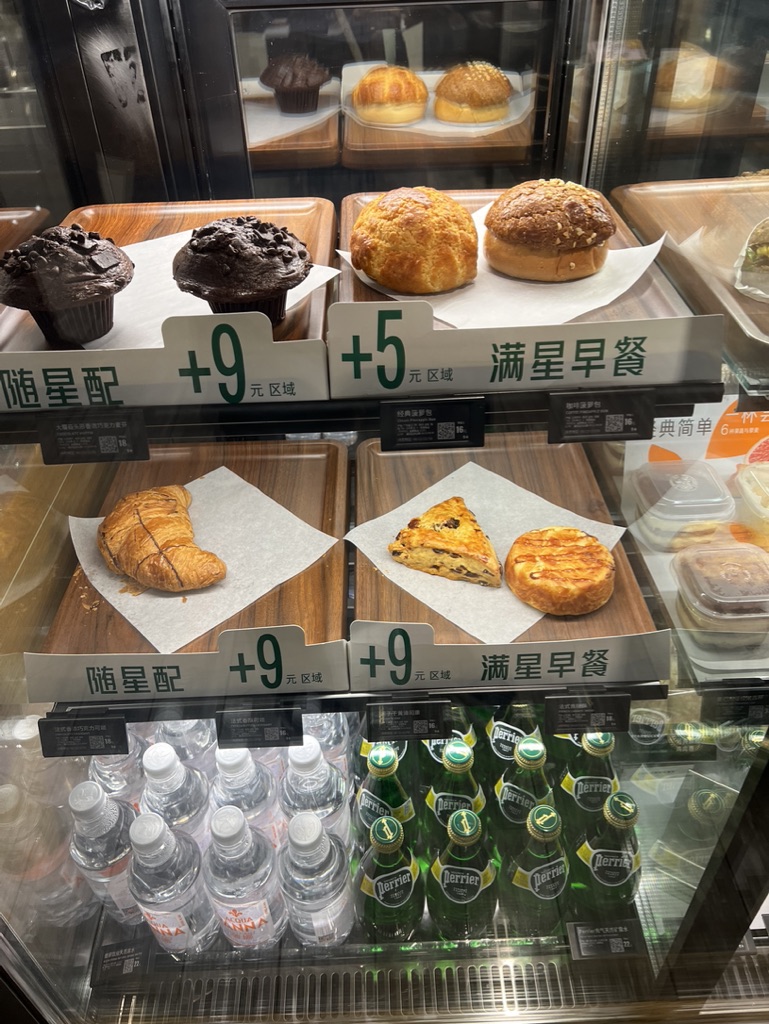

1. Overall Rating (0–10) — 5.5
This image captures a typical bakery display with a mix of pastries and beverages, but its commercial, transactional nature undermines artistic depth. The composition is functional, emphasizing product pricing and branding, yet lacks visual harmony or emotional resonance. While the scene feels authentic, the flat lighting and cluttered layout prevent it from feeling like a cohesive visual statement.
2. Composition (0–10) — 5.0
The framing is busy and uneven, with overlapping trays and price tags disrupting visual flow. The diagonal arrangement of products creates a sense of depth, but the lack of a clear focal point dilutes impact.
3. Lighting (0–10) — 5.5
The lighting is bright and even, typical of retail environments, but it flattens textures and shadows, resulting in a sterile, unemotional atmosphere. The reflections on the glass case further distract from the subject.
4. Color & Tone (0–10) — 5.0
The color palette is dominated by neutral browns and grays, with the green of the Perrier bottles offering a slight contrast. However, the colors appear muted and lack vibrancy, reducing the appeal of the food items.
5. Creativity (0–10) — 4.5
The image functions as a straightforward documentation of a retail display rather than a creative interpretation. The inclusion of pricing and branding suggests a commercial intent, but little effort is made to elevate the scene into something visually compelling.
6. Technical Quality (0–10) — 7.0
The image is sharp and well-focused, with clear details on the pastries and labels. The resolution is adequate, and the depth of field allows the foreground elements to stand out, though reflections and clutter slightly compromise clarity.
7. Emotional Impact (0–10) — 4.0
The photograph evokes a sense of routine and convenience rather than joy or indulgence. The cold, transactional presentation makes it difficult to connect emotionally with the scene, reducing its ability to stir desire or nostalgia.


1. Overall Rating (0–10) — 7.0
This photograph captures the opulent and meticulously organized interior of a high-end confectionery, where luxury and commerce converge in a visually rich environment. The layered circular ceiling and reflective surfaces create a sense of depth and grandeur, while the display of colorful chocolates and pastries invites indulgence. Though the image is visually dense and well-composed, the lack of human interaction slightly dampens its narrative energy, making it feel more like a showroom than a lived-in space.
2. Composition (0–10) — 7.5
The symmetrical framing and strong leading lines of the circular ceiling draw the eye toward the center, creating a balanced and harmonious composition. The use of the stanchion rope in the foreground adds depth and guides the viewer’s gaze into the scene, enhancing spatial awareness.
3. Lighting (0–10) — 8.0
The lighting is bright and evenly distributed, with recessed ceiling fixtures providing soft, ambient illumination that highlights the products without harsh glare. The reflective surfaces amplify the light, enhancing the sense of luxury and cleanliness.
4. Color & Tone (0–10) — 7.0
The palette is dominated by warm golds and creams, complemented by the vibrant colors of the chocolate packaging. The contrast between the neutral floor and the colorful displays creates visual interest, though the overall tone leans slightly toward a sterile, commercial aesthetic.
5. Creativity (0–10) — 6.5
The image successfully conveys the store’s upscale identity through its architectural and design details. While the concept is familiar, the execution leverages symmetry and reflection to create a visually striking and memorable presentation.
6. Technical Quality (0–10) — 8.0
The image is sharp and well-focused, with clean details visible in the glass cases and product packaging. The depth of field is appropriately managed, allowing both foreground and background elements to remain clear and distinct.
7. Emotional Impact (0–10) — 6.0
The photograph evokes a sense of indulgence and sophistication, but the absence of people or personal interaction keeps the emotional connection at a distance. It feels more like an invitation to consume than an invitation to experience.
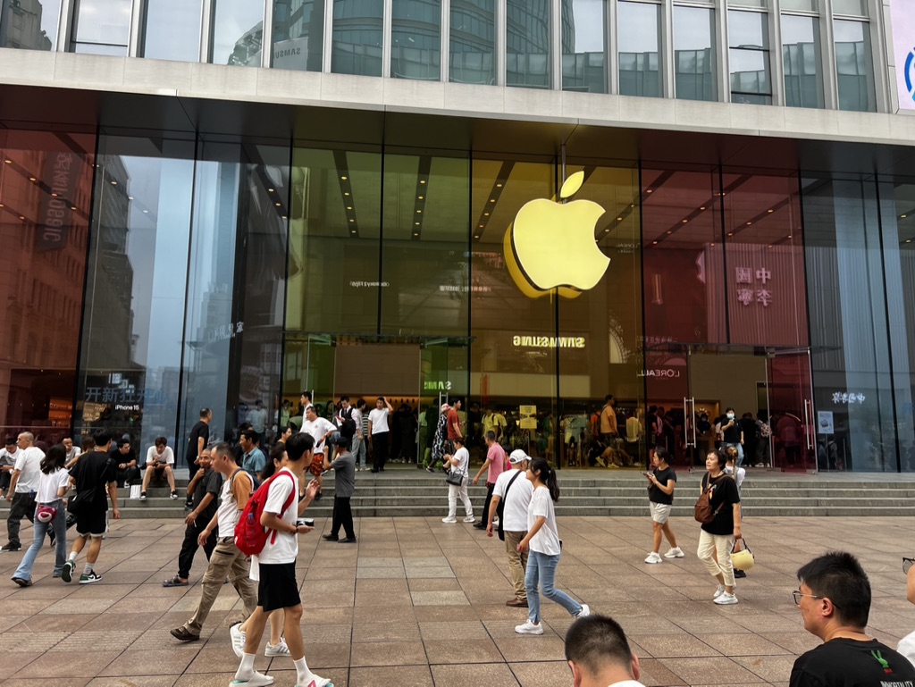

1. Overall Rating (0–10) — 6.0
This photograph captures the bustling energy of a modern urban retail environment, where the sleek Apple store stands as a luminous centerpiece amid a crowd of pedestrians. The golden Apple logo glows with iconic presence, contrasting with the everyday movement of people and the reflective glass facade that absorbs the surrounding cityscape. While the image effectively conveys the intersection of technology and daily life, it lacks a deeper narrative or emotional resonance, feeling more like a snapshot than a composed statement.
2. Composition (0–10) — 6.5
The wide-angle framing includes a broad view of the scene, but the lack of a clear focal point creates visual clutter. The Apple logo draws the eye, yet the surrounding pedestrians and reflections compete for attention, slightly disrupting the image’s balance.
3. Lighting (0–10) — 6.0
Natural daylight illuminates the scene evenly, with the glowing Apple logo providing a strong focal light source. The reflections on the glass add complexity but also reduce clarity in parts of the image, softening details and creating a slightly overexposed feel in the highlights.
4. Color & Tone (0–10) — 6.5
The dominant golden hue of the Apple logo contrasts with the neutral tones of the pavement and clothing, creating a visually striking centerpiece. The color palette is generally balanced, though the reflections on the glass introduce a greenish tint that slightly muddies the overall tone.
5. Creativity (0–10) — 6.0
The image captures a familiar urban moment with a recognizable cultural symbol, but it offers little originality in its approach. The juxtaposition of consumer culture and daily life is evident, yet the execution feels more observational than interpretive.
6. Technical Quality (0–10) — 7.0
The image is sharp and well-exposed overall, with clear details in the foreground and background. However, the reflections and overlapping elements introduce some technical imperfections, reducing the overall clarity.
7. Emotional Impact (0–10) — 5.5
The photograph evokes a sense of urban rhythm and modernity, but it remains emotionally detached. The anonymity of the crowd and the commercial setting prevent a strong personal connection, leaving the viewer as an observer rather than a participant.
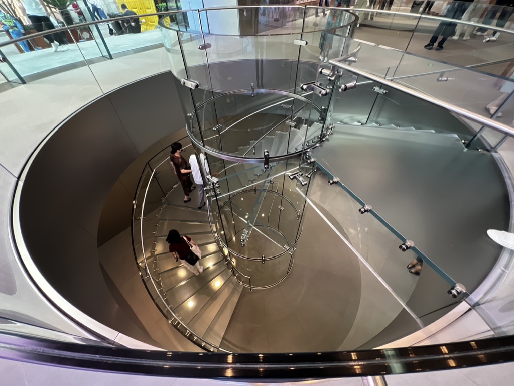

1. Overall Rating (0–10) — 7.0
This photograph captures the elegant rhythm of a modern spiral staircase, where architectural form and human movement converge in a dynamic, almost choreographed composition. The high-angle perspective emphasizes the circular flow and transparency of glass and steel, creating a sense of both order and motion. While the image successfully highlights the interplay between structure and life, it lacks a compelling focal point, and the lighting, though functional, doesn’t fully elevate the atmosphere.
2. Composition (0–10) — 7.5
The overhead view creates a strong sense of symmetry and visual flow, guiding the eye around the spiral. The placement of figures along the curve adds scale and narrative, though their small size risks making them feel incidental.
3. Lighting (0–10) — 6.5
Even, ambient lighting illuminates the space clearly but lacks depth and contrast. The reflections on the glass and polished floor add complexity, yet the absence of directional or dramatic light softens the overall mood.
4. Color & Tone (0–10) — 6.0
The palette is dominated by neutral grays and silvers, punctuated by subtle skin tones and clothing hues. While clean and modern, the lack of vibrancy or tonal variation gives the image a somewhat sterile feel.
5. Creativity (0–10) — 7.0
The conceptual strength lies in capturing the interplay between architecture and human presence in a single, fluid frame. The spiral motif evokes themes of movement and continuity, making the image more than a mere architectural record.
6. Technical Quality (0–10) — 8.0
Sharp focus, clean lines, and precise exposure ensure technical clarity. The glass and metal surfaces are rendered with detail, though reflections and glare are slightly distracting.
7. Emotional Impact (0–10) — 6.0
The image conveys a quiet, contemplative energy—suggestive of urban rhythm and the beauty of everyday motion. However, the lack of emotional intensity or narrative depth keeps the viewer at a slight remove.


1. Overall Rating (0–10) — 7.0
This image captures a striking contrast between bold, culturally inspired design and the cool, expansive cityscape beyond, creating a compelling blend of modernity and tradition. The vibrant red wall with its studded doors and the Google-themed cushions inject personality and energy into the space, while the hazy urban vista through the window adds a contemplative, almost cinematic quality. While the composition feels slightly cluttered and the lighting lacks dramatic flair, the scene succeeds in conveying a unique corporate identity that is both playful and intentional.
2. Composition (0–10) — 6.5
The strong diagonal of the red wall draws the eye into the frame, but the cluttered foreground and off-center sofa create a slightly unbalanced feel. A tighter crop would emphasize the interplay between the interior and the view.
3. Lighting (0–10) — 5.5
The interior is lit with flat, overhead lighting that flattens textures and minimizes depth. The natural light from the window is diffused, creating a muted glow that softens the city view but also reduces visual contrast.
4. Color & Tone (0–10) — 7.0
The bold crimson red of the wall and sofa creates a powerful visual anchor, while the cool blue of the cityscape provides a compelling contrast. The color palette is harmonious, though the tones are slightly desaturated, giving the image a subdued, atmospheric quality.
5. Creativity (0–10) — 7.5
The fusion of traditional Chinese design elements with modern tech branding is highly original and tells a story of cultural integration. The choice of a lounge space as a visual statement adds a layer of narrative about innovation and identity.
6. Technical Quality (0–10) — 7.5
The image is sharp and clear, with good focus throughout. The depth of field is adequate, and the details in the wall texture and cushions are well-preserved.
7. Emotional Impact (0–10) — 6.0
The image evokes a sense of quiet confidence and pride in cultural fusion, but the lack of human presence and emotional warmth keeps the viewer at a slight distance. It feels more like an architectural portrait than an intimate moment.
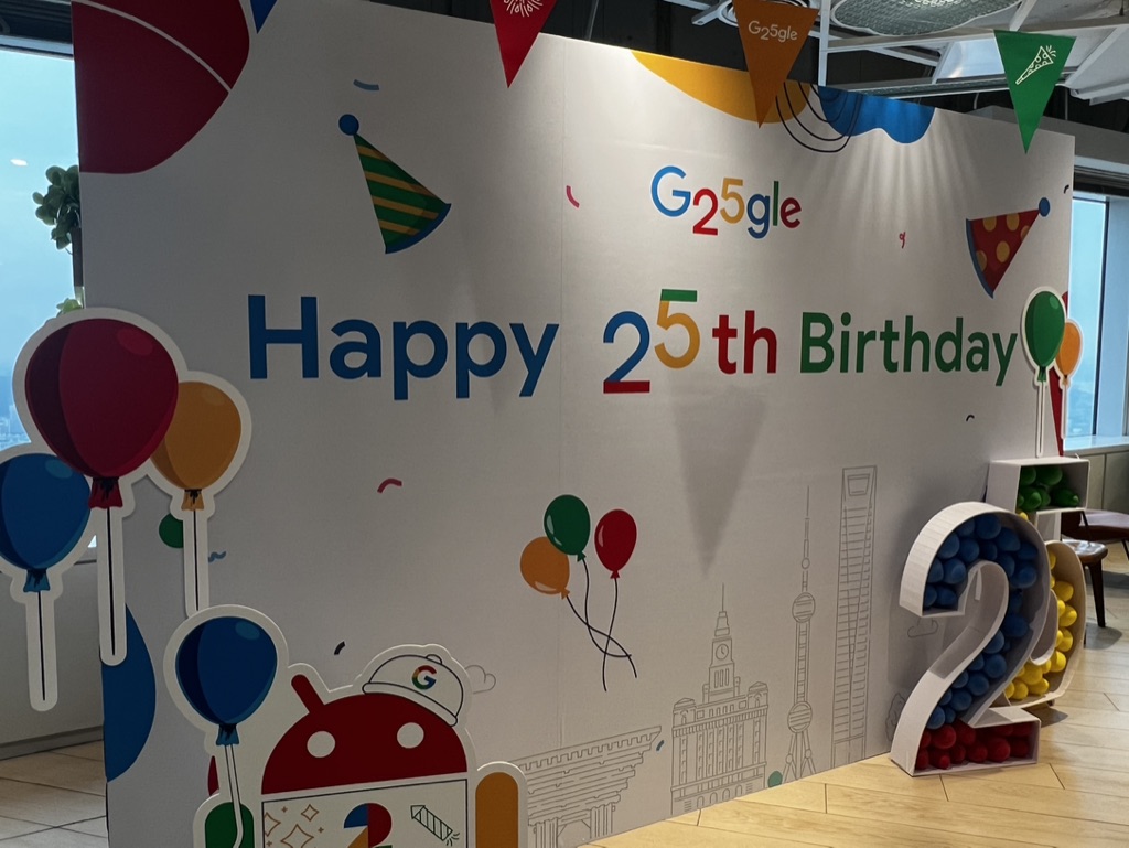

1. Overall Rating (0–10) — 6.8
This photograph captures the celebratory spirit of Google’s 25th anniversary with vibrant design and playful energy, though the composition feels slightly cluttered and lacks a strong focal point. The colorful branding and festive elements convey a sense of joy and corporate pride, but the image’s documentary nature limits its artistic depth. A more deliberate framing could elevate the scene from a simple snapshot to a memorable visual statement.
2. Composition (0–10) — 6.0
The central banner dominates the frame, but the scattered props and uneven placement of balloons and the "25" sculpture create visual distraction. A tighter crop would improve balance and guide the viewer’s eye more effectively.
3. Lighting (0–10) — 7.0
Natural light from the windows on the left provides even illumination, enhancing the clarity of the colorful details. The overhead lighting is soft and diffused, avoiding harsh shadows and preserving the cheerful tone.
4. Color & Tone (0–10) — 8.0
The palette is lively and well-coordinated, with Google’s signature colors used effectively to reinforce brand identity. The contrast between the bright graphics and the neutral background makes the key elements pop, contributing to a festive and energetic mood.
5. Creativity (0–10) — 7.5
The integration of the Android mascot, cityscape silhouettes, and festive motifs demonstrates a thoughtful blend of brand storytelling and celebration. While the concept is familiar, the execution feels fresh and engaging, especially in its use of 3D elements.
6. Technical Quality (0–10) — 7.5
The image is sharp and clear, with accurate focus across the main subject. The depth of field is sufficient to keep the key elements in focus, though some of the smaller details in the background are slightly soft.
7. Emotional Impact (0–10) — 7.0
The photograph evokes a sense of pride and excitement, capturing a moment of corporate milestone with warmth and humor. While it doesn’t deeply resonate emotionally, it effectively conveys the joy of a shared celebration.
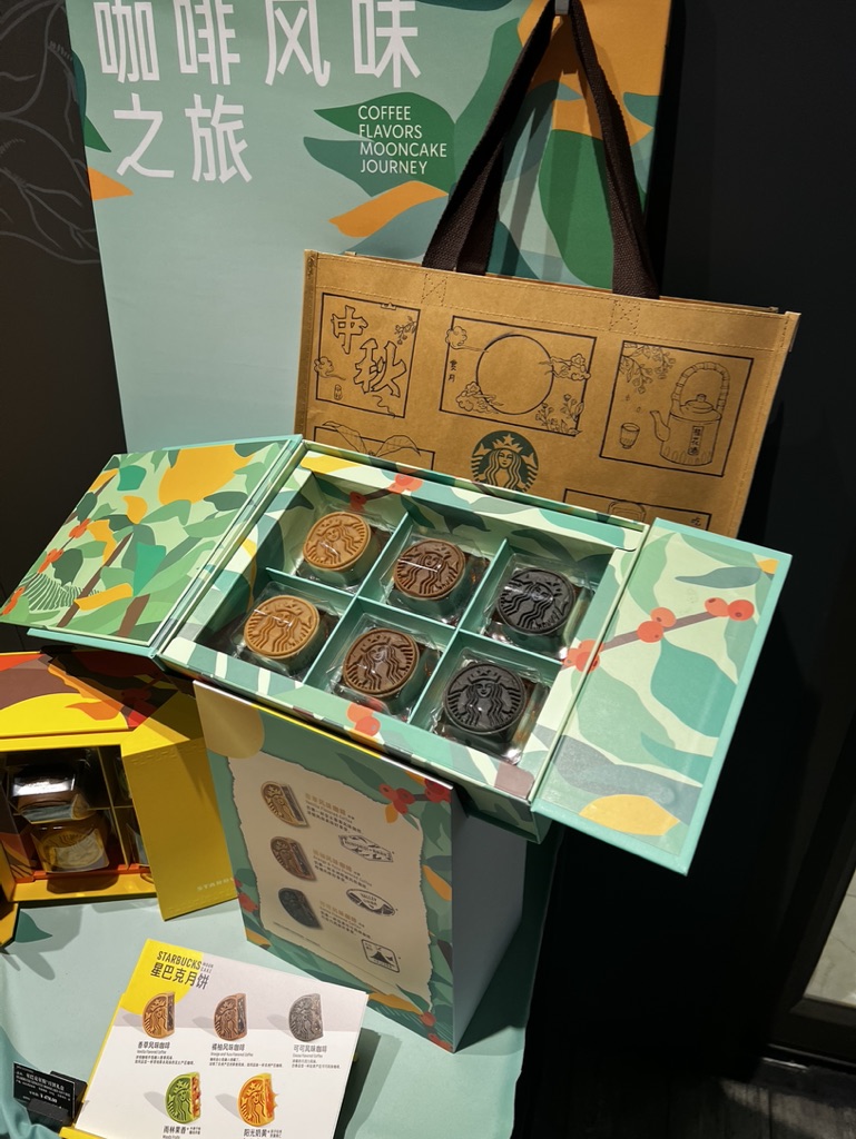

1. Overall Rating (0–10) — 7.0
This photograph captures the essence of a seasonal product launch with a strong sense of brand identity and cultural fusion. The vibrant packaging and neatly arranged mooncakes convey a celebratory, curated atmosphere, while the layered composition effectively guides the eye through the product and its narrative. While the lighting and framing are functional, the image feels slightly staged and lacks the dynamic energy needed to elevate it beyond a standard promotional shot.
2. Composition (0–10) — 7.0
The arrangement centers the open box, drawing attention to the mooncakes, while the surrounding elements—tote bag, brochure, and backdrop—provide context. The diagonal flow of the box and the slight tilt of the camera add subtle visual interest, though the composition is slightly busy.
3. Lighting (0–10) — 6.0
The lighting is even and bright, likely from overhead fluorescent sources, which illuminates the product clearly but lacks directional warmth or shadow play. The result is a clean but somewhat flat presentation that doesn't enhance the textures or depth.
4. Color & Tone (0–10) — 8.0
The palette is rich and cohesive, blending Starbucks’ signature green with autumnal yellows and warm browns, complemented by pops of red from the coffee bean motif. The colors feel intentional and festive, reinforcing the seasonal theme.
5. Creativity (0–10) — 7.5
The integration of traditional Chinese mooncake imagery with Starbucks branding creates a unique cultural narrative. The use of illustrative elements on the tote and packaging adds storytelling depth, making the product feel both familiar and innovative.
6. Technical Quality (0–10) — 7.5
The image is sharp and well-focused, with clear details visible on the mooncakes and printed materials. There is minimal noise, and the exposure is balanced, though the depth of field could be more controlled to isolate the subject.
7. Emotional Impact (0–10) — 6.5
The image evokes a sense of celebration and indulgence, particularly for fans of Starbucks or those familiar with Mid-Autumn traditions. However, the commercial nature of the scene keeps the emotional connection at a surface level, limiting deeper resonance.
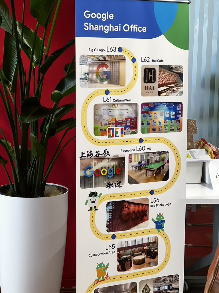

1. Overall Rating (0–10) — 6.0
This image presents a promotional banner for the Google Shanghai Office, capturing the vibrant, playful tone of the company’s workplace culture. The composition is visually engaging due to the dynamic layout and colorful elements, though the framing feels slightly cluttered and the lighting is uneven, which detracts from its overall aesthetic appeal. While the image effectively communicates information, it lacks the refinement to stand out as a compelling photograph.
2. Composition (0–10) — 6.5
The banner dominates the frame with a strong vertical orientation, but the large potted plant on the left disrupts balance and partially obscures the view. The curved yellow path guides the eye down the banner, but the inclusion of the white pot and background elements creates visual noise, reducing the focus on the central subject.
3. Lighting (0–10) — 5.5
The lighting is flat and diffuse, likely from indoor overhead sources, resulting in a lack of depth and contrast. The white pot reflects light unevenly, creating a glare on the left side, while the background remains underexposed, diminishing the clarity of details in the scene.
4. Color & Tone (0–10) — 7.0
The palette is bright and energetic, with the Google branding and colorful images creating visual interest. The red wall provides a strong contrast that enhances the banner’s visibility. However, the overall tone is slightly washed out, and the color saturation is inconsistent across the frame.
5. Creativity (0–10) — 6.0
The design of the banner itself is creative and playful, reflecting Google’s brand identity. However, the photograph’s execution is more documentary than artistic, capturing the scene without adding a distinct visual interpretation or narrative layer.
6. Technical Quality (0–10) — 7.0
The image is sharp and clear in the central area, with good focus on the banner. However, the edges of the frame show minor softness and uneven exposure, and the composition lacks intentional framing, suggesting a casual snapshot rather than a carefully composed shot.
7. Emotional Impact (0–10) — 5.5
The image conveys a sense of curiosity and familiarity with Google’s brand, but it does not evoke strong emotion. The viewer is informed rather than moved, and the lack of human presence or storytelling limits the emotional connection.
Loading map...