The Guinness Storehouse in Dublin offers a unique and informative experience, taking visitors through the history of Ireland's iconic beer from its origins 250 years ago to pouring a perfect pint. The self-guided tour is engaging and includes a complimentary drink at the Gravity Bar with stunning views over Dublin. It was highly praised by one visitor as a highlight of their trip to Dublin.
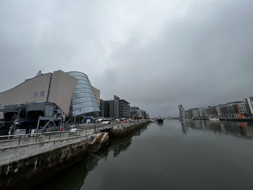

1. Overall Rating (0–10) — 5.8
This photograph captures a moody urban riverscape under a heavy overcast sky, where the stillness of the water mirrors the somber tone of the day. The modern architecture, particularly the curved glass building, provides a striking contrast to the industrial waterfront, but the lack of vibrant light and human presence gives the scene a muted, almost melancholic quality. While the composition suggests a quiet moment in a bustling city, the image feels more like a snapshot than a compelling narrative, lacking the visual energy to draw the viewer deeper.
2. Composition (0–10) — 6.0
The wide-angle perspective emphasizes the length of the river and the urban landscape, but the framing feels slightly unbalanced, with too much empty sky and a cluttered foreground. The diagonal line of the riverbank leads the eye into the distance, yet the left side dominates, creating an uneven visual weight.
3. Lighting (0–10) — 4.5
The flat, diffused light of the overcast day eliminates shadows and depth, flattening the scene and reducing the visual texture of the buildings and water. While consistent, it lacks drama and fails to highlight the architectural details.
4. Color & Tone (0–10) — 5.0
The palette is dominated by cool grays and muted tones, reflecting the weather and time of day. While cohesive, the lack of color vibrancy gives the image a washed-out appearance, limiting its emotional resonance.
5. Creativity (0–10) — 5.5
The image offers a straightforward documentation of a cityscape, with no bold artistic choices or unique perspective. The reflective water adds a subtle layer of visual interest, but the overall approach is conventional and observational rather than expressive.
6. Technical Quality (0–10) — 7.0
The image is sharp and clear, with good detail in the architecture and water surface. The exposure is well-balanced, avoiding harsh highlights or deep shadows, though the low contrast limits visual impact.
7. Emotional Impact (0–10) — 5.0
The atmosphere is calm and reflective, but the absence of people or movement creates a sense of detachment. The viewer is invited to observe, but not to feel, making the emotional connection subtle and fleeting.
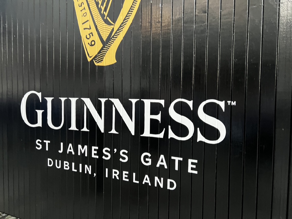

1. Overall Rating (0–10) — 6.0
This image captures the iconic branding of Guinness at St. James’s Gate with bold clarity, presenting a strong visual identity rooted in tradition. The clean typography and high-contrast design effectively communicate the brand’s heritage, though the lack of environmental context limits its narrative depth. While the photograph succeeds as a straightforward documentation of a landmark, it feels more like a promotional sign than an expressive or emotionally resonant image.
2. Composition (0–10) — 6.5
The vertical lines of the black paneling create a structured, rhythmic background that complements the centered placement of the logo and text. The framing is tight, emphasizing the branding without distraction, though the absence of surrounding context or human presence gives it a static, isolated feel.
3. Lighting (0–10) — 6.0
Even, diffuse lighting illuminates the sign without harsh shadows, allowing the white text and gold harp to stand out clearly against the dark surface. The lighting is functional and consistent, though it lacks the dramatic contrast or directional quality that might enhance mood or texture.
4. Color & Tone (0–10) — 7.0
The monochromatic black-and-white palette with a gold accent delivers a strong, classic aesthetic. The limited color scheme reinforces the brand’s identity, and the high contrast between the white lettering and dark background ensures legibility and visual impact.
5. Creativity (0–10) — 5.0
The image is conceptually straightforward, prioritizing brand recognition over artistic interpretation. While the composition is clean and purposeful, it lacks originality or conceptual layering—more a factual record than a creative vision.
6. Technical Quality (0–10) — 8.0
Sharp focus and even exposure highlight the crispness of the lettering and the texture of the paneling. The image is technically sound, with no apparent flaws in resolution or focus.
7. Emotional Impact (0–10) — 5.0
The photograph conveys a sense of place and tradition, but its emotional resonance is restrained. The absence of human interaction or environmental storytelling keeps the viewer at a distance, making the experience more informational than evocative.
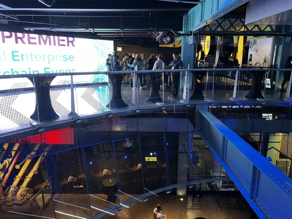

1. Overall Rating (0–10) — 6.0
This photograph captures the energy of a modern corporate event within a multi-level industrial-chic venue, where the interplay of architecture and technology creates a dynamic atmosphere. The elevated perspective and layered composition convey a sense of scale and activity, though the scene feels slightly cluttered and lacks a clear focal point. While the setting is visually engaging, the image struggles to balance its many elements—digital signage, structural forms, and human activity—into a cohesive narrative, resulting in a snapshot that feels more observational than compelling.
2. Composition (0–10) — 5.5
The high-angle framing offers an expansive view but creates visual disarray, with overlapping railings, signage, and people competing for attention. The diagonal lines of the bridge and railings provide some structure, but the lack of a strong focal point weakens the overall balance.
3. Lighting (0–10) — 5.0
The lighting is functional and evenly distributed, relying on artificial sources that highlight the space without creating mood or depth. The bright screen on the left competes with ambient light, contributing to a slightly harsh and uneven exposure.
4. Color & Tone (0–10) — 5.5
The palette is dominated by cool blues and grays, with the screen introducing a splash of purple and white. While the colors are modern and aligned with the event’s tech-forward theme, the lack of contrast and warm tones gives the image a sterile, corporate feel.
5. Creativity (0–10) — 6.0
The image successfully captures the essence of a contemporary enterprise event, using the venue’s industrial architecture as a backdrop. However, it leans more toward documentation than artistic interpretation, with little effort to elevate the scene beyond a straightforward record.
6. Technical Quality (0–10) — 7.0
The photograph is sharp and clear, with good detail in the structural elements and readable text. Focus is consistent across the frame, and the exposure is largely balanced despite the mixed lighting conditions.
7. Emotional Impact (0–10) — 5.0
The image conveys a sense of activity and professionalism but fails to evoke a strong emotional response. The viewer is positioned as an observer rather than an participant, leaving the scene feeling distant and impersonal.
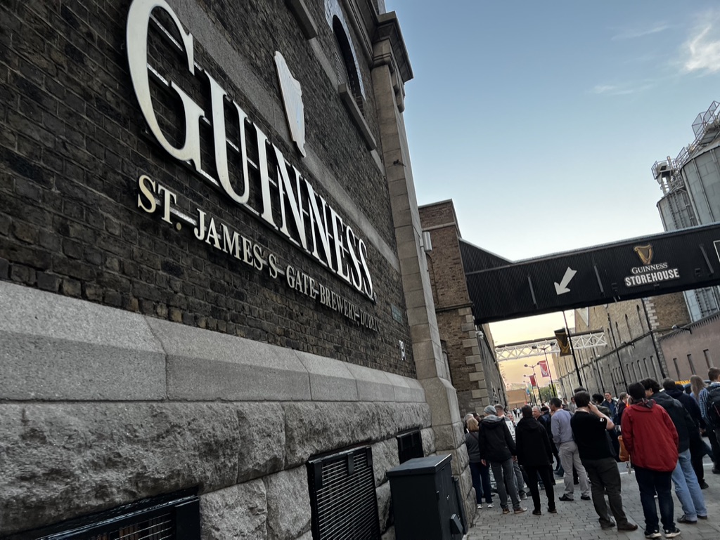

1. Overall Rating (0–10) — 6.8
This photograph captures the iconic presence of the Guinness St. James’s Gate Brewery with a sense of place and purpose, grounding the viewer in Dublin’s industrial heritage. The low-angle perspective emphasizes the scale of the building, while the gathering of visitors suggests the site’s enduring appeal as a cultural destination. However, the image’s strength lies more in its documentation than in its aesthetic refinement—its composition feels slightly cluttered, and the lighting lacks the drama needed to elevate the scene beyond a simple travel snapshot.
2. Composition (0–10) — 6.0
The low-angle framing creates a dramatic sense of scale, but the inclusion of the crowd and overhead walkway introduces visual noise. The diagonal lines of the arch and signage pull the eye, yet the off-center placement of the main subject and the busy foreground detract from a more cohesive visual flow.
3. Lighting (0–10) — 6.5
The soft, diffused light of late afternoon provides even illumination across the scene, preserving detail in the brickwork and signage. However, the lack of strong contrast or golden-hour warmth limits the image’s atmospheric depth, giving it a neutral, observational tone.
4. Color & Tone (0–10) — 6.0
The palette is dominated by muted grays and browns, with the white lettering of the sign offering a stark contrast. While the colors are authentic and grounded, they lack vibrancy and tonal richness, resulting in a somewhat flat visual impression.
5. Creativity (0–10) — 6.5
The image successfully captures a well-known landmark in a recognizable setting, but it doesn’t push beyond conventional travel photography. The low angle and wide frame suggest intention, but the lack of a strong narrative or emotional hook keeps the image from feeling particularly original.
6. Technical Quality (0–10) — 7.5
Sharp focus and clear detail are evident in the textures of the brick and signage. The exposure is well-balanced, with no significant overexposed or underexposed areas, showcasing solid technical execution.
7. Emotional Impact (0–10) — 6.0
The photograph evokes a sense of place and shared experience, particularly with the line of visitors suggesting pilgrimage to a cultural landmark. However, the emotional resonance is restrained by the image’s straightforward, documentary quality, preventing a deeper connection with the viewer.
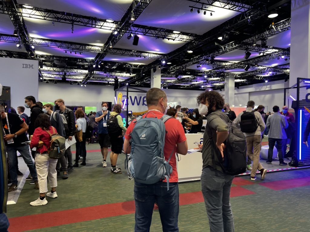

1. Overall Rating (0–10) — 6.0
This photograph captures the bustling energy of a technology trade show, where the interplay of light, movement, and corporate branding creates a sense of modern industry in motion. The scene feels authentic and immersive, with people engaged in conversation and exploration, though the composition's busyness slightly undermines focus. While it effectively conveys the atmosphere of a live event, the lack of a clear focal point or narrative thread keeps the image from achieving greater visual cohesion.
2. Composition (0–10) — 5.5
The wide-angle perspective captures the scale of the event but results in a cluttered foreground and uneven subject distribution. The placement of the two men in the center provides a natural entry point, yet the surrounding activity creates visual distraction.
3. Lighting (0–10) — 6.0
The overhead trusses and purple ambient lighting lend a dynamic, high-tech feel, though the flat, diffused illumination lacks depth. The mix of artificial sources creates a slightly uneven exposure, with some areas overexposed and others shadowed.
4. Color & Tone (0–10) — 6.5
The cool purples and blues of the ceiling lighting contrast with the neutral tones of the carpet and booths, creating a contemporary palette. The color balance is generally consistent, though the lack of vibrancy in the mid-tones limits visual impact.
5. Creativity (0–10) — 6.0
The image successfully documents a moment in time at a tech conference, but its strength lies in realism rather than artistic innovation. The use of light and depth adds a sense of place, but the narrative remains observational rather than interpretive.
6. Technical Quality (0–10) — 7.0
Sharpness is adequate throughout, with clear detail in the foreground subjects and background elements. Focus is consistent, and the camera appears to have handled the mixed lighting well, despite some slight overexposure in highlights.
7. Emotional Impact (0–10) — 5.5
The image evokes a sense of curiosity and engagement, reflecting the excitement of a live event. However, the lack of a central emotional anchor or human connection keeps the viewer at a distance, making the experience feel more like an observation than an invitation.
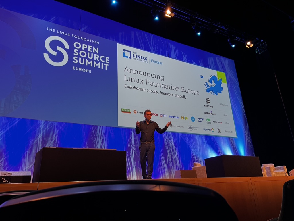

1. Overall Rating (0–10) — 6.0
This image captures the energy of a live tech conference announcement, with a speaker confidently presenting on stage at the Linux Foundation Open Source Summit Europe. The vibrant blue backdrop and clear branding convey professionalism and purpose, though the composition feels slightly crowded and the foreground obstruction detracts from the visual clarity. While it effectively documents a moment of innovation and collaboration, it lacks the artistic refinement to feel truly compelling.
2. Composition (0–10) — 5.5
The speaker is centered but partially framed by stage elements and a dark foreground, which disrupts visual flow and draws attention away from the subject. The wide-angle perspective creates a sense of scale but introduces clutter.
3. Lighting (0–10) — 6.5
Stage lighting highlights the speaker and screen effectively, though the blue wash on the backdrop creates a cool, uniform tone that flattens depth. The ambient light in the audience area remains dim, emphasizing the stage but reducing overall scene balance.
4. Color & Tone (0–10) — 6.0
The dominant blue palette reinforces the event’s branding but limits tonal variety. The white text and logos stand out clearly, but the overall color scheme feels functional rather than expressive.
5. Creativity (0–10) — 5.5
The image functions as a straightforward event capture rather than a creative statement. While the subject matter is inherently engaging, the execution remains conventional and documentary in nature.
6. Technical Quality (0–10) — 7.0
The focus is sharp on the speaker and screen, and detail is preserved in the lighting. However, the dark foreground and slight overexposure on the screen slightly compromise technical precision.
7. Emotional Impact (0–10) — 5.0
The image conveys a sense of professional momentum and collective progress, but the viewer is kept at a distance by the lack of personal connection and the impersonal stage environment. It informs rather than inspires.
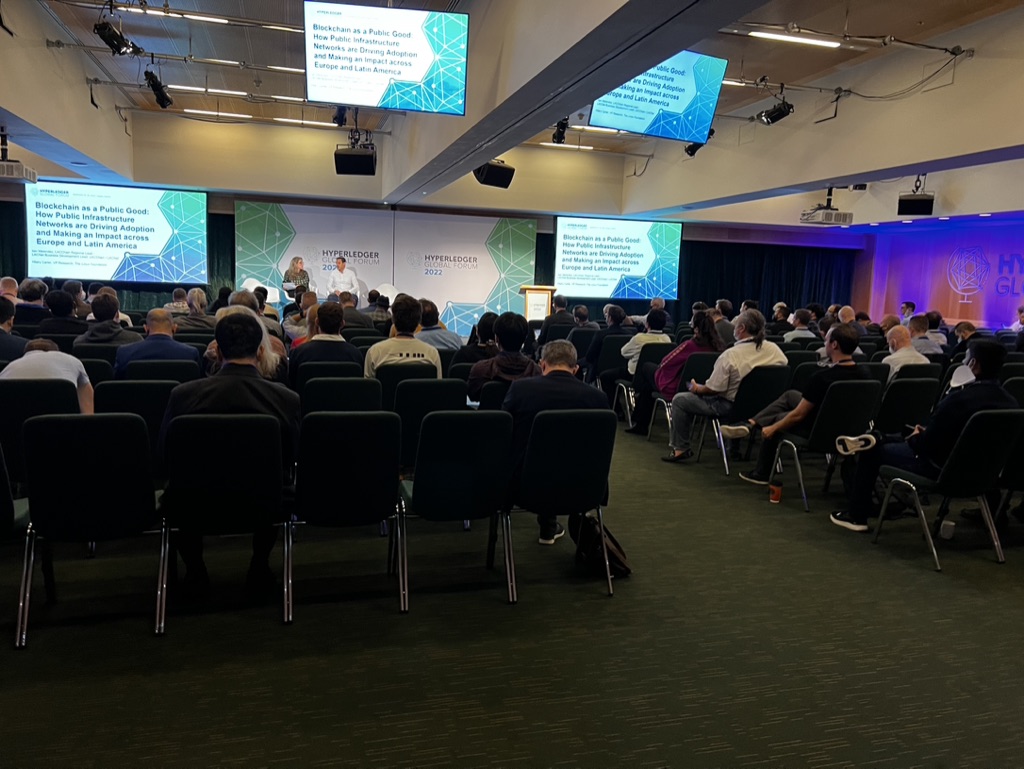

1. Overall Rating (0–10) — 6.0
This photograph captures the atmosphere of a professional conference, conveying a sense of intellectual engagement and structured discourse. The wide-angle perspective effectively communicates the scale of the event and the audience’s attentiveness, though the image lacks visual dynamism due to its documentary nature. While it succeeds as a factual record, it falls short of evoking a strong emotional or aesthetic response, feeling more like a snapshot than a compelling composition.
2. Composition (0–10) — 6.5
The wide framing captures the full scope of the event, with the stage and audience arranged in a balanced, symmetrical composition. However, the lack of a strong focal point and the cluttered foreground of empty chairs slightly dilute the visual impact.
3. Lighting (0–10) — 6.0
The lighting is functional and even, typical of a conference hall, with overhead fixtures providing consistent illumination. The stage lighting is slightly brighter, drawing attention to the speakers, but the overall flatness of the light limits depth and mood.
4. Color & Tone (0–10) — 5.5
The palette is dominated by neutral tones—grays, blacks, and muted blues—reinforcing the professional, subdued atmosphere. The blue accents on the screens and backdrop add a touch of modernity, but the overall tone lacks vibrancy and contrast.
5. Creativity (0–10) — 5.0
The image is straightforward and reportorial, prioritizing clarity over artistic expression. While the use of multiple screens and branding elements provides context, the composition is conventional and does not offer a unique visual interpretation.
6. Technical Quality (0–10) — 7.5
The image is sharp and well-exposed, with clean details visible in the audience, stage, and screens. The wide-angle lens choice is appropriate for the environment, though it introduces slight distortion at the edges.
7. Emotional Impact (0–10) — 5.0
The photograph conveys a sense of intellectual gathering, but its impersonal and detached quality keeps the viewer at a distance. The lack of human connection or narrative tension limits its emotional resonance.
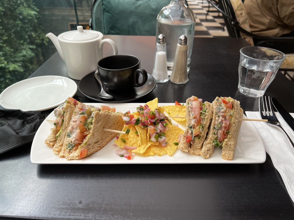

1. Overall Rating (0–10) — 6.8
This photograph captures a cozy, well-arranged afternoon tea setting with a modern twist, where traditional sandwiches meet a vibrant salsa and tortilla chips. The composition balances warmth and elegance, enhanced by natural light filtering through the window, though the scene feels slightly over-staged, as if designed for a menu rather than a lived-in moment. While the textures and colors are inviting, the arrangement lacks spontaneity, giving the image a polished but distant quality.
2. Composition (0–10) — 7.0
The central platter is well-framed, drawing the eye with a diagonal line from the teapot to the glass of water. The background elements—salt and pepper shakers, chair, and foliage—add depth without distraction, creating a balanced, layered scene.
3. Lighting (0–10) — 7.5
Natural light from the window softly illuminates the scene, enhancing the textures of the food and the reflective surfaces of the glass and ceramic. The contrast between light and shadow adds dimension without harshness.
4. Color & Tone (0–10) — 7.0
The palette is harmonious, with the warm yellows of the chips and the reds of the salsa providing pops of color against the neutral tones of the bread and table. The cool black table and dark cup create a sophisticated contrast, though the overall tone leans slightly flat.
5. Creativity (0–10) — 6.5
The fusion of classic tea service with casual snacks like chips and salsa suggests a playful, contemporary twist. While the concept is engaging, the execution leans toward conventional food photography, offering little surprise or narrative depth.
6. Technical Quality (0–10) — 8.0
The image is sharp, with clear focus on the food and tableware. Depth of field is well-managed, and the lighting is consistent, resulting in a clean, professional appearance.
7. Emotional Impact (0–10) — 6.0
The photograph evokes a sense of comfort and indulgence, inviting the viewer to enjoy a leisurely meal. However, the lack of human presence or candid interaction tempers the emotional resonance, leaving the scene feeling more like an advertisement than a personal moment.
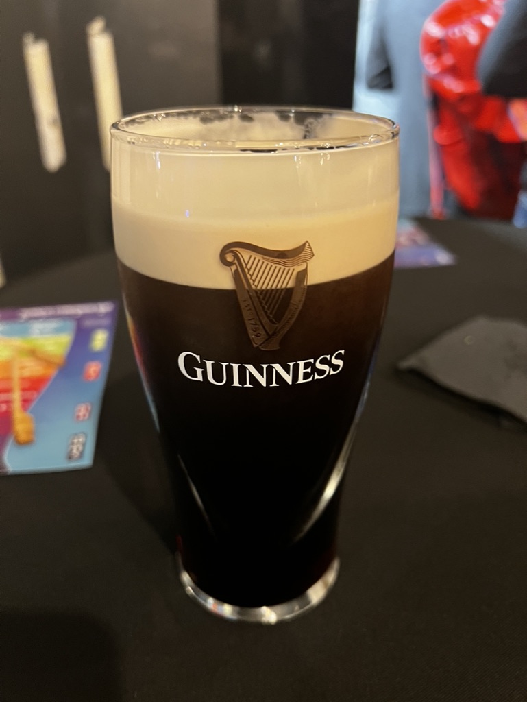

1. Overall Rating (0–10) — 7.0
This photograph captures the rich, velvety texture of a pint of Guinness with a crisp, inviting head, evoking the warmth of a cozy pub. The focus on the glass creates an immediate sense of indulgence, while the blurred background hints at a lively social setting without distracting from the subject. Though the composition is strong, the slightly awkward framing and flat lighting prevent it from feeling truly cinematic.
2. Composition (0–10) — 6.5
The glass is centered and well-framed, but the off-center background elements and cluttered surroundings create a sense of visual noise. A tighter crop would enhance focus on the beer as the primary subject.
3. Lighting (0–10) — 6.0
The lighting is functional but lacks depth—soft, ambient indoor light highlights the glass’s form but fails to create dramatic shadows or accentuate the beer’s texture and shine.
4. Color & Tone (0–10) — 7.0
The deep black of the stout contrasts sharply with the creamy tan head, and the subtle warmth of the background adds a touch of atmosphere. The color palette is balanced, though slightly muted by the indoor lighting.
5. Creativity (0–10) — 6.5
The image is straightforward and observational, capturing a familiar scene with a clear focus. It leans more on authenticity than artistic interpretation, but the subject’s iconic nature gives it a subtle charm.
6. Technical Quality (0–10) — 7.5
The glass is in sharp focus, and the details of the Guinness logo and foam are clear. Depth of field is appropriately used to blur the background, though slight noise is visible in the darker areas.
7. Emotional Impact (0–10) — 6.5
The image evokes a sense of comfort and ritual, particularly for fans of Guinness. It invites the viewer to imagine the taste and warmth of a freshly poured pint, though the emotional resonance is somewhat restrained by the lack of atmosphere.
Loading map...