The Griffith Observatory in Los Angeles is a popular landmark featuring exhibits, planetarium shows, and stunning views. Located on Mount Hollywood, it has been a California icon since 1935 and has appeared in numerous movies. Admission to the observatory building is free, while parking can be limited on weekends. The complex includes various points of interest, including an Egyptian sundial, James Dean's memorial, and solar telescopes.
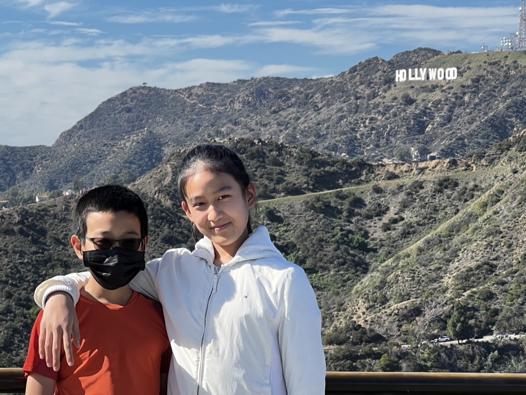

1. Overall Rating (0–10) — 7.0
This photograph captures a warm, candid moment between two children against the iconic backdrop of the Hollywood Sign, evoking a sense of travel, youth, and place. The natural daylight and relaxed body language lend authenticity to the scene, though the image's composition and lighting slightly diminish its visual impact. While the emotional resonance is strong, the technical execution holds it back from greater artistic depth.
2. Composition (0–10) — 6.5
The subjects are centered and framed naturally, but the foreground railing cuts into the bottom of the image, creating a distracting element. The distant Hollywood Sign provides a strong contextual anchor, though it competes slightly with the subjects for attention.
3. Lighting (0–10) — 7.5
Bright, even daylight illuminates the scene clearly, with soft shadows suggesting midday sun. The lighting enhances the natural colors and details without harshness, contributing to the image’s candid, travel-moment feel.
4. Color & Tone (0–10) — 7.0
The palette is balanced, with the white jacket and red shirt providing subtle contrast against the earthy tones of the hills and the blue sky. The saturation is natural, and the white of the sign stands out without appearing overexposed.
5. Creativity (0–10) — 6.0
The image is a classic travel portrait, relying on recognizable landmarks and familial connection. While it tells a simple, heartfelt story, it lacks originality in framing or perspective, feeling more like a snapshot than a deliberate artistic statement.
6. Technical Quality (0–10) — 7.5
The focus is sharp on the subjects, and the image is clear with good resolution. The exposure is well-managed, and there is minimal noise despite the bright outdoor conditions.
7. Emotional Impact (0–10) — 7.5
The warmth of the embrace and the subtle smiles convey a genuine moment of sibling connection. The iconic background adds a layer of nostalgia and aspiration, making the image feel personal and meaningful to those involved.
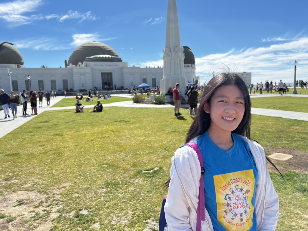

1. Overall Rating (0–10) — 7.5
This photograph captures a joyful moment at the Griffith Observatory, where personal memory and cultural landmark converge under a vibrant sky. The subject’s warm smile and the iconic architecture create a sense of place and celebration, while the bright daylight enhances the scene’s authenticity. Though the background is slightly busy, the image effectively balances personal connection with public space, resulting in a candid and uplifting portrait.
2. Composition (0–10) — 7.0
The subject is placed slightly off-center, drawing attention while allowing the observatory to anchor the background. The wide-angle perspective includes context without overwhelming the focal point, though the scattered crowd adds visual noise.
3. Lighting (0–10) — 9.0
Bright, natural sunlight enhances the vivid blue of the sky and the crisp whites of the building, creating strong contrast and clarity. The even lighting on the subject’s face highlights her expression, contributing to the image’s warmth.
4. Color & Tone (0–10) — 8.0
The palette is rich and balanced, with the deep blue of the sky and shirt complementing the green lawn and white architecture. The warm yellow of the t-shirt graphic adds a pop of color that draws the eye without disrupting harmony.
5. Creativity (0–10) — 7.0
The image captures a personal travel moment with a strong sense of location. While not overtly experimental, it tells a story of joy and exploration, using familiar landmarks to ground the subject’s experience.
6. Technical Quality (0–10) — 8.5
The photo is sharp, well-focused, and free from noticeable flaws. The exposure is well-managed, preserving detail in both highlights and shadows.
7. Emotional Impact (0–10) — 8.0
The subject’s genuine smile and the cheerful setting evoke a sense of happiness and wanderlust. The viewer is invited to share in the joy of a memorable day, making the image emotionally resonant and relatable.
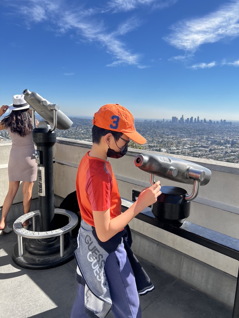

1. Overall Rating (0–10) — 7.5
This photograph captures a vibrant moment of youthful curiosity against the sweeping backdrop of a sprawling city, with the bright blue sky and distant skyline lending a sense of wonder and scale. The boy’s focused engagement with the binoculars creates a compelling narrative of discovery, while the contrast between his colorful attire and the urban expanse adds visual energy. The image’s strength lies in its candid authenticity, though the framing slightly undermines its compositional harmony.
2. Composition (0–10) — 6.0
The subject is well-placed but partially cropped, and the foreground binoculars create a visual imbalance. A tighter crop or adjusted angle would better center the boy and emphasize his interaction with the scene.
3. Lighting (0–10) — 9.0
Bright, natural sunlight enhances the clarity and vividness of the scene, casting clean shadows and illuminating the colors of the boy’s clothing and the sky with a crisp, energetic quality.
4. Color & Tone (0–10) — 8.0
The palette is rich and balanced, with the orange cap and shirt creating a strong focal point against the cool blues and grays of the cityscape. The contrast between warm and cool tones adds depth and visual interest.
5. Creativity (0–10) — 7.0
The image captures a moment of personal exploration within a public space, blending travel, youth, and urban scale into a relatable and evocative story. While the concept is familiar, the execution feels genuine and emotionally resonant.
6. Technical Quality (0–10) — 8.0
The image is sharp and well-exposed, with clear detail in both the foreground and background. The focus is precise, and the camera appears to be well-handled, capturing the moment with clarity.
7. Emotional Impact (0–10) — 7.5
The photograph evokes a sense of awe and discovery, drawing the viewer into the boy’s experience of seeing the city for the first time. The emotional connection is strong, rooted in the universal joy of exploration and the beauty of a shared moment.
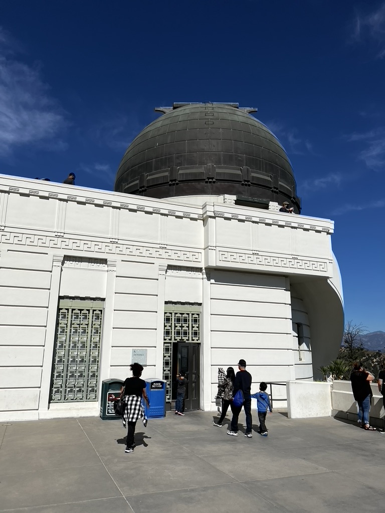

1. Overall Rating (0–10) — 7.0
This photograph captures the iconic Griffith Observatory under a vast, clear blue sky, evoking a sense of wonder and public engagement with science and space. The bold contrast between the white structure and the deep blue sky creates a striking visual presence, while the inclusion of visitors adds a human scale and narrative of curiosity. While the composition is strong, the slightly awkward framing and flat lighting reduce its overall dynamism, keeping it from reaching its full aesthetic potential.
2. Composition (0–10) — 6.5
The low-angle perspective emphasizes the grandeur of the observatory, but the off-center placement of the dome and the uneven distribution of people create a slightly unbalanced feel. A tighter crop or more deliberate framing would enhance focus on the building’s architectural details.
3. Lighting (0–10) — 6.0
The bright, direct sunlight creates sharp shadows and highlights the building’s clean lines, but it also flattens the scene’s depth and casts harsh contrasts, reducing subtlety in texture and mood.
4. Color & Tone (0–10) — 7.5
The deep blue of the sky contrasts vividly with the white architecture, creating a clean, bold palette. The natural tones feel authentic and well-balanced, with minimal post-processing, preserving the scene’s clarity and vibrancy.
5. Creativity (0–10) — 6.5
The image successfully documents a well-known landmark in a familiar tourist context, but it relies on the inherent visual appeal of the subject rather than a unique artistic vision. The storytelling is straightforward, focusing on place and presence rather than interpretation.
6. Technical Quality (0–10) — 7.5
The image is sharp and well-focused, with clear details in the building’s facade and textures. The exposure is generally accurate, though the sky shows some slight overexposure in the brightest areas.
7. Emotional Impact (0–10) — 6.0
The photograph conveys a sense of openness and public accessibility, inviting viewers to imagine themselves exploring the site. While it captures a moment of shared experience, it lacks the emotional depth or intimacy to deeply resonate.
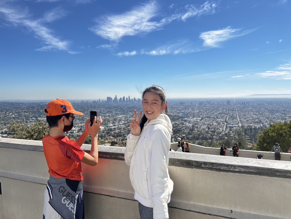

1. Overall Rating (0–10) — 7.0
This photograph captures a vibrant, candid moment of childhood joy against the sweeping backdrop of a sprawling city, where youthful energy contrasts beautifully with the vast urban landscape. The bright daylight and clear skies amplify the sense of openness and adventure, while the children’s gestures—peace signs, phone in hand—suggest a shared memory in the making. While the image is rich in atmosphere and emotion, it lacks the compositional refinement to feel fully polished, and the background's visual weight slightly overwhelms the subjects.
2. Composition (0–10) — 6.5
The subjects are well-placed within the frame, with the girl centered and the boy slightly off-center, creating a natural balance. However, the wide-angle perspective introduces a slight distortion, and the expansive cityscape, while impressive, competes for attention, reducing focus on the emotional core of the moment.
3. Lighting (0–10) — 9.0
Bright, natural sunlight enhances the scene with clarity and depth, casting soft shadows and illuminating the subjects’ faces and clothing with warmth. The strong daylight contributes to the image’s cheerful mood and crisp detail.
4. Color & Tone (0–10) — 8.0
The vivid blue sky and rich oranges and whites of the children’s clothing create a dynamic, harmonious palette. The tones are well-balanced, with the warm colors of the subjects standing out against the cooler tones of the city, adding visual interest and depth.
5. Creativity (0–10) — 7.5
The photograph captures a relatable, authentic moment of travel and joy, with a strong narrative potential. The juxtaposition of youthful exuberance against the urban expanse adds a layer of storytelling, elevating it beyond a simple snapshot.
6. Technical Quality (0–10) — 8.0
The image is sharp, well-focused, and free from noticeable flaws. The exposure is accurate, and the camera’s detail capture is strong, particularly in the textures of the clothing and the distant cityscape.
7. Emotional Impact (0–10) — 8.0
The warmth and genuine happiness of the children, paired with the expansive view, evoke a sense of wonder and shared experience. The viewer is invited to imagine the story behind the moment—travel, friendship, and the thrill of being somewhere new—making it emotionally resonant and memorable.
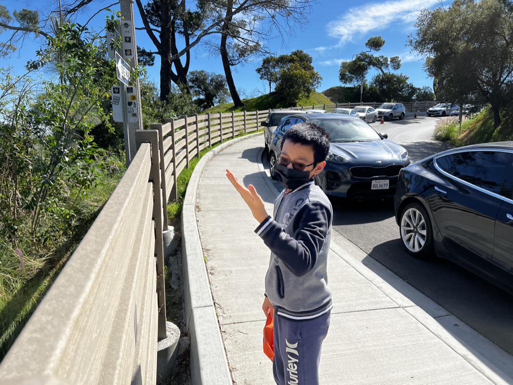

1. Overall Rating (0–10) — 6.0
This photograph captures a candid moment of a child on a sunny day, standing on a sidewalk beside a road with cars and trees in the background. The natural lighting and relaxed posture of the subject convey a sense of everyday life, yet the image feels slightly unbalanced due to the cluttered environment and off-center framing. While the scene is relatable and captures a genuine moment, it lacks the compositional refinement to elevate it beyond a simple snapshot.
2. Composition (0–10) — 5.5
The subject is placed off-center, and the diagonal line of the sidewalk draws the eye, but the cluttered background and intrusive vehicles disrupt visual harmony. A tighter crop would focus attention on the child.
3. Lighting (0–10) — 7.5
Bright, natural sunlight enhances clarity and detail, casting sharp shadows that add depth. The clear blue sky contributes to a crisp, vibrant outdoor feel.
4. Color & Tone (0–10) — 6.5
The palette is dominated by natural tones—grays, blues, and greens—with the black car and mask creating contrast. The colors are accurate but not particularly rich or stylized.
5. Creativity (0–10) — 5.5
The image captures a real-life moment with authenticity, but it lacks a unique artistic vision or narrative twist. It feels more observational than expressive.
6. Technical Quality (0–10) — 7.0
The focus is sharp on the subject, and the image is free of technical flaws. However, the framing and background distractions reduce overall impact.
7. Emotional Impact (0–10) — 6.0
The child’s gesture and relaxed demeanor evoke a sense of calm and familiarity, but the lack of deeper context or emotional resonance keeps the viewer at a distance.
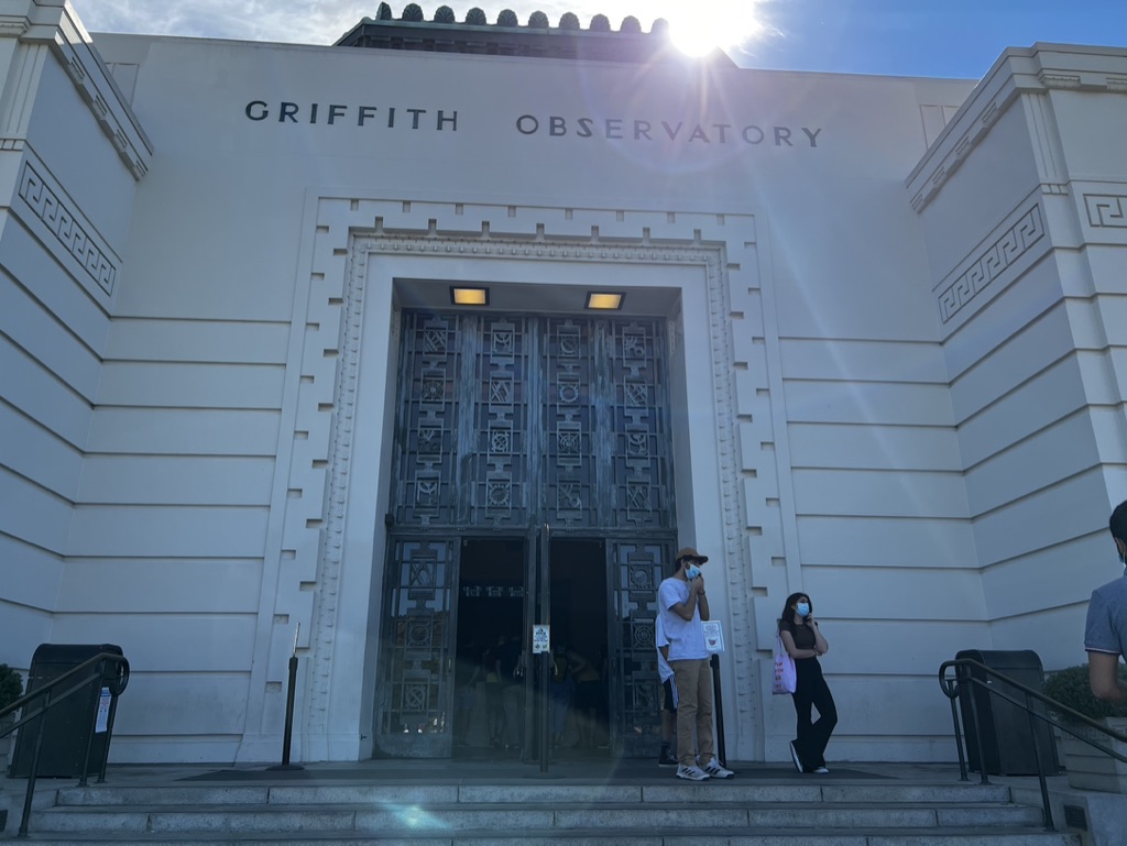

1. Overall Rating (0–10) — 6.0
This photograph captures the grandeur of the Griffith Observatory with a sense of architectural presence, yet the bright sun and harsh lens flare detract from its visual clarity. The composition centers on the iconic entrance, grounding the image in place and time, but the overexposed sky and washed-out details in the building’s facade slightly undermine its aesthetic impact. While the scene feels authentic and grounded in reality, it lacks the refined balance needed to elevate it into a more compelling visual statement.
2. Composition (0–10) — 6.5
The central placement of the observatory entrance creates a strong focal point, supported by the symmetry of the building’s Art Deco design. The steps and railings lead the eye toward the doorway, enhancing depth, though the partial inclusion of people on the right slightly disrupts the formal symmetry.
3. Lighting (0–10) — 5.0
The harsh overhead sunlight creates a strong lens flare and overexposes the sky, washing out details on the upper portion of the building. While the light highlights the texture of the stone and the intricate ironwork, it also casts deep shadows within the doorway, reducing visibility of interior activity.
4. Color & Tone (0–10) — 6.0
The palette is dominated by the cool whites and grays of the building, with the blue sky providing a subtle contrast. The overall tone is bright and neutral, but the overexposure and lack of dynamic range result in a somewhat flat appearance, with muted warmth in the shadows.
5. Creativity (0–10) — 5.5
The image captures a familiar landmark with a straightforward approach, emphasizing documentation over artistic interpretation. The inclusion of visitors adds a human element, grounding the scene in everyday life, but the lack of a unique perspective or intentional framing limits its originality.
6. Technical Quality (0–10) — 6.5
The focus is sharp on the entrance, capturing the details of the iron gates and architectural ornamentation. However, the lens flare and uneven exposure reduce the overall technical polish, particularly in the sky and highlights.
7. Emotional Impact (0–10) — 5.0
The image conveys a sense of place and public access, but the glare and flatness of the light keep the viewer at a distance. There’s a quiet dignity in the architecture, yet the emotional resonance is muted by the technical imperfections and lack of atmospheric depth.
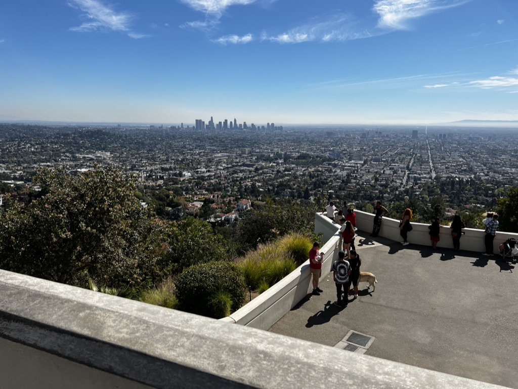

1. Overall Rating (0–10) — 7.5
This panoramic view captures the expansive energy of Los Angeles from an elevated vantage point, where the city sprawls beneath a vast blue sky. The juxtaposition of the bustling urban core against the quiet observation deck creates a compelling narrative of scale and human presence. While the image is visually striking, its composition feels slightly unbalanced due to the foreground railing and the uneven placement of figures, which detract from the overall harmony.
2. Composition (0–10) — 6.5
The wide-angle perspective emphasizes the city’s vastness, but the low foreground railing disrupts the visual flow. The people on the right edge create a sense of scale, yet their placement feels asymmetrical, drawing attention away from the central skyline.
3. Lighting (0–10) — 8.0
Strong, direct sunlight enhances clarity and depth, casting crisp shadows that define the landscape. The bright, natural light accentuates the contrast between the urban sprawl and the open sky, lending the scene a vibrant, daytime clarity.
4. Color & Tone (0–10) — 7.0
The dominant blue of the sky contrasts effectively with the neutral tones of the cityscape and the green of the trees. The palette is balanced and natural, though the color saturation is moderate, giving the image a slightly muted quality that limits its visual punch.
5. Creativity (0–10) — 7.0
The photograph successfully conveys the grandeur of the Los Angeles vista, blending urban geography with human interaction. While the concept is familiar, the inclusion of everyday visitors adds a layer of relatability, transforming a standard cityscape into a moment of shared experience.
6. Technical Quality (0–10) — 8.0
The image is sharp and well-exposed, with clean detail across the frame. The focus is consistent, and the lack of motion blur or noise indicates strong technical execution, particularly in the bright daylight conditions.
7. Emotional Impact (0–10) — 6.5
The image evokes a sense of awe and contemplation, capturing the moment of a city dweller pausing to take in the view. The presence of people adds warmth and relatability, but the emotional resonance is tempered by the lack of a strong focal point or narrative focus.
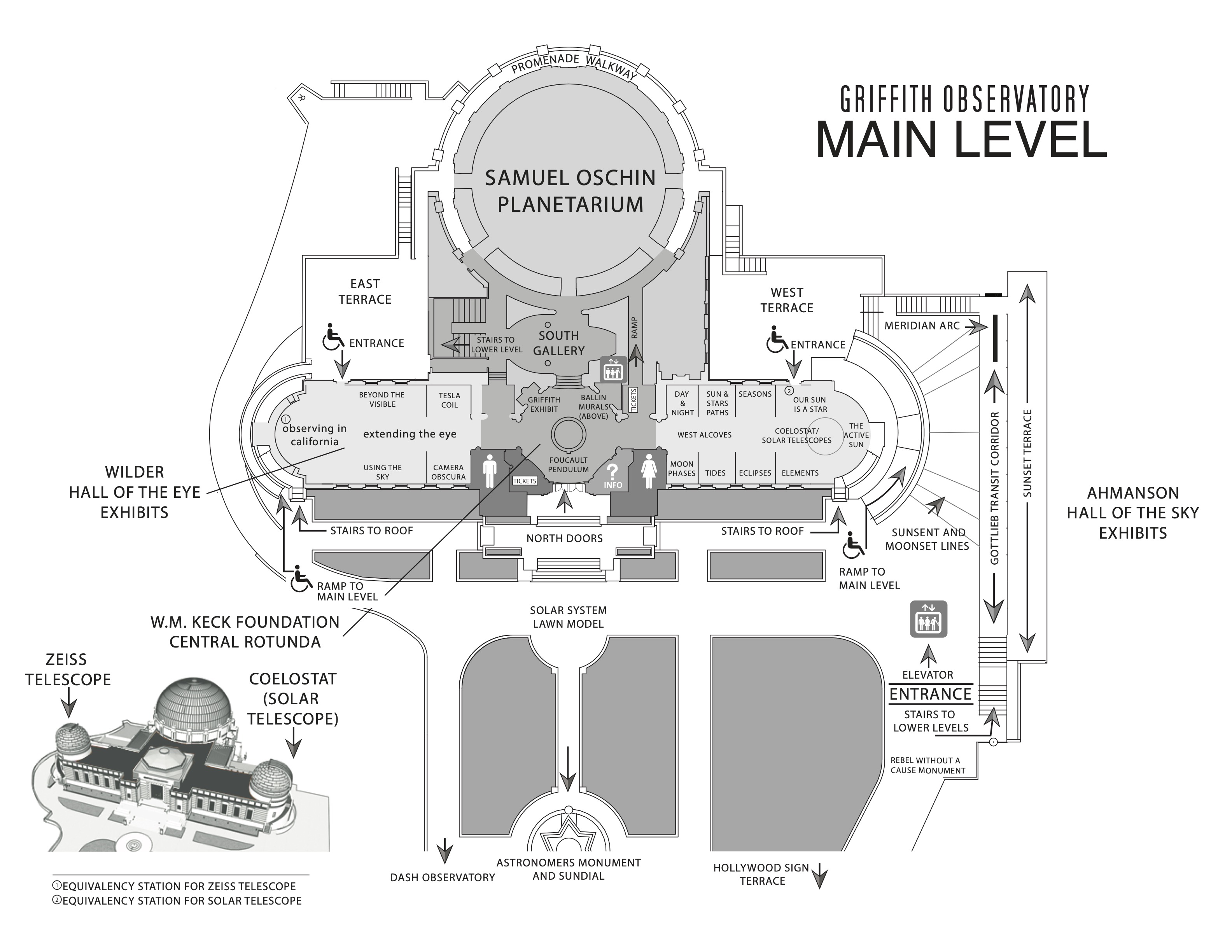

1. Overall Rating (0–10) — 7.0
This floor plan of the Griffith Observatory’s main level is a striking blend of architectural clarity and educational intent, presenting a wealth of information with precision and elegance. The layout effectively communicates the spatial relationships between exhibits, terraces, and key features, making it both functional and visually engaging. While its monochromatic design and dense labeling may feel slightly overwhelming at first glance, the map ultimately succeeds in guiding visitors through a rich constellation of scientific and cultural experiences.
2. Composition (0–10) — 8.0
The composition is well-organized, with a clear central focus on the Samuel Oschin Planetarium and balanced distribution of labeled zones. The use of concentric shapes and radial pathways mirrors the astronomical theme, while the inset architectural rendering of the observatory grounds adds depth and context. The layout feels deliberate and navigable, with logical flow from entrance to exhibit areas.
3. Lighting (0–10) — 9.0
Though not a photograph of a scene with light and shadow, the effective use of grayscale and line weight creates a sense of depth and hierarchy. The contrast between shaded areas and white space enhances readability, mimicking how light would naturally define space and structure. This technical use of tonal value gives the map a clean, almost illuminated quality.
4. Color & Tone (0–10) — 8.0
The monochromatic palette—black, white, and grayscale—lends the image a timeless, authoritative tone appropriate for an educational institution. The absence of color emphasizes clarity and precision, allowing the viewer to focus on the information rather than aesthetic embellishment. The subtle tonal variations effectively distinguish architectural features and directional paths.
5. Creativity (0–10) — 7.5
The design demonstrates thoughtful creativity in how it translates complex spatial data into a visually coherent and thematic map. The integration of a small 3D rendering of the observatory grounds adds a layer of narrative and spatial imagination, bridging the gap between the abstract plan and the real-world structure. This approach elevates the map from mere navigation aid to a piece of design storytelling.
6. Technical Quality (0–10) — 9.0
The map is technically flawless—crisp lines, legible typography, and consistent scale make it highly functional. Each label is clearly placed, and the use of icons (e.g., wheelchair access, elevators) ensures accessibility and clarity. The attention to detail in labeling the observatory’s key features reflects a high standard of design precision.
7. Emotional Impact (0–10) — 6.5
While the map is intellectually stimulating and informative, its emotional resonance is more intellectual than visceral. It evokes curiosity and wonder about the cosmos and the observatory’s role in exploring it, but it lacks the warmth or dramatic flair that might inspire deeper personal connection. Its strength lies in clarity and order, not in evoking awe or nostalgia.
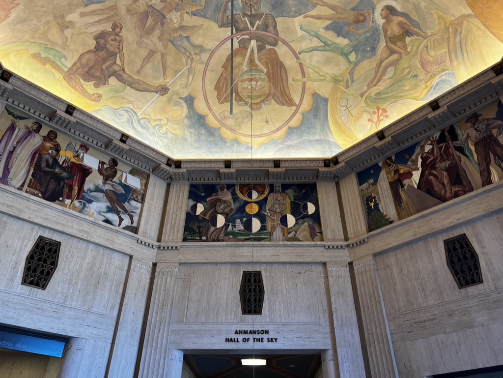

1. Overall Rating (0–10) — 8.0
This photograph captures the grandeur and spiritual ambition of the Ahmanson Hall of the Sky with a striking sense of reverence and scale. The upward gaze emphasizes the opulent frescoes and the intricate interplay of myth and science on the ceiling, evoking awe and wonder. While the image is rich in detail and atmosphere, the slightly low-angle perspective and ambient lighting reduce the clarity of some lower mural panels, preventing it from achieving complete visual harmony.
2. Composition (0–10) — 8.0
The framing effectively draws the eye upward toward the central ceiling fresco, using the vertical symmetry of the hall to create a sense of balance and reverence. The placement of the entrance sign grounds the image, while the surrounding murals add narrative depth and visual interest around the periphery.
3. Lighting (0–10) — 6.5
The ambient light is soft and diffused, enhancing the warmth of the ceiling frescoes and casting subtle shadows that add dimension to the architectural elements. However, the lower walls and murals appear underexposed, with some areas lost in shadow, reducing overall visibility and contrast.
4. Color & Tone (0–10) — 8.0
The palette is rich and warm, with golden yellows and earthy tones dominating the ceiling, creating a luminous, celestial atmosphere. The contrast between the vibrant frescoes and the muted gray stone of the walls enhances the visual drama, while the cool blue of the entrance sign provides a subtle counterpoint.
5. Creativity (0–10) — 8.5
The photograph captures not just a space, but a narrative—of human aspiration, cosmology, and artistic legacy. The composition and perspective emphasize the building’s intended grandeur, transforming a simple architectural record into a meditative visual homage.
6. Technical Quality (0–10) — 7.5
The image is sharp and detailed, particularly in the ceiling fresco, with good focus and clarity. However, uneven exposure and slight underexposure in the lower portion slightly compromise technical precision.
7. Emotional Impact (0–10) — 8.0
The photograph evokes a profound sense of wonder and contemplation, inviting the viewer to reflect on humanity’s place in the cosmos. The scale and artistry of the hall, captured with reverence, resonate deeply, creating a moment of quiet awe.
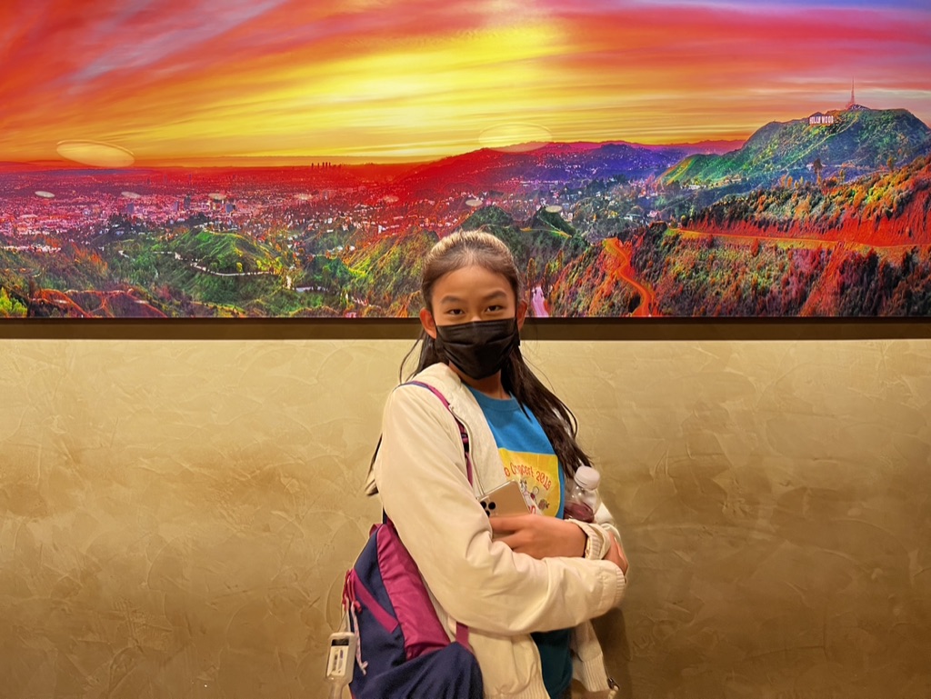

1. Overall Rating (0–10) — 6.0
This photograph captures a moment of personal travel, with the subject posing in front of a vibrant, stylized mural of the Hollywood Hills. The image's strength lies in its bold color palette and the playful contrast between the real-world subject and the hyper-saturated backdrop. While the composition and lighting are straightforward, the artificiality of the scene gives it a slightly surreal quality that invites curiosity. The photo feels more like a souvenir than a fine art piece, but it effectively conveys the experience of visiting a tourist landmark.
2. Composition (0–10) — 6.5
The subject is well-centered and clearly the focal point, with the mural providing a dramatic, expansive background. The horizontal division between the textured wall and the panoramic image creates a layered effect, though the framing feels slightly off-kilter, with the mural extending beyond the top edge and the subject slightly cropped at the bottom.
3. Lighting (0–10) — 7.0
The lighting is even and bright, likely from an indoor source, which illuminates the subject clearly while preserving the vivid colors of the mural. The light is neutral and functional, with no dramatic shadows, allowing the saturated background to dominate the visual experience.
4. Color & Tone (0–10) — 8.0
The image is striking for its use of color—fiery reds, yellows, and oranges in the sky contrast dramatically with the cool greens and purples of the hills. The warm tone of the wall complements the mural’s glow, creating a cohesive, if artificial, atmosphere. The intensity of the colors gives the scene a dreamlike, almost digital quality.
5. Creativity (0–10) — 6.5
The concept is imaginative in its juxtaposition of a real person against a stylized, oversized backdrop, creating a sense of place and memory. While the idea is not groundbreaking, the choice to frame the subject within such a vibrant, surreal landscape adds a layer of whimsy and storytelling.
6. Technical Quality (0–10) — 7.5
The image is sharp and well-focused, with clean details in both the subject and the mural. The resolution is high, and there is no noticeable noise or blur, indicating good technical execution for a casual snapshot.
7. Emotional Impact (0–10) — 5.5
The photograph evokes a sense of travel and nostalgia, capturing a moment of personal experience. However, the emotional resonance is tempered by the artificiality of the setting and the subject’s neutral expression, which keeps the viewer from fully connecting with the moment.
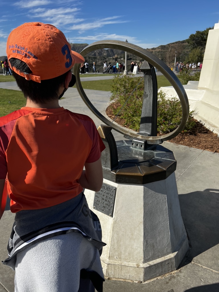

1. Overall Rating (0–10) — 7.0
This photograph captures a quiet moment of curiosity, where a child observes a sundial in a sun-drenched park, evoking a sense of wonder and timelessness. The natural lighting and candid composition lend authenticity, while the contrast between the vibrant orange cap and the muted tones of the monument create a subtle visual rhythm. The image succeeds in blending personal narrative with public space, though the background activity slightly distracts from the central focus.
2. Composition (0–10) — 6.5
The child is framed off-center, creating a dynamic sense of movement toward the sundial, which serves as a natural focal point. However, the background crowd and distant structures introduce visual clutter, slightly undermining the composition’s clarity and balance.
3. Lighting (0–10) — 8.5
Bright, natural sunlight enhances the scene with sharp shadows and clear definition, highlighting the textures of the stone monument and the child’s clothing. The high contrast between light and shadow adds depth and reinforces the midday setting.
4. Color & Tone (0–10) — 7.0
The warm orange of the cap and shirt creates a strong visual anchor against the neutral tones of the stone and pavement. The blue sky adds a cool counterpoint, resulting in a balanced, natural palette that feels both vivid and grounded.
5. Creativity (0–10) — 7.5
The image captures a thoughtful, narrative moment—childhood exploration in a space of historical and scientific significance. The juxtaposition of the modern, casual attire with the classical design of the sundial adds conceptual depth, suggesting a bridge between past and present.
6. Technical Quality (0–10) — 8.0
The photograph is sharp and well-focused, with clean detail in both the foreground subject and the background. Exposure is well-managed, preserving texture and color without overexposure or loss of detail.
7. Emotional Impact (0–10) — 7.0
The image evokes a sense of innocence and discovery, inviting the viewer to reflect on the passage of time and the way we engage with history. While emotionally resonant, the lack of a more intimate connection to the child limits the depth of emotional immersion.
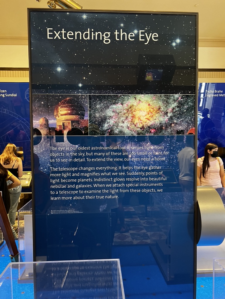

1. Overall Rating (0–10) — 5.8
This image captures a museum exhibit titled "Extending the Eye," conveying an educational narrative about telescopes and astronomy. The display is informative and visually rich, with a strong thematic focus on celestial observation. However, the photograph feels slightly overexposed and cluttered by reflections and surrounding visitors, which detract from the clarity and elegance of the exhibit. While the content is compelling, the execution in the image fails to fully capture the intended wonder of the subject.
2. Composition (0–10) — 5.0
The central exhibit dominates the frame, but the inclusion of people and reflections on the glass panel creates visual distractions. The composition is centered, but the surrounding elements disrupt the balance and draw attention away from the main text and imagery.
3. Lighting (0–10) — 5.5
The lighting is bright and even, likely from overhead museum fixtures, but it causes glare on the glass and washes out some of the text. While the scene is well-lit, the quality of light lacks subtlety, reducing the depth and mood of the display.
4. Color & Tone (0–10) — 6.0
The deep blues and starry backdrop create a cosmic atmosphere, but the color palette is somewhat flat due to overexposure. The contrast between the dark background and white text is strong, but the reflections and lighting reduce the richness of the tones.
5. Creativity (0–10) — 6.5
The exhibit itself is creatively designed, using a mix of text, imagery, and thematic visuals to engage visitors. The photograph, however, is more documentary than artistic, failing to elevate the inherent creativity of the display.
6. Technical Quality (0–10) — 6.5
The image is generally sharp and focused, with clear text and legible details. However, the reflections on the glass and slight overexposure reduce overall technical polish, particularly in the darker areas of the display.
7. Emotional Impact (0–10) — 5.0
The image conveys a sense of curiosity and discovery, but the visual clutter and lack of atmospheric depth prevent it from evoking a strong emotional response. The viewer is more likely to feel informed than inspired.
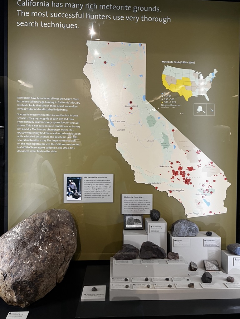

1. Overall Rating (0–10) — 7.0
This museum exhibit effectively communicates the science and culture of meteorite hunting in California, blending informative text with tangible artifacts to create an educational narrative. The large meteorite specimen grounds the display in physical reality, while the map and curated specimens lend a sense of scale and discovery. The lighting, though functional, slightly flattens the depth of the scene, and the cluttered layout risks overwhelming the viewer with information, but the overall impact remains engaging and informative.
2. Composition (0–10) — 6.0
The arrangement feels slightly overcrowded, with the large meteorite on the left competing for attention with the central display and text. The diagonal flow from the meteorite to the map creates a natural visual path, but the scattered placement of smaller specimens and signage disrupts balance, making the scene feel more like a collection than a cohesive composition.
3. Lighting (0–10) — 6.5
The lighting is adequate but not dramatic, with overhead fixtures casting a neutral, even glow that illuminates the exhibits clearly. While the text and map are legible, the lack of directional or accent lighting reduces the visual drama of the meteorite specimens and fails to highlight their textures and forms.
4. Color & Tone (0–10) — 6.0
The palette is dominated by earthy browns, grays, and muted greens, which align well with the geological theme. However, the colors lack vibrancy and contrast, resulting in a subdued tone that, while appropriate, doesn’t elevate the visual appeal of the exhibit.
5. Creativity (0–10) — 7.0
The integration of a large meteorite with a detailed map and curated specimens creates a compelling narrative about discovery and science. The inclusion of historical context, such as the Bruceville Meteorite story, adds depth, and the display effectively turns a scientific topic into a tangible story, though it remains firmly within the conventions of museum curation.
6. Technical Quality (0–10) — 7.5
The image is sharp and well-focused, with clear detail in the meteorites and readable text. The lighting is consistent, and there are no visible technical flaws such as blur or noise, though the slight glare on the glass panel detracts slightly from clarity.
7. Emotional Impact (0–10) — 6.5
The exhibit evokes curiosity and wonder about extraterrestrial objects and human exploration, but the clinical presentation limits emotional resonance. While it informs, it doesn’t deeply engage the viewer’s imagination or evoke awe, keeping the experience more intellectual than visceral.
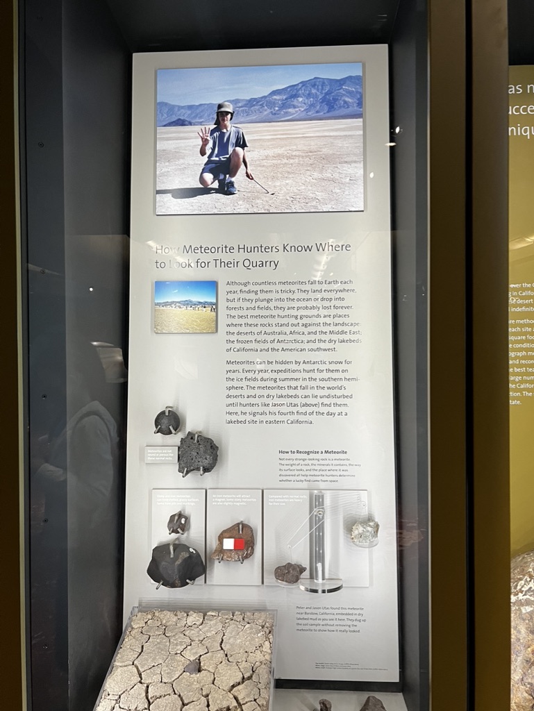

1. Overall Rating (0–10) — 6.0
This photograph captures a museum exhibit with a clear educational purpose, showcasing meteorite hunting and identification in an accessible, informative way. The display effectively blends narrative, artifacts, and visuals to convey scientific discovery, though its documentary nature limits artistic flair. While the composition is functional and informative, it lacks the visual dynamism to elevate the image beyond a straightforward record of an exhibit.
2. Composition (0–10) — 6.0
The framing centers the exhibit panel, creating a balanced view, but the inclusion of reflections and surrounding display cases introduces visual clutter. The vertical format emphasizes the exhibit’s layout, but the lack of a clear focal point weakens the overall impact.
3. Lighting (0–10) — 5.5
Even, ambient museum lighting illuminates the display adequately but without depth or mood. The reflections on the glass and the flatness of the light reduce visual interest and obscure some text and artifacts.
4. Color & Tone (0–10) — 5.0
The palette is dominated by neutral whites, grays, and browns, reflecting the clinical nature of the exhibit. The lack of vibrancy or contrast gives the image a subdued, almost sterile feel, which aligns with the setting but diminishes emotional engagement.
5. Creativity (0–10) — 6.0
The image functions as a straightforward documentation of an educational display, with a clear narrative arc. While the subject matter—meteorite hunting—is inherently intriguing, the execution remains conventional, prioritizing clarity over artistic interpretation.
6. Technical Quality (0–10) — 7.0
The image is sharp and well-focused, with clean details visible in the text and meteorite specimens. However, reflections on the glass and slight overexposure in the top photo reduce technical polish.
7. Emotional Impact (0–10) — 5.5
The photograph conveys curiosity and wonder about space and discovery, but the cold, institutional environment and lack of human presence in the foreground keep the viewer at a distance. It invites intellectual engagement more than emotional resonance.
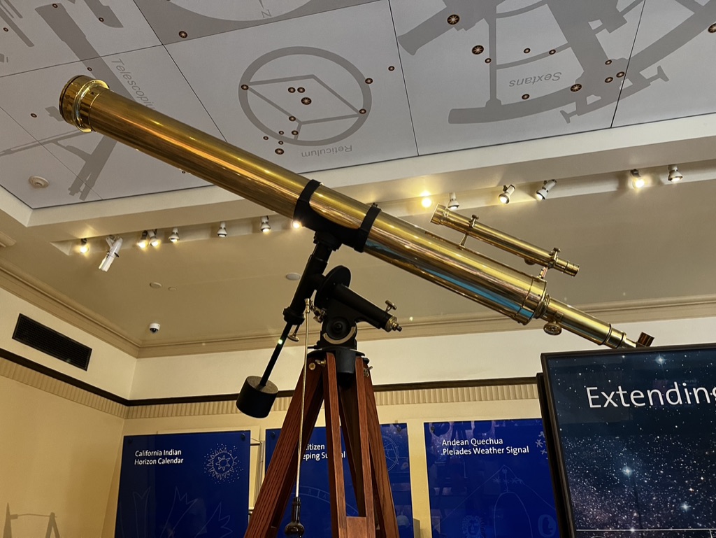

1. Overall Rating (0–10) — 7.0
This photograph captures the quiet elegance of a vintage telescope in a museum setting, where history and science converge. The golden brass of the instrument gleams under warm gallery lighting, drawing the eye to its intricate craftsmanship, while the surrounding educational displays subtly contextualize its significance. Though the composition feels slightly cluttered by the surrounding signage, the image succeeds in evoking a sense of curiosity and reverence for astronomical heritage.
2. Composition (0–10) — 6.5
The telescope is well-framed diagonally, creating a dynamic line that leads the eye through the image. However, the background elements—such as the informational panels and ceiling fixtures—compete for attention, slightly disrupting visual harmony.
3. Lighting (0–10) — 7.5
Warm, directional spotlights enhance the reflective surfaces of the telescope, accentuating its metallic texture and craftsmanship. The ambient light is evenly distributed, avoiding harsh shadows while maintaining a museum-like atmosphere.
4. Color & Tone (0–10) — 7.0
The golden brass contrasts beautifully with the cool blue of the background panels and the neutral cream of the walls, creating a balanced and visually engaging palette. The warm tones of the wood tripod further ground the image in a sense of time and tradition.
5. Creativity (0–10) — 6.5
The image functions as a strong documentary portrait of a scientific artifact, but its creativity is limited by its straightforward, observational approach. The narrative is clear but lacks a deeper conceptual or artistic layer.
6. Technical Quality (0–10) — 8.0
Sharp focus and clean detail are evident in the telescope’s surface and the surrounding signage. The depth of field is appropriately managed, keeping the main subject crisp while softly blurring the background.
7. Emotional Impact (0–10) — 6.5
The photograph evokes a quiet sense of wonder and respect for scientific history, inviting the viewer to reflect on humanity’s quest to understand the cosmos. While emotionally resonant, the connection is subtle and requires context to fully appreciate.
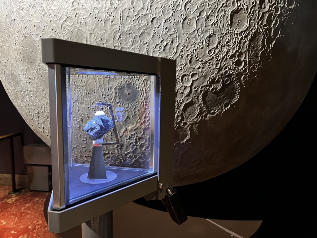

1. Overall Rating (0–10) — 7.0
This photograph captures a compelling juxtaposition of cosmic scale and human artifact, evoking a sense of wonder through the contrast between the massive lunar replica and the delicate, preserved meteorite. The lighting enhances the texture of the moon’s surface and the specimen’s form, grounding the scene in both science and awe. While the composition is strong, the framing feels slightly awkward, pulling focus away from the intended narrative of discovery.
2. Composition (0–10) — 6.0
The large moon dominates the frame, creating a strong backdrop, but the placement of the display case slightly off-center and the visible lock on the side disrupt visual harmony. A tighter crop would better emphasize the relationship between the artifact and its celestial context.
3. Lighting (0–10) — 7.5
The display case is illuminated with a cool, focused light that highlights the meteorite, creating a sense of importance and reverence. The ambient lighting on the moon’s surface is soft and directional, enhancing its craggy texture without overpowering the subject.
4. Color & Tone (0–10) — 6.5
The palette is largely neutral—grays and metallics dominate—creating a clinical, museum-like atmosphere. The subtle blue tint from the display adds a touch of otherworldliness, though the overall tone remains subdued and lacks dynamic contrast.
5. Creativity (0–10) — 7.0
The image effectively uses scale and context to tell a story of space exploration and scientific preservation. The inclusion of the moon as a backdrop transforms a simple exhibit into a symbolic narrative, elevating the photograph beyond mere documentation.
6. Technical Quality (0–10) — 8.0
Sharp focus on the meteorite and the display case is well-executed, with clean edges and minimal noise. The depth of field correctly isolates the subject, and the lighting is controlled and intentional.
7. Emotional Impact (0–10) — 7.5
The image stirs curiosity and reverence, inviting the viewer to contemplate humanity’s connection to the cosmos. The quiet focus on the preserved rock, framed by the vastness of the moon, evokes a sense of humility and wonder.
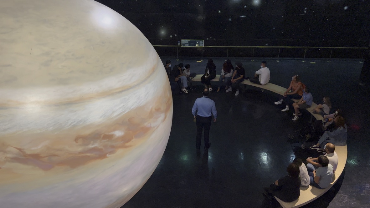

1. Overall Rating (0–10) — 7.0
This photograph captures a mesmerizing blend of science and human wonder, with a colossal model of Jupiter dominating the frame and drawing the viewer into an immersive educational experience. The scale and realism of the planet create a sense of awe, while the seated audience and guide ground the scene in human curiosity. The dark, star-dusted backdrop enhances the cosmic mood, though the composition’s slight imbalance and flat lighting prevent it from achieving greater visual depth.
2. Composition (0–10) — 6.5
The large, left-side placement of Jupiter creates a strong visual anchor, but the off-center subject and asymmetrical framing result in a slightly unbalanced composition. The curved bench and circular arrangement of the audience help guide the eye, but the low vantage point and cluttered foreground reduce spatial clarity.
3. Lighting (0–10) — 6.0
The lighting is functional but lacks dramatic contrast; the overhead illumination is even and flat, which preserves detail but diminishes the atmospheric quality of the scene. The reflections on the floor add subtle texture, but the absence of directional or ambient lighting limits mood and depth.
4. Color & Tone (0–10) — 7.0
The warm, earthy tones of Jupiter—creams, browns, and soft oranges—stand out against the cool, dark backdrop of the space. The color palette feels authentic and immersive, with the deep black of the room enhancing the planet’s visual presence. However, the overall tonal range is somewhat compressed, reducing the impact of contrast.
5. Creativity (0–10) — 7.5
The concept of placing a massive planetary model within a museum or exhibit space is inherently imaginative and evocative. The juxtaposition of the vast and the intimate—planet and people—creates a powerful narrative of exploration and discovery. The high-angle perspective adds a sense of grandeur and observational detachment.
6. Technical Quality (0–10) — 7.5
The image is sharp and well-focused, with clean detail visible on the planet’s surface and in the audience. The camera appears to be well-handled, capturing the scene with clarity and minimal noise. The slight distortion at the edges suggests a wide-angle lens, which is appropriate for the context.
7. Emotional Impact (0–10) — 7.0
The photograph evokes a sense of wonder and intellectual curiosity, inviting the viewer to imagine standing in that space, dwarfed by the scale of Jupiter. The presence of the audience and guide adds a human element that makes the experience feel relatable and shared, fostering a quiet awe rather than an overwhelming emotional surge.
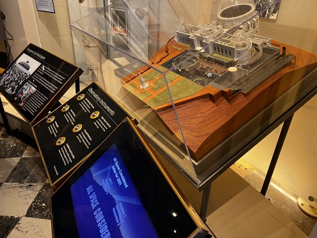

1. Overall Rating (0–10) — 6.0
This photograph captures a museum exhibit with a detailed architectural model of an observatory, surrounded by interpretive panels and a digital display. The scene conveys a sense of educational intent, with information layered across multiple mediums. While the composition effectively communicates the exhibit’s purpose, the cluttered arrangement and uneven lighting reduce its visual coherence, making it feel more like a documentation than a compelling image.
2. Composition (0–10) — 5.5
The frame is angled, with overlapping elements creating visual tension. The model sits slightly off-center, and the angled display panels and digital screen introduce competing focal points, disrupting balance.
3. Lighting (0–10) — 5.0
Warm ambient lighting casts soft shadows, but the overhead lights create glare on the glass case and uneven exposure across the scene, diminishing clarity in certain areas.
4. Color & Tone (0–10) — 5.5
The palette is dominated by muted browns, blacks, and grays, with the blue screen offering a cool contrast. The color harmony is functional but lacks vibrancy or emotional depth.
5. Creativity (0–10) — 5.5
The image documents a complex exhibit with multiple informational layers, but it does not transcend its documentary function. The approach is straightforward, with little sense of narrative or artistic interpretation.
6. Technical Quality (0–10) — 6.5
The image is sharp and well-focused, with clear text on the panels and readable screen content. However, reflections on the glass and slight overexposure in the ceiling light detract from overall quality.
7. Emotional Impact (0–10) — 5.0
The scene feels informative but emotionally neutral. While it invites curiosity about the observatory’s design, it does not evoke wonder, awe, or introspection—more a sense of observation than connection.
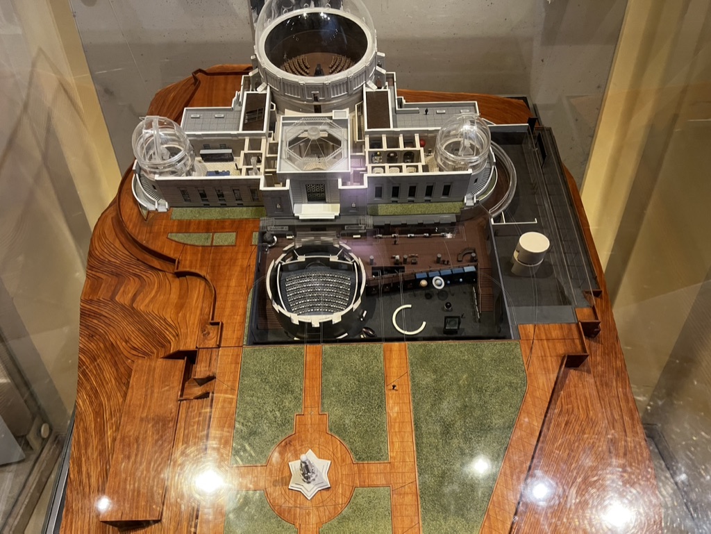

1. Overall Rating (0–10) — 7.0
This photograph presents a meticulously crafted architectural model of a complex scientific facility, capturing both its structural intricacy and spatial harmony. The overhead perspective reveals a thoughtful design, with clean lines and layered components that suggest purpose and precision. While the model itself is visually compelling, the reflections on the glass case and slightly cluttered framing detract from the clarity and elegance of the subject.
2. Composition (0–10) — 6.5
The top-down framing emphasizes the model’s symmetry and layout, though the inclusion of the surrounding glass reflections and edges of the case introduces visual noise. The subject is centered, but the frame feels slightly unbalanced due to the uneven border of the wooden base and the intrusion of reflections.
3. Lighting (0–10) — 6.0
The lighting is bright and even, illuminating the model effectively, but the overhead glare from the glass case creates distracting reflections. The light appears to be artificial and diffused, which helps preserve detail but lacks directional warmth or mood.
4. Color & Tone (0–10) — 6.5
The palette is grounded in natural tones—warm wood, muted grays, and soft green—creating a cohesive and professional aesthetic. However, the lack of contrast and the overexposed highlights from reflections reduce the depth and richness of the color presentation.
5. Creativity (0–10) — 7.5
The image captures a rare and detailed subject—architectural modeling—offering insight into design and engineering. The choice to photograph the model through glass adds a layer of realism, suggesting a museum or exhibition context. While the execution is straightforward, the subject matter itself carries inherent creative and intellectual interest.
6. Technical Quality (0–10) — 7.0
The image is sharp and well-focused, with clear detail visible in the model’s intricate components. However, the reflections on the glass and minor lens flare slightly compromise technical clarity, indicating the challenges of photographing through a protective enclosure.
7. Emotional Impact (0–10) — 6.5
The photograph evokes a sense of curiosity and reverence for scientific and architectural achievement. The precision of the model invites contemplation of scale, design, and function, though the clinical presentation and reflective barriers limit deeper emotional connection.
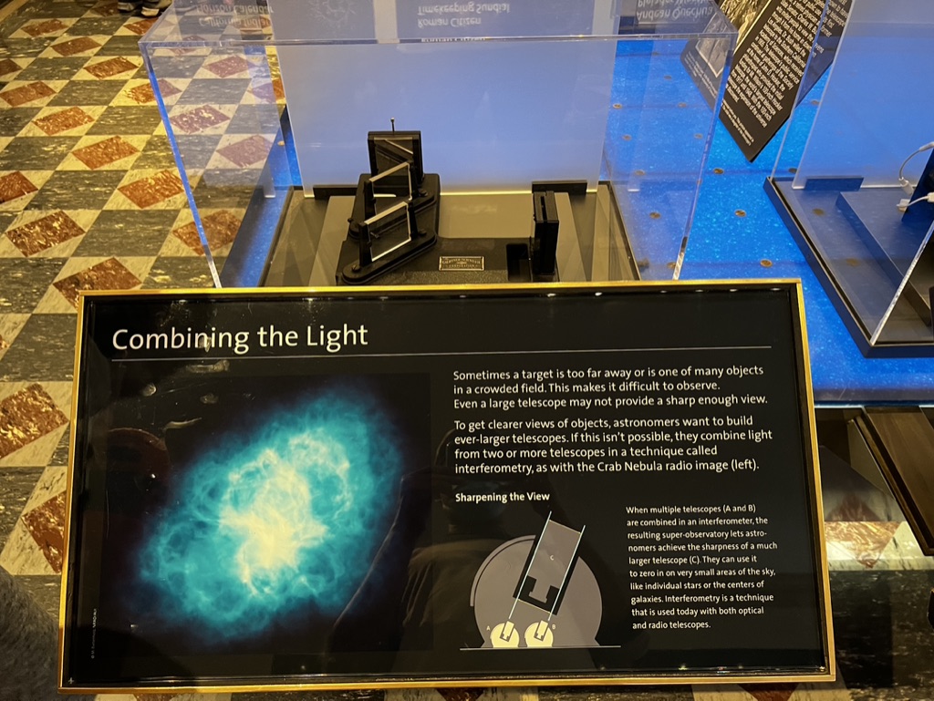

1. Overall Rating (0–10) — 6.0
This photograph captures a museum exhibit explaining astronomical interferometry, blending scientific instruction with visual storytelling. The display’s informative layout and striking image of the Crab Nebula provide a compelling educational moment, though the cluttered surrounding environment and reflective surfaces detract from its clarity. While the content is strong and conceptually rich, the execution feels slightly overwhelmed by its context, limiting its aesthetic and emotional resonance.
2. Composition (0–10) — 6.5
The exhibit sign is well-framed and centered, drawing attention to the educational content. However, the surrounding glass cases, reflections, and patterned floor create visual noise, disrupting the clean narrative flow and pulling focus from the main subject.
3. Lighting (0–10) — 6.0
The lighting is functional but uneven—bright overhead illumination creates glare on the glass cases and obscures parts of the text. The blue ambient lighting in the background adds mood but also contributes to the visual clutter, reducing contrast and legibility.
4. Color & Tone (0–10) — 6.5
The dominant blue of the Crab Nebula image provides a striking focal point, contrasting with the neutral tones of the exhibit and floor. The color palette is balanced but lacks vibrancy in the surrounding areas, where reflections and dim lighting dull the overall effect.
5. Creativity (0–10) — 6.0
The integration of scientific explanation with a visually arresting astronomical image demonstrates creative educational intent. However, the presentation is constrained by its museum environment, limiting originality in framing and visual storytelling.
6. Technical Quality (0–10) — 7.0
The image is sharp and well-focused, with clear text and detailed graphics. However, reflections and glare from the glass cases reduce clarity in certain areas, and the composition is hindered by the physical setup.
7. Emotional Impact (0–10) — 5.5
The photograph evokes curiosity and wonder about the cosmos, particularly through the vivid Nebula image. Yet, the clinical, cluttered setting and technical nature of the exhibit keep the emotional connection at a distance, making the experience more informative than deeply moving.
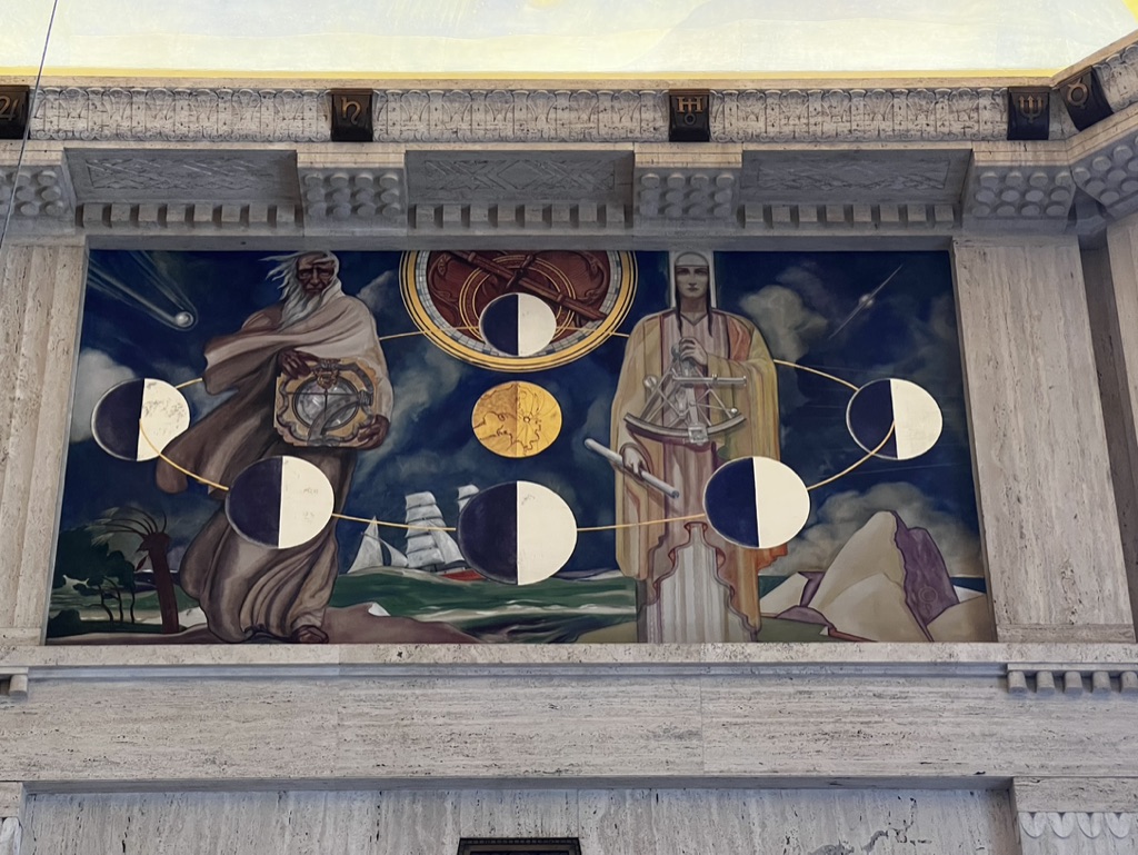

1. Overall Rating (0–10) — 7.8
This mural radiates a sense of grandeur and intellectual reverence, capturing the intersection of science, mythology, and human exploration. The composition draws the viewer into a symbolic narrative, with rich iconography and a balanced arrangement that speaks to both historical and cosmic themes. While the photograph’s framing feels slightly compressed, the mural itself is a compelling fusion of art and science, inviting contemplation and discovery.
2. Composition (0–10) — 8.0
The mural is framed symmetrically within the architectural structure, creating a strong sense of balance and order. The central figures and celestial motifs are arranged with deliberate harmony, guiding the eye across the narrative. The use of space within the painting effectively separates symbolic elements while maintaining visual unity.
3. Lighting (0–10) — 6.5
Natural light illuminates the mural evenly, preserving the depth and texture of the painted surface. However, the lighting is somewhat flat, lacking dramatic shadows or highlights that might enhance the mural’s three-dimensional quality. The overhead illumination softens the contrast between the figures and the dark sky, slightly muting the overall impact.
4. Color & Tone (0–10) — 7.5
The palette is rich and deliberate, with deep blues, golds, and earthy tones that evoke a sense of timelessness. The contrast between the luminous celestial bodies and the somber figures enhances the mystical atmosphere. While the colors are well-integrated, the overall tone leans slightly toward the subdued, limiting the vibrancy of the scene.
5. Creativity (0–10) — 8.5
The mural is a masterful synthesis of allegory and scientific symbolism, blending historical figures with astronomical imagery in a way that feels both poetic and educational. The creative use of the moon phases, instruments, and maritime elements tells a layered story of discovery, making the work not only visually striking but conceptually profound.
6. Technical Quality (0–10) — 7.0
The photograph captures the mural with clarity and precision, rendering the details of the figures and inscriptions clearly visible. The focus is sharp across the frame, and the wide-angle perspective, while slightly distorting the edges, allows the entire composition to be included. Minor lens distortion is present but does not detract significantly from the overall quality.
7. Emotional Impact (0–10) — 8.0
The mural evokes a sense of awe and intellectual curiosity, inspiring reflection on humanity’s quest for knowledge. The solemn figures and cosmic imagery create a meditative mood, inviting the viewer to contemplate the vastness of time and the enduring pursuit of understanding. The emotional resonance lies in its timeless, almost sacred quality.
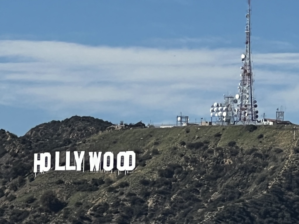

1. Overall Rating (0–10) — 6.0
This photograph captures the iconic Hollywood Sign under a vast sky, juxtaposed with a modern communications tower, creating a striking contrast between cultural symbol and technological infrastructure. While the image effectively conveys the landmark’s presence, the composition feels slightly disjointed, with the tower’s intrusion into the frame undermining the sign’s romanticized aura. The lighting is bright but lacks subtlety, and the overall mood leans more documentary than evocative, offering a realistic snapshot rather than a poetic interpretation.
2. Composition (0–10) — 6.0
The Hollywood Sign is well-framed and centered in the lower half, drawing immediate attention, but the tower on the right introduces a visual imbalance, disrupting the harmony of the natural landscape. The diagonal slope of the hill adds dynamic movement, yet the composition feels crowded due to the inclusion of the communications equipment.
3. Lighting (0–10) — 7.0
The scene is illuminated by bright, even daylight, allowing for clear visibility of the sign and surrounding terrain. The light enhances the contrast between the white letters and the green-brown hillside, though the sky’s scattered clouds soften the overall intensity, preventing harsh shadows.
4. Color & Tone (0–10) — 6.0
The color palette is natural and restrained, dominated by the earthy greens and browns of the hillside and the pale blue of the sky. The white of the sign stands out effectively, but the overall tone lacks vibrancy, giving the image a slightly muted, almost desaturated quality.
5. Creativity (0–10) — 6.0
The juxtaposition of the Hollywood Sign with the communications tower introduces a thought-provoking narrative about modernity encroaching on cultural icons. While the concept is strong, the execution remains literal, with little artistic manipulation or interpretive depth.
6. Technical Quality (0–10) — 7.0
The image is sharp and well-focused, with clear details visible in both the sign and the tower. The exposure is balanced, with no significant overexposed or underexposed areas, and the resolution is high enough to capture the textures of the hillside and structures.
7. Emotional Impact (0–10) — 5.5
The photograph evokes a sense of nostalgia for the classic Hollywood image, but the presence of the tower introduces a subtle tension that dampens the romanticism. It feels more like a factual observation than an emotional journey, leaving the viewer with a sense of distance rather than connection.
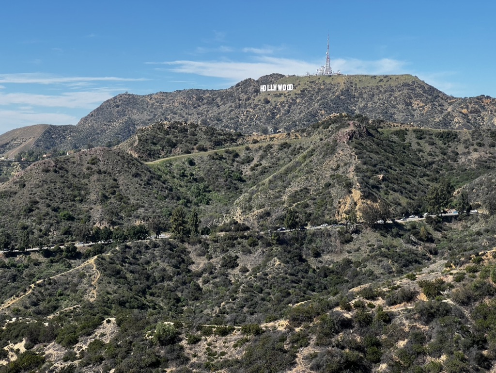

1. Overall Rating (0–10) — 7.0
This photograph captures the iconic Hollywood Sign under a vast, clear sky, evoking a sense of American cultural mythology and geographic grandeur. The expansive view balances natural ruggedness with man-made symbolism, creating a visually resonant image that feels both familiar and majestic. While the scene is well-composed and rich in context, the lack of human presence or dynamic lighting tempers its emotional immediacy.
2. Composition (0–10) — 7.5
The Hollywood Sign is centered atop the hill, serving as a strong focal point, while the winding roads and layered hills create depth and lead the eye into the frame. The natural diagonal lines of the terrain enhance visual movement without disrupting balance.
3. Lighting (0–10) — 8.0
Bright, even daylight illuminates the landscape, highlighting textures in the brush and hills. The clear blue sky and soft shadows suggest midday sun, which enhances clarity and contrast without overexposing key elements.
4. Color & Tone (0–10) — 7.5
The palette is dominated by earthy greens and browns of the chaparral, contrasted against the crisp white of the sign and the deep blue of the sky. The colors feel authentic and harmonious, with sufficient saturation to convey vitality without appearing oversaturated.
5. Creativity (0–10) — 6.5
The image is a classic, widely recognized view, which limits its originality. However, the thoughtful framing and timing offer a fresh perspective on a well-worn subject, suggesting an intention to capture the place as a cultural icon rather than just a tourist snapshot.
6. Technical Quality (0–10) — 8.0
The image is sharp and well-focused throughout, with clean detail in both the foreground and background. The exposure is balanced, and there are no noticeable artifacts or distractions.
7. Emotional Impact (0–10) — 7.0
The photograph evokes a sense of awe and nostalgia, tapping into the aspirational energy associated with Hollywood. While it doesn’t stir deep personal emotion, it resonates with a broad cultural memory, inviting contemplation of fame, ambition, and landscape.
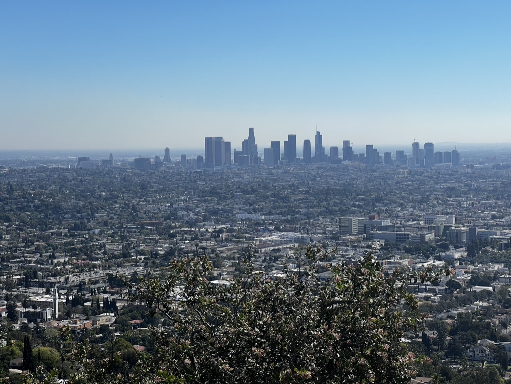

1. Overall Rating (0–10) — 7.0
This panoramic view of Los Angeles captures the city’s vast sprawl with a striking sense of scale and atmospheric depth. The clear blue sky and distant skyline create a serene, almost meditative mood, while the foreground foliage adds a natural frame that grounds the composition. The image succeeds in conveying the city’s immense reach, though the hazy atmosphere slightly softens the visual impact of the downtown core.
2. Composition (0–10) — 7.5
The wide-angle perspective effectively captures the expansive urban landscape, with the tree branch in the foreground providing depth and a natural leading edge. The skyline is centered and balanced, though the sheer density of the midground could benefit from tighter framing to emphasize key architectural forms.
3. Lighting (0–10) — 8.0
Bright, even daylight enhances clarity and definition across the scene, with the sun high in the sky creating minimal shadows. The soft haze adds a layer of atmospheric diffusion, giving the distant skyscrapers a dreamlike quality while maintaining visibility.
4. Color & Tone (0–10) — 7.0
The palette is dominated by cool blues and muted grays, reflecting the urban environment and hazy air. While the colors are natural and harmonious, they lack vibrancy, which slightly diminishes the visual energy of the scene.
5. Creativity (0–10) — 6.5
The image is more documentary than conceptual, capturing a familiar vista with a sense of place rather than a unique artistic vision. However, the thoughtful use of foreground framing and atmospheric haze adds a layer of quiet contemplation.
6. Technical Quality (0–10) — 8.0
The photograph is sharp and well-exposed, with clean detail across the cityscape and a clear distinction between foreground, midground, and background. The lack of noise and consistent focus suggest a high level of technical execution.
7. Emotional Impact (0–10) — 6.5
The image evokes a sense of awe at the scale of urban life and a quiet melancholy in the distance between the natural foreground and the concrete expanse. It invites reflection on the relationship between nature and the metropolis, though the emotional resonance remains subtle.


1. Overall Rating (0–10) — 7.0
This photograph captures a classic tourist moment with the Hollywood sign in the background, balancing personal presence with iconic landscape. The subject’s composed stance and sunglasses lend a casual, contemplative air, while the clear blue sky and sunlit hills lend a sense of optimism and openness. Though the image is straightforward and well-framed, it lacks a deeper narrative or emotional nuance, feeling more like a snapshot than a fully realized portrait.
2. Composition (0–10) — 7.0
The subject is centered and well-framed, with the Hollywood sign placed off-center to the left, creating visual balance and reinforcing the location. The foreground railing adds depth, and the layered hills provide a sense of scale, though the subject’s slight proximity to the right edge creates a subtle asymmetry.
3. Lighting (0–10) — 8.0
Bright, natural daylight illuminates the scene evenly, with soft shadows that enhance texture in the hills and the subject’s clothing. The sun’s angle creates a crisp contrast between the white sign and the blue sky, while avoiding harsh glare on the subject’s face.
4. Color & Tone (0–10) — 7.0
The palette is vibrant and well-saturated, with rich blues in the sky and warm earth tones in the hills. The white and gray of the subject’s shirt contrast cleanly with the background, while the green shrubbery adds a touch of natural variation. The overall tone feels bright and inviting.
5. Creativity (0–10) — 6.0
The image is conceptually familiar, leveraging a widely recognized landmark to create a personal connection. While it effectively captures a moment of place and identity, it doesn’t push beyond the conventional travel portrait—its strength lies in clarity, not innovation.
6. Technical Quality (0–10) — 8.0
The image is sharp and well-exposed, with clean detail in both the foreground and background. Focus is precise on the subject, and the dynamic range handles the bright sky and shadowed terrain effectively.
7. Emotional Impact (0–10) — 6.5
There’s a quiet sense of fulfillment and pride in the subject’s expression, suggesting a meaningful visit to a place of cultural significance. The emotional resonance is subtle, more reflective than dramatic, but still relatable to anyone who’s stood in awe of a dreamland landmark.
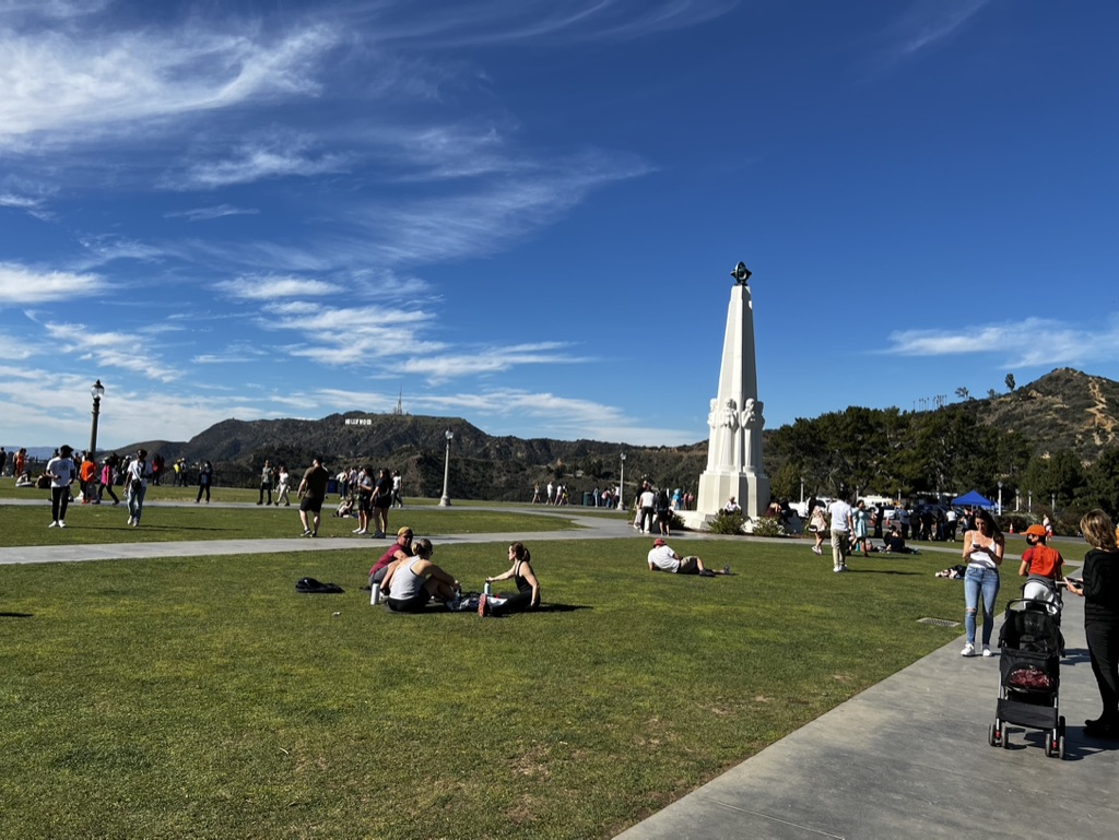

1. Overall Rating (0–10) — 7.0
This photograph captures a vibrant, sun-drenched day at a public park with the iconic Hollywood sign visible in the distance, evoking a sense of leisure and urban connection. The composition balances human activity with a grand, open landscape, and the bright blue sky lends an airy, optimistic tone. While the scene is lively and well-framed, the abundance of people and foreground elements slightly dilutes the focus on the central obelisk, preventing the image from achieving a more cohesive narrative.
2. Composition (0–10) — 7.0
The obelisk is well-positioned to the right, creating visual balance with the open space and the Hollywood sign on the left. The diagonal path leads the eye toward the monument, while the scattered groups of people add rhythm and scale. However, the wide perspective introduces a degree of visual clutter, particularly in the lower-left quadrant.
3. Lighting (0–10) — 8.0
Bright, natural daylight enhances the clarity and vibrancy of the scene, casting soft shadows that define form and depth. The high contrast between the sunlit grass and the deep blue sky creates a dynamic visual effect, reinforcing the image’s sense of warmth and openness.
4. Color & Tone (0–10) — 7.5
The palette is rich and harmonious, with lush green grass, crisp white monument, and deep blue sky creating a pleasing triad. The subtle gradations in the clouds add texture, while the earthy tones of the hills in the background ground the composition. A slight coolness in the overall tone could be adjusted to warm up the sunlit areas.
5. Creativity (0–10) — 7.0
The image successfully captures a moment of communal leisure in a culturally significant location, blending documentary realism with scenic grandeur. The inclusion of the Hollywood sign adds a layer of narrative, transforming the scene into a celebration of place and identity. While not particularly inventive in technique, the concept is strong and relatable.
6. Technical Quality (0–10) — 8.0
The image is sharp and well-exposed, with clean detail across the frame. The focus is consistent, and the dynamic range is effectively managed, preserving details in both the bright sky and shaded areas. There are no visible artifacts or technical flaws.
7. Emotional Impact (0–10) — 7.0
The photograph conveys a sense of joy, relaxation, and shared experience, inviting the viewer to imagine themselves in this sunlit space. The presence of families and friends enjoying the day adds warmth and humanity, while the iconic backdrop gives the scene a touch of aspirational charm. It feels accessible and uplifting, though not emotionally overwhelming.
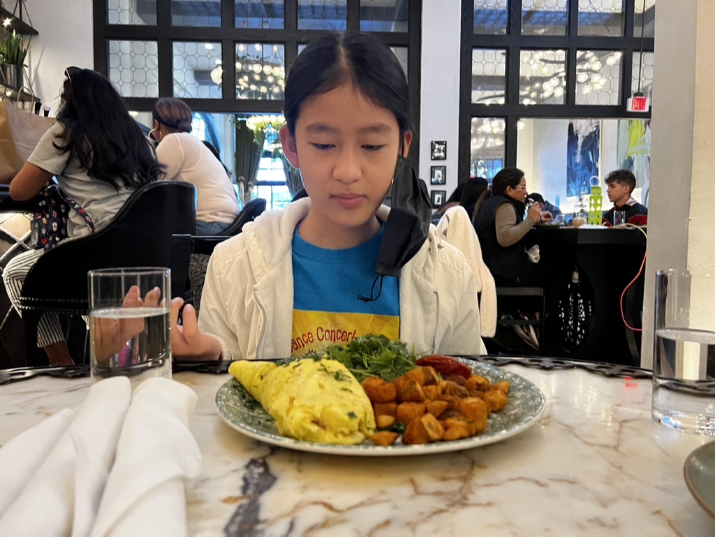

1. Overall Rating (0–10) — 6.8
This photograph captures a quiet, introspective moment in a bustling restaurant, where a young girl’s focused gaze contrasts with the lively background. The composition draws attention to her contemplative expression and the vibrant breakfast spread, creating a subtle narrative of childhood stillness amid urban energy. While the image feels candid and authentic, it lacks the visual polish to fully elevate the scene into something more evocative.
2. Composition (0–10) — 7.0
The subject is well-centered, with the plate of food framing her face and drawing the eye naturally. The background activity adds depth without overwhelming the focal point, though the clutter of chairs and people slightly disrupts the balance.
3. Lighting (0–10) — 6.5
Natural light filters through the windows, creating a soft, even illumination that enhances the scene’s realism. The indoor lighting adds warmth but does little to create dramatic contrast or mood.
4. Color & Tone (0–10) — 6.0
The color palette is balanced, with the yellow omelet and green arugula providing pops of vibrancy against the neutral tones of the marble and clothing. The overall tone is slightly cool, which tempers the warmth of the setting.
5. Creativity (0–10) — 6.5
The image succeeds in capturing a genuine, unposed moment, blending documentary style with narrative potential. The juxtaposition of the girl’s stillness and the surrounding movement adds a layer of quiet storytelling.
6. Technical Quality (0–10) — 7.5
Sharp focus on the subject and plate, with good clarity and detail in the textures of the food and marble. The shallow depth of field helps isolate the main subject effectively.
7. Emotional Impact (0–10) — 6.0
The image evokes a sense of quiet introspection and everyday life, allowing viewers to connect with the moment on a personal level. While emotionally resonant, it stops short of deep emotional engagement due to the lack of heightened visual drama.


1. Overall Rating (0–10) — 6.8
This photograph captures a candid moment of a young boy in a restaurant, his gaze fixed on the camera with quiet intensity, while a hearty breakfast burrito sits before him. The composition feels natural and unposed, with the subject’s neutral expression and the surrounding environment lending a sense of everyday authenticity. While the lighting and framing are adequate, the image’s emotional resonance is slightly muted by the flatness of the background and the lack of dynamic contrast, keeping it from feeling truly cinematic.
2. Composition (0–10) — 6.5
The subject is well-placed off-center, creating visual interest, though the cluttered background and uneven framing of the foreground elements slightly distract from the focal point. The marble table and glass of water anchor the scene, but the composition could benefit from tighter framing to emphasize the subject and his meal.
3. Lighting (0–10) — 6.0
The lighting is bright and even, likely from overhead indoor sources, which illuminates the scene clearly but without depth or mood. The harshness of the overhead lights creates flatness and washes out subtle textures, particularly on the boy’s face and the food.
4. Color & Tone (0–10) — 6.5
The color palette is largely neutral—beige, gray, and black—creating a subdued tone that matches the casual atmosphere. The warm tones of the egg and tortilla in the burrito offer a small point of contrast, but the overall lack of vibrancy keeps the image from feeling visually engaging.
5. Creativity (0–10) — 6.0
The photograph is a strong example of candid storytelling, capturing a quiet, unfiltered moment. While not highly original in its approach, it succeeds in conveying a slice-of-life narrative through its authenticity and natural setting.
6. Technical Quality (0–10) — 7.5
The image is sharp and well-focused on the subject, with clean detail visible in the boy’s face and the food. The exposure is balanced, and there are no significant technical flaws such as blur or noise.
7. Emotional Impact (0–10) — 6.5
The boy’s direct gaze and neutral expression evoke a sense of quiet introspection, inviting the viewer to wonder about his thoughts. The emotional weight is subtle but present, particularly in the contrast between his solemn look and the cheerful meal in front of him.


1. Overall Rating (0–10) — 6.8
This photograph captures a candid moment of everyday life in a bright, modern café, where a young girl sits with her meal amid a bustling environment. The composition balances personal intimacy with the surrounding activity, while the natural light and casual setting lend a sense of authenticity. Though the image is well-framed and clearly composed, it lacks a strong emotional or artistic hook, feeling more like a snapshot than a fully realized portrait.
2. Composition (0–10) — 7.0
The subject is well-placed, with the table and foreground elements leading the eye toward her. The diagonal lines of the table and chairs create a sense of depth, while the background activity adds context without overwhelming the focal point.
3. Lighting (0–10) — 8.0
Natural light floods the space from the large windows, creating a bright, airy atmosphere. The soft, diffused sunlight enhances the scene’s realism and gives the image a warm, inviting quality.
4. Color & Tone (0–10) — 7.0
The palette is lively, with the red chairs providing a bold contrast against the neutral tones of the space. The vibrant bottle of Honest Tea and the red drink add pops of color that draw attention, while the overall tone remains balanced and natural.
5. Creativity (0–10) — 6.5
The image tells a simple story of a child’s day, grounded in realism. While it doesn’t break new visual ground, its strength lies in its authenticity and the subtle narrative of a moment captured in time.
6. Technical Quality (0–10) — 8.0
The focus is sharp on the subject and foreground, with clear details in the food and drink. The depth of field is appropriately managed, allowing the background to remain softly blurred without sacrificing clarity.
7. Emotional Impact (0–10) — 6.0
The image evokes a quiet sense of normalcy and routine, with the girl’s masked face hinting at the broader context of contemporary life. While relatable, it doesn’t strongly stir emotion—more observational than poignant.
Loading map...