The National Museum of Mongolia in Ulaanbaatar is one of the country's national museums, established in 1924. It features exhibits on Stone Age sites, petroglyphs, and burial sites, as well as a collection of costumes, hats, jewelry, and traditional Mongolian culture. The museum also houses real examples of 12th-century Mongol armor, correspondence between Pope Innocent IV and Guyuk Khaan, and artifacts from D Sükhbaatar's life, including his famous hollow horsewhip.
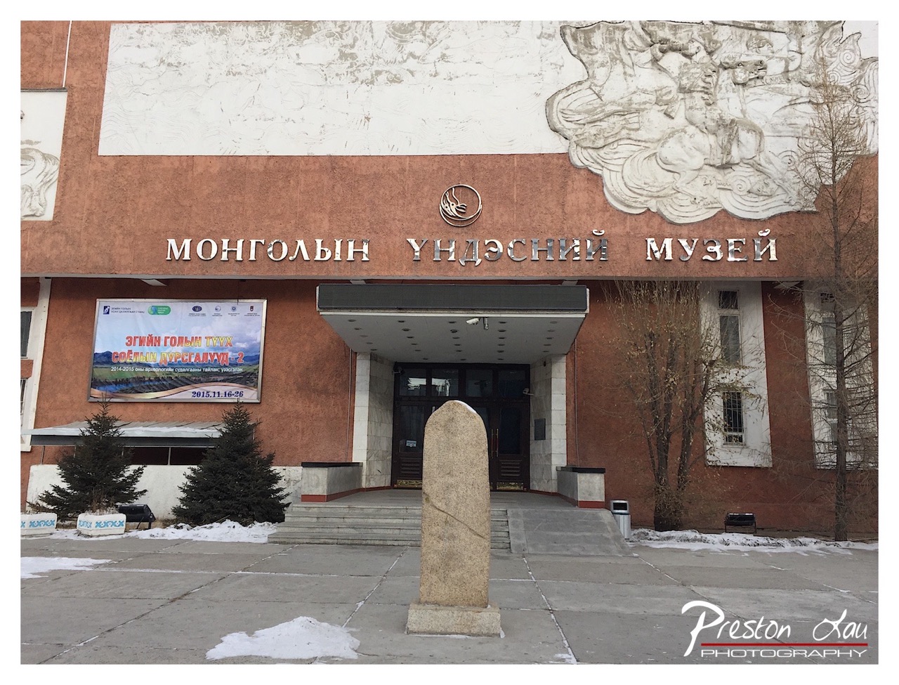

1. Overall Rating (0–10) — 6.0
This photograph captures the stoic presence of the Mongolian National Museum, grounding its cultural weight in a quiet winter stillness. The muted tones and overcast light lend a somber, contemplative mood, though the composition’s straightforwardness keeps it from transcending mere documentation. While the architectural details and sculptural elements offer visual interest, the image lacks dynamic energy, feeling more like a snapshot than a crafted statement.
2. Composition (0–10) — 6.5
The stone stele in the foreground provides a strong vertical anchor, leading the eye toward the central entrance. However, the off-center placement of the main subject and the cluttered left side—due to the banner and shrubs—create a slight imbalance. A tighter crop or more deliberate framing could enhance focus on the museum’s facade.
3. Lighting (0–10) — 5.5
The flat, diffused light of an overcast day softens shadows and reduces texture, creating a muted atmosphere. While this suits the subdued winter setting, it also diminishes the contrast and depth that would highlight the relief sculpture and architectural details.
4. Color & Tone (0–10) — 5.0
The palette is dominated by muted browns, grays, and pale whites, with only slight pops of color from the banner. The lack of vibrancy and warmth gives the image a subdued, almost melancholic tone, which, while consistent with the season, limits visual appeal.
5. Creativity (0–10) — 6.0
The image successfully conveys the museum’s cultural significance through its architectural and sculptural elements, but the approach is conventional. The inclusion of the banner and the photographer’s watermark adds context, but the overall execution remains observational rather than interpretive.
6. Technical Quality (0–10) — 7.5
The image is sharp and well-focused, with clear details in the signage, stone stele, and relief work. The exposure is balanced, and the digital clarity is strong, allowing for fine texture to be visible despite the overcast conditions.
7. Emotional Impact (0–10) — 5.5
The photograph evokes a sense of quiet dignity and cultural endurance, but the lack of dramatic lighting or emotional resonance keeps the viewer at a distance. The stillness of the scene feels respectful, but not deeply moving.
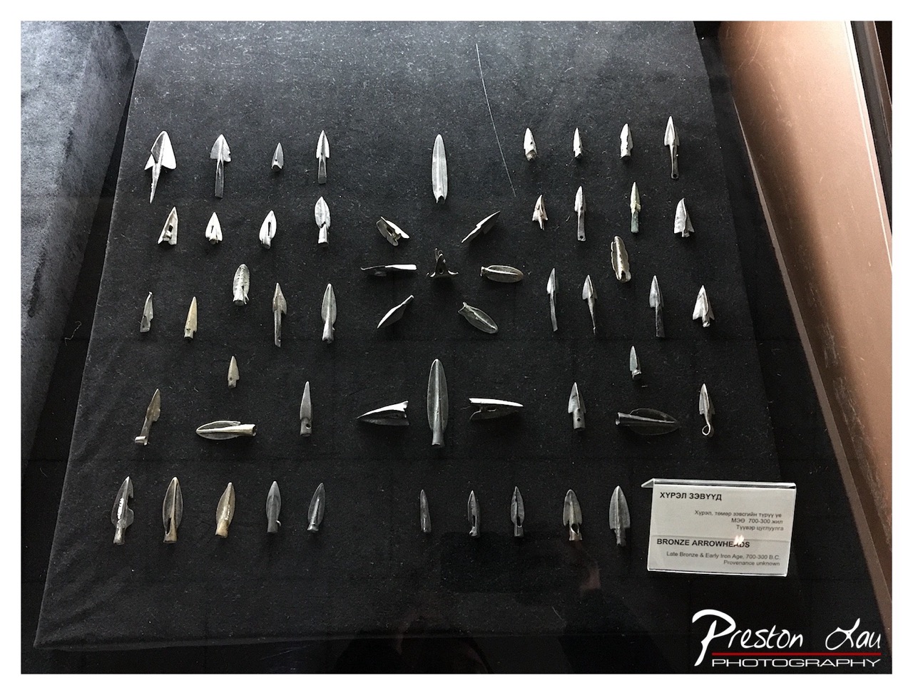

1. Overall Rating (0–10) — 6.8
This photograph presents a curated collection of ancient bronze arrowheads with a quiet scholarly precision, capturing both their historical weight and delicate craftsmanship. The display, framed behind glass, emphasizes the artifacts’ uniformity and diversity, while the muted tones and reflective surface lend a contemplative stillness. While the image succeeds in documenting the objects clearly, its emotional resonance is tempered by the clinical nature of the presentation and the slight glare from the glass.
2. Composition (0–10) — 7.0
The arrowheads are arranged in a balanced, grid-like pattern that guides the eye across the frame, though the composition is slightly off-center, with the label anchoring the lower right. The inclusion of the display case and reflective surface adds depth, but the reflection of the photographer subtly disrupts the clean presentation.
3. Lighting (0–10) — 6.0
The lighting is functional and even, highlighting the metallic sheen of the arrowheads against the dark background. However, the overhead illumination creates a slight glare on the glass, reducing clarity in some areas and flattening the sense of dimension.
4. Color & Tone (0–10) — 6.5
The monochromatic palette—dominated by black, silver, and muted bronze—creates a cohesive and somber tone appropriate for archaeological material. The lack of vibrant color enhances the historical gravity, though a touch of warmth could have added visual interest.
5. Creativity (0–10) — 6.0
The image is observational and documentary in nature, prioritizing clarity over artistic interpretation. The arrangement of the arrowheads offers a subtle narrative of technological evolution, but the execution is conventional, lacking a bold stylistic or conceptual twist.
6. Technical Quality (0–10) — 7.5
The image is sharp and well-focused, with fine detail visible in the arrowheads’ edges and textures. The resolution is high, and the exposure is balanced, though the reflections on the glass slightly compromise clarity.
7. Emotional Impact (0–10) — 6.0
The photograph evokes a sense of quiet reverence for the past, but the emotional distance created by the glass case and the clinical setting limits the viewer’s connection to the artifacts. The mood is intellectual rather than visceral.
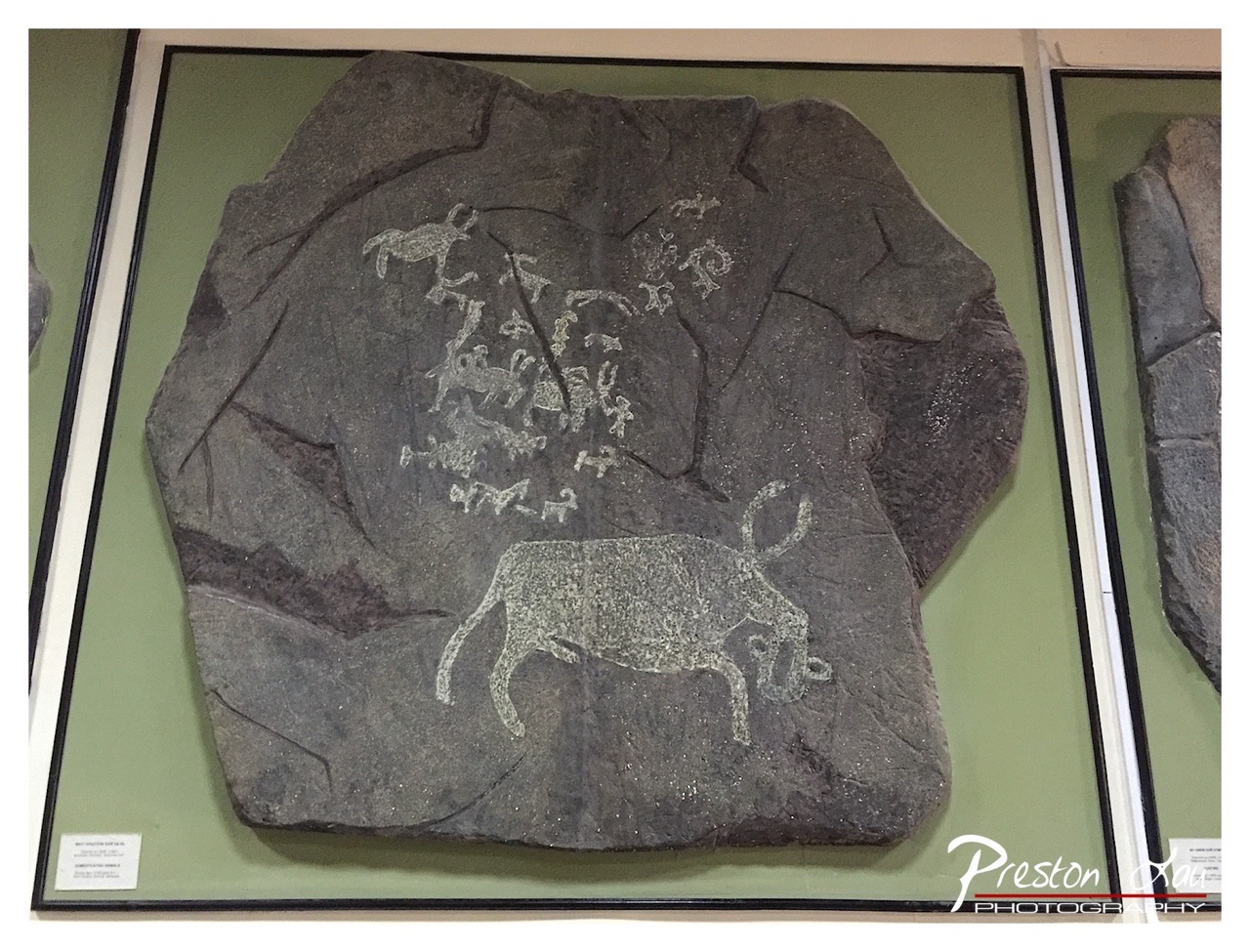

1. Overall Rating (0–10) — 6.0
This photograph presents a compelling display of ancient rock art, capturing the raw texture and historical weight of the engraved stone. The framing centers the viewer’s attention on the intricate carvings, particularly the prominent bovine figure, while the museum setting provides context. However, the flat lighting and neutral background slightly dampen the visual drama, making the image feel more like documentation than a compelling artistic statement.
2. Composition (0–10) — 6.5
The subject is well-centered within the frame, allowing the viewer to absorb the details of the petroglyphs. The inclusion of adjacent display panels adds context, though the right edge feels slightly cropped, creating an imbalance.
3. Lighting (0–10) — 5.5
The light is even and functional, illuminating the surface of the stone clearly. However, it lacks directionality and depth, flattening the texture of the rock and diminishing the contrast between the carved lines and the dark stone.
4. Color & Tone (0–10) — 6.0
The palette is subdued, dominated by the gray of the stone and the olive green of the display wall. While this supports the historical tone, the lack of vibrancy or tonal variation keeps the image from feeling dynamic or emotionally resonant.
5. Creativity (0–10) — 6.5
The image successfully captures a moment of cultural preservation, presenting ancient art in a modern context. The choice to include the surrounding display enhances narrative depth, though the approach remains straightforward and observational.
6. Technical Quality (0–10) — 7.5
The image is sharp and detailed, with clear focus on the engraved figures. The digital watermark and text in the corner are slightly distracting but do not detract significantly from the clarity of the subject.
7. Emotional Impact (0–10) — 6.0
The photograph evokes a sense of reverence for ancient human expression, but the clinical presentation and lack of atmospheric lighting keep the emotional connection subtle rather than powerful.
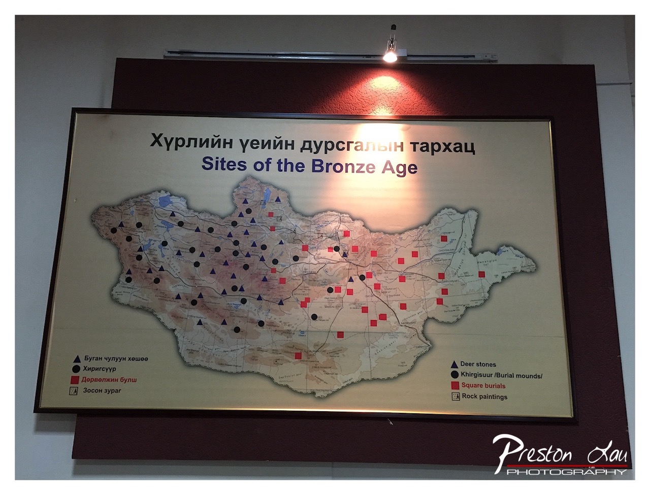

1. Overall Rating (0–10) — 5.5
This photograph captures an informational exhibit about Bronze Age archaeological sites in Mongolia, presenting a mix of cultural and historical context. The lighting casts a warm glow on the map, enhancing its visibility, but the composition feels functional rather than artistic. While the image successfully documents the display, it lacks visual dynamism and emotional engagement, leaning more toward utility than aesthetic storytelling.
2. Composition (0–10) — 6.0
The map is centered and framed well, with the text and legend clearly visible. However, the overhead light fixture and the visible ceiling details distract from the subject, creating a slightly cluttered foreground and reducing the sense of cohesion.
3. Lighting (0–10) — 6.5
A single spotlight illuminates the map from above, creating a warm, directional glow that highlights the central area. The light is effective in drawing attention to the content but casts a harsh shadow on the upper wall, introducing unevenness and a slightly artificial feel.
4. Color & Tone (0–10) — 6.0
The palette is subdued, dominated by earthy tones on the map and the warm amber of the spotlight. The contrast between the light and shadow areas is moderate, but the overall tone feels flat and lacks vibrancy, giving the image a documentary rather than expressive quality.
5. Creativity (0–10) — 5.0
The image is straightforward and informative, with little attempt at creative framing or artistic interpretation. It functions as a record of the exhibit rather than a compelling visual narrative, limiting its originality.
6. Technical Quality (0–10) — 7.5
The focus is sharp, and the details on the map are clear and legible. The exposure is well-balanced, though the white balance appears slightly warm due to the artificial lighting, which slightly affects the accuracy of color representation.
7. Emotional Impact (0–10) — 4.5
The image evokes a sense of intellectual curiosity and historical awareness, but it fails to elicit a strong emotional response. The clinical presentation and lack of human presence create distance, making it more informative than emotionally resonant.
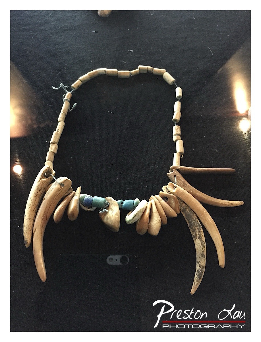

1. Overall Rating (0–10) — 7.0
This photograph captures a striking indigenous necklace, rich in cultural symbolism and tactile texture, set against a dark, reflective surface that enhances its organic forms. The composition draws attention to the intricate arrangement of bone, tusk, and turquoise, suggesting both craftsmanship and spiritual significance. While the image is compelling in its subject matter, the presence of a phone in the frame and the somewhat cluttered reflections slightly undermine its elegance and focus.
2. Composition (0–10) — 6.5
The necklace is centered and well-framed, with the curved arrangement of tusk-like elements creating a natural focal point. However, the inclusion of the phone in the lower third disrupts the visual flow and introduces a modern, distracting element.
3. Lighting (0–10) — 6.0
The lighting is directional and creates soft highlights on the polished surfaces of the beads and tusks, enhancing their texture. However, the reflections on the glossy background introduce bright hotspots that distract from the subject and reduce overall tonal harmony.
4. Color & Tone (0–10) — 6.5
The palette is dominated by earthy tones—beige, cream, and muted turquoise—creating a natural and cohesive look. The dark background provides strong contrast, though the cool reflections slightly disrupt the warmth of the materials.
5. Creativity (0–10) — 7.5
The image effectively highlights the cultural and aesthetic value of the piece, with a thoughtful arrangement that emphasizes its unique construction. The juxtaposition of ancient materials with a modern camera lens adds an interesting layer of narrative about documentation and preservation.
6. Technical Quality (0–10) — 7.0
The image is sharp and detailed, allowing the viewer to appreciate the textures and craftsmanship of the necklace. Focus is consistent across the subject, though the reflections and the phone in the frame detract from overall technical refinement.
7. Emotional Impact (0–10) — 7.0
The photograph evokes a sense of reverence and connection to tradition, inviting contemplation of the object’s history and cultural context. The tactile quality of the materials and the careful presentation lend a quiet dignity to the piece, though the modern intrusion slightly tempers the emotional resonance.
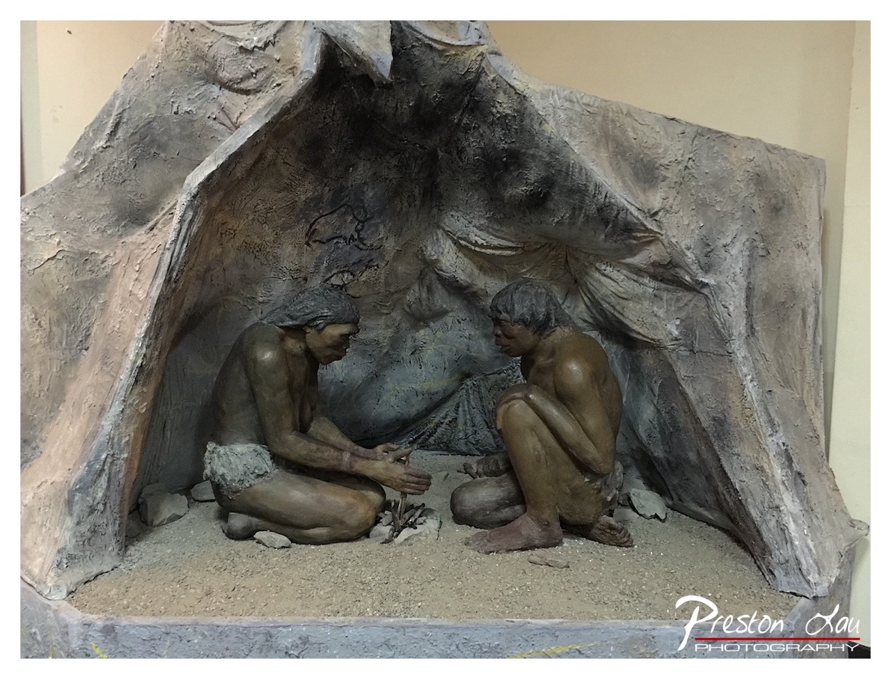

1. Overall Rating (0–10) — 7.0
This diorama captures a quiet, intimate moment of early human life, evoking a sense of resilience and connection within a rudimentary shelter. The sculptural detail and naturalistic poses lend authenticity to the scene, while the subdued lighting and earthy textures enhance its historical weight. While the image feels slightly staged due to the museum-like presentation, it succeeds in conveying a narrative of survival and communal life with restrained emotional depth.
2. Composition (0–10) — 7.0
The figures are centered within the cave-like structure, creating a balanced focal point. The framing emphasizes the intimacy of the scene, though the surrounding empty space slightly dilutes the sense of enclosure.
3. Lighting (0–10) — 6.0
The lighting is even and functional, illuminating the diorama clearly but lacking directional drama. A softer, more directional light would enhance the shadows and give greater depth to the figures and cave walls.
4. Color & Tone (0–10) — 7.0
The palette is cohesive, dominated by earth tones—browns, grays, and muted tans—that reinforce the prehistoric theme. The subtle tonal variations in the sculpted figures and background add texture and realism.
5. Creativity (0–10) — 7.5
The concept of reconstructing a moment from prehistoric life is compelling and well-executed. The artist’s attention to anatomical detail and cultural context demonstrates thoughtful storytelling and imaginative vision.
6. Technical Quality (0–10) — 7.5
The image is sharp and well-focused, capturing fine details in the sculpture and texture of the materials. The exposure is balanced, and the photograph effectively preserves the scene’s integrity.
7. Emotional Impact (0–10) — 6.5
The scene elicits a quiet contemplation of human origins and the universal need for shelter and connection. While emotionally restrained, it invites the viewer to reflect on the shared roots of humanity.
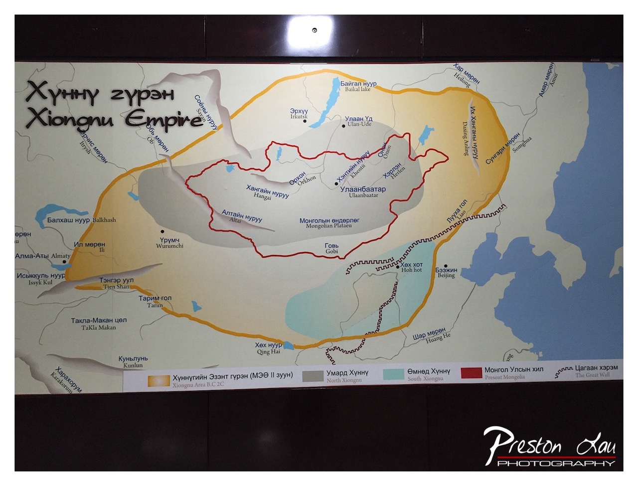

1. Overall Rating (0–10) — 6.0
This photograph presents a historical map of the Xiongnu Empire with clear informational intent, capturing a museum-style exhibit that blends cultural documentation with geographic storytelling. While the layered details and bilingual labels offer educational value, the image lacks visual dynamism—its composition is functional rather than evocative, and the overhead lighting creates a glare that distracts from the map’s clarity. The photograph succeeds as a record but falls short as a compelling visual narrative.
2. Composition (0–10) — 5.5
The map is centered but framed tightly, with a dark border that visually constrains the image. The overhead glare at the top disrupts balance, and the low-angle perspective slightly distorts the map’s geometry.
3. Lighting (0–10) — 4.5
Harsh overhead lighting creates a bright glare at the top of the frame, washing out detail in that area and producing uneven illumination across the map. The light is functional but not flattering, diminishing the visual clarity of the text and lines.
4. Color & Tone (0–10) — 6.0
The palette is muted, dominated by beige, gray, and pale blue, with a limited range of tones that reflect the map’s informational nature. The color choices are accurate but lack vibrancy, resulting in a flat, neutral appearance.
5. Creativity (0–10) — 5.5
The image is conceptually straightforward—documenting a historical exhibit—but offers little originality in framing or perspective. The dual-language labeling adds cultural depth, but the execution remains conventional.
6. Technical Quality (0–10) — 7.0
The focus is sharp across the map, and the text remains legible. However, the glare and slight unevenness in lighting detract from the overall technical refinement.
7. Emotional Impact (0–10) — 5.0
The image conveys a sense of historical reverence and scholarly intent, but it does not evoke strong emotion. Its detachment and functional presentation keep the viewer in a neutral, observational space rather than inviting deeper connection.
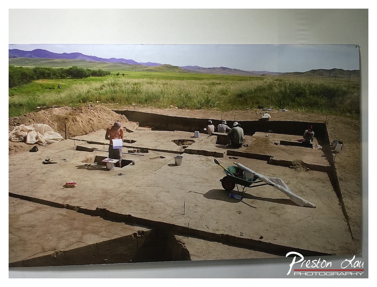

1. Overall Rating (0–10) — 7.0
This photograph captures the quiet intensity of an archaeological dig, where human effort unfolds against a vast, tranquil landscape. The expansive frame and natural lighting emphasize the scale of the excavation and the patience of the work, creating a sense of timelessness. While the image is grounded in realism, its emotional weight is slightly diluted by a lack of dynamic tension, leaving the viewer as a passive observer rather than an engaged participant.
2. Composition (0–10) — 7.5
The wide-angle perspective effectively captures the full scope of the dig and its surrounding terrain, with the trench lines guiding the eye across the scene. The placement of figures adds narrative depth, though the foreground wheelbarrow slightly disrupts the visual flow.
3. Lighting (0–10) — 7.0
Natural daylight illuminates the scene evenly, enhancing texture and form without casting harsh shadows. The soft, diffuse light contributes to the calm, methodical mood, though it lacks the dramatic contrast that might elevate the image.
4. Color & Tone (0–10) — 6.5
The earthy tones of the excavation—beige, tan, and muted green—create a cohesive palette that reflects the site’s natural context. However, the colors feel somewhat desaturated, slightly dulling the visual impact.
5. Creativity (0–10) — 6.5
The image successfully documents a moment in archaeological fieldwork, but it leans more toward documentation than artistic interpretation. The storytelling is clear, yet restrained, with little visual innovation.
6. Technical Quality (0–10) — 8.0
The photograph is sharp and well-focused, with clean detail in both the foreground and background. The clarity of the image allows for a thorough examination of the site and the work being done.
7. Emotional Impact (0–10) — 6.0
The image evokes a sense of quiet dedication and historical curiosity, but its emotional resonance is tempered by the clinical distance of the composition. It invites contemplation rather than deep connection.
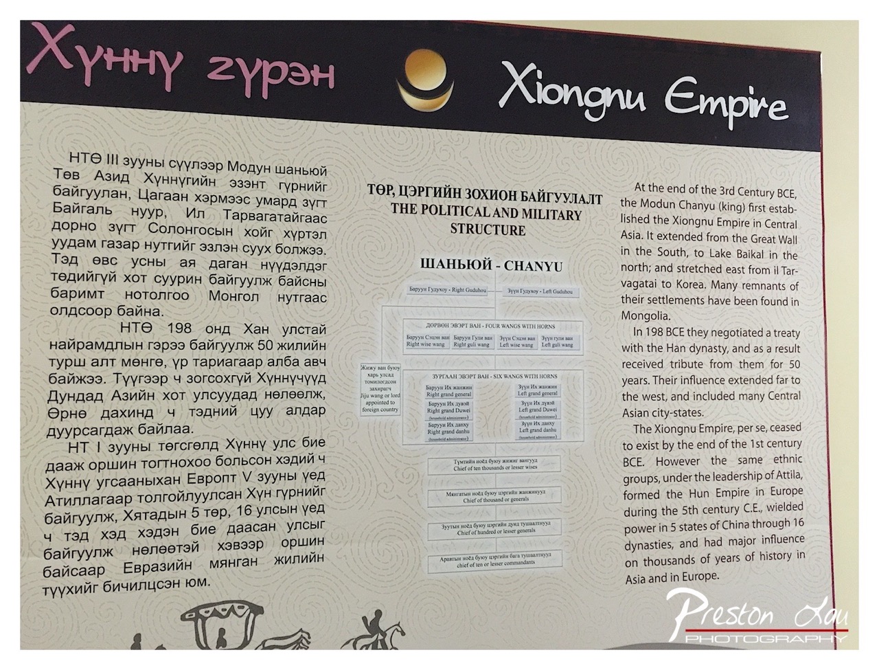

1. Overall Rating (0–10) — 5.5
This photograph captures an educational exhibit panel about the Xiongnu Empire, blending Mongolian and English text with historical diagrams. While the content is informative and the layout is structured, the image lacks visual dynamism—its flat lighting and busy composition make it feel more like a documentation than an artistic statement. The overlay of the photographer’s watermark further detracts from the panel’s intended authority, diminishing its aesthetic and emotional weight.
2. Composition (0–10) — 6.0
The panel is framed diagonally, creating a slight imbalance that draws attention to the text rather than guiding the eye naturally. The central diagram provides a focal point, but the surrounding text blocks, particularly on the left, create visual clutter. A more centered and balanced framing would improve readability and visual harmony.
3. Lighting (0–10) — 5.5
The lighting is even but flat, with no strong directional quality or contrast. The overhead illumination casts minimal shadows, resulting in a neutral, almost sterile atmosphere that fails to highlight the textures or depth of the exhibit panel.
4. Color & Tone (0–10) — 5.0
The color palette is muted and dominated by beige and black, with only a subtle accent from the pink Mongolian script and golden emblem. The lack of vibrancy makes the image feel static, and the tonal range is compressed, offering little visual interest.
5. Creativity (0–10) — 5.0
The image is functional and informative, but lacks originality in its approach. It presents the exhibit straightforwardly without stylistic interpretation or narrative depth. The dual-language format is conceptually sound, but the execution remains literal and unengaging.
6. Technical Quality (0–10) — 7.0
The image is sharp and clear, with good focus across the panel. The text is legible, and the details of the diagram are preserved. However, the watermark and slight angle of capture reduce the overall professionalism.
7. Emotional Impact (0–10) — 4.5
The photograph feels detached and clinical, offering information without evoking curiosity or wonder. The viewer is invited to read, not to feel, and the absence of emotional resonance limits the image’s ability to connect with the subject’s historical significance.
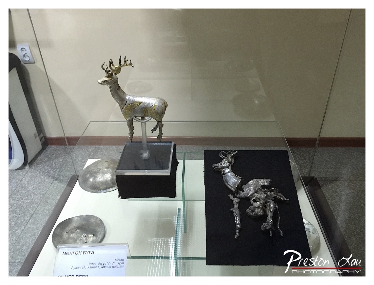

1. Overall Rating (0–10) — 6.0
This photograph captures a museum display of ancient silver artifacts, including a finely crafted deer figure and a damaged counterpart, evoking a sense of historical reverence. While the composition effectively conveys the context of preservation, the flat lighting and reflective glass dull the visual impact, limiting the emotional resonance of the ancient objects. The image succeeds as a documentary record but falls short of artistic transcendence.
2. Composition (0–10) — 6.5
The arrangement balances the two deer figures across the frame, with the intact sculpture as the focal point. The placement of the broken piece to the right creates a subtle narrative contrast, though the cluttered foreground and reflections slightly disrupt visual harmony.
3. Lighting (0–10) — 5.5
Even, artificial lighting illuminates the artifacts clearly but lacks directionality or mood, resulting in a sterile atmosphere. Reflections on the glass further obscure details and reduce depth.
4. Color & Tone (0–10) — 6.0
The palette is dominated by muted metallic grays and blacks, with the gold accents on the deer offering a subtle contrast. The overall tone is neutral and functional, underscoring the utilitarian purpose of the display.
5. Creativity (0–10) — 6.0
The juxtaposition of the intact and damaged deer suggests a narrative of preservation and loss, lending the image conceptual depth. However, the straightforward documentation style limits its originality.
6. Technical Quality (0–10) — 7.0
The image is sharp and well-focused, with clean detail on the artifacts. The watermark is unobtrusive, and exposure is balanced, though the reflections on the glass detract from clarity.
7. Emotional Impact (0–10) — 5.5
The photograph conveys a quiet reverence for history, but the technical limitations and lack of atmospheric lighting keep the viewer at a distance, preventing a deeper emotional connection.
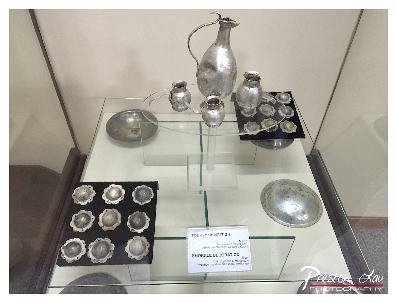

1. Overall Rating (0–10) — 6.0
This photograph captures a museum display of silver artifacts with a clear focus on historical craftsmanship, yet it feels more like a documentation than an artistic interpretation. The arrangement of the objects is orderly and informative, but the flat lighting and lack of dramatic composition prevent it from conveying the richness of the cultural context. While the details are visible, the image lacks the visual depth to truly engage the viewer beyond curiosity.
2. Composition (0–10) — 6.0
The arrangement of objects within the glass case is balanced, with the central pitcher drawing attention. However, the framing feels slightly off-center, and the cluttered layout of the display, including the multiple trays and labels, creates visual noise. A tighter crop would improve focus and emphasize the intricate details of the silverwork.
3. Lighting (0–10) — 5.5
The lighting is functional but unremarkable—diffuse and flat, typical of museum environments. While it ensures all objects are visible, it fails to highlight textures or create depth, leaving the metallic surfaces appearing dull rather than luminous.
4. Color & Tone (0–10) — 6.0
The dominant silver tones are consistent but lack contrast, resulting in a monotonous grayscale palette. The black trays provide some visual grounding, but the overall tone is muted, which dampens the sense of historical elegance the objects might otherwise convey.
5. Creativity (0–10) — 5.5
The image is straightforward and informative, fulfilling its purpose as a record of the exhibit. However, it offers little in the way of artistic interpretation or narrative tension, relying instead on literal representation rather than evoking emotion or imagination.
6. Technical Quality (0–10) — 7.5
The photograph is sharp and clear, with well-defined edges and readable text on the label. The focus is consistent across the display, and there is minimal distortion from the glass case, indicating good technical execution.
7. Emotional Impact (0–10) — 5.0
The image feels detached and observational, offering a glimpse into history without fostering a deeper emotional connection. The viewer is invited to look, but not to feel, limiting the photograph’s power to resonate beyond intellectual interest.
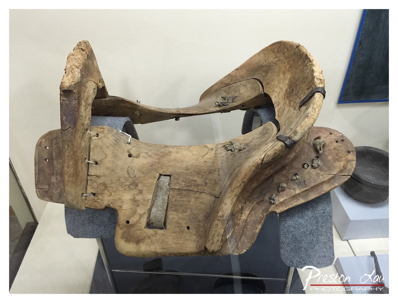

1. Overall Rating (0–10) — 6.0
This photograph presents a weathered wooden saddle, its worn surface telling a story of long use and resilience. The object’s aged texture and asymmetrical form are captured with clarity, offering a quiet dignity to a relic of rural life. While the composition and lighting are functional, they lack the refinement to elevate the subject into a compelling visual narrative—this is a document, not a portrait.
2. Composition (0–10) — 6.0
The saddle is framed slightly off-center, with a subtle diagonal orientation that adds visual interest. However, the cluttered background and uneven depth of field distract from the subject’s form and craftsmanship.
3. Lighting (0–10) — 5.5
Even, diffused lighting illuminates the saddle without harsh shadows, preserving texture. Yet the lack of directional emphasis flattens the object’s three-dimensional character, reducing the tactile quality of the wood.
4. Color & Tone (0–10) — 5.5
The palette is muted and monochromatic, dominated by browns and grays, which reflects the object’s aged nature. However, the absence of tonal contrast and warmth gives the image a lifeless, almost clinical feel.
5. Creativity (0–10) — 5.0
The image is observational rather than expressive, capturing the saddle as a historical artifact without evoking deeper emotional or thematic resonance. The choice to include the surrounding museum elements suggests context, but does not enhance the story.
6. Technical Quality (0–10) — 7.5
Sharp focus on the saddle is consistent, and the exposure is well-balanced. The watermark and slight reflections in the glass are minor distractions, but overall technical execution is sound.
7. Emotional Impact (0–10) — 5.0
The image conveys a sense of quiet history and endurance, but the detached presentation keeps the viewer at a distance. There’s no strong emotional pull—only curiosity about the object’s past.
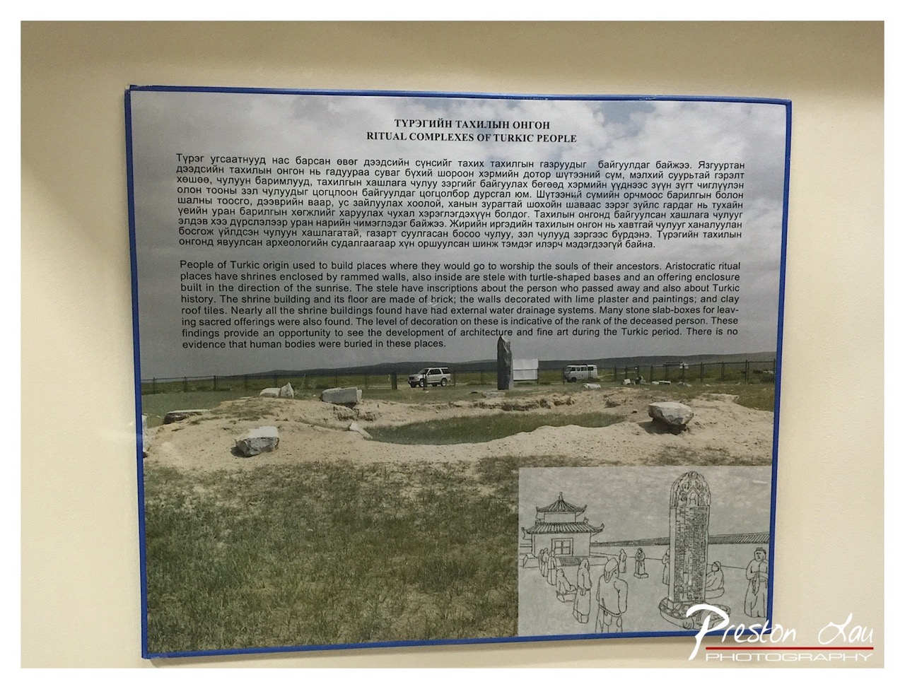

1. Overall Rating (0–10) — 5.5
This photograph presents an informative museum display about Turkic ritual complexes, capturing both historical context and archaeological evidence. While the image successfully conveys educational content through its layered composition—text, photograph, and illustration—it lacks visual dynamism due to a flat, documentary approach. The framing feels functional rather than expressive, and the muted colors and neutral lighting dampen the emotional resonance of the subject, leaving the viewer with a sense of information delivery rather than cultural immersion.
2. Composition (0–10) — 6.0
The layout is structured with a clear hierarchy, placing the text at the top and the photograph below, with an inset illustration adding contextual depth. However, the composition is somewhat static, with the large informational panel dominating the frame and leaving little visual breathing room. The placement of the photograph and drawing creates a visual imbalance, and the overall arrangement feels more like a scan than a deliberate photographic statement.
3. Lighting (0–10) — 5.0
The lighting is even and functional, likely from indoor display fixtures, but it lacks directionality or mood. The flat illumination flattens the image, diminishing the texture of the photograph and the depth of the illustrated reconstruction. While it ensures legibility of the text, it fails to enhance the atmosphere of the ancient site depicted.
4. Color & Tone (0–10) — 5.0
The palette is muted and desaturated, dominated by neutral grays and earthy tones that reflect the informational nature of the display. The colors lack vibrancy and contrast, contributing to a clinical, almost sterile appearance. The monochrome illustration further reduces tonal variety, reinforcing the image’s documentary character over artistic expression.
5. Creativity (0–10) — 5.5
The photograph is conceptually sound, combining text, image, and illustration to convey historical information in a layered way. However, the execution is conventional and lacks originality in framing or perspective. The creative effort lies in the curation of content rather than in visual storytelling, making it more informative than imaginative.
6. Technical Quality (0–10) — 7.5
The image is sharp and well-focused, with clear text and discernible details in both the photograph and illustration. The exposure is balanced, and there are no significant technical flaws such as blur or noise. The framing is straightforward, and the watermark is discreetly placed, indicating a level of technical competence.
7. Emotional Impact (0–10) — 4.5
The image evokes a sense of curiosity about Turkic history and heritage but fails to elicit a strong emotional response. The detached, factual presentation distances the viewer from the cultural significance of the ritual sites. While it informs, it does not inspire awe or connection, leaving the emotional impact subdued and academic.
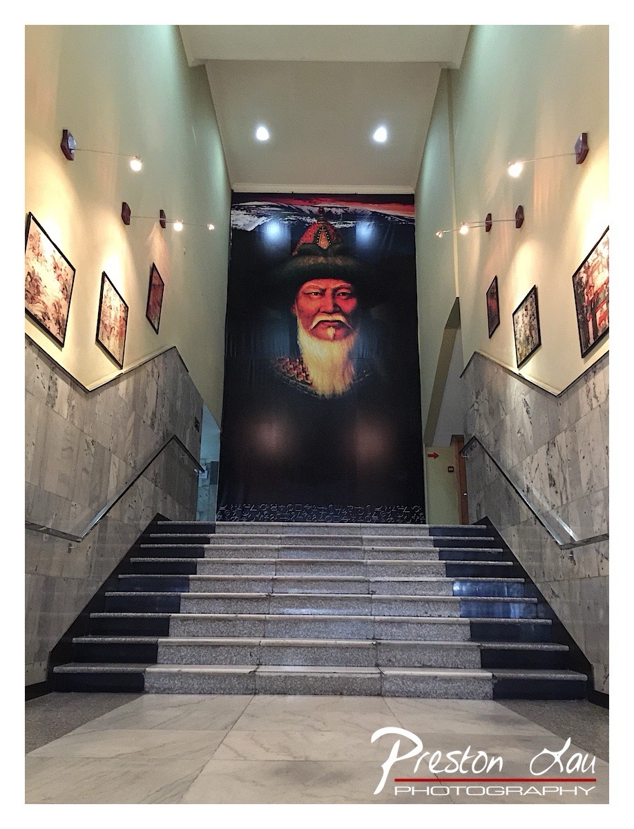

1. Overall Rating (0–10) — 7.0
This photograph captures a striking architectural space where tradition and modernity converge, centered around a powerful portrait that commands attention at the top of a grand staircase. The symmetrical composition and dramatic lighting enhance the sense of reverence and historical weight, while the clean marble and gallery-style presentation lend an air of cultural importance. The image succeeds in conveying both the physical grandeur of the setting and the symbolic weight of the figure depicted, though the overall mood is slightly restrained by the clinical lighting and lack of dynamic contrast.
2. Composition (0–10) — 8.0
The symmetrical framing of the staircase and the central placement of the portrait create a strong sense of balance and visual hierarchy, guiding the viewer’s eye upward with clear intention. The leading lines of the stairs reinforce the focal point, and the surrounding gallery wall art adds context without distracting.
3. Lighting (0–10) — 6.5
The recessed spotlights provide even illumination but lack depth, resulting in a somewhat flat and functional glow. While the lighting effectively highlights the central portrait and the staircase, the overall effect is sterile, with harsh reflections on the marble and minimal atmospheric warmth.
4. Color & Tone (0–10) — 6.0
The color palette is dominated by neutral tones—beige, gray, and black—creating a formal, restrained aesthetic. The portrait introduces a contrast with its bold reds and deep shadows, but the overall tonal range is limited, and the lack of vibrancy in the surrounding space tempers the image’s emotional resonance.
5. Creativity (0–10) — 7.5
The conceptual strength lies in the juxtaposition of the historical figure with a modern institutional setting, creating a narrative of cultural continuity. The use of scale and perspective enhances the portrait’s dominance, offering a thoughtful commentary on legacy and memory.
6. Technical Quality (0–10) — 8.0
The image is sharp and well-focused, with clear detail in the marble textures and the portrait’s features. The exposure is balanced, and the photographer’s control over perspective and framing demonstrates strong technical execution.
7. Emotional Impact (0–10) — 7.0
There is a quiet dignity and solemnity in the image, evoked by the imposing portrait and the formal architecture. The viewer is invited to reflect on the significance of the figure and the space, though the emotional pull is subtle, leaning more on intellectual engagement than visceral resonance.
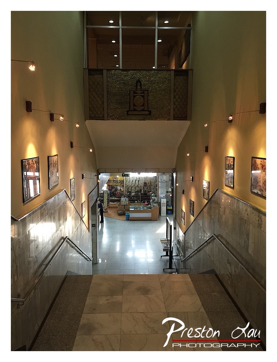

1. Overall Rating (0–10) — 6.8
This photograph captures the quiet dignity of a museum or cultural institution’s interior, where symmetry and light guide the eye toward a central mosaic focal point. The warm glow of the wall-mounted lights enhances the architectural lines and gives the space a contemplative atmosphere, though the composition feels slightly overexposed in the lower hall, softening the impact of detail. While the image successfully conveys the scale and purpose of the space, it leans more toward documentation than evocative storytelling.
2. Composition (0–10) — 7.0
The strong central symmetry creates a powerful sense of order and depth, drawing the viewer’s gaze down the staircase toward the mosaic and shop below. The use of leading lines from the stair railings and the tiled floor reinforces this directional pull, though the slightly low vantage point introduces a subtle imbalance in the frame.
3. Lighting (0–10) — 7.5
The warm, directional wall lighting enhances texture and form, creating a soft glow that accentuates the artwork and architectural details. While the lower hall is slightly overexposed, the interplay of light and shadow adds depth and warmth, reinforcing the quiet, reverent mood of the space.
4. Color & Tone (0–10) — 6.5
The palette is dominated by warm yellows and earthy beiges, creating a cohesive and inviting atmosphere. However, the color balance leans slightly toward warmth, with a lack of cool contrast that diminishes the visual distinction between the stone tiles and the wall finishes.
5. Creativity (0–10) — 6.0
The photograph is conceptually sound, using symmetry and light to reflect the institution’s cultural purpose. However, it remains largely conventional in its approach—more observational than expressive—offering a strong but not particularly innovative interpretation of the space.
6. Technical Quality (0–10) — 7.5
Sharp focus and clean detail are evident in the foreground and midground, with the lighting effectively highlighting texture and form. The exposure is mostly controlled, though minor overexposure in the lower hall slightly reduces tonal range.
7. Emotional Impact (0–10) — 6.5
The image evokes a sense of calm and reverence, inviting the viewer to step into a space of cultural reflection. While the mood is well-captured, the emotional resonance is tempered by the photograph’s straightforward, documentary style, which keeps the viewer at a slight remove.
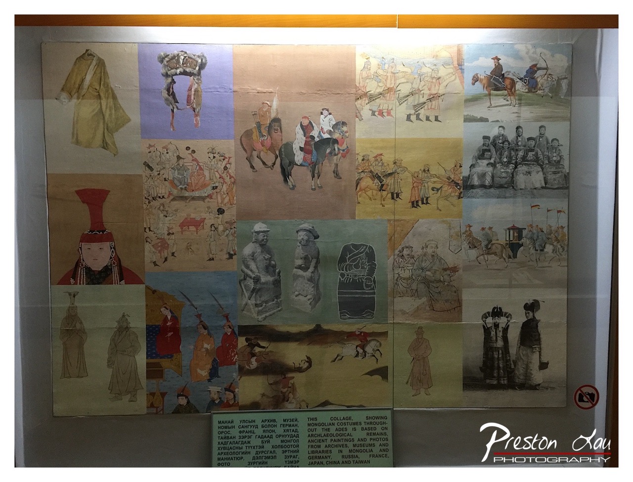

1. Overall Rating (0–10) — 6.8
This photograph captures a richly detailed museum exhibit, presenting a historical collage of Mongolian culture through a diverse array of costumes, artifacts, and scenes. The composition is dense and informative, offering a layered narrative of tradition and heritage. While the image successfully conveys the cultural depth of the display, its value is slightly diminished by the glare of the glass case and the cluttered arrangement, which can distract from the individual elements.
2. Composition (0–10) — 6.0
The collage is arranged in a grid-like fashion, but the uneven spacing and overlapping of images create a visually busy composition. The central placement of the sign provides grounding, yet the lack of clear focal hierarchy makes it difficult to guide the viewer’s eye through the narrative.
3. Lighting (0–10) — 5.5
The lighting is flat and diffused, typical of indoor museum spaces, which results in a lack of contrast and depth. The reflection of overhead lights on the glass case obscures parts of the display, particularly in the upper and lower quadrants, reducing clarity and visual engagement.
4. Color & Tone (0–10) — 6.5
The color palette is warm and earthy, dominated by muted yellows, browns, and reds, which align well with the historical subject matter. However, the overall tone is somewhat dull due to the subdued lighting and the aged appearance of the printed materials, which slightly dampens the vibrancy.
5. Creativity (0–10) — 7.0
The collage itself is a creative and ambitious effort to represent Mongolian history across time and media. The inclusion of diverse sources—archaeological remains, ancient paintings, and historical photographs—adds narrative richness. The photograph captures this diversity effectively, though it remains largely documentary rather than interpretive.
6. Technical Quality (0–10) — 7.5
The image is sharp and clear, with good resolution that allows the viewer to discern fine details in the illustrations and text. The focus is consistent across the frame, and the exposure is adequate, though the reflections on the glass detract slightly from the overall clarity.
7. Emotional Impact (0–10) — 6.0
The image evokes a sense of reverence for cultural heritage and historical continuity. The viewer is invited to explore the layers of tradition, but the emotional resonance is moderated by the clinical presentation and the physical barriers of the display case, which create a sense of distance between the observer and the subject.
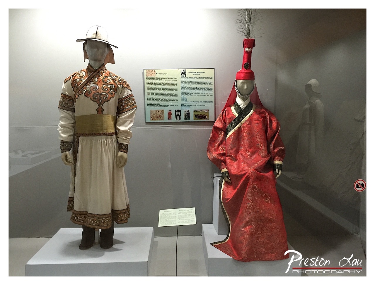

1. Overall Rating (0–10) — 7.0
This photograph presents a compelling display of traditional Mongolian attire, capturing the rich textures and ceremonial elegance of the garments. The contrast between the cream and red ensembles creates a visually balanced composition, while the museum setting lends a sense of historical gravitas. While the image effectively conveys cultural detail, the sterile lighting and slight clutter in the background detract from its overall aesthetic cohesion.
2. Composition (0–10) — 7.0
The two mannequins are symmetrically framed, creating a balanced visual dialogue between the two garments. The inclusion of the informational plaque adds context, though it slightly disrupts the clean lines of the composition. The reflection in the glass adds depth but risks distracting from the main subjects.
3. Lighting (0–10) — 6.5
The lighting is functional but flat, casting even illumination that emphasizes the garments’ details without creating dramatic shadows. While adequate for documentation, it lacks the warmth or directional quality that could enhance the textures and richness of the fabrics.
4. Color & Tone (0–10) — 7.5
The color palette is strong, with the deep red of the right garment providing a striking contrast to the cream and gold tones of the left. The muted background enhances the vibrancy of the clothing, and the overall tonal balance supports the cultural significance of the display.
5. Creativity (0–10) — 6.5
The photograph is more documentary than artistic, focusing on accurate representation of the costumes and their context. While the composition is deliberate, the lack of dynamic angles or stylized treatment limits its originality.
6. Technical Quality (0–10) — 7.5
The image is sharp and well-focused, with clear details visible in the embroidery and fabric textures. The exposure is balanced, and the watermark is unobtrusive, preserving the image’s integrity.
7. Emotional Impact (0–10) — 6.0
The image evokes a sense of cultural pride and historical reverence, but the clinical museum environment tempers the emotional resonance. The viewer is invited to observe rather than feel, resulting in a respectful but distant connection to the subject.
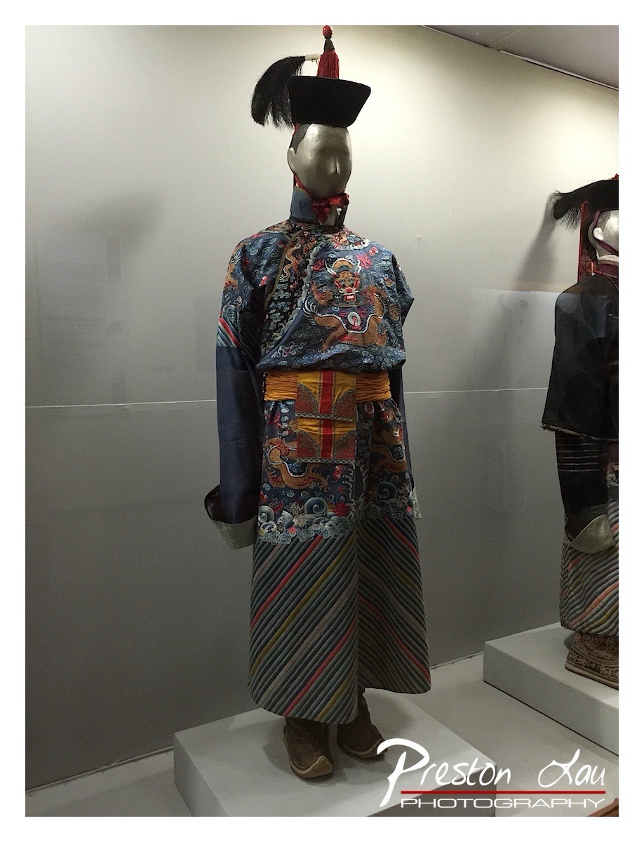

1. Overall Rating (0–10) — 7.0
This photograph captures the rich detail and ceremonial grandeur of a traditional robe, showcasing its intricate embroidery and cultural significance with clarity and respect. The lighting, while functional, slightly flattens the texture of the fabric, and the composition feels more like a documentation than a narrative, but the subject’s visual complexity compensates for these shortcomings. The image succeeds in presenting the garment as a cultural artifact, though it holds back from transcending into the realm of artful storytelling.
2. Composition (0–10) — 6.5
The mannequin is centered, but the framing feels slightly off-kilter, with the right edge cutting into the second display. The presence of another mannequin in the background adds context but also distracts from the main subject. A tighter crop and more balanced spacing would enhance focus and visual harmony.
3. Lighting (0–10) — 6.0
Even and diffused lighting highlights the garment’s details without harsh shadows, appropriate for a museum setting. However, the flatness of the light undercuts the richness of the fabric’s texture and depth, making the colors appear somewhat muted.
4. Color & Tone (0–10) — 7.0
The deep blues, golds, and reds of the robe stand out against the neutral background, creating a striking contrast. The tonal range is well-managed, though the overall coolness of the lighting tempers the warmth of the embroidery, slightly dampening the garment’s vibrancy.
5. Creativity (0–10) — 6.5
The image functions as a clear ethnographic record, emphasizing authenticity and detail. While it lacks a unique visual perspective or emotional lens, the choice to highlight the intricate patterns and regal design reflects a thoughtful intent to honor the cultural artifact.
6. Technical Quality (0–10) — 8.0
The image is sharp, well-focused, and free of noise, with clean details visible in the embroidery and fabric folds. The watermark is unobtrusive, and the exposure is consistent throughout.
7. Emotional Impact (0–10) — 6.0
The photograph conveys a sense of reverence for tradition, but the clinical museum setting and lack of human presence limit its emotional resonance. The viewer is invited to observe rather than feel, creating a respectful but distant connection.
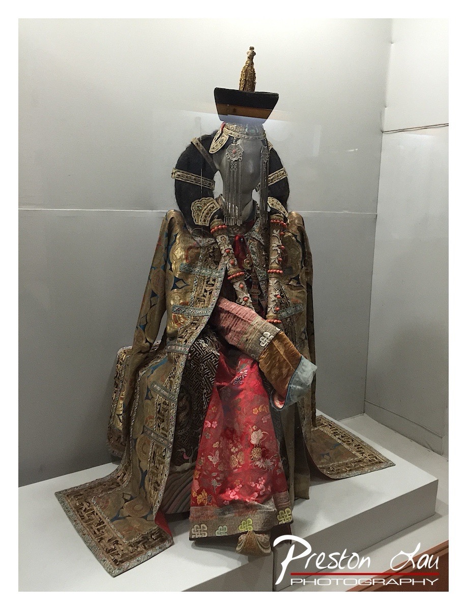

1. Overall Rating (0–10) — 7.0
This photograph captures the regal splendor of a traditional ceremonial costume, showcasing intricate embroidery, rich textures, and cultural significance. The display within a museum setting lends a sense of reverence, though the composition is slightly hampered by reflections and a cluttered background. The image succeeds in conveying the garment’s ornate craftsmanship and historical weight, yet it stops short of cinematic elegance due to modest lighting and framing.
2. Composition (0–10) — 6.5
The subject is centered and well-framed, allowing the full ensemble to be appreciated, though the angle slightly cuts into the headpiece. The use of a white pedestal creates visual separation, but the reflection on the glass and the off-center wall seam disrupt balance.
3. Lighting (0–10) — 6.0
Soft, even lighting highlights the fabric textures and embroidery, but the overhead museum lighting creates a slight glare on the glass case and flattens depth. The light lacks directional warmth, resulting in a clinical rather than dramatic effect.
4. Color & Tone (0–10) — 7.5
The rich golds, deep reds, and dark silks create a visually striking palette, enhanced by the contrast with the neutral white background. The tonal range is balanced, though the cool white backdrop slightly diminishes the warmth of the fabric.
5. Creativity (0–10) — 7.0
The choice to document the costume as a cultural artifact with attention to detail reflects thoughtful curation. The image captures the essence of tradition, though it leans more toward documentary than artistic interpretation.
6. Technical Quality (0–10) — 7.5
The image is sharp and well-focused, with clear detail in the embroidery and fabric textures. The photographer has successfully captured the intricacy of the garment, despite the challenging reflective environment.
7. Emotional Impact (0–10) — 7.0
The image evokes a sense of awe and respect for cultural heritage, drawing the viewer into the ceremonial significance of the attire. The stillness of the display and the richness of the costume invite contemplation, though the lack of human presence tempers the emotional connection.
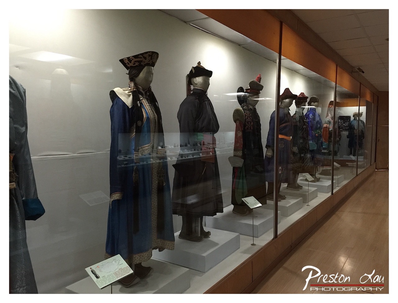

1. Overall Rating (0–10) — 6.0
This photograph captures a museum display of traditional garments with a sense of cultural reverence, though the image feels restrained by its sterile environment. The mannequins, dressed in richly detailed attire, convey a quiet dignity, but the reflections on the glass and flat lighting dilute the visual impact. While the subject matter is compelling, the execution lacks the atmospheric depth needed to fully convey the heritage on display.
2. Composition (0–10) — 6.0
The long diagonal line of the display case creates a sense of continuity, guiding the eye through the sequence of garments. However, the inclusion of reflections and the cluttered foreground slightly disrupt the visual flow, and the off-center framing leaves the left side underutilized.
3. Lighting (0–10) — 5.0
Harsh overhead lighting creates glare on the glass and flattens the textures of the fabrics. The light is functional but lacks the warmth or directionality needed to enhance the garments’ colors and intricate details.
4. Color & Tone (0–10) — 5.5
The color palette is subdued, dominated by the blues and dark tones of the clothing, which are muted by the lighting. The lack of contrast and vibrancy makes the scene feel somewhat washed out, reducing the visual richness of the traditional garments.
5. Creativity (0–10) — 6.5
The image presents a straightforward documentation of a cultural exhibit, but it stops short of artistic interpretation. The photographer captures the essence of the display, yet fails to elevate it through creative framing or mood.
6. Technical Quality (0–10) — 7.0
The image is sharp and clear, with good focus on the mannequins and readable text on the placards. The slight reflections are a technical limitation of the environment rather than a flaw in the camera work.
7. Emotional Impact (0–10) — 5.5
While the garments suggest a deep cultural narrative, the emotional resonance is muted by the clinical setting and technical limitations. The viewer is left with a sense of observation rather than connection or wonder.
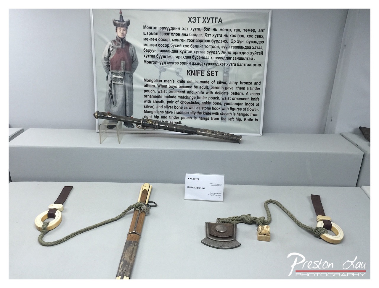

1. Overall Rating (0–10) — 6.0
This photograph documents a traditional Mongolian knife set with a clear educational intent, presenting historical artifacts in a museum-like setting. While the display is informative and the objects are well-preserved, the clinical lighting and straightforward composition lack visual drama, making the image feel more like a catalog entry than a compelling photograph. The focus on factual clarity overshadows artistic expression, though the cultural richness of the items offers a quiet sense of heritage.
2. Composition (0–10) — 6.0
The items are arranged horizontally across the foreground, creating a balanced but somewhat static composition. The central knife and flint are well-positioned, but the large informational panel in the background slightly overwhelms the scene, drawing attention away from the artifacts.
3. Lighting (0–10) — 5.5
The lighting is even and functional, typical of indoor museum displays, but it lacks depth and warmth. The flat illumination minimizes shadows and texture, which dulls the visual impact of the metallic and organic materials.
4. Color & Tone (0–10) — 5.5
The palette is muted, dominated by grays and neutral tones, with only subtle accents from the wood, silver, and brown leather. The lack of vibrant color or tonal contrast gives the image a subdued, documentary feel.
5. Creativity (0–10) — 5.5
The photograph functions as a straightforward documentation rather than a creative interpretation. While the subject matter is culturally rich, the execution is conventional and does not take advantage of compositional or stylistic opportunities to elevate the narrative.
6. Technical Quality (0–10) — 7.0
The image is sharp and well-focused, with clear detail on the knife, sheath, and inscriptions. The exposure is balanced, and the depth of field is adequate for capturing the entire display.
7. Emotional Impact (0–10) — 5.0
The emotional resonance is restrained, rooted more in intellectual curiosity than in aesthetic or personal connection. The viewer is invited to learn rather than to feel, limiting the image’s ability to evoke deeper reflection or wonder.
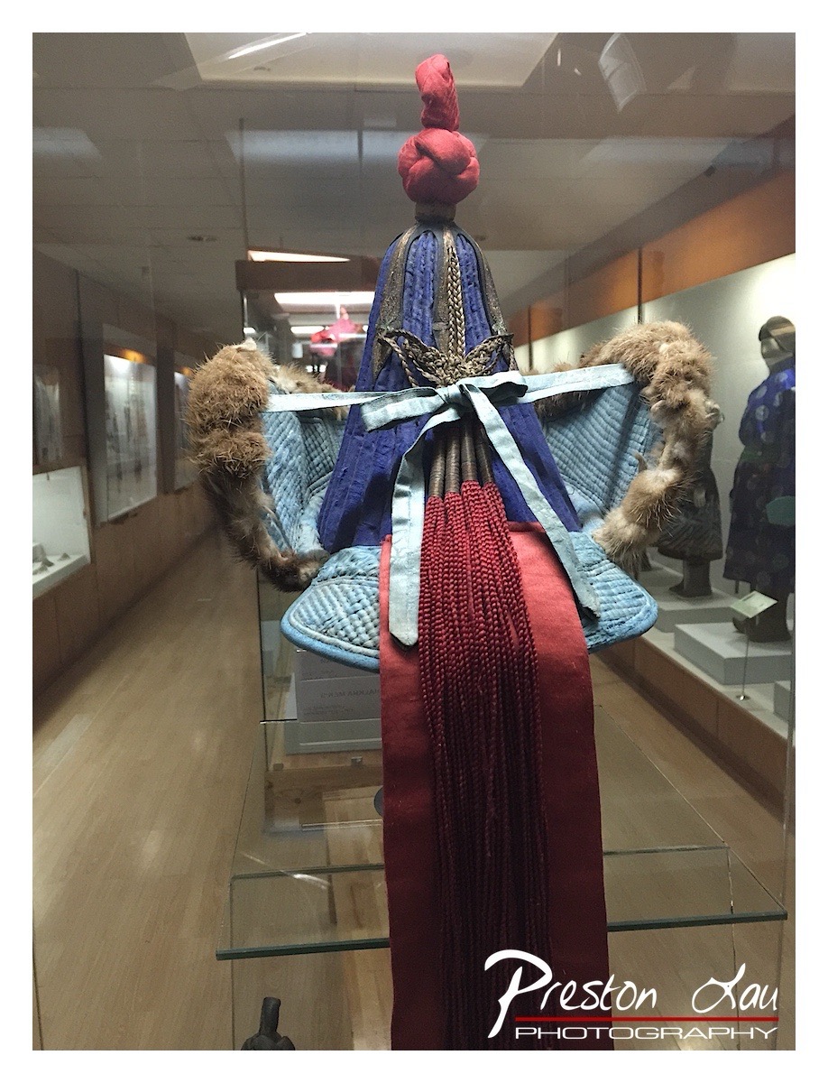

1. Overall Rating (0–10) — 7.0
This photograph captures the intricate craftsmanship of a traditional ceremonial headdress, its vibrant colors and textures standing out against the muted backdrop of a museum gallery. The composition draws attention to the object’s cultural significance, though the surrounding environment slightly dilutes its visual impact. While the image successfully documents the artifact, it holds back from fully conveying the grandeur of the piece, held back by a lack of dramatic lighting and a cluttered background.
2. Composition (0–10) — 6.5
The headdress is centered and well-framed, with the viewer’s eye naturally drawn to its vertical structure. However, the reflection of the hallway and other exhibits in the glass case creates visual distractions, reducing the focus on the main subject.
3. Lighting (0–10) — 5.5
The overhead fluorescent lighting is functional but flat, failing to accentuate the texture and depth of the fabric and fur. The lack of directional or ambient light gives the scene a sterile, documentary feel rather than a sense of reverence.
4. Color & Tone (0–10) — 7.0
The rich blue, red, and gold tones of the headdress are vivid and striking, creating a strong contrast with the neutral beige and gray surroundings. The color palette enhances the cultural richness of the piece, though the overall tone is slightly washed out by the lighting.
5. Creativity (0–10) — 6.0
The image is observational and respectful, capturing the artifact as it exists in a museum setting. While the subject matter is inherently compelling, the approach is conventional, with little attempt to reinterpret or stylize the scene for artistic effect.
6. Technical Quality (0–10) — 7.5
The photograph is sharp and clear, with good focus on the headdress. The depth of field is adequate, though the reflection in the glass adds a minor technical flaw.
7. Emotional Impact (0–10) — 6.5
The image conveys a sense of cultural preservation and quiet dignity, inviting viewers to appreciate the artistry and history of the object. However, the clinical setting and lack of atmospheric lighting prevent a deeper emotional connection.
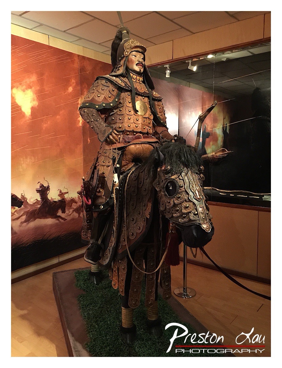

1. Overall Rating (0–10) — 7.0
This photograph captures a powerful and imposing display of a mounted warrior in ornate armor, evoking the grandeur of ancient military tradition. The dramatic backdrop of a fiery battlefield enhances the narrative weight of the figure, while the rich textures of the armor and horse gear are rendered with clarity. While the composition is strong and the subject compelling, the artificial lighting and slight clutter in the frame slightly diminish the image’s overall elegance.
2. Composition (0–10) — 7.0
The subject is well-centered and dominates the frame, drawing immediate attention. The background mural adds depth and context, though the reflections on the glass case and the foreground stanchion slightly disrupt the visual flow.
3. Lighting (0–10) — 6.5
The lighting is functional, highlighting the armor’s details and textures. However, the overhead museum lights create harsh reflections on the glass and cast uneven shadows, reducing the image’s atmospheric quality.
4. Color & Tone (0–10) — 7.0
The warm orange and red tones of the background mural create a dramatic, almost cinematic contrast with the earthy browns and metallic sheen of the armor. The color palette is cohesive and enhances the historical mood, though the overall saturation feels slightly muted.
5. Creativity (0–10) — 7.5
The image successfully blends historical representation with storytelling, using the backdrop to contextualize the warrior within a moment of battle. The choice to capture the figure in full regalia, mounted and poised, conveys a sense of narrative power and cultural significance.
6. Technical Quality (0–10) — 7.5
The photograph is sharp and detailed, particularly in the textures of the armor and horse gear. Focus is well-managed, and the depth of field keeps the subject clearly defined against the slightly softer background.
7. Emotional Impact (0–10) — 7.0
The image evokes a sense of awe and reverence for the past, with the warrior’s stoic posture and the war-torn backdrop suggesting sacrifice and valor. The viewer is drawn into a moment of imagined history, though the museum setting tempers the emotional intensity.
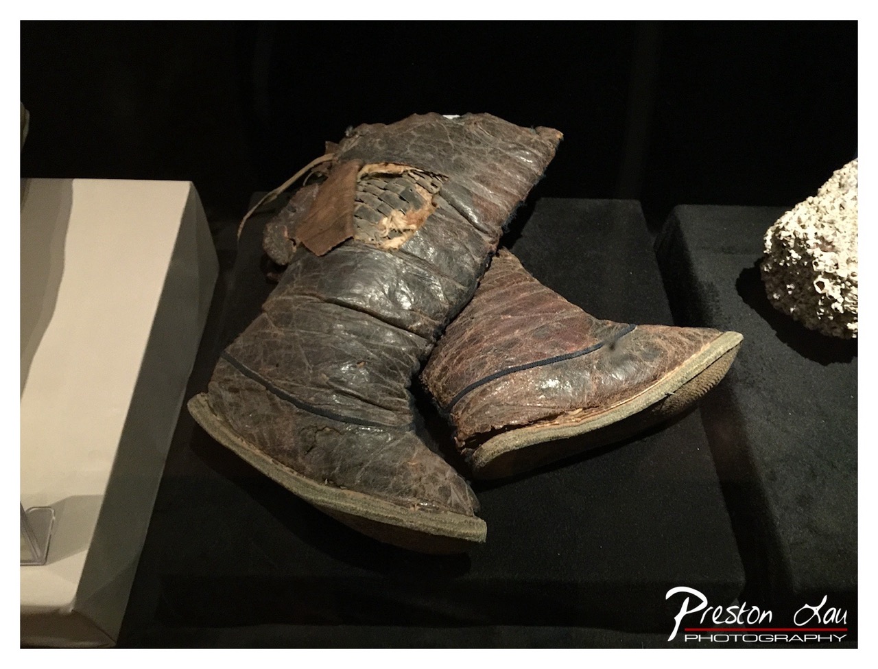

1. Overall Rating (0–10) — 7.0
This photograph captures the quiet dignity of a weathered pair of ancient boots, their worn leather and visible repairs telling a story of endurance and survival. The dark, focused lighting enhances the tactile quality of the artifact, drawing the viewer into its historical narrative. While the composition is strong and the subject compelling, the framing feels slightly off-center, and the presence of the photographer’s watermark detracts from the image’s authenticity as a museum documentation.
2. Composition (0–10) — 6.5
The boots are placed diagonally across the frame, creating a sense of movement, but the composition is slightly unbalanced by the white display case on the left and the out-of-focus rock on the right. A tighter crop could better emphasize the boots as the central subject.
3. Lighting (0–10) — 7.5
The directional lighting from above highlights the texture and decay of the leather, creating depth and contrast against the dark background. The use of shadows enhances the artifact’s three-dimensional form and evokes a somber, contemplative mood.
4. Color & Tone (0–10) — 6.5
The muted palette of dark browns, grays, and blacks reinforces the aged and solemn nature of the object. The tonal range is well-managed, but the lack of color vibrancy limits the image’s visual appeal, making it feel more like a document than a work of art.
5. Creativity (0–10) — 7.0
The photograph successfully captures the narrative potential of an archaeological artifact, transforming a simple museum display into a story of human resilience. The choice to emphasize texture and wear demonstrates a thoughtful approach to visual storytelling.
6. Technical Quality (0–10) — 7.5
The image is sharp and well-focused on the boots, with clear detail in the leather and stitching. The dark background effectively isolates the subject, and the exposure is appropriately balanced despite the low-light conditions.
7. Emotional Impact (0–10) — 7.0
The image evokes a sense of time and loss, inviting the viewer to reflect on the lives of those who once wore these boots. The quiet presence of the artifact and the careful lighting create a poignant, almost reverent atmosphere.
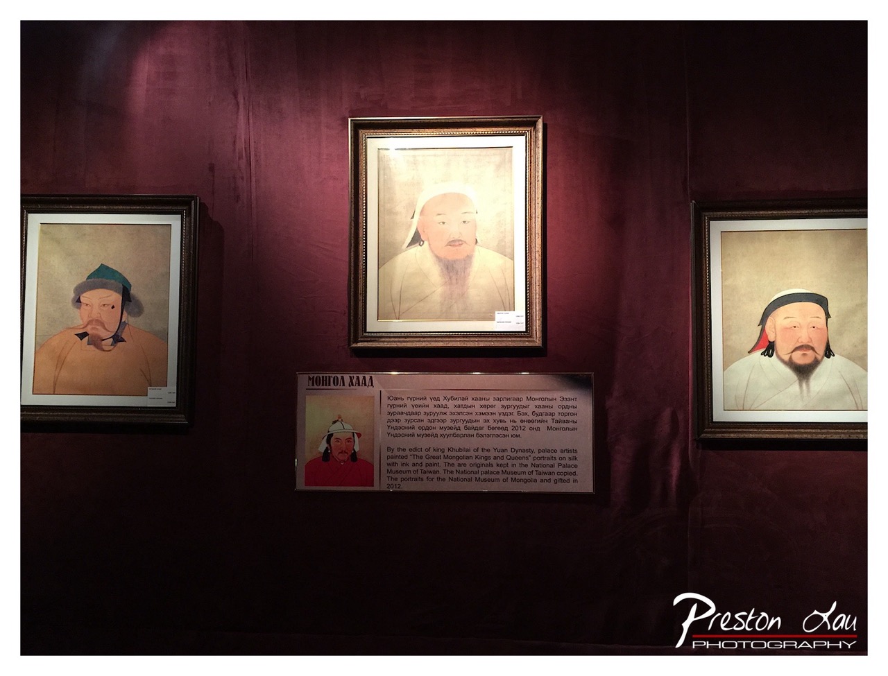

1. Overall Rating (0–10) — 7.0
This photograph captures the solemn reverence of a museum display, where historical portraiture is presented with quiet dignity. The deep maroon wall and soft lighting enhance the gravitas of the subject matter, while the arrangement of the portraits and informational plaque creates a balanced, narrative-rich scene. While the composition is effective and the lighting supports the mood, a slightly more dynamic angle or tighter framing could elevate the visual impact.
2. Composition (0–10) — 7.5
The central placement of the middle portrait creates a strong focal point, with the flanking images and plaque forming a balanced triad. The horizontal alignment and spacing lend harmony, though the lower portion feels slightly underutilized in terms of visual weight.
3. Lighting (0–10) — 7.0
Soft, directional lighting highlights the portraits without harsh glare, creating gentle shadows that add depth. The overall illumination is warm and deliberate, enhancing the historical tone of the exhibition.
4. Color & Tone (0–10) — 7.5
The rich, deep maroon of the wall provides a powerful backdrop, complementing the earthy tones of the portraits. The color palette is cohesive and evocative, with subtle warmth enhancing the sense of antiquity and cultural significance.
5. Creativity (0–10) — 6.5
The image functions as a straightforward documentation of an exhibit, but the thoughtful use of lighting and color elevates it beyond mere record. The inclusion of the plaque adds narrative depth, suggesting a story beyond the frame.
6. Technical Quality (0–10) — 8.0
The image is sharp and well-focused, with clean detail visible in the portraits and text. The exposure is balanced, and the watermark is unobtrusive, preserving the image's integrity.
7. Emotional Impact (0–10) — 7.0
The photograph conveys a sense of reverence and historical continuity, inviting contemplation of the figures depicted. The subdued lighting and composition foster quiet reflection, allowing the viewer to connect with the cultural legacy on display.
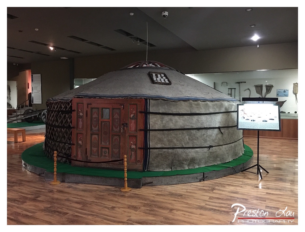

1. Overall Rating (0–10) — 6.8
This photograph captures a traditional yurt displayed in a museum setting, evoking a sense of cultural preservation and historical continuity. The warm wooden floors and soft overhead lighting create a contemplative atmosphere, while the yurt’s intricate door and weathered textures speak to craftsmanship and heritage. However, the composition feels slightly cluttered, with informational signage and museum elements competing for attention, which detracts from the visual focus on the yurt as a cultural artifact.
2. Composition (0–10) — 6.0
The yurt is centered but framed too wide, including extraneous background elements like the railing and distant display cases. The low-angle perspective adds a sense of scale, but the imbalance between the foreground and background reduces compositional harmony.
3. Lighting (0–10) — 6.5
The ambient lighting is functional and even, with spotlights highlighting the yurt’s structure. However, the overhead lights create some glare on the polished floor and fail to cast dramatic shadows, resulting in a flat, documentary feel rather than an evocative mood.
4. Color & Tone (0–10) — 6.2
The palette is subdued, dominated by earthy browns and grays, which suit the subject’s authenticity. The green platform offers a subtle contrast, but the overall tone lacks vibrancy, slightly diminishing the visual impact of the yurt’s painted details.
5. Creativity (0–10) — 6.5
The image successfully documents a cultural exhibit with a respectful, observational approach. While not particularly original in concept, it effectively conveys the yurt’s cultural significance and physical presence within a museum context.
6. Technical Quality (0–10) — 7.5
Sharp focus is maintained across the scene, with clean details visible on the yurt’s fabric and door. The exposure is balanced, though some overexposure occurs on the digital display screen.
7. Emotional Impact (0–10) — 6.0
The photograph invites curiosity and reflection on nomadic traditions, but the clinical museum environment and lack of human presence limit its emotional resonance. It feels more like a record than an evocative narrative.
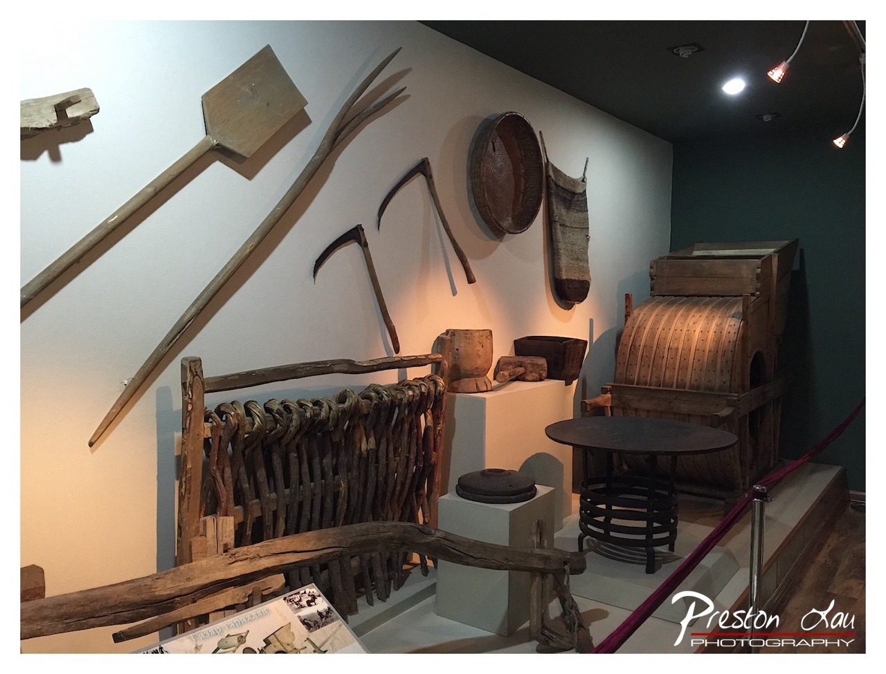

1. Overall Rating (0–10) — 7.0
This photograph captures the quiet dignity of a cultural heritage exhibit, where traditional tools and implements are displayed with reverence and historical weight. The warm, directional lighting enhances the textures of wood and woven materials, creating a sense of timelessness. While the composition is somewhat cluttered and the framing feels slightly off-center, the image succeeds in conveying the authenticity and craftsmanship of the artifacts on display.
2. Composition (0–10) — 6.0
The arrangement of tools and objects feels slightly unbalanced, with the foreground elements partially obstructing the view. A tighter crop and more deliberate framing would improve focus on the central display.
3. Lighting (0–10) — 7.5
The use of spotlights creates a dramatic, focused glow that highlights the textures and forms of the wooden tools. The contrast between the warm light and the darkened background enhances the mood and draws attention to key elements.
4. Color & Tone (0–10) — 6.5
The palette is dominated by earthy browns and muted tones, which support the historical and natural aesthetic. However, the overall color temperature is slightly uneven, with a cool cast in the background that detracts from the warmth of the illuminated area.
5. Creativity (0–10) — 7.0
The image effectively tells a story of tradition and labor through its selection of objects and atmospheric lighting. The inclusion of a human-scale perspective—through the tools and their arrangement—invites contemplation of past ways of life.
6. Technical Quality (0–10) — 7.5
The image is sharp and well-focused, with clear detail in the textures of the wood and woven materials. The exposure is generally balanced, though slight overexposure in the brightest areas could be refined.
7. Emotional Impact (0–10) — 6.5
The photograph evokes a quiet reverence for cultural memory, inviting viewers to reflect on the tools that shaped generations. While the emotional resonance is present, it is restrained by the distance created by the museum setting and the lack of human presence.
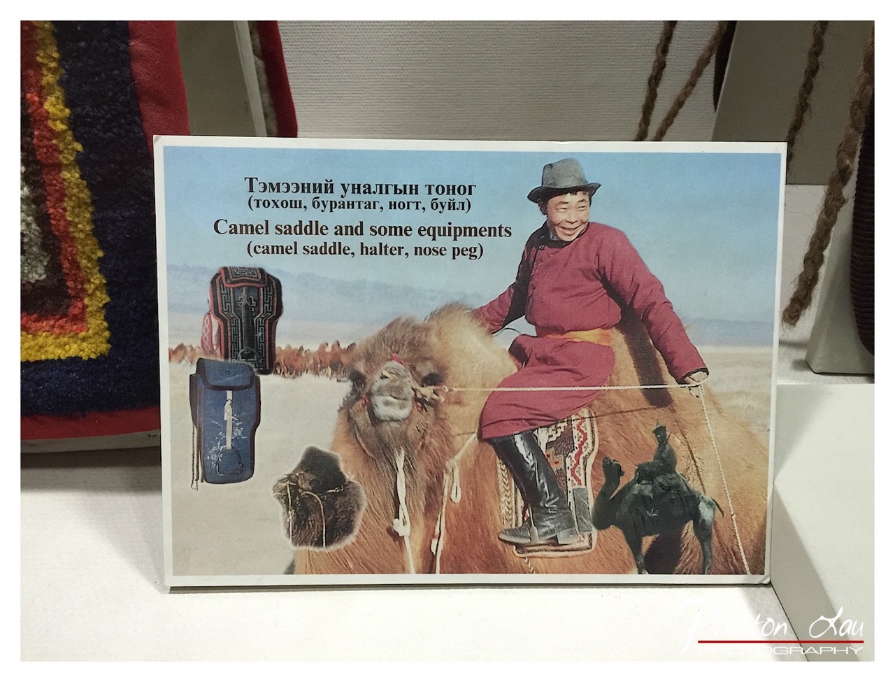

1. Overall Rating (0–10) — 6.0
This photograph captures a vintage postcard depicting traditional Mongolian camel equipment, offering a glimpse into cultural heritage and nomadic life. The image's charm lies in its nostalgic quality and informative nature, though the cluttered framing and low resolution detract from its visual appeal. While it succeeds as a cultural artifact, its presentation lacks the refinement to feel like a polished photographic work.
2. Composition (0–10) — 5.0
The postcard is centered but partially obscured by foreground elements, creating a sense of clutter. The subject is framed unevenly, and the surrounding objects distract from the intended focus on the card itself.
3. Lighting (0–10) — 5.5
Ambient indoor lighting is flat and neutral, casting minimal shadows and failing to enhance the depth or texture of the postcard. The lighting is functional but unremarkable.
4. Color & Tone (0–10) — 6.0
The colors on the postcard are somewhat faded, with muted reds and browns that suggest age. The overall tone is subdued, with a lack of vibrancy that reflects the photograph’s vintage origin.
5. Creativity (0–10) — 5.5
The image is more documentary than artistic, focusing on the postcard’s content rather than interpreting it creatively. The composition and framing are straightforward, with little sense of visual storytelling.
6. Technical Quality (0–10) — 6.5
The image is reasonably sharp, with clear text and discernible details on the postcard. However, the overall resolution and focus are limited, and the presence of a watermark detracts from professionalism.
7. Emotional Impact (0–10) — 5.0
The photograph evokes a sense of nostalgia and cultural curiosity but does not elicit strong emotional resonance. The viewer is more likely to appreciate it intellectually than emotionally.
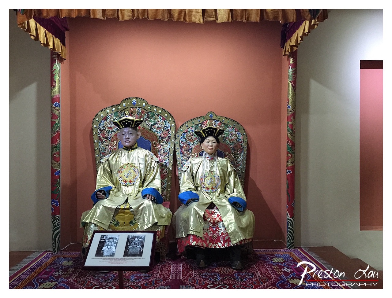

1. Overall Rating (0–10) — 7.0
This photograph captures a regal and historically rich display, evoking the solemn dignity of imperial Tibetan or Qing-era court life. The intricate costumes and ornate thrones convey a sense of ceremonial grandeur, while the warm, ambient lighting enhances the richness of the textures and fabrics. The composition is strong, though the presence of the photographer’s watermark and the informational plaque slightly disrupts the visual harmony.
2. Composition (0–10) — 7.0
The subjects are centrally framed, creating a balanced and symmetrical composition that emphasizes their importance. The vertical lines of the drapery and throne backs guide the eye toward the figures, while the patterned rug adds depth and grounding to the scene.
3. Lighting (0–10) — 6.5
The lighting is soft and warm, enhancing the golden tones of the robes and the richness of the surroundings. However, the left side of the image is slightly darker, creating a subtle imbalance, and the overhead light source casts mild shadows that reduce some of the detail in the faces.
4. Color & Tone (0–10) — 7.5
The palette is dominated by warm golds, reds, and deep blues, creating a cohesive and luxurious visual tone. The contrast between the golden robes and the terracotta wall enhances the vibrancy of the scene, while the richly patterned carpet adds complexity and cultural depth.
5. Creativity (0–10) — 7.0
The image successfully captures a moment of cultural and historical significance, presenting the figures not as mere mannequins but as symbolic representations of authority and tradition. The inclusion of the historical photographs in the foreground adds narrative context and elevates the image beyond a simple documentary shot.
6. Technical Quality (0–10) — 7.5
The focus is sharp on the figures, and the details of the embroidery and fabric textures are well-preserved. The image is clean with minimal noise, and the white balance accurately reflects the warm indoor lighting.
7. Emotional Impact (0–10) — 7.0
The image evokes a sense of reverence and timelessness, inviting the viewer to reflect on the legacy of the figures depicted. The stillness of the scene and the formal posture of the figures convey a quiet dignity that resonates emotionally, though the lack of human expression slightly limits the connection.
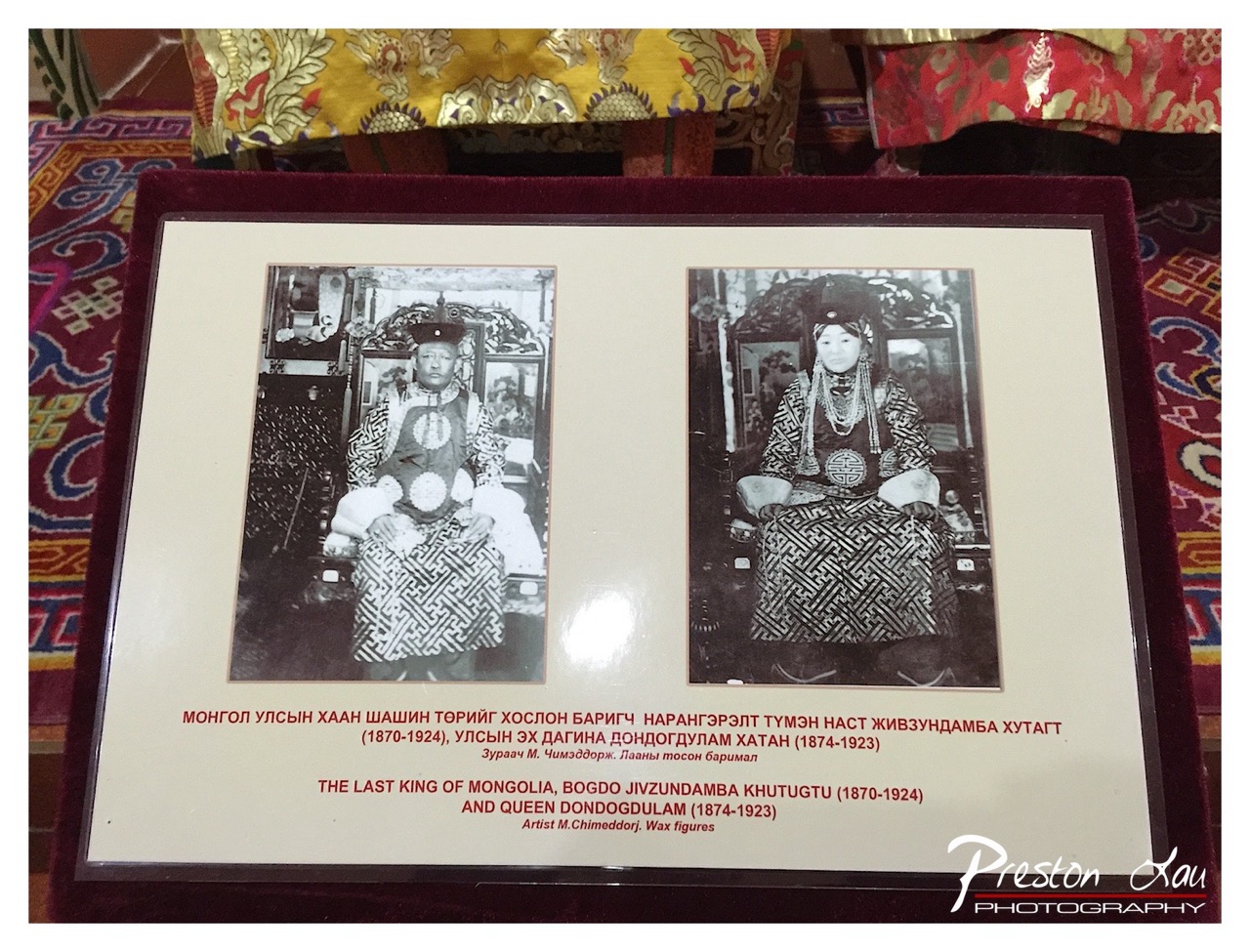

1. Overall Rating (0–10) — 6.0
This photograph captures a historical display with cultural richness, presenting wax figures of Mongolia’s last king and queen in formal regalia. The composition is informative, emphasizing cultural heritage through detailed costumes and inscriptions. However, the image’s flat lighting and lack of dynamic framing reduce its visual impact, making it feel more like a documentation than an artistic statement.
2. Composition (0–10) — 6.0
The display is centered and balanced, with the two portraits equidistant and framed symmetrically. The surrounding textiles add context but slightly clutter the foreground, drawing attention away from the central subject.
3. Lighting (0–10) — 5.0
The lighting is direct and even, causing a noticeable glare on the protective glass. While functional for visibility, it flattens the image and diminishes the depth and texture of the wax figures and fabric.
4. Color & Tone (0–10) — 6.0
The warm maroon of the frame and vibrant textiles contrast with the black-and-white portraits, creating a visually layered effect. However, the color palette is limited and lacks vibrancy, resulting in a somewhat muted overall tone.
5. Creativity (0–10) — 6.0
The photograph documents a historically significant exhibit with a clear intent to preserve cultural identity. While the presentation is straightforward and respectful, it lacks originality in framing or perspective, feeling more like a record than a creative interpretation.
6. Technical Quality (0–10) — 7.0
The image is sharp and clear, with readable text and well-defined details in the wax figures and textiles. The focus is consistent, and the depth of field adequately captures the subject.
7. Emotional Impact (0–10) — 5.5
The image conveys a sense of reverence and historical weight, but the emotional connection is muted by the sterile presentation and technical imperfections. It invites curiosity about the subjects but does not evoke a strong personal or emotional response.
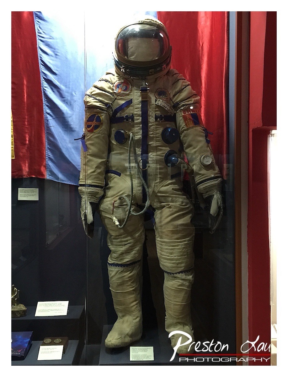

1. Overall Rating (0–10) — 7.0
This photograph captures the solemn dignity of a Soviet-era spacesuit, standing as a relic of human ambition and Cold War rivalry. The juxtaposition of the cream-colored suit against the bold red and blue drapery evokes a powerful sense of history and national pride. While the image is clear and informative, the reflective glass and cluttered foreground slightly dilute its visual impact, keeping it from achieving full artistic resonance.
2. Composition (0–10) — 6.5
The suit is centered and well-framed, drawing immediate attention, though the reflections on the glass and the presence of display labels in the lower left distract from the subject’s commanding presence.
3. Lighting (0–10) — 6.0
The lighting is even but somewhat flat, likely from overhead museum fixtures. It highlights the suit’s texture and details without creating dramatic shadows or depth.
4. Color & Tone (0–10) — 7.0
The contrast between the muted beige of the suit and the saturated red and blue background creates a visually striking palette, emphasizing the suit’s historical significance and the symbolism of the flags behind it.
5. Creativity (0–10) — 7.5
The image successfully blends documentary and symbolic elements, using color and context to elevate a museum artifact into a narrative about exploration and ideology.
6. Technical Quality (0–10) — 7.5
The photograph is sharp, with clear focus on the spacesuit and readable text on the display placards. The white balance is accurate, preserving the authenticity of the scene.
7. Emotional Impact (0–10) — 7.0
There is a quiet reverence in the image, evoking awe for human achievement and the courage of early astronauts, though the glass barrier subtly reinforces a sense of distance between viewer and artifact.
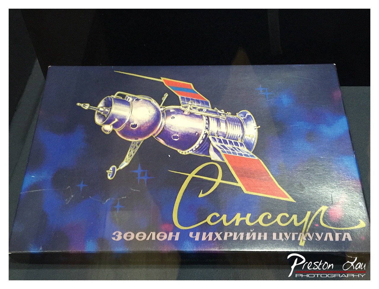

1. Overall Rating (0–10) — 6.0
This image captures a nostalgic Soviet-era space-themed box, its bold illustration and Cyrillic script evoking a sense of Cold War-era ambition and technological pride. The artwork, while vibrant and dynamic, is slightly dulled by the glare and reflections from the protective glass, which softens the visual impact. While the subject matter is rich with historical and cultural resonance, the photograph itself feels more like a casual documentation than a polished artistic statement.
2. Composition (0–10) — 6.5
The box is centered and fills the frame, with the spacecraft illustration leading the eye diagonally across the image. However, the uneven lighting and reflections introduce distractions, particularly in the lower corners, which disrupt the visual flow.
3. Lighting (0–10) — 5.5
The lighting is uneven, with strong reflections on the glossy surface that obscure details of the box. The ambient light is cool and diffuse, failing to enhance the depth or texture of the illustration.
4. Color & Tone (0–10) — 7.0
The color palette is rich and evocative, with deep blues and purples contrasting against the bright red and gold accents. The warm gold script stands out against the cool background, creating a dynamic visual hierarchy.
5. Creativity (0–10) — 7.0
The image successfully captures a piece of cultural history with a strong sense of narrative. The juxtaposition of the retro-futuristic artwork with the modern photograph adds a layer of temporal contrast that is both intriguing and thoughtfully composed.
6. Technical Quality (0–10) — 6.0
The photograph is clear and in focus, but the reflections and glare significantly reduce overall sharpness and clarity. The lens flare and surface imperfections detract from the technical precision.
7. Emotional Impact (0–10) — 6.5
The image evokes a sense of wonder and nostalgia, particularly for those familiar with the Soviet space program. While the emotional resonance is strong, the technical limitations of the photograph prevent it from fully conveying the grandeur of the subject.
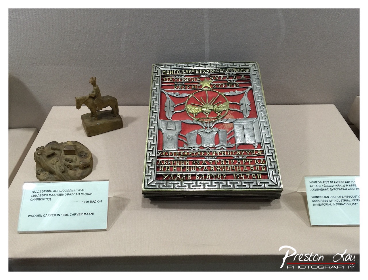

1. Overall Rating (0–10) — 7.0
This photograph presents a compelling display of Mongolian cultural artifacts, capturing the quiet dignity of historical objects within a museum setting. The central emblem, rich with symbolic detail and bold color, draws the eye, while the surrounding items—though modest—offer context and narrative depth. The composition is balanced and informative, though a slightly warmer tone might enhance the emotional resonance of the scene.
2. Composition (0–10) — 7.5
The arrangement is well-structured, with the central plaque anchoring the frame and the smaller objects creating a natural visual flow. The use of negative space and the angled perspective give the scene a sense of depth, though the labels slightly disrupt the aesthetic harmony.
3. Lighting (0–10) — 6.5
Even, diffused lighting highlights the textures and details of the artifacts without creating harsh shadows. However, the cool, sterile quality of the light tempers the warmth of the red and gold elements, slightly diminishing their visual impact.
4. Color & Tone (0–10) — 7.0
The red and gold of the central plaque stand out against the muted background, creating a strong focal point. The overall tone is neutral and documentary, with a subtle warmth that complements the cultural significance of the objects.
5. Creativity (0–10) — 7.0
The photograph successfully balances documentation with artistic intent, using framing and focus to emphasize the cultural narrative. The choice to include the signage adds authenticity, though the approach remains largely conventional.
6. Technical Quality (0–10) — 8.0
Sharp focus and clear detail across the frame ensure that the inscriptions and textures are legible. The image is well-exposed, with no noticeable technical flaws.
7. Emotional Impact (0–10) — 6.5
While the image conveys respect for the artifacts and their historical context, the emotional connection is more intellectual than visceral. The viewer is invited to learn rather than feel, making the impact informative but not deeply moving.
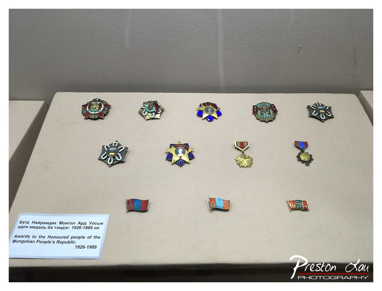

1. Overall Rating (0–10) — 6.0
This photograph presents a collection of Mongolian state awards with a clear documentary intent, capturing the historical significance of the medals displayed in a museum setting. The arrangement is orderly, and the accompanying label adds contextual depth, though the image’s overall impact is restrained by its flat lighting and conventional framing. While it succeeds in conveying information, it lacks the visual dynamism to elevate the subject beyond mere record-keeping.
2. Composition (0–10) — 6.5
The medals are arranged in a balanced, grid-like pattern, creating a sense of order and formality. However, the wide shot includes unnecessary negative space and a slightly tilted perspective, which detracts from the visual harmony and diminishes the focus on the central subject.
3. Lighting (0–10) — 5.5
The lighting is even and functional, likely from overhead museum fixtures, but it produces a flat, unidimensional quality that fails to highlight the textures and metallic sheen of the medals. The lack of directional light or shadow reduces the sense of depth and dimension.
4. Color & Tone (0–10) — 6.0
The color palette is muted, dominated by the beige display surface and the subdued tones of the medals. While the enamel details in red, blue, and gold are visible, they are not emphasized, and the overall tone feels neutral and slightly washed out.
5. Creativity (0–10) — 5.5
The image is straightforward and informative, prioritizing clarity over artistic expression. The arrangement of medals is methodical, but there is little visual storytelling or conceptual interpretation—this is more of a historical archive than a creative composition.
6. Technical Quality (0–10) — 7.0
The image is sharp and well-focused, with clear detail visible on the medals and the text label. The resolution is adequate, and the exposure is balanced, though the camera angle and framing reduce the overall impact.
7. Emotional Impact (0–10) — 5.0
The photograph conveys respect for the historical significance of the awards, but its clinical presentation keeps the viewer at a distance. There is little emotional resonance, as the image functions more as a factual record than an evocative portrait of honor and legacy.
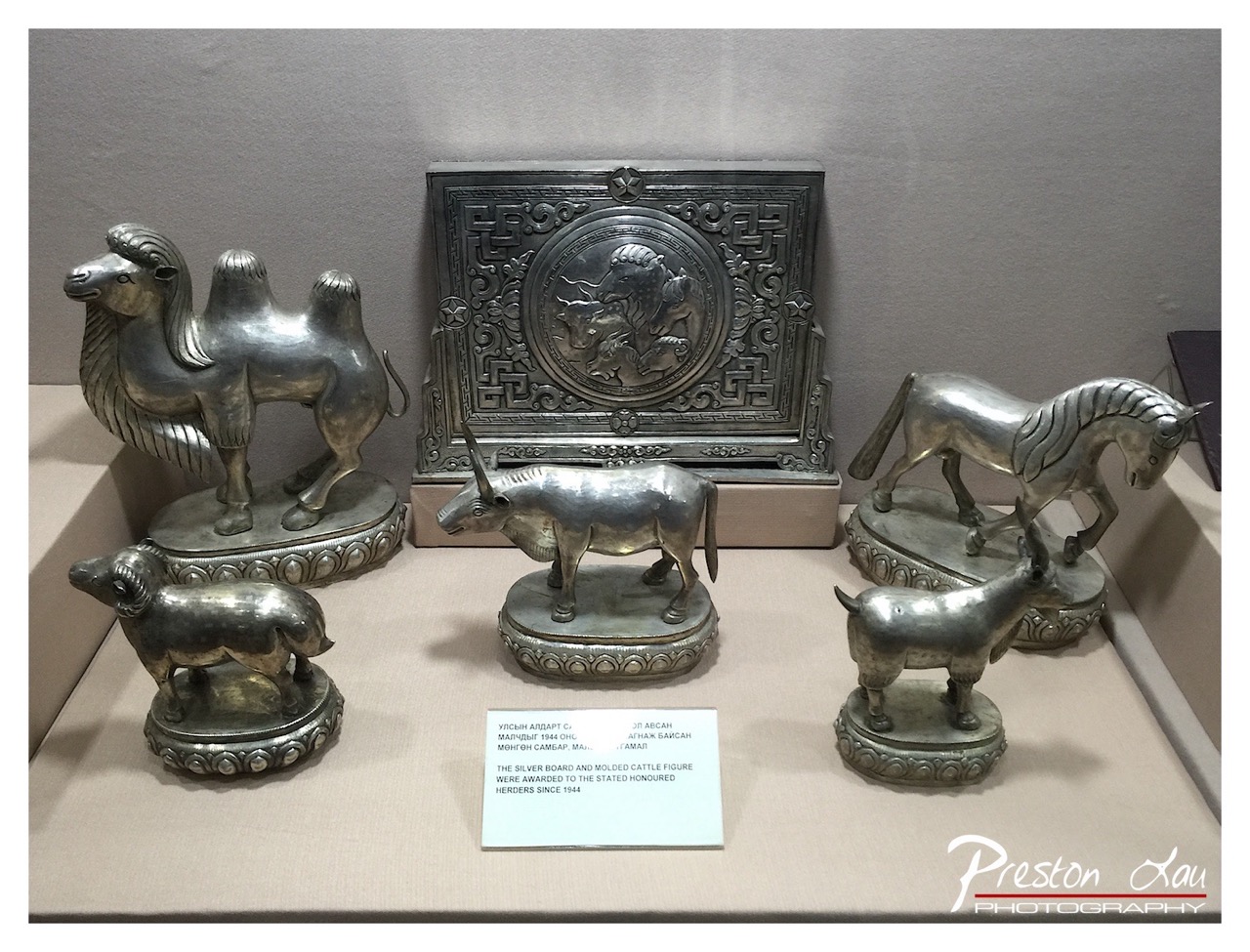

1. Overall Rating (0–10) — 6.0
This photograph captures a curated display of traditional silver artifacts, evoking a sense of cultural heritage and craftsmanship. The metallic sheen of the animals and the ornate board reflect light in a way that highlights their intricate details, though the composition feels slightly static and documentary in tone. While the objects themselves are rich in history and artistry, the image lacks a dynamic visual narrative, remaining more informative than emotionally compelling.
2. Composition (0–10) — 6.5
The arrangement of the silver figures creates a balanced, symmetrical layout with the central plaque anchoring the scene. However, the inclusion of the label and the uneven spacing between objects disrupts visual flow, creating a cluttered feel that detracts from the aesthetic cohesion.
3. Lighting (0–10) — 6.0
The lighting is even and functional, suitable for a museum setting, but it lacks directionality and depth. The flat illumination highlights the metallic surfaces without creating dramatic shadows, resulting in a somewhat sterile atmosphere.
4. Color & Tone (0–10) — 6.5
The monochromatic palette of silver and beige tones is consistent and restrained, emphasizing the metallic textures. The subtle variations in tone across the objects add visual interest, though the lack of color variety limits emotional resonance.
5. Creativity (0–10) — 5.5
The image functions as a straightforward documentation of cultural artifacts, with limited artistic interpretation. The focus is on clarity and information rather than creative expression or storytelling.
6. Technical Quality (0–10) — 7.5
The image is sharp and well-focused, with clean details visible on the metal surfaces and inscriptions. The depth of field is appropriate, keeping all objects in focus, though the slight grain suggests a higher ISO or lower light environment.
7. Emotional Impact (0–10) — 5.0
While the craftsmanship of the artifacts evokes a sense of respect and admiration, the photograph itself remains detached and clinical. The viewer is invited to observe rather than feel, limiting the emotional connection.
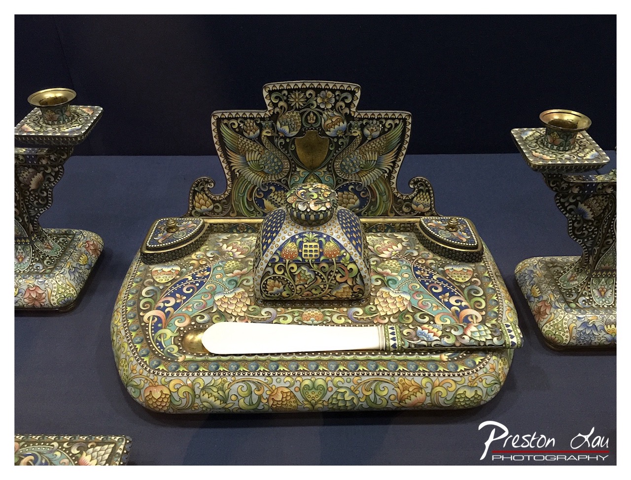

1. Overall Rating (0–10) — 7.5
This photograph captures the intricate artistry of a Fabergé-style enamel desk set with remarkable clarity, showcasing its opulent details and symmetrical elegance. The rich ornamentation and jewel-toned palette evoke a sense of historical grandeur, though the flat lighting and slightly cluttered framing prevent it from achieving a more refined visual impact. The image succeeds as a document of craftsmanship, but it feels more like a museum catalog than a compelling artistic statement.
2. Composition (0–10) — 6.5
The central desk set is well-framed, with the candlesticks creating balanced symmetry on either side. However, the inclusion of the partial base in the lower-left corner disrupts the composition’s harmony and adds unnecessary visual noise.
3. Lighting (0–10) — 6.0
The lighting is even and functional, highlighting the enamel work without harsh glare, but it lacks directional warmth or contrast, resulting in a somewhat flat, sterile quality that diminishes the object’s three-dimensional richness.
4. Color & Tone (0–10) — 7.5
The vibrant, jewel-like palette—featuring deep blues, golds, and emerald greens—is beautifully rendered, with the colors complementing one another and enhancing the ornate design. The dark background provides effective contrast, allowing the piece to stand out.
5. Creativity (0–10) — 7.0
The photograph captures a rare and visually complex object with care, but the approach is conventional—more documentary than interpretive. The creative strength lies in the subject itself rather than the photographer’s vision.
6. Technical Quality (0–10) — 8.0
Sharp focus and clean detail are evident throughout, particularly in the fine enameled textures. The image is technically sound, with minimal noise and precise rendering of the intricate patterns.
7. Emotional Impact (0–10) — 6.5
The piece evokes a sense of luxury and historical craftsmanship, but the emotional resonance is restrained by the impersonal presentation. The viewer is invited to admire the object, but not to feel deeply connected to its story.
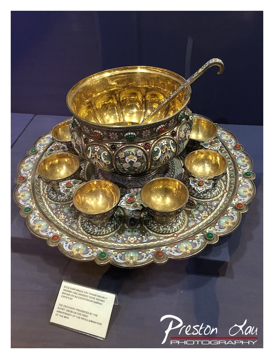

1. Overall Rating (0–10) — 7.5
This photograph captures the opulence and intricate craftsmanship of a Soviet-era cloisonné casserole set, where gold and enamel details gleam under museum lighting. The composition balances the rich textures and vibrant colors of the piece with a clean, respectful presentation, though the watermark and informational placard slightly disrupt the visual harmony. The image succeeds in conveying both the historical significance and artistic beauty of the object, though it remains grounded in documentation rather than evoking deeper narrative.
2. Composition (0–10) — 7.0
The casserole set is centered and framed to emphasize its symmetry and ornate design. The surrounding space and the placard create a balanced, gallery-like setting, though the lower-left text and watermark slightly interrupt the visual flow.
3. Lighting (0–10) — 8.0
The lighting is soft and directional, enhancing the metallic sheen of the gold and the depth of the enamel work. It creates gentle highlights that emphasize texture without overwhelming the details, though a touch more contrast could deepen the shadows.
4. Color & Tone (0–10) — 8.0
The rich palette of gold, green, red, and blue enamel creates a vibrant yet harmonious contrast against the dark background. The color temperature is neutral, allowing the natural tones of the object to shine without distortion.
5. Creativity (0–10) — 7.0
The photograph is conceptually straightforward—documenting a museum artifact—but the careful framing and attention to light elevate it beyond mere record-keeping. The composition suggests a reverence for the object’s craftsmanship, subtly conveying its cultural and artistic value.
6. Technical Quality (0–10) — 8.0
Sharp focus and fine detail reveal the intricate patterns and textures of the cloisonné work. The depth of field is appropriate, keeping the entire set in focus while softly blurring the background to emphasize the subject.
7. Emotional Impact (0–10) — 7.5
The image evokes a sense of awe and appreciation for historical artistry, inviting the viewer to contemplate the skill and cultural context behind the piece. While not emotionally charged, it carries a quiet dignity that resonates with the viewer’s sense of heritage and craftsmanship.
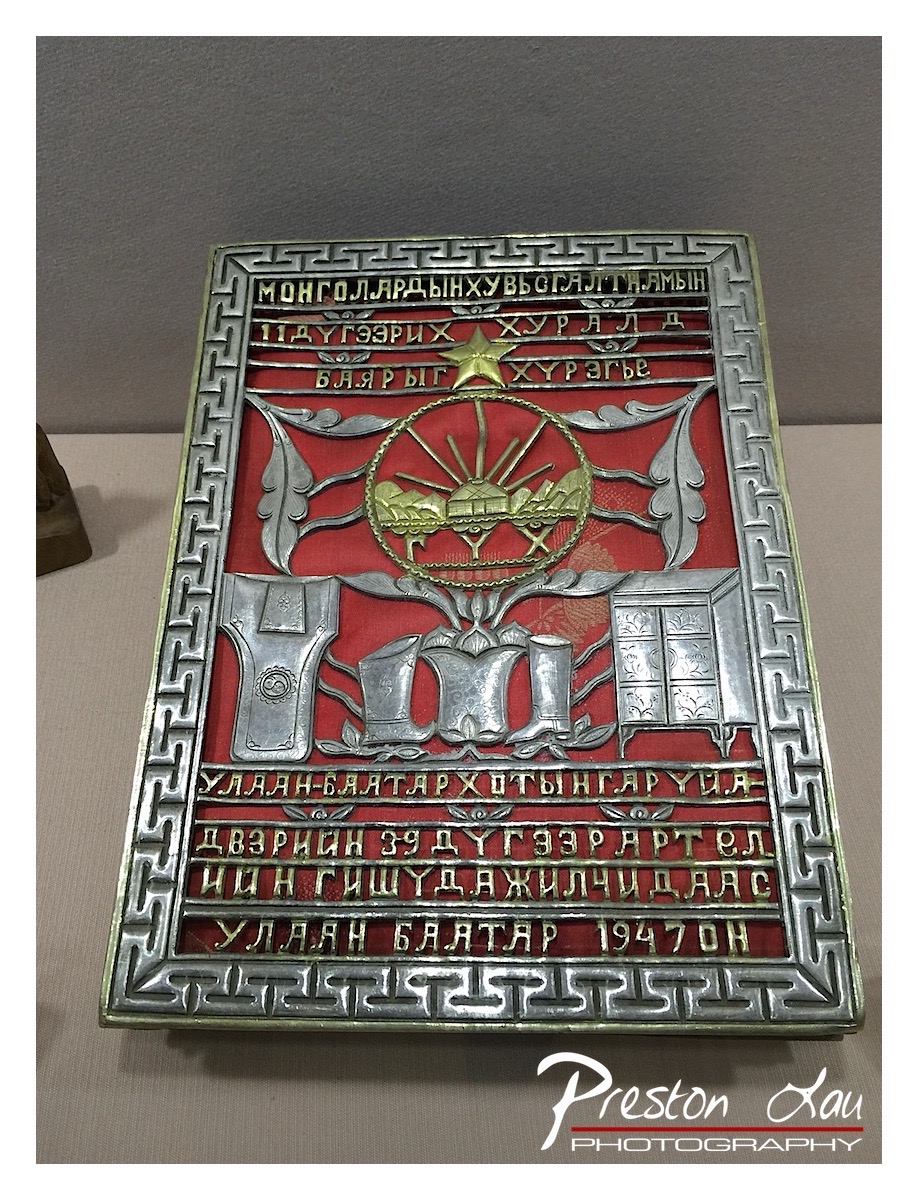

1. Overall Rating (0–10) — 7.5
This photograph captures a richly detailed Mongolian commemorative plaque with a strong sense of historical gravitas. The intricate metalwork and symbolic imagery—such as the star, traditional elements, and Cyrillic script—convey a powerful cultural narrative. While the composition is slightly off-center and the lighting feels flat, the image successfully preserves the artifact’s solemnity and craftsmanship, making it a compelling document of heritage.
2. Composition (0–10) — 6.0
The plaque is framed with a slight off-center tilt, and the left edge cuts into the frame, creating an asymmetrical balance. A tighter, centered crop would enhance visual harmony and focus.
3. Lighting (0–10) — 5.5
The lighting is even but lacks directional depth, resulting in a flat appearance that diminishes the three-dimensional texture of the embossed metal. A more directional light source would highlight the relief and detail.
4. Color & Tone (0–10) — 7.0
The red background provides a strong contrast against the silver metal, and the gold accents add visual warmth. However, the overall tone is slightly desaturated, reducing the richness of the colors.
5. Creativity (0–10) — 7.5
The image thoughtfully presents a historical artifact with cultural significance. The choice to include the full text and intricate design honors the object’s narrative, offering viewers a glimpse into Mongolian history and tradition.
6. Technical Quality (0–10) — 8.0
The image is sharp and detailed, with clear focus on the plaque’s surface. The photographer has captured the text and textures well, despite the limitations of the lighting.
7. Emotional Impact (0–10) — 7.0
The artifact evokes a sense of reverence and historical continuity, inviting reflection on Mongolia’s past. While the emotional resonance is strong, the clinical presentation keeps the viewer at a slight remove.
Loading map...