The blog post describes a trip to South Korea during Chinese New Year holiday. The author visited several sites in the Demilitarized Zone (DMZ), including Imjimgak, Dora-san Observatory, Panmunjom, and the 3rd Tunnel. They also spent time at COEX Aquarium and Alpensia Ski Resort, enjoying various attractions such as fish tanks, moving walkways, and snowboarding for kids. The family had a fun experience with skiing lessons and creating giant snowmen.
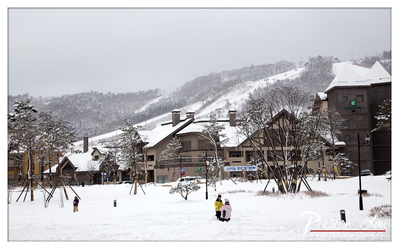

1. Overall Rating (0–10) — 6.8
This photograph captures the serene stillness of a snowy mountain resort, where the quiet hum of winter life unfolds beneath a gray, overcast sky. The composition balances architectural warmth with the stark beauty of the natural landscape, and the muted palette enhances the sense of calm, though the lack of strong contrast slightly dampens the visual punch. While the image effectively conveys a peaceful winter atmosphere, it holds back from transcending into something more striking or emotionally resonant.
2. Composition (0–10) — 7.0
The framing centers the cluster of buildings and distant ski slopes, creating a balanced and expansive view. The scattered trees and figures in the foreground add depth, though the wide perspective slightly dilutes the sense of intimacy.
3. Lighting (0–10) — 5.5
Diffused, overcast light flattens the scene, minimizing shadows and texture. While this contributes to the quiet mood, it also reduces dimensionality and visual interest.
4. Color & Tone (0–10) — 6.0
The palette is dominated by cool whites and grays, with subtle hints of earthy browns and muted greens. The tonal range is limited, giving the image a monochromatic feel that feels both cohesive and subdued.
5. Creativity (0–10) — 6.5
The photograph captures a familiar winter scene with a documentary honesty, but it lacks a distinctive artistic angle. The inclusion of the directional sign and the Holiday Inn logo grounds it in place, making it more a record than a vision.
6. Technical Quality (0–10) — 7.5
Sharpness is generally strong, with fine detail visible in the snow and architecture. The exposure is well-managed, though the flat lighting prevents deeper tonal richness.
7. Emotional Impact (0–10) — 6.0
The image evokes a sense of quiet contemplation and mild nostalgia, but its emotional pull is restrained by the lack of dynamic light and narrative focus. The viewer is invited to observe, but not deeply moved.
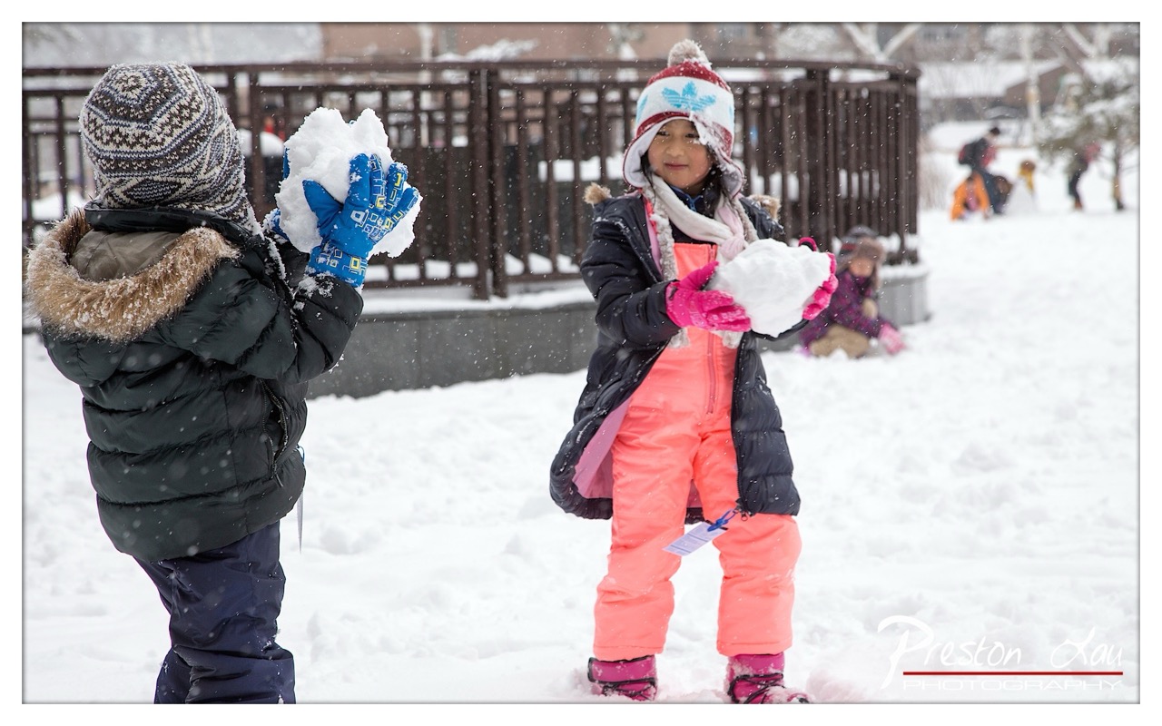

1. Overall Rating (0–10) — 7.5
This photograph captures the joyful spontaneity of children playing in the snow, where motion and emotion converge in a moment of winter delight. The vibrant clothing contrasts beautifully with the muted white landscape, drawing the eye to the children’s playful energy. While the background is slightly cluttered, the image succeeds in conveying a sense of candid warmth and seasonal magic.
2. Composition (0–10) — 7.0
The two children are well-placed along the diagonal, creating a dynamic flow from left to right. The girl in pink commands attention as the focal point, while the other child’s back adds depth and narrative context. A tighter crop might enhance intimacy, but the current framing effectively includes environmental storytelling.
3. Lighting (0–10) — 6.5
Diffused natural light from an overcast sky softens shadows and evenly illuminates the scene, preserving detail in the snow and clothing. The falling snow adds texture and atmosphere, though the lack of directional light slightly diminishes depth.
4. Color & Tone (0–10) — 8.0
The bold coral of the girl’s snowsuit and the bright blue gloves pop against the cool whites and grays, creating a visually engaging contrast. The color palette feels natural yet lively, enhancing the scene’s cheerful tone.
5. Creativity (0–10) — 7.5
The image captures a timeless, universal moment of childhood play, but its strength lies in the photographer’s ability to frame it with emotional clarity. The inclusion of snow in motion adds a layer of dynamism, elevating it beyond a simple snapshot.
6. Technical Quality (0–10) — 8.0
Sharp focus on the children, with clean detail in their clothing and snow, demonstrates strong technical control. The shallow depth of field effectively blurs the background, keeping the subjects prominent.
7. Emotional Impact (0–10) — 8.0
There is an immediate sense of joy and carefree energy that resonates with viewers, evoking nostalgia for snowy days past. The children’s expressions and actions invite connection, making the image feel both personal and universally relatable.
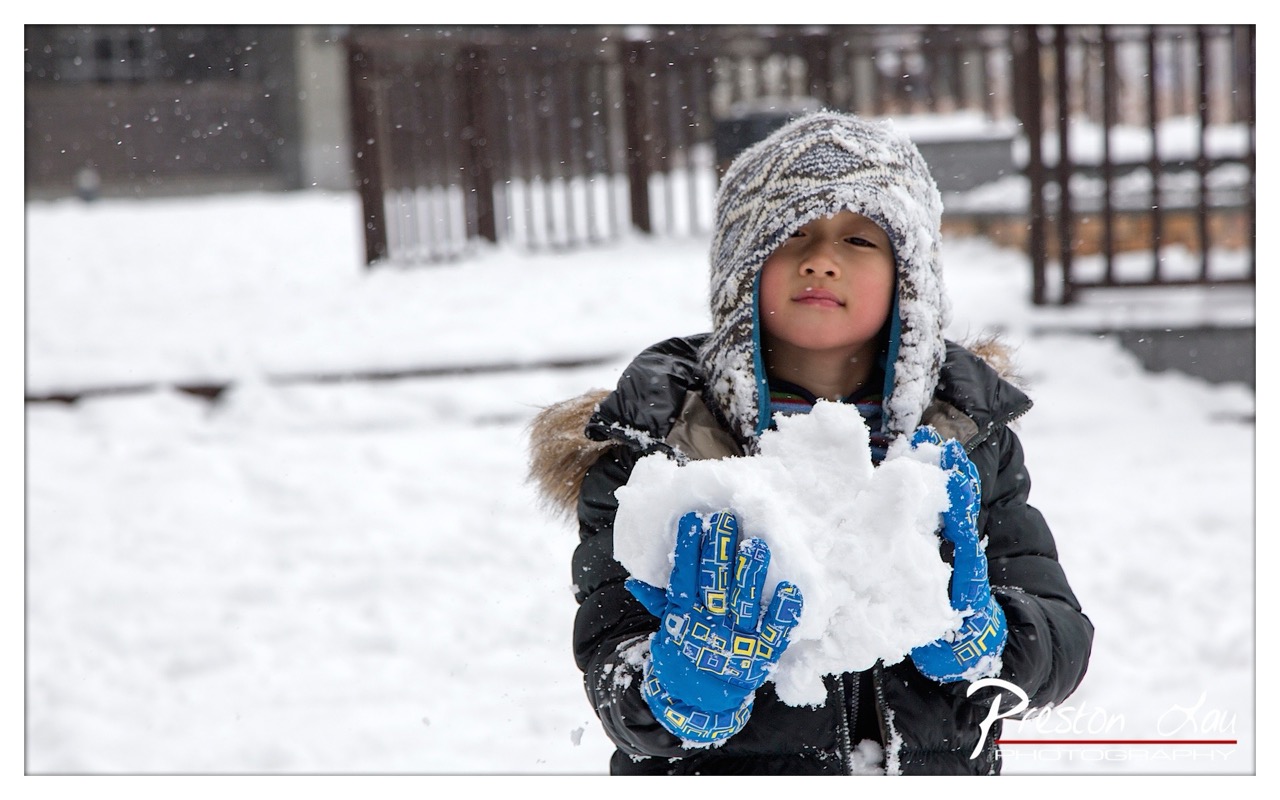

1. Overall Rating (0–10) — 7.5
This photograph captures a tender, wintry moment with quiet charm, where a child’s quiet focus on a snowball becomes a window into the simple joys of winter. The soft snowfall and intimate framing draw the viewer into the scene, creating a sense of stillness and wonder. While the image is strong in mood and composition, it slightly lacks the visual dynamism to feel fully transcendent—still, it succeeds as a heartfelt, atmospheric portrait of childhood in snow.
2. Composition (0–10) — 8.0
The child is centered with a shallow depth of field that isolates the subject, drawing attention to the snowball and the expressive face. The blurred background reinforces the focus on the moment, while the diagonal lines of the fence add subtle structure without distraction.
3. Lighting (0–10) — 7.0
Diffuse, overcast light evenly illuminates the scene, enhancing the softness of the snow and the child’s features. The natural light complements the cold atmosphere, though the lack of strong contrast slightly dampens the image’s visual punch.
4. Color & Tone (0–10) — 7.5
The palette is dominated by cool whites and grays, which are punctuated by the bright blue gloves—a deliberate and effective use of color to draw the eye. The contrast between the cool background and the warm pops of color adds visual interest and emotional warmth.
5. Creativity (0–10) — 8.0
The photograph captures a quiet, universal moment with emotional authenticity. The inclusion of falling snow and the child’s contemplative expression elevate it beyond a simple snapshot into a narrative of winter wonder and childhood innocence.
6. Technical Quality (0–10) — 8.5
Sharp focus on the child’s face and hands, with precise detail in the snow and gloves, demonstrates strong technical control. The exposure is well-balanced, and the depth of field is effectively used to guide the viewer’s gaze.
7. Emotional Impact (0–10) — 8.0
The image evokes a sense of nostalgia and serenity, inviting the viewer to recall their own childhood winters. The child’s calm, almost reverent expression connects deeply, making the moment feel both personal and universal.
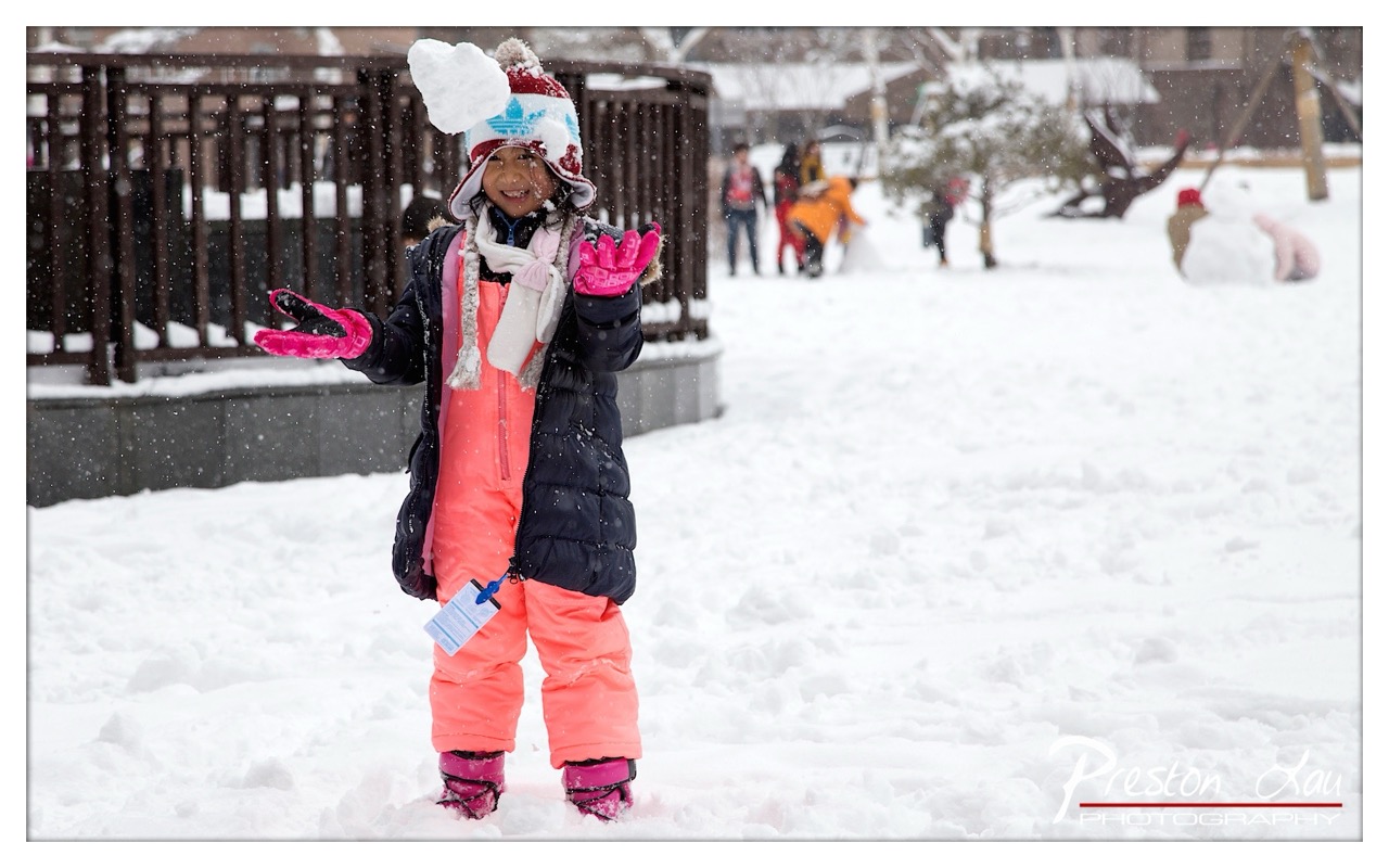

1. Overall Rating (0–10) — 7.5
This photograph captures the pure joy of childhood in a winter wonderland, where snowflakes fall like confetti and a smiling girl becomes the embodiment of winter’s magic. The vibrant colors of her outfit pop against the white landscape, drawing the eye and evoking warmth despite the cold. While the background activity adds context, it slightly competes with the subject, and the image could benefit from a tighter focus to amplify its emotional punch.
2. Composition (0–10) — 7.0
The girl is well-centered and dominates the frame, with her outstretched arms creating a welcoming, dynamic pose. The background elements, though slightly distracting, add depth and narrative context. A tighter crop would enhance focus on the subject’s expression and gesture.
3. Lighting (0–10) — 6.5
The overcast sky provides soft, diffused light that evenly illuminates the scene, preventing harsh shadows. However, the flatness of the light slightly dulls the vibrancy of the colors, and the falling snow is captured with slight motion blur, giving the image a gentle, dreamy quality.
4. Color & Tone (0–10) — 8.0
The bright coral of the snowsuit and vivid pink gloves create a striking contrast against the snowy white and muted background, drawing immediate attention to the child. The cool tones of the snow and sky balance the warmth of the colors, enhancing the wintry atmosphere.
5. Creativity (0–10) — 8.0
The image captures a candid, joyful moment with genuine emotion, elevating it beyond a simple snapshot. The combination of color, motion, and expression conveys a story of winter play and childhood wonder in a visually engaging way.
6. Technical Quality (0–10) — 7.5
The focus is sharp on the subject, with clear details in the snow-covered hat and gloves. The depth of field is appropriate, blurring the background just enough to keep attention on the girl while preserving context. The watermark is discreet and unobtrusive.
7. Emotional Impact (0–10) — 8.5
The girl’s radiant smile and open posture evoke a powerful sense of happiness and carefree joy. The viewer is immediately drawn into the moment, feeling the warmth of her laughter and the magic of a snowy day. It’s a heartwarming image that resonates with nostalgia and innocence.
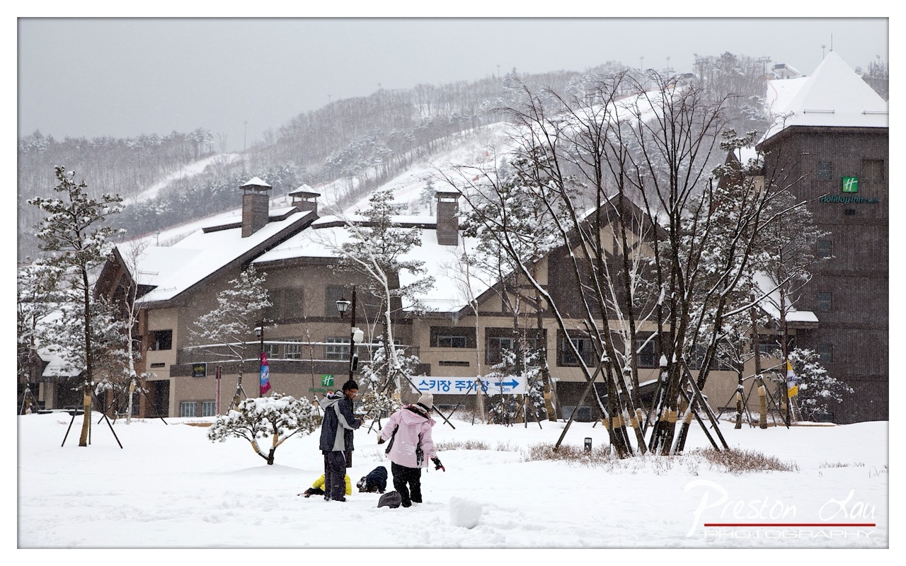

1. Overall Rating (0–10) — 6.8
This photograph captures the quiet charm of a snowy resort village, where architecture and nature blend into a serene winter tableau. The falling snow and muted tones lend a hushed, almost cinematic quality, while the presence of people adds a human scale to the scene. While the composition is strong, the overcast lighting and slightly cluttered signage detract from the image’s overall elegance, preventing it from achieving a more refined, evocative tone.
2. Composition (0–10) — 7.0
The central placement of the figures and the layered arrangement of buildings, trees, and the snowy hill create a balanced, three-dimensional feel. The diagonal lines of the ski slope and the bare branches guide the eye through the frame, though the signage and utility poles slightly disrupt the visual harmony.
3. Lighting (0–10) — 6.0
The diffuse, overcast light softens the scene and enhances the quiet mood, but it also flattens shadows and reduces depth. The lack of directional light diminishes the texture of the snow and the architectural details, giving the image a slightly washed-out appearance.
4. Color & Tone (0–10) — 6.5
The palette is dominated by cool whites and grays, punctuated by the muted browns of the buildings and the soft pink of one person’s coat. While the colors are harmonious, the lack of saturation and contrast limits the image’s visual punch, contributing to a subdued, almost monochromatic feel.
5. Creativity (0–10) — 6.0
The image successfully captures a moment of everyday life in a winter resort, but it leans more toward documentation than artistic expression. The narrative is clear—people enjoying a snowy day—but the composition and lighting remain conventional rather than inventive.
6. Technical Quality (0–10) — 7.5
The image is sharp and well-focused, with clean detail visible in the snow-covered trees and buildings. The exposure is balanced, and there is no noticeable noise, indicating strong technical execution despite the challenging lighting conditions.
7. Emotional Impact (0–10) — 6.5
The photograph evokes a sense of calm and quiet companionship, with the snowfall creating a cocoon-like atmosphere. The presence of people, even in the distance, invites a gentle connection, though the lack of dramatic lighting or expressive moments keeps the emotional resonance at a moderate level.
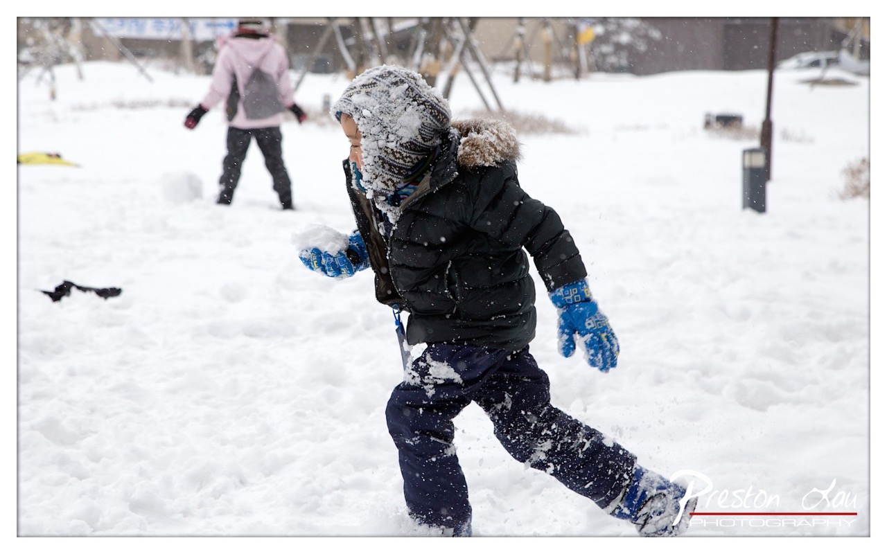

1. Overall Rating (0–10) — 7.5
This photograph captures the joyful chaos of a child in motion during a snowy day, freezing a moment of pure, unfiltered delight. The dynamic composition and candid energy convey the thrill of winter play, while the soft blur of falling snow adds a dreamlike quality. Though the background is slightly distracting, the central figure’s motion and expression carry the image forward with infectious warmth and spontaneity.
2. Composition (0–10) — 7.0
The child is placed slightly off-center, creating a sense of movement toward the right, while the blurred background keeps focus on the main subject. A tighter crop might enhance intimacy, but the open space allows the snowy environment to frame the action naturally.
3. Lighting (0–10) — 6.5
Diffuse, overcast lighting softens shadows and evenly illuminates the scene, preserving detail in the snow and clothing. The flat light suits the wintry mood but limits depth and contrast.
4. Color & Tone (0–10) — 7.0
The cool white and gray palette dominates, punctuated by the vibrant blue gloves and pops of color in the child’s hat. The contrast between the bright gloves and the dark jacket adds visual interest and guides the eye.
5. Creativity (0–10) — 8.0
The photographer captures a genuine, fleeting moment with an eye for storytelling. The sense of motion and candid emotion elevate the image beyond a simple snapshot into a narrative of childhood joy.
6. Technical Quality (0–10) — 8.0
Sharp focus on the child, with a shallow depth of field that blurs the background, effectively isolates the subject. The shutter speed is well-chosen to capture motion without excessive blur.
7. Emotional Impact (0–10) — 8.5
The image resonates with nostalgia and warmth, evoking memories of winter play and carefree moments. The child’s expression and posture radiate pure happiness, creating a strong emotional connection with the viewer.
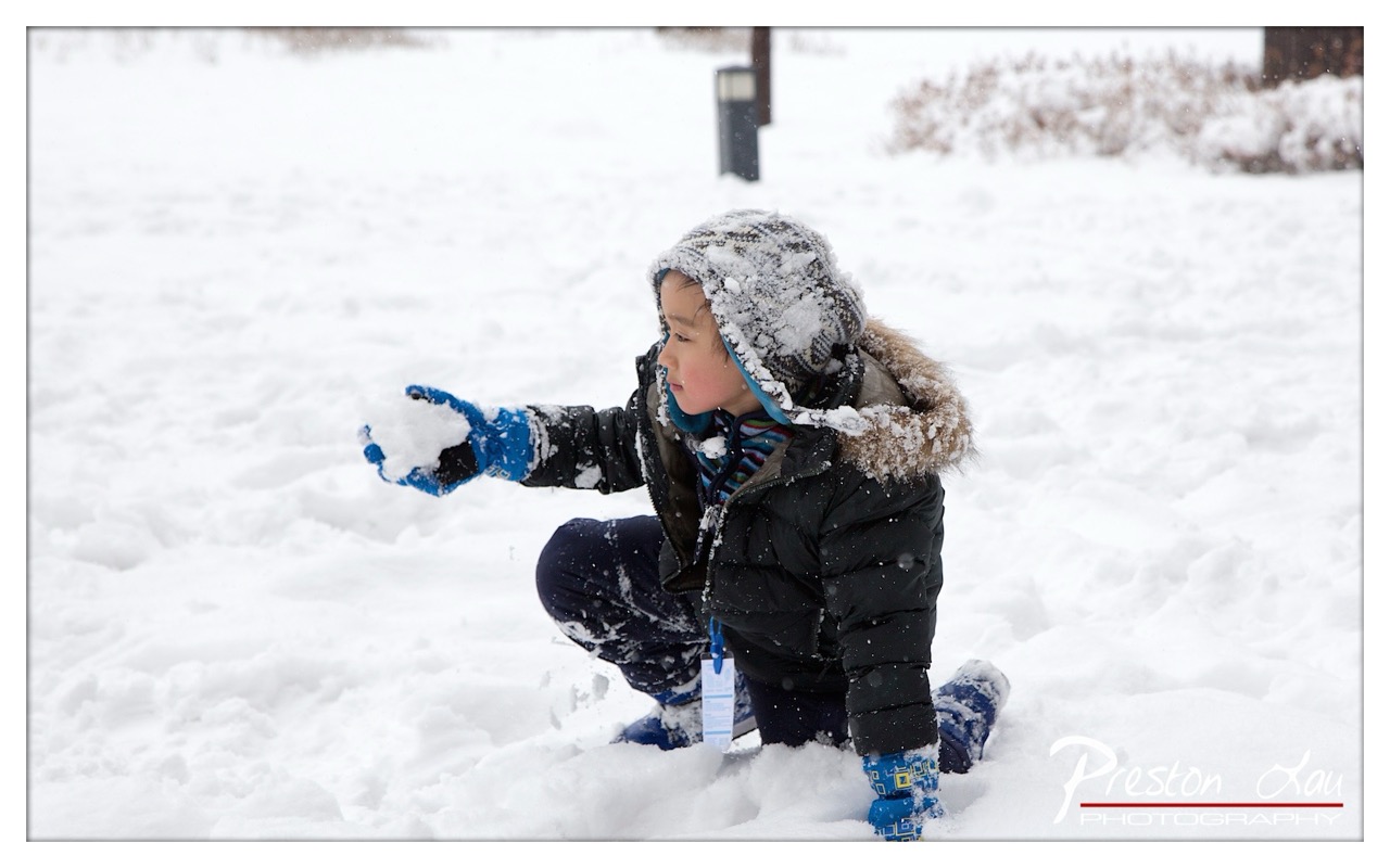

1. Overall Rating (0–10) — 7.5
This photograph captures a tender, candid moment of childhood joy amid a snowy landscape, where the quiet stillness of winter contrasts with the child’s lively engagement. The composition centers on the boy’s focused expression and the delicate gesture of his hand, conveying a sense of wonder and playfulness. While the image is emotionally resonant and well-executed, the flat lighting and slightly overexposed snow reduce its visual depth, keeping it from achieving true artistic impact.
2. Composition (0–10) — 7.0
The subject is well-placed off-center, creating a dynamic balance with the open snow-covered space to the left. The child’s pose and gaze lead the eye naturally into the frame, though the background elements—such as the dark post and bushes—add minor distractions that slightly disrupt the harmony.
3. Lighting (0–10) — 6.5
The scene is illuminated by soft, diffused light typical of an overcast winter day, which evenly exposes the subject but results in a lack of shadow definition. The bright snow creates a high-key effect, flattening the tonal range and reducing the sense of depth.
4. Color & Tone (0–10) — 7.0
The palette is dominated by whites and cool grays, punctuated by the vibrant blue of the gloves and boots, which draws attention to the child’s hands and movement. The contrast between the dark jacket and the snow enhances visual separation, while the subtle warmth in the child’s flushed cheeks adds a touch of life and emotion.
5. Creativity (0–10) — 8.0
The image successfully captures a fleeting, authentic moment of childhood, transforming a simple act—making a snowball—into a narrative of joy and exploration. The candid nature of the shot, combined with the intimate framing, gives it a personal and storytelling quality that feels both genuine and evocative.
6. Technical Quality (0–10) — 8.0
The focus is sharp on the child’s face and upper body, capturing fine details like snowflakes on the hood and the texture of the gloves. The image is clean, with minimal noise and appropriate exposure, demonstrating strong technical control.
7. Emotional Impact (0–10) — 8.5
The photograph evokes a strong sense of nostalgia and innocence, inviting the viewer to recall their own childhood winters. The child’s concentration and the quiet beauty of the snowy setting combine to create a poignant, heartwarming moment that resonates deeply.
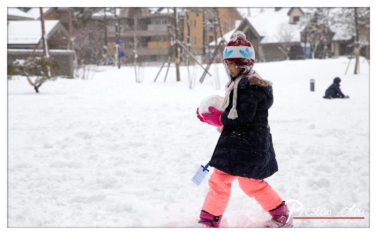

1. Overall Rating (0–10) — 7.5
This photograph captures a tender, candid moment of a child immersed in the joy of a snowy day, where movement and winter play converge in a natural, unposed way. The subject’s focused expression and the dynamic posture convey a sense of playful determination, while the falling snow adds a dreamy, atmospheric quality. While the composition feels slightly off-center and the background is a bit busy, the image succeeds in evoking warmth and nostalgia, balancing realism with a quiet poetic charm.
2. Composition (0–10) — 7.0
The child is placed slightly off-center, creating a sense of motion and direction as she walks through the snow. The background, though cluttered with buildings and trees, remains softly blurred, keeping focus on the subject. A tighter crop might enhance the intimacy, but the current framing allows the environment to tell a story of place and season.
3. Lighting (0–10) — 6.5
The overcast sky provides soft, diffused light that evenly illuminates the scene, minimizing harsh shadows and enhancing the snowy atmosphere. The falling snow adds texture and depth, though the lighting lacks dramatic contrast, contributing to a slightly flat feel in the midtones.
4. Color & Tone (0–10) — 7.5
The contrast between the child’s bright pink pants and the muted winter palette creates a strong focal point. The cool blue and white tones of the snow and sky are balanced by the warmth of the jacket and hat, giving the image a harmonious, wintry color scheme. The saturation is natural and effective, enhancing the scene without appearing oversaturated.
5. Creativity (0–10) — 7.0
The photograph captures a fleeting, authentic moment of childhood delight, with a strong narrative element. The inclusion of falling snow and the child’s engagement with the environment lend a sense of time and place, making the image feel both personal and universally relatable.
6. Technical Quality (0–10) — 8.0
The image is sharp and well-focused on the subject, with a shallow depth of field that isolates the child from the background. The shutter speed is appropriate for capturing motion without blur, and the exposure is balanced, preserving detail in both the highlights and shadows.
7. Emotional Impact (0–10) — 8.0
There is a palpable sense of innocence and joy in the child’s expression and posture, evoking feelings of nostalgia and warmth. The snowy setting and quiet focus on the moment create a poignant, almost cinematic quality that resonates emotionally with the viewer.
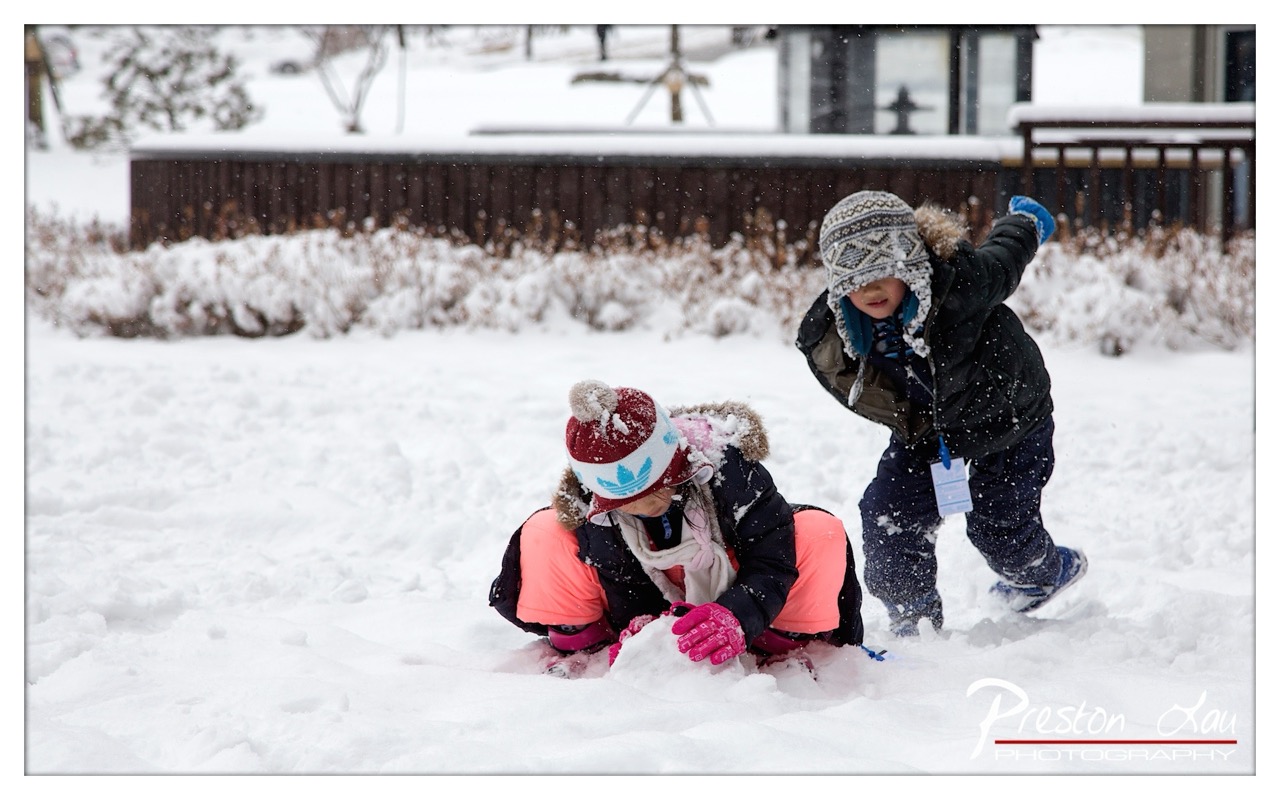

1. Overall Rating (0–10) — 7.5
This photograph captures a joyful, candid moment of two children immersed in winter play, their energy and delight radiating through the falling snow. The dynamic composition and natural lighting lend a sense of spontaneity and warmth to the scene, despite the cold surroundings. While the image is rich in emotion and narrative, a slightly more refined balance between the subjects and background could enhance its visual cohesion.
2. Composition (0–10) — 7.0
The children are placed off-center, creating a sense of movement and spontaneity. The low angle draws the viewer into the snow-covered scene, but the background elements—particularly the fence and building—slightly distract from the focal subjects.
3. Lighting (0–10) — 7.5
Soft, diffused light from an overcast sky evenly illuminates the scene, minimizing harsh shadows and enhancing the gentle fall of snow. The light enhances the texture of the snow and the children’s expressions, contributing to a cozy, wintry atmosphere.
4. Color & Tone (0–10) — 7.0
The cool white and gray tones of the snow contrast effectively with the vibrant coral pants and pink gloves, drawing attention to the children. The warm pops of color provide visual interest, though the overall palette remains subdued, reflecting the winter setting.
5. Creativity (0–10) — 8.0
The image captures a genuine, unposed moment of childhood joy, elevating it beyond a simple snapshot. The interplay of motion, snow, and expressive faces conveys a narrative of carefree play and winter wonder.
6. Technical Quality (0–10) — 8.0
The focus is sharp on the children, with clear detail in their clothing and facial features. The snowflakes are well-captured in motion, adding texture and dynamism. The depth of field is appropriately managed, keeping the background slightly soft to emphasize the subjects.
7. Emotional Impact (0–10) — 8.5
The photograph evokes a strong sense of nostalgia and warmth, resonating with the universal joy of childhood and winter play. The genuine expressions and physical engagement with the snow create an immediate emotional connection with the viewer.
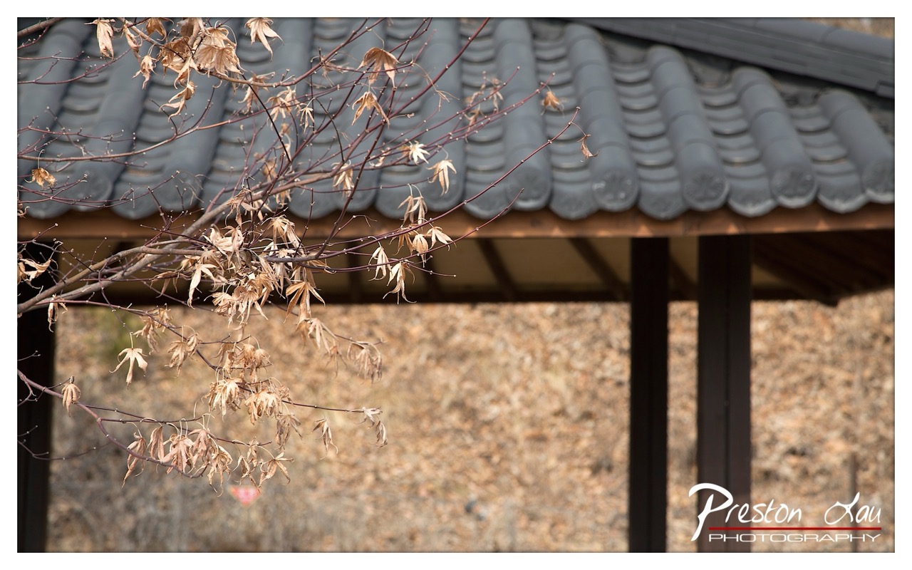

1. Overall Rating (0–10) — 7.0
This photograph captures a quiet, contemplative moment in a traditional East Asian setting, where the delicate remnants of autumn leaves contrast with the enduring structure of a tiled roof. The interplay between the fragile, dried foliage and the stoic architecture evokes a sense of seasonal transition and impermanence. While the composition is thoughtful and the mood is serene, the image’s emotional depth is slightly restrained by its neutral lighting and lack of dynamic visual tension.
2. Composition (0–10) — 7.5
The diagonal line of the branches creates a natural leading line into the frame, drawing the eye toward the roof and background. The use of negative space and depth of field effectively isolates the subject, though the framing feels slightly off-center, creating a subtle imbalance.
3. Lighting (0–10) — 6.0
Soft, diffused daylight evenly illuminates the scene, preserving detail in both the leaves and the roof. However, the lack of strong directional light or shadows reduces the image’s dramatic impact, resulting in a flat, almost documentary quality.
4. Color & Tone (0–10) — 6.5
The palette is harmonious, with earthy browns and muted grays creating a cohesive autumnal mood. While the tones are natural and restrained, they lack vibrancy, contributing to a subdued visual experience.
5. Creativity (0–10) — 7.0
The photographer captures a quiet, poetic moment with a strong sense of place. The juxtaposition of organic decay and architectural permanence is conceptually rich, and the use of shallow depth of field enhances the contemplative mood.
6. Technical Quality (0–10) — 8.0
The focus is sharp on the foreground leaves, with a smooth, natural blur in the background. The image is free of technical flaws, and the sensor detail renders textures clearly, particularly in the dried leaves and tile surface.
7. Emotional Impact (0–10) — 7.0
The image resonates with a quiet melancholy and reflection on time’s passage. The viewer is invited to pause and consider the beauty in decay, making it emotionally engaging, though not overwhelmingly powerful.
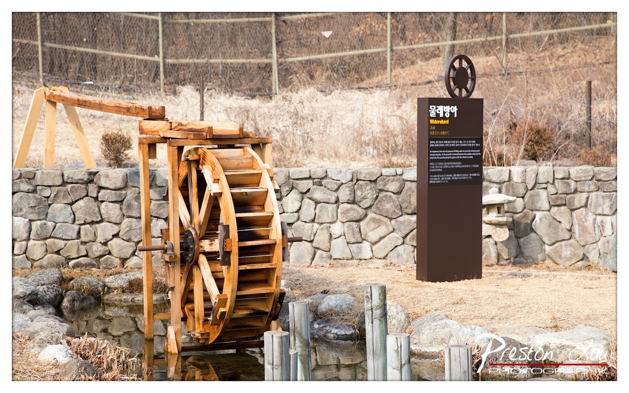

1. Overall Rating (0–10) — 7.0
This photograph captures a serene and historically evocative scene, blending traditional Korean craftsmanship with natural elements in a quiet, contemplative setting. The wooden waterwheel, weathered by time and use, stands as a testament to enduring rural ingenuity, while the stone wall and bare winter foliage lend a sense of authenticity and stillness. Though the presence of the modern informational sign slightly disrupts the historical immersion, the image succeeds in conveying a peaceful narrative of cultural preservation and the quiet rhythm of life.
2. Composition (0–10) — 7.0
The waterwheel is well-placed on the left, creating a strong focal point, while the sign on the right balances the frame. The stone wall provides a horizontal anchor, and the foreground posts lead the eye into the scene. A tighter crop could enhance focus, but the current composition effectively guides the viewer through the layers of the landscape.
3. Lighting (0–10) — 7.5
Soft, diffused daylight enhances the natural textures of wood and stone without harsh shadows. The gentle light creates a calm mood and allows for subtle tonal variations in the water and dry vegetation, contributing to the tranquil atmosphere.
4. Color & Tone (0–10) — 6.5
The palette is dominated by earthy browns, grays, and muted tans, reflecting the seasonal and rural setting. While harmonious, the colors lack vibrancy, which slightly diminishes the image’s visual punch. A touch more warmth could enhance the sense of life and history.
5. Creativity (0–10) — 7.0
The image successfully blends documentary and artistic intent, capturing both the physical details of the waterwheel and the cultural context through the signage. The juxtaposition of the traditional structure with the modern interpretive sign adds a layer of narrative depth, suggesting a dialogue between past and present.
6. Technical Quality (0–10) — 8.0
Sharp focus across the scene, particularly on the waterwheel and sign, ensures clarity. The exposure is well-balanced, with no significant over- or underexposed areas. The watermark is unobtrusive and does not detract from the image’s integrity.
7. Emotional Impact (0–10) — 7.0
The photograph evokes a sense of nostalgia and quiet reverence for traditional ways of life. The stillness of the scene, combined with the historical subject, invites reflection and connects the viewer to a slower, more deliberate pace of existence.
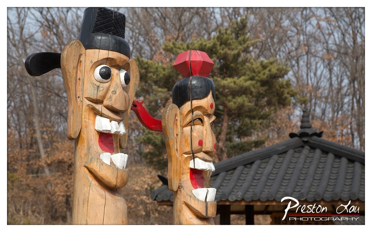

1. Overall Rating (0–10) — 7.0
This photograph captures the whimsical and culturally rich essence of Korean wooden guardian figures, known as *Jangseung*, with a lively sense of character and tradition. The exaggerated expressions and bold colors of the carvings stand out against the muted winter backdrop, creating a striking contrast that draws the viewer in. While the image is visually engaging and rich in cultural context, the slightly cluttered framing and overexposed sky limit its overall compositional harmony.
2. Composition (0–10) — 6.5
The two figures are well-framed, with the larger one anchoring the left side and the smaller one slightly behind, creating a sense of depth. However, the inclusion of the roof and bare trees in the background slightly disrupts the visual focus, making the composition feel crowded.
3. Lighting (0–10) — 7.0
Natural daylight illuminates the scene evenly, highlighting the textures and painted details of the wooden figures. The soft, diffused light enhances the warm wood tones and the vibrant red accents, while the overcast sky prevents harsh shadows.
4. Color & Tone (0–10) — 7.5
The warm, earthy tones of the wood contrast effectively with the bright red and black accents on the carvings. The background’s muted browns and grays provide a neutral canvas, allowing the figures to stand out. The color palette feels authentic and culturally resonant.
5. Creativity (0–10) — 7.0
The photographer captures the playful and symbolic nature of the *Jangseung* with a keen eye for detail and expression. The choice to focus on the interaction between the two figures adds narrative depth, though the shot remains more observational than interpretive.
6. Technical Quality (0–10) — 8.0
The image is sharp and well-focused, with clear detail in the wood grain and painted surfaces. The depth of field is appropriately managed, keeping the main subjects in crisp focus while softly blurring the background.
7. Emotional Impact (0–10) — 6.5
The exaggerated expressions evoke a sense of humor and cultural storytelling, inviting curiosity about the figures’ roles in tradition. While the image is visually engaging, it lacks a deeper emotional pull, remaining more informative than moving.
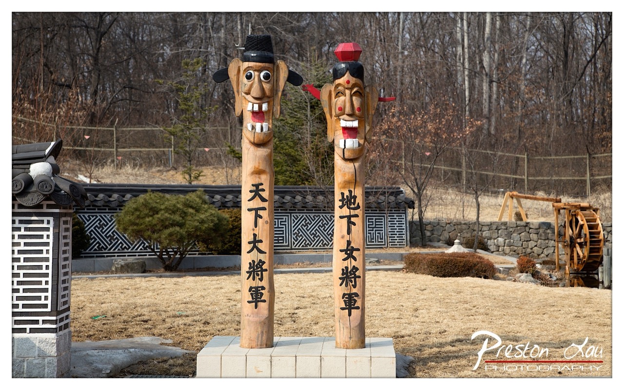

1. Overall Rating (0–10) — 7.0
This photograph captures the whimsical and culturally rich essence of traditional Korean guardian figures, known as *Jangseung*, set against a quiet, wintry landscape. The playful expressions and bold inscriptions on the wooden poles convey a sense of folklore and storytelling, while the surrounding architecture and natural elements provide context without distraction. Though the image is strong in narrative and cultural resonance, its slightly flat lighting and busy background prevent it from achieving a more refined visual harmony.
2. Composition (0–10) — 7.0
The two totemic figures are centered and balanced, creating a strong focal point. The inclusion of the traditional lantern on the left and the waterwheel on the right adds depth and cultural framing, though the background foliage slightly competes for attention.
3. Lighting (0–10) — 6.0
Natural daylight provides even illumination, but the lack of directional warmth or contrast results in a somewhat flat and neutral tone. The overcast sky softens shadows but also reduces the visual pop of the carved faces and painted details.
4. Color & Tone (0–10) — 6.5
The palette is largely restrained—muted browns, grays, and earth tones dominate, with subtle pops of red and black on the figures. While the colors are accurate, they lack vibrancy, which slightly diminishes the visual impact of the expressive carvings.
5. Creativity (0–10) — 8.0
The choice to photograph these cultural symbols in a serene outdoor setting with a mix of traditional and rustic elements demonstrates strong artistic intent. The juxtaposition of the humorous, animated faces against the solemn winter backdrop creates a compelling narrative tension.
6. Technical Quality (0–10) — 8.0
The image is sharp and well-focused, with clear detail in the wood grain and inscriptions. The exposure is balanced, and the resolution supports a clean, high-quality presentation.
7. Emotional Impact (0–10) — 7.5
The image evokes a sense of quiet wonder and cultural pride, inviting viewers to reflect on tradition, folklore, and the unseen stories behind these guardian figures. The playful character of the *Jangseung* contrasts pleasantly with the stillness of the surroundings, creating a gentle emotional resonance.
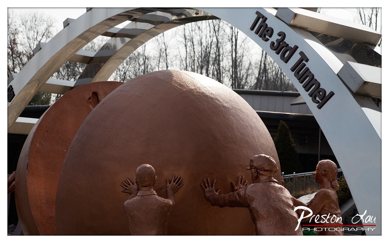

1. Overall Rating (0–10) — 7.0
This photograph captures a powerful and symbolic sculpture under a bold architectural arch, evoking themes of collective effort and progress. The warm, earthy tones of the figures and sphere contrast beautifully with the cool, industrial lines of the arch, creating a compelling visual dialogue. While the framing feels slightly awkward and the background is cluttered, the image succeeds in conveying the monument’s narrative weight and emotional resonance.
2. Composition (0–10) — 6.5
The sculpture is centered but partially obscured by the arch, creating a layered effect. The diagonal lines of the arch guide the eye, but the framing feels slightly unbalanced due to the prominent foreground element and off-center placement of the figures.
3. Lighting (0–10) — 7.0
Natural daylight illuminates the scene evenly, casting soft shadows that emphasize the texture of the bronze-like figures and the spherical form. The bright sky behind the arch enhances contrast and highlights the sculpture’s three-dimensional quality.
4. Color & Tone (0–10) — 7.5
The warm, terracotta hue of the sculpture contrasts effectively with the cool metallic gray of the arch, creating a harmonious and visually engaging palette. The muted background tones help the subject stand out without overwhelming the composition.
5. Creativity (0–10) — 7.0
The juxtaposition of human figures pushing a large sphere under a modern arch creates a metaphorical narrative that invites interpretation. The choice to include the sign "The 3rd Tunnel" adds historical context, enhancing the conceptual depth of the image.
6. Technical Quality (0–10) — 8.0
The image is sharp and detailed, with excellent clarity in the textures of the sculpture and the metallic surface of the arch. The focus is precise, and the depth of field effectively isolates the subject from the background.
7. Emotional Impact (0–10) — 7.5
The image conveys a sense of perseverance and shared purpose, amplified by the physical strain depicted in the figures’ postures. The viewer is drawn into the narrative, evoking feelings of determination and collective achievement.
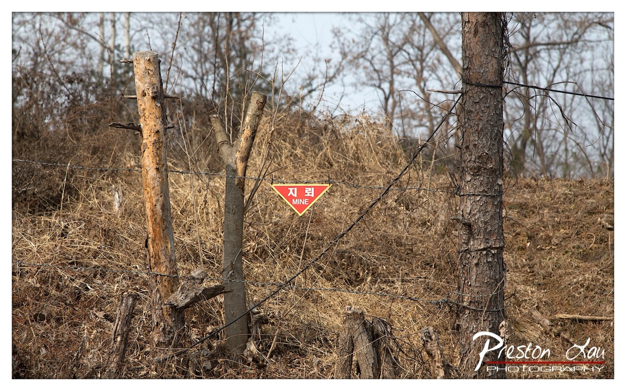

1. Overall Rating (0–10) — 7.0
This photograph captures a haunting stillness at the edge of a war-torn landscape, where nature slowly reclaims a place marked by human conflict. The red mine warning sign, stark against the muted browns and grays of winter vegetation, serves as a powerful focal point, evoking tension and unease. While the image is strong in its message and atmosphere, the composition feels slightly unbalanced, and the lighting, though clear, lacks the dramatic depth that might elevate its emotional weight.
2. Composition (0–10) — 6.0
The triangular sign is well-placed as a focal point, but the framing feels slightly off-center and cluttered with foreground debris. The diagonal lines of the barbed wire and tree trunks create a sense of tension, but the left side of the frame feels underutilized, giving the image a lopsided feel.
3. Lighting (0–10) — 6.5
The light is flat and even, characteristic of an overcast day, which enhances the somber mood but diminishes shadow contrast. This neutral lighting supports the documentary tone but limits the visual drama.
4. Color & Tone (0–10) — 6.0
The color palette is dominated by earthy browns and grays, with the red of the sign providing a stark contrast. While the contrast is effective, the overall tone feels muted, reducing the image's visual impact.
5. Creativity (0–10) — 7.0
The juxtaposition of a man-made warning sign within a natural, decaying landscape is conceptually strong. The image tells a story of danger, abandonment, and resilience, with the sign serving as a silent witness to history.
6. Technical Quality (0–10) — 7.5
The image is sharp and clear, with good focus on the sign and surrounding elements. The depth of field is appropriate, and the watermark is unobtrusive.
7. Emotional Impact (0–10) — 7.5
The photograph evokes a sense of unease and contemplation, drawing the viewer into a quiet moment of reflection on the lingering scars of conflict. The presence of the mine warning sign instills a palpable tension, making the stillness feel charged with unspoken history.
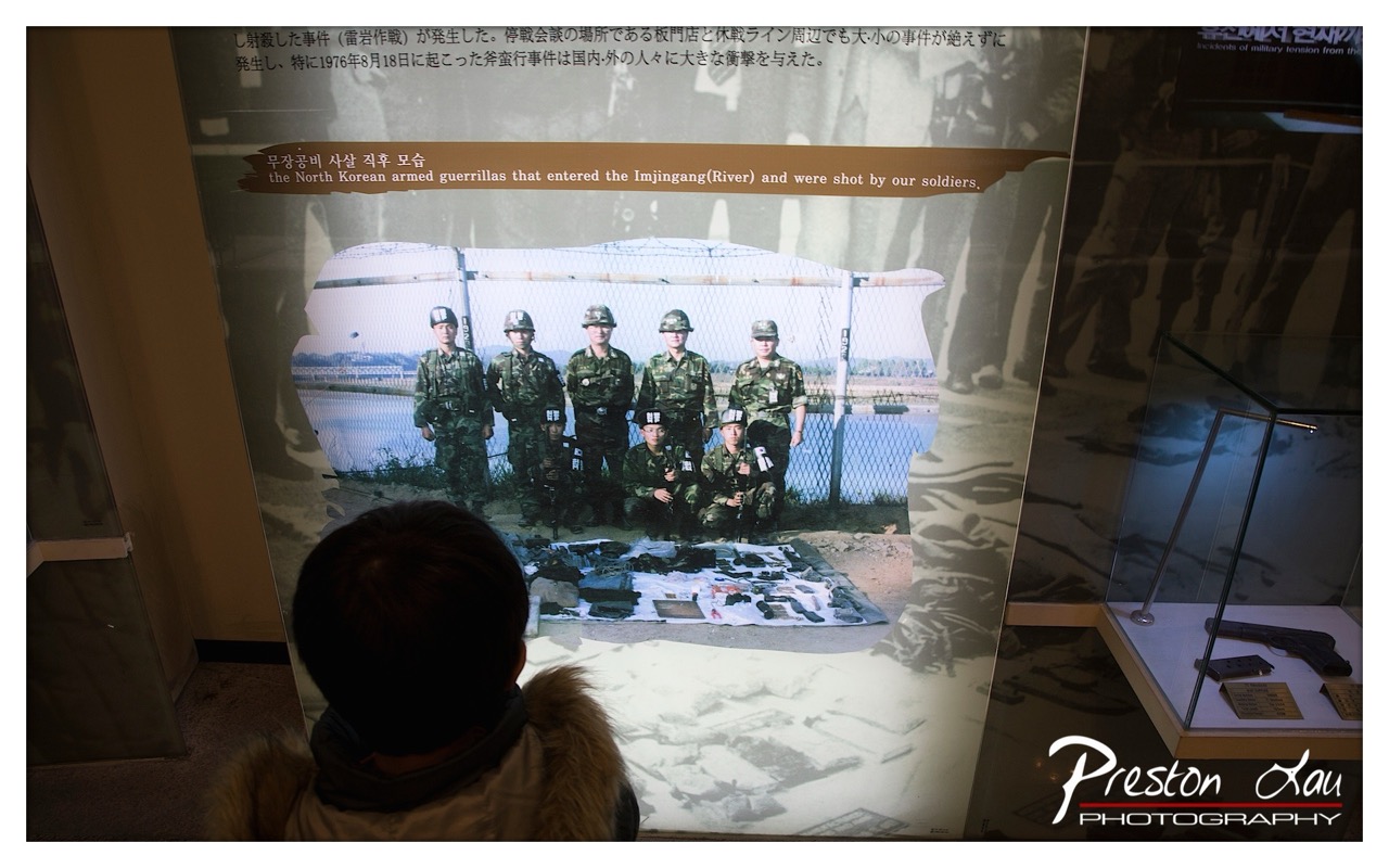

1. Overall Rating (0–10) — 7.0
This photograph captures a poignant moment of historical reflection, where a visitor observes a museum exhibit depicting a tense chapter in Korean military history. The layered composition—featuring the viewer’s back, the historical photograph, and the surrounding display—creates a narrative depth that underscores the weight of memory. While the lighting and framing lean toward the documentary, the image successfully conveys a sense of solemnity and introspection, though it could benefit from greater visual harmony and emotional clarity.
2. Composition (0–10) — 6.5
The subject is centered but partially obscured by the viewer’s head, creating a layered, observational perspective. The diagonal line of the display and the placement of the exhibit case add visual interest, though the cluttered foreground slightly disrupts focus.
3. Lighting (0–10) — 6.0
The scene is lit with ambient museum lighting, casting soft shadows and creating a subdued mood. The reflection on the glass slightly obscures the photograph, reducing clarity and depth.
4. Color & Tone (0–10) — 6.5
The color palette is muted, dominated by earth tones and grays, which reinforce the somber, archival nature of the exhibit. The slight warmth in the foreground contrasts subtly with the cooler tones of the photograph, enhancing visual separation.
5. Creativity (0–10) — 7.0
The image is conceptually strong, using the viewer’s presence to frame the historical narrative and invite contemplation. The juxtaposition of past and present adds narrative depth, though the execution remains more observational than artistically bold.
6. Technical Quality (0–10) — 7.5
The image is sharp and well-exposed, with clear detail in both the foreground and the display. Focus is precise, and the composition, while slightly cluttered, remains technically sound.
7. Emotional Impact (0–10) — 7.0
The photograph evokes a quiet reverence, inviting the viewer to reflect on history and its lingering presence. The presence of the observer adds a human element, grounding the historical moment in personal connection.
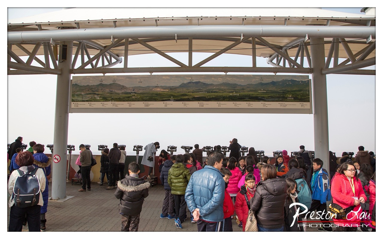

1. Overall Rating (0–10) — 6.0
This photograph captures a bustling tourist observation deck with a sense of collective curiosity and quiet anticipation. The composition effectively conveys the density of the crowd and the shared experience of viewing a distant landscape, though the visual narrative is slightly undermined by the overwhelming presence of the informational banner. While the scene feels authentic and grounded in everyday travel, the lack of a clear focal point and the flat lighting prevent it from achieving a more compelling aesthetic.
2. Composition (0–10) — 5.5
The frame is filled with people and structural elements, creating a busy, layered scene. The large informational banner dominates the upper third, disrupting the visual flow and drawing attention away from the natural view beyond. A tighter crop or shift in angle could have emphasized the human interaction with the space, improving balance and focus.
3. Lighting (0–10) — 5.0
The lighting is flat and diffused, likely due to overcast skies, which results in a lack of depth and contrast. While it evenly illuminates the scene, it also flattens textures and minimizes the emotional impact of the moment. The absence of directional light prevents the creation of shadows or highlights that could have added drama.
4. Color & Tone (0–10) — 5.5
The palette is dominated by muted grays and neutral tones from the infrastructure and the sky, punctuated by occasional pops of color from winter jackets. While the clothing adds visual interest, the overall color scheme feels subdued and slightly washed out, reflecting the overcast conditions and contributing to a sense of impersonality.
5. Creativity (0–10) — 6.0
The image offers a candid glimpse into a public space, capturing the diversity and movement of a tourist crowd. However, the creativity is limited by the straightforward documentation of a scene rather than a more interpretive or emotionally charged approach. The presence of the banner, while informative, detracts from the potential for a more artistic or contemplative composition.
6. Technical Quality (0–10) — 7.5
The image is sharp and clear, with good detail in the foreground subjects and the structural elements. The focus is consistent across the frame, and the digital quality is clean, with no noticeable noise or distortion. The photographer’s technical control is evident, though the composition and lighting choices limit the overall impact.
7. Emotional Impact (0–10) — 5.0
The emotional resonance is modest, as the photograph feels more like a travel snapshot than an evocative moment. While there is a sense of shared experience and quiet engagement, the viewer is kept at a distance by the visual clutter and lack of personal connection. The scene suggests a collective pause, but it does not invite deeper emotional reflection.


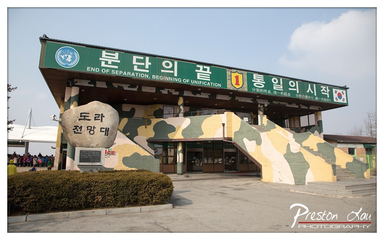
1. Overall Rating (0–10) — 7.0
This photograph captures a powerful cultural and political landmark with a strong sense of place and history. The bold inscription on the stone and the camouflaged backdrop create a striking contrast, emphasizing the tension between natural form and military symbolism. While the composition is compelling and the subject matter rich, the framing feels slightly cluttered, and the overcast lighting tempers the emotional weight of the scene.
2. Composition (0–10) — 6.5
The large stone dominates the frame, creating a strong focal point, but the inclusion of the crowd and surrounding structures introduces visual noise. The diagonal line of the camouflaged wall adds dynamic tension, though the left-side framing feels slightly unbalanced.
3. Lighting (0–10) — 5.5
The soft, diffused daylight flattens the scene’s depth and reduces texture contrast. While the light is even and avoids harsh shadows, it also diminishes the dramatic potential of the stone and its inscriptions.
4. Color & Tone (0–10) — 6.0
The muted grays of the stone and the subdued tones of the camo wall create a somber palette, appropriate for the subject. The pop of red in the "ICE" logo adds a minor visual disruption, breaking the otherwise cohesive color scheme.
5. Creativity (0–10) — 7.0
The juxtaposition of natural stone with military camouflage and the presence of tourists lends the image narrative depth. The choice to focus on the inscription and its symbolic context demonstrates thoughtful conceptual intent.
6. Technical Quality (0–10) — 7.5
The image is sharp and well-focused, with clear detail on the inscriptions and textures. The exposure is balanced, and the watermark is professionally integrated without distracting from the subject.
7. Emotional Impact (0–10) — 6.5
The photograph evokes a sense of solemnity and geopolitical tension, particularly through the juxtaposition of the stone monument and military aesthetics. However, the distance created by the crowd and the flat lighting prevents a deeper emotional connection.

1. Overall Rating (0–10) — 7.5
This photograph powerfully captures the symbolic weight of the Joint Security Area at the Korean Demilitarized Zone, where political history and human emotion converge. The bold camouflage architecture and multilingual signage convey a sense of tension and hope, while the gathering of visitors adds a layer of human scale and contemplation. The image succeeds in balancing documentary clarity with emotional resonance, though the composition’s slight imbalance and flat lighting prevent it from achieving greater visual impact.
2. Composition (0–10) — 6.5
The building dominates the frame, with the large rock and staircase leading the eye toward the entrance. However, the off-center placement of the sign and the wide angle create a slightly cluttered feel, with the left side feeling heavier than the right.
3. Lighting (0–10) — 6.0
The scene is evenly lit by diffuse daylight, which minimizes shadows and preserves detail. While this ensures clarity, it also flattens the mood, robbing the camouflage textures and symbolic elements of atmospheric depth.
4. Color & Tone (0–10) — 7.0
The green and beige camouflage is visually striking, offering a strong contrast against the pale sky. The muted tones of the pavement and shrubs help balance the composition, while the red and blue accents in the signage provide subtle focal points.
5. Creativity (0–10) — 8.0
The image is conceptually rich, combining political symbolism, cultural identity, and human presence into a single frame. The multilingual text and juxtaposition of military aesthetics with the message of unification add layers of narrative depth and originality.
6. Technical Quality (0–10) — 8.0
The image is sharp and well-exposed, with clean detail throughout the building and signage. The watermark is tastefully placed and does not interfere with the composition.
7. Emotional Impact (0–10) — 8.0
The photograph evokes a powerful sense of solemnity and possibility. The message of “End of Separation, Beginning of Unification” resonates deeply, and the presence of visitors—some children, some contemplative—adds a poignant human dimension that connects the viewer to the site’s historical weight.
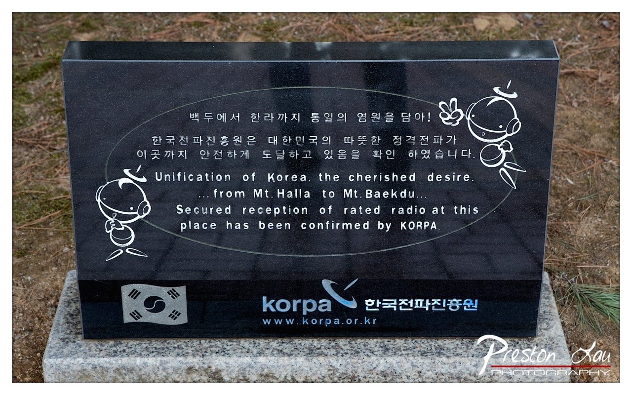

1. Overall Rating (0–10) — 6.0
This photograph captures a symbolic marker of Korean reunification sentiment, blending solemnity with a touch of whimsy through its cartoon characters. The engraved text and national imagery convey a strong political and cultural message, but the image’s visual appeal is held back by its utilitarian presentation and lack of atmospheric depth. While the content is meaningful, the composition and lighting fail to elevate it into a compelling visual statement.
2. Composition (0–10) — 5.5
The central placement of the plaque provides a clear focal point, but the surrounding space feels uneven, with the ground and scattered pine needles creating visual distraction. The framing is slightly off-center, reducing the sense of balance.
3. Lighting (0–10) — 6.0
Natural daylight evenly illuminates the scene, preserving legibility of the text and details. However, the light is flat and lacks directional quality, resulting in minimal shadowing or depth.
4. Color & Tone (0–10) — 6.5
The deep black of the stone contrasts sharply with the white engraving and the gray granite base, creating a clean, graphic look. The muted earth tones of the background complement the solemnity of the subject, though the overall palette is restrained and lacks vibrancy.
5. Creativity (0–10) — 5.5
The use of cartoon characters alongside formal Korean and English text presents an unusual juxtaposition, suggesting a blend of earnestness and approachability. However, the concept is not fully realized in the visual execution, feeling more informational than expressive.
6. Technical Quality (0–10) — 7.5
The image is sharp and well-focused, with clear detail in the engraving and text. The exposure is balanced, and the digital watermark does not detract significantly from the overall clarity.
7. Emotional Impact (0–10) — 5.0
While the message of Korean reunification carries deep emotional weight, the photograph's clinical presentation limits its ability to evoke a strong emotional response. The viewer is more likely to read the message than feel it.
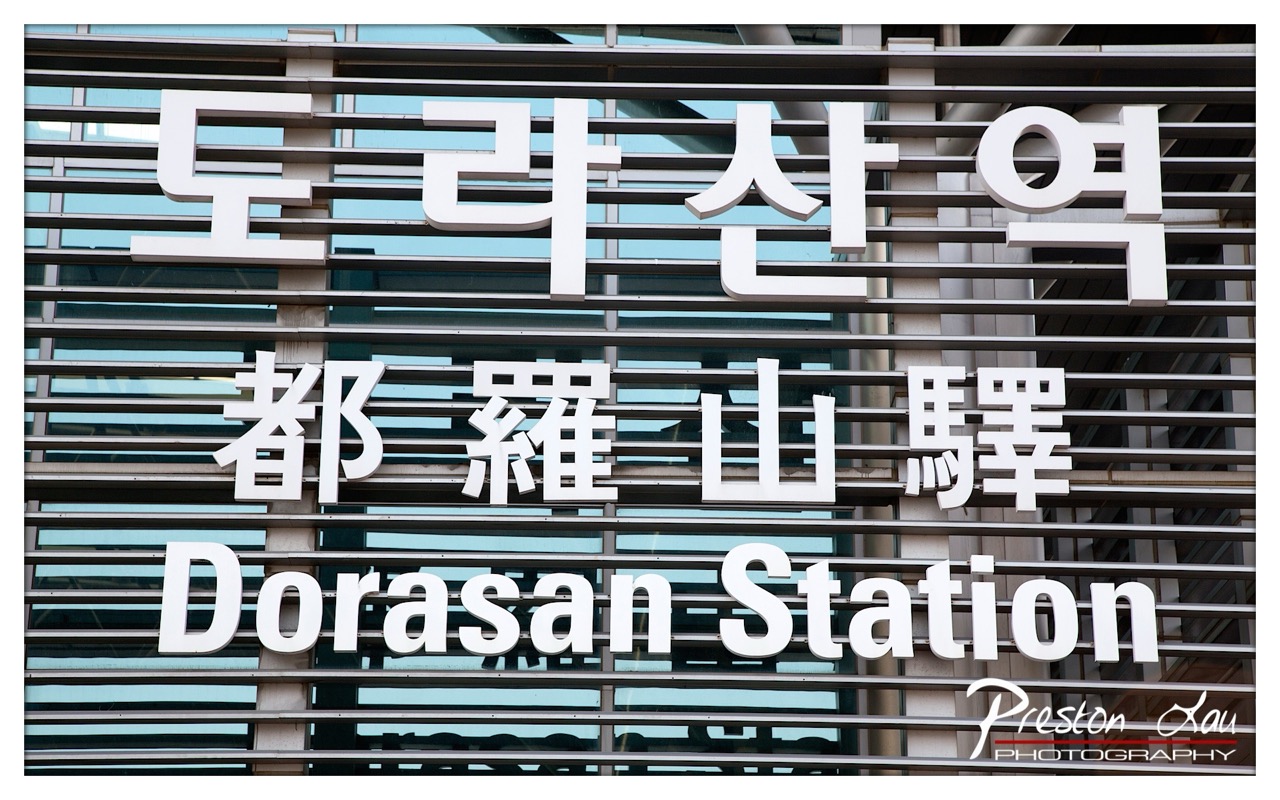

1. Overall Rating (0–10) — 7.0
This photograph captures the clean, modern architecture of Dorasan Station with a strong sense of place, emphasizing its role as a symbolic border point. The layered text—Korean, Chinese, and English—adds cultural depth and reinforces the station’s geopolitical significance. While the image is visually striking due to its bold typography and geometric structure, the slightly overexposed sky and flat lighting reduce its atmospheric impact, keeping it more documentary than evocative.
2. Composition (0–10) — 7.5
The layered text creates a strong visual hierarchy, with the Korean characters anchoring the top, followed by Chinese and English below. The horizontal lines of the metal slats guide the eye across the frame, creating rhythm and balance. The tight framing focuses attention on the signage, though the slight tilt in the angle introduces a subtle tension that prevents perfect symmetry.
3. Lighting (0–10) — 6.0
The lighting is bright and even, likely from midday sun, which flattens the scene and minimizes shadows. While this highlights the signage clearly, it also reduces depth and texture, giving the image a slightly sterile quality. The overexposed sky behind the sign further diminishes tonal range and mood.
4. Color & Tone (0–10) — 6.5
The palette is dominated by cool grays and whites, with a soft blue tint from the glass behind the slats. The white lettering stands out crisply against the metallic background, creating high contrast. However, the lack of warm tones and the narrow dynamic range give the image a clinical feel, limiting its emotional resonance.
5. Creativity (0–10) — 7.0
The concept is strong—using multilingual signage to represent the station’s identity as a point of convergence and transition. The photographer’s choice to frame it as a graphic composition, rather than a scenic shot, adds a layer of conceptual interest. The interplay of language, architecture, and perspective elevates the image beyond a simple travel snapshot.
6. Technical Quality (0–10) — 8.0
The image is sharp and well-focused, with clear, legible text and clean details in the metal slats. The depth of field is sufficient to keep all elements in focus, and the resolution is high. The watermark is professionally placed and unobtrusive.
7. Emotional Impact (0–10) — 6.5
The image conveys a sense of quiet significance, hinting at the weight of history and division associated with the station. However, the lack of human presence and emotional warmth keeps the viewer at a distance, making the impact more intellectual than visceral.
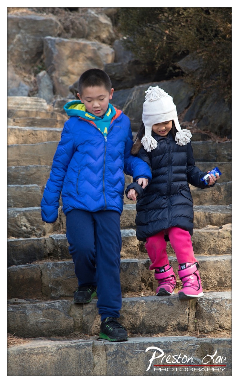

1. Overall Rating (0–10) — 7.0
This photograph captures a tender moment of sibling connection as two children descend stone steps, their hands clasped in quiet companionship. The natural interaction and warm winter attire convey a sense of care and shared journey, while the soft sunlight enhances the intimacy of the scene. The image is grounded in authenticity, though its narrative depth could be amplified with more dynamic composition and lighting.
2. Composition (0–10) — 6.5
The children are centered and well-framed, with the diagonal lines of the steps guiding the eye downward. However, the background’s cluttered rocks and uneven depth create a slightly distracting backdrop, reducing the focus on the emotional core of the moment.
3. Lighting (0–10) — 7.0
Natural sunlight illuminates the scene from the side, casting soft shadows that define the children’s forms and textures of their jackets. The light enhances the warmth of the moment without overpowering the subjects, contributing to a gentle, candid mood.
4. Color & Tone (0–10) — 7.5
The vibrant blue and pink clothing pop against the muted earth tones of the stone and background, creating a visually engaging contrast. The warm tones in the light enhance the color saturation, giving the image a lively yet cohesive palette.
5. Creativity (0–10) — 7.0
The image captures a genuine, unposed moment between siblings, elevating it beyond a simple portrait. The use of color and framing suggests a narrative of togetherness and childhood resilience, though the composition remains relatively conventional.
6. Technical Quality (0–10) — 8.0
Sharp focus and clear detail in the children’s clothing and expressions indicate strong technical execution. The exposure is balanced, and the depth of field appropriately isolates the subjects from the background.
7. Emotional Impact (0–10) — 8.0
The photograph resonates with warmth and affection, evoking nostalgia and the quiet strength of familial bonds. The children’s expressions and physical connection create a powerful sense of trust and shared experience, drawing the viewer into their world.
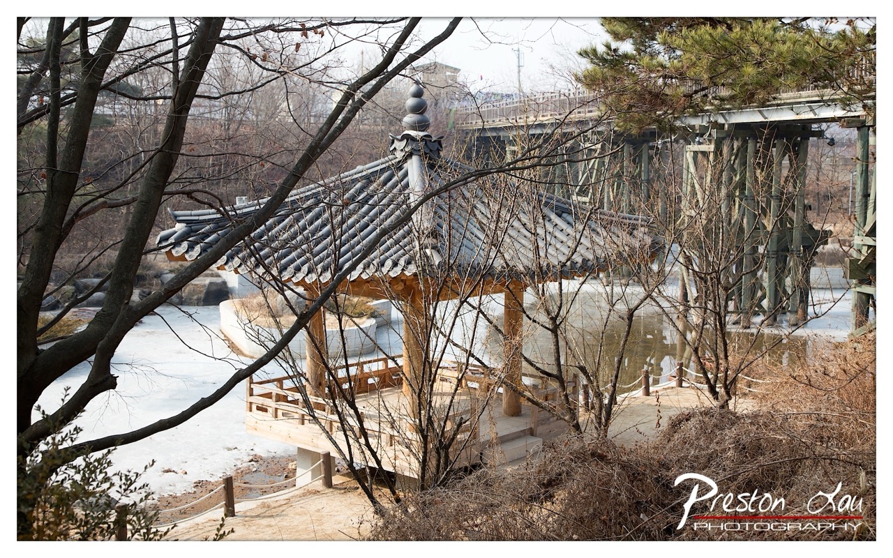

1. Overall Rating (0–10) — 7.0
This photograph captures a quiet, contemplative moment where traditional Korean architecture meets the stark stillness of winter, creating a compelling contrast between culture and season. The gazebo, framed by bare branches, feels both timeless and isolated, while the frozen river and distant bridge introduce a subtle tension between nature and modernity. While the image is visually rich and layered, it’s held back slightly by a lack of emotional depth and a slightly overexposed sky that flattens the atmosphere.
2. Composition (0–10) — 7.0
The foreground branches create a natural frame, drawing the eye toward the gazebo and adding depth. The placement of the gazebo off-center and the diagonal lines of the bridge and trees create a dynamic balance, though the framing feels slightly crowded.
3. Lighting (0–10) — 6.0
The light is soft and diffused, likely from an overcast day, which works well with the muted winter palette. However, the sky is overexposed, losing detail and giving the scene a flat, washed-out look that diminishes atmospheric tension.
4. Color & Tone (0–10) — 6.5
The palette is dominated by cool grays and browns, which reinforce the winter mood. While the colors are harmonious, they lack vibrancy, resulting in a somewhat subdued tone that could benefit from more contrast and warmth to enhance visual engagement.
5. Creativity (0–10) — 7.5
The juxtaposition of the traditional gazebo with the modern bridge and barren landscape is conceptually strong, offering a narrative of continuity and change. The use of natural framing and seasonal context adds a layer of poetic observation.
6. Technical Quality (0–10) — 7.5
The image is sharp and well-focused, with clear detail in the architectural elements and textures of the branches. The exposure is the primary technical weakness, particularly in the sky, but overall clarity and resolution are strong.
7. Emotional Impact (0–10) — 6.5
The photograph evokes a sense of solitude and reflection, inviting the viewer to pause and consider the passage of time. While the mood is quiet and contemplative, it remains somewhat detached, failing to fully connect on an emotional level due to the flat lighting and lack of human presence.
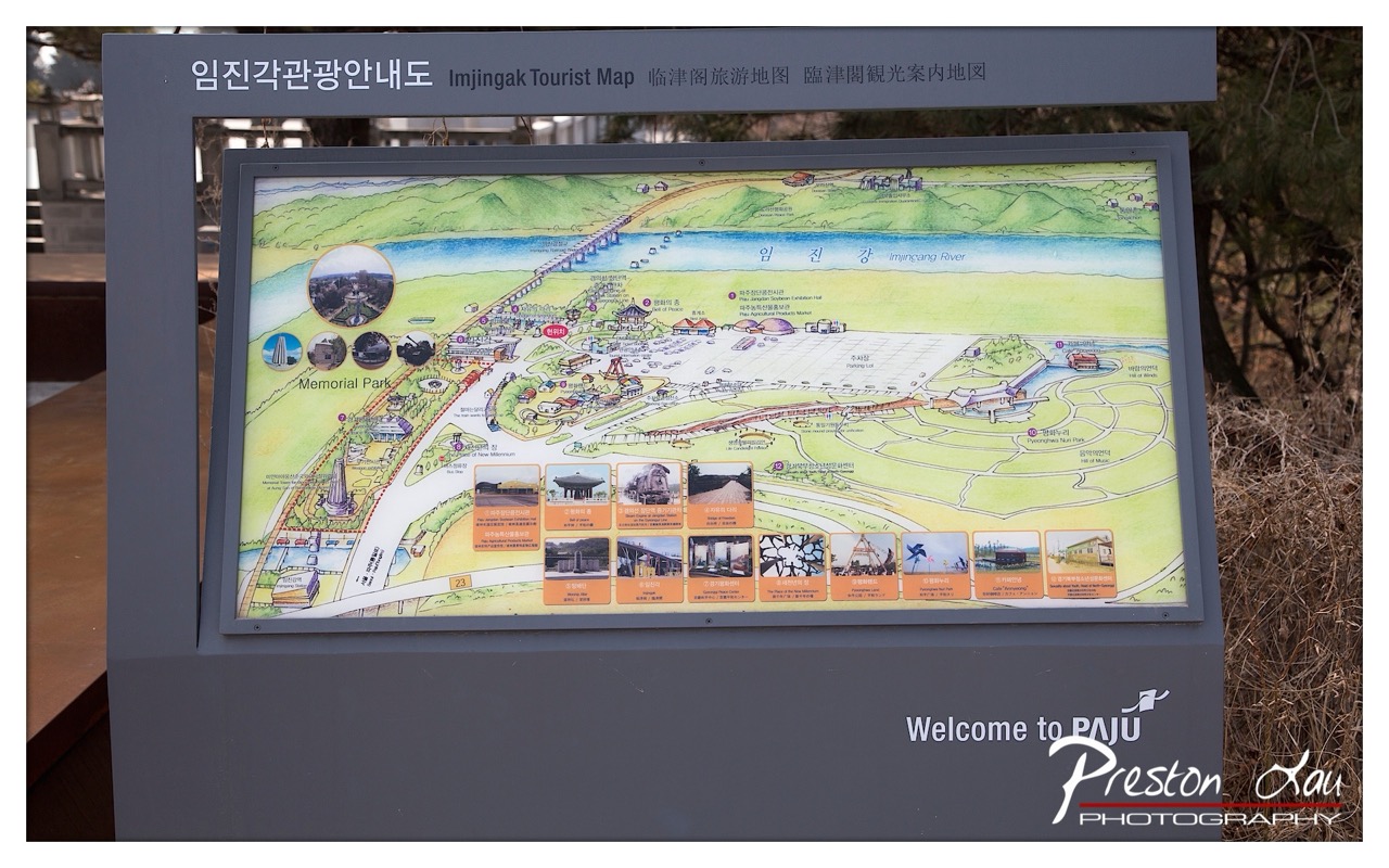

1. Overall Rating (0–10) — 6.0
This photograph captures a tourist map at Imjingak, presenting a blend of informational clarity and cultural context. The vibrant, illustrated map stands out against the muted outdoor surroundings, drawing the eye to its detailed layout and cultural landmarks. While the image effectively documents the site’s welcoming signage and purpose, it feels more like a straightforward documentary shot than an artistic interpretation, lacking a strong visual or emotional pull beyond its functional intent.
2. Composition (0–10) — 6.5
The map is centered and framed effectively, with the sign’s structure providing a clean, rectangular boundary that guides the viewer’s focus. The inclusion of natural elements—dry grass on the right and soft background foliage—adds subtle context without distracting from the subject.
3. Lighting (0–10) — 7.0
Natural daylight illuminates the scene evenly, enhancing the visibility of the map’s colors and text. The soft, diffused light avoids harsh shadows, preserving the clarity of the illustration and signage.
4. Color & Tone (0–10) — 7.5
The map’s bright greens, blues, and warm earth tones contrast well with the neutral gray of the sign and the brown tones of the surrounding foliage. The color palette feels inviting and appropriately aligned with the theme of a tourist destination.
5. Creativity (0–10) — 5.5
The image is functional and informative, but lacks a distinctive artistic perspective. The composition is straightforward, and while the map itself is creatively illustrated, the photograph does not push beyond documentation into narrative or conceptual exploration.
6. Technical Quality (0–10) — 8.0
The image is sharp, with clear focus on the map and readable text. The exposure is balanced, and the depth of field appropriately isolates the subject from the background.
7. Emotional Impact (0–10) — 5.0
The photograph conveys a sense of place and welcome, but the emotional resonance is limited. It invites curiosity about the location, but does not evoke deeper feelings of nostalgia, wonder, or connection.
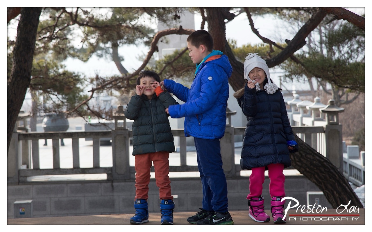

1. Overall Rating (0–10) — 7.5
This photograph captures a candid moment of childhood joy and sibling connection, set against the quiet backdrop of a traditional Korean garden. The natural interaction between the three children—playful, affectionate, and unposed—gives the image a warm, authentic energy. While the background is slightly distracting and the lighting is flat, the emotional authenticity and vibrant color choices elevate the image beyond a simple snapshot into a meaningful, narrative moment.
2. Composition (0–10) — 7.0
The subjects are well-placed in the frame, with the central boy acting as a natural focal point. The diagonal line of the tree branch adds visual interest, though the right side feels slightly unbalanced due to the girl’s position and the overhanging limb. A tighter crop could improve focus and cohesion.
3. Lighting (0–10) — 6.0
The light is soft and diffused, likely from an overcast day, which prevents harsh shadows and allows for even exposure across the subjects. However, the flat quality of the light diminishes depth and dimensionality, making the scene feel somewhat two-dimensional.
4. Color & Tone (0–10) — 8.0
The rich, contrasting colors—especially the bright blue jacket and vivid pink leggings—stand out against the muted greens and grays of the environment. The color palette feels intentional and playful, enhancing the youthful energy of the scene.
5. Creativity (0–10) — 7.5
The image succeeds in capturing a spontaneous, genuine moment of childhood, which is a strong creative choice. The juxtaposition of modern winter clothing with the traditional architecture adds subtle narrative depth, suggesting a blend of cultural continuity and contemporary life.
6. Technical Quality (0–10) — 7.5
The focus is sharp on the children, with clear detail in their expressions and clothing. The image is well-exposed with no obvious technical flaws, though the background is slightly soft, which may indicate a shallow depth of field used to isolate the subjects.
7. Emotional Impact (0–10) — 8.5
The genuine smiles, playful gestures, and physical closeness between the children evoke warmth, affection, and nostalgia. The viewer is drawn into the moment, feeling the joy and innocence of the scene, making it emotionally resonant and memorable.
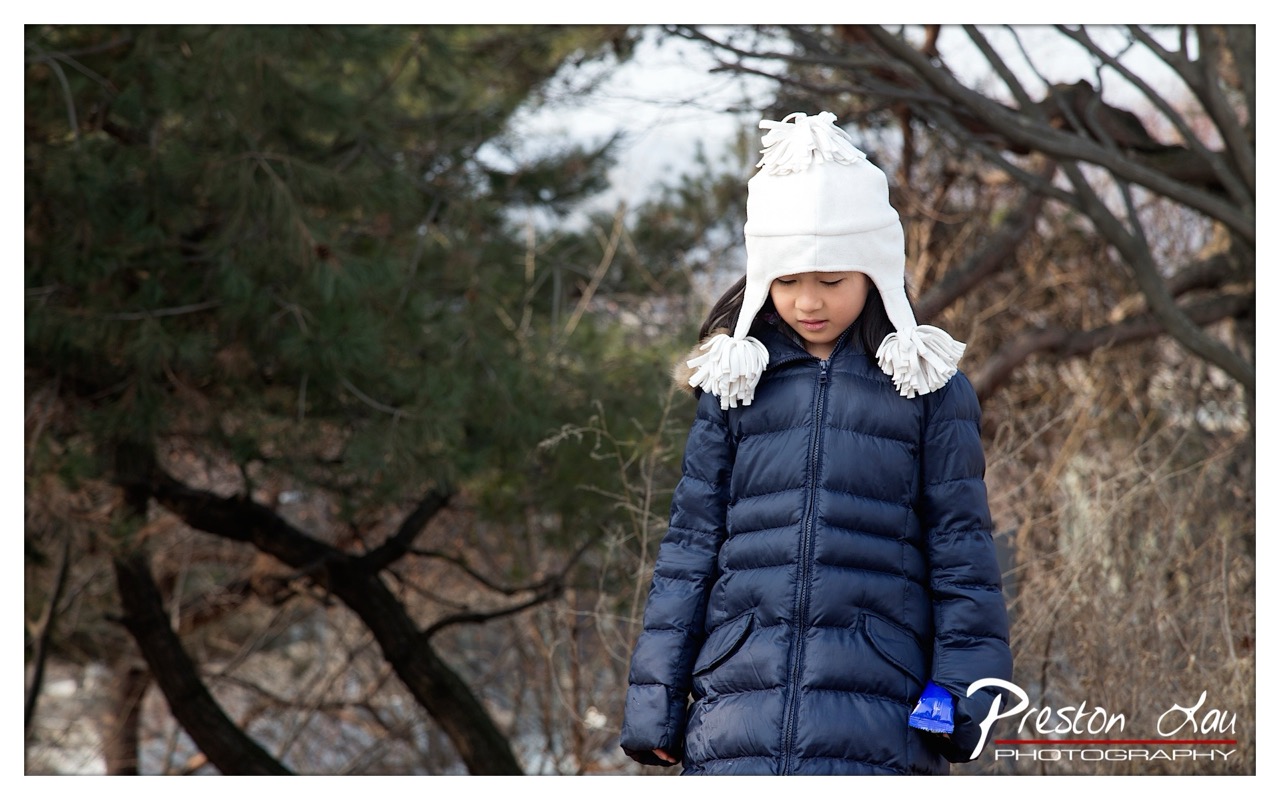

1. Overall Rating (0–10) — 7.0
This portrait captures a quiet, introspective moment of a young girl in a winter setting, where the soft textures of her coat and hat contrast with the stark, bare branches around her. The composition draws attention to her thoughtful expression, while the muted natural backdrop enhances the sense of stillness. Though the image is well-executed in its technical aspects, it feels slightly restrained in emotional depth, holding back from fully evoking the intimacy of the moment.
2. Composition (0–10) — 7.5
The subject is placed slightly off-center, creating a natural and balanced visual flow. The framing is tight enough to emphasize the girl while still allowing the surrounding trees to provide context and depth. The diagonal lines of the branches add subtle dynamism without distracting from the focal point.
3. Lighting (0–10) — 6.5
The soft, diffused daylight evenly illuminates the subject, minimizing harsh shadows and highlighting the textures of the coat and hat. While the lighting is gentle and flattering, it lacks the warmth or directional quality that could enhance mood and dimension.
4. Color & Tone (0–10) — 6.0
The palette is restrained, dominated by cool blues and grays, with the white hat providing a soft contrast. The overall tone is subdued, which suits the winter theme but limits vibrancy. A touch more warmth or saturation could have enlivened the image without compromising its natural feel.
5. Creativity (0–10) — 7.0
The photograph succeeds in capturing a candid, reflective moment, using simple elements—clothing, expression, and environment—to tell a quiet story. The choice of a textured white hat as a visual anchor adds a touch of whimsy, elevating the image beyond a standard portrait.
6. Technical Quality (0–10) — 8.0
The focus is sharp on the girl, with a smooth depth of field that softly blurs the background. The image is clean, well-exposed, and free of noise, demonstrating strong technical control and attention to detail.
7. Emotional Impact (0–10) — 6.5
The girl’s downcast gaze and contemplative expression evoke a sense of solitude and introspection, inviting viewers to wonder about her thoughts. While the emotional resonance is present, it remains subtle, leaving the narrative open-ended and somewhat distant.
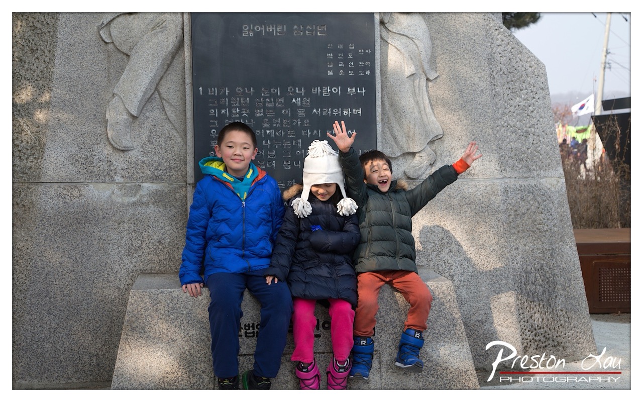

1. Overall Rating (0–10) — 7.0
This photograph captures a candid moment of childhood joy set against a solemn monument, creating a poignant contrast between innocence and memory. The children’s expressions—especially the one waving with unfiltered delight—inject warmth and life into the scene, while the weathered stone and inscribed text lend a sense of gravity. The composition balances these opposing moods effectively, though the slightly cluttered background and overcast lighting temper its emotional resonance.
2. Composition (0–10) — 7.0
The children are centered and well-framed, creating a strong focal point against the monument’s imposing structure. The use of the stone steps as a natural platform grounds the subjects, while the asymmetrical placement of the figures adds dynamism. However, the slight overexposure on the right and the distracting elements in the background detract from the visual harmony.
3. Lighting (0–10) — 5.5
The lighting is flat and diffused, typical of an overcast day, which softens shadows but also reduces depth and texture in the stone. While it evenly illuminates the subjects, the lack of directional light diminishes the monument’s sculptural quality and gives the image a muted, almost clinical feel.
4. Color & Tone (0–10) — 6.5
The color palette is balanced, with the bright blue and pink jackets standing out against the neutral gray stone. The winter tones feel authentic, and the colors, though not highly saturated, are well-organized and contribute to the scene’s narrative. A touch more warmth or contrast could enhance the visual vibrancy.
5. Creativity (0–10) — 7.5
The juxtaposition of playful children with a memorial monument is striking and thoughtfully executed. It tells a story of continuity—children as bearers of memory and hope—while maintaining a documentary authenticity. The image resists sentimentality, favoring quiet observation and emotional complexity.
6. Technical Quality (0–10) — 7.5
The image is sharp, with clear focus on the children and the inscription. The exposure is generally well-managed, though there’s a slight loss of detail in the highlights on the right. The watermark is unobtrusive and professionally placed.
7. Emotional Impact (0–10) — 7.0
The image evokes a layered emotional response—joy, reverence, and a subtle melancholy. The children’s laughter feels genuine, and their connection to the site suggests a generational link to history. The emotional weight is strongest in the contrast between their innocence and the monument’s solemnity, making the viewer pause and reflect.
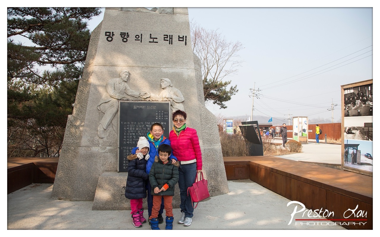

1. Overall Rating (0–10) — 6.8
This photograph captures a tender family moment in front of a solemn monument, blending personal memory with historical context. The composition balances the emotional warmth of the group with the gravity of the site, though the bright, overcast lighting slightly flattens the scene’s depth. While the image succeeds as a heartfelt travel memory, it could better convey the monument’s significance through stronger visual storytelling.
2. Composition (0–10) — 6.5
The subjects are well-centered, with the monument anchoring the frame and providing cultural context. The depth of field is appropriate, but the background elements—especially the display panels and distant figures—introduce visual distractions.
3. Lighting (0–10) — 5.5
The light is soft and diffused, likely from an overcast sky, which minimizes harsh shadows and evenly illuminates the subjects. However, the lack of directional light results in a somewhat flat and muted atmosphere.
4. Color & Tone (0–10) — 6.0
The palette is subdued, with muted grays and earth tones dominating the monument and landscape. The vibrant pink jacket and red handbag stand out, drawing attention to the family, but the overall tone lacks richness and contrast.
5. Creativity (0–10) — 6.5
The image thoughtfully juxtaposes personal joy with a site of historical weight, suggesting a narrative of remembrance across generations. The inclusion of the monument elevates the photo beyond a simple family portrait.
6. Technical Quality (0–10) — 7.5
Sharp focus and clear detail are evident throughout, particularly in the subjects and the monument’s inscriptions. The exposure is well-balanced, and there are no noticeable technical flaws.
7. Emotional Impact (0–10) — 7.0
The warmth of the family’s interaction—smiles, close proximity, and shared presence—evokes a sense of connection and love. The monument adds a layer of solemnity, creating a poignant contrast that resonates emotionally.
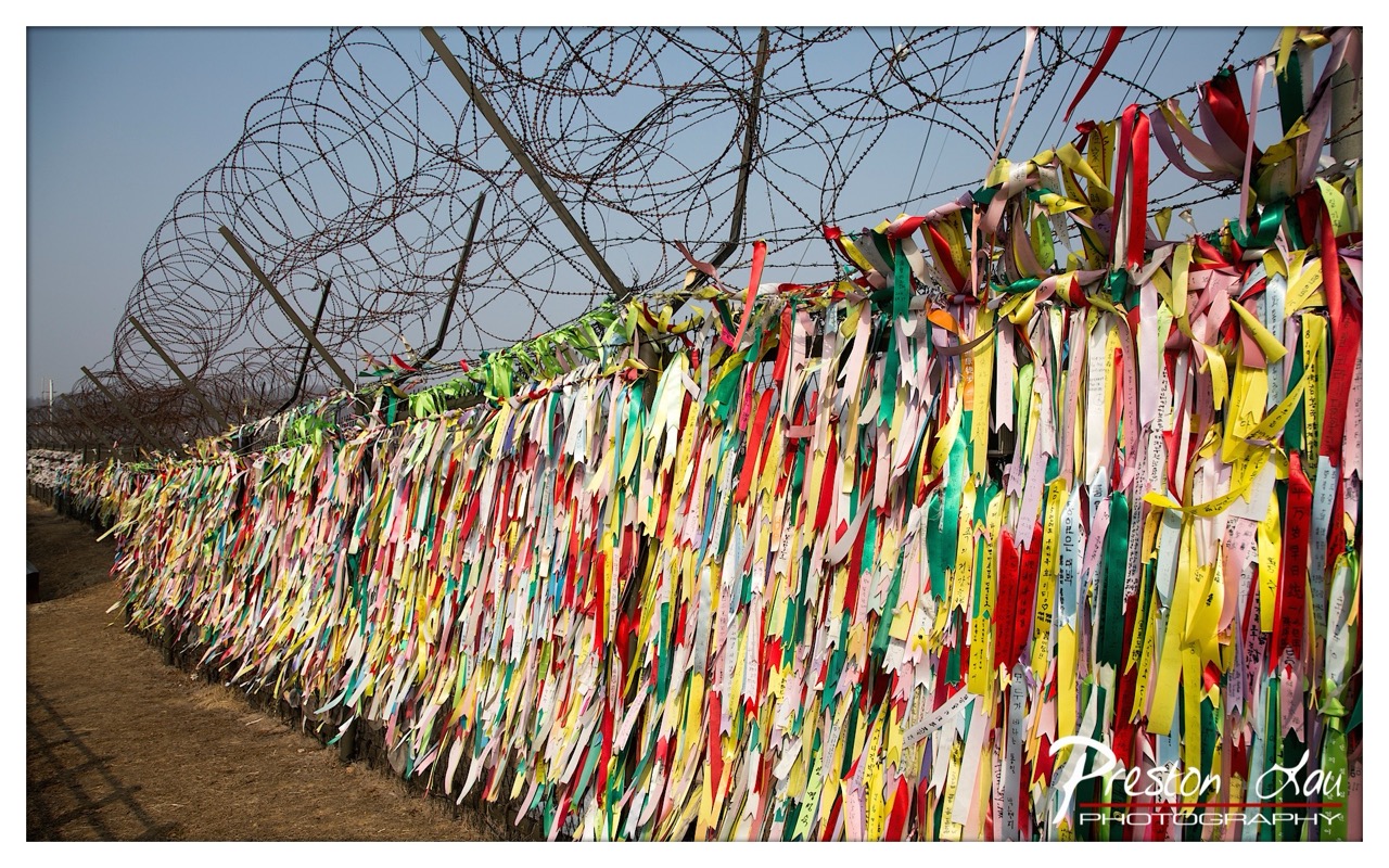

1. Overall Rating (0–10) — 7.5
This photograph captures a powerful juxtaposition between the harshness of a barbed wire fence and the delicate, vibrant expressions of hope and remembrance carried on colorful ribbons. The contrast between the oppressive structure and the personal, emotional messages creates a poignant narrative that resonates deeply. While the image is visually compelling, its emotional weight is slightly diminished by the overwhelming density of ribbons, which can distract from the overall clarity of the scene.
2. Composition (0–10) — 7.0
The diagonal line of the fence draws the eye into the frame, creating a strong sense of depth and perspective. The placement of the ribbons along the fence creates a dynamic, textured foreground, while the barbed wire overhead adds a layer of tension and visual interest. The composition is balanced, though the sheer volume of ribbons slightly disrupts the visual flow.
3. Lighting (0–10) — 7.5
The natural daylight provides even illumination across the scene, highlighting the vivid colors of the ribbons while maintaining detail in the barbed wire. The light casts subtle shadows that add depth and dimension, enhancing the texture of the ribbons and the metallic sheen of the wire. The clear sky in the background provides a neutral backdrop that allows the colors to stand out.
4. Color & Tone (0–10) — 8.0
The palette is rich and varied, with a wide spectrum of bright, saturated colors that create a striking visual contrast against the muted tones of the fence and the pale sky. The use of vibrant reds, yellows, greens, and pinks conveys a sense of life and hope, while the neutral background enhances the emotional impact of the colors. The tonal range is well-balanced, with no areas of overexposure or underexposure.
5. Creativity (0–10) — 8.5
The image is highly creative in its ability to convey a complex emotional and symbolic message through visual contrast. The juxtaposition of the barbed wire—often associated with confinement and division—with the ribbons—symbols of peace, prayer, and unity—creates a powerful narrative. The photographer has captured a moment of collective expression that transcends the literal, inviting viewers to reflect on themes of hope and reconciliation.
6. Technical Quality (0–10) — 8.0
The image is sharp and well-focused, with fine detail visible in both the ribbons and the barbed wire. The depth of field is appropriate, keeping the foreground elements in focus while allowing the background to remain clear but slightly softer. The overall clarity is high, and the exposure is well-managed, with no significant technical flaws.
7. Emotional Impact (0–10) — 9.0
The emotional impact is profound, evoking a sense of both sorrow and hope. The sight of countless ribbons tied to a barrier of confinement speaks to the human desire for connection and peace, even in the face of division. The image invites contemplation and empathy, making it a powerful and moving visual statement.
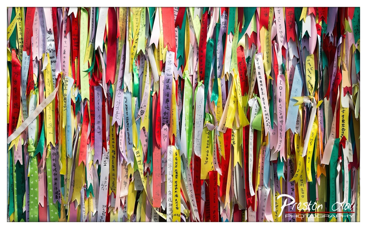

1. Overall Rating (0–10) — 7.5
This photograph captures the vibrant energy of a cultural tradition, where countless ribbons woven with handwritten wishes create a rich tapestry of hope and personal expression. The sheer density of color and text invites the viewer into a moment of communal faith, though the visual clutter risks overwhelming the eye. The image succeeds in conveying the emotional weight of the scene, even as its aesthetic complexity demands careful attention.
2. Composition (0–10) — 6.5
The frame is tightly packed with ribbons, creating a sense of abundance but sacrificing spatial breathing room. The vertical orientation emphasizes the height of the display, yet the lack of a clear focal point results in a slightly chaotic distribution.
3. Lighting (0–10) — 7.0
Natural light illuminates the scene evenly, enhancing the vibrancy of the colors without harsh shadows or overexposure. The lighting supports the joyful, celebratory mood of the setting.
4. Color & Tone (0–10) — 8.0
A diverse palette of bright, saturated hues—reds, yellows, greens, and pinks—fills the frame, creating a lively and energetic atmosphere. The contrast between the vivid ribbons and the handwritten black script adds visual depth and texture.
5. Creativity (0–10) — 8.0
The photograph captures a unique cultural practice with authenticity and respect. By filling the frame with the ribbons, the image transforms a simple display into a powerful visual metaphor for collective hope and individual dreams.
6. Technical Quality (0–10) — 8.5
The image is sharp and well-focused, with clear legibility of the inscriptions. The resolution effectively captures fine details in the textures of the ribbons and the handwritten characters.
7. Emotional Impact (0–10) — 8.0
The photograph evokes a strong sense of connection and reverence, as the viewer is drawn into the shared act of writing and hanging wishes. The emotional resonance is amplified by the sheer number of personal messages, suggesting a community bound by hope and tradition.
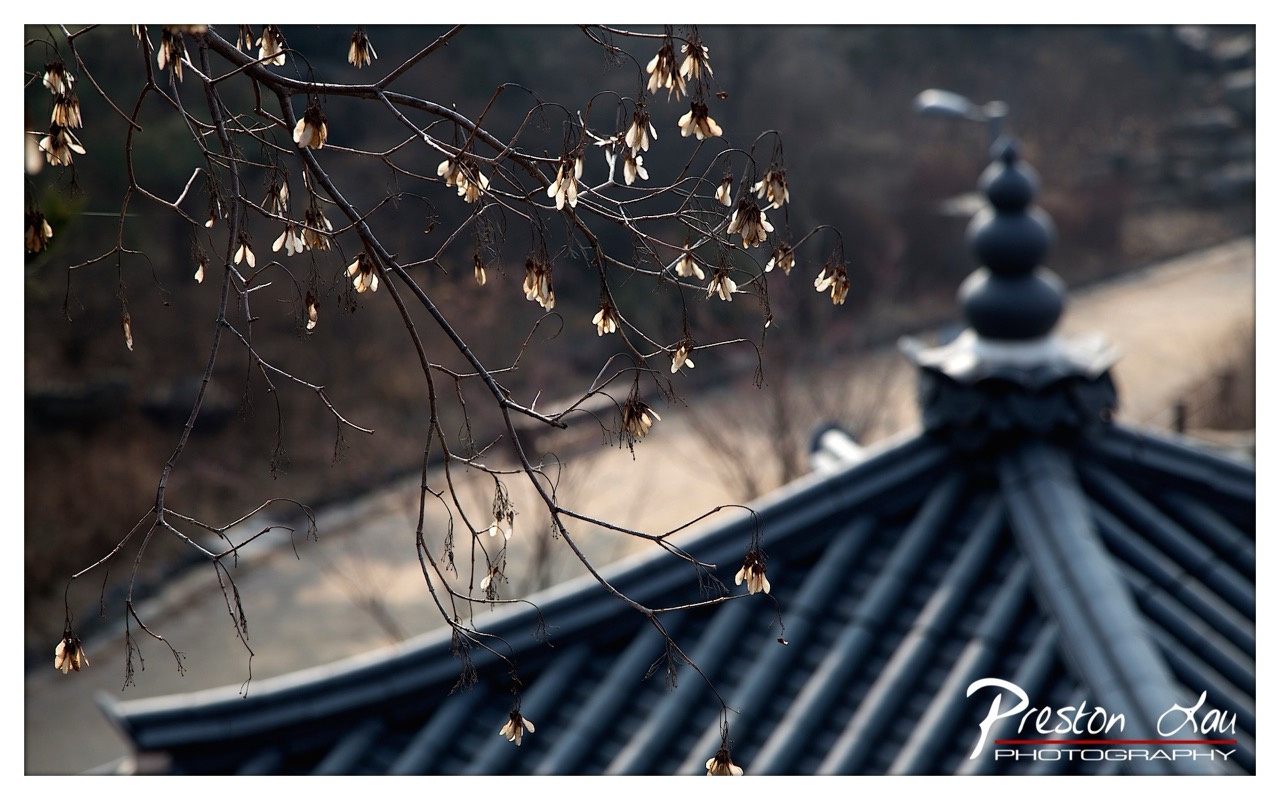

1. Overall Rating (0–10) — 7.5
This photograph captures a quiet, contemplative moment where nature and tradition intersect, with delicate seed pods clinging to bare branches against the backdrop of a classic tiled roof. The interplay of texture and form—twisted limbs, weathered tiles, and the soft, fading light—evokes a sense of seasonal transition and quiet endurance. While the mood is deeply atmospheric, the composition’s subtlety could be more fully realized with a stronger focal point and more intentional use of depth.
2. Composition (0–10) — 7.0
The diagonal line of the branches draws the eye across the frame, creating a dynamic yet balanced structure. The placement of the roof in the lower right provides a grounding element, though the subject’s slight off-center positioning could be refined for greater visual harmony.
3. Lighting (0–10) — 7.5
Soft, diffused light enhances the mood, casting gentle shadows and highlighting the textures of the dried seed pods and tile ridges. The backlighting on the pods adds a subtle glow, emphasizing their fragile beauty.
4. Color & Tone (0–10) — 7.0
The muted palette of grays, browns, and faded whites creates a somber, contemplative tone. The lack of vibrant color is appropriate for the season and mood, though a slightly warmer tone could add emotional warmth.
5. Creativity (0–10) — 8.0
The juxtaposition of natural decay with architectural permanence is a compelling narrative. The choice to focus on the delicate, almost ghostly seed pods against the solid roof suggests a poetic meditation on time and impermanence.
6. Technical Quality (0–10) — 8.0
Sharp focus on the foreground elements, precise depth of field, and clean exposure demonstrate strong technical control. The clarity of the textures enhances the image’s tactile quality.
7. Emotional Impact (0–10) — 7.5
The image resonates with a quiet melancholy and reverence for the passage of time, inviting the viewer to pause and reflect. Its understated beauty lingers, evoking a sense of peace amid decay.
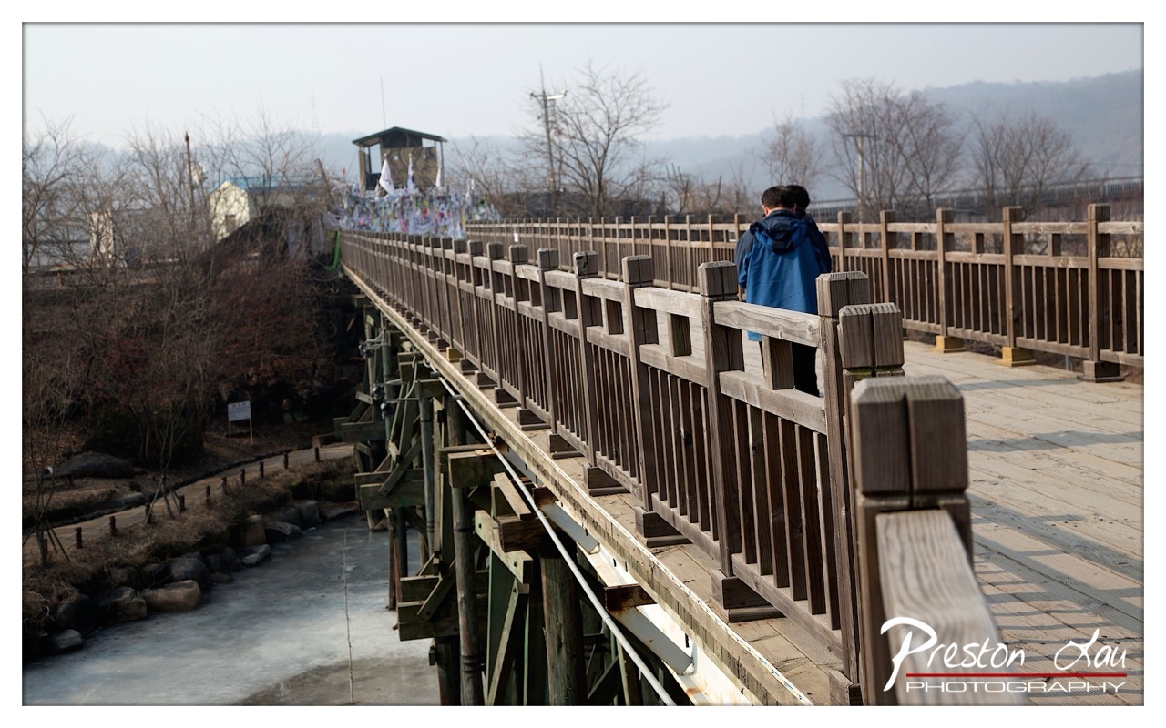

1. Overall Rating (0–10) — 6.8
This photograph captures a quiet, contemplative moment on a wooden bridge, where the interplay of human presence and natural stillness evokes a sense of journey and introspection. The muted winter palette and distant haze lend a serene, almost melancholic atmosphere, though the composition’s slightly awkward framing and flat lighting prevent it from achieving greater visual depth. The image succeeds as a quiet narrative of passage, but it stops short of transcendent beauty.
2. Composition (0–10) — 6.0
The bridge creates a strong diagonal leading line, guiding the eye toward the figure and the distant shrine. However, the off-center placement and cluttered foreground slightly disrupt visual harmony, and the low-angle perspective feels more observational than intentional.
3. Lighting (0–10) — 5.5
Diffuse, overcast light flattens the scene, minimizing texture and depth. While it contributes to the muted mood, the lack of contrast and shadow detail gives the image a lifeless quality.
4. Color & Tone (0–10) — 5.5
A subdued palette of grays, browns, and pale blues dominates, reinforcing the quiet, wintry atmosphere. The tonal range is limited, and the colors lack vibrancy, though they are consistent with the mood.
5. Creativity (0–10) — 6.5
The image captures a moment of quiet human presence within a landscape rich with cultural symbolism—the shrine and ritual banners hint at deeper meaning. However, the execution leans more toward documentation than artistic interpretation.
6. Technical Quality (0–10) — 7.0
The photograph is sharp and well-focused, with clean detail in the wooden textures and railings. The exposure is balanced, though the lack of dynamic range limits the image’s visual impact.
7. Emotional Impact (0–10) — 6.0
The scene evokes a sense of solitude and reflection, particularly through the solitary figure walking away. While the emotion is present, it remains understated, leaving the viewer to fill in the narrative gaps.
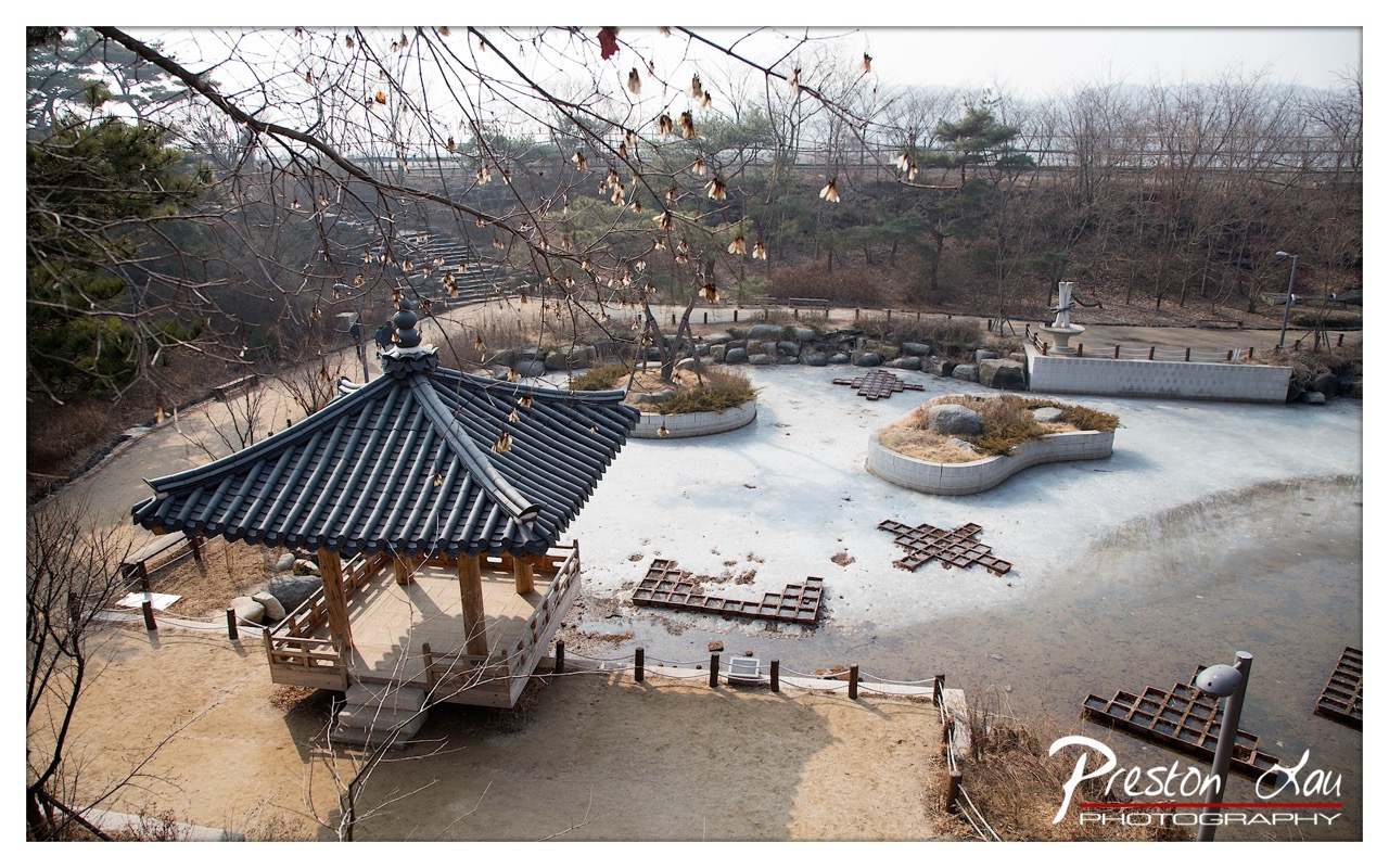

1. Overall Rating (0–10) — 7.0
This photograph captures a serene, wintery Korean garden with a striking sense of stillness and cultural resonance. The traditional pavilion, juxtaposed against the frozen pond and bare branches, evokes a quiet contemplation of nature and time. While the composition is strong and the mood contemplative, the muted color palette and overcast lighting slightly dampen the visual energy, leaving the scene feeling more observational than immersive.
2. Composition (0–10) — 7.5
The elevated perspective provides a balanced view of the scene, with the pavilion anchoring the left side and the frozen pond drawing the eye toward the center. The diagonal lines of the branches and walkways guide the viewer’s gaze, creating a sense of depth and rhythm.
3. Lighting (0–10) — 6.0
The soft, diffused light of an overcast day casts even illumination across the scene, minimizing harsh shadows and enhancing the quiet mood. However, the lack of directional light reduces texture and depth, giving the image a slightly flat appearance.
4. Color & Tone (0–10) — 6.5
The palette is subdued, dominated by cool grays, browns, and muted greens, which align well with the winter setting. While harmonious, the colors lack vibrancy, contributing to a somewhat somber and distant atmosphere.
5. Creativity (0–10) — 7.0
The photograph effectively blends cultural architecture with natural elements, creating a narrative of seasonal transition. The use of framing through bare branches adds a poetic layer, enhancing the sense of looking into a quiet, frozen moment.
6. Technical Quality (0–10) — 7.5
The image is sharp and well-focused, with clean detail in both the pavilion and the surrounding landscape. The exposure is balanced, and the depth of field is appropriate for the scene.
7. Emotional Impact (0–10) — 7.0
The image conveys a calm, introspective mood, inviting reflection on the quiet beauty of a winter landscape. The stillness of the frozen pond and the solitary pavilion evoke a sense of solitude and peace, resonating with viewers on a contemplative level.
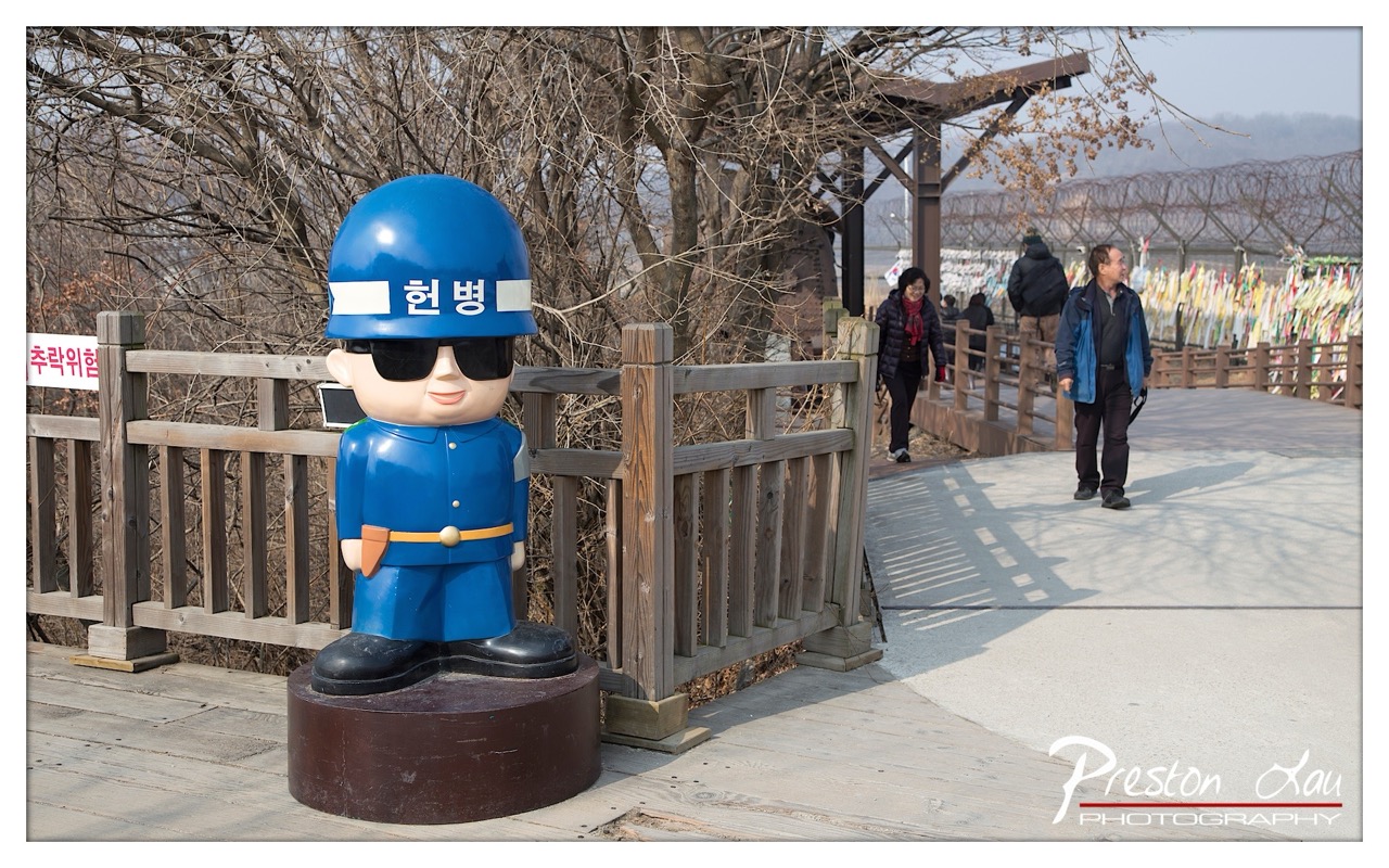

1. Overall Rating (0–10) — 6.8
This photograph captures a curious juxtaposition of humor and solemnity at the border between North and South Korea, where a cheerful, cartoonish guard statue contrasts sharply with the barbed wire and watchful environment. The image succeeds in conveying a sense of irony and cultural commentary, though the narrative is slightly diluted by the casual presence of tourists and the flat lighting. The statue’s exaggerated features and bright blue uniform draw immediate attention, yet the scene’s deeper political weight remains underdeveloped in the frame.
2. Composition (0–10) — 7.0
The statue is well-placed in the foreground, creating a strong focal point, while the wooden walkway and railing lead the eye toward the background, where visitors and the border fence provide context. The diagonal lines of the path and railings add dynamism, though the background elements feel slightly crowded, competing for attention.
3. Lighting (0–10) — 6.5
Natural daylight provides even illumination, with soft shadows suggesting a slightly overcast or midday sky. The lighting is functional but lacks drama, failing to enhance the emotional contrast between the playful statue and the serious geopolitical backdrop.
4. Color & Tone (0–10) — 7.0
The vibrant blue of the statue stands out against the muted browns and grays of the wooden fence and bare trees. The color palette is balanced, with the white and yellow flags in the background adding subtle pops of color that hint at cultural significance without overwhelming the scene.
5. Creativity (0–10) — 7.5
The image is conceptually strong, leveraging visual irony to comment on the paradox of peace and division. The choice to frame the statue as a symbol of both protection and absurdity is inventive, and the inclusion of human figures grounds the scene in reality, inviting viewers to reflect on the juxtaposition.
6. Technical Quality (0–10) — 7.5
The photograph is sharp and well-focused, with clear details in both the foreground and background. The depth of field is appropriate, allowing the statue to stand out while maintaining contextual clarity. The watermark is subtle and does not detract from the image.
7. Emotional Impact (0–10) — 6.0
The image evokes a sense of contemplative irony, prompting reflection on the humanization of conflict and the role of symbolism in border zones. While the emotional resonance is present, it remains restrained due to the lack of dramatic lighting and the casual demeanor of the people, which slightly diminishes the weight of the setting.
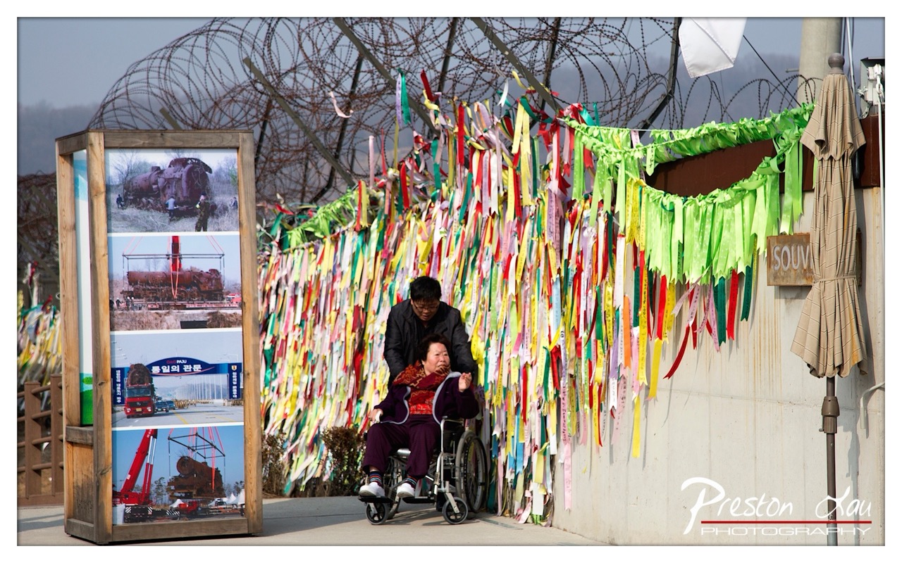

1. Overall Rating (0–10) — 7.0
This photograph captures a poignant moment of care and human connection against a backdrop of symbolic tension, where vibrant ribbons of hope contrast sharply with the barbed wire above. The juxtaposition of the tender interaction between the caregiver and the woman in the wheelchair with the industrial and militarized environment creates a powerful narrative of resilience and peace. While the image is rich in symbolism and emotional depth, the composition feels slightly cluttered, which tempers its overall visual impact.
2. Composition (0–10) — 6.5
The subjects are well-centered and framed by the colorful ribbons and the wooden display, drawing the viewer’s eye to the emotional core of the image. However, the presence of the sign and umbrella on the right side introduces visual noise, slightly disrupting the balance.
3. Lighting (0–10) — 6.0
The scene is illuminated by soft, diffused daylight, which evenly lights the subjects and highlights the vivid colors of the ribbons. While the lighting is clear and natural, it lacks dramatic contrast, resulting in a somewhat flat overall effect.
4. Color & Tone (0–10) — 7.5
The vibrant hues of the ribbons create a striking contrast against the muted tones of the concrete wall and barbed wire, enhancing the image’s emotional resonance. The color palette is rich and expressive, with the greens, reds, and yellows evoking a sense of hope and unity.
5. Creativity (0–10) — 8.0
The image is highly original in its conceptual juxtaposition of peace and division, using the ribbon-covered wall as a powerful symbol of longing and reconciliation. The narrative is both personal and universal, elevating the photograph beyond a simple documentary moment.
6. Technical Quality (0–10) — 7.5
The focus is sharp on the subjects, with clear detail in the ribbons and background elements. The exposure is well-managed, and the image retains texture and clarity, though slight overexposure in the sky slightly reduces overall depth.
7. Emotional Impact (0–10) — 8.0
The emotional weight of the image is strong, evoking empathy through the intimate gesture of care and the poignant contrast with the militarized setting. It invites reflection on themes of division, healing, and the enduring human spirit.
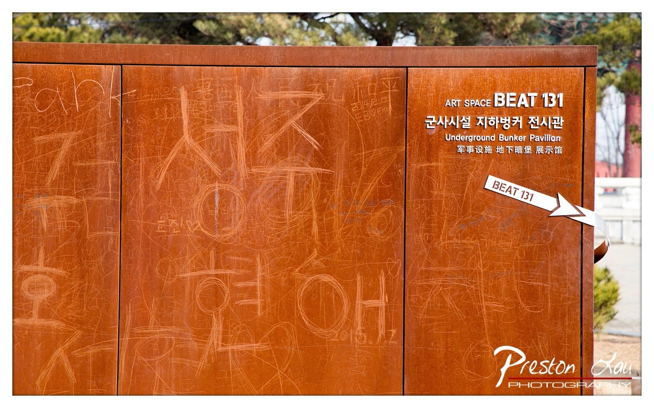

1. Overall Rating (0–10) — 7.0
This photograph captures a compelling contrast between institutional signage and the chaotic mark-making of human presence, creating a layered narrative about memory and space. The weathered metal surface, scarred with scratches and graffiti, speaks to years of visitors leaving their traces, while the clean, official text of "ART SPACE BEAT 131" grounds the scene in a formal, curated context. The image succeeds in highlighting the tension between preservation and rebellion, though the visual clutter risks overwhelming the viewer’s focus.
2. Composition (0–10) — 6.5
The framing centers on the signage, but the left side is dominated by chaotic graffiti, creating an uneven visual balance. The arrow and text on the right pull attention, but the left panel’s density risks distracting from the primary subject.
3. Lighting (0–10) — 7.0
Natural daylight illuminates the scene evenly, enhancing the texture of the metal and making the engraved marks visible. The soft, diffused light prevents harsh shadows, allowing both the text and graffiti to be clearly read.
4. Color & Tone (0–10) — 7.5
The warm, rust-orange tone of the metal creates a cohesive and slightly nostalgic palette. The contrast between the light scratches and the darker background enhances visibility, while the white text stands out cleanly against the surface.
5. Creativity (0–10) — 7.0
The juxtaposition of formal institutional labeling with personal, impromptu graffiti offers a powerful commentary on public space and human interaction. The photographer captures a moment where history and individual expression collide.
6. Technical Quality (0–10) — 8.0
The image is sharp and detailed, with clear focus across the surface. The depth of field is sufficient to keep both the text and the graffiti legible, and the exposure is well-balanced.
7. Emotional Impact (0–10) — 6.5
The photograph evokes a quiet tension between order and chaos, inviting reflection on how people leave their mark on spaces meant to be preserved. The emotional resonance lies in the unspoken stories behind each scratch and inscription.
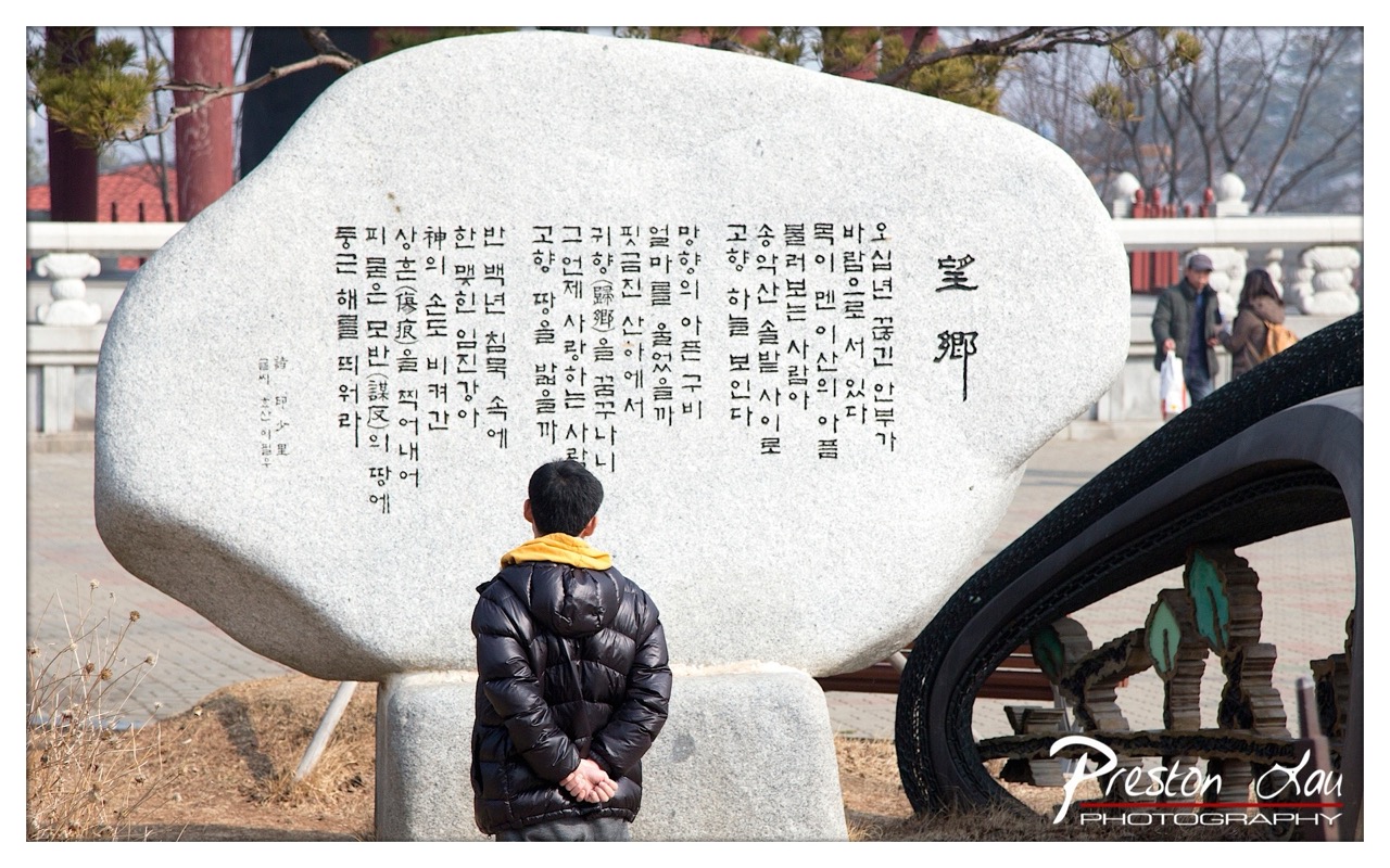

1. Overall Rating (0–10) — 7.0
This photograph captures a contemplative moment of a person standing before a large inscribed stone, evoking themes of memory, tradition, and quiet reflection. The contrast between the solemnity of the stone monument and the casual presence of the figure creates a subtle narrative tension. While the image is strong in its cultural resonance and composition, the slightly cluttered background and overexposed sky detract from its visual cohesion.
2. Composition (0–10) — 7.5
The subject is well-placed in the lower-left third, drawing the eye toward the inscribed stone, which dominates the frame. The diagonal curve of the foreground sculpture on the right adds dynamic balance, while the depth created by the background figures enhances the sense of place.
3. Lighting (0–10) — 6.5
Natural daylight illuminates the scene clearly, though the sky is overexposed, washing out details in the upper portion. The shadows on the stone are soft and even, preserving legibility of the Korean text, but the harshness of the upper light detracts from atmospheric depth.
4. Color & Tone (0–10) — 6.0
The palette is restrained, dominated by grays and muted earth tones, which support the solemn mood. The yellow collar of the jacket offers a subtle pop of color, drawing attention to the subject, but the overall tonal range lacks richness and vibrancy.
5. Creativity (0–10) — 7.0
The image successfully blends documentary realism with artistic intent, using the juxtaposition of modern attire and ancient inscription to suggest a dialogue between past and present. The framing and subject interaction lend a narrative quality that feels both personal and universal.
6. Technical Quality (0–10) — 7.5
The focus is sharp on the central subject and the stone, with sufficient detail in the inscriptions. The image is well-exposed overall, though the blown-out sky suggests a slight overexposure in the highlights.
7. Emotional Impact (0–10) — 7.5
The photograph conveys a quiet reverence and introspection, inviting the viewer to consider the weight of history and the act of remembering. The solitary figure, absorbed in the text, creates a powerful sense of personal connection to the past.
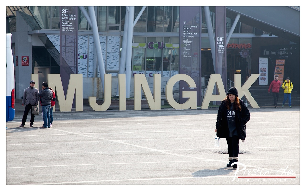

1. Overall Rating (0–10) — 6.0
This photograph captures a quiet, candid moment in a bustling urban space, where the imposing "IMJINGAK" sign anchors a scene of everyday movement. The subject—a woman walking with a sense of purpose—adds narrative weight, while the scattered figures and commercial signage ground the image in a real-world context. Though the composition feels slightly static and the lighting is flat, the image succeeds in documenting a slice of life with subtle emotional depth, balancing documentary realism with a restrained sense of place.
2. Composition (0–10) — 5.5
The wide-angle perspective creates a sense of space but results in a cluttered foreground and uneven distribution of subjects. The woman in the right foreground draws the eye, yet the large sign and scattered people create visual competition, diluting focus.
3. Lighting (0–10) — 5.0
The scene is lit by flat, overcast daylight that minimizes shadows and depth. While the light is even and functional, it lacks warmth or drama, contributing to a somewhat sterile atmosphere.
4. Color & Tone (0–10) — 5.5
The palette is dominated by muted grays and beiges, with only subtle pops of color from the woman’s black coat and the red and yellow jackets in the background. The tonal range is limited, reducing visual impact.
5. Creativity (0–10) — 6.0
The image captures a moment with authenticity, using a recognizable landmark to suggest a narrative. However, it leans more toward observation than interpretation, offering a straightforward documentation rather than a bold artistic statement.
6. Technical Quality (0–10) — 7.0
The image is sharp and well-focused, with clean detail throughout. The exposure is balanced, and the watermark is discreet, indicating a professional handling of the technical aspects.
7. Emotional Impact (0–10) — 5.5
The photograph evokes a sense of urban solitude and routine. While the woman’s expression and posture suggest introspection, the overall mood remains detached, leaving the viewer as a quiet observer rather than an emotional participant.
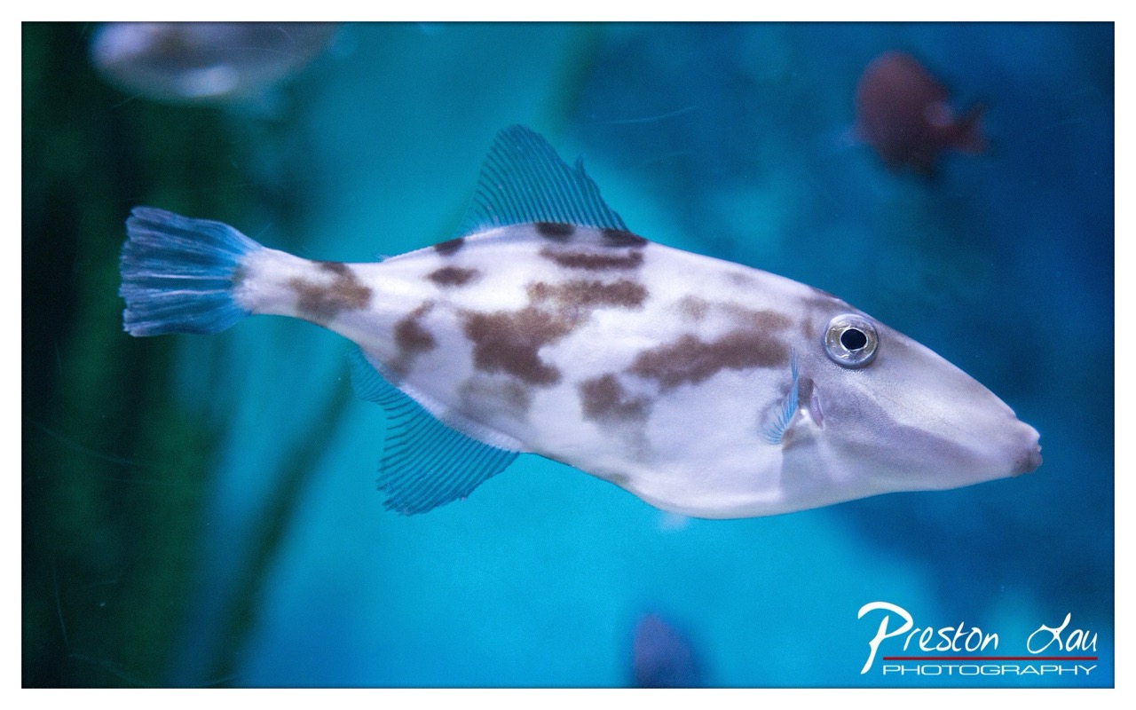

1. Overall Rating (0–10) — 7.0
This photograph captures the serene grace of a triggerfish gliding through a tranquil underwater world, its distinctive markings and translucent fins rendered with striking clarity. The cool blue backdrop enhances the sense of depth and immersion, while the fish’s calm demeanor evokes a quiet fascination with marine life. While the image is compelling and well-executed, it holds back slightly from true artistry due to a lack of dramatic lighting and a somewhat predictable framing.
2. Composition (0–10) — 6.5
The fish is well-positioned along the diagonal, creating a sense of movement, but the composition feels slightly unbalanced due to the empty space on the right. A tighter crop could enhance focus on the subject.
3. Lighting (0–10) — 7.0
Soft, even lighting highlights the fish’s texture and coloration without harsh shadows, though the light lacks depth and a sense of direction, resulting in a flat, studio-like quality.
4. Color & Tone (0–10) — 7.5
The cool blue and teal tones create a cohesive underwater atmosphere, with the white and brown patterns on the fish providing natural contrast. The color palette is rich and evocative, enhancing the aquatic mood.
5. Creativity (0–10) — 6.5
The image offers a clear and respectful portrayal of marine life, but it leans toward documentation rather than bold artistic interpretation. The composition and lighting are competent but not particularly inventive.
6. Technical Quality (0–10) — 8.0
Sharp focus on the fish, clean detail in the fins and eye, and minimal noise suggest strong technical execution. The watermark is unobtrusive and professionally placed.
7. Emotional Impact (0–10) — 6.0
The image conveys calm and wonder, inviting the viewer into a peaceful underwater moment. However, the emotional resonance is restrained, as the fish appears more like a specimen than a living being with character.
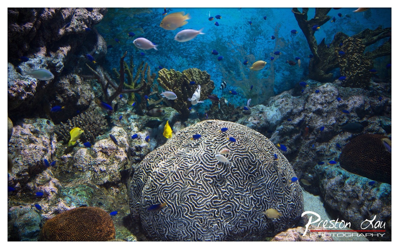

1. Overall Rating (0–10) — 7.5
This underwater scene captures the vibrant complexity of a coral reef with striking clarity and depth. The central brain coral serves as a powerful anchor, its intricate patterns drawing the eye into a bustling marine ecosystem. While the image succeeds in conveying the richness of coral life, the sheer number of fish and textures can feel slightly overwhelming, diluting the focus on any single element.
2. Composition (0–10) — 7.0
The brain coral is well-placed in the lower center, creating a strong focal point, while the scattered fish and coral formations create a sense of depth and movement. The frame is slightly busy, but the diagonal flow of fish from the upper left to the lower right helps guide the viewer’s gaze through the scene.
3. Lighting (0–10) — 8.0
The lighting is soft and diffused, mimicking natural underwater illumination with a gentle blue cast that enhances the aquatic atmosphere. The light highlights the textures of the coral and the translucency of the fish, creating a sense of immersion without harsh shadows or overexposure.
4. Color & Tone (0–10) — 8.0
The palette is rich with varying shades of blue and turquoise, punctuated by the bright yellows and blues of the fish. The contrast between the dark, intricate coral and the vibrant marine life adds visual interest, while the cool tones reinforce the serene, underwater mood.
5. Creativity (0–10) — 7.5
The image captures a dynamic and authentic underwater moment, blending natural beauty with a sense of narrative. The photographer’s decision to include both the large brain coral and the surrounding ecosystem creates a layered story of biodiversity, though the composition could be more refined to emphasize a single focal theme.
6. Technical Quality (0–10) — 8.5
Sharp focus is maintained throughout, particularly on the brain coral, while the background remains slightly soft, enhancing depth. The exposure is balanced, with no blown highlights or lost shadows, and the water clarity allows for detailed textures to be visible.
7. Emotional Impact (0–10) — 7.0
The photograph evokes a sense of wonder and tranquility, inviting the viewer into a hidden world teeming with life. The abundance of fish and the intricate coral patterns inspire awe, though the crowded nature of the scene prevents a more intimate emotional connection.
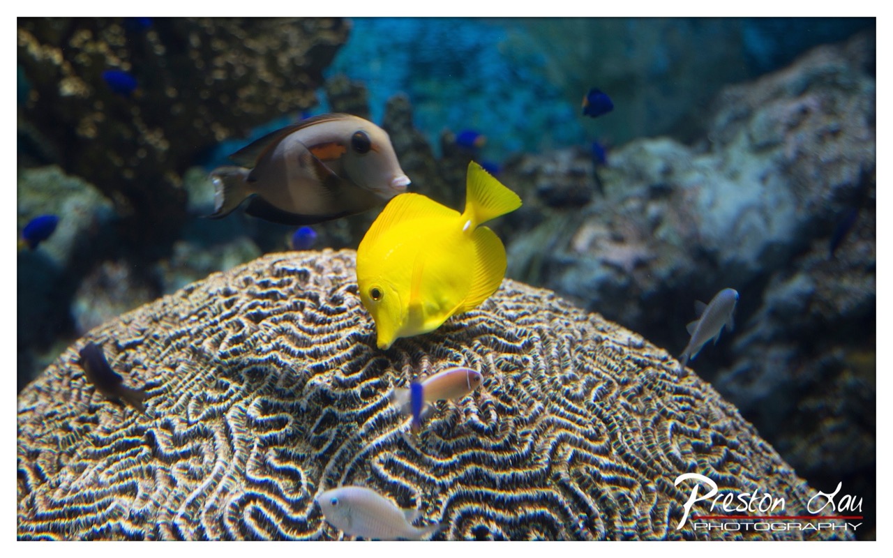

1. Overall Rating (0–10) — 7.5
This underwater scene captures the vibrant energy of a coral reef with striking clarity and color. The bright yellow tang stands out as a dynamic focal point against the textured brain coral, while the surrounding fish and deep blue water lend a sense of depth and life. The composition is strong and engaging, though the image feels slightly over-processed in its saturation, which diminishes some of the natural subtlety of the marine environment.
2. Composition (0–10) — 8.0
The central placement of the yellow fish and brain coral creates a balanced focal point, with the surrounding fish adding depth and movement. The diagonal flow of the coral’s ridges guides the eye through the frame, enhancing visual interest.
3. Lighting (0–10) — 7.5
The lighting is well-distributed, highlighting the yellow fish and coral while maintaining a soft, diffused glow in the background. The use of ambient light enhances the underwater atmosphere without creating harsh shadows.
4. Color & Tone (0–10) — 8.0
The vivid yellow of the tang contrasts beautifully with the cool blues and grays of the coral and background, creating a visually striking palette. The color vibrancy is high, though it leans slightly toward oversaturation, giving the image a stylized quality.
5. Creativity (0–10) — 7.0
The photographer captures a compelling moment in a natural setting with a clear artistic eye. The choice to emphasize the yellow fish against the intricate coral pattern is both effective and imaginative, suggesting a narrative of exploration and discovery.
6. Technical Quality (0–10) — 8.5
The image is sharp and well-focused, with excellent detail visible in the coral’s texture and the fish’s scales. The depth of field is controlled, keeping the main subjects in crisp focus while softly blurring the background.
7. Emotional Impact (0–10) — 7.5
The image evokes a sense of wonder and tranquility, inviting the viewer into the peaceful yet dynamic world beneath the waves. The vibrant colors and lifelike subjects create a moment of connection with marine life, though the slight artificiality in color reduces its emotional depth.
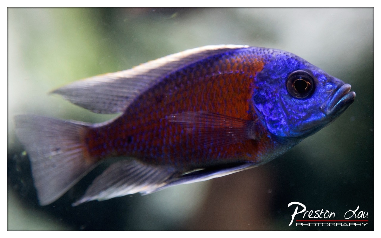

1. Overall Rating (0–10) — 8.0
This photograph captures the striking beauty of a cichlid fish with vivid clarity, showcasing its electric blue and fiery red hues against a soft, blurred backdrop. The image excels in highlighting the intricate textures of the fish’s scales and fins, creating a sense of life and movement. While the composition is strong and the colors pop, the subtle presence of the photographer’s watermark slightly detracts from the immersive quality of the scene.
2. Composition (0–10) — 7.5
The fish is well-placed off-center, creating a dynamic diagonal flow that guides the eye across the frame. The shallow depth of field isolates the subject effectively, though the slight imbalance in negative space on the right could be refined for greater visual harmony.
3. Lighting (0–10) — 8.5
The lighting is soft and even, enhancing the natural iridescence of the fish’s blue head and the rich saturation of its red body. The subtle highlights on the fins and scales add dimension without creating harsh reflections, giving the image a polished, underwater glow.
4. Color & Tone (0–10) — 9.0
The contrast between the vibrant blue and deep red creates a visually arresting palette, while the muted, greenish-gray background allows the fish to stand out dramatically. The color temperature is well-balanced, preserving the natural aquatic tone while emphasizing the subject’s luminous qualities.
5. Creativity (0–10) — 8.0
The photographer captures a moment of quiet elegance, transforming a simple aquarium portrait into a compelling study of color and form. The choice to focus on the fish’s side profile and subtle motion adds a narrative layer, inviting viewers to appreciate the animal’s grace and complexity.
6. Technical Quality (0–10) — 9.0
The image is sharp and detailed, with precise focus on the fish’s eye and scales. The depth of field is controlled with precision, and the overall clarity is excellent, indicating strong technical execution.
7. Emotional Impact (0–10) — 7.5
There is a sense of serene beauty and quiet intensity in the fish’s steady gaze, evoking a feeling of wonder at the intricacies of nature. While the image is visually captivating, the lack of a broader environmental context keeps the emotional connection more restrained than profound.
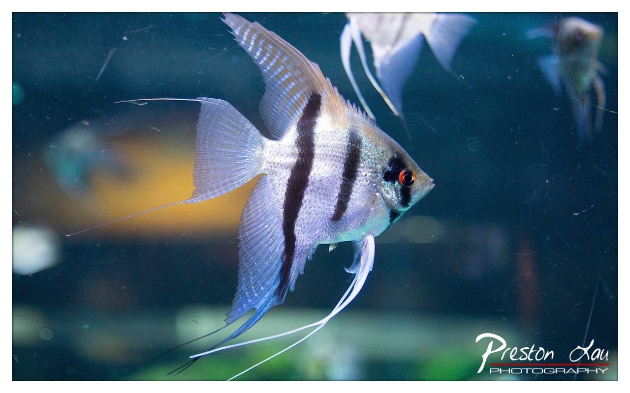

1. Overall Rating (0–10) — 7.5
This photograph captures the graceful elegance of an angelfish in motion, its translucent fins and bold stripes creating a striking contrast against the deep, moody water. The image conveys a sense of serene movement, with the fish’s vivid red eye adding a focal point of life and intensity. While the background remains slightly cluttered with indistinct shapes and reflections, the composition successfully highlights the subject’s natural beauty and fluidity.
2. Composition (0–10) — 7.0
The angelfish is well-placed on the left, allowing its fins to extend into the frame and emphasizing its dynamic form. The shallow depth of field helps isolate the subject, though the scattered background elements slightly distract from the clean visual narrative.
3. Lighting (0–10) — 7.5
Soft, directional lighting highlights the fish’s iridescent scales and delicate fin structure, creating subtle gradations of light and shadow. The illumination enhances texture and form without overpowering the scene, though a touch more contrast could deepen the underwater ambiance.
4. Color & Tone (0–10) — 7.0
The cool blue-green tones of the water create a natural aquatic atmosphere, complementing the fish’s silvery body and black vertical markings. The warm glow from the red eye provides a striking contrast, though the overall palette leans slightly muted.
5. Creativity (0–10) — 7.5
The photographer captures a moment of quiet grace, transforming a common aquarium subject into a visually compelling portrait. The use of motion blur in the fins and the strategic focus on the eye demonstrate thoughtful intent and a strong sense of narrative.
6. Technical Quality (0–10) — 8.0
The image is sharp on the angelfish, with clear detail in the scales and fin membranes. The depth of field is well-managed, though minor lens smudges and reflections are visible, slightly reducing the pristine quality.
7. Emotional Impact (0–10) — 7.0
The photograph evokes a sense of calm and wonder, inviting the viewer to appreciate the delicate beauty of aquatic life. The fish’s poised presence and the quiet stillness of the water create a contemplative mood, though the lack of strong emotional contrast keeps the impact restrained.
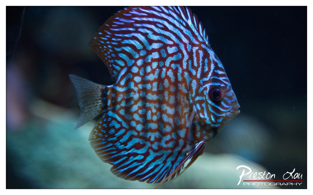

1. Overall Rating (0–10) — 8.0
This image captures the mesmerizing elegance of a discus fish with striking clarity, its intricate blue and red patterns glowing against the dark, aquatic backdrop. The composition draws the eye directly to the fish’s vivid details, creating a sense of serene motion and biological artistry. While the subject is inherently captivating, the image’s strength lies in its ability to transform a simple underwater moment into a visually rich and contemplative portrait.
2. Composition (0–10) — 8.0
The fish is positioned slightly off-center, creating a dynamic balance that guides the viewer’s gaze across the frame. The use of negative space on the right enhances the sense of depth and movement, while the soft blur of the background keeps the focus firmly on the subject.
3. Lighting (0–10) — 9.0
The lighting is masterfully controlled, highlighting the iridescent quality of the fish’s scales with a soft, directional glow. The contrast between the illuminated subject and the dark background adds drama and dimension, enhancing the natural luminosity of the discus.
4. Color & Tone (0–10) — 9.0
The palette is rich and harmonious, with vibrant blues and deep reds creating a striking visual contrast. The cool tones of the water complement the warm hues of the fish, while the subtle gradation in the background adds depth and a sense of underwater atmosphere.
5. Creativity (0–10) — 8.5
The photographer elevates a common aquarium subject into a fine art portrait through thoughtful composition and lighting. The focus on the fish’s intricate patterns and the moody ambiance lend a sense of narrative and wonder, transforming a biological specimen into a work of visual poetry.
6. Technical Quality (0–10) — 9.0
The image is sharp and well-defined, with excellent focus on the fish’s body and fins. The depth of field is precisely managed, isolating the subject while maintaining a natural, immersive feel. The watermark is unobtrusive and professionally integrated.
7. Emotional Impact (0–10) — 8.0
There is a quiet sense of awe and tranquility in the image, inviting the viewer to pause and appreciate the beauty of aquatic life. The fish’s calm presence and the serene environment evoke a meditative stillness, making the image both visually and emotionally compelling.
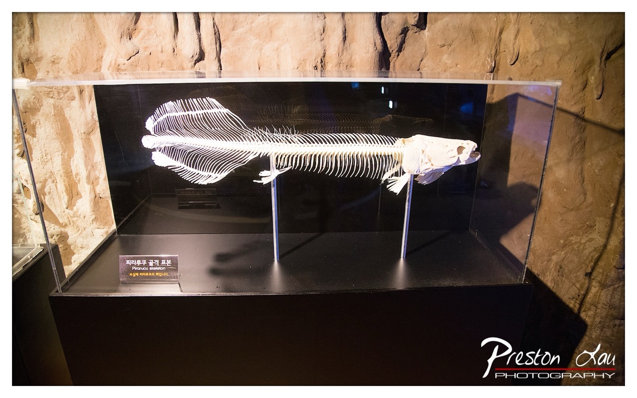

1. Overall Rating (0–10) — 7.0
This photograph captures the eerie elegance of a preserved piranha skeleton, its delicate bones glowing against the dark, cavernous backdrop. The interplay of light and shadow enhances the specimen’s intricate structure, evoking a sense of scientific wonder and prehistoric mystery. While the composition is strong and the subject compelling, the image is slightly hindered by a lack of dynamic contrast and a somewhat flat tonal range.
2. Composition (0–10) — 7.5
The skeleton is centered and well-framed within the display case, with the rock-textured wall providing a naturalistic context. The slight tilt of the camera adds subtle asymmetry, enhancing the visual interest without disrupting balance.
3. Lighting (0–10) — 6.5
The lighting effectively highlights the skeleton’s fine details, though it appears to be a direct flash, resulting in some glare on the glass and a loss of ambient mood. The illumination is functional but lacks the subtlety needed to fully enhance the scene’s atmosphere.
4. Color & Tone (0–10) — 6.0
The palette is limited, dominated by the white of the skeleton and the dark browns of the background. While the contrast is strong, the colors are muted and lack richness, giving the image a slightly clinical feel.
5. Creativity (0–10) — 7.0
The choice to photograph a museum exhibit with such a focused, artistic approach demonstrates a keen eye for form and texture. The juxtaposition of the naturalistic setting with the scientific display adds depth, transforming a simple documentation into a contemplative image.
6. Technical Quality (0–10) — 7.5
The image is sharp and well-focused, with clean detail in the skeleton and clear text on the plaque. The exposure is generally balanced, though reflections on the glass slightly compromise clarity.
7. Emotional Impact (0–10) — 6.5
The photograph evokes curiosity and reverence, inviting the viewer to contemplate the fragility and complexity of life. The quiet stillness of the scene resonates emotionally, though the clinical lighting tempers the sense of awe.
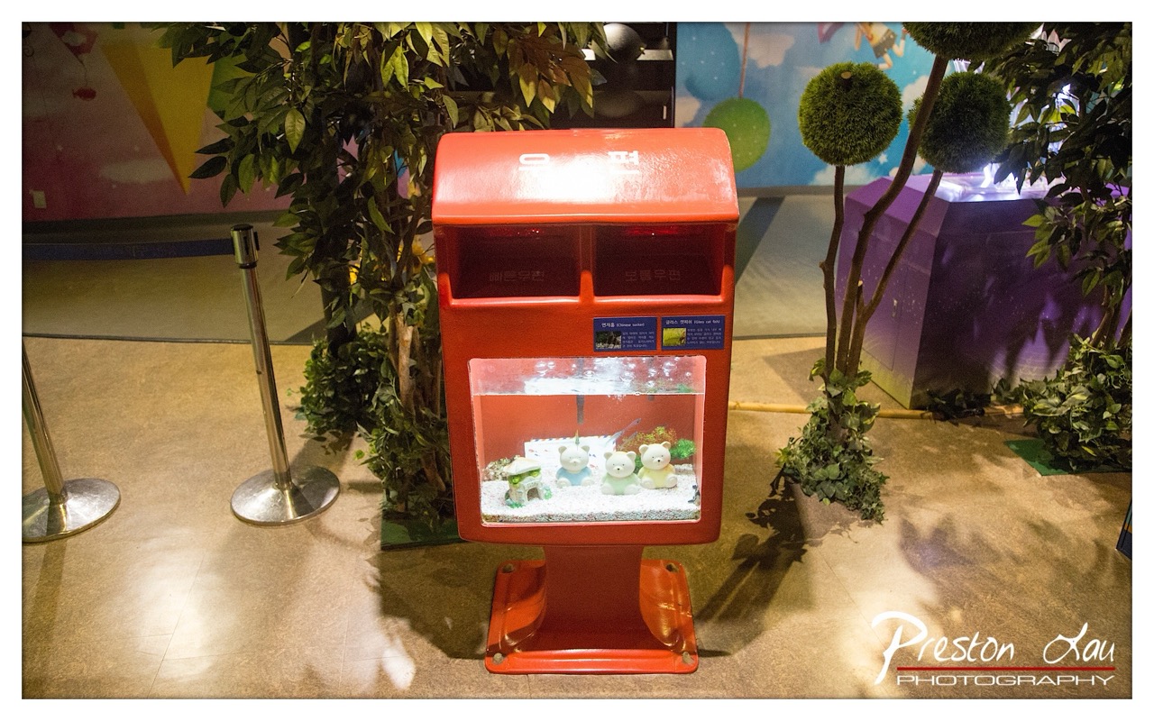

1. Overall Rating (0–10) — 6.0
This photograph captures a whimsical, child-friendly installation where a bright red mailbox doubles as a miniature aquarium, blending functionality with playful design. The juxtaposition of the ordinary mailbox with the imaginative aquarium creates a charming, story-rich scene, though the cluttered background and flat lighting prevent it from feeling fully cohesive. While the concept is endearing and visually engaging, the image's overall impact is held back by a lack of visual refinement and atmospheric depth.
2. Composition (0–10) — 6.0
The central placement of the red mailbox draws attention, but the surrounding elements—such as the stanchions, artificial trees, and background mural—create visual distraction. A tighter crop would enhance focus on the main subject and reduce the sense of clutter.
3. Lighting (0–10) — 5.0
The lighting is functional and even, likely from overhead fluorescent fixtures, which flattens the scene and diminishes the vibrancy of the colors. The reflections on the glass and the lack of directional light reduce depth and mood.
4. Color & Tone (0–10) — 6.5
The bold red of the mailbox stands out against the muted beige floor and soft greens, creating a strong visual anchor. However, the overall color palette feels slightly washed out, and the cool tones in the background contrast with the warm, inviting design of the mailbox.
5. Creativity (0–10) — 8.0
The fusion of a mailbox with a fish tank is a clever and original concept, suggesting a blend of utility and playfulness. The inclusion of small plush bears and decorative elements adds narrative charm, making the scene feel curated and thoughtfully designed.
6. Technical Quality (0–10) — 7.5
The image is sharp and well-focused, with clean details visible in the aquarium and the mailbox's surface. The exposure is balanced, and the watermark is unobtrusive, demonstrating solid technical execution.
7. Emotional Impact (0–10) — 6.5
The photograph evokes a sense of whimsy and nostalgia, appealing to both children and adults who appreciate imaginative design. While the emotional resonance is present, the lack of atmospheric lighting and visual storytelling limits its ability to deeply engage the viewer.
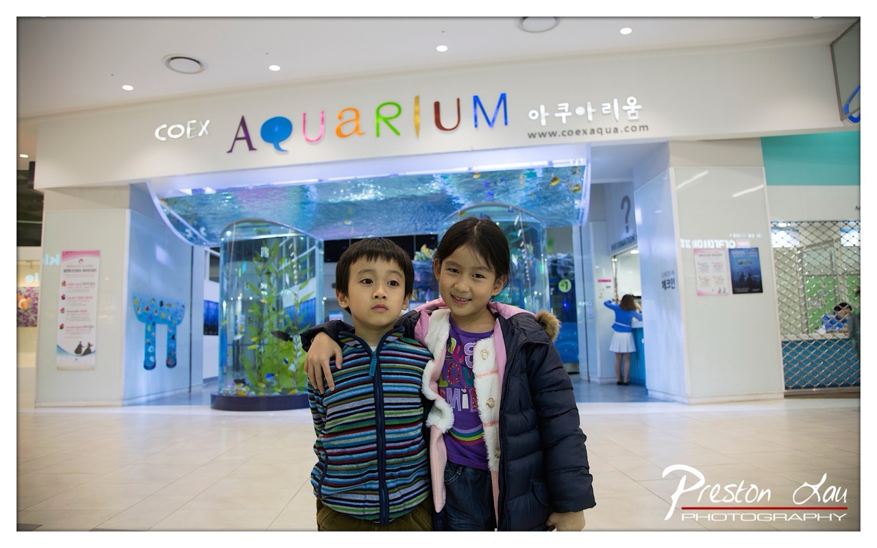

1. Overall Rating (0–10) — 7.0
This photograph captures a tender, candid moment between two children in front of an aquarium entrance, evoking a sense of childhood wonder and familial warmth. The vibrant, multicolored signage and the underwater tunnel behind them create a playful, immersive atmosphere, while the children’s contrasting expressions—one shy, one joyful—add emotional depth. Though the composition is slightly hindered by a busy background, the image succeeds as a charming, authentic travel memory.
2. Composition (0–10) — 6.5
The children are centered and well-framed, drawing immediate attention, but the background elements—signage, people, and structural details—create visual distraction. A tighter crop would emphasize the subjects and reduce clutter.
3. Lighting (0–10) — 7.0
Even, bright overhead lighting illuminates the scene clearly, preserving detail in the children’s faces and clothing. The glow from the aquarium tunnel adds a soft, ambient highlight that enhances the mood without creating harsh shadows.
4. Color & Tone (0–10) — 7.5
The palette is lively and engaging, with the rainbow-colored "AQUARIUM" sign anchoring the image in a cheerful tone. The cool blues of the aquarium contrast nicely with the warmth of the children’s clothing, creating a balanced and visually appealing harmony.
5. Creativity (0–10) — 7.0
The image captures a natural, unposed moment with strong narrative potential. The contrast between the children’s expressions and the whimsical setting adds a layer of storytelling, suggesting a personal journey or shared experience.
6. Technical Quality (0–10) — 8.0
Sharp focus on the children, clean detail, and accurate exposure demonstrate strong technical control. The depth of field appropriately blurs the background while keeping the subjects crisp.
7. Emotional Impact (0–10) — 7.5
The image resonates with warmth and nostalgia, inviting viewers to recall their own childhood moments of discovery. The children’s genuine connection and the inviting setting evoke a sense of joy and shared adventure.
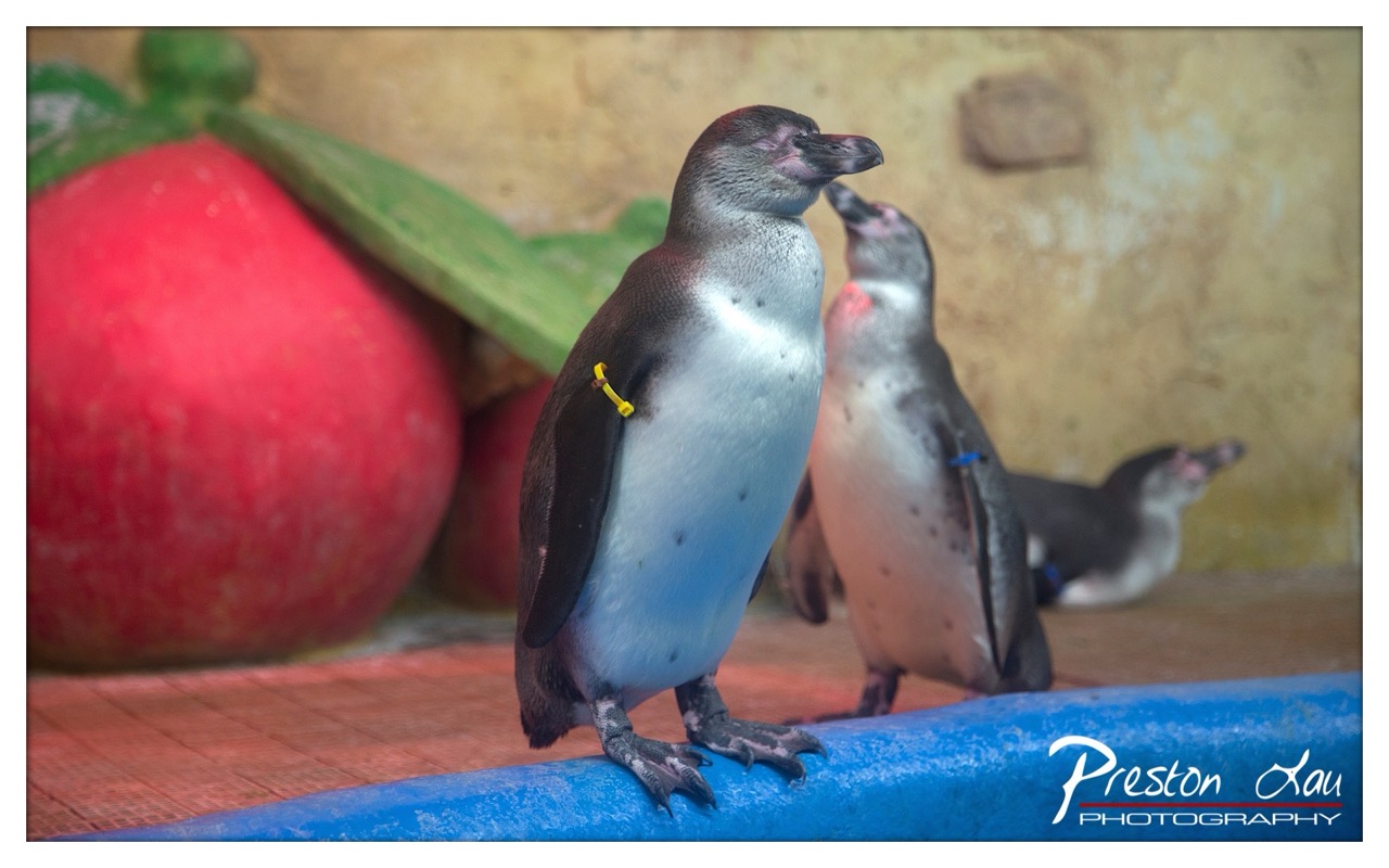

1. Overall Rating (0–10) — 6.8
This photograph captures a moment of quiet companionship between two penguins in a zoo enclosure, with a whimsical touch added by the oversized red apple prop. The subject is engaging and well-framed, with a naturalistic yet slightly staged atmosphere. While the lighting and color palette lend a gentle warmth, the image is held back by a lack of visual cohesion between the natural and artificial elements, which slightly undermines the emotional resonance.
2. Composition (0–10) — 6.5
The penguins are well-placed, with the foreground subject drawing immediate attention. The large red apple in the background adds visual interest but creates a slight distraction due to its scale and placement, leading to a composition that feels more cluttered than balanced.
3. Lighting (0–10) — 6.0
The lighting is soft and even, likely from an indoor source, which highlights the penguins’ textures without harsh shadows. However, the warm tone feels slightly unnatural, possibly due to white balance or ambient lighting, giving the scene a slightly artificial glow.
4. Color & Tone (0–10) — 6.5
The contrast between the penguins’ black-and-white plumage and the vibrant red apple creates a visually striking palette. The warm yellowish background and cool blue ledge add tonal variety, but the color harmony is uneven, with the artificial prop disrupting the natural aesthetic.
5. Creativity (0–10) — 7.0
The inclusion of the oversized fruit prop introduces a playful, almost surreal element, suggesting a narrative beyond a simple wildlife portrait. This choice reflects a creative intent to blend realism with whimsy, though it risks feeling gimmicky.
6. Technical Quality (0–10) — 7.5
The focus is sharp on the main penguin, with a shallow depth of field that effectively isolates the subject. The image is clear and well-exposed, with no visible technical flaws such as noise or blur.
7. Emotional Impact (0–10) — 6.0
The image evokes a sense of calm and curiosity, particularly through the penguins’ body language and proximity. However, the presence of the artificial prop and the sterile environment limit the depth of emotional connection, keeping the viewer in a detached, observational mode.
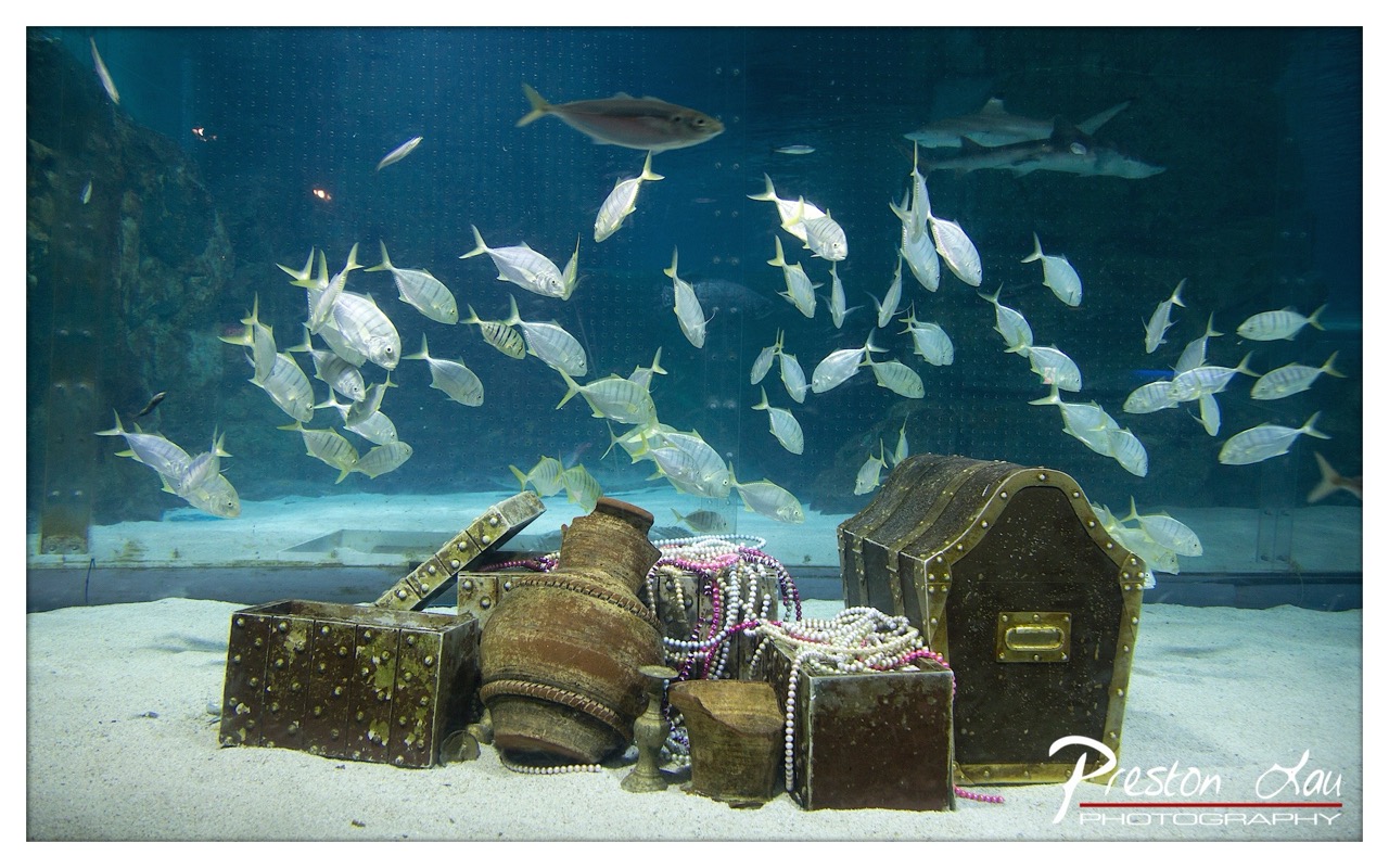

1. Overall Rating (0–10) — 7.0
This underwater scene blends the fantastical with the real, creating a compelling narrative of sunken treasure and marine life. The arrangement of aged chests and beads feels deliberately staged, evoking the allure of lost shipwrecks, while the fish add movement and life to the composition. Though the lighting and color palette lean slightly toward the cool and flat, the concept is strong and well-executed, offering a whimsical yet immersive underwater tableau.
2. Composition (0–10) — 7.5
The foreground objects are well-balanced, with the treasure chests and beads creating a strong focal point. The diagonal placement of the open chest draws the eye across the scene, while the school of fish adds dynamic movement above. The framing is wide enough to include context without diluting the central theme.
3. Lighting (0–10) — 6.5
The lighting is even and functional, illuminating the scene clearly, but lacks dramatic contrast or directional emphasis. The blue cast enhances the underwater feel, though it slightly flattens the textures of the treasure. A more directional light could add depth and highlight the metallic sheen of the chests.
4. Color & Tone (0–10) — 7.0
The cool blue tones dominate, creating a consistent underwater atmosphere. The muted browns and golds of the treasure provide a warm contrast, while the occasional pink and white beads introduce subtle pops of color. The overall palette is cohesive and enhances the mood of mystery.
5. Creativity (0–10) — 8.0
The concept of combining marine life with man-made treasure is imaginative and visually engaging. The photo tells a story—of discovery, loss, and the passage of time—inviting the viewer to wonder about the ship’s history. The integration of natural and artificial elements is both original and effective.
6. Technical Quality (0–10) — 7.5
The image is sharp and well-focused, with clear detail in both the foreground objects and the fish. The resolution is high, and the water clarity allows for good visibility. There is minimal noise, and the watermark is unobtrusive.
7. Emotional Impact (0–10) — 7.5
The scene evokes a sense of wonder and nostalgia, tapping into childhood dreams of pirates and buried gold. The presence of living fish adds a layer of poignancy—nature reclaiming human artifacts. It feels both adventurous and contemplative, leaving the viewer with a lingering sense of mystery.
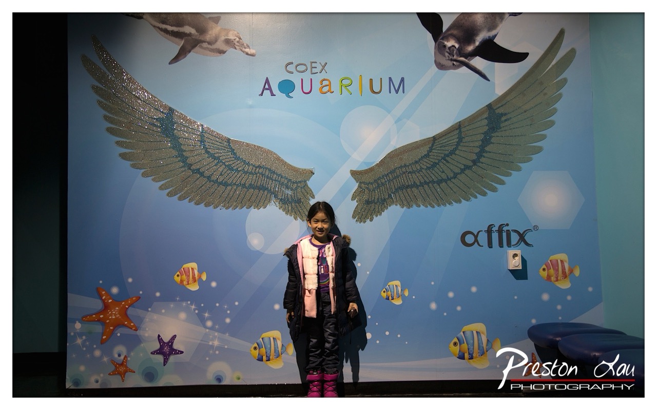

1. Overall Rating (0–10) — 7.0
This photograph captures a joyful moment at the Coex Aquarium, where a child’s bright smile contrasts beautifully with the whimsical, aquatic-themed backdrop. The glittering wings and playful marine illustrations create a sense of wonder and fantasy, while the child’s natural expression grounds the image in warmth and authenticity. Though the composition leans slightly toward a standard tourist snapshot, the vibrant colors and emotional resonance elevate it beyond mere documentation.
2. Composition (0–10) — 6.5
The child is centered, drawing immediate attention, but the wide framing and busy background slightly distract from the subject. The large wings create strong visual symmetry, though their dominance risks overshadowing the human element.
3. Lighting (0–10) — 6.0
The lighting is even and functional, likely from a flash, which illuminates the subject clearly but creates a slight flatness. The glow of the backdrop and the sparkles on the wings add texture, but the overall effect lacks atmospheric depth.
4. Color & Tone (0–10) — 7.5
The palette is vibrant and playful, with bright blues, pinks, and yellows that evoke a sense of fun and childlike wonder. The contrast between the cool background and the warm tones of the child’s clothing enhances visual appeal.
5. Creativity (0–10) — 7.0
The concept is original and engaging, merging a real-life moment with a fantastical, themed environment. The use of the wings as a symbolic element adds a layer of storytelling, suggesting transformation or flight.
6. Technical Quality (0–10) — 7.5
The image is sharp and well-focused, with clean details in both the subject and the background. The watermark is tastefully placed and does not interfere with the composition.
7. Emotional Impact (0–10) — 7.5
The photograph conveys genuine happiness and a sense of awe, capturing a fleeting moment of childhood delight. The viewer is drawn into the scene, feeling the joy and wonder the child experiences in that space.


1. Overall Rating (0–10) — 7.5
This photograph captures the graceful power of a shark gliding through deep blue water, evoking a sense of awe and quiet majesty. The composition draws the eye to the central subject with a strong sense of motion, while the ambient light and surrounding aquatic life add depth and context. While the image is technically strong, a more deliberate use of light and framing could elevate its artistic impact beyond that of a compelling wildlife record.
2. Composition (0–10) — 7.0
The shark is well-placed along a diagonal axis, creating a dynamic sense of movement. The inclusion of another shark in the background adds spatial depth, though the left-side rock formation slightly disrupts balance.
3. Lighting (0–10) — 7.5
The soft, directional blue light enhances the underwater atmosphere, highlighting the shark’s streamlined form. A subtle lens flare in the lower center adds an organic, cinematic quality without distracting from the subject.
4. Color & Tone (0–10) — 8.0
The cool blue palette is cohesive and immersive, with natural gradations in tone that emphasize depth. The contrast between the shark’s pale underside and the darker background creates visual interest and definition.
5. Creativity (0–10) — 7.0
The image successfully blends documentary realism with artistic vision, capturing the shark’s elegance in a controlled environment. The choice to include a second shark and ambient lighting suggests narrative intent, though it remains grounded in naturalistic observation.
6. Technical Quality (0–10) — 8.5
Sharp focus on the main subject, clean detail in the shark’s skin, and well-managed exposure contribute to high technical execution. The watermark is subtle and unobtrusive.
7. Emotional Impact (0–10) — 8.0
The photograph conveys a sense of serenity and power, inviting the viewer into a quiet moment of underwater life. The shark’s calm motion evokes both respect and fascination, creating a strong emotional connection to the natural world.
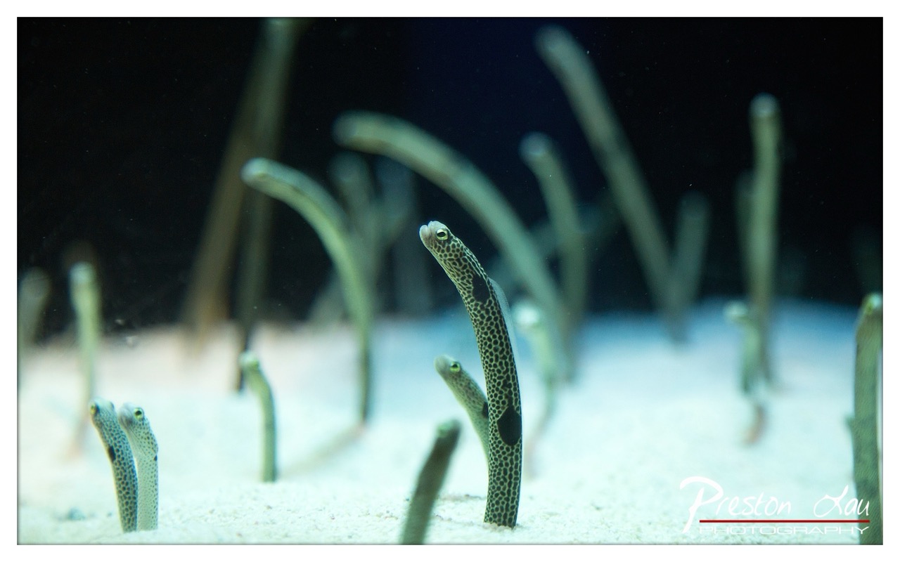

1. Overall Rating (0–10) — 7.5
This photograph captures the quiet intrigue of a school of moray eels emerging from the sandy ocean floor, their spotted bodies creating a hypnotic rhythm against the dark, mysterious backdrop. The shallow depth of field isolates the central eel, drawing the viewer into the scene with a sense of intimacy and wonder. While the image effectively conveys the serene strangeness of underwater life, the slightly cool color cast and minimal contrast temper its visual impact, holding it just short of transcendent.
2. Composition (0–10) — 8.0
The central eel is well-placed, creating a natural focal point that draws the eye through the diagonal lines of the surrounding eels. The use of leading lines and depth enhances the sense of space, though the scattered background elements risk visual clutter.
3. Lighting (0–10) — 7.0
The lighting is soft and directional, likely from an external flash, which highlights the texture of the eels’ skin and separates them from the dark background. However, the light is slightly flat, lacking the dynamic contrast that could enhance dimensionality.
4. Color & Tone (0–10) — 6.5
The palette is dominated by cool blues and muted greens, creating a tranquil underwater mood. While the color temperature is appropriate, the lack of saturation and subtle green cast slightly dulls the vibrancy of the eels’ spotted patterns.
5. Creativity (0–10) — 8.0
The image successfully captures a rare, intimate moment in marine life, using a naturalistic approach to convey both scientific interest and aesthetic wonder. The choice to focus on the eels’ upward gaze adds a narrative quality, suggesting curiosity and alertness.
6. Technical Quality (0–10) — 8.0
The focus is sharp on the main subject, with smooth bokeh in the background that enhances depth. The image is clean, with minimal noise and well-managed exposure, indicating strong technical execution.
7. Emotional Impact (0–10) — 7.0
There’s a quiet sense of mystery and anticipation, as if the eels are on the verge of revealing something hidden. The viewer is drawn into the scene, prompted to wonder about the unseen world beneath the surface.
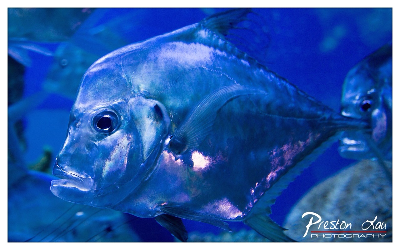

1. Overall Rating (0–10) — 7.8
This photograph captures the ethereal grace of a fish gliding through deep blue water, its metallic scales catching light like liquid silver. The cool, monochromatic palette and the intimate framing create a dreamlike underwater portrait, evoking both serenity and mystery. While the image excels in mood and texture, the heavy blue cast slightly mutes the natural vibrancy of the subject, holding it back from full visual impact.
2. Composition (0–10) — 8.0
The fish is positioned diagonally, leading the eye through the frame with a sense of motion. The shallow depth of field isolates the subject while softly blurring the background, enhancing focus and creating a layered, immersive feel.
3. Lighting (0–10) — 8.5
The lighting is soft and directional, highlighting the fish’s iridescent scales with a gentle glow. The interplay of light and shadow enhances the three-dimensionality of the fish and adds depth to the blue aquatic environment.
4. Color & Tone (0–10) — 7.5
The dominant blue tone establishes a cool, underwater atmosphere, though the subtle hints of purple and white on the fish’s body provide a striking contrast. The palette is cohesive but could benefit from a touch more warmth to avoid a sterile feel.
5. Creativity (0–10) — 8.0
The photographer transforms a simple marine subject into a poetic, almost surreal image through careful lighting and framing. The choice to emphasize texture and reflection over action gives the photograph a contemplative, artistic quality.
6. Technical Quality (0–10) — 8.5
The image is sharp on the fish’s face and eye, with excellent detail in the scales and fins. The focus is precise, and the exposure is well-balanced, capturing both highlights and shadows without clipping.
7. Emotional Impact (0–10) — 8.0
The photograph evokes a sense of quiet wonder and tranquility, inviting the viewer into a peaceful underwater world. The close-up intimacy of the fish’s gaze creates a moment of connection, making the image emotionally resonant and memorable.
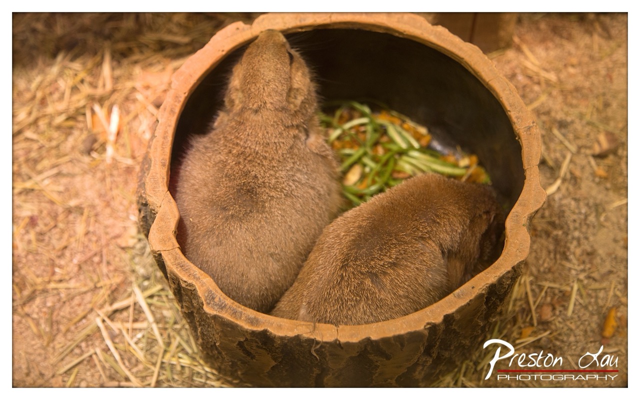

1. Overall Rating (0–10) — 7.0
This photograph captures a tender, intimate moment between two small mammals nestled together in a rustic ceramic bowl, evoking a sense of quiet companionship and natural simplicity. The warm, earthy tones and soft focus lend a gentle, almost nostalgic atmosphere, while the composition draws the viewer into the animals’ private world. Though the image is visually pleasing, it lacks the dynamic tension or narrative depth to feel truly compelling, resting instead on charm and atmosphere.
2. Composition (0–10) — 7.0
The circular frame of the bowl creates a natural vignette, drawing the eye toward the two animals at the center. The top-down perspective emphasizes intimacy, though the slightly off-center placement of the subjects introduces a subtle imbalance.
3. Lighting (0–10) — 6.5
Warm, directional lighting enhances the texture of the animals’ fur and the bowl’s surface, creating soft shadows that add depth. The light feels natural and diffused, contributing to the image’s cozy mood, though it lacks dramatic contrast.
4. Color & Tone (0–10) — 7.0
The palette is harmonious, dominated by warm browns, tans, and muted greens, reinforcing the earthy, organic feel. The color temperature enhances the sense of warmth and calm, though the tones verge on being overly uniform.
5. Creativity (0–10) — 6.5
The concept of framing the animals within a natural-looking vessel is clever and evocative, suggesting a rustic or farm-like setting. While not groundbreaking, the image successfully uses composition and mood to create a narrative of quiet connection.
6. Technical Quality (0–10) — 7.5
The focus is sharp on the animals’ fur and the bowl’s edge, with a well-controlled depth of field that blurs the background effectively. The image is clean, with minimal noise, and the photographer’s signature is subtly placed.
7. Emotional Impact (0–10) — 7.5
The photograph elicits a sense of warmth, tenderness, and quiet affection. The close proximity of the two animals and their shared moment of feeding evoke a gentle emotional resonance, inviting the viewer to pause and reflect on simple, peaceful connections.
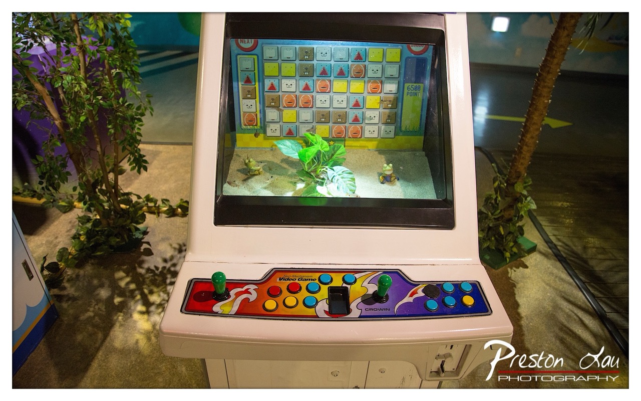

1. Overall Rating (0–10) — 6.0
This photograph captures a whimsical arcade cabinet with a playful, layered aesthetic that blends digital game imagery with physical environmental elements. The juxtaposition of the game’s cartoonish frogs and the real plants within the cabinet’s display creates a curious, dreamlike atmosphere. While the scene is visually engaging and rich in detail, the lighting and composition lack cohesion, preventing the image from fully realizing its surreal potential.
2. Composition (0–10) — 6.5
The arcade machine is centered, drawing immediate attention, but the surrounding elements—plants and background details—create visual clutter. The depth of field is shallow, isolating the cabinet effectively, yet the framing feels slightly unbalanced due to the uneven placement of foliage.
3. Lighting (0–10) — 5.5
The scene is lit with mixed sources—ambient indoor lighting and the glow from the screen—creating a contrast between the bright display and the dimmer surroundings. While the screen’s illumination adds a focal point, the overall lighting feels flat and unrefined, with some areas underexposed.
4. Color & Tone (0–10) — 6.0
The vibrant, multicolored arcade panel contrasts with the muted, earthy tones of the surrounding environment. The color palette is playful and energetic, but the lack of tonal harmony tempers the image’s visual appeal.
5. Creativity (0–10) — 7.0
The integration of real plants into the arcade’s game display is a clever and imaginative concept, blurring the line between virtual and physical worlds. This inventive approach gives the image a unique narrative quality.
6. Technical Quality (0–10) — 7.5
The image is sharp and well-focused on the arcade machine, with clean detail in the controls and screen. The watermark is unobtrusive, and the exposure is generally sound, though some areas lack definition.
7. Emotional Impact (0–10) — 5.5
The image evokes a sense of nostalgia and whimsy, appealing to those familiar with arcade culture. However, the emotional resonance is muted by the lack of dynamic lighting and a more compelling narrative structure.
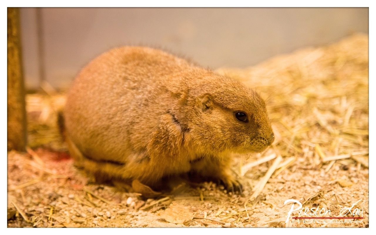

1. Overall Rating (0–10) — 7.0
This photograph captures a moment of quiet stillness, focusing on a prairie dog in a softly lit enclosure that feels both intimate and natural. The warm, golden glow enhances the animal’s textured fur and gives the scene a gentle, almost nostalgic quality. While the subject is compelling and the mood is serene, the slightly cluttered background and soft focus detract from the image’s overall clarity and impact.
2. Composition (0–10) — 6.0
The prairie dog is positioned slightly off-center, creating a sense of movement toward the right, but the uneven framing and distracting elements in the foreground and background reduce visual harmony.
3. Lighting (0–10) — 7.5
The warm, directional lighting enhances the texture of the fur and creates a soft, inviting glow, though the source appears somewhat artificial, lending a slightly staged feel to the scene.
4. Color & Tone (0–10) — 7.0
The warm, golden color palette is cohesive and supports the tranquil mood, though the lack of contrast slightly flattens the image’s depth.
5. Creativity (0–10) — 6.5
The photographer captures a candid moment with a natural subject, but the approach is conventional rather than imaginative, relying on atmosphere over conceptual innovation.
6. Technical Quality (0–10) — 7.5
The focus is sharp on the prairie dog’s face and upper body, with a shallow depth of field that effectively isolates the subject. The image is clean and well-exposed, though minor noise is present in the darker areas.
7. Emotional Impact (0–10) — 7.0
The image evokes a sense of calm and curiosity, inviting the viewer to pause and observe the quiet life of the animal. The warmth of the light and the animal’s stillness create a gentle emotional connection.
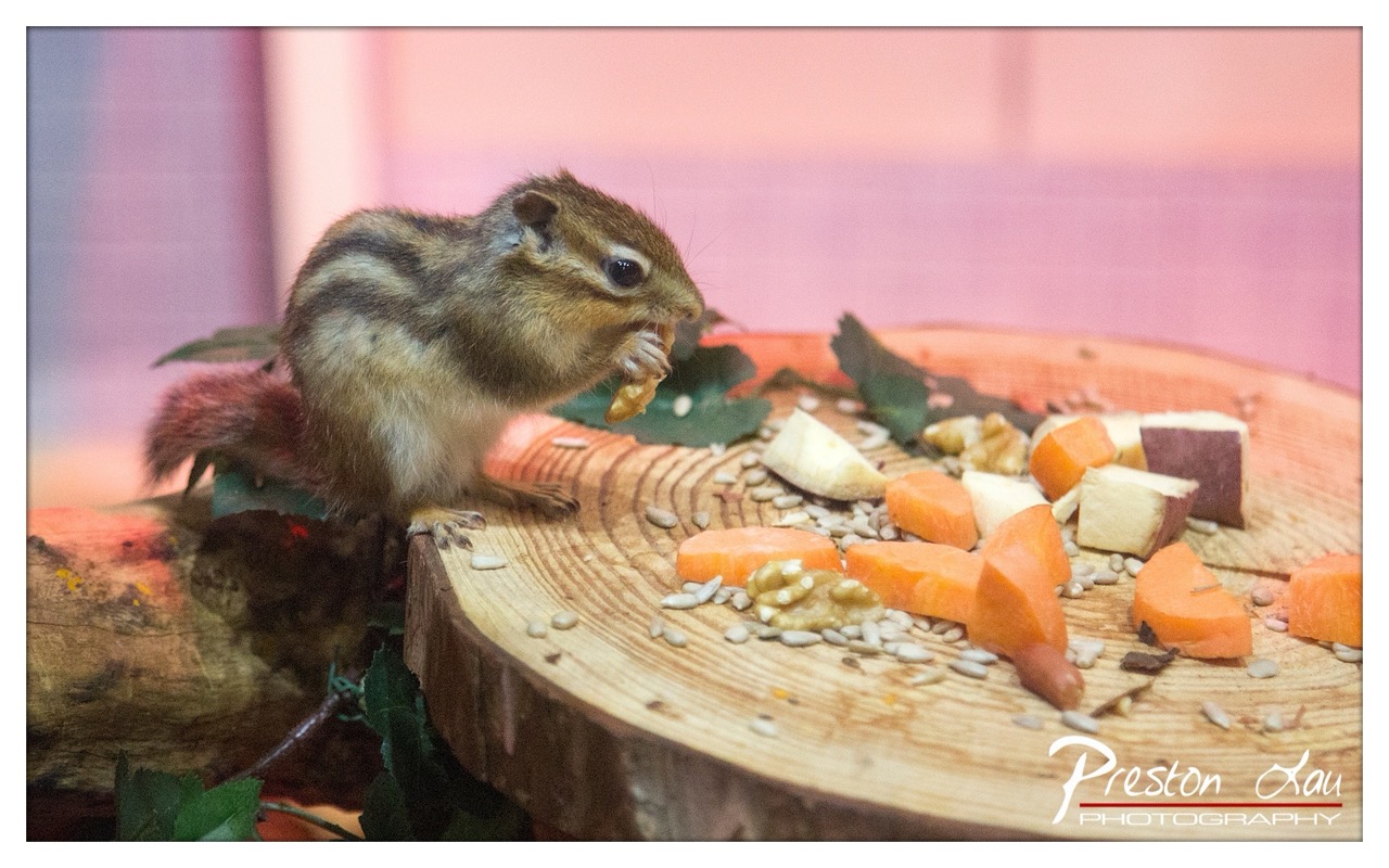

1. Overall Rating (0–10) — 7.5
This photograph captures a charming, intimate moment of a chipmunk feeding, exuding a sense of natural curiosity and quiet delight. The soft, warm lighting and shallow depth of field lend a dreamy, almost storybook quality to the scene, while the vibrant array of food and the animal’s expressive posture create an engaging focal point. The image is strong in mood and narrative, though the slightly cluttered arrangement and artificial backdrop temper its overall refinement.
2. Composition (0–10) — 7.0
The chipmunk is well-placed off-center, drawing the eye naturally toward the food and creating a sense of movement. The circular wooden platform provides a strong visual anchor, though the scattered background elements slightly distract from the subject’s prominence.
3. Lighting (0–10) — 8.0
The lighting is soft and diffused, enhancing the warmth of the scene and highlighting the texture of the chipmunk’s fur and the food. The gentle glow from the pink backdrop adds a whimsical atmosphere without overpowering the subject.
4. Color & Tone (0–10) — 7.5
The palette is harmonious, with warm oranges and browns complementing the pink background. The contrast between the natural tones of the food and the artificial hue of the backdrop creates visual interest while maintaining a cohesive mood.
5. Creativity (0–10) — 7.0
The image successfully blends natural behavior with a stylized setting, offering a unique perspective on a common wildlife moment. The choice to frame the scene as a still-life tableau elevates it beyond a simple animal portrait.
6. Technical Quality (0–10) — 8.0
The focus is sharp on the chipmunk’s face and front paws, with a pleasingly blurred background that isolates the subject. The image is clear and well-exposed, with minimal noise and good detail retention.
7. Emotional Impact (0–10) — 8.0
The photograph evokes warmth, tenderness, and a sense of wonder, inviting the viewer to pause and appreciate the small, delightful moments of nature. The chipmunk’s focused expression and the inviting spread of food create a quiet emotional connection.
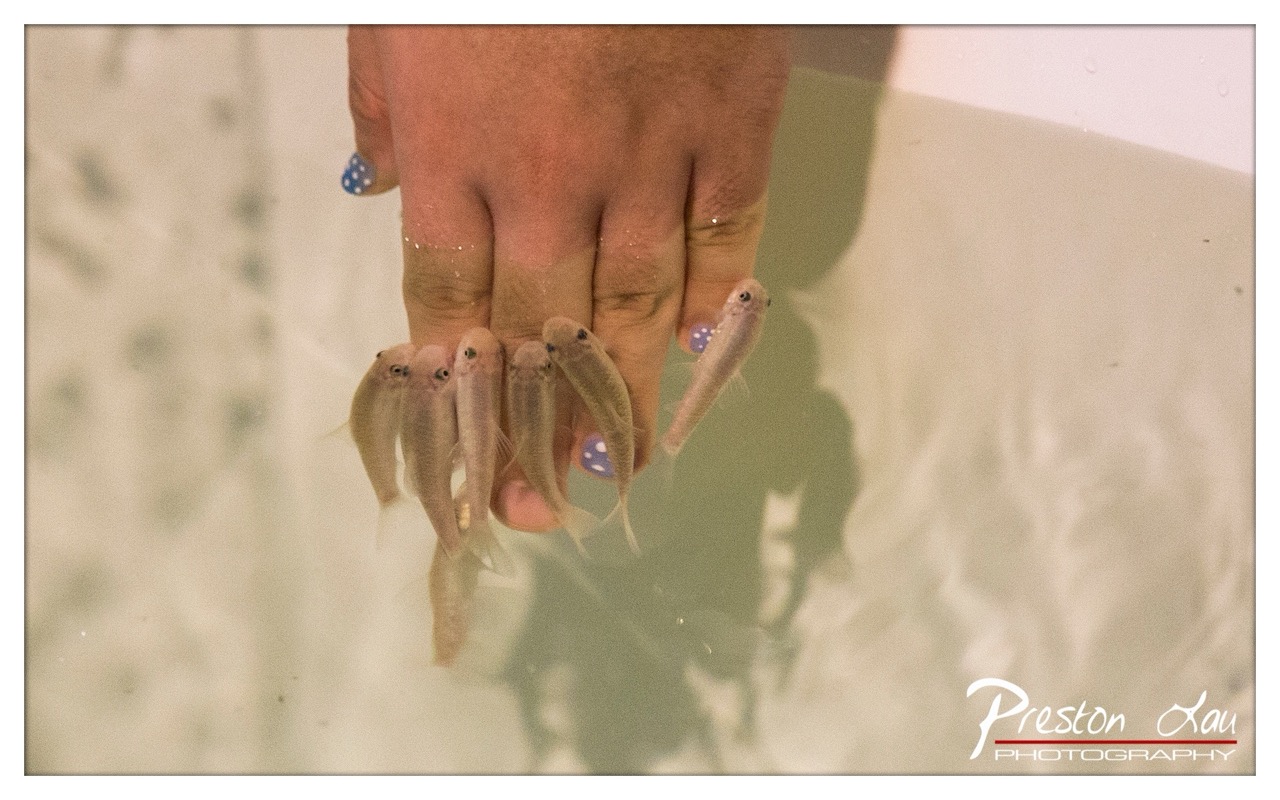

1. Overall Rating (0–10) — 7.0
This photograph captures a tender, almost surreal moment of connection between human and nature, where delicate fish cradle a hand in quiet communion. The soft, diffused lighting and gentle subject matter evoke a sense of intimacy and stillness, though the slightly murky water and muted tones temper its visual clarity. While the image feels more like a fleeting memory than a polished composition, its emotional sincerity and quiet beauty give it a compelling presence.
2. Composition (0–10) — 6.5
The hand is centrally framed, drawing immediate attention, but the surrounding water and faint reflections create a slightly cluttered background. A tighter crop could enhance focus on the interaction between hand and fish.
3. Lighting (0–10) — 6.0
The lighting is soft and even, likely from an overhead source, which creates a dreamlike quality. However, the lack of strong contrast and the hazy water reduce depth and dimensionality.
4. Color & Tone (0–10) — 6.5
The palette is subdued, dominated by pale beige and soft greens, giving the image a muted, vintage feel. The blue polka-dot nail polish offers a subtle pop of color, adding a touch of personality without disrupting the calm mood.
5. Creativity (0–10) — 7.0
The concept is original and evocative, blending human touch with aquatic life in a way that feels both whimsical and contemplative. The choice to capture this intimate, unposed moment adds to its artistic charm.
6. Technical Quality (0–10) — 6.5
The image is reasonably sharp, with clear detail in the hand and fish. However, the water’s opacity and slight grain reduce overall clarity, and the exposure appears slightly underexposed.
7. Emotional Impact (0–10) — 7.5
The photograph conveys a quiet sense of wonder and gentle connection, inviting the viewer to reflect on the delicate bond between species. Its emotional resonance lies in its simplicity and the universality of the moment.
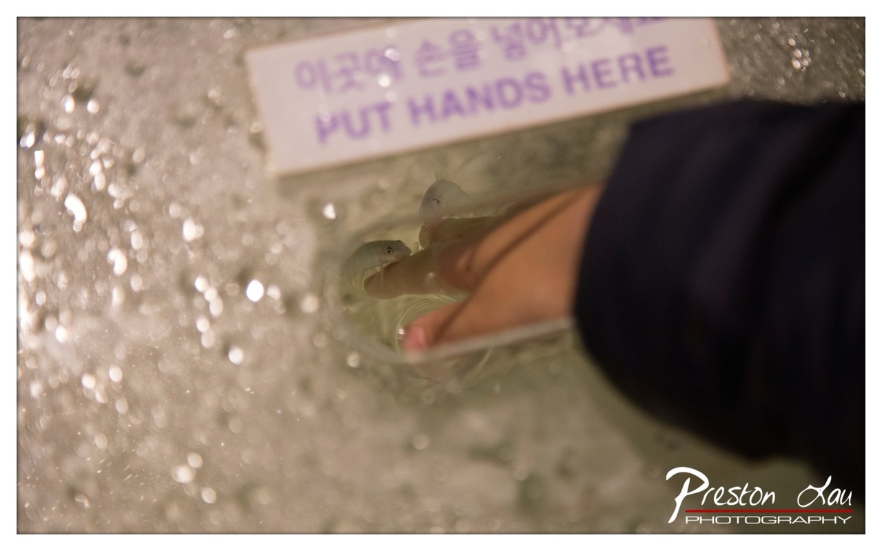

1. Overall Rating (0–10) — 6.0
This photograph captures an intimate, tactile moment of human interaction with aquatic life, where curiosity and gentle touch create a quiet narrative. The shallow depth of field draws attention to the hand and the small fish, emphasizing the connection between observer and creature, while the sign adds a layer of cultural context. The image feels candid and authentic, though its emotional resonance is slightly muted by the soft focus and lack of visual drama in the lighting and composition.
2. Composition (0–10) — 5.5
The hand and fish are positioned off-center, creating a dynamic but slightly unbalanced frame. The diagonal line of the hand and the sign guide the eye, but the cluttered foreground and shallow focus limit clarity and visual hierarchy.
3. Lighting (0–10) — 5.0
The lighting is flat and diffused, likely from overhead indoor sources, which results in a lack of dimension and contrast. While it illuminates the scene adequately, it fails to enhance the texture of the water or the subtle details of the fish and skin.
4. Color & Tone (0–10) — 5.5
The palette is muted, dominated by cool grays and soft purples from the sign, with a slightly yellowish cast from the ambient light. The colors are natural but lack vibrancy, which diminishes the visual appeal.
5. Creativity (0–10) — 6.5
The concept is strong—bridging human touch with marine life in a sensory, immersive setting. The bilingual sign adds cultural specificity and narrative depth, suggesting a public aquarium or interactive exhibit. However, the execution feels more documentary than artistic.
6. Technical Quality (0–10) — 6.5
The focus is soft, especially in the foreground, likely due to the shallow depth of field and possible motion blur from the fish. While the image is sharp enough to identify key elements, finer details are lost in the bokeh and grain.
7. Emotional Impact (0–10) — 5.0
The image evokes curiosity and mild tenderness, but the lack of strong emotional lighting and composition keeps the viewer at a distance. The intimacy of the moment is present but not fully realized.
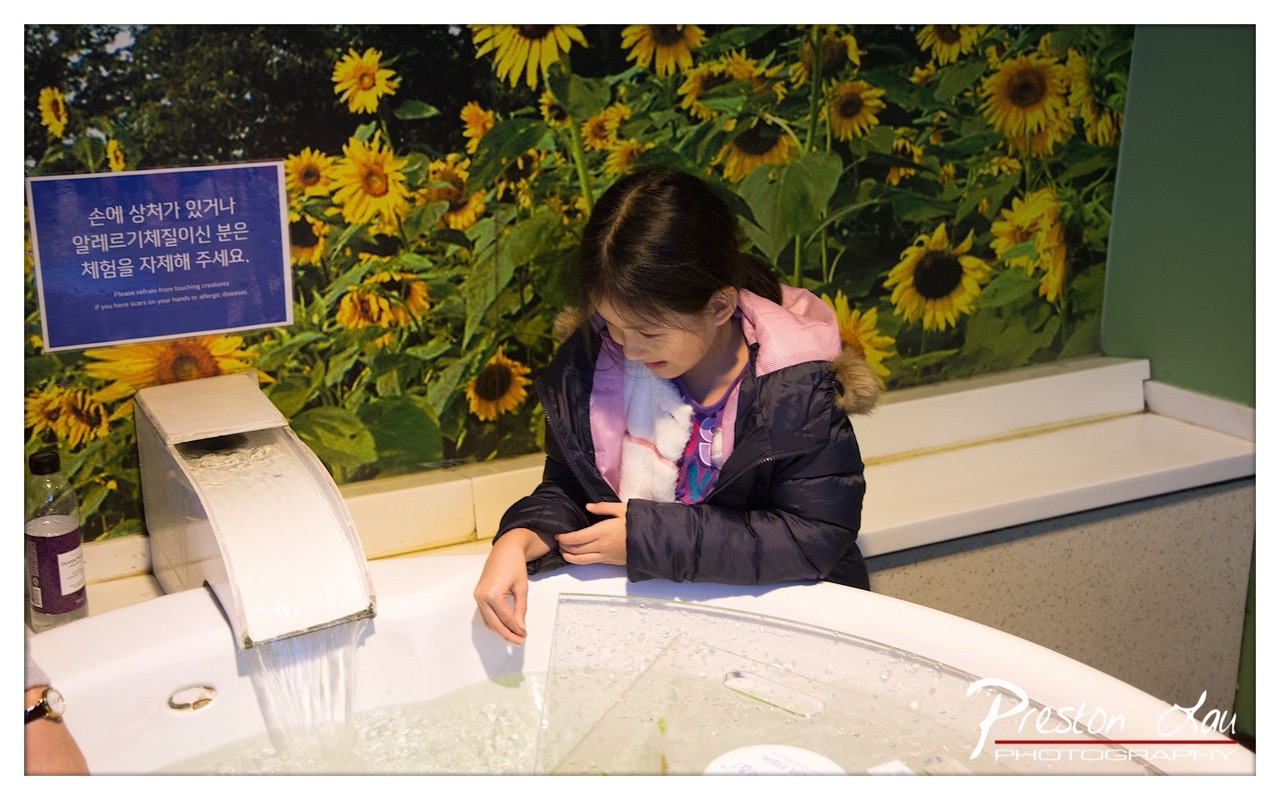

1. Overall Rating (0–10) — 6.8
This photograph captures a quiet, introspective moment of a child engaging with a water exhibit, set against a vibrant sunflower mural that adds warmth and whimsy. The scene feels candid and authentic, balancing the playful energy of the environment with the girl’s focused curiosity. While the composition is slightly cluttered and the lighting is functional rather than dramatic, the image succeeds in conveying a sense of discovery and innocence within a museum-like setting.
2. Composition (0–10) — 6.0
The subject is positioned slightly off-center, creating a natural flow from the water feature toward the girl, though the left-side sign and bottle introduce visual distractions. The sunflower backdrop provides depth but competes for attention, reducing focus on the main subject.
3. Lighting (0–10) — 6.5
The lighting is even and bright, typical of indoor educational spaces, allowing clear visibility of the scene. However, it lacks directionality and softness, resulting in flat illumination that diminishes the mood and depth.
4. Color & Tone (0–10) — 7.0
The warm yellows of the sunflowers contrast beautifully with the cool tones of the girl’s jacket and the white basin, creating a lively and balanced palette. The colors are vibrant but not oversaturated, supporting the playful, child-friendly atmosphere.
5. Creativity (0–10) — 6.5
The juxtaposition of a naturalistic backdrop with a hands-on exhibit introduces a layered narrative—education, nature, and childhood wonder. While the concept is familiar, the execution feels genuine and emotionally resonant.
6. Technical Quality (0–10) — 7.5
The image is sharp and well-focused, particularly on the girl and the water’s movement. The clarity of the water droplets and the clean resolution of the background details reflect strong technical control.
7. Emotional Impact (0–10) — 7.0
The photograph evokes a sense of quiet wonder and curiosity, inviting the viewer to reflect on the joy of simple, tactile experiences. The girl’s absorbed expression creates a subtle emotional connection, making the moment feel both personal and universal.
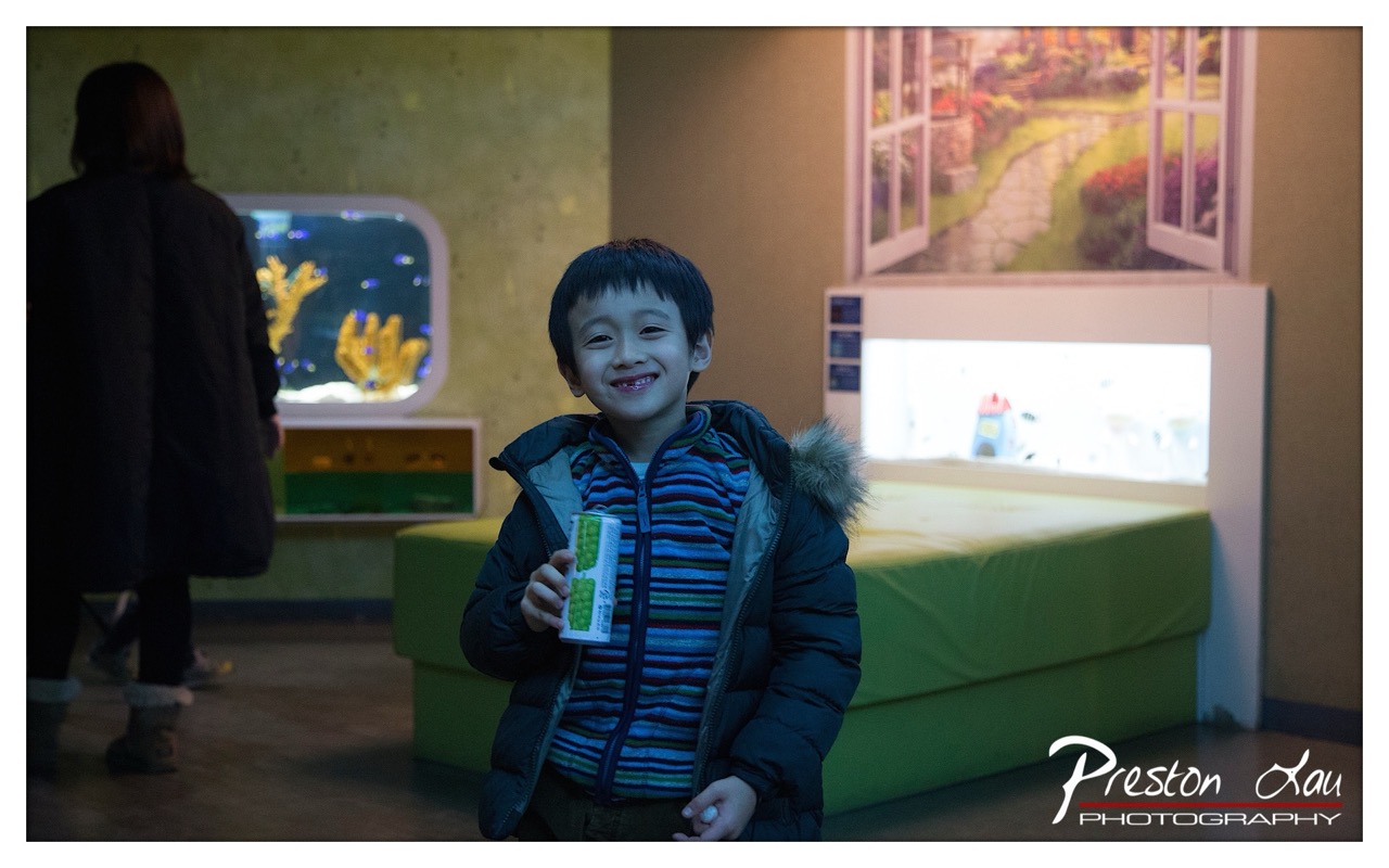

1. Overall Rating (0–10) — 7.0
This photograph captures a candid moment of youthful joy within a softly lit indoor space, where the child’s genuine smile becomes the emotional anchor. The ambient lighting and layered background elements—fish tanks, a garden mural, and a green bench—create a sense of narrative depth, suggesting a visit to a children’s museum or interactive exhibit. While the image successfully conveys warmth and spontaneity, the slightly dim lighting and muted color palette limit its visual punch, preventing it from fully resonating as a polished portrait.
2. Composition (0–10) — 7.0
The child is centered and clearly the focal point, with the background elements providing context without distraction. The diagonal line of the green bench and the placement of the adult figure to the left create a balanced, dynamic frame, guiding the eye toward the subject.
3. Lighting (0–10) — 6.0
The lighting is soft and ambient, with warm tones that enhance the intimate mood. However, the underexposure in the shadows and the lack of directional light result in a somewhat flat appearance, reducing depth and texture in the subject’s face and clothing.
4. Color & Tone (0–10) — 6.5
The color palette is subdued, with muted greens and browns dominating the scene, complemented by the warm glow from the fish tanks. The child’s striped shirt adds a touch of vibrancy, but the overall tone leans toward a cool, dim atmosphere that slightly dulls the image’s energy.
5. Creativity (0–10) — 7.0
The photographer captures a genuine, unposed moment, using the environment to add narrative context. The inclusion of the mural and aquariums suggests a playful, imaginative setting, elevating the image beyond a simple snapshot into a story of childhood wonder.
6. Technical Quality (0–10) — 7.5
The image is sharp in focus, with clean detail in the child’s face and clothing. The depth of field effectively isolates the subject from the background, and the exposure is generally well-managed despite the low-light conditions.
7. Emotional Impact (0–10) — 8.0
The child’s bright, unfiltered smile radiates warmth and happiness, creating an immediate emotional connection. The candid nature of the moment and the quiet intimacy of the setting evoke a sense of nostalgia and tenderness, making the image deeply relatable.
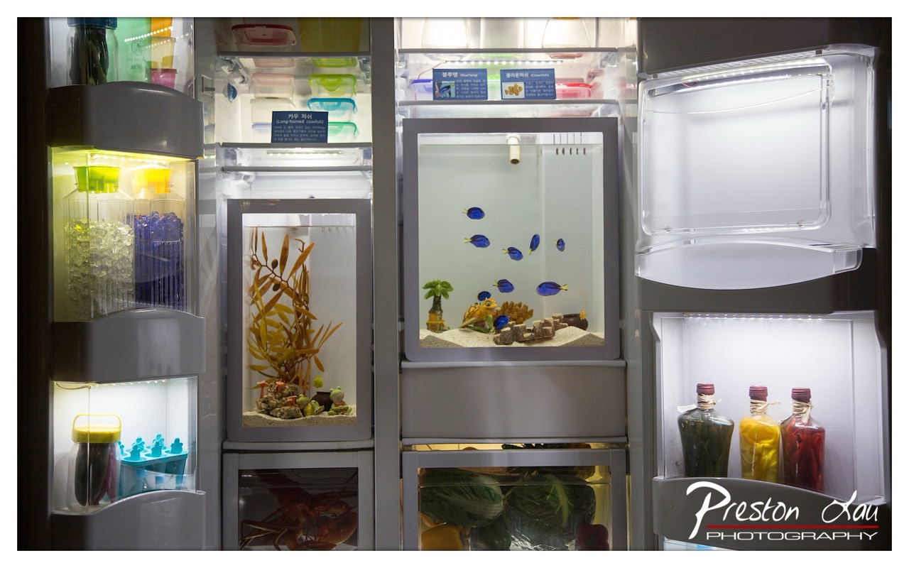

1. Overall Rating (0–10) — 7.0
This photograph presents a surreal and meticulously staged scene, blending domestic functionality with whimsical artistry. The integration of aquariums and decorative elements into a refrigerator creates a striking juxtaposition of the ordinary and the fantastical, evoking curiosity and delight. While the composition is visually rich and conceptually engaging, the image occasionally feels over-styled, with elements competing for attention rather than harmonizing into a cohesive narrative.
2. Composition (0–10) — 7.0
The framing effectively captures the full depth of the refrigerator’s interior, with the aquariums and shelves creating a layered, grid-like structure. The central fish tank draws the eye, while the vertical arrangement of compartments guides the viewer’s gaze across the frame. However, the right side’s empty shelf and the cluttered lower section slightly disrupt visual balance.
3. Lighting (0–10) — 8.0
The internal lighting of the refrigerator casts a cool, even glow that enhances the clarity of the contents, particularly the vibrant colors of the fish and the glass bottles. The backlighting on the aquariums adds depth and highlights the subjects without creating harsh shadows, contributing to the image’s clean, almost clinical aesthetic.
4. Color & Tone (0–10) — 7.5
The palette is rich and varied, with the deep blues of the fish contrasting beautifully against the warm yellows and greens of the bottles and plants. The cool white of the refrigerator interior provides a neutral backdrop that allows the colors to stand out. Slight oversaturation in the fish and some bottles adds a playful, dreamlike quality.
5. Creativity (0–10) — 9.0
The concept is highly original—transforming a refrigerator into a display of miniature ecosystems and personal artifacts is both imaginative and thought-provoking. The integration of Korean labels and traditional fermented foods with the aquariums suggests a cultural narrative, blending modernity with tradition in a visually compelling way.
6. Technical Quality (0–10) — 8.5
The image is sharp and well-focused, with fine detail visible in the textures of the sand, glass, and plastic. The depth of field is consistent across the frame, allowing the entire scene to remain clear. The watermark is discreet and does not detract from the composition.
7. Emotional Impact (0–10) — 7.0
The image evokes a sense of wonder and playful curiosity, inviting the viewer to consider the relationship between domestic life and artistic expression. While the emotional resonance is strong, it leans more toward intellectual engagement than deep personal connection, leaving the viewer intrigued but not emotionally moved.
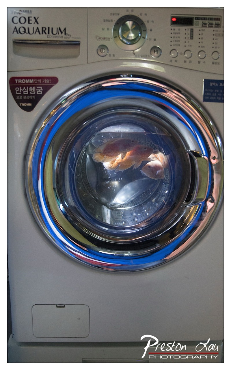

1. Overall Rating (0–10) — 7.0
This photograph presents a striking and surreal juxtaposition: fish swimming inside a washing machine, framed by the glossy, reflective door of a TROMM COEX AQUARIUM model. The concept is bold and imaginative, turning a mundane appliance into a metaphorical vessel for life and movement. While the technical execution is solid, the image’s strength lies in its conceptual audacity—though the surrealism feels slightly staged, it invites contemplation on domesticity, nature, and the absurd.
2. Composition (0–10) — 7.0
The circular frame of the washing machine door creates a natural vignette, drawing the eye to the fish at the center. The symmetry is balanced, with the control panel anchoring the top and the photographer’s signature grounding the bottom. The slight tilt of the machine adds subtle dynamism, enhancing the sense of movement within the still frame.
3. Lighting (0–10) — 6.5
The lighting is functional and even, with a cool, slightly artificial tone that suits the machine’s interior. The reflections on the chrome door and glass are well-managed, but the overall brightness lacks depth, flattening some of the scene’s atmospheric potential. A warmer or more directional light might have heightened the contrast between the mechanical and organic elements.
4. Color & Tone (0–10) — 7.5
The cool white and metallic tones of the machine contrast vividly with the warm, translucent orange of the fish, creating a visually arresting palette. The blue tint around the door’s seal enhances the aquatic illusion, while the neutral background keeps the focus on the central interaction. The color harmony is strong, though slightly oversaturated in places, giving it a slightly digital sheen.
5. Creativity (0–10) — 8.5
This image excels in conceptual originality—transforming a household appliance into a living aquarium is both whimsical and thought-provoking. The juxtaposition challenges perceptions of function and form, inviting interpretations about technology, nature, and domestic life. It’s a clever visual metaphor that lingers in the mind long after viewing.
6. Technical Quality (0–10) — 7.0
The image is sharp and well-focused, with clear details on the machine’s controls and the fish within the drum. The reflection and transparency of the glass are captured cleanly, though minor lens flare and slight overexposure in the brightest areas suggest room for refinement in exposure control.
7. Emotional Impact (0–10) — 6.5
The image evokes curiosity and mild amusement, with a hint of unease about the unnatural setting for the fish. It doesn’t elicit strong emotion but rather prompts questions—about the meaning of the scene, the fate of the fish, and the boundaries between home and nature. The emotional resonance is subtle but persistent, rooted in the power of the surreal.
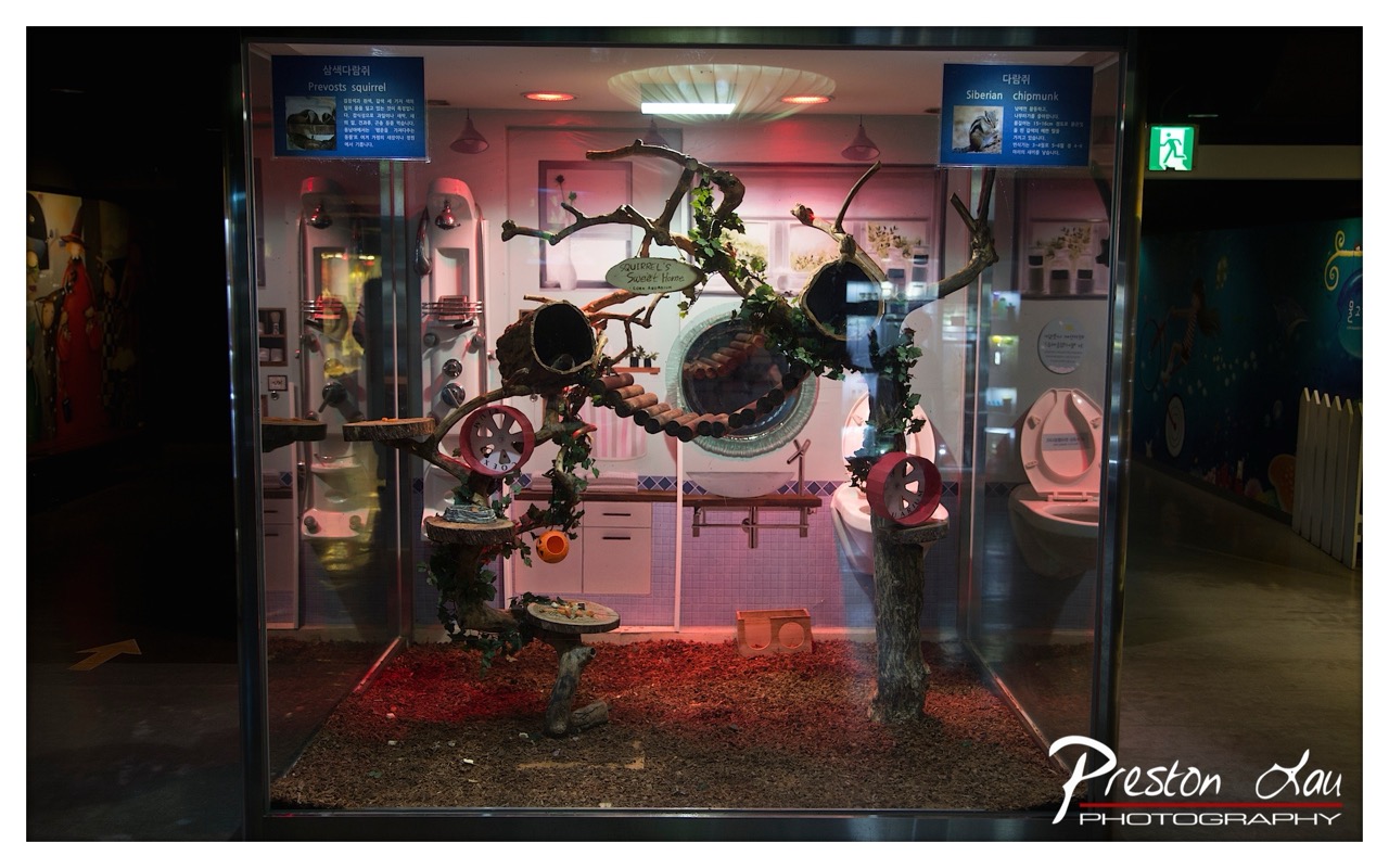

1. Overall Rating (0–10) — 7.0
This photograph captures a whimsical and imaginative exhibit that blends natural elements with domestic objects in a surreal, museum-like setting. The clever juxtaposition of a squirrel’s habitat with a miniature bathroom creates a humorous and thought-provoking narrative, inviting viewers to consider the absurdity of domestication and animal adaptation. While the scene is rich in detail and concept, the lighting and color balance occasionally detract from the clarity and emotional resonance of the composition.
2. Composition (0–10) — 7.0
The central display is well-framed within the glass enclosure, drawing focus to the intricate arrangement of branches, platforms, and toys. The symmetry of the mirrored bathroom setup provides visual balance, while the surrounding exhibit space adds context without overwhelming the subject.
3. Lighting (0–10) — 5.5
The warm, reddish glow from the interior lighting creates a cozy, almost theatrical atmosphere, but it casts an unnatural hue across the scene. The contrast between the bright display and the dark surrounding hallway is effective, yet the uneven illumination slightly obscures details and reduces overall clarity.
4. Color & Tone (0–10) — 6.0
The palette is dominated by earthy browns and muted pinks, with pops of red from the lighting and toys. While the color choices reinforce the playful, artificial nature of the exhibit, the overall tone is somewhat flat and lacks vibrancy, limiting the visual impact.
5. Creativity (0–10) — 8.5
The concept is highly original and inventive, merging the natural world with human domesticity in a clever, narrative-driven way. The inclusion of signage in both Korean and English adds layers of cultural and linguistic context, enhancing the image’s conceptual depth.
6. Technical Quality (0–10) — 7.5
The image is sharp and clear, with fine detail visible in the textures of the bark, wood, and ceramic fixtures. The glass reflections are minimal and do not significantly interfere with the view of the display.
7. Emotional Impact (0–10) — 6.5
The image evokes curiosity and amusement, with a touch of irony in the surreal setup. While the concept is engaging, the somewhat cold and artificial lighting keeps the emotional connection from fully resonating, leaving the viewer more amused than moved.
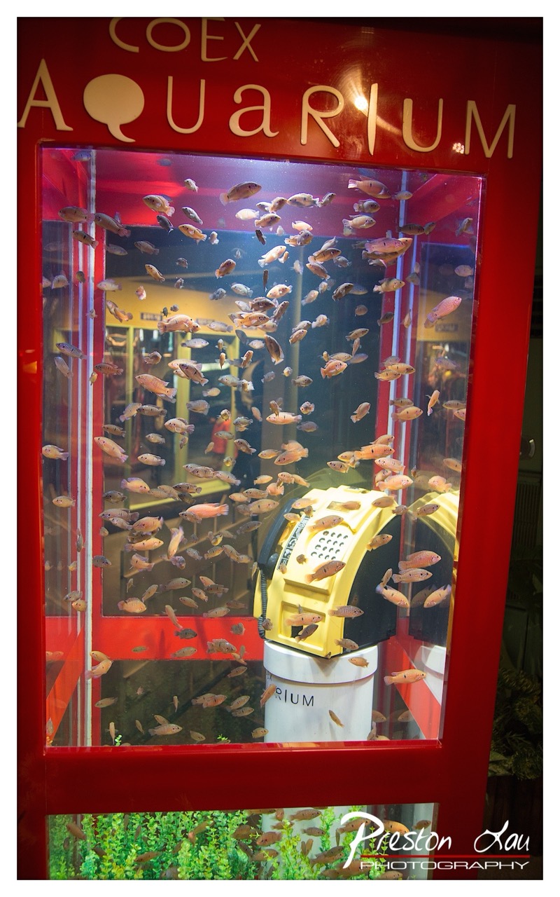

1. Overall Rating (0–10) — 7.0
This photograph captures a striking juxtaposition of the mechanical and the natural, where a claw machine sits submerged in a fish tank, creating a surreal and thought-provoking scene. The vibrant red frame and glowing signage lend a playful, almost whimsical energy, while the movement of the fish adds life and dynamism. The image’s charm lies in its unexpected narrative, though the cluttered composition slightly undermines its visual clarity.
2. Composition (0–10) — 6.0
The central placement of the claw machine draws focus, but the overlapping elements—fish, reflections, and the lower greenery—create visual noise. A tighter crop could enhance clarity and emphasize the conceptual contrast.
3. Lighting (0–10) — 6.5
The interior lighting of the aquarium casts a warm glow that enhances the red frame and highlights the fish. However, reflections on the glass and uneven exposure in the background reduce depth and obscure details.
4. Color & Tone (0–10) — 7.0
The bold red of the enclosure contrasts effectively with the pale fish and yellow claw machine, while the green aquatic plants at the bottom add a natural counterpoint. The color palette is lively, though some areas appear oversaturated.
5. Creativity (0–10) — 8.0
The concept of merging a claw machine with an aquarium is highly original and evocative, inviting viewers to question consumerism, nature, and play. The image succeeds as a conceptual piece with strong storytelling potential.
6. Technical Quality (0–10) — 7.5
The image is sharp and clear, with good detail visible in the fish and the claw machine. The focus is consistent, and the watermark is subtly placed, preserving the integrity of the composition.
7. Emotional Impact (0–10) — 6.5
The image elicits curiosity and mild amusement, with a hint of unease at the absurdity of the scene. While it doesn’t evoke deep emotion, it lingers in the mind as a clever visual paradox.
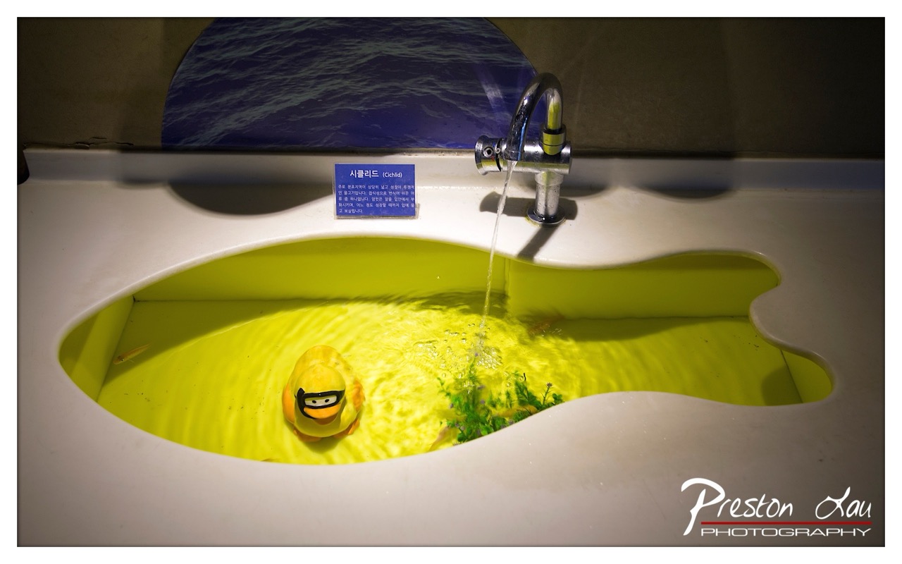

1. Overall Rating (0–10) — 7.0
This photograph captures a whimsical and thoughtfully staged scene, blending playful elements with a subtle commentary on environmental themes. The vibrant yellow sink and the duck wearing goggles create a surreal, almost theatrical atmosphere, while the flowing water and artificial plant add movement and life. The image succeeds in balancing humor and meaning, though its staged nature slightly undermines a sense of authenticity.
2. Composition (0–10) — 7.5
The fish-shaped sink draws the eye naturally, with the faucet and stream of water creating a strong diagonal leading line. The duck is well-placed as a focal point, and the surrounding elements—such as the blue backdrop and the sign—add context without overwhelming the frame. The slight asymmetry enhances the organic feel of the composition.
3. Lighting (0–10) — 6.5
The lighting emphasizes the yellow glow of the sink, creating a warm, almost otherworldly tone. The focused illumination enhances the vibrancy of the scene, though the shadows on the upper wall appear slightly harsh and uneven, reducing the overall softness.
4. Color & Tone (0–10) — 8.0
The bold contrast between the bright yellow sink and the deep blue background creates a visually striking palette. The warm tones of the water and the cool backdrop produce a dynamic balance, while the green plant adds a natural touch that grounds the otherwise surreal scene.
5. Creativity (0–10) — 8.5
The concept is highly original, merging everyday objects with symbolic elements to suggest themes of water conservation or marine life. The anthropomorphized duck and the stylized sink transform a simple sink into a narrative device, demonstrating clever and imaginative storytelling.
6. Technical Quality (0–10) — 7.5
The image is sharp and well-focused, with clear details in the water, duck, and faucet. The depth of field is appropriately managed, keeping the main subject in crisp focus while softly blurring the background. The watermark is subtle and does not detract from the composition.
7. Emotional Impact (0–10) — 7.0
The image evokes a sense of playful curiosity and gentle irony, inviting the viewer to reflect on humanity’s relationship with water and nature. While the emotional tone is not deeply personal, it succeeds in sparking thought and amusement, making it both engaging and memorable.
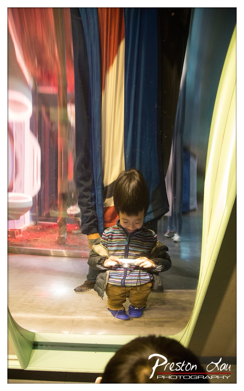

1. Overall Rating (0–10) — 7.0
This photograph captures a tender moment of childhood curiosity, where a young boy is absorbed in examining a small object, possibly a camera, through the reflective surface of a museum exhibit. The layered composition—featuring reflections, translucent curtains, and the child’s focused expression—creates a sense of depth and narrative intrigue. While the image succeeds in conveying intimacy and quiet wonder, the slightly cluttered background and soft focus detract from its visual clarity, preventing it from achieving greater emotional resonance.
2. Composition (0–10) — 6.5
The subject is well-centered, drawing the viewer’s eye, but the overlapping reflections and off-center framing create a sense of visual noise. The use of reflections adds dimension, yet the composition feels slightly unbalanced due to the foreground and background elements competing for attention.
3. Lighting (0–10) — 6.0
The lighting is ambient and diffuse, typical of an indoor exhibit space, which helps maintain a soft, natural mood. However, the lack of directional emphasis results in flat illumination and a loss of detail in the shadows, particularly on the child’s face and clothing.
4. Color & Tone (0–10) — 6.5
The color palette is warm and cohesive, with the reds and blues of the background curtains adding visual interest. The tones are slightly muted, which enhances the quiet atmosphere, though the color contrast could be stronger to better distinguish the subject from the background.
5. Creativity (0–10) — 7.5
The use of reflections and layered perspectives gives the image a unique, almost cinematic quality. The photographer captures a candid, introspective moment that suggests a story beyond the frame, blending documentary realism with artistic composition.
6. Technical Quality (0–10) — 7.0
The focus is sharp on the child, and the image is free from significant noise. The exposure is balanced, though the lower contrast and softness in the background reduce overall clarity.
7. Emotional Impact (0–10) — 7.0
The image evokes a sense of quiet wonder and innocence, inviting the viewer to reflect on the child’s curiosity and the fleeting nature of childhood moments. The emotional weight is strong, though slightly tempered by the visual distractions in the background.
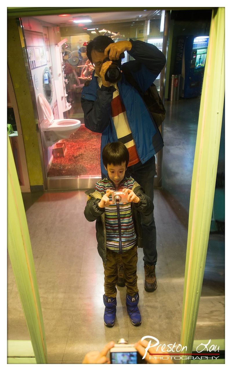

1. Overall Rating (0–10) — 7.0
This photograph captures a charming, layered moment of intergenerational connection, where both father and son are absorbed in the act of photography, creating a narrative within a narrative. The reflection in the mirror introduces a playful, self-referential quality, while the vibrant, slightly surreal environment of the exhibit adds visual intrigue. The image succeeds in blending candid emotion with artistic framing, though the slightly cluttered background and awkward framing of the foreground hand detract from its overall polish.
2. Composition (0–10) — 6.5
The central placement of the boy and the father creates a strong focal point, while the mirror frame adds depth and context. However, the composition is slightly disrupted by the visible hand and camera in the foreground, which draws attention away from the main subjects.
3. Lighting (0–10) — 6.0
The lighting is functional but uneven, with bright overhead lights casting harsh reflections on the glass and floor. The ambient glow from the exhibit behind the mirror adds warmth, but the overall exposure lacks subtlety, creating flat areas and blown highlights.
4. Color & Tone (0–10) — 6.5
The scene is rich with contrasting colors—vibrant blue boots, a striped sweater, and the warm red carpet in the background—which create visual interest. However, the color balance is slightly cool, and the saturation feels inconsistent, with some areas appearing washed out.
5. Creativity (0–10) — 7.5
The layered reflection and dual focus on both photographer and subject offer a clever, self-aware narrative. The choice to capture this moment in a mirror adds a unique dimension, transforming a simple snapshot into a meta-photographic statement.
6. Technical Quality (0–10) — 7.0
The image is sharp and well-focused on the subjects, with clean details in the clothing and camera. The exposure is adequate, though some areas are overexposed due to lighting challenges in the environment.
7. Emotional Impact (0–10) — 7.0
There’s a warm, authentic sense of shared curiosity and joy between the father and son, which resonates with viewers. The playful engagement with photography evokes a sense of nostalgia and familial bonding, making the image emotionally engaging despite its technical imperfections.
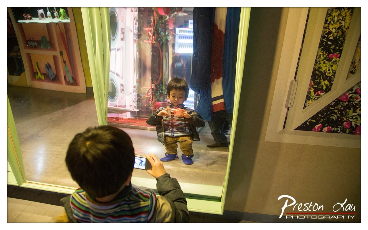

1. Overall Rating (0–10) — 7.0
This photograph captures a tender, self-reflective moment of childhood curiosity, where a child becomes both subject and observer through the lens of a mirror and a phone. The layered composition—child photographing his own reflection—creates a compelling narrative of identity and play, enhanced by the soft, warm lighting that gives the scene an intimate, almost cinematic quality. While the background’s clutter slightly distracts from the emotional core, the image succeeds in conveying quiet wonder and the innocence of discovery.
2. Composition (0–10) — 7.5
The framing cleverly uses the mirror as a central narrative device, creating depth and symmetry. The child in the foreground, seen from behind, directs the viewer’s gaze toward his reflection, establishing a strong visual and emotional connection.
3. Lighting (0–10) — 7.0
The warm, diffused lighting enhances the scene’s cozy atmosphere, casting soft highlights on the child’s face and clothing. The light subtly separates the subject from the background, adding depth without overpowering the moment.
4. Color & Tone (0–10) — 7.5
The color palette is rich yet harmonious, with warm yellows and earthy tones complemented by the vibrant stripes on the child’s sweater. The contrast between the bright reflection and the muted surroundings enhances visual interest.
5. Creativity (0–10) — 8.0
The concept of the child photographing his own reflection is original and layered, transforming a simple moment into a meditation on self-perception and technology. The interplay between the mirror, phone, and camera creates a clever visual loop.
6. Technical Quality (0–10) — 8.0
Sharp focus on the child’s face and hands, with clean detail and minimal noise, demonstrates strong technical control. The depth of field effectively isolates the subject, enhancing clarity and engagement.
7. Emotional Impact (0–10) — 8.0
The image evokes a sense of quiet introspection and playful discovery, inviting viewers to reflect on their own childhood moments of self-discovery. The emotional resonance is strong, rooted in the universal language of a child’s curiosity.
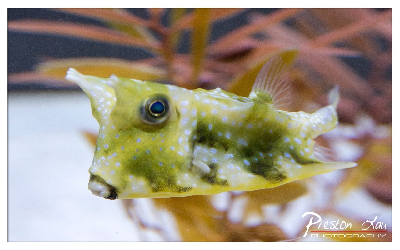

1. Overall Rating (0–10) — 7.5
This photograph captures the quiet curiosity of a horned pufferfish with striking clarity, drawing the viewer into its alien yet endearing world. The subject’s expressive eye and delicate texture are rendered with care, while the soft, out-of-focus background enhances its presence without distraction. While the composition leans slightly toward the conventional, the image succeeds in conveying both biological detail and a subtle sense of wonder.
2. Composition (0–10) — 7.0
The fish is well-placed, centered and angled to showcase its distinctive features, with a balanced use of negative space that keeps focus on the subject. The blurred aquatic foliage in the background creates depth without competing for attention.
3. Lighting (0–10) — 8.0
Soft, even lighting highlights the fish’s textured skin and translucent fins, while avoiding harsh reflections. The light enhances the natural colors and gives the image a gentle, underwater glow.
4. Color & Tone (0–10) — 7.5
The palette of pale yellow, green, and soft white is harmonious and natural, with a subtle contrast between the fish and the warm-toned background. The cool blue of the eye provides a striking accent that draws the eye.
5. Creativity (0–10) — 7.0
The image offers a fresh perspective on a common aquarium subject, emphasizing texture and expression over dramatic action. The photographer’s choice to isolate the fish in this way feels intentional and evocative.
6. Technical Quality (0–10) — 8.5
Sharp focus on the fish’s eye and face, clean depth of field, and excellent detail in the skin texture demonstrate strong technical control and attention to focus.
7. Emotional Impact (0–10) — 7.0
There’s a quiet charm in the fish’s wide-eyed gaze, inviting empathy and curiosity. The image feels intimate, like a quiet moment shared between observer and creature.
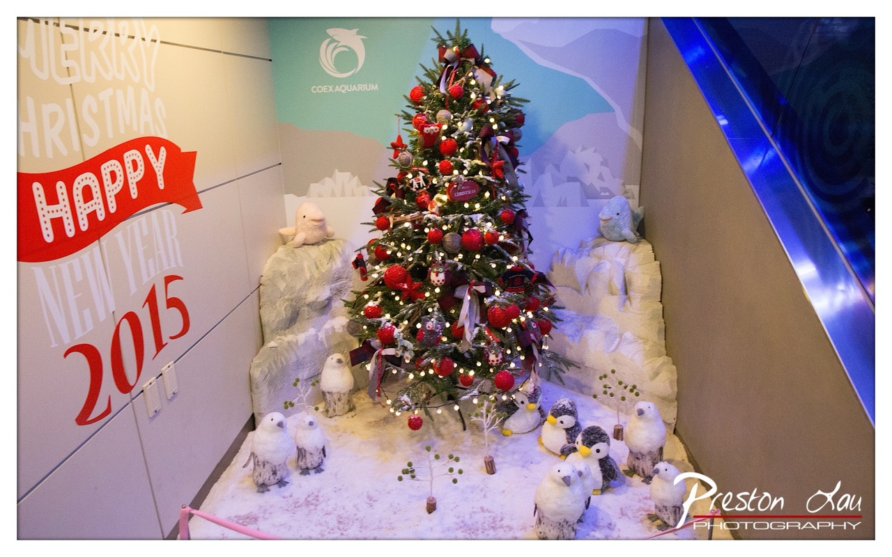

1. Overall Rating (0–10) — 7.0
This festive display at the Coex Aquarium captures the spirit of holiday cheer with a playful, polar-themed twist. The Christmas tree, adorned with red ornaments and warm lights, stands as the centerpiece, surrounded by plush penguins and a snowy diorama that evokes a whimsical Arctic scene. While the composition is rich in detail and seasonal energy, the slightly cluttered arrangement and artificial lighting dampen the overall visual harmony, preventing it from feeling truly immersive.
2. Composition (0–10) — 6.5
The tree is well-centered, drawing the eye, but the surrounding elements—especially the stuffed animals and snow-covered rocks—create a busy foreground. The diagonal edge of the escalator on the right introduces a dynamic line, though it slightly disrupts the scene’s balance and feels like an intrusion.
3. Lighting (0–10) — 6.0
The warm glow of the tree lights creates a cozy ambiance, but the harsh, cool blue lighting from the escalator casts an unnatural hue across the right side of the image. This creates a visual clash, undermining the intended warmth and cohesion of the holiday theme.
4. Color & Tone (0–10) — 6.5
The palette is dominated by festive reds and whites, with the soft blues of the backdrop providing a gentle contrast. However, the color temperature is uneven, with the cool blue light overpowering the natural warmth of the scene, slightly flattening the tonal range.
5. Creativity (0–10) — 7.5
The concept of blending a Christmas tree with a polar animal theme is imaginative and well-suited to the aquarium setting. The use of plush penguins and a snowy landscape adds a layer of whimsy and storytelling, making the display both engaging and contextually appropriate.
6. Technical Quality (0–10) — 7.0
The image is sharp and well-focused, with clear details in the ornaments, lights, and textures of the faux snow. The photographer has captured the scene with precision, though the lighting and framing choices slightly compromise the overall aesthetic.
7. Emotional Impact (0–10) — 6.5
The display evokes a sense of holiday joy and childlike wonder, particularly through the playful penguin figures and the warm glow of the lights. However, the artificiality of the setting and the uneven lighting keep the viewer at a slight remove, limiting the emotional depth.
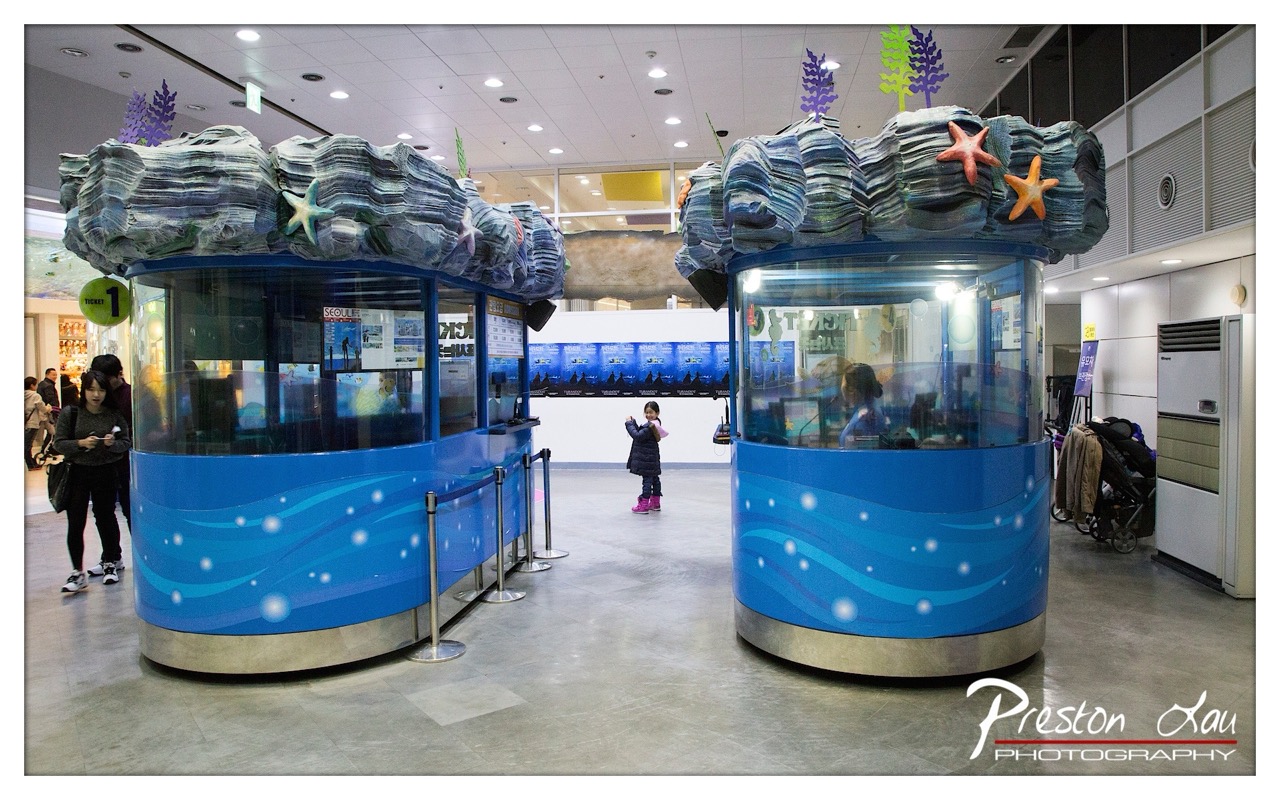

1. Overall Rating (0–10) — 6.8
This photograph captures a whimsical, undersea-themed ticketing area in what appears to be a public aquarium or entertainment complex, where playful design contrasts with the sterile surroundings of a modern interior. The vibrant blue kiosks, adorned with starfish and coral-like textures, create a sense of wonder and childlike delight, while the casual presence of visitors grounds the scene in everyday reality. While the image is visually engaging and conceptually strong, its potential is slightly diminished by the flat lighting and lack of dynamic perspective.
2. Composition (0–10) — 6.5
The symmetrical placement of the two kiosks creates a balanced, centered composition, drawing the eye toward the child in the middle as a focal point. However, the wide framing and the presence of unrelated background elements—like the stroller and signage—distract from the main subject, slightly weakening the visual narrative.
3. Lighting (0–10) — 5.5
The lighting is functional and even, typical of indoor commercial spaces, with overhead fluorescent fixtures providing uniform illumination. While it ensures clarity, the lack of direction or contrast gives the image a flat, uninspired quality that fails to highlight the textures and colors of the kiosks.
4. Color & Tone (0–10) — 7.0
The dominant blue tones of the kiosks are vibrant and well-saturated, creating a cohesive aquatic theme. The addition of warm orange starfish and soft white highlights adds visual interest and enhances the playful mood. The neutral gray floor and ceiling help the colors stand out, though the overall palette remains somewhat restrained.
5. Creativity (0–10) — 7.5
The concept of transforming ticket booths into immersive, oceanic structures is imaginative and effective. The juxtaposition of whimsical design within a mundane setting adds a layer of narrative charm, suggesting a deliberate effort to engage visitors and evoke a sense of adventure.
6. Technical Quality (0–10) — 7.5
The image is sharp and well-focused, with clear details visible on the kiosks, signage, and people. The resolution and clarity are strong, and the photographer has successfully captured the scene without significant noise or blur, indicating a high level of technical control.
7. Emotional Impact (0–10) — 6.5
The photograph evokes a sense of lightheartedness and curiosity, particularly through the child’s pose and the playful design. While it doesn’t elicit a strong emotional response, it does convey a quiet moment of wonder in a public space, inviting viewers to imagine the experience of entering an underwater world.
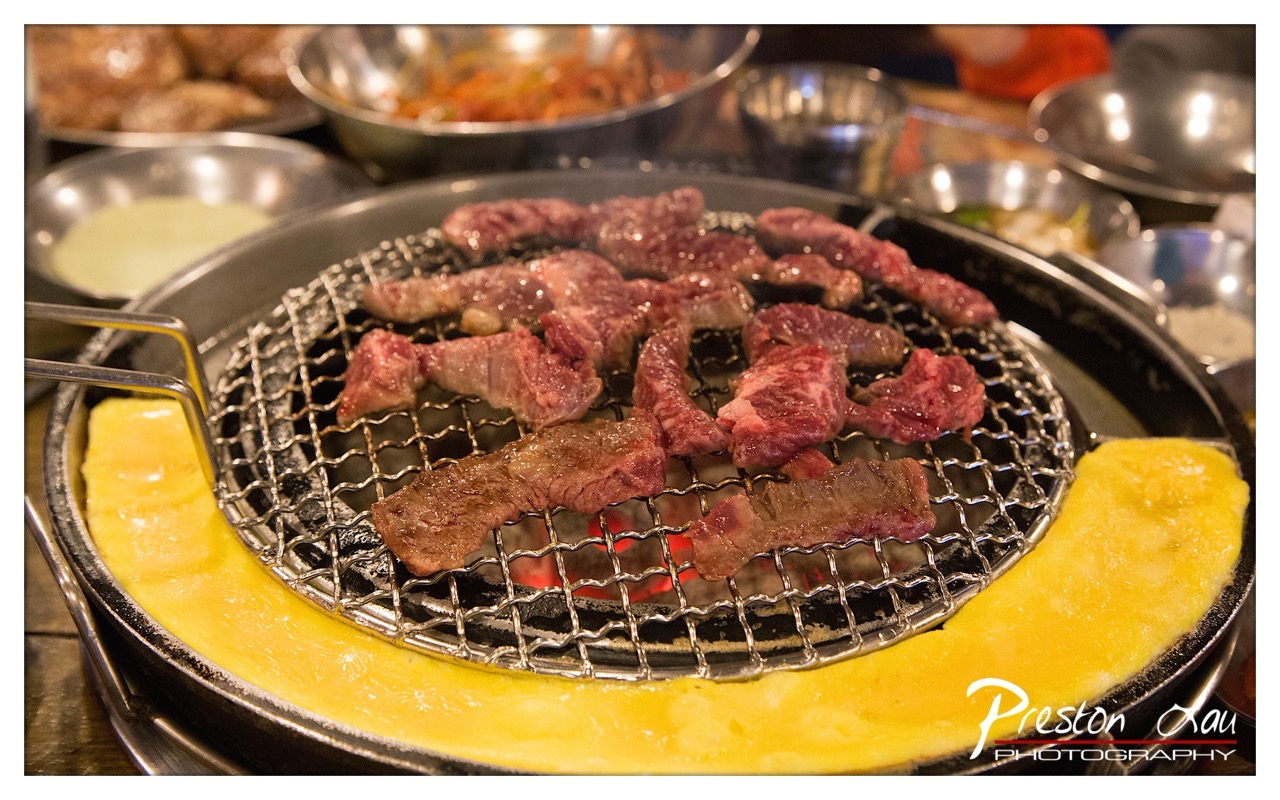

1. Overall Rating (0–10) — 7.5
This photograph captures the vibrant energy of a Korean barbecue experience, where sizzling meat and golden egg omelet create a feast for the senses. The warm glow of the grill and the rich textures of the food convey a sense of immediacy and indulgence. While the image is visually compelling, the slightly cluttered background and soft focus on the periphery keep it from achieving a more refined aesthetic.
2. Composition (0–10) — 7.0
The central grill draws the eye, with the curved egg omelet framing the scene naturally. However, the scattered bowls and utensils in the background create visual noise, slightly disrupting the balance.
3. Lighting (0–10) — 8.0
The warm, directional lighting from the grill enhances the richness of the meat and highlights the sizzle, creating an inviting and dynamic mood. The glow of the coals adds depth and authenticity.
4. Color & Tone (0–10) — 8.0
The deep reds of the marbled beef contrast beautifully with the bright yellow of the egg and the dark metal of the grill. The warm tone enhances the feeling of a hearty, communal meal.
5. Creativity (0–10) — 7.5
The image successfully captures a culturally rich moment with a strong sense of place. The focus on the cooking process—rather than a posed portrait—gives it an authentic, immersive quality.
6. Technical Quality (0–10) — 8.0
The focus is sharp on the meat and grill, with good clarity in the textures. The shallow depth of field effectively isolates the main subject, though some background elements remain slightly distracting.
7. Emotional Impact (0–10) — 8.0
The photograph evokes hunger, warmth, and conviviality—key emotions associated with shared meals. The viewer can almost smell the smoke and hear the sizzle, creating a strong sensory connection.
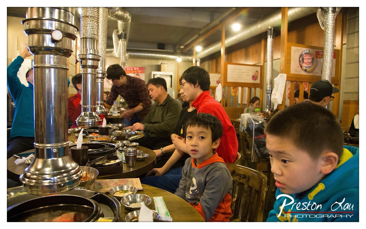

1. Overall Rating (0–10) — 7.0
This photograph captures the lively energy of a Korean barbecue restaurant, where the warmth of shared meals and family interaction radiates through the frame. The foreground child’s direct gaze creates an immediate connection with the viewer, while the bustling background adds narrative depth. Though the scene is candid and rich with cultural authenticity, the composition’s busyness slightly dilutes the focus, preventing the image from achieving greater visual cohesion.
2. Composition (0–10) — 6.5
The foreground child anchors the image, but the overlapping elements—especially the large ventilation pipes and multiple diners—create a cluttered visual field. A tighter framing would better emphasize the central subjects and their emotional connection.
3. Lighting (0–10) — 6.0
The warm, artificial lighting enhances the cozy, communal atmosphere of the restaurant. However, the overhead lights produce harsh reflections on the metal exhausts and create uneven exposure, with some areas slightly overexposed and others shadowed.
4. Color & Tone (0–10) — 6.5
The palette is dominated by warm wood tones and metallic silver, punctuated by the vibrant red and blue clothing of the diners. While the colors are rich and natural, the overall tonal range is somewhat flat, with muted contrast that softens the image’s visual impact.
5. Creativity (0–10) — 7.0
The photograph succeeds in capturing a genuine cultural moment with an authentic, documentary feel. The use of a wide-angle lens and layered composition adds dynamism, though the storytelling could be more focused to elevate the image beyond a simple snapshot.
6. Technical Quality (0–10) — 7.5
The image is sharp and detailed, with clear focus on the child in the foreground and good control of depth of field. The slight digital noise in the background suggests a high ISO setting, but it doesn’t significantly detract from the overall clarity.
7. Emotional Impact (0–10) — 7.5
The direct gaze of the boy in the foreground evokes curiosity and empathy, drawing the viewer into the moment. The sense of familial warmth and shared experience resonates strongly, creating a memorable and emotionally engaging scene.
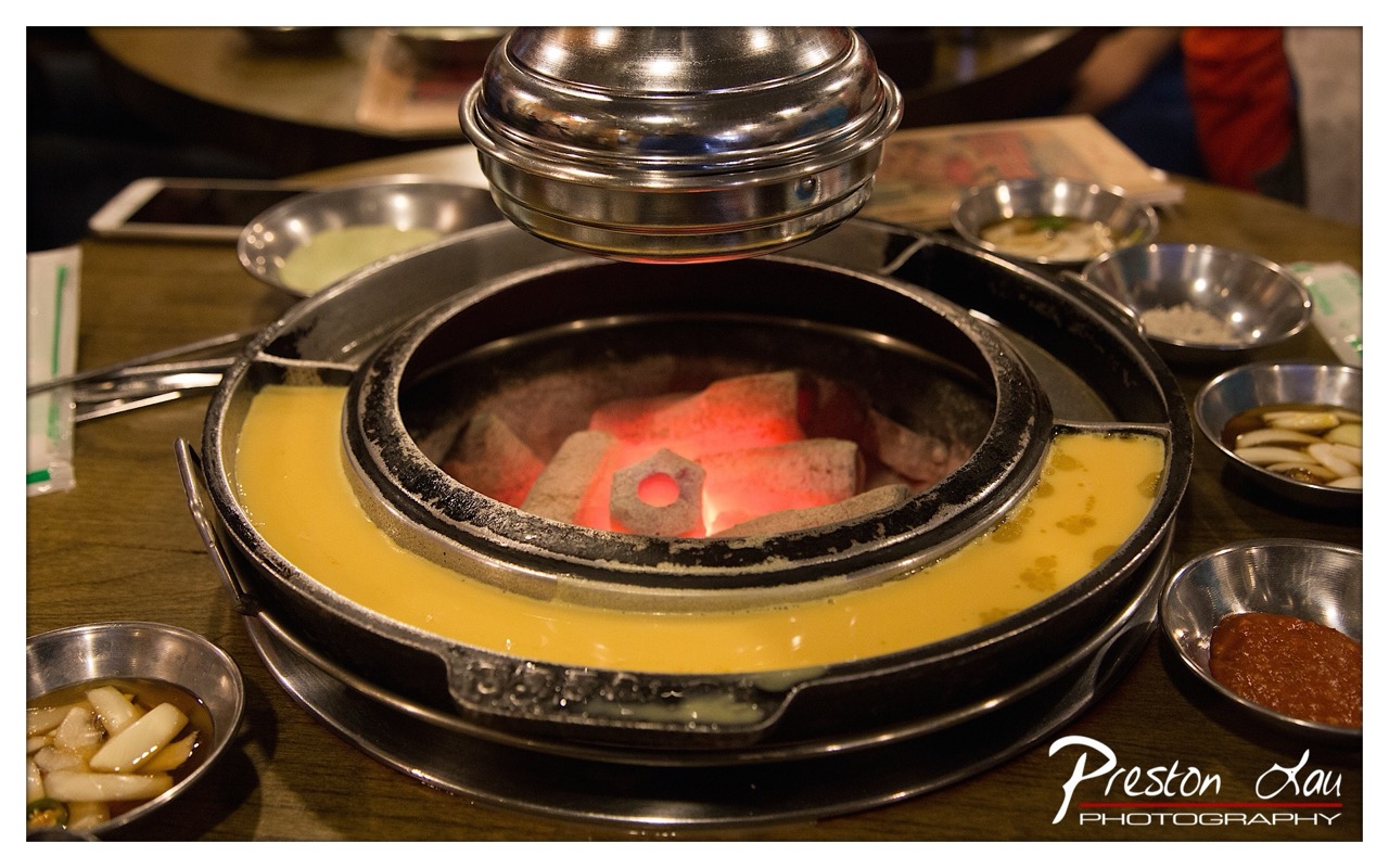

1. Overall Rating (0–10) — 7.0
This image captures the vibrant heart of a Korean barbecue dining experience, where the glow of hot coals and the rich textures of simmering broth create a sense of warmth and anticipation. The composition draws the eye to the central grill, its radiant heat contrasting with the cool metallic sheen of the surrounding bowls, while the scattered side dishes add layers of cultural authenticity. While the scene is rich in detail, the slightly cluttered arrangement and overexposed highlights limit its visual cohesion, keeping it from achieving a more refined aesthetic.
2. Composition (0–10) — 6.5
The central grill dominates the frame, creating a strong focal point, but the surrounding bowls and scattered objects introduce visual noise. A more deliberate arrangement would enhance balance and guide the viewer’s eye more effectively.
3. Lighting (0–10) — 7.5
The warm glow of the coals provides a dramatic, natural light source, casting a rich orange hue that enhances the mood and emphasizes the heat of the meal. The contrast between the bright embers and the dimmer ambient light creates depth and atmosphere.
4. Color & Tone (0–10) — 7.0
The dominant warm yellows and oranges of the broth and glowing coals create a cohesive, inviting palette. The metallic silver of the bowls and the dark wood table provide grounding contrast, though the overall tone leans slightly warm, with some loss of detail in the highlights.
5. Creativity (0–10) — 7.5
The image successfully captures the sensory experience of a communal meal, blending cultural specificity with a universal sense of warmth and connection. The choice to highlight the heat source as the centerpiece adds narrative depth and visual intrigue.
6. Technical Quality (0–10) — 7.0
The image is sharp in the center, with clear detail in the coals and broth. However, the overexposed areas in the background and the slightly soft focus on the periphery reduce overall clarity.
7. Emotional Impact (0–10) — 7.5
The photograph evokes a strong sense of comfort and shared experience, inviting the viewer to imagine the sizzle of meat, the aroma of spices, and the warmth of a gathering. The glow of the coals and the inviting spread of side dishes create a compelling emotional pull.
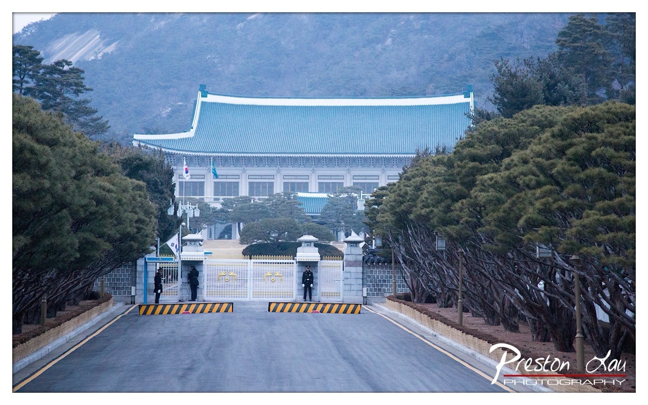

1. Overall Rating (0–10) — 7.5
This photograph captures the solemn grandeur of a national landmark, where tradition and authority converge under a hazy sky. The symmetrical composition and muted tones evoke a sense of stillness and discipline, while the presence of guards and the iconic architecture lend the scene gravitas. Though the image is visually compelling, the overcast light tempers its emotional intensity, holding back the full potential of the moment.
2. Composition (0–10) — 8.0
The strong central axis of the road draws the eye directly to the gate and building, creating a powerful sense of balance and order. The framing by the trees on either side enhances depth and guides the viewer’s gaze, reinforcing the ceremonial nature of the scene.
3. Lighting (0–10) — 6.0
The soft, diffused light of an overcast day flattens contrast and mutes texture, creating a somber, almost melancholic atmosphere. While the lighting is even and avoids harsh shadows, it lacks the warmth or drama that might elevate the image’s mood.
4. Color & Tone (0–10) — 7.0
The cool blue-gray tones of the roof and sky harmonize beautifully, establishing a cohesive and dignified palette. The yellow and black barricades provide a subtle pop of color, grounding the image in reality without disrupting its formal tone.
5. Creativity (0–10) — 7.0
The photograph successfully merges architectural precision with human presence, capturing both the ceremonial and the everyday. The choice to include the guards and the empty road suggests a narrative of vigilance and continuity, offering a quiet commentary on power and routine.
6. Technical Quality (0–10) — 8.0
The image is sharp and well-focused, with clear details in the gate, the building, and the surrounding trees. The exposure is balanced, and the watermark is unobtrusive, preserving the image’s integrity.
7. Emotional Impact (0–10) — 7.0
There is a quiet dignity in the stillness of the scene—its emotional resonance lies in the unspoken tension between tradition, security, and national identity. The viewer is invited to reflect on the weight of history and the quiet persistence of duty.
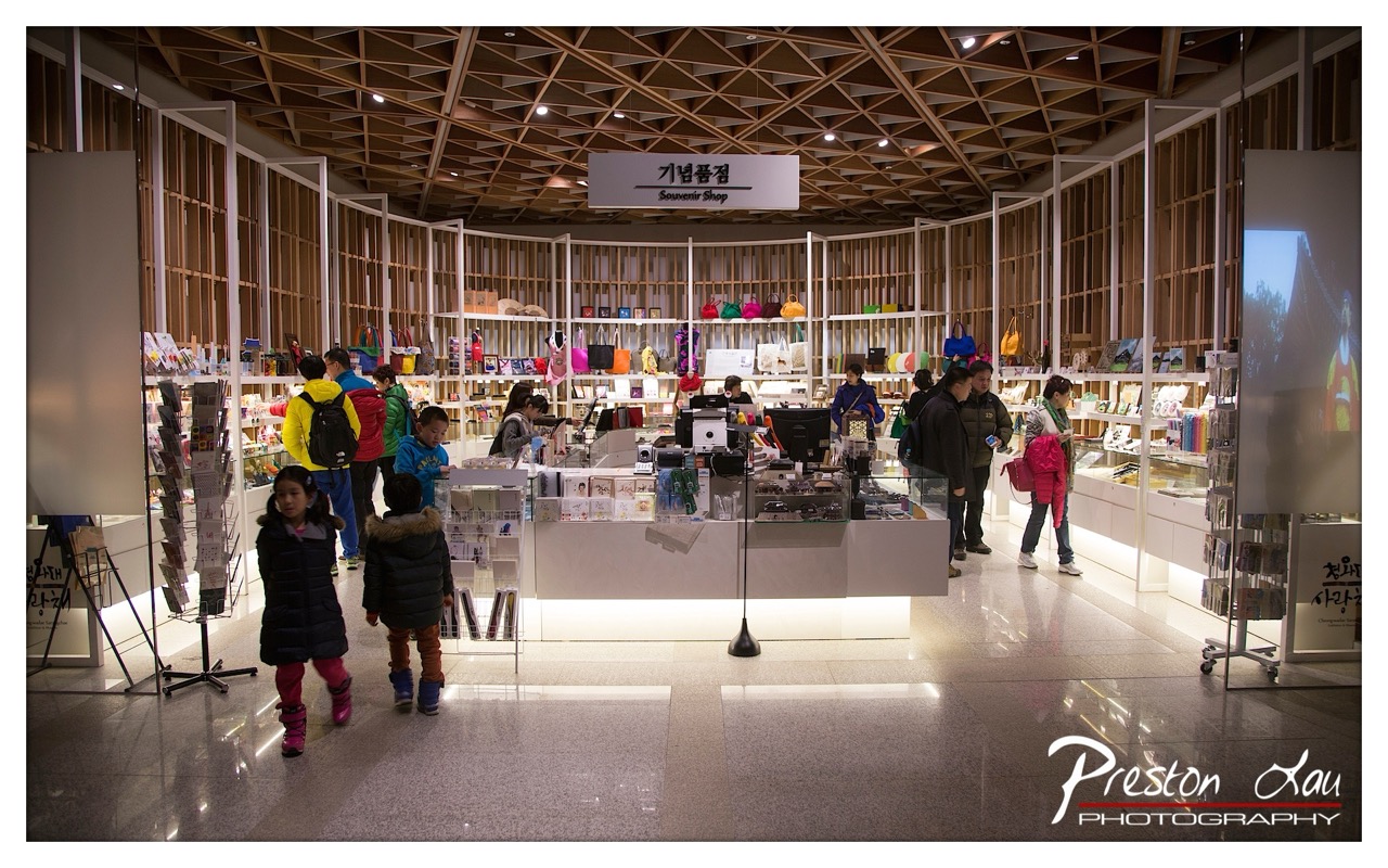

1. Overall Rating (0–10) — 7.0
This photograph captures the vibrant energy of a modern souvenir shop within a cultural space, where the interplay of architecture, light, and human activity creates a sense of lively authenticity. The geometric wooden ceiling and circular shelving lend a dynamic rhythm to the scene, while the movement of visitors—especially the children in the foreground—adds narrative depth. Though the composition is slightly crowded, the image successfully conveys the atmosphere of a bustling, well-used public space, with a subtle elegance in its design and purpose.
2. Composition (0–10) — 6.5
The wide-angle perspective captures the full scope of the space, but the central counter and shelving create a visual anchor that draws the eye. The placement of children in the foreground adds depth, though their positioning slightly disrupts the symmetry. A tighter crop might enhance focus on the interaction between people and the environment.
3. Lighting (0–10) — 7.0
The combination of recessed ceiling lights and under-cabinet illumination creates a warm, inviting glow that enhances the wood textures and highlights the merchandise. The reflections on the polished floor add depth and a sense of spaciousness, while the lighting remains balanced and avoids harsh shadows.
4. Color & Tone (0–10) — 6.5
The palette is dominated by warm wood tones and neutral whites, punctuated by colorful souvenirs and clothing that add visual interest. The overall tone is bright and clean, though the color saturation is moderate, lending a slightly subdued feel that aligns with the retail environment’s functional aesthetic.
5. Creativity (0–10) — 7.0
The photograph demonstrates strong compositional awareness, using the architectural elements to frame the scene and guide the viewer’s eye. The inclusion of people in motion introduces a narrative layer, transforming a simple storefront into a story of cultural engagement and tourism.
6. Technical Quality (0–10) — 8.0
The image is sharp and well-focused, with clear detail in both the foreground and background. The exposure is well-managed, and the wide dynamic range captures both the bright highlights and deeper shadows without losing detail. The watermark is professionally placed and does not detract from the image.
7. Emotional Impact (0–10) — 6.5
The scene evokes a sense of curiosity and exploration, particularly through the presence of children and the colorful display of cultural artifacts. While not overtly emotional, the image connects viewers to the experience of visiting a cultural site, suggesting a shared moment of discovery and connection.
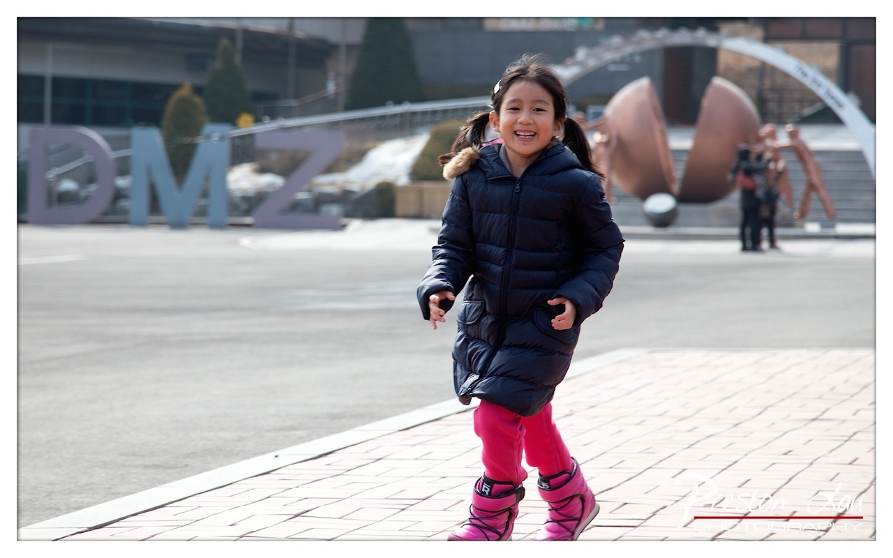

1. Overall Rating (0–10) — 7.0
This photograph captures a moment of unfiltered joy, with a young girl radiating happiness as she moves through a public space. The contrast between her bright, colorful attire and the muted urban backdrop creates a striking visual narrative, emphasizing innocence and vitality. While the background elements add context, they slightly distract from the subject’s emotional center, and the shallow depth of field, while intentional, could be more precisely managed to enhance focus.
2. Composition (0–10) — 7.0
The subject is well-placed in the foreground, creating a natural focal point, but the diagonal edge of the pavement and scattered background elements introduce visual clutter. A tighter framing or more deliberate use of negative space would strengthen the composition and draw the eye more directly to the child’s expression.
3. Lighting (0–10) — 7.5
Natural daylight illuminates the scene evenly, highlighting the girl’s features and clothing with soft, flattering light. The slight overcast quality prevents harsh shadows, allowing for rich detail in both the subject and the background, though a touch more contrast could enhance dimension.
4. Color & Tone (0–10) — 8.0
The vibrant pink of the girl’s pants and boots creates a bold pop against the cool, neutral tones of her coat and the surrounding environment. The color palette is balanced, with warm accents that draw attention and reinforce the image’s joyful mood.
5. Creativity (0–10) — 7.5
The image succeeds in capturing a candid moment of childhood delight within an urban setting, blending narrative and aesthetics. The juxtaposition of the child’s energy against the stillness of the public art and signage adds a layer of visual storytelling that feels both spontaneous and purposeful.
6. Technical Quality (0–10) — 8.0
Sharp focus on the subject, clean detail in the textures of the coat and boots, and a well-executed shallow depth of field demonstrate strong technical control. The watermark is unobtrusive and professionally placed.
7. Emotional Impact (0–10) — 8.5
The girl’s radiant smile and dynamic posture convey a powerful sense of joy and freedom, creating an immediate emotional connection. The image feels authentic and heartwarming, evoking nostalgia and the simple beauty of childhood.
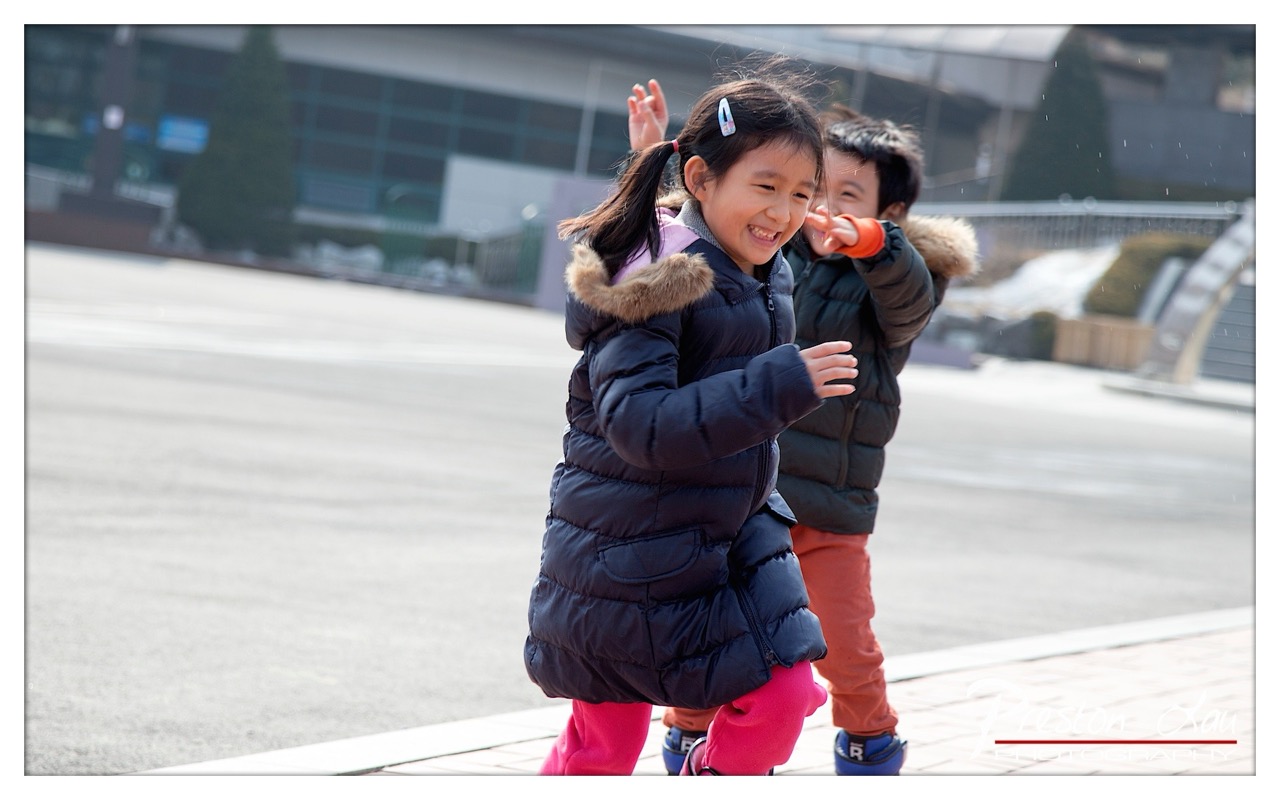

1. Overall Rating (0–10) — 7.5
This photograph captures a fleeting moment of pure childhood joy, where laughter and motion blend into a vibrant, authentic scene. The candid energy of the children, especially the girl’s radiant smile, infuses the image with warmth and spontaneity. While the background is slightly distracting and the composition leans casual, the emotional honesty and natural light elevate the image beyond a simple snapshot into a heartfelt memory.
2. Composition (0–10) — 6.5
The subjects are well-placed, with the girl centered and leading the eye, while the boy adds depth and movement behind her. However, the wide framing and off-center background elements create a slightly unbalanced feel, pulling focus from the emotional core.
3. Lighting (0–10) — 7.0
Natural daylight illuminates the scene evenly, enhancing the crispness of the winter clothes and the children’s expressions. The soft shadows and slight overcast quality lend a gentle, diffused feel that complements the lighthearted mood.
4. Color & Tone (0–10) — 7.5
The contrast between the girl’s bright pink pants and the dark puffer jacket creates a striking visual pop, while the muted winter tones in the background keep the focus on the subjects. The color palette feels natural and harmonious, with a subtle warmth that enhances the joyful atmosphere.
5. Creativity (0–10) — 7.0
The image succeeds in capturing a genuine, unposed moment, which is a form of creative strength in its own right. The photographer’s choice to freeze the motion and focus on expression over perfection results in a compelling narrative of childhood play.
6. Technical Quality (0–10) — 8.0
Sharp focus on the girl’s face, with a shallow depth of field that blurs the background, demonstrates strong technical control. The exposure is well-balanced, and the image is free of noticeable noise or artifacts.
7. Emotional Impact (0–10) — 8.5
The infectious smile and dynamic body language of the girl radiate happiness and carefree energy, creating an immediate emotional connection. The viewer is drawn into the moment, feeling the warmth and laughter of a child at play.
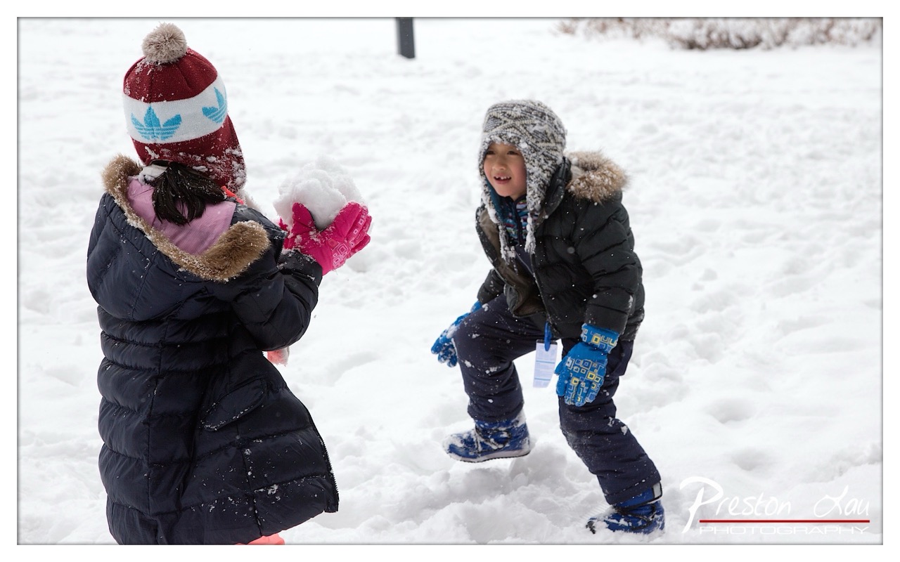

1. Overall Rating (0–10) — 7.5
This photograph captures a joyful, candid moment of two children playing in the snow, radiating genuine childhood exuberance. The dynamic interaction—frozen mid-laugh and mid-throw—imbues the scene with energy and warmth despite the cold setting. While the composition is slightly cluttered and the lighting is flat, the emotional authenticity and natural storytelling elevate the image into a memorable snapshot of winter play.
2. Composition (0–10) — 6.5
The children are positioned off-center, creating a sense of movement and spontaneity. However, the background lacks visual interest and the framing feels slightly tight, cutting off some of the surrounding snowscape that could enhance the sense of place.
3. Lighting (0–10) — 6.0
The overcast sky provides even, diffused light, minimizing harsh shadows and preserving detail in the snow and clothing. While functional, the lighting lacks depth and dimension, resulting in a somewhat flat and gray atmosphere.
4. Color & Tone (0–10) — 7.0
The cool white and gray tones of the snow create a natural winter palette, which is softened by the pops of color in the children’s winter gear—especially the bright pink mittens and blue gloves. These accents add visual warmth and draw attention to the subjects.
5. Creativity (0–10) — 7.5
The image captures a fleeting, unposed moment with strong narrative potential. The photographer’s ability to anticipate the children’s expressions and actions demonstrates a keen eye for storytelling, turning a simple scene into a vibrant memory.
6. Technical Quality (0–10) — 8.0
The focus is sharp on the children, with clean detail in their clothing and snow textures. The exposure is well-balanced, and the image is free from noticeable technical flaws such as noise or blur.
7. Emotional Impact (0–10) — 8.5
The genuine smiles and playful energy evoke a strong sense of nostalgia and warmth. The viewer is immediately drawn into the moment, feeling the joy and carefree spirit of childhood in winter.
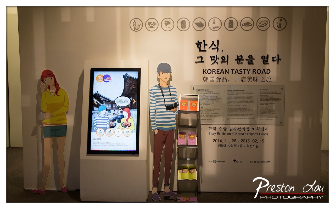

1. Overall Rating (0–10) — 6.0
This photograph captures the inviting atmosphere of a Korean food exhibition, where cultural storytelling meets modern display. The blend of animated cutouts, digital signage, and multilingual text creates a layered narrative, though the composition feels slightly cluttered. While the scene conveys the event’s purpose with clarity, the lack of visual rhythm and subtle distractions prevent it from achieving a more cohesive and compelling aesthetic.
2. Composition (0–10) — 5.5
The framing includes too many elements, creating visual overload. The central figure and digital screen draw attention, but the off-center placement of the cutouts and information panels disrupts balance and flow.
3. Lighting (0–10) — 6.0
Soft, even lighting highlights the display without harsh shadows, though the overall tone is slightly flat. The ambient light creates a neutral backdrop, allowing the text and graphics to remain legible but not particularly dynamic.
4. Color & Tone (0–10) — 6.5
The palette is restrained—dominated by beige, muted blues, and soft yellows—giving the scene a calm, institutional feel. The digital screen introduces brighter colors that draw the eye, but the overall tonal harmony is subdued and somewhat monotonous.
5. Creativity (0–10) — 6.5
The combination of traditional Korean motifs with modern digital elements reflects a thoughtful blend of culture and technology. The use of cutout figures adds a whimsical, narrative touch, suggesting a curated experience rather than a static display.
6. Technical Quality (0–10) — 7.5
The image is sharp and well-focused, with clean details in both the text and digital screen. The exposure is consistent, and the watermark does not interfere with the main subject.
7. Emotional Impact (0–10) — 5.5
The photograph communicates information effectively but lacks emotional resonance. The scene feels informative rather than evocative, offering a glimpse into the exhibition without inviting deeper engagement or wonder.


1. Overall Rating (0–10) — 8.0
This overhead shot captures the vibrant diversity of a Korean banchan spread with striking clarity and balance, transforming a simple meal into a feast for the eyes. The rich red tray and gleaming gold dishes create a luxurious contrast, while the variety of textures and colors invites the viewer into a sensory experience of traditional cuisine. The image succeeds in celebrating cultural abundance, though its meticulous arrangement borders on overly staged, slightly sacrificing spontaneity.
2. Composition (0–10) — 8.5
The overhead view offers a symmetrical and harmonious layout, with dishes radiating from the center in a balanced, circular arrangement. The use of negative space around the edges frames the composition effectively, drawing the eye inward and emphasizing the central abundance.
3. Lighting (0–10) — 7.5
Soft, warm lighting enhances the richness of the food and the metallic sheen of the dishes, creating a welcoming and appetizing atmosphere. The slight shadows beneath the plates add depth without obscuring detail, though a touch more directional light could further accentuate texture.
4. Color & Tone (0–10) — 8.5
The palette is bold and cohesive, with the deep red of the tray grounding the warm golds and the vivid pops of red, green, and orange from the various side dishes. The tonal contrast is strong, and the colors feel naturally vibrant without appearing oversaturated.
5. Creativity (0–10) — 8.0
The arrangement feels both intentional and celebratory, transforming a familiar cultural practice into a visually compelling narrative. The choice to photograph the full spread from above emphasizes the communal and ceremonial nature of Korean dining, offering a fresh perspective on a well-known tradition.
6. Technical Quality (0–10) — 8.5
The image is sharp and well-focused, with fine detail visible in the textures of the food and the reflections on the metal plates. The depth of field is appropriate, keeping all elements in focus and enhancing the sense of abundance.
7. Emotional Impact (0–10) — 7.5
The photograph evokes a sense of warmth, hospitality, and cultural richness. It invites the viewer to appreciate not just the food, but the care and tradition behind its presentation, creating a quiet connection to the ritual of sharing a meal.
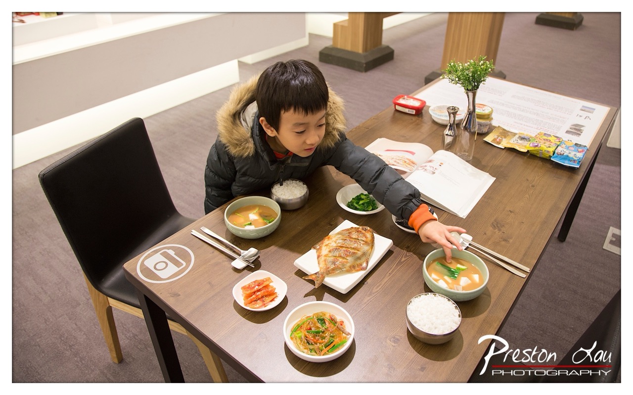

1. Overall Rating (0–10) — 7.0
This photograph captures a tender, everyday moment of a child engaging with a traditional Korean meal, evoking warmth and cultural authenticity. The natural interaction with the food and the thoughtful arrangement of dishes lend a sense of narrative and intimacy. While the composition is strong and the subject compelling, the lighting and color balance could be more dynamic to fully elevate the scene’s emotional resonance.
2. Composition (0–10) — 7.5
The high-angle perspective frames the boy and the table effectively, drawing the eye across the array of dishes. The diagonal line of the table guides the viewer’s gaze, while the empty chair on the left provides balance and context. The placement of the boy slightly off-center adds visual interest and a sense of candidness.
3. Lighting (0–10) — 6.5
The lighting is soft and diffused, likely from overhead indoor sources, which evenly illuminates the scene without harsh shadows. However, the cool tone and lack of directional emphasis slightly flatten the depth and texture of the food, reducing the visual richness of the meal.
4. Color & Tone (0–10) — 7.0
The palette is warm and harmonious, with earthy browns of the table complementing the vibrant reds of the kimchi and the greens of the vegetables. The muted tones of the boy’s jacket and the background help the food stand out. A touch more saturation would enhance the appetizing quality of the meal.
5. Creativity (0–10) — 7.5
The image successfully blends cultural documentation with a personal, human moment. The inclusion of the open cookbook and branded elements suggests a curated dining experience, adding layers of storytelling. The photographer captures both the ritual of eating and the quiet curiosity of the child.
6. Technical Quality (0–10) — 8.0
The image is sharp and well-focused, with clear detail in the food textures and the boy’s expression. The depth of field is appropriately managed, keeping the main subject and the meal in focus while softly blurring the background. The watermark is subtle and does not detract from the composition.
7. Emotional Impact (0–10) — 7.5
The photograph conveys a quiet sense of wonder and connection to tradition, with the child’s focused gaze suggesting genuine engagement. The intimacy of the moment and the familiar setting invite viewers to reflect on family, food, and cultural heritage, creating a strong emotional pull.
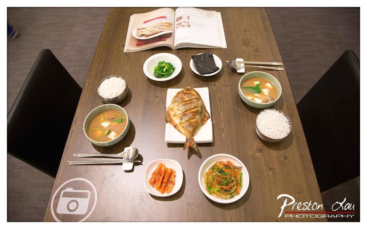

1. Overall Rating (0–10) — 7.5
This overhead shot of a traditional Korean meal radiates warmth and cultural authenticity, capturing the harmony of a thoughtfully arranged table. The composition balances the centerpiece grilled fish with surrounding banchan and rice, creating a sense of ritual and shared dining. While the scene feels inviting and rich in detail, the slightly awkward framing and distracting watermark reduce its visual elegance, keeping it from achieving true artistry.
2. Composition (0–10) — 7.0
The top-down perspective offers a clear view of the meal’s layout, but the asymmetrical placement of dishes and the presence of chairs on either side create visual tension. A more centered or balanced arrangement would enhance the sense of order and cohesion.
3. Lighting (0–10) — 6.5
Soft, ambient lighting highlights the textures of the food without harsh shadows, though the overall tone leans slightly cool, muting the warmth of the cooked dishes. The light direction is consistent, suggesting a controlled indoor setting, but could benefit from a warmer cast to enhance the meal’s appeal.
4. Color & Tone (0–10) — 7.5
The palette features earthy browns of the wood table, contrasted with vibrant greens, reds, and the golden-brown of the grilled fish. The colors are rich and natural, with a balanced contrast that keeps the image visually engaging while maintaining authenticity.
5. Creativity (0–10) — 7.0
The inclusion of the open cookbook adds narrative depth, suggesting a moment of culinary exploration or appreciation. The composition feels intentional, blending food photography with cultural storytelling, though the idea is not entirely novel.
6. Technical Quality (0–10) — 8.0
Sharp focus, clean detail, and accurate exposure contribute to a technically sound image. The clarity of textures—especially the grill marks on the fish and the sheen on the rice—demonstrates strong control in capture.
7. Emotional Impact (0–10) — 7.0
The image evokes a sense of comfort and connection, conjuring the feeling of a shared meal in a warm, intimate setting. While the emotional resonance is strong, the slight detachment from the viewer—due to the overhead angle and composition—keeps the connection from being fully immersive.
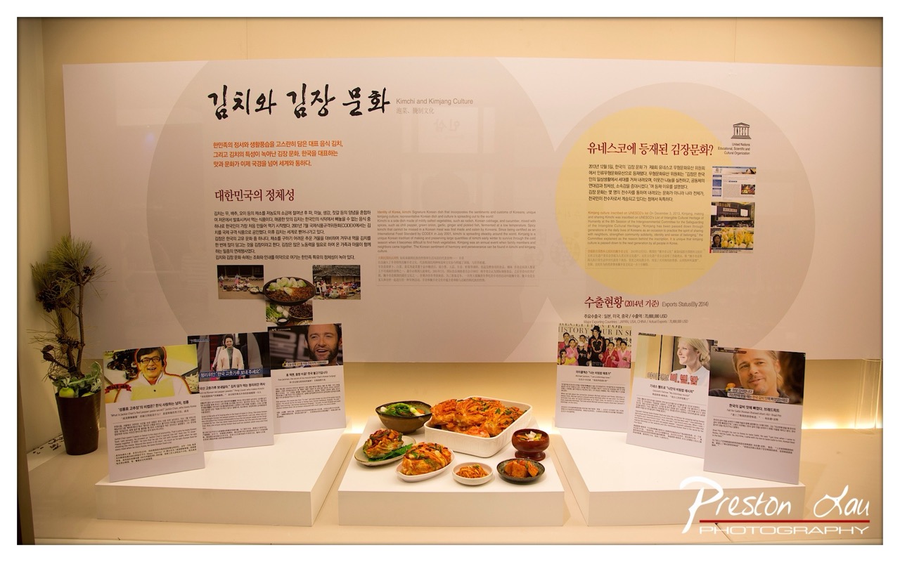

1. Overall Rating (0–10) — 6.0
This photograph documents an exhibition on Kimchi and Kimjang Culture with a clear sense of purpose, capturing both cultural narrative and sensory detail. The display is rich in information and visual elements, yet the composition feels slightly overwhelmed by the sheer volume of text and objects. While the image successfully conveys the educational intent of the exhibit, its visual harmony is compromised by a lack of intentional framing, leaving the scene feeling more like a snapshot than a curated image.
2. Composition (0–10) — 5.5
The scene is framed with a wide-angle perspective that includes too much of the surrounding space, creating a cluttered and unfocused feel. The main subject—the kimchi display and accompanying panels—is slightly off-center, and the foreground elements compete for attention, disrupting visual flow. A tighter crop and more deliberate placement of key elements would improve balance and focus.
3. Lighting (0–10) — 6.5
The lighting is even and functional, typical of an indoor exhibition space, with soft overhead illumination that minimizes harsh shadows. However, the flat, uniform light lacks direction and depth, resulting in a somewhat sterile atmosphere that underplays the textures and colors of the food and display. A touch of accent lighting could have enhanced the mood and highlighted key details.
4. Color & Tone (0–10) — 6.0
The palette is dominated by neutral whites and beiges from the display panels, which allows the vibrant reds and greens of the kimchi and vegetables to stand out. However, the overall tone is muted and slightly yellowed, likely due to indoor lighting, which dulls the vibrancy of the food. The color contrast is effective but not fully realized due to the subdued lighting.
5. Creativity (0–10) — 6.5
The photograph captures a unique cultural narrative, blending food, tradition, and global recognition through the UNESCO designation. The inclusion of celebrity endorsements and real-world context adds layers of storytelling, making the image more than just a documentation—it becomes a cultural commentary. However, the approach remains largely literal, missing opportunities for more inventive framing or artistic interpretation.
6. Technical Quality (0–10) — 7.5
The image is sharp and in focus, with clear text and well-defined details on the food and signage. The depth of field is adequate, capturing both foreground and background elements with reasonable clarity. The photographer’s watermark is prominent but does not detract from the content.
7. Emotional Impact (0–10) — 5.5
The image conveys a sense of pride and cultural preservation, but the emotional resonance is tempered by the overwhelming amount of text and visual noise. While viewers familiar with Korean cuisine may feel a connection, the scene’s busy composition distances the viewer, preventing a deeper emotional engagement. The warmth of tradition is present but not fully felt.
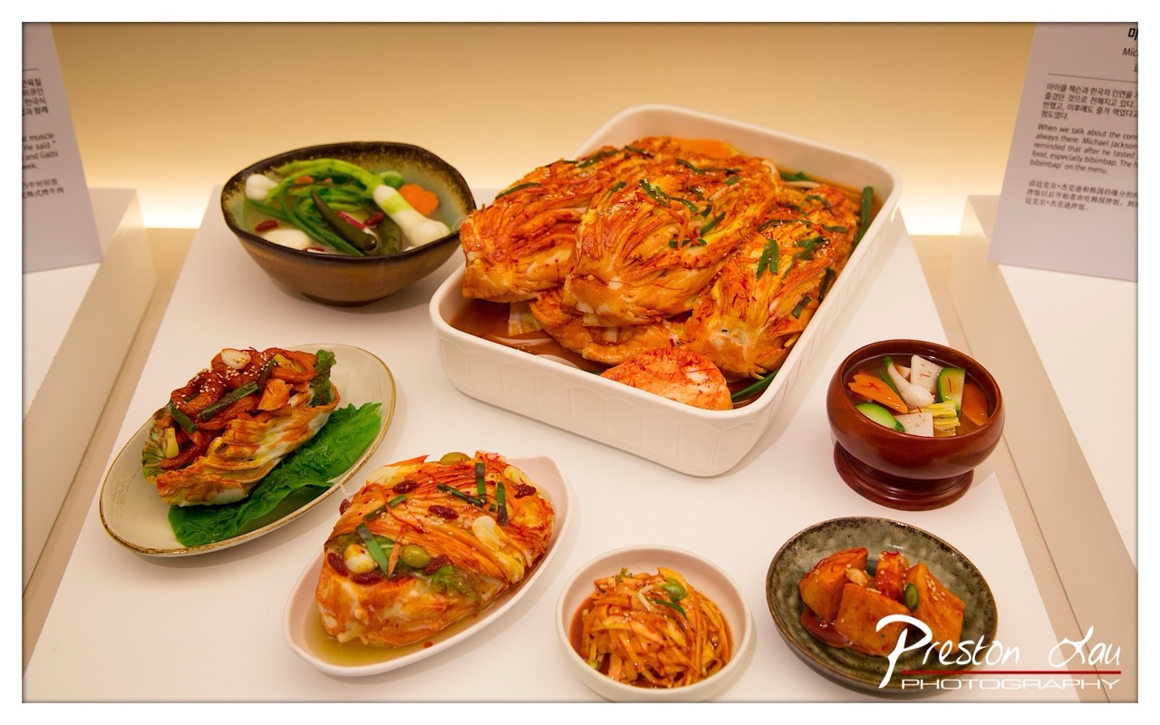

1. Overall Rating (0–10) — 7.5
This photograph presents a vibrant and inviting display of Korean cuisine, capturing the rich textures and colors of traditional dishes with a sense of authenticity and cultural warmth. The arrangement feels deliberate and curated, suggesting a museum or culinary exhibit, where each element is thoughtfully placed to highlight its significance. While the lighting and composition are strong, the presence of informational signage and the watermark slightly disrupt the visual harmony, grounding the image more as documentation than art.
2. Composition (0–10) — 7.0
The arrangement of dishes creates a balanced, diagonal flow across the frame, guiding the eye from the large kimchi centerpiece to the smaller side dishes. The use of varied plate shapes and heights adds visual interest, though the cluttered background and overlapping text panels introduce slight distractions.
3. Lighting (0–10) — 8.0
Soft, even lighting enhances the natural colors of the food, highlighting the glistening sauce on the kimchi and the freshness of the garnishes. The warm tone of the light complements the reds and greens of the dishes, creating an appetizing and inviting mood.
4. Color & Tone (0–10) — 8.5
The palette is rich and harmonious, with bold reds of the kimchi contrasting beautifully against the greens of the vegetables and the earthy tones of the ceramic bowls. The warm color temperature enhances the food’s appeal, while subtle variations in hue give depth and dimension.
5. Creativity (0–10) — 7.5
The photographer successfully captures a cultural narrative through food, presenting not just a meal but a story of tradition and craftsmanship. The inclusion of text and signage adds context, transforming the image into an educational and sensory experience.
6. Technical Quality (0–10) — 8.0
The image is sharp and well-focused, with clear details visible in the textures of the kimchi and garnishes. The white surface provides a clean backdrop, and the depth of field is controlled to keep the main dishes in focus while softly blurring the background.
7. Emotional Impact (0–10) — 7.0
The photograph evokes a sense of warmth and culinary pride, inviting viewers to appreciate the artistry behind Korean cuisine. While the emotional resonance is strong, the documentary nature of the scene keeps the viewer at a slight remove, emphasizing observation over personal connection.
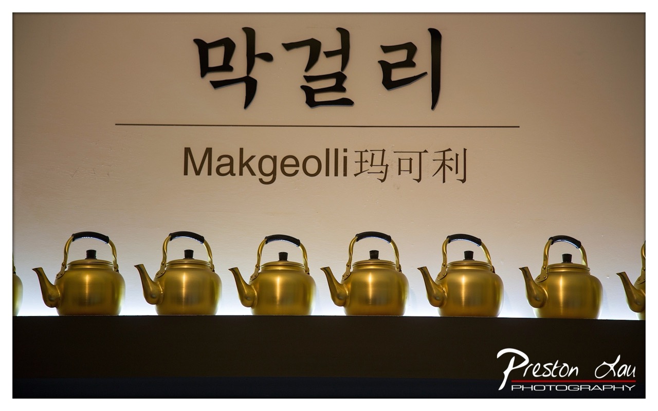

1. Overall Rating (0–10) — 7.5
This photograph captures a serene and culturally rich still life, where the warm glow of golden kettles contrasts beautifully with the clean, minimalist backdrop. The repetition of the kettles creates a sense of rhythm and order, while the bilingual signage adds a layer of global appeal. The image succeeds in blending tradition with modern presentation, though the composition feels slightly over-structured, limiting its emotional spontaneity.
2. Composition (0–10) — 7.0
The kettles are arranged in a strong horizontal line, creating a sense of balance and visual harmony. However, the framing cuts off the leftmost and rightmost kettles, which slightly disrupts the symmetry and leaves the viewer with a sense of incompleteness.
3. Lighting (0–10) — 8.0
The backlighting enhances the metallic sheen of the kettles, creating a soft glow that highlights their form and texture. The lighting is controlled and deliberate, casting a warm ambiance that complements the subject matter and adds depth to the image.
4. Color & Tone (0–10) — 7.5
The warm golden tones of the kettles stand out against the neutral beige wall, creating a pleasing contrast. The color palette is restrained and cohesive, with subtle variations in tone that give the image a refined, almost ceremonial feel.
5. Creativity (0–10) — 7.0
The combination of traditional Korean teapots with modern signage and lighting reflects a thoughtful fusion of culture and contemporary design. While conceptually strong, the execution leans toward the conventional, with a focus more on documentation than bold artistic interpretation.
6. Technical Quality (0–10) — 8.0
The image is sharp and well-focused, with clean details on the kettles and text. The exposure is balanced, and the depth of field is appropriately controlled, keeping the subject in crisp clarity while softly blurring the background.
7. Emotional Impact (0–10) — 7.0
The photograph evokes a sense of calm and reverence, inviting the viewer to appreciate the craftsmanship and cultural significance of the kettles. The warm lighting and orderly arrangement create a meditative quality, though the lack of human presence tempers its emotional resonance.
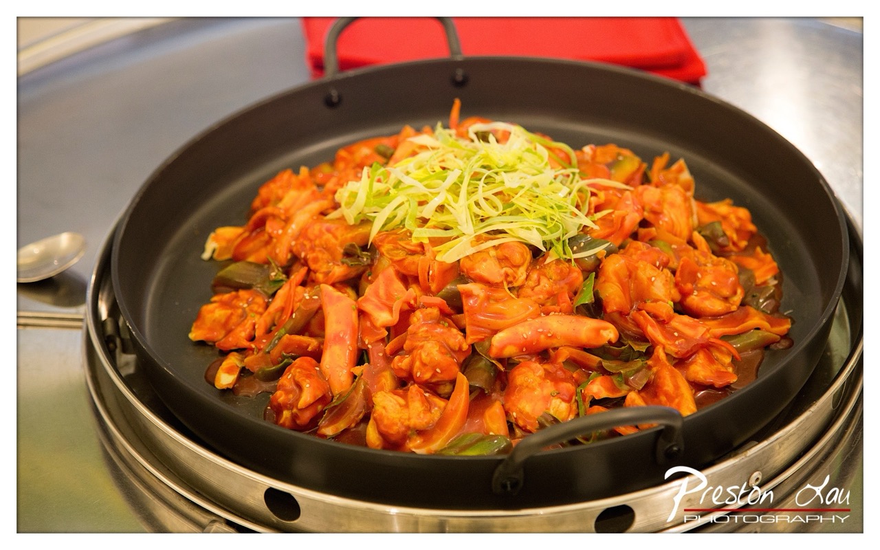

1. Overall Rating (0–10) — 7.5
This photograph captures the vibrant energy of a sizzling Korean dish, where bold colors and texture invite the viewer into a moment of sensory indulgence. The rich reds of the sauce and the crisp green garnish create a dynamic contrast that draws the eye, while the warm glow of the cooking surface adds a sense of immediacy. Though the background remains functional and unobtrusive, the image succeeds in conveying the heat and flavor of the meal, making it both appetizing and visually engaging.
2. Composition (0–10) — 7.0
The dish is centered with a strong focal point, and the use of the pan’s rim frames the subject effectively. The slight tilt and visible steam vents in the base add depth, while the red napkin in the background subtly balances the composition.
3. Lighting (0–10) — 8.0
The lighting is warm and directional, enhancing the glistening texture of the sauce and emphasizing the dish’s freshness. The soft highlights on the pan’s surface add dimension without creating harsh shadows.
4. Color & Tone (0–10) — 8.5
The palette is rich and harmonious, with deep reds and bright greens creating a natural contrast that feels both appetizing and visually striking. The warm tone enhances the food’s inviting quality, and the metallic sheen of the pan provides a cool counterpoint.
5. Creativity (0–10) — 7.5
The image captures a familiar culinary moment with a strong sense of atmosphere, elevating a simple dish through thoughtful composition and lighting. The choice to focus on the sizzle and presentation suggests an intent to evoke the sensory experience of dining.
6. Technical Quality (0–10) — 8.0
The image is sharp and detailed, with clear focus on the food and good control of depth of field. The watermark is subtle and does not detract from the visual impact.
7. Emotional Impact (0–10) — 8.0
The photograph evokes a strong sense of warmth, comfort, and anticipation—qualities that resonate with anyone who enjoys a hearty, flavorful meal. It successfully bridges the gap between food photography and emotional storytelling.


1. Overall Rating (0–10) — 7.0
This photograph captures an intimate, luxurious still life of beauty products and personal accessories, evoking a sense of elegance and preparation. The rich textures and reflective surfaces create a visually layered composition, though the cluttered arrangement slightly undermines its refinement. The warm lighting and ornate details lend a dreamy, almost cinematic quality, making the scene feel both personal and aspirational.
2. Composition (0–10) — 6.5
The framing is tight and slightly asymmetrical, with a strong emphasis on the silver tray and perfume bottles. While the depth of field effectively isolates the central subjects, the left side feels slightly overcrowded, and the reflection of the mirror creates visual complexity that risks distraction.
3. Lighting (0–10) — 7.5
Warm, soft lighting enhances the opulent feel, casting gentle highlights on glass and metal. The light direction creates pleasing reflections and depth, with subtle shadows that add dimension without obscuring details.
4. Color & Tone (0–10) — 7.0
The palette balances warm golds and pinks with cool metallics, creating a harmonious contrast. The rich red of the decorative box adds a focal point, while the overall tone remains cohesive and rich, enhancing the luxurious mood.
5. Creativity (0–10) — 7.5
The image tells a quiet story of preparation and indulgence, blending personal objects into a carefully curated scene. The use of reflections and layered elements adds a narrative layer, transforming a simple vanity into a moment of quiet ritual.
6. Technical Quality (0–10) — 8.0
The focus is sharp on the central tray and its contents, with excellent clarity and detail. The depth of field is well-managed, and the image is free from noticeable technical flaws, such as noise or blur.
7. Emotional Impact (0–10) — 7.0
The photograph evokes a sense of anticipation and intimacy, suggesting a private moment before a significant event. The personal touch of the photo frame and the care in arrangement create a connection, inviting the viewer to imagine the story behind the scene.
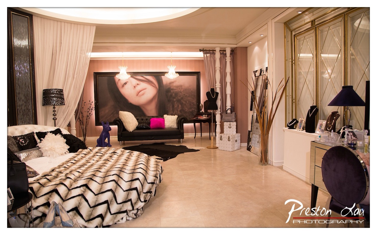

1. Overall Rating (0–10) — 7.0
This photograph captures a luxurious, stylized interior that blends opulence with personal branding, evoking the atmosphere of a high-end boutique or private lounge. The bold use of textures—from the chevron fur throw to the shimmering wall panel—adds depth and tactile richness, while the oversized portrait anchors the space with a sense of identity. Though the composition is dense and slightly cluttered, the deliberate styling and warm lighting create a cohesive, indulgent mood that feels both aspirational and intimate.
2. Composition (0–10) — 6.5
The wide-angle perspective captures the full scope of the room, but the arrangement of furniture and decor creates visual weight on the left, pulling focus away from the central axis. A tighter crop or more balanced placement of objects would improve spatial harmony.
3. Lighting (0–10) — 7.5
Soft, warm ambient lighting from recessed fixtures and chandeliers enhances the luxurious feel, casting a flattering glow across the surfaces. The strategic use of uplighting behind the portrait adds depth and draws the eye to the focal point.
4. Color & Tone (0–10) — 7.0
The palette blends creamy neutrals with rich accents—deep purples, black, and a vibrant magenta pillow—creating a sophisticated contrast. The warm tone unifies the space, though the slight yellow cast from the lighting slightly mutes the vibrancy of the colors.
5. Creativity (0–10) — 7.5
The image reflects a strong artistic vision, merging lifestyle branding with interior design. The integration of personal elements—such as the portrait and curated accessories—suggests a narrative of identity and luxury, making it more than just a room shot.
6. Technical Quality (0–10) — 8.0
The image is sharp and well-exposed, with clean details in both the foreground and background. The wide dynamic range preserves texture and depth, and the photographer’s handling of the light is technically sound.
7. Emotional Impact (0–10) — 7.0
The space conveys indulgence, confidence, and exclusivity, evoking a sense of being invited into a private world. While it may feel more like a showcase than an emotional moment, the warmth and richness of the setting foster a subtle sense of intimacy and allure.
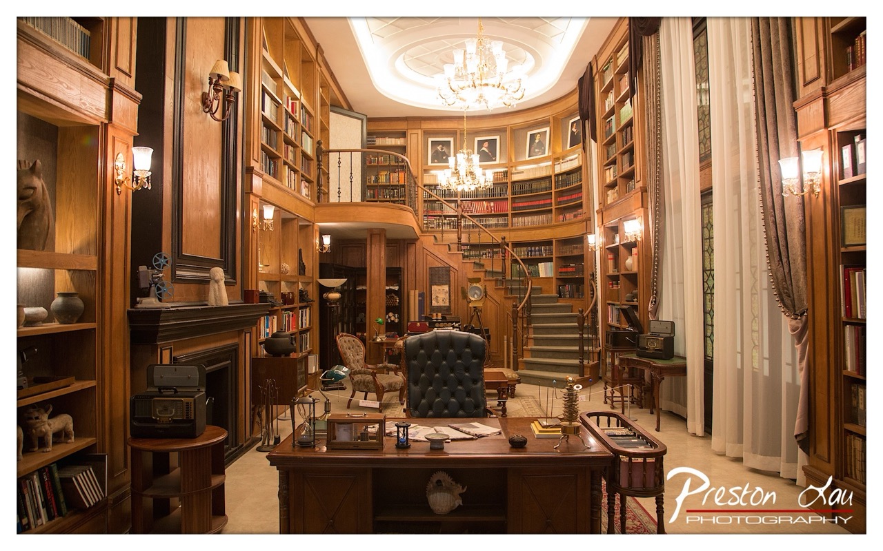

1. Overall Rating (0–10) — 8.0
This photograph captures the opulent grandeur of a classic library study, evoking a sense of intellectual indulgence and timeless sophistication. The rich wood tones, layered lighting, and carefully arranged artifacts create a deeply immersive atmosphere, reminiscent of a Victorian-era scholar’s sanctuary. While the scene is meticulously staged, its visual richness and narrative potential elevate it beyond mere decoration into the realm of storytelling.
2. Composition (0–10) — 8.0
The symmetrical framing draws the eye toward the central desk and staircase, creating a sense of balance and depth. The curving staircase and layered bookshelves guide the viewer’s gaze upward and inward, enhancing the room’s architectural elegance.
3. Lighting (0–10) — 9.0
Warm, ambient light from the chandeliers and wall sconces casts a soft glow that accentuates the wood textures and creates inviting shadows. The combination of overhead and accent lighting enhances depth and mood, lending the space a rich, cinematic quality.
4. Color & Tone (0–10) — 8.0
The dominant warm brown tones of the wood are complemented by the soft cream of the curtains and the subtle gold of the chandelier, creating a harmonious, vintage palette. The muted contrast allows the scene to feel cohesive and luxurious without appearing garish.
5. Creativity (0–10) — 8.5
The image transcends simple documentation by crafting a narrative of erudition and refinement. The carefully placed objects—antique radio, globe, and framed portraits—suggest a personal history, transforming the space into a character-driven tableau.
6. Technical Quality (0–10) — 8.5
Sharp focus and excellent detail capture the textures of leather, wood, and fabric. The exposure is balanced, with no harsh shadows or blown highlights, demonstrating strong control over lighting and camera settings.
7. Emotional Impact (0–10) — 8.0
The photograph evokes a sense of quiet reverence and nostalgia, inviting the viewer to imagine the stories and thoughts that might have unfolded within these walls. Its warmth and detail create a strong emotional connection to a bygone era of intellectual pursuit.
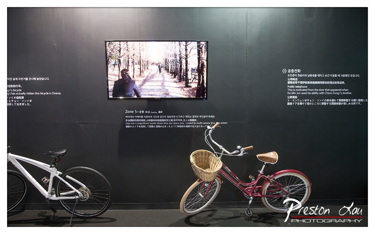

1. Overall Rating (0–10) — 7.0
This photograph captures a thoughtfully curated exhibition space, where the juxtaposition of physical bicycles and a video screen evokes a narrative of movement, memory, and media. The clean, dark backdrop enhances the focus on the exhibits, while the on-screen footage introduces a dynamic, cinematic layer. The inclusion of multilingual text adds cultural depth, though the visual composition occasionally feels overloaded, with text competing for attention against the compelling central image.
2. Composition (0–10) — 6.5
The framing balances the two bicycles and the screen effectively, with the red bike and basket drawing the eye as a focal point. However, the left side feels slightly unbalanced due to the larger white bike and text block, creating an uneven visual weight.
3. Lighting (0–10) — 7.0
The lighting is even and controlled, highlighting the bicycles and screen without harsh reflections. The soft illumination enhances the gallery atmosphere, allowing the content on the monitor to stand out against the dark wall.
4. Color & Tone (0–10) — 6.5
The palette is restrained, dominated by black, white, and red, which gives the image a sleek, modern feel. The warm tones of the basket and the red bike provide a subtle contrast, while the coolness of the background reinforces the gallery’s contemplative mood.
5. Creativity (0–10) — 7.5
The concept of blending physical objects with digital storytelling is original and effective. The video screen acts as a narrative anchor, inviting viewers to connect the bicycles to a larger cinematic experience, demonstrating thoughtful curation.
6. Technical Quality (0–10) — 8.0
The image is sharp and well-focused, with clean lines and precise detail. The watermark is discreet, and the exposure is balanced, capturing both the ambient lighting and the screen’s glow without loss of detail.
7. Emotional Impact (0–10) — 6.0
The scene conveys a sense of quiet introspection and cultural storytelling, inviting viewers to reflect on the intersection of technology, memory, and personal journeys. While the emotional resonance is subtle, it lingers through the narrative implied by the exhibition’s design.
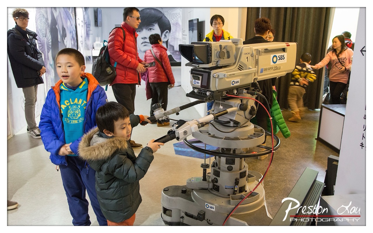

1. Overall Rating (0–10) — 7.0
This photograph captures a moment of youthful curiosity and wonder as two boys interact with a professional broadcast camera in what appears to be a media exhibition. The scene is vibrant and candid, with the children’s expressions conveying genuine fascination, while the surrounding environment adds context and depth. Though the composition is slightly cluttered and the lighting is functional rather than dramatic, the image succeeds in telling a story of discovery and human connection with the tools of media.
2. Composition (0–10) — 6.5
The framing centers on the children and the camera, creating a natural focal point. However, the background is busy with multiple figures and signage, which slightly distracts from the main subjects. A tighter crop or better use of negative space could enhance visual clarity and focus.
3. Lighting (0–10) — 6.0
The lighting is even and functional, typical of an indoor exhibition space, with fluorescent overheads casting a neutral tone. While it clearly illuminates the scene, it lacks depth and contrast, flattening the image and reducing the potential for dramatic effect.
4. Color & Tone (0–10) — 6.5
The color palette is balanced, with pops of bright blue and red from the children’s jackets providing visual interest. The overall tone is slightly cool and clinical, which matches the institutional setting, but a touch more warmth could have enhanced the emotional appeal.
5. Creativity (0–10) — 7.0
The image captures a unique, authentic moment that blends technology, childhood, and curiosity. The choice to include the surrounding environment adds layers of narrative, making it more than just a portrait—it becomes a document of a cultural experience.
6. Technical Quality (0–10) — 7.5
The image is sharp and well-focused, particularly on the children and the camera. The depth of field is sufficient to draw attention to the main subjects while still allowing background context. The watermark is unobtrusive and professionally placed.
7. Emotional Impact (0–10) — 7.5
The photograph evokes a sense of nostalgia and innocence, capturing the universal thrill of engaging with something new and impressive. The children’s expressions—especially the boy on the right, focused on the camera—convey a quiet joy and wonder that resonates with viewers of all ages.
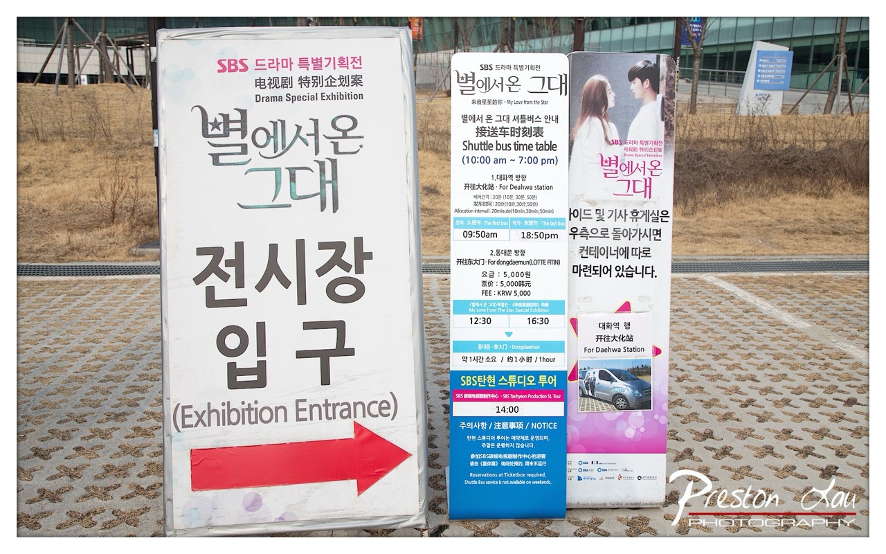

1. Overall Rating (0–10) — 5.5
This photograph documents a promotional setup for the SBS drama special exhibition "My Love from the Star," capturing the practical signage and logistical details of the event. The image successfully conveys the functional nature of the location, with clear directional and scheduling information. However, the composition feels cluttered and utilitarian, lacking visual elegance or narrative depth, and the overexposed background reduces atmospheric richness.
2. Composition (0–10) — 5.0
The signs dominate the frame, creating a dense and slightly chaotic arrangement. The placement of the signs is practical but visually unbalanced, with the large white sign on the left overpowering the smaller blue and pink panels to the right. The red arrow adds a strong directional element, but the lack of negative space and visual hierarchy detracts from overall cohesion.
3. Lighting (0–10) — 6.0
The scene is lit by bright, even daylight, which enhances readability of the text but flattens the image’s tonal range. The sky is overexposed, washing out details in the background, while the foreground signs retain sharp contrast and clarity.
4. Color & Tone (0–10) — 5.5
The color palette is dominated by the white, blue, and pink of the signage, with a neutral, desaturated background of dry grass and pavement. The colors are functional and legible but lack vibrancy or emotional resonance, contributing to a clinical, documentary feel.
5. Creativity (0–10) — 5.0
The image is straightforward and documentary in intent, offering clear information but little artistic interpretation. While the subject matter is culturally specific and timely, the execution is conventional, with no strong visual or conceptual innovation.
6. Technical Quality (0–10) — 7.0
The photograph is sharp and well-focused, with clean details on the signage. The exposure is generally correct for the foreground, and the watermark is discreet. However, the overexposed sky and lack of tonal depth limit the image’s technical refinement.
7. Emotional Impact (0–10) — 4.5
The image conveys a sense of anticipation and organization, but it remains emotionally distant. The viewer is informed rather than moved, with the sterile outdoor setting and utilitarian signage offering little in the way of warmth or personal connection.
Loading map...