Sanrio Puroland is a theme park located in Tama, west of Tokyo, featuring popular Japanese characters like Hello Kitty, My Melody, and Cinnamoroll. The park offers various attractions, shows, and exhibits, including a boat ride and live theaters, with a focus on Sanrio goodies and merchandise. It's a popular destination for families and fans of the brand, with many overseas visitors drawn in by its worldwide popularity.
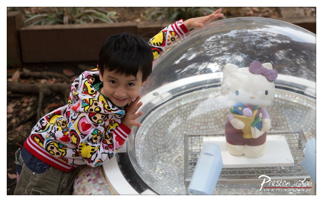

1. Overall Rating (0–10) — 7.0
This photograph captures a candid moment of childhood joy, where a young boy’s playful expression and dynamic pose infuse the scene with warmth and energy. The contrast between the vibrant, patterned hoodie and the clean, reflective surface of the dome creates visual interest, while the presence of the Hello Kitty figure adds a touch of whimsy. The image is slightly overexposed in highlights, which softens the overall impact, but the genuine emotion and composition keep it engaging and memorable.
2. Composition (0–10) — 7.0
The boy is positioned slightly off-center, creating a natural and dynamic feel. The curved dome draws the eye into the frame, with the Hello Kitty figure acting as a focal point within the structure. The background is softly blurred, emphasizing the subject, though the left side feels slightly unbalanced due to the empty space and cluttered ground.
3. Lighting (0–10) — 6.5
Natural daylight illuminates the scene evenly, though strong reflections on the dome’s surface cause some glare and loss of detail. The light is soft and diffused, which enhances the subject’s features, but the overexposed highlights in the glass slightly detract from the overall tonal balance.
4. Color & Tone (0–10) — 7.5
The image features a bright, playful palette dominated by the vivid colors of the boy’s hoodie—yellows, reds, and pinks—which contrast effectively with the neutral tones of the mosaic and dome. The warm, slightly muted tones of the background complement the subject, while the overall color balance feels cohesive and inviting.
5. Creativity (0–10) — 7.0
The combination of a child’s candid moment with a whimsical, stylized environment creates a narrative that feels both personal and imaginative. The inclusion of the Hello Kitty figure adds a layer of cultural and emotional resonance, suggesting a playful exploration of identity and fantasy.
6. Technical Quality (0–10) — 7.5
The focus is sharp on the boy and the dome, with good detail retention in the fabric and mosaic textures. The depth of field is appropriately managed, blurring the background to emphasize the subject. The exposure is mostly well-handled, though some loss of detail in the brightest areas suggests minor overexposure.
7. Emotional Impact (0–10) — 8.0
The boy’s genuine smile and playful gesture evoke a strong sense of innocence and delight. The image captures a fleeting, joyful moment that resonates with warmth and nostalgia, making it emotionally engaging and relatable to viewers of all ages.
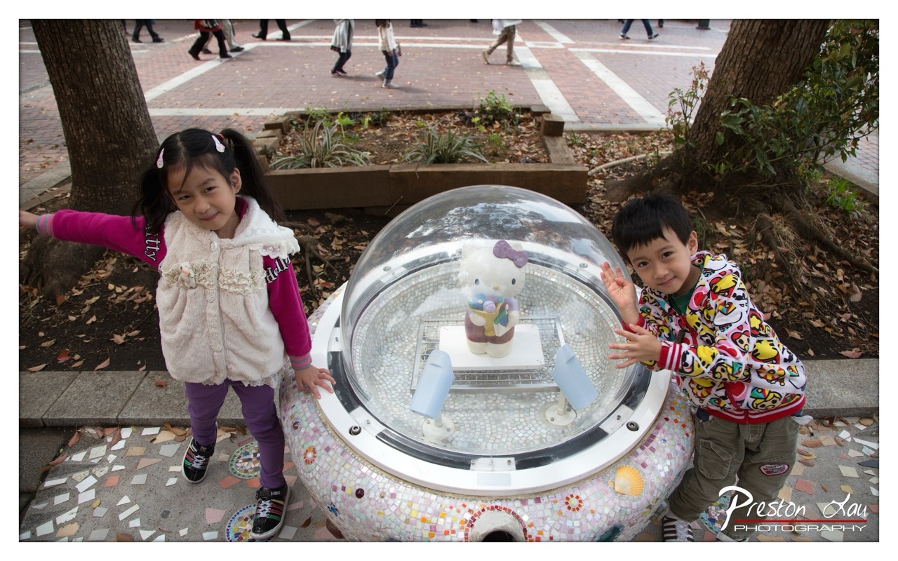

1. Overall Rating (0–10) — 7.0
This photograph captures a joyful, candid moment of two children interacting with a whimsical Hello Kitty sculpture, radiating youthful energy and curiosity. The mosaic details of the installation and the natural outdoor setting lend a playful, story-rich quality to the scene. While the composition is slightly cluttered and the lighting is flat, the image successfully conveys a sense of childlike wonder and cultural charm, making it both charming and engaging.
2. Composition (0–10) — 6.0
The children are placed on either side of the central subject, creating a balanced but somewhat crowded frame. The wide-angle perspective includes distracting background activity, which slightly undermines the focus on the main subjects.
3. Lighting (0–10) — 5.5
Natural daylight provides even illumination, but the overcast conditions result in flat, diffused light that lacks depth and shadow definition, softening the overall visual impact.
4. Color & Tone (0–10) — 7.0
The palette is vibrant, with the colorful mosaic and the children’s bright clothing creating visual interest. The warm tones of the children’s clothing contrast pleasantly with the neutral background, enhancing the scene’s liveliness.
5. Creativity (0–10) — 7.5
The combination of a pop-culture icon with an artistic, mosaic-covered installation creates a unique and playful narrative. The children’s expressions and gestures add a personal, human touch that elevates the image beyond a simple snapshot.
6. Technical Quality (0–10) — 7.5
The image is sharp and well-focused, with clean detail in the mosaic tiles and the children’s features. The wide-angle lens is used effectively to capture the full scene without distortion.
7. Emotional Impact (0–10) — 7.0
The warmth and joy in the children’s expressions evoke a sense of nostalgia and innocence. The viewer is drawn into the moment, feeling the delight and wonder of a child’s interaction with a beloved character.
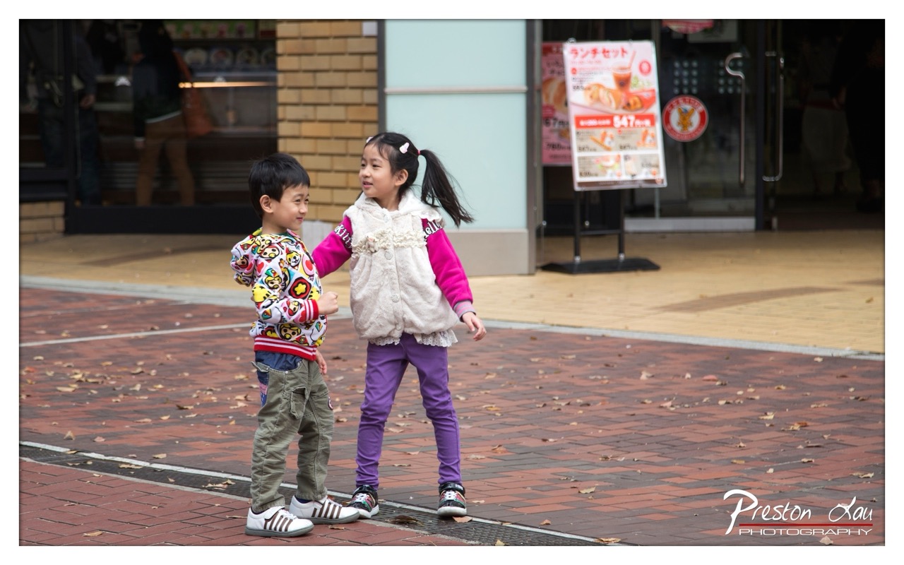

1. Overall Rating (0–10) — 7.0
This photograph captures a candid moment of childhood connection, where two children share a quiet, joyful exchange on a city sidewalk. The natural interaction and vibrant clothing create a sense of warmth and spontaneity, though the background clutter slightly distracts from the emotional core. The image succeeds in conveying authenticity, even if it lacks the polished elegance of a staged portrait.
2. Composition (0–10) — 6.5
The children are placed off-center, creating a dynamic diagonal line that guides the eye through the frame. However, the surrounding urban elements—such as the sign and storefront—introduce visual noise, diluting the focus on the subjects.
3. Lighting (0–10) — 7.0
Natural daylight illuminates the scene evenly, with soft shadows that suggest an overcast or late afternoon sky. The light enhances the colors of the children’s clothing and adds a gentle, lived-in quality to the moment.
4. Color & Tone (0–10) — 7.5
The palette is rich and varied, with the bright pinks, purples, and colorful patterns on the boy’s sweater creating a lively contrast against the muted red brick and neutral building tones. The color balance feels natural and enhances the warmth of the scene.
5. Creativity (0–10) — 7.0
The photographer captures a genuine, unposed interaction, emphasizing the narrative of childhood play. While the concept is familiar, the execution feels fresh due to the candid nature and vibrant details.
6. Technical Quality (0–10) — 8.0
The image is sharp and well-focused on the children, with a shallow depth of field that blurs the background effectively. The exposure is balanced, and the detail in the subjects’ clothing and expressions is clear.
7. Emotional Impact (0–10) — 7.5
The photograph evokes a strong sense of innocence and connection, drawing the viewer into a fleeting but tender moment. The children’s expressions and body language convey mutual affection, making the image emotionally resonant.
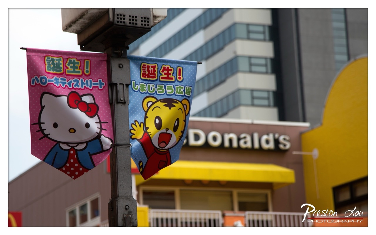

1. Overall Rating (0–10) — 7.0
This photograph captures a vibrant urban moment where pop culture and commercial life intersect, blending the whimsy of Sanrio characters with the starkness of city architecture. The juxtaposition of Hello Kitty and Tama-chan against the backdrop of a McDonald’s creates a playful narrative of globalization and branding. While the composition is engaging and rich in cultural detail, the slightly overcast lighting and soft focus temper its visual punch, leaving the image feeling more like a snapshot than a fully realized artistic statement.
2. Composition (0–10) — 6.5
The banners are well-framed on the left, drawing the eye with their bright colors and central placement. However, the background elements—particularly the McDonald’s sign and the building—feel slightly cluttered and distract from the main subjects. A tighter crop could enhance focus and reduce visual noise.
3. Lighting (0–10) — 6.0
The lighting is even and diffused, likely from an overcast sky, which softens shadows and prevents harsh highlights. While this suits the muted tone of the scene, it also reduces contrast and depth, giving the image a flat quality that diminishes the vibrancy of the banners.
4. Color & Tone (0–10) — 7.5
The color palette is lively and engaging, with the pink and blue of the banners creating a strong visual contrast against the neutral backdrop. The yellow of the McDonald’s awning adds a complementary pop, though the overall tone is slightly washed out by the lack of saturation.
5. Creativity (0–10) — 7.0
The image stands out for its clever cultural juxtaposition—bringing together iconic Japanese characters with a global fast-food chain. This duality tells a story of modern urban life, blending nostalgia, commercialism, and cultural identity in a way that is both humorous and thought-provoking.
6. Technical Quality (0–10) — 7.0
The focus is sharp on the banners, with a shallow depth of field effectively blurring the background. The image is clear and free of noise, though the slight softness in the overall exposure suggests room for improvement in dynamic range.
7. Emotional Impact (0–10) — 6.5
The photograph evokes a sense of playful irony and mild nostalgia, tapping into the viewer’s recognition of these characters and brands. While it doesn’t elicit strong emotion, it invites reflection on the role of consumer culture in everyday life, creating a subtle but resonant connection.
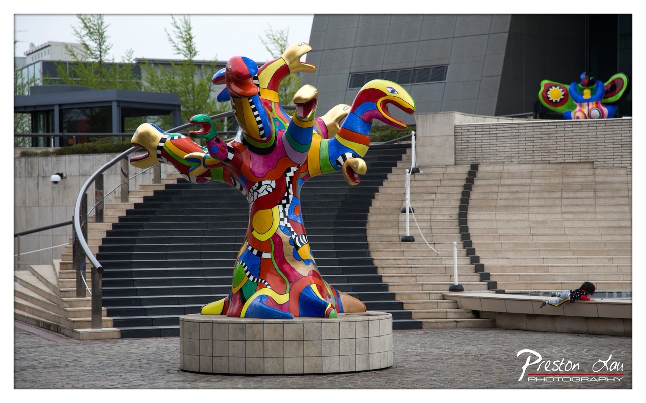

1. Overall Rating (0–10) — 7.0
This photograph captures the bold energy of a vibrant, multi-headed sculpture set against the stark geometry of modern architecture, creating a dynamic contrast between whimsy and order. The sculpture’s vivid colors and playful forms immediately draw the eye, while the surrounding environment grounds it in a real-world context. The image succeeds in showcasing the artwork’s personality, though the overcast lighting tempers its visual punch and the composition feels slightly crowded by background elements.
2. Composition (0–10) — 7.5
The sculpture is well-placed in the foreground, drawing immediate attention, while the sweeping staircase and architectural lines create leading lines that guide the eye into the frame. The inclusion of the child on the right adds a sense of scale and narrative, though the composition is slightly unbalanced due to the visual weight of the steps on the left.
3. Lighting (0–10) — 6.0
The overcast sky produces soft, diffused light that evenly illuminates the scene, minimizing harsh shadows. While this ensures clarity and detail across the sculpture, it also flattens the image’s depth and reduces the vibrancy of the colors, making them appear somewhat muted.
4. Color & Tone (0–10) — 8.0
The sculpture’s kaleidoscopic palette—rich with bright reds, yellows, blues, and greens—stands out vividly against the neutral tones of the stone steps and modern building. The contrast between the playful colors and the monochromatic background enhances the sculpture’s visual impact, though the overall tone remains slightly subdued due to the lighting.
5. Creativity (0–10) — 8.0
The juxtaposition of the whimsical, almost cartoonish sculpture with the austere urban setting creates a compelling narrative about art in public space. The photographer captures not just the object, but its interaction with its environment and the subtle presence of human life, suggesting a story beyond the frame.
6. Technical Quality (0–10) — 8.5
The image is sharp and well-focused, with clear detail in both the sculpture and the background. The depth of field is appropriate, keeping the main subject crisp while allowing the surroundings to remain visible. The watermark is subtle and does not detract from the composition.
7. Emotional Impact (0–10) — 7.5
The photograph evokes a sense of wonder and curiosity, inviting the viewer to consider the relationship between art, architecture, and everyday life. The presence of the child adds a touch of innocence and playfulness, enhancing the emotional resonance and making the scene feel alive and relatable.
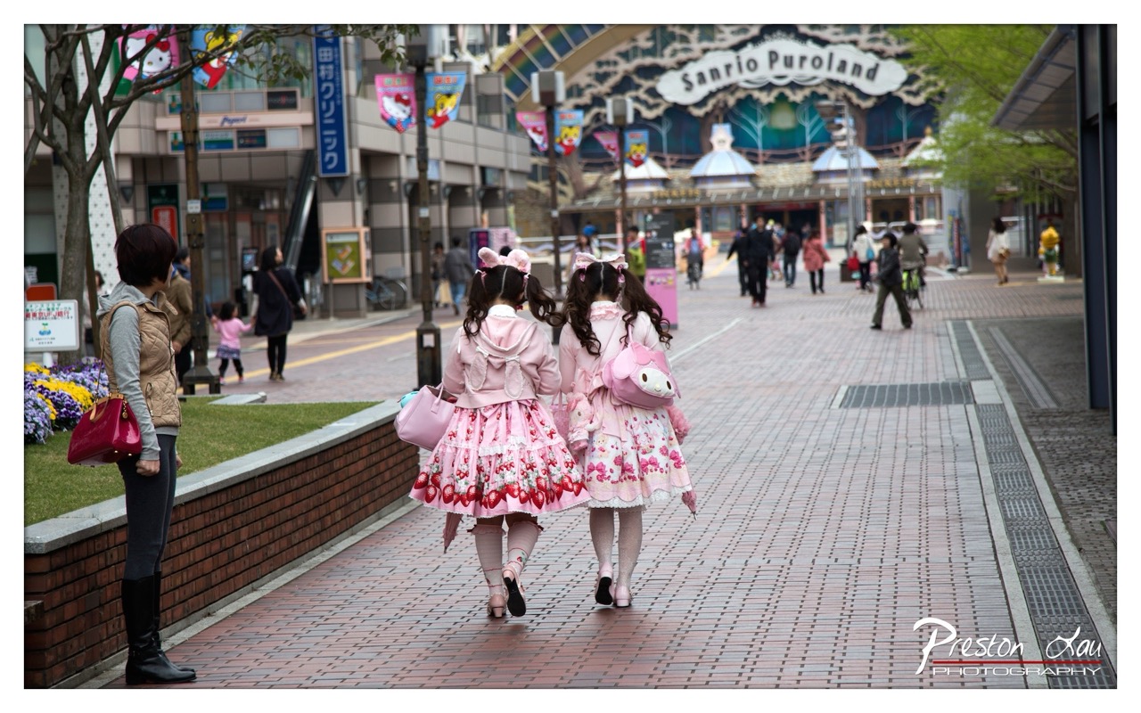

1. Overall Rating (0–10) — 7.0
This photograph captures a vibrant slice of Japanese pop culture, where the whimsy of Lolita fashion collides with the everyday rhythm of a city street. The two girls in their pink, character-themed dresses walk toward the Sanrio Puroland entrance, their coordinated outfits creating a striking visual harmony against the muted urban backdrop. While the scene is rich in narrative and cultural context, the image’s emotional pull is slightly dampened by a lack of dynamic lighting and a composition that feels more observational than immersive.
2. Composition (0–10) — 7.5
The subjects are well-placed along the leading lines of the brick pathway, guiding the eye toward the Sanrio sign. The depth of field effectively isolates the girls from the background, while the inclusion of the observer on the left adds narrative tension. The framing is balanced, though the slight asymmetry gives the image a candid, documentary feel.
3. Lighting (0–10) — 6.0
Natural daylight provides even illumination, but the overcast sky results in soft, diffused light that flattens the scene’s depth. While the light is functional and clear, it lacks the warmth or contrast that would enhance the mood and highlight the textures of the dresses.
4. Color & Tone (0–10) — 8.0
The soft pastels of the pink dresses and the playful floral patterns stand out vividly against the neutral tones of the pavement and buildings. The color palette is cohesive and intentionally whimsical, with the pink hues evoking a sense of innocence and fantasy. The subtle tonal contrast between the subjects and their surroundings enhances visual focus.
5. Creativity (0–10) — 8.5
The image is creatively compelling due to its juxtaposition of youthful fantasy and urban realism. The choice to photograph the girls from behind, walking toward the theme park, suggests a narrative of journey and anticipation. The inclusion of Sanrio branding and the girls’ outfits creates a layered commentary on consumer culture and identity.
6. Technical Quality (0–10) — 8.0
The image is sharp and well-focused, with clean details in the textures of the clothing and pavement. The depth of field is effectively controlled, keeping the subjects crisp while gently blurring the background. The watermark is unobtrusive and professionally placed.
7. Emotional Impact (0–10) — 7.0
There’s a sense of quiet wonder and youthful optimism in the image, evoked by the girls’ coordinated outfits and their shared destination. The emotional resonance is strongest in the contrast between their fantastical attire and the mundane setting, prompting reflection on the intersection of fantasy and reality in modern youth culture.
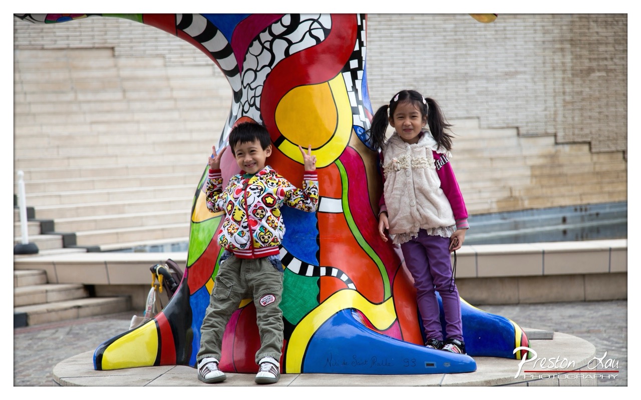

1. Overall Rating (0–10) — 7.5
This photograph captures a joyful, candid moment between two children posing beside a vibrant, whimsical sculpture, evoking a sense of playfulness and cultural curiosity. The bold colors of the artwork contrast beautifully with the muted tones of the surrounding architecture, drawing the eye to the subjects and their expressive gestures. While the image is lively and full of character, it could benefit from a slightly more intentional composition to elevate its visual storytelling.
2. Composition (0–10) — 7.0
The children are well-placed within the frame, with the sculpture acting as a dynamic backdrop that frames them naturally. The diagonal lines of the steps in the background add depth, though the wide shot includes a bit too much empty space, slightly diluting the focus on the central subjects.
3. Lighting (0–10) — 7.5
Soft, diffused daylight illuminates the scene evenly, avoiding harsh shadows and allowing the rich colors of the sculpture to stand out. The lighting enhances the playful mood, creating a natural and inviting atmosphere.
4. Color & Tone (0–10) — 9.0
The palette is striking and intentional, with the sculpture’s vivid reds, yellows, and blues creating a strong visual contrast against the neutral beige of the steps. The colors are saturated and harmonious, lending the image a lively, celebratory tone.
5. Creativity (0–10) — 8.0
The photographer captures a unique moment where culture, art, and childhood innocence intersect. The use of the sculpture as both a backdrop and a narrative element adds depth, and the children’s gestures—particularly the peace signs—contribute to the image’s charm and spontaneity.
6. Technical Quality (0–10) — 8.0
The image is sharp and well-focused, with clear details in both the children’s clothing and the sculpture’s surface. The depth of field is appropriately controlled, keeping the subjects in crisp focus while softly blurring the background.
7. Emotional Impact (0–10) — 8.5
The genuine smiles and playful energy of the children create an immediate emotional connection, evoking warmth and nostalgia. The scene feels authentic and full of life, inviting the viewer to share in the joy of a simple, happy moment.
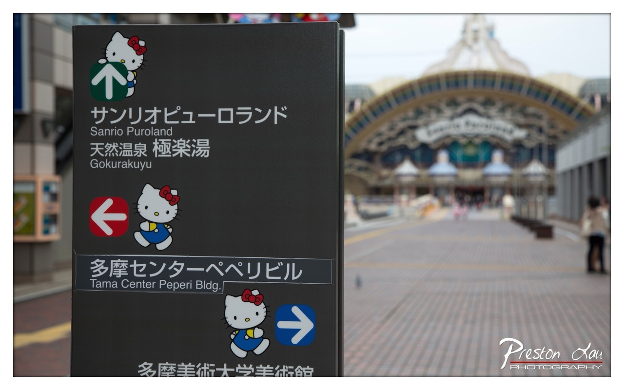

1. Overall Rating (0–10) — 6.8
This photograph captures a playful yet functional moment at Sanrio Puroland, where whimsy meets wayfinding in a distinctly Japanese aesthetic. The Hello Kitty-themed signpost draws the eye with its vibrant, character-driven design, while the blurred background hints at the park’s grand entrance, creating a sense of anticipation. Though the image leans heavily on documentation, the deliberate use of shallow depth of field gives it a cinematic quality, balancing utility with charm.
2. Composition (0–10) — 7.0
The signpost is placed off-center, creating a dynamic diagonal that leads the eye toward the blurred entrance. The use of shallow depth of field effectively isolates the subject, though the composition feels slightly unbalanced due to the heavy visual weight of the sign on the left.
3. Lighting (0–10) — 6.5
Soft, diffused daylight evenly illuminates the scene, preventing harsh shadows and allowing the colors of the sign to pop. The overcast sky contributes to a muted, even tone that enhances the clarity of the signage without creating glare or contrast issues.
4. Color & Tone (0–10) — 7.5
The palette is clean and deliberate, with the black background of the sign providing a strong contrast to the bright red, white, and blue of the directional icons. The muted tones of the background reinforce the focus on the sign, while the subtle color accents maintain a cheerful, playful mood.
5. Creativity (0–10) — 7.0
The integration of Hello Kitty into functional signage is inherently creative, turning a utilitarian object into a narrative device. The photographer’s choice to frame the image with the sign in sharp focus while rendering the destination dreamlike adds a layer of storytelling, suggesting the journey to the park is as important as the destination.
6. Technical Quality (0–10) — 8.0
The image is sharp on the sign, with precise focus and clear lettering. The depth of field is well-controlled, and the overall exposure is balanced. The watermark is unobtrusive and professionally placed.
7. Emotional Impact (0–10) — 7.0
The photograph evokes a sense of nostalgia and childlike wonder, especially for fans of Sanrio characters. The soft focus on the distant entrance suggests a dreamy, almost magical anticipation, inviting the viewer to imagine the joy and excitement that awaits beyond the sign.
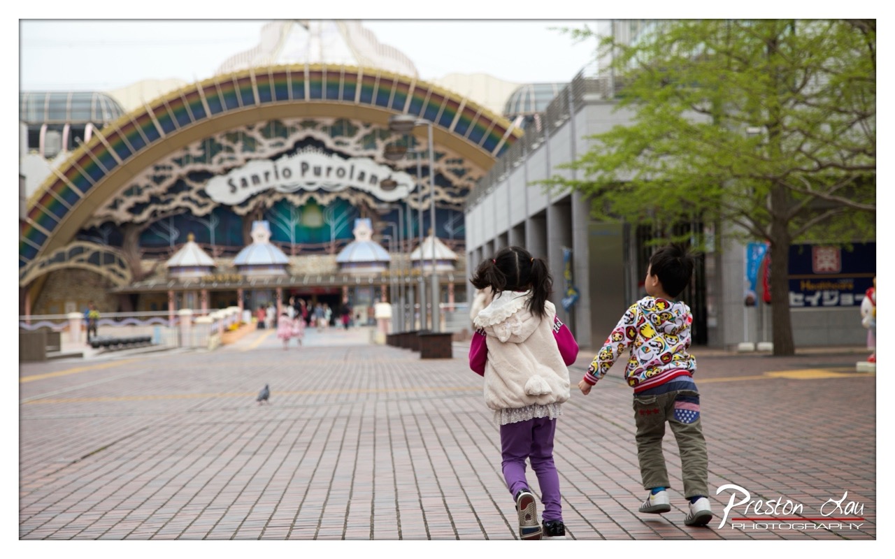

1. Overall Rating (0–10) — 7.0
This photograph captures a tender moment of childhood wonder as two children walk hand-in-hand toward the whimsical entrance of Sanrio Puroland, evoking a sense of joyful anticipation. The shallow depth of field beautifully isolates the subjects from the bustling background, drawing the viewer into their small world. While the composition is strong and emotionally resonant, the slightly flat lighting and muted tones prevent the image from fully conveying the vibrant energy of the destination.
2. Composition (0–10) — 7.5
The children are placed off-center, leading the eye toward the ornate archway, creating a natural narrative flow. The leading lines of the walkway and the arch enhance depth and guide the viewer’s gaze effectively.
3. Lighting (0–10) — 6.0
Soft, diffused daylight provides even illumination, but lacks the warmth and contrast needed to highlight textures and emotion. The overcast sky contributes to a neutral mood, which slightly dampens the scene’s potential vibrancy.
4. Color & Tone (0–10) — 6.5
The palette is balanced, with the colorful clothing of the children contrasting against the muted tones of the pavement and architecture. However, the overall saturation is subdued, diminishing the playful atmosphere of the setting.
5. Creativity (0–10) — 7.0
The choice to shoot from behind the children adds intimacy and narrative depth, transforming a simple tourist snapshot into a story of shared discovery. The focus on movement and perspective elevates the image beyond mere documentation.
6. Technical Quality (0–10) — 8.0
Sharp focus on the children, accurate exposure, and clean detail in the background signage demonstrate strong technical execution. The shallow depth of field is well-controlled, emphasizing the subjects without distracting blur.
7. Emotional Impact (0–10) — 7.5
The image conveys a quiet sense of joy and connection, capturing a fleeting moment of childhood innocence. The viewer is invited to imagine the excitement of the children as they approach the magical world ahead.
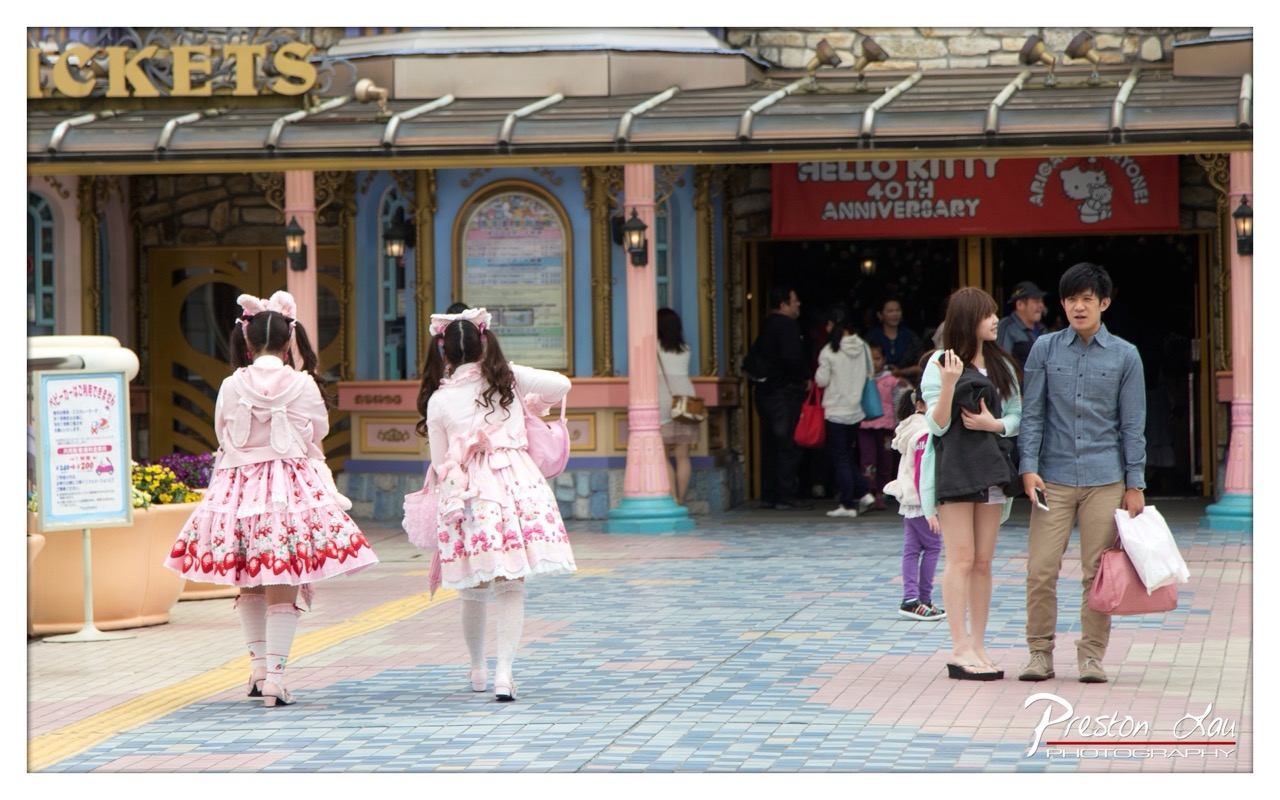

1. Overall Rating (0–10) — 7.0
This photograph captures a vibrant moment at a Hello Kitty-themed attraction, where playful fashion and cultural expression collide with everyday tourism. The two women in elaborate pink Lolita-style dresses stand out against the more casually dressed crowd, creating a striking contrast that speaks to the fusion of subculture and mainstream entertainment. While the scene is rich with narrative potential, the composition's slight imbalance and overexposed signage detract from its visual cohesion.
2. Composition (0–10) — 6.0
The subjects are well-framed, with the two women in pink drawing the eye, but the composition feels slightly crowded and unbalanced due to the off-center placement of the main subjects and the busy background. The depth of field effectively isolates the foreground, but the inclusion of too many background elements creates visual clutter.
3. Lighting (0–10) — 6.5
Natural daylight provides even illumination across the scene, though the bright overhead light causes slight overexposure on the signage and the upper façade. The lighting supports the cheerful mood but lacks directional warmth, giving the image a flat, documentary quality.
4. Color & Tone (0–10) — 7.5
The palette is rich with pastel pinks, blues, and soft yellows, creating a whimsical and inviting atmosphere. The contrast between the vibrant costumes and the more neutral tones of the tourists enhances the visual storytelling. The color grading is consistent, though the saturation is slightly muted in the midtones.
5. Creativity (0–10) — 7.0
The image captures a unique cultural moment—Lolita fashion within a commercial theme park—offering a fresh perspective on subcultural expression in public space. The juxtaposition of dressed-up individuals with casual visitors is both visually and conceptually compelling.
6. Technical Quality (0–10) — 7.5
Sharp focus on the foreground subjects ensures clarity, and the resolution is high with clean details. The exposure is well-managed overall, though the overexposed sign slightly compromises technical precision.
7. Emotional Impact (0–10) — 6.5
The image evokes a sense of joy and curiosity, inviting viewers to consider the personal expression behind the costumes. While the emotional resonance is strong in the subject matter, the slightly distant framing and lack of interaction between subjects limit the intimacy of the moment.
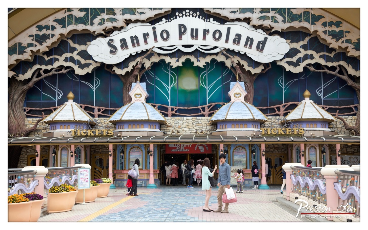

1. Overall Rating (0–10) — 7.0
This photograph captures the whimsical charm of Sanrio Puroland’s entrance with a strong sense of place and narrative. The vibrant architecture and playful design elements evoke the joy and nostalgia associated with the theme park, while the presence of visitors grounds the scene in reality. The composition is rich with detail, though slight overexposure in the sky and a busy foreground slightly detract from the overall visual harmony.
2. Composition (0–10) — 7.5
The symmetrical framing of the entrance draws the eye naturally toward the center, with the arching sign acting as a strong focal point. The placement of people in the lower third adds depth and scale, while the railings and flower pots guide the viewer’s gaze toward the main structure. The wide angle captures the full grandeur of the façade without distorting the architecture.
3. Lighting (0–10) — 6.5
The scene is evenly lit by bright daylight, which enhances the colors and clarity of the building’s details. However, the sky is slightly overexposed, losing some texture and contrast. The light is flat in the upper portion of the image, which diminishes the sense of depth in the background.
4. Color & Tone (0–10) — 8.0
The palette is rich and playful, with soft pastels and bold accents that reflect the theme park’s cheerful identity. The contrast between the warm tones of the stone and the cool blues and greens of the backdrop creates a visually engaging balance. The saturation is well managed, preserving the fantasy-like atmosphere without appearing unnatural.
5. Creativity (0–10) — 7.0
The image successfully captures the spirit of Sanrio Puroland through its stylized architecture and character-themed signage. The choice to include visitors adds a layer of authenticity and storytelling, transforming the photo from a mere architectural shot into a moment of shared experience. While the concept is familiar, the execution is fresh and engaging.
6. Technical Quality (0–10) — 8.0
The image is sharp and well-focused, with clear detail throughout the frame, from the intricate carvings on the sign to the textures of the stone and metal elements. The exposure is mostly balanced, though the slight overexposure in the sky suggests room for adjustment in dynamic range.
7. Emotional Impact (0–10) — 7.5
The photograph evokes a sense of wonder and delight, capturing the magic and excitement that visitors likely feel upon entering the park. The combination of whimsical design, vibrant colors, and the presence of families and couples creates a warm, nostalgic atmosphere that resonates with both children and adults.
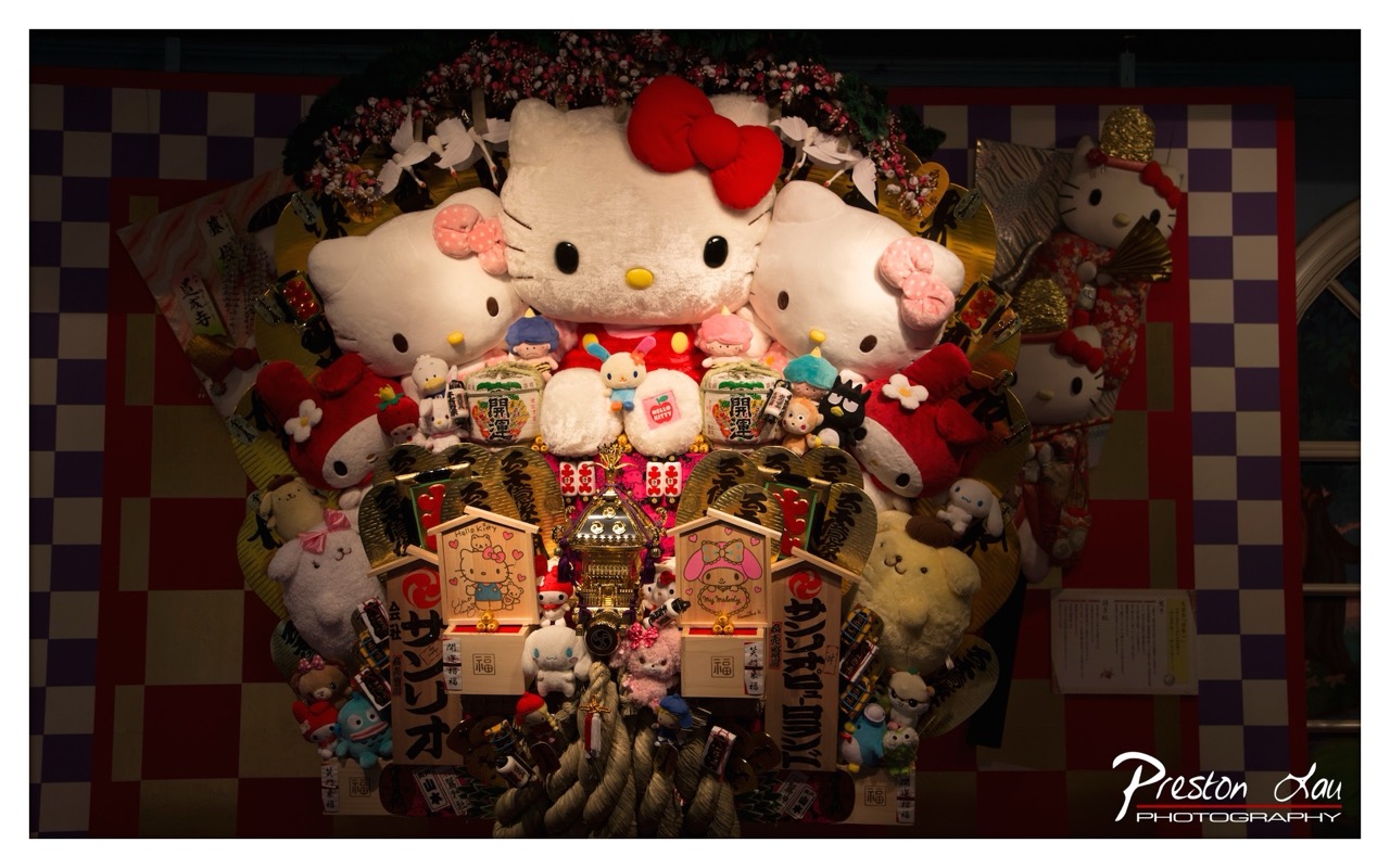

1. Overall Rating (0–10) — 7.5
This photograph captures the whimsical abundance of a Hello Kitty-themed display, bursting with playful charm and cultural texture. The dense arrangement of plush figures, sacred ema plaques, and decorative elements creates a visually rich tapestry that celebrates both pop culture and tradition. While the composition feels slightly overwhelming due to the sheer number of objects, the image succeeds in conveying a sense of joyous festivity and devotion, making it a compelling document of modern Japanese pop-art rituals.
2. Composition (0–10) — 6.5
The central focus on the large Hello Kitty figure is strong, but the surrounding clutter creates visual noise, making it difficult to discern individual details. The checkered background provides structure, but the framing feels slightly too wide, allowing distractions on the periphery.
3. Lighting (0–10) — 6.0
The lighting is dramatic, with a spotlight effect that emphasizes the central figures while casting deep shadows around the edges. While this creates a theatrical mood, the harsh contrast slightly flattens the depth and obscures some details in the darker areas.
4. Color & Tone (0–10) — 7.0
The palette is vibrant and playful, with rich reds, pinks, and whites dominating the scene. The contrast between the bright foreground and the dark background enhances the visual pop, though the slightly muted tones in the shadows reduce overall color harmony.
5. Creativity (0–10) — 8.0
The fusion of traditional Japanese shrine elements with modern pop culture icons is highly original and conceptually intriguing. The photographer captures a unique cultural phenomenon with both reverence and whimsy, turning a commercial display into a narrative of devotion and celebration.
6. Technical Quality (0–10) — 7.5
The image is sharp and well-focused, with fine detail visible in the textures of the plush toys and wooden plaques. The exposure is controlled, though some loss of detail in the shadows suggests a narrow dynamic range.
7. Emotional Impact (0–10) — 7.0
The photograph evokes a sense of nostalgia and delight, inviting viewers into a world where childhood icons and spiritual practice coexist. The emotional resonance lies in the unexpected harmony between the sacred and the silly, creating a moment of gentle wonder.
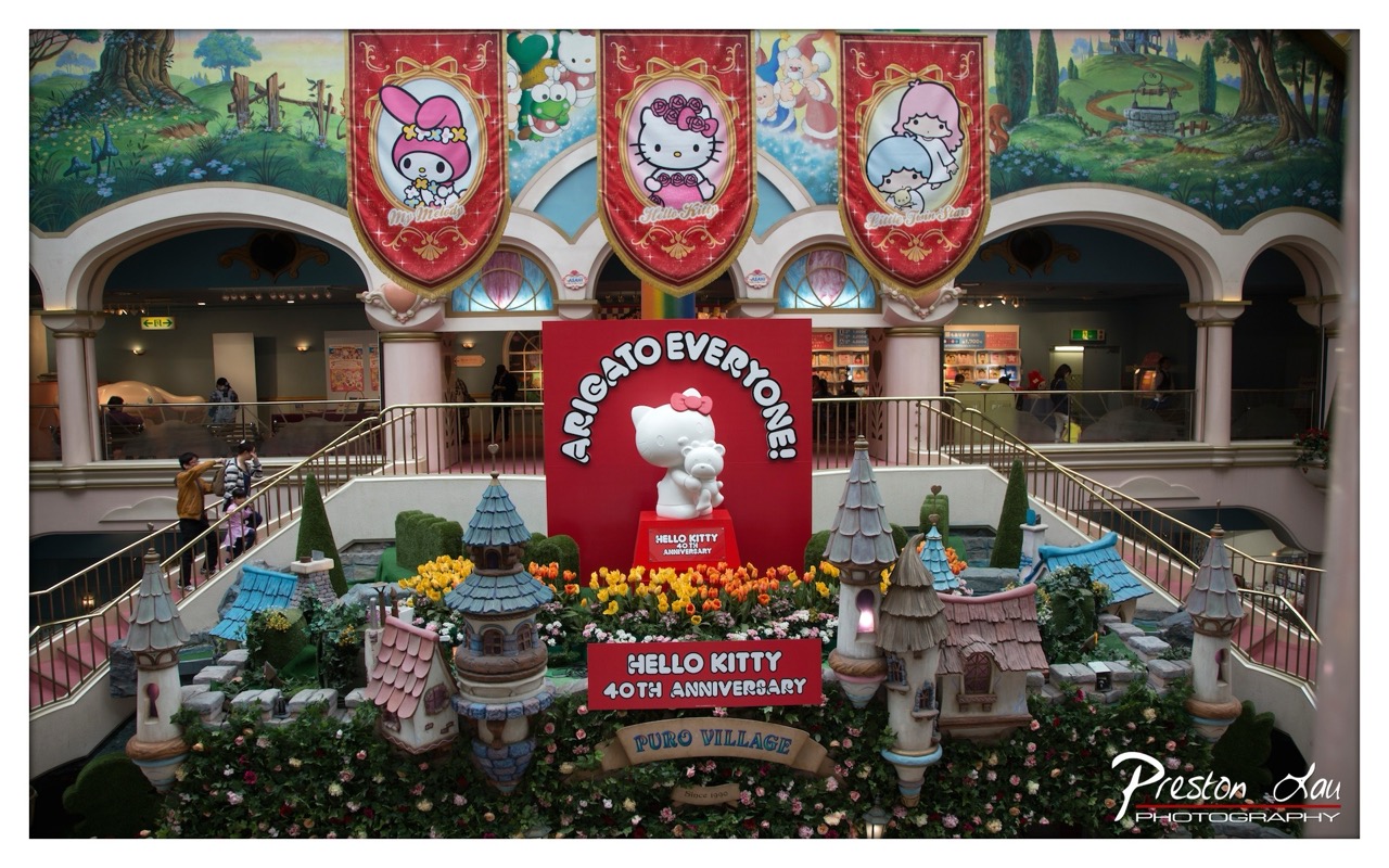

1. Overall Rating (0–10) — 7.5
This photograph captures the whimsical energy of a Hello Kitty 40th Anniversary celebration with vibrant charm and playful detail. The layered composition, rich with character banners, floral arrangements, and miniature castles, conveys a sense of joyful spectacle. While the scene is visually dense and celebratory, the slight overexposure and cluttered foreground risk overwhelming the viewer’s focus, preventing the image from achieving a more refined aesthetic balance.
2. Composition (0–10) — 7.0
The central placement of the Hello Kitty statue and the “ARIGATO EVERYONE!” sign anchors the image, creating a strong focal point. The symmetrical arches and railings frame the display effectively, while the surrounding miniature village adds depth and texture. However, the foreground elements—particularly the floral and architectural details—create a busy lower third that slightly disrupts the visual flow.
3. Lighting (0–10) — 6.5
The lighting is bright and even, likely from overhead indoor fixtures, which ensures clarity across the entire scene. However, the flat illumination lacks directional depth, resulting in a somewhat washed-out appearance, especially in the midtones of the banners and the background murals.
4. Color & Tone (0–10) — 8.0
The color palette is rich and cohesive, dominated by warm reds, soft pinks, and lush greens that evoke a cheerful, storybook atmosphere. The vibrant yellows and oranges of the flowers provide a striking contrast against the pastel architecture, enhancing the celebratory mood.
5. Creativity (0–10) — 8.0
The image successfully transforms a commercial exhibition into a narrative-rich display, blending character branding with fairy-tale aesthetics. The thoughtful integration of signage, scale models, and thematic elements reflects strong creative intent, turning a promotional space into a visually engaging experience.
6. Technical Quality (0–10) — 7.5
The photograph is sharp and well-focused, with clear details in the central display and signage. The depth of field is sufficient to capture both the foreground and background elements, though slight digital noise is visible in the darker areas of the arches.
7. Emotional Impact (0–10) — 7.0
The image radiates a sense of joy and nostalgia, particularly for fans of the Hello Kitty franchise. The celebratory tone and childlike wonder evoke warmth and delight, though the commercial nature of the scene may limit its emotional resonance for viewers unconnected to the brand.
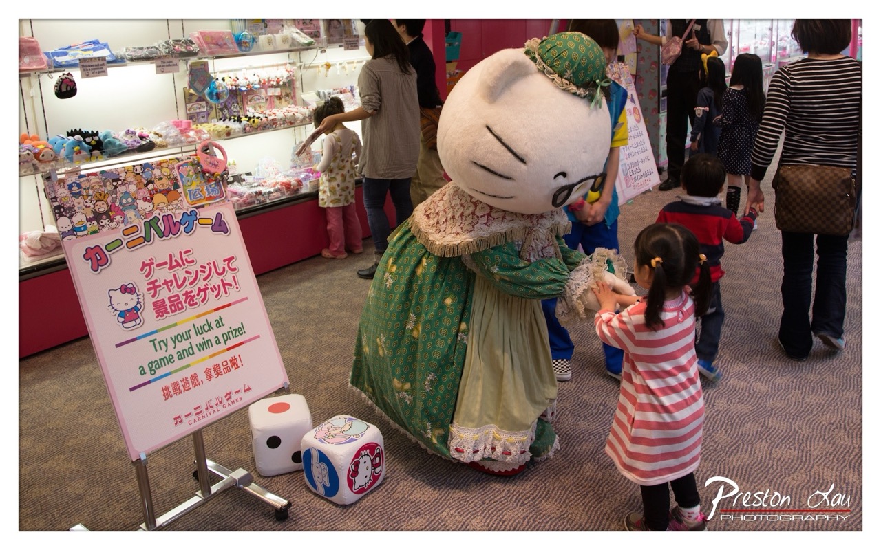

1. Overall Rating (0–10) — 7.0
This photograph captures the playful energy of a Hello Kitty-themed carnival game, blending whimsy and childhood wonder in a vibrant retail setting. The central figure of the costumed character draws the eye with its exaggerated charm, while the surrounding children and signage add narrative depth. The scene feels authentic and lively, though the cluttered background slightly dilutes the focus, preventing it from achieving a more refined visual harmony.
2. Composition (0–10) — 6.5
The framing centers on the Hello Kitty figure and the child interacting with it, creating a natural focal point. However, the inclusion of multiple people and objects—especially the sign and dice in the foreground—creates a sense of visual noise, and the diagonal flow of the crowd pulls attention away from the main subject.
3. Lighting (0–10) — 6.0
The scene is lit by bright, even fluorescent lighting typical of retail environments, which clearly illuminates the subjects but lacks atmospheric warmth. The flat lighting diminishes depth and shadows, resulting in a slightly sterile feel despite the colorful setting.
4. Color & Tone (0–10) — 7.5
The palette is rich and playful, dominated by pinks, greens, and soft pastels that enhance the whimsical tone. The color contrast between the character’s green dress and the pink striped dress of the child adds visual interest, though the overall tone remains slightly washed out due to the lighting.
5. Creativity (0–10) — 7.0
The image successfully captures a candid moment of interaction in a themed environment, blending narrative and character in a way that feels both genuine and staged. The choice to include the game sign and dice adds context and storytelling, elevating it beyond a simple snapshot.
6. Technical Quality (0–10) — 7.5
The image is sharp and well-focused, with clear details in the costume, sign, and children’s faces. The depth of field is adequate, keeping the main subject in focus while slightly softening the background, though some areas appear slightly overexposed due to the bright lighting.
7. Emotional Impact (0–10) — 7.5
The photograph evokes a sense of joy and nostalgia, capturing the delight of a child engaging with a beloved character. The warmth of the interaction and the playful setting resonate emotionally, creating a moment that feels both personal and universally relatable.
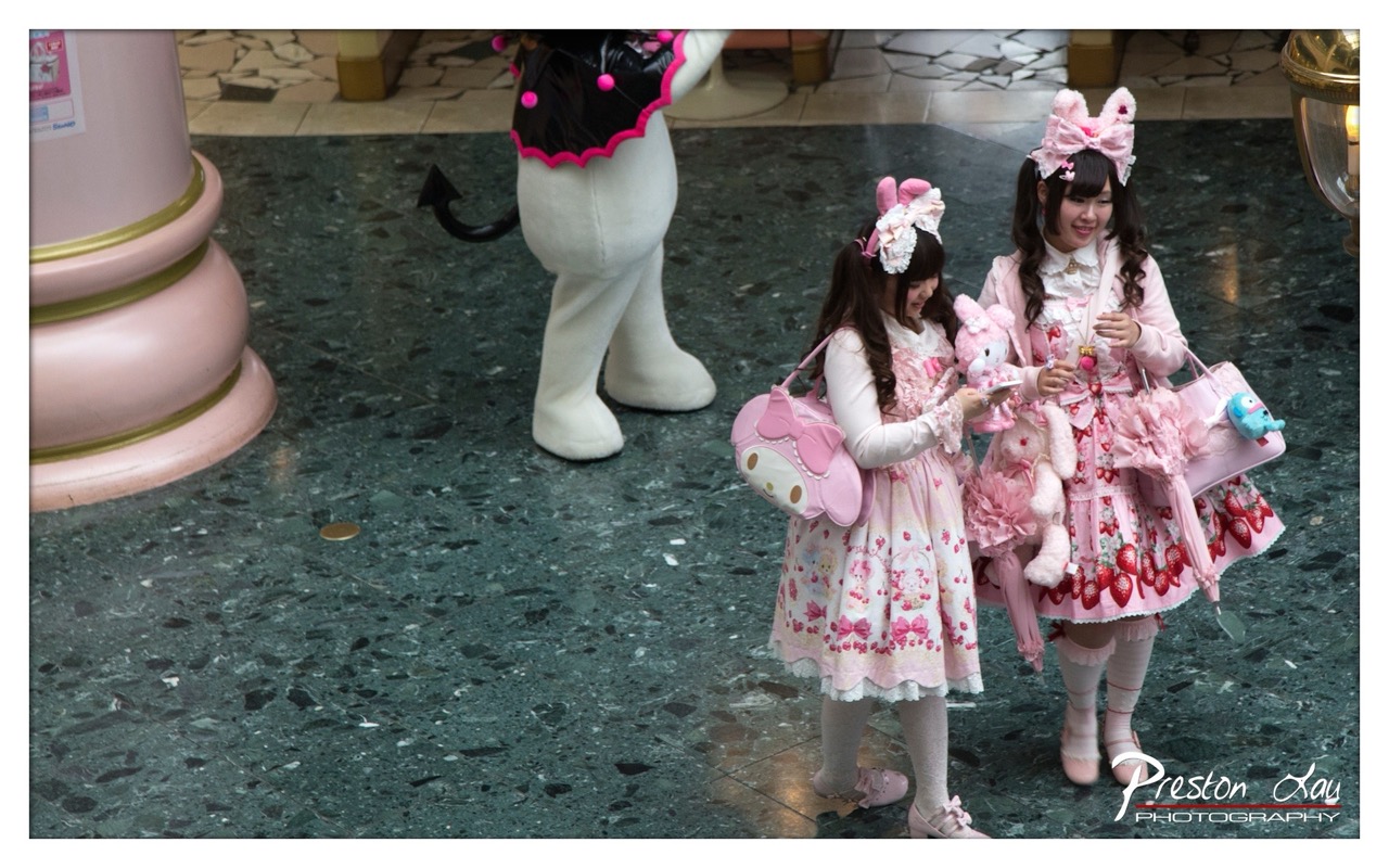

1. Overall Rating (0–10) — 7.0
This photograph captures the whimsical energy of a Lolita fashion scene with vivid clarity and playful charm. The subjects’ elaborate pink ensembles and accessories stand out against the muted, polished floor, creating a striking contrast that draws the eye. While the image succeeds in conveying the joy and meticulous detail of the subculture, the composition’s slight imbalance and flat lighting prevent it from achieving a truly cinematic feel.
2. Composition (0–10) — 6.0
The subjects are well-placed in the lower right, but the large pink column on the left creates visual weight that disrupts balance. The inclusion of the mascot in the background adds context but distracts from the central figures.
3. Lighting (0–10) — 5.5
Even, ambient lighting illuminates the scene clearly but lacks depth and dimension, resulting in a slightly flat appearance that undercuts the visual richness of the costumes.
4. Color & Tone (0–10) — 7.5
The dominant pink palette is vibrant and thematically cohesive, with the green marble floor providing a strong contrast that enhances the subjects’ visual presence. The color harmony is effective, though slightly muted in saturation.
5. Creativity (0–10) — 7.0
The image captures a unique cultural moment with authenticity and flair, blending fashion, character, and setting into a narrative that feels both personal and public. The choice to include the mascot adds a layer of storytelling.
6. Technical Quality (0–10) — 8.0
Sharp focus and clean detail allow the textures of the dresses, bows, and accessories to be clearly visible. The image is well-exposed and free of technical flaws.
7. Emotional Impact (0–10) — 6.5
The subjects’ gentle smiles and shared moment convey warmth and connection, inviting the viewer into their playful world. However, the emotional resonance is slightly tempered by the lack of dynamic lighting and a more intimate framing.
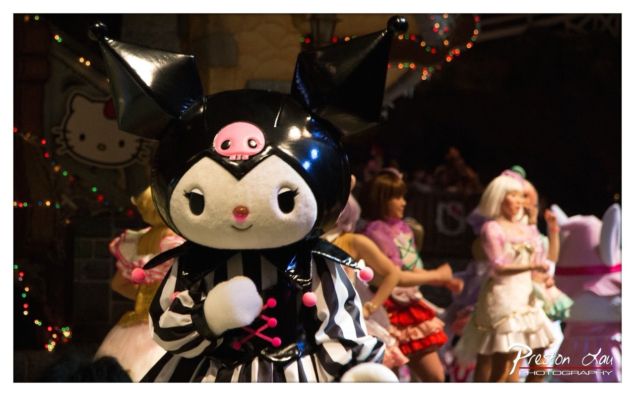

1. Overall Rating (0–10) — 7.0
This photograph captures the whimsical energy of a themed performance, with the Kuromi mascot as the vibrant focal point amid a flurry of motion and color. The glossy costume and expressive pose convey playful confidence, while the blurred background dancers and bokeh lights add a sense of live spectacle. Though the image is visually rich, the depth of field is slightly too shallow, softening the edges of the main subject and diluting the scene’s overall clarity.
2. Composition (0–10) — 6.5
The Kuromi figure is well-centered and dominates the frame, drawing immediate attention. However, the shallow depth of field and tight framing slightly disrupt the balance, with the background figures partially obscuring the subject’s lower body and reducing compositional harmony.
3. Lighting (0–10) — 7.0
The lighting is dynamic and theatrical, with strong highlights on the glossy black helmet and soft ambient glow from the background lights. The contrast between the illuminated subject and the darker surroundings enhances the sense of performance, though some areas remain underexposed.
4. Color & Tone (0–10) — 7.5
The palette is rich and vibrant, with bold black and white stripes accented by bright pink details and warm holiday lights. The contrast between the cool tones of the costume and the warm bokeh creates a lively, celebratory mood.
5. Creativity (0–10) — 7.0
The image successfully captures the essence of a live, character-driven event, blending pop culture with performance art. The choice to focus on Kuromi amidst the motion conveys a narrative of playful spectacle, though the execution leans more on spectacle than originality.
6. Technical Quality (0–10) — 7.0
The image is sharp on the subject’s face and helmet, with clean focus and minimal noise. However, the shallow depth of field causes the background to blur excessively, and some parts of the subject’s costume appear slightly overexposed.
7. Emotional Impact (0–10) — 7.5
The photograph radiates joy and excitement, evoking a sense of childlike wonder and festive celebration. The viewer is drawn into the energy of the moment, with the Kuromi figure exuding charm and confidence that feels both inviting and theatrical.
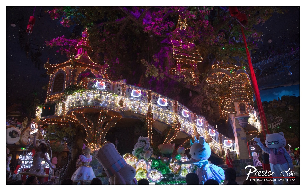

1. Overall Rating (0–10) — 7.5
This photograph captures the whimsical magic of a nighttime themed parade, where light and character blend into a dreamlike spectacle. The vibrant illumination of the float and the expressive figures create a sense of joy and fantasy, though the slightly cluttered composition and dim ambient lighting temper its overall visual clarity. The image succeeds in conveying the excitement of a live entertainment experience, even if it lacks the refined polish of a staged portrait.
2. Composition (0–10) — 6.0
The frame is filled with multiple elements—characters, lights, and structures—leading to a busy composition. While the central float draws the eye, the foreground figures and scattered lights create visual distractions, reducing the sense of depth and focus.
3. Lighting (0–10) — 8.0
The use of warm string lights and glowing accents on the float creates a magical, enchanting atmosphere. The contrast between the bright decorations and the dark night sky enhances the scene’s luminosity and theatricality, though some areas remain underexposed.
4. Color & Tone (0–10) — 7.5
A rich palette of purples, golds, and whites dominates, creating a festive and cohesive tone. The warm yellows and cool purples interplay beautifully, enhancing the whimsical mood, though the color balance leans slightly toward oversaturation in highlights.
5. Creativity (0–10) — 8.0
The photographer captures a lively, imaginative moment that feels authentic to the theme park experience. The integration of characters and lights into a narrative of celebration demonstrates strong conceptual awareness and a keen eye for spectacle.
6. Technical Quality (0–10) — 7.0
The image is sharp and detailed in the illuminated areas, with good focus on the central float. However, the low-light conditions introduce some noise and softness in the darker regions, particularly in the background.
7. Emotional Impact (0–10) — 8.5
The photograph evokes a strong sense of wonder and delight, capturing the childlike joy and excitement of a themed nighttime parade. The glowing characters and festive atmosphere resonate emotionally, inviting viewers to feel the magic of the moment.
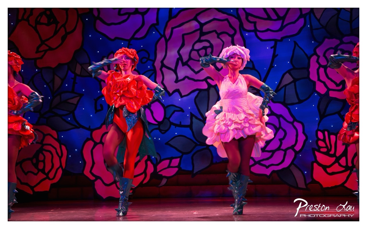

1. Overall Rating (0–10) — 7.5
This photograph captures the vibrant energy of a theatrical performance, where costume, lighting, and choreography converge into a visually striking spectacle. The bold, stylized backdrop of oversized roses and the dancers’ flamboyant outfits create a dreamlike, almost surreal atmosphere. While the image is rich in color and movement, its dynamic intensity is slightly tempered by the overexposure in the highlights and the cluttered framing, which distract from the performers’ individual presence.
2. Composition (0–10) — 6.5
The central figures are well-placed, but the inclusion of partial dancers on both sides creates a sense of visual imbalance. A tighter crop would focus attention on the two main performers and improve the overall symmetry.
3. Lighting (0–10) — 8.0
The stage lighting effectively enhances the theatrical mood, with strong contrasts between the illuminated performers and the deep blue backdrop. The strategic use of spotlights highlights the dancers’ costumes and expressions, adding drama and depth.
4. Color & Tone (0–10) — 9.0
The palette is rich and saturated, with bold contrasts between the reds, pinks, and purples that evoke a sense of whimsy and theatricality. The cool background complements the warm tones of the costumes, creating a visually cohesive and emotionally charged scene.
5. Creativity (0–10) — 8.5
The image demonstrates strong artistic vision, combining stylized costumes, a fantastical set, and expressive poses to convey a sense of narrative and performance. The use of color and composition suggests a deliberate homage to musical theater aesthetics.
6. Technical Quality (0–10) — 7.0
The photograph is sharp and clear, with good focus on the dancers. However, the bright stage lights cause some loss of detail in the highlights, particularly on the costumes and boots.
7. Emotional Impact (0–10) — 8.0
The image evokes a sense of joy, energy, and theatrical magic, capturing the excitement of live performance. The dancers’ expressions and gestures invite the viewer into the world of the show, creating an engaging and memorable moment.
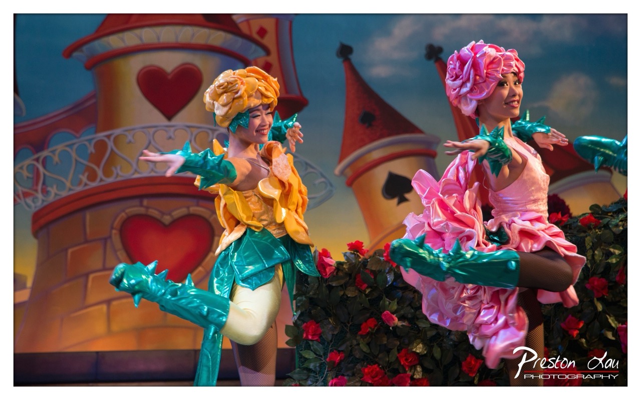

1. Overall Rating (0–10) — 7.5
This vibrant theatrical photograph captures the whimsical energy of a live performance, evoking the fantastical world of a storybook ballet. The costumes are bold and imaginative, and the performers’ expressions radiate joy and engagement. While the image is rich in color and movement, the slightly cluttered background and soft focus on the foreground figures slightly diminish its visual cohesion.
2. Composition (0–10) — 7.0
The performers are placed off-center, creating dynamic movement across the frame. The background elements, though elaborate, add depth without overpowering the subjects, though a tighter crop could have sharpened the focus on the dancers.
3. Lighting (0–10) — 8.0
The stage lighting enhances the theatrical mood, casting soft highlights on the performers and costumes. The warm glow contrasts with the cooler sky tones in the backdrop, creating a balanced and dramatic effect.
4. Color & Tone (0–10) — 9.0
The palette is rich and playful, with vivid pinks, yellows, and greens that pop against the dreamy blue and gold background. The tonal contrast between the bright costumes and the darker foliage adds depth and visual excitement.
5. Creativity (0–10) — 8.5
The image celebrates theatrical storytelling with imaginative costuming and expressive posing. The photographer captures a moment of pure performance magic, transforming a stage scene into a visually arresting narrative.
6. Technical Quality (0–10) — 7.5
The focus is sharp on the performers, and the image is clear with minimal noise. However, the background details are slightly soft, possibly due to a shallow depth of field or motion blur during the shot.
7. Emotional Impact (0–10) — 8.0
The performers’ joyful expressions and graceful poses convey a sense of wonder and enchantment, inviting the viewer into the story’s whimsical world. The image feels alive with energy and childlike delight.
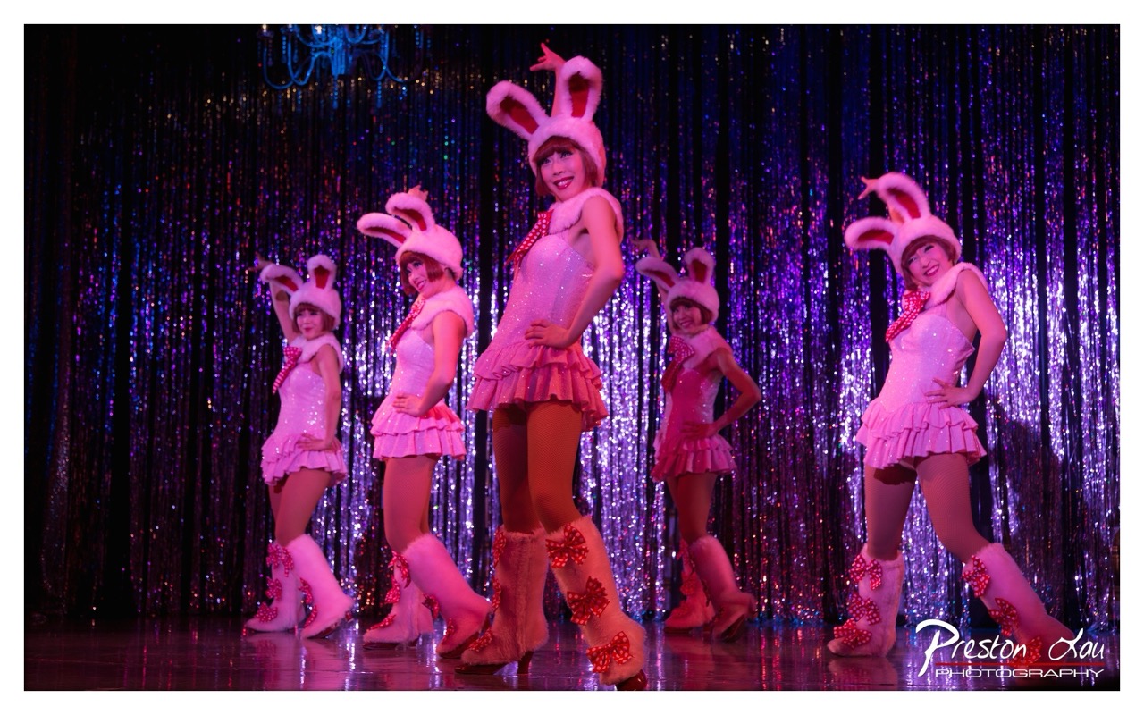

1. Overall Rating (0–10) — 7.0
This photograph captures the exuberant energy of a stage performance, where the performers’ playful costumes and synchronized poses radiate a sense of theatrical joy. The vibrant pink and purple palette, combined with the shimmering backdrop, creates a dynamic and celebratory atmosphere. While the image successfully conveys the spectacle of the moment, its visual intensity borders on overstimulation, slightly diminishing the clarity of individual expression.
2. Composition (0–10) — 6.5
The performers are arranged in a staggered diagonal line, creating a sense of depth and movement across the frame. The central figure draws the eye effectively, but the tight framing and busy background reduce the visual breathing room, making the composition feel slightly crowded.
3. Lighting (0–10) — 7.0
The stage lighting enhances the scene with dramatic color washes—pink and purple hues that match the performers’ costumes. The light sources create soft highlights on the sequins and boots, adding texture and sparkle, though some areas show slight overexposure in the brightest spots.
4. Color & Tone (0–10) — 7.5
The dominant pink and purple tones create a cohesive, high-energy palette that evokes a sense of fun and festivity. The contrast between the bright costumes and the dark, shimmering curtain enhances the visual drama, while the warm lighting adds a touch of theatrical warmth.
5. Creativity (0–10) — 7.0
The image captures a lively, stylized performance with a clear sense of character and intent. The choice of a sparkly backdrop and bold costumes reflects a deliberate aesthetic, leaning into the playful nature of the act. While the concept is familiar, the execution feels confident and engaging.
6. Technical Quality (0–10) — 7.5
The focus is sharp on the central performer, with good clarity throughout the frame. The image is well-exposed, with minimal noise, and the reflections on the stage floor add depth. The photographer’s attention to detail in capturing the textures of the sequins and fabric is commendable.
7. Emotional Impact (0–10) — 7.5
The image conveys a strong sense of joy and performance energy, drawing the viewer into the lively atmosphere of the show. The performers’ expressions and poses radiate confidence and playfulness, making the scene feel both entertaining and emotionally engaging.
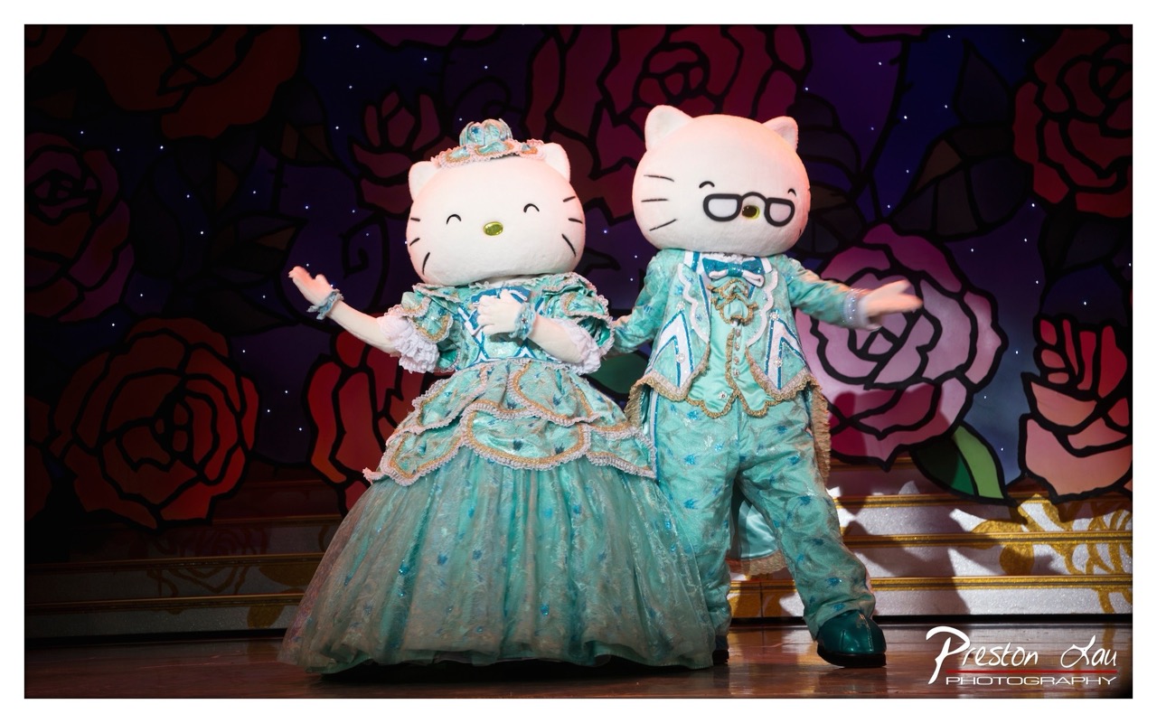

1. Overall Rating (0–10) — 7.0
This photograph captures a whimsical and theatrical moment, with two costumed characters embodying the charm of a live performance. The vibrant costumes and expressive poses convey a sense of playful elegance, while the stylized floral backdrop enhances the theatrical atmosphere. While the image is visually engaging and rich in detail, the slightly cluttered background and flat lighting prevent it from achieving a more refined, cinematic quality.
2. Composition (0–10) — 6.5
The subjects are well-centered and occupy a balanced space, with the two figures creating a natural visual symmetry. However, the stage backdrop, while colorful, introduces visual noise that competes for attention, slightly disrupting the focus on the characters.
3. Lighting (0–10) — 6.0
The lighting is functional and evenly distributed, highlighting the performers without creating dramatic shadows. While the stage lights are bright enough to illuminate the scene clearly, they lack depth and direction, resulting in a somewhat flat and commercial feel.
4. Color & Tone (0–10) — 7.5
The color palette is rich and cohesive, with the turquoise costumes standing out against the deep purples and reds of the floral background. The contrast between the bright costumes and the darker backdrop enhances visual pop, and the overall tone supports the playful, fantastical mood.
5. Creativity (0–10) — 8.0
The concept of dressing iconic characters in elaborate theatrical costumes is imaginative and delightfully unexpected. The blend of pop culture and performance art creates a unique narrative, making the image memorable and whimsical.
6. Technical Quality (0–10) — 7.0
The image is sharp and well-focused, with clean details visible in the textures of the costumes and the backdrop. The photographer has captured a clear, well-exposed moment, though minor distractions in the background slightly reduce the overall polish.
7. Emotional Impact (0–10) — 7.0
The image evokes a sense of joy and lightheartedness, inviting viewers into a world of playful storytelling. The characters’ open, welcoming gestures contribute to a feeling of warmth and connection, making the scene feel inviting and fun.
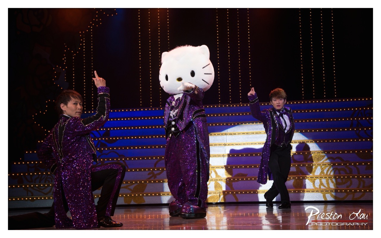

1. Overall Rating (0–10) — 7.0
This photograph captures a vibrant and theatrical moment, where the playful energy of a stage performance is amplified by bold costumes and dynamic staging. The central figure of Hello Kitty in a sparkling purple suit creates an unexpected yet compelling focal point, juxtaposed with the performers’ expressive gestures. While the image succeeds in conveying the spectacle of the show, the composition’s symmetry and flat lighting slightly diminish its visual depth, keeping it from achieving true artistic impact.
2. Composition (0–10) — 7.0
The stage is framed with balanced symmetry, placing the Hello Kitty figure at the center, flanked by two performers in matching costumes. This creates a sense of visual harmony, though the left performer’s lower position slightly disrupts the equilibrium. The use of leading lines from the illuminated steps guides the eye toward the central figure, reinforcing focus.
3. Lighting (0–10) — 6.5
The stage is illuminated by a combination of warm spotlights and cool blue backlighting, creating a theatrical contrast. While the lighting effectively highlights the performers and their glittering costumes, the flatness of the main light source on the stage floor reduces depth and dimensionality.
4. Color & Tone (0–10) — 8.0
The dominant purple hue of the costumes is rich and vibrant, creating a cohesive and celebratory palette. The contrast between the bright purple and the dark backdrop enhances visual drama, while the warm golden accents in the background add depth and warmth to the overall tone.
5. Creativity (0–10) — 8.0
The juxtaposition of a pop culture icon like Hello Kitty within a theatrical performance setting is both unexpected and imaginative. The costumes and staging suggest a narrative that blends whimsy with spectacle, demonstrating a bold creative vision that transforms a familiar character into a dramatic centerpiece.
6. Technical Quality (0–10) — 7.5
The image is sharp and clear, with precise focus on the performers and the central figure. The flash appears to have been well-controlled, minimizing motion blur despite the dynamic poses. The watermark is unobtrusive and professionally placed.
7. Emotional Impact (0–10) — 7.5
The image evokes a sense of joy, energy, and theatrical wonder, capturing the excitement of a live performance. The performers’ animated gestures and the playful presence of Hello Kitty create a mood of celebration, inviting the viewer into a world of entertainment and imagination.
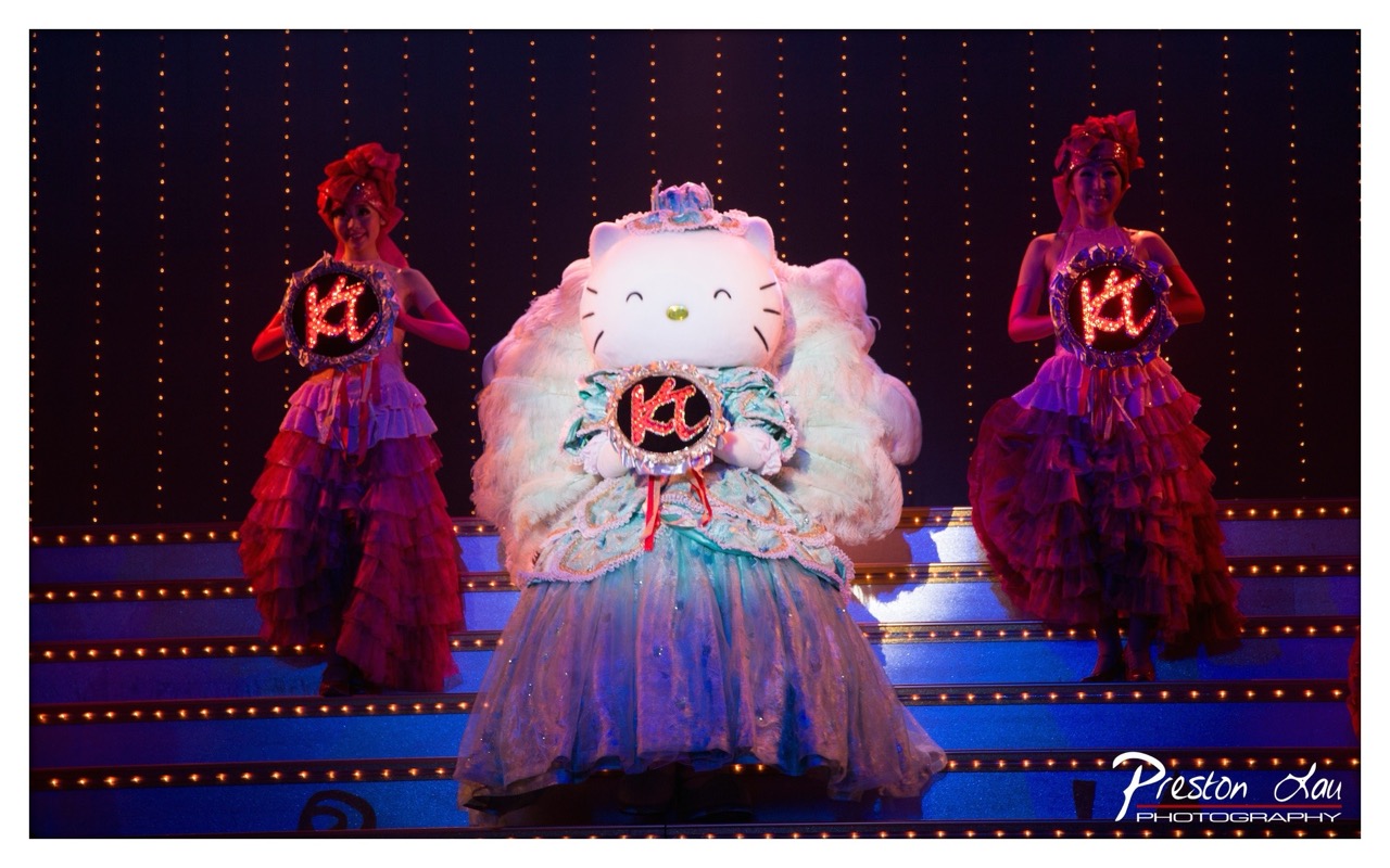

1. Overall Rating (0–10) — 7.0
This photograph captures the whimsical spectacle of a Hello Kitty-themed stage performance, where vibrant costumes and theatrical lighting converge to create a sense of playful grandeur. The central figure of Hello Kitty, flanked by performers in layered, ruffled gowns, commands attention with its oversized, plush presence, while the glowing "K" emblems add a touch of magical branding. The image succeeds in conveying the energy and spectacle of a live show, though the slightly cluttered composition and artificial lighting temper its visual elegance.
2. Composition (0–10) — 6.5
The central placement of Hello Kitty creates a strong focal point, balanced by the symmetry of the two performers on either side. However, the overlapping layers of ruffles and the stair-step stage design introduce visual busyness that slightly disrupts the clarity of the frame.
3. Lighting (0–10) — 7.5
The stage lighting effectively highlights the performers with warm, vertical strings of lights that create a sense of depth and theatricality. The contrast between the bright stage and the dark background enhances the vibrancy of the costumes, though the flat illumination on the figures lacks subtle modeling.
4. Color & Tone (0–10) — 8.0
The rich palette of purples, pinks, and blues creates a dynamic and cohesive visual harmony, enhanced by the glowing red "K" emblems that serve as focal accents. The cool blue stage lighting adds a dreamlike quality, complementing the whimsical theme.
5. Creativity (0–10) — 8.0
The fusion of pop culture iconography with theatrical performance is inventive and engaging, capturing a unique moment of entertainment art. The use of illuminated props and elaborate costumes reflects a strong conceptual vision.
6. Technical Quality (0–10) — 7.5
The image is sharp and well-exposed, with clear details in the costumes and lighting effects. The focus is precise on the central figure, though some minor noise is visible in the darker areas of the background.
7. Emotional Impact (0–10) — 7.0
The photograph evokes a sense of joy and wonder, tapping into nostalgia and the delight of live spectacle. The performers’ expressions and the playful theme invite the viewer into a world of imagination and celebration.
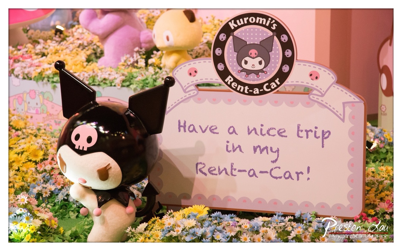

1. Overall Rating (0–10) — 7.0
This photograph captures a whimsical, playful scene centered around the beloved character Kuromi, set within a vibrant floral display that feels both commercial and charming. The bright colors and cheerful theme create an inviting atmosphere, though the composition’s density slightly undermines visual clarity. The image succeeds in conveying a sense of joy and nostalgia, particularly for fans of Sanrio characters, but its commercial staging keeps it from achieving deeper artistic resonance.
2. Composition (0–10) — 6.5
The Kuromi figure is well-placed in the foreground, drawing immediate attention, but the background elements—particularly the out-of-focus plush characters and floral arrangement—create a busy, cluttered effect. The sign’s diagonal placement adds visual interest but disrupts the overall balance.
3. Lighting (0–10) — 7.0
Even, soft lighting enhances the pastel tones and highlights the glossy finish of the Kuromi figure. The ambient light, likely from indoor fixtures, is well-distributed, avoiding harsh shadows and preserving the scene’s lighthearted mood.
4. Color & Tone (0–10) — 8.0
The palette is rich with soft pinks, purples, and bright floral hues, creating a harmonious and cohesive visual that reinforces the playful theme. The contrast between the black Kuromi figure and the pastel background adds visual pop without disrupting the overall tone.
5. Creativity (0–10) — 7.5
The concept of merging a character-themed display with a “Rent-a-Car” sign is clever and tongue-in-cheek, adding narrative charm. The use of flowers and character design creates a unique, immersive environment that feels both curated and whimsical.
6. Technical Quality (0–10) — 8.0
Sharp focus on the Kuromi figure and the sign ensures clarity, while the depth of field effectively separates the foreground from the background. The image is clean, well-exposed, and free of noticeable technical flaws.
7. Emotional Impact (0–10) — 7.0
The image evokes a sense of delight and nostalgia, particularly for fans of Sanrio and Japanese pop culture. The cheerful tone and whimsical setup create a warm, inviting feeling, though the commercial nature of the scene limits its emotional depth.
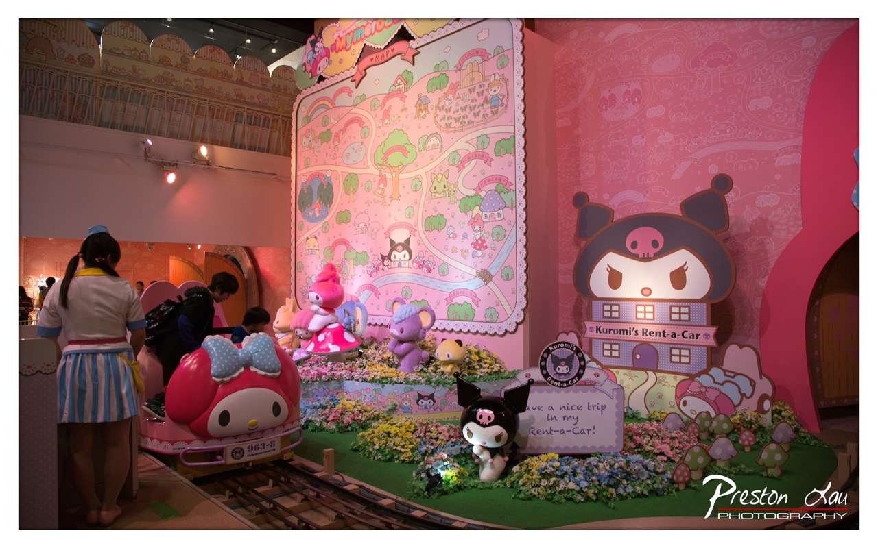

1. Overall Rating (0–10) — 7.0
This photograph captures the whimsical charm of a Sanrio-themed exhibit with vibrant energy and playful detail. The rich pink palette and character-filled environment evoke a sense of childlike wonder, making the scene feel immersive and joyful. While the composition is lively and engaging, the depth of field and framing slightly undermine the clarity of the central narrative, preventing the image from feeling fully polished.
2. Composition (0–10) — 6.5
The frame includes a variety of elements—characters, rides, and signage—creating a layered but slightly cluttered scene. The train in the foreground draws attention, but the background details compete for focus, reducing visual hierarchy.
3. Lighting (0–10) — 6.0
The artificial lighting is bright and even, successfully illuminating the colorful scene. However, the harsh overhead lights create slight glare on reflective surfaces and flatten the depth, diminishing the three-dimensional feel of the exhibit.
4. Color & Tone (0–10) — 8.0
The image bursts with saturated pinks, purples, and pastels, creating a visually cohesive and energetic atmosphere. The consistent tonal palette enhances the playful mood, though some areas appear overexposed due to the intensity of the lighting.
5. Creativity (0–10) — 7.5
The photograph successfully captures the imaginative spirit of a themed space, blending real-world interaction with fantastical design. The choice to include both the ride and the character display tells a story of playful engagement, showcasing creativity in both subject and framing.
6. Technical Quality (0–10) — 7.0
The image is sharp and well-focused, with clear details in the foreground characters and signage. However, the depth of field is somewhat shallow, and the background elements are slightly soft, indicating a trade-off between focus and composition.
7. Emotional Impact (0–10) — 7.5
The scene radiates warmth and nostalgia, evoking a sense of joy and wonder that resonates with fans of the characters. The presence of visitors adds a human touch, making the image feel alive and inviting, though the visual density keeps the emotional connection from reaching its full potential.
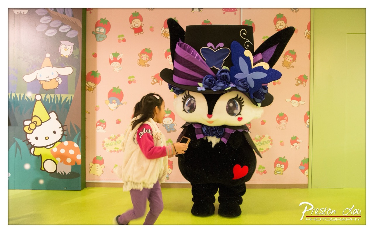

1. Overall Rating (0–10) — 7.0
This photograph captures a whimsical, playful moment between a child and a costumed character in a vibrant, themed environment. The colorful setting and the child’s natural interaction with the character create a sense of joy and wonder. While the image is lively and engaging, the composition feels slightly cluttered, and the lighting, though bright, lacks depth, slightly diminishing the overall visual impact.
2. Composition (0–10) — 6.5
The child is positioned off-center, creating a dynamic sense of movement, but the large mascot dominates the frame, slightly overwhelming the subject. The background elements, while thematically appropriate, add visual noise and distract from the central interaction.
3. Lighting (0–10) — 6.0
The lighting is bright and even, typical of an indoor amusement setting, but it flattens the scene and reduces texture. The lack of directional light or shadowing gives the image a somewhat sterile, commercial feel.
4. Color & Tone (0–10) — 8.0
The palette is rich and playful, with bold pinks, purples, and greens that enhance the cheerful, child-friendly atmosphere. The saturation is well-balanced, and the colors pop against the clean, bright backdrop.
5. Creativity (0–10) — 7.0
The image successfully captures a candid moment in a highly stylized environment, blending realism with fantasy. The choice to include both the child and the character in a single frame tells a simple but effective story of childhood wonder and interaction.
6. Technical Quality (0–10) — 7.5
The image is sharp and well-focused, with clear details in both the child’s face and the mascot’s costume. The depth of field is adequate, keeping the main subjects in focus while softly blurring the background.
7. Emotional Impact (0–10) — 7.5
The photograph evokes warmth and nostalgia, capturing a genuine moment of delight. The child’s curiosity and the mascot’s friendly presence create a connection that resonates with viewers, especially those familiar with the characters.
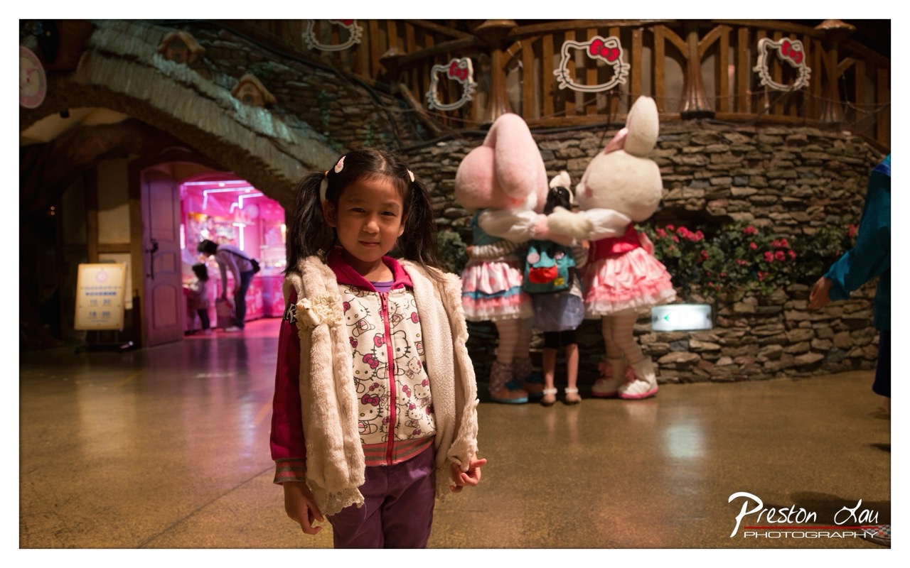

1. Overall Rating (0–10) — 7.0
This photograph captures a tender moment of childhood wonder within a whimsical, themed environment, where the girl’s quiet expression contrasts with the playful chaos of the background. The composition draws the viewer into a narrative of innocence and imagination, heightened by the soft glow of artificial lighting and the recognizable charm of Hello Kitty branding. While the scene feels slightly staged, the naturalness of the subject’s pose and gaze lends a genuine emotional warmth that elevates the image beyond mere souvenir photography.
2. Composition (0–10) — 7.0
The girl is centered and slightly off-kilter, creating a balanced yet dynamic focal point. The depth of field effectively isolates her from the background, though the busy environment—filled with costumed characters and colorful signage—adds narrative richness without overwhelming the subject.
3. Lighting (0–10) — 6.5
The warm, artificial lighting enhances the cozy, indoor atmosphere, though it casts a slightly uneven glow that flattens some details. The light on the girl’s face is soft and flattering, while the background remains dimly lit, contributing to a sense of depth.
4. Color & Tone (0–10) — 7.0
The palette is dominated by soft pinks and purples, reinforcing the playful, feminine theme of the setting. The contrast between the warm foreground and the cooler, neon-lit background adds visual interest, though the overall tone leans slightly toward oversaturation.
5. Creativity (0–10) — 6.5
The image succeeds in capturing a specific cultural moment—childhood in a themed amusement space—but remains rooted in documentation rather than bold artistic interpretation. The use of recognizable characters and branding gives it narrative clarity, though originality in perspective is limited.
6. Technical Quality (0–10) — 7.5
The image is sharp and well-focused on the subject, with clean detail in the girl’s face and clothing. The photographer has managed noise and exposure well, despite the low-light conditions, resulting in a technically sound capture.
7. Emotional Impact (0–10) — 7.5
The girl’s gentle, slightly curious expression evokes a sense of quiet introspection, inviting viewers to reflect on the fleeting nature of childhood wonder. The contrast between her calm presence and the playful surroundings creates a poignant emotional resonance.
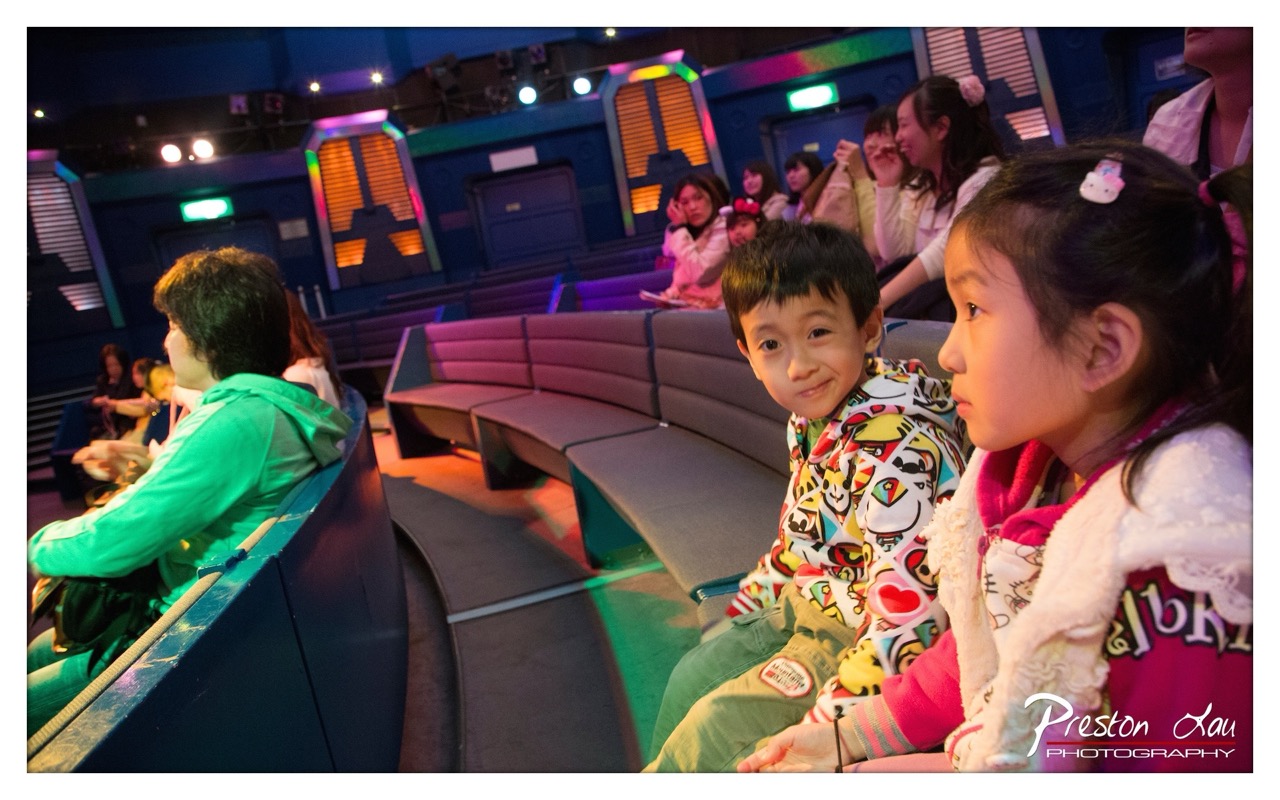

1. Overall Rating (0–10) — 7.0
This photograph captures a moment of shared wonder in a futuristic, immersive environment, where the glow of colored lights and the children’s expressions convey a sense of playful anticipation. The boy’s direct gaze adds a personal touch, grounding the scene in genuine emotion, while the surrounding details hint at a themed attraction or interactive exhibit. While the lighting and composition create a lively atmosphere, the image occasionally feels more like a candid snapshot than a polished portrait, slightly limiting its visual impact.
2. Composition (0–10) — 6.5
The diagonal flow of the curved seating guides the eye through the frame, with the boy and girl positioned as natural focal points. However, the crowded background and slight asymmetry create a sense of visual clutter, pulling attention away from the central subjects.
3. Lighting (0–10) — 7.0
The mix of colored stage lights—purple, green, and orange—creates a dynamic and atmospheric mood, enhancing the futuristic setting. While the lighting is dramatic, some areas remain underexposed, and the harshness of the spotlights creates uneven highlights.
4. Color & Tone (0–10) — 7.0
The vibrant, contrasting colors of the children’s clothing stand out against the cooler blue and purple backdrop, adding energy to the scene. The overall palette feels lively and playful, though the color balance leans slightly toward cool tones, which slightly dampens the warmth of the human elements.
5. Creativity (0–10) — 7.5
The photograph successfully captures a narrative moment—children immersed in an entertainment experience—blending candid emotion with a stylized environment. The choice to include the surrounding audience adds context and depth, suggesting a shared cultural experience.
6. Technical Quality (0–10) — 7.5
The image is sharp and well-focused on the foreground subjects, with clear details in the children’s expressions and clothing. The camera’s ability to handle low-light conditions is evident, though some digital noise appears in the darker areas.
7. Emotional Impact (0–10) — 8.0
The boy’s warm, curious smile and the girl’s rapt attention evoke a strong sense of childhood wonder and connection. The image resonates emotionally by capturing a fleeting moment of joy and engagement, inviting viewers to recall their own experiences of awe and discovery.
Loading map...