The Hong Kong Railway Museum is a 1985 railway museum in Tai Po, managed by the Leisure and Cultural Service Department. It's located at the site of the Old Tai Po Market Railway Station, built in 1913, and features exhibits on KCR trains, Japanese Shinkansen, Eurostar, as well as historic locomotives like "Sir Alexander" (1955) and a narrow gauge steam locomotive from the Philippines (restored in 1995).
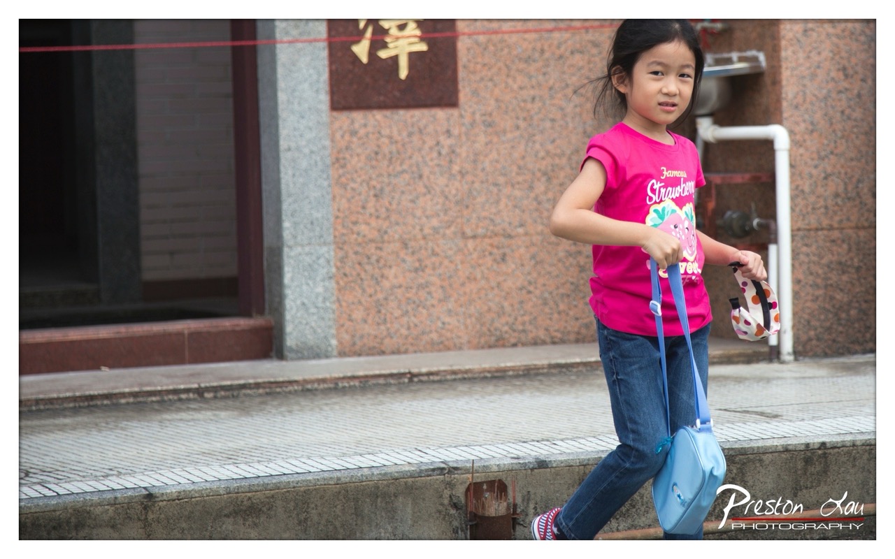

1. Overall Rating (0–10) — 7.0
This photograph captures a candid moment of a young girl mid-stride, exuding a sense of quiet determination and everyday life. The natural pose and direct gaze lend an intimate, documentary quality to the image, while the vibrant pink of her shirt contrasts sharply with the muted tones of the urban backdrop. While the composition is strong, the background clutter and slightly awkward framing prevent it from achieving a more refined aesthetic.
2. Composition (0–10) — 6.5
The subject is placed off-center, creating a sense of movement, but the composition feels slightly unbalanced due to the large empty space on the left and the visual distraction of the pipe and doorway. A tighter crop would better focus attention on the girl’s expression and gesture.
3. Lighting (0–10) — 7.0
Natural daylight provides even illumination, preserving detail in both highlights and shadows. The soft, diffused light enhances the subject’s features without creating harsh contrasts, supporting a calm and realistic mood.
4. Color & Tone (0–10) — 7.5
The warm, earthy tones of the wall and pavement create a grounded backdrop, while the bright pink shirt acts as a powerful focal point. The color palette is harmonious, with the blue bag and polka-dotted accessory adding subtle complementary accents.
5. Creativity (0–10) — 7.0
The image succeeds in capturing a genuine, unposed moment, elevating a simple scene into a narrative about childhood and daily routine. The choice to frame the girl in motion, rather than in a posed portrait, adds a layer of authenticity and narrative depth.
6. Technical Quality (0–10) — 8.0
The image is sharp and well-focused on the subject, with clear details in the girl’s clothing and facial expression. The depth of field is appropriately controlled, keeping the background slightly soft to emphasize the subject.
7. Emotional Impact (0–10) — 7.5
The girl’s direct gaze and forward motion evoke a sense of purpose and quiet confidence, inviting viewers to wonder about her story. The image feels personal and relatable, creating a gentle emotional connection through its authenticity.
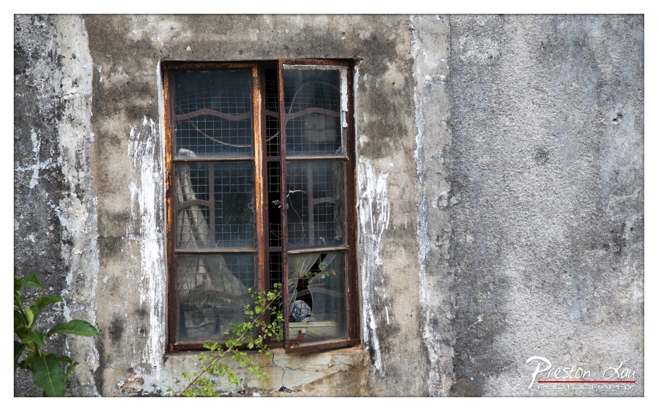

1. Overall Rating (0–10) — 7.0
This photograph captures a quiet moment of decay and resilience, where the weathered textures of the concrete wall and rusted window frame tell a story of time and neglect. The interplay of natural growth—vines creeping through the broken glass—and the remnants of human habitation within create a poignant contrast between abandonment and life. While the image is visually compelling in its detail and mood, the lack of a strong focal point or narrative hook keeps it from achieving deeper resonance.
2. Composition (0–10) — 6.5
The window is centered but slightly off-kilter, creating a subtle imbalance that adds to the sense of decay. The overgrown foliage in the lower-left corner provides a natural frame and visual anchor, though it slightly distracts from the main subject.
3. Lighting (0–10) — 6.0
Diffused natural light softly illuminates the scene, enhancing the textures of the wall and rust without creating harsh shadows. The light is even but lacks drama, resulting in a muted atmosphere that reflects the stillness of the moment.
4. Color & Tone (0–10) — 6.5
The palette is restrained—muted grays, browns, and the faint green of the vines—creating a somber, earthy tone. The tonal contrast is subtle, and while the colors are natural, they lack vibrancy, reinforcing the image’s quiet, melancholic mood.
5. Creativity (0–10) — 7.0
The photograph successfully captures a narrative of urban decay and nature reclaiming space, offering a contemplative and slightly poetic view. The choice to focus on the window as a symbolic threshold between interior and exterior, past and present, adds depth to the visual story.
6. Technical Quality (0–10) — 7.5
The image is sharp and detailed, particularly in the textures of the concrete and rust. The focus is consistent across the frame, and the exposure is well-balanced, preserving detail in both the shadows and highlights.
7. Emotional Impact (0–10) — 6.5
There is a quiet melancholy in the scene—of forgotten spaces and the slow passage of time—but the emotional pull is restrained. The viewer is invited to reflect, but the image doesn’t demand an emotional response, leaving it somewhat detached.
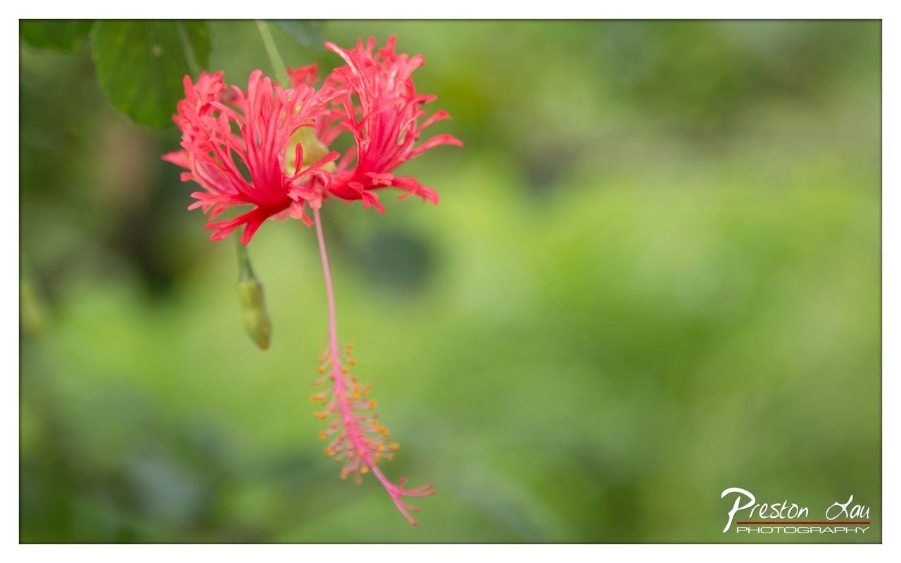

1. Overall Rating (0–10) — 8.0
This photograph captures the delicate elegance of a hibiscus flower in soft, natural light, where vibrant red petals contrast beautifully against a lush green backdrop. The shallow depth of field isolates the subject with a painterly quality, creating a sense of quiet intimacy and botanical grace. While the composition is strong, the image’s emotional pull could be deepened with more dynamic light or a bolder color contrast.
2. Composition (0–10) — 8.5
The flower is placed slightly off-center, following the rule of thirds, and the long stamen creates a graceful diagonal line that draws the eye through the frame. The blurred background enhances focus on the subject, while the inclusion of a developing bud adds narrative depth and visual balance.
3. Lighting (0–10) — 7.5
Soft, diffused light illuminates the flower evenly, highlighting its texture without harsh shadows. The gentle illumination enhances the natural vibrancy of the red petals and contributes to the serene, contemplative mood.
4. Color & Tone (0–10) — 8.0
The rich crimson of the hibiscus contrasts beautifully with the soft, verdant green background, creating a harmonious and visually striking palette. The tonal range is well-balanced, with subtle gradations in the bokeh enhancing depth and mood.
5. Creativity (0–10) — 8.0
The photographer captures a moment of natural beauty with a clear artistic intent—highlighting the intricate details of the flower while using selective focus to create a dreamlike atmosphere. The inclusion of the stamen and bud adds a narrative layer, suggesting life and growth.
6. Technical Quality (0–10) — 8.5
Sharp focus on the flower’s center ensures clarity and detail, while the smooth, creamy bokeh demonstrates excellent lens control and depth-of-field management. The image is clean, with no visible noise or artifacts.
7. Emotional Impact (0–10) — 7.5
The photograph evokes a sense of tranquility and appreciation for nature’s delicate intricacies. The viewer is invited to pause and reflect, drawn in by the quiet beauty of the bloom and the soft, dreamy environment.
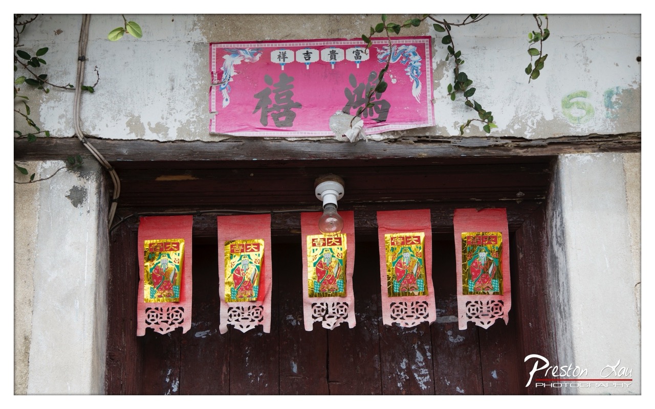

1. Overall Rating (0–10) — 7.0
This photograph captures a quiet moment of cultural resilience, where tradition clings to the weathered surface of an old doorway. The contrast between the vibrant, sacred paper offerings and the peeling paint and decaying wall creates a poignant narrative of endurance and faith. While the image is rich in symbolic detail, its visual impact is slightly dampened by a lack of dynamic lighting and a somewhat flat presentation, preventing it from fully conveying the emotional weight of the scene.
2. Composition (0–10) — 7.5
The central placement of the hanging banners creates a strong focal point, balanced by the symmetrical arrangement of the smaller paper talismans. The aged wall and creeping vines frame the scene naturally, adding texture and depth, though the slight asymmetry of the top banner and the wiring on the left introduce minor visual distractions.
3. Lighting (0–10) — 6.0
The diffuse, overcast lighting softens the scene, preserving detail in the textures of the wall and wood but lacking the dramatic contrast that would emphasize the vivid colors. The bare bulb hanging from the ceiling adds a touch of realism but does little to enhance the mood or directionality of the light.
4. Color & Tone (0–10) — 7.5
The bold reds and golds of the religious paper offerings stand out against the muted grays and browns of the aged structure, creating a visually striking contrast. The color palette feels authentic and culturally resonant, though the overall tone remains somewhat subdued due to the flat lighting.
5. Creativity (0–10) — 7.0
The image successfully blends documentary realism with cultural storytelling, capturing a moment of spiritual practice in a decaying urban environment. The juxtaposition of sacred symbols against neglect is both powerful and thought-provoking, suggesting a deeper narrative about preservation and identity.
6. Technical Quality (0–10) — 8.0
The photograph is sharp and detailed, with clear focus across the main elements. The exposure is well-balanced, and the slight vignette adds a subtle framing effect without detracting from the scene. The watermark is discreet and does not interfere with the composition.
7. Emotional Impact (0–10) — 6.5
The image evokes a sense of reverence and quiet dignity, but the emotional connection is tempered by the distance created by the camera’s neutral perspective. The viewer is invited to observe rather than feel, leaving the deeper emotional resonance to the imagination.
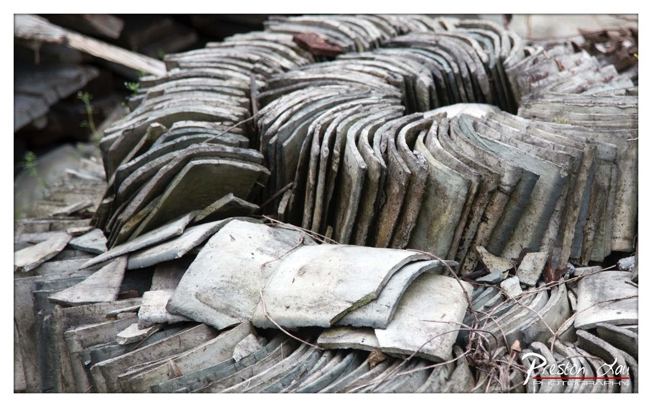

1. Overall Rating (0–10) — 7.0
This photograph captures the quiet poetry of decay, where weathered roof tiles form a rhythmic, almost sculptural pattern amid the ruins of a forgotten structure. The repetition of curved shapes creates a strong visual cadence, and the muted tones evoke a sense of time-worn stillness. While the image is compelling in its texture and composition, it slightly lacks a focal point to draw the viewer deeper into the narrative.
2. Composition (0–10) — 7.5
The layered arrangement of tiles creates a dynamic diagonal flow that guides the eye through the frame. The placement of the foreground tiles adds depth, though the left side feels slightly underdeveloped, offering more visual weight than narrative purpose.
3. Lighting (0–10) — 6.5
Soft, diffused daylight evenly illuminates the scene, enhancing the texture of the tiles without creating harsh shadows. The lack of dramatic contrast tempers the mood, lending a subdued, documentary feel to the image.
4. Color & Tone (0–10) — 6.0
The palette is dominated by desaturated grays and earthy tones, which reinforce the theme of decay. While cohesive, the colors lack vibrancy and could benefit from a subtle shift in warmth to evoke greater emotional resonance.
5. Creativity (0–10) — 7.0
The photographer transforms a mundane pile of debris into a visually engaging study of pattern and texture. The organic arrangement of the tiles suggests an accidental elegance, elevating the image beyond simple documentation.
6. Technical Quality (0–10) — 8.0
The image is sharp and detailed, with excellent focus across the frame. The clarity of the tile surfaces and the fine lines of the debris highlight the photographer’s technical precision.
7. Emotional Impact (0–10) — 6.5
The image conveys a contemplative melancholy, inviting reflection on impermanence and the quiet beauty found in abandonment. While emotionally understated, it resonates through its visual harmony and quiet dignity.
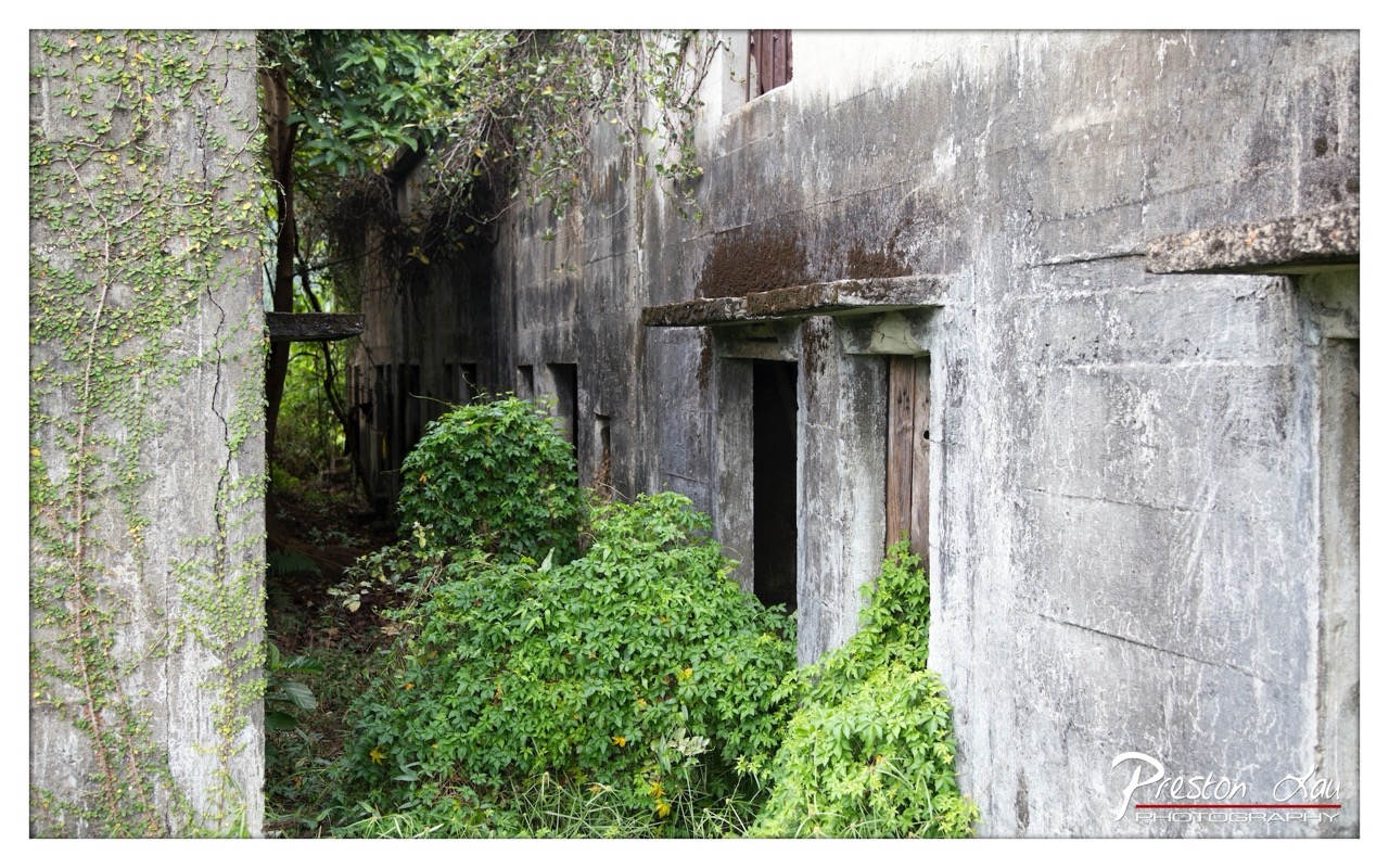

1. Overall Rating (0–10) — 7.0
This photograph captures the haunting beauty of decay, where nature reclaims a forgotten concrete structure with quiet persistence. The contrast between the rigid, weathered walls and the vibrant, unruly greenery creates a compelling narrative of time and resilience. While the image is rich in texture and mood, its potential is slightly diminished by a lack of dynamic lighting and a somewhat flat tonal range.
2. Composition (0–10) — 6.5
The framing uses the concrete pillar on the left as a natural leading line, guiding the eye into the scene toward the dark openings. However, the composition feels slightly unbalanced due to the heavy presence of the pillar, which dominates the left side and reduces visual flow. A more centered or symmetrical approach might have improved the sense of harmony.
3. Lighting (0–10) — 5.5
The lighting is diffused and even, likely from an overcast sky, which softens shadows and highlights the texture of the concrete. While this creates a moody, subdued atmosphere, it also flattens the image, reducing depth and the dramatic interplay between light and shadow that could have enhanced the sense of decay.
4. Color & Tone (0–10) — 6.0
The color palette is dominated by muted grays and greens, which effectively convey the scene’s aged and overgrown character. The greens, while lush, lack vibrancy, and the overall tone leans toward a washed-out look. A slight boost in saturation or contrast could have made the foliage pop more against the concrete.
5. Creativity (0–10) — 7.0
The photograph is conceptually strong, capturing a poignant moment of nature reclaiming human-made structures. The choice to frame the image through the narrow passage between the wall and the greenery adds a sense of discovery and mystery, enhancing the storytelling quality.
6. Technical Quality (0–10) — 7.5
The image is sharp and well-focused, with fine detail visible in both the concrete texture and the leaves. The depth of field is appropriate, keeping the foreground and midground clear while allowing the background to softly recede. The watermark is cleanly placed and does not distract.
7. Emotional Impact (0–10) — 6.5
The image evokes a contemplative, melancholic mood, inviting reflection on impermanence and the passage of time. The sense of abandonment and quiet reclamation is palpable, though the subdued lighting and muted tones keep the emotional resonance from fully resonating with the viewer.
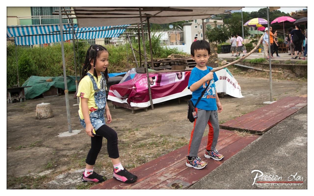

1. Overall Rating (0–10) — 6.8
This photograph captures a candid moment of childhood play, where two children engage in imaginative games amidst a rustic outdoor setting. The scene feels authentic and unposed, with the boy’s confident grip on his stick and the girl’s curious gaze suggesting a narrative unfolding in real time. While the background clutter and uneven lighting slightly detract from the image’s clarity, the natural interaction between the children gives it a warm, documentary-like charm.
2. Composition (0–10) — 6.0
The children are well-framed and occupy the visual center, but the cluttered background and diagonal wooden plank create a sense of visual distraction. A tighter crop would better emphasize the subjects and their interaction.
3. Lighting (0–10) — 6.5
Natural daylight provides even illumination, though it appears overcast, resulting in flat light with minimal shadows. This soft light suits the candid mood but reduces depth and dimensionality.
4. Color & Tone (0–10) — 6.5
The colors are generally balanced, with the bright blue of the boy’s shirt and the yellow of the girl’s top standing out against the muted earth tones. However, the overall palette is somewhat washed out, and the slight color cast from the overcast sky dampens vibrancy.
5. Creativity (0–10) — 7.0
The image succeeds in capturing a genuine moment of childhood exploration, with the stick-as-sword and outdoor setting evoking a sense of imaginative play. The photographer’s choice to capture the scene as-is, without staging, adds to its authenticity and storytelling potential.
6. Technical Quality (0–10) — 7.5
The image is sharp and well-focused, particularly on the children, with clean details in their clothing and expressions. The exposure is accurate, and there are no major technical flaws.
7. Emotional Impact (0–10) — 7.0
The photograph evokes a sense of nostalgia and warmth, highlighting the joy and innocence of childhood. The viewer is drawn into the quiet moment of play, creating a subtle emotional connection through the children’s natural expressions and engagement.
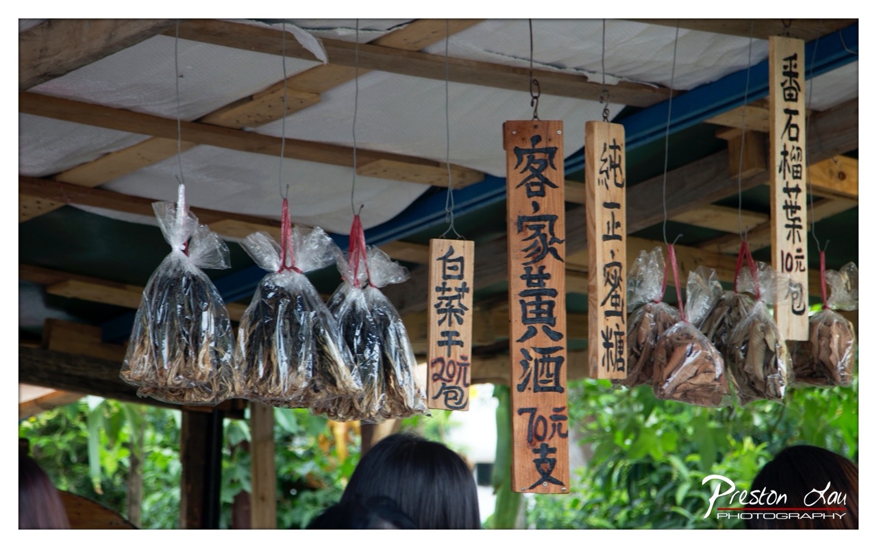

1. Overall Rating (0–10) — 6.0
This photograph captures the quiet authenticity of a local market stall, where tradition and commerce intersect in a simple, unpolished way. The hanging goods and hand-carved signs evoke a sense of place and cultural specificity, though the image feels slightly cluttered and lacks a strong focal point. While it succeeds in documenting a slice of everyday life, its visual appeal is restrained by a lack of compositional cohesion and atmospheric depth.
2. Composition (0–10) — 5.5
The image is crowded with hanging items and signs, creating visual busyness. The arrangement feels natural but uneven, with the signs and bags competing for attention and a slight imbalance in framing.
3. Lighting (0–10) — 6.0
Soft, diffused daylight illuminates the scene evenly, preserving detail without harsh shadows. However, the lighting is flat and does little to enhance texture or mood, resulting in a somewhat lifeless atmosphere.
4. Color & Tone (0–10) — 5.5
The palette is muted, dominated by earthy browns and greens, with the black ink on wood signs providing contrast. While the colors feel natural, they lack vibrancy, contributing to a subdued and somewhat dated tone.
5. Creativity (0–10) — 6.5
The photograph captures a culturally rich moment with a strong sense of authenticity. The inclusion of handwritten signs and traditional packaging adds narrative depth, though the execution leans more toward documentation than artistic interpretation.
6. Technical Quality (0–10) — 7.0
The image is sharp and well-focused, with clean details visible in the wood grain and plastic bags. The depth of field is appropriate, keeping the foreground in focus while softly blurring the background.
7. Emotional Impact (0–10) — 5.0
The image conveys a sense of quiet daily life, but the emotional resonance is limited by the lack of a compelling subject or moment. The viewer is observing, not feeling.
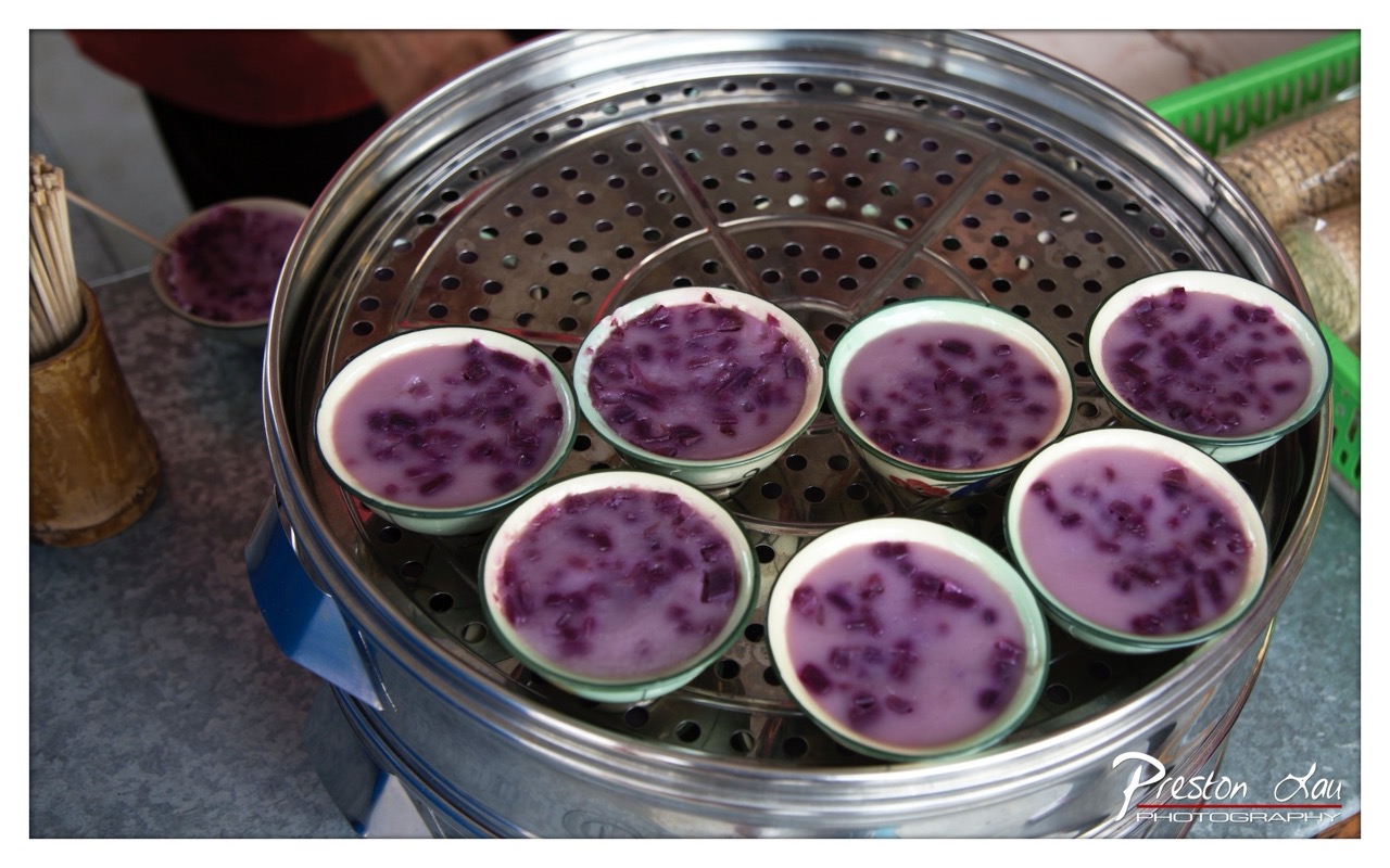

1. Overall Rating (0–10) — 7.0
This photograph captures a warm, intimate moment of traditional food preparation, where the vibrant purple hue of the steamed dessert draws the eye and evokes a sense of cultural richness. The composition centers on the steam basket, grounding the image in authenticity and daily ritual, though the slightly cluttered background tempers its visual elegance. The image succeeds in conveying both the tactile quality of the dish and the quiet labor behind it.
2. Composition (0–10) — 6.5
The circular arrangement of the bowls creates a natural focal point, but the off-center framing and partial view of the steamer lid introduce slight imbalance. A tighter crop could enhance focus on the main subject.
3. Lighting (0–10) — 6.0
Soft, diffused lighting highlights the texture of the dessert without harsh shadows, though the overall scene feels slightly underexposed, muting the vibrancy of the purple tones.
4. Color & Tone (0–10) — 7.0
The rich purple of the dessert contrasts beautifully with the metallic silver of the steamer and the muted background tones. The palette feels natural and appetizing, though a touch more saturation would elevate its visual impact.
5. Creativity (0–10) — 7.5
The choice to photograph a simple, everyday food item with such attention to detail elevates it into a cultural portrait. The image tells a story of tradition, care, and sensory experience beyond mere documentation.
6. Technical Quality (0–10) — 7.5
Sharp focus on the bowls and their contents, with a clean depth of field that separates the subject from the background. The image is technically sound and well-executed.
7. Emotional Impact (0–10) — 7.0
There’s a quiet warmth and nostalgia in the scene—evoking memories of family, markets, and home-cooked meals. The viewer is invited to imagine the taste, smell, and texture, making the image emotionally resonant.
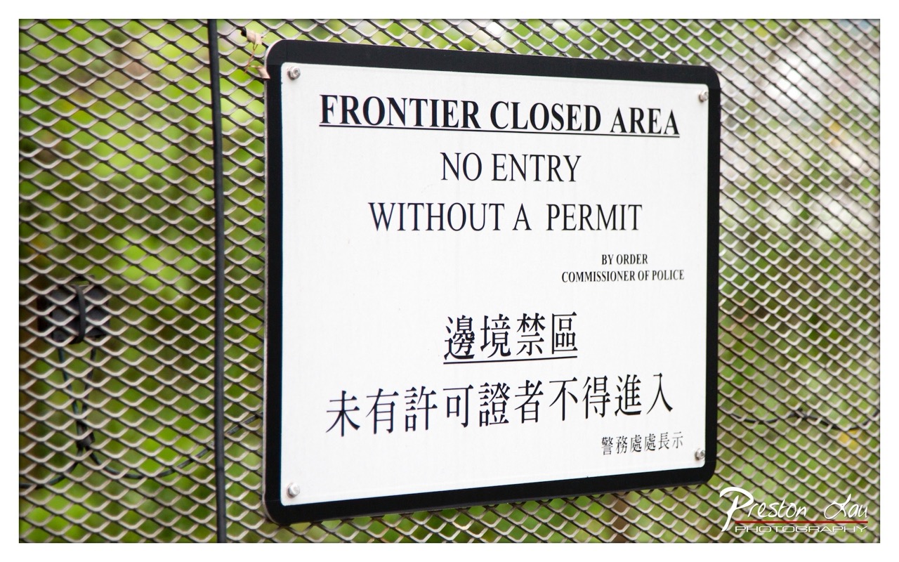

1. Overall Rating (0–10) — 6.0
This photograph effectively captures the stark authority of a restricted border zone, with the sign’s bilingual message conveying a sense of official gravity. The mesh fence adds texture and reinforces the theme of containment, while the green foliage behind it offers subtle contrast. However, the image feels more like a documentary record than a compelling visual statement, lacking emotional depth or compositional finesse.
2. Composition (0–10) — 6.5
The sign is centered and clearly legible, but the framing feels slightly off-kilter, with the left edge appearing compressed. The diagonal mesh pattern creates visual rhythm, though the vertical pole on the left disrupts balance and draws attention away from the subject.
3. Lighting (0–10) — 7.0
Even, diffused lighting ensures the text is readable without harsh shadows or glare. The natural light enhances the green tones in the background, adding a subtle layer of organic contrast to the rigid signage.
4. Color & Tone (0–10) — 6.5
The palette is restrained—white, black, and muted green—with a cool, clinical tone that matches the sign’s authoritative message. While the colors are accurate, they lack vibrancy, contributing to a somewhat flat aesthetic.
5. Creativity (0–10) — 6.0
The concept is straightforward and functional, relying on the inherent symbolism of the sign rather than artistic interpretation. The bilingual text adds cultural context, but the execution remains conventional.
6. Technical Quality (0–10) — 8.0
The image is sharp, well-focused, and free of noise. The details of the sign and mesh are clear, and the watermark is discreetly placed, indicating solid technical control.
7. Emotional Impact (0–10) — 5.5
The photograph conveys a sense of restriction and formality, but it remains emotionally detached. The viewer is informed rather than moved, with little opportunity for personal connection or introspection.
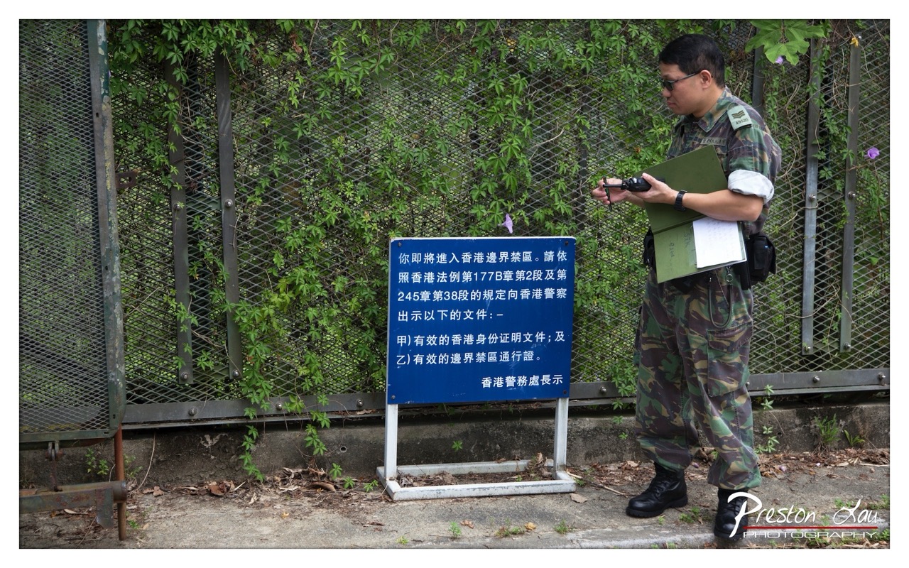

1. Overall Rating (0–10) — 7.0
This photograph captures a quiet moment at a border checkpoint, where the juxtaposition of military formality and natural overgrowth creates a subtle tension. The uniformed officer, absorbed in his task, contrasts with the encroaching greenery, suggesting a place where human regulation meets the persistence of nature. While the image is grounded in realism, its narrative depth is slightly restrained by the flat lighting and straightforward composition.
2. Composition (0–10) — 6.5
The officer is positioned off-center, creating a sense of candid observation, while the sign anchors the frame and provides narrative context. However, the cluttered background and uneven ground slightly disrupt visual balance.
3. Lighting (0–10) — 5.5
Diffused daylight provides even illumination but lacks directional character, resulting in a neutral mood. The lack of strong shadows diminishes the image’s atmospheric depth.
4. Color & Tone (0–10) — 6.0
The dominant green of the foliage and camouflage contrasts with the blue sign, creating a natural harmony. However, the overall palette is subdued, with limited vibrancy and tonal range.
5. Creativity (0–10) — 6.5
The image effectively documents a specific cultural and geographical moment, with the bilingual sign adding layers of context. While not overtly artistic, it succeeds in conveying a quiet story of regulation and transition.
6. Technical Quality (0–10) — 7.5
Sharp focus is maintained on the officer and sign, with clean detail throughout. The exposure is balanced, and the image is free of technical flaws.
7. Emotional Impact (0–10) — 6.0
The scene evokes a sense of routine and quiet authority, but the emotional resonance is limited by the lack of expressive lighting or dynamic framing. It feels more like a record than an emotional encounter.
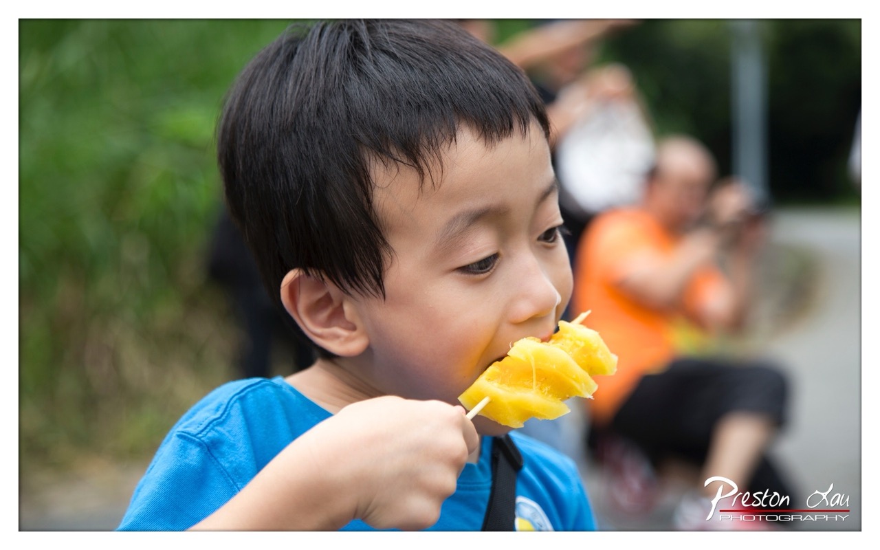

1. Overall Rating (0–10) — 7.5
This photograph captures a candid, joyful moment of a young boy savoring a slice of mango, radiating pure, unfiltered delight. The shallow depth of field isolates the subject beautifully, drawing the viewer into his sensory experience, while the soft natural light enhances the warmth of the scene. Though the background is slightly distracting with its cluttered presence, the image’s emotional honesty and intimate framing elevate it beyond a simple snapshot into a touching portrait of childhood innocence.
2. Composition (0–10) — 7.0
The subject is placed slightly off-center, creating a dynamic and natural feel, while the shallow depth of field effectively draws focus to the boy’s face and the vibrant mango. The background elements, though blurred, add context without overpowering the main subject.
3. Lighting (0–10) — 8.0
Soft, diffused natural light bathes the scene, creating gentle highlights on the boy’s face and enhancing the juicy texture of the mango. The lighting is balanced and flattering, contributing to the image’s warm, inviting mood.
4. Color & Tone (0–10) — 8.0
The rich yellow of the mango contrasts beautifully with the boy’s blue shirt, creating a visually striking palette. The natural tones of the skin and foliage are well-rendered, with a subtle warmth that reinforces the image’s cheerful, summery atmosphere.
5. Creativity (0–10) — 7.5
The photograph captures a spontaneous, authentic moment with a strong sense of narrative. The use of shallow depth of field and selective focus adds a creative touch, transforming a simple scene into a visually compelling story.
6. Technical Quality (0–10) — 8.5
The image is sharp on the subject’s face and mango, with excellent focus control and a clean, noise-free capture. The exposure is well-balanced, and the background blur is smoothly rendered.
7. Emotional Impact (0–10) — 8.5
The genuine expression of pleasure on the boy’s face is deeply engaging, evoking nostalgia and warmth. The viewer is instantly drawn into the moment, sharing in the simple joy of a child enjoying a sweet treat.
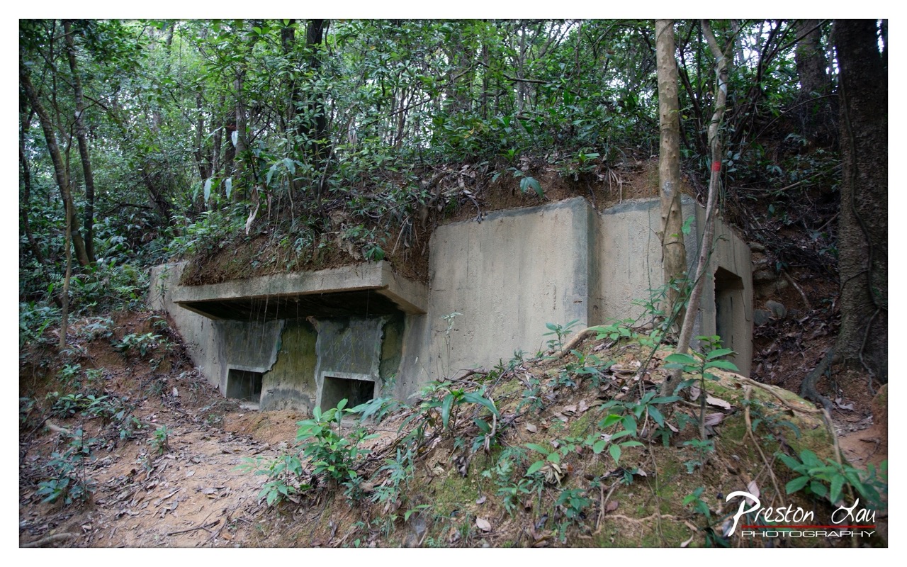

1. Overall Rating (0–10) — 7.0
This photograph captures the quiet melancholy of a forgotten concrete bunker nestled within a lush, overgrown forest, where nature slowly reclaims human-made structures. The composition balances the stark geometry of the man-made object with the organic chaos of the surrounding foliage, creating a compelling contrast between decay and resilience. While the image effectively conveys a sense of abandonment and time’s passage, the slightly muted tones and lack of dynamic lighting prevent it from fully transcending documentary realism.
2. Composition (0–10) — 6.5
The bunker is framed slightly off-center, with the path leading into the scene guiding the eye toward the structure. However, the cluttered foreground and uneven terrain create a sense of visual disarray, slightly diluting the focus on the main subject.
3. Lighting (0–10) — 5.5
Diffuse, overcast light softens shadows and evenly illuminates the scene, but the lack of strong directional light results in a flat, somewhat lifeless atmosphere. The lighting supports clarity but fails to add drama or depth.
4. Color & Tone (0–10) — 6.0
The palette is dominated by earthy greens and grays, which suit the natural and industrial elements. However, the colors appear slightly desaturated, reducing the visual richness and emotional impact of the scene.
5. Creativity (0–10) — 7.0
The juxtaposition of decayed military architecture with encroaching nature offers a strong narrative theme. The image is conceptually engaging, suggesting stories of conflict, isolation, and reclamation, though it remains grounded in straightforward observation.
6. Technical Quality (0–10) — 7.5
The image is sharp and clear, with well-defined textures in both the concrete and foliage. Focus is consistent across the frame, and the exposure is well-balanced, capturing detail in both shadows and highlights.
7. Emotional Impact (0–10) — 6.5
The scene evokes a contemplative mood, inviting reflection on war, memory, and nature’s persistence. While the emotional resonance is present, it is restrained by the image’s clinical clarity and lack of dramatic tonal contrast.
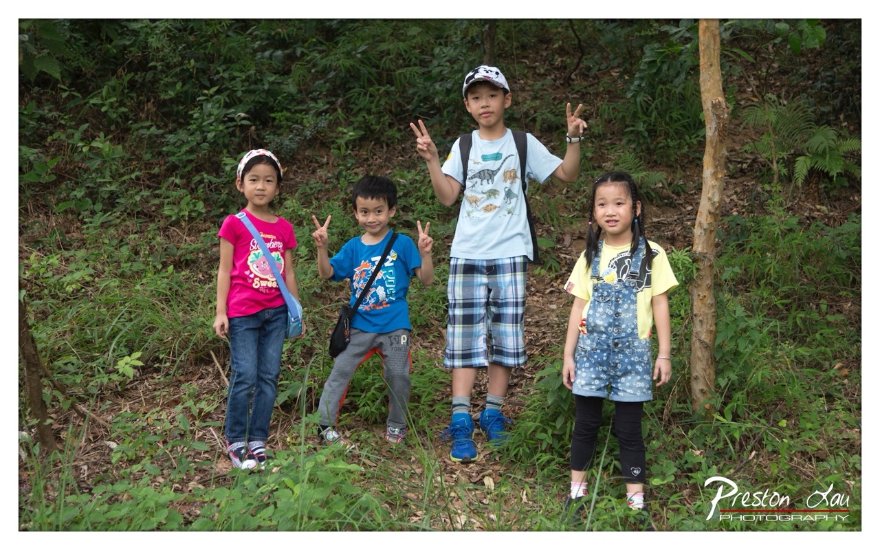

1. Overall Rating (0–10) — 7.0
This photograph captures a joyful moment of childhood exploration in a lush, natural setting, where the children’s expressions and gestures radiate unfiltered happiness. The vibrant colors of their clothing contrast beautifully with the green backdrop, creating a lively and engaging scene. While the composition is slightly uneven and the lighting is somewhat flat, the image succeeds in conveying a sense of spontaneity and connection with nature, making it both heartwarming and visually appealing.
2. Composition (0–10) — 6.5
The children are arranged across the frame with a slight imbalance, creating a dynamic but slightly cluttered feel. The inclusion of the tree on the right adds depth, but the uneven spacing between the subjects disrupts visual harmony.
3. Lighting (0–10) — 6.0
Natural daylight illuminates the scene evenly, but the lack of directional light results in flat, diffused illumination that minimizes texture and depth in the foliage and subjects.
4. Color & Tone (0–10) — 7.5
The palette is rich and lively, with bright, saturated colors in the children’s clothing—especially the pink and blue—standing out against the earthy greens. The color temperature is neutral, enhancing the natural feel of the outdoor setting.
5. Creativity (0–10) — 7.0
The photographer captures a genuine, candid moment, emphasizing the children’s personalities and the joy of outdoor play. The peace signs and casual poses add a playful, expressive quality that elevates the image beyond a simple snapshot.
6. Technical Quality (0–10) — 7.5
The image is sharp and clear, with well-defined details in the children’s faces and clothing. The focus is consistent across the subjects, and the resolution is high, supporting a clean, professional look.
7. Emotional Impact (0–10) — 8.0
The photograph evokes warmth and nostalgia, capturing the carefree spirit of childhood. The children’s smiles and relaxed body language create an immediate emotional connection, inviting the viewer to reminisce about their own adventures in nature.
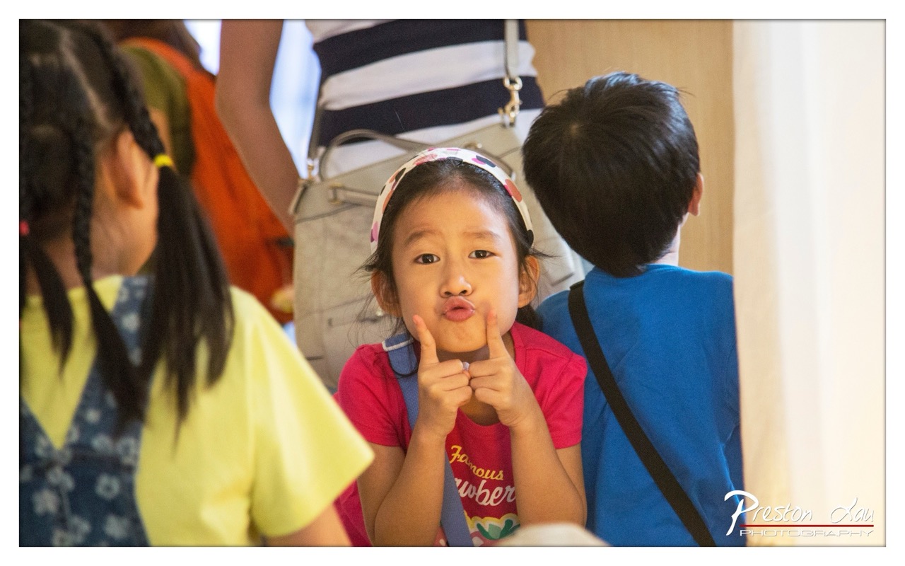

1. Overall Rating (0–10) — 7.0
This photograph captures a spontaneous and endearing moment of childhood play, with a young girl’s exaggerated pout and finger gesture radiating playful confidence. The candid composition and natural lighting lend authenticity to the scene, while the surrounding children add context and depth. Though the background is slightly cluttered, the central subject’s expressive face holds the viewer’s attention, creating a warm and memorable snapshot of youthful joy.
2. Composition (0–10) — 6.5
The girl is well-centered, drawing focus despite the busy foreground and background. The framing feels slightly tight, and the overlapping figures create a sense of depth, though the composition could benefit from a more deliberate balance.
3. Lighting (0–10) — 7.0
Natural, soft lighting enhances the scene’s authenticity, with even illumination on the girl’s face that highlights her expression without harsh shadows. The light quality feels organic and suits the candid nature of the moment.
4. Color & Tone (0–10) — 6.5
The colors are vibrant but not oversaturated, with the pink shirt and colorful headband standing out against the more neutral tones of the surroundings. The overall palette feels warm and inviting, though it lacks a strong tonal contrast to elevate the image.
5. Creativity (0–10) — 7.5
The photographer captures a genuine, unposed moment that reflects both humor and innocence. The playful gesture, combined with the natural setting, makes the image feel both spontaneous and thoughtfully observed.
6. Technical Quality (0–10) — 8.0
Sharp focus on the girl’s face ensures clarity and detail, while the shallow depth of field effectively blurs the background. The image is clean and well-exposed, with no noticeable technical flaws.
7. Emotional Impact (0–10) — 8.0
The image evokes a strong sense of warmth and nostalgia, with the girl’s exaggerated expression instantly conveying joy and playfulness. It invites the viewer into a fleeting, intimate moment of childhood, creating a lasting emotional connection.
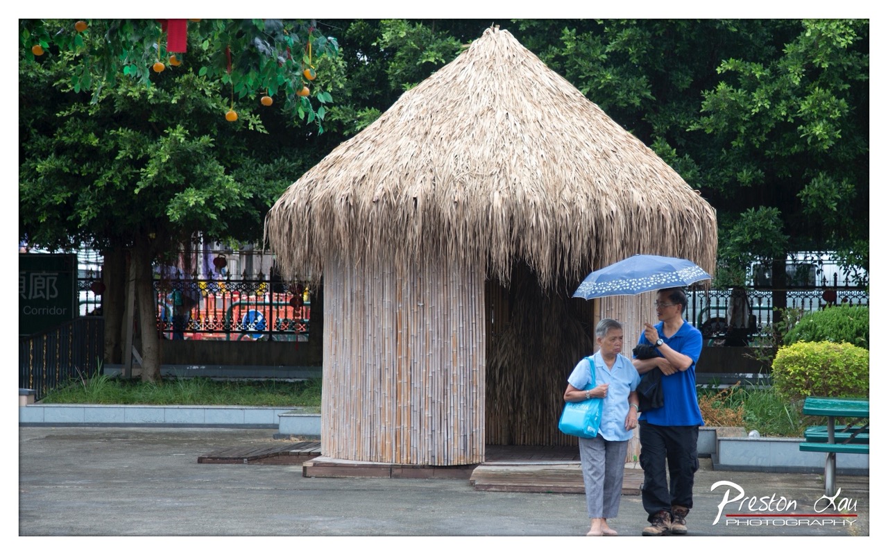

1. Overall Rating (0–10) — 7.0
This photograph captures a quiet, candid moment between two individuals under a simple umbrella, set against the backdrop of a thatched bamboo hut in a lush, park-like environment. The scene feels natural and unposed, with the warm, diffused light and soft textures of the bamboo and foliage lending a gentle, contemplative mood. While the image is grounded in authenticity, the composition’s slight imbalance and flat lighting prevent it from achieving a more compelling visual rhythm.
2. Composition (0–10) — 6.0
The subjects are placed off-center, creating a sense of movement, but the heavy left-side presence of the hut and the tree branches slightly disrupts visual balance. The framing includes extraneous background elements that distract from the central narrative.
3. Lighting (0–10) — 6.5
The light is soft and evenly diffused, likely from an overcast sky, which minimizes harsh shadows and preserves detail in both the subjects and the background. However, the lack of directional light reduces depth and dimensionality.
4. Color & Tone (0–10) — 6.0
The palette is dominated by muted greens and earthy browns, with the blue of the umbrella and shirt providing a subtle pop. The colors feel natural but lack vibrancy, contributing to a somewhat subdued tone.
5. Creativity (0–10) — 7.0
The photograph captures a quiet, narrative-driven moment with a sense of cultural texture, particularly through the use of the bamboo hut and decorative oranges. The composition suggests a story of companionship and shared space, though it remains grounded in realism rather than stylized interpretation.
6. Technical Quality (0–10) — 7.5
The image is sharp and well-focused, with clean detail visible in the bamboo texture and the subjects’ clothing. The exposure is balanced, and the watermark is unobtrusive.
7. Emotional Impact (0–10) — 7.0
There is a quiet intimacy in the scene—the shared umbrella, the relaxed posture of the pair—that evokes a sense of companionship and everyday life. The viewer is invited into a fleeting, unguarded moment, making the image emotionally resonant despite its modest visual flair.
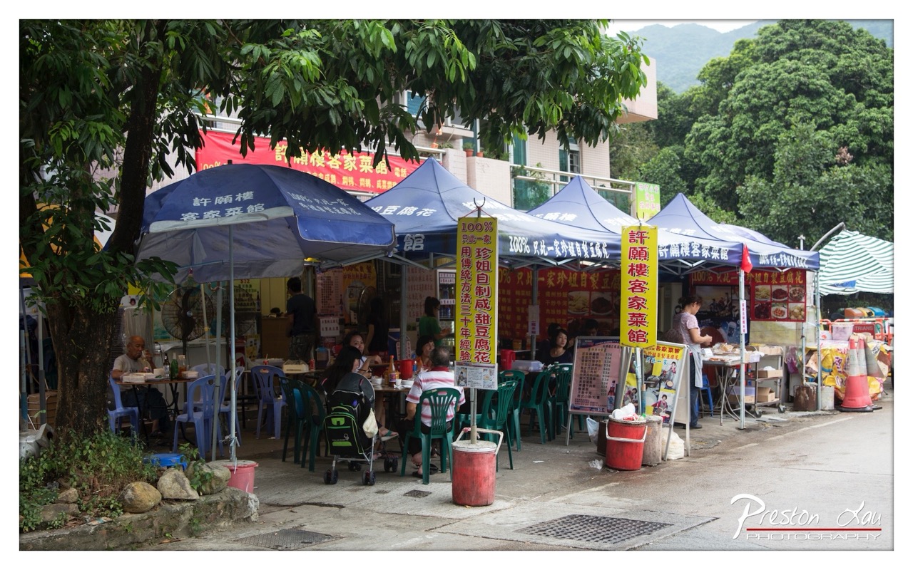

1. Overall Rating (0–10) — 6.8
This photograph captures the lively, unpretentious energy of a local street-side eatery, where daily life unfolds under makeshift canopies and beneath the shade of a large tree. The scene feels authentic and grounded, with a strong sense of place and cultural context, though the visual clutter and flat lighting slightly dampen its overall impact. The image succeeds as a candid document of community and tradition, even if it lacks the polished aesthetic of a staged portrait.
2. Composition (0–10) — 6.0
The framing includes too much peripheral detail, creating a sense of visual chaos. The tree on the left and the scattered objects disrupt the balance, though the central cluster of tables and patrons provides a natural focal point.
3. Lighting (0–10) — 5.5
The overcast daylight produces even, soft illumination but lacks directional warmth or contrast, flattening the scene’s depth and emotional texture.
4. Color & Tone (0–10) — 6.5
The palette is dominated by the blue of the tents and green of the foliage, creating a cohesive natural tone. However, the colors appear slightly washed out, reducing vibrancy and visual punch.
5. Creativity (0–10) — 7.0
The photograph captures a slice of everyday life with authenticity and cultural specificity, offering a narrative of resilience and community. The use of signage and informal setup adds a layer of storytelling that feels both candid and purposeful.
6. Technical Quality (0–10) — 7.5
The image is sharp and well-focused, with clean detail throughout. The depth of field is adequate, though some elements in the foreground and background are slightly soft.
7. Emotional Impact (0–10) — 6.0
There’s a quiet warmth in the scene—families eating, vendors at work, a sense of routine and connection—but the lack of dramatic lighting and tight composition keeps the emotional resonance at a distance.
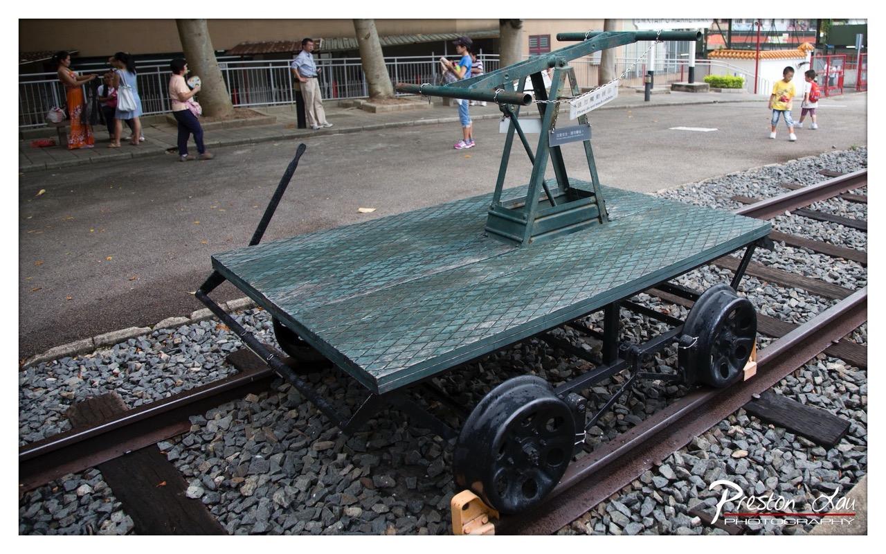

1. Overall Rating (0–10) — 6.0
This photograph captures a nostalgic slice of urban history, with a vintage railway handcar resting on tracks amid a bustling public space. The juxtaposition of the old industrial artifact against the casual backdrop of modern-day visitors creates a subtle tension between past and present. While the image effectively documents a moment in time, its composition feels slightly cluttered and the lighting lacks the dramatic punch to elevate the scene into something truly compelling.
2. Composition (0–10) — 5.5
The handcar is well-framed and centered, drawing immediate attention, but the background activity and uneven foreground edges create visual distraction. A tighter crop or more deliberate use of negative space could enhance focus.
3. Lighting (0–10) — 5.0
The lighting is flat and diffused, typical of an overcast day, which flattens the texture of the metal and gravel. While it allows for clear detail, it fails to add depth or mood to the scene.
4. Color & Tone (0–10) — 5.5
The muted greens and grays dominate, creating a subdued, industrial palette. The lack of vibrancy dampens the visual energy, though the color balance remains consistent and natural.
5. Creativity (0–10) — 6.0
The image offers a strong conceptual contrast between historical machinery and contemporary life, but the execution remains observational rather than interpretive. It tells a story, but doesn’t invite deeper reflection.
6. Technical Quality (0–10) — 7.5
Sharp focus and clean detail are evident, particularly on the handcar and tracks. The image is well-exposed, with no obvious technical flaws.
7. Emotional Impact (0–10) — 5.0
The emotional resonance is modest—there’s a quiet charm in the scene’s authenticity, but it doesn’t provoke a strong emotional response. The viewer is more likely to feel curiosity than connection.
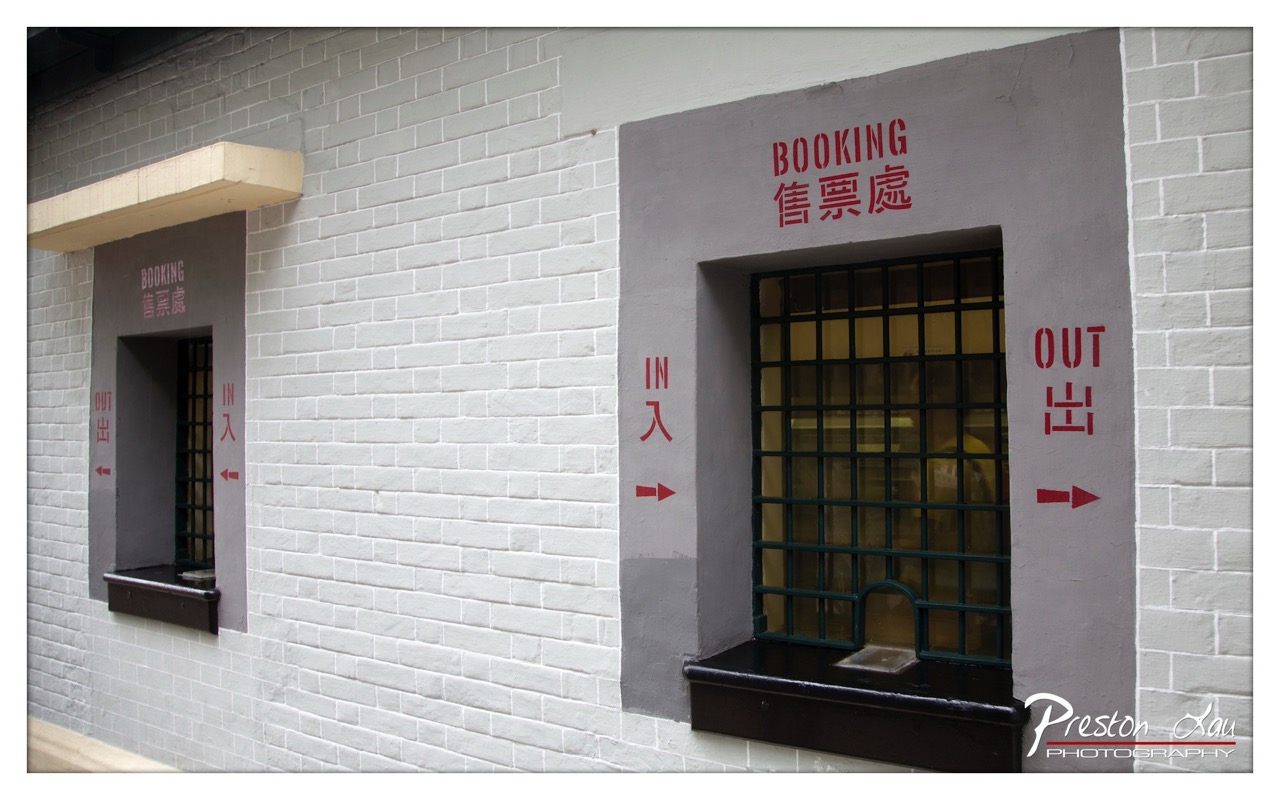

1. Overall Rating (0–10) — 7.0
This photograph captures a quiet, almost cinematic moment at a historical ticket office, where the contrast between worn brick and bold red signage creates a subtle tension between function and memory. The clean lines and symmetrical placement of the two booking windows lend the image a sense of order, while the faded paint and barred windows hint at a past era. While the composition is strong and the subject clear, the scene lacks a compelling emotional hook, feeling more like an architectural record than a deeply resonant portrait.
2. Composition (0–10) — 7.5
The balanced placement of the two windows creates a strong visual symmetry, with the white brick wall serving as a neutral canvas. The slight diagonal angle adds subtle dynamism, guiding the eye across the frame from left to right.
3. Lighting (0–10) — 6.5
Natural daylight evenly illuminates the scene, preserving detail in the brickwork and signage. However, the lack of directional shadows or dramatic contrast softens the image’s mood, giving it a flat, documentary quality.
4. Color & Tone (0–10) — 7.0
The restrained palette—white, gray, and black—grounded by the striking red lettering—creates a clean, almost graphic effect. The red text pops with purpose, drawing attention without overwhelming the composition.
5. Creativity (0–10) — 6.5
The image presents a familiar subject with a thoughtful, balanced approach. While not groundbreaking, the juxtaposition of English and Chinese signage, combined with the institutional aesthetic, suggests a layered narrative of cultural transition.
6. Technical Quality (0–10) — 8.0
Sharp focus and clear detail throughout the frame, with no visible technical flaws. The watermark is discreet and does not distract from the subject.
7. Emotional Impact (0–10) — 6.0
The image evokes a sense of quiet nostalgia, but the emotional resonance remains restrained. The viewer is invited to observe rather than feel, leaving the story of the place to the imagination.
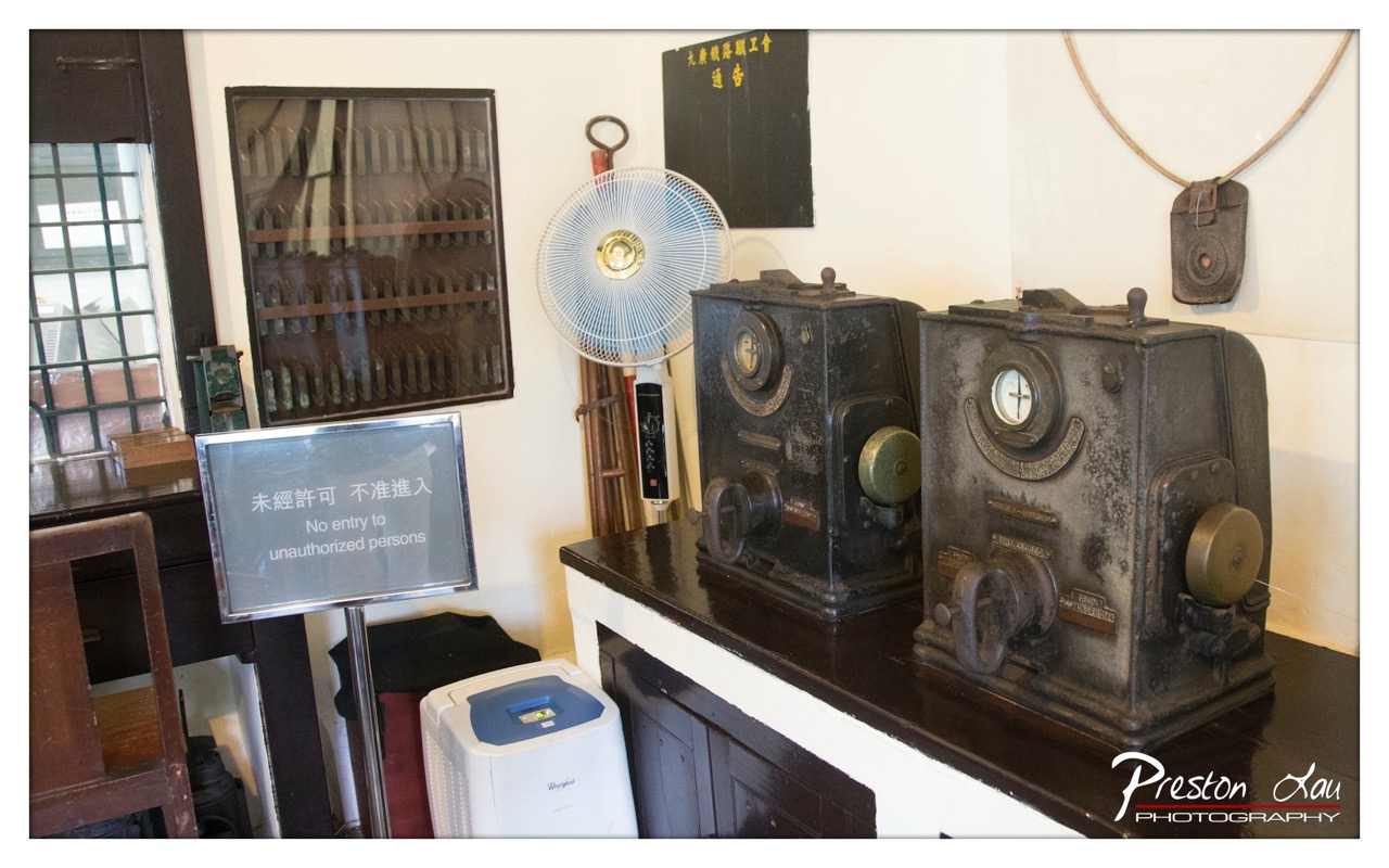

1. Overall Rating (0–10) — 6.0
This photograph captures a slice of historical technology, presenting a curated display of vintage communication equipment with a sense of quiet authenticity. The juxtaposition of old machinery—telegraph apparatus and a fan—against modern signage and a contemporary air purifier creates a subtle tension between past and present. While the scene feels authentic and informative, the composition’s clutter and lack of visual harmony slightly undermine its aesthetic impact, making it more a documentary record than a compelling image.
2. Composition (0–10) — 5.5
The frame is slightly unbalanced, with the main subjects—the two telegraph machines—crowded on the right, leaving the left side feeling underutilized. The diagonal line of the sign and the window’s grid create competing visual paths, pulling focus away from the central objects.
3. Lighting (0–10) — 6.0
The lighting is even and functional, likely from ambient indoor sources, which highlights the textures of the aged machines without creating dramatic shadows. However, the flatness of the light diminishes depth and mood, making the scene feel more like an archival snapshot than an artistic rendering.
4. Color & Tone (0–10) — 5.5
The palette is dominated by muted grays and browns, with the white air purifier and blue accents providing a slight contrast. The overall tone is neutral and somewhat dull, reflecting the utilitarian nature of the space but lacking vibrancy or emotional resonance.
5. Creativity (0–10) — 6.0
The image succeeds in capturing a historical moment, but the approach is straightforward and observational rather than imaginative. The inclusion of the modern air purifier introduces an unintentional anachronism that could be interpreted as commentary, but it's not fully leveraged as a creative device.
6. Technical Quality (0–10) — 7.5
The image is sharp and well-focused, with clear details visible on the machines and signage. The depth of field is adequate, and the watermark is cleanly placed, suggesting competent technical execution.
7. Emotional Impact (0–10) — 5.5
The photograph evokes a sense of nostalgia and curiosity about the past, but the emotional connection is muted. The viewer is invited to observe rather than feel, and the lack of a strong narrative or atmospheric quality keeps the experience more intellectual than visceral.
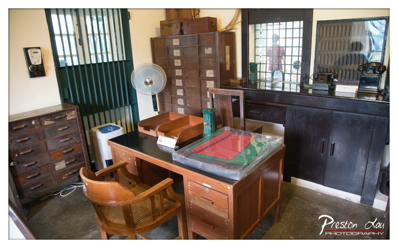

1. Overall Rating (0–10) — 6.8
This photograph captures the quiet atmosphere of a preserved historical office, evoking a sense of time suspended in a bygone era. The arrangement of vintage furniture, typewriters, and filing cabinets creates a narrative of bureaucratic order, while the modern fan and air purifier subtly remind the viewer of the present. The image successfully blends authenticity with documentary clarity, though its emotional resonance is slightly dampened by a lack of dramatic lighting or compositional tension.
2. Composition (0–10) — 6.0
The scene is framed with a wide-angle perspective that captures the full breadth of the room, but the cluttered arrangement and uneven distribution of objects create a slightly chaotic feel. The central desk acts as a natural focal point, but the surrounding elements compete for attention, weakening the overall visual hierarchy.
3. Lighting (0–10) — 5.5
The lighting is flat and utilitarian, likely from overhead fluorescent sources, which flattens the textures and shadows of the wooden furniture. While it provides even illumination, it fails to create mood or depth, leaving the scene feeling more like a record than a portrait.
4. Color & Tone (0–10) — 6.0
The palette is dominated by earthy browns and muted tones, punctuated by the red and green of the document under glass. The color temperature is neutral, reinforcing the archival, institutional feel, but the lack of vibrancy limits the image’s visual appeal.
5. Creativity (0–10) — 6.5
The photograph succeeds in capturing a moment of historical authenticity, with a clear intent to document rather than interpret. The inclusion of modern appliances adds a subtle layer of irony, but the overall approach remains observational rather than expressive.
6. Technical Quality (0–10) — 7.5
The image is sharp and well-focused, with clean details visible in the wood grain, metal fixtures, and labels on the drawers. The depth of field is adequate, and the exposure is balanced, though the wide-angle lens introduces some distortion at the edges.
7. Emotional Impact (0–10) — 5.8
The image conveys a quiet nostalgia, inviting contemplation of the past, but the clinical lighting and lack of human presence keep the viewer at a distance. The emotional pull is subtle and intellectual rather than visceral.
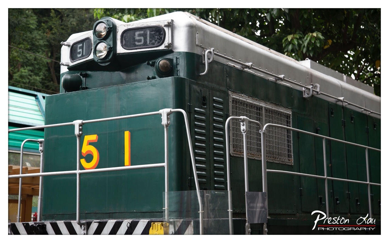

1. Overall Rating (0–10) — 7.0
This photograph captures the rugged charm of a vintage green diesel locomotive, evoking nostalgia through its weathered details and industrial design. The bold "51" marking draws the eye, grounding the image in a sense of identity and history, while the surrounding foliage adds a subtle contrast between machinery and nature. Though the composition is strong, the slightly cluttered foreground and flat lighting prevent it from feeling fully immersive or emotionally resonant.
2. Composition (0–10) — 7.0
The frame is well-balanced, with the locomotive centered and the railings guiding the eye toward the number. The diagonal lines of the railings and the angle of the train create a sense of forward motion, while the foliage in the background provides depth without distracting.
3. Lighting (0–10) — 6.0
The lighting is even and diffused, likely from an overcast sky, which softens shadows and preserves detail across the locomotive’s surface. However, the lack of directional light diminishes the sense of texture and three-dimensionality, giving the image a somewhat flat appearance.
4. Color & Tone (0–10) — 7.0
The deep green of the locomotive contrasts effectively with the bright yellow and red "51," creating a strong focal point. The muted tones of the surrounding foliage and the silver roof add visual variety, while the overall color palette feels authentic and grounded in its industrial subject.
5. Creativity (0–10) — 7.0
The image successfully captures a moment of quiet history, treating the locomotive not just as a machine but as a relic with character. The inclusion of the photographer’s watermark adds a personal touch, suggesting a deliberate artistic intent beyond mere documentation.
6. Technical Quality (0–10) — 8.0
The image is sharp and clear, with fine detail visible in the metal surfaces, vents, and railings. Focus is consistent across the main subject, and the exposure is well-managed, though the dynamic range could be slightly improved.
7. Emotional Impact (0–10) — 6.5
There is a quiet dignity in the locomotive’s presence, suggesting a story of service and endurance. The viewer is invited to reflect on the passage of time and the role of industrial relics in cultural memory, though the emotional connection remains subtle and understated.
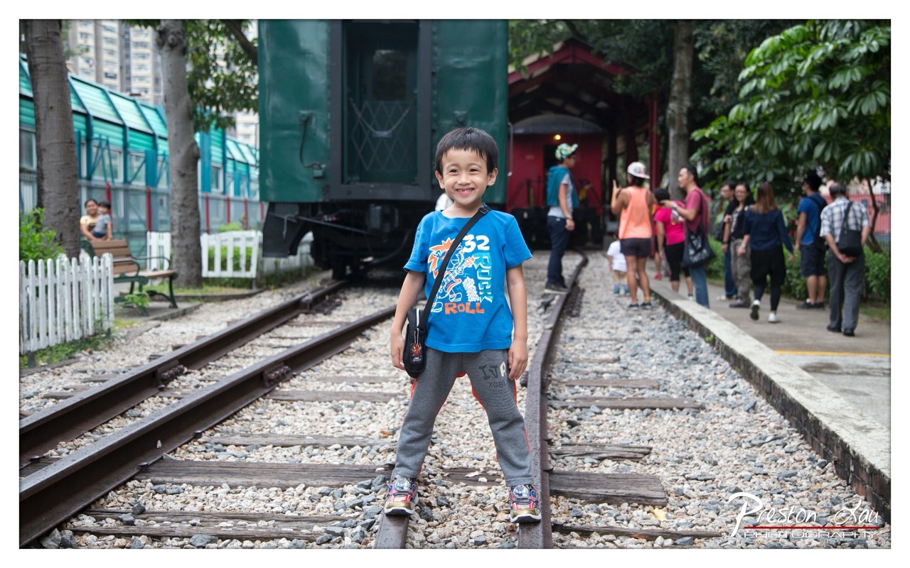

1. Overall Rating (0–10) — 7.0
This photograph captures a joyful moment of childhood wonder at a railway heritage site, where the boy’s radiant smile becomes the emotional anchor of the scene. The juxtaposition of the child’s vibrant energy against the muted tones of the train and surrounding greenery creates a compelling visual contrast. While the image is rich in narrative and charm, the background’s clutter and flat lighting slightly diminish its overall aesthetic cohesion.
2. Composition (0–10) — 6.5
The boy is well-centered and clearly the focal point, with the converging train tracks leading the eye toward him. However, the off-center placement of the green train and the busy background on the right create visual imbalance, distracting from the subject’s prominence.
3. Lighting (0–10) — 6.0
The scene is evenly lit with soft, diffused daylight, which avoids harsh shadows and suits the candid nature of the moment. However, the lack of directional light or dynamic highlights gives the image a flat, unmoored quality, reducing depth and atmosphere.
4. Color & Tone (0–10) — 6.5
The boy’s bright blue t-shirt stands out vividly against the neutral grays and greens of the setting, creating a strong focal point. The color palette is natural and cohesive, though it lacks vibrancy and contrast, making the image feel slightly subdued.
5. Creativity (0–10) — 7.0
The photograph successfully captures a spontaneous, heartwarming moment, using the railway setting as a narrative backdrop. The choice to place the child directly on the tracks adds a sense of adventure and playfulness, lending the image a personal and memorable quality.
6. Technical Quality (0–10) — 7.5
The image is sharp and clear, with well-defined focus on the boy and a shallow depth of field that gently blurs the background. The exposure is balanced, and details in both highlights and shadows are preserved.
7. Emotional Impact (0–10) — 8.0
The boy’s genuine smile and playful stance evoke a strong sense of innocence and joy. The image resonates emotionally by capturing a fleeting, authentic moment of childhood delight, inviting viewers to recall their own early adventures.
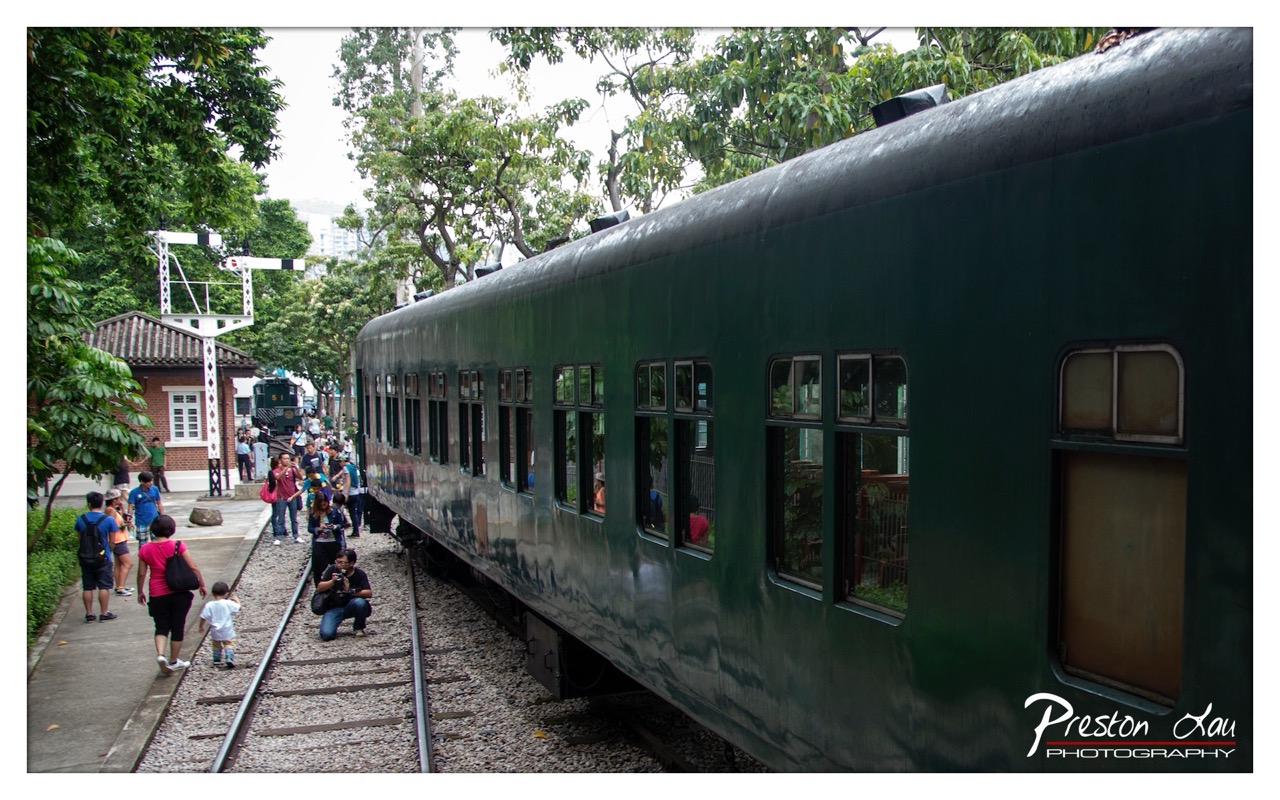

1. Overall Rating (0–10) — 7.0
This photograph captures a nostalgic moment at a heritage railway station, where the vibrant green train and bustling crowd evoke a sense of communal history and movement. The interplay of natural light, reflections on the train’s surface, and the layered composition create a dynamic yet grounded scene. While the image is rich in narrative and context, it slightly lacks visual cohesion due to the scattered composition and overcast lighting, which tempers its emotional resonance.
2. Composition (0–10) — 6.5
The train dominates the right side, creating a strong diagonal that guides the eye, while the people and signal post on the left add balance. However, the crowd’s scattered positioning and the inclusion of the distant building create a slightly cluttered frame, diluting the focus on the central subject.
3. Lighting (0–10) — 5.5
Diffuse, overcast lighting softens shadows and flattens the scene, reducing depth and contrast. While it evenly illuminates the subject, the lack of directional light diminishes the train’s reflective qualities and the overall mood.
4. Color & Tone (0–10) — 6.0
The deep green of the train provides a strong visual anchor, complemented by the earthy tones of the station and the muted greens of the foliage. The overall palette is harmonious but subdued, lacking vibrancy that could elevate the image.
5. Creativity (0–10) — 7.0
The photographer captures a moment rich in cultural and historical context, blending documentary realism with a subtle narrative. The choice to include the people and the station environment adds layers of storytelling, transforming a simple scene into a cultural snapshot.
6. Technical Quality (0–10) — 7.5
The image is sharp and well-focused, with clean details in the train’s surface and surrounding environment. The exposure is balanced, and the depth of field effectively captures both foreground and background elements.
7. Emotional Impact (0–10) — 6.5
The scene evokes a sense of nostalgia and community, particularly through the presence of families and curious onlookers. While the emotional pull is present, the overcast conditions and busy composition keep the viewer from fully immersing in the moment.
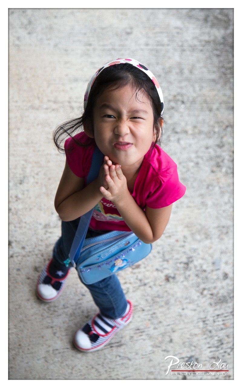

1. Overall Rating (0–10) — 7.5
This portrait captures a moment of pure, unfiltered childhood expression, where the girl’s exaggerated scrunched face and wide-eyed gaze convey a playful defiance that draws the viewer in. The high-angle perspective enhances the intimacy, making the subject feel both mischievous and endearing. While the composition is strong and the emotion palpable, the slightly grainy texture and subdued background tone prevent the image from achieving a more polished, cinematic feel.
2. Composition (0–10) — 7.0
The high-angle shot centers the subject effectively, with her body angled slightly to create dynamic tension. The diagonal line of her arms and bag leads the eye toward her face, though the cluttered lower edge of the frame slightly disrupts balance.
3. Lighting (0–10) — 7.5
Soft, diffused light illuminates the subject evenly, highlighting her facial expression without harsh shadows. The light source appears natural, enhancing the candid quality and giving depth to her features.
4. Color & Tone (0–10) — 8.0
The vibrant pink of her shirt contrasts sharply with the muted gray background, drawing attention to the subject. The cool blue of her bag adds a complementary pop, while the overall tone remains balanced and visually cohesive.
5. Creativity (0–10) — 8.5
The photographer’s choice to capture the exaggerated expression from above adds a layer of narrative playfulness. The image transcends a simple snapshot, becoming a character study in youthful humor and spontaneity.
6. Technical Quality (0–10) — 8.0
Sharp focus on the girl’s face ensures clarity, and the depth of field isolates her effectively from the background. The watermark is subtle and unobtrusive.
7. Emotional Impact (0–10) — 9.0
The girl’s expressive face radiates joy and mischief, instantly evoking a sense of warmth and nostalgia. The image feels personal and authentic, inviting the viewer to share in a fleeting, genuine moment of childhood exuberance.
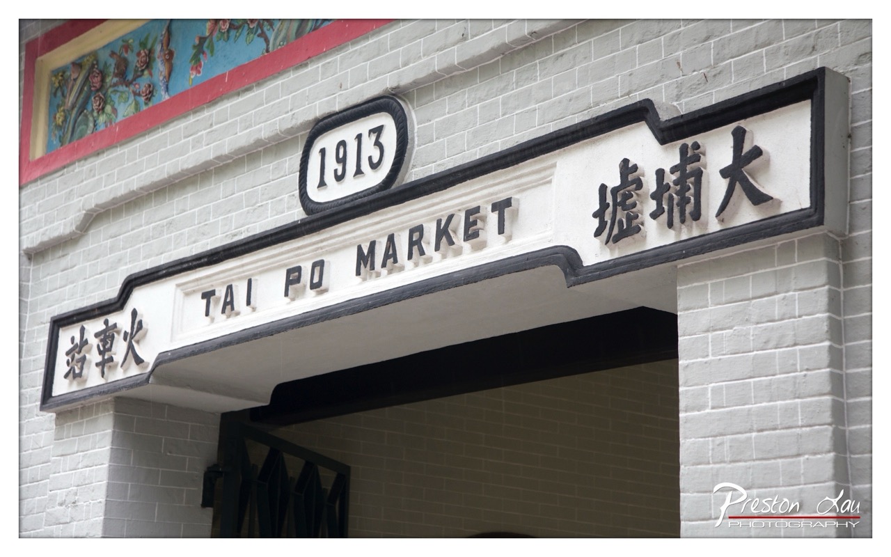

1. Overall Rating (0–10) — 7.0
This photograph captures the historical essence of Tai Po Market with a clean, documentary-style clarity, emphasizing its cultural and architectural significance. The signage, with its bilingual inscription and the year “1913,” conveys a sense of continuity and tradition. While the image is well-framed and rich in detail, the slightly muted lighting and lack of atmospheric depth prevent it from feeling fully immersive, leaving the scene feeling more like an archive entry than a living moment.
2. Composition (0–10) — 7.5
The angled perspective draws attention to the sign, creating a dynamic yet balanced composition. The symmetry of the lettering and the alignment with the brickwork enhance visual harmony, though the inclusion of the photographer’s watermark in the corner slightly disrupts the frame’s integrity.
3. Lighting (0–10) — 6.5
The lighting is even and natural, highlighting the texture of the bricks and the three-dimensional quality of the lettering. However, the absence of strong directional light or shadow reduces the image’s dramatic impact, giving it a flat, neutral tone.
4. Color & Tone (0–10) — 6.0
The color palette is restrained, dominated by whites, grays, and black, with a subtle pop of color from the painted mural above. While this creates a timeless, almost monochromatic feel, the lack of vibrancy in the tones limits the image’s emotional resonance.
5. Creativity (0–10) — 6.5
The photograph is conceptually strong, capturing a place of cultural heritage with clarity and respect. However, the approach is conventional, relying on straightforward documentation rather than a unique artistic vision or interpretive angle.
6. Technical Quality (0–10) — 8.0
Sharp focus and precise detail are evident in the lettering and brick texture. The exposure is well-balanced, and the resolution captures fine architectural elements with clarity, demonstrating solid technical execution.
7. Emotional Impact (0–10) — 6.0
The image evokes a sense of nostalgia and quiet dignity, inviting viewers to reflect on the passage of time. Yet, the lack of human presence or emotional context keeps the experience detached, making the emotional connection more intellectual than visceral.