The blog describes a visit to Berlin and Dresden, Germany, exploring landmarks like the Brandenburg Gate, Deutsches Historisches Museum, Kaiser Wilhelm Memorial Church, and Checkpoint Charlie. The author also visited Dresden's Theaterplatz, featuring the Zwinger Palace, Semper Opera House, and Italian Dörfchen. Finally, they stopped by the Bastei rock formation near the Czech border, learning about its geological history.
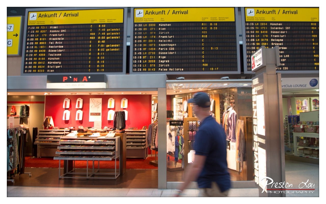

1. Overall Rating (0–10) — 6.0
This photograph captures the bustling energy of an airport terminal, where the rhythm of travel unfolds in real time. The motion blur of the passing figure injects life into the scene, contrasting with the static precision of the flight information displays. While the composition effectively conveys the atmosphere of transit, the cluttered foreground and slightly awkward framing dilute its visual impact, leaving the image feeling more like a snapshot than a polished statement.
2. Composition (0–10) — 5.5
The subject is off-center and partially obscured by the moving figure, creating a sense of chaos. The strong horizontal lines of the arrival boards anchor the image, but the framing feels unbalanced due to the intrusion of the foreground.
3. Lighting (0–10) — 6.0
Bright, even fluorescent lighting illuminates the scene clearly, enhancing legibility of the flight details. However, it flattens the depth and fails to create dramatic contrast or mood.
4. Color & Tone (0–10) — 6.5
The bold red of the PNA store provides a strong focal point, contrasting with the yellow signage and neutral tones of the terminal. The color palette is functional and modern, though slightly overexposed, giving the image a sterile quality.
5. Creativity (0–10) — 6.0
The use of motion blur adds dynamism and tells a story of constant movement. The juxtaposition of commercial branding and travel infrastructure offers a layered commentary on modern mobility.
6. Technical Quality (0–10) — 7.0
The image is sharp where it counts, with clean focus on the flight boards and clear detail in the store. The motion blur is intentional and controlled, though the overall sharpness varies.
7. Emotional Impact (0–10) — 5.5
The image evokes the impersonal yet familiar feeling of waiting in transit—neutral and detached. While the motion of the traveler suggests narrative, the emotional resonance remains subtle, leaving the viewer as an observer rather than a participant.
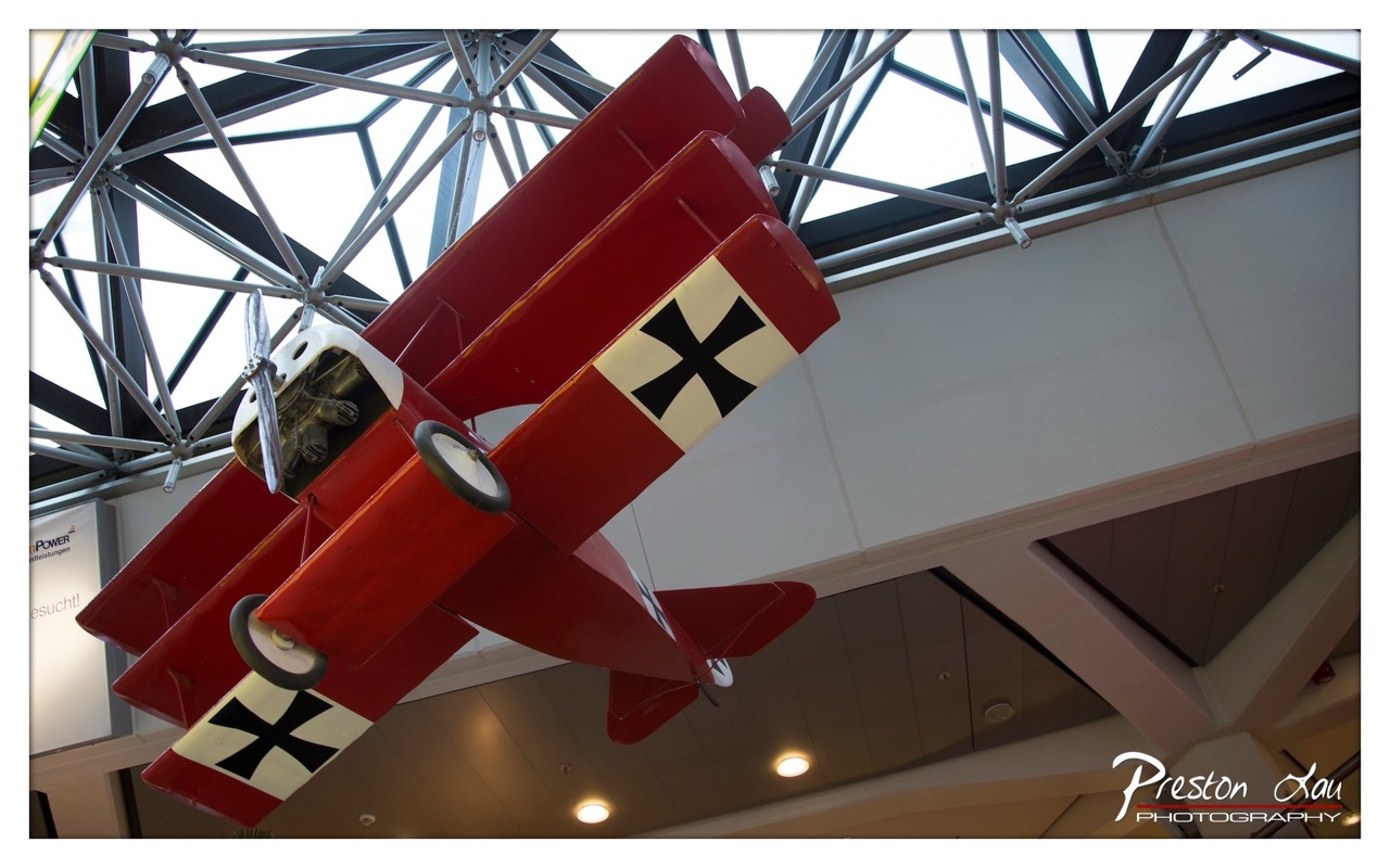

1. Overall Rating (0–10) — 7.0
This photograph captures the bold presence of a red biplane suspended in a modern indoor space, creating a striking contrast between historical aviation and contemporary architecture. The low-angle perspective emphasizes the aircraft’s scale and dynamism, while the geometric ceiling frames it like a monument. While the composition is strong and the subject compelling, the ambient lighting and background details slightly dilute the focus, preventing the image from achieving full visual impact.
2. Composition (0–10) — 7.5
The diagonal placement of the biplane creates a dynamic diagonal line that draws the eye across the frame. The low-angle view enhances the sense of grandeur, and the intersecting lines of the ceiling structure add visual interest without overwhelming the subject.
3. Lighting (0–10) — 6.0
Natural light from the glass ceiling illuminates the top of the aircraft, while artificial lights below cast soft highlights on the fuselage. The contrast between bright overhead light and the dimmer interior creates depth, though some areas remain underexposed, muting details.
4. Color & Tone (0–10) — 7.5
The vibrant red of the biplane stands out against the neutral tones of the ceiling and walls, creating a powerful visual contrast. The black Iron Cross insignia provides a sharp graphic element, and the overall color palette feels balanced and purposeful.
5. Creativity (0–10) — 7.0
The juxtaposition of a historical military aircraft within a modern architectural setting is both clever and evocative. The photographer captures a moment of stillness that suggests motion and history, blending documentary realism with artistic framing.
6. Technical Quality (0–10) — 8.0
The image is sharp and well-focused, with clean detail visible on the aircraft’s surface and propeller. The depth of field is appropriately managed, keeping the biplane in clear focus while softly blurring the background.
7. Emotional Impact (0–10) — 6.5
The photograph evokes a sense of awe and nostalgia, capturing the legacy of early aviation in a contemporary context. While the emotional resonance is strong, the clinical environment tempers the dramatic potential, leaving the viewer with admiration rather than deep emotional engagement.
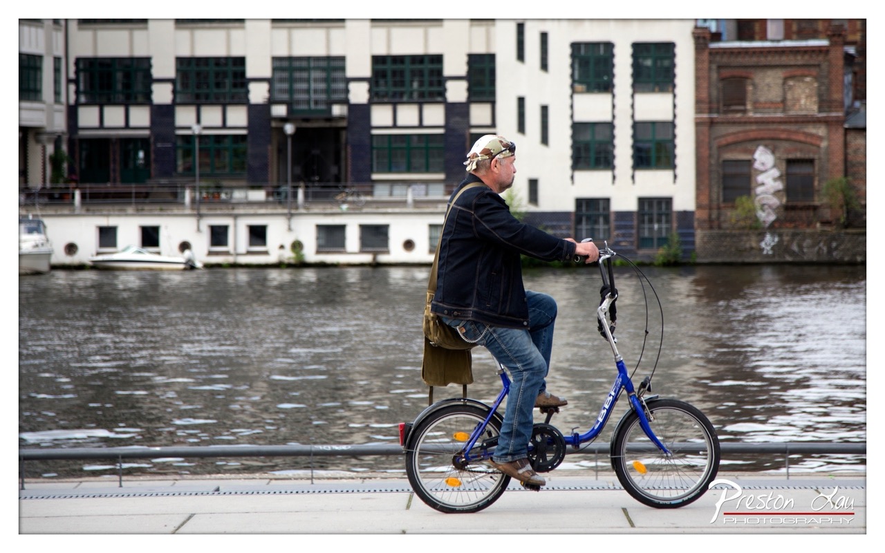

1. Overall Rating (0–10) — 7.0
This photograph captures a candid moment of urban life, where motion and stillness intersect along a city canal. The man on the folding bike provides a dynamic focal point against the calm, reflective water and the layered architecture of the background. While the image is grounded in realism and carries a sense of everyday rhythm, its visual impact is slightly restrained by a lack of atmospheric depth and emotional urgency. The composition suggests a story—commuting, city living, quiet persistence—but doesn’t fully draw the viewer into its mood.
2. Composition (0–10) — 7.5
The subject is well-placed in profile along the left third of the frame, creating a sense of forward movement. The canal and buildings form a layered backdrop that adds depth, while the railing grounds the scene. The slight asymmetry enhances naturalism, though the horizontal lines of the canal and walkway could be stronger with tighter framing.
3. Lighting (0–10) — 6.5
The soft, diffused daylight creates even illumination across the scene, avoiding harsh shadows. However, the lack of strong directional light results in a somewhat flat appearance, which diminishes the texture of the buildings and the water’s surface. The overcast conditions suit the subdued tone but limit visual drama.
4. Color & Tone (0–10) — 6.0
The palette is restrained, dominated by muted blues, grays, and earth tones. While the blue of the bicycle provides a subtle pop, the overall color scheme feels slightly washed out. A touch of warmth or increased saturation could enhance the mood and make the scene feel more vibrant without losing its realism.
5. Creativity (0–10) — 6.5
The image is conceptually strong, capturing a slice of daily life with authenticity. The juxtaposition of the individual cyclist against the urban backdrop suggests themes of mobility and city culture. However, the approach is more documentary than interpretive, with little visual innovation in framing or perspective.
6. Technical Quality (0–10) — 8.0
The focus is sharp on the cyclist, with good detail in the subject and background. The image is well-exposed, with no obvious technical flaws in clarity or noise. The watermark is discreet, preserving the image’s integrity.
7. Emotional Impact (0–10) — 6.0
The photograph conveys a quiet, contemplative mood—perhaps a sense of routine or solitude. While the viewer can infer the cyclist’s purpose and the environment’s rhythm, the emotional resonance is moderate, held back by the neutral lighting and lack of expressive composition. It invites reflection but doesn’t deeply move.
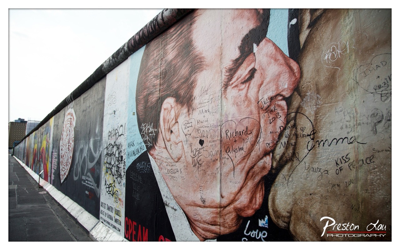

1. Overall Rating (0–10) — 7.5
This photograph captures the layered history and emotional resonance of the Berlin Wall, where political symbolism meets personal expression. The juxtaposition of the massive mural of a man’s face—likely a political figure—with the countless handwritten messages of love and hope creates a powerful narrative of unity and remembrance. While the overcast sky and flat lighting slightly dampen the visual drama, the image succeeds in conveying the weight of history and the human stories inscribed upon it.
2. Composition (0–10) — 8.0
The diagonal line of the wall leads the eye from the foreground into the distance, creating a strong sense of depth. The large portrait dominates the right side, drawing focus, while the left side offers visual variety with additional murals and graffiti, balancing the frame effectively.
3. Lighting (0–10) — 6.0
The overcast sky provides even, diffused light that avoids harsh shadows and highlights the textures of the wall and graffiti. However, the lack of directional light or contrast diminishes the drama and depth of the mural, giving the scene a somewhat muted tone.
4. Color & Tone (0–10) — 7.0
The muted, earthy tones of the mural—browns, grays, and faded reds—contrast with the brighter splashes of graffiti and the white of the wall. While the palette is subdued, it suits the somber yet hopeful mood of the location, with the handwritten messages adding pockets of personal color and emotion.
5. Creativity (0–10) — 8.0
The image captures a unique convergence of political art and personal testimony, transforming a historical monument into a living canvas of human connection. The choice to include both the monumental portrait and the intimate inscriptions adds a layered narrative that feels both timely and timeless.
6. Technical Quality (0–10) — 8.0
The image is sharp and well-focused, with fine detail visible in both the mural and the handwriting. The wide-angle perspective captures the scale of the wall without significant distortion, and the watermark is discreet, preserving the image’s integrity.
7. Emotional Impact (0–10) — 8.5
The photograph evokes a deep sense of reflection, touching on themes of division, reconciliation, and enduring love. The handwritten notes—“Love,” “Kiss of Peace,” “Richard + Alysha”—infuse the scene with warmth and vulnerability, creating a strong emotional connection that transcends the historical context.
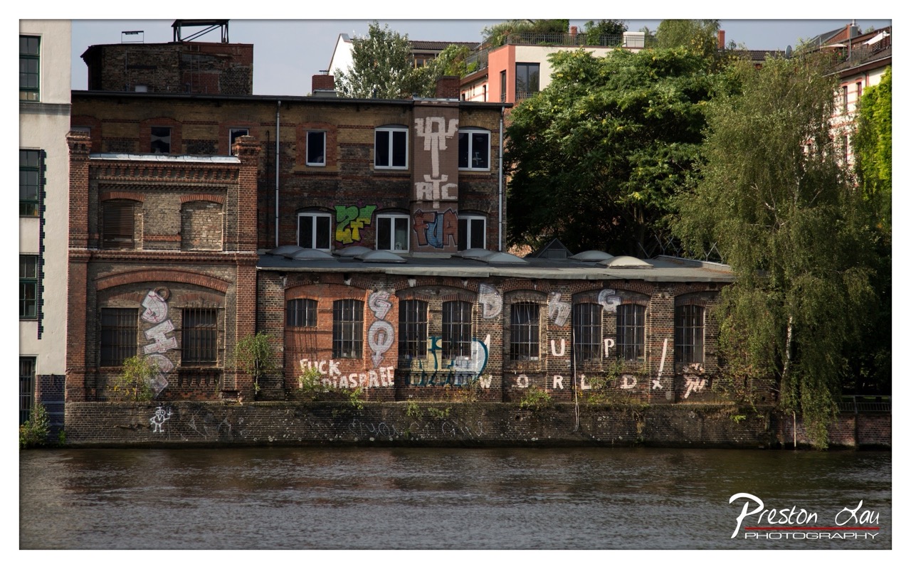

1. Overall Rating (0–10) — 6.8
This photograph captures the gritty poetry of urban decay along a riverbank, where history and rebellion collide in a single frame. The weathered brick façade, marked by layers of graffiti and overgrown foliage, tells a story of abandonment and resistance. While the image conveys a strong sense of place and atmosphere, its visual impact is slightly diminished by a lack of dynamic lighting and a muted tonal range, keeping the scene from fully resonating as a powerful artistic statement.
2. Composition (0–10) — 7.0
The building is centered with the river occupying the lower third, creating a balanced and grounded composition. The inclusion of the tree on the right adds visual weight and frames the structure, though the left side feels slightly more open and unbalanced.
3. Lighting (0–10) — 5.5
The lighting is flat and diffused, likely due to an overcast sky, which softens textures and reduces contrast. While this creates a somber mood appropriate to the subject, it also flattens the architectural details and limits the depth of the image.
4. Color & Tone (0–10) — 6.0
The palette is dominated by earthy reds, browns, and greens, with the graffiti introducing pops of brighter color. The overall tone is subdued, with a slight coolness in the water and sky that enhances the melancholic atmosphere but limits vibrancy.
5. Creativity (0–10) — 7.0
The photograph is conceptually strong, using graffiti as a form of urban commentary and the river as a symbolic boundary between past and present. The integration of text and architecture creates a narrative that feels both personal and political.
6. Technical Quality (0–10) — 7.5
The image is sharp and well-focused, with clean details in the brickwork and graffiti. The exposure is balanced, and there is minimal noise, indicating a high level of technical control.
7. Emotional Impact (0–10) — 6.5
The scene evokes a sense of quiet defiance and nostalgia, inviting reflection on urban transformation and cultural expression. While the emotional resonance is present, the lack of dramatic lighting and strong color dynamics keeps the viewer from fully immersing in the mood.
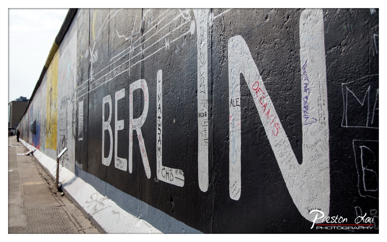

1. Overall Rating (0–10) — 7.0
This photograph captures the enduring power of the Berlin Wall as both a historical monument and a canvas for human expression. The bold, weathered "BERLIN" letters dominate the frame, evoking a sense of resilience and memory amid layers of graffiti and time. While the image’s clarity and composition are strong, the clutter of smaller markings slightly dilutes the visual focus, keeping it from achieving a more refined artistic impact.
2. Composition (0–10) — 7.5
The diagonal perspective of the wall draws the eye through the frame, creating a sense of depth and continuity. The placement of "BERLIN" as the central subject is effective, though the left side’s slight visual overload from additional graffiti and background elements disrupts balance.
3. Lighting (0–10) — 6.5
Natural daylight provides even illumination across the wall, highlighting texture and detail. The overcast sky softens shadows, allowing for clear visibility of the graffiti, though the lack of dramatic contrast limits the mood’s intensity.
4. Color & Tone (0–10) — 6.0
The dominant black-and-white palette of the wall emphasizes the starkness of the structure, while the scattered bursts of color—yellow, red, and blue—add visual interest. However, the color use is inconsistent and somewhat chaotic, reducing overall tonal cohesion.
5. Creativity (0–10) — 7.0
The image succeeds in capturing a layered narrative—history, art, and protest—within a single frame. The juxtaposition of the bold lettering with the dense graffiti reflects the Wall’s evolution from barrier to public forum, lending the photograph a strong conceptual depth.
6. Technical Quality (0–10) — 8.0
The photograph is sharp and well-focused, with clear detail in the texture of the concrete and the various inscriptions. The watermark is unobtrusive, and the exposure is balanced, indicating strong technical execution.
7. Emotional Impact (0–10) — 7.5
There is a palpable sense of gravity and reflection in the image, rooted in the Wall’s symbolic weight. The viewer is drawn into the story of division and remembrance, with the personal messages etched into the concrete serving as quiet testaments to human resilience.
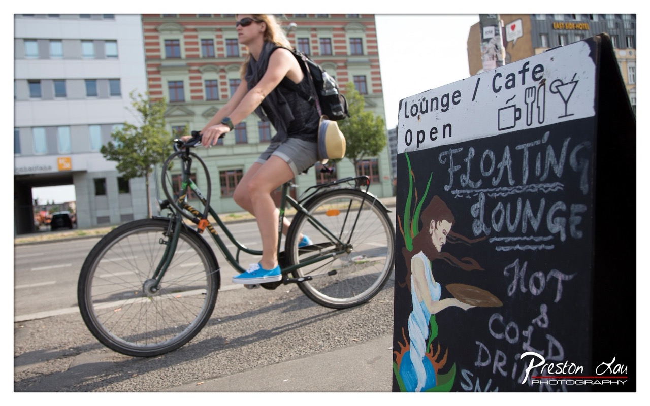

1. Overall Rating (0–10) — 7.0
This photograph captures a dynamic urban moment, blending motion and stillness in a way that feels both candid and composed. The cyclist’s movement contrasts with the static, hand-painted sign, creating a narrative tension between transit and place. While the image successfully conveys a slice of city life, the slightly cluttered background and uneven focus prevent it from achieving greater visual harmony.
2. Composition (0–10) — 6.5
The cyclist is positioned off-center, creating a sense of motion, while the sign anchors the frame on the right. However, the overlapping elements and lack of clear depth diminish the compositional balance.
3. Lighting (0–10) — 7.0
Natural daylight provides even illumination, with soft shadows that enhance texture without overpowering the scene. The bright sky adds contrast, though it slightly overexposes the background.
4. Color & Tone (0–10) — 7.5
The muted tones of the buildings and pavement are offset by the vibrant blue sneakers and the colorful sign, creating a lively yet grounded palette. The use of black and white for the sign adds graphic contrast.
5. Creativity (0–10) — 7.0
The juxtaposition of the cyclist and the whimsical café sign suggests a story of urban life and local culture. The hand-drawn elements add a personal, artistic touch that elevates the image beyond mere documentation.
6. Technical Quality (0–10) — 7.0
The focus is sharp on the cyclist and sign, with adequate clarity throughout. The slight motion blur on the wheels enhances dynamism, though the background detail is somewhat lost.
7. Emotional Impact (0–10) — 6.5
The image evokes a sense of everyday vitality and movement, inviting viewers to imagine the rhythm of city life. While not deeply emotive, it captures a fleeting, authentic moment with quiet charm.
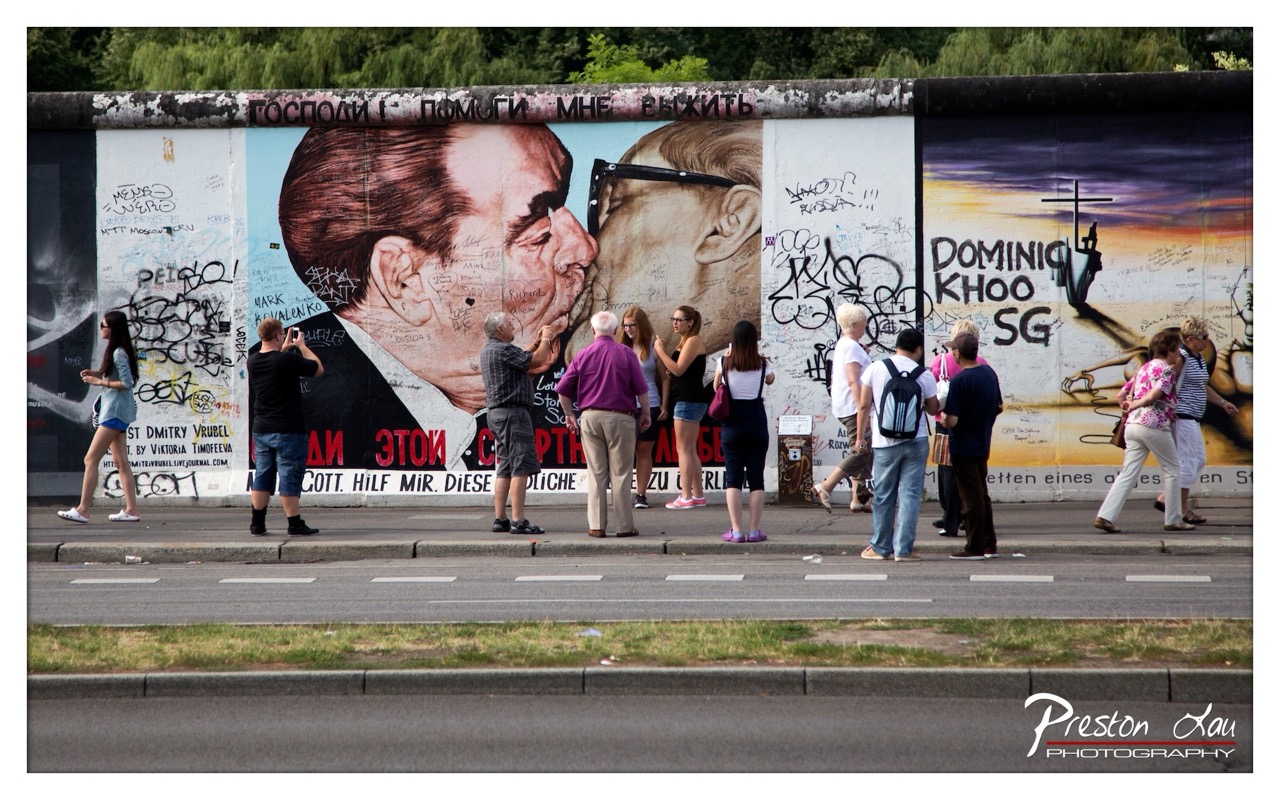

1. Overall Rating (0–10) — 7.0
This photograph captures a compelling intersection of history and contemporary life at the Berlin Wall, where political symbolism meets modern tourism. The juxtaposition of the iconic mural—featuring a kiss between Soviet leader Leonid Brezhnev and East German leader Erich Honecker—against the backdrop of tourists taking photos adds a layer of irony and reflection. While the image effectively documents a moment of cultural memory, the cluttered composition and overcast lighting slightly diminish its visual power.
2. Composition (0–10) — 6.0
The wide framing includes too much extraneous detail, particularly the road and sidewalk in the foreground, which distract from the mural’s significance. The central mural is visually dominant, but the scattered people and graffiti create a sense of visual noise.
3. Lighting (0–10) — 5.5
The flat, diffused daylight of an overcast day softens the scene, reducing contrast and depth. While it ensures even exposure, it also drains the emotional intensity of the mural’s powerful imagery.
4. Color & Tone (0–10) — 6.5
The muted tones of the concrete and sky are offset by the bold red and black of the mural, creating a visual anchor. However, the overall palette lacks vibrancy, with the graffiti and clothing blending into the background rather than enhancing it.
5. Creativity (0–10) — 7.5
The image succeeds in capturing a layered narrative—history, politics, and tourism—within a single frame. The choice to include both the mural and the observers adds a meta-commentary on memory and its public consumption.
6. Technical Quality (0–10) — 7.0
The photograph is sharp and clear, with good focus across the scene. The depth of field is adequate, though the wide perspective sacrifices some detail in the periphery.
7. Emotional Impact (0–10) — 6.5
The image evokes a contemplative mood, prompting reflection on the passage of time and the transformation of political symbols into tourist attractions. However, the lack of dramatic lighting and the busy composition limit its emotional resonance.
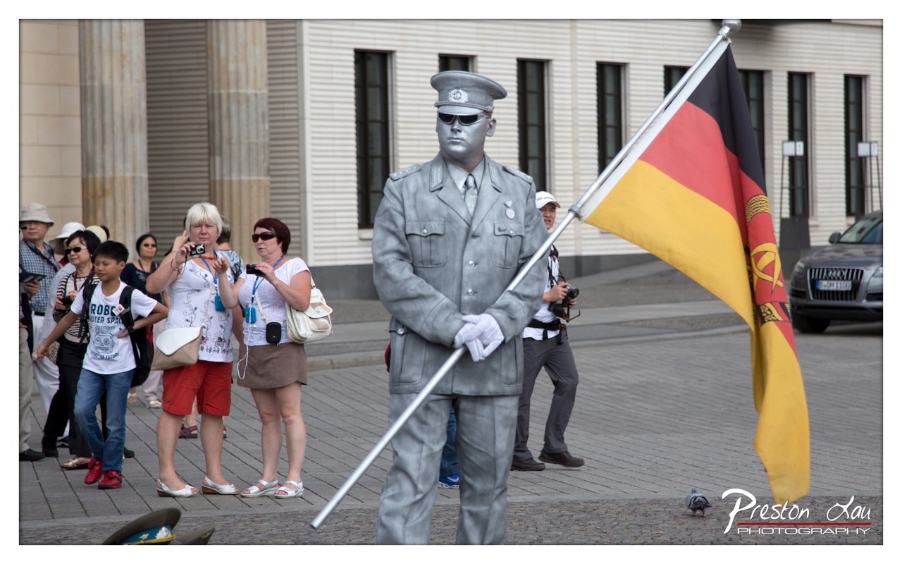

1. Overall Rating (0–10) — 7.0
This photograph captures a striking street performance, where a living statue in a silver-painted German military uniform commands attention amid a bustling public square. The contrast between the still, solemn figure and the casual, observant crowd creates a layered narrative about history, memory, and public engagement. While the image is visually compelling and rich in context, the slightly cluttered background and overexposed highlights slightly diminish its overall aesthetic cohesion.
2. Composition (0–10) — 6.5
The subject is well-centered and dominant, with the flag's diagonal line drawing the eye across the frame. However, the surrounding tourists and vehicles create visual distractions, and the composition feels slightly unbalanced due to the asymmetrical placement of the background elements.
3. Lighting (0–10) — 6.0
Bright, even daylight illuminates the scene, but the strong overhead light creates harsh reflections on the silver paint and overexposes the flag, reducing detail in the highlights. The lighting supports clarity but lacks the subtlety needed to enhance the mood.
4. Color & Tone (0–10) — 6.5
The bold red, black, and yellow of the German flag stand out against the muted silver and neutral tones of the surroundings. The palette is balanced, though the overexposure slightly flattens the tonal range, particularly in the sky and highlights.
5. Creativity (0–10) — 7.5
The concept of a living statue in a historically charged uniform is both bold and thought-provoking. It invites viewers to reflect on the intersection of art, history, and public space. The choice to use silver paint adds a surreal, almost alien quality that amplifies the commentary.
6. Technical Quality (0–10) — 7.0
The image is sharp and well-focused, with clean details in the subject’s face, uniform, and flag. The depth of field is appropriately managed, keeping the main figure in focus while softly blurring the background.
7. Emotional Impact (0–10) — 7.0
The photograph evokes a sense of tension and intrigue—between performance and reality, between past and present. The contrast between the solemn figure and the curious, modern-day onlookers creates a powerful emotional undercurrent, prompting reflection on how history is remembered and reenacted.
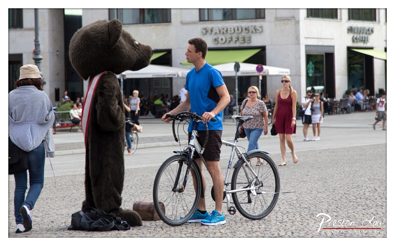

1. Overall Rating (0–10) — 6.8
This photograph captures a whimsical yet grounded moment in a bustling urban square, where the surreal presence of a costumed bear mascot contrasts with the everyday reality of a cyclist and passersby. The juxtaposition of the oversized, furry figure and the casual human activity creates a subtle narrative of absurdity and charm, though the scene feels slightly staged and lacks the spontaneity that would elevate it into a truly compelling image. The background details—Starbucks, cobblestones, and pedestrians—anchor the scene in a recognizable modern context, giving it a documentary feel that’s both relatable and slightly ironic.
2. Composition (0–10) — 6.5
The bear mascot and the cyclist are well-framed in the foreground, creating a strong focal point, though the composition is slightly off-center, with the bear’s head cutting into the left edge. The depth of field is effective, blurring the background just enough to draw attention to the main subjects, but the placement of the cyclist and mascot feels slightly awkward, as if the moment was interrupted rather than captured organically.
3. Lighting (0–10) — 7.0
Natural daylight illuminates the scene evenly, with soft shadows suggesting a midday sky. The lighting is bright and clear, enhancing the textures of the bear’s fur and the pavement, while casting subtle highlights on the cyclist’s blue shirt and sneakers. The overall brightness supports the lighthearted mood without creating harsh contrasts or blown-out areas.
4. Color & Tone (0–10) — 7.0
The palette is balanced, with the rich brown of the bear’s costume contrasting against the vibrant blue of the cyclist’s shirt and the neutral tones of the cobblestone and buildings. The red and white sash adds a pop of color that draws the eye. The overall tone is warm and inviting, with a slight coolness in the background that helps separate the foreground subjects.
5. Creativity (0–10) — 7.5
The image stands out for its playful juxtaposition of the absurd and the ordinary—a costumed mascot interacting with a real person in a public space. This contrast invites interpretation, suggesting themes of performance, identity, and urban life. The photographer captures a moment that feels both humorous and reflective, though the execution leans more toward documentation than artistic expression.
6. Technical Quality (0–10) — 7.5
The image is sharp and well-focused, particularly on the bear and the cyclist, with clean details throughout. The exposure is balanced, with no obvious over- or underexposed areas. The depth of field is appropriately managed, keeping the subjects crisp while softly blurring the background. The watermark in the corner is unobtrusive but clearly visible.
7. Emotional Impact (0–10) — 6.5
The image evokes a sense of curiosity and mild amusement, inviting viewers to wonder about the story behind the encounter. The emotional resonance is modest—while the scene is engaging, it doesn’t provoke a strong emotional reaction. The viewer is more likely to feel amused or intrigued than moved, as the moment feels fleeting and somewhat detached from deeper human connection.
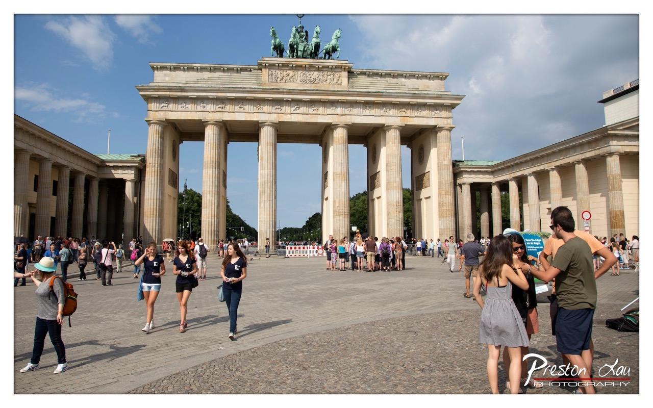

1. Overall Rating (0–10) — 7.0
This photograph captures the grandeur of the Brandenburg Gate under a bright, partly cloudy sky, with a lively crowd of tourists adding scale and energy to the scene. The image effectively conveys the monument’s historical weight while grounding it in the present through the presence of everyday visitors. While the composition is strong and the lighting is natural, the scene feels slightly overexposed in the sky and the foreground activity borders on distracting, slightly undermining the gate’s solemnity.
2. Composition (0–10) — 7.5
The gate is centered and dominates the frame, creating a strong focal point. The wide-angle perspective emphasizes its scale, and the diagonal movement of the people adds dynamism. However, the crowd in the foreground slightly cluttered the lower third, reducing visual clarity.
3. Lighting (0–10) — 7.0
The bright daylight enhances the textures of the stone and casts crisp shadows, adding depth. The sky is slightly overexposed, with some loss of detail in the clouds, but overall the lighting supports the scene’s vibrant, open-air atmosphere.
4. Color & Tone (0–10) — 6.5
The palette is natural and consistent, with warm stone tones and a vivid blue sky. However, the colors lack vibrancy, possibly due to overexposure, giving the image a slightly washed-out feel.
5. Creativity (0–10) — 6.0
The image is a solid travel photograph, capturing a well-known landmark in a familiar context. While it effectively documents the moment, it offers little beyond the expected view—there’s no strong narrative or unique perspective to distinguish it.
6. Technical Quality (0–10) — 7.5
The image is sharp and well-focused, with good detail in the architectural elements and foreground subjects. The wide-angle lens is used skillfully to capture the full scope of the scene without significant distortion.
7. Emotional Impact (0–10) — 6.5
The photograph evokes a sense of place and shared experience—tourists exploring a historic site—but lacks deeper emotional resonance. It feels more like a snapshot than a contemplative portrait of history and memory.
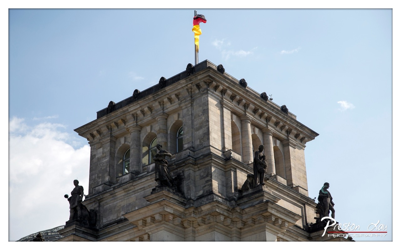

1. Overall Rating (0–10) — 7.0
This photograph captures the grandeur of the Reichstag’s iconic dome under a bright sky, with the German flag fluttering as a symbol of continuity and renewal. The low-angle perspective emphasizes the monument’s architectural weight and historical significance, while the clear, crisp details lend a sense of dignity to the image. A more dynamic sky or a subtle shift in lighting could elevate its emotional resonance, but as it stands, the photo effectively conveys both architectural majesty and national identity.
2. Composition (0–10) — 7.5
The low-angle framing creates a powerful sense of scale, drawing the eye upward toward the flag. The statues are balanced along the building’s cornice, adding rhythm and visual interest, though the slight asymmetry of the flagpole slightly disrupts the symmetry.
3. Lighting (0–10) — 8.0
Bright, natural daylight illuminates the stone facade evenly, highlighting texture and detail. The soft shadows enhance depth without obscuring architectural elements, and the clear sky provides a clean backdrop that makes the flag stand out.
4. Color & Tone (0–10) — 7.0
The palette is dominated by neutral stone tones and the vivid red, black, and gold of the German flag, which provide a strong focal point. The blue sky adds a cool contrast, though the overall tone leans slightly clinical due to the high-key exposure.
5. Creativity (0–10) — 7.5
The choice to focus on the upper portion of the Reichstag, rather than a full façade shot, offers a fresh perspective on a well-documented landmark. The interplay between historic architecture and the national flag adds narrative depth.
6. Technical Quality (0–10) — 8.5
Sharp focus, excellent clarity, and clean exposure demonstrate strong technical execution. The image is free of noise and distortion, capturing fine architectural details with precision.
7. Emotional Impact (0–10) — 7.0
The photograph evokes a sense of pride and reverence, rooted in the symbolic presence of the flag atop one of Germany’s most important political buildings. While the emotional pull is subtle, it resonates through the strength of its subject and composition.
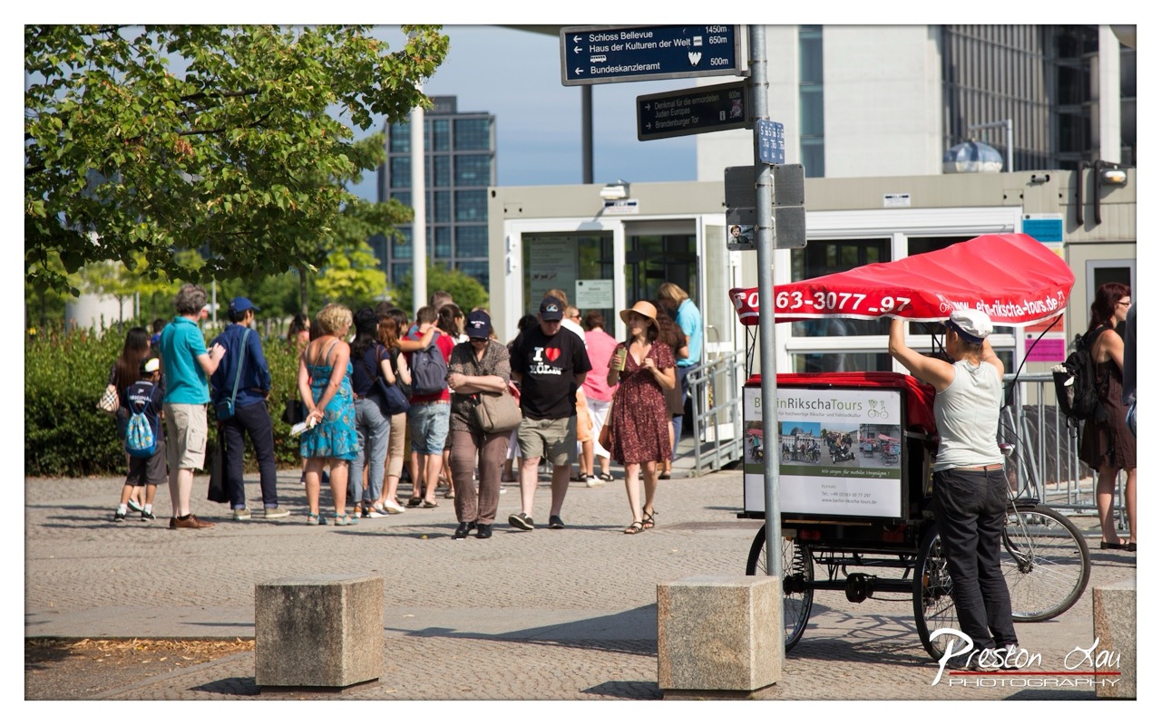

1. Overall Rating (0–10) — 6.8
This photograph captures a lively moment in an urban European setting, where tourists gather under a bright sun, creating a sense of movement and everyday life. The composition effectively balances human activity with architectural and informational elements, grounding the scene in a specific location. While the image conveys a candid, documentary quality, it lacks a strong focal point, slightly diminishing its visual impact. The vibrant red of the rickshaw tent provides a striking contrast, drawing the eye but not fully integrating into the narrative.
2. Composition (0–10) — 6.5
The image is well-framed with a balanced distribution of subjects and elements across the frame. The diagonal placement of the rickshaw and the leading lines of the cobblestone path guide the viewer’s eye through the scene. However, the large group of people on the left creates a slight visual imbalance, and the foreground bollards, while grounding the image, also interrupt the flow.
3. Lighting (0–10) — 7.0
The scene is illuminated by bright, natural sunlight, creating sharp shadows and a clear sense of time of day. The light enhances the vividness of the red tent and the green foliage, adding depth and clarity. However, the overhead sun creates harsh highlights on some surfaces, slightly flattening the texture of the pavement and faces.
4. Color & Tone (0–10) — 7.0
The color palette is rich and varied, with the red canopy standing out against the neutral tones of the pavement and modern architecture. The green of the trees adds a natural contrast, while the overall tones remain clean and well-exposed. The subtle saturation enhances the image’s realism without appearing overly processed.
5. Creativity (0–10) — 6.0
The photograph documents a moment in time with a sense of authenticity, capturing the intersection of tourism, urban life, and public space. The inclusion of directional signage and the rickshaw adds narrative context, but the approach is largely observational rather than interpretive, limiting its originality.
6. Technical Quality (0–10) — 7.5
The image is sharp and well-focused, with clear details in both the foreground and background. The exposure is well-managed, with no significant overexposed or underexposed areas. The focus is consistent across the frame, and the depth of field appropriately captures the scene’s breadth.
7. Emotional Impact (0–10) — 6.5
The photograph evokes a sense of curiosity and movement, inviting the viewer to imagine the stories behind the people and their destinations. The sunny atmosphere and casual interactions create a light, upbeat mood, though the sheer number of subjects keeps the emotional connection somewhat impersonal.
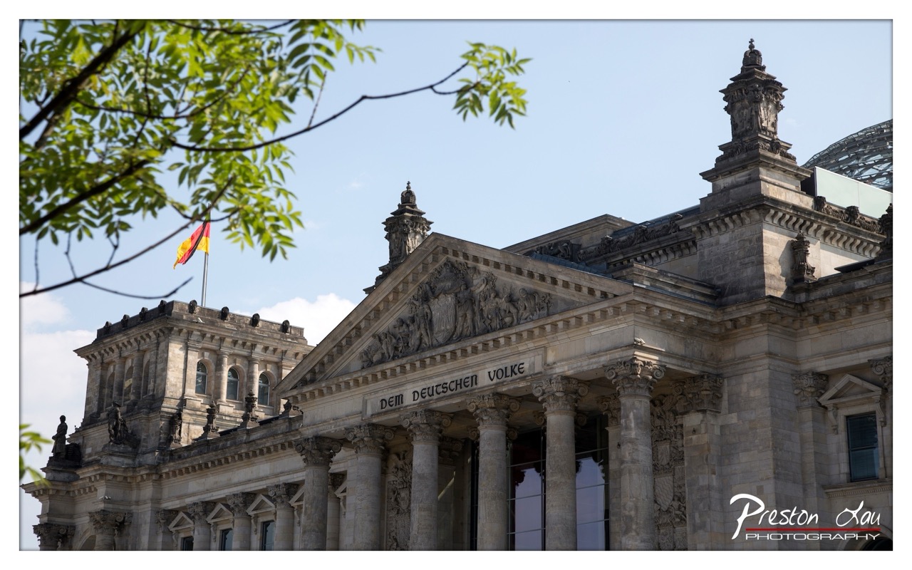

1. Overall Rating (0–10) — 7.5
This photograph captures the Reichstag Building with a sense of grandeur and historical weight, its classical architecture framed by the soft green of spring foliage. The inclusion of the German flag and the inscription “Dem Deutschen Volke” adds a layer of national significance, while the natural foreground balances the monument’s formality. The image is strong in mood and context, though the composition’s slight asymmetry and overexposed sky prevent it from feeling fully polished.
2. Composition (0–10) — 7.0
The diagonal branch in the upper left creates a natural frame, guiding the eye toward the building’s pediment. However, the left side feels slightly heavier due to the foliage and flag placement, while the right side appears more open, creating an imbalance that slightly disrupts visual harmony.
3. Lighting (0–10) — 7.5
Natural daylight illuminates the façade evenly, highlighting the stone texture and sculptural details. The bright sky, while slightly overexposed, adds clarity and contrast, enhancing the monument’s presence without obscuring key features.
4. Color & Tone (0–10) — 7.0
The palette is balanced, with the warm stone tones of the building contrasting against the vibrant green leaves and the cool blue of the sky. The German flag adds a bold splash of color, though the overall tone leans slightly cool, which softens the image’s warmth.
5. Creativity (0–10) — 7.5
The interplay between nature and architecture offers a thoughtful juxtaposition, evoking both continuity and renewal. The choice to include the flag and inscription grounds the image in cultural narrative, elevating it beyond a simple architectural portrait.
6. Technical Quality (0–10) — 8.0
The image is sharp and well-focused, with clear detail in the stonework and carvings. The exposure is generally well-handled, though the sky’s brightness suggests a minor overexposure that slightly washes out the upper frame.
7. Emotional Impact (0–10) — 7.0
The photograph conveys a sense of reverence and civic pride, inviting reflection on history and democracy. The blend of natural and man-made elements fosters a contemplative mood, though the emotional resonance is slightly muted by the composition’s uneven balance.
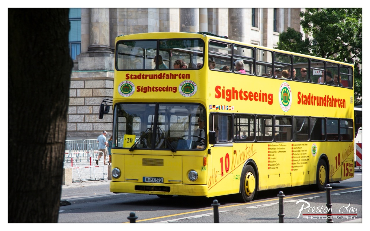

1. Overall Rating (0–10) — 7.0
This photograph captures the vibrant energy of urban tourism with a bold, eye-catching subject—a bright yellow double-decker sightseeing bus—set against the backdrop of classical European architecture. The bus’s vivid color contrasts sharply with the muted stone of the building, creating a dynamic visual tension that draws the viewer in. While the framing is slightly off-center and the composition feels casual, the image effectively conveys the rhythm of city life and the appeal of travel, with a sense of motion and immediacy that gives it life.
2. Composition (0–10) — 6.5
The bus dominates the frame, but the inclusion of the tree trunk on the left and the barrier on the right creates a slightly cluttered feel. A tighter crop would improve balance and focus.
3. Lighting (0–10) — 7.5
Bright, natural daylight enhances the bus’s yellow hue and reveals fine details. The shadows are well-defined, adding depth without overexposing the scene.
4. Color & Tone (0–10) — 8.0
The dominant yellow is rich and saturated, creating a strong visual anchor. The neutral tones of the stone and asphalt provide a complementary backdrop, while the red and green accents add subtle vibrancy.
5. Creativity (0–10) — 7.0
The juxtaposition of modern tourism with historic architecture offers a compelling narrative. The use of a moving vehicle as a focal point adds dynamism, though the moment captured is fairly typical of city sightseeing.
6. Technical Quality (0–10) — 8.0
Sharp focus on the bus and clean details throughout the image indicate strong technical execution. The exposure is well-balanced, and the watermark is unobtrusive.
7. Emotional Impact (0–10) — 6.5
The image evokes a sense of travel and discovery, inviting viewers to imagine the stories of the tourists aboard. While engaging, it lacks deeper emotional resonance, leaning more toward documentation than evocation.
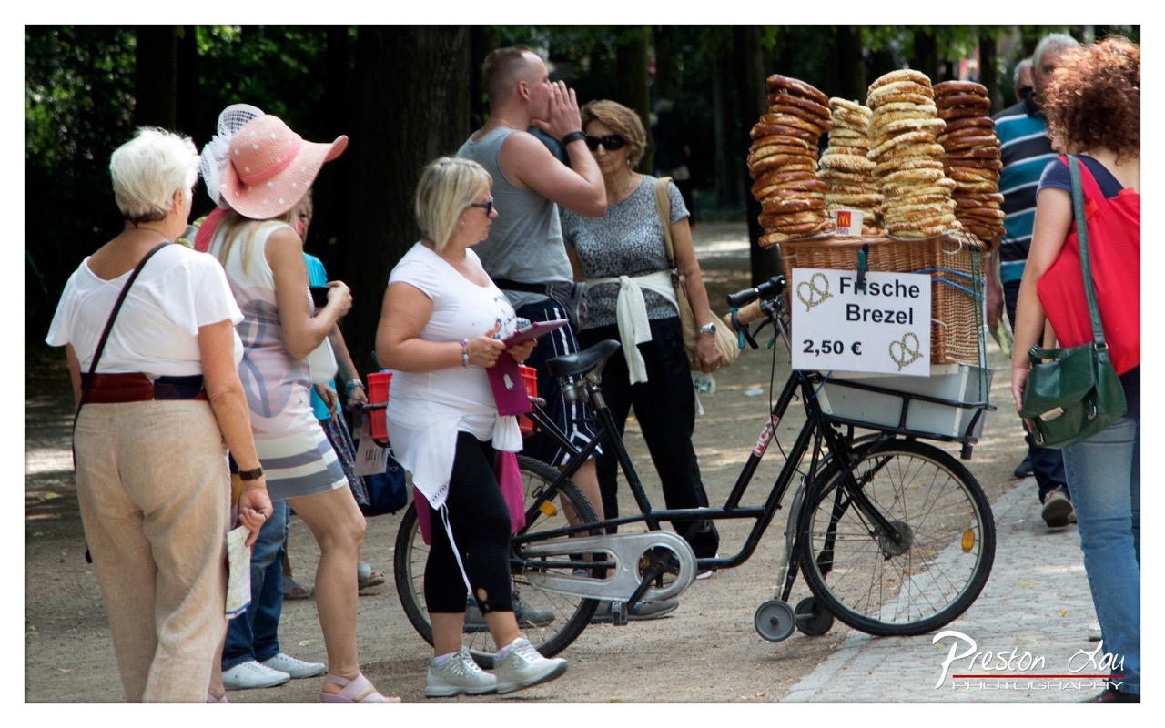

1. Overall Rating (0–10) — 6.8
This photograph captures a lively street scene in a park, where a bicycle vendor selling fresh pretzels becomes the focal point amid a casual crowd. The candid nature of the moment gives it authenticity, and the warm daylight enhances the sense of everyday life. While the composition is engaging, it lacks a clear narrative focus, and the cluttered background slightly dilutes the visual impact.
2. Composition (0–10) — 6.0
The subject is well-placed near the center, but the overlapping figures and uneven framing create visual tension. A tighter crop would emphasize the vendor and his wares, reducing distractions from the surrounding pedestrians.
3. Lighting (0–10) — 7.0
Natural daylight provides even illumination with soft shadows, highlighting textures in the pretzels and clothing. The sunlight filtering through trees adds depth and a sense of place, though some areas are slightly overexposed.
4. Color & Tone (0–10) — 6.5
The palette is balanced, with earthy tones from the pretzels and foliage complementing the neutral clothing. The scene feels natural, though the colors lack vibrancy, giving it a slightly muted, documentary quality.
5. Creativity (0–10) — 6.5
The image succeeds in capturing a slice of urban life with an authentic, observational approach. The use of a bicycle vendor as a cultural anchor adds narrative depth, but the execution remains conventional rather than inventive.
6. Technical Quality (0–10) — 7.5
Sharp focus on the central figures and the pretzel display ensures clarity, and the exposure is well-managed. The watermark is present but does not detract significantly from the overall quality.
7. Emotional Impact (0–10) — 6.0
The photograph evokes a sense of casual community and everyday rhythm, but the emotional resonance is limited by the lack of a strong focal point or emotional connection to any individual. It feels more like a snapshot than a deeply moving moment.
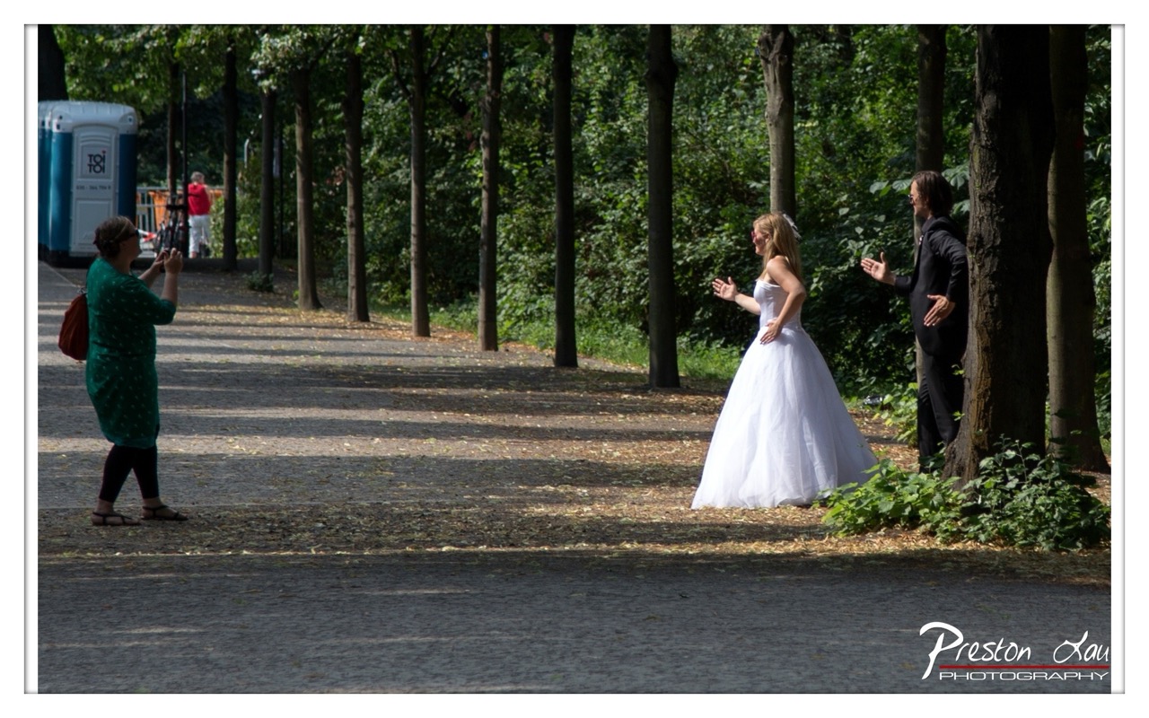

1. Overall Rating (0–10) — 7.0
This photograph captures a candid, emotionally charged moment during what appears to be a wedding photoshoot, blending formal elegance with spontaneous joy. The contrast between the bride’s radiant white gown and the natural, sun-dappled park setting creates a visually compelling narrative. While the composition is strong and the mood authentic, the presence of a portable toilet in the background slightly undermines the romantic ideal, grounding the scene in reality.
2. Composition (0–10) — 6.5
The diagonal path leads the eye through the frame, creating depth and guiding attention toward the central interaction. However, the inclusion of the woman on the left and the off-center placement of the bride disrupt visual balance, making the scene feel slightly cluttered.
3. Lighting (0–10) — 7.5
Natural sunlight filters through the trees, casting soft, dappled shadows that enhance the texture of the scene. The interplay of light and shade adds dimension and warmth, reinforcing the intimate, candid atmosphere.
4. Color & Tone (0–10) — 7.0
The palette is rich and natural, with the crisp white of the bride’s gown standing out against the lush greens and earthy browns of the park. The tones are well-balanced, with sufficient contrast to make the subject pop without appearing oversaturated.
5. Creativity (0–10) — 7.5
The image successfully captures a moment of genuine emotion and connection, elevating a routine wedding portrait into a narrative scene. The juxtaposition of formal attire against an informal outdoor setting adds an element of authenticity and spontaneity.
6. Technical Quality (0–10) — 8.0
The image is sharp and well-focused, with clean detail in the bride’s dress and facial expressions. The exposure is well-managed, preserving highlights and shadows without clipping.
7. Emotional Impact (0–10) — 8.0
The joy and laughter between the bride and groom are palpable, and the photographer’s ability to capture this fleeting moment creates a strong emotional resonance. The viewer feels like a quiet observer of a private, heartfelt celebration.
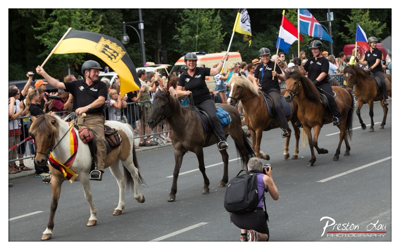

1. Overall Rating (0–10) — 7.0
This photograph captures the vibrant energy of a horse parade with dynamic movement and palpable joy. The riders’ expressions and the waving flags convey a sense of pride and celebration, while the crowd’s engagement adds to the festive atmosphere. Though the composition is slightly cluttered, the image succeeds in conveying the spirit of a lively public event, making it both engaging and memorable.
2. Composition (0–10) — 6.5
The diagonal flow of riders creates a sense of motion, but the crowded foreground and midground slightly disrupt visual balance. The kneeling photographer in the lower right adds depth but also competes for attention.
3. Lighting (0–10) — 7.0
Natural daylight illuminates the scene evenly, highlighting the riders and horses without harsh shadows. The overcast sky softens the light, enhancing texture and detail across the subjects.
4. Color & Tone (0–10) — 7.5
The palette is rich and varied, with the bold yellow and black flag standing out against the earthy tones of the horses and the green background. The colors feel authentic and vibrant, contributing to the celebratory mood.
5. Creativity (0–10) — 7.0
The image captures a moment of cultural expression with a strong sense of place and identity. The inclusion of multiple national flags adds narrative depth, suggesting a multicultural or international event.
6. Technical Quality (0–10) — 8.0
Sharp focus on the main subjects, clean detail in the riders and horses, and good exposure control reflect strong technical execution. The depth of field is appropriate for the scene.
7. Emotional Impact (0–10) — 8.0
The joy and enthusiasm of the riders, combined with the crowd’s excitement, create an infectious sense of celebration. The image evokes warmth, pride, and a shared sense of community.
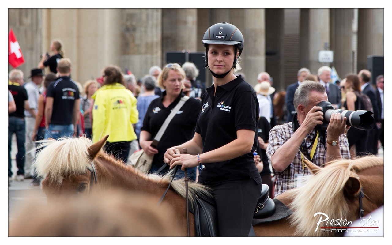

1. Overall Rating (0–10) — 7.0
This photograph captures a moment of poised focus amidst the chaos of a public equestrian event, where the rider’s calm presence stands in contrast to the surrounding energy. The shallow depth of field isolates the subject effectively, drawing the eye to her composed expression and athletic bearing. While the background is lively and full of motion, the image risks feeling slightly over-crowded, with competing elements that dilute the central narrative.
2. Composition (0–10) — 7.5
The rider is well-placed off-center, creating a dynamic balance with the surrounding activity. The use of foreground elements—horse heads and blurred figures—adds depth and frames the subject naturally, though the left side feels slightly more congested than the right.
3. Lighting (0–10) — 7.0
Natural daylight provides even illumination, highlighting the rider’s face and uniform without harsh shadows. The soft, diffused light enhances the mood, lending a candid, documentary quality to the scene.
4. Color & Tone (0–10) — 6.5
The palette is grounded in earthy browns and blacks, with the pop of the yellow jacket and red flag adding visual interest. The overall tone is neutral, with a slight coolness in the highlights that slightly undercuts the warmth of the moment.
5. Creativity (0–10) — 7.0
The photographer captures a layered narrative—athletic discipline, public spectacle, and behind-the-scenes preparation—through a single, well-timed frame. The inclusion of the photographer in the background adds a meta layer, reinforcing the idea of documentation and observation.
6. Technical Quality (0–10) — 8.0
The focus is sharp on the rider’s face and upper body, with excellent clarity in the foreground and background blur. The lens choice and aperture were well-suited to the situation, creating a strong sense of depth.
7. Emotional Impact (0–10) — 7.5
The rider’s direct gaze and calm demeanor evoke a sense of determination and quiet confidence, inviting the viewer to connect with her personal moment of focus. The surrounding activity underscores the intensity of the event, amplifying the emotional resonance of her composure.
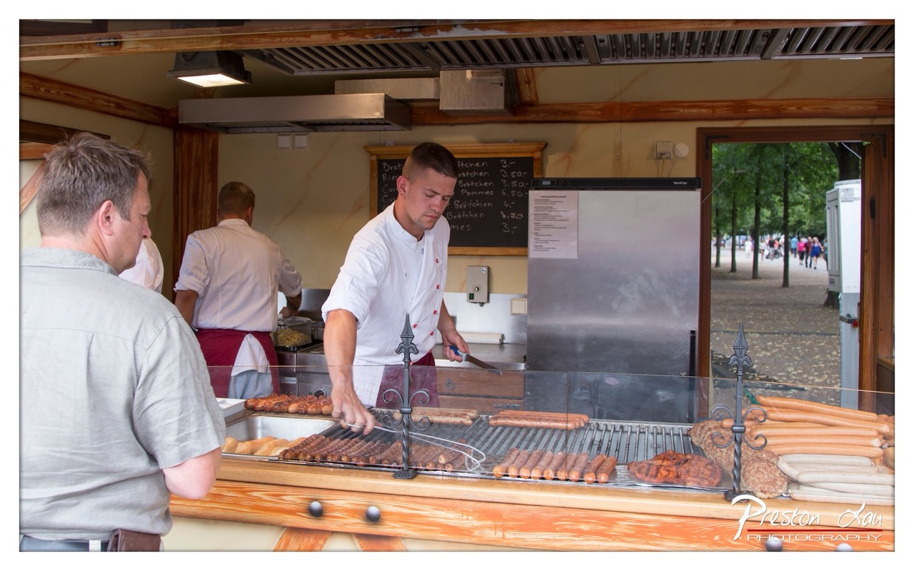

1. Overall Rating (0–10) — 7.0
This photograph captures the vibrant energy of a street food stall, where the interplay of movement, texture, and human interaction creates a compelling snapshot of everyday life. The chef’s focused expression and the sizzling sausages on the grill convey a sense of authenticity and craftsmanship. While the composition is busy and the lighting somewhat flat, the image succeeds in evoking the sensory richness of a lively market scene.
2. Composition (0–10) — 6.5
The framing includes a strong diagonal line from the grill to the customer, guiding the eye through the scene. However, the cluttered foreground and overlapping figures slightly disrupt visual flow, creating a sense of immediacy but reducing compositional harmony.
3. Lighting (0–10) — 6.0
The overhead fluorescent light provides even illumination, clearly revealing details but lacking depth and mood. The natural light from the open door contrasts with the interior, creating a slight imbalance in tonal consistency.
4. Color & Tone (0–10) — 6.5
The warm browns of the wood and the golden hues of the grilled sausages are balanced by the cool metallic tones of the equipment. The palette is natural and cohesive, though the overall tone leans slightly muted, dampening the vibrancy of the scene.
5. Creativity (0–10) — 7.0
The image captures a candid moment with strong narrative potential, emphasizing the ritual of food preparation. The juxtaposition of the focused chef and the relaxed customer adds narrative depth, making the scene feel both personal and universal.
6. Technical Quality (0–10) — 7.5
The image is sharp and well-exposed, with clear focus on the central subject. The details of the sausages, the grill, and the chef’s uniform are well-defined, and the watermark is discreet.
7. Emotional Impact (0–10) — 7.0
The photograph evokes a sense of warmth, tradition, and communal enjoyment. The viewer is drawn into the scene, imagining the smell of grilling meat and the sounds of a bustling market, creating a strong emotional connection to the moment.
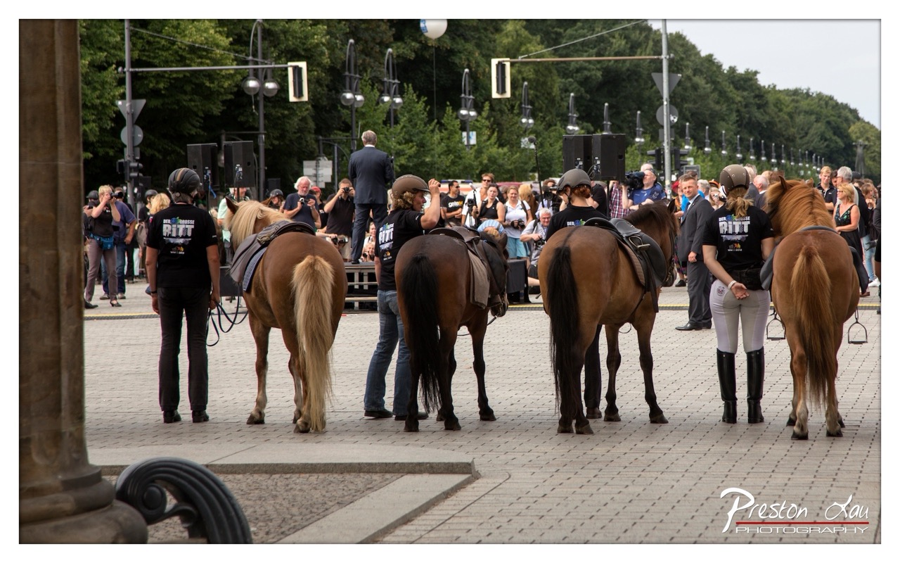

1. Overall Rating (0–10) — 6.8
This photograph captures a vibrant equestrian gathering, where the energy of preparation and anticipation is palpable. The riders and horses, clad in matching black shirts, form a cohesive group against the backdrop of a bustling public square, suggesting a ceremonial or competitive event. While the image effectively conveys the atmosphere of the moment, its visual impact is slightly diminished by the lack of a strong focal point and the distraction of background elements. The scene feels authentic and lively, but could benefit from tighter framing and more deliberate composition to elevate its artistic resonance.
2. Composition (0–10) — 6.0
The subjects are arranged in a staggered line, creating a sense of depth, but the wide-angle perspective and busy background dilute focus. The left edge of the frame includes a large column that partially obstructs the view, while the right side is cluttered with spectators and equipment. A tighter crop would enhance the visual cohesion and direct attention to the riders and their horses.
3. Lighting (0–10) — 6.5
The scene is illuminated by soft, diffused daylight, likely from an overcast sky, which evenly lights the subjects and minimizes harsh shadows. This lighting is well-suited for capturing the natural colors and details of the horses and riders without glare or contrast issues. However, the lack of directional light results in a somewhat flat appearance, reducing the sense of drama or atmosphere.
4. Color & Tone (0–10) — 6.2
The color palette is dominated by earthy browns of the horses, black and gray tones of the riders' attire, and the muted grays of the pavement. The greens of the trees in the background provide a subtle contrast, but the overall tone is subdued and somewhat desaturated. A touch more vibrancy in the colors—particularly in the horses’ manes and tails—would add visual interest.
5. Creativity (0–10) — 6.5
The photograph successfully documents a moment of collective preparation, capturing the quiet anticipation before a performance. The matching team shirts and uniformity of the riders suggest a sense of unity and purpose. While the image is observational and grounded in reality, it lacks a distinctive visual or conceptual twist that would elevate it beyond a straightforward event capture.
6. Technical Quality (0–10) — 7.5
The image is sharp and well-focused, with clear details visible in the riders’ gear, the horses’ coats, and the surrounding environment. The resolution is high, and the camera appears to have handled the dynamic range effectively, preserving detail in both the shadows and highlights. The watermark is discreet and does not detract from the image.
7. Emotional Impact (0–10) — 6.0
The photograph evokes a sense of calm readiness and shared purpose among the riders, suggesting a moment of quiet before action. The presence of spectators and media hints at the significance of the event, but the emotional connection to the viewer is somewhat restrained by the wide, impersonal framing. The image feels more like a document than a deeply personal or moving portrait.
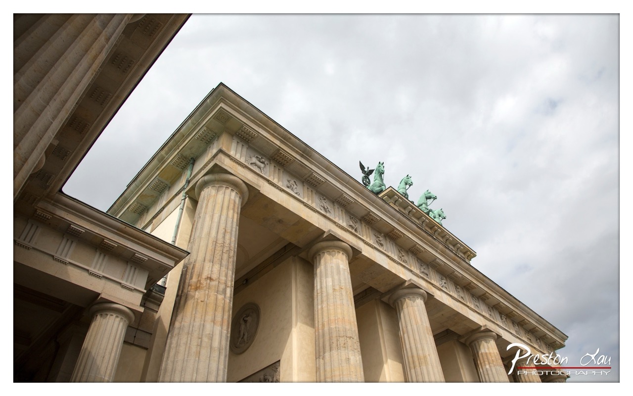

1. Overall Rating (0–10) — 7.5
This photograph captures the grandeur of the Brandenburg Gate with a dramatic low-angle perspective that emphasizes its architectural majesty. The cloudy sky adds a somber, contemplative mood, while the weathered stone and iconic Quadriga sculpture lend historical weight. The image is strong in atmosphere and composition, though the overcast lighting slightly dulls the potential vibrancy of the scene.
2. Composition (0–10) — 8.0
The low-angle framing creates a powerful sense of scale, drawing the eye upward along the fluted columns toward the Quadriga. The diagonal inclusion of the adjacent column on the left adds depth and dynamism, while the balanced arrangement of the central structure guides the viewer’s gaze effectively.
3. Lighting (0–10) — 6.5
Diffused light from the overcast sky provides even illumination, minimizing harsh shadows and allowing texture in the stone to be visible. However, the lack of direct sunlight results in a muted tonal range, reducing the dramatic contrast that could enhance the structure’s three-dimensionality.
4. Color & Tone (0–10) — 7.0
The palette is restrained, dominated by soft beige and gray tones that evoke a sense of timelessness. The green patina of the Quadriga offers a subtle but effective accent, adding a touch of color without disrupting the image’s subdued harmony.
5. Creativity (0–10) — 7.5
The choice of angle and framing elevates a familiar landmark into a more monumental and introspective portrayal. By focusing on architectural detail and atmospheric context, the photograph transforms a tourist image into a contemplative study of history and endurance.
6. Technical Quality (0–10) — 8.5
Sharp focus across the frame captures fine details in the stone and sculpture. The clean, well-exposed image, with minimal noise and strong clarity, reflects a high level of technical execution.
7. Emotional Impact (0–10) — 7.0
The image conveys a quiet reverence for history, evoking a sense of awe and solemnity. The combination of grand architecture and overcast sky invites reflection, creating a mood that is both majestic and melancholic.
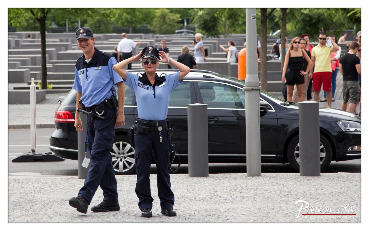

1. Overall Rating (0–10) — 7.0
This photograph captures a candid moment of human connection amidst a solemn public space, where two police officers share a lighthearted interaction that contrasts with the somber backdrop of the Memorial to the Murdered Jews of Europe. The authenticity of their expressions—especially the woman’s playful pose and the man’s warm smile—injects warmth and humanity into the scene. While the image succeeds in conveying a quiet narrative of duty and camaraderie, the background’s emotional weight and the slight busyness of the composition temper its overall visual cohesion.
2. Composition (0–10) — 6.5
The officers are well-framed in the foreground, drawing immediate attention, but the background’s scattered visitors and architectural elements create visual noise that competes for focus. A tighter crop or slightly more intentional alignment with the memorial’s geometric lines could enhance balance.
3. Lighting (0–10) — 7.0
Natural daylight provides even illumination, highlighting the officers’ uniforms and facial expressions without harsh shadows. The soft, diffused light enhances the candid quality of the moment while maintaining clarity.
4. Color & Tone (0–10) — 6.5
The cool blue of the uniforms contrasts effectively with the muted grays of the memorial and the black car, creating visual interest. However, the overall palette leans toward neutrality, with a lack of vibrant tones that might otherwise elevate the emotional resonance.
5. Creativity (0–10) — 7.5
The juxtaposition of lightheartedness against a site of profound historical significance offers a compelling narrative. The photographer’s choice to capture this spontaneous moment adds depth and originality, transforming a routine scene into a thought-provoking story.
6. Technical Quality (0–10) — 8.0
The image is sharp and well-focused, with clean detail in the uniforms, facial features, and background elements. The exposure is balanced, and the resolution supports clarity across the frame.
7. Emotional Impact (0–10) — 7.0
The warmth of the officers’ interaction evokes a sense of relatability and humanity, creating an emotional bridge between the viewer and the scene. While the memorial’s gravity looms in the background, the photograph’s focus on personal connection gives it a poignant, uplifting undertone.
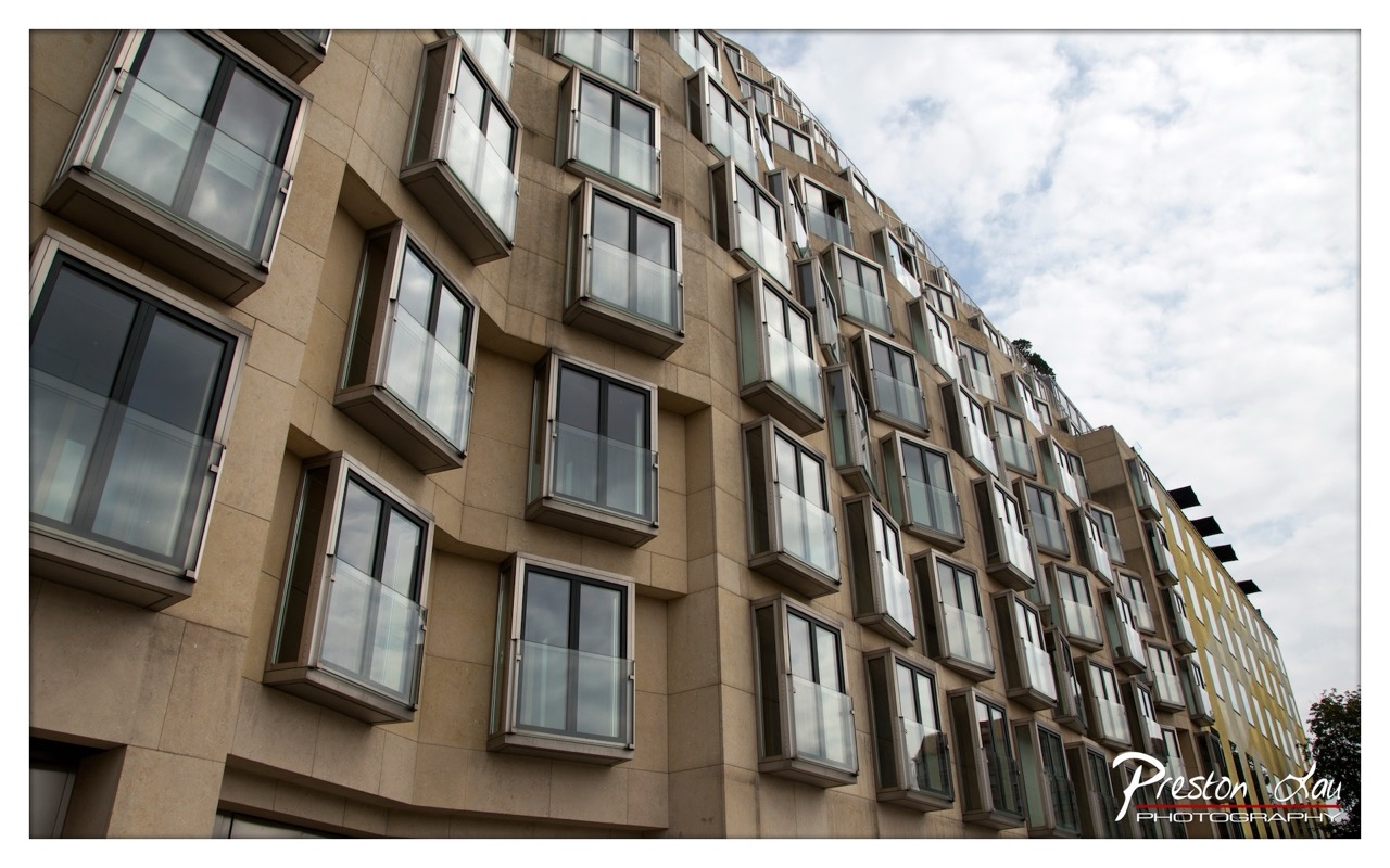

1. Overall Rating (0–10) — 7.0
This photograph captures the bold, geometric rhythm of a modern architectural facade, where the staggered windows create a dynamic, almost musical pattern against the soft sky. The low-angle perspective emphasizes the building’s imposing scale and sculptural form, while the overcast light lends a contemplative, subdued mood. Though the image is visually striking in its composition, it feels slightly restrained by the lack of a strong focal point, leaving the viewer adrift in the repetition of forms.
2. Composition (0–10) — 7.5
The diagonal alignment of the building draws the eye upward and across the frame, creating a sense of movement. The low-angle shot enhances the structure’s grandeur, while the consistent repetition of windows establishes a compelling rhythm. The inclusion of a sliver of yellow on the right edge adds subtle contrast, though the composition could benefit from tighter framing to eliminate distractions.
3. Lighting (0–10) — 6.5
Diffuse light from the overcast sky provides even illumination, minimizing harsh shadows and allowing the textures of the stone and glass to emerge clearly. While the lighting is technically effective, it lacks dramatic contrast, resulting in a somewhat flat atmosphere that softens the architectural detail.
4. Color & Tone (0–10) — 6.0
The palette is dominated by neutral beiges and grays, with a muted reflection in the glass windows. The subtle yellow accent on the far right offers a touch of warmth, but the overall tone remains restrained and cool, reinforcing the building’s modern, functional aesthetic.
5. Creativity (0–10) — 7.0
The photographer’s choice to emphasize the building’s unique geometry and rhythm demonstrates a strong visual sensibility. The perspective and framing transform an ordinary structure into a study in pattern and form, showcasing an appreciation for architectural detail and urban design.
6. Technical Quality (0–10) — 8.0
The image is sharp and well-focused throughout, with clear detail in both the stone facade and the glass panes. The exposure is balanced, and the camera’s angle and framing are executed with precision, resulting in a technically sound photograph.
7. Emotional Impact (0–10) — 5.5
While the image conveys a sense of order and quiet contemplation, it remains emotionally distant. The absence of human presence and the repetitive nature of the windows create a feeling of impersonality, making it more of an architectural study than an emotionally resonant portrait of place.
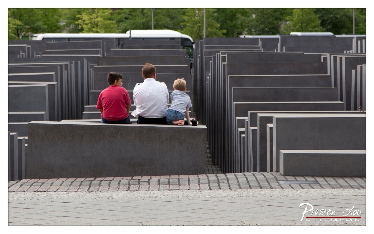

1. Overall Rating (0–10) — 7.5
This photograph captures a poignant moment of reflection within the solemn landscape of the Memorial to the Murdered Jews of Europe, where the weight of history meets the innocence of childhood. The composition draws the viewer into the maze-like arrangement of concrete slabs, emphasizing both the scale of the memorial and the quiet intimacy of the family seated together. While the image succeeds in conveying gravity and contemplation, its emotional power is tempered by a slightly distant perspective and a lack of dramatic lighting, which keeps it from transcending documentary realism into deeper artistic resonance.
2. Composition (0–10) — 8.0
The subjects are framed centrally, seated on a low wall that anchors the foreground, while the receding rows of stone slabs create a strong sense of depth and order. The diagonal lines of the walkway lead the eye into the scene, reinforcing the memorial’s geometric structure and the contemplative mood.
3. Lighting (0–10) — 6.5
Natural daylight illuminates the scene evenly, but the flat, overcast quality of the light softens shadows and diminishes the textural contrast of the concrete. While this contributes to the somber atmosphere, it also reduces the visual drama that could have heightened the memorial’s emotional weight.
4. Color & Tone (0–10) — 7.0
The muted palette—dominated by grays and the subtle contrast of the boys’ red and light-blue shirts—evokes a restrained, contemplative mood. The slight warmth in the brick pavement provides a subtle counterpoint to the cool tones of the memorial, adding visual interest without distracting from the solemnity.
5. Creativity (0–10) — 7.5
The image leverages the memorial’s powerful architectural form to create a narrative of memory and legacy. By capturing a family within this space, the photographer introduces a human element that contrasts with the monument’s impersonal scale, suggesting a connection between past and present that feels both thoughtful and original.
6. Technical Quality (0–10) — 8.0
The photograph is sharp and well-focused, with clean detail throughout the scene. The depth of field is appropriately managed, keeping both the subjects and the surrounding stelae in focus. The post-processing appears subtle and effective, preserving the scene’s natural tones.
7. Emotional Impact (0–10) — 8.0
The image evokes a quiet sense of reverence and introspection. The stillness of the moment, combined with the vastness of the memorial, creates a space for reflection on loss, remembrance, and the passage of time. The presence of the children adds a layer of vulnerability and continuity, making the emotional resonance both profound and deeply human.
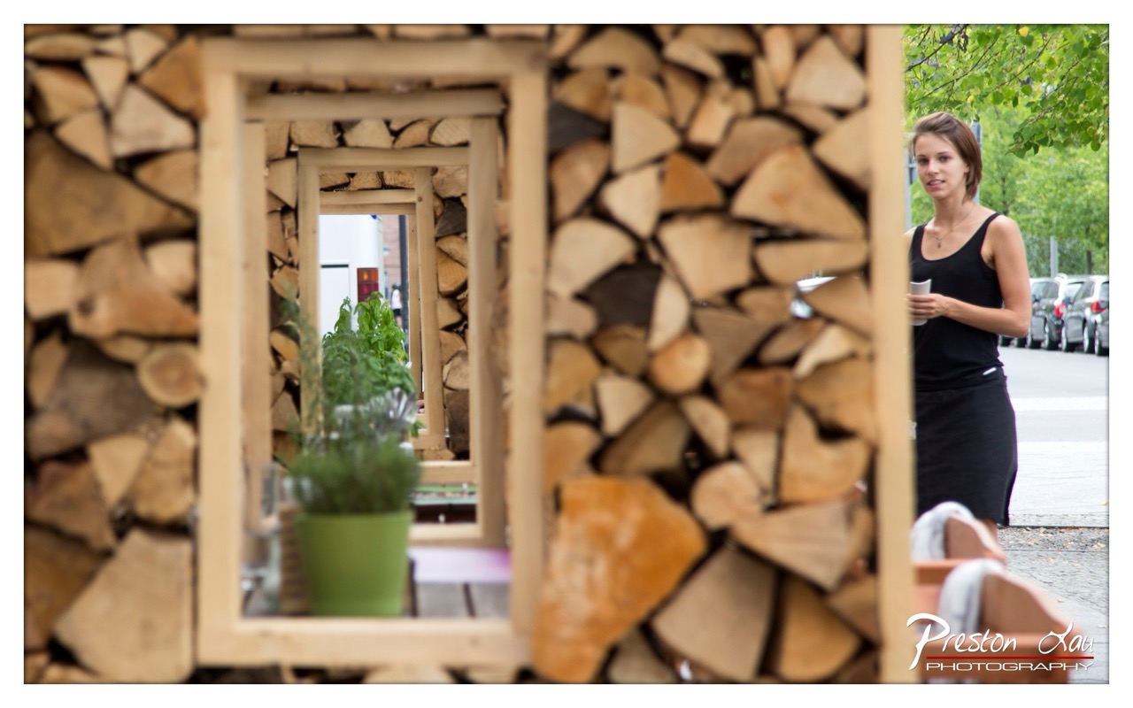

1. Overall Rating (0–10) — 7.0
This photograph masterfully blends everyday realism with a layered, almost cinematic composition, drawing the viewer into a quiet urban moment. The juxtaposition of natural textures—stacked firewood and a green plant—against the human figure creates a compelling narrative of stillness within movement. While the depth of field and framing are strong, the image’s emotional resonance is slightly held back by a lack of dramatic lighting, keeping it grounded in observation rather than transcendence.
2. Composition (0–10) — 8.0
The use of nested wooden frames creates a strong sense of depth and perspective, guiding the eye through layers of the scene. The woman on the right is positioned off-center, balancing the visual weight of the firewood and mirror, though the framing feels slightly asymmetrical and could benefit from tighter control.
3. Lighting (0–10) — 6.0
Natural daylight provides even illumination, but the flatness of the light softens the textures of the wood and reduces the scene’s atmospheric tension. The lack of strong shadows or directional light limits the sense of drama, giving the image a documentary feel rather than an artistic one.
4. Color & Tone (0–10) — 7.0
The palette is harmonious, with warm earth tones in the wood complemented by the cool green of the plant and the woman’s black attire. The muted greens and browns evoke a natural, grounded mood, though the color saturation could be slightly enhanced to make the scene more vivid.
5. Creativity (0–10) — 8.0
The layered framing and use of reflection introduce a conceptual dimension, transforming a simple street scene into a meditative exploration of space and perception. The inclusion of the mirror adds a subtle narrative layer, inviting viewers to consider what lies beyond the frame.
6. Technical Quality (0–10) — 7.5
The image is sharp in the focal plane, with clean focus on the mirror and plant, while the foreground and background are softly blurred to create a pleasing bokeh. The overall clarity and depth of field are well-executed, though minor chromatic aberration is visible along high-contrast edges.
7. Emotional Impact (0–10) — 6.5
The photograph captures a fleeting, introspective moment, evoking a sense of quiet contemplation. The woman’s neutral expression and the stillness of the scene suggest a pause in motion, but the lack of strong emotional cues keeps the viewer at a distance, observing rather than feeling.
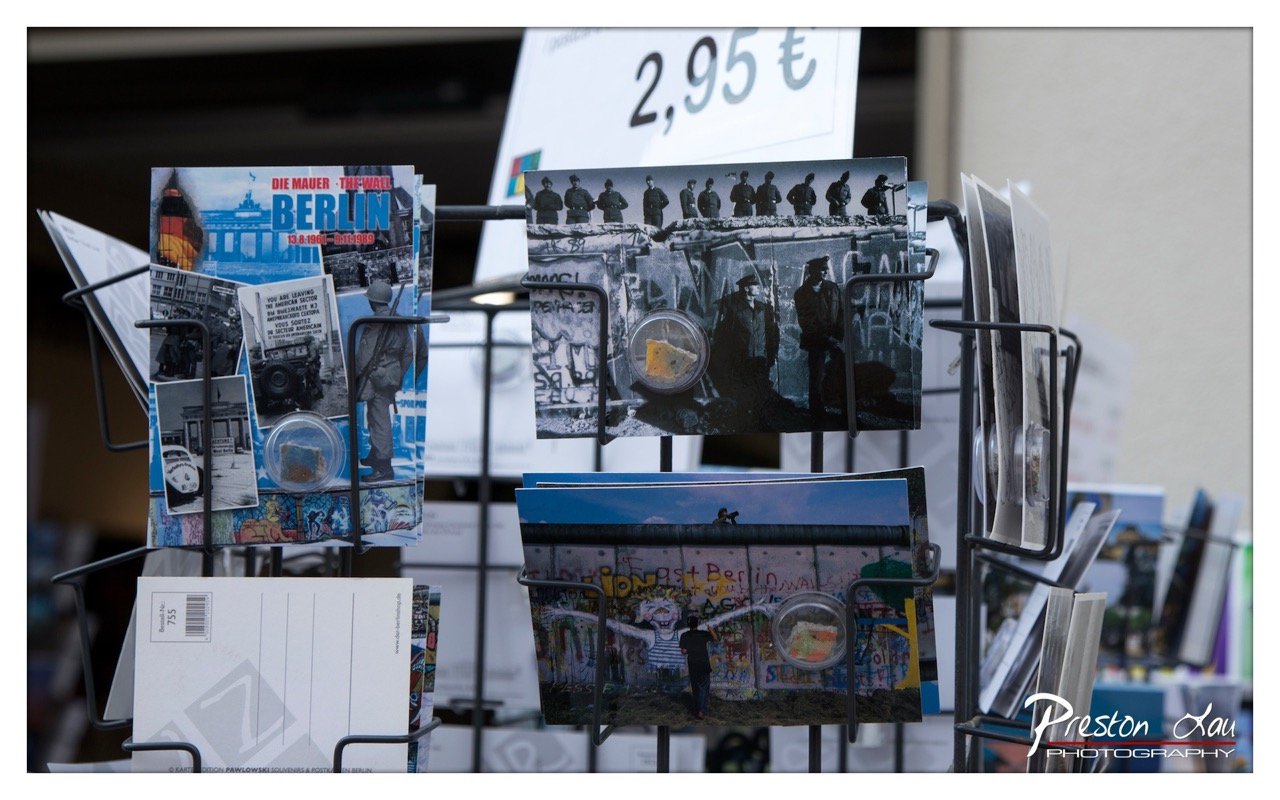

1. Overall Rating (0–10) — 7.0
This photograph captures the poignant intersection of history and commerce at a Berlin souvenir stand, where postcards about the Berlin Wall serve as both memorabilia and cultural artifacts. The layered composition and thematic focus on the Wall’s legacy lend the image a contemplative depth, though the cluttered arrangement and overexposed signage detract slightly from its visual cohesion. The narrative of remembrance and tourism is palpable, yet the image remains more documentary than evocative.
2. Composition (0–10) — 6.5
The arrangement of postcards creates a sense of depth, but the overlapping elements and uneven spacing result in a slightly chaotic feel. The central focus on the Wall-themed cards is effective, though the clutter in the foreground and background disrupts visual flow.
3. Lighting (0–10) — 6.0
The lighting is bright and even, likely from an overhead source, which clearly illuminates the subject matter. However, the flatness of the light diminishes the dramatic contrast needed to emphasize the historical gravity of the images on the postcards.
4. Color & Tone (0–10) — 6.5
The color palette is a mix of muted grays and blues from the postcards, contrasted with the vibrant graffiti in the lower image. The overall tone is slightly cool, which suits the somber theme, but the color saturation lacks richness, particularly in the background.
5. Creativity (0–10) — 7.0
The photographer captures a compelling juxtaposition of historical imagery and modern consumer culture. The choice to highlight postcards featuring the Berlin Wall as both objects and subjects adds a layer of conceptual depth, though the execution leans more toward observational than imaginative.
6. Technical Quality (0–10) — 7.5
The focus is sharp on the central postcards, with clean detail in the images and text. The shallow depth of field effectively isolates the subject, though the background remains slightly distracting due to overexposure and lack of control.
7. Emotional Impact (0–10) — 6.5
The image evokes a reflective mood, inviting the viewer to consider the transformation of a symbol of division into a commodified memory. While the emotional resonance is present, the visual clutter and lack of atmospheric lighting prevent a deeper emotional connection.
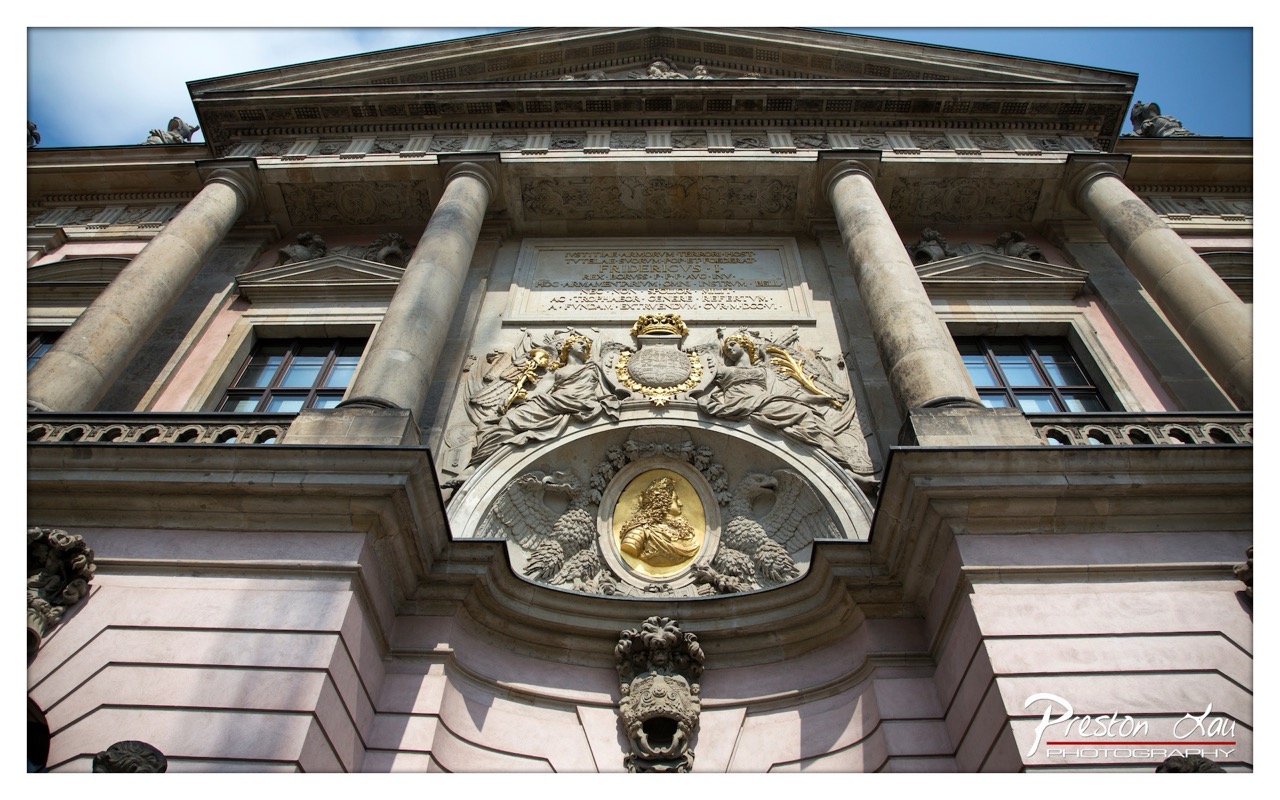

1. Overall Rating (0–10) — 8.0
This photograph captures the grandeur and intricate craftsmanship of a Baroque palace facade with striking clarity and reverence. The low-angle perspective emphasizes the monumentality of the architecture, while the golden relief at the center acts as a luminous focal point. The image balances historical gravitas with aesthetic richness, though the slightly overexposed sky detracts from the otherwise harmonious composition.
2. Composition (0–10) — 8.5
The symmetrical framing centers the ornate relief, drawing the eye upward along the columns and architectural details. The low-angle shot enhances the sense of scale, while the inclusion of the sky provides a subtle contrast to the stone textures. The placement of the golden emblem creates a strong visual anchor, and the diagonal lines of the entablature guide the viewer’s gaze effectively.
3. Lighting (0–10) — 7.5
Natural sunlight illuminates the facade from the upper left, casting soft shadows that accentuate the depth of the carvings and the texture of the stone. The golden relief reflects light brilliantly, enhancing its prominence. However, the sky is slightly overexposed, losing some detail in the clouds and creating a harsh contrast with the darker architectural elements.
4. Color & Tone (0–10) — 7.0
The palette is dominated by soft pinkish-beige stone tones, contrasted with the rich gold of the central medallion and the deep blue of the sky. The colors are harmonious and evoke a sense of historical elegance, though the saturation of the blue sky appears slightly unnatural, suggesting some post-processing imbalance.
5. Creativity (0–10) — 8.0
The photographer has made a strong artistic choice in emphasizing the architectural narrative through a low-angle perspective and careful framing. The focus on the central emblem and the use of light to highlight its golden sheen demonstrate an intent to convey both reverence and visual drama, transforming a static facade into a story of power and artistry.
6. Technical Quality (0–10) — 8.5
The image is sharp and detailed, with excellent clarity in the sculptural elements and inscriptions. The focus is precise, capturing the fine textures of the stone and the intricacy of the carvings. The exposure is well-managed across most of the frame, though the overexposed sky indicates a minor technical limitation in dynamic range.
7. Emotional Impact (0–10) — 7.5
The photograph evokes a sense of awe and historical weight, inviting the viewer to contemplate the legacy of the structure and the craftsmanship behind it. The golden emblem, bathed in sunlight, feels like a symbol of enduring prestige, creating a moment of quiet reverence that resonates emotionally with those who appreciate architectural heritage.
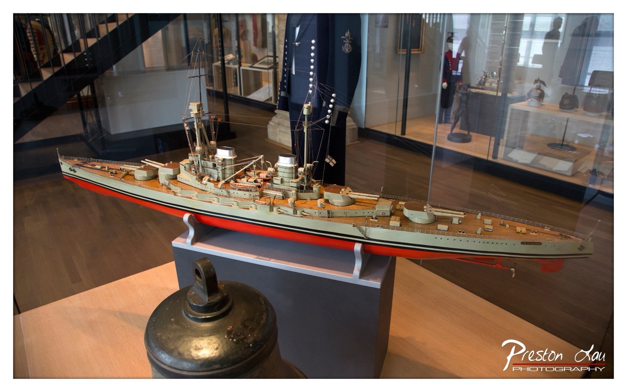

1. Overall Rating (0–10) — 7.0
This photograph captures the intricate detail of a naval warship model within a museum setting, where historical reverence meets artistic documentation. The composition frames the model with a sense of scale and context, while reflections in the glass add a layer of complexity to the scene. Though the image is visually rich, the reflections and cluttered background slightly detract from the model’s prominence, holding it back from full aesthetic cohesion.
2. Composition (0–10) — 6.5
The model is placed diagonally across the frame, creating a dynamic line that draws the eye through the image. However, the foreground bell and reflections in the glass disrupt visual flow, creating a sense of visual noise that competes with the central subject.
3. Lighting (0–10) — 7.0
The ambient lighting is soft and even, highlighting the model’s fine details without harsh glare. The warm tone of the museum interior enhances the historical atmosphere, though the glass reflections introduce some overexposed areas.
4. Color & Tone (0–10) — 7.5
The palette is composed of muted naval grays and olive greens, accented by the bold red hull stripe, which adds visual pop. The warm wood tones of the floor and the metallic sheen of the bell contribute to a cohesive, grounded color scheme.
5. Creativity (0–10) — 7.0
The photographer captures a moment of historical documentation with a thoughtful eye, using reflections and foreground elements to add depth and narrative. While not overtly experimental, the image successfully conveys the weight of history through layered visual storytelling.
6. Technical Quality (0–10) — 8.0
The image is sharp and well-focused, with clean detail on the model and surrounding objects. The depth of field is appropriately managed, keeping the main subject in focus while softly blurring the background.
7. Emotional Impact (0–10) — 7.0
The photograph evokes a sense of quiet reverence and historical curiosity, inviting the viewer to contemplate the craftsmanship and legacy of naval warfare. The presence of museum artifacts and the scale of the model lend a solemn, contemplative mood.
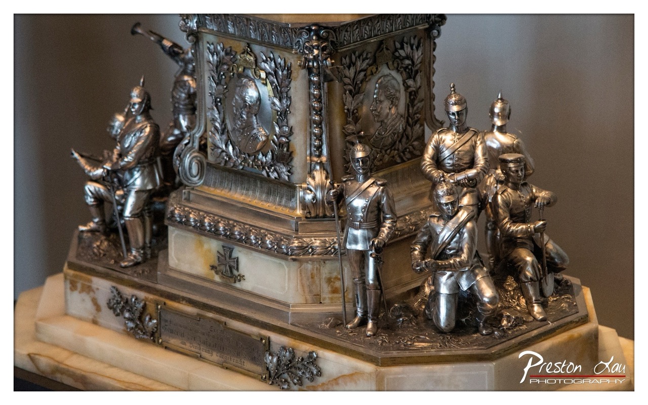

1. Overall Rating (0–10) — 7.5
This photograph captures the intricate grandeur of a historical military monument with a striking sense of reverence and craftsmanship. The interplay of polished metal and marble exudes a dignified solemnity, emphasizing the memorial’s ceremonial importance. While the lighting and composition effectively highlight the sculpture’s detail, a more dynamic angle or tighter framing could further elevate its narrative power.
2. Composition (0–10) — 7.0
The subject is well-centered, with the monument’s layered forms creating a strong sense of depth. However, the slightly cluttered base and visible corner edges detract from the visual harmony, suggesting a need for tighter framing to emphasize the central figures.
3. Lighting (0–10) — 8.0
Soft, directional light enhances the metallic sheen and embossed textures, creating subtle highlights and shadows that give the sculpture dimension. The even exposure preserves detail across the silver and marble surfaces without harsh glare.
4. Color & Tone (0–10) — 7.5
The palette is restrained, dominated by cool silvers and warm beige marble, which complements the historical tone of the piece. The tonal contrast between the reflective metal and matte stone adds visual interest and depth.
5. Creativity (0–10) — 7.0
The image succeeds in presenting the monument as both a work of art and a historical artifact, balancing documentation with aesthetic sensitivity. While not overtly experimental, the approach is thoughtful and respectful of the subject’s significance.
6. Technical Quality (0–10) — 8.5
The image is sharp and detailed, with excellent focus on the sculptural elements. The shallow depth of field isolates the monument from the background, enhancing clarity and visual impact.
7. Emotional Impact (0–10) — 7.0
The photograph conveys a sense of solemnity and reverence, inviting contemplation of the monument’s historical weight. The viewer is drawn into a quiet moment of remembrance, though the lack of human presence limits the emotional immediacy.
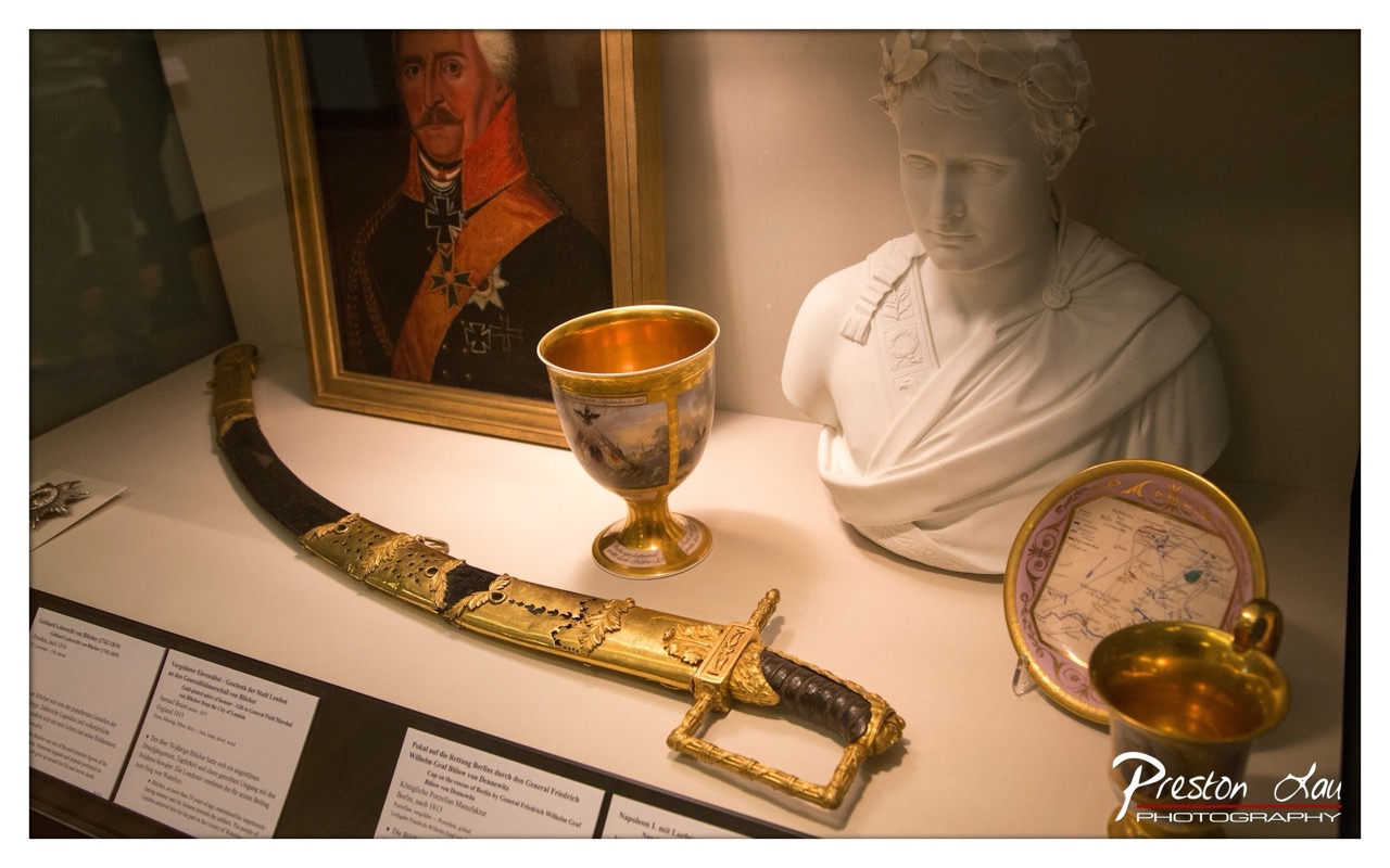

1. Overall Rating (0–10) — 7.0
This photograph captures a richly curated museum display, where historical artifacts converge to tell a story of power, artistry, and legacy. The interplay of light and texture brings out the opulence of the sword and goblet, while the portrait and bust lend a sense of gravitas. Though the composition feels slightly crowded, the image succeeds in conveying the weight of history through its careful arrangement and atmospheric lighting.
2. Composition (0–10) — 6.5
The arrangement of objects creates a diagonal flow from left to right, guiding the eye across the display. However, the inclusion of multiple items and labels introduces visual clutter, and the framing could be tighter to emphasize the central artifacts.
3. Lighting (0–10) — 7.5
Soft, directional lighting enhances the metallic sheen of the sword and goblet, creating depth and highlighting intricate details. The gentle shadows add dimension, while the warm tone complements the historical theme.
4. Color & Tone (0–10) — 7.0
The palette is rich yet restrained, with golds and whites dominating the scene. The warm tones enhance the sense of antiquity, and the contrast between the polished metal and matte stone creates visual interest.
5. Creativity (0–10) — 7.0
The image is more documentary than conceptual, but the thoughtful arrangement of objects and the deliberate use of light lend a narrative quality. The inclusion of the portrait and map adds context, inviting interpretation.
6. Technical Quality (0–10) — 8.0
The focus is sharp on the central objects, and detail is well-preserved across the frame. The lighting is controlled, and the exposure is balanced, though a slight overexposure on the white bust slightly flattens its texture.
7. Emotional Impact (0–10) — 7.5
The photograph evokes a sense of reverence and contemplation, inviting the viewer to reflect on the individuals and events behind the artifacts. The quiet dignity of the scene resonates with a deep historical weight.
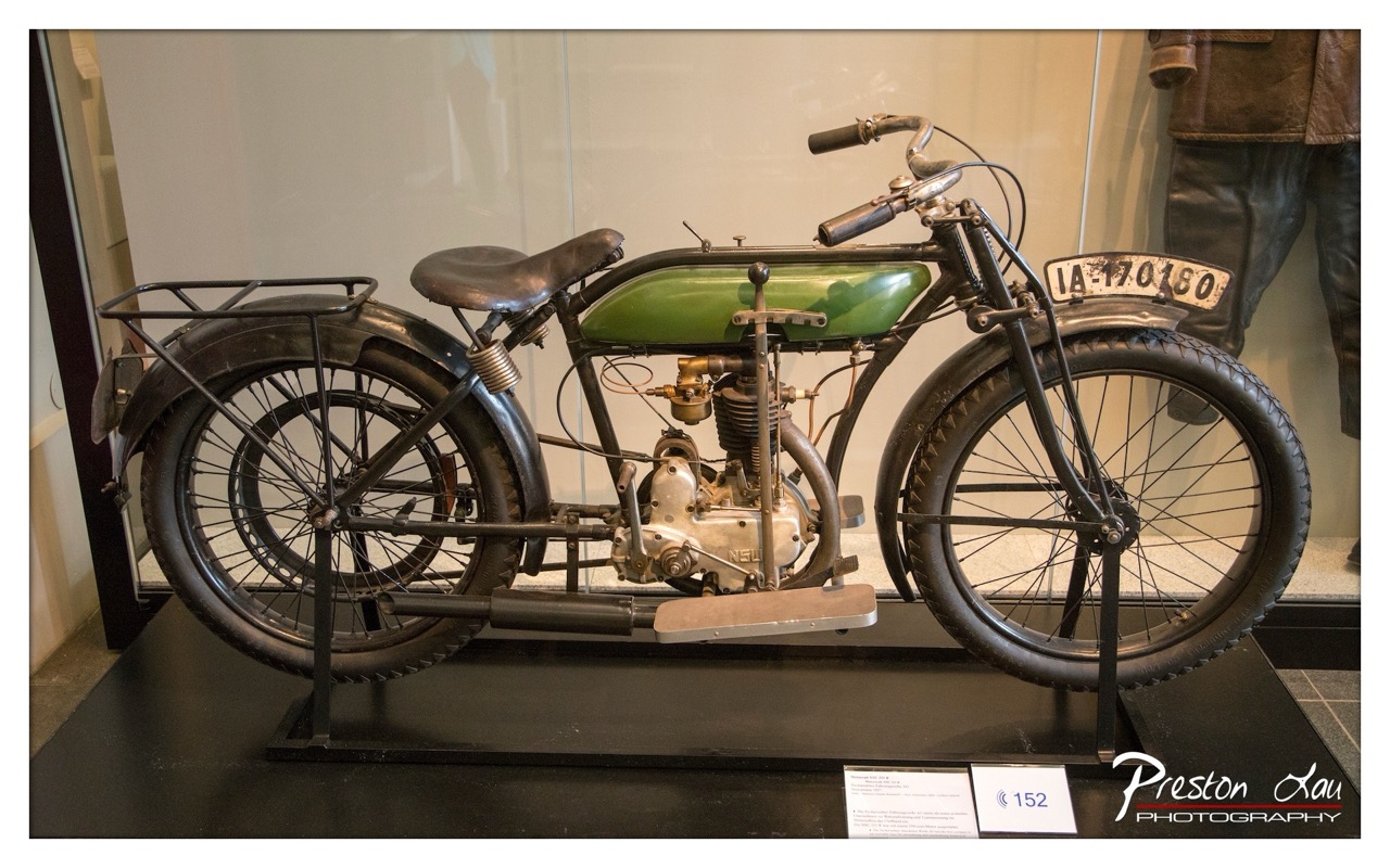

1. Overall Rating (0–10) — 7.0
This photograph captures the elegant simplicity of an early 20th-century motorcycle, showcasing its mechanical charm and historical gravitas within a museum setting. The green fuel tank and polished engine gleam under soft, ambient light, drawing the eye to the machine’s intricate details. While the composition is strong and the subject compelling, the presence of the mannequin and signage slightly disrupts the visual focus, preventing the image from achieving a more refined aesthetic.
2. Composition (0–10) — 7.0
The motorcycle is framed diagonally, creating a dynamic line that guides the viewer’s eye from front to back. The use of negative space around the subject enhances its prominence, though the mannequin on the right edge introduces a subtle visual distraction.
3. Lighting (0–10) — 7.5
The lighting is soft and diffused, evenly illuminating the motorcycle without harsh shadows. This highlights the metallic textures and the green tank, contributing to a calm, museum-like atmosphere.
4. Color & Tone (0–10) — 7.0
The palette is restrained, dominated by the dark tones of the motorcycle and the muted background, with the green tank providing a subtle but effective pop of color. The tonal range is balanced, with a slight warmth that enhances the vintage feel.
5. Creativity (0–10) — 6.5
The image is more documentary than expressive, focusing on accurate representation of the motorcycle rather than artistic interpretation. However, the choice to include the mannequin and exhibit context adds a layer of narrative depth.
6. Technical Quality (0–10) — 8.0
The image is sharp and well-focused, with fine detail visible in the engine and frame. The glass reflections are minimal, indicating good control over the shooting environment.
7. Emotional Impact (0–10) — 6.5
The photograph evokes a sense of nostalgia and reverence for early engineering, appealing to those with an interest in history and mechanics. While emotionally resonant, the detachment of the museum setting tempers the connection.
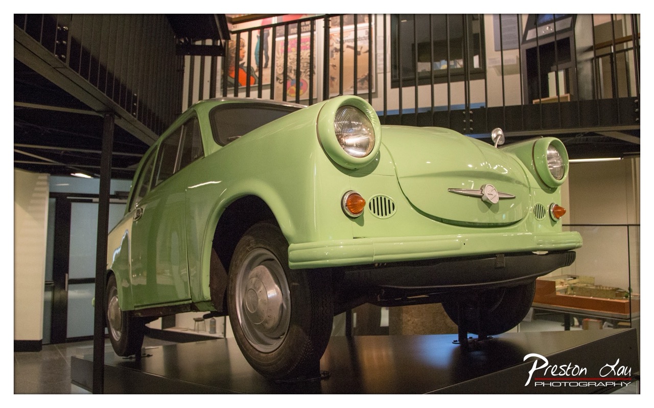

1. Overall Rating (0–10) — 7.0
This photograph captures the charming, bulbous silhouette of a vintage light-green car in a museum setting, where its retro design stands out against the modern industrial backdrop. The car’s rounded form and distinctive headlights are rendered with clarity and presence, evoking a sense of nostalgia and design history. While the setting is compelling, the image’s impact is slightly diminished by a lack of dynamic lighting and a somewhat generic framing that keeps the viewer at a distance rather than drawing them into the scene.
2. Composition (0–10) — 6.5
The car is well-centered and fills the frame effectively, with the low angle enhancing its presence. However, the surrounding elements—such as the railing and distant display cases—create visual clutter that competes for attention, slightly disrupting the balance.
3. Lighting (0–10) — 6.0
The lighting is functional and even, highlighting the car’s contours without creating harsh shadows. However, the flat, ambient illumination lacks depth and fails to accentuate the vehicle’s glossy finish or sculptural form.
4. Color & Tone (0–10) — 7.0
The pale green of the car is vibrant and distinct, creating a pleasing contrast against the neutral tones of the museum interior. The color palette is cohesive, though the overall tone leans slightly cool, which slightly dampens the warmth of the subject.
5. Creativity (0–10) — 6.5
The image offers a straightforward yet effective documentation of a historic vehicle, with a clear focus on form and context. The juxtaposition of vintage design against modern architecture provides a subtle narrative, but the approach remains conventional rather than inventive.
6. Technical Quality (0–10) — 8.0
The image is sharp, with clean focus on the car and well-managed exposure. The lens choice and depth of field are appropriate, rendering the subject clearly while softly blurring the background to maintain emphasis.
7. Emotional Impact (0–10) — 6.0
The photograph evokes a quiet appreciation for mid-century automotive design and cultural preservation. While the subject is inherently nostalgic, the lack of atmospheric lighting and emotional texture keeps the emotional resonance from fully resonating with the viewer.
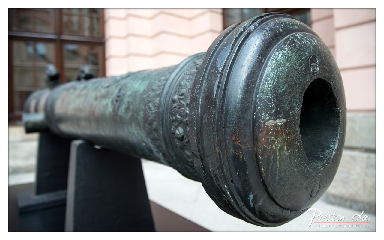

1. Overall Rating (0–10) — 7.0
This photograph captures the quiet dignity of a historic cannon, its weathered patina telling a story of time and endurance. The tight framing emphasizes texture and detail, inviting the viewer to consider the object’s weight and history. While the composition is strong, the background remains slightly distracting, preventing the image from achieving a more immersive atmosphere.
2. Composition (0–10) — 7.5
The diagonal placement of the cannon draws the eye naturally through the frame, with the close-up perspective emphasizing its craftsmanship. The shallow depth of field effectively isolates the subject, though the background architecture introduces a subtle visual tension.
3. Lighting (0–10) — 7.0
Soft, diffused daylight enhances the cannon’s textures without creating harsh shadows. The gentle highlights on the metal reveal the green patina and surface wear, adding depth and authenticity to the scene.
4. Color & Tone (0–10) — 6.5
The muted tones—earthy greens, dark bronzes, and soft pinks in the background—create a subdued palette that complements the historical subject. While harmonious, the colors lack vibrancy, slightly dampening the image’s overall impact.
5. Creativity (0–10) — 7.0
The choice to focus on the cannon’s muzzle and intricate engravings offers a fresh perspective on a familiar object. The photographer emphasizes texture and narrative over grandeur, transforming a static artifact into a quiet, contemplative portrait.
6. Technical Quality (0–10) — 8.0
Sharp focus on the cannon’s surface, precise depth of field, and clean post-processing demonstrate strong technical control. The image is free of noise and distortion, with the details of the metal clearly rendered.
7. Emotional Impact (0–10) — 6.5
The image evokes a sense of reverence for the past, with the cannon standing as a silent witness to history. Its stillness and wear invite reflection, though the lack of human presence keeps the emotional connection somewhat restrained.
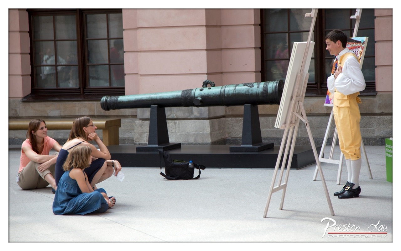

1. Overall Rating (0–10) — 7.0
This photograph captures a lively moment of cultural performance, where historical reenactment meets public engagement in a museum courtyard. The contrast between the costumed performer and the casually seated audience creates a compelling narrative of storytelling and connection across time. While the scene is well-framed and rich in context, the lighting and color balance slightly dampen the vibrancy of the moment, keeping it from fully resonating as a dynamic visual statement.
2. Composition (0–10) — 7.5
The diagonal line of the cannon and the easel creates a strong visual pathway leading from the audience to the performer, guiding the viewer’s eye through the scene. The placement of the subjects balances the frame effectively, with the seated group grounding the left side and the performer anchoring the right, while the cannon serves as a powerful central element.
3. Lighting (0–10) — 6.0
Natural daylight provides even illumination, but the overcast quality casts a flat, diffused light that softens shadows and reduces depth. The lack of strong directional light diminishes the texture and form of the subjects, particularly the performer’s costume, which could benefit from more contrast.
4. Color & Tone (0–10) — 6.5
The warm yellow of the performer’s breeches stands out against the muted tones of the stone and pavement, creating a focal point. However, the overall palette is subdued, with washed-out whites and grays dominating the scene, which slightly dulls the visual impact.
5. Creativity (0–10) — 7.0
The image successfully blends historical context with contemporary audience interaction, offering a layered narrative about public history and education. The use of costume and setting adds narrative depth, making the scene feel both authentic and engaging.
6. Technical Quality (0–10) — 7.5
The focus is sharp across the frame, with fine detail visible in the cannon, clothing, and architectural background. The exposure is well-balanced, and the image is free of noticeable noise or distortion, indicating strong technical execution.
7. Emotional Impact (0–10) — 6.5
The scene evokes curiosity and a sense of shared experience, particularly through the attentive expressions of the audience. While the emotional connection is present, the slightly detached composition and neutral lighting keep the viewer from fully immersing in the moment.
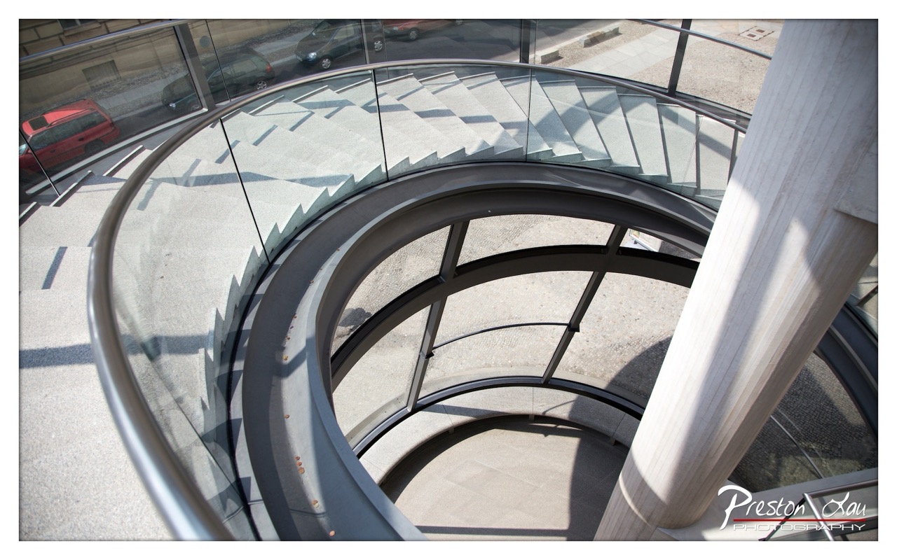

1. Overall Rating (0–10) — 7.5
This photograph captures the elegant geometry of a spiral staircase with a striking sense of depth and motion, drawing the eye into the architectural curve. The interplay of light and shadow on the concrete steps enhances the sense of rhythm and movement, while the inclusion of the urban street beyond the glass railing grounds the image in reality. While the composition is visually compelling, the framing feels slightly off-center, and the image could benefit from a more intentional balance to fully elevate its artistic impact.
2. Composition (0–10) — 7.0
The spiral forms a strong visual vortex, guiding the viewer’s gaze downward. The diagonal entry of the pillar on the right introduces tension, while the glass railing and external street scene add layers of depth. However, the off-center placement of the spiral slightly disrupts the symmetry, creating a minor imbalance.
3. Lighting (0–10) — 8.0
Bright, natural sunlight casts sharp, defined shadows across the steps, accentuating the staircase’s form and creating a dynamic interplay of light and dark. The contrast enhances the three-dimensional quality of the architecture, while the clear daylight ensures excellent visibility and clarity.
4. Color & Tone (0–10) — 6.5
The palette is dominated by neutral grays and metallic tones, giving the image a clean, modern feel. The red car in the background offers a subtle pop of color, but the overall tone remains restrained and somewhat monochromatic, limiting emotional warmth.
5. Creativity (0–10) — 7.5
The high-angle perspective and focus on architectural lines demonstrate a strong visual concept, transforming an everyday structure into a dynamic, almost abstract composition. The inclusion of the outside world through the glass adds a layer of narrative, suggesting a connection between interior and exterior spaces.
6. Technical Quality (0–10) — 8.5
The image is sharp and well-focused, with fine detail visible in the concrete steps and glass surfaces. The exposure is balanced, with no significant overexposed or underexposed areas, and the depth of field effectively captures both foreground and background elements.
7. Emotional Impact (0–10) — 6.0
The photograph evokes a sense of order, precision, and quiet contemplation, inviting the viewer to reflect on movement and structure. While the mood is cool and cerebral, it lacks the emotional resonance to deeply engage the viewer, remaining more visually than emotionally compelling.
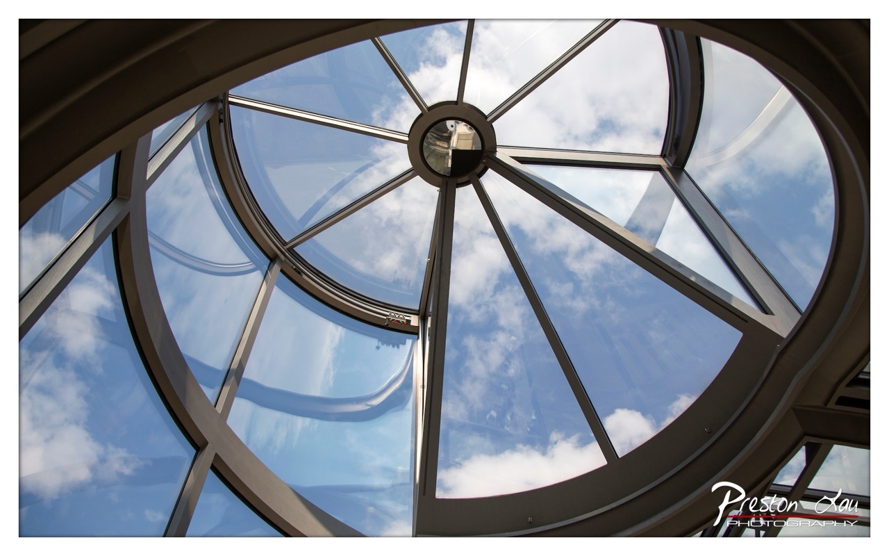

1. Overall Rating (0–10) — 8.0
This photograph captures a striking upward view through a domed glass ceiling, where architectural precision meets the vastness of the sky. The symmetrical composition and dynamic interplay of light and reflection create a sense of awe and spatial grandeur. While the image is technically strong and visually compelling, its emotional resonance is somewhat restrained by the clinical clarity of the architecture, which keeps the viewer in the realm of observation rather than immersion.
2. Composition (0–10) — 9.0
The centered, radial symmetry draws the eye naturally toward the dome’s apex, creating a powerful sense of balance and unity. The clean lines and repeating geometric forms enhance visual harmony, while the subtle framing by the surrounding structure grounds the image in architectural context.
3. Lighting (0–10) — 9.0
Natural daylight floods the scene from above, illuminating the glass panels with soft, even light. The reflections on the curved surfaces add depth and dimension, while the bright blue sky and scattered clouds provide a vivid backdrop that enhances the luminosity of the composition.
4. Color & Tone (0–10) — 8.5
The palette is dominated by cool blues and crisp whites, with the metallic gray of the frame providing a subtle contrast. The tonal range is well-balanced, with a pleasing gradient from the bright sky to the darker structural elements, lending a clean and modern aesthetic.
5. Creativity (0–10) — 8.0
The choice of perspective and the focus on architectural geometry offer a fresh interpretation of an everyday structure. By framing the sky through the dome, the photograph transforms a functional space into a portal—suggesting themes of openness, vision, and aspiration.
6. Technical Quality (0–10) — 9.0
The image is sharp and detailed, with precise focus across the glass panels and frame. The exposure is well-managed, avoiding glare while preserving the clarity of reflections and the texture of the clouds.
7. Emotional Impact (0–10) — 7.5
The photograph evokes a sense of calm and contemplation, inviting the viewer to pause and look upward. While it doesn’t elicit strong emotion, its quiet beauty and architectural elegance create a meditative, almost spiritual atmosphere.
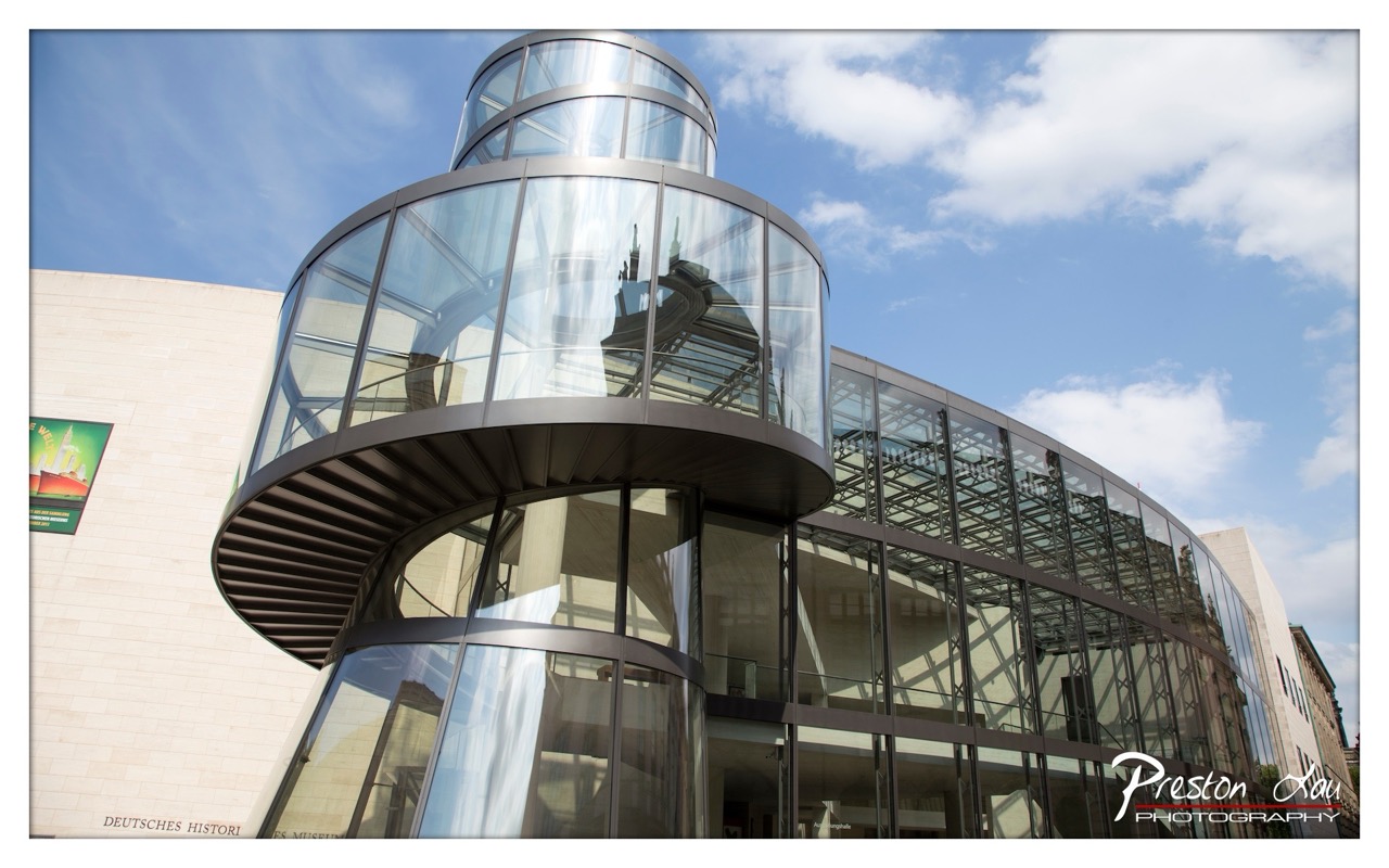

1. Overall Rating (0–10) — 7.5
This photograph captures the dynamic interplay between modern architecture and the sky, emphasizing the graceful curve of a glass spiral staircase as a striking visual anchor. The bold low-angle perspective enhances the building’s imposing scale and futuristic design, while reflections in the glass add layers of depth and complexity. Though the image is visually compelling, the slight overexposure in the sky and the presence of a watermark slightly detract from its artistic cohesion.
2. Composition (0–10) — 8.0
The low-angle shot and diagonal lines of the spiral staircase create a strong sense of movement and visual tension. The framing effectively balances the architectural structure against the expansive sky, drawing the eye upward and emphasizing verticality.
3. Lighting (0–10) — 7.0
Bright, natural daylight enhances the transparency of the glass and the reflective surfaces, but the sky is slightly overexposed, losing detail in the clouds. The interplay of light and shadow on the building’s facade adds dimension, though some areas appear washed out.
4. Color & Tone (0–10) — 7.5
The palette is dominated by cool blues and neutral grays, creating a clean, modern aesthetic. The contrast between the glass’s reflective surface and the warm beige of the adjacent wall provides visual interest, while the overall tone remains crisp and balanced.
5. Creativity (0–10) — 8.0
The choice of angle and focus on the spiral staircase transforms an architectural detail into a dynamic, almost sculptural element. The reflections within the glass add a layer of narrative, suggesting movement and time, which elevates the image beyond a simple documentation.
6. Technical Quality (0–10) — 8.5
Sharp focus throughout the frame, excellent clarity in the glass and structural details, and precise exposure control (aside from the sky) demonstrate strong technical execution. The composition is well-framed and visually coherent.
7. Emotional Impact (0–10) — 7.0
The image evokes a sense of awe and modernity, inviting contemplation of human design and its relationship with space. While the emotional resonance is strong, the watermark and slight visual distractions prevent a fully immersive experience.
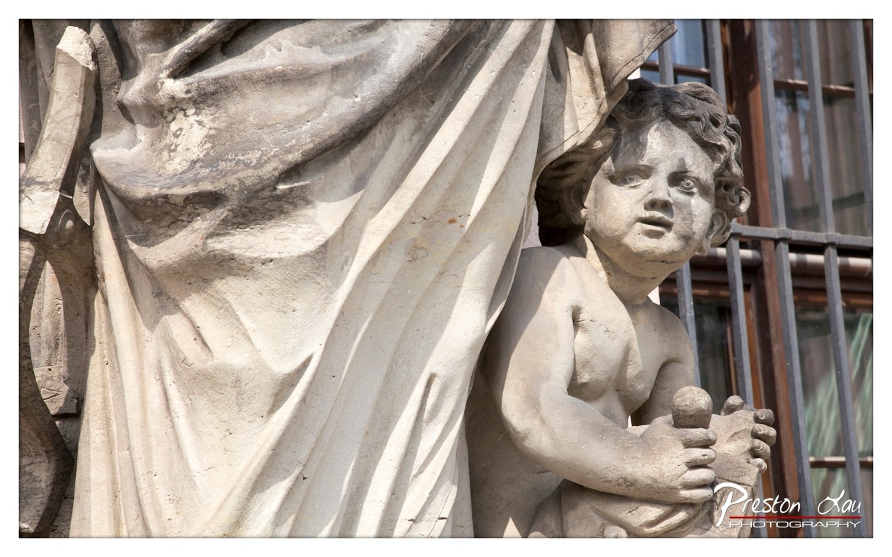

1. Overall Rating (0–10) — 7.5
This photograph captures the quiet dignity of a weathered stone sculpture, where time and craftsmanship converge in a moment of stillness. The interplay of light and shadow across the aged surface enhances the texture and emotional weight of the figure, while the intimate framing draws the viewer into a contemplative dialogue with the subject. Though the background remains slightly distracting, the image succeeds in conveying both the physical presence and the spiritual resonance of the sculpture.
2. Composition (0–10) — 7.0
The close-up framing emphasizes the sculptural details, with the drapery leading the eye toward the child’s face. The slight tilt and off-center placement create a sense of naturalism, though a more balanced arrangement would enhance visual harmony.
3. Lighting (0–10) — 8.0
Strong directional sunlight creates deep, sculptural shadows that accentuate the folds of the fabric and the contours of the child’s face, giving the stone a sense of volume and life.
4. Color & Tone (0–10) — 7.5
The monochromatic palette of weathered stone is rich in tonal variation, from bright highlights to deep grays. The subtle warmth of the sunlight adds depth without overpowering the natural color of the material.
5. Creativity (0–10) — 7.0
The choice to focus on a fragment of a larger sculpture invites interpretation, transforming a historical artifact into a personal, almost narrative moment. The image feels both documentary and meditative.
6. Technical Quality (0–10) — 8.0
Sharp focus and high detail reveal the texture of the stone, and the exposure is well-balanced despite the high-contrast lighting.
7. Emotional Impact (0–10) — 8.0
There is a quiet poignancy in the child’s expression and the way the light caresses the aged surface—evoking themes of innocence, endurance, and time’s passage. The image lingers in the mind, inviting reflection.
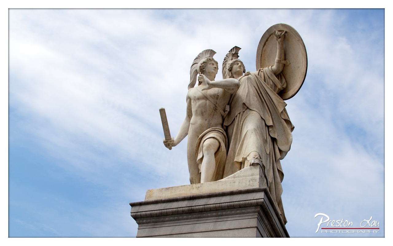

1. Overall Rating (0–10) — 7.5
This photograph captures the grandeur of a classical marble statue with a sense of timeless dignity, set against a soft, dynamic sky that enhances its mythic presence. The low-angle perspective emphasizes the monumentality of the figures, while the subtle weathering on the stone adds authenticity and depth. The image succeeds in evoking a sense of history and reverence, though its emotional resonance could be heightened with more dramatic lighting or a more deliberate framing.
2. Composition (0–10) — 8.0
The low-angle shot creates a powerful sense of scale, with the figures rising diagonally into the frame. The asymmetrical placement of the subjects and the clean negative space on the left guide the eye naturally toward the central figures, creating a balanced and dynamic composition.
3. Lighting (0–10) — 7.0
Natural daylight illuminates the statue evenly, highlighting the intricate details of the drapery and anatomy. The soft, diffused light enhances texture without creating harsh shadows, though a more directional light could add greater contrast and drama.
4. Color & Tone (0–10) — 7.5
The palette is restrained and harmonious, with the pale stone of the statue contrasting gently against the soft blue and white of the sky. The subtle tonal range gives the image a serene, almost ethereal quality, though a slightly warmer tone could add a touch of richness.
5. Creativity (0–10) — 7.0
The photographer interprets a classical subject with respect and clarity, emphasizing the sculptural form and historical significance. While the approach is conventional, the choice of angle and timing lend a contemplative and cinematic quality to the image.
6. Technical Quality (0–10) — 8.5
Sharp focus and clear detail are evident throughout the stone surface, with excellent resolution in the textures and edges. The exposure is well-balanced, and the watermark is discreet, preserving the image’s integrity.
7. Emotional Impact (0–10) — 7.0
The image conveys a quiet reverence for antiquity and artistry, inviting the viewer to reflect on the enduring legacy of classical ideals. While the emotional pull is subtle, it is sustained through the monument’s poised dignity and the expansive sky that frames it.
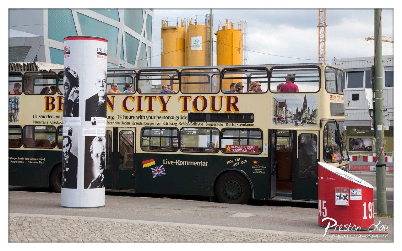

1. Overall Rating (0–10) — 6.0
This photograph captures a lively moment on a Berlin city tour, blending urban life with cultural storytelling. The juxtaposition of the tour bus, historical figures on the column, and industrial backdrops creates a layered narrative of modernity and heritage. While the image is rich in detail and context, its composition feels slightly cluttered, and the lighting lacks the dramatic contrast needed to elevate the scene into something truly compelling.
2. Composition (0–10) — 5.5
The frame is crowded with elements—bus, column, construction crane, and signage—creating visual noise. The central placement of the bus draws attention, but the surrounding details compete for focus, weakening the overall balance.
3. Lighting (0–10) — 5.0
Diffuse daylight under an overcast sky provides even illumination but diminishes shadows and depth. The flat lighting softens textures and reduces the visual impact of the scene’s industrial and architectural contrasts.
4. Color & Tone (0–10) — 6.0
The color palette is grounded in muted earth tones—beige, green, and gray—with pops of red and yellow from the bus and signage. While functional, the colors feel slightly washed out, lacking vibrancy or a cohesive tonal mood.
5. Creativity (0–10) — 6.5
The image successfully merges travel, history, and urban development into a single frame. The inclusion of the historical figures on the column adds narrative depth, suggesting a dialogue between past and present.
6. Technical Quality (0–10) — 7.5
The photograph is sharp and well-exposed, with clear detail in the bus, text, and background elements. The focus is consistent across the frame, and the resolution is high, allowing for fine detail in the signage and architecture.
7. Emotional Impact (0–10) — 5.0
The image evokes a sense of place and movement but fails to create a strong emotional connection. It feels more like a documentation than an evocative portrait of Berlin, leaving the viewer observing rather than feeling.
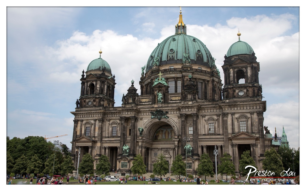

1. Overall Rating (0–10) — 7.5
This photograph captures the grandeur of the Berlin Cathedral with a balanced blend of architectural detail and human presence, evoking a sense of historical weight and public life. The composition frames the cathedral as a monumental centerpiece, while the scattered crowds and greenery lend a lively, lived-in quality. The slightly overcast sky softens the light, enhancing the texture of the stone and the patina of the green domes. While the image is strong in storytelling and scale, a more dynamic angle or tighter framing could elevate its visual impact.
2. Composition (0–10) — 7.0
The cathedral is centered and dominates the frame, creating a sense of stability and grandeur. The inclusion of trees and people at the base adds depth and scale, but the wide perspective slightly dilutes focus on the architectural details. A tighter crop could enhance visual cohesion.
3. Lighting (0–10) — 7.0
Diffused daylight from the overcast sky provides even illumination, minimizing harsh shadows and allowing the textures of the stone and copper domes to be clearly visible. The soft light enhances the mood without overpowering the scene.
4. Color & Tone (0–10) — 7.5
The palette is rich and natural, with the verdigris of the domes contrasting beautifully against the warm stone and the blue-gray sky. The green of the trees adds a fresh, organic element, while the muted tones prevent the image from feeling overly saturated.
5. Creativity (0–10) — 7.0
The photograph successfully blends documentary realism with artistic composition, capturing both the cathedral’s majesty and its role in daily urban life. The inclusion of people and activity adds narrative depth, making the image more than a simple architectural portrait.
6. Technical Quality (0–10) — 8.0
The image is sharp, with excellent detail throughout the facade. Focus is consistent across the frame, and the dynamic range is well managed, preserving detail in both highlights and shadows.
7. Emotional Impact (0–10) — 7.5
The photograph evokes a sense of awe and reverence for history, while the presence of visitors grounds it in the present. It invites contemplation of the past while acknowledging the cathedral as a living part of the city, creating a layered emotional resonance.
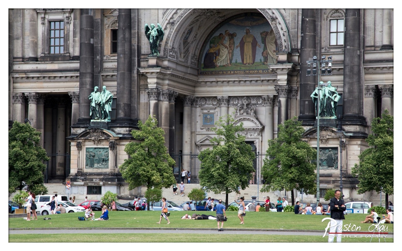

1. Overall Rating (0–10) — 7.5
This photograph captures the vibrant interplay between history and daily life in an urban square, where the grandeur of a neoclassical cathedral meets the relaxed rhythm of modern leisure. The juxtaposition of ornate architecture and casual park-goers creates a dynamic narrative of time and place, though the image’s full potential is slightly restrained by a lack of compositional focus. The scene feels authentic and alive, with the cathedral’s imposing presence serving as both backdrop and silent witness to the human activity unfolding before it.
2. Composition (0–10) — 6.0
The wide framing includes too much peripheral detail, diluting the visual impact of the central cathedral. The placement of figures and trees creates visual clutter, and the horizontal lines of the grass and pavement flatten the sense of depth.
3. Lighting (0–10) — 6.5
Natural daylight provides even illumination, but the overcast quality softens the architectural details and reduces contrast. The light is functional but lacks drama, failing to emphasize the textures of stone and bronze.
4. Color & Tone (0–10) — 7.0
The palette is grounded in earthy tones—grays, greens, and muted stone—with a natural balance that enhances realism. However, the colors lack vibrancy, giving the image a slightly muted, documentary feel.
5. Creativity (0–10) — 7.5
The concept of merging monumental history with everyday life is compelling and well-executed. The inclusion of people in various states of repose and motion adds narrative depth, suggesting a story of continuity and public life.
6. Technical Quality (0–10) — 8.0
The image is sharp and well-exposed, with clear details in both the architecture and foreground. The depth of field is appropriate, and the focus is consistent across the frame.
7. Emotional Impact (0–10) — 7.0
The photograph evokes a sense of calm urbanity and shared public space, inviting contemplation of how people interact with historical monuments. While it doesn’t stir strong emotion, it resonates with a quiet dignity and the comfort of everyday life.
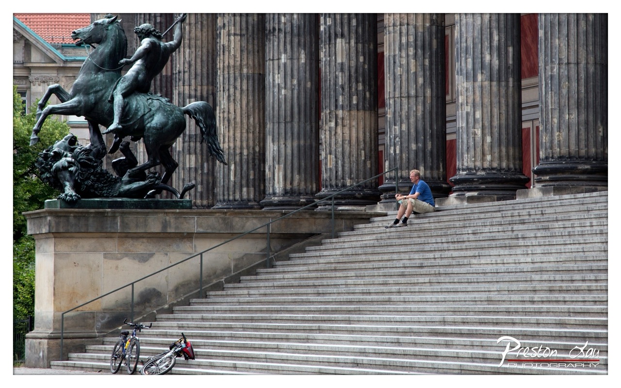

1. Overall Rating (0–10) — 7.5
This photograph masterfully juxtaposes the grandeur of classical architecture with the quiet solitude of a modern traveler, creating a contemplative dialogue between history and the present. The imposing neoclassical columns and the dramatic equestrian statue lend a sense of timelessness, while the lone figure seated on the steps introduces a human scale and narrative depth. The composition balances monumental scale with intimate detail, though the slightly heavy-handed contrast and muted color palette temper its emotional resonance.
2. Composition (0–10) — 8.0
The diagonal lines of the staircase guide the eye from the foreground bicycle to the seated man and up toward the statue, creating a strong visual path. The placement of the man off-center and the statue in the upper left balance the frame effectively, while the depth of the steps adds dimensionality.
3. Lighting (0–10) — 7.0
Natural daylight illuminates the scene evenly, with soft shadows that enhance the texture of the stone and bronze. The light emphasizes the verticality of the columns and the form of the sculpture, though a slightly warmer tone might have added more atmospheric warmth.
4. Color & Tone (0–10) — 6.5
The palette is dominated by cool grays and muted earth tones, with the blue shirt of the man providing a subtle pop of color. While the tonal range is well-defined, the overall coolness and lack of vibrancy give the image a somewhat detached, documentary feel.
5. Creativity (0–10) — 7.5
The image captures a rare moment of stillness in a bustling urban setting, using scale and contrast to evoke themes of time, memory, and individual journey. The inclusion of the bicycle adds a layer of narrative—suggesting travel, rest, and transit—making the scene feel both personal and universal.
6. Technical Quality (0–10) — 8.5
Sharp focus across the frame ensures clarity in both the foreground and background, with no noticeable blur or noise. The exposure is well-managed, preserving detail in both highlights and shadows.
7. Emotional Impact (0–10) — 7.0
The image conveys a quiet introspection, inviting the viewer to reflect on the weight of history and the fleeting nature of personal moments within it. The solitude of the figure resonates emotionally, though the subdued tones slightly limit the intensity of the connection.
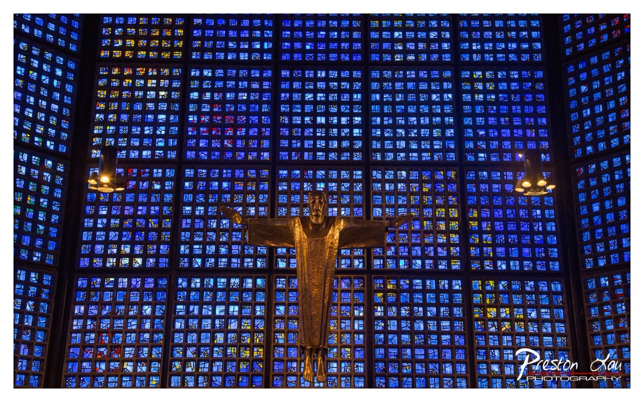

1. Overall Rating (0–10) — 8.0
This photograph captures the solemn grandeur of a modern religious space, where the golden figure of Christ stands as a luminous focal point against a vast, geometric stained-glass wall. The deep blue tones and radiant light create a sense of spiritual awe, while the symmetrical composition enhances the image’s meditative quality. The scene is both visually striking and emotionally resonant, though the slightly darkened edges could be balanced for greater visual harmony.
2. Composition (0–10) — 8.5
The central placement of the crucifix creates strong symmetry and visual balance, drawing the eye directly to the figure. The repeating grid of stained glass provides rhythm and depth, while the two pendant lights add subtle symmetry and frame the subject effectively.
3. Lighting (0–10) — 8.0
The interplay of ambient blue light filtering through the stained glass and the warm, directional glow on the crucifix creates a dramatic contrast that enhances the subject’s presence. The lighting is moody and intentional, highlighting the figure while allowing the background to recede into a rich, textured field.
4. Color & Tone (0–10) — 8.5
The dominant blue palette is both cohesive and evocative, conveying serenity and reverence. The warm gold of the crucifix provides a powerful contrast, creating visual warmth and spiritual focus. The subtle hints of yellow and red in the glass add depth and complexity without disrupting the overall harmony.
5. Creativity (0–10) — 8.0
The image successfully blends architectural grandeur with spiritual symbolism, using light and color to evoke a sense of transcendence. The choice to photograph the crucifix against the expansive stained glass wall is both bold and meaningful, transforming a simple scene into a powerful visual statement.
6. Technical Quality (0–10) — 8.5
The image is sharp and well-focused, with clear detail in both the crucifix and the stained glass. The exposure is well-managed, preserving highlights and shadows without overexposure or noise. The watermark is unobtrusive and professionally placed.
7. Emotional Impact (0–10) — 8.5
The photograph conveys a deep sense of reverence and quiet contemplation. The combination of light, color, and composition invites the viewer into a moment of spiritual reflection, making the image both visually and emotionally compelling.
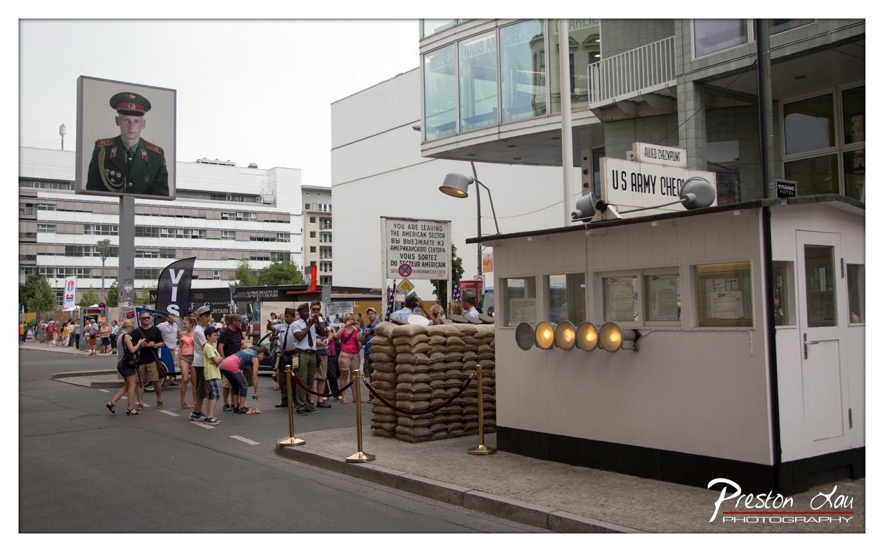

1. Overall Rating (0–10) — 7.0
This photograph captures the layered history of the Berlin Wall at the Allied Checkpoint, where past and present converge in a striking urban tableau. The juxtaposition of the life-sized soldier poster, the authentic guard booth, and the modern cityscape creates a powerful narrative of memory and transformation. While the composition is rich with symbolic detail, the slightly overcast lighting and cluttered background prevent the image from achieving a more immersive, cinematic quality.
2. Composition (0–10) — 6.5
The scene is well-framed with the guard booth anchoring the right side and the large portrait drawing the eye on the left, creating a balanced diagonal flow. However, the crowd and surrounding buildings introduce visual noise, slightly disrupting the focus on the historical elements.
3. Lighting (0–10) — 6.0
The overcast sky provides even, diffused light that avoids harsh shadows, allowing for clear visibility of details. The illuminated lights on the booth add a subtle warmth, contrasting with the cool, muted tones of the surroundings.
4. Color & Tone (0–10) — 6.5
The palette is restrained—dominated by grays, whites, and the muted green of the soldier’s uniform—conveying a somber, historical mood. The warm glow of the booth lights provides a gentle contrast, adding visual interest without overpowering the scene.
5. Creativity (0–10) — 7.5
The image effectively blends documentary realism with symbolic storytelling, using the juxtaposition of past and present to evoke reflection. The inclusion of the multilingual sign and the soldier’s portrait enriches the narrative depth.
6. Technical Quality (0–10) — 7.5
Sharp focus across the frame ensures clarity in both foreground and background elements. The exposure is balanced, and the details in the booth and signage are well-preserved.
7. Emotional Impact (0–10) — 7.0
The photograph evokes a contemplative mood, inviting viewers to reflect on division, transition, and the endurance of memory. The presence of tourists adds a layer of present-day connection, reinforcing the enduring relevance of the site.
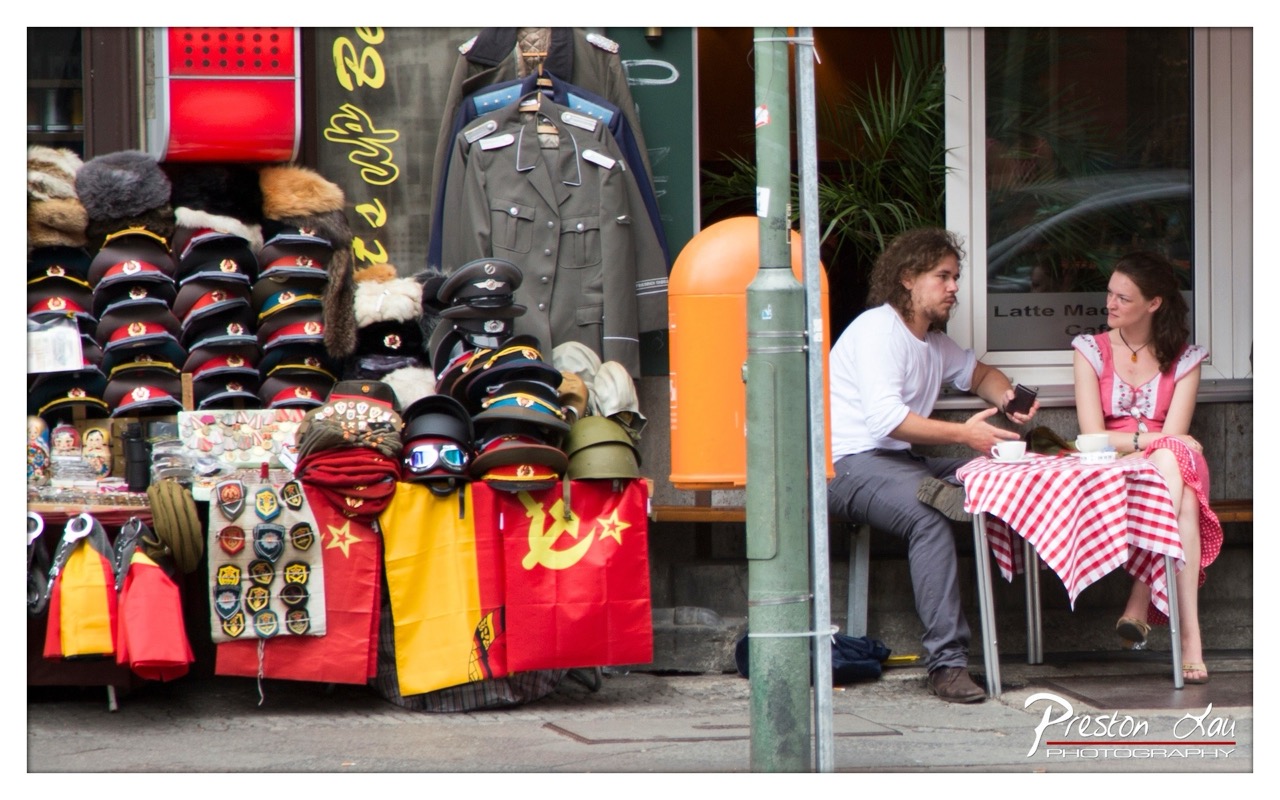

1. Overall Rating (0–10) — 7.0
This photograph captures a compelling juxtaposition of history and modernity, where the weight of Cold War relics meets the casual intimacy of a street-side conversation. The vibrant display of Soviet-era memorabilia—flags, uniforms, and insignia—creates a powerful visual anchor, while the couple’s quiet exchange adds a human, almost timeless element. The image’s strength lies in its layered storytelling, though the composition feels slightly cluttered, preventing the viewer from fully absorbing the scene’s deeper resonance.
2. Composition (0–10) — 6.0
The framing splits the image between the souvenir stall and the couple, creating a visual tension. The pole in the center disrupts the flow, while the off-center placement of the subjects gives a candid, documentary feel.
3. Lighting (0–10) — 6.5
Natural daylight illuminates the scene evenly, preserving detail in both the foreground and background. However, the lack of directional light flattens the textures of the fabric and metal objects.
4. Color & Tone (0–10) — 7.0
The bold reds and yellows of the flags and caps pop against the muted urban backdrop, drawing the eye. The color palette feels authentic and slightly nostalgic, though some areas appear oversaturated.
5. Creativity (0–10) — 7.5
The photographer skillfully juxtaposes political history with everyday life, creating a narrative that invites interpretation. The choice to include both the merchandise and the couple as co-protagonists enhances the image’s conceptual depth.
6. Technical Quality (0–10) — 7.5
Sharp focus across the frame, with clean detail in both the foreground and background. The exposure is well-balanced, though slight overexposure in the windows detracts from subtlety.
7. Emotional Impact (0–10) — 6.5
The scene evokes a sense of quiet reflection—between past and present, between public memory and private connection. While the emotion is understated, it lingers, inviting the viewer to consider the stories behind the objects and the people.
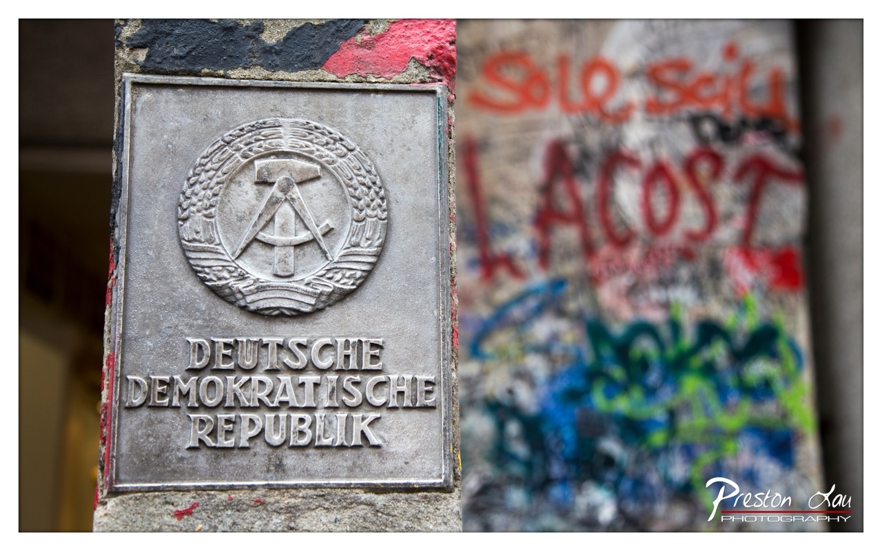

1. Overall Rating (0–10) — 7.5
This photograph captures a powerful juxtaposition between the rigid symbolism of the East German state and the chaotic, lived-in rebellion of urban graffiti. The sharp focus on the DDR plaque contrasts strikingly with the blurred, colorful chaos behind it, emphasizing a tension between ideology and individual expression. While the image is strong in concept and mood, the slightly awkward framing and heavy-handed blur in the background slightly diminish its visual cohesion.
2. Composition (0–10) — 6.5
The plaque is well-framed and centered, drawing immediate attention, but the composition feels slightly off-balance due to the uneven placement of the graffiti on the right. The shallow depth of field effectively isolates the subject, though the chaotic background edges could benefit from more deliberate framing.
3. Lighting (0–10) — 6.0
Natural daylight provides even, soft illumination on the plaque, highlighting its texture and details. However, the lighting is flat and lacks directional drama, which slightly weakens the emotional weight of the scene.
4. Color & Tone (0–10) — 7.0
The muted silver of the plaque contrasts sharply with the vibrant red, blue, and green graffiti, creating a dynamic visual tension. The color palette, though limited in range, effectively underscores the ideological clash between order and anarchy.
5. Creativity (0–10) — 8.0
The conceptual pairing of the DDR emblem with modern graffiti is highly original and thought-provoking. It speaks to the enduring legacy of political regimes and the persistent voice of dissent in public space.
6. Technical Quality (0–10) — 8.0
The focus on the plaque is sharp and precise, with clean detail and minimal noise. The depth of field is well-executed, though the background blur could be more refined to avoid visual distraction.
7. Emotional Impact (0–10) — 7.5
The image evokes a sense of historical weight and cultural resistance, inviting reflection on the passage of time and the struggle between state control and individual freedom. It resonates emotionally through its symbolic contrast, though the emotional pull is restrained by the image’s documentary tone.
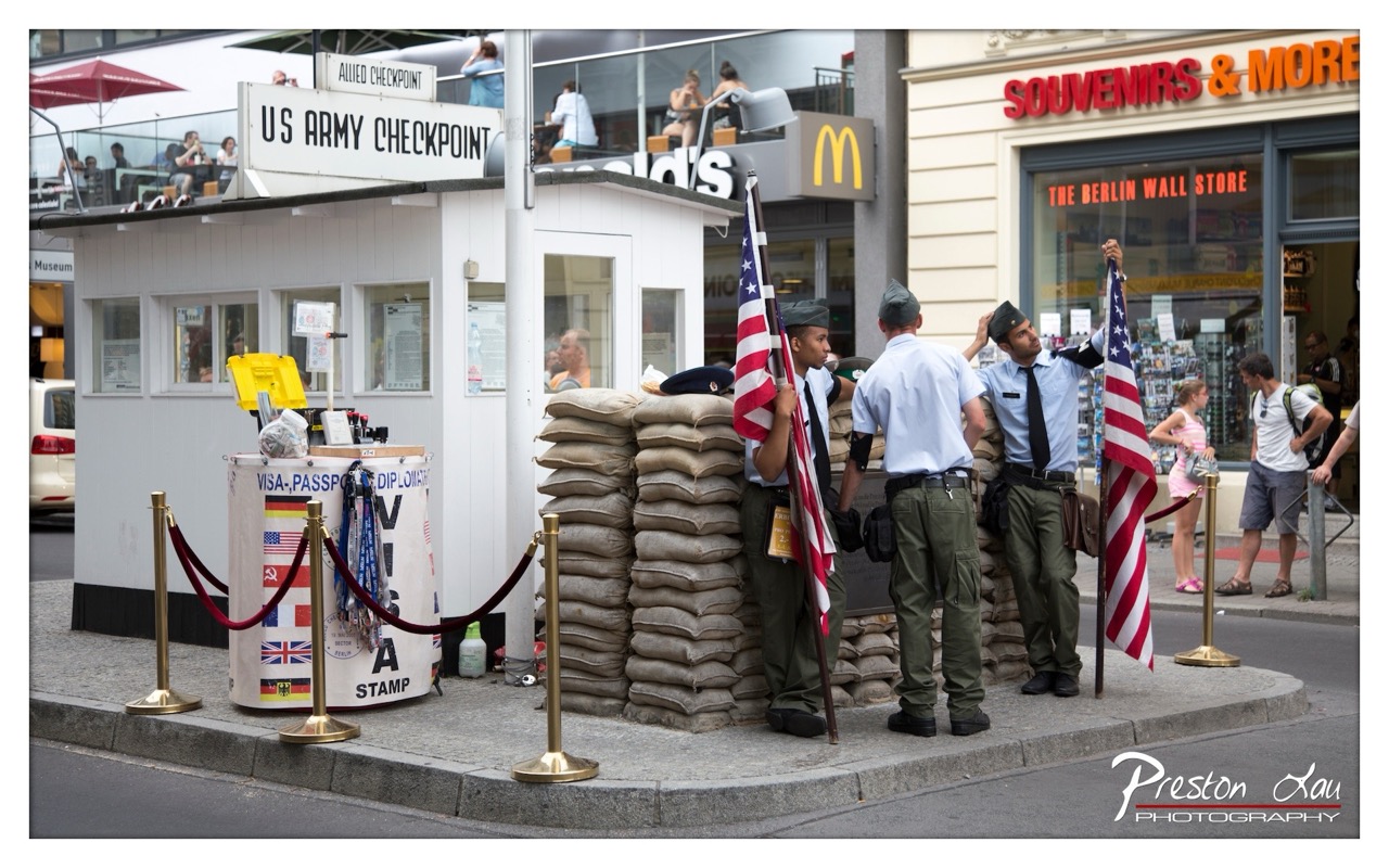

1. Overall Rating (0–10) — 7.5
This photograph masterfully captures a poignant juxtaposition of history and modernity at the Berlin Wall Checkpoint, where reenactment meets everyday life. The staging of the soldiers, sandbags, and signage evokes the Cold War era with striking authenticity, while the casual presence of tourists and a McDonald’s in the background grounds the scene in the present. The image succeeds in balancing documentary realism with symbolic weight, though the busy surroundings slightly dilute its emotional focus.
2. Composition (0–10) — 7.0
The framing effectively centers the checkpoint, using the sandbags and flagbearers as strong vertical and diagonal elements that draw the eye. The inclusion of the souvenir shop and pedestrians on the right creates visual contrast, enhancing the narrative of past and present. The stanchions and rope barrier lead the viewer’s gaze into the scene, though the composition feels slightly crowded.
3. Lighting (0–10) — 7.5
Natural daylight provides even, clear illumination, highlighting textures in the sandbags, uniforms, and signage. The soft shadows suggest midday light, which enhances detail without creating harsh contrasts. The lighting supports the scene’s documentary tone while subtly emphasizing the solemnity of the reenactment.
4. Color & Tone (0–10) — 7.0
The palette is grounded in muted earth tones—beige sandbags, olive greens, and gray pavement—contrasted by the vibrant red, white, and blue of the American flags. The red of the souvenir shop sign and the McDonald’s arch add modern pop, creating a visual tension between historical gravity and commercial tourism. The color balance is natural, though slightly oversaturated in the signage.
5. Creativity (0–10) — 8.0
The photograph’s strength lies in its layered storytelling: it captures both a historical reenactment and the reality of tourism as a cultural phenomenon. The juxtaposition of the solemn checkpoint with the casual passersby and commercial backdrop is conceptually rich, offering a commentary on memory, commodification, and time.
6. Technical Quality (0–10) — 8.5
Sharp focus across the frame, with excellent detail in the uniforms, signage, and textures. The depth of field is well-managed, keeping both the foreground and background elements clear. The exposure is balanced, and the image is free of noticeable noise or artifacts.
7. Emotional Impact (0–10) — 7.0
The image evokes a reflective mood, prompting contemplation of history’s legacy in the present. The soldiers’ solemnity and the symbolic weight of the checkpoint create a sense of reverence, though the casual tourists and modern branding temper the emotional intensity, creating a complex, layered response.
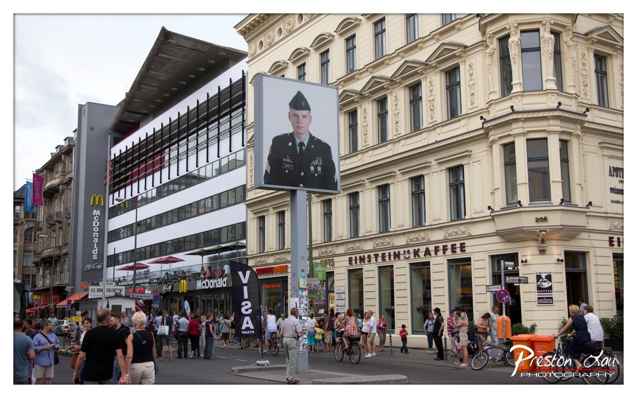

1. Overall Rating (0–10) — 6.0
This photograph captures a striking juxtaposition of modern consumerism and solemn military presence in a bustling European cityscape. The oversized portrait of a soldier, mounted prominently beside a McDonald’s and a historic café, creates a visually arresting and thought-provoking contrast. While the image effectively conveys a sense of cultural collision and public space dynamics, its narrative strength is slightly undermined by the cluttered framing and lack of compositional focus, leaving the viewer with a sense of visual overload rather than clear intention.
2. Composition (0–10) — 5.5
The frame is crowded with multiple elements—pedestrians, signage, buildings—resulting in a busy and unbalanced composition. The soldier’s portrait dominates the center, but the surrounding activity distracts from its symbolic weight, weakening the overall visual hierarchy.
3. Lighting (0–10) — 6.0
The overcast daylight provides even, diffused illumination, minimizing harsh shadows and allowing clear visibility across the scene. However, the flat lighting diminishes depth and texture, contributing to a somewhat lifeless atmosphere despite the vibrant urban environment.
4. Color & Tone (0–10) — 6.5
The palette is dominated by muted neutrals—beiges, grays, and blacks—broken only by the occasional pop of red from umbrellas and signage. The military uniform’s dark green and the McDonald’s yellow offer subtle contrast, but the overall tonal range lacks vibrancy, slightly dulling the image’s visual impact.
5. Creativity (0–10) — 7.5
The conceptual juxtaposition of a soldier’s portrait amid commercial and historical architecture is bold and original, inviting reflection on memory, militarism, and public space. This layered narrative elevates the photograph beyond mere documentation into the realm of social commentary.
6. Technical Quality (0–10) — 7.5
The image is sharp and well-exposed, with clear detail in both the foreground and background. The focus is consistent, and there are no visible technical flaws, though the tight crop and density of elements reduce its overall aesthetic cohesion.
7. Emotional Impact (0–10) — 6.0
The image evokes a sense of tension—between past and present, honor and commerce, individual and crowd. While the emotional resonance is present, it is muted by the visual chaos, preventing a deeper, more intimate connection with the viewer.
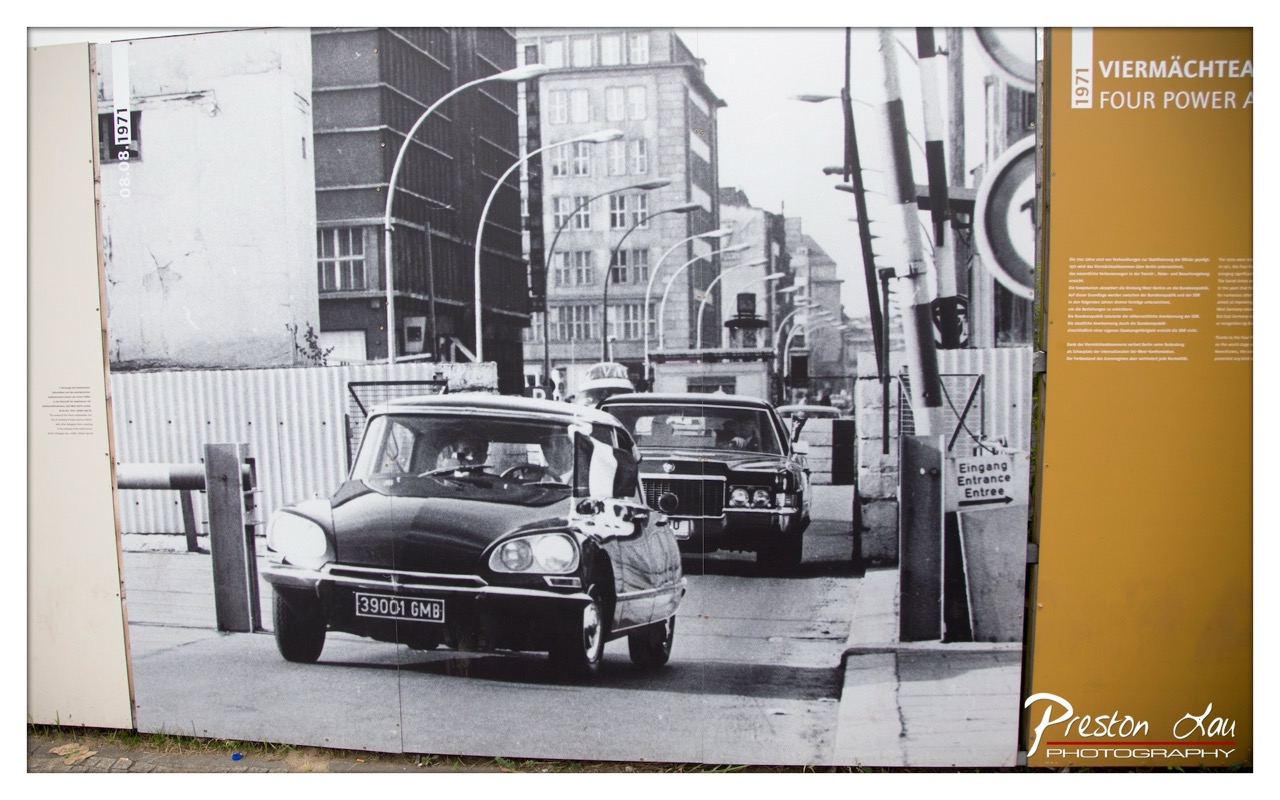

1. Overall Rating (0–10) — 7.0
This photograph captures a powerful historical moment at the Berlin Wall, frozen in time through a striking black-and-white image displayed as part of a museum exhibit. The juxtaposition of the archival photo with the surrounding informational panels adds depth, grounding the scene in its context. While the composition is strong and the subject matter inherently compelling, the framing feels slightly constrained by the physical display, limiting the full emotional resonance of the moment.
2. Composition (0–10) — 7.0
The central placement of the Citroën DS draws the eye, while the converging lines of the street and lampposts create a sense of depth and movement. The inclusion of the exhibit’s borders and signage frames the image, adding layers of narrative, though the left and right edges feel slightly crowded.
3. Lighting (0–10) — 7.0
The original photograph benefits from strong, even lighting that accentuates the textures of the cars and the urban environment. The contrast between light and shadow enhances the dramatic tension of the border crossing, while the monochromatic tone adds historical gravitas.
4. Color & Tone (0–10) — 6.0
The black-and-white palette reinforces the documentary nature of the image, emphasizing form and contrast over color. The lack of color is appropriate for the historical context, though a touch of tonal warmth might have heightened the emotional weight.
5. Creativity (0–10) — 7.0
The photograph’s strength lies in its storytelling—capturing a moment of Cold War tension with quiet realism. The framing within the exhibit adds a meta-layer of historical reflection, transforming a single image into a commentary on memory and preservation.
6. Technical Quality (0–10) — 7.5
The original photograph is sharp and well-defined, with clear details in the cars and architecture. The print quality of the exhibit display is clean, though minor reflections and the presence of the photographer’s watermark slightly detract from the authenticity of the archival image.
7. Emotional Impact (0–10) — 7.5
The image evokes a sense of gravity and historical significance, prompting reflection on division, movement, and the human stories behind political borders. The presence of the "Entrance" sign and the cars at the checkpoint create a palpable tension, making the viewer feel the weight of history.
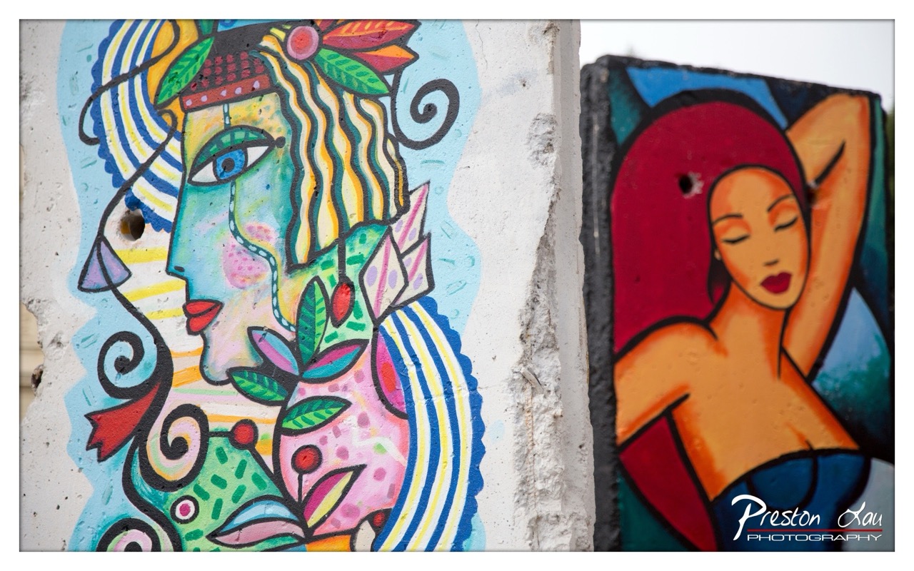

1. Overall Rating (0–10) — 7.5
This photograph captures the vibrant energy of urban street art, where bold colors and expressive forms collide against the raw texture of a weathered concrete wall. The juxtaposition of two distinct mural styles—one abstract and ornate, the other figurative and sensuous—creates a dynamic visual dialogue. While the composition is strong and the colors pop, the framing feels slightly uneven, and the overexposed sky detracts from the overall harmony.
2. Composition (0–10) — 7.0
The split-frame approach effectively contrasts two separate artworks, but the division is slightly off-center, creating an imbalance. The left mural dominates the frame, while the right feels compressed, limiting its visual impact.
3. Lighting (0–10) — 6.5
Natural daylight illuminates the scene evenly, allowing the vivid colors to stand out. However, the sky on the right is overexposed, washing out detail and creating a stark contrast with the richly colored murals.
4. Color & Tone (0–10) — 8.0
The palette is rich and varied, with bold blues, reds, greens, and yellows that pop against the neutral concrete. The tonal contrast between the bright art and the muted wall enhances the visual drama.
5. Creativity (0–10) — 8.5
The pairing of two different artistic styles on a single wall speaks to the diversity and spontaneity of street art culture. The composition itself is inventive, turning a simple snapshot into a narrative about artistic expression.
6. Technical Quality (0–10) — 8.0
Sharp focus and clear detail highlight the intricate patterns and textures in the murals. The image is well-captured, though the slight overexposure in the background slightly undermines the technical polish.
7. Emotional Impact (0–10) — 7.5
The image evokes a sense of urban vitality and creative freedom. The expressive faces and bold forms invite contemplation, while the weathered wall grounds the art in a tangible, real-world context.
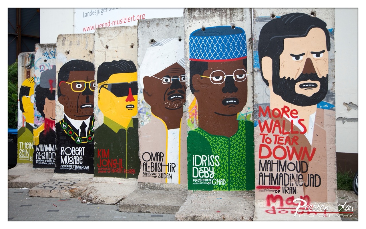

1. Overall Rating (0–10) — 7.5
This photograph captures a powerful and politically charged installation of Berlin Wall segments, each adorned with stylized portraits of world leaders labeled as “dictators” or “tyrants.” The bold, graphic illustrations convey a clear message of resistance and critique, while the weathered texture of the concrete adds historical weight. While the image is visually striking and conceptually strong, the crowded arrangement and overlapping text slightly diminish its clarity and visual harmony.
2. Composition (0–10) — 6.0
The composition is strong in its horizontal alignment and progression, guiding the eye across the wall segments. However, the uneven spacing and overlapping of the panels create a sense of visual clutter, and the framing cuts off the top of the far-left panel, disrupting balance.
3. Lighting (0–10) — 7.0
Natural daylight provides even illumination, highlighting the vibrant colors and details of the graffiti without harsh shadows. The light enhances the textures of the concrete and the boldness of the painted figures, contributing to the image’s documentary feel.
4. Color & Tone (0–10) — 8.0
The palette is rich and intentional, with bold primary and secondary colors—especially red, blue, and yellow—used in the portraits and text to create visual impact. The contrast between the bright graffiti and the muted gray concrete enhances the graphic quality and emphasizes the political message.
5. Creativity (0–10) — 9.0
The concept is highly original and provocative, using art as a form of political commentary. The stylized caricatures and the choice of figures evoke both satire and critique, turning a historical artifact into a contemporary statement on global power structures.
6. Technical Quality (0–10) — 8.0
The image is sharp and well-focused, with clear detail in the textures of the concrete and the painted surfaces. The resolution is high, and the watermark is unobtrusive, preserving the integrity of the composition.
7. Emotional Impact (0–10) — 8.0
The photograph evokes a sense of defiance and urgency, resonating with themes of resistance and the dismantling of oppressive systems. The bold expressions and the phrase “More Walls to Tear Down” stir a strong emotional response, encouraging reflection on current global politics.
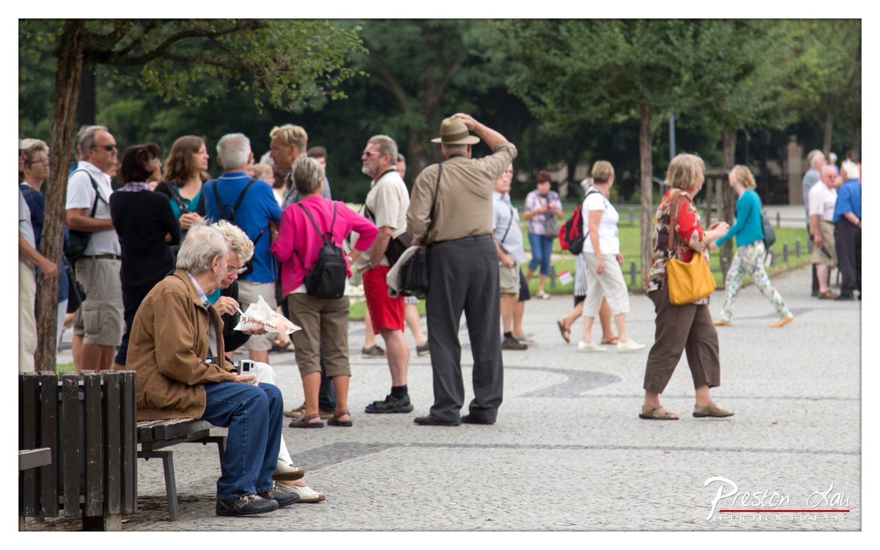

1. Overall Rating (0–10) — 6.0
This photograph captures a candid moment in a bustling public space, where the quiet intimacy of two seated figures contrasts with the movement of passersby. The composition feels observational, as if plucked from a day in the life of a park or plaza, with the couple’s stillness anchoring the frame amidst the surrounding motion. While the image conveys a sense of everyday realism and subtle human connection, it lacks a stronger visual focus and emotional punch, leaving the viewer slightly detached from the narrative.
2. Composition (0–10) — 6.0
The couple on the bench is placed off-center, creating a natural focal point, but the surrounding crowd and diagonal walkway introduce visual distractions. The depth of field is shallow enough to keep the foreground sharp, yet the scattered figures in the midground create a sense of clutter rather than cohesion.
3. Lighting (0–10) — 6.5
Natural daylight provides even, soft illumination, with no harsh shadows, allowing for clear visibility across the scene. The overcast quality of the light lends a muted, documentary feel, though it slightly diminishes the vibrancy of the colors.
4. Color & Tone (0–10) — 6.0
The palette is largely neutral—browns, grays, and muted greens—accented by pops of color like the pink shirt and yellow bag, which draw attention but don’t create a unified mood. The tonal range is balanced, but the lack of richness reduces the image’s visual appeal.
5. Creativity (0–10) — 6.5
The photograph succeeds in capturing a slice of life with authenticity, using the contrast between stillness and motion to suggest a quiet story within a larger narrative. However, the execution leans more toward snapshot realism than deliberate artistic expression.
6. Technical Quality (0–10) — 7.5
The focus is sharp on the foreground subjects, and the depth of field is appropriately controlled. The image is free of noise and distortion, with good resolution and clean details throughout.
7. Emotional Impact (0–10) — 6.0
The image evokes a sense of quiet companionship and everyday routine, but the emotional resonance is tempered by the busy background and lack of a strong central narrative, leaving the viewer with a fleeting impression rather than a lasting impression.
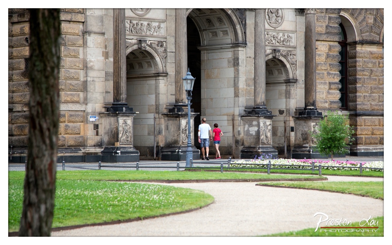

1. Overall Rating (0–10) — 7.0
This photograph captures a quiet moment of human scale within an imposing historical setting, where architecture and nature coexist in harmonious contrast. The interplay between the grand stone structure and the soft, curving garden path creates a sense of timelessness and quiet contemplation. While the image is visually balanced and compositionally sound, the slightly muted lighting and lack of dramatic tension keep it from feeling truly striking.
2. Composition (0–10) — 7.5
The framing uses the tree on the left as a natural leading element, guiding the eye toward the couple and the architectural entrance. The curved path enhances depth and movement, while the central placement of the figures grounds the scene, though the symmetry of the columns slightly overshadows their individual presence.
3. Lighting (0–10) — 6.5
Soft, diffused daylight evenly illuminates the scene, preserving detail in both the shadows and highlights. The overcast quality lends a calm, neutral tone, but it also diminishes the dramatic texture of the stonework and reduces the visual impact of the architecture.
4. Color & Tone (0–10) — 6.0
The palette is restrained, dominated by earthy stone tones and muted greens, with the red of the woman’s shirt providing a subtle pop of color. The overall tonal balance is consistent, but the lack of vibrancy gives the image a slightly flat appearance.
5. Creativity (0–10) — 6.5
The image successfully juxtaposes the grandeur of classical architecture with the simplicity of a casual stroll, creating a narrative of everyday life within a historic space. While not radically original, it conveys a sense of place and time with quiet elegance.
6. Technical Quality (0–10) — 8.0
Sharp focus and clear detail are maintained throughout the frame, particularly in the foreground and midground. The depth of field is well-managed, with the subject and background both rendered with clarity, and the watermark is unobtrusive.
7. Emotional Impact (0–10) — 6.5
The photograph evokes a sense of peaceful solitude and reverence for history, inviting the viewer to pause and reflect. The presence of the couple adds a touch of warmth and relatability, but the emotional resonance remains subdued due to the image’s composed, observational tone.
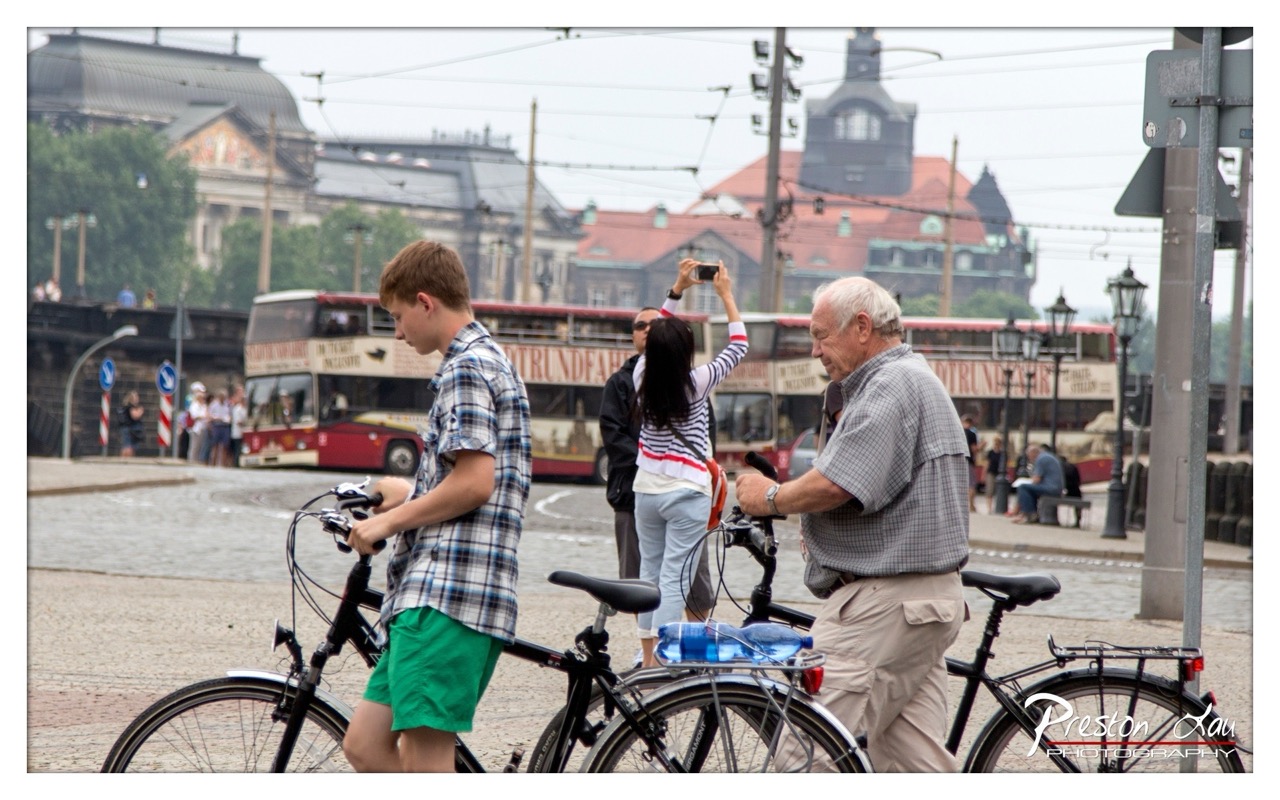

1. Overall Rating (0–10) — 6.0
This photograph captures a candid moment of urban life, where bicycles and tourists intersect in a bustling European cityscape. The composition balances human activity with architectural context, grounding the scene in a real, lived-in atmosphere. While the image conveys a sense of movement and place, the muted lighting and slightly cluttered background dampen its visual cohesion, leaving the viewer with a sense of documentation rather than artistry.
2. Composition (0–10) — 6.5
The subjects are well-placed within the frame, creating a natural diagonal flow from the boy on the left to the older man on the right. However, the background is dense with distractions—wires, signage, and the double-decker bus—pulling focus from the central narrative. A tighter crop or deeper depth of field could sharpen the emphasis on the human interaction.
3. Lighting (0–10) — 5.5
Diffuse, overcast light flattens the scene, minimizing shadows and reducing tonal contrast. While this softness suits the documentary tone, it also drains the image of vibrancy and depth, making the colors appear washed out and the overall mood slightly dull.
4. Color & Tone (0–10) — 5.0
The palette is dominated by muted grays and earth tones, with the red bus providing a minor pop of color. The lack of saturation and warm tones contributes to a subdued, almost grayed-out atmosphere that feels more like a snapshot than a composed image.
5. Creativity (0–10) — 6.0
The photograph captures a slice of everyday life with authenticity, suggesting a story of travel, generational exchange, and urban mobility. The inclusion of the woman taking a photo adds a layer of meta-narrative, but the execution remains conventional rather than innovative.
6. Technical Quality (0–10) — 7.0
The image is sharp and well-focused, particularly on the foreground figures. The lens choice and aperture appear to balance depth of field effectively, allowing both people and background architecture to remain visible, though not perfectly crisp.
7. Emotional Impact (0–10) — 5.5
The scene evokes a sense of quiet observation and urban rhythm, but the emotional resonance is muted by the flat lighting and lack of dramatic tension. It invites contemplation rather than stirring a strong response, leaving the viewer with a fleeting impression of a moment rather than a lasting connection.
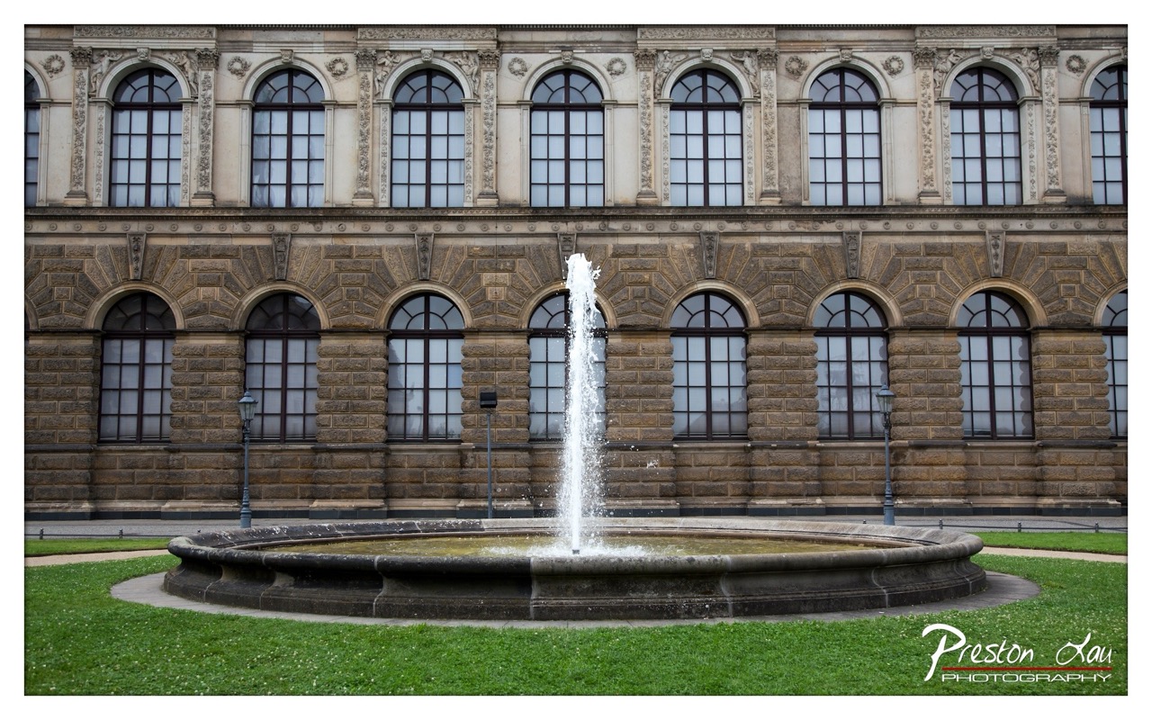

1. Overall Rating (0–10) — 7.5
This photograph captures the timeless elegance of a grand architectural façade, with the fountain serving as a dynamic focal point that breathes life into the scene. The symmetry of the building and the vertical jet of water create a striking balance between stillness and motion. While the image is visually compelling and rich in detail, the slightly muted color grading tempers its emotional resonance, holding it just short of transcendent.
2. Composition (0–10) — 8.0
The central placement of the fountain aligns perfectly with the building’s symmetry, creating a strong sense of balance. The low angle emphasizes the height of the structure and the spray of water, while the surrounding lawn frames the scene with natural softness.
3. Lighting (0–10) — 7.0
Even, diffused light softens the stone texture and prevents harsh shadows, allowing architectural details to emerge clearly. The overcast conditions lend a neutral tone that enhances the historic feel, though a touch more contrast would add depth.
4. Color & Tone (0–10) — 6.5
The palette leans toward subdued earth tones—grays, beiges, and a quiet green—creating a cohesive and dignified mood. However, the colors lack vibrancy, giving the image a slightly flat appearance that diminishes its visual punch.
5. Creativity (0–10) — 7.0
The photographer leverages symmetry and contrast between motion and stillness to elevate a classic architectural subject. The choice to capture the fountain in full spray adds narrative energy, transforming a static scene into a moment of subtle dynamism.
6. Technical Quality (0–10) — 8.5
Sharp focus across the frame ensures clarity in both the fountain and the ornate stonework. The exposure is well-managed, with no blown highlights or lost shadows, showcasing a high level of technical control.
7. Emotional Impact (0–10) — 7.0
The image evokes a sense of quiet grandeur and contemplative serenity, inviting the viewer to reflect on the passage of time and the permanence of art and architecture. The fountain’s movement offers a gentle counterpoint to the stillness of the building, creating a subtle emotional lift.
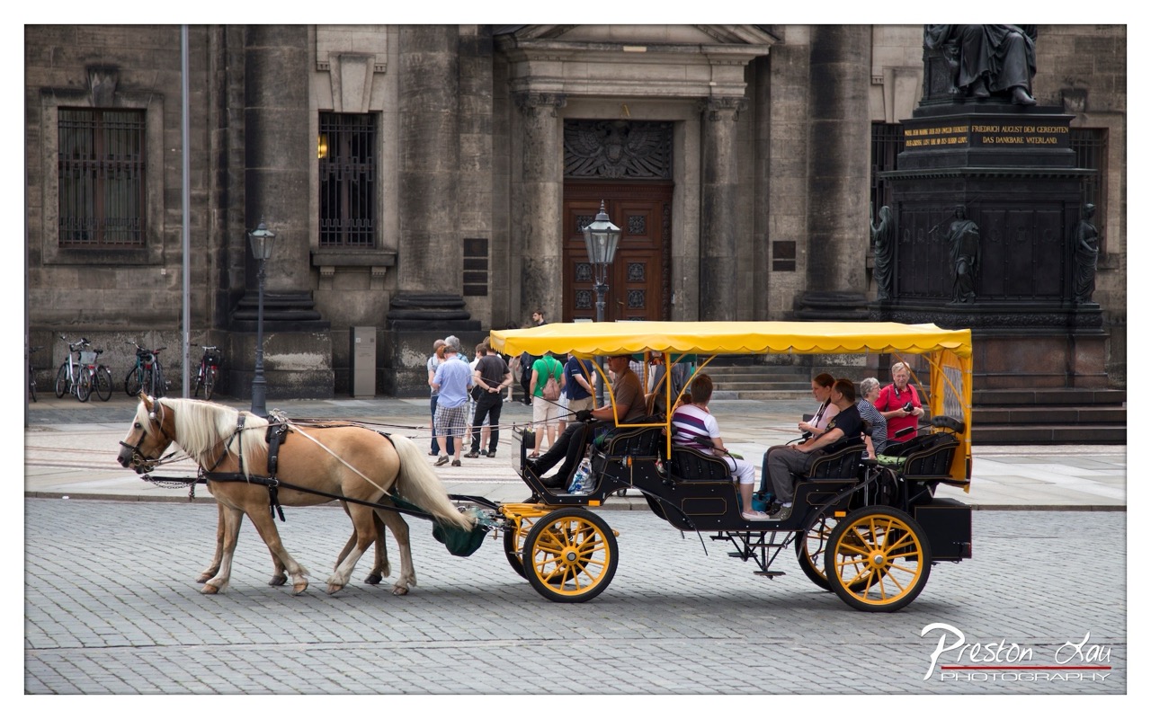

1. Overall Rating (0–10) — 7.0
This photograph captures a lively urban scene where tradition meets modernity, with a horse-drawn carriage gliding through a historic European square. The contrast between the vibrant yellow canopy and the muted stone architecture creates a visually engaging focal point, while the presence of tourists adds a sense of everyday life and movement. While the image is rich in narrative and context, it lacks a strong emotional pull due to a slightly overexposed sky and flat lighting, which dulls the overall atmosphere.
2. Composition (0–10) — 7.5
The carriage is well-placed along the diagonal, guiding the eye across the frame and creating a sense of motion. The background architecture provides a balanced, symmetrical structure, with the statue and building framing the scene naturally. The depth of field is effective, keeping the carriage in sharp focus while softly blurring the background, enhancing the subject’s prominence.
3. Lighting (0–10) — 6.0
The lighting is even but somewhat flat, likely due to an overcast sky or midday sun, which reduces shadows and depth. The bright yellow canopy reflects light, drawing attention, but the overall exposure lacks contrast, especially in the sky, which appears slightly washed out.
4. Color & Tone (0–10) — 7.0
The color palette is balanced, with the bold yellow of the carriage providing a striking contrast against the neutral grays and browns of the stone and pavement. The tones are consistent, with no harsh color casts, though the overall vibrancy could be enhanced to make the image more dynamic.
5. Creativity (0–10) — 7.0
The image successfully blends historical and contemporary elements, capturing a moment that feels both timeless and alive. The use of the carriage as a focal point against a grand architectural backdrop suggests a narrative of tourism and cultural heritage, making the photograph both documentary and evocative.
6. Technical Quality (0–10) — 8.0
The image is sharp and well-focused, particularly on the horse and carriage, with clean details visible in the harness and wheels. The exposure is generally accurate, though the highlights in the sky could be better managed. The watermark is discreet and does not detract from the composition.
7. Emotional Impact (0–10) — 6.5
The photograph conveys a sense of leisure and nostalgia, inviting the viewer to imagine a pleasant day in a historic city. While the mood is pleasant and engaging, it remains somewhat detached, as the expressionless faces of the passengers and the lack of dramatic lighting prevent a deeper emotional connection.
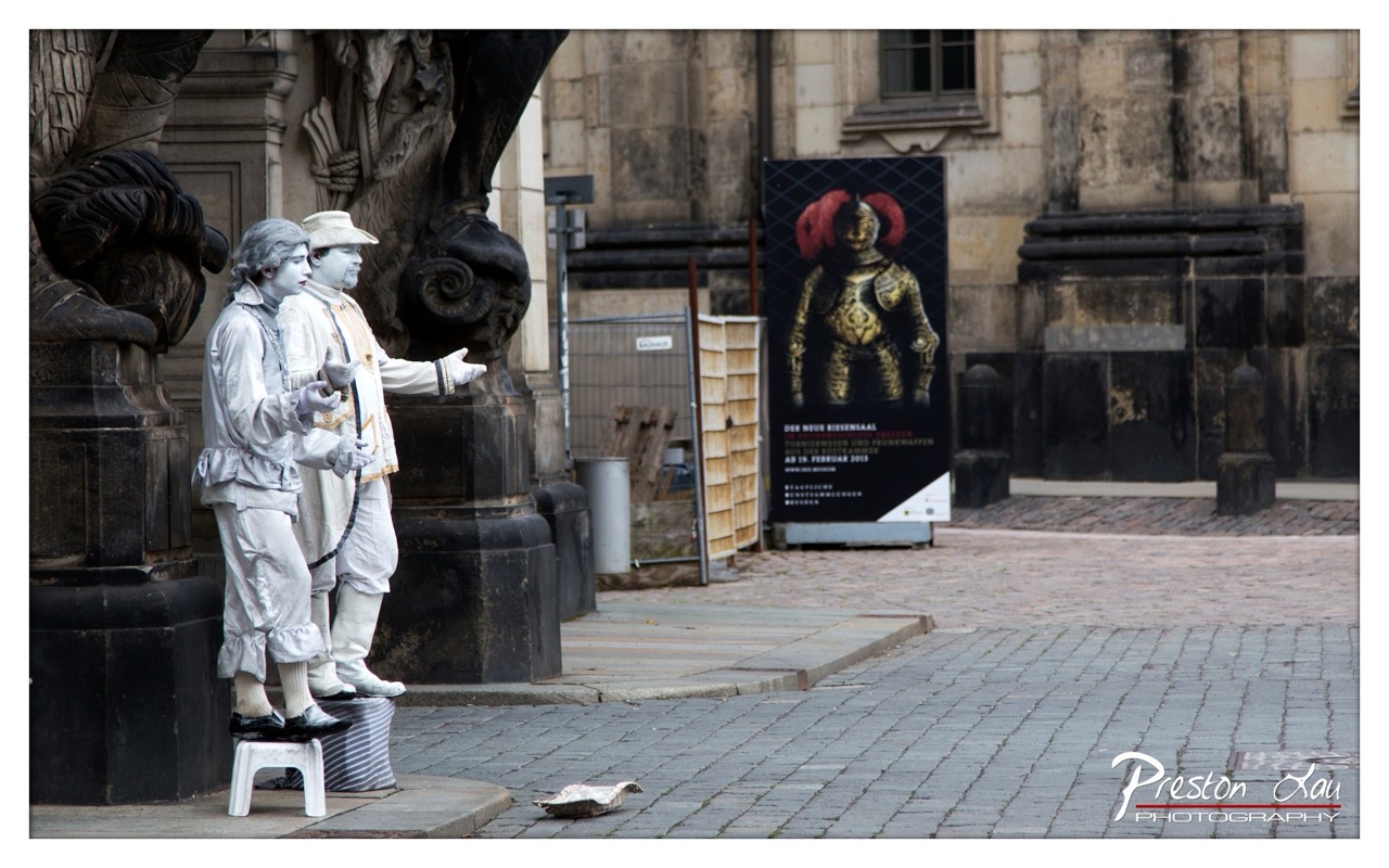

1. Overall Rating (0–10) — 7.0
This photograph captures a striking juxtaposition between historical performance and urban reality, where two street performers in white costumes stand like living statues against the backdrop of a weathered European square. The image balances the whimsy of the performers with the weight of the architecture and the subtle decay of the surroundings, creating a contemplative mood. While the composition draws the eye effectively, the muted tones and flat lighting slightly diminish the visual drama, keeping the image grounded but not transcendent.
2. Composition (0–10) — 6.5
The performers are placed off-center, creating a dynamic imbalance that guides the eye across the frame. The strong verticals of the sculpture and architecture contrast with the horizontal cobblestone street, while the poster in the background adds a layer of narrative depth. However, the wide perspective introduces a sense of emptiness, diluting the focus on the central subjects.
3. Lighting (0–10) — 5.5
The light is diffused and even, likely from an overcast day, which flattens the scene and reduces shadows. While this soft light suits the somber mood, it also diminishes the texture and dimensionality of the costumes and stone, making the image feel somewhat lifeless.
4. Color & Tone (0–10) — 5.0
The palette is dominated by muted grays and whites, with the black and red poster providing a sharp but isolated burst of color. The lack of vibrancy gives the image a documentary feel, but it also limits the emotional pull and visual richness.
5. Creativity (0–10) — 7.5
The concept of frozen performers in a historic setting is inherently creative, evoking themes of artifice, time, and public space. The inclusion of the poster adds a layer of narrative, suggesting a larger cultural context. The photograph succeeds in capturing a fleeting moment that blends performance, history, and urban life.
6. Technical Quality (0–10) — 7.5
The image is sharp and well-focused, particularly on the performers, with clean detail in the textures of the costumes and stonework. The exposure is balanced, with no blown highlights or lost shadows. The watermark is subtle and does not distract.
7. Emotional Impact (0–10) — 6.0
The scene elicits a sense of quiet melancholy and detachment—two figures performing a ritual of stillness in a world that moves on. The emotional resonance is subtle, rooted more in observation than in strong feeling. It invites reflection but does not demand an emotional response.
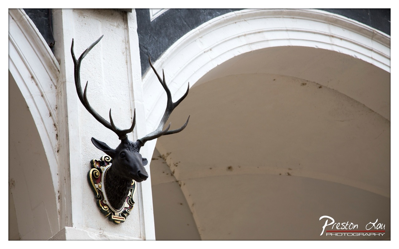

1. Overall Rating (0–10) — 7.0
This photograph captures the quiet dignity of a taxidermied stag head mounted on a weathered stone archway, evoking a sense of tradition and time-worn grandeur. The ornate plaque and architectural details lend the image a narrative weight, suggesting a place steeped in history and ceremony. While the lighting and color are subdued, the composition’s focus on the stag as a symbol of status and heritage gives the image a strong visual and emotional anchor.
2. Composition (0–10) — 7.5
The stag head is placed off-center, creating a dynamic diagonal with the archway, while the strong curve of the arch guides the eye toward the subject. The framing is tight and intentional, emphasizing the details of the mount and the surrounding architecture.
3. Lighting (0–10) — 6.0
Soft, diffused light evenly illuminates the scene, minimizing harsh shadows and highlighting the texture of the stone and the stag’s antlers. However, the lack of directional light reduces depth and dimensionality.
4. Color & Tone (0–10) — 6.5
The palette is restrained, dominated by muted whites, grays, and the deep black of the stag, with subtle accents of gold and red on the plaque. The tonal range is limited, giving the image a somber, almost monochromatic feel.
5. Creativity (0–10) — 7.0
The juxtaposition of the natural form of the stag with the man-made architecture creates a compelling visual metaphor. The image suggests themes of legacy, control over nature, and the passage of time, offering more than a simple portrait of a trophy.
6. Technical Quality (0–10) — 8.0
The image is sharp and well-focused, with fine detail visible in the antlers and the decorative plaque. The exposure is balanced, and the sensor noise is minimal, indicating a high level of technical execution.
7. Emotional Impact (0–10) — 6.5
The photograph conveys a quiet solemnity and a sense of faded prestige. While not emotionally charged, it invites contemplation on the relationship between humans, nature, and tradition, leaving a lingering impression of nostalgia and reverence.
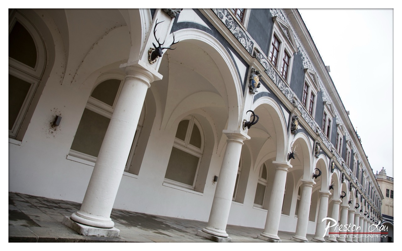

1. Overall Rating (0–10) — 7.5
This photograph captures the regal elegance of a historic courtyard, where architectural symmetry and decorative detail converge to evoke a sense of timeless grandeur. The low-angle perspective enhances the verticality of the columns and the ornate façade, drawing the eye along the rhythmic repetition of arches and trophies. While the overcast sky tempers the scene with a subdued mood, the image succeeds in conveying both the scale and the cultural weight of the space—its strength lies in its atmospheric restraint and architectural storytelling.
2. Composition (0–10) — 8.0
The strong diagonal leading line created by the row of arches guides the viewer’s gaze through the frame, creating depth and rhythm. The low angle emphasizes the monumentality of the columns, while the balanced repetition of elements lends a sense of order and harmony.
3. Lighting (0–10) — 6.0
The soft, diffused light of an overcast day minimizes harsh shadows and allows for even exposure across the façade, though it also flattens the texture and reduces contrast. The lack of directional light lends a muted tone that, while appropriate for the mood, limits the visual drama.
4. Color & Tone (0–10) — 7.0
The palette is restrained—dominated by whites, grays, and dark accents—creating a classic, monochromatic aesthetic that emphasizes form and pattern. The subtle contrast between the white columns and the dark blue-gray wall enhances the architectural details without overwhelming the eye.
5. Creativity (0–10) — 7.5
The use of a wide-angle lens and tilted perspective adds a dynamic, almost painterly quality to the architectural subject. The inclusion of the mounted antlers and heraldic elements introduces a narrative layer, suggesting a history of tradition and status.
6. Technical Quality (0–10) — 8.0
Sharp focus across the frame ensures clarity in the architectural details, and the clean, precise lines of the columns and arches demonstrate strong technical control. The wide-angle lens is used effectively without excessive distortion.
7. Emotional Impact (0–10) — 7.0
The image evokes a quiet reverence for history and craftsmanship, inviting contemplation of the past. While the overcast light tempers the emotional intensity, the composition and subject matter still convey a sense of dignity and permanence.
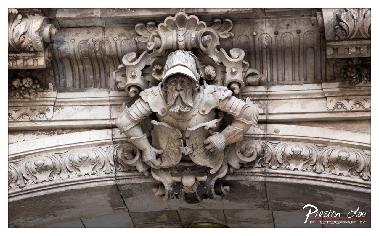

1. Overall Rating (0–10) — 7.5
This photograph captures the intricate craftsmanship of a stone gargoyle-like figure embedded in an ornate architectural facade, exuding a sense of historical weight and narrative depth. The detailed carving, with its weathered textures and expressive features, draws the viewer into a moment of quiet contemplation, while the surrounding decorative elements enhance the image’s sense of grandeur. A slight imbalance in exposure and the flatness of the lighting prevent the image from achieving its full artistic potential, but the subject’s inherent drama and the photographer’s clear intent to highlight craftsmanship make this a compelling visual statement.
2. Composition (0–10) — 8.0
The subject is well-centered, with the gargoyle occupying the visual focal point, supported by symmetrical ornamental framing. The use of the arch and horizontal moldings creates a natural leading structure, guiding the eye toward the figure. The slightly tight framing enhances intimacy, though the inclusion of the lower archway adds a subtle layer of depth.
3. Lighting (0–10) — 6.0
The lighting is even and diffuse, likely from an overcast sky, which softens shadows and reveals texture without harsh contrast. However, this flatness diminishes the three-dimensional quality of the carving, slightly flattening the image and reducing the dramatic interplay of light and shadow that could have emphasized the sculpture’s form.
4. Color & Tone (0–10) — 7.0
The monochromatic palette of weathered stone—ranging from pale gray to soft beige—lends a timeless, almost classical quality to the image. Subtle tonal variations in the stone’s surface add richness, and the lack of strong color keeps the focus on form and texture. A slight warm tint could have added emotional warmth, but the natural tones are consistent and effective.
5. Creativity (0–10) — 8.0
The photographer demonstrates a clear artistic intent to celebrate architectural detail and historical artistry. The choice to isolate the gargoyle from its urban context and focus on its expressive character transforms a mundane architectural feature into a narrative figure. This imaginative framing elevates the image beyond simple documentation into a study of character and form.
6. Technical Quality (0–10) — 8.5
The image is sharp and detailed, capturing fine textures in the stone carving with precision. Focus is well-managed, and the exposure is balanced across the frame, with no obvious technical flaws. The watermark is discreet and does not detract from the composition.
7. Emotional Impact (0–10) — 7.5
The sculpture’s weathered expression and stoic posture evoke a sense of endurance and quiet dignity, inviting the viewer to ponder the stories embedded in stone. The image captures a moment of stillness that feels both ancient and deeply human, creating a subtle emotional resonance rooted in time and memory.
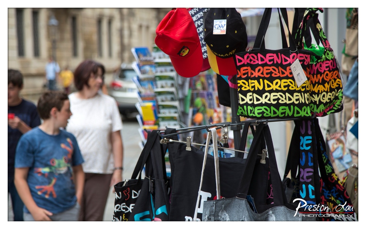

1. Overall Rating (0–10) — 6.8
This photograph captures the vibrant energy of a street market, where souvenir bags and caps emblazoned with "Dresden" signal a tourist destination rich in local identity. The bold, colorful typography of the bags contrasts sharply with the muted, out-of-focus background, creating a dynamic tension between commerce and culture. While the image effectively conveys the atmosphere of a bustling city square, its depth of field and framing feel slightly unbalanced, leaving the human elements more like background noise than central narrative.
2. Composition (0–10) — 6.0
The foreground elements dominate the frame, with the bags and hats creating a visually busy arrangement. The placement of the boy and woman on the left adds depth, but their blur and off-center positioning disrupt visual harmony, drawing attention without purpose.
3. Lighting (0–10) — 6.5
Natural daylight provides even illumination, allowing the colors of the merchandise to pop. However, the light lacks directionality or mood, resulting in a flat, functional exposure that prioritizes clarity over atmosphere.
4. Color & Tone (0–10) — 7.5
The bright, saturated colors of the bags—especially the neon pink, green, and yellow—create a lively, energetic palette. These contrast effectively with the neutral tones of the background, making the merchandise the undeniable focal point.
5. Creativity (0–10) — 7.0
The photographer leverages the juxtaposition of commercial souvenirs and everyday passersby to suggest a story about tourism and place. The choice to foreground the text-heavy bags adds a layer of commentary on identity and branding, though the concept could be more tightly executed.
6. Technical Quality (0–10) — 7.5
Sharp focus on the bags and hats reveals fine detail, while the shallow depth of field cleanly separates the subject from the background. The image is well-exposed and free of technical flaws.
7. Emotional Impact (0–10) — 6.0
The photograph evokes a sense of travel and casual exploration, but the emotional resonance is limited by the impersonal nature of the scene. The blurred figures feel detached, preventing a deeper connection with the human element of the moment.
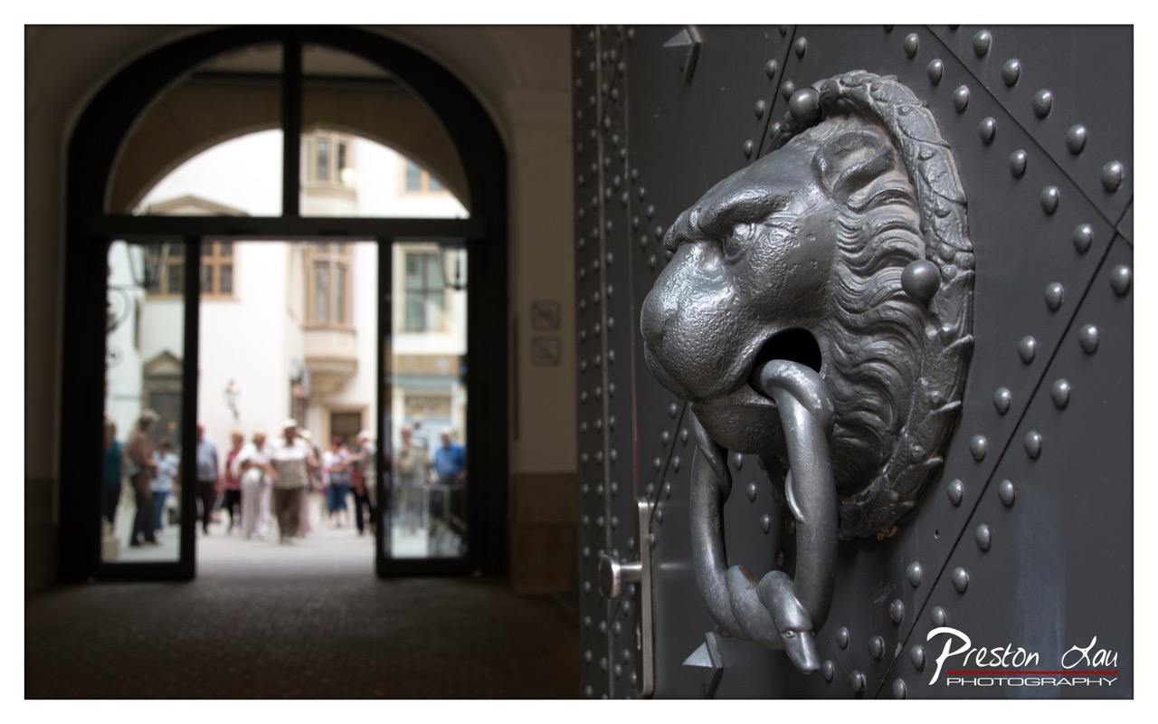

1. Overall Rating (0–10) — 7.5
This photograph masterfully juxtaposes the weighty, historic presence of a lion-headed door knocker against the fleeting, everyday motion of people beyond. The shallow depth of field draws the viewer’s eye to the intricate craftsmanship of the metalwork while softly blurring the background into a dreamlike passage. While the composition is strong, the muted lighting slightly dampens the image’s atmospheric potential, leaving a sense of restraint in its emotional reach.
2. Composition (0–10) — 8.0
The lion knocker dominates the right side of the frame, creating a strong visual anchor, while the arched doorway on the left guides the eye into the scene. The diagonal placement of the door and the knocker’s gaze toward the background form a dynamic balance, enhancing the sense of depth and narrative.
3. Lighting (0–10) — 6.5
Natural light filters through the archway, creating a soft, diffused glow that illuminates the background while leaving the foreground in gentle shadow. The lighting is even and functional, though it lacks the dramatic contrast or warmth that could elevate the mood.
4. Color & Tone (0–10) — 7.0
The palette is restrained, dominated by cool grays and muted earth tones, which suit the historic and stately atmosphere. The metallic sheen of the knocker adds subtle tonal variation, while the soft background hues contribute to a cohesive, moody tone.
5. Creativity (0–10) — 8.0
The photographer uses selective focus and architectural framing to tell a story of time and transition—between past and present, permanence and movement. The choice to center the viewer’s attention on the knocker as a symbol of guardianship adds narrative depth and originality.
6. Technical Quality (0–10) — 8.5
Sharp focus on the lion knocker highlights fine textures and details, while the background remains softly blurred in a controlled manner. The image is clean, well-exposed, and free of distracting artifacts.
7. Emotional Impact (0–10) — 7.5
The image evokes a quiet reverence for history and craftsmanship, inviting contemplation on the passage of time. The juxtaposition of the enduring knocker and the transient figures creates a poignant sense of continuity, resonating with a subtle emotional weight.
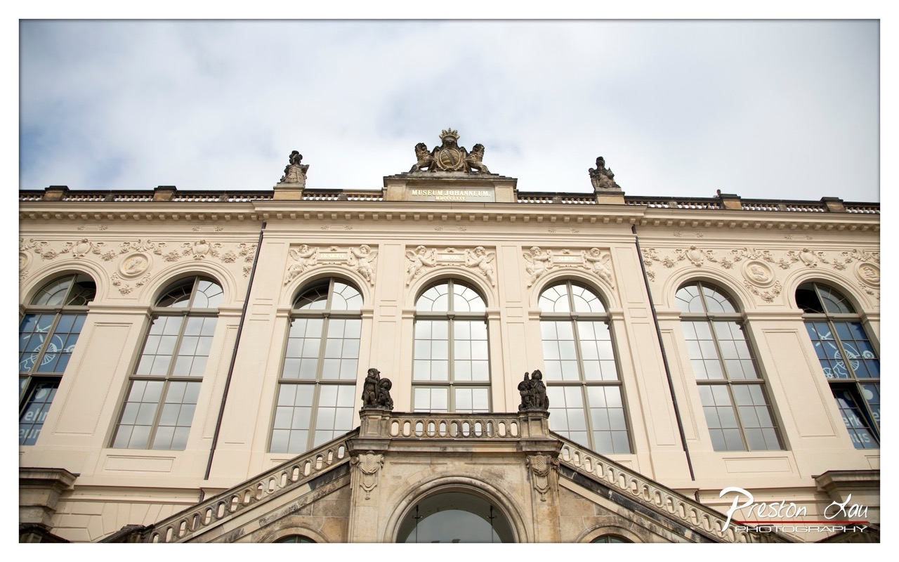

1. Overall Rating (0–10) — 7.5
This photograph captures the grandeur of the Museum Johanneum with a strong sense of architectural dignity, where classical ornamentation and symmetry speak to centuries of cultural legacy. The low-angle perspective amplifies the building’s imposing presence, while the overcast sky softens the light, lending a contemplative mood to the scene. Though the image is technically sound, the lack of dynamic contrast and a more compelling focal point slightly limits its emotional pull.
2. Composition (0–10) — 8.0
The symmetrical arrangement of the facade and arched windows creates a balanced, harmonious frame, with the central staircase guiding the eye upward toward the ornate crest. The low angle enhances the building’s verticality and authority, though the inclusion of the watermark in the lower right slightly disrupts the visual flow.
3. Lighting (0–10) — 6.5
Diffuse, overcast light evenly illuminates the façade, minimizing harsh shadows and preserving fine details in the stonework. However, the flatness of the lighting reduces depth and atmospheric tension, resulting in a somewhat muted visual impact.
4. Color & Tone (0–10) — 7.0
The soft beige of the stone contrasts gently with the cool grays of the sky and the dark accents of the statues and railings. The palette is restrained and harmonious, enhancing the classical tone, though a touch more saturation could add vibrancy without compromising authenticity.
5. Creativity (0–10) — 7.0
The photographer’s choice of a low-angle perspective and focus on the architectural details reflects a thoughtful approach to capturing historical grandeur. While the composition is conventional, the emphasis on symmetry and vertical lines offers a compelling interpretation of the building’s significance.
6. Technical Quality (0–10) — 8.5
The image is sharp, with clear focus across the entire frame, allowing intricate carvings and inscriptions to remain legible. The exposure is well-balanced, with no blown-out highlights or crushed shadows, demonstrating strong technical control.
7. Emotional Impact (0–10) — 6.5
The photograph evokes a sense of reverence and timelessness, inviting the viewer to reflect on the cultural weight of the institution. Yet, the neutral lighting and lack of human presence create a detached, almost impersonal atmosphere that limits deeper emotional engagement.
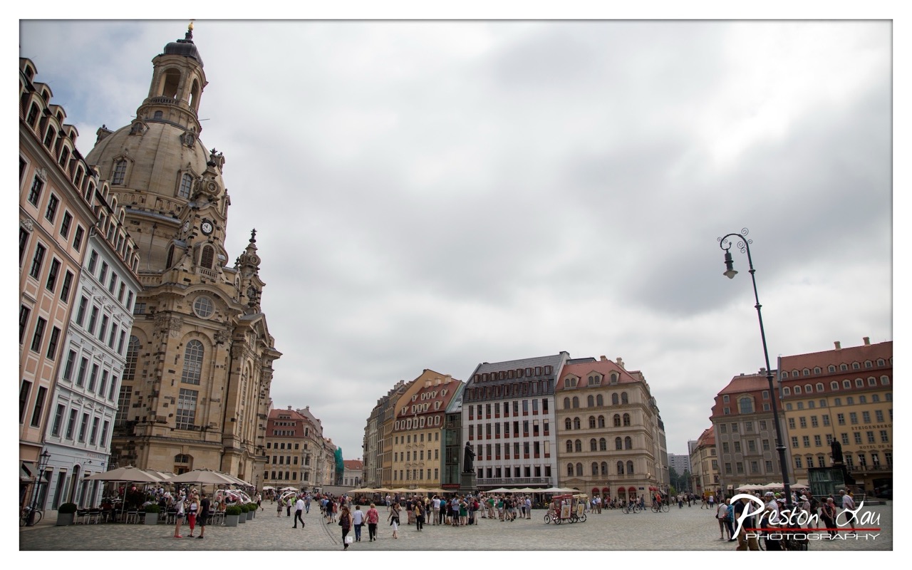

1. Overall Rating (0–10) — 7.0
This photograph captures the grandeur and liveliness of a historic European square, where architecture and human activity converge under a brooding sky. The towering church dominates the left, anchoring the composition with its Baroque elegance, while the bustling crowd adds a pulse of everyday life. The overcast light softens the scene, lending a contemplative mood, though the image's potential is slightly dampened by a lack of visual drama in the sky and a somewhat busy foreground.
2. Composition (0–10) — 7.0
The diagonal sweep of the church and the receding line of buildings create a strong sense of depth, guiding the eye across the frame. The placement of the lamppost on the right provides balance, though the right side feels slightly more cluttered than the left.
3. Lighting (0–10) — 6.0
The overcast sky diffuses light evenly, minimizing harsh shadows and preserving detail in both highlights and shadows. However, the flat lighting diminishes the architectural textures and reduces the scene’s atmospheric depth.
4. Color & Tone (0–10) — 6.5
The palette is restrained, dominated by muted beiges, grays, and soft reds, which reflect the cloudy sky. While harmonious, the colors lack vibrancy, giving the image a slightly washed-out quality that softens its visual impact.
5. Creativity (0–10) — 7.0
The photographer captures a dynamic moment in a historically rich setting, blending architectural grandeur with human activity. The wide-angle perspective emphasizes scale and context, offering a narrative of place and time.
6. Technical Quality (0–10) — 8.0
The image is sharp and clear, with fine detail visible in the buildings and the crowd. The exposure is well-managed, and the focus is consistent across the frame, demonstrating solid technical execution.
7. Emotional Impact (0–10) — 6.5
The photograph evokes a sense of place and quiet urban energy, but the lack of dramatic light and color keeps the emotional resonance subdued. It invites contemplation of history and daily life, but doesn’t fully capture a powerful emotional moment.
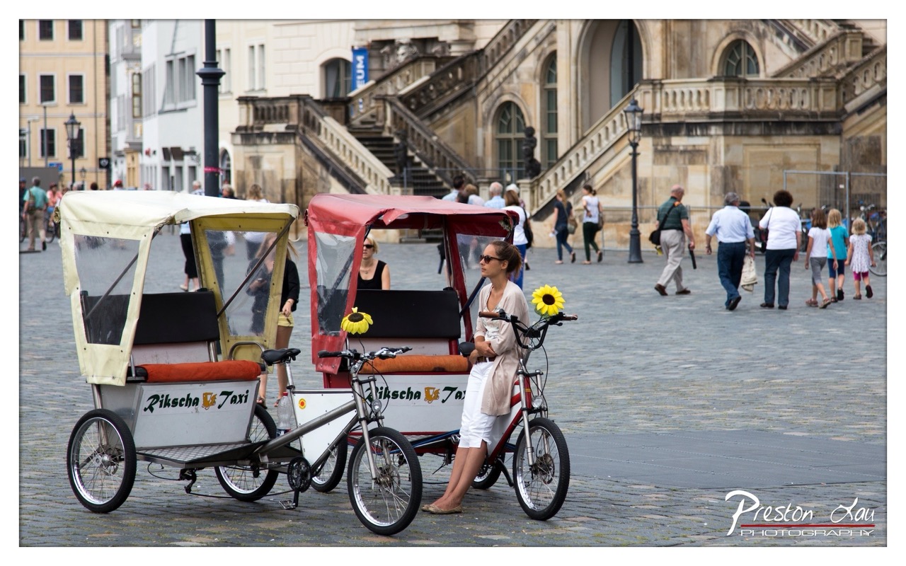

1. Overall Rating (0–10) — 7.0
This photograph captures a vibrant urban moment where tradition meets daily life, with rickshaws poised as both transport and performance. The composition balances human presence with architectural grandeur, and the soft, diffused light enhances the scene’s authenticity. While the image successfully conveys a sense of place, its storytelling potential is slightly diminished by a lack of narrative focus, leaving the viewer observing rather than fully engaging.
2. Composition (0–10) — 7.5
The rickshaws anchor the foreground with strong diagonal lines, leading the eye toward the central figure and the sweeping staircase behind. The placement of the woman on the red rickshaw creates a natural focal point, while the background activity adds depth without overwhelming the scene. A slightly tighter crop could enhance intimacy, but the current framing effectively captures the bustling environment.
3. Lighting (0–10) — 7.0
Soft, overcast lighting evenly illuminates the scene, minimizing harsh shadows and preserving detail across the cobblestones, rickshaws, and architecture. The diffused light supports a calm, documentary mood, though it slightly mutes the potential vibrancy of the colors and sunflower accents.
4. Color & Tone (0–10) — 6.5
The palette is grounded in earthy tones—beige, gray, and muted reds—creating a harmonious, historically resonant atmosphere. The yellow sunflowers offer a bright contrast, drawing attention to the rickshaws, but their intensity is restrained by the subdued lighting. A touch more saturation would elevate the visual energy.
5. Creativity (0–10) — 7.0
The inclusion of sunflowers as props adds a whimsical, almost performative touch, suggesting a blend of cultural tourism and personal expression. The juxtaposition of the modern rickshaws against the classical architecture offers a subtle commentary on time and mobility, giving the image a layered narrative.
6. Technical Quality (0–10) — 8.0
The image is sharp and well-focused, with clean details in the rickshaws, the woman’s features, and the background architecture. The exposure is balanced, and the depth of field appropriately isolates the subject while retaining context.
7. Emotional Impact (0–10) — 6.5
The scene evokes a sense of quiet anticipation—of a day’s work beginning or a journey about to unfold. The woman’s relaxed posture and the gentle presence of passersby create a contemplative mood, but the emotional connection remains subtle, more observational than deeply moving.
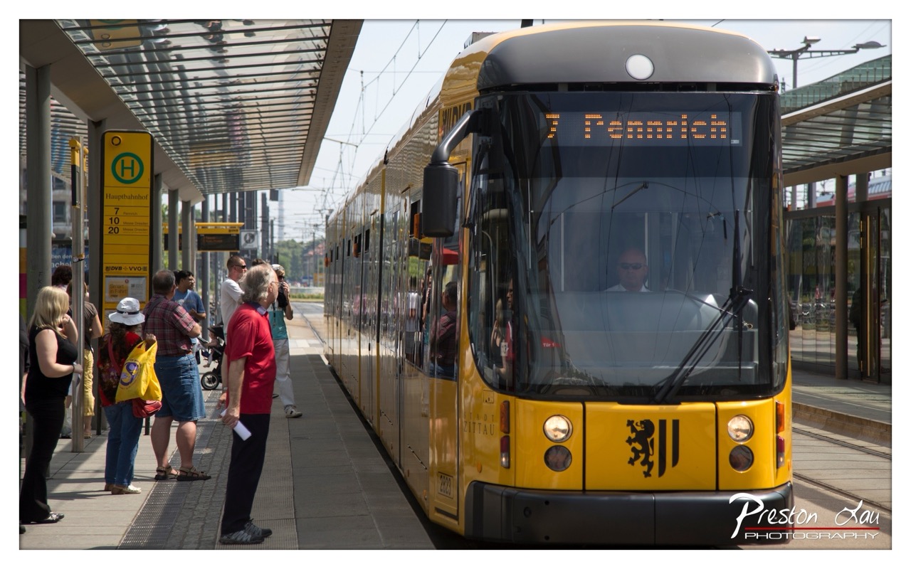

1. Overall Rating (0–10) — 7.0
This photograph captures a vibrant urban moment at a tram stop, where the yellow tram and the diverse group of passengers create a dynamic sense of everyday life. The bright sunlight enhances the scene’s energy, while the composition draws the eye along the length of the tram toward the bustling platform. While the image is visually engaging and well-framed, the slightly busy foreground and flat lighting prevent it from achieving a more refined aesthetic balance.
2. Composition (0–10) — 7.5
The diagonal line of the tram leads the viewer’s eye through the frame, creating a sense of movement and depth. The placement of the passengers on the left balances the visual weight of the tram on the right, though the scattered grouping slightly disrupts the flow.
3. Lighting (0–10) — 7.0
The bright, direct sunlight creates strong highlights and defined shadows, emphasizing the textures of the tram and pavement. The overhead canopy casts dappled light, adding visual interest, though some areas of the image are slightly overexposed.
4. Color & Tone (0–10) — 8.0
The bold yellow of the tram stands out against the neutral tones of the platform and the sky, creating a striking contrast. The warm, natural color palette enhances the sunny atmosphere and gives the image a lively, urban feel.
5. Creativity (0–10) — 7.0
The photograph captures a moment of urban transit with a sense of authenticity and spontaneity. While not highly experimental, the framing and timing reflect a thoughtful approach to documenting public life in motion.
6. Technical Quality (0–10) — 8.0
The image is sharp and well-focused, with clean details on the tram and visible text. The exposure is balanced overall, though slight overexposure in the sky and bright areas suggests minor post-processing adjustments.
7. Emotional Impact (0–10) — 6.5
The image conveys a sense of routine and connection, capturing the quiet anticipation of daily commuting. It evokes a feeling of place and time, inviting viewers to reflect on the rhythm of city life.
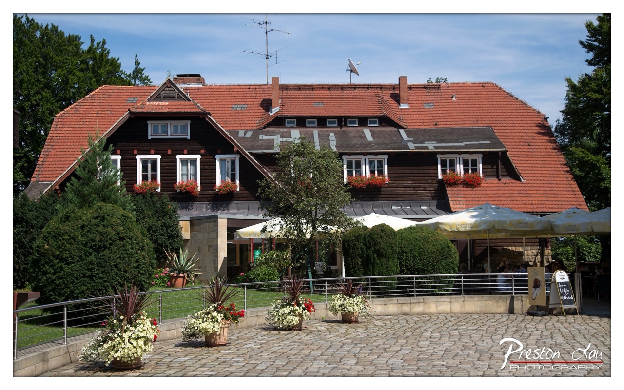

1. Overall Rating (0–10) — 7.0
This photograph captures a charming, sun-drenched German-style building with a warm, inviting atmosphere, where rustic architecture meets pastoral tranquility. The composition is balanced and the scene feels lived-in and authentic, though the slightly busy foreground and overexposed sky prevent it from achieving a more refined aesthetic. The image succeeds in conveying a sense of place, inviting the viewer into a moment of quiet European life.
2. Composition (0–10) — 7.5
The building is centered with strong symmetry, framed by trees and a cobblestone courtyard that guide the eye toward the subject. The potted plants in the foreground add depth and a sense of scale, though their placement slightly disrupts the visual flow.
3. Lighting (0–10) — 8.0
Bright, natural daylight enhances the scene, casting soft shadows that define the textures of the wooden facade and terracotta roof. The sky is slightly overexposed, but the overall light is even and flattering, highlighting the warm tones of the architecture.
4. Color & Tone (0–10) — 7.5
The rich reds of the roof tiles and flower boxes contrast beautifully with the dark wood and lush greenery. The color palette is vibrant yet harmonious, with a balanced warm tone that enhances the inviting mood of the setting.
5. Creativity (0–10) — 6.5
While the image is technically strong and visually pleasing, it leans toward conventional travel photography rather than pushing creative boundaries. The narrative is straightforward—celebrating a picturesque location—without a unique artistic perspective.
6. Technical Quality (0–10) — 8.0
Sharp focus across the frame, clean detail in the textures of the wood and cobblestones, and well-handled exposure contribute to a technically proficient image. The watermark is subtle and does not detract from the overall quality.
7. Emotional Impact (0–10) — 7.0
The photograph evokes a sense of peace and nostalgia, capturing a moment of quiet charm in a traditional European setting. The presence of people under the umbrellas adds a subtle human element, enhancing the feeling of a welcoming, lived-in space.
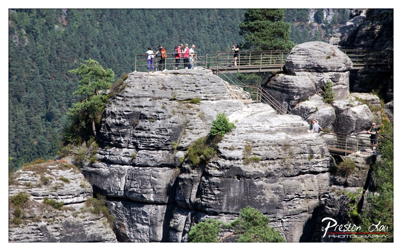

1. Overall Rating (0–10) — 7.0
This photograph captures the grandeur of a rugged, forested cliffside with a sense of human scale and adventure. The layered rock formations and lush greenery create a dramatic natural backdrop, while the visitors on the walkway add narrative depth and a touch of life to the scene. The composition balances the vastness of nature with the intimacy of human exploration, though the framing feels slightly crowded, reducing the sense of spaciousness.
2. Composition (0–10) — 6.5
The image is framed with a wide perspective that includes both the towering rock formations and the man-made walkway, but the placement of people and structures slightly disrupts the natural flow. The diagonal lines of the stairs and railings draw the eye through the frame, yet the upper-left grouping of figures creates visual weight that feels slightly unbalanced.
3. Lighting (0–10) — 7.5
Bright, direct sunlight illuminates the scene, casting strong shadows that emphasize the texture and depth of the rock layers. The contrast between light and shadow enhances the three-dimensional quality of the landscape, though some areas of the background forest appear slightly overexposed.
4. Color & Tone (0–10) — 7.0
The palette is rich with earthy grays of the stone and deep greens of the forest, creating a natural harmony. The contrast between the dark rock and the bright sky adds visual interest, while the warm tones of the sunlight lend a slightly golden cast that enhances the scene’s warmth and vitality.
5. Creativity (0–10) — 7.0
The photographer captures a moment of human interaction with a dramatic natural landscape, using the walkway and visitors to suggest scale and narrative. The choice to include the railing and stairs introduces a subtle theme of accessibility and exploration, grounding the image in a relatable human experience.
6. Technical Quality (0–10) — 8.0
The image is sharp and well-defined, with clear detail in both the foreground rock textures and the distant trees. The focus is consistent across the frame, and the exposure is generally well-managed, though slight overexposure in the sky suggests minor dynamic range limitations.
7. Emotional Impact (0–10) — 7.5
The photograph evokes a sense of awe and adventure, inviting the viewer to imagine standing on the edge of the cliff, taking in the panoramic view. The presence of other visitors adds a shared sense of wonder and connection, making the experience feel both personal and communal.
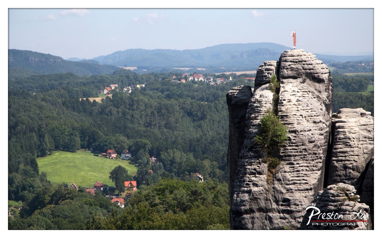

1. Overall Rating (0–10) — 7.5
This photograph captures a striking contrast between the rugged, weathered rock formation and the lush, pastoral valley below, evoking a sense of timelessness and quiet grandeur. The towering figure atop the stone adds a human element, grounding the scene in both myth and reality. While the image is visually compelling, its full potential is slightly restrained by a muted color palette and a lack of atmospheric depth that could further enhance the mood.
2. Composition (0–10) — 8.0
The rock formation on the right anchors the frame, creating a strong diagonal that leads the eye toward the distant village and rolling hills. The placement of the figure atop the peak draws immediate attention, while the expansive valley balances the composition and adds depth.
3. Lighting (0–10) — 7.0
The scene is illuminated by bright, even daylight, highlighting the textures of the rock and the lush greenery below. However, the harshness of the midday sun flattens some of the shadows, reducing the sense of three-dimensionality and atmospheric drama.
4. Color & Tone (0–10) — 6.5
The dominant greens and grays of the landscape create a natural, earthy palette, but the colors lack vibrancy and richness. The sky is slightly overexposed, washing out subtle tonal variations and muting the overall mood.
5. Creativity (0–10) — 7.5
The juxtaposition of the ancient rock, the small human figure, and the tranquil valley suggests a narrative of endurance and contemplation. The inclusion of the figure adds symbolic weight, elevating the image beyond a simple landscape into a meditation on scale and solitude.
6. Technical Quality (0–10) — 8.0
The image is sharp and well-focused, particularly on the rock face and the distant village. The depth of field is effectively managed, allowing both foreground and background elements to remain clear and detailed.
7. Emotional Impact (0–10) — 7.0
The photograph conveys a sense of awe and introspection, inviting the viewer to reflect on humanity’s place within nature. The solitary figure atop the rock evokes a feeling of contemplation, though the emotional resonance is tempered by the lack of dramatic lighting and color intensity.
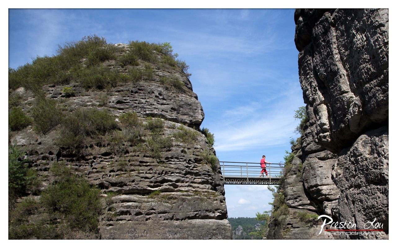

1. Overall Rating (0–10) — 7.5
This photograph captures a striking contrast between human scale and geological grandeur, where a lone figure traverses a narrow bridge suspended between towering rock formations. The vibrant red of the person’s clothing creates a powerful focal point against the muted stone and expansive sky, emphasizing both solitude and adventure. While the composition is visually compelling, the image’s strength lies in its balance of natural drama and human presence, though the overall mood could be more immersive with deeper atmospheric depth.
2. Composition (0–10) — 8.0
The low-angle perspective emphasizes the towering cliffs, creating a sense of awe and scale. The bridge acts as a strong leading line, drawing the eye toward the figure and enhancing depth. The framing is balanced, with the rock formations on either side forming a natural frame, though the right cliff slightly dominates the composition.
3. Lighting (0–10) — 8.5
Bright, natural daylight illuminates the scene with even clarity, highlighting the texture of the weathered rock and the crispness of the sky. The sun’s position creates soft shadows that enhance dimension without obscuring detail, while the clear blue sky adds a sense of openness and calm.
4. Color & Tone (0–10) — 7.5
The palette is dominated by earthy grays and greens, punctuated by the vivid red of the subject’s clothing, which creates a dynamic contrast. The blue sky provides a cool counterpoint to the warm tones of the stone, resulting in a balanced and visually engaging tonal range.
5. Creativity (0–10) — 8.0
The image demonstrates strong creative vision through its use of color contrast and perspective to highlight the human element within a vast natural landscape. The inclusion of the figure adds narrative intrigue, transforming a scenic landscape into a story of exploration and connection with nature.
6. Technical Quality (0–10) — 9.0
The image is sharp and well-focused, with excellent detail in the rock textures and clear definition in the background. The exposure is well-managed, with no significant overexposed or underexposed areas, and the white balance accurately reflects the natural lighting conditions.
7. Emotional Impact (0–10) — 7.0
The photograph evokes a sense of adventure and contemplative solitude, inviting the viewer to imagine the experience of crossing the bridge. The vastness of the landscape and the smallness of the human figure create a quiet emotional resonance, though the lack of motion or expressive gesture from the subject keeps the emotional tone somewhat restrained.
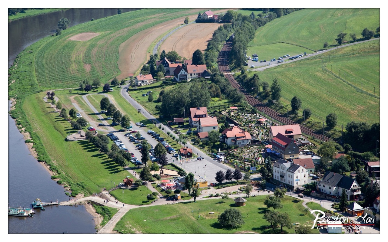

1. Overall Rating (0–10) — 7.5
This aerial view captures a serene riverside village nestled between lush green fields and a winding waterway, evoking a sense of peaceful rural life. The composition balances natural and man-made elements with clarity, and the vibrant greens and warm roof tones create a visually harmonious scene. While the image is rich in detail, its wide perspective slightly dilutes the emotional intimacy of the setting.
2. Composition (0–10) — 8.0
The diagonal flow of the river and the railway line guide the eye through the frame, creating a dynamic yet balanced structure. The village is centered effectively, with surrounding fields and roads enhancing spatial depth.
3. Lighting (0–10) — 8.5
Bright, natural daylight enhances the scene’s clarity and detail, casting soft shadows that give depth to the landscape. The even illumination highlights textures in the fields and architecture without harsh contrasts.
4. Color & Tone (0–10) — 8.0
A rich palette of emerald greens, terracotta roofs, and earthy browns creates a warm, inviting tone. The contrast between the dark river and the bright surroundings adds visual interest and depth.
5. Creativity (0–10) — 7.5
The elevated perspective offers a unique, almost cinematic view of a quiet community, transforming an everyday landscape into something visually compelling. The inclusion of subtle human activity adds life without disrupting the calm.
6. Technical Quality (0–10) — 9.0
Sharp focus, clean detail, and excellent exposure make this a technically strong image. The high resolution captures fine textures in the terrain and structures, showcasing strong photographic control.
7. Emotional Impact (0–10) — 7.0
The image evokes a sense of tranquility and nostalgia, inviting contemplation of rural life. While the scale of the view distances the viewer slightly, the warmth of the scene fosters a quiet connection to place and time.
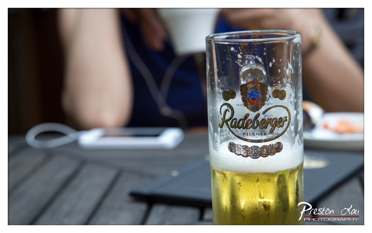

1. Overall Rating (0–10) — 7.0
This photograph captures a moment of casual relaxation with a refreshing, chilled beer as the central focus, evoking a sense of leisure and connection. The condensation on the glass and the soft background blur lend a tactile, intimate quality, while the warm golden hue of the beer contrasts beautifully with the muted, cool tones of the setting. While the composition is strong and the mood inviting, the slightly cluttered background and overexposed white elements distract from the image’s potential elegance.
2. Composition (0–10) — 6.5
The beer glass is well-positioned on the right, drawing the eye, but the cluttered background and off-center placement of the phone and plate disrupt visual harmony. A tighter crop would enhance focus and balance.
3. Lighting (0–10) — 7.0
Natural light highlights the condensation and foam, creating a sense of coolness and refreshment. The soft shadows and even exposure contribute to a relaxed atmosphere, though the background remains slightly overexposed.
4. Color & Tone (0–10) — 7.5
The golden amber of the beer stands out against the cool grays and muted blues, creating a pleasing contrast. The overall tone is balanced, with a slightly warm cast that enhances the sense of warmth and conviviality.
5. Creativity (0–10) — 7.0
The image captures a relatable, everyday moment with a cinematic feel, using depth of field to elevate the beer into a focal point. The storytelling is subtle but effective, suggesting a pause in a social setting.
6. Technical Quality (0–10) — 8.0
Sharp focus on the glass, with smooth bokeh in the background, demonstrates strong technical control. The image is clean and well-exposed, with attention to detail in the texture of the condensation.
7. Emotional Impact (0–10) — 7.5
The photograph evokes a sense of calm and contentment, inviting the viewer to imagine the taste and feel of the cold beer. The intimate framing and quiet moment resonate with a universal feeling of relaxation.
Loading map...