The Venetian Macao is a luxury hotel and casino resort in Macau owned by Las Vegas Sands. It features a 40-story building with over 10 million square feet of space, modeled after its sister resort in Las Vegas. The property hosts the annual Venetian Carnevale celebration, offering Italian-themed entertainment, street performers, and game booths, with proceeds benefiting charity.
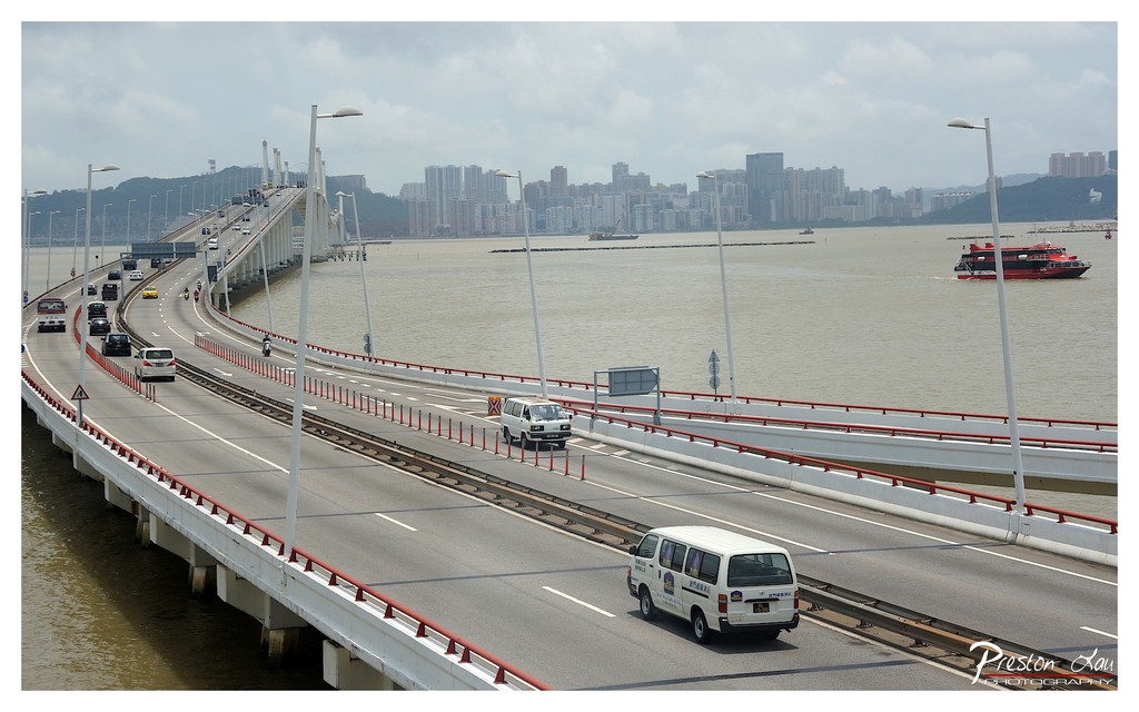

1. Overall Rating (0–10) — 6.8
This photograph captures the dynamic interplay between urban infrastructure and natural waterways, presenting a sweeping view of a modern bridge connecting to a dense cityscape. The composition effectively conveys the scale and movement of a bustling metropolis, though the overcast sky tempers the scene’s visual energy. While the image successfully documents the environment, it lacks a compelling focal point, leaving the viewer with a sense of breadth without emotional depth.
2. Composition (0–10) — 7.0
The curved bridge creates a strong diagonal leading the eye into the frame, while the city skyline provides a layered backdrop. The inclusion of the ferry and vehicles adds narrative movement, though the framing feels slightly wide, diluting the sense of intimacy.
3. Lighting (0–10) — 5.5
The diffused light from the overcast sky creates even illumination, minimizing harsh shadows but also flattening the scene’s depth. The muted tones reflect the atmospheric conditions but reduce the visual drama.
4. Color & Tone (0–10) — 6.0
The palette is dominated by neutral grays and muted earth tones, with the red railings and ferry providing subtle accents. The lack of vibrant contrast limits the image’s visual impact, giving it a somewhat restrained appearance.
5. Creativity (0–10) — 6.5
The photograph successfully balances documentation with visual storytelling, capturing the rhythm of urban life. However, the approach is conventional, with little innovation in perspective or artistic interpretation.
6. Technical Quality (0–10) — 7.5
The image is sharp and well-exposed, with clear details visible in the vehicles, bridge structure, and distant skyline. The focus is consistent across the frame, and the digital clarity is strong.
7. Emotional Impact (0–10) — 5.8
The scene evokes a sense of quiet motion and urban endurance, but the emotional resonance is limited by the lack of a personal or narrative anchor. It feels more like a snapshot than a deeply felt moment.
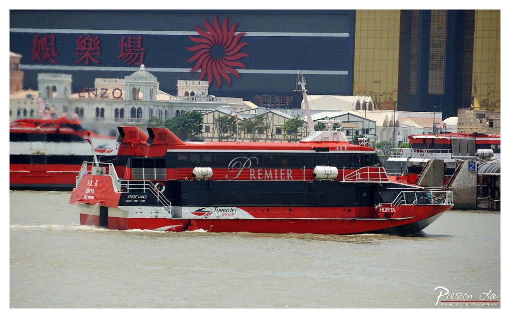

1. Overall Rating (0–10) — 7.0
This photograph captures the dynamic energy of a modern ferry navigating a bustling waterway, set against a backdrop of architectural contrast and urban vibrancy. The bold red and black color scheme of the vessel draws the eye, while the juxtaposition of the traditional-style building and the sleek casino facade adds narrative depth. While the image is visually engaging and rich in detail, the composition’s slight clutter and flat lighting prevent it from achieving greater artistic cohesion.
2. Composition (0–10) — 6.5
The ferry is well-placed as the central subject, with a diagonal orientation that conveys motion. However, the background elements—especially the overlapping structures and signage—create visual noise, and the inclusion of the second ferry on the left slightly distracts from the main focus.
3. Lighting (0–10) — 6.0
The lighting is even and functional, typical of an overcast or midday sky, which ensures clear visibility but lacks dramatic shadows or highlights. The flatness of the light diminishes the sense of depth and atmosphere.
4. Color & Tone (0–10) — 7.5
The dominant red of the ferry contrasts sharply with the muted tones of the water and the background, creating a strong focal point. The red sun logo on the casino building echoes the ferry’s color, subtly unifying the scene. The overall palette is balanced, with a warm, slightly desaturated tone that enhances the urban feel.
5. Creativity (0–10) — 7.0
The image succeeds in capturing a moment of urban transit, blending modern technology with cultural context. The layered background—combining traditional architecture, commercial signage, and transportation—suggests a story of movement and transformation. While not radically original, the visual narrative is compelling and thoughtfully composed.
6. Technical Quality (0–10) — 8.0
The photograph is sharp and well-focused, with clean detail on the ferry and readable text. The exposure is balanced, and the image is free from noticeable flaws such as blur or noise, reflecting strong technical execution.
7. Emotional Impact (0–10) — 6.5
The image evokes a sense of motion and urban vitality, inviting the viewer to consider the rhythm of city life. The ferry’s forward momentum and the surrounding structures suggest progress and connectivity, but the emotional resonance is tempered by the impersonal nature of the setting.
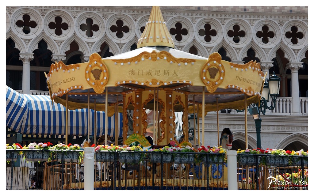

1. Overall Rating (0–10) — 7.0
This photograph captures the whimsical charm of a carousel set against the ornate backdrop of The Venetian Macao, blending fantasy and grandeur with striking visual harmony. The golden carousel, adorned with intricate details and vibrant flowers, stands as a focal point of playful elegance, while the gothic-inspired architecture provides a rich, textured contrast. Though the image is visually engaging, the composition’s slight busyness and flat lighting prevent it from achieving a more transcendent quality.
2. Composition (0–10) — 7.0
The carousel is centered and dominates the frame, creating a strong focal point. The striped awning and floral fence add layers of pattern and color, while the architectural arches in the background provide depth and balance. The framing is slightly wide, including excess elements that dilute focus, but the overall structure remains harmonious.
3. Lighting (0–10) — 6.0
Natural daylight illuminates the scene evenly, but the light is somewhat flat and diffuse, lacking strong direction or shadow to create depth. The overcast quality softens the scene, muting the golden tones of the carousel and reducing visual drama.
4. Color & Tone (0–10) — 7.0
The warm gold of the carousel contrasts beautifully with the cool whites and grays of the building and the bold blue-and-white stripes of the awning. The floral accents add splashes of red, yellow, and pink, enhancing the playful mood. The overall palette is rich and cohesive, though slightly desaturated by the lighting.
5. Creativity (0–10) — 7.0
The juxtaposition of a traditional carousel with a lavish, themed architectural setting creates a visually engaging narrative. The dual-language signage adds cultural context and reinforces the location’s identity, lending a sense of place and story. While not radically original, the concept is executed with charm and intention.
6. Technical Quality (0–10) — 7.5
The image is sharp and well-focused, with clear details in both the carousel and the background architecture. The exposure is balanced, with no blown-out highlights or crushed shadows. The watermark is discreet and does not detract from the image.
7. Emotional Impact (0–10) — 7.0
The photograph evokes a sense of wonder and nostalgia, reminiscent of childhood joy and fairy-tale escapism. The combination of playfulness and grandeur invites the viewer into a world of fantasy, making it emotionally resonant for those who appreciate whimsy and architectural beauty.
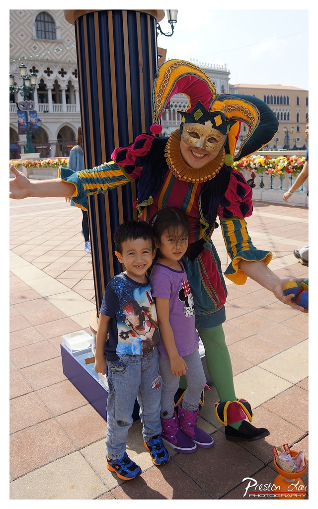

1. Overall Rating (0–10) — 7.0
This photograph captures a joyful, candid moment between two children and a costumed performer in a vibrant theme park setting, where fantasy and reality briefly converge. The bright colors and expressive smiles infuse the image with a sense of wonder and playfulness, though the slightly cluttered background and casual composition keep it from feeling fully polished. The scene feels authentic and emotionally resonant, capturing a fleeting memory of childhood delight.
2. Composition (0–10) — 6.5
The subjects are well-centered, with the performer’s expansive pose creating a dynamic frame around the children. However, the background architecture and distant figures introduce visual noise, slightly disrupting the focus on the central interaction.
3. Lighting (0–10) — 7.0
Natural daylight illuminates the scene evenly, with soft shadows that enhance depth without creating harsh contrasts. The bright, open environment allows the colors of the costume and clothing to pop, contributing to the image’s lively tone.
4. Color & Tone (0–10) — 7.5
The palette is rich and varied, with the jester’s colorful costume standing out against the neutral tones of the pavement and buildings. The warm sunlight enhances the vibrancy of the reds, yellows, and greens, giving the image a cheerful and inviting feel.
5. Creativity (0–10) — 7.0
The image successfully captures a moment of shared joy between performers and guests, blending narrative and character in a way that feels spontaneous and engaging. The juxtaposition of fantasy and reality adds a layer of whimsy that is both charming and unique.
6. Technical Quality (0–10) — 7.5
The focus is sharp on the subjects, with clear detail in the costumes and facial expressions. The exposure is well-balanced, and the resolution is high, allowing for fine texture and color fidelity throughout the frame.
7. Emotional Impact (0–10) — 8.0
The genuine smiles and playful pose of the children and performer evoke warmth and nostalgia, creating a strong emotional connection with the viewer. The image captures the essence of childhood wonder and the magic of themed entertainment.
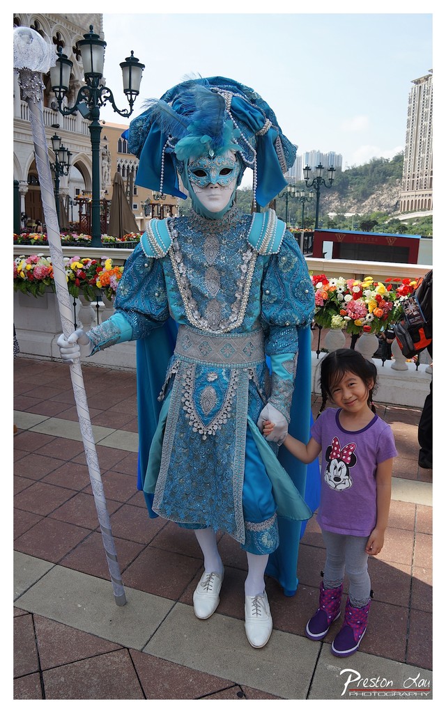

1. Overall Rating (0–10) — 7.0
This photograph captures a vibrant moment of whimsy and cultural performance, where the elaborate Venetian-inspired costume contrasts playfully with the casual presence of a young girl. The rich blue tones of the costume and the festive floral arrangements create a sense of celebration, while the juxtaposition of the character and the child grounds the scene in human connection. The image is strong in storytelling but slightly undermined by a cluttered background that distracts from the central figures.
2. Composition (0–10) — 6.5
The subject is well-centered, with the costumed figure and child forming a balanced focal point. However, the background elements—such as the distant buildings and lampposts—introduce visual noise that weakens the composition’s clarity.
3. Lighting (0–10) — 7.0
Natural daylight provides even illumination, highlighting the textures and embellishments of the costume. The soft shadows and bright sky contribute to a lively, outdoor atmosphere without harsh contrast.
4. Color & Tone (0–10) — 7.5
The dominant cool blue of the costume harmonizes with the warm floral accents and the neutral pavement. The palette is vibrant and cohesive, enhancing the festive mood while maintaining visual balance.
5. Creativity (0–10) — 7.0
The image successfully blends fantasy and reality, capturing a candid moment within a themed environment. The choice to include the child adds narrative depth and emotional warmth, making the scene feel both authentic and imaginative.
6. Technical Quality (0–10) — 8.0
The photograph is sharp and well-focused, with clear details in the costume’s embroidery and the child’s expression. The exposure is well-managed, and the framing effectively captures the interaction between the two subjects.
7. Emotional Impact (0–10) — 7.5
The image evokes a sense of joy and wonder, capturing a fleeting moment of connection between a performer and a young visitor. The warmth of the child’s smile and the grandeur of the costume combine to create a memorable, emotionally resonant scene.
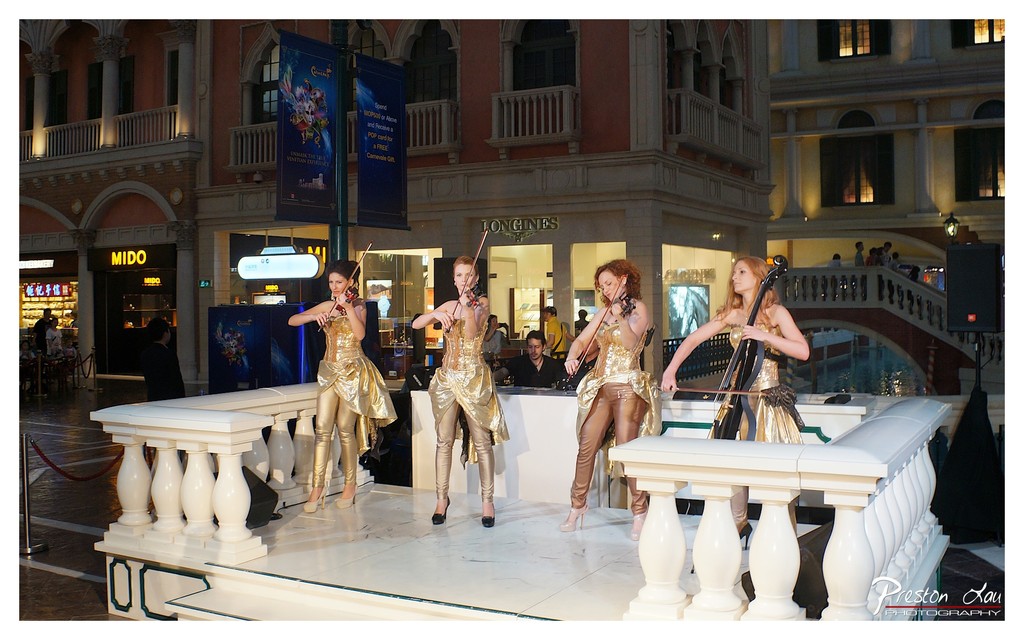

1. Overall Rating (0–10) — 7.0
This photograph captures a vibrant and theatrical performance by four musicians in shimmering gold costumes, set against the opulent backdrop of a luxurious shopping arcade. The scene exudes a sense of grandeur and spectacle, enhanced by the elaborate architecture and ambient lighting. While the composition effectively highlights the performers and their dynamic poses, the background details occasionally compete for attention, slightly diluting the focus on the central subjects.
2. Composition (0–10) — 6.5
The performers are well-placed across the frame, creating a balanced visual flow from left to right. The white balustrade frames the stage and adds depth, but the inclusion of background elements like the MIDO sign and distant pedestrians introduces visual clutter that distracts from the main subjects.
3. Lighting (0–10) — 7.0
The lighting is warm and well-distributed, highlighting the reflective gold costumes and contributing to the luxurious atmosphere. The combination of ambient and artificial light creates a dynamic contrast, though some areas of the background appear slightly overexposed.
4. Color & Tone (0–10) — 7.5
The dominant golden tones of the performers' costumes create a cohesive and striking palette, complemented by the rich reds and creams of the surrounding architecture. The color harmony is strong, with a balanced contrast between the warm foreground and cooler background tones.
5. Creativity (0–10) — 7.0
The image successfully blends performance art with architectural elegance, presenting a moment of theatrical spectacle. The choice to capture the musicians in action, with their instruments raised, adds a sense of movement and narrative to the scene.
6. Technical Quality (0–10) — 7.5
The photograph is sharp and clear, with good focus on the performers. The exposure is well-handled, and the details in both the costumes and the background are visible. However, minor noise in the darker areas suggests a higher ISO setting.
7. Emotional Impact (0–10) — 7.0
The image evokes a sense of wonder and sophistication, drawing the viewer into a world of elegance and performance. The performers’ poised expressions and dynamic poses convey confidence and artistry, creating a memorable and engaging visual experience.
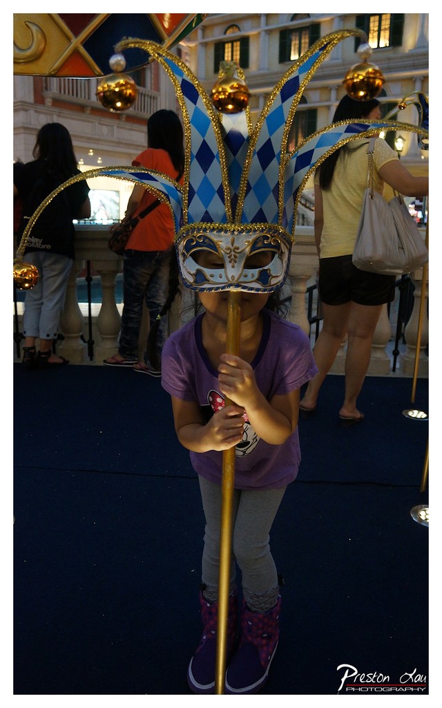

1. Overall Rating (0–10) — 7.0
This photograph captures a whimsical moment of childhood imagination, where a young girl becomes a playful jester through the lens of a carnival mask. The vibrant blue and gold of the mask contrasts beautifully with the subdued tones of the surrounding environment, drawing the viewer’s eye to the subject’s quiet engagement with the prop. While the composition is slightly cluttered by background activity, the emotional warmth and narrative charm of the scene elevate it beyond a simple snapshot into a tender, story-rich moment.
2. Composition (0–10) — 6.0
The subject is centered but partially obscured by the mask, which dominates the frame. The background figures and architectural elements create visual noise, slightly detracting from the focus on the child.
3. Lighting (0–10) — 6.5
The scene is illuminated by ambient indoor lighting that casts soft shadows and enhances the texture of the mask. While adequate, the lighting lacks directional drama, resulting in a somewhat flat quality.
4. Color & Tone (0–10) — 7.5
The rich blue and gold of the mask pop against the muted purple, gray, and black tones of the child’s clothing and the deep blue carpet. The color palette feels intentional and festive, though slightly limited by the subdued background tones.
5. Creativity (0–10) — 7.0
The image succeeds in capturing a narrative of play and self-expression, with the oversized mask adding a sense of theatricality. The juxtaposition of the child’s serious expression with the whimsical costume creates a compelling emotional contrast.
6. Technical Quality (0–10) — 7.0
The image is sharp and well-focused, particularly on the mask and the child’s hands. The depth of field isolates the subject from the background, though some minor noise is visible in the darker areas.
7. Emotional Impact (0–10) — 7.5
There’s a strong sense of innocence and quiet wonder in the child’s posture and gaze, inviting the viewer to reflect on the joy of imaginative play. The image resonates with warmth and nostalgia, even if it doesn’t achieve full visual grandeur.
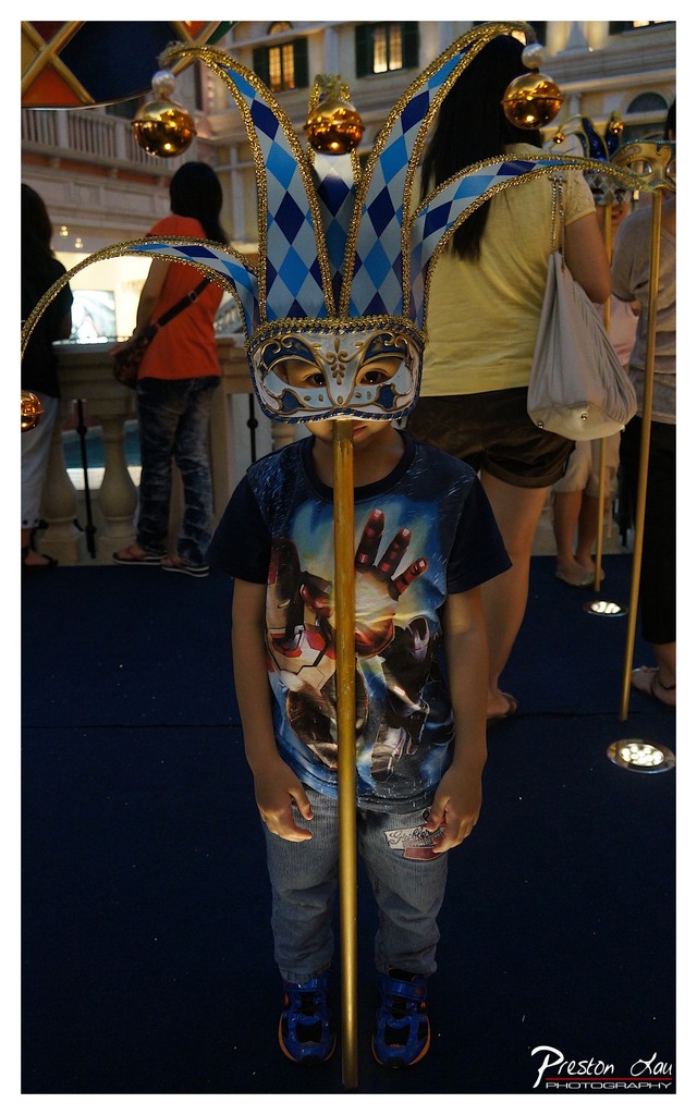

1. Overall Rating (0–10) — 7.0
This photograph captures a whimsical moment of childhood wonder, where a young child stands in front of an elaborate Venetian jester mask, creating a striking juxtaposition between innocence and theatricality. The vibrant colors and layered textures add depth, while the candid framing gives the image a playful, story-rich quality. The scene feels slightly overexposed and cluttered, which detracts from its visual cohesion, but the emotional resonance of the moment remains strong.
2. Composition (0–10) — 6.0
The subject is centered but partially obscured by the mask on a pole, creating a visual interruption. The background figures and architectural elements add context but also distract from the main focal point.
3. Lighting (0–10) — 6.5
The scene is lit by ambient indoor lighting, which is adequate but flat, resulting in a loss of detail in the shadows and overexposure in highlights. The golden accents on the mask are emphasized, enhancing its visual appeal.
4. Color & Tone (0–10) — 7.5
The blue and gold tones of the jester mask stand out vividly against the muted background, creating a strong color contrast. The cool overall tone complements the playful theme, though some color saturation appears slightly unnatural.
5. Creativity (0–10) — 7.0
The concept of placing a child in front of a large jester mask is imaginative and evocative, blending reality with fantasy. The composition suggests a narrative of curiosity and play, inviting the viewer to wonder about the child’s experience.
6. Technical Quality (0–10) — 7.0
The image is sharp and in focus, with clean details visible on the mask and clothing. However, the lighting and exposure issues slightly reduce the overall technical polish.
7. Emotional Impact (0–10) — 7.5
There’s a charming sense of wonder and innocence in the child’s stillness, enhanced by the theatrical backdrop. The image captures a fleeting moment of childhood imagination, resonating with warmth and nostalgia.
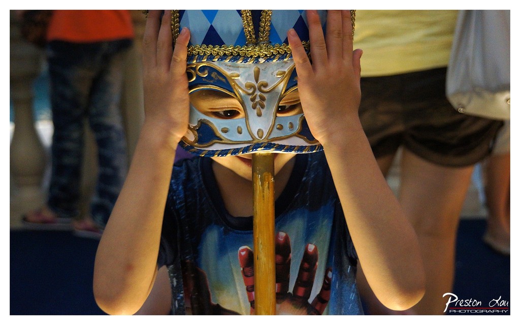

1. Overall Rating (0–10) — 7.0
This photograph captures a moment of playful mystery, where a child’s hands lift a Venetian-style mask to reveal their eyes, creating a sense of hidden identity and youthful curiosity. The composition draws the viewer into an intimate, candid moment, though the background distractions slightly undermine the image’s focus. The warm lighting and rich textures give it a tactile, story-driven quality that feels both personal and theatrical.
2. Composition (0–10) — 7.0
The subject is centered and framed tightly, emphasizing the mask and the child’s hands, which serve as visual anchors. The background figures are softly blurred, creating depth, but the presence of multiple people on either side introduces a slight imbalance.
3. Lighting (0–10) — 7.0
The lighting is warm and directional, highlighting the mask’s gold details and the child’s face with soft shadows that enhance depth. The indoor setting suggests artificial light, which contributes to the intimate, slightly theatrical mood.
4. Color & Tone (0–10) — 7.5
The dominant blue and gold of the mask stand out against the muted tones of the background and the child’s shirt. The color palette is harmonious, with warm skin tones and rich contrasts that give the image a vibrant, celebratory feel.
5. Creativity (0–10) — 8.0
The choice to capture the child mid-movement—lifting the mask—adds narrative intrigue and a sense of spontaneity. The juxtaposition of innocence and theatricality makes the image both whimsical and emotionally resonant.
6. Technical Quality (0–10) — 7.5
The focus is sharp on the mask and the child’s face, with a shallow depth of field that effectively isolates the subject. The image is clean and well-exposed, with no noticeable noise or technical flaws.
7. Emotional Impact (0–10) — 7.5
The image evokes a sense of wonder and playfulness, inviting the viewer to imagine the story behind the mask. The child’s direct gaze through the mask creates a subtle connection, blending curiosity and charm in a single frame.
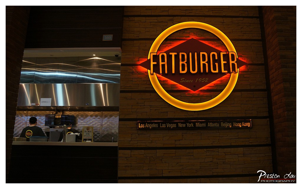

1. Overall Rating (0–10) — 7.0
This image captures the energetic branding of a Fatburger location with a strong sense of place and atmosphere. The glowing neon sign dominates the frame, radiating warmth and inviting curiosity, while the visible kitchen activity adds a layer of authenticity and dynamism. The contrast between the bright signage and the dimly lit interior enhances the visual drama, though the composition feels slightly unbalanced due to the tight framing and the presence of a watermark that distracts from the overall aesthetic.
2. Composition (0–10) — 6.0
The framing is off-center, with the sign occupying the right side and the kitchen area on the left, creating an asymmetrical balance. While the neon sign draws the eye, the cluttered foreground and the partial view of the kitchen reduce visual cohesion and make the image feel more like a snapshot than a composed shot.
3. Lighting (0–10) — 8.0
The lighting is a standout element, with the warm glow of the neon sign creating a strong focal point. The contrast between the bright sign and the dark surroundings enhances depth and mood. The ambient lighting in the kitchen is functional but underexposed, which helps emphasize the sign without distracting from it.
4. Color & Tone (0–10) — 7.0
The palette is dominated by warm yellows and oranges from the neon, complemented by the cool metallic tones of the kitchen fixtures. The color temperature enhances the nighttime ambiance, though the overall tone is slightly muted due to the subdued lighting in the non-illuminated areas.
5. Creativity (0–10) — 7.0
The image successfully captures the brand identity of Fatburger through its iconic signage and global presence. The inclusion of city names adds a narrative layer, suggesting expansion and cultural reach. The photo leans into the commercial nature of the subject while still offering a visually engaging moment.
6. Technical Quality (0–10) — 7.5
The image is sharp, with clear focus on the sign and readable text. The exposure is well-handled, particularly on the illuminated elements, though the darker areas lack detail. The watermark in the corner is a minor technical flaw that detracts from professionalism.
7. Emotional Impact (0–10) — 6.5
The photograph evokes a sense of familiarity and urban energy, tapping into the nostalgia of classic American diners. The warmth of the sign creates a welcoming feeling, though the lack of human presence or interaction limits the emotional connection. It feels more like a document of a place than a story about people.
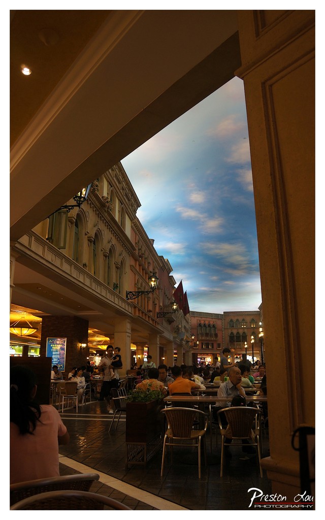

1. Overall Rating (0–10) — 7.5
This photograph captures a bustling outdoor dining area with a striking artificial sky that evokes a sense of theatrical grandeur. The interplay between the warm, inviting architecture and the expansive, painted heavens creates a dreamlike atmosphere, blending reality with imagination. While the scene feels slightly staged, its rich textures and layered composition give it a cinematic quality that draws the viewer in.
2. Composition (0–10) — 7.0
The frame is anchored by strong architectural lines that guide the eye into the scene, creating a sense of depth. The diagonal perspective and the framing by the foreground columns enhance the sense of immersion, though the left side feels slightly heavier due to the large column.
3. Lighting (0–10) — 7.5
The warm ambient lighting from the buildings and overhead fixtures creates a cozy, inviting glow that contrasts beautifully with the cool tones of the artificial sky. The soft, diffused light enhances the scene’s theatrical mood without creating harsh shadows.
4. Color & Tone (0–10) — 8.0
The contrast between the warm golds and browns of the architecture and the cool blues and purples of the sky creates a visually striking palette. The color harmony is strong, with the tones working together to enhance the surreal atmosphere.
5. Creativity (0–10) — 8.5
The use of a painted sky to simulate a natural environment is a bold and imaginative choice, transforming a mundane urban space into a fantastical setting. This creative decision elevates the image beyond a simple snapshot, turning it into a visual narrative.
6. Technical Quality (0–10) — 7.0
The image is sharp and well-focused, with clean details in both the foreground and background. The exposure is balanced, though the lower-left area appears slightly underexposed, possibly due to the lighting conditions.
7. Emotional Impact (0–10) — 8.0
The photograph evokes a sense of wonder and escapism, inviting viewers to imagine themselves in a world where reality and fantasy merge. The lively atmosphere and warm lighting contribute to a feeling of joy and enchantment.
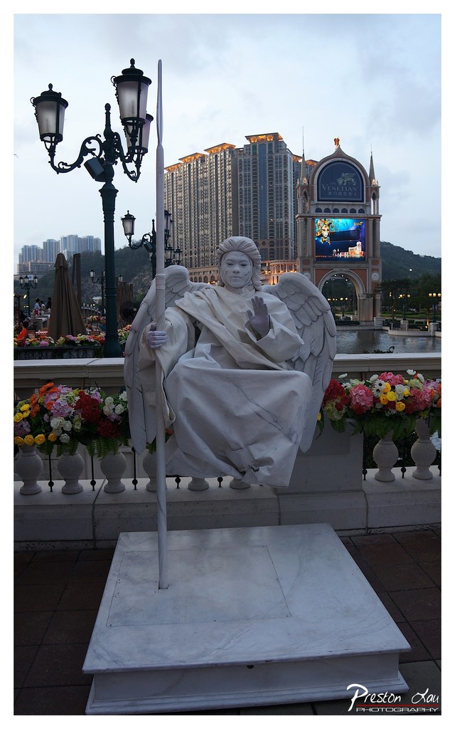

1. Overall Rating (0–10) — 7.0
This photograph captures a striking juxtaposition between classical sculpture and modern urban grandeur, where the serene angel statue stands in quiet contrast to the towering, illuminated Venetian Macao complex. The blend of historical design and contemporary luxury evokes a sense of theatrical opulence, though the overcast sky tempers the scene’s dramatic potential. While the image succeeds in conveying a narrative of cultural fusion, it is held back slightly by the lack of dynamic lighting and a more decisive compositional focus.
2. Composition (0–10) — 6.5
The statue is centered but slightly off-kilter, with the lamppost and flowers framing the foreground. The background architecture draws the eye, creating depth, though the clutter of elements like the digital screen and distant buildings slightly dilutes the focus on the central figure.
3. Lighting (0–10) — 6.0
The soft, diffused light of dusk provides even illumination without harsh shadows, but the overcast sky flattens the tonal range and reduces the sculptural detail in the angel’s form. The artificial lights of the building add a touch of warmth, but they don’t fully compensate for the lack of natural contrast.
4. Color & Tone (0–10) — 6.5
The palette is dominated by cool grays and whites, punctuated by the vibrant floral arrangements in the foreground. While the color contrast between the flowers and the marble enhances visual interest, the overall tone feels muted, with the digital screen’s blue glow adding a slightly jarring modern element.
5. Creativity (0–10) — 7.5
The image is conceptually strong, leveraging the juxtaposition of old and new, sacred and commercial, to tell a story of cultural convergence. The inclusion of the angel as a contemplative figure amidst a symbol of modern excess offers a subtle commentary on tradition in the face of globalization.
6. Technical Quality (0–10) — 7.0
The image is sharp and well-focused, with clean detail in both the foreground and background. The white balance is accurate, and the exposure is balanced, though slight noise in the sky suggests a high ISO was used.
7. Emotional Impact (0–10) — 6.5
The scene evokes a contemplative mood, inviting the viewer to reflect on the tension between serenity and spectacle. While the emotional resonance is present, it is subdued by the visual complexity and lack of dramatic lighting, making the moment feel more observational than moving.
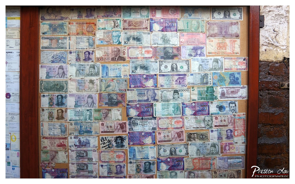

1. Overall Rating (0–10) — 7.0
This photograph presents a richly textured mosaic of global currency, transforming a simple display into a visual narrative of travel, exchange, and cultural convergence. The sheer density of banknotes creates a sense of abundance and global interconnectedness, while the aged wood frame and weathered wall add a layer of authenticity and time-worn charm. Though the composition is busy, it successfully conveys the story of a place where money becomes both currency and art, though the image could benefit from a more deliberate arrangement to guide the eye.
2. Composition (0–10) — 6.5
The image is tightly framed, focusing on the banknote collage with minimal distractions. However, the uneven spacing and overlapping of bills create a chaotic visual rhythm, making it difficult to find a clear focal point. A more structured layout or tighter crop could enhance the sense of order.
3. Lighting (0–10) — 6.0
Natural light illuminates the scene evenly, allowing the colors and details of the banknotes to remain visible. However, the lighting lacks depth and direction, resulting in a flat appearance that diminishes the tactile quality of the paper and the subtle textures of the wall.
4. Color & Tone (0–10) — 7.5
The palette is vibrant and varied, with a wide range of hues from different currencies creating a dynamic visual tapestry. The contrast between the bright banknotes and the muted brown frame enhances visual interest, though some notes appear slightly washed out due to lighting.
5. Creativity (0–10) — 8.0
The concept of using currency as a decorative and symbolic display is highly original and evocative. The photograph transforms everyday objects into a metaphor for global commerce and travel, suggesting stories behind each note. This artistic framing elevates a simple sight into a thoughtful commentary.
6. Technical Quality (0–10) — 8.0
The image is sharp and clear, with fine detail visible in the text and portraits on the banknotes. The focus is consistent across the frame, and the exposure is well-balanced, preserving information in both highlights and shadows.
7. Emotional Impact (0–10) — 7.0
The image evokes a sense of wonder and nostalgia, inviting the viewer to reflect on journeys taken, cultures encountered, and the universal language of money. The tactile nature of the display and the personal nature of the notes—some scribbled on, others faded—add a layer of intimacy and human connection.
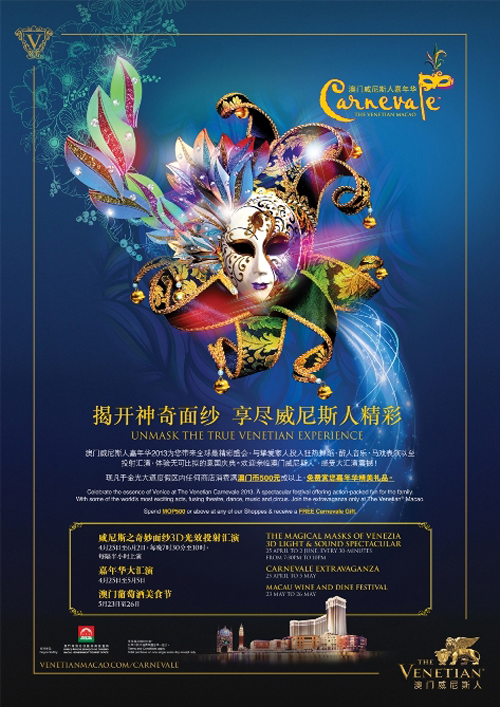

1. Overall Rating (0–10) — 7.5
This poster vibrantly captures the opulence and mystery of a Venetian carnival, blending theatricality with cultural allure. The central mask, richly detailed and dramatically lit, draws the eye with its layered textures and radiant colors, while the ornate typography and flowing script enhance the sense of festivity. While the design is visually compelling, the dense text and layered elements risk overwhelming the viewer, slightly diminishing the clarity of the promotional message.
2. Composition (0–10) — 7.0
The composition centers on the mask, creating a strong focal point, though the surrounding text and decorative elements introduce visual clutter. The use of negative space around the mask helps balance the design, but the lower section’s information block feels cramped, disrupting the poster’s elegant flow.
3. Lighting (0–10) — 8.0
The lighting is dramatic and stylized, with a radiant glow emanating from behind the mask, enhancing its three-dimensional form and creating a sense of magic. The contrast between the luminous mask and the deep blue background adds depth and mystery, effectively evoking the nighttime spectacle of a carnival.
4. Color & Tone (0–10) — 8.5
The palette is rich and harmonious, blending deep blues, jewel-toned purples, and gold accents to evoke luxury and fantasy. The interplay of bright, iridescent colors on the mask against the dark background creates a striking visual contrast that reinforces the theme of revelation and celebration.
5. Creativity (0–10) — 9.0
The design is highly original in its fusion of traditional Venetian motifs with modern graphic flair. The use of a dramatic mask as the centerpiece, combined with dynamic swirls and elegant script, demonstrates strong conceptual storytelling that successfully communicates the event’s theme of mystery and indulgence.
6. Technical Quality (0–10) — 8.0
The image is sharp and well-rendered, with clean lines and precise detail in the mask and typography. The integration of digital effects, such as light trails and subtle gradients, enhances the poster’s polished, professional appearance.
7. Emotional Impact (0–10) — 8.0
The poster evokes a sense of wonder and anticipation, inviting viewers into a world of elegance and spectacle. The theatricality of the mask and the rich color scheme stir feelings of excitement and cultural curiosity, making the event feel both exclusive and enchanting.
Loading map...