Preston Lau: A Journey Through Memories, Tech, and Humanity
Welcome to my personal blog that delves into the intricate tapestry of personal albums and the fascinating intersection of ever-evolving technology and humanity. Come along on a journey with me as we delve into the seamless fusion of creativity, state-of-the-art AI and robotics, intricately interwoven within the tapestry of our shared awareness. Have fun!
History, Seafood, and Revolutionary Spirit at Dr. Sun Yat-sen Former Residence in Zhongshan China
AI Summary
We visited the former residence of Dr. Sun Yat-sen in Zhongshan, China, over a 2-day weekend. The museum showcases Dr. Sun's childhood home, designed by himself in 1892, featuring Chinese and Western styles. After exploring the house, we also sampled local seafood and fruits at the nearby NanSha Nineteenth Yong street market, where we tried the unique Red Dragon banana.
For a weekend getaway, we journeyed to Zhongshan (中山) in China, a trip primarily motivated by a desire to sample the local cuisine and explore the city's historical offerings. Getting to Zhongshan for a quick weekend trip from nearby hubs like Hong Kong, Shenzhen, or Guangzhou is relatively convenient, with options including high-speed train or bus, typically taking anywhere from under an hour to a few hours depending on the starting point and mode of transport.
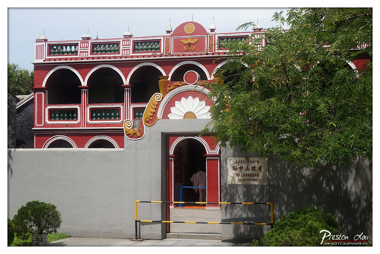
1. Overall Rating (0–10) — 7.0 This photograph captures the historic and symbolic presence of Sun Yat-sen’s former residence with a strong sense of cultural weight and architectural detail. The bold red and white façade, combined with traditional Chinese decorative elements, creates a visually striking subject. While the framing is slightly obstructed by foliage and the modern barrier, the image successfully conveys the site’s historical importance and aesthetic character, balancing documentary clarity with artistic composition.
2. Composition (0–10) — 6.5 The composition is anchored by the central archway, drawing the eye into the entrance, though the overhanging tree on the right disrupts visual flow. The low-angle perspective emphasizes the building’s grandeur, while the asymmetrical framing adds dynamism, though the clutter of the barrier and foliage slightly undermines balance.
3. Lighting (0–10) — 7.0 Natural daylight illuminates the scene evenly, enhancing the rich reds and crisp white trim. The soft shadows cast by the tree and architectural features add depth, while the bright sky prevents harsh contrasts, creating a balanced and clear exposure.
4. Color & Tone (0–10) — 7.5 The dominant red and white palette is vibrant and culturally resonant, with the green foliage providing a complementary contrast. The tonal range is well-managed, with the mid-tones of the wall and shadows adding grounding to the composition. The colors feel authentic and emotionally charged, reinforcing the site’s historical significance.
5. Creativity (0–10) — 7.0 The image captures a moment of cultural heritage with a respectful yet engaging eye. The inclusion of the visitor and signage grounds the scene in reality, while the artistic use of color and framing elevates it beyond mere documentation. The photographer’s choice to frame the shot with natural elements and modern signage adds narrative depth.
6. Technical Quality (0–10) — 8.0 The image is sharp and well-focused, with clean details in both the architecture and foliage. The exposure is balanced, and the resolution captures fine textures in the wall and decorative elements. The watermark is unobtrusive and professionally placed.
7. Emotional Impact (0–10) — 7.5 There is a quiet reverence in the image, evoking a sense of history and continuity. The presence of the visitor and the formal signage invite contemplation of the site’s legacy, while the vivid colors and balanced composition create a feeling of pride and connection to cultural heritage.
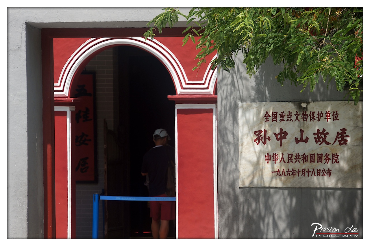
1. Overall Rating (0–10) — 7.0 This photograph captures the solemn dignity of Sun Yat-sen’s former residence, blending historical gravitas with quiet human presence. The contrast between the vibrant red arch and the muted gray wall creates a compelling visual rhythm, while the silhouette of the visitor grounds the scene in everyday reality. Though the composition is strong, the heavy shadows and slightly cluttered framing prevent it from achieving a more refined balance.
2. Composition (0–10) — 6.5 The arched doorway creates a natural frame, drawing the eye toward the interior, while the hanging foliage and signage add depth and context. However, the off-center placement of the subject and the intrusion of the blue barrier slightly disrupt visual harmony.
3. Lighting (0–10) — 6.0 Harsh daylight creates deep shadows within the doorway, emphasizing the contrast between light and dark. While this enhances mood, the bright overhead light flattens details on the wall and casts distracting shadows from the tree.
4. Color & Tone (0–10) — 7.0 The bold red of the arch stands out against the neutral gray wall, creating a strong visual anchor. The natural green of the foliage adds a touch of life, while the warm tones of the text and shadowed areas contribute to a balanced, albeit slightly over-saturated, palette.
5. Creativity (0–10) — 7.0 The image successfully merges documentary and artistic intent, using the architecture and signage to tell a story of heritage and remembrance. The choice to include the visitor adds narrative depth, transforming a static scene into a moment of cultural engagement.
6. Technical Quality (0–10) — 7.5 The focus is sharp on the central elements, and detail is well-preserved in the signage and textures. The exposure is generally balanced, though some highlights in the foliage and shadows are slightly lost.
7. Emotional Impact (0–10) — 7.0 The image evokes a sense of reverence and quiet contemplation, inviting the viewer to reflect on the historical weight of the site. The lone figure enhances the feeling of personal connection to the past, creating a subtle emotional resonance.
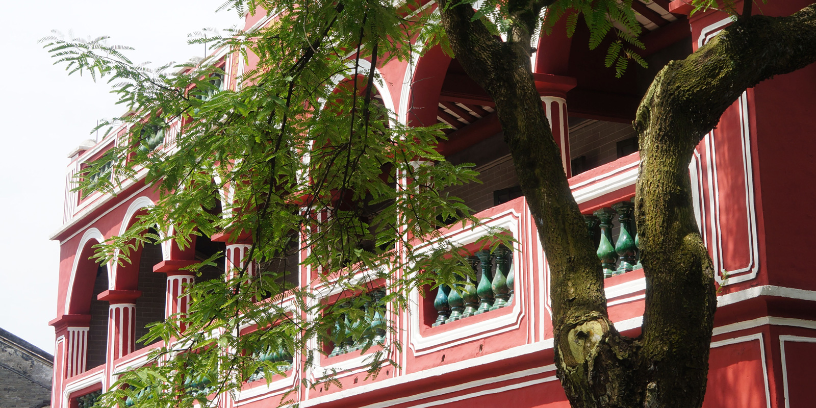
1. Overall Rating (0–10) — 7.0 This photograph captures a striking interplay between natural vitality and architectural elegance, where the lush green branches of a tree frame a vibrant red colonial-style building. The composition draws the eye through the layered foliage and ornate arches, creating a sense of depth and cultural richness. While the image is visually engaging and rich in texture, the overcast lighting slightly dampens the building’s vivid color, holding back its full potential to dazzle.
2. Composition (0–10) — 7.5 The diagonal sweep of the tree’s branches creates a dynamic leading line, guiding the viewer toward the building’s detailed facade. The framing by foliage adds depth and a sense of intimacy, though the top-left corner feels slightly underutilized, leaving a void in the composition.
3. Lighting (0–10) — 6.0 Soft, diffused daylight evenly illuminates the scene, minimizing harsh shadows and allowing for rich detail in both the tree and the building. However, the lack of strong directional light flattens the image’s depth and reduces the visual pop of the red walls.
4. Color & Tone (0–10) — 7.5 The contrast between the vibrant red of the building and the fresh green of the tree is compelling and harmonious. The white trim adds crispness, while the muted sky provides a neutral backdrop that lets the colors stand out without overwhelming.
5. Creativity (0–10) — 7.0 The photographer skillfully uses the tree as a natural frame, transforming a simple architectural shot into a layered, narrative image. The choice to capture the scene from a low angle enhances the building’s grandeur, suggesting a quiet dialogue between nature and human design.
6. Technical Quality (0–10) — 8.0 Sharp focus across the frame, with fine detail visible in both the tree bark and the building’s stonework. The exposure is well-balanced, and the image retains clarity even in the shadowed areas of the balcony.
7. Emotional Impact (0–10) — 6.5 The image evokes a sense of serene nostalgia, suggesting a place where time has paused. The juxtaposition of nature reclaiming space around a man-made structure stirs reflection on memory, preservation, and the passage of time.
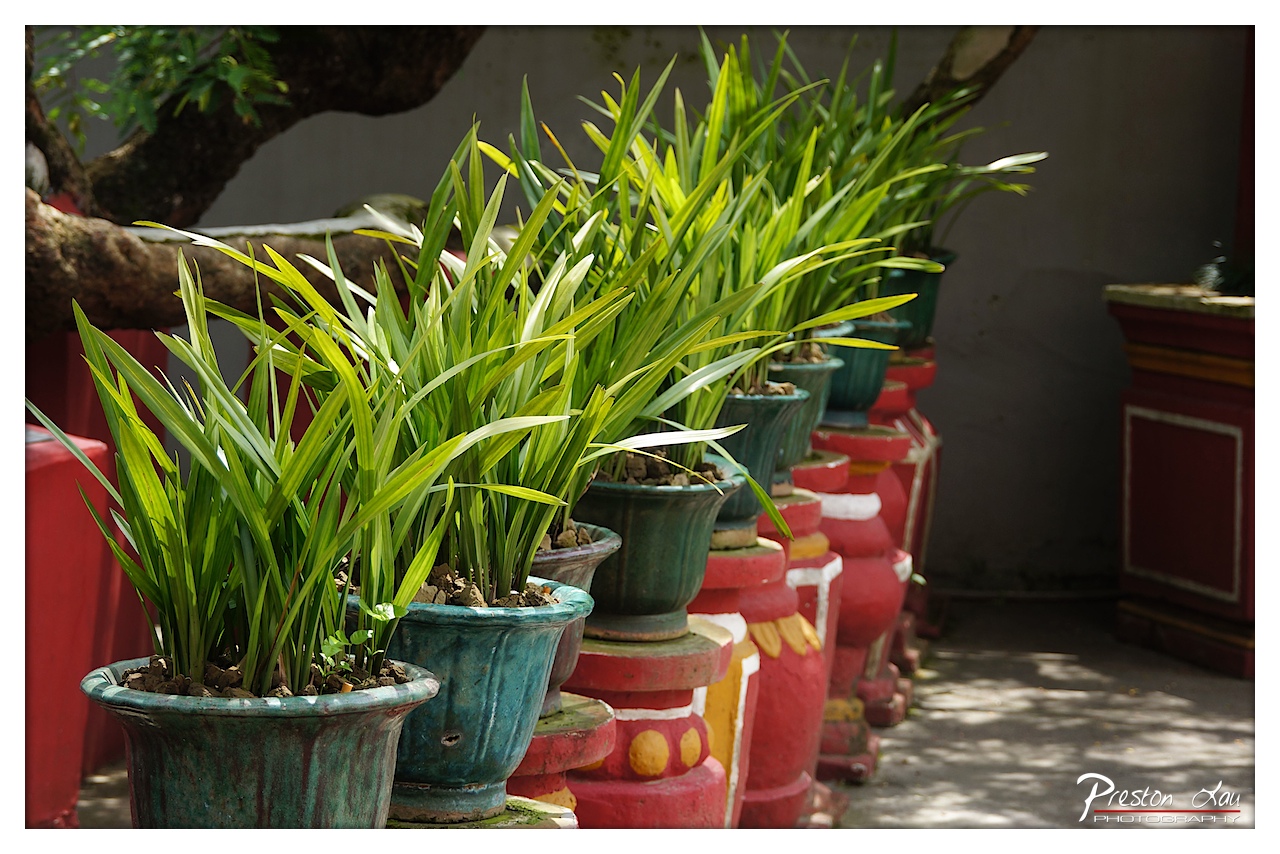
1. Overall Rating (0–10) — 7.5 This photograph captures a serene and contemplative moment in a garden, where the rhythmic arrangement of potted plants creates a sense of order and tranquility. The interplay of light and shadow, combined with the rich textures of the ceramic pots and the vibrant greenery, evokes a quiet beauty rooted in everyday ritual. While the image is visually engaging, it could benefit from a more dynamic composition to elevate its narrative presence.
2. Composition (0–10) — 7.0 The diagonal line of potted plants guides the eye through the frame, creating a sense of depth and movement. The slight asymmetry and framing by the tree branch add natural balance, though the composition feels slightly static due to the repetitive repetition of forms.
3. Lighting (0–10) — 8.0 Soft, directional sunlight filters through the foliage, casting dappled shadows that enhance texture and depth. The highlights on the leaves create a luminous glow, while the shaded areas provide contrast and mood, suggesting a calm midday atmosphere.
4. Color & Tone (0–10) — 8.0 The vibrant greens of the plants contrast beautifully with the earthy teal and red pots, creating a warm, harmonious palette. The tonal range is well-balanced, with natural saturation that enhances the organic feel without appearing over-processed.
5. Creativity (0–10) — 7.5 The arrangement of plants and pots suggests a cultural or spiritual context, possibly within a temple or garden space. The photographer’s choice to emphasize repetition and pattern lends a meditative quality, transforming a simple scene into a visual rhythm.
6. Technical Quality (0–10) — 8.5 Sharp focus on the foreground plants draws attention to detail, while a shallow depth of field softly blurs the background. The image is clean, with minimal noise and well-handled exposure, indicating strong technical control.
7. Emotional Impact (0–10) — 7.0 The photograph evokes a sense of peace and stillness, inviting quiet reflection. The presence of life and care in the arrangement of plants suggests dedication and ritual, resonating with viewers on a contemplative level.
A cornerstone of any visit to Zhongshan is exploring the Former Residence of Dr. Sun Yat-sen (孫逸仙/孫中山), a pivotal figure often revered as the Father of Modern China. Born in Cuiheng Village (翠亨村) in 1866, Dr. Sun led the movement that ultimately overthrew the Qing dynasty in 1912, ushering in a new era for China. The museum dedicated to his memory is situated within the tranquil setting of Cuiheng Village itself, where Dr. Sun spent his formative years.
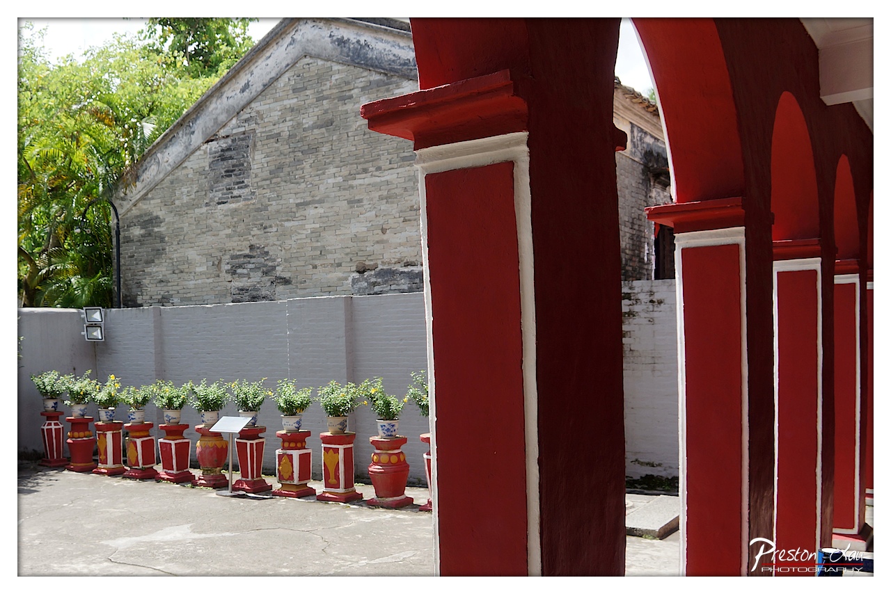
1. Overall Rating (0–10) — 7.0 This photograph captures a striking contrast between traditional architecture and vibrant cultural detail, where the bold red arches frame a quiet courtyard in soft daylight. The juxtaposition of weathered gray brick and the orderly, painted planters creates a visual rhythm that draws the eye through the space. While the image is strong in composition and color harmony, it feels slightly restrained by its documentary tone—more evocative than deeply emotional.
2. Composition (0–10) — 7.5 The red arches on the right create a strong leading line, guiding the viewer’s gaze toward the row of potted plants and the aged brick wall. The diagonal alignment of the planters adds rhythm, while the open space on the left provides visual balance.
3. Lighting (0–10) — 7.0 Natural daylight illuminates the scene evenly, highlighting textures in the brick and paint without harsh shadows. The soft light enhances the warm tones of the red columns and gives depth to the background.
4. Color & Tone (0–10) — 8.0 The rich red of the columns creates a powerful contrast against the muted grays and greens, while the earthy tones of the planters add warmth. The palette is cohesive and visually engaging, with a balanced tonal range.
5. Creativity (0–10) — 7.0 The framing through the arches offers a unique perspective, transforming a simple courtyard into a layered, almost theatrical scene. The composition suggests a narrative of tradition meeting daily life, though it remains grounded in realism.
6. Technical Quality (0–10) — 8.0 The image is sharp and well-focused, with clear detail in the textures of the brick, paint, and foliage. The exposure is balanced, and the watermark is subtle and unobtrusive.
7. Emotional Impact (0–10) — 6.5 The scene evokes a sense of calm and quiet dignity, suggesting a place of cultural significance and daily routine. While the mood is peaceful, it doesn’t elicit a strong emotional response—more reflective than stirring.
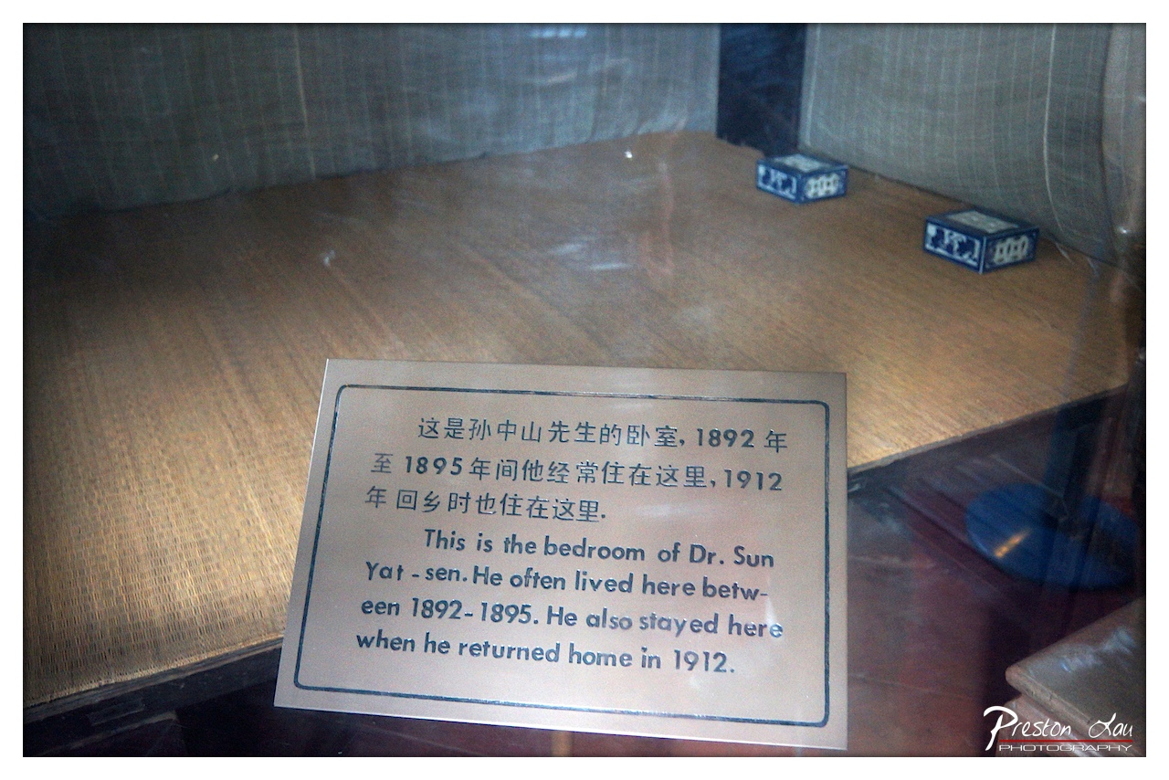
1. Overall Rating (0–10) — 6.0 This photograph captures a historical artifact within a preserved space, conveying a sense of reverence and documentation. The focus on the informational plaque, combined with the muted tones and reflective glass, emphasizes the site’s archival nature. While the image successfully communicates its subject, the technical limitations—such as reflections and lack of visual dynamism—reduce its overall aesthetic impact.
2. Composition (0–10) — 5.5 The plaque is centered and legible, but the composition feels slightly cluttered due to reflections and the angled perspective. The two blue boxes in the background add visual interest but distract from the primary subject.
3. Lighting (0–10) — 5.0 The lighting is flat and functional, likely from indoor sources, which results in a dull, even exposure. Reflections on the glass surface further obscure details and reduce contrast.
4. Color & Tone (0–10) — 5.5 The palette is subdued, dominated by neutral browns and grays, with the blue boxes providing a minor pop of color. The overall tone is muted and lacks vibrancy, contributing to a documentary rather than artistic impression.
5. Creativity (0–10) — 6.0 The image functions as a straightforward historical record, with a clear intent to inform. While the subject matter is inherently meaningful, the execution lacks a unique visual perspective or narrative depth.
6. Technical Quality (0–10) — 6.5 The focus is sharp on the plaque, and the image is well-exposed. However, reflections and a slightly cluttered frame detract from the clarity and professionalism of the shot.
7. Emotional Impact (0–10) — 5.0 The image evokes a sense of quiet reverence and historical weight, but the technical and compositional choices prevent a stronger emotional connection. The viewer is informed but not moved.
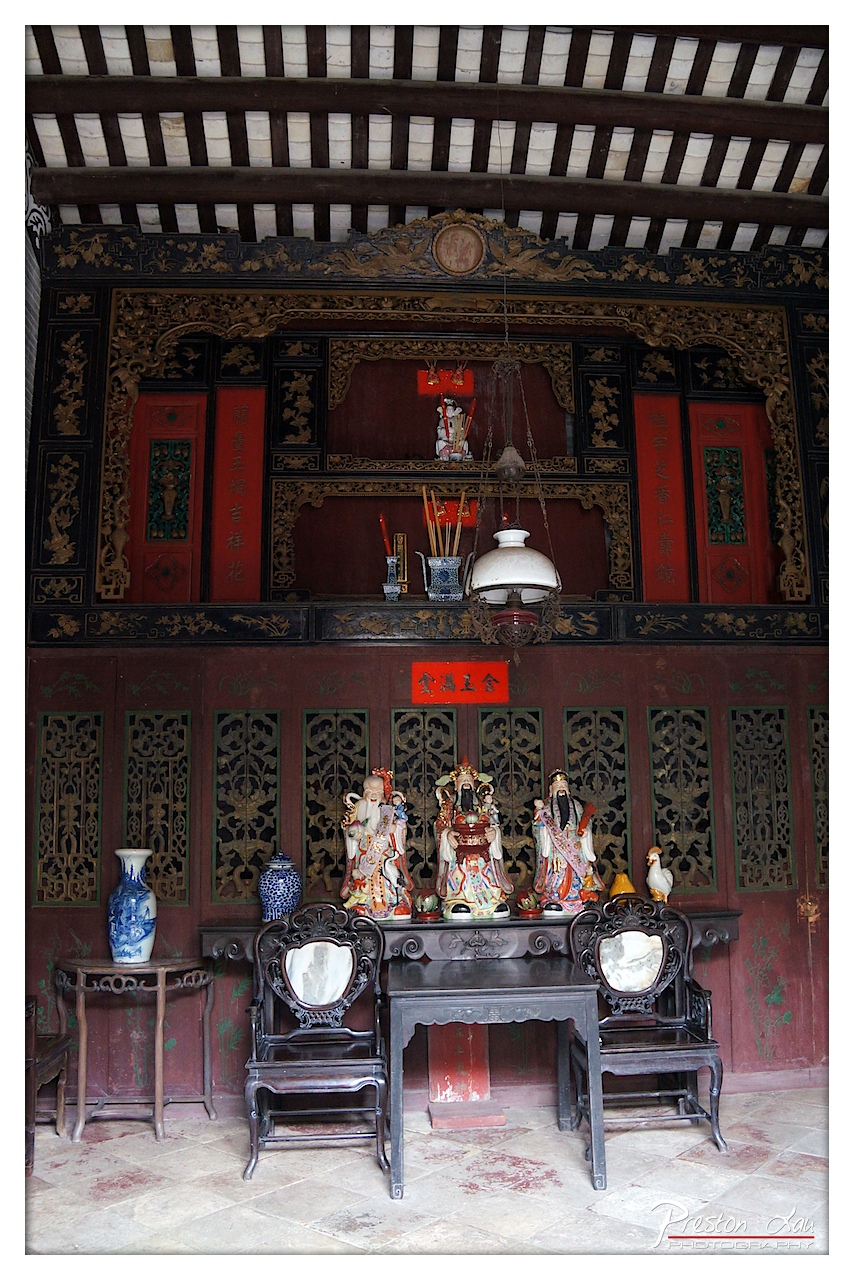
1. Overall Rating (0–10) — 7.5 This photograph captures the solemn grandeur of a traditional Chinese ancestral shrine, where intricate craftsmanship and spiritual reverence converge. The rich textures of carved wood, painted ceramics, and aged stone create a layered visual narrative of cultural continuity. While the composition is strong, a more deliberate use of light and framing could elevate its emotional resonance beyond mere documentation.
2. Composition (0–10) — 7.0 The central alignment of the altar and figures creates a strong focal point, with the symmetrical arrangement of chairs and decorative elements enhancing balance. The ceiling beams add depth and verticality, though the lower third feels slightly cluttered with the foreground objects, slightly disrupting the visual harmony.
3. Lighting (0–10) — 6.5 The light appears to be ambient and diffused, likely from an overhead source, casting soft shadows that emphasize the relief of the carvings. While adequate for clarity, the lighting lacks directional drama, resulting in a somewhat flat and neutral mood that underplays the scene’s sacred atmosphere.
4. Color & Tone (0–10) — 7.0 The deep reds and blacks of the woodwork contrast effectively with the white and blue of the vases and the vibrant hues of the deity figures. The warm, earthy tones of the tiles and aged surfaces contribute to a sense of timelessness, though the overall saturation is slightly muted, softening the visual impact.
5. Creativity (0–10) — 7.5 The image successfully captures a moment of cultural and spiritual significance, presenting the shrine not just as a setting but as a living space of tradition. The juxtaposition of the ornate altar with the simple, everyday objects like the hanging lamp introduces a subtle narrative of continuity between ritual and daily life.
6. Technical Quality (0–10) — 8.0 The image is sharp and detailed, particularly in the intricate carvings and ceramic figures. Focus is consistent across the frame, and the exposure is well-balanced, preserving detail in both the highlights and shadows without noticeable noise or distortion.
7. Emotional Impact (0–10) — 7.0 There is a quiet dignity in the scene, evoking a sense of reverence and continuity with the past. The viewer is invited to contemplate the rituals and beliefs embedded in the space, though the lack of dynamic lighting and human presence tempers the emotional pull, leaving the image more contemplative than moving.
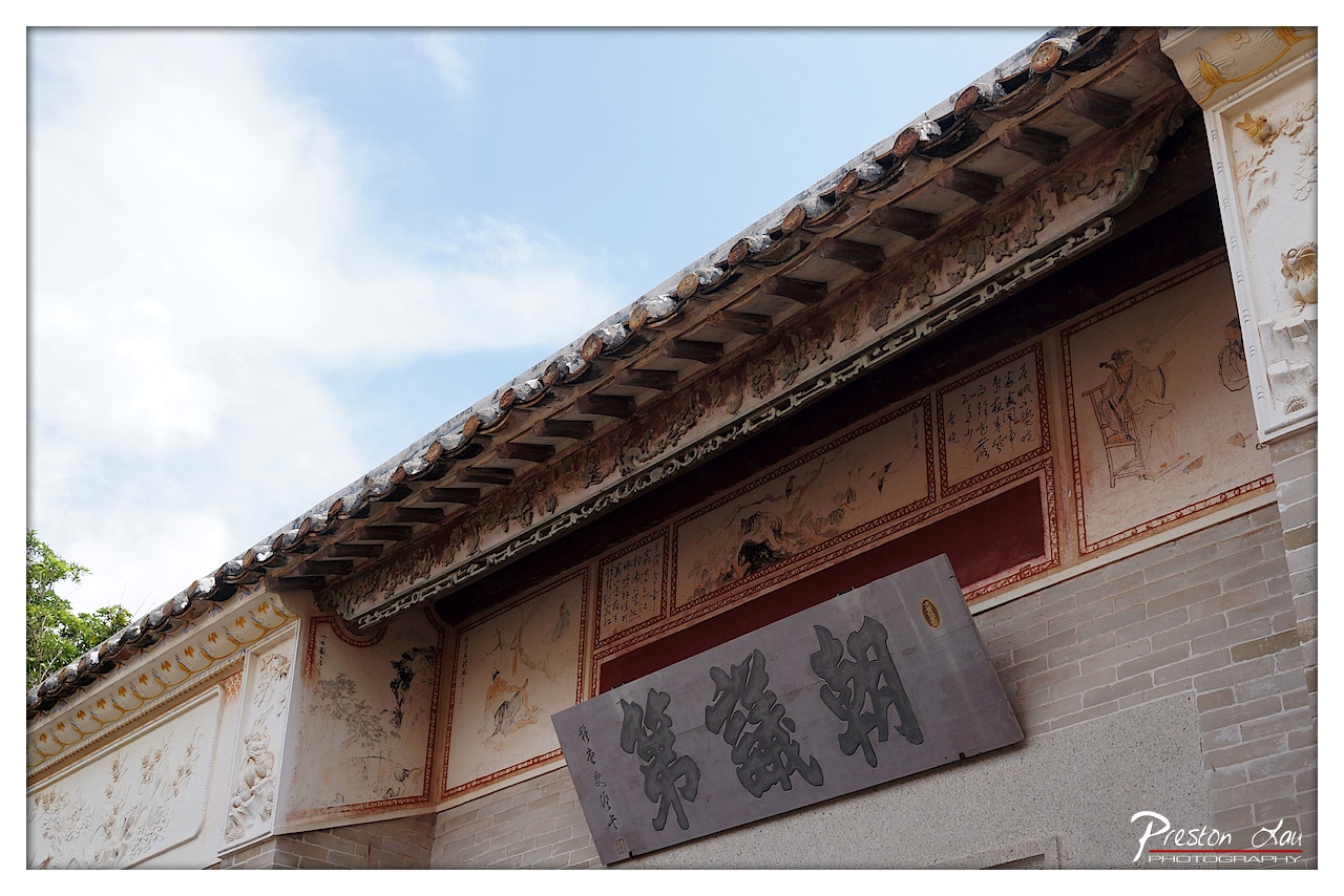
1. Overall Rating (0–10) — 7.5 This photograph captures the quiet dignity of a traditional Chinese architectural facade, where history and craftsmanship converge in weathered detail. The angled perspective emphasizes the roofline’s ornate tiles and the painted murals beneath, evoking a sense of time-worn elegance. While the composition is strong and rich in cultural texture, the slightly overexposed sky and muted wall tones slightly diminish the image’s atmospheric depth.
2. Composition (0–10) — 8.0 The low-angle shot creates a dynamic diagonal that leads the eye across the roofline and into the painted panels, emphasizing architectural grandeur. The placement of the signboard adds balance, though the slight tilt in framing introduces a subtle tension.
3. Lighting (0–10) — 7.0 Natural daylight illuminates the scene evenly, highlighting the textures of the tiles and carvings. However, the bright sky slightly washes out the upper portion, reducing contrast and depth in the clouds.
4. Color & Tone (0–10) — 7.0 The palette is restrained—soft whites, earthy reds, and faded ochres—reflecting the aged materials. While cohesive, the lack of vibrant color tempers the image’s visual impact, giving it a subdued, almost documentary feel.
5. Creativity (0–10) — 8.0 The choice to focus on the interplay between calligraphy, murals, and structure offers a layered narrative of cultural heritage. The photographer’s eye for detail transforms a simple architectural study into a contemplative visual story.
6. Technical Quality (0–10) — 8.0 Sharp focus and clean detail across the textures of brick, tile, and painted panels demonstrate strong technical control. The image is well-exposed overall, despite minor sky overexposure.
7. Emotional Impact (0–10) — 7.5 The photograph evokes a quiet reverence for tradition and endurance, inviting the viewer to pause and reflect on the stories embedded in the walls. The aged beauty of the structure resonates with a sense of continuity and quiet pride.
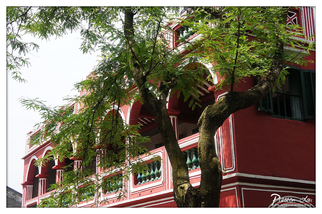
The Former Residence is a distinctive two-storey building that immediately catches the eye due to its blend of architectural styles. Dr. Sun himself designed the building in 1892 and personally oversaw its construction. The result is a fascinating fusion: a traditional Chinese-style interior reflects his heritage, while the exterior boasts a more Western architectural influence, showcasing his exposure to the outside world. Dr. Sun lived in this house from 1892 to 1895 while practicing medicine and engaging in revolutionary activities in the Pearl River Delta region. He also briefly returned for three days after resigning from the presidency. Walking through the rooms provides a tangible connection to his early life, offering insights into his childhood, family, and education through preserved furnishings, artifacts, and historical displays. The site is more than just a historical house; it's part of a larger museum complex that includes exhibitions detailing his life and revolutionary achievements. Recognized in 2000 as a national AAAA-level tourist attraction and a demonstration base for national patriotism education, the residence serves as an important pilgrimage site for those who admire his legacy, offering a deeply informative and moving experience. Cuiheng Village itself maintains a peaceful, historical ambiance, providing a fitting backdrop for the residence.
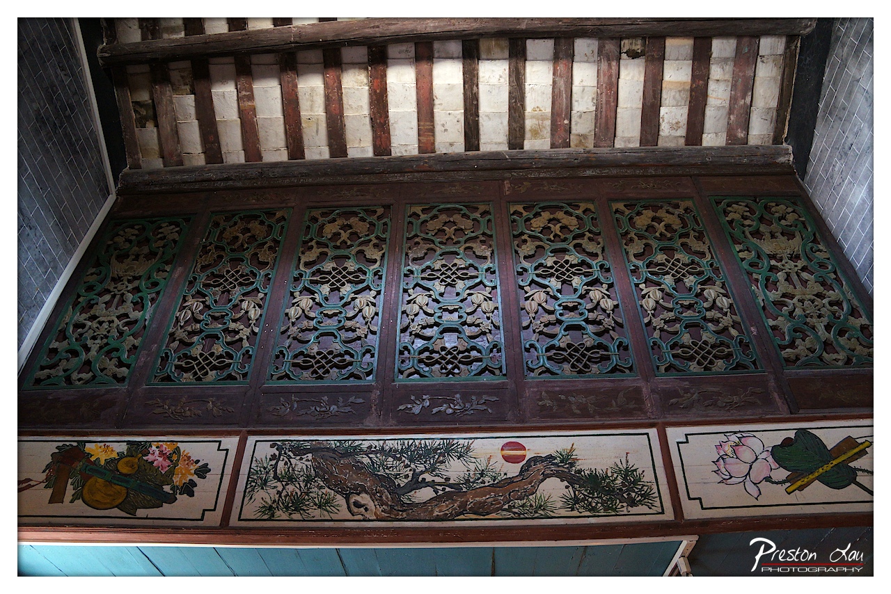
1. Overall Rating (0–10) — 7.5 This photograph captures the intricate craftsmanship of traditional East Asian architectural detailing, where wood and paint converge in a celebration of cultural heritage. The rich textures and layered patterns evoke a sense of time-worn elegance, though the slightly uneven lighting and composition prevent it from achieving a fully immersive presence. The image succeeds as both a documentation of artistry and a subtle invitation to contemplate the stories embedded in the carvings.
2. Composition (0–10) — 6.5 The framing is slightly off-center, with the upper structure pulling attention upward and creating an asymmetrical balance. A tighter crop would better emphasize the symmetry of the carvings and the painted panels below.
3. Lighting (0–10) — 6.0 The lighting is functional but flat, casting soft shadows that obscure some of the fine details in the woodwork. A more directional light source would enhance depth and highlight the relief of the carvings.
4. Color & Tone (0–10) — 7.0 The palette is rich with earthy tones—deep browns, muted greens, and touches of red and pink—creating a harmonious and traditional aesthetic. The tonal contrast is moderate, allowing the painted scenes to stand out without overwhelming the intricate woodwork.
5. Creativity (0–10) — 7.5 The image demonstrates a strong eye for cultural detail, capturing both the craftsmanship and symbolic elements—such as the pine tree, lotus, and fruit—common in East Asian art. The juxtaposition of carved and painted panels adds narrative depth.
6. Technical Quality (0–10) — 8.0 The image is sharp and detailed, with clear focus on the carvings and paintings. The exposure is well-balanced, preserving texture and color without harsh highlights or deep shadows.
7. Emotional Impact (0–10) — 7.0 There is a quiet reverence in the image, evoking a sense of connection to tradition and craftsmanship. The viewer is drawn into a moment of stillness, as if standing in a temple or ancestral hall, contemplating the enduring beauty of handcrafted art.
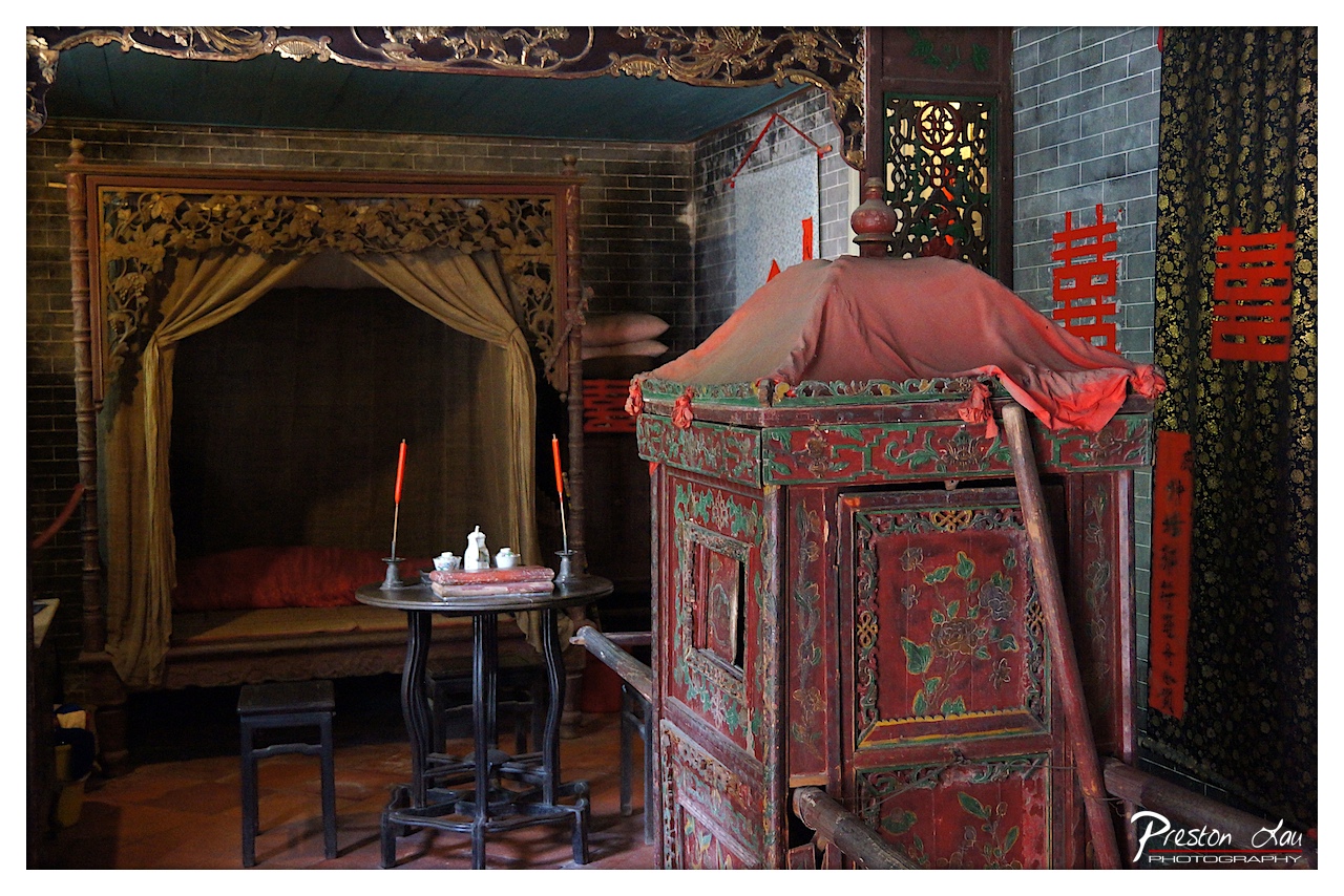
1. Overall Rating (0–10) — 7.5 This photograph captures the intimate and ceremonial atmosphere of a traditional Chinese wedding chamber, rich with cultural symbolism and historical texture. The interplay of ornate woodwork, vibrant red accents, and subdued lighting evokes a sense of reverence and tradition, while the arrangement of objects—like the bridal bed and ceremonial chest—tells a quiet story of ritual and union. While the scene is visually dense, the composition could benefit from a more balanced distribution of visual weight to enhance clarity and focus.
2. Composition (0–10) — 7.0 The framing centers the ornate bed and red bridal chest, creating a strong visual anchor. The diagonal placement of the chest and the leaning pole introduce dynamic tension, while the depth of the room draws the eye into the space. However, the cluttered foreground and slight asymmetry slightly disrupt the harmony, making the composition feel more like a snapshot than a carefully composed scene.
3. Lighting (0–10) — 6.5 The lighting is soft and diffused, likely from a natural source, which enhances the authenticity of the scene. It casts gentle shadows that accentuate the textures of the wood and fabric. However, the overall dimness and lack of directional contrast limit the dramatic impact, giving the image a flat, documentary quality rather than a cinematic mood.
4. Color & Tone (0–10) — 8.0 The color palette is rich and culturally resonant, dominated by deep reds and earthy browns, with accents of gold and muted green. The red—symbolic of luck and joy in Chinese tradition—stands out powerfully against the dark brick and wood. The tonal range is warm and cohesive, creating a sense of timelessness and ritual.
5. Creativity (0–10) — 8.0 The photograph is highly evocative, using cultural symbols—such as the double happiness characters and the traditional bridal chest—to tell a story beyond the visual. The inclusion of subtle details like the candles and tea set suggests a narrative of preparation and anticipation. The image is not just a depiction but a quiet homage to tradition, demonstrating thoughtful artistic intent.
6. Technical Quality (0–10) — 8.0 The image is sharp and well-focused, with clear detail in the carved wood and fabric textures. The exposure is balanced, avoiding harsh highlights or deep shadows, and the camera settings appear to have captured the scene’s richness without over-processing. The watermark is discreet and does not detract from the composition.
7. Emotional Impact (0–10) — 7.5 The image conveys a quiet solemnity and intimacy, inviting the viewer to reflect on the significance of marriage in a traditional context. The presence of symbolic objects and the stillness of the room evoke a sense of reverence and anticipation, creating a strong emotional resonance with themes of love, heritage, and ritual.
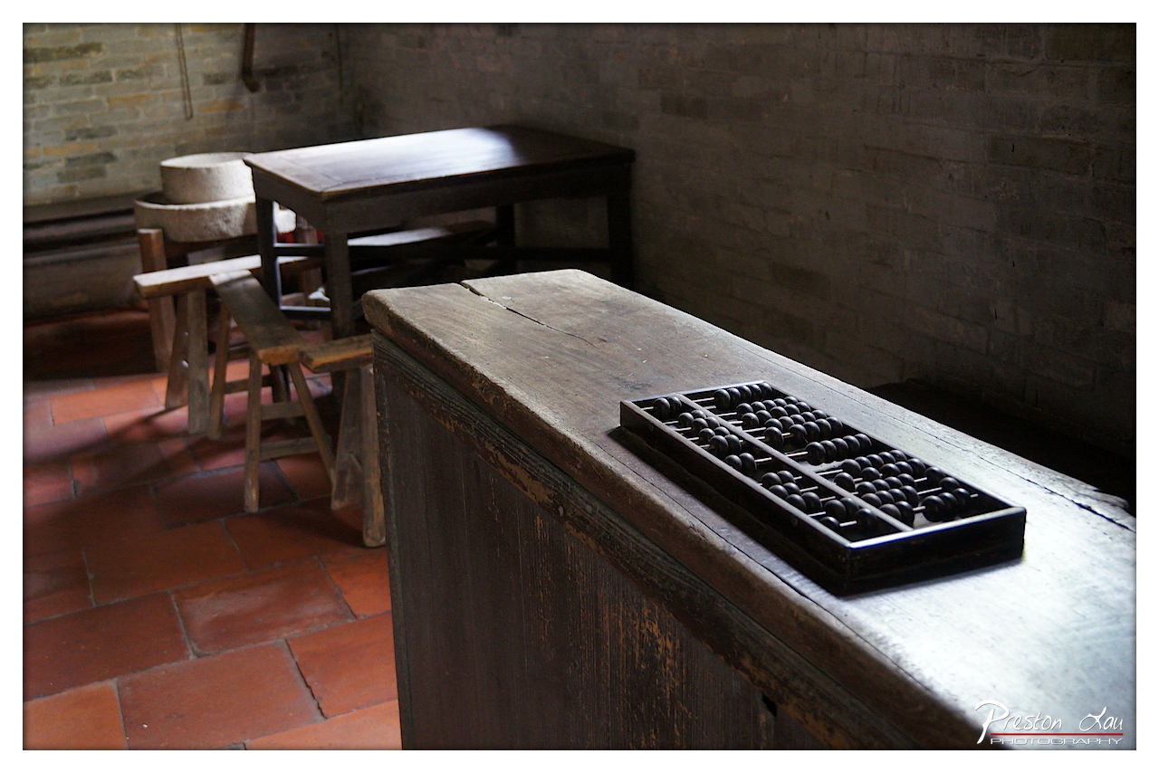
1. Overall Rating (0–10) — 7.5 This photograph captures a quiet, contemplative moment in a rustic, historically resonant space, where the stillness of time is palpable in every worn surface. The abacus, a symbol of tradition and calculation, rests prominently on the weathered wooden counter, anchoring the scene in a narrative of old-world commerce and labor. While the lighting and composition are strong, the image holds back from fully embracing the emotional depth of its subject, remaining more observational than immersive.
2. Composition (0–10) — 7.0 The diagonal placement of the wooden counter leads the eye naturally into the frame, with the abacus serving as a clear focal point. The background elements—the table, stools, and stone mill—add context without distracting, though the depth of field slightly flattens the space.
3. Lighting (0–10) — 7.5 Soft, directional light from the left creates gentle highlights and shadows, enhancing the texture of the wood and brick. The contrast between the illuminated abacus and the dimmer background adds a sense of intimacy and focus.
4. Color & Tone (0–10) — 7.0 The warm, earthy tones of the red brick and aged wood create a cohesive palette, while the dark abacus provides a strong visual anchor. The overall tonal range is well-balanced, with a subtle coolness in the shadows that adds depth.
5. Creativity (0–10) — 7.5 The image successfully blends documentary realism with a quiet narrative quality, using everyday objects to evoke a sense of history and memory. The choice to center the abacus on the counter suggests a deliberate storytelling intention.
6. Technical Quality (0–10) — 8.0 The focus is sharp on the abacus and the front edge of the counter, with a smooth transition into the background. The image is clear and well-exposed, with no noticeable technical flaws.
7. Emotional Impact (0–10) — 7.0 The photograph evokes a sense of nostalgia and quiet reverence, inviting the viewer to reflect on the passage of time and the enduring presence of tradition. The stillness of the scene allows for personal interpretation, though it remains emotionally restrained.
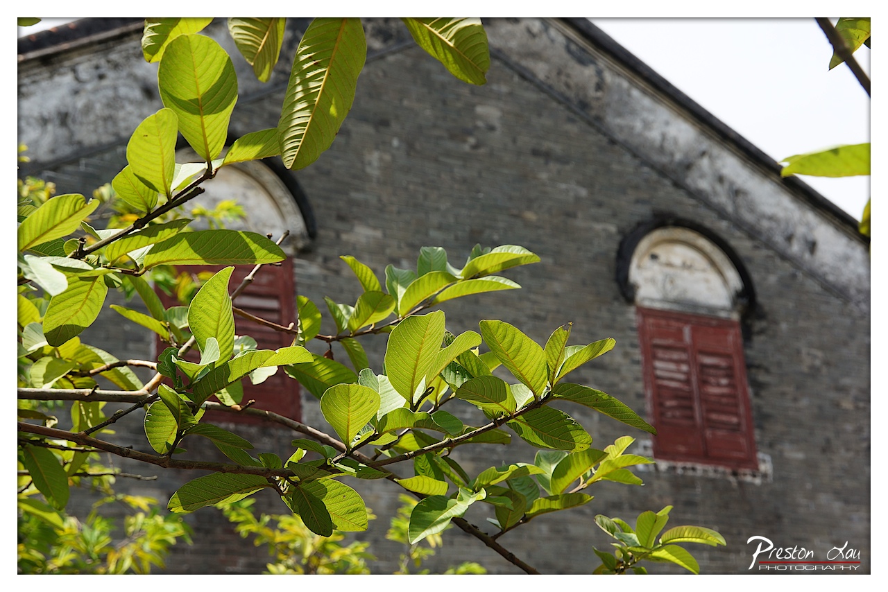
1. Overall Rating (0–10) — 7.5 This photograph captures a quiet harmony between nature and architecture, where vibrant green leaves frame a weathered brick façade, evoking a sense of timelessness. The interplay of light and texture gives the image a contemplative mood, though the shallow depth of field slightly weakens the narrative clarity. The composition feels intentional, balancing organic form with man-made structure, resulting in a visually poetic and emotionally resonant moment.
2. Composition (0–10) — 8.0 The foreground leaves create a natural frame, guiding the eye toward the arched window and red shutters. The diagonal placement of the branches adds movement, while the soft focus on the background enhances depth and draws attention to the central architectural detail.
3. Lighting (0–10) — 7.5 Natural daylight illuminates the scene with soft, even light, highlighting the translucency of the leaves and the subtle textures of the aged brick. The gentle contrast between sunlit foliage and the shaded wall enhances dimension without creating harsh shadows.
4. Color & Tone (0–10) — 7.0 The rich green of the leaves contrasts beautifully with the deep red shutters and the muted gray of the wall. The overall palette is balanced and harmonious, with a slightly cool tone that reinforces the quiet, nostalgic atmosphere.
5. Creativity (0–10) — 7.5 The use of foliage as a framing device is both natural and inventive, transforming a simple architectural scene into a layered, narrative image. The selective focus and color contrast contribute to a thoughtful, almost cinematic quality.
6. Technical Quality (0–10) — 8.0 The image is sharp in the foreground, with clean detail in the leaves and a smooth, controlled bokeh in the background. The exposure is well-balanced, with no noticeable noise or loss of detail.
7. Emotional Impact (0–10) — 8.0 The photograph evokes a sense of calm and reflection, suggesting a hidden corner of history touched by nature’s quiet persistence. The viewer is invited to pause and imagine the stories behind the weathered walls and closed shutters.
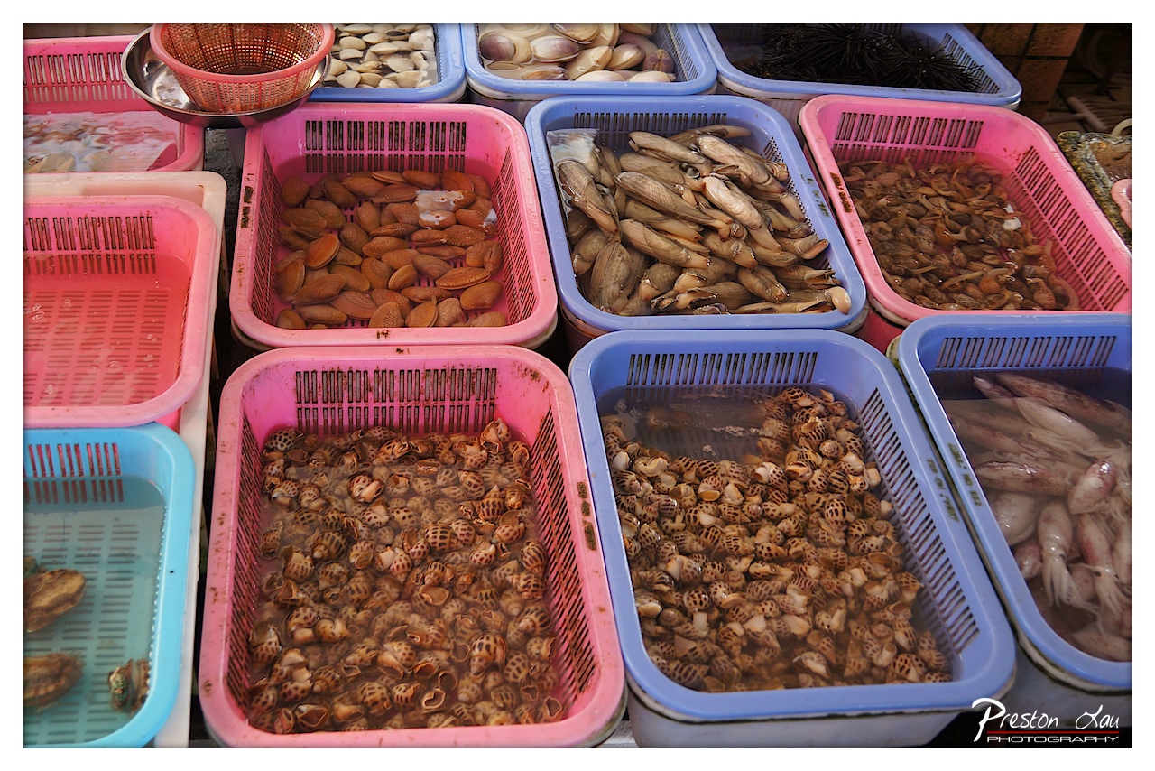
Beyond the historical immersion, our culinary exploration led us to Nansha Nineteenth Yong (南沙十九涌), also widely known as the "Hong Kong Saigon Seafood Street." While located in the Nansha district, which is technically part of Guangzhou rather than Zhongshan, it's a popular destination in the Pearl River Delta region and a must-visit for seafood lovers. This bustling market area is a vibrant hub where local vendors sell an incredible array of fresh seafood directly from the Pearl River estuary, alongside fresh vegetables and a colorful bounty of local fruits. The atmosphere is lively and authentic, with the invigorating smell of the sea filling the air as vendors call out their offerings and shoppers peruse the day's catch.
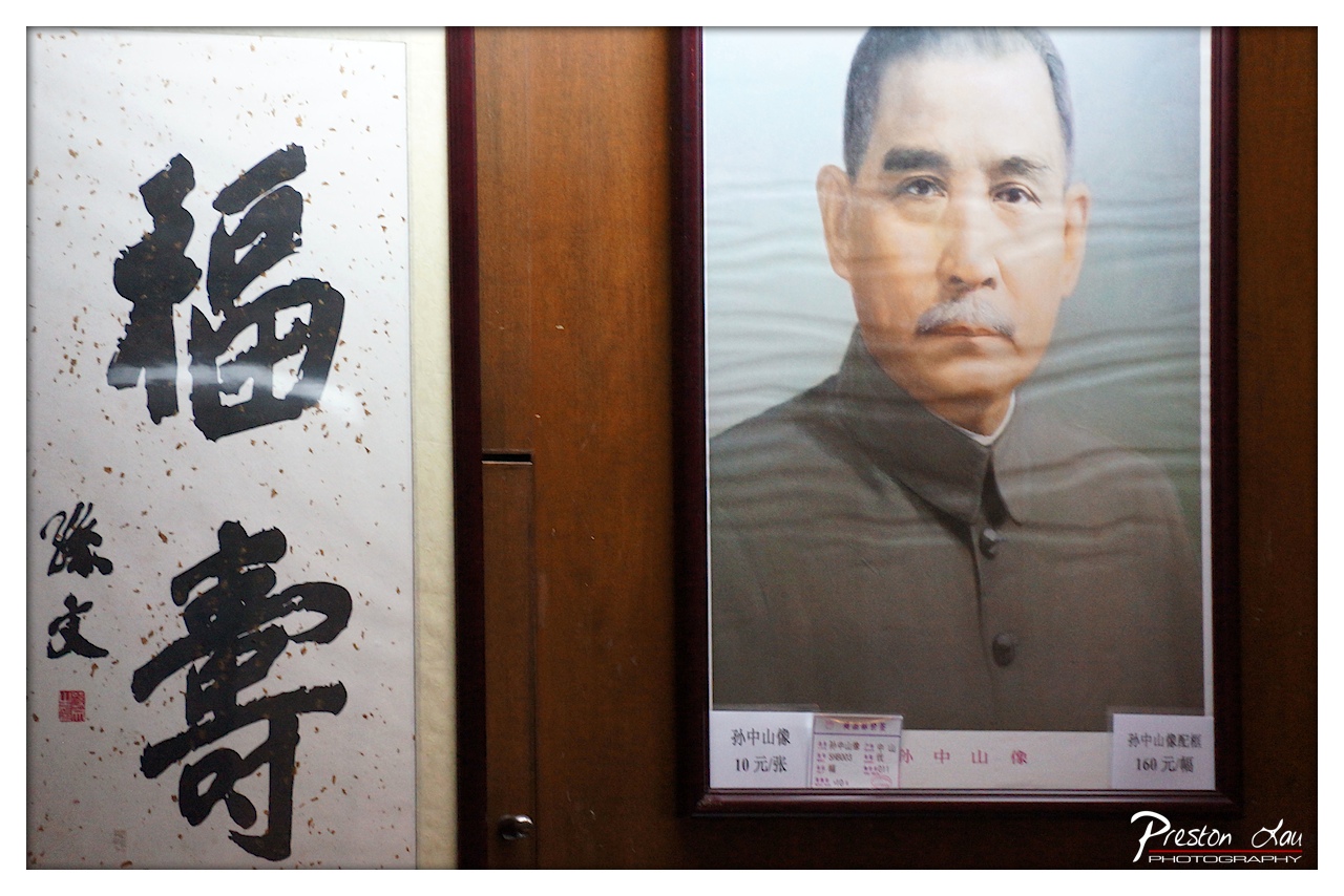
1. Overall Rating (0–10) — 6.0 This photograph captures a quiet juxtaposition of cultural and political iconography within a commercial setting, where reverence and commerce intersect. The framing centers on a portrait of Sun Yat-sen alongside a calligraphic scroll bearing the characters for "blessing" and "longevity," creating a subtle dialogue between tradition and state ideology. While the image successfully documents a specific cultural moment, its visual impact is muted by a lack of dynamic lighting and a composition that feels more observational than intentional.
2. Composition (0–10) — 6.0 The split framing between the calligraphy and the portrait creates a balanced but somewhat static arrangement. The vertical alignment of the two elements works well, but the off-center placement of the Sun Yat-sen portrait slightly disrupts visual harmony.
3. Lighting (0–10) — 5.5 The lighting is flat and functional, likely from overhead fluorescent sources, which casts a neutral tone across the scene. While it clearly illuminates the subjects, it lacks directional warmth or contrast to create depth or mood.
4. Color & Tone (0–10) — 6.0 The color palette is restrained—dominated by earthy browns, muted blacks, and off-whites—giving the image a subdued, documentary feel. The limited tonal range keeps the focus on the subjects, though it sacrifices visual richness.
5. Creativity (0–10) — 6.5 The conceptual pairing of a political figure with a traditional blessing symbol offers a thought-provoking narrative, suggesting the blending of cultural values in public life. The inclusion of price tags adds a layer of irony, elevating the image beyond mere documentation.
6. Technical Quality (0–10) — 7.5 The image is sharp and well-focused, with clear details in both the calligraphy and the portrait. The resolution is high, and the watermark is unobtrusive, indicating competent technical execution.
7. Emotional Impact (0–10) — 5.0 The emotional resonance is restrained, leaning more toward intellectual curiosity than visceral connection. The viewer is invited to reflect on cultural duality, but the emotional pull is softened by the impersonal, transactional context.
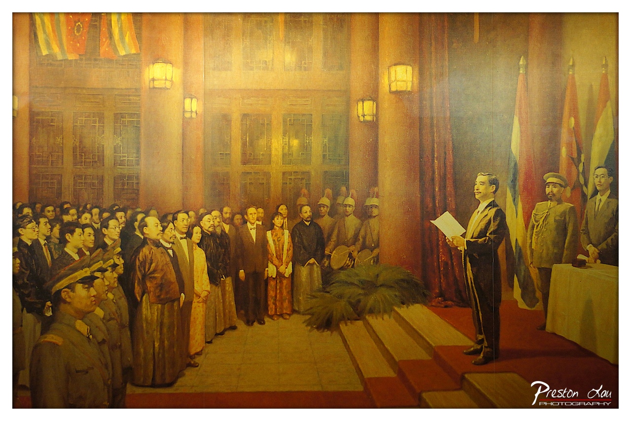
1. Overall Rating (0–10) — 7.0 This mural captures a moment of national significance with solemn grandeur, its warm, golden tones evoking a sense of historical weight and ceremonial dignity. The composition effectively conveys a collective gaze toward a central figure, suggesting a pivotal public declaration. While the image’s narrative power is strong, the slightly aged and uneven lighting softens the visual clarity, limiting its overall impact.
2. Composition (0–10) — 7.5 The central figure is well-placed on the right, drawing the eye naturally while the crowd forms a dynamic diagonal leading toward him. The use of steps and flags adds depth and structure, though the left side feels slightly more crowded, creating a subtle imbalance.
3. Lighting (0–10) — 6.5 The warm, directional lighting enhances the painting’s solemn mood, simulating a stage-like illumination that highlights the speaker. However, the lighting appears uneven across the mural, with some areas overly bright and others shadowed, likely due to photographic conditions rather than artistic intent.
4. Color & Tone (0–10) — 7.0 The palette is rich with golden yellows, deep reds, and earthy browns, creating a cohesive and dignified atmosphere. The color harmony supports the historical tone, though the overall warmth slightly mutes contrast and vibrancy.
5. Creativity (0–10) — 7.5 The scene is a powerful representation of a pivotal moment, blending realism with symbolic grandeur. The artist’s choice to include diverse figures and national symbols adds narrative depth and political resonance, elevating the work beyond mere documentation.
6. Technical Quality (0–10) — 6.0 The photograph is reasonably sharp, but the lighting and reflections from the glass case introduce glare and uneven exposure. The fine details of the painting are visible, though some areas are lost in shadow or overexposed.
7. Emotional Impact (0–10) — 7.0 The image evokes a strong sense of reverence and historical gravity, inviting the viewer to reflect on the weight of national leadership and collective identity. The solemnity of the moment resonates through the composed expressions and formal setting.
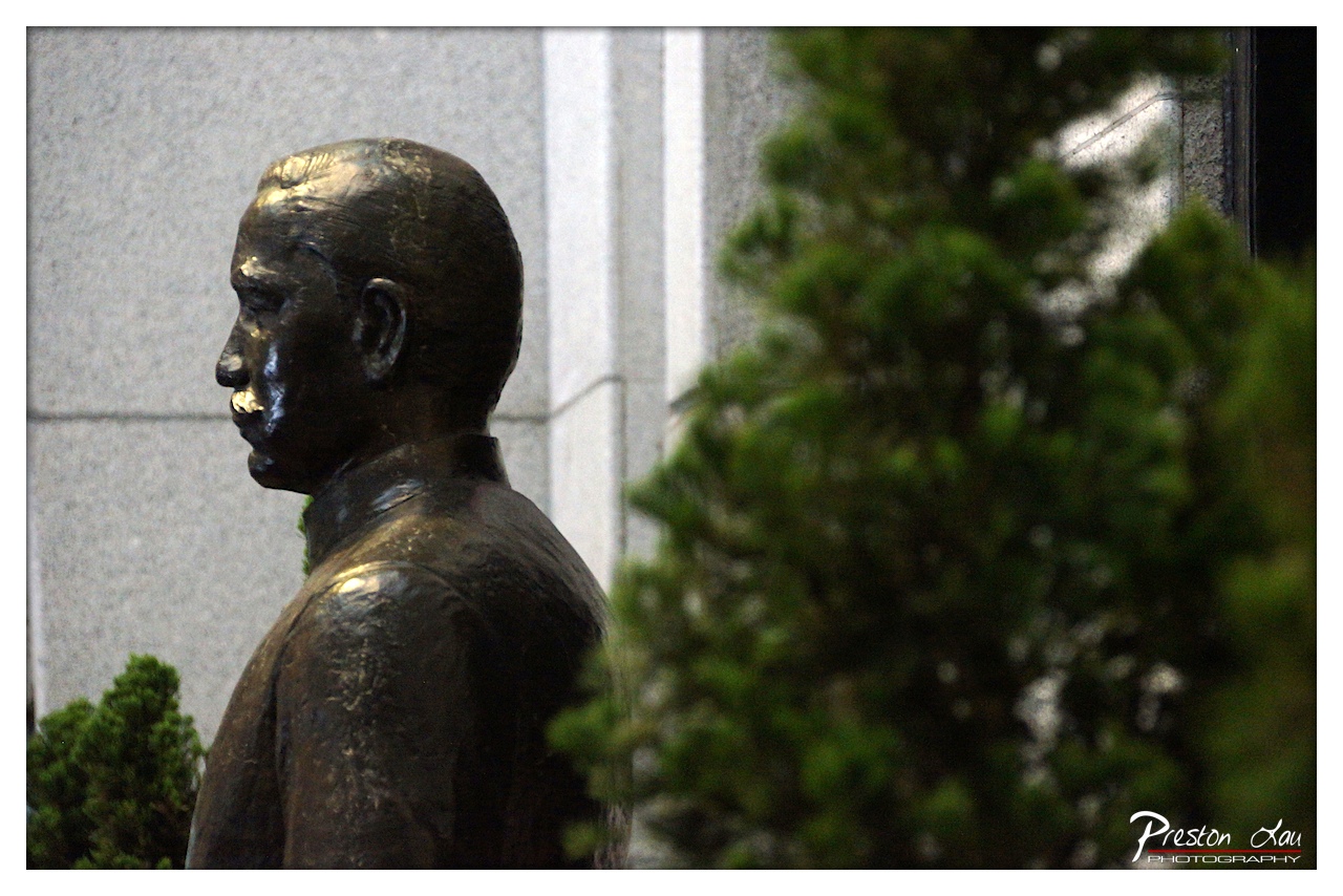
1. Overall Rating (0–10) — 7.0 This photograph captures the solemn dignity of a bronze statue, its weathered surface reflecting the quiet reverence of a public memorial. The interplay between the stillness of the figure and the soft blur of surrounding foliage creates a contemplative mood, though the image’s emotional depth is slightly restrained by its muted lighting and composition. The choice to frame the subject partially behind greenery adds a layer of narrative, suggesting both protection and concealment.
2. Composition (0–10) — 6.5 The statue is placed off-center, creating a sense of asymmetry that draws the eye across the frame. The blurred foliage in the foreground adds depth but partially obscures the subject, slightly disrupting visual balance.
3. Lighting (0–10) — 6.0 The lighting is soft and diffused, likely from an overcast sky or late afternoon, which enhances the texture of the bronze without creating harsh reflections. However, the overall flatness of the light diminishes the dramatic potential of the scene.
4. Color & Tone (0–10) — 6.5 The palette is subdued, dominated by the dark bronze of the statue and the muted greens of the foliage. The tonal contrast is gentle, lending a calm, almost somber mood, but could benefit from richer saturation to emphasize the materiality of the bronze.
5. Creativity (0–10) — 7.0 The framing through the foliage introduces a layer of narrative and visual interest, suggesting a quiet encounter with history. The choice to focus on the profile rather than a full frontal view lends a sense of introspection and timelessness.
6. Technical Quality (0–10) — 7.5 The image is sharp where it matters—on the statue’s profile—with a smooth depth of field that separates the subject from the background. The focus is well-controlled, and the details of the bronze surface are clearly rendered.
7. Emotional Impact (0–10) — 7.0 There is a quiet reverence in the image that invites reflection on the legacy of the figure depicted. The partial concealment by nature adds a sense of mystery and time-worn respect, allowing the viewer to feel the weight of memory.
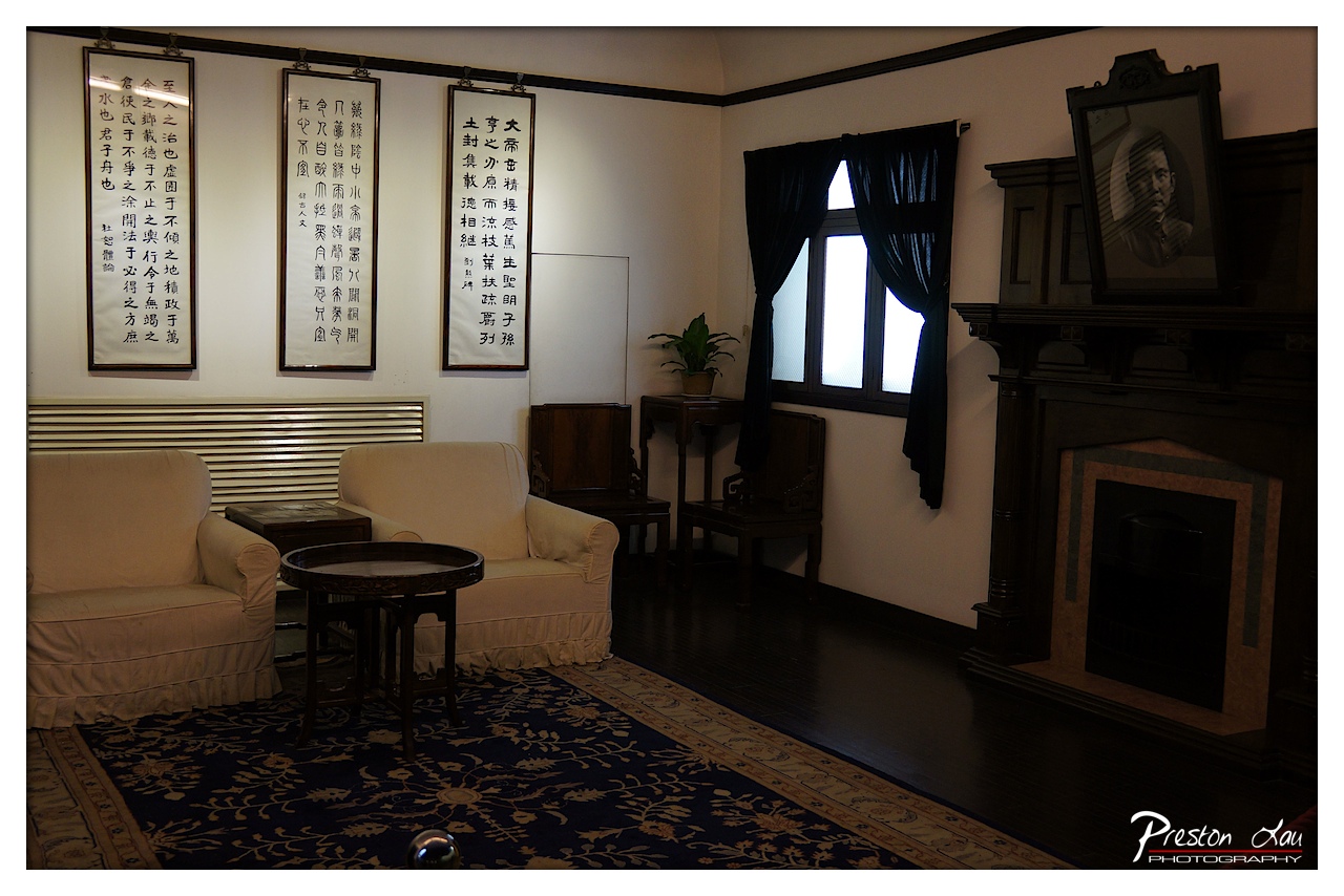
1. Overall Rating (0–10) — 7.0 This photograph captures a solemn and historically rich interior, evoking the quiet dignity of a preserved study or formal living space. The arrangement of calligraphy scrolls, the portrait above the fireplace, and the traditional furnishings convey a deep sense of cultural reverence and personal legacy. While the composition is deliberate and atmospheric, the dim lighting and subdued color palette, though intentional, slightly limit the image’s visual immediacy.
2. Composition (0–10) — 7.5 The framing balances the elements well, with the calligraphy on the left drawing the eye toward the central seating area, while the portrait and fireplace on the right provide visual weight. The low angle and wide perspective create depth, though the foreground rug slightly disrupts the flow.
3. Lighting (0–10) — 6.5 The light from the window casts soft, directional illumination, creating a moody atmosphere that enhances the historical tone. However, the overall darkness of the room and underexposed areas, especially in the corners, reduce detail and give the image a somewhat flat appearance.
4. Color & Tone (0–10) — 6.0 The palette is restrained, dominated by deep blues, blacks, and muted beiges, which supports the room’s solemn mood. The lack of vibrancy, however, makes the scene feel more like a document than a dynamic image, with the tonal range leaning toward the lower end of the spectrum.
5. Creativity (0–10) — 7.0 The image successfully captures a narrative through its curated environment—each object contributes to a story of tradition and reverence. The juxtaposition of classical calligraphy with the modern fireplace adds a subtle layer of cultural continuity, showing thoughtful artistic intent.
6. Technical Quality (0–10) — 7.5 The image is sharp and well-focused, particularly on the furniture and calligraphy. The exposure is controlled, with the window acting as a natural light source. The watermark is discreet and does not detract from the composition.
7. Emotional Impact (0–10) — 7.5 There’s a quiet introspection in the space, inviting contemplation of the person and values represented. The stillness of the room and the presence of the portrait generate a sense of reverence and nostalgia, allowing the viewer to feel a connection to the past.
The variety of seafood available is impressive, from various fish and shellfish to crustaceans, offering a true taste of the region's aquatic bounty. What makes Nansha Nineteenth Yong particularly appealing is the opportunity to select your fresh seafood and often have it cooked on the spot at one of the many small eateries or stalls, ensuring an incredibly fresh and delicious meal.
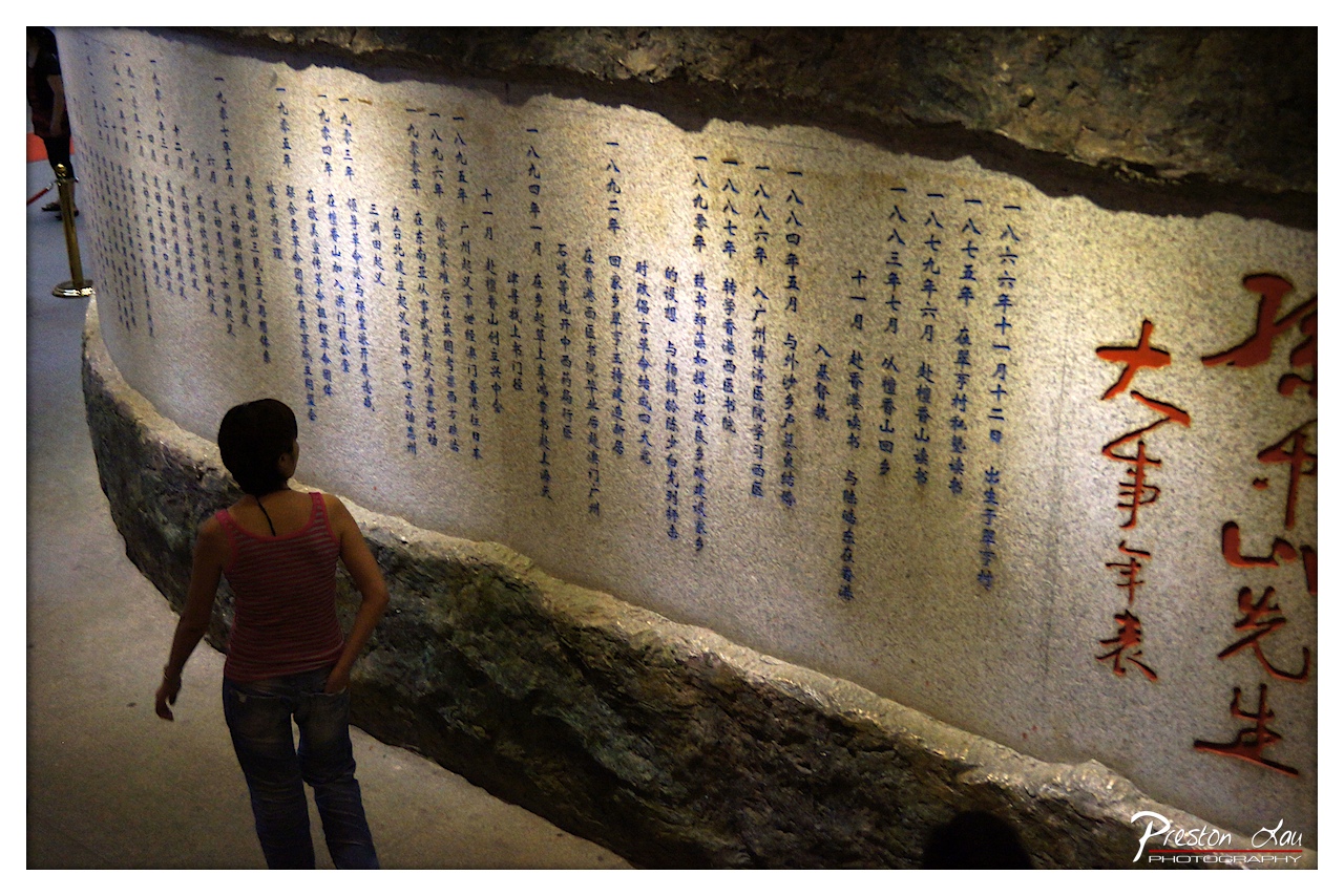
1. Overall Rating (0–10) — 6.0 This photograph captures a quiet, contemplative moment as a visitor stands before a large inscribed stone wall, evoking a sense of historical reverence. The composition draws attention to the juxtaposition of the individual and the weight of collective memory, though the dim lighting and grainy texture slightly diminish the visual clarity. While the image succeeds in conveying a reflective mood, its technical and aesthetic limitations prevent it from achieving greater impact.
2. Composition (0–10) — 6.5 The subject is positioned off-center, creating a sense of movement and narrative as they walk along the wall. The curved line of the stone wall guides the eye through the frame, but the slight tilt and uneven framing reduce visual harmony.
3. Lighting (0–10) — 5.5 The lighting is dim and uneven, with strong shadows obscuring parts of the text and creating a murky atmosphere. The warm, artificial light highlights the red characters but leaves much of the scene in shadow, diminishing detail and depth.
4. Color & Tone (0–10) — 6.0 The color palette is muted, dominated by earthy tones and dark grays, with the red calligraphy providing a striking contrast. The overall tone is somber and subdued, reinforcing the historical gravity of the scene.
5. Creativity (0–10) — 6.5 The image effectively captures the intersection of personal experience and historical documentation, using the visitor’s presence to humanize the monumental text. The choice to include the viewer adds narrative depth, though the execution remains conventional.
6. Technical Quality (0–10) — 6.0 The image is somewhat grainy and lacks sharpness, particularly in the darker areas. Focus is acceptable on the central subject, but the overall clarity is compromised by low-light conditions and post-processing noise.
7. Emotional Impact (0–10) — 6.5 The photograph evokes a sense of introspection and respect for history, inviting the viewer to reflect on the passage of time and the lives recorded in the inscriptions. The quiet presence of the woman enhances the emotional resonance, though the technical limitations slightly distance the viewer from the moment.
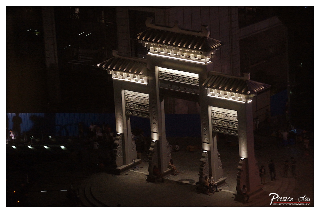
1. Overall Rating (0–10) — 6.0 This nighttime photograph captures the quiet dignity of a traditional Chinese archway, illuminated against the dark urban backdrop. The lighting highlights the intricate carvings and architectural details, giving the structure a sense of reverence and permanence. While the mood is contemplative and the composition has potential, the low-light conditions result in a lack of clarity and a somewhat flat visual impact, limiting the image’s emotional resonance.
2. Composition (0–10) — 6.5 The archway is centered and dominates the frame, creating a strong focal point. The elevated perspective offers a comprehensive view of the structure and its surroundings, though the scattered people and uneven foreground slightly disrupt visual harmony.
3. Lighting (0–10) — 7.0 The strategic uplighting on the archway effectively emphasizes its design and texture, creating contrast against the surrounding darkness. The warm glow enhances the cultural significance of the structure, though some areas remain underexposed due to the low-light environment.
4. Color & Tone (0–10) — 5.5 The palette is dominated by deep shadows and muted tones, with the warm light on the stone providing the only color contrast. While the limited range reinforces the nighttime mood, it lacks vibrancy and dynamic tonal variation.
5. Creativity (0–10) — 6.0 The image successfully juxtaposes traditional architecture with a modern urban setting, suggesting a narrative of cultural continuity. However, the execution leans toward documentation rather than artistic interpretation.
6. Technical Quality (0–10) — 6.0 The photograph is sharp in the illuminated areas, but the low-light conditions introduce grain and softness in the darker regions. Exposure is balanced on the archway, but the overall image appears underexposed.
7. Emotional Impact (0–10) — 5.5 The scene evokes a sense of stillness and cultural reverence, but the lack of viewer engagement and muted atmosphere keeps the emotional connection at a distance.
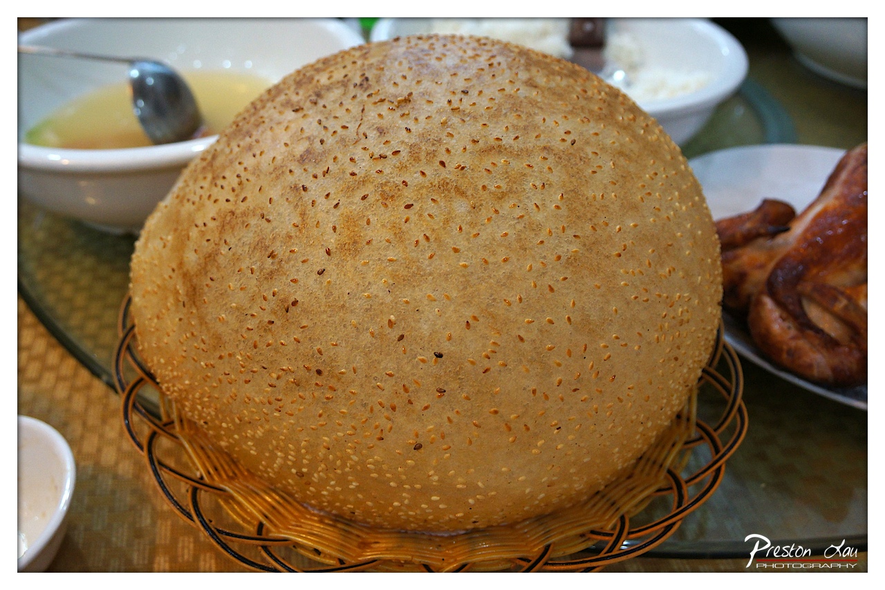
1. Overall Rating (0–10) — 7.0 This photograph captures the inviting warmth of a traditional meal, with a focus on a large, sesame-topped bread that radiates rustic charm. The shallow depth of field draws attention to the bread’s textured surface, while the surrounding dishes suggest a shared, communal dining experience. Though the image is rich in cultural suggestion, its composition and lighting feel slightly unrefined, holding back its full visual potential.
2. Composition (0–10) — 6.5 The bread is well-centered, creating a strong focal point, but the surrounding elements—especially the out-of-focus bowl and chicken—introduce visual clutter. A tighter crop or more deliberate arrangement would enhance balance and focus.
3. Lighting (0–10) — 6.0 The lighting is warm and ambient, likely from overhead indoor fixtures, which enhances the homely atmosphere. However, the shadows are soft and uneven, and the highlights on the bread lack definition, slightly flattening the image.
4. Color & Tone (0–10) — 6.5 The palette is dominated by earthy yellows and browns, creating a harmonious and appetizing tone. The warm color cast complements the subject, though the lack of contrast slightly dulls the vibrancy of the sesame seeds and the golden crust.
5. Creativity (0–10) — 7.0 The choice to center on the bread as a cultural icon—likely a regional specialty—gives the image narrative weight. The casual, candid framing suggests authenticity, elevating it beyond a simple food snapshot into a moment of cultural documentation.
6. Technical Quality (0–10) — 7.5 The focus is sharp on the bread’s surface, highlighting the fine texture of the crust and the scattered sesame seeds. The image is clear and free of noise, though the background blur is inconsistent, indicating a modest depth of field control.
7. Emotional Impact (0–10) — 7.0 The photograph evokes a sense of comfort and shared tradition, drawing the viewer into a meal that feels both familiar and meaningful. The warm tones and intimate framing foster a quiet connection to the moment, though the emotional resonance is slightly tempered by the lack of dramatic lighting or composition.
1. Overall Rating (0–10) — 6.0 This photograph captures a striking juxtaposition of naturalistic greenery and gilded, oversized elephant sculptures, creating a surreal yet playful atmosphere. The golden hue of the statues contrasts vividly with the lush foliage and the muted tones of the surrounding environment, drawing the eye immediately. While the image is visually engaging and rich in texture, its composition feels slightly cluttered and the background distractions—particularly the restaurant sign—detract from the overall harmony, preventing it from achieving a more refined aesthetic.
2. Composition (0–10) — 6.0 The framing centers on the two elephant statues, with the larger one commanding attention, but the placement of the smaller elephant and surrounding plants creates a busy foreground. The inclusion of the railing and background signage disrupts the visual flow, and a tighter crop would improve focus and balance.
3. Lighting (0–10) — 5.5 The lighting is flat and diffused, likely from an overcast sky or shaded area, which softens shadows and reduces depth. While the golden color of the elephants stands out, the lack of strong directional light diminishes the sense of volume and texture in the sculpture.
4. Color & Tone (0–10) — 6.5 The contrast between the warm, metallic gold of the elephants and the cool greens of the plants creates a visually dynamic palette. However, the overall tone is somewhat muted due to the overcast lighting, and the red and white sign in the background introduces a jarring, commercial element that disrupts the color harmony.
5. Creativity (0–10) — 7.0 The choice of golden elephant statues as a focal point is imaginative and whimsical, suggesting a themed or cultural space. The juxtaposition of nature and artificial grandeur adds narrative intrigue, though the lack of context leaves the story open to interpretation.
6. Technical Quality (0–10) — 7.5 The image is sharp and detailed, particularly in the textures of the elephant sculptures and the surrounding foliage. The focus is consistent, and the depth of field effectively isolates the main subjects from the background.
7. Emotional Impact (0–10) — 5.5 The photograph evokes a sense of curiosity and mild amusement, but the emotional resonance is limited by the cluttered setting and lack of human presence. The viewer is intrigued by the spectacle but not deeply moved, as the scene feels more like a decorative display than a moment of genuine connection.
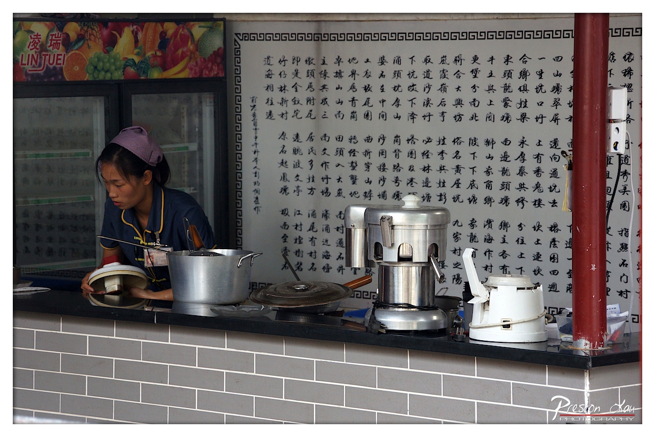
1. Overall Rating (0–10) — 6.8 This photograph captures the quiet intensity of a street food vendor at work, where the rhythm of daily labor is etched into the scene’s details. The juxtaposition of traditional calligraphy and modern kitchen tools creates a layered narrative of cultural continuity and practicality. While the image conveys a strong sense of place and authenticity, its visual impact is slightly diminished by a lack of dynamic lighting and a composition that feels more observational than evocative.
2. Composition (0–10) — 6.5 The subject is placed off-center, creating a sense of candidness, but the cluttered counter and overlapping elements—particularly the red pole on the right—distract from the focal point. A tighter crop could enhance visual clarity and focus on the vendor’s hands and expression.
3. Lighting (0–10) — 5.5 The lighting is flat and functional, likely from overhead fluorescent sources, which flattens the scene’s depth and minimizes texture. While it captures the details clearly, it fails to create mood or highlight the subject’s form.
4. Color & Tone (0–10) — 6.0 The palette is dominated by neutral grays and metallics, punctuated by the purple headscarf and the colorful fruit sign in the upper left. These pops of color are effective but feel slightly disconnected from the rest of the scene, reducing the overall tonal harmony.
5. Creativity (0–10) — 7.0 The image stands out for its cultural specificity and the narrative embedded in the juxtaposition of the handwritten text and modern appliances. The choice to document the vendor’s quiet focus adds a layer of storytelling that feels both authentic and reflective.
6. Technical Quality (0–10) — 7.5 The image is sharp and well-exposed, with clean focus on the central subject. The clarity of the calligraphy and the details on the equipment demonstrate strong technical control.
7. Emotional Impact (0–10) — 6.0 There is a subtle emotional resonance in the vendor’s concentration, suggesting dedication and routine. However, the lack of warmth in the lighting and the busy composition prevent the viewer from fully connecting with the human element of the scene.
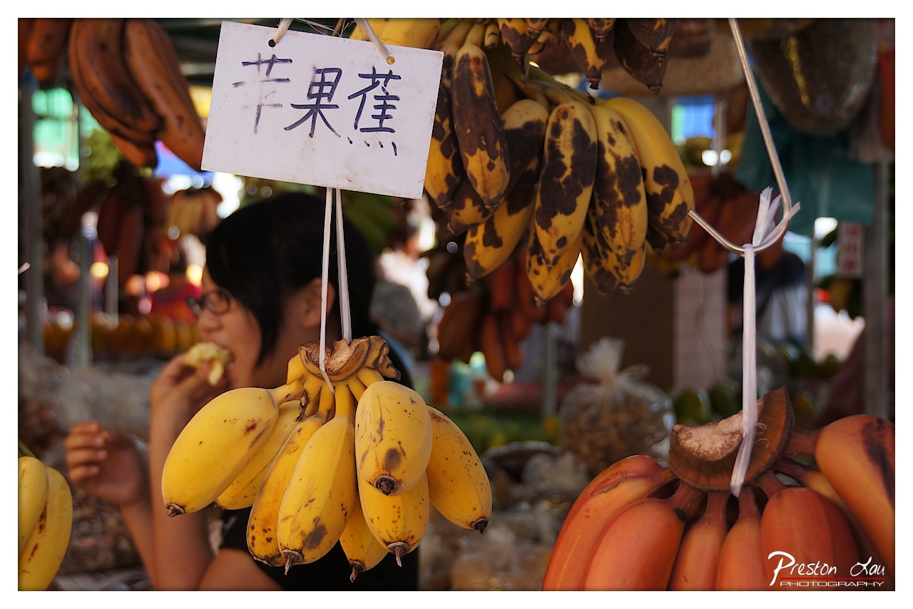
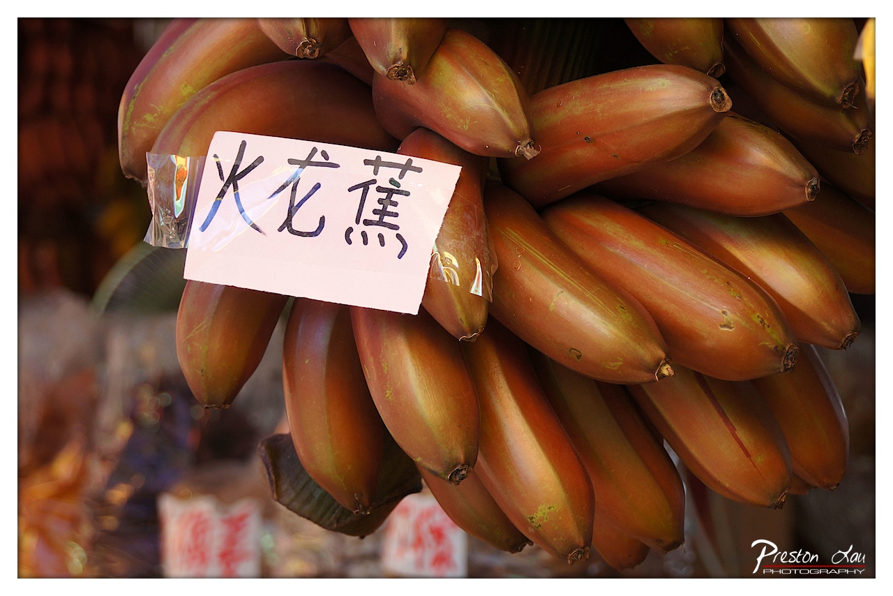
The fruit stalls are equally enticing, showcasing a wide selection of seasonal produce. We were particularly drawn to the diverse kinds of bananas on offer. Following a local recommendation, we purchased the Red Banana, known locally as "red dragon banana" (火龍蕉). These distinctively reddish-purple skinned bananas are typically smaller and plumper than the common yellow varieties. Upon tasting, we discovered they are indeed particularly tasty, offering a sweeter flavor than regular bananas, often with a subtle hint of raspberry or an earthy undertone. Trying this local specialty is definitely a must if you visit the area.
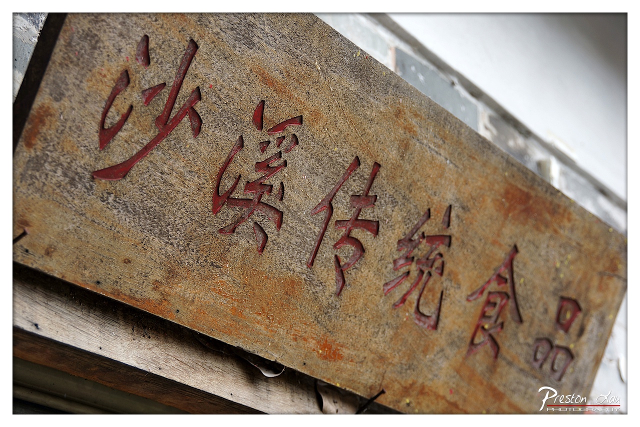
1. Overall Rating (0–10) — 7.0 This photograph captures the quiet dignity of a weathered sign, where time and use have etched stories into its surface. The bold red characters stand out against the aged, textured wood, suggesting a place steeped in tradition and history. While the image is rich in texture and narrative potential, the tight framing and shallow depth of field limit the broader context, leaving the viewer to wonder about the space beyond the sign.
2. Composition (0–10) — 6.5 The diagonal placement of the sign adds dynamic tension, drawing the eye across the frame. However, the tight crop and lack of negative space slightly compress the scene, reducing its visual breathing room.
3. Lighting (0–10) — 7.0 Soft, directional light enhances the texture of the wood and casts subtle shadows within the carved characters, adding depth and dimension. The lighting is natural and unobtrusive, supporting the rustic mood.
4. Color & Tone (0–10) — 7.5 The warm, earthy tones of the wood contrast beautifully with the deep red of the lettering, creating a visually harmonious palette. The slight rust stains and discoloration lend authenticity, while the overall tone feels grounded and organic.
5. Creativity (0–10) — 7.0 The image succeeds in transforming a simple sign into a narrative artifact, evoking a sense of place and tradition. The focus on texture and aging gives it a documentary charm, though it remains more observational than conceptually bold.
6. Technical Quality (0–10) — 8.0 Sharp focus on the characters ensures clarity, while the shallow depth of field isolates the subject effectively. The image is well-exposed and free of distracting artifacts.
7. Emotional Impact (0–10) — 6.5 The photograph evokes a sense of nostalgia and quiet reverence for tradition. While it doesn’t elicit strong emotion, it invites contemplation about heritage, preservation, and the passage of time.
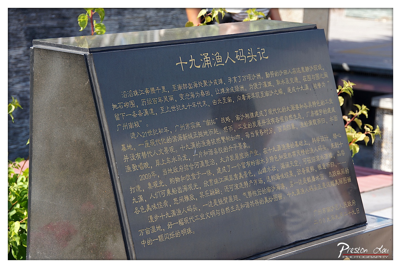
1. Overall Rating (0–10) — 7.0 This photograph captures the quiet dignity of a historical marker, where text becomes both a narrative and a monument to place. The angled composition and soft sunlight lend a contemplative mood, while the contrast between the dark plaque and golden lettering draws the eye with clarity. Though the image is rich in cultural detail, it remains somewhat restrained in its visual drama, prioritizing documentation over emotional resonance.
2. Composition (0–10) — 7.0 The tilted angle of the plaque creates a dynamic diagonal, guiding the viewer’s gaze across the text. The inclusion of green foliage in the foreground adds depth and frames the subject, though the right side feels slightly unbalanced.
3. Lighting (0–10) — 7.5 Natural sunlight illuminates the plaque from the upper left, casting a soft glow on the inscriptions and creating subtle highlights on the polished surface. The light enhances legibility while preserving a calm, dignified atmosphere.
4. Color & Tone (0–10) — 6.5 The deep black of the plaque contrasts with the warm gold of the text and the lush green of the plants, creating a harmonious palette. The overall tone is subdued, with a slight coolness in the shadows that tempers the warmth of the sunlight.
5. Creativity (0–10) — 6.0 While the image is technically sound and informative, its creativity lies more in its storytelling than in visual innovation. The focus on text and historical context suggests a documentary intent rather than a bold artistic statement.
6. Technical Quality (0–10) — 8.0 Sharp focus across the plaque ensures readability of the text, and the exposure is well-balanced. The depth of field is sufficient to keep the main subject clear while gently blurring the background.
7. Emotional Impact (0–10) — 6.5 The image evokes a sense of reverence and reflection, inviting the viewer to pause and consider the history embedded in the land. Though not emotionally overwhelming, it carries a quiet weight of memory and continuity.
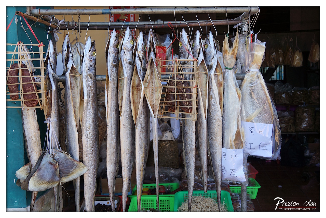
1. Overall Rating (0–10) — 7.0 This photograph captures the raw, unfiltered atmosphere of a traditional fish market, where preservation and commerce intertwine in a visually compelling tableau. The hanging fish, their silvery bodies and wide eyes frozen in time, create a rhythmic pattern that draws the eye through the frame, while the scattered baskets and handwritten signs lend an authentic, lived-in quality. Though the image is rich in texture and cultural detail, its slightly cluttered composition and flat lighting prevent it from achieving a more refined aesthetic, leaving it as a strong documentary piece rather than a polished work of art.
2. Composition (0–10) — 6.5 The vertical alignment of the fish creates a strong linear rhythm, but the asymmetrical placement of the baskets and signage disrupts visual balance. A tighter crop would improve focus and eliminate distracting background elements.
3. Lighting (0–10) — 5.5 Natural light from the side casts soft shadows, but the overall exposure is uneven—some fish are overexposed while others fall into shadow. The lighting is functional but lacks the warmth or drama needed to elevate the mood.
4. Color & Tone (0–10) — 6.0 The palette is dominated by muted grays and browns, punctuated by the green baskets and the red of the hanging sausage. While the colors are authentic to the scene, they lack vibrancy and tonal richness, contributing to a somewhat flat appearance.
5. Creativity (0–10) — 7.0 The image successfully captures a slice of daily life with an almost ethnographic precision. The juxtaposition of dried fish, woven baskets, and handwritten labels suggests a story of tradition and sustenance, offering a glimpse into a culture rooted in preservation and commerce.
6. Technical Quality (0–10) — 7.5 Sharp focus is maintained across the central subjects, with clear detail in the fish scales and textures of the woven baskets. The depth of field is appropriate, though some background elements are slightly soft.
7. Emotional Impact (0–10) — 6.5 There’s a quiet dignity in the scene—of labor, of tradition, of quiet resilience. The image evokes a sense of place and time, but the emotional resonance is restrained by the lack of dramatic lighting and a more intimate framing.
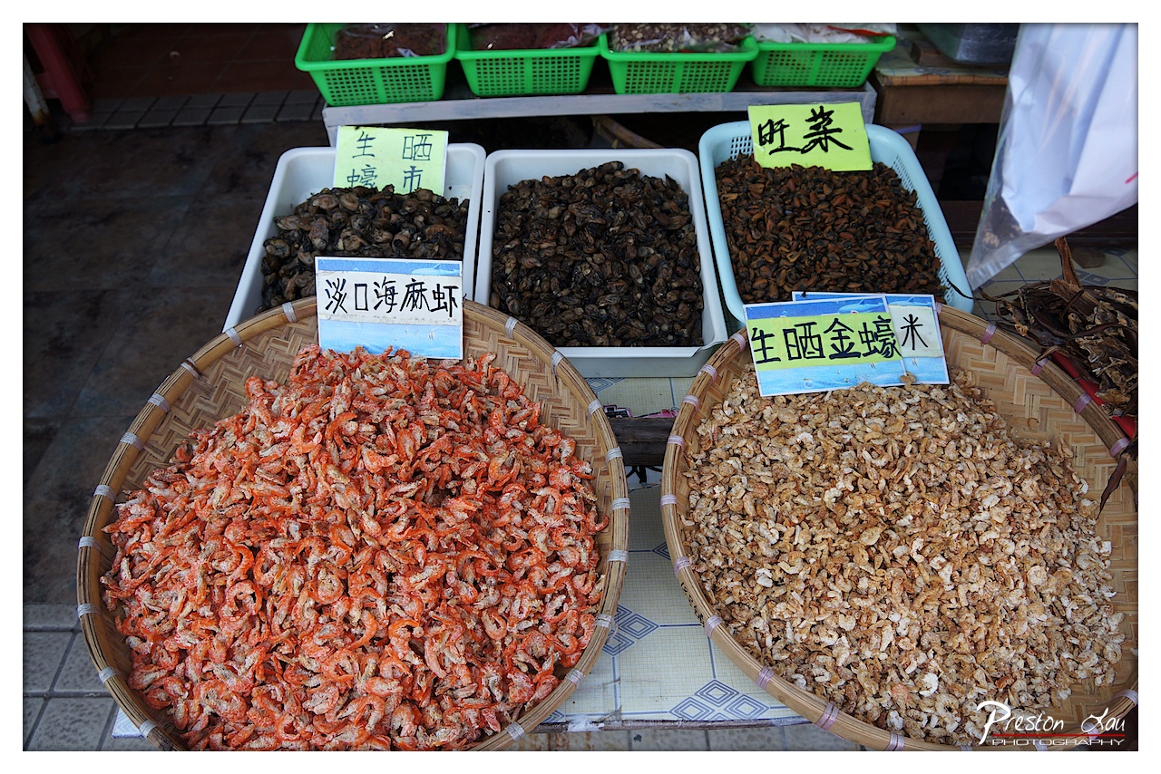
1. Overall Rating (0–10) — 7.0 This photograph captures the vibrant texture and color of a traditional market display, where dried seafood and grains are arranged with a sense of rustic authenticity. The warm orange of the dried shrimp contrasts beautifully with the earthy tones of the other goods, creating a visually engaging composition that evokes the sensory richness of a local marketplace. While the scene is rich in detail, the slightly cluttered background and informal framing limit its overall aesthetic cohesion.
2. Composition (0–10) — 6.5 The foreground baskets dominate the frame, creating a strong visual anchor, while the mid-ground containers and signs provide context. However, the uneven arrangement and overlapping elements introduce a sense of visual busyness that slightly undermines balance.
3. Lighting (0–10) — 6.0 Natural light illuminates the scene evenly, preserving the natural colors of the dried goods. The absence of harsh shadows enhances clarity, though the lighting lacks directional drama, resulting in a flat, documentary feel.
4. Color & Tone (0–10) — 7.5 The palette is rich and grounded, with warm oranges, browns, and the green of the baskets creating a harmonious earthy tone. The contrast between the vivid shrimp and the subdued background draws the eye effectively.
5. Creativity (0–10) — 7.0 The image captures an everyday market scene with a strong sense of cultural specificity. The use of hand-written signs and traditional baskets adds authenticity, though the approach is observational rather than conceptual.
6. Technical Quality (0–10) — 8.0 The image is sharp and well-focused, with clear details in the textures of the dried seafood. The resolution is high, and the exposure is well-balanced, capturing fine detail without overexposure.
7. Emotional Impact (0–10) — 6.5 The photograph conveys a sense of place and tradition, inviting the viewer to imagine the smells, sounds, and rhythms of a local market. While it is engaging, the emotional resonance is more documentary than deeply evocative.
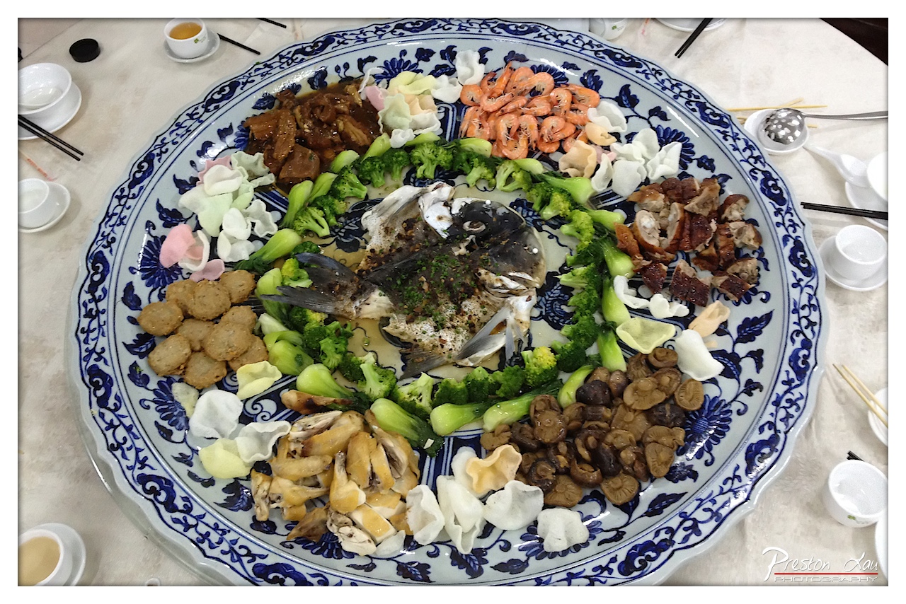
1. Overall Rating (0–10) — 7.0 This image captures the lavish abundance of a traditional Chinese banquet, where a central fish dish is surrounded by an array of meticulously arranged ingredients, evoking a sense of celebration and cultural richness. The ornate blue-and-white platter enhances the visual opulence, though the composition feels slightly crowded, pulling focus from the symbolic centerpiece. While the photograph succeeds in conveying the feast’s grandeur, its documentary quality limits its artistic depth.
2. Composition (0–10) — 6.5 The circular arrangement of food creates a natural focal point around the fish, but the overhead perspective and cluttered table edges disrupt visual flow. A tighter crop would emphasize the dish’s symmetry and cultural significance.
3. Lighting (0–10) — 5.5 Harsh overhead lighting flattens the scene, casting minimal shadows and washing out subtle textures. While functional for clarity, it lacks the warmth and directionality needed to enhance the dish’s appeal.
4. Color & Tone (0–10) — 6.0 The dominant blue-and-white pattern provides a striking contrast to the varied hues of the food—golden fried items, vibrant greens, and rich browns. However, the overall tone is slightly cool and desaturated, reducing the vibrancy of the ingredients.
5. Creativity (0–10) — 7.0 The image celebrates cultural tradition through its subject and composition, presenting a feast as both a culinary and symbolic act. The choice to highlight the full platter, rather than a close-up, reflects a documentary yet celebratory intent.
6. Technical Quality (0–10) — 7.5 Sharp focus and clear detail allow individual ingredients to be distinguished. The image is well-exposed, though slight chromatic aberration and a busy frame slightly detract from technical polish.
7. Emotional Impact (0–10) — 6.5 The photograph evokes a sense of communal joy and abundance, resonating with themes of festivity and togetherness. While it captures the essence of the occasion, the lack of human presence tempers its emotional intimacy.
Our two-day weekend trip to Zhongshan, combined with the culinary adventure in nearby Nansha, provided a rich blend of historical insight and gastronomic delight. Exploring the roots of modern China at Dr. Sun Yat-sen's Former Residence and indulging in the freshest seafood and local fruits at Nansha Nineteenth Yong made for a rewarding and truly authentic Pearl River Delta experience.
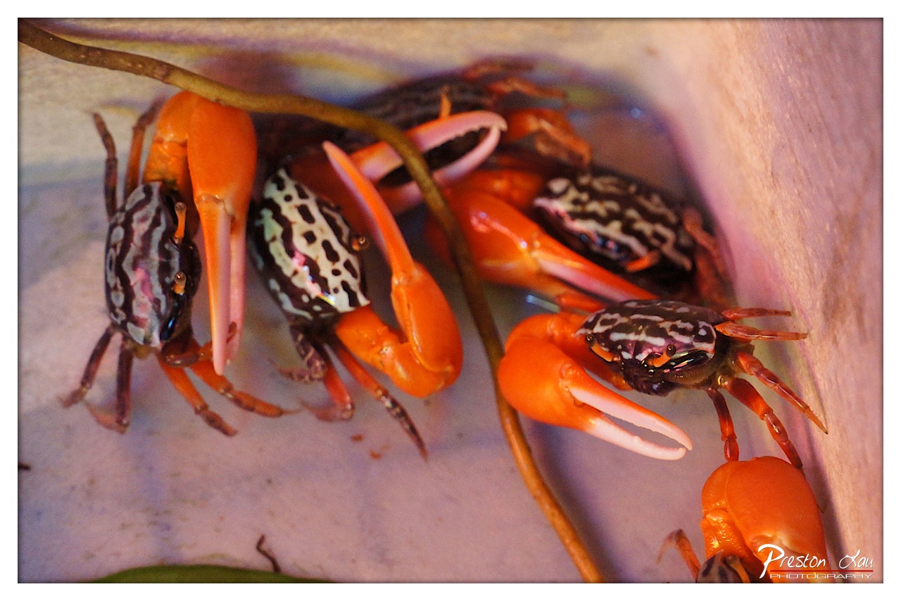
1. Overall Rating (0–10) — 7.5 This photograph captures a vibrant, almost theatrical moment among a cluster of brightly colored crabs, where the interplay of vivid orange claws and patterned shells creates a dynamic, eye-catching composition. The warm, saturated tones and tight framing emphasize the natural textures and intricate details of the crabs, giving the image a sense of life and movement. While the lighting enhances the colors effectively, the slight overexposure in the highlights and the soft focus in the background detract from the overall clarity, keeping the image from achieving a more refined aesthetic.
2. Composition (0–10) — 7.0 The crabs are arranged diagonally across the frame, creating a sense of movement and depth. The inclusion of the thin branch adds a natural, organic element that guides the eye through the scene. However, the slight clutter and overlapping bodies reduce visual clarity, and the right side feels slightly unbalanced due to the more prominent crab partially cut off.
3. Lighting (0–10) — 8.0 The lighting is warm and directional, highlighting the glossy texture of the crabs' shells and casting subtle shadows that add dimension. The use of a soft, diffused light source enhances the vibrant colors without creating harsh glare, though some areas—particularly the upper right—show slight overexposure.
4. Color & Tone (0–10) — 8.5 The palette is striking, with rich oranges, deep blacks, and whites creating a high-contrast, visually engaging image. The warm tone enhances the organic, almost tropical feel, while the color harmony between the crabs and their surroundings is strong and cohesive.
5. Creativity (0–10) — 8.0 The photograph captures an unusual, intimate moment in nature, showcasing the crabs in a way that feels both documentary and artistic. The choice to focus closely on their intricate patterns and vivid colors transforms a simple scene into something visually compelling and memorable.
6. Technical Quality (0–10) — 7.5 The image is sharp in the focal plane, with fine detail visible on the crabs’ shells and claws. The depth of field is appropriately shallow, isolating the main subjects. However, slight softness in the background and minor overexposure in the highlights slightly reduce the overall technical precision.
7. Emotional Impact (0–10) — 7.0 The image evokes a sense of wonder and fascination with the natural world, inviting the viewer to appreciate the beauty in small, often overlooked creatures. The warmth and vibrancy of the scene create a feeling of energy and life, though the lack of broader context keeps the emotional connection somewhat limited.
1. Overall Rating (0–10) — 7.0 This photograph captures the vibrant, lived-in energy of a Southeast Asian market, where commerce and daily life intertwine. The warm, golden light and the natural candidness of the woman eating a banana lend authenticity and intimacy to the scene. While the depth of field is well-managed, the composition’s busyness risks diluting the focus, and the signage, though culturally rich, remains slightly distracting.
2. Composition (0–10) — 6.5 The foreground bananas frame the scene effectively, drawing the eye toward the central subject. However, the overlapping elements and cluttered background create visual noise, slightly undermining the intended focus on the woman and the fruit.
3. Lighting (0–10) — 7.5 The soft, diffused sunlight filters through the market canopy, casting a warm glow that enhances the golden tones of the bananas and gives the image a natural, sun-drenched feel. The lighting contributes to the atmosphere without creating harsh shadows.
4. Color & Tone (0–10) — 7.0 The rich yellows and deep browns of the bananas create a warm, earthy palette that feels inviting and authentic. The muted background tones help the subject stand out, though the overall saturation could be slightly more balanced to avoid a muddy effect.
5. Creativity (0–10) — 7.5 The photograph captures a candid moment that feels both personal and culturally specific. The use of the handwritten sign in Chinese characters adds narrative depth, suggesting a story of local commerce and daily life, making the image more than just a snapshot.
6. Technical Quality (0–10) — 8.0 Sharp focus on the foreground bananas and the woman’s face ensures clarity, while the shallow depth of field beautifully blurs the background. The image is well-exposed, with no noticeable technical flaws.
7. Emotional Impact (0–10) — 7.0 The image evokes a sense of quiet joy and authenticity, inviting the viewer into a moment of simple pleasure. The candid nature of the woman eating and the bustling market environment create a subtle emotional connection, though the distance created by the framing slightly limits the immediacy.
1. Overall Rating (0–10) — 7.0 This image captures the warm, earthy tones of a bunch of red bananas with a sense of quiet authenticity, evoking the atmosphere of a bustling market. The handwritten label adds a personal, cultural touch, grounding the scene in everyday life. While the composition is visually engaging, the shallow depth of field and slightly cluttered background prevent the image from achieving greater visual harmony.
2. Composition (0–10) — 6.5 The bananas are well-centered and fill the frame effectively, drawing the eye to the label. However, the out-of-focus background elements create visual distraction, slightly weakening the overall balance.
3. Lighting (0–10) — 7.0 Soft, natural light enhances the rich textures and warm tones of the bananas, creating a gentle glow that highlights their form. The lighting is even and flattering, though it lacks dramatic contrast.
4. Color & Tone (0–10) — 7.5 The warm, reddish-brown hues of the bananas are rich and inviting, complemented by the soft pink of the label. The color palette is cohesive and evocative, creating a sense of warmth and familiarity.
5. Creativity (0–10) — 6.5 The image offers a simple yet effective cultural snapshot, using everyday objects to tell a quiet story. While not groundbreaking, the choice of subject and the handwritten label add a layer of authenticity and charm.
6. Technical Quality (0–10) — 8.0 The focus is sharp on the bananas and the label, with excellent clarity and detail. The shallow depth of field is well-executed, isolating the subject effectively.
7. Emotional Impact (0–10) — 6.5 The photograph conveys a sense of quiet observation and cultural curiosity, inviting the viewer to consider the story behind the scene. While it doesn’t evoke strong emotion, it leaves a lasting impression of authenticity and warmth.
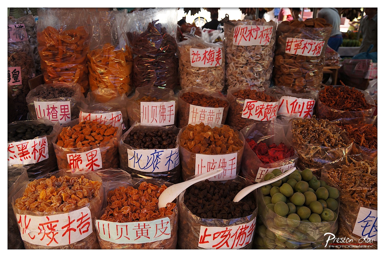
1. Overall Rating (0–10) — 7.5 This photograph bursts with the vibrant chaos of a bustling Asian market, where the abundance of dried fruits and snacks creates a rich tapestry of texture and color. The handwritten signs in Chinese add authenticity and cultural depth, drawing the viewer into a sensory world of flavor and tradition. While the composition is visually dense, the image succeeds in capturing the energy and variety of the scene, though the sheer number of elements risks overwhelming the eye.
2. Composition (0–10) — 6.5 The frame is tightly packed with bags of dried goods, creating a layered, almost overwhelming depth. The central placement of the green plums and the white scoops provide visual anchors, but the lack of clear leading lines or negative space makes the arrangement feel cluttered rather than cohesive.
3. Lighting (0–10) — 7.0 Natural light illuminates the scene from above, casting soft shadows that enhance texture and depth. The light highlights the glistening surfaces of the dried fruits, adding a sense of richness and warmth. Slight overexposure in the background slightly flattens the top of the frame, but overall the lighting supports the lively mood.
4. Color & Tone (0–10) — 8.0 The palette is rich and varied, with deep oranges, browns, and reds of the dried fruits contrasting against the bright green plums and the white of the scoops and labels. The warm tones evoke a sense of abundance and earthiness, while the handwritten signs add pops of red and blue that draw the eye.
5. Creativity (0–10) — 7.0 The photograph captures a moment of cultural specificity with authenticity and immediacy. The use of handwritten labels and the natural arrangement of goods lend a documentary feel, but the composition leans more toward observation than deliberate storytelling, missing a stronger narrative thread.
6. Technical Quality (0–10) — 8.0 The image is sharp and detailed, with clear focus on the foreground elements. The depth of field is well-managed, keeping the central items crisp while allowing the background to softly blur. The color balance is natural, and the exposure is well-handled, despite minor overexposure in highlights.
7. Emotional Impact (0–10) — 7.5 The image evokes a sense of curiosity and nostalgia, inviting the viewer to imagine the tastes, smells, and sounds of a busy market. The abundance and variety of goods create a feeling of warmth and generosity, while the handwritten signs add a personal, human touch that enhances emotional connection.
1. Overall Rating (0–10) — 7.0 This photograph captures the vibrant, chaotic energy of a seafood market, where the abundance of fresh shellfish and squid speaks to the rhythm of daily life. The vivid colors of the plastic crates create a lively, almost rhythmic pattern, while the wet surfaces and organic textures lend a sense of immediacy and authenticity. Though the composition is dense and slightly overwhelming, it effectively conveys the sensory richness of a bustling marketplace, where life and commerce move in tandem.
2. Composition (0–10) — 6.5 The image is tightly framed, emphasizing the abundance of seafood and creating a sense of immersion. However, the overlapping crates and lack of clear focal point result in a visually busy scene that can feel slightly disorganized.
3. Lighting (0–10) — 6.0 Natural light illuminates the scene evenly, enhancing the textures of the shells and water. The reflections on the wet surfaces add depth, but the absence of directional light limits dramatic contrast and shadow play.
4. Color & Tone (0–10) — 8.0 The bold pink, blue, and turquoise crates create a striking, almost playful palette that contrasts beautifully with the earthy tones of the seafood. The color saturation is strong, lending vibrancy without appearing oversaturated.
5. Creativity (0–10) — 7.0 The photograph transforms a mundane market scene into a visually engaging study of pattern, texture, and color. The use of repetition and symmetry in the crates adds a conceptual layer, elevating the image beyond simple documentation.
6. Technical Quality (0–10) — 8.0 The image is sharp and well-focused, with clear detail in the shells and water. The white balance is accurate, preserving the natural tones of the scene, and the resolution is high, allowing for fine texture to be visible.
7. Emotional Impact (0–10) — 6.5 The image evokes a sense of authenticity and vitality, drawing the viewer into the sensory world of the market. While it captures the essence of daily life, it lacks a deeper emotional narrative, leaving the viewer as an observer rather than a participant.