The blog visited the Noboribetsu Marine Park Nixe and Hokkaido Jingu Shrine, learning about Shintoism and its significance in Japan. It also made homemade ice cream at Lake Hill Farm using fresh Hokkaido milk. In Otaru city, it explored Sakaimachi Street's shops, cafes, and museums, including a Music Box Museum and a LeTao Desert Shop known for its delicious cheesecake.
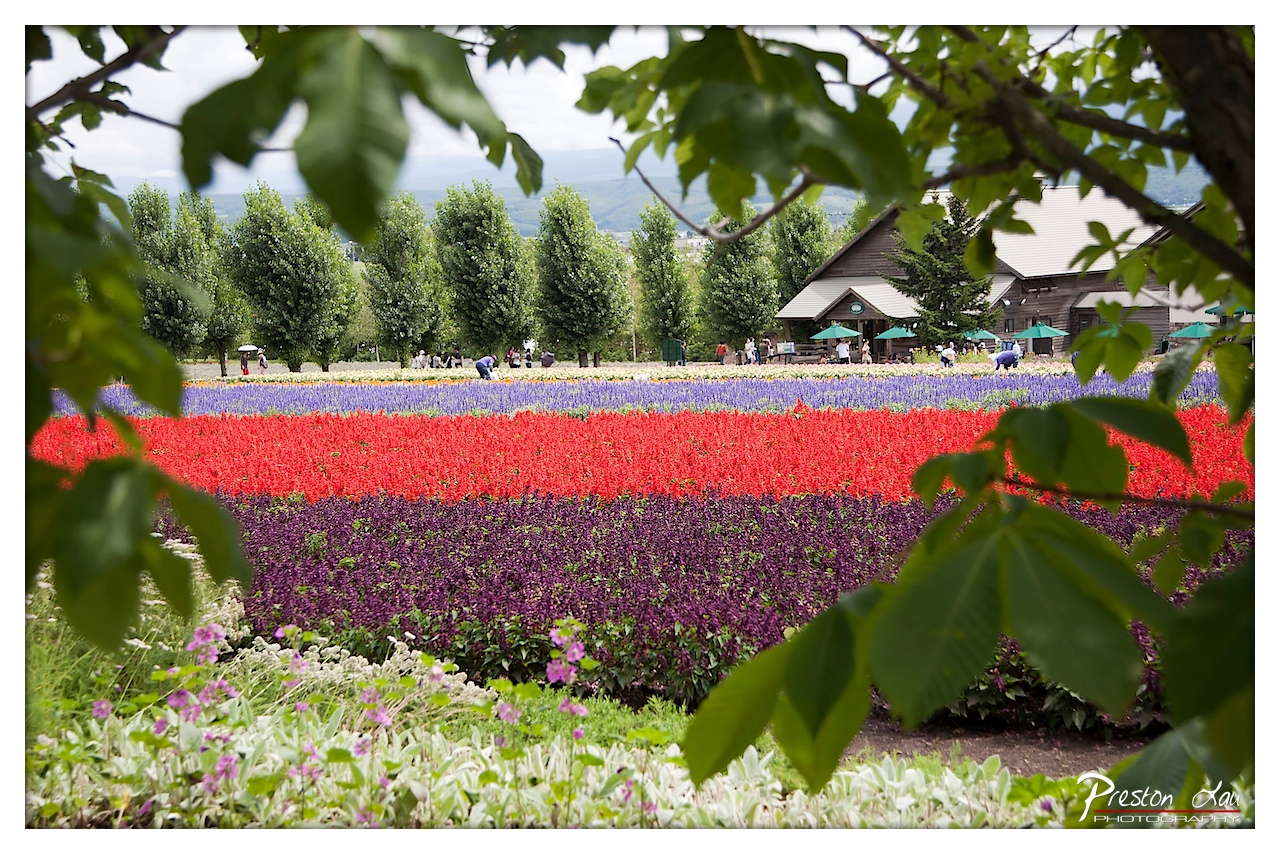

1. Overall Rating (0–10) — 7.5
This photograph captures the vibrant energy of a flower garden with a natural, inviting framing that draws the viewer into its colorful expanse. The layered composition, with foreground leaves and vivid rows of blooms, creates a sense of depth and immersion. While the image is visually rich, the slightly overcast lighting tempers the vibrancy of the colors, and the distant background feels somewhat lost in the soft focus.
2. Composition (0–10) — 8.0
The framing through the leafy branches provides a natural vignette, enhancing depth and directing attention toward the colorful flower beds. The horizontal bands of color create strong visual rhythm, and the placement of the wooden building on the right balances the composition, though the scattered figures add a subtle sense of chaos.
3. Lighting (0–10) — 6.5
Diffused, overcast light softens shadows and evenly illuminates the scene, preserving detail across the field. However, this also mutes the intensity of the reds and purples, giving the image a slightly flat quality that limits the emotional punch of the colors.
4. Color & Tone (0–10) — 8.0
The palette is rich and varied, with bold reds, deep purples, and soft blues creating a dynamic contrast against the green foliage. The natural framing and tonal range lend the image a painterly quality, though the cool overall tone slightly dampens the warmth of the flowers.
5. Creativity (0–10) — 7.5
The use of natural framing through the leaves adds a unique, organic perspective, transforming a standard landscape into a more intimate, story-driven scene. The composition feels deliberate and thoughtful, inviting the viewer to look beyond the obvious and explore the layers of the garden.
6. Technical Quality (0–10) — 8.0
Sharp focus on the midground flowers ensures clarity and detail, while the background remains softly blurred, creating a pleasing depth of field. The exposure is balanced, with no blown highlights or crushed shadows, and the image is clean with minimal noise.
7. Emotional Impact (0–10) — 7.0
The photograph evokes a sense of peaceful joy and natural beauty, enhanced by the harmonious colors and quiet atmosphere. The presence of people in the distance adds a subtle human element, suggesting a shared moment of appreciation for nature, though the overall mood remains somewhat detached due to the distance of the framing.
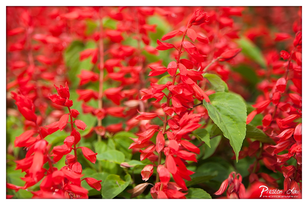

1. Overall Rating (0–10) — 8.0
This photograph bursts with vibrant energy, capturing the lush intensity of red salvia flowers in full bloom. The vivid color palette and shallow depth of field create a dreamy, immersive quality that draws the viewer into the floral tapestry. While the image is visually striking, a slightly more deliberate focus on a single stem could elevate its narrative clarity.
2. Composition (0–10) — 7.5
The central cluster of red blooms serves as a strong focal point, with the surrounding flowers softly blurred to guide the eye. The placement of the green leaf adds balance and contrast, though the composition feels slightly crowded, with too much visual noise in the background.
3. Lighting (0–10) — 8.0
Natural, diffused light enhances the saturation of the reds without harsh shadows, giving the scene a soft, luminous glow. The even exposure preserves detail in both the petals and foliage, creating a harmonious and inviting atmosphere.
4. Color & Tone (0–10) — 9.0
The rich reds and complementary greens create a dynamic, high-contrast palette that feels both bold and balanced. The tonal range is well-managed, with the warm hues evoking passion and vitality.
5. Creativity (0–10) — 8.5
The photographer’s use of a shallow depth of field transforms a common floral scene into a painterly composition, emphasizing texture and form. The choice to focus on the interplay between color and blur demonstrates a strong artistic sensibility.
6. Technical Quality (0–10) — 8.0
The image is sharp where it counts, with clean focus on the foreground flowers and smooth bokeh in the background. The exposure and color rendering are precise, reflecting skilled technical execution.
7. Emotional Impact (0–10) — 8.5
The image evokes a sense of natural exuberance and beauty, inviting the viewer to pause and appreciate the vibrancy of life. The warmth and intensity of the reds stir feelings of joy and passion, making the photograph both visually and emotionally engaging.
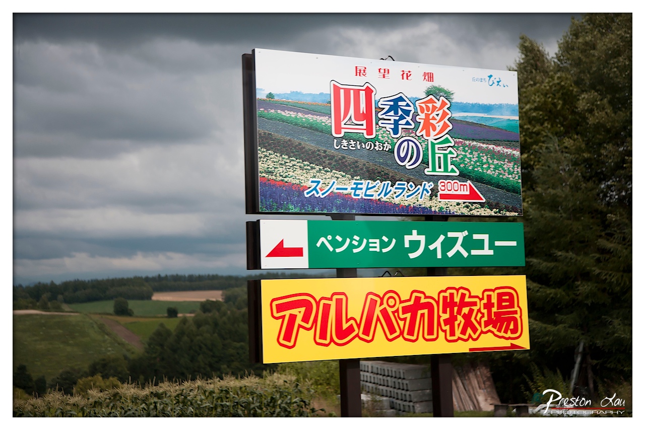

1. Overall Rating (0–10) — 6.0
This photograph captures a quiet, rural moment in Japan, where signage and landscape converge to tell a story of place and direction. The dramatic, overcast sky adds a moody atmosphere that contrasts with the bright, colorful signs, creating visual tension. While the image effectively communicates location and intent, its potential is slightly undercut by a lack of compositional refinement and a sense of visual clutter.
2. Composition (0–10) — 5.5
The signs dominate the frame, creating a strong vertical axis, but their placement disrupts the natural balance of the landscape. The background scenery—rolling hills and trees—feels compressed and secondary, diminishing the sense of depth. A more intentional crop or angle could better integrate the signs with the environment.
3. Lighting (0–10) — 5.0
The diffuse, overcast light flattens the scene, reducing shadows and depth. While it prevents harsh contrasts, it also mutes the vibrancy of the signs and the natural tones of the landscape. The lighting supports mood but fails to enhance detail or texture.
4. Color & Tone (0–10) — 5.5
The bold reds, yellows, and greens of the signs stand out sharply against the muted, gray-green backdrop, creating a strong visual contrast. However, the overall palette feels unbalanced, with the signs overpowering the natural tones. A more harmonious integration of color could improve the image’s aesthetic cohesion.
5. Creativity (0–10) — 6.0
The juxtaposition of vivid commercial signage against a moody, natural landscape offers an interesting narrative—of human presence in rural space. The choice to frame the scene this way is thoughtful, though the execution lacks subtlety, leaning toward the literal rather than the poetic.
6. Technical Quality (0–10) — 7.0
The image is sharp and clear, with clean focus across the frame. The exposure is well-managed, capturing detail in both the signs and the background. The watermark is unobtrusive, and there are no visible flaws in the capture.
7. Emotional Impact (0–10) — 5.0
The image evokes a sense of quiet anticipation, as if standing at a crossroads between nature and human design. However, the emotional resonance is limited by the dominance of signage and the lack of human presence. It feels more like a documentation than an evocative moment.
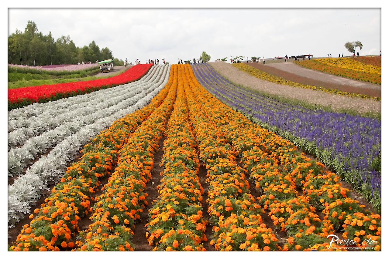

1. Overall Rating (0–10) — 8.0
This photograph captures the breathtaking grandeur of a vast, color-swept flower field, where human design and nature converge in a vivid tapestry. The sweeping rows of marigolds, lavender, and silver foliage create a rhythmic, almost musical visual flow, drawing the eye deep into the frame. While the composition is striking and the palette vibrant, the scene’s artificiality—evident in the perfectly manicured lines and scattered visitors—moderates its emotional depth, giving it the feel of a spectacular spectacle rather than an intimate moment.
2. Composition (0–10) — 9.0
The strong leading lines of the flower beds guide the viewer’s gaze toward the horizon, creating a sense of depth and scale. The diagonal arrangement of the rows adds dynamism, while the central placement of the orange marigolds anchors the composition and draws focus.
3. Lighting (0–10) — 7.0
The soft, diffused light of an overcast day evenly illuminates the scene, preventing harsh shadows and allowing the colors to appear rich and saturated. This lighting enhances the natural vibrancy of the flowers without overpowering them.
4. Color & Tone (0–10) — 9.0
The palette is a bold and harmonious blend of warm oranges, cool purples, silvers, and reds, creating a visually striking contrast. The tonal balance is well-managed, with each color standing out clearly while contributing to the overall cohesion of the image.
5. Creativity (0–10) — 8.0
The photographer captures a highly stylized landscape with a clear sense of intention—transforming a cultivated garden into a work of visual art. The use of color and perspective to evoke rhythm and movement demonstrates thoughtful creativity.
6. Technical Quality (0–10) — 8.5
The image is sharp and detailed, with excellent clarity in the foreground and midground. The focus is consistent across the frame, and the wide-angle perspective is handled skillfully to preserve the scene’s grandeur.
7. Emotional Impact (0–10) — 7.5
The photograph evokes a sense of awe and wonder at the beauty of human-crafted nature. While the scale and color are exhilarating, the presence of visitors and the structured layout lend a slightly detached, almost surreal quality, keeping the emotional connection from fully resonating.
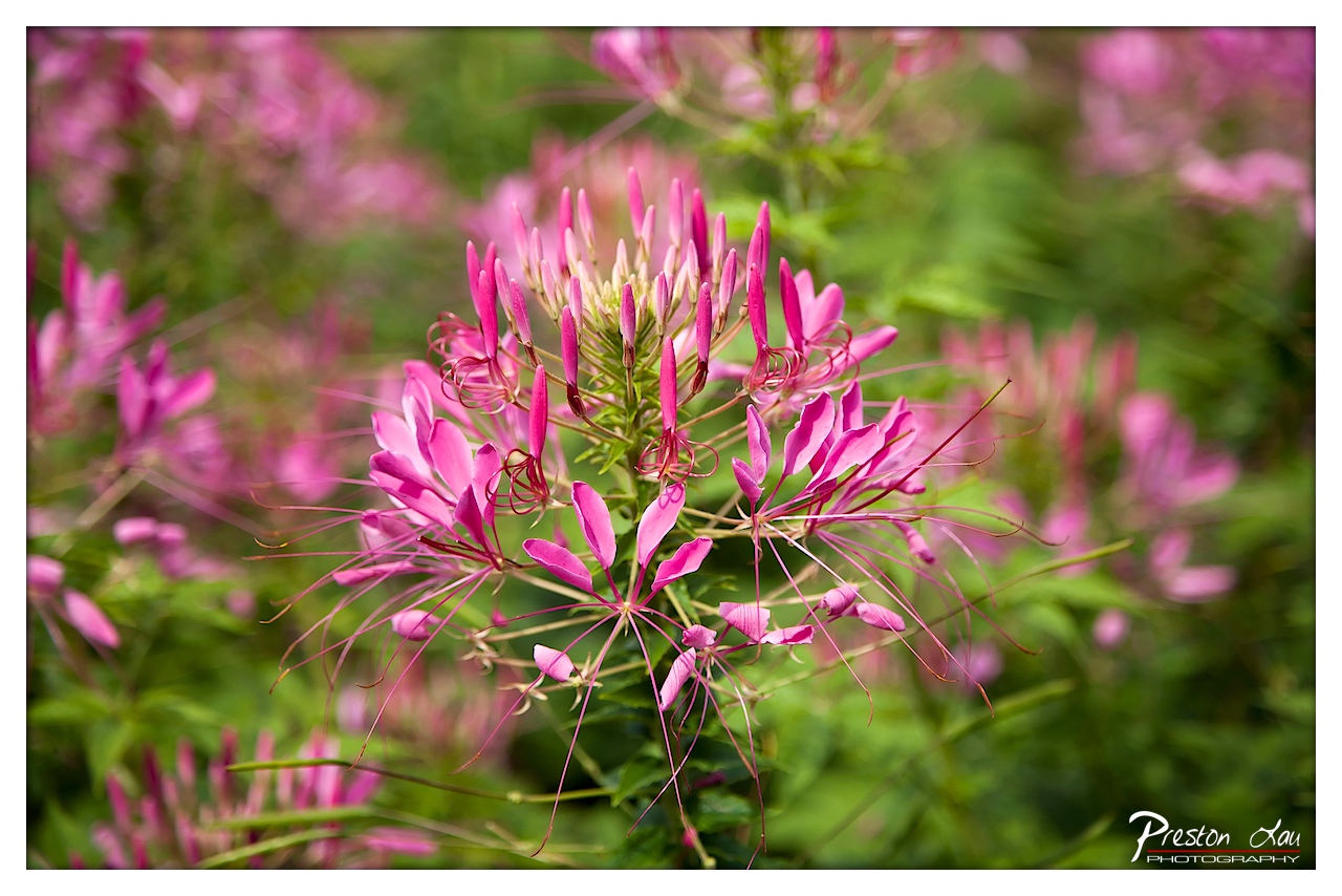

1. Overall Rating (0–10) — 8.0
This image captures the delicate complexity of a spider flower in full bloom, its vibrant pink filaments radiating with a sense of organic grace. The shallow depth of field beautifully isolates the subject, creating a dreamy, painterly effect that draws the eye to the intricate details. While the composition is strong and the colors rich, the image occasionally borders on oversaturated, slightly diminishing its natural subtlety.
2. Composition (0–10) — 8.5
The flower is centered with a balanced arrangement of elongated stamens, creating a natural focal point. The soft, blurred background enhances the subject’s prominence, while the surrounding blooms add depth without distraction.
3. Lighting (0–10) — 7.5
Natural daylight illuminates the scene evenly, highlighting the flower’s texture and color. The light is soft and diffused, avoiding harsh shadows and enhancing the delicate structure of the petals.
4. Color & Tone (0–10) — 8.5
The vivid magenta of the flower contrasts strikingly with the lush green backdrop, creating a dynamic and harmonious palette. The tones are rich and saturated, lending an almost luminous quality to the image.
5. Creativity (0–10) — 8.0
The photographer uses selective focus and color contrast to transform a simple botanical subject into a visually compelling narrative. The composition evokes a sense of intimacy and wonder, celebrating the quiet beauty of nature.
6. Technical Quality (0–10) — 8.0
The image is sharp in focus on the central flower, with excellent clarity and detail. The depth of field is well-controlled, and the sensor noise is minimal, indicating high technical proficiency.
7. Emotional Impact (0–10) — 8.0
The photograph evokes a sense of serenity and delicate beauty, inviting the viewer to pause and appreciate the intricate details of the natural world. The soft focus and vibrant colors create a meditative, almost romantic atmosphere.
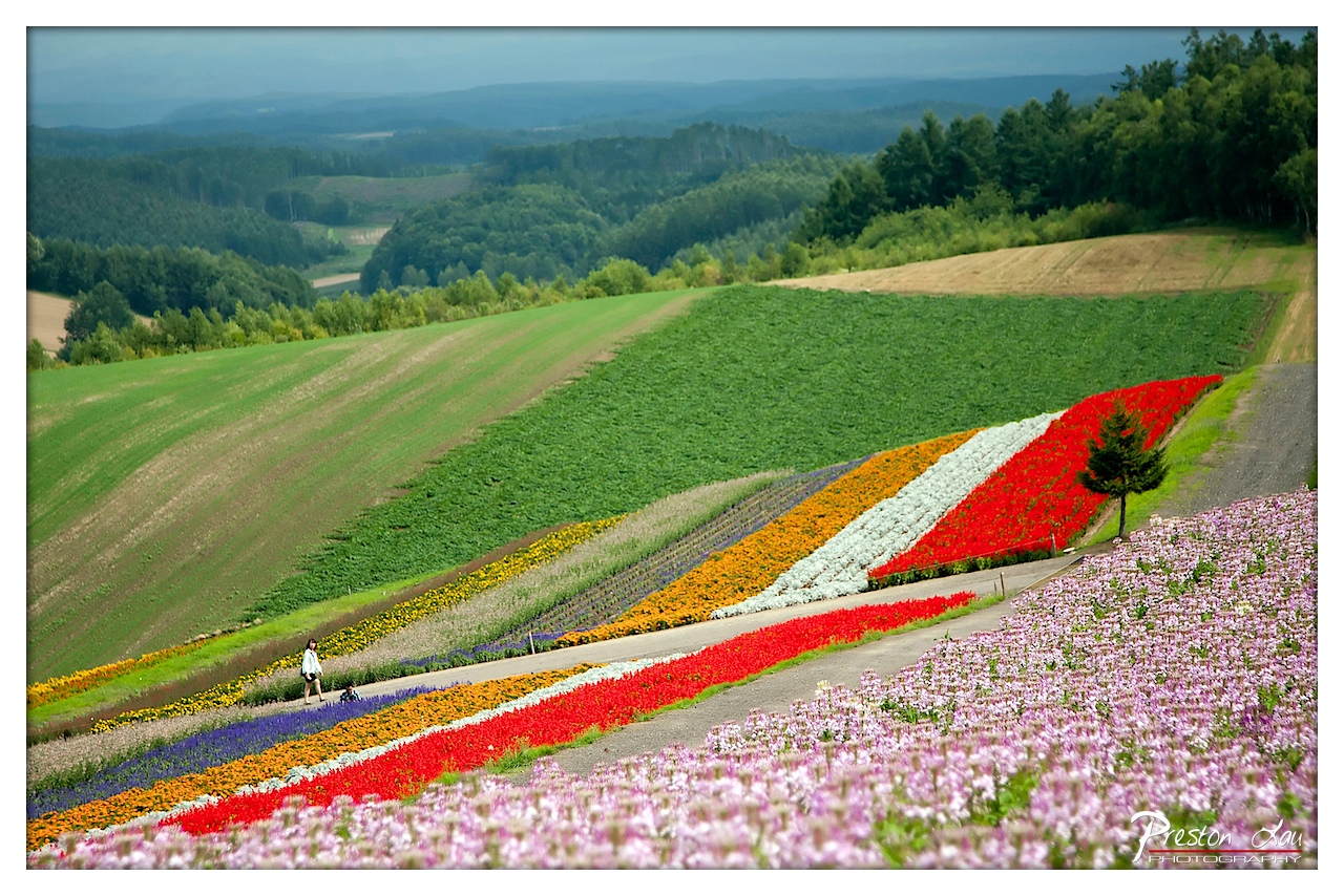

1. Overall Rating (0–10) — 8.0
This photograph captures the breathtaking harmony of cultivated nature, where vibrant flower fields cascade down a rolling hillside like a painter’s palette laid across the landscape. The bold colors and sweeping composition evoke a sense of wonder and tranquility, while the solitary figure adds a human scale that grounds the scene in reality. While the image is visually arresting, the slight oversaturation of the colors and the heavy-handed use of contrast temper its subtlety, preventing it from achieving true refinement.
2. Composition (0–10) — 8.5
The diagonal sweep of the flower beds creates a dynamic leading line that guides the eye from the foreground into the distance, enhancing depth and movement. The placement of the lone figure adds balance and scale, while the framing effectively captures both the intimacy of the flower fields and the vastness of the surrounding hills.
3. Lighting (0–10) — 7.0
The soft, diffused light suggests an overcast day, which evenly illuminates the scene and minimizes harsh shadows. This lighting enhances the richness of the colors while maintaining a calm, serene mood. However, the lack of directional light slightly reduces the three-dimensionality of the landscape.
4. Color & Tone (0–10) — 9.0
The palette is striking and vivid, with bold stripes of red, orange, white, and purple creating a visually rhythmic pattern. The contrast between the warm flower colors and the cool green and blue tones of the hills enhances the image’s vibrancy. While the saturation is pushed, it contributes to the photograph’s energetic and almost dreamlike quality.
5. Creativity (0–10) — 8.0
The image demonstrates a strong artistic vision, transforming a natural landscape into a stylized, almost surreal tapestry. The deliberate arrangement of the flowers and the inclusion of the walking figure suggest a narrative of exploration and discovery, elevating the scene beyond mere scenery into a celebration of human connection with nature.
6. Technical Quality (0–10) — 8.0
The photograph is sharp and well-focused throughout, with fine detail visible in the flowers and distant trees. The exposure is balanced, and the image retains clarity even in the darker areas of the frame. The slight color manipulation, while noticeable, does not detract significantly from the overall technical excellence.
7. Emotional Impact (0–10) — 8.5
The image evokes a profound sense of awe and peace, inviting the viewer to pause and marvel at the beauty of a carefully tended natural wonder. The vastness of the landscape, combined with the intimate presence of the lone walker, fosters a feeling of contemplative solitude and connection to the natural world.
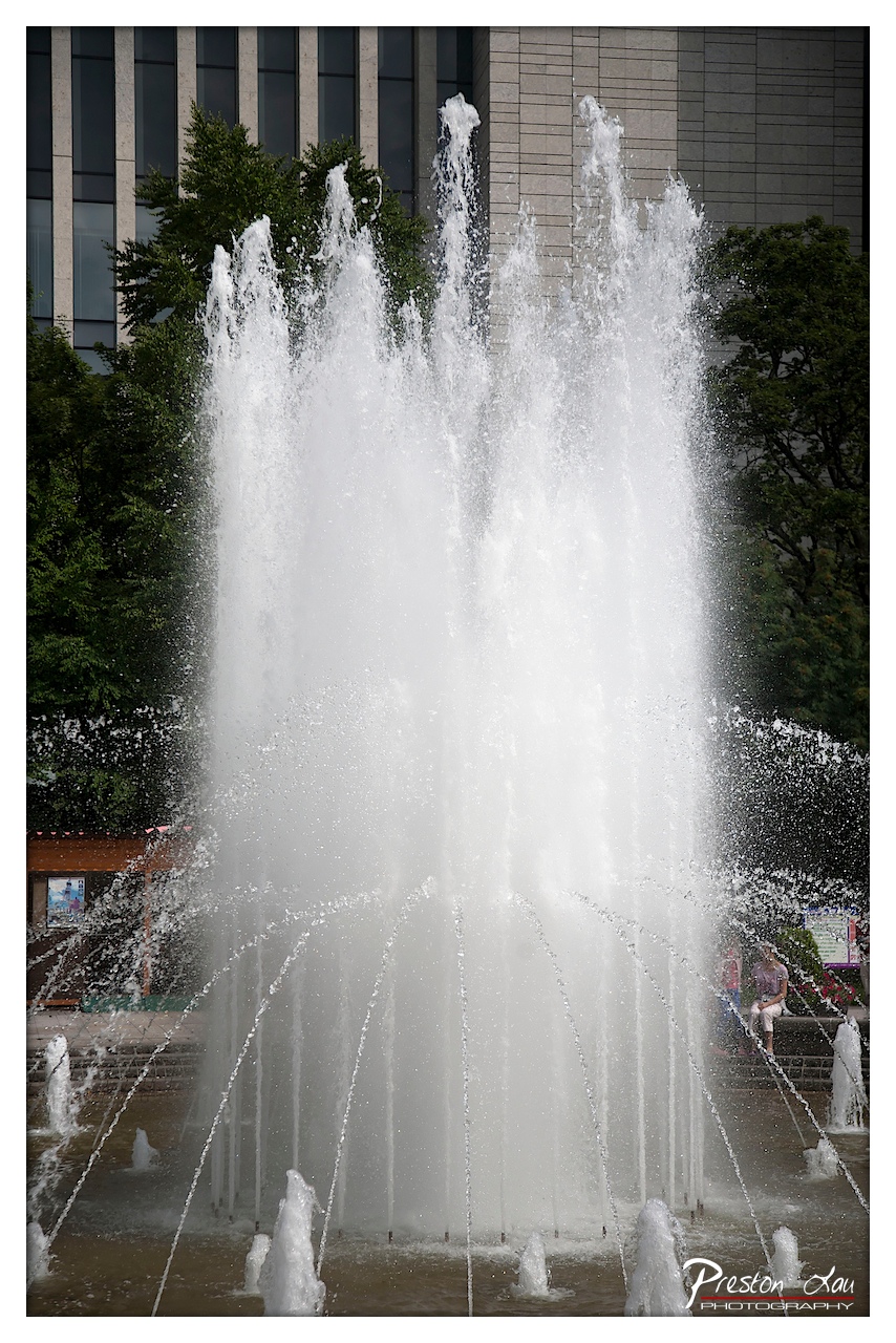

1. Overall Rating (0–10) — 7.0
This photograph captures the dynamic energy of a grand fountain in full motion, where water becomes both subject and sculpture. The powerful upward spray dominates the frame, conveying movement and vitality, while the juxtaposition of the fountain against the rigid architecture and greenery adds narrative depth. The image is strong in its ability to convey motion and scale, though the framing and background elements slightly dilute the visual impact.
2. Composition (0–10) — 6.5
The central placement of the fountain creates a strong focal point, but the wide framing includes distracting background elements—trees and a building—that compete for attention. A tighter crop would enhance focus and improve balance.
3. Lighting (0–10) — 6.0
The scene is evenly lit with natural daylight, which captures the detail of the water droplets and spray. However, the lack of directional light limits shadow contrast, resulting in a somewhat flat appearance that softens the sense of depth.
4. Color & Tone (0–10) — 6.5
The palette is dominated by cool whites and grays from the water and building, with muted greens from the trees. While clean and cohesive, the colors lack vibrancy, giving the image a subdued, almost documentary feel.
5. Creativity (0–10) — 7.0
The choice to freeze the fountain’s motion at a moment of peak activity is visually engaging. The contrast between the organic fluidity of water and the rigid urban backdrop suggests a thematic tension between nature and modernity.
6. Technical Quality (0–10) — 8.0
The image is sharp, with excellent clarity in the water’s texture and spray. The shutter speed effectively freezes motion without introducing blur, and the focus is consistently on the fountain’s core.
7. Emotional Impact (0–10) — 6.5
The photograph evokes a sense of energy and urban vitality, but the emotional resonance is tempered by the lack of personal connection or narrative context. The viewer is shown a moment, but not invited into it.
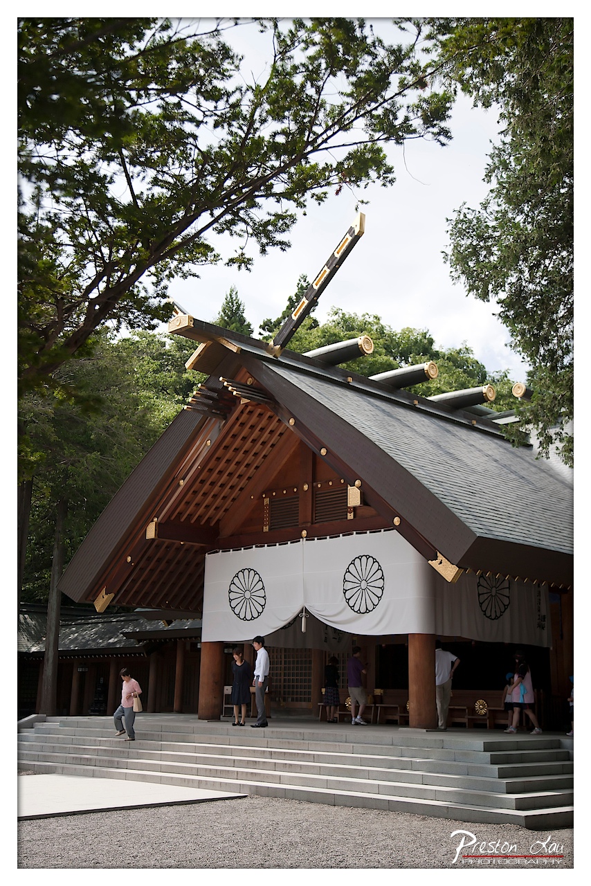

1. Overall Rating (0–10) — 7.0
This photograph captures the serene dignity of a traditional Japanese shrine, framed by the natural canopy of trees and punctuated by the subtle presence of visitors. The architectural details—especially the bold roofline and symbolic white banners—draw the eye and convey cultural significance. While the image successfully communicates place and atmosphere, a more dynamic composition and refined lighting could elevate its emotional resonance.
2. Composition (0–10) — 7.0
The low-angle perspective emphasizes the shrine’s grandeur, while the diagonal lines of the roof and tree branches create visual movement. The placement of people on the steps adds scale and narrative, though the slightly cluttered foreground and off-center framing slightly disrupt the balance.
3. Lighting (0–10) — 6.0
Natural daylight provides even illumination, but the overcast sky softens the shadows and reduces depth. The light is functional but lacks the warmth or contrast that would enhance the textures of wood and stone.
4. Color & Tone (0–10) — 6.5
The palette is restrained—earthy browns, muted grays, and soft whites—reflecting the tranquil setting. The black-and-white chrysanthemum emblems stand out clearly, adding symbolic contrast. A touch more saturation could bring the scene to life without compromising its solemn tone.
5. Creativity (0–10) — 7.0
The image is a thoughtful blend of cultural documentation and aesthetic framing. The inclusion of visitors grounds the scene in reality, while the architectural focus suggests reverence and continuity. The photographer’s intent to capture both the sacred and the everyday is compelling.
6. Technical Quality (0–10) — 8.0
Sharp focus and clean detail are evident throughout, especially in the wooden structure and banners. The exposure is well-balanced, and the image is free of distracting noise or artifacts.
7. Emotional Impact (0–10) — 6.5
The photograph evokes a quiet sense of reverence and timelessness, inviting contemplation of tradition and ritual. While the mood is peaceful, the lack of dramatic lighting or emotional tension keeps the viewer at a respectful distance rather than drawing them into the moment.
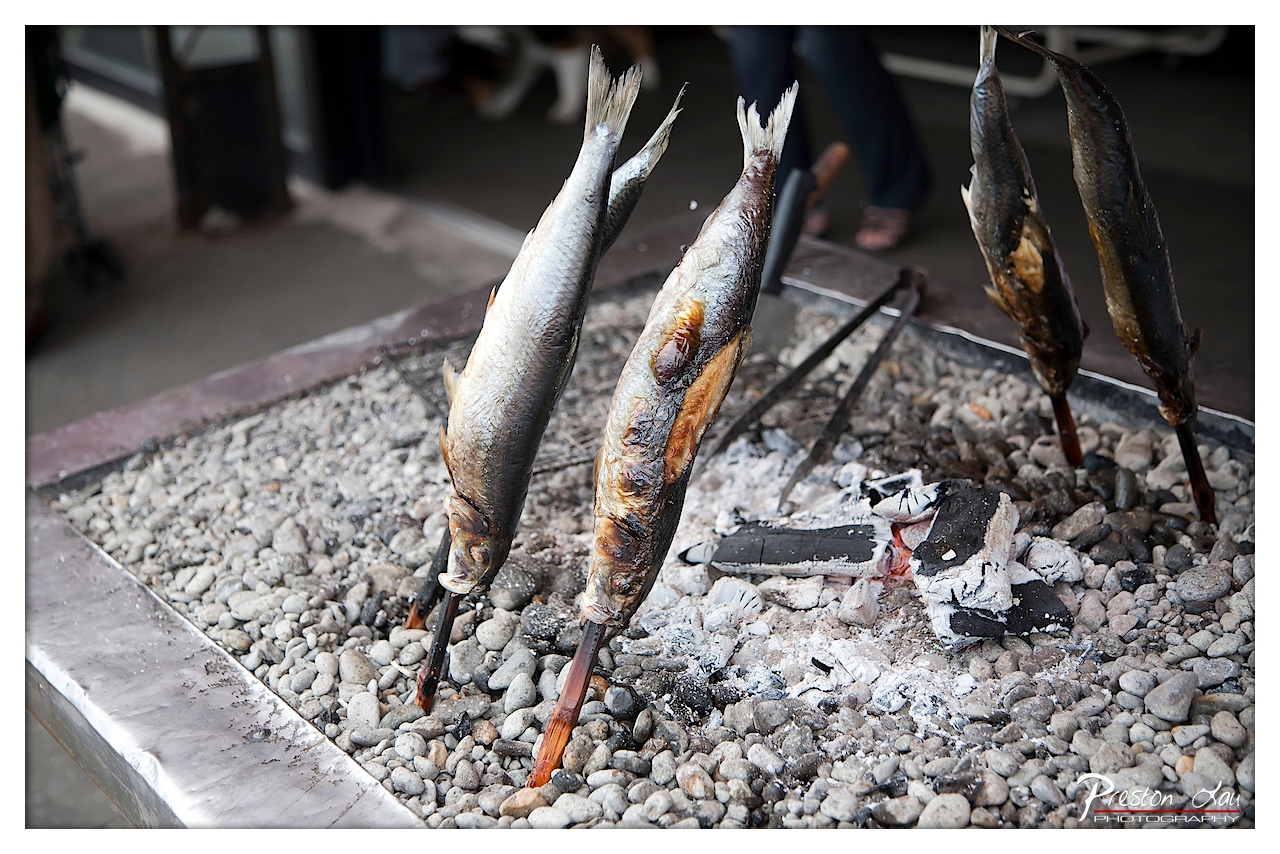

1. Overall Rating (0–10) — 7.5
This photograph captures the rustic authenticity of street-side fish grilling, where the sizzle of fire and the char of skin evoke sensory immediacy. The composition draws the eye to the fish’s transformation over coals, with the shallow depth of field isolating the subject from the blurred background. While the image succeeds in conveying a moment of simple culinary tradition, its emotional pull is tempered by a lack of dynamic lighting and color vibrancy, keeping it grounded in documentation rather than poetic storytelling.
2. Composition (0–10) — 7.0
The diagonal arrangement of the fish creates a strong visual flow from the lower left to the upper right, guiding the eye naturally across the frame. The use of shallow depth of field effectively isolates the subject, though the slightly cluttered background and uneven framing of the grill edges slightly disrupt the balance.
3. Lighting (0–10) — 6.0
The lighting is functional but flat, relying on ambient light that lacks directionality or warmth. While the charred areas of the fish provide natural contrast, the overall illumination feels neutral and fails to emphasize the texture and heat of the scene.
4. Color & Tone (0–10) — 6.5
The palette is dominated by muted grays and earthy tones, with the charred browns of the fish offering subtle warmth. While the colors are natural and cohesive, they lack richness and vibrancy, resulting in a subdued, almost monochromatic mood.
5. Creativity (0–10) — 7.0
The choice to focus on the process of grilling—rather than a stylized presentation—reflects a documentary approach that values authenticity. The composition and framing suggest an intent to capture a cultural moment, making the image more narrative than purely aesthetic.
6. Technical Quality (0–10) — 8.0
The image is sharp and clear, particularly in the foreground, with fine detail visible in the fish’s skin and the texture of the coals. The focus is well-placed, and the exposure is balanced, though slight noise is present in the darker areas.
7. Emotional Impact (0–10) — 7.0
The photograph evokes a sense of warmth and tradition, inviting the viewer into a sensory experience of smell, sound, and taste. The quiet intensity of the grilling process and the human presence in the background—though blurred—add a layer of intimacy and connection, making the image emotionally resonant despite its restrained visual flair.
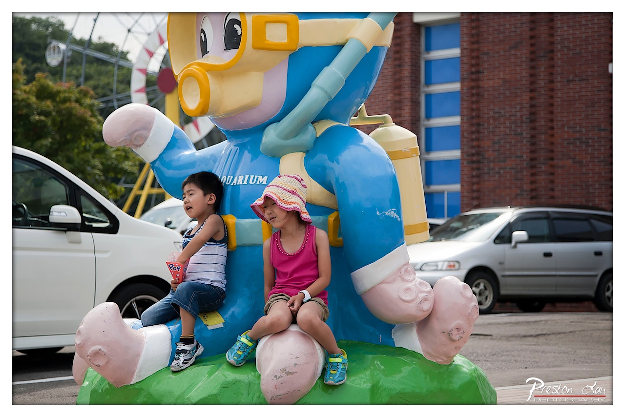

1. Overall Rating (0–10) — 6.8
This photograph captures a candid, playful moment of two children interacting with a whimsical mascot statue at what appears to be an aquarium or theme park. The vibrant colors and childlike energy create a sense of joy and spontaneity, though the cluttered background and slightly awkward framing prevent the image from feeling fully cohesive. The scene is charming in its authenticity, offering a snapshot of childhood wonder that resonates with a sense of lived experience.
2. Composition (0–10) — 6.0
The children are placed slightly off-center, with the large mascot dominating the frame and creating a visually engaging focal point. However, the inclusion of parked cars and the visible building edge introduces distractions, weakening the overall balance. A tighter crop would have better isolated the subjects and enhanced the narrative focus.
3. Lighting (0–10) — 6.5
Natural daylight illuminates the scene evenly, with soft shadows indicating an overcast or diffused light source. This prevents harsh contrasts and allows the colors of the mascot and clothing to appear vibrant. The lighting supports the cheerful mood but lacks dramatic depth or directionality.
4. Color & Tone (0–10) — 7.0
The palette is rich and playful, with the bold blue of the mascot, the pink of the girl’s tank top, and the green base creating a lively visual harmony. The tones are well-saturated without appearing oversharpened, giving the image a bright, youthful feel that complements the subject matter.
5. Creativity (0–10) — 7.0
The photograph captures a moment of genuine childlike interaction with a fun, oversized character, lending it a narrative quality that feels both personal and universal. The choice to include the surrounding environment adds context, giving the image a documentary-style authenticity that enhances its charm.
6. Technical Quality (0–10) — 7.5
The image is sharp and well-focused, particularly on the children and the mascot, with clear detail in the textures of the clothing and the statue. The depth of field effectively blurs the background, though the edges of the frame are slightly soft, suggesting a moderate aperture choice.
7. Emotional Impact (0–10) — 7.5
There’s a strong sense of innocence and delight in the children’s expressions and posture, which evokes warmth and nostalgia. The viewer is drawn into the moment, imagining the laughter and curiosity that likely accompanied the photo, making it emotionally engaging despite its casual composition.
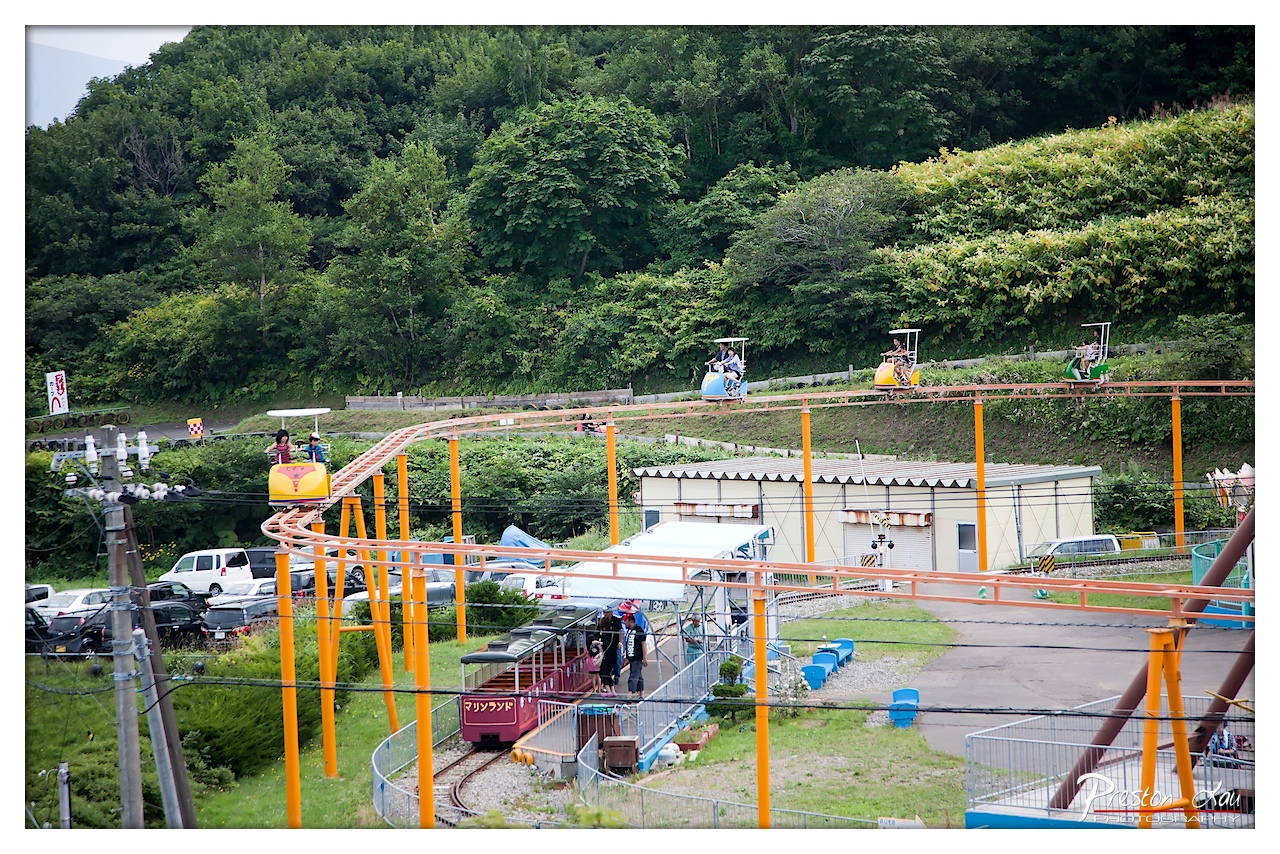

1. Overall Rating (0–10) — 6.0
This photograph captures the vibrant energy of a small amusement park nestled into a lush, green hillside, where miniature rides and cheerful colors evoke a sense of playful nostalgia. The scene is lively and full of activity, with the contrast between the bright rides and the dense foliage creating a visually engaging composition. However, the image feels slightly cluttered, with too many competing elements that prevent a clear focal point, and the overcast lighting dampens the overall vibrancy.
2. Composition (0–10) — 5.5
The wide framing includes too many distractions, such as the overhead power lines and scattered vehicles, which break the visual flow. While the curved tracks create a sense of movement, the subject placement is uneven, with the small train and riders appearing secondary to the surrounding infrastructure.
3. Lighting (0–10) — 5.0
The diffuse, overcast light flattens the scene, reducing shadows and depth. While it ensures even exposure across the frame, it also diminishes the richness of colors and the dynamic quality that strong directional light might have provided.
4. Color & Tone (0–10) — 6.0
The bright orange of the roller coaster tracks and the vivid red of the train stand out against the dominant greens and grays, creating a cheerful palette. However, the overall tone feels muted, with the colors lacking saturation due to the lighting conditions.
5. Creativity (0–10) — 6.0
The image captures a whimsical, everyday moment with a sense of authenticity, blending the charm of a local amusement park with the natural landscape. While not particularly original in concept, it succeeds in conveying a slice-of-life narrative with a touch of childlike wonder.
6. Technical Quality (0–10) — 7.0
The photograph is sharp and detailed, with clear focus on the rides and surrounding structures. The depth of field is adequate, and the resolution is high, allowing for fine detail in both the foreground and background.
7. Emotional Impact (0–10) — 6.5
The image evokes a gentle sense of joy and nostalgia, especially for those familiar with small-town amusement parks. The presence of riders and families adds warmth, though the lack of strong emotional lighting or a compelling narrative keeps the connection with the viewer from feeling deeply resonant.
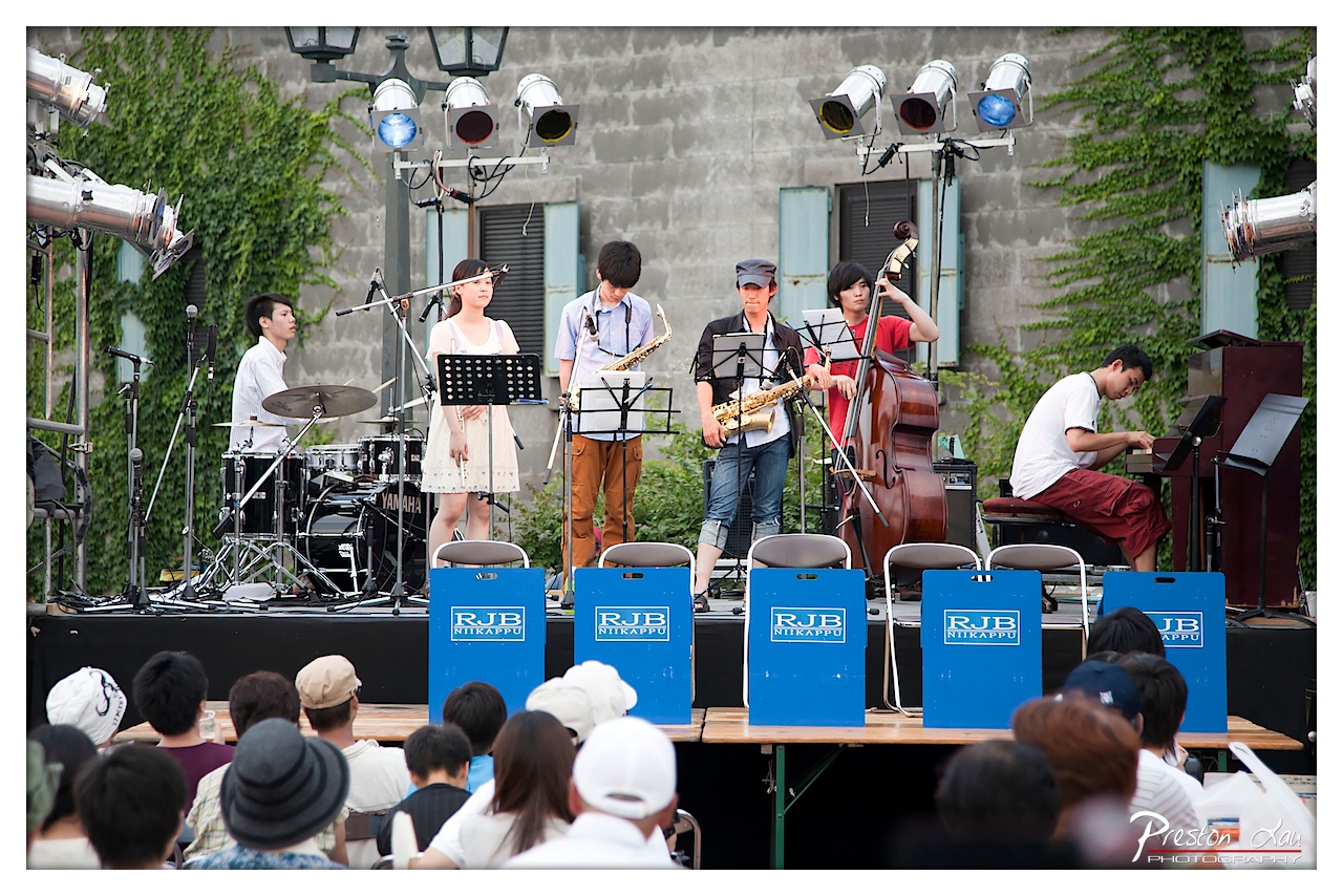

1. Overall Rating (0–10) — 7.0
This photograph captures the vibrant energy of a live jazz ensemble performing outdoors, with the performers fully immersed in their music. The blend of natural greenery and industrial elements—like the ivy-covered wall and stage lights—creates a dynamic backdrop that enhances the spontaneity of the moment. While the image is rich in detail and narrative, it is slightly hindered by a cluttered foreground and a lack of depth in the emotional engagement of the musicians.
2. Composition (0–10) — 6.5
The performers are well-distributed across the frame, creating a balanced ensemble, though the audience in the foreground partially obstructs the lower third. The stage is framed symmetrically, but the uneven spacing of the musicians and equipment introduces a slight visual imbalance.
3. Lighting (0–10) — 6.0
The combination of natural daylight and stage lighting creates a mixed quality—some areas are well-illuminated while others fall into shadow. The colored stage lights add a subtle theatricality, but their effect is muted by the overall brightness of the scene.
4. Color & Tone (0–10) — 6.5
The palette is dominated by the green of the ivy and the blue of the stage branding, creating a cohesive visual theme. The contrast between the warm skin tones and cool background hues adds depth, though the overall tone remains somewhat flat due to the daylight conditions.
5. Creativity (0–10) — 7.0
The image successfully captures a candid moment of live music, blending documentary realism with artistic framing. The use of the audience as a foreground element adds a layer of authenticity and viewer inclusion, elevating the scene beyond a simple performance capture.
6. Technical Quality (0–10) — 7.5
The image is sharp and detailed, with clear focus on the musicians. The depth of field is adequate, allowing both the performers and the stage setup to be rendered with clarity. The post-processing is clean, preserving natural textures and colors.
7. Emotional Impact (0–10) — 6.5
There is a sense of communal joy and artistic expression, but the emotional connection is tempered by the distance between the photographer and the subjects. The audience’s presence grounds the image in reality, yet the performers' expressions remain reserved, limiting the intensity of the emotional resonance.
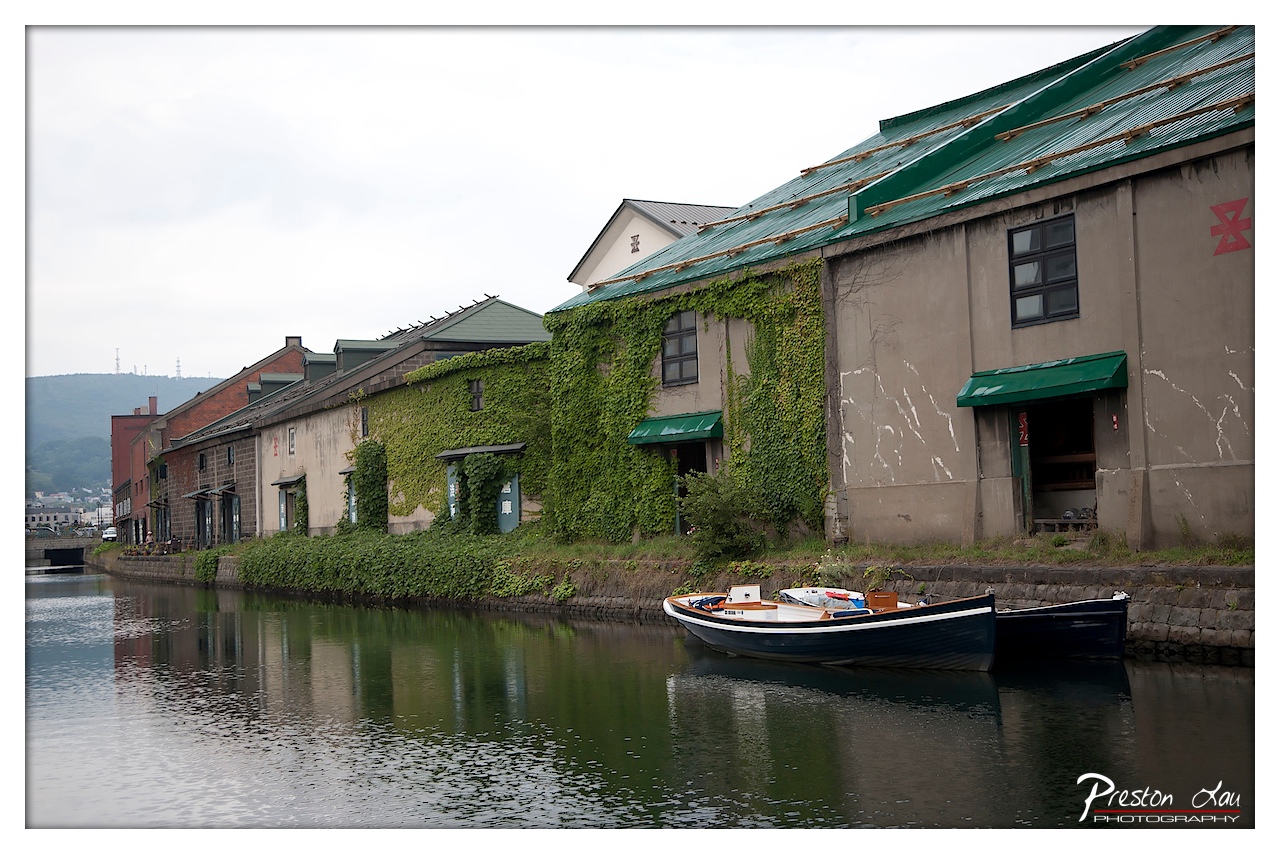

1. Overall Rating (0–10) — 7.0
This photograph captures a serene, almost timeless riverside scene, where nature gently reclaims industrial architecture. The interplay between the ivy-covered warehouses and the still water creates a quiet harmony, evoking a sense of history and stillness. While the muted lighting and overcast sky temper the image’s vibrancy, the composition’s balance and storytelling give it a contemplative charm.
2. Composition (0–10) — 7.5
The diagonal line of buildings leads the eye through the frame, creating depth and guiding attention toward the distant hills. The boats in the foreground add scale and grounding, while the reflection on the water enhances symmetry and visual interest.
3. Lighting (0–10) — 6.0
Soft, diffused light from an overcast sky evenly illuminates the scene, minimizing harsh shadows but also reducing dynamic contrast. While this creates a calm mood, it slightly flattens the image’s visual energy.
4. Color & Tone (0–10) — 6.5
The palette is dominated by muted greens and grays, which complement the natural and industrial elements. The deep green of the ivy and roof provides subtle contrast, but the overall tonal range is subdued, giving the image a quiet, melancholic feel.
5. Creativity (0–10) — 7.0
The photograph effectively blends natural and man-made elements, using the juxtaposition of ivy-covered warehouses and moored boats to tell a story of time and transformation. The framing and perspective offer a fresh, contemplative view of a familiar setting.
6. Technical Quality (0–10) — 8.0
The image is sharp and well-focused, with clean details in the textures of the brick, ivy, and water. The exposure is balanced, and the depth of field is appropriate for the scene.
7. Emotional Impact (0–10) — 7.0
The stillness of the water, the quiet decay of the buildings, and the presence of the small boats evoke a sense of nostalgia and peaceful melancholy, inviting the viewer to reflect on the passage of time and the quiet beauty of forgotten places.
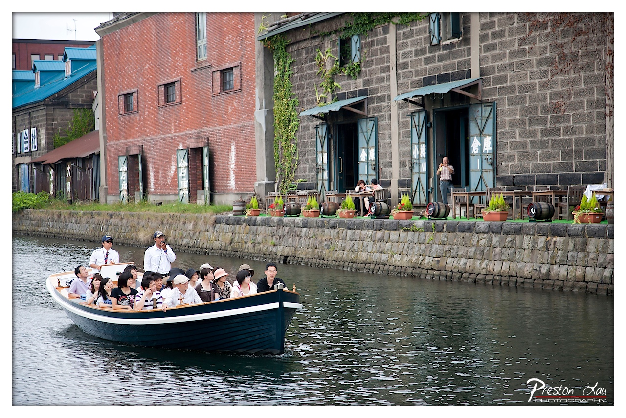

1. Overall Rating (0–10) — 7.0
This photograph captures the lively charm of a canal tour in a historic waterfront district, where industrial heritage meets leisurely tourism. The juxtaposition of the bustling boat and the quiet, weathered buildings creates a narrative of time passing—modern life moving through a space steeped in history. While the image is rich in context and detail, the slightly cluttered composition and flat lighting hold it back from true visual mastery.
2. Composition (0–10) — 6.5
The boat is well-framed and leads the eye diagonally across the frame, but the surrounding architecture competes for attention. The stone wall and buildings create a layered depth, though the right side feels slightly unbalanced due to the scattered tables and people.
3. Lighting (0–10) — 5.5
Diffuse, overcast lighting flattens the scene and reduces contrast, giving the image a muted quality. While it ensures even exposure, it also diminishes the texture of the brick and stone, which could have added more visual interest.
4. Color & Tone (0–10) — 6.0
The palette is subdued, with dominant grays and earth tones, punctuated by the dark blue of the boat and the green of the ivy. A touch more saturation could have enhanced the colors without compromising the authentic, subdued atmosphere.
5. Creativity (0–10) — 7.0
The image successfully captures a slice of everyday life in a culturally rich setting. The inclusion of both tourists and local elements—such as the barrel-lined promenade and Japanese signage—adds narrative depth and a sense of place.
6. Technical Quality (0–10) — 7.5
Sharp focus is maintained throughout, with clear details in the boat, passengers, and background. The exposure is well-balanced, and the watermark is unobtrusive, indicating professional handling.
7. Emotional Impact (0–10) — 6.5
The photograph evokes a sense of quiet exploration and nostalgia, capturing a moment of shared experience. While it doesn’t elicit strong emotion, it invites the viewer to imagine the sounds of water and conversation, creating a subtle sense of connection to the scene.
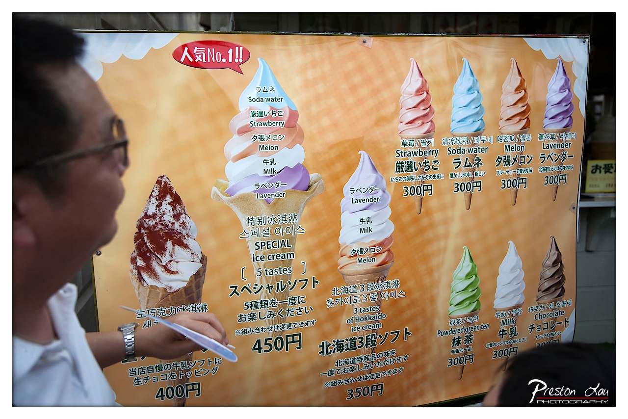

1. Overall Rating (0–10) — 6.0
This photograph captures a candid moment of a man contemplating a colorful ice cream menu, blending everyday life with vibrant commercial design. The composition feels spontaneous, yet the menu’s bright, layered visuals dominate the frame, creating a playful contrast between the human subject and the artificial allure of the product. While the image succeeds in conveying a slice of street-side culture, its narrative depth is limited by the cluttered background and lack of emotional intimacy.
2. Composition (0–10) — 6.0
The man is framed off-center, creating a sense of candid observation, but the large menu dominates the visual space, drawing attention away from his expression. The diagonal placement of the hand and pen adds a subtle dynamic, though the overlapping elements slightly disrupt visual harmony.
3. Lighting (0–10) — 5.5
Natural daylight illuminates the scene evenly, but the harsh overhead light flattens the subject’s features and creates a slight glare on the menu’s glossy surface. The lighting is functional but lacks the warmth or mood that would elevate the image.
4. Color & Tone (0–10) — 7.5
The menu bursts with vivid, saturated colors—vivid purples, greens, and pinks—that contrast sharply with the muted tones of the man’s shirt and the background. The warm orange backdrop enhances the inviting quality of the ice cream, though the overall palette feels slightly overexposed.
5. Creativity (0–10) — 6.5
The image leverages the juxtaposition of a real person against a stylized, commercial backdrop, offering a subtle commentary on consumer culture. The candid framing and focus on choice suggest a narrative, but the execution remains observational rather than deeply conceptual.
6. Technical Quality (0–10) — 7.0
Sharp focus on the menu ensures legibility of text and detail, while the shallow depth of field gently blurs the foreground and background. The image is well-exposed with minimal noise, though the watermark slightly distracts from the composition.
7. Emotional Impact (0–10) — 5.0
The photo captures a fleeting, relatable moment of decision-making, but the viewer’s connection to the subject is muted by the overwhelming presence of the menu and the man’s obscured expression. The emotional resonance is subtle and fleeting.
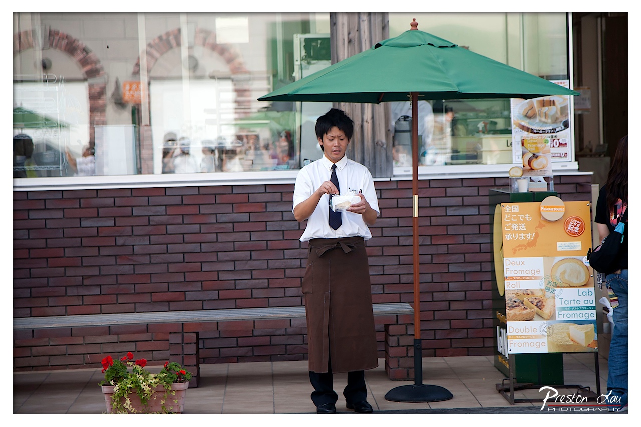

1. Overall Rating (0–10) — 7.0
This photograph captures a candid moment of quiet professionalism in a Japanese bakery setting, where the worker’s focused expression and meticulous actions convey a sense of dedication. The green umbrella and brick facade create a harmonious backdrop, grounding the scene in a specific place and time, while the soft, natural light lends a gentle realism. Though the image feels slightly staged in its composition, it succeeds in telling a small story of routine and care, offering a window into everyday labor with warmth and dignity.
2. Composition (0–10) — 6.5
The subject is centered and well-framed, drawing attention to the worker’s action. However, the wide shot includes distracting elements—such as the passerby on the right and the cluttered sign—diluting the focus and creating visual imbalance.
3. Lighting (0–10) — 7.0
Natural daylight provides even, soft illumination that enhances the scene’s authenticity. The overcast quality of the light minimizes harsh shadows and creates a calm, contemplative mood.
4. Color & Tone (0–10) — 7.5
The palette is harmonious, with the green umbrella contrasting gently against the warm brick tones and the worker’s crisp white shirt. The colors feel authentic and balanced, contributing to the image’s grounded, everyday aesthetic.
5. Creativity (0–10) — 6.5
The image is observational rather than conceptual, relying on the narrative of the moment rather than bold artistic interpretation. While it captures a genuine slice of life, it lacks a strong visual hook or unique perspective.
6. Technical Quality (0–10) — 8.0
The focus is sharp on the subject, and the depth of field effectively isolates him from the background. The exposure is well-managed, with no significant blown highlights or lost shadows.
7. Emotional Impact (0–10) — 7.0
The image evokes a sense of quiet respect for the worker’s attention to detail, creating a subtle emotional connection. The viewer is invited to pause and reflect on the dignity of small, everyday tasks.
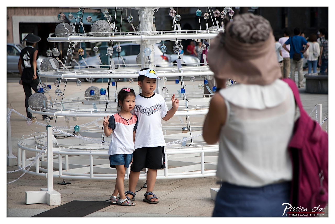

1. Overall Rating (0–10) — 7.0
This photograph captures a candid moment of childhood posed for a photo, framed by the presence of an adult photographer and a whimsical, multi-tiered art installation. The interplay between the children’s serious expressions and the playful setting creates a subtle tension between performance and authenticity. While the composition is engaging and the scene feels authentic, the shallow depth of field and slightly cluttered background detract from the image’s overall visual harmony.
2. Composition (0–10) — 6.5
The framing is dynamic, with the photographer in the foreground creating a layered, meta-narrative effect. The children are well-placed in the midground, drawing focus, though the background elements—particularly the parked cars and passing pedestrians—introduce visual distractions that weaken the image’s cohesion.
3. Lighting (0–10) — 7.0
Natural daylight provides even, soft illumination, highlighting the children and the white structure without harsh shadows. The light enhances the textures of the glass orbs and the children’s clothing, contributing to a balanced exposure and a calm, daytime atmosphere.
4. Color & Tone (0–10) — 6.5
The palette is dominated by neutral whites and grays, punctuated by the children’s colorful clothing and the translucent blues and greens of the glass ornaments. While the colors are pleasant, they lack vibrancy, giving the image a slightly muted, documentary feel.
5. Creativity (0–10) — 7.5
The photograph stands out for its layered narrative—capturing both the act of being photographed and the moment itself. The inclusion of the photographer in the foreground adds a self-referential dimension, transforming a simple portrait into a commentary on memory and representation.
6. Technical Quality (0–10) — 8.0
The focus is sharp on the children, with a deliberate shallow depth of field that blurs the foreground and background effectively. The image is well-exposed, with no obvious noise or technical flaws, showcasing strong control over aperture and focus.
7. Emotional Impact (0–10) — 6.5
The children’s serious, almost solemn expressions evoke a sense of quiet introspection, contrasting with the playful setting. While the emotional resonance is present, it remains subtle, leaving the viewer to interpret the mood rather than feeling it directly.
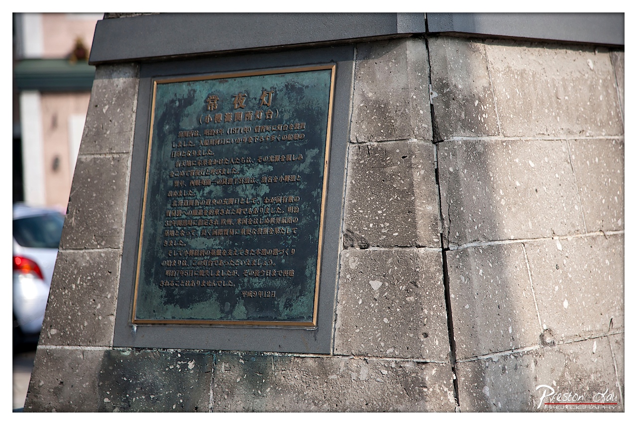

1. Overall Rating (0–10) — 7.0
This photograph captures the quiet dignity of a historical marker, its weathered surface telling a story of time and endurance. The focus on the plaque, set against the textured stone, emphasizes the weight of memory and the passage of years. While the image is technically sound and emotionally resonant, the composition feels slightly constrained by the framing, which keeps the viewer from fully engaging with the broader context of the site.
2. Composition (0–10) — 6.5
The plaque is centered but slightly off-kilter, with the stone wall dominating the frame. The blurred car in the background adds a subtle modern intrusion, creating a contrast between past and present, though it slightly distracts from the focal point.
3. Lighting (0–10) — 7.0
Natural daylight highlights the texture of the stone and the patina on the metal plaque, casting soft shadows that enhance depth. The light is even and clear, allowing the Japanese text to remain legible without glare.
4. Color & Tone (0–10) — 6.5
The muted tones of gray and green dominate the palette, evoking a sense of age and solemnity. The subtle blue-green patina on the plaque adds a touch of visual warmth, contrasting gently with the neutral stone.
5. Creativity (0–10) — 7.0
The image successfully blends historical documentation with a contemplative aesthetic. The choice to focus tightly on the plaque, while allowing the surrounding environment to recede, creates a narrative of preservation and reflection.
6. Technical Quality (0–10) — 8.0
Sharp focus on the plaque ensures legibility, and the depth of field effectively isolates the subject. The image is clean, with minimal noise and well-managed exposure.
7. Emotional Impact (0–10) — 7.5
The photograph conveys a quiet reverence for history, inviting the viewer to pause and consider the significance of the words etched in stone. There is a sense of permanence and loss, underscored by the weathered surface and the faint presence of the modern world in the background.
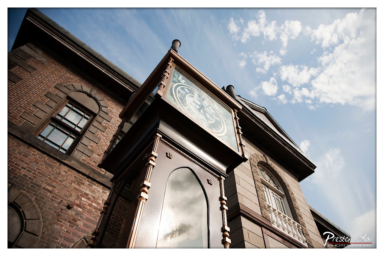

1. Overall Rating (0–10) — 7.5
This photograph captures the timeless elegance of a historic clock tower with a dramatic low-angle perspective that emphasizes its grandeur against a vast, cloud-dappled sky. The interplay of architectural detail and natural light lends the image a sense of gravitas and nostalgia, though the composition’s slight asymmetry and the overexposed reflection on the clock face temper its visual harmony.
2. Composition (0–10) — 7.0
The low-angle shot creates a strong sense of scale and monumentality, with the clock tower rising diagonally from the lower left toward the upper right. The framing feels dynamic but slightly unbalanced, as the building’s brick facade on the left dominates the frame, creating a visual tension with the open sky on the right.
3. Lighting (0–10) — 8.0
The bright daylight enhances the textures of the brick and ornate woodwork, while the soft, scattered clouds lend a gentle contrast to the strong shadows beneath the clock’s overhang. The sunlight reflects subtly on the glass, adding depth without overwhelming the scene.
4. Color & Tone (0–10) — 7.5
The warm, earthy tones of the brick and dark wood contrast beautifully with the cool blue of the sky, creating a balanced and visually pleasing palette. The slight saturation enhances the richness of the materials without appearing artificial.
5. Creativity (0–10) — 8.0
The choice of perspective and the focus on a clock tower—a symbol of time and permanence—elevate the image beyond a simple architectural snapshot. The interplay between the man-made structure and the expansive sky suggests a quiet meditation on history and continuity.
6. Technical Quality (0–10) — 8.5
Sharp focus on the clock and surrounding details, with excellent clarity throughout the image. The lens distortion is minimal, and the exposure is well-managed despite the bright sky and reflective surfaces.
7. Emotional Impact (0–10) — 7.0
The photograph evokes a sense of reverence and contemplation, inviting the viewer to pause and reflect on the passage of time. The quiet dignity of the structure and the expansive sky combine to create a mood that is both peaceful and introspective.
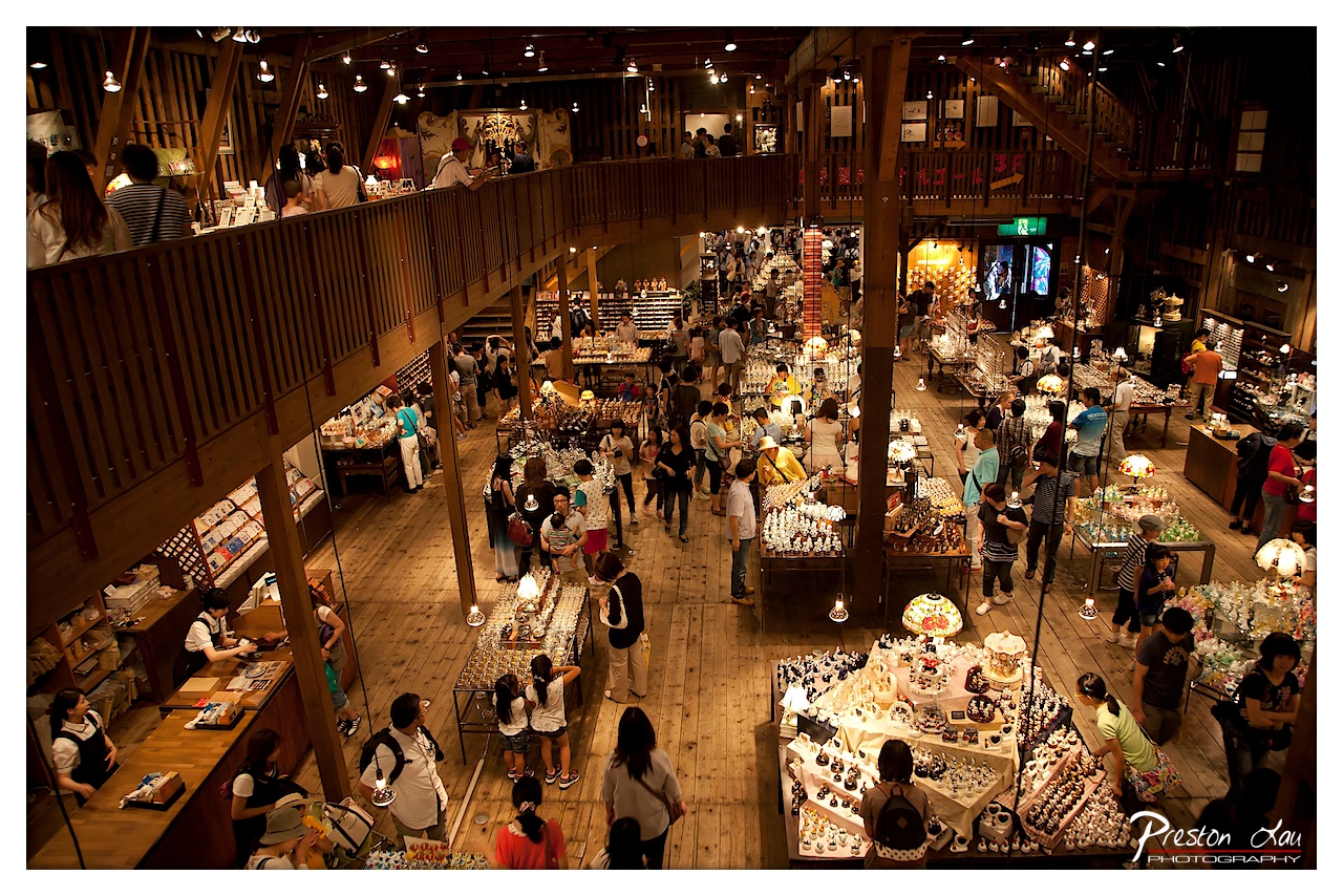

1. Overall Rating (0–10) — 7.5
This photograph captures the vibrant energy of a bustling, multi-level market with a warm, inviting glow that draws the viewer into its lively chaos. The high vantage point and wide perspective emphasize the density of people and goods, creating a sense of immersive activity. While the scene is rich in detail, the sheer number of elements risks visual overload, slightly diminishing the clarity of narrative focus.
2. Composition (0–10) — 7.0
The elevated viewpoint provides a dynamic, panoramic view of the space, with strong diagonal lines formed by the wooden railings and aisles guiding the eye through the scene. The arrangement of tables and people creates a natural rhythm, though the lower right corner feels slightly cluttered, and the central walkway could benefit from clearer visual flow.
3. Lighting (0–10) — 8.0
Warm, ambient lighting from hanging lamps and overhead fixtures bathes the scene in a golden glow, enhancing the cozy, inviting atmosphere of the wooden interior. The interplay of light and shadow adds depth and texture, highlighting the variety of merchandise and creating a sense of intimacy despite the crowd.
4. Color & Tone (0–10) — 7.5
The palette is dominated by warm browns and soft yellows, complemented by subtle pops of color from the merchandise and clothing. The tonal range is balanced, with rich shadows and highlights that add dimension without overwhelming the image. The overall warmth supports the convivial mood of the space.
5. Creativity (0–10) — 7.0
The photographer captures a moment of authentic cultural vibrancy, transforming a busy marketplace into a visually compelling narrative. The high-angle perspective offers a unique view of human interaction and commerce, elevating the scene beyond a simple snapshot into something more observational and atmospheric.
6. Technical Quality (0–10) — 8.5
The image is sharp and well-focused, with excellent detail in both the foreground and background. The depth of field is appropriately managed, allowing key areas of the scene to stand out while maintaining clarity throughout. The wide-angle perspective is handled skillfully, minimizing distortion.
7. Emotional Impact (0–10) — 8.0
The photograph evokes a strong sense of community and shared experience, inviting the viewer to feel the energy and warmth of the marketplace. The human interactions, the glow of the lights, and the dense arrangement of goods combine to create a feeling of connection and delight in everyday life.
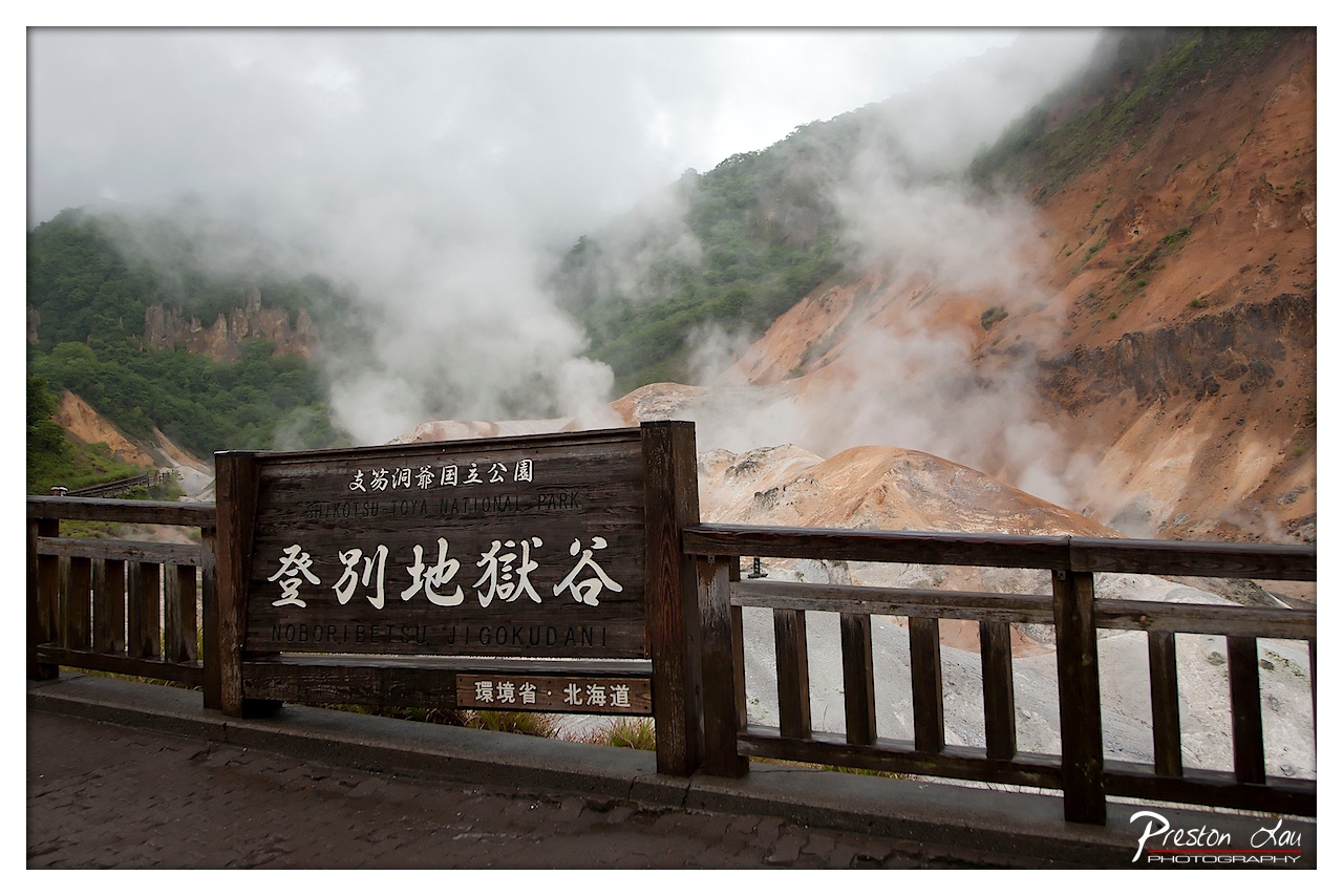

1. Overall Rating (0–10) — 7.0
This photograph captures the raw, otherworldly atmosphere of Noboribetsu Jigokudani, where steam rises from the earth like a breath from the planet’s core. The wooden sign grounds the scene in place and culture, while the mist and rugged terrain evoke a sense of primal geothermal energy. While the overcast sky tempers the drama slightly, the image successfully balances documentation with mood, offering a quiet but powerful impression of nature’s untamed forces.
2. Composition (0–10) — 7.0
The sign is well-placed in the foreground, serving as a strong anchor, while the railing frames the view and guides the eye toward the steaming valley. The diagonal flow of the terrain and rising vapor creates dynamic movement across the frame.
3. Lighting (0–10) — 6.0
Soft, diffused light from the overcast sky evenly illuminates the scene, preserving detail in both the sign and the misty background. However, the lack of directional light limits depth and contrast, softening the overall visual punch.
4. Color & Tone (0–10) — 6.5
The palette is restrained—earthy ochres, muted greens, and the white of the steam—creating a natural harmony. The tonal range is subtle, with a cool, muted cast that enhances the foggy, ethereal mood.
5. Creativity (0–10) — 7.5
The image effectively blends cultural context with natural wonder, using the sign as a narrative device to situate the viewer. The interplay of steam, texture, and scale suggests a place both beautiful and unsettling, elevating it beyond simple landscape documentation.
6. Technical Quality (0–10) — 8.0
Sharp focus across the frame, balanced exposure, and clean detail—especially in the sign and railing—demonstrate strong technical control. The image is free of distracting flaws.
7. Emotional Impact (0–10) — 7.0
There is a quiet awe in the scene, evoked by the steam and isolation. The viewer is invited to feel the heat and stillness of a place where the earth is visibly alive, though the subdued lighting tempers the emotional intensity.
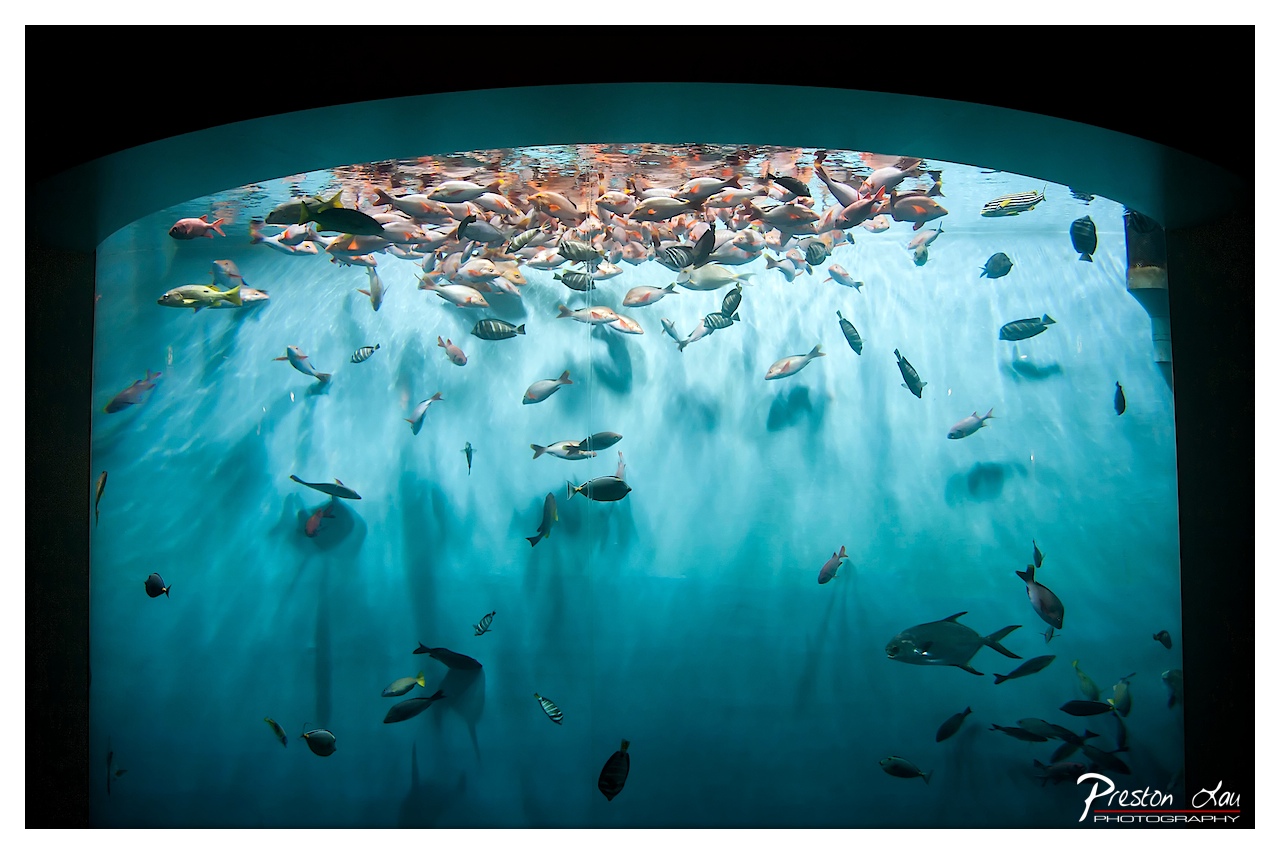

1. Overall Rating (0–10) — 7.5
This image captures the mesmerizing dynamism of an aquarium’s underwater world, where schools of fish weave through a luminous blue expanse. The curved perspective enhances the sense of immersion, drawing the viewer into the fluid motion of the scene. While the composition is visually rich and evocative, the slight overexposure near the water’s surface tempers its overall subtlety.
2. Composition (0–10) — 8.0
The curved arch of the tank frames the scene effectively, creating a natural focal point at the water’s surface where the fish congregate. The diagonal flow of fish from the lower right to the upper left guides the eye through the image, balancing the composition despite the density of subjects.
3. Lighting (0–10) — 7.5
The lighting creates a serene, ethereal glow, with soft, diffused light filtering through the water and illuminating the fish from above. The bright highlights at the surface add depth and realism, though they slightly overpower the darker lower zones, creating a minor loss of detail.
4. Color & Tone (0–10) — 8.0
The cool, monochromatic blue palette enhances the underwater ambiance, with subtle variations in tone adding dimension. The contrast between the deep blues and the silvery glints on the fish creates a harmonious and calming visual rhythm.
5. Creativity (0–10) — 7.0
The perspective and framing offer a unique view of a familiar subject, transforming a typical aquarium scene into something immersive and poetic. The interplay between light, movement, and form conveys a sense of life and rhythm, elevating the image beyond mere documentation.
6. Technical Quality (0–10) — 8.0
Sharp focus and clean detail are evident throughout, particularly in the mid-ground where the fish are most distinct. The exposure is well-managed overall, though the bright highlights at the top edge show slight overexposure.
7. Emotional Impact (0–10) — 8.0
The image evokes a sense of calm wonder and quiet awe, capturing the grace and fluidity of marine life. The viewer is invited to pause and reflect, drawn into the tranquil pulse of the underwater world.
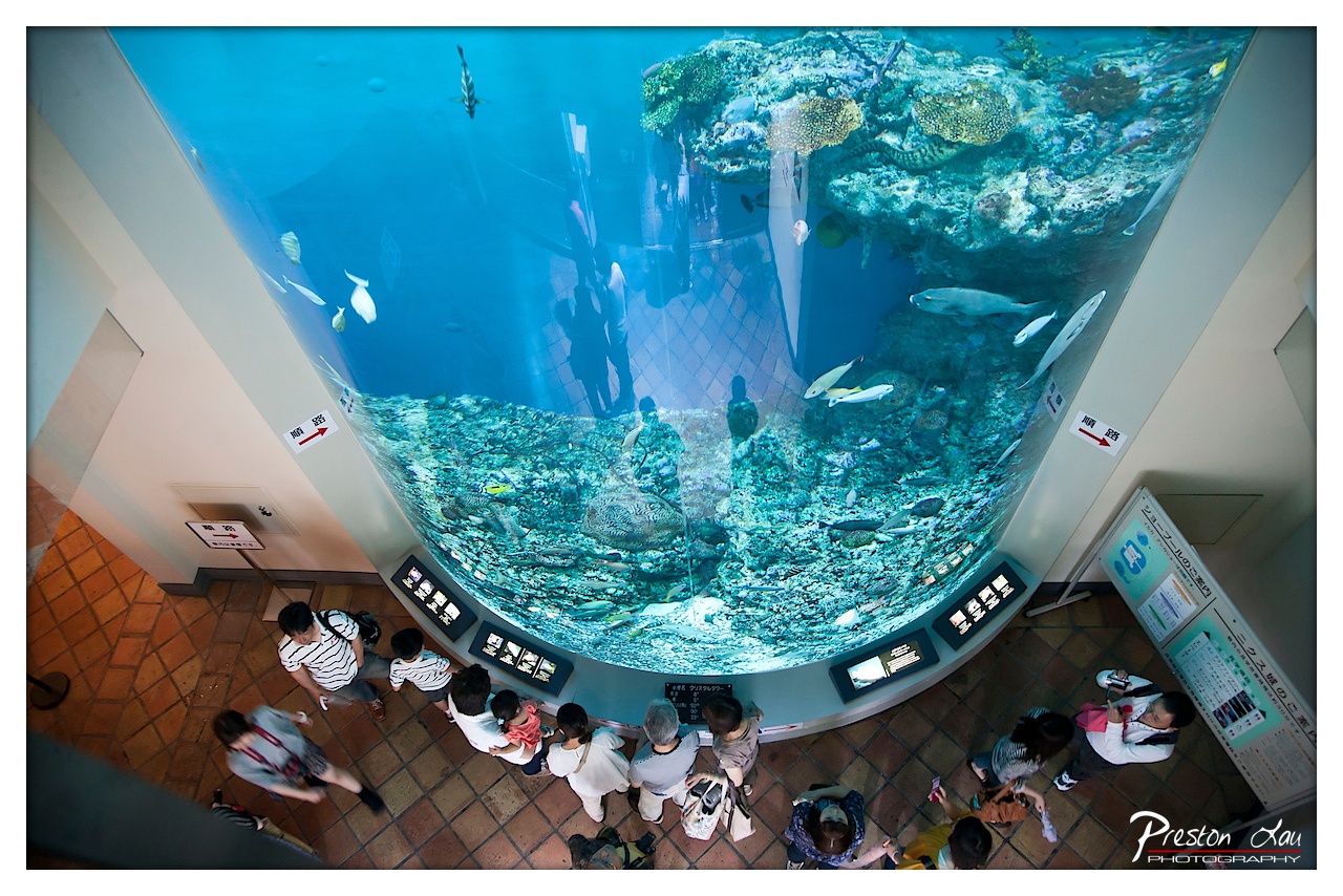

1. Overall Rating (0–10) — 7.5
This overhead view of an aquarium tunnel captures a vibrant, immersive experience, where the boundary between observer and ocean dissolves. The curved glass and the interplay of light and movement create a sense of wonder, while the silhouettes of visitors add a human scale that grounds the scene. The image succeeds in conveying both the majesty of marine life and the quiet awe of shared discovery, though its realism borders on documentary, slightly limiting its artistic resonance.
2. Composition (0–10) — 8.0
The high-angle perspective emphasizes the curve of the tank and frames the visitors in a natural, flowing arc. The diagonal lines of the walkway and the arrangement of people guide the eye through the scene, creating a dynamic yet balanced composition.
3. Lighting (0–10) — 7.0
The soft, diffused light within the tank enhances the clarity of the underwater environment, while the ambient lighting on the floor keeps the foreground grounded. The reflections on the glass add depth but also slightly disrupt the clarity of the marine life.
4. Color & Tone (0–10) — 7.5
The dominant cool blues of the water create a serene, aquatic mood, contrasted by the warm terracotta tones of the floor. The vibrant colors of the fish and coral add pops of life, though the overall palette remains restrained, preserving a sense of calm.
5. Creativity (0–10) — 7.0
The perspective is both familiar and striking, offering a unique vantage point that blends natural beauty with human presence. The interplay of reflection and transparency adds a layer of visual intrigue, though the concept is more observational than experimental.
6. Technical Quality (0–10) — 8.0
The image is sharp and well-focused, with clean details throughout the tank and the surrounding area. The wide-angle lens captures the full scope of the scene without significant distortion.
7. Emotional Impact (0–10) — 7.5
The photograph evokes a sense of curiosity and shared wonder, inviting the viewer to step into the scene and experience the quiet magic of the underwater world. The presence of families and children adds warmth and emotional depth.
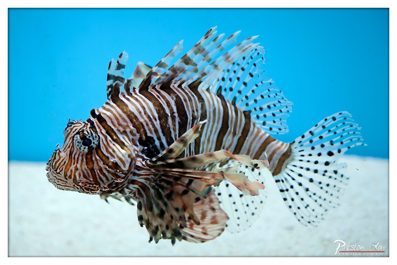

1. Overall Rating (0–10) — 8.0
This image captures the striking elegance of a lionfish with vivid clarity and dynamic presence, transforming a simple underwater moment into a compelling visual study. The bold contrast between the fish’s intricate patterns and the serene blue backdrop creates immediate visual impact, while the sharp focus and clean background emphasize the subject’s natural beauty. Slight overexposure in the background and a minor lack of depth in the foreground could be refined, but the photograph succeeds as both a technical achievement and an artistic celebration of marine life.
2. Composition (0–10) — 8.0
The lionfish is positioned diagonally across the frame, creating a sense of movement and dynamism. The negative space on the right balances the visual weight of the subject, allowing the viewer’s eye to follow the fish’s form naturally.
3. Lighting (0–10) — 8.5
The lighting is even and bright, effectively illuminating the lionfish’s delicate fins and vivid markings. The soft, diffused light enhances texture without creating harsh shadows, while the cool blue background suggests an underwater environment with natural depth.
4. Color & Tone (0–10) — 9.0
The rich contrast between the warm brown and white stripes of the fish and the cool, saturated blue background creates a visually striking palette. The colors are vibrant and well-balanced, enhancing the natural beauty and complexity of the subject.
5. Creativity (0–10) — 8.0
The photograph captures the lionfish in a way that emphasizes both its biological uniqueness and aesthetic grace. The choice to isolate the subject against a smooth, uniform background transforms a common marine scene into a portrait-like study, demonstrating thoughtful artistic intent.
6. Technical Quality (0–10) — 9.0
The image is exceptionally sharp, with fine detail visible in the fish’s fins and scales. The focus is precise, and the exposure is well-managed, preserving tonal range and minimizing noise.
7. Emotional Impact (0–10) — 7.5
The image evokes a sense of wonder and admiration for the natural world, drawing the viewer into the quiet elegance of an underwater moment. While the subject is captivating, the lack of narrative context keeps the emotional response more contemplative than deeply personal.
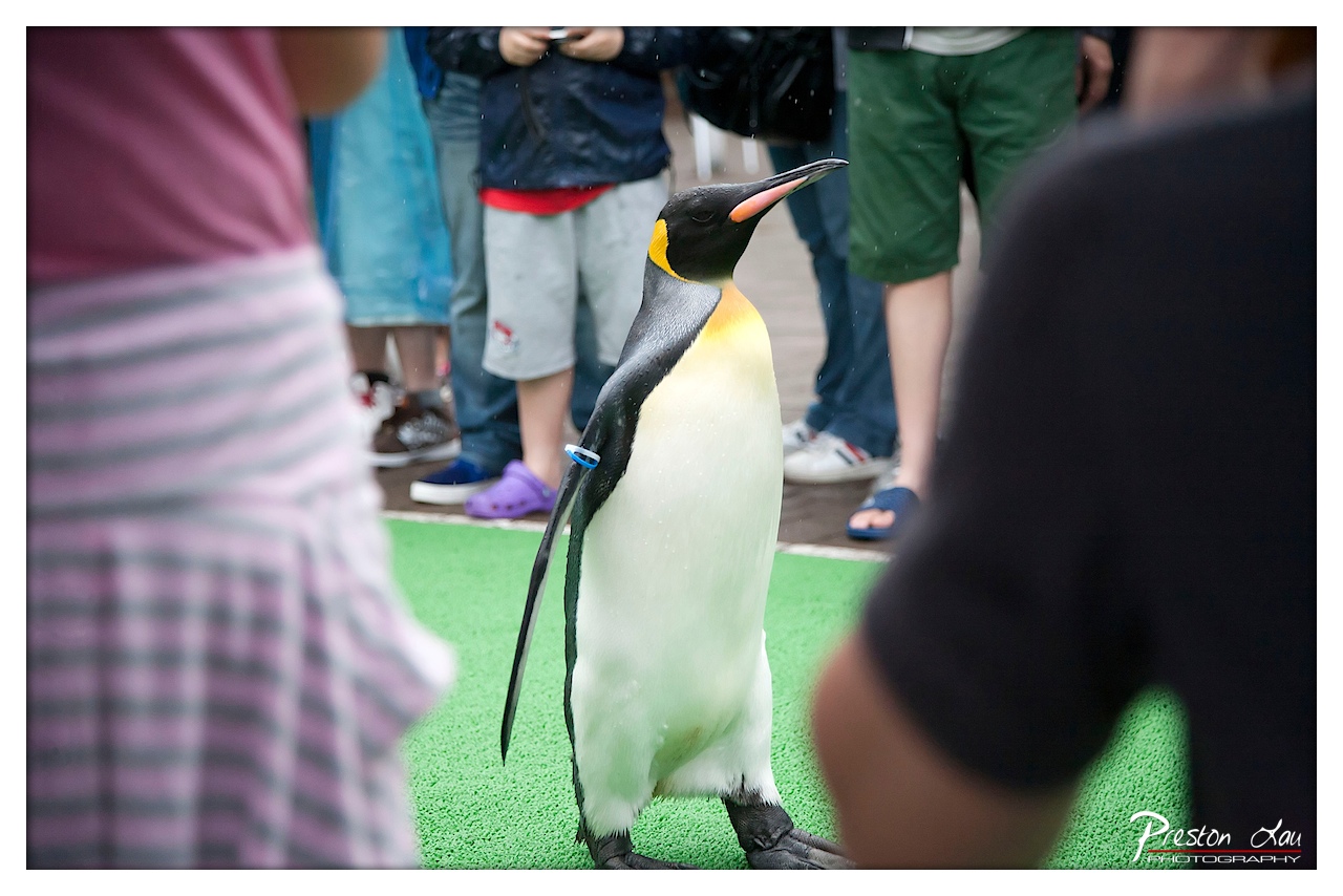

1. Overall Rating (0–10) — 6.8
This photograph captures a lively, candid moment between a penguin and a crowd of onlookers, evoking a sense of wonder and connection in a controlled environment. The penguin’s poised stance and the surrounding human curiosity create a narrative of shared experience, though the cluttered foreground and slightly awkward framing temper its visual impact. The image succeeds in documenting a fleeting interaction, but lacks the compositional finesse to elevate it beyond a simple snapshot.
2. Composition (0–10) — 6.0
The penguin is well-centered, but the framing is compromised by the out-of-focus foreground elements—particularly the pink and black clothing—which disrupt the viewer’s focus and create visual noise.
3. Lighting (0–10) — 6.5
Natural, diffused daylight evenly illuminates the scene, preserving detail on the penguin’s feathers and the green artificial turf. The lighting is functional but lacks dramatic contrast or mood.
4. Color & Tone (0–10) — 6.0
The palette is balanced, with the penguin’s black, white, and yellow plumage standing out against the bright green ground and muted background tones. However, the colors appear slightly flat, lacking vibrancy or intentional tonal harmony.
5. Creativity (0–10) — 7.0
The concept of a penguin in a public setting with people offers a charming, almost anthropomorphic narrative. The photographer captures a moment that feels both spontaneous and meaningful, blending wildlife and human interaction in an engaging way.
6. Technical Quality (0–10) — 7.5
The focus is sharp on the penguin, with a shallow depth of field effectively isolating the subject. The image is clear and well-exposed, with no noticeable technical flaws.
7. Emotional Impact (0–10) — 7.0
The image conveys a sense of wonder and gentle curiosity, especially through the penguin’s alert posture and the attentive crowd. It invites viewers to reflect on the relationship between humans and animals in captivity, sparking warmth and mild amusement.
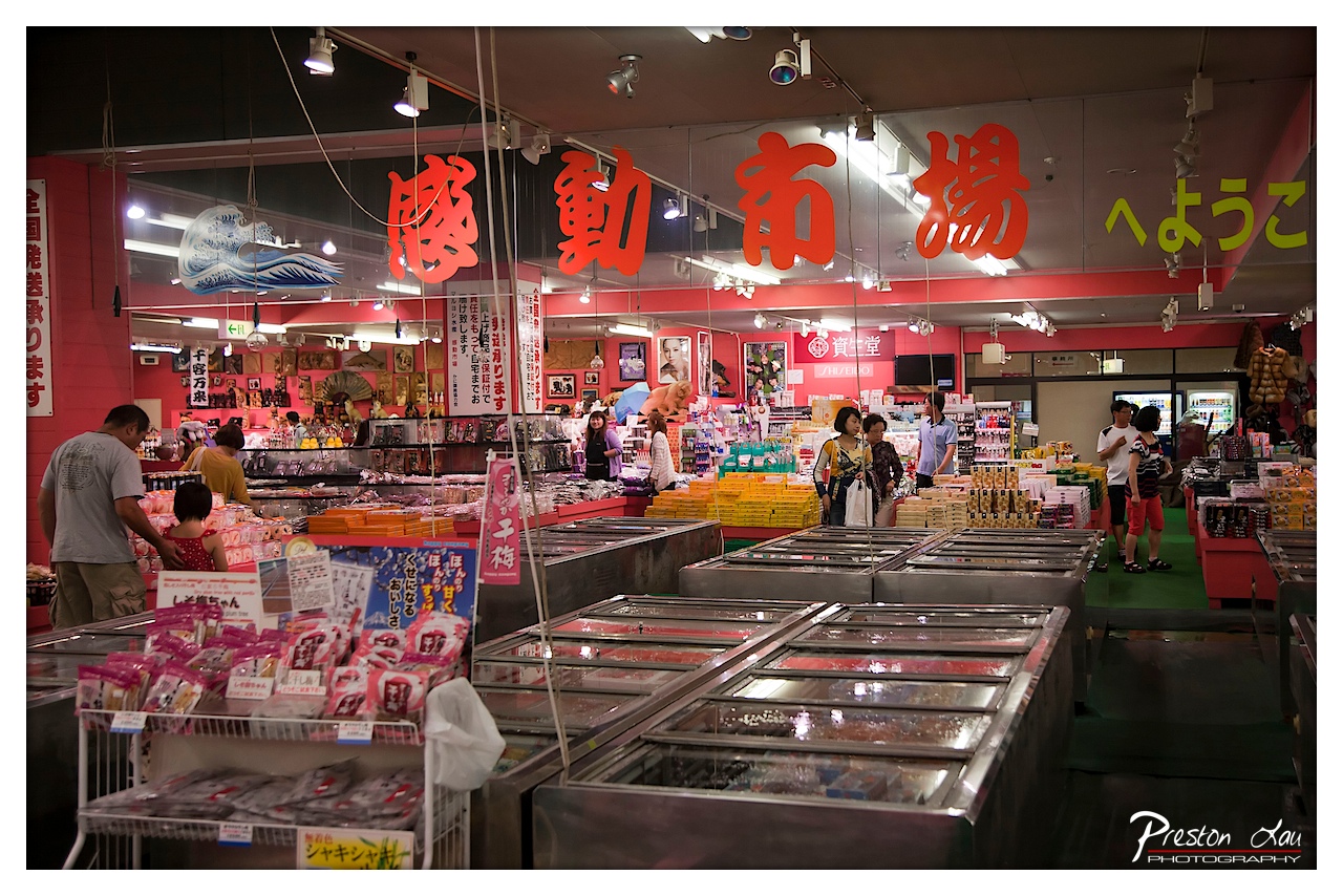

1. Overall Rating (0–10) — 7.0
This photograph captures the vibrant, bustling energy of a Japanese market, where commerce and culture converge in a richly layered visual narrative. The bold red signage and dynamic array of products create an immersive sense of place, while the mix of shoppers and vendors adds life and movement. While the scene is visually dense and slightly chaotic, the image succeeds in conveying the lively atmosphere of a traditional market, though its cluttered composition limits its aesthetic cohesion.
2. Composition (0–10) — 6.0
The wide-angle perspective captures the full scope of the market, but the cluttered foreground and uneven subject placement create visual imbalance. A tighter crop might better guide the viewer’s eye through the scene.
3. Lighting (0–10) — 6.5
Bright overhead fluorescent lighting illuminates the space evenly, though it casts a flat, clinical glow that diminishes atmospheric depth. The reflections on the glass coolers add some visual texture, but the light lacks warmth or directionality.
4. Color & Tone (0–10) — 7.5
The dominant reds of the signage create a striking contrast against the cooler tones of the refrigerated cases and the green floor. The palette is bold and energetic, effectively capturing the commercial vibrancy of the setting, though some areas appear oversaturated.
5. Creativity (0–10) — 7.0
The image successfully conveys the cultural specificity of the location through its signage and product displays, blending documentary realism with a sense of place. The inclusion of the wave motif adds a subtle nod to Japanese aesthetics, enriching the narrative.
6. Technical Quality (0–10) — 7.5
Sharp focus across the frame and clear detail in both foreground and background demonstrate strong technical execution. The depth of field is well-managed, capturing both the immediate display cases and the activity deeper in the market.
7. Emotional Impact (0–10) — 6.5
The photograph evokes a sense of curiosity and immersion, inviting the viewer into the rhythm of daily life in a Japanese marketplace. While the emotional resonance is grounded in realism rather than drama, the scene feels authentic and engaging.
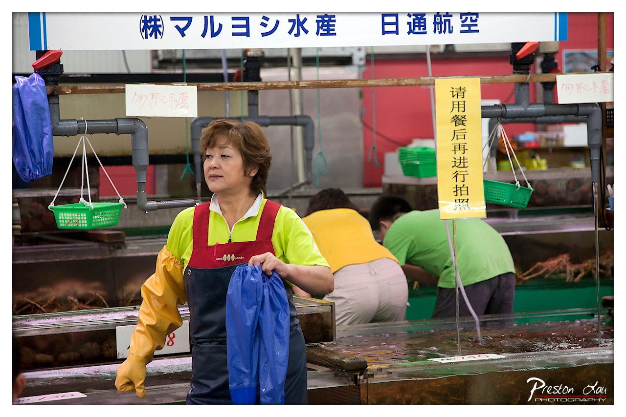

1. Overall Rating (0–10) — 7.0
This photograph captures a candid moment in a bustling Japanese seafood market, where the interplay of labor, language, and daily routine creates a vivid sense of place. The woman in the foreground, poised and attentive, serves as a human anchor amid the mechanical clutter of tanks and signage, grounding the scene in authenticity. While the composition is rich with cultural detail, the visual chaos of signs and pipes slightly detracts from the image’s overall cohesion, keeping it from achieving a more refined narrative depth.
2. Composition (0–10) — 6.5
The subject is well-placed, drawing the eye with her central positioning and direct gaze. However, the busy background and overlapping elements—pipes, baskets, and signage—create visual distraction, reducing the clarity of the focal point.
3. Lighting (0–10) — 6.0
The scene is illuminated by bright, even fluorescent light, which clearly reveals details but flattens shadows and diminishes atmospheric depth. The lighting feels functional rather than artistic, emphasizing documentation over mood.
4. Color & Tone (0–10) — 6.5
The palette is vibrant, with bold yellows, greens, and reds that reflect the energy of the market. However, the color balance is slightly cool, and the saturation feels uneven, with some areas appearing washed out.
5. Creativity (0–10) — 7.0
The image stands out for its cultural specificity and narrative potential. The juxtaposition of Japanese text, the worker’s focused expression, and the layered environment suggests a story beyond the frame, offering a unique glimpse into daily life.
6. Technical Quality (0–10) — 7.5
The image is sharp and well-focused, with clean detail in the foreground subject. The depth of field is appropriately managed, though some background elements are slightly soft, contributing to the sense of realism.
7. Emotional Impact (0–10) — 6.5
There is a quiet dignity in the woman’s posture and expression, conveying dedication and routine. While the scene is engaging, the emotional resonance is tempered by the visual clutter, preventing a deeper connection with the viewer.
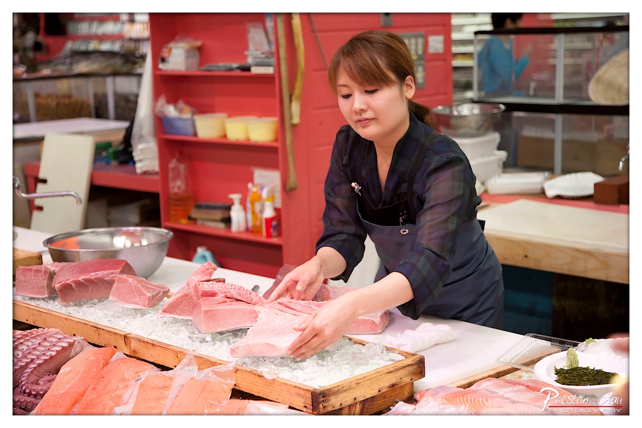

1. Overall Rating (0–10) — 7.5
This photograph captures the quiet intensity of a fishmonger at work, where precision and tradition meet in a vibrant marketplace setting. The warm, saturated tones and candid focus on the woman’s hands and expression convey both professionalism and cultural authenticity. While the scene is rich in detail and context, the slightly cluttered background and flat lighting prevent it from achieving a more refined visual harmony.
2. Composition (0–10) — 7.0
The subject is well-placed off-center, drawing the eye to her hands and the fish, while the red shelving provides a strong vertical anchor. The foreground elements, though slightly distracting, add depth and context to the scene.
3. Lighting (0–10) — 6.5
The light is functional and even, likely from overhead fluorescent fixtures, which flattens shadows and reduces dimensionality. While it captures the details of the fish and the workspace, it lacks the warmth and sculpting quality that would enhance mood.
4. Color & Tone (0–10) — 8.0
The bold red of the shelving contrasts beautifully with the cool pinks and whites of the fish, creating a visually engaging palette. The saturation enhances the vibrancy of the scene, giving it an energetic, almost theatrical quality.
5. Creativity (0–10) — 7.5
The image succeeds in telling a story of craftsmanship and cultural practice, with a clear narrative focus. The choice to capture the moment mid-action—hands at work—adds authenticity and dynamism.
6. Technical Quality (0–10) — 8.0
The focus is sharp on the central subject and the fish, with clean detail throughout. The depth of field effectively isolates the main action, though some background elements remain slightly distracting.
7. Emotional Impact (0–10) — 7.0
There is a quiet dignity in the woman’s concentration, which evokes respect for her skill and dedication. The viewer is drawn into the rhythm of the workspace, creating a sense of intimacy and appreciation for artisanal labor.
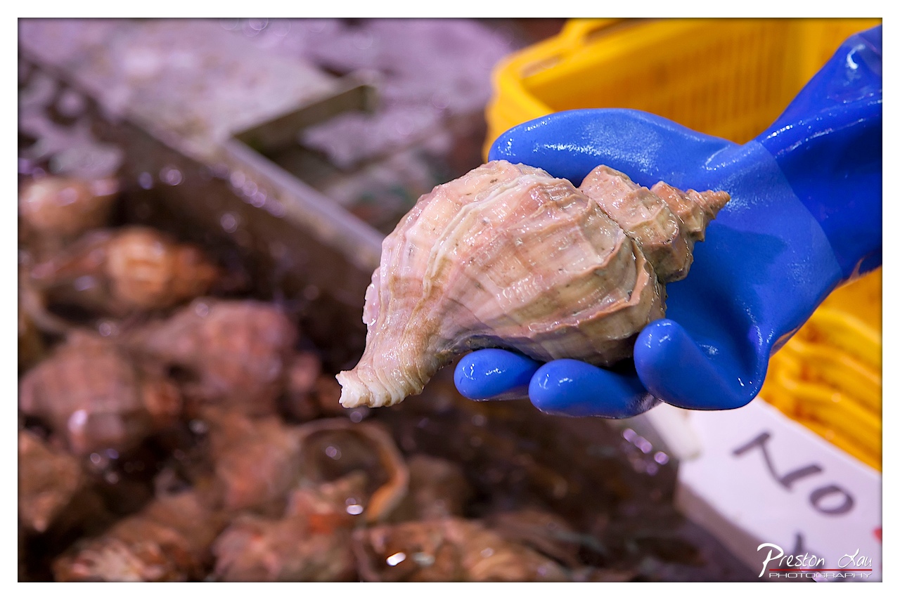

1. Overall Rating (0–10) — 7.0
This photograph captures the tactile immediacy of a seafood market, where the raw texture of a conch shell contrasts with the synthetic sheen of a blue glove. The shallow depth of field draws attention to the shell’s intricate ridges and the hand’s careful grip, creating a moment of quiet focus amid the chaos of the market. While the image effectively highlights the subject, the background remains slightly indistinct, limiting its narrative depth.
2. Composition (0–10) — 7.0
The subject is well-placed in the foreground, with the hand and shell forming a strong diagonal that guides the eye. The blurred background helps isolate the focal point, though the composition feels slightly off-center, with the yellow basket partially cut off.
3. Lighting (0–10) — 6.0
The lighting is functional but flat, likely from overhead market fixtures, which results in a lack of dramatic shadows. The highlights on the glove and shell are strong, but the overall tone is somewhat sterile, dampening the scene’s natural vibrancy.
4. Color & Tone (0–10) — 7.0
The bold blue of the glove creates a striking contrast with the muted beige and brown tones of the shell and background. The yellow basket adds a warm accent, though the overall palette is subdued. A touch more saturation would enhance the visual appeal.
5. Creativity (0–10) — 6.5
The image presents a familiar scene with a fresh, close-up perspective, emphasizing texture and detail. The choice to focus on the hand holding the shell gives it a human element, but the concept remains grounded in documentation rather than conceptual storytelling.
6. Technical Quality (0–10) — 8.0
The focus is sharp on the shell and glove, with a well-executed shallow depth of field that blurs the background effectively. The image is clear and free of technical flaws, with good control over exposure.
7. Emotional Impact (0–10) — 6.0
The photograph conveys a sense of routine and labor, inviting the viewer to consider the unseen hands behind the market’s offerings. While it captures a quiet moment of interaction with food, it lacks the emotional intensity to deeply resonate.
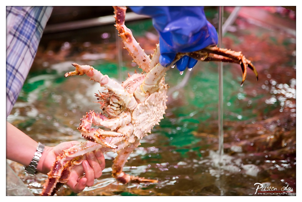

1. Overall Rating (0–10) — 7.0
This photograph captures a moment of raw, tactile interaction between human hands and a massive crab, evoking the energy of a bustling seafood market. The vivid contrast between the blue glove and the pale, spiky crustacean creates a compelling focal point, while the water’s movement and reflections add a sense of immediacy. While the composition leans slightly toward documentary realism, it succeeds in conveying both the scale and the tactile reality of the scene, though a more deliberate framing could elevate its artistic impact.
2. Composition (0–10) — 6.5
The crab is well-centered and dominates the frame, but the cluttered background and uneven framing of the hands and water edges reduce visual harmony. A tighter crop and better alignment would enhance focus.
3. Lighting (0–10) — 6.0
The scene is evenly lit with ambient overhead light, which highlights the crab’s texture but lacks directional drama. The water reflections add complexity, but the overall lighting feels functional rather than atmospheric.
4. Color & Tone (0–10) — 7.0
The palette balances the cool blue of the glove with the warm tones of the crab and the green-tinged water, creating a naturalistic yet visually engaging contrast. The slight color cast in the water adds depth, though the overall vibrancy is moderate.
5. Creativity (0–10) — 7.0
The image captures an authentic, unposed moment with strong subject matter. The juxtaposition of human touch and the rugged form of the crab suggests a narrative of commerce and nature, making it both documentary and subtly poetic.
6. Technical Quality (0–10) — 8.0
The focus is sharp on the crab and hands, with clear detail in the textures of the shell and the water droplets. The shallow depth of field effectively isolates the subject, though the background blur is slightly uneven.
7. Emotional Impact (0–10) — 6.5
The photograph conveys a sense of immediacy and tactile realism, inviting the viewer to feel the weight and coldness of the crab. While it doesn’t evoke deep emotional resonance, it successfully communicates the energy and rawness of a market environment.
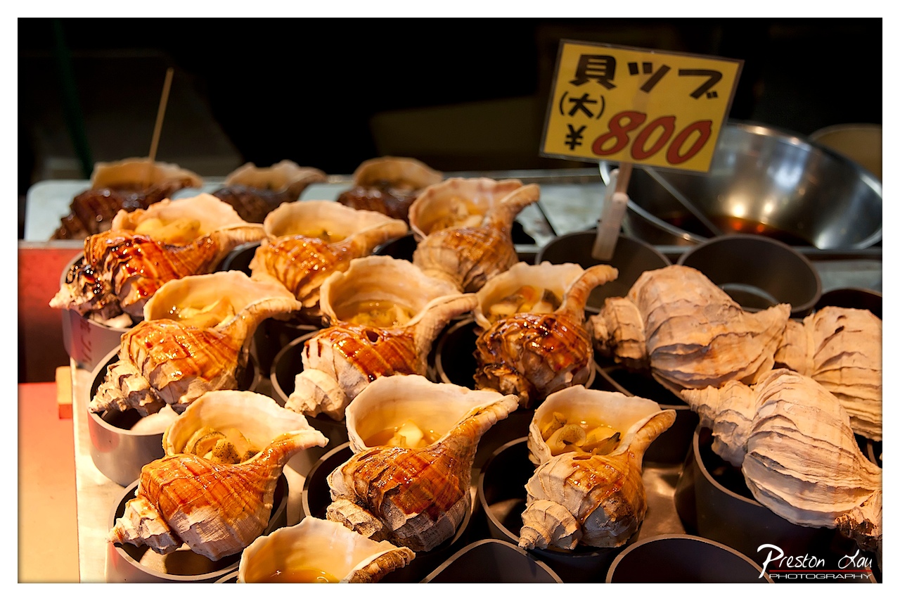

1. Overall Rating (0–10) — 7.0
This photograph captures the vibrant allure of a Japanese street food stall, where the rich textures and warm glaze of simmered conch shells evoke a sense of sensory indulgence. The composition draws the eye to the glistening seafood, while the Japanese price sign adds cultural context and authenticity. While the lighting and framing work well to highlight the food’s appeal, the image feels slightly overexposed in the highlights, and the background clutter competes for attention.
2. Composition (0–10) — 6.5
The arrangement of shells fills the frame, creating a sense of abundance. However, the uneven depth and cluttered background slightly disrupt the visual flow, and the sign’s placement is slightly off-center, pulling focus away from the main subject.
3. Lighting (0–10) — 7.5
Warm, directional lighting enhances the glistening glaze on the shells, creating appealing highlights and emphasizing texture. The contrast between the bright food and dark background helps the subject stand out, though some areas are slightly overexposed.
4. Color & Tone (0–10) — 7.0
The warm golden and amber tones of the glazed conch contrast beautifully with the neutral shell colors and dark background. The palette feels inviting and appetizing, with a slightly saturated tone that enhances the richness of the dish.
5. Creativity (0–10) — 6.5
The image successfully captures a moment of everyday culinary culture with an artistic eye. The focus on texture and light elevates a simple street food scene into something visually engaging, though the concept remains grounded in straightforward documentation.
6. Technical Quality (0–10) — 7.5
The focus is sharp on the foreground shells, with excellent detail in the glaze and shell texture. The exposure is well-handled overall, though slight overexposure in the highlights and a faint lens flare suggest minor technical imperfections.
7. Emotional Impact (0–10) — 6.5
The photograph evokes a sense of warmth, indulgence, and cultural authenticity, inviting the viewer to imagine the flavors and aromas of the dish. While the emotional resonance is strong, the lack of a human element keeps the connection more observational than intimate.
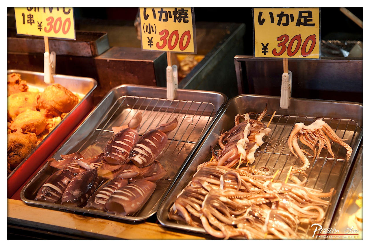

1. Overall Rating (0–10) — 7.0
This photograph captures the vibrant energy of a Japanese street food stall, where the rich textures and warm tones evoke the sensory experience of a bustling market. The arrangement of grilled squid and tempura, paired with bold price signs, conveys authenticity and immediacy. While the composition leans slightly cluttered, the image succeeds in transporting the viewer into the scene, blending cultural specificity with visual appeal.
2. Composition (0–10) — 6.5
The frame is filled with overlapping trays and signage, creating a layered, dynamic arrangement. The diagonal flow of the trays draws the eye across the image, though the left side feels slightly more congested, detracting from visual balance.
3. Lighting (0–10) — 7.5
Warm, directional lighting enhances the glistening surfaces of the squid and highlights the textures of the food. The contrast between the bright yellow signs and the dimmer background adds depth and visual interest.
4. Color & Tone (0–10) — 7.0
The palette balances warm yellows and browns with the deep purples and translucent whites of the squid, creating a natural and appetizing harmony. The slight color cast from the ambient lighting adds to the scene’s authenticity.
5. Creativity (0–10) — 7.0
The image captures a candid, unfiltered moment of street food culture, emphasizing authenticity over stylization. The choice to focus on the food and signage, rather than people, tells a story of commerce and tradition.
6. Technical Quality (0–10) — 8.0
Sharp focus on the foreground squid and clear detail in the textures of the food and metal trays demonstrate strong technical execution. The depth of field is well-managed, keeping the main subjects crisp while softly blurring the background.
7. Emotional Impact (0–10) — 6.5
The photograph evokes a sense of warmth and nostalgia, inviting the viewer to imagine the sizzle of grills and the aroma of fried seafood. While not emotionally overwhelming, it effectively conveys the charm of a simple, everyday moment.

1. Overall Rating (0–10) — 7.0
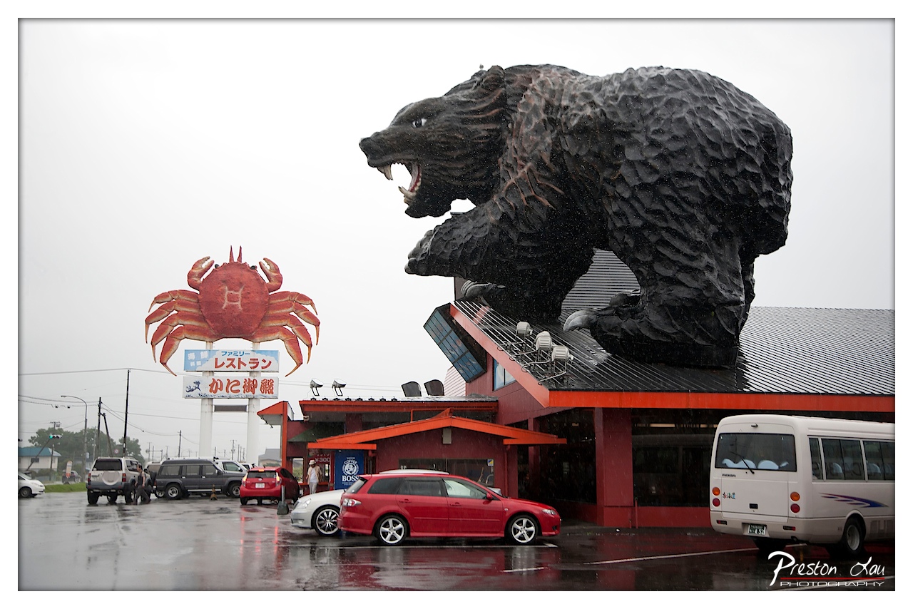
This photograph captures a striking, surreal roadside landmark under a moody, rain-soaked sky, where the overgrown scale of the bear sculpture and the bold red crab sign create an almost cinematic clash of nature and kitsch. The wet pavement reflects the scene’s colors and adds a layer of atmospheric depth, enhancing the sense of isolation and exaggeration. While the composition feels slightly cluttered, the image succeeds in conveying the eccentricity of the location, blending humor, scale, and environmental mood into a compelling visual narrative.
2. Composition (0–10) — 6.5
The bear dominates the right side, creating visual weight, while the crab sign anchors the left, establishing a strong diagonal tension. However, the inclusion of multiple vehicles and signage slightly distracts from the central spectacle, making the frame feel busy rather than balanced.
3. Lighting (0–10) — 6.0
The overcast sky provides soft, diffused light that evenly illuminates the scene, minimizing harsh shadows and enhancing the moody atmosphere. The rain adds texture and depth, though the lack of strong highlights limits the image’s dynamic range.
4. Color & Tone (0–10) — 7.0
The saturated reds of the building and crab sign contrast sharply with the muted gray sky and dark bear, creating visual pop. The wet surface amplifies reflections, adding richness to the tonal palette and reinforcing the rainy, atmospheric mood.
5. Creativity (0–10) — 8.0
The juxtaposition of the massive bear and the whimsical crab sign evokes a sense of playful absurdity, suggesting a narrative beyond mere documentation. The photographer’s choice to frame the scene during rain adds a layer of cinematic storytelling, elevating it beyond a simple travel snapshot.
6. Technical Quality (0–10) — 8.0
The image is sharp and well-focused, with clear details in the sculpture and reflections on the wet ground. The exposure is well-handled, capturing the overcast light without significant loss of detail in the shadows or highlights.
7. Emotional Impact (0–10) — 6.5
The scene evokes a sense of wonder and mild disorientation, capturing the odd charm of roadside Americana. While not emotionally stirring in a traditional sense, it invites curiosity and amusement, leaving the viewer to ponder the story behind such an extravagant landmark.

1. Overall Rating (0–10) — 7.0
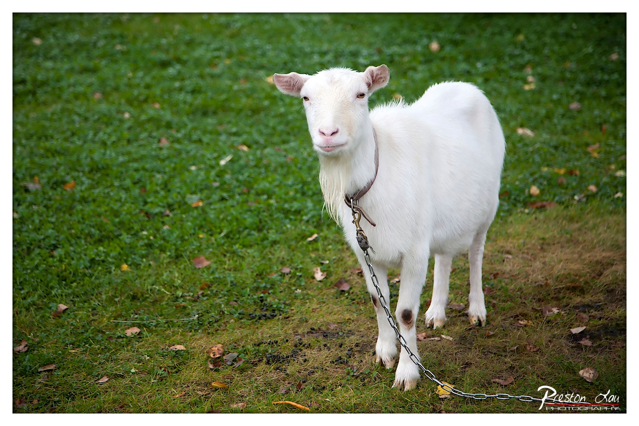
This photograph captures a quiet, intimate moment with a white goat standing alert in a grassy field, its gaze fixed directly on the viewer. The soft focus on the background and the natural lighting lend a gentle, pastoral quality to the scene, while the chain subtly hints at a narrative of domestication. Though the image is visually pleasing, it holds back from full emotional resonance due to a slightly sterile atmosphere and an over-reliance on a familiar subject.
2. Composition (0–10) — 6.5
The goat is placed slightly off-center, creating a balanced yet dynamic frame, with the chain leading the eye diagonally into the composition. The shallow depth of field effectively isolates the subject, though the composition could benefit from tighter framing to emphasize the goat’s expression and presence.
3. Lighting (0–10) — 7.0
Soft, diffused natural light illuminates the scene evenly, minimizing harsh shadows and enhancing the goat’s white fur. The lighting contributes to a calm, serene mood, though a touch more directional light could add dimension and texture to the subject.
4. Color & Tone (0–10) — 7.5
The vibrant green of the grass contrasts beautifully with the goat’s white coat, creating a clean and natural palette. The autumnal leaves scattered on the ground introduce subtle warm tones, adding depth and seasonal context to the image.
5. Creativity (0–10) — 6.0
While the subject is charming and the execution is competent, the image leans toward the conventional. It presents a familiar scene with a straightforward approach, offering little surprise or conceptual depth beyond its visual appeal.
6. Technical Quality (0–10) — 8.0
The image is sharp and well-focused on the goat’s face, with clean detail in the fur and chain. The background is smoothly blurred, demonstrating strong control over depth of field and lens choice.
7. Emotional Impact (0–10) — 6.5
The goat’s direct gaze creates a sense of connection, inviting the viewer into its quiet world. However, the emotional pull is tempered by the image’s general familiarity, preventing a deeper, lasting impression.

1. Overall Rating (0–10) — 8.0
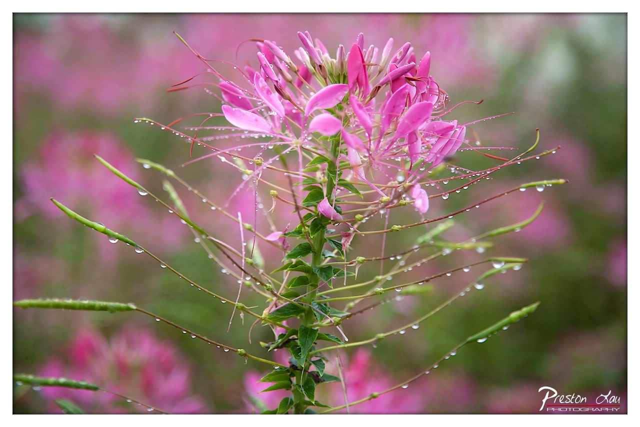
This image captures the delicate beauty of a pink spider flower glistening with dew, evoking a sense of fresh morning tranquility. The soft focus and vibrant color palette create a dreamlike quality, while the intricate details of the petals and droplets invite close inspection. While the composition is strong, a more deliberate use of depth and framing could elevate the image from lovely to extraordinary.
2. Composition (0–10) — 7.5
The flower is well-centered, drawing the eye to its intricate structure, though the slightly off-center stem creates a subtle visual tension. The shallow depth of field effectively isolates the subject, but the background, while softly blurred, still contains a few distracting elements.
3. Lighting (0–10) — 8.0
The soft, diffused light enhances the natural glow of the petals and highlights the dewdrops without harsh reflections. This gentle illumination contributes to the serene, early-morning atmosphere.
4. Color & Tone (0–10) — 8.5
The vivid magenta of the flower contrasts beautifully with the soft green stems and muted background, creating a rich, harmonious palette. The tonal range is well-balanced, with subtle gradients that add depth.
5. Creativity (0–10) — 8.0
The photograph transforms a common natural scene into a poetic moment through careful attention to light, focus, and texture. The choice to emphasize the dewdrops and fine filaments adds a layer of intimacy and detail.
6. Technical Quality (0–10) — 9.0
Sharp focus on the central flower, precise exposure, and clean detail in the water droplets demonstrate strong technical control. The image is free of noise and artifacts.
7. Emotional Impact (0–10) — 8.5
The image evokes calmness, renewal, and quiet beauty, inviting the viewer to pause and appreciate the fleeting elegance of nature. The presence of dew suggests freshness and the start of a new day, creating a deeply resonant emotional connection.
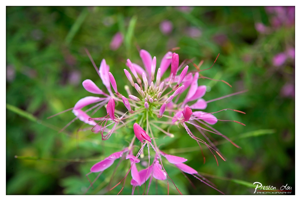

1. Overall Rating (0–10) — 8.0
This image captures the delicate intricacy of a spider flower with a painterly sensitivity, where the soft pink petals and wispy stamens unfold like a natural sculpture. The shallow depth of field isolates the bloom with elegance, drawing the viewer into its quiet complexity. While the composition is strong and the colors rich, a touch more contrast in the background could further elevate the flower’s presence and emotional weight.
2. Composition (0–10) — 8.5
The flower is centered with balanced framing, allowing its radial form to command attention. The soft blur of the surrounding greenery enhances focus and creates a sense of depth, though the composition slightly favors symmetry over dynamic tension.
3. Lighting (0–10) — 7.5
Natural, diffused light illuminates the flower evenly, highlighting the subtle textures of the petals and stamens without harsh shadows. The soft glow enhances the delicate nature of the subject, though a hint of directional light might add more dimension.
4. Color & Tone (0–10) — 8.0
The vibrant magenta of the flower contrasts beautifully with the lush, muted greens of the background, creating a harmonious and visually pleasing palette. The tones are rich yet natural, with a subtle warmth that enhances the organic feel.
5. Creativity (0–10) — 8.5
The photographer captures a moment of natural beauty with a refined, almost ethereal touch. The use of macro detail and selective focus transforms a common flower into a subject of quiet drama, suggesting an intimate dialogue between nature and observation.
6. Technical Quality (0–10) — 9.0
Sharp focus on the flower’s center, clean detail throughout, and smooth bokeh demonstrate strong technical control. The image is free of noise and distortion, with excellent clarity in the foreground.
7. Emotional Impact (0–10) — 8.0
There is a sense of stillness and wonder in the image—quiet beauty that invites contemplation. The viewer is drawn into a moment of serene observation, evoking a gentle appreciation for the intricate details of the natural world.
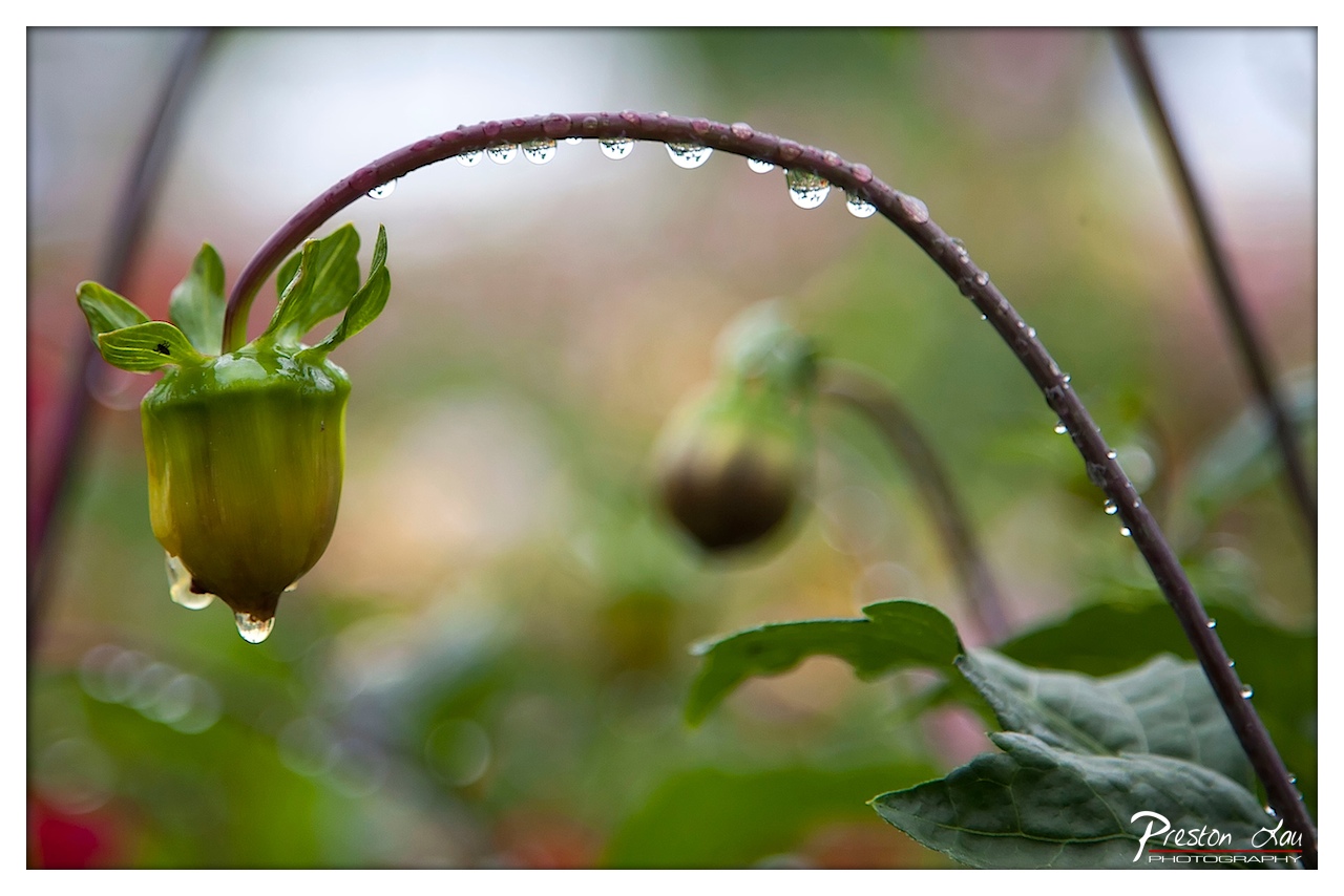

1. Overall Rating (0–10) — 7.5
This photograph captures a quiet moment of natural resilience, where a drooping flower bud and a rain-laden stem evoke both fragility and endurance. The delicate arc of the stem, adorned with glistening water droplets, creates a poetic visual rhythm, while the soft bokeh background enhances the intimacy of the scene. While the composition is strong and emotionally resonant, a slightly more intentional use of depth and contrast could elevate the image from lovely to transcendent.
2. Composition (0–10) — 8.0
The curved stem forms a graceful arch that draws the eye across the frame, with the drooping bud anchoring the left side and creating a balanced asymmetry. The shallow depth of field isolates the subject effectively, though the right side feels slightly underutilized in terms of visual weight.
3. Lighting (0–10) — 7.5
Diffused, overcast light enhances the softness of the scene, allowing the water droplets to catch subtle highlights without harsh glare. The even illumination supports the delicate textures of the plant and reinforces the quiet, contemplative mood.
4. Color & Tone (0–10) — 7.0
The palette is dominated by soft greens and earthy purples, creating a natural harmony. While the colors are true to life, a touch more saturation could bring the green of the bud to life without sacrificing the image’s gentle tone.
5. Creativity (0–10) — 8.0
The image transforms a simple natural detail into a lyrical narrative—using the curve of the stem and the weight of water to suggest both vulnerability and strength. The choice to focus on a pre-bloom bud adds a layer of quiet anticipation.
6. Technical Quality (0–10) — 8.5
The focus is sharp on the key elements—the bud and the droplets—while the background melts into a smooth bokeh. The image is clean, well-exposed, and shows excellent control over depth of field.
7. Emotional Impact (0–10) — 8.0
There’s a quiet melancholy and beauty in the drooping form, evoking feelings of stillness, renewal, and the weight of life’s delicate balance. The viewer is invited to pause and reflect on the quiet dignity of the natural world.
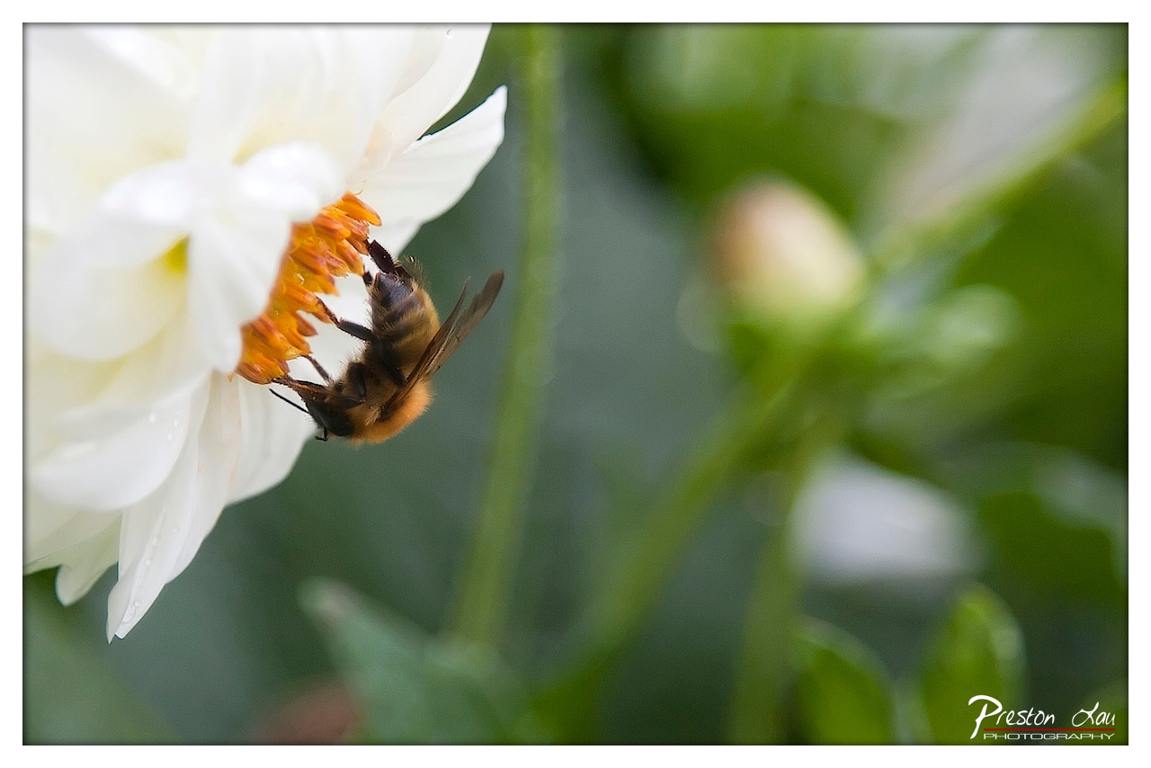

1. Overall Rating (0–10) — 7.8
This photograph captures a delicate moment of natural interaction, where a bee delicately harvests nectar from a white flower, creating a sense of quiet intimacy. The shallow depth of field isolates the subject with exquisite precision, drawing the viewer into the micro-world of pollination. While the composition is strong and the moment is beautifully preserved, the image’s emotional resonance is slightly tempered by the cool, clinical lighting, which softens the warmth of the scene.
2. Composition (0–10) — 8.0
The bee and flower are positioned along the left third of the frame, creating a dynamic diagonal that leads the eye into the image. The negative space on the right balances the composition and allows the subject to breathe, while the blurred background enhances focus without distraction.
3. Lighting (0–10) — 6.5
Soft, diffused natural light illuminates the scene evenly, avoiding harsh shadows and preserving fine details on the bee’s body and the flower’s petals. However, the lack of directional warmth gives the image a slightly flat, overcast quality that reduces atmospheric depth.
4. Color & Tone (0–10) — 7.5
The contrast between the bright white petals and the warm orange of the flower’s center creates a striking visual anchor. The surrounding greens are muted and desaturated, enhancing the focus on the central subject. The overall palette is harmonious and natural, though slightly cool in tone.
5. Creativity (0–10) — 8.0
The photographer captures a fleeting, intimate moment with a clear artistic vision—using shallow depth of field and tight framing to elevate a simple natural scene into something contemplative and elegant. The choice to focus on the bee’s interaction with the flower suggests a deeper narrative about life and sustenance.
6. Technical Quality (0–10) — 8.5
The focus is precisely on the bee and the flower’s center, with sharp detail in the subject while the background dissolves into a smooth bokeh. The image is clean, with no visible noise or technical flaws, showcasing strong control over aperture and shutter speed.
7. Emotional Impact (0–10) — 7.0
There is a quiet, meditative quality to the image that invites reflection on the small, essential moments in nature. The viewer is drawn into the stillness of the scene, evoking a sense of calm and appreciation for the intricate beauty of pollination.
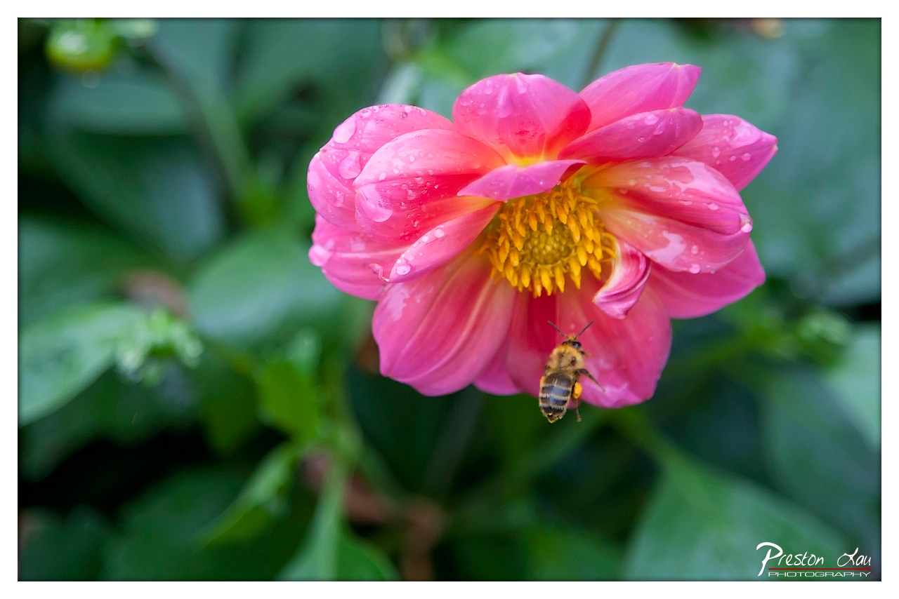

1. Overall Rating (0–10) — 8.0
This photograph captures a delicate moment of nature with vibrant clarity and emotional warmth, where a bee hovers near a dew-kissed dahlia, suggesting the quiet harmony of a garden at dawn. The composition draws the eye naturally to the flower’s rich pink petals and the bee’s subtle motion, while the soft background depth enhances the sense of intimacy. Though the image is visually compelling, a touch more contrast in the midtones could further elevate the scene’s dynamic range.
2. Composition (0–10) — 8.5
The flower is placed slightly off-center, creating a balanced and natural flow, while the bee’s positioning adds movement and narrative. The shallow depth of field effectively isolates the subject, enhancing focus on the interaction between bee and bloom.
3. Lighting (0–10) — 8.0
Soft, diffused light enhances the natural textures of the petals and the glistening water droplets, creating a gentle glow without harsh shadows. The light highlights the flower’s warm center while maintaining the cool tone of the surrounding foliage.
4. Color & Tone (0–10) — 9.0
The rich pink of the dahlia contrasts beautifully with the deep green leaves and the golden yellow center, creating a vivid, harmonious palette. The tones are balanced and rich, with the water droplets adding subtle highlights that enhance the image’s freshness.
5. Creativity (0–10) — 8.5
The photographer captures a fleeting, intimate moment in nature with a clear artistic intent—celebrating the quiet beauty of pollination. The inclusion of the bee in motion adds narrative depth and elevates the image beyond a simple floral portrait.
6. Technical Quality (0–10) — 9.0
Sharp focus on the flower and bee, with smooth background blur, demonstrates excellent control over depth of field. The image is clean, well-exposed, and free from distracting artifacts, showcasing high technical proficiency.
7. Emotional Impact (0–10) — 8.5
The image evokes a sense of peace, wonder, and connection to the natural world, inviting the viewer to pause and appreciate the small, delicate interactions that sustain life. The presence of the bee adds a touch of life and movement that enhances its emotional resonance.
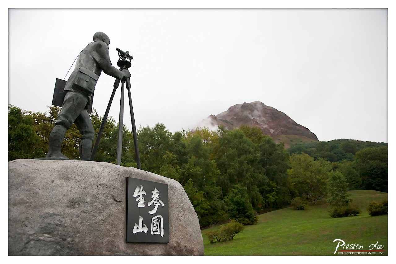

1. Overall Rating (0–10) — 7.0
This photograph captures a solemn and contemplative moment, blending human endeavor with the raw power of nature. The statue of the surveyor, poised with his instrument, stands as a testament to scientific curiosity and observation, while the distant, mist-shrouded mountain evokes both awe and foreboding. The muted palette and overcast sky lend a somber tone, reinforcing the image’s narrative weight. While the composition is strong, the flat lighting slightly diminishes the visual drama, keeping the image from reaching its full emotional potential.
2. Composition (0–10) — 7.5
The statue is well-placed on the left, creating a strong visual anchor, while the mountain on the right balances the frame. The diagonal line of the trees leads the eye naturally from the foreground into the depth of the scene. The inclusion of the sign adds cultural context without distracting from the central subject.
3. Lighting (0–10) — 6.0
The overcast sky produces soft, diffused light that evenly illuminates the scene, minimizing harsh shadows. While this ensures clarity and detail, it also flattens the image’s depth and mood, reducing the dramatic contrast between the statue and the mountain.
4. Color & Tone (0–10) — 6.5
The colors are restrained and natural—dominated by muted greens, grays, and the subdued brown of the mountain. The tonal range is limited, contributing to the somber atmosphere, but the lack of vibrant contrast keeps the image from feeling dynamic or engaging.
5. Creativity (0–10) — 7.0
The juxtaposition of human measurement against the untamed mountain is a powerful metaphor for science and nature’s enduring mystery. The inclusion of the Japanese characters adds cultural specificity and depth, enhancing the image’s storytelling quality.
6. Technical Quality (0–10) — 8.0
The image is sharp and well-focused, particularly on the statue and the sign. The depth of field is effectively managed, keeping both the foreground and background reasonably clear. The watermark is subtle and unobtrusive.
7. Emotional Impact (0–10) — 7.5
The photograph evokes a sense of reverence and introspection, inviting the viewer to reflect on humanity’s relationship with the natural world. The quiet stillness of the scene and the implied history of the monument create a lasting emotional resonance.
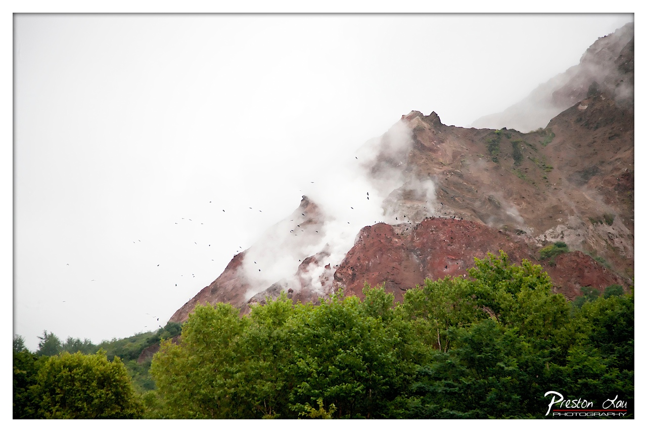

1. Overall Rating (0–10) — 7.0
This photograph captures the raw power of a volcanic landscape, where steam and smoke rise from the rugged, reddish slopes, evoking both awe and unease. The contrast between the lush green trees in the foreground and the barren, active mountain creates a compelling narrative of nature’s duality—life and destruction coexisting. While the image is striking in its subject and atmosphere, the overcast lighting and slightly muted colors temper its visual impact, keeping it from achieving full artistic resonance.
2. Composition (0–10) — 6.5
The framing places the mountain off-center, allowing the steam and birds to lead the eye diagonally across the frame. The foreground foliage provides depth and grounding, but the composition feels slightly unbalanced due to the dominant blank sky on the left.
3. Lighting (0–10) — 5.5
The diffused, overcast light softens details and creates a somber mood, but it also flattens the scene and reduces the mountain’s textural richness. The lack of directional light limits depth and shadows.
4. Color & Tone (0–10) — 6.0
The palette is dominated by muted earth tones—reddish browns and dull greens—with the white steam providing contrast. The overall tone is subdued, with little vibrancy or warmth, which aligns with the atmospheric mood but lacks visual punch.
5. Creativity (0–10) — 7.0
The image successfully captures a dynamic natural phenomenon, with the birds and rising steam adding movement and life. The juxtaposition of life and geological activity suggests a deeper narrative, elevating the photograph beyond a simple landscape.
6. Technical Quality (0–10) — 7.5
The focus is sharp on the midground, with clear detail in the trees and mountain texture. The exposure is well-managed, avoiding harsh highlights or deep shadows, though the image lacks crispness in the upper areas due to atmospheric haze.
7. Emotional Impact (0–10) — 7.0
There’s a palpable sense of tension and wonder, as the viewer is drawn into a world where nature’s forces are visibly at work. The steam, birds, and rugged terrain evoke both beauty and danger, creating a contemplative, almost meditative emotional response.
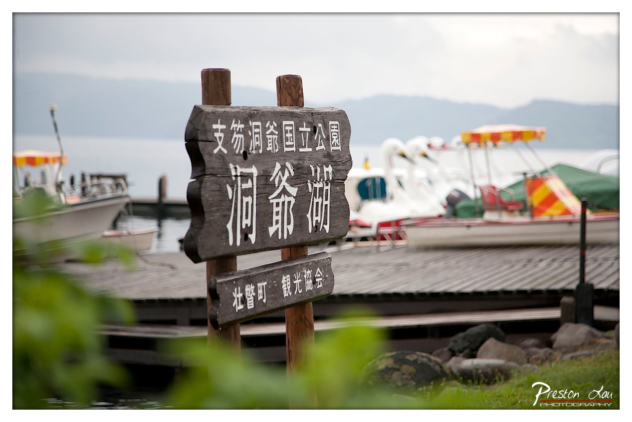

1. Overall Rating (0–10) — 7.0
This photograph captures a serene lakeside scene with a quiet, contemplative mood, where the rustic wooden sign acts as both a focal point and a cultural anchor. The shallow depth of field beautifully isolates the sign from the soft, blurred background, creating a sense of place without distraction. While the composition is strong and evocative, the muted lighting and slightly overcast sky temper its emotional punch, leaving the image feeling more like a travel snapshot than a fully realized portrait of atmosphere.
2. Composition (0–10) — 7.5
The sign is placed slightly off-center, creating a natural visual anchor, while the diagonal lines of the dock and the boats lead the eye into the scene. The foreground foliage adds depth and frames the image effectively, enhancing the sense of immersion.
3. Lighting (0–10) — 6.0
Diffuse, overcast lighting softens the scene and minimizes harsh shadows, lending a calm, even tone. However, the lack of directional light or highlights reduces the image’s dynamic range and visual energy.
4. Color & Tone (0–10) — 6.5
The palette is subdued, dominated by earthy browns, soft grays, and muted greens, which complement the tranquil setting. The pops of color from the swan boats provide subtle contrast but are held back by the overall desaturation.
5. Creativity (0–10) — 7.0
The use of selective focus and cultural signage creates a narrative that feels both personal and place-specific. The image successfully blends documentary detail with artistic framing, offering a glimpse into a quiet moment at a Japanese lakeside park.
6. Technical Quality (0–10) — 8.0
Sharp focus on the sign ensures clarity and legibility, while the background blur is smoothly rendered. The image is well-exposed, with no visible noise or artifacts, demonstrating strong technical control.
7. Emotional Impact (0–10) — 6.5
The photograph evokes a sense of peaceful solitude and quiet travel, inviting the viewer to imagine the calm of a lake in the early morning. While it doesn’t stir intense emotion, it carries a gentle, reflective warmth that lingers.
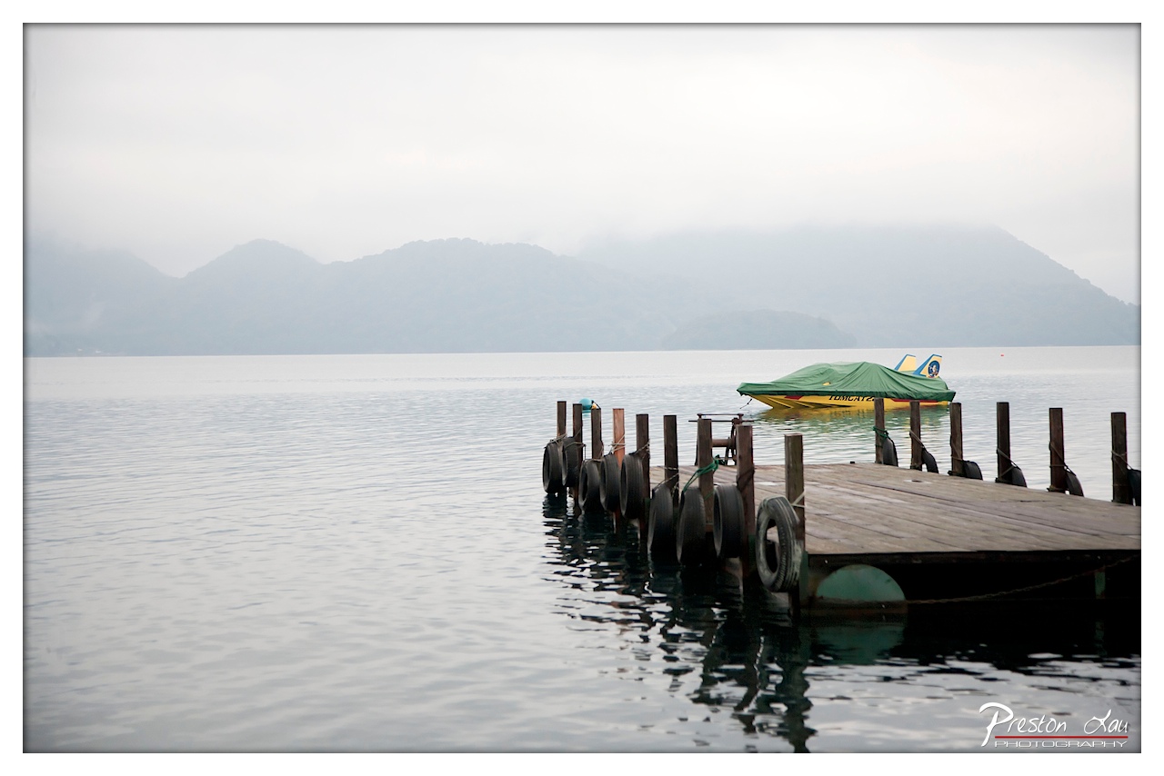

1. Overall Rating (0–10) — 7.0
This photograph captures a serene, almost meditative stillness at a misty lakeside, where the quiet presence of a lone boat and weathered dock evokes a sense of solitude and timelessness. The soft, diffused light and muted tones enhance the tranquil mood, while the layered composition—ranging from the textured dock in the foreground to the hazy mountains in the distance—adds depth and quiet drama. While the image is beautifully atmospheric, its emotional resonance is slightly restrained by a lack of strong visual contrast or focal intensity.
2. Composition (0–10) — 7.5
The diagonal line of the dock leads the eye naturally into the frame, balancing the composition and drawing attention to the covered boat. The placement of the boat slightly off-center creates visual interest, while the expansive water and distant mountains provide a sense of scale and calm.
3. Lighting (0–10) — 8.0
The soft, overcast lighting creates a uniform and even exposure, enhancing the misty, dreamlike quality of the scene. The diffused light minimizes harsh shadows and contributes to the overall mood of quiet contemplation.
4. Color & Tone (0–10) — 7.0
The palette is restrained and cohesive, dominated by cool grays and muted blues, with the green and yellow of the boat offering a subtle but effective point of color contrast. The tonal range is gentle, supporting the image’s tranquil atmosphere.
5. Creativity (0–10) — 6.5
The image relies on natural beauty and atmospheric conditions rather than bold artistic choices, but it effectively captures a moment of quiet contemplation. The use of fog and reflection adds a layer of poetic stillness, suggesting a story of solitude and peace.
6. Technical Quality (0–10) — 8.0
The image is sharp and well-focused, with clear detail in the wooden dock and tire bumpers. The exposure is balanced, and the subtle vignette adds a gentle framing effect that enhances the mood without distracting from the scene.
7. Emotional Impact (0–10) — 7.5
The photograph evokes a deep sense of calm and introspection, inviting the viewer to pause and reflect. The stillness of the water, the muted colors, and the distant mountains combine to create a mood that is both peaceful and slightly melancholic, resonating with the quiet solitude of the moment.
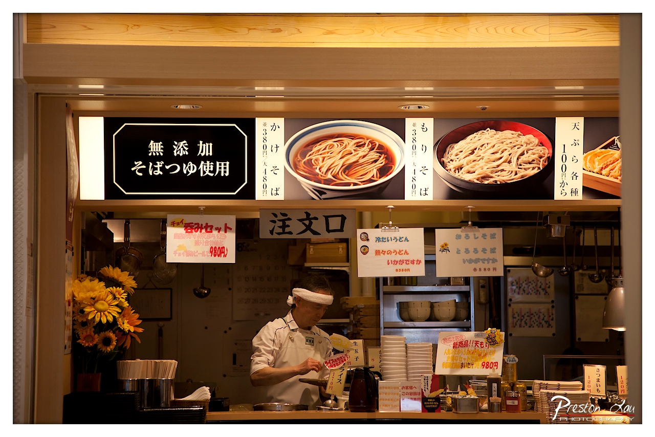

1. Overall Rating (0–10) — 7.0
This photograph captures the intimate, bustling atmosphere of a traditional Japanese noodle shop, where the warmth of the interior lighting and the focused energy of the chef create a sense of authenticity and lived-in charm. The layered composition, filled with signage, menus, and kitchen tools, tells a story of daily routine and culinary craftsmanship. While the visual busyness risks feeling cluttered, it ultimately serves to immerse the viewer in the scene, though a slightly more deliberate framing could elevate its narrative clarity.
2. Composition (0–10) — 6.5
The frame is rich with detail, but the central subject—the chef—is slightly off-center, and the surrounding signs and objects create a sense of visual noise. A tighter crop or more deliberate use of negative space could enhance focus and balance.
3. Lighting (0–10) — 7.5
Warm, ambient light from above casts a golden glow over the scene, highlighting the chef and the wooden surfaces while creating soft shadows that add depth. The lighting enhances the cozy, inviting atmosphere of the shop.
4. Color & Tone (0–10) — 7.0
The palette is dominated by warm yellows and browns, with the bright sunflowers on the left offering a vibrant pop of color. The contrast between the warm tones and the cooler whites of the signage creates visual interest, though the overall tone leans slightly toward flatness due to the fluorescent underlighting.
5. Creativity (0–10) — 7.5
The image successfully captures the essence of a working Japanese eatery, blending documentary realism with a touch of artistic framing. The inclusion of the chef in motion, combined with the layered signage and textures, gives the photo a strong narrative quality and a sense of cultural specificity.
6. Technical Quality (0–10) — 8.0
Sharp focus on the chef and foreground elements, with clean detail throughout. The exposure is well-balanced, capturing both highlights and shadows without significant loss of information.
7. Emotional Impact (0–10) — 7.0
There’s a quiet dignity in the chef’s concentration, and the warmth of the space evokes a sense of comfort and tradition. The image invites the viewer into a moment of everyday life, fostering a connection to the culture and craft of Japanese noodle-making.
Loading map...