EE City is a simulation city in Beijing designed for children aged 4-15, allowing kids to play and learn through various occupations and role-playing scenarios. Children earn money, value its worth, and make purchases, teaching them valuable life skills. The facility features multiple settings, including jobs like police officer, doctor, and airline pilot, which stimulate learning capability and provide an enjoyable experience for children.
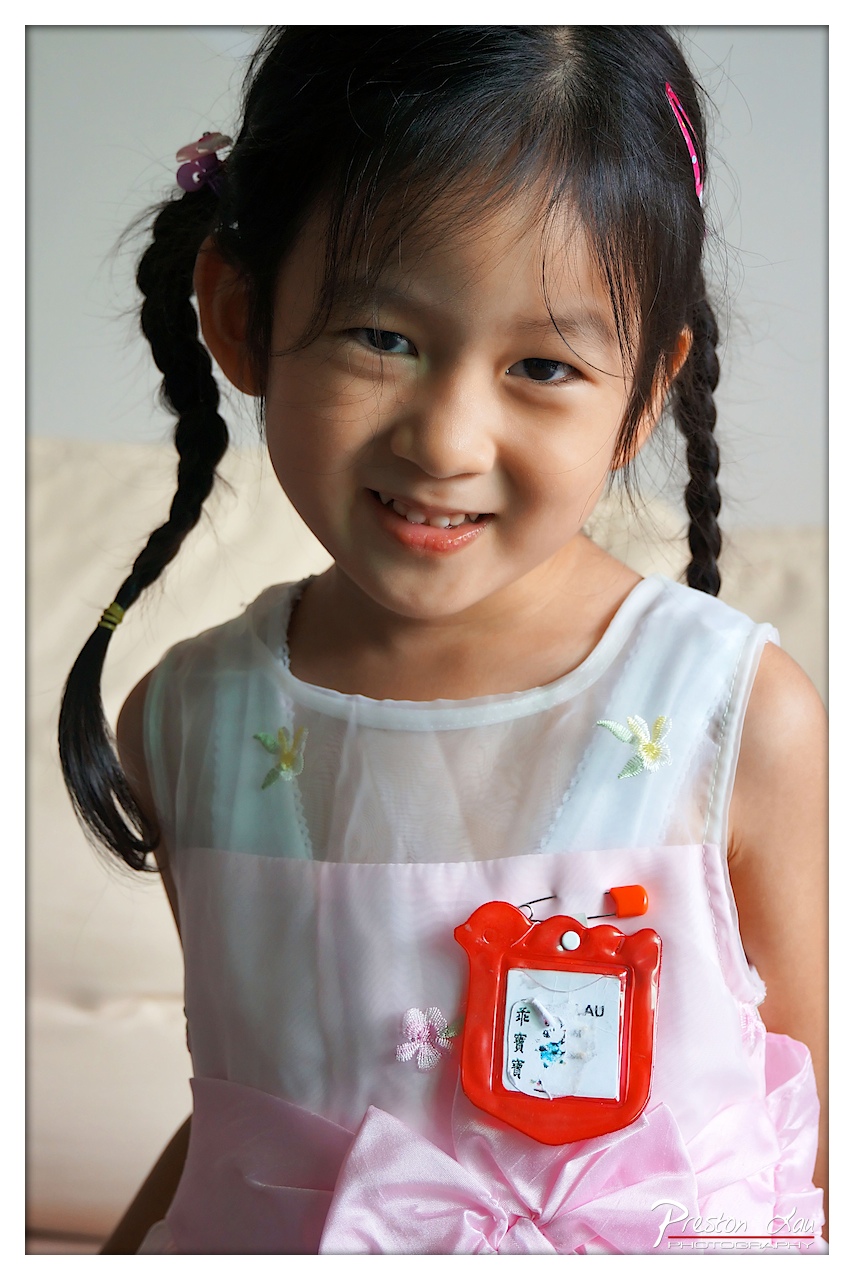

1. Overall Rating (0–10) — 7.5
This portrait captures a moment of pure, unguarded joy, with the child’s radiant smile serving as the emotional centerpiece. The soft lighting and intimate framing create a tender, personal atmosphere, drawing the viewer into the subject’s world. While the composition is strong and the expression compelling, the slightly cluttered details—like the badge and ribbon—add a touch of visual noise that slightly undermines the image’s elegance.
2. Composition (0–10) — 7.0
The subject is well-centered, with a close-up framing that emphasizes her face and expression. The off-center placement of the badge adds subtle visual interest, though it slightly disrupts the balance of the upper torso.
3. Lighting (0–10) — 8.0
Soft, directional light from the side highlights the child’s features with gentle warmth, creating natural depth and dimension. The shadows are soft and flattering, enhancing the portrait’s gentle mood.
4. Color & Tone (0–10) — 7.5
The palette is dominated by soft pinks and whites, evoking innocence and sweetness. The red badge provides a striking contrast that draws attention without overpowering the scene. The tonal range is smooth, with a slightly cool cast that lends a clean, crisp quality.
5. Creativity (0–10) — 7.0
The image succeeds in capturing a genuine moment of childhood delight, but its approach is more documentary than conceptual. The inclusion of the badge adds narrative context, grounding the image in a specific cultural or personal moment.
6. Technical Quality (0–10) — 8.0
Sharp focus on the child’s face ensures clarity, with smooth background blur that isolates the subject. The image is clean and well-exposed, with no visible technical flaws.
7. Emotional Impact (0–10) — 8.5
The child’s wide, genuine smile radiates warmth and happiness, creating an immediate emotional connection. The viewer is drawn in by the authenticity of the expression, making the image both touching and memorable.
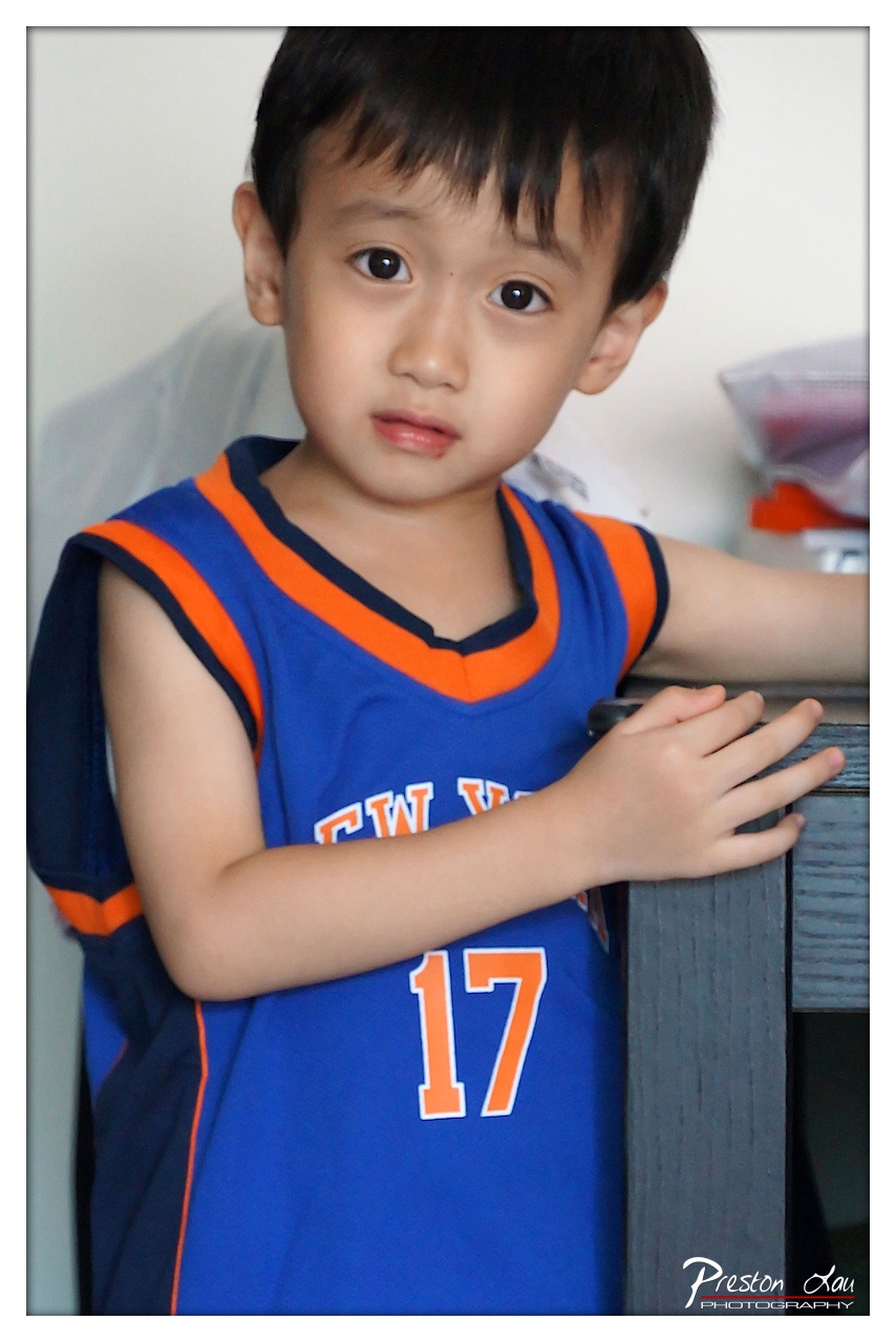

1. Overall Rating (0–10) — 7.0
This portrait captures a quiet, introspective moment in a young boy, his wide eyes and subtle expression conveying a sense of vulnerability and thoughtfulness. The vibrant basketball jersey contrasts with the soft, neutral background, drawing attention to the subject’s emotional presence. While the image is well-executed and emotionally resonant, it leans slightly toward the candid rather than the artistically refined, holding back from full visual impact due to a lack of atmospheric depth.
2. Composition (0–10) — 7.5
The subject is well-centered with a balanced framing, and the diagonal line of the boy’s arm adds subtle dynamism. The shallow depth of field isolates the child effectively, though the background clutter slightly distracts from the focus.
3. Lighting (0–10) — 7.0
Soft, even lighting highlights the boy’s face and jersey without harsh shadows, creating a gentle, natural look. The light direction enhances his features and gives the image a warm, intimate feel.
4. Color & Tone (0–10) — 7.5
The bold blue and orange of the jersey pop against the muted background, creating a strong visual contrast. The color temperature is slightly cool but appropriate, supporting the calm and contemplative mood.
5. Creativity (0–10) — 7.0
The image leverages a simple, relatable moment with emotional depth, using color and expression to tell a story. While not groundbreaking, the focus on a child’s quiet gaze offers a refreshing and sincere narrative.
6. Technical Quality (0–10) — 8.0
The image is sharp, with clear focus on the boy’s face and well-controlled exposure. The depth of field is used effectively, and the overall resolution is clean and professional.
7. Emotional Impact (0–10) — 8.0
The boy’s expression—partly serious, partly pensive—creates an immediate emotional connection. There’s a quiet power in his gaze that invites viewers to wonder about his thoughts, making the image memorable and touching.
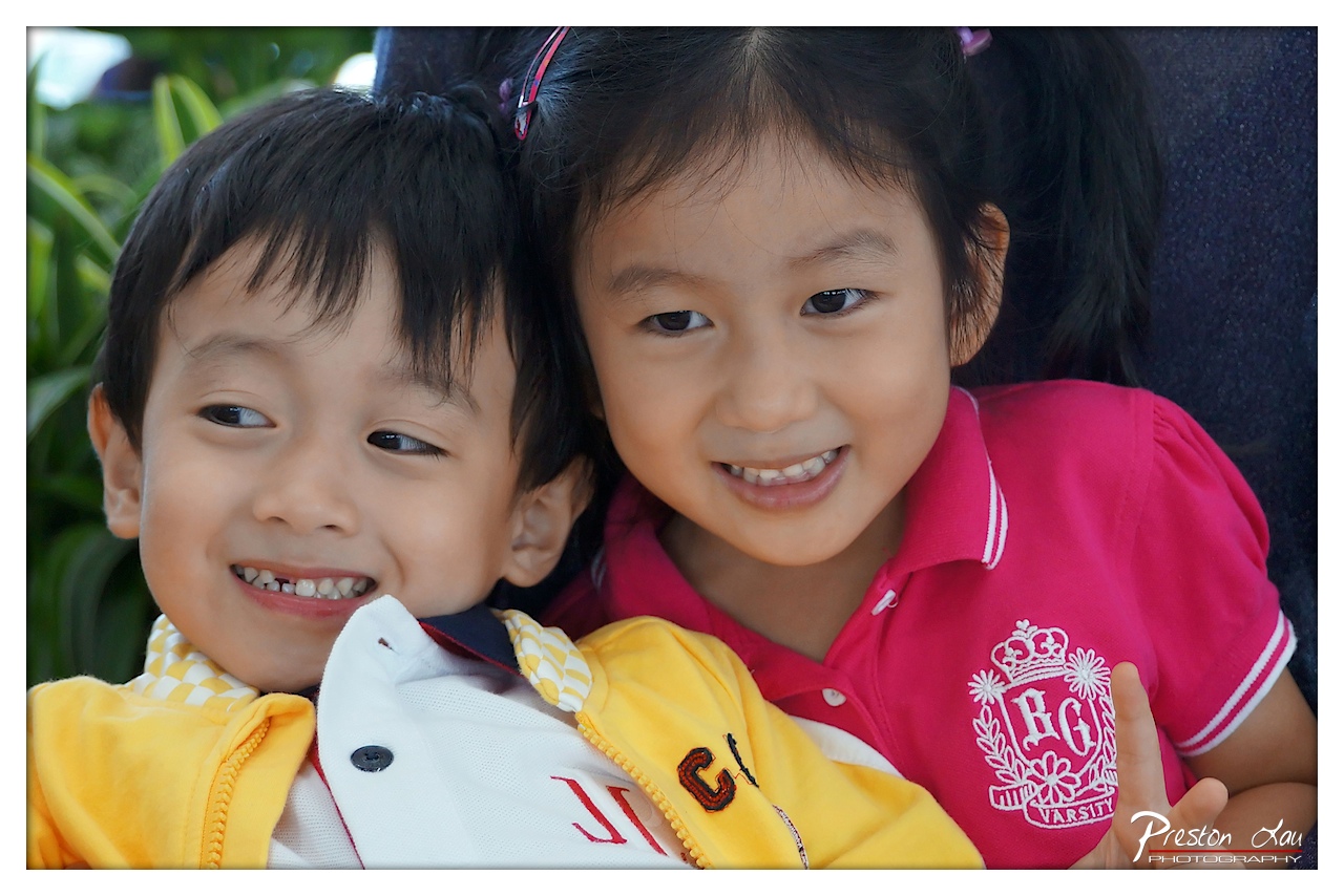

1. Overall Rating (0–10) — 8.0
This photograph captures a genuine moment of childhood joy, with two children radiating warmth and affection. The close framing and natural expressions create an intimate, heartfelt connection, while the vibrant clothing and soft lighting enhance the sense of innocence. The image is slightly held back by a busy background and minor distractions, but its emotional authenticity more than compensates.
2. Composition (0–10) — 7.5
The tight, centered framing emphasizes the children’s bond, with their faces positioned to draw the eye. The slight asymmetry of the boy’s gaze adds a candid quality, while the background foliage provides subtle depth without overwhelming the subjects.
3. Lighting (0–10) — 8.0
Soft, natural light illuminates the children’s faces evenly, highlighting their features without harsh shadows. The gentle highlights on their skin and clothing enhance the warmth and sincerity of the moment.
4. Color & Tone (0–10) — 8.5
The bright, saturated colors—particularly the pink and yellow—are lively and engaging, creating a cheerful palette that matches the children’s expressions. The contrast between the vivid foreground and the muted background helps the subjects stand out.
5. Creativity (0–10) — 7.0
While the image is not technically experimental, its strength lies in its emotional storytelling and naturalism. The candid interaction and genuine smiles elevate it beyond a simple portrait into a moment of shared joy.
6. Technical Quality (0–10) — 8.5
The focus is sharp on the children’s faces, with clear detail in their expressions and clothing. The image is well-exposed, with no visible noise or blur, and the shallow depth of field effectively isolates the subjects.
7. Emotional Impact (0–10) — 9.0
The image resonates deeply due to the children’s infectious smiles and the warmth of their physical closeness. It evokes nostalgia and universal feelings of love and happiness, making it emotionally powerful and memorable.
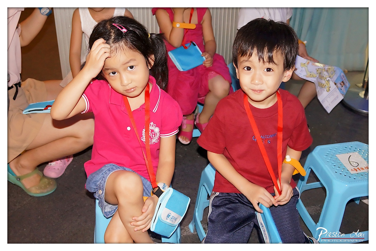

1. Overall Rating (0–10) — 7.0
This photograph captures a candid moment of two children in what appears to be a school or educational setting, radiating quiet curiosity and youthful stillness. The natural expressions—her hand on her head, his gentle smile—convey a subtle narrative of anticipation or mild fatigue, grounded in the authenticity of a real-life event. While the composition feels slightly cluttered and the lighting is flat, the emotional honesty of the subjects elevates the image beyond mere documentation into a tender, relatable portrait.
2. Composition (0–10) — 6.0
The framing centers on the two children, but the background activity and overlapping figures create visual distraction. A tighter crop would better isolate the subjects and emphasize their expressions.
3. Lighting (0–10) — 5.5
The lighting is direct and somewhat harsh, likely from a flash, casting flat illumination and creating slight overexposure on the children’s faces. While it ensures visibility, it diminishes the warmth and nuance of the scene.
4. Color & Tone (0–10) — 6.5
The bright pinks and reds of the children’s clothing stand out against the muted background, drawing the eye effectively. However, the color balance leans slightly cool, giving the image a clinical feel that contrasts with the naturalness of the moment.
5. Creativity (0–10) — 7.0
The image succeeds in capturing an unposed, authentic moment, using the children’s contrasting expressions to suggest a quiet story. While not highly stylized, it conveys a sense of narrative through simplicity and observation.
6. Technical Quality (0–10) — 7.5
The focus is sharp on the children, and the detail in their clothing and accessories is clear. The watermark is unobtrusive, and the image is free from major technical flaws.
7. Emotional Impact (0–10) — 7.5
There is a strong emotional resonance in the children’s expressions—her pensive look, his gentle smile—inviting the viewer to wonder about their thoughts and the event they are attending. The image feels intimate and human, despite its straightforward execution.
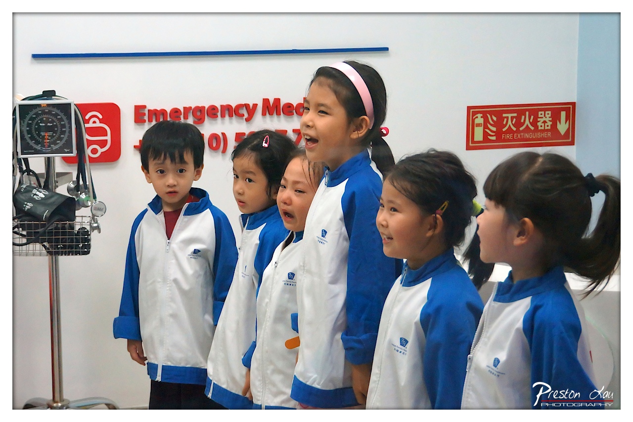

1. Overall Rating (0–10) — 7.0
This photograph captures a lively and candid moment of young children in a medical-themed setting, their expressions ranging from curiosity to playful delight. The scene feels authentic and energetic, with the children’s varied reactions adding narrative depth. While the composition and lighting are functional, they slightly undermine the image’s emotional resonance, keeping it more observational than deeply immersive.
2. Composition (0–10) — 6.5
The children are arranged in a staggered line, creating a sense of depth, but the framing cuts off slightly on the right, giving the image a cramped feel. The medical equipment on the left anchors the scene but distracts from the central emotional focus.
3. Lighting (0–10) — 6.0
The lighting is bright and even, likely from overhead fluorescent fixtures, which flattens shadows and gives the scene a clinical tone. While it ensures clarity, it lacks warmth and fails to enhance the children’s expressions.
4. Color & Tone (0–10) — 7.0
The blue and white uniforms create a cohesive palette, complemented by the red signage, which adds visual pop. The colors are clean and balanced, though the overall tone feels slightly cool and sterile, reflecting the environment rather than the warmth of the children’s interaction.
5. Creativity (0–10) — 7.5
The image succeeds in capturing a genuine moment of childhood play within an educational or medical simulation space. The contrast between the formal setting and the children’s uninhibited expressions adds a layer of narrative charm and originality.
6. Technical Quality (0–10) — 8.0
The focus is sharp on the children, and the image is free of blur or noise. The watermark is subtle and unobtrusive, and the exposure is well-balanced despite the harsh lighting.
7. Emotional Impact (0–10) — 7.5
The expressions—especially the laughing girl in the center and the boy on the left—convey joy and wonder, creating a strong emotional connection. The authenticity of the moment makes the image feel both relatable and heartwarming.
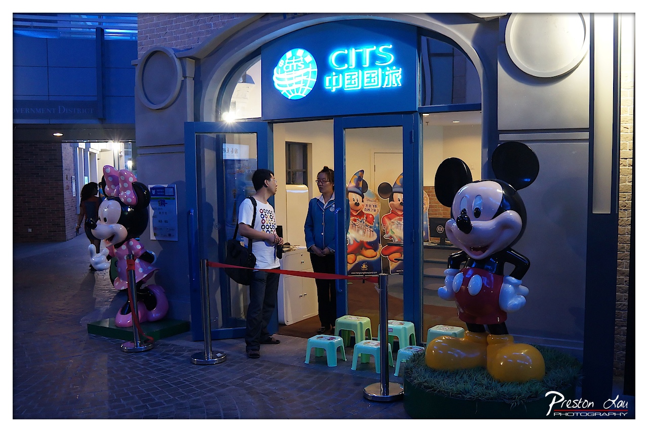

1. Overall Rating (0–10) — 6.0
This image captures a lively, themed entrance at a Disney-themed attraction, blending commercial branding with playful character design. The neon signage and vibrant figures create an inviting atmosphere, though the composition feels slightly cluttered and the lighting lacks subtlety. While the scene successfully conveys the energy of a tourist destination, it falls short of visual cohesion, with competing elements pulling attention in multiple directions.
2. Composition (0–10) — 5.5
The framing includes both characters and people, but the central focus is divided between the entrance and the statues. The red stanchion rope creates a leading line, but the placement of the figures and the uneven depth of field result in a somewhat chaotic balance.
3. Lighting (0–10) — 5.0
The dominant blue neon glow casts a cool tone across the scene, enhancing the nighttime ambiance but also flattening the natural details. The interior lighting is adequate but unremarkable, failing to create strong contrast or highlight key subjects.
4. Color & Tone (0–10) — 6.0
The bright blue and red hues of the signage and characters stand out against the neutral brick and pavement, creating a playful palette. However, the overall tone is slightly oversaturated, reducing the richness of the midtones and giving the image a slightly artificial feel.
5. Creativity (0–10) — 6.5
The juxtaposition of commercial tourism with Disney iconography offers a unique cultural commentary, merging global branding with local entertainment. The image tells a story of modern theme park marketing, though it leans more on recognition than original visual storytelling.
6. Technical Quality (0–10) — 7.0
The photograph is sharp and clear, with good focus on the foreground subjects. The depth of field is appropriate, and the exposure is balanced despite the challenging lighting conditions.
7. Emotional Impact (0–10) — 5.5
The scene evokes a sense of fun and nostalgia associated with theme parks, but the emotional connection is tempered by the impersonal, commercial environment. The presence of visitors adds life, but the overall mood feels more observational than immersive.
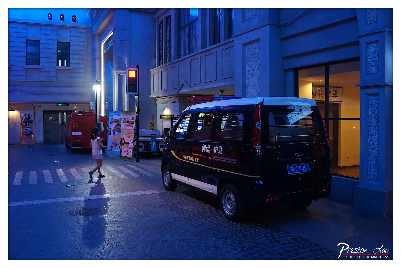

1. Overall Rating (0–10) — 7.0
This photograph captures a quiet urban moment at twilight, where the interplay of artificial blue light and warm interior glows creates a cinematic atmosphere. The security van and pedestrian add narrative tension, suggesting a story of routine surveillance in a stylized, almost staged environment. While the scene feels slightly over-processed in its color grading, the mood is compelling and the composition effectively balances stillness with subtle motion.
2. Composition (0–10) — 6.5
The van is positioned slightly off-center, drawing the eye while allowing space for the pedestrian’s movement across the frame. The leading lines of the crosswalk and building edges guide the viewer’s gaze, though the cluttered background slightly distracts from the focal point.
3. Lighting (0–10) — 7.5
The dominant blue lighting casts a cool, moody glow that enhances the nighttime ambiance, while the warm light spilling from the storefronts provides a strong contrast. The lighting is deliberate and cinematic, though the shadows are somewhat flat due to the ambient sources.
4. Color & Tone (0–10) — 7.0
The cool blue dominates the scene, creating a cohesive and atmospheric tone. The contrast with the warm yellow light from the building adds visual interest, and the color balance, while heavily tinted, contributes to the image’s mood.
5. Creativity (0–10) — 7.5
The image feels intentionally staged, blending realism with a cinematic aesthetic. The juxtaposition of a security van and a pedestrian in a quiet, architecturally styled street suggests a narrative of urban life under surveillance, offering a fresh, almost filmic perspective.
6. Technical Quality (0–10) — 8.0
The image is sharp and well-focused, with clean details visible on the van and surrounding textures. The exposure is balanced, though some areas of the background are slightly underexposed due to the lighting conditions.
7. Emotional Impact (0–10) — 6.5
The scene evokes a sense of quiet solitude and urban detachment, with the lone pedestrian and stationary van suggesting a moment of pause. The mood is contemplative, though the heavy color grading and staged feel slightly distance the viewer from authentic emotional resonance.
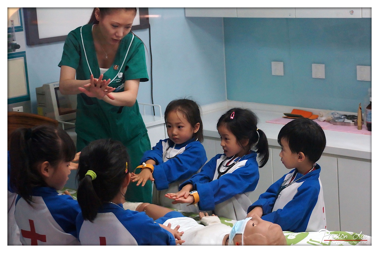

1. Overall Rating (0–10) — 7.0
This photograph captures a heartwarming moment of early childhood education, where curiosity and learning unfold in a simulated medical setting. The children’s focused expressions and the instructor’s gentle guidance create a sense of engagement and discovery. While the composition is slightly cluttered and the lighting lacks dramatic flair, the image succeeds in conveying a genuine, nurturing atmosphere—its strength lies in its narrative authenticity rather than technical polish.
2. Composition (0–10) — 6.0
The framing is slightly off-center, with the instructor positioned too high and the children’s faces partially obscured. A tighter crop would emphasize the interaction and enhance visual cohesion.
3. Lighting (0–10) — 6.5
The indoor fluorescent lighting is even and functional, illuminating the scene clearly without harsh shadows. However, it lacks warmth and depth, giving the image a clinical feel that slightly undermines the emotional tone.
4. Color & Tone (0–10) — 7.0
The cool blue walls contrast nicely with the vibrant green scrubs and the children’s blue-and-white uniforms, creating a visually balanced palette. The colors are well-saturated but not oversaturated, lending the scene a natural, educational tone.
5. Creativity (0–10) — 7.5
The concept of children role-playing as medical professionals is engaging and thoughtfully staged. The inclusion of a mannequin and stethoscopes adds narrative depth, turning a simple classroom activity into a compelling story of growth and imagination.
6. Technical Quality (0–10) — 7.5
The focus is sharp on the central subjects, with good detail in the children’s faces and the instructor’s hands. The image is free of distracting noise or motion blur, indicating strong technical control.
7. Emotional Impact (0–10) — 8.0
There is a strong sense of innocence and attentiveness in the children’s expressions, and the instructor’s patient demeanor evokes warmth and care. The image resonates emotionally by capturing a quiet moment of learning and connection.
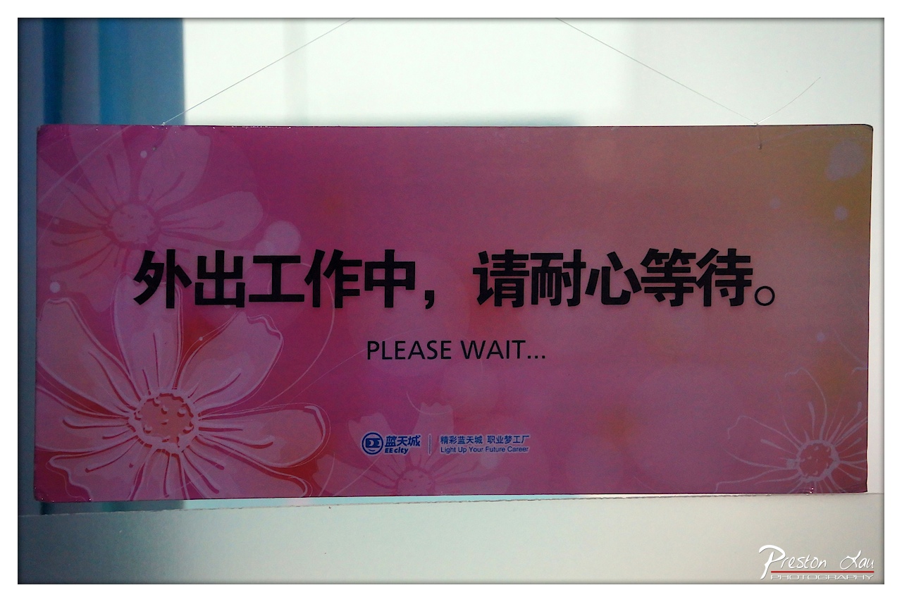

1. Overall Rating (0–10) — 6.0
This photograph captures a simple yet telling moment of institutional waiting, where a sign’s message—“Out on work, please wait”—becomes a quiet commentary on bureaucracy and time. The design of the sign, with its floral motif and corporate branding, contrasts sharply with the impersonal nature of the message, creating a subtle irony. While the image is clear and well-framed, it lacks the visual dynamism to elevate it beyond a straightforward document of a mundane scene.
2. Composition (0–10) — 6.5
The sign is centered and fills the frame, creating a balanced composition. However, the surrounding space feels slightly cluttered, with the white wall and faint reflections detracting from the focus on the message. A tighter crop could enhance visual clarity.
3. Lighting (0–10) — 6.0
The lighting is even and functional, likely from overhead fluorescent sources, which flattens the image slightly. The soft shadows and reflections on the sign’s surface suggest an indoor setting with neutral, unvaried illumination.
4. Color & Tone (0–10) — 6.5
The dominant pink hue and floral pattern give the sign a soft, almost decorative quality, which contrasts with the formal, utilitarian text. The color palette is cohesive but lacks depth, with the muted tones slightly dulling the overall impact.
5. Creativity (0–10) — 5.5
The image is conceptually interesting, using a mundane sign to hint at larger themes of waiting and institutional systems. However, the execution is straightforward and lacks originality in framing or perspective.
6. Technical Quality (0–10) — 7.5
The image is sharp, with clear text and clean details. Focus is accurate, and the watermark is discreet. The lighting and exposure are consistent, with no visible technical flaws.
7. Emotional Impact (0–10) — 5.0
The photograph evokes a sense of quiet resignation and the monotony of bureaucratic processes. While the message is relatable, the emotional resonance is restrained, leaving the viewer detached rather than engaged.


1. Overall Rating (0–10) — 7.0
This photograph captures a tender, focused moment of a child immersed in the simple pleasure of eating, exuding warmth and innocence. The soft, golden lighting and intimate framing create a sense of quiet joy, while the child’s concentration on the cup adds a layer of narrative depth. Though the image is rich in mood, the slightly overexposed highlights and tight crop slightly limit its visual polish.
2. Composition (0–10) — 7.5
The subject is well-placed in the frame, with a shallow depth of field drawing attention to the child’s face and hands. The diagonal line of the arm and the cup guides the eye naturally, though the tight cropping on the left slightly disrupts balance.
3. Lighting (0–10) — 7.0
Warm, ambient lighting enhances the cozy atmosphere, casting a golden glow that complements the subject’s skin tones. The light is soft and diffused, creating gentle shadows that add dimension without harshness.
4. Color & Tone (0–10) — 7.5
The warm color palette—dominated by reds, yellows, and soft whites—evokes a sense of comfort and nostalgia. The slightly saturated tones give the image a dreamy, almost cinematic quality.
5. Creativity (0–10) — 7.0
The image successfully captures a candid, intimate moment, elevating a mundane act into a story of childhood wonder. The use of a hairnet adds an unexpected layer of context, hinting at a food-making or dining experience.
6. Technical Quality (0–10) — 7.0
Sharp focus on the child’s face and hands ensures clarity, while the background remains softly blurred. The exposure is mostly balanced, though the highlights on the white table show slight overexposure.
7. Emotional Impact (0–10) — 8.0
The photograph resonates with warmth and tenderness, evoking a sense of nostalgia and quiet joy. The viewer is drawn into the child’s world, sharing in the simple pleasure of the moment.
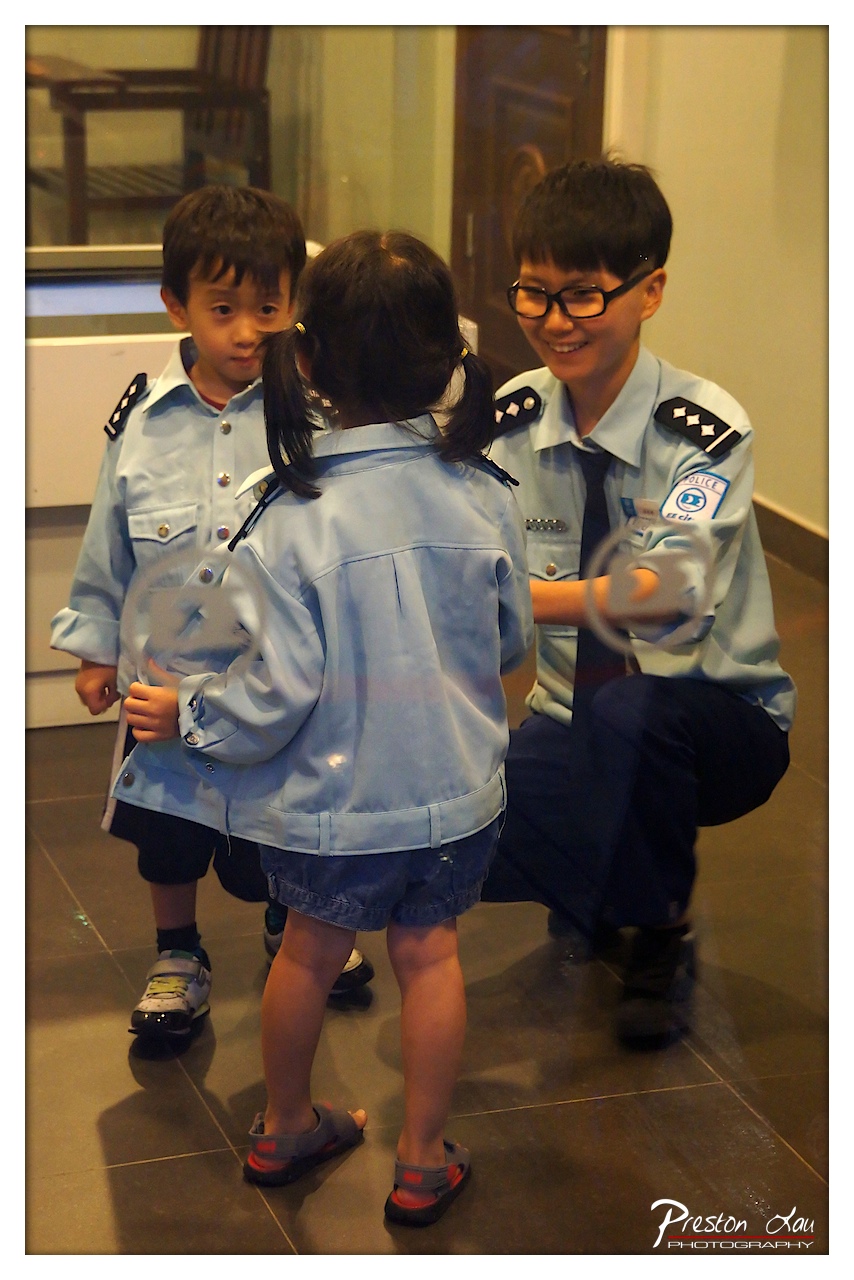

1. Overall Rating (0–10) — 7.5
This photograph captures a heartwarming moment of connection between a police officer and two children, all dressed in light blue uniforms, evoking a sense of community engagement and youthful aspiration. The candid interaction, illuminated by soft indoor lighting, feels genuine and full of warmth, though the composition’s slight clutter and soft focus detract from its overall visual clarity. The image succeeds in conveying a narrative of trust and inspiration, balancing documentary realism with emotional resonance.
2. Composition (0–10) — 6.5
The subjects are centered, but the framing is slightly tight and the background elements create visual distraction. The kneeling officer and the children’s positioning create a triangular composition that guides the eye, yet the off-center reflection and partial obstruction of the girl’s face reduce clarity.
3. Lighting (0–10) — 7.0
Warm, ambient indoor lighting enhances the scene’s intimacy, casting soft shadows that add depth. The light is evenly distributed, preserving detail in both the subjects and the background, though a slight overexposure in the upper left suggests a flash or bright overhead source.
4. Color & Tone (0–10) — 7.5
The dominant light blue of the uniforms creates a cohesive, calming palette, complemented by the neutral tones of the tiled floor and walls. The warm undertones in the lighting lend a gentle, inviting mood, while the subtle contrast between the uniforms and darker pants adds visual interest.
5. Creativity (0–10) — 7.0
The concept of children in police uniforms engaging with an officer is inherently creative and emotionally engaging. The photograph captures a playful yet meaningful moment, suggesting themes of role modeling and civic pride, though the execution leans more toward documentary than artistic interpretation.
6. Technical Quality (0–10) — 7.0
The image is sharp enough to capture facial expressions and uniform details, with no major focus issues. However, a slight softness in the overall image and a visible watermark reduce its professional polish.
7. Emotional Impact (0–10) — 8.0
The genuine smiles and relaxed body language convey warmth, joy, and trust. The image evokes a strong sense of community and innocence, inviting viewers to reflect on the positive role of law enforcement in nurturing youth.
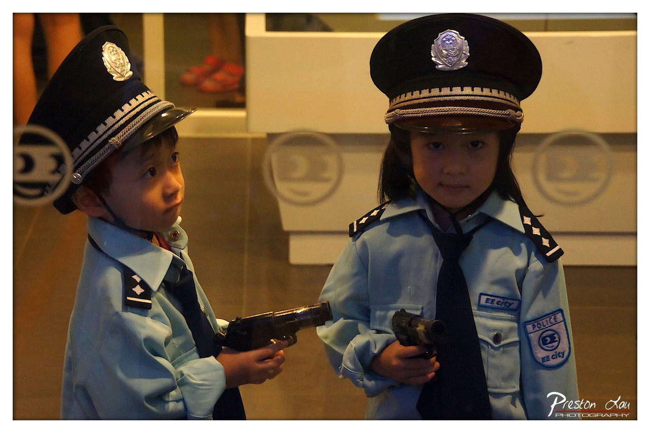

1. Overall Rating (0–10) — 7.0
This photograph captures a charming and slightly surreal moment of childhood imagination, where two children in police uniforms stand as miniature guardians in a world of play. The warm lighting and candid expressions lend a sense of authenticity, while the reflective glass and blurred background hint at a public space—perhaps a themed attraction—adding layers of context. While the image is sweet and well-composed, its emotional resonance is slightly muted by the lack of dynamic interaction between the subjects.
2. Composition (0–10) — 7.0
The children are positioned slightly off-center, creating a natural balance between the boy on the left and the girl on the right. The reflective surface in the background adds depth, though it slightly distracts with its circular logos. The framing keeps the focus on the subjects, emphasizing their roles and expressions.
3. Lighting (0–10) — 7.0
The warm, ambient lighting enhances the scene's intimacy and highlights the details of the uniforms and expressions. The soft shadows add dimension, and the light source from the front creates a gentle glow on the children’s faces, contributing to the image’s gentle mood.
4. Color & Tone (0–10) — 6.5
The cool blue of the uniforms contrasts subtly with the warm background tones, creating a balanced palette. While the colors are pleasant and cohesive, they lack vibrancy—leaning slightly muted, which slightly dampens the visual energy of the playful scene.
5. Creativity (0–10) — 7.5
The image is creatively strong in its ability to capture a moment of childhood role-play with sincerity and charm. The juxtaposition of youthful innocence with the authoritative imagery of police uniforms adds a layer of narrative depth, inviting interpretation beyond a simple snapshot.
6. Technical Quality (0–10) — 8.0
The focus is sharp on both children, capturing fine details in their uniforms and expressions. The exposure is well-managed, and the image is free of noticeable noise or distortion, indicating a high level of technical execution.
7. Emotional Impact (0–10) — 7.0
The photograph evokes a sense of nostalgia and tenderness, drawing the viewer into a world where children take on adult roles with earnestness. The girl’s direct gaze and the boy’s thoughtful side-glance create a quiet connection, making the image emotionally engaging and thoughtfully composed.
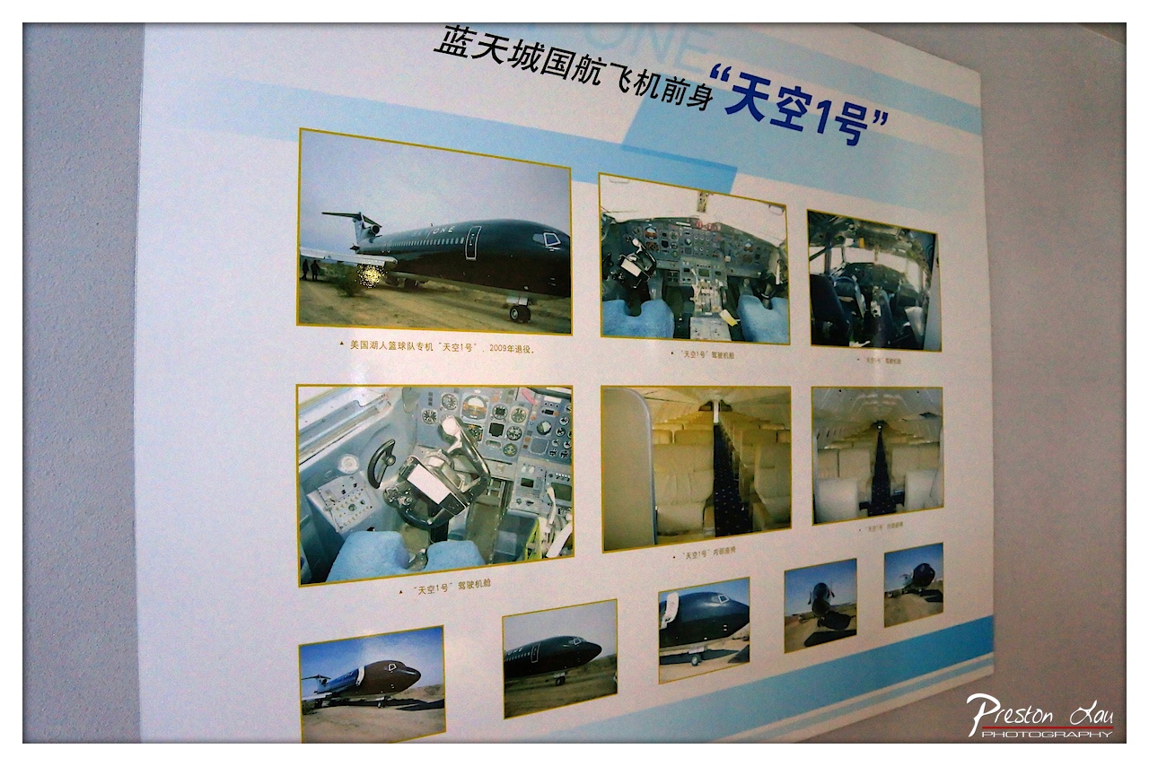

1. Overall Rating (0–10) — 5.5
This photograph captures a display panel about the "Sky One" aircraft, documenting its history and features with a mix of factual and nostalgic intent. The image succeeds in conveying the informational nature of the exhibit, but its technical execution—particularly the uneven lighting and slight distortion—diminishes its visual clarity and emotional resonance. While the content is intriguing, the presentation feels more like a casual documentation than a refined photographic statement.
2. Composition (0–10) — 6.0
The panel is framed with a slight angle, creating a dynamic but unbalanced perspective. The arrangement of photos on the display is organized, yet the off-center composition and tilted framing reduce visual harmony.
3. Lighting (0–10) — 5.0
The lighting is flat and inconsistent, with a bright spot on the upper left that causes glare and washes out details. The ambient light lacks direction, resulting in a dull, lifeless appearance across the panel.
4. Color & Tone (0–10) — 5.5
The color palette is muted, dominated by pale blues and whites, with the black aircraft providing a stark contrast. However, the overall tone is slightly cool and desaturated, which dulls the vibrancy of the images on display.
5. Creativity (0–10) — 5.0
The photograph is functional and documentary in nature, capturing the exhibit with straightforward intent. It lacks artistic flair or interpretive vision, focusing more on recording than evoking.
6. Technical Quality (0–10) — 6.5
The image is generally sharp with clear details, though there is slight softness at the edges and minor digital noise. Focus is consistent across the panel, but the camera angle and lighting limit overall clarity.
7. Emotional Impact (0–10) — 4.5
The image evokes a sense of curiosity about the aircraft’s history but fails to generate deeper emotional engagement. The clinical presentation and lack of atmospheric depth keep the viewer at a distance.
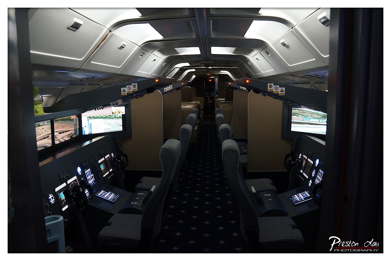

1. Overall Rating (0–10) — 7.0
This photograph offers a compelling glimpse into the interior of a high-fidelity train simulator, capturing both the technological precision and the immersive atmosphere of a professional training environment. The symmetrical composition draws the eye down the aisle, emphasizing the repetition and order of the control stations, while the glowing screens and ambient lighting create a sense of quiet intensity. Though the image is strong in its technical clarity and thematic resonance, the deep shadows and subdued color palette slightly limit its visual dynamism, leaving it more documentary than evocative.
2. Composition (0–10) — 8.0
The image employs strong leading lines from the central aisle and repeating control panels, creating a sense of depth and symmetry. The framing from the doorway enhances the perspective, drawing the viewer into the space and emphasizing the structure’s linear geometry.
3. Lighting (0–10) — 6.5
The lighting is functional and atmospheric, with a mix of ambient overhead lights and the glow from digital displays. While the contrast between the dark carpet and illuminated screens adds visual interest, the overall darkness slightly obscures finer details and reduces the sense of openness.
4. Color & Tone (0–10) — 6.0
The palette is dominated by cool grays and blacks, punctuated by the blue and white hues of the screens. While this reinforces the technological mood, the lack of warmth or vibrancy gives the image a somewhat sterile tone, limiting its emotional range.
5. Creativity (0–10) — 7.0
The photograph successfully captures the unique environment of a simulator with a clear artistic intent to highlight both order and technology. The use of symmetry and perspective enhances the sense of realism and immersion, making it more than a simple snapshot.
6. Technical Quality (0–10) — 8.0
The image is sharp and well-focused, with clean details visible on the control panels and screens. The exposure is well-managed despite the low-light conditions, and the watermark is discreet, preserving the integrity of the composition.
7. Emotional Impact (0–10) — 6.5
There is a quiet sense of concentration and professionalism that resonates through the image—evoking the seriousness of training and the precision of modern transportation systems. While not overtly emotional, the scene invites contemplation of the human role within advanced technology.
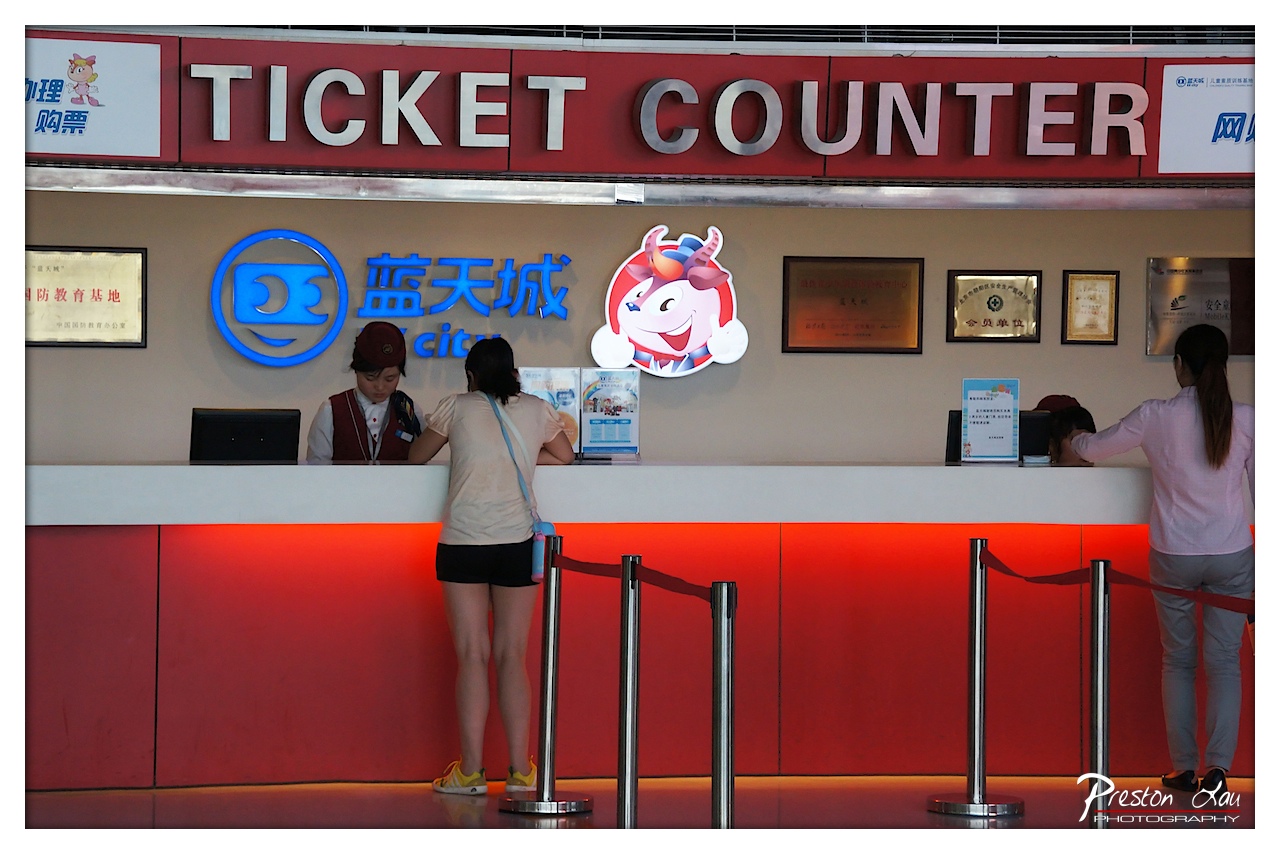

1. Overall Rating (0–10) — 6.0
This photograph captures a routine moment at a ticket counter with a distinct institutional atmosphere, where the bright red backdrop and corporate branding create a sense of place. The scene is visually grounded by the strong color and signage, but the composition feels slightly flat and overly literal, lacking the emotional resonance or narrative depth that would elevate it beyond a simple documentation. While the setting is clearly defined and the subjects are engaged in a natural interaction, the image falls short of evoking a deeper story or aesthetic impact.
2. Composition (0–10) — 6.5
The framing is balanced, with the ticket counter centered and the vertical lines of the stanchions guiding the eye across the scene. However, the wide shot includes distracting elements like the lower wall and floor, which slightly dilute the focus on the human interaction at the counter.
3. Lighting (0–10) — 6.0
The overhead lighting is functional but harsh, casting a flat glow that minimizes shadows and depth. The red backlighting adds warmth and visual interest, but it also creates a slightly artificial mood that doesn't fully complement the candid nature of the scene.
4. Color & Tone (0–10) — 7.0
The dominant red background creates a bold, energetic palette, while the blue neon logo offers a strong contrast. The color choices are intentional and help establish the commercial identity of the location, though the overall tone is slightly oversaturated, reducing subtle tonal variation.
5. Creativity (0–10) — 5.5
The image presents a straightforward, observational approach to a mundane setting. While the branding and signage add a layer of cultural specificity, the lack of a unique perspective or artistic manipulation limits its originality.
6. Technical Quality (0–10) — 7.5
The image is sharp and well-exposed, with clear details in the signage, uniforms, and facial features. Focus is consistent, and the digital clarity supports the narrative intent without technical flaws.
7. Emotional Impact (0–10) — 5.0
The emotional resonance is modest, evoking a sense of everyday routine rather than a compelling human moment. The viewer is invited to observe, but not to feel, making the scene feel more like a snapshot than a story.
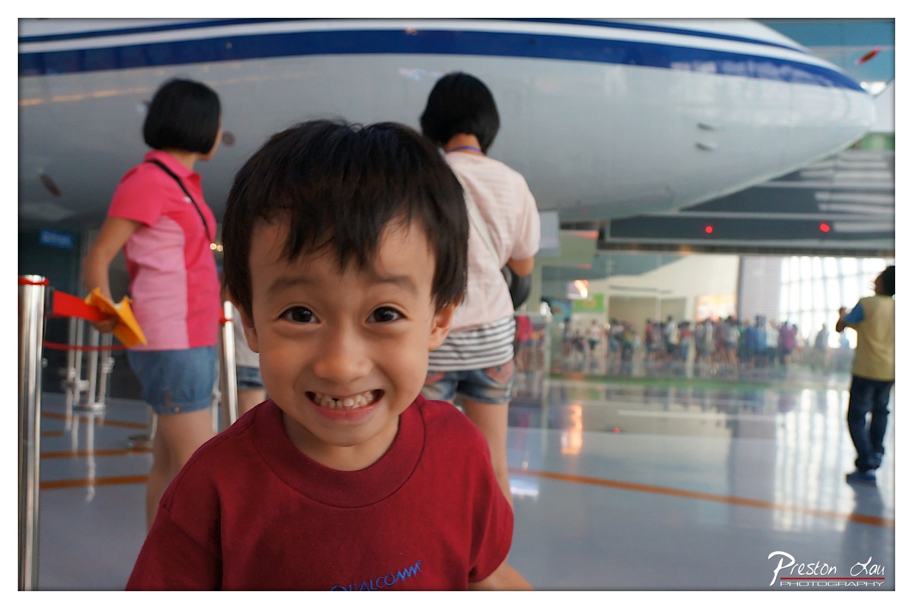

1. Overall Rating (0–10) — 7.0
This photograph captures a candid moment of unfiltered joy, with a young boy’s radiant smile anchoring the image in warmth and authenticity. The shallow depth of field effectively isolates the subject from the bustling museum environment, emphasizing the personal connection to the experience. While the background activity adds context, it slightly distracts from the emotional focus, and the lighting, though adequate, lacks the richness to elevate the scene into something truly luminous.
2. Composition (0–10) — 7.5
The subject is well-centered and framed with a tight focus, drawing immediate attention to the child’s expression. The blurred background creates depth, though the inclusion of two figures in the mid-ground slightly disrupts the visual harmony.
3. Lighting (0–10) — 6.5
The ambient lighting is bright and even, likely from overhead sources, which illuminates the child’s face clearly but lacks directional warmth. The reflections on the polished floor add a subtle sense of depth, but the light feels somewhat flat and clinical.
4. Color & Tone (0–10) — 7.0
The red of the boy’s shirt stands out vibrantly against the neutral tones of the surroundings, creating a strong focal point. The overall palette is balanced, with cool blues and grays in the background complementing the warmth of the subject’s skin and clothing.
5. Creativity (0–10) — 7.5
The photographer skillfully uses a shallow depth of field to isolate the subject, turning a simple museum visit into a moment of personal significance. The candid nature of the shot and the genuine emotion captured demonstrate strong storytelling intent.
6. Technical Quality (0–10) — 8.0
The image is sharp on the boy’s face, with clean focus and well-controlled exposure. The lens choice and aperture settings were appropriate, allowing for a crisp subject while softly blurring the background.
7. Emotional Impact (0–10) — 8.5
The boy’s wide, toothy grin radiates pure happiness and wonder, creating an immediate emotional connection with the viewer. The image evokes nostalgia and the simple joy of discovery, making it both relatable and heartwarming.
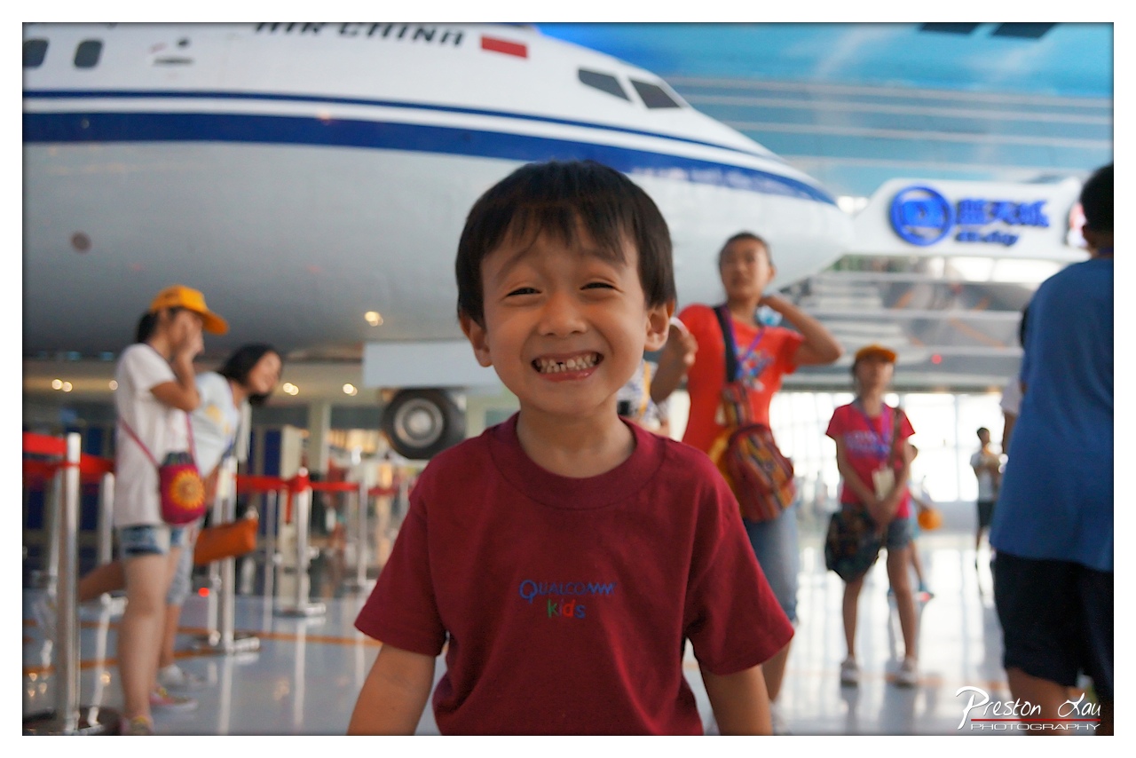

1. Overall Rating (0–10) — 7.0
This photograph captures a moment of pure, unfiltered joy, with the child’s radiant smile serving as the emotional anchor of the scene. The shallow depth of field isolates the subject from the bustling background, emphasizing his happiness while still grounding the image in a real-world context. While the composition and lighting are effective, the slightly busy background and muted color palette prevent it from achieving a more refined aesthetic.
2. Composition (0–10) — 6.5
The child is well-centered and framed with a shallow depth of field that draws focus, but the cluttered background and off-center elements slightly disrupt visual harmony. A tighter crop could enhance the subject’s prominence.
3. Lighting (0–10) — 6.0
The lighting is bright and even, likely from overhead indoor sources, which illuminates the child’s face clearly. However, the flat quality of the light lacks dimension, resulting in a somewhat clinical feel that undercuts the warmth of the moment.
4. Color & Tone (0–10) — 6.5
The colors are balanced but lean toward a cool, slightly washed-out tone. The red of the child’s shirt provides a strong focal point, but the overall palette lacks vibrancy and contrast, giving the image a muted, almost sterile quality.
5. Creativity (0–10) — 7.0
The photographer captures a genuine moment with strong emotional intent, using a shallow depth of field to create intimacy. The juxtaposition of the child’s joy against the impersonal museum environment adds narrative depth, making the image both personal and contextually rich.
6. Technical Quality (0–10) — 7.5
The focus is sharp on the child’s face, and the image is free of motion blur or noise. The use of a wide aperture is technically sound, though the background blur is uneven in places.
7. Emotional Impact (0–10) — 8.0
The child’s broad, toothy grin radiates happiness and innocence, creating an immediate emotional connection. Despite the surrounding activity, the viewer’s attention is drawn to the pure joy on his face, making the image both uplifting and memorable.
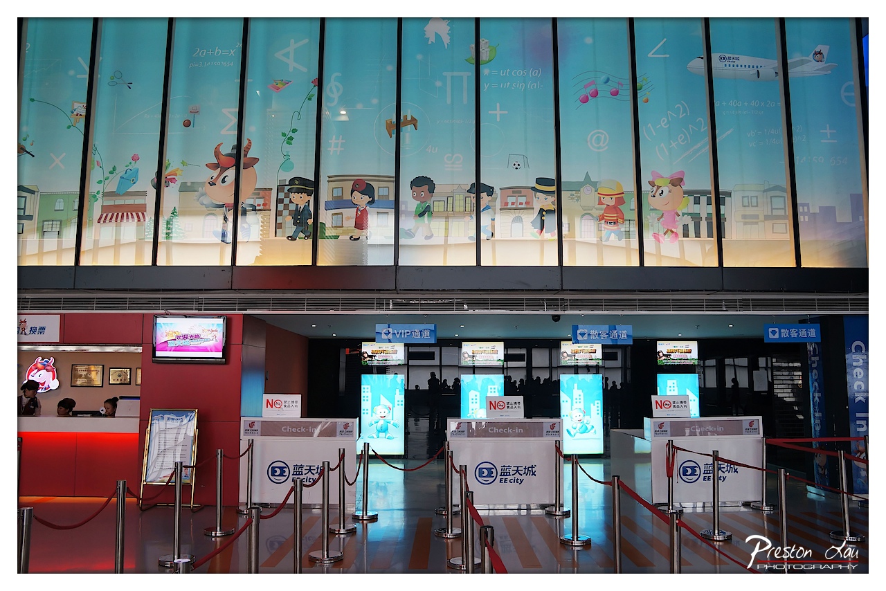

1. Overall Rating (0–10) — 6.0
This photograph captures a vibrant, child-friendly airport terminal with a playful educational theme, where whimsical graphics transform a functional space into a visually engaging environment. The colorful cartoon characters and mathematical motifs on the glass wall contrast with the sterile check-in counters below, creating a curious blend of imagination and routine. While the scene is rich in narrative potential, the composition feels slightly cluttered, and the lighting lacks the warmth needed to fully elevate the mood.
2. Composition (0–10) — 6.0
The image is well-framed with a clear focal point in the animated glass wall, but the symmetry of the check-in counters and the presence of multiple signs create visual noise. The red rope barriers and repeated branding distract from the central storytelling element, while the depth of field keeps the foreground and background in focus, flattening the sense of space.
3. Lighting (0–10) — 5.5
The lighting is functional but flat, relying on overhead fluorescent sources that cast a cool, even tone across the scene. The illuminated graphics on the glass wall stand out, but the lack of directional or ambient light limits the depth and mood, making the environment feel more like a transit hub than a destination.
4. Color & Tone (0–10) — 7.0
The palette is bold and engaging, with the bright blues, reds, and yellows of the graphics and signage creating a lively contrast against the neutral grays and blacks of the terminal. The color temperature is cool, which suits the modern setting, but a touch of warmth could have softened the edges of the scene.
5. Creativity (0–10) — 7.5
The integration of educational and whimsical elements into a transportation space is inventive and thoughtfully executed. The use of animated characters and mathematical symbols to create a child-centric atmosphere reflects a unique branding approach, blending function with imagination in a way that feels both playful and purposeful.
6. Technical Quality (0–10) — 7.5
The image is sharp and well-exposed, with clear details in both the foreground and background. The focus is consistent across the frame, and the long exposure captures the ambient light without noticeable motion blur, indicating strong technical control.
7. Emotional Impact (0–10) — 5.5
While the scene is visually stimulating, the emotional resonance is moderate—its appeal lies more in its novelty than in its ability to evoke deep sentiment. The childlike theme suggests joy and wonder, but the impersonal nature of the airport setting keeps the viewer at a distance, preventing a strong emotional connection.
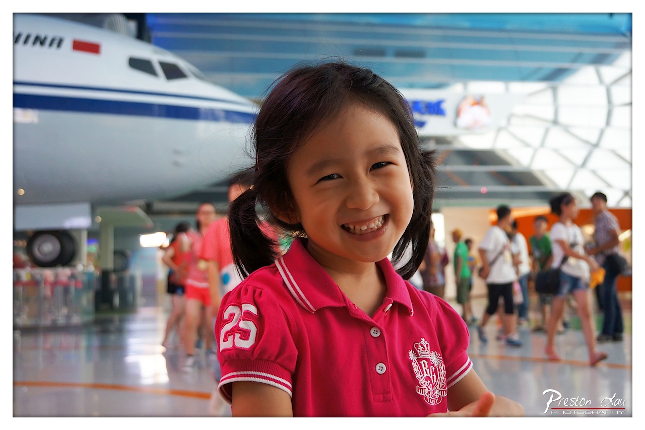

1. Overall Rating (0–10) — 7.5
This photograph captures a radiant moment of childhood joy set against the backdrop of an aviation exhibit, where the juxtaposition of innocence and human achievement creates a compelling narrative. The girl’s genuine smile and direct gaze draw the viewer in, while the blurred background of the airplane and museum visitors adds context without distracting from the emotional core. The image is well-executed, though its slightly cluttered background and flat lighting prevent it from reaching its full artistic potential.
2. Composition (0–10) — 7.0
The subject is well-placed off-center, creating a dynamic balance with the airplane in the background. The shallow depth of field effectively isolates the girl, though the composition feels slightly crowded by the surrounding figures and signage.
3. Lighting (0–10) — 6.5
Even, ambient lighting illuminates the scene clearly, but the overhead illumination lacks warmth and dimension, resulting in a somewhat flat appearance that underplays the emotional depth of the moment.
4. Color & Tone (0–10) — 7.5
The vibrant red of the girl’s shirt stands out against the cooler blues and grays of the background, creating a strong focal point. The color palette is balanced, with natural tones that support the candid mood of the scene.
5. Creativity (0–10) — 7.0
The image leverages a strong emotional subject and an unexpected setting to create a narrative-rich moment. While the concept is familiar, the execution feels authentic and personal, capturing a fleeting instance of wonder.
6. Technical Quality (0–10) — 8.0
Sharp focus on the girl’s face, clean detail, and well-managed depth of field demonstrate strong technical control. The image is free from noticeable flaws and effectively uses selective focus to guide the eye.
7. Emotional Impact (0–10) — 8.5
The girl’s unfiltered happiness radiates through the frame, evoking a sense of warmth and nostalgia. The photograph successfully captures a universal moment of delight, making it deeply relatable and emotionally resonant.
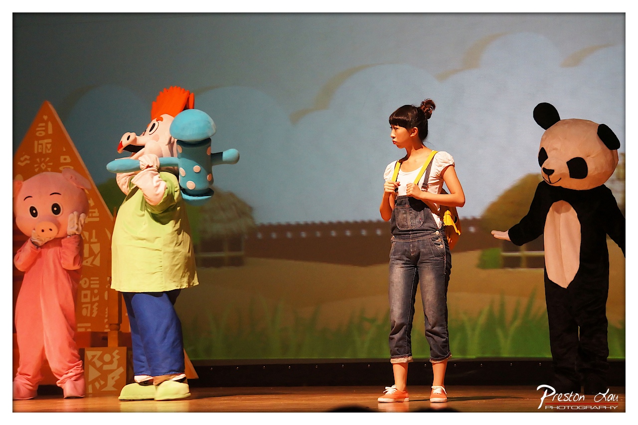

1. Overall Rating (0–10) — 7.0
This photograph captures a lively and whimsical children’s stage performance, where costumed characters and a live performer create a playful, storybook atmosphere. The scene feels energetic and engaging, with a clear narrative tension between the characters, though the composition’s busyness slightly dilutes its visual focus. The lighting and staging convey a sense of live theater, but the image could benefit from tighter framing to emphasize the central interaction.
2. Composition (0–10) — 6.5
The stage is filled with multiple figures, creating a balanced but crowded arrangement. The performer stands slightly off-center, drawing attention, while the characters on either side frame the scene. A tighter crop would improve focus and reduce visual clutter.
3. Lighting (0–10) — 7.0
Stage lighting highlights the performers effectively, with even illumination across the scene. The backdrop is slightly overexposed, but the foreground subjects are well-lit and clearly defined, supporting the theatrical mood.
4. Color & Tone (0–10) — 7.5
The palette is vibrant and cheerful, with bold character costumes contrasting against the soft, pastel backdrop. The warm tones of the stage and the cool blue sky in the background create a pleasing visual harmony, enhancing the lighthearted tone.
5. Creativity (0–10) — 7.0
The image captures a unique blend of live performance and character storytelling, offering a glimpse into a children’s theatrical production. The juxtaposition of real-life performer and costumed characters adds a layer of imaginative play.
6. Technical Quality (0–10) — 8.0
Sharp focus on the subjects, clean detail in the costumes and expressions, and minimal noise suggest a well-executed capture. The watermark is subtle and does not distract from the image.
7. Emotional Impact (0–10) — 7.5
The image evokes a sense of joy and wonder, resonating with the playful spirit of children’s theater. The performers’ expressions and gestures invite the viewer into the story, creating a warm and engaging emotional connection.
Loading map...