The blog visits three main attractions: A-ma Temple, a 500-year-old temple dedicated to Tin Hau; Chapel of Our Lady of Penha, rebuilt in 1837 after its initial construction in 1622; and the Venetian Macao, a $2.4 billion casino resort with a 40-story hotel, featuring the largest single structure hotel building in Asia.
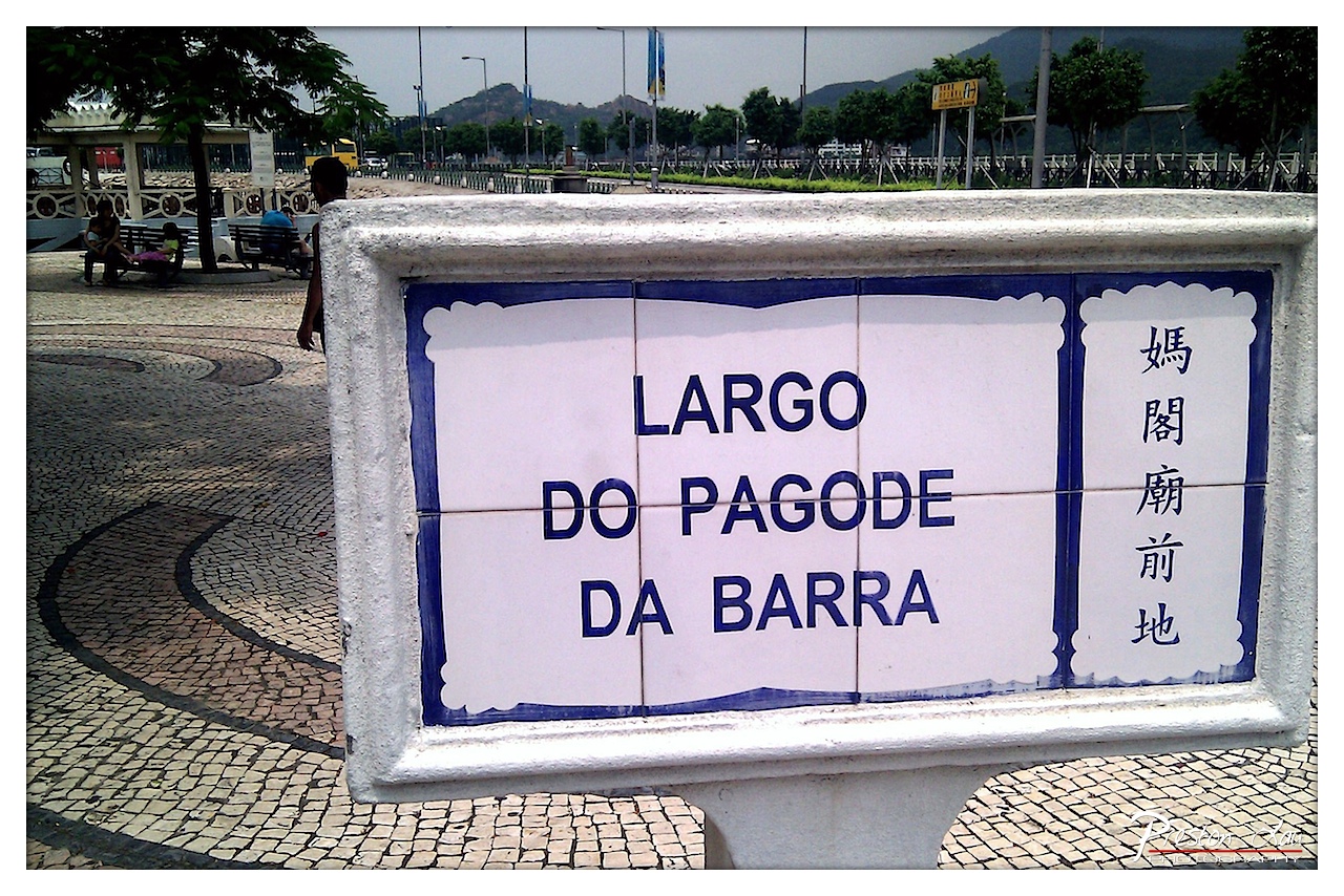

1. Overall Rating (0–10) — 6.8
This photograph captures the quiet charm of a public space in Macau, where Portuguese and Chinese cultural influences converge in a single frame. The tiled sign, with its bilingual inscription, serves as both a geographical marker and a visual metaphor for the region’s hybrid identity. While the image effectively documents a real-world location, its visual impact is tempered by a lack of dynamic composition and muted tonal range, preventing it from feeling truly compelling.
2. Composition (0–10) — 6.0
The sign is well-framed and centrally placed, creating a strong focal point, but the background elements—trees, benches, and a distant hill—feel underutilized and slightly distracting. The curved cobblestone pattern adds visual interest but does not fully integrate with the subject, resulting in a composition that feels more like a snapshot than a deliberate arrangement.
3. Lighting (0–10) — 5.5
The lighting is flat and diffused, likely due to overcast skies, which softens shadows and reduces depth. While this ensures even exposure across the scene, it also diminishes the richness of the textures in the tiles and pavement, giving the image a somewhat washed-out quality.
4. Color & Tone (0–10) — 6.5
The palette is dominated by the blue and white of the tiles, which create a clean, cohesive visual theme. However, the surrounding environment—gray pavement, muted green foliage—lacks vibrancy, and the overall tone feels subdued, limiting the image’s ability to convey energy or mood.
5. Creativity (0–10) — 7.0
The dual-language signage offers a strong narrative element, reflecting the cultural duality of Macau. The inclusion of the traditional cobblestone pattern and the distant hills adds layers of context, making the image more than just a place name—it becomes a story of place, history, and identity.
6. Technical Quality (0–10) — 7.5
The image is sharp and clear, with good focus on the sign and sufficient detail in the background. The exposure is balanced, and there are no major technical flaws. The watermark, while distracting, does not detract significantly from the overall quality.
7. Emotional Impact (0–10) — 6.0
The photograph evokes a sense of quiet observation and cultural curiosity, inviting the viewer to reflect on the layers of history embedded in the landscape. However, the lack of emotional intensity or human connection—despite the presence of people—keeps the viewer at a distance, making the emotional resonance more intellectual than visceral.
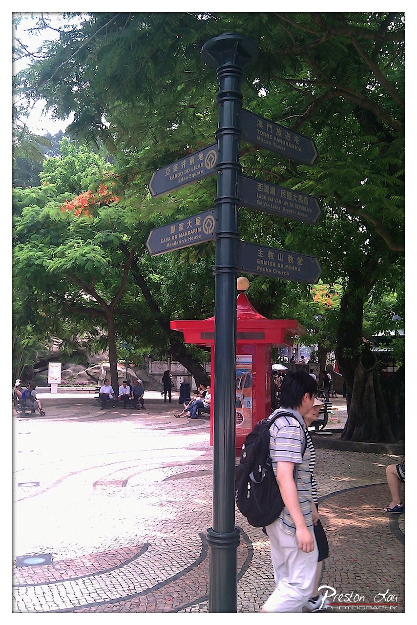

1. Overall Rating (0–10) — 6.8
This image captures a lively urban scene in Macau, blending cultural signage with natural greenery and everyday life. The directional pole serves as a strong focal point, anchoring the viewer amidst a rich tapestry of cultural references and movement. While the composition is engaging and layered, the overexposed foreground and slightly cluttered background detract from the overall visual harmony, giving the photo a candid, documentary feel rather than a polished aesthetic.
2. Composition (0–10) — 6.5
The central placement of the signpost creates a strong vertical axis, guiding the eye through the scene. However, the wide-angle perspective and uneven balance between the bright foreground and darker background create a sense of visual disarray. The red kiosk and walking figure add depth and motion, but the framing feels slightly unbalanced, with too much empty space on the left.
3. Lighting (0–10) — 5.5
Harsh daylight creates strong highlights on the cobblestone path, resulting in blown-out whites and a loss of texture. The dappled shade under the trees provides contrast, but the overall lighting lacks nuance, giving the image a flat, high-contrast appearance that diminishes detail.
4. Color & Tone (0–10) — 6.0
The vibrant red of the kiosk stands out against the lush greens and muted tones of the pavement and signs. The color palette is rich and authentic, reflecting the multicultural character of the location. However, the oversaturation of certain areas and the uneven exposure reduce the overall tonal range and visual cohesion.
5. Creativity (0–10) — 7.0
The photograph effectively tells a story of place and movement, capturing the intersection of history, tourism, and daily life. The multilingual signage and architectural elements add layers of cultural context, making the image both informative and visually engaging, though the execution leans more toward observation than artistic interpretation.
6. Technical Quality (0–10) — 6.5
The image is sharp and clear, with good detail in the signpost and surrounding foliage. However, the overexposure in the lower left and slight softness in the background suggest limitations in dynamic range and focus control. The wide-angle lens choice enhances the scene’s scope but contributes to the composition’s imbalance.
7. Emotional Impact (0–10) — 6.0
The photo evokes a sense of exploration and discovery, inviting the viewer to imagine the stories behind each destination listed. While the candid nature of the moment adds authenticity, the technical flaws and lack of emotional depth prevent a stronger connection, leaving the viewer more as an observer than an emotional participant.
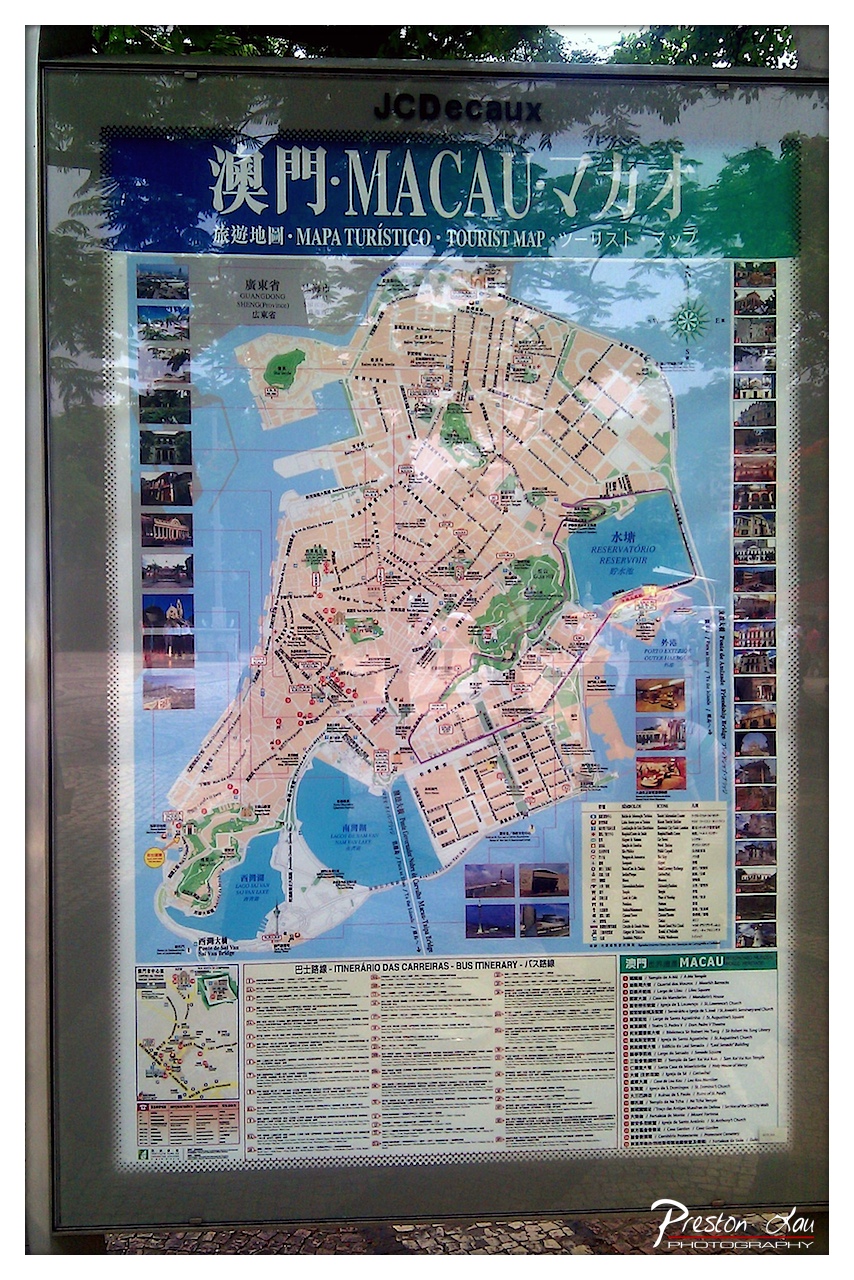

1. Overall Rating (0–10) — 5.5
This photograph captures a tourist map of Macau, presenting a functional yet visually cluttered document of a vibrant cultural crossroads. The map’s multilingual text and dense layout reflect its practical purpose, but the image itself feels more like a candid snapshot than a composed photograph. Reflections on the glass and uneven lighting obscure some details, diminishing the clarity and visual appeal. While it conveys the essence of a travel guide in situ, the image lacks the artistic cohesion to transcend mere documentation.
2. Composition (0–10) — 4.5
The frame is dominated by the map, but the reflection of trees and ambient light creates visual noise. The composition is slightly off-center, with the top edge of the map cut off, giving an unbalanced and accidental feel.
3. Lighting (0–10) — 5.0
The lighting is flat and diffuse, likely from an overcast sky, which minimizes shadows but also flattens the depth of the scene. Reflections on the glass surface further disrupt the visual clarity.
4. Color & Tone (0–10) — 5.5
The color palette is functional, with the blue of the map’s background and green accents providing a sense of structure. However, the colors appear muted and slightly washed out due to glare and the reflective surface.
5. Creativity (0–10) — 5.0
The image is observational rather than expressive, capturing a real-world object without a clear artistic intent. The reflection of nature on the glass adds a subtle layer of juxtaposition, but it's underutilized.
6. Technical Quality (0–10) — 6.0
The image is sharp and detailed in the areas not affected by reflections. However, the glare and reflections reduce overall clarity and make some text difficult to read.
7. Emotional Impact (0–10) — 4.5
The image evokes a sense of travel and place, but the technical limitations and lack of emotional focus keep the viewer at a distance. It feels more like a record than an invitation to feel.
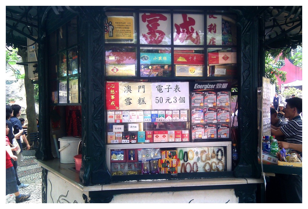

1. Overall Rating (0–10) — 6.0
This photograph captures the vibrant, cluttered energy of a traditional street kiosk in a bustling urban setting, where commerce and culture intersect in a visually dense tapestry. The abundance of signage, products, and human activity conveys a sense of authenticity and daily life, though the image’s visual chaos risks overwhelming the viewer. While it successfully documents a moment of cultural specificity, it lacks a cohesive visual narrative, feeling more like a snapshot than a composed statement.
2. Composition (0–10) — 5.5
The frame is tightly packed with objects and text, creating a busy, uneven balance. The central kiosk is well-placed, but the surrounding elements—pedestrians on the left, a partial vendor on the right—distract from the main subject, reducing compositional harmony.
3. Lighting (0–10) — 5.0
Natural daylight illuminates the scene evenly, but the lack of directional contrast flattens depth. Harsh overhead light creates glare on glass surfaces, diminishing detail and contributing to the image’s somewhat chaotic feel.
4. Color & Tone (0–10) — 5.5
The palette is dominated by the reds and yellows of product packaging, with a strong presence of black and white in the kiosk structure. While vibrant, the colors feel unbalanced and overly saturated, with little tonal variation to guide the eye.
5. Creativity (0–10) — 6.5
The image captures a slice of everyday life with an authentic, unfiltered eye. Its strength lies in its documentary quality and cultural specificity, though it lacks a strong artistic vision or conceptual twist to elevate it beyond mere observation.
6. Technical Quality (0–10) — 6.0
The image is sharp and well-focused, with sufficient detail in the signage and products. However, the overexposure in highlights and the slight lack of depth control reduce its technical polish.
7. Emotional Impact (0–10) — 5.5
The photograph evokes a sense of place—busy, lively, and rooted in tradition—but its visual clutter and lack of narrative focus limit its emotional resonance. The viewer is presented with information rather than feeling, making it more intellectually engaging than emotionally compelling.
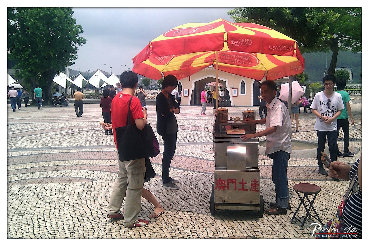

1. Overall Rating (0–10) — 6.0
This photograph captures a slice of everyday life in a vibrant public square, where the energy of a street vendor contrasts with the quiet rhythm of passersby. The bold red-and-yellow umbrella draws the eye, anchoring the scene in a moment of cultural authenticity, though the slightly cluttered composition and muted lighting prevent it from feeling fully cohesive. While it succeeds in documenting a lively urban interaction, it lacks the visual polish to transcend its documentary roots.
2. Composition (0–10) — 5.5
The vendor and his cart are well-centered, but the surrounding figures and background elements create visual noise. A tighter crop would better focus attention on the interaction at the cart.
3. Lighting (0–10) — 5.0
Overcast skies produce flat, diffused light that softens details and weakens contrast. While even, it diminishes the scene’s dynamic potential and creates a somewhat dull atmosphere.
4. Color & Tone (0–10) — 6.0
The red and yellow of the umbrella provide a strong focal point, but the overall palette is muted by the cloudy sky and the grayish tones of the cobblestone. A bit more saturation would enhance visual appeal.
5. Creativity (0–10) — 6.5
The image captures a candid, authentic moment, offering a glimpse into local life. While not particularly original in concept, it tells a story of daily commerce and interaction with quiet dignity.
6. Technical Quality (0–10) — 7.0
The image is sharp and in focus, with clear details in the foreground. The watermark and slight grain suggest a digital capture with decent technical execution.
7. Emotional Impact (0–10) — 5.5
The scene evokes a sense of everyday routine and community, but the lack of dramatic lighting or emotional intensity keeps the viewer at a distance. The mood is observational rather than evocative.
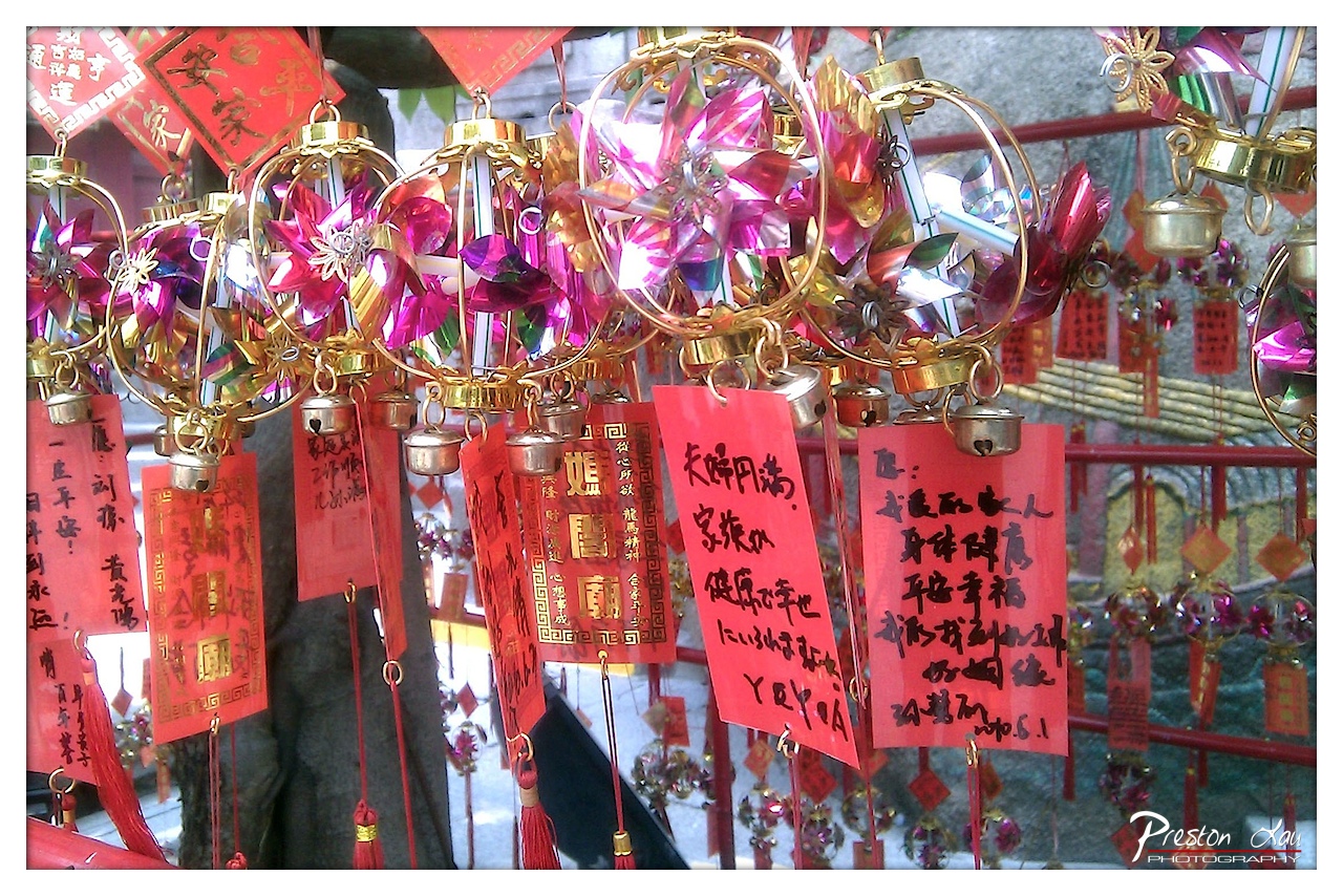

1. Overall Rating (0–10) — 7.5
This photograph captures the vibrant energy and spiritual richness of a temple祈福 scene, where tradition and personal hope converge in a dazzling display of color and symbolism. The dense arrangement of red prayer tags, shimmering pinwheels, and golden bells creates a visually dynamic tapestry that pulses with cultural significance. While the composition is rich in detail, the sheer density of elements risks overwhelming the viewer, slightly diminishing the clarity of individual messages.
2. Composition (0–10) — 6.5
The image is tightly framed, with a busy foreground that draws the eye but creates visual clutter. The central cluster of pinwheels and bells provides a focal point, though the overlapping layers and diagonal lines of the red railings disrupt a sense of balance.
3. Lighting (0–10) — 6.0
Natural daylight illuminates the scene evenly, highlighting the metallic sheen of the pinwheels and the bold red of the prayer slips. However, the light lacks directionality, resulting in a somewhat flat appearance that doesn’t accentuate depth or texture.
4. Color & Tone (0–10) — 8.0
The palette is striking—dominated by radiant reds and golds, with flashes of magenta and purple from the pinwheels. This bold color scheme reinforces the celebratory and sacred atmosphere, while the contrast between the vivid foreground and muted background enhances visual impact.
5. Creativity (0–10) — 7.0
The photograph captures a deeply cultural moment with authenticity and vibrancy. The integration of handwritten wishes and traditional symbols tells a layered story of faith and personal aspiration, offering a glimpse into ritual practice that is both intimate and communal.
6. Technical Quality (0–10) — 7.5
The image is sharp and detailed, particularly in the foreground elements. Focus is well-managed, allowing the textures of the paper, metal, and tassels to be clearly visible. The exposure is balanced, preserving detail in both highlights and shadows.
7. Emotional Impact (0–10) — 7.0
The image evokes a sense of reverence and hope, as the handwritten prayers—each a personal plea—hang among the sacred symbols. There is a quiet intimacy in the individual wishes, inviting the viewer to reflect on the universal desire for peace, health, and prosperity.
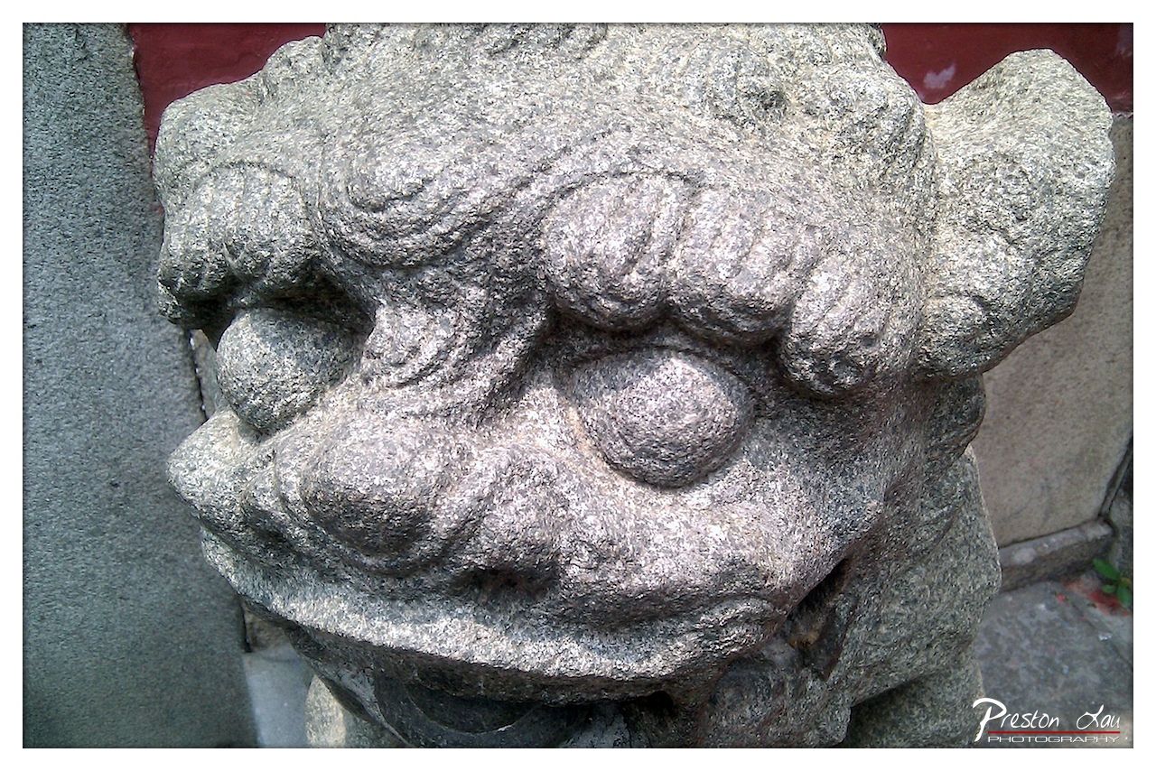

1. Overall Rating (0–10) — 7.5
This photograph captures the weathered dignity of a traditional stone guardian lion, its expression both fierce and serene in the quiet passage of time. The tight framing and focus on texture give the sculpture a monumental presence, while the subtle red background adds a hint of cultural context. Though the lighting is somewhat flat and the composition slightly off-center, the image succeeds in conveying the weight of history and craftsmanship embedded in the stone.
2. Composition (0–10) — 6.5
The close-up framing emphasizes the sculpture’s intricate details, but the off-center placement and partial cropping of the head create a slight imbalance. A more centered composition would enhance visual stability.
3. Lighting (0–10) — 6.0
The light is even and diffused, highlighting the stone’s texture without harsh shadows. However, the lack of directional lighting reduces depth and dramatic contrast, softening the sculpture’s imposing character.
4. Color & Tone (0–10) — 6.5
The muted gray of the stone contrasts subtly with the red background, adding a touch of cultural warmth. The tonal range is consistent but lacks vibrancy, giving the image a subdued, almost documentary feel.
5. Creativity (0–10) — 7.0
The choice to focus on the facial details of the lion, rather than a full-body shot, offers a fresh perspective on a familiar subject. The interplay of texture and color suggests a quiet reverence for tradition.
6. Technical Quality (0–10) — 8.0
The image is sharp and clear, with fine detail visible in the stone’s grain. Focus is well-managed, and the resolution is high, capturing the sculpture’s character with precision.
7. Emotional Impact (0–10) — 7.0
There’s a sense of solemnity and endurance in the lion’s expression, evoking a quiet connection to cultural heritage. The viewer is drawn into a moment of stillness, contemplating the passage of time and the guardianship these figures represent.
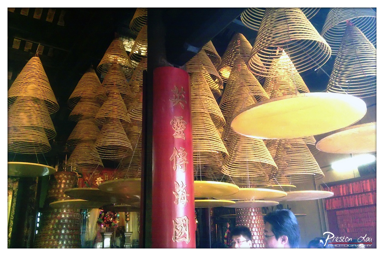

1. Overall Rating (0–10) — 7.0
This photograph captures the dense, reverent atmosphere of a temple interior, where the hanging incense coils create a hypnotic, almost cathedral-like rhythm. The rich textures of the woven coils and the bold red column anchor the composition, while the subtle human presence grounds the scene in lived ritual. The image succeeds in conveying a sense of spiritual immersion, though the slightly cluttered arrangement and uneven lighting prevent it from achieving a more refined visual harmony.
2. Composition (0–10) — 6.5
The frame is filled with a dense array of incense coils, creating a sense of visual weight and rhythm, but the central red column slightly disrupts the flow. The inclusion of people in the lower right adds scale and context, though their placement feels incidental rather than intentional.
3. Lighting (0–10) — 5.5
The lighting is warm but uneven, with bright spots from artificial sources creating harsh reflections on the coils and some areas of deep shadow. While the glow enhances the spiritual mood, the lack of controlled illumination detracts from the overall tonal balance.
4. Color & Tone (0–10) — 7.0
The dominant golden yellows of the incense coils contrast sharply with the deep red of the column, creating a rich, culturally resonant palette. The warm tones evoke tradition and reverence, though some areas appear overexposed, washing out subtle textures.
5. Creativity (0–10) — 7.5
The image captures a unique cultural moment with strong visual rhythm and symbolic depth. The repetition of the coils and the use of the red column as a narrative anchor demonstrate a thoughtful approach to framing an everyday spiritual practice.
6. Technical Quality (0–10) — 6.5
The focus is generally sharp, particularly on the central column and nearby coils, but some areas of the image suffer from slight softness and noise, likely due to low-light conditions. The composition is effective, but the technical execution shows signs of compromise.
7. Emotional Impact (0–10) — 7.0
The image evokes a quiet sense of devotion and continuity, inviting the viewer into a space of ritual and reflection. The warmth and density of the scene create a meditative atmosphere, though the lack of clear focal direction keeps the emotional connection from fully resonating.
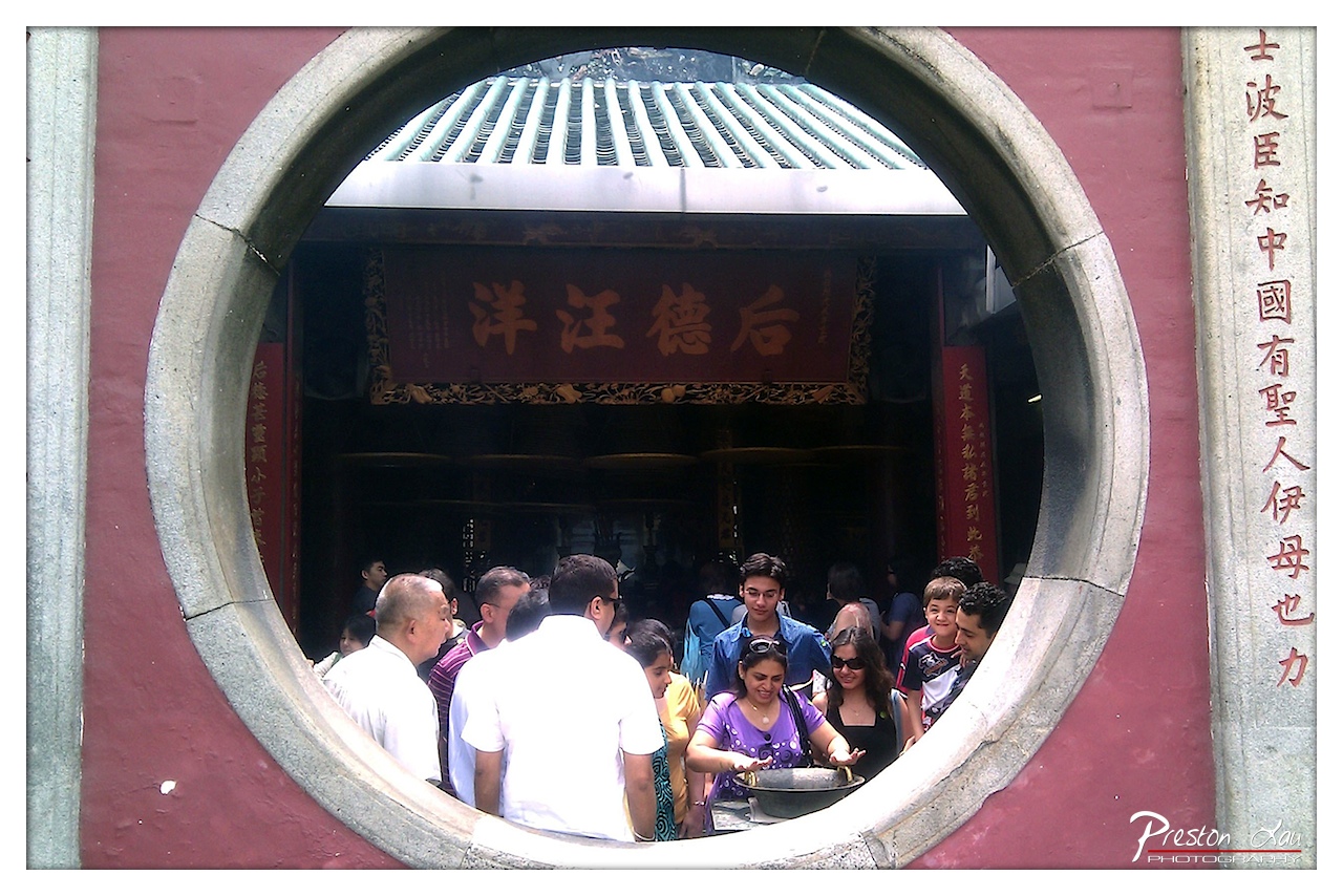

1. Overall Rating (0–10) — 7.0
This photograph captures the vibrant energy of a cultural site through a striking circular frame, blending tradition and modernity in a single glance. The composition draws the viewer into a bustling temple courtyard, where the interplay of light, color, and human activity creates a sense of authenticity and movement. While the image successfully conveys the atmosphere of the location, it is slightly hindered by overexposure in the highlights and a lack of deeper tonal contrast, which softens its overall impact.
2. Composition (0–10) — 8.0
The circular frame creates a natural vignette, drawing attention to the activity within. The subjects are arranged dynamically across the center, with the temple sign anchoring the composition and the vertical inscription on the right providing balance. The framing enhances narrative depth, inviting the viewer to peer into a moment of cultural practice.
3. Lighting (0–10) — 6.0
Bright daylight illuminates the scene, but the harsh overhead sun creates blown-out highlights on the white clothing and bright surfaces, reducing detail in the upper portion. The shadows within the temple entrance are deep, contributing to a contrasty but uneven lighting scheme that detracts from overall tonal harmony.
4. Color & Tone (0–10) — 7.0
The reds of the walls and the banner are vivid and culturally resonant, creating a strong visual anchor. The contrast between the warm reds and the cool green tiles adds depth, while the skin tones and varied clothing colors contribute to a lively palette. However, the overexposed areas flatten the tonal range and reduce the richness of the image.
5. Creativity (0–10) — 8.0
The use of the circular window as a framing device is both traditional and inventive, transforming a simple scene into a layered narrative. This compositional choice reflects a deep understanding of cultural context and visual storytelling, elevating the image beyond a mere snapshot into a thoughtful observation.
6. Technical Quality (0–10) — 7.0
The image is sharp and detailed, particularly in the central area, with good focus on the people and architectural elements. The exposure is strong, though the highlights are slightly overblown, and the watermark in the corner, while subtle, disrupts the visual flow.
7. Emotional Impact (0–10) — 7.5
The photograph evokes a sense of curiosity and connection, inviting the viewer to imagine themselves in the moment—participating in or observing a sacred ritual. The warmth of the crowd and the cultural richness of the setting create a palpable sense of human engagement and spiritual significance.
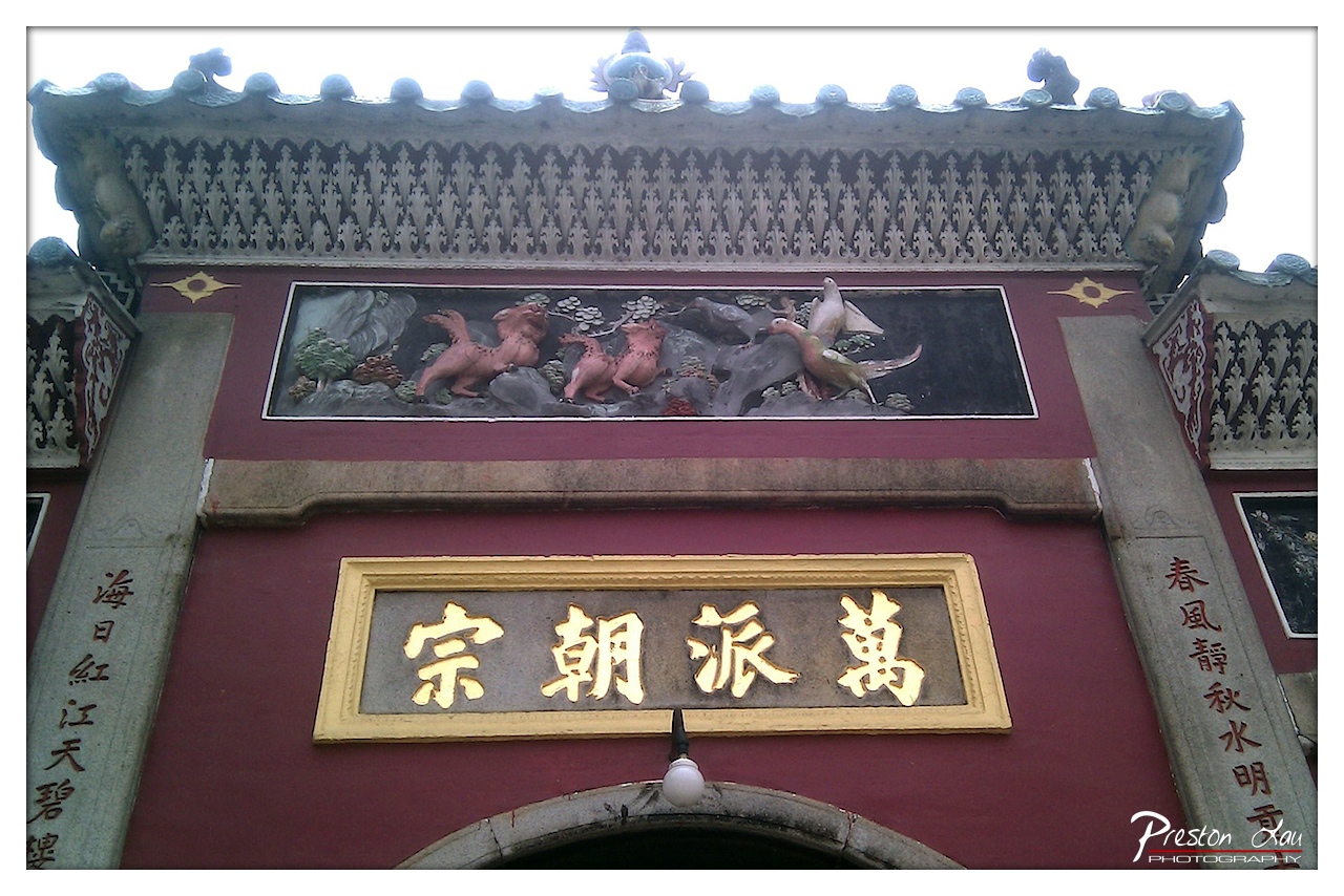

1. Overall Rating (0–10) — 7.5
This photograph captures the ornate grandeur of a traditional Chinese temple entrance, where architectural detail and cultural symbolism converge. The rich maroon facade, gold lettering, and sculpted relief above the doorway convey a sense of reverence and historical depth. While the image effectively highlights the craftsmanship, the overexposed sky detracts slightly from the overall balance, softening the impact of the intricate roofline.
2. Composition (0–10) — 8.0
The central framing of the sign and relief creates a strong focal point, with the vertical columns and arched entry guiding the viewer’s eye naturally. The symmetry of the composition enhances the sense of order and formality, though the slight tilt introduces a subtle imbalance.
3. Lighting (0–10) — 6.0
The harsh, overcast light flattens the textures of the stonework and tiles, while the bright sky causes significant overexposure at the top of the frame. This washes out the details of the roofline and diminishes the atmospheric depth.
4. Color & Tone (0–10) — 7.0
The deep maroon and gold dominate the palette, creating a regal and harmonious contrast that reflects traditional Chinese aesthetics. However, the muted tones of the overcast sky and the lack of rich shadows reduce the vibrancy of the image.
5. Creativity (0–10) — 7.0
The photograph successfully captures the cultural and architectural significance of the site, with the placement of the relief and calligraphy enhancing the narrative. While the approach is straightforward, it effectively communicates the dignity and permanence of the structure.
6. Technical Quality (0–10) — 7.5
The image is sharp and clear in the central area, with good detail in the sign and carving. The focus is consistent, though the overexposed sky and minor noise in the highlights reduce overall technical refinement.
7. Emotional Impact (0–10) — 7.5
The image evokes a sense of quiet reverence and timelessness, inviting contemplation of tradition and heritage. The strong visual cues of cultural identity create a connection to history, even if the lighting tempers the emotional intensity.
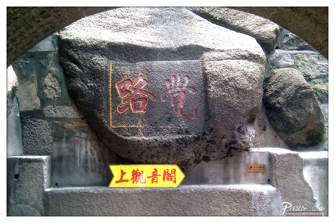

1. Overall Rating (0–10) — 6.8
This photograph captures a moment of cultural and historical resonance, where ancient stone inscriptions meet modern signage in a quiet, layered narrative. The bold red characters carved into the rock convey a sense of permanence and tradition, while the yellow directional sign introduces a contemporary, functional contrast. Though the composition is slightly cluttered by the modern elements, the image succeeds in evoking a sense of place and time—where history is not just preserved but actively navigated. The tension between the old and the new gives the photograph a subtle, lived-in quality.
2. Composition (0–10) — 6.0
The stone arch frames the central inscription effectively, creating a natural focal point. However, the inclusion of the yellow sign and the small warning plaque disrupts visual harmony, creating a sense of visual clutter. A more deliberate arrangement or tighter crop could enhance the balance.
3. Lighting (0–10) — 6.5
Natural daylight illuminates the scene evenly, highlighting the texture of the stone and the depth of the carved characters. The lighting is clear but lacks dramatic contrast, resulting in a somewhat flat and functional exposure that serves documentation over mood.
4. Color & Tone (0–10) — 6.5
The muted grays and earthy tones of the stone provide a neutral backdrop, allowing the red characters and yellow sign to stand out. The color palette is purposeful, emphasizing contrast for legibility, though the vibrancy of the signage slightly undermines the traditional aesthetic.
5. Creativity (0–10) — 7.0
The juxtaposition of ancient carving with modern signage offers a compelling narrative about cultural continuity and adaptation. The photographer captures a real-world moment where tradition and modernity coexist, making the image both informative and thought-provoking.
6. Technical Quality (0–10) — 7.5
The image is sharp and well-focused, with clear detail in the texture of the stone and legible inscriptions. The exposure is balanced, and the overall clarity supports the photograph’s documentary intent.
7. Emotional Impact (0–10) — 6.0
The image evokes a quiet contemplation of history and its ongoing presence in daily life. While it doesn’t elicit strong emotion, it invites the viewer to reflect on the passage of time and the ways in which cultural markers endure.
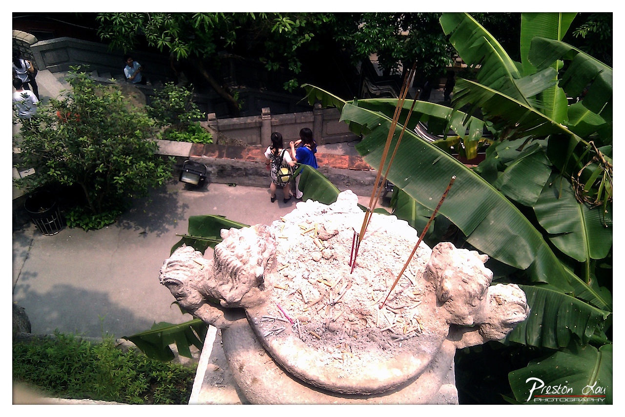

1. Overall Rating (0–10) — 7.0
This photograph captures a quiet, layered moment at a temple or shrine, where ritual and daily life intersect. The incense-laden stone censer in the foreground grounds the image in sensory detail, while the blurred figures in the background suggest a living, breathing space. The composition feels candid and immersive, though the slightly cluttered arrangement and harsh sunlight temper its visual cohesion.
2. Composition (0–10) — 6.5
The high-angle perspective creates a natural depth, with the incense censer anchoring the foreground and leading the eye toward the figures below. However, the large banana leaves on the right slightly overpower the frame, and the off-center subject placement creates a slight imbalance.
3. Lighting (0–10) — 6.0
Strong overhead sunlight creates harsh highlights and deep shadows, particularly on the censer and pavement. While the light clearly defines texture, it flattens the scene’s tonal range and reduces the subtlety of the mood.
4. Color & Tone (0–10) — 6.5
The image features a natural palette dominated by the greens of the foliage and the earthy tones of the stone. The contrast between the bright incense ash and the dark shadows adds visual interest, though the oversaturated greens and blown-out highlights slightly diminish the color harmony.
5. Creativity (0–10) — 7.0
The juxtaposition of ritual (incense, stone carvings) with everyday life (tourists, casual clothing) offers a compelling narrative. The elevated vantage point adds a sense of observation, inviting the viewer to reflect on cultural continuity and shared space.
6. Technical Quality (0–10) — 7.5
The image is sharp and detailed, particularly in the texture of the stone and ash. The focus is well-managed, and the high level of detail contributes to the authenticity of the scene.
7. Emotional Impact (0–10) — 6.5
The photograph evokes a contemplative stillness, suggesting reverence and the passage of time. While the emotional resonance is present, the lack of clear focal warmth and the busy background prevent a deeper connection.
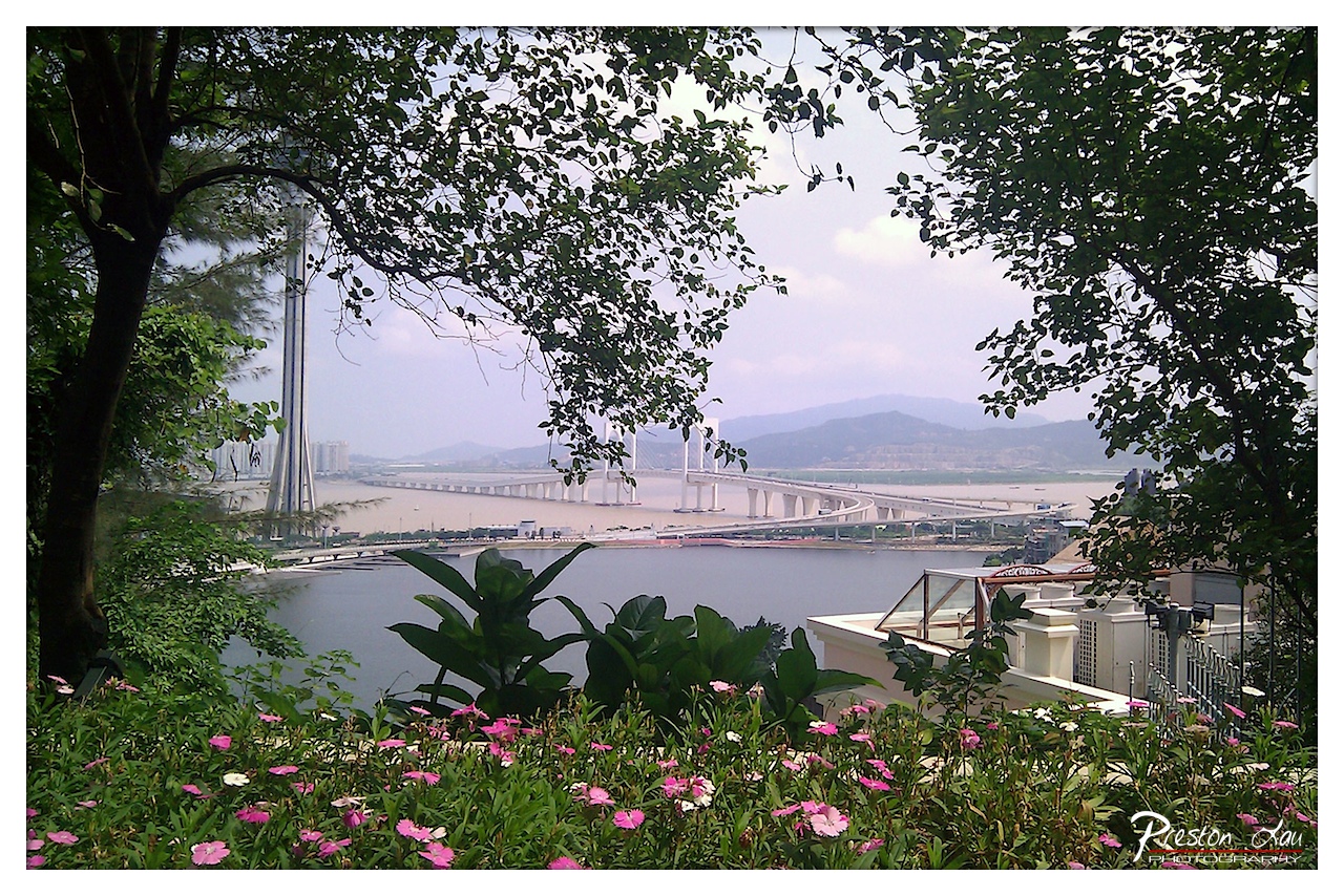

1. Overall Rating (0–10) — 7.5
This photograph masterfully blends natural beauty with urban grandeur, offering a serene yet expansive view of a modern bridge framed by lush foliage and vibrant flowers. The composition draws the eye through layers of greenery into the distant cityscape, creating a sense of depth and quiet harmony. While the lighting is slightly hazy, the image succeeds in capturing a moment where nature and engineering coexist with subtle elegance.
2. Composition (0–10) — 8.0
The framing through tree branches and flowers creates a natural vignette, guiding the viewer’s gaze toward the bridge and water. The balance between foreground flora and background architecture adds depth and visual interest, though the composition feels slightly asymmetrical.
3. Lighting (0–10) — 6.5
Soft, diffused daylight enhances the scene’s tranquility but reduces contrast and detail in the distance. The overcast sky contributes to a muted tone, softening the overall impact but preserving the calm mood.
4. Color & Tone (0–10) — 7.0
The palette is rich with natural greens and vibrant pinks in the foreground, which contrast beautifully with the cool grays of the bridge and water. The tones are well-balanced, though the slight haze limits the vibrancy in the background.
5. Creativity (0–10) — 7.5
The use of natural framing and layered perspective gives the image a distinctive, painterly quality. It elevates a standard landscape into a more contemplative and artistic vision.
6. Technical Quality (0–10) — 7.5
Sharp focus in the foreground complements the clarity of the midground, while the distant elements are slightly softened by atmospheric haze. The image is well-exposed and free of technical flaws.
7. Emotional Impact (0–10) — 7.0
The photograph evokes a sense of peaceful observation, inviting the viewer to pause and reflect on the harmony between urban development and natural surroundings. The floral foreground adds a touch of intimacy and warmth.
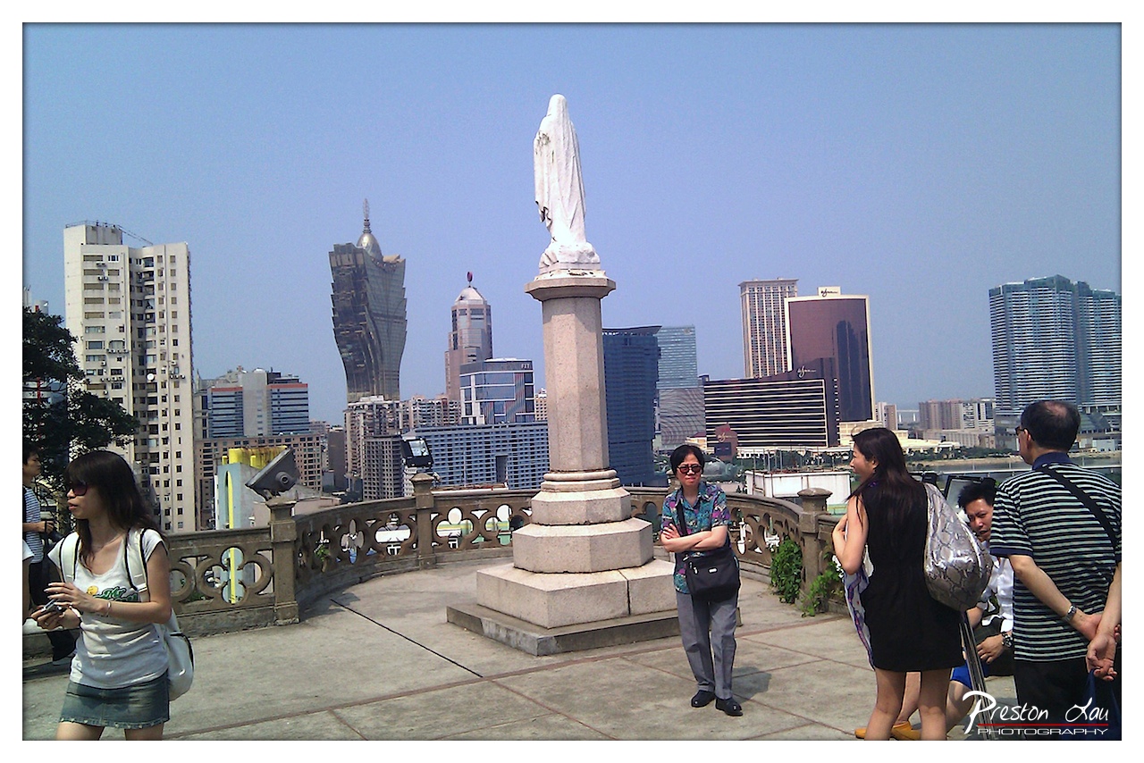

1. Overall Rating (0–10) — 6.0
This photograph captures a striking juxtaposition between tradition and modernity, with a religious statue standing solemnly against the backdrop of Macau’s towering skyline. The contrast between the serene figure and the bustling urban sprawl evokes a sense of cultural duality, though the image’s overall impact is tempered by a lack of visual cohesion. While the scene is rich with narrative potential, the composition and lighting feel somewhat routine, preventing it from rising above a simple travel snapshot.
2. Composition (0–10) — 5.5
The statue is centrally placed, creating a visual anchor, but the surrounding tourists and architectural clutter distract from the focal point. The railing and uneven framing introduce visual noise, weakening the balance and leading the eye away from the intended narrative.
3. Lighting (0–10) — 6.0
Bright, direct daylight illuminates the scene evenly, but the harshness flattens shadows and diminishes the depth of the background. The sky is slightly overexposed, robbing the image of atmospheric subtlety.
4. Color & Tone (0–10) — 5.5
The palette is dominated by muted grays and blues, with the white statue standing out but lacking tonal richness. The colors feel slightly washed out, reducing the vibrancy of the scene and giving it a flat, documentary quality.
5. Creativity (0–10) — 6.5
The concept of contrasting the sacred and the secular is compelling and thoughtfully captured. However, the execution lacks a unique artistic vision, resulting in a conventional portrayal rather than a deeply expressive interpretation.
6. Technical Quality (0–10) — 7.0
The image is sharp and well-focused, with clear detail in both the foreground and background. The exposure is generally correct, though the sky’s brightness suggests minor overexposure.
7. Emotional Impact (0–10) — 5.0
While the setting suggests a moment of reflection and cultural transition, the emotional resonance is muted. The presence of tourists and the busy composition create a sense of detachment, keeping the viewer from fully connecting with the scene’s deeper meaning.
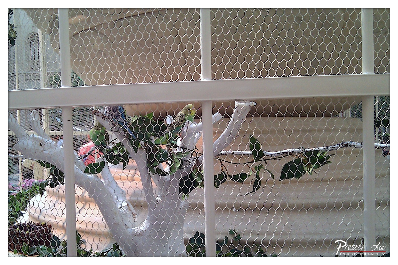

1. Overall Rating (0–10) — 6.0
This photograph captures a quiet moment within a bird enclosure, where the interplay of natural and man-made elements creates a sense of contained life. The chain-link barrier and artificial branch structure establish a clinical, zoo-like atmosphere, yet the presence of the colorful parakeets offers a touch of vitality and movement. While the image succeeds in documenting the scene with clarity, its emotional resonance is muted by the visual clutter and the heavy obstruction of the fence, which distances the viewer from the birds.
2. Composition (0–10) — 5.5
The framing is centered but uneven, with the white bars and mesh creating a grid that divides the image into fragmented sections. The birds are scattered across the frame, with no clear focal point, leading the eye to wander rather than rest. A tighter crop would help emphasize the birds and reduce the visual distraction of the surrounding structure.
3. Lighting (0–10) — 6.0
The lighting is bright and even, suggesting midday sun, which illuminates the scene without harsh shadows. However, the flatness of the light lacks depth and dimension, diminishing the texture of the birds’ feathers and the surrounding foliage. The white enclosure reflects light, contributing to a slightly overexposed and washed-out effect.
4. Color & Tone (0–10) — 6.5
The palette is dominated by neutral whites and grays from the enclosure, which contrasts with the vibrant greens and blues of the parakeets. While the birds stand out, the overall tone feels muted due to the lack of saturation and dynamic range. A more balanced exposure and richer color rendering would enhance the natural vibrancy of the birds.
5. Creativity (0–10) — 5.5
The image is observational rather than expressive, capturing a candid moment without a strong artistic vision. The use of the chain-link fence as a compositional element is present but not fully leveraged—its pattern creates a visual barrier that could be used more intentionally to symbolize confinement or observation.
6. Technical Quality (0–10) — 7.0
The focus is sharp on the birds and the immediate foreground, with adequate detail visible in the mesh and branches. The exposure is generally correct, though slight overexposure in the background reduces detail. The watermark is subtle and does not distract.
7. Emotional Impact (0–10) — 5.0
The emotional impact is limited by the visual distance created by the enclosure. While the birds’ colors suggest life and energy, the sterile environment and the viewer’s perspective through the mesh inhibit a deeper connection. The image feels more like a snapshot than an evocative portrait of animal life.
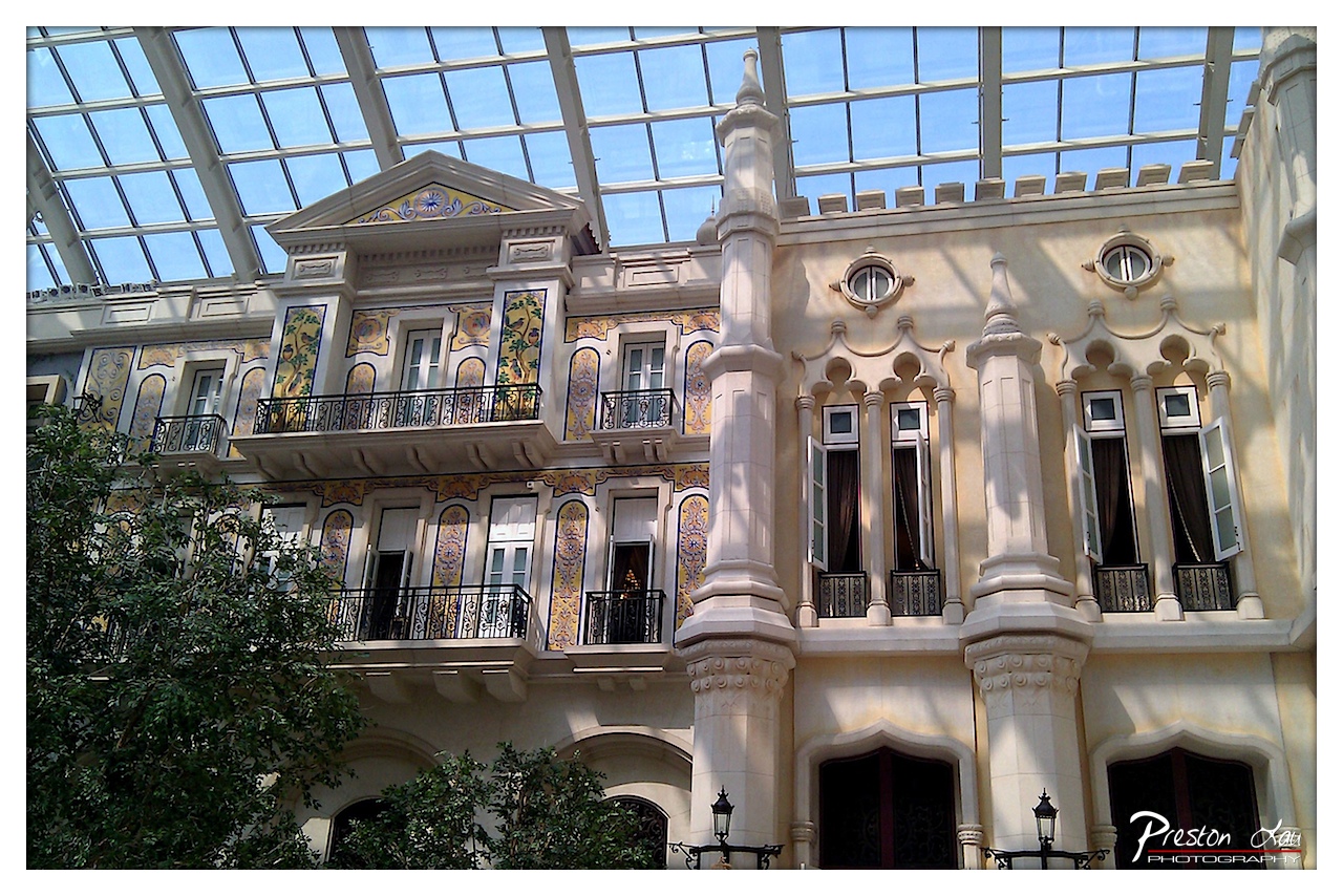

1. Overall Rating (0–10) — 7.5
This photograph captures the opulent fusion of historic architecture and modern design within a grand indoor atrium, where light and ornamentation converge to create a sense of architectural wonder. The intricate tilework and classical detailing evoke a European elegance, while the glass ceiling grounds the scene in a contemporary setting. Though the composition is visually rich, the framing feels slightly unbalanced, and the natural foliage in the foreground, while adding depth, risks distracting from the architectural centerpiece.
2. Composition (0–10) — 6.5
The image is framed with a slightly off-center focus, placing the ornate facade diagonally across the frame. While the structure dominates the upper half, the lower-left foliage intrudes into the visual space, creating an imbalance. A tighter crop could better emphasize the architectural symmetry and vertical lines.
3. Lighting (0–10) — 8.0
Natural light floods the space through the expansive glass ceiling, casting soft, diffused shadows that enhance the texture and depth of the stonework. The interplay of light and shadow highlights the building’s details, while the bright blue sky visible through the glass adds a sense of openness and clarity.
4. Color & Tone (0–10) — 7.5
The warm cream and beige tones of the facade are beautifully contrasted by the vibrant yellows and blues of the tilework, creating a rich, harmonious palette. The cool blue of the sky complements the warm architectural hues, while the green foliage introduces a natural, grounding element.
5. Creativity (0–10) — 7.0
The juxtaposition of traditional ornamental design with a modern glass conservatory setting is inherently creative, offering a unique blend of old and new. The image captures a rare architectural hybrid, inviting viewers to contemplate the fusion of history and contemporary design.
6. Technical Quality (0–10) — 8.5
The photograph is sharp and detailed, with excellent clarity in the architectural elements. The focus is consistent across the frame, and the exposure is well-balanced, capturing both the bright sky and the shaded areas of the building with minimal loss of detail.
7. Emotional Impact (0–10) — 7.0
The image evokes a sense of awe and admiration for the craftsmanship and grandeur of the architecture. The light-filled space and intricate design inspire a feeling of wonder, though the lack of human presence keeps the emotional connection more intellectual than personal.
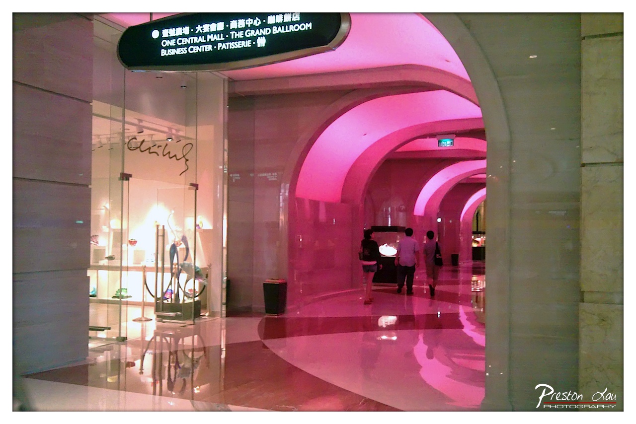

1. Overall Rating (0–10) — 6.8
This photograph captures the sleek, modern elegance of a luxury hotel corridor, where architecture and ambient lighting merge into a dreamlike passage. The dominant pink glow casts a surreal, almost futuristic mood, while the polished floor reflects the arches and signage with a quiet shimmer. Though the scene is visually striking, the overuse of artificial color and the cluttered signage slightly detract from its refined atmosphere, creating a tension between opulence and commercial clarity.
2. Composition (0–10) — 7.0
The arches create strong leading lines that draw the eye deep into the frame, emphasizing depth and movement. The placement of the three figures adds scale and narrative, while the storefront on the left provides a point of contrast and visual interest. The composition is balanced, though the framing feels slightly off-center, which weakens the symmetry of the arches.
3. Lighting (0–10) — 7.5
The pink lighting bathes the space in a dramatic, uniform glow, creating a mood of sophistication and modernity. While the light is intense, it enhances the architectural curves and reflections, giving the corridor a theatrical quality. The overhead signage is slightly overexposed, but the ambient illumination remains consistent and effective.
4. Color & Tone (0–10) — 6.5
The dominant pink hue creates a bold, monochromatic palette that is both striking and somewhat overwhelming. The lack of natural color variation limits tonal depth, and the contrast between the bright pink and the neutral marble tones is strong but slightly jarring. The color choice feels intentional, yet it risks overshadowing the environment’s inherent elegance.
5. Creativity (0–10) — 7.0
The image successfully transforms a mundane hallway into a visually compelling narrative through the use of color and perspective. The choice to emphasize the pink lighting and architectural rhythm suggests a deliberate artistic vision, turning a commercial space into something almost cinematic. However, the heavy reliance on artificial color limits its broader aesthetic appeal.
6. Technical Quality (0–10) — 7.5
The image is sharp and clear, with excellent detail in the reflections and textures of the marble and glass. The focus is consistent throughout, and the exposure is well-managed despite the high-contrast lighting. The watermark in the corner is unobtrusive and does not detract from the composition.
7. Emotional Impact (0–10) — 6.0
The photograph evokes a sense of quiet luxury and futuristic calm, inviting the viewer to imagine walking through this elegant corridor. The mood is dreamy and slightly detached, which may resonate with some but feels emotionally distant to others. The combination of color and scale creates a sense of wonder, though the commercial elements slightly dilute its emotional depth.
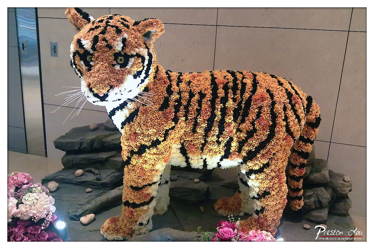

1. Overall Rating (0–10) — 7.5
This photograph captures a striking and imaginative floral sculpture of a tiger, rendered with remarkable detail and texture that brings the animal to life in an unexpected medium. The craftsmanship is evident in the precision of the stripes and the lifelike posture, while the surrounding floral arrangement adds a soft contrast to the bold figure. While the setting feels slightly utilitarian, the artistry of the piece transcends its environment, offering a compelling fusion of nature and creativity.
2. Composition (0–10) — 7.0
The tiger is centered and dominates the frame, creating a strong focal point. The inclusion of rocks and flowers grounds the sculpture in a naturalistic context, though the tight framing and background elements slightly clutter the scene, reducing visual clarity.
3. Lighting (0–10) — 6.5
The lighting is functional but flat, with a small spotlight enhancing the sculpture’s texture but creating harsh shadows on the floor. The ambient light lacks depth, muting the vibrancy of the flowers and weakening the overall mood.
4. Color & Tone (0–10) — 7.5
The warm orange and black of the tiger contrast beautifully with the soft pinks and whites of the surrounding flowers. The color palette is cohesive and lively, though the overall tone is slightly washed out due to the artificial lighting.
5. Creativity (0–10) — 9.0
The concept of crafting a tiger from flowers is highly original and demonstrates impressive artistic vision. The fusion of natural materials with a wild animal motif creates a unique narrative, evoking themes of beauty, fragility, and transformation.
6. Technical Quality (0–10) — 8.0
The image is sharp and well-focused, with clear detail in the floral texture and facial features of the tiger. The watermark is discreet, and the exposure is generally balanced, though some areas are slightly overexposed due to the spotlight.
7. Emotional Impact (0–10) — 7.0
The sculpture evokes a sense of wonder and admiration for the skill involved, but the sterile indoor environment tempers its emotional resonance. It invites curiosity and delight but doesn’t fully capture the wild spirit of the animal it represents.
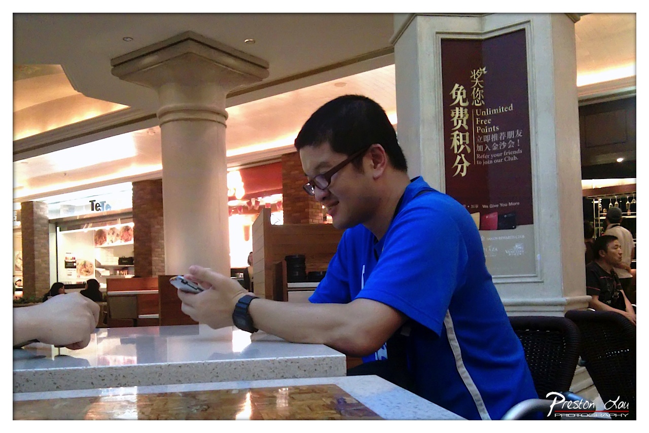

1. Overall Rating (0–10) — 6.0
This photograph captures a candid moment of quiet engagement, where a man in a blue shirt is absorbed in his phone, his expression a mix of amusement and focus. The setting—a mall food court—adds a layer of everyday realism, grounding the scene in a recognizable urban ritual. While the image conveys a sense of intimacy and authenticity, the lighting and framing feel slightly haphazard, keeping the moment from achieving a more refined or impactful presence.
2. Composition (0–10) — 5.5
The subject is placed off-center, creating a natural, candid feel, but the cluttered foreground and uneven framing—especially the intrusive hand and table edge—distract from the central figure. The strong vertical column on the left competes for attention, disrupting visual flow.
3. Lighting (0–10) — 5.0
Harsh overhead lighting flattens the scene, washing out subtle textures and casting unflattering shadows. The warm glow from the background lights adds a touch of ambiance, but overall, the lighting lacks depth and directionality, contributing to a somewhat sterile atmosphere.
4. Color & Tone (0–10) — 5.5
The dominant blue of the subject’s shirt creates a strong focal point, but it contrasts awkwardly with the neutral beige and muted tones of the environment. The color palette feels unbalanced, with little tonal harmony, and the overall warmth is inconsistent.
5. Creativity (0–10) — 6.0
The photograph succeeds in capturing a slice-of-life moment with authenticity, but the composition and lighting prevent it from feeling artistically intentional. The candid nature is refreshing, yet the image doesn’t push beyond mere documentation.
6. Technical Quality (0–10) — 6.5
The image is reasonably sharp, with clear focus on the man and his phone. However, slight noise and a lack of dynamic range suggest a high ISO or suboptimal camera settings, reducing overall clarity in the shadows and highlights.
7. Emotional Impact (0–10) — 6.0
There’s a quiet warmth in the subject’s smile and the shared moment with the unseen companion, suggesting connection and comfort. Yet the distance created by the composition and lighting limits the emotional resonance, leaving the viewer as an observer rather than a participant.
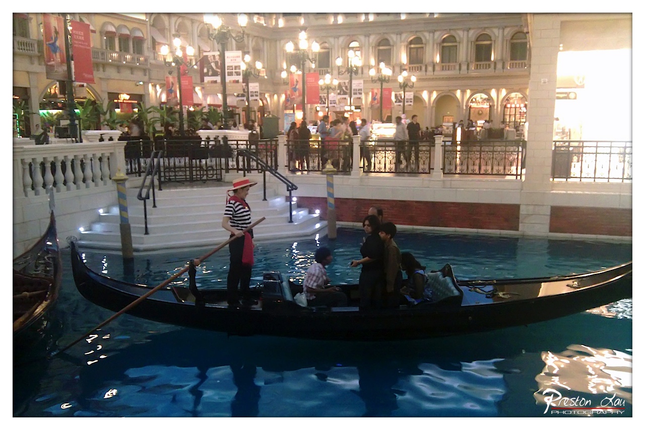

1. Overall Rating (0–10) — 6.8
This image captures the theatrical charm of a Venetian-themed gondola ride inside a bustling indoor mall, blending realism with staged romance. The gondolier’s poised stance and the passengers’ relaxed engagement create a sense of narrative, while the ornate architecture and ambient lighting lend an air of whimsical elegance. However, the image’s authenticity is undercut by the artificiality of the setting, and the composition’s cluttered background detracts from the focal intimacy of the gondola.
2. Composition (0–10) — 6.0
The gondola is well-framed in the lower third, drawing attention to the central action, but the background is visually busy with people, banners, and architectural elements that distract from the main subject. The diagonal line of the gondola adds dynamism, yet the composition feels slightly unbalanced due to the off-center placement of the gondolier and the lack of negative space.
3. Lighting (0–10) — 6.5
The warm, artificial lighting of the indoor setting creates a soft, inviting glow that enhances the romantic atmosphere. However, the lighting is uneven—overexposed in the background on the right and dimmer in the foreground—resulting in a loss of detail and a slightly flat overall tone.
4. Color & Tone (0–10) — 6.0
The palette is dominated by cool blues in the water and warm golds in the lighting, creating a pleasant contrast. However, the colors are somewhat muted and lack vibrancy, likely due to the indoor lighting conditions. The white architecture and red accents provide visual interest but do not fully stand out against the overall subdued tone.
5. Creativity (0–10) — 6.5
The image successfully captures a unique cultural experience within a modern, commercial context, blending reality with fantasy. The concept of a gondola ride in a mall is inherently creative, and the photograph documents this juxtaposition effectively, though it lacks deeper artistic innovation.
6. Technical Quality (0–10) — 7.0
The image is sharp and clear, with good detail visible in the gondola, passengers, and background architecture. Focus is well-managed, and the exposure is generally balanced despite the lighting challenges. The watermark is discreet and does not interfere with the composition.
7. Emotional Impact (0–10) — 6.0
The photograph evokes a sense of wonder and nostalgia, reminiscent of a romantic Venetian evening. While the setting is artificial, the image still manages to convey a moment of leisure and connection. The emotional resonance is moderate, as the viewer is reminded of the constructed nature of the scene, which slightly limits the immersive experience.
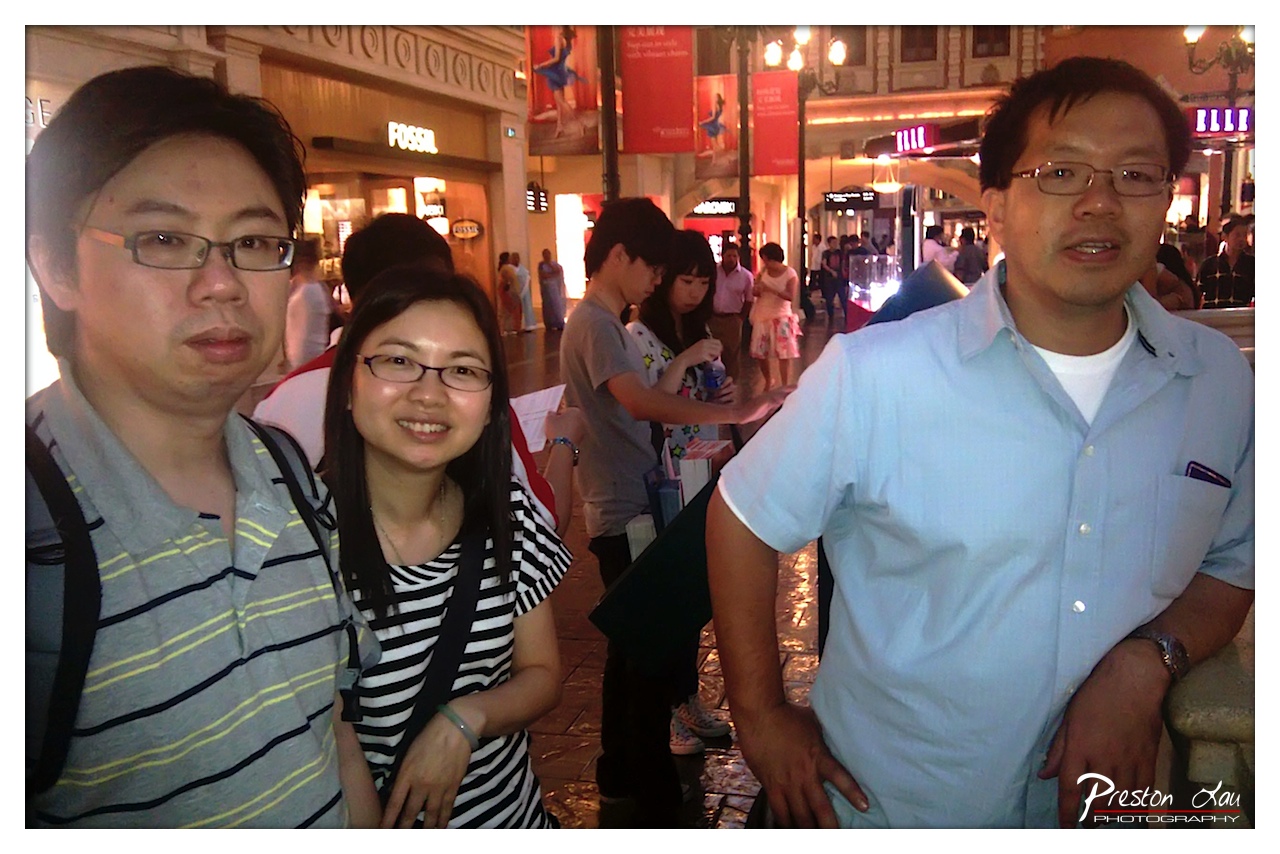

1. Overall Rating (0–10) — 6.0
This photograph captures a candid moment among three individuals in a bustling urban shopping district, evoking the energy of a shared outing. The warm evening lighting and surrounding storefronts lend a sense of place and movement, though the image’s informal framing and slightly cluttered background detract from its compositional cohesion. While it succeeds as a personal memento, it lacks the visual refinement to feel like a polished portrait.
2. Composition (0–10) — 5.5
The subjects are unevenly framed, with the man on the left partially cut off and the man on the right occupying too much space. The background activity, while adding context, creates visual distraction and weakens the focus on the central figures.
3. Lighting (0–10) — 6.5
The warm artificial light of the evening illuminates the scene naturally, casting a soft glow that enhances the relaxed mood. However, the light is uneven, with some areas slightly overexposed while others fall into shadow, creating a lack of balance.
4. Color & Tone (0–10) — 6.0
The color palette is dominated by warm yellows and oranges from the ambient lighting, with the cool blue of the man’s shirt providing a subtle contrast. The overall tone is slightly flat, and the colors lack vibrancy, giving the image a muted, slightly dated feel.
5. Creativity (0–10) — 5.5
The photograph captures a genuine, unposed moment, which is its strongest creative quality. However, the lack of intentional composition or narrative focus limits its artistic impact, making it more documentary than conceptual.
6. Technical Quality (0–10) — 7.0
The image is sharp and clear, with well-defined details in the subjects’ faces and clothing. The focus is accurate, and the exposure is generally balanced, though slight overexposure in the background lights slightly compromises overall technical precision.
7. Emotional Impact (0–10) — 6.5
The smiles and relaxed postures of the subjects convey warmth and camaraderie, creating a sense of connection and shared experience. While not emotionally dramatic, the image feels personal and authentic, resonating with viewers who recognize the simplicity of such moments.
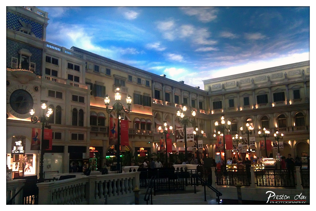

1. Overall Rating (0–10) — 7.0
This photograph captures the grandeur and theatricality of an opulent indoor plaza, evoking the ambiance of a European-style resort with its dramatic sky mural and classical architecture. The warm glow of the lanterns contrasts beautifully with the cool blue of the painted ceiling, creating a sense of immersive fantasy. While the image is rich in atmosphere, the slightly overexposed sky and cluttered foreground detract from its visual cohesion, keeping it from achieving full artistic refinement.
2. Composition (0–10) — 6.5
The diagonal placement of the clock tower and the railing leads the eye through the scene, but the crowded lower frame and uneven spacing of lampposts create a sense of visual chaos. A tighter crop would improve balance and focus.
3. Lighting (0–10) — 7.5
The interplay between the artificial warm lights and the cool, simulated dusk sky creates a dynamic and layered lighting scheme. The ambient glow enhances the theatrical mood, though the sky’s exposure is slightly blown out, softening its detail.
4. Color & Tone (0–10) — 7.0
The color palette is rich and harmonious, with deep blues in the sky contrasting against the warm yellows and golds of the architecture. The overall tone is cinematic and inviting, though some saturation in the sky edges feels artificial.
5. Creativity (0–10) — 8.0
The image demonstrates strong creative intent, transforming a commercial space into a visually immersive fantasy. The painted sky and Venetian-style architecture suggest a deliberate storytelling approach, blending realism with theatrical illusion.
6. Technical Quality (0–10) — 7.5
Sharp focus and clear details in the architectural elements suggest strong technical execution. The slight noise and overexposure in the sky are minor flaws, but the image remains technically sound overall.
7. Emotional Impact (0–10) — 7.5
The photograph evokes a sense of wonder and escapism, inviting the viewer into a dreamlike world. The combination of grand scale and warm lighting stirs feelings of awe and nostalgia, though the artificiality of the setting tempers the emotional depth.