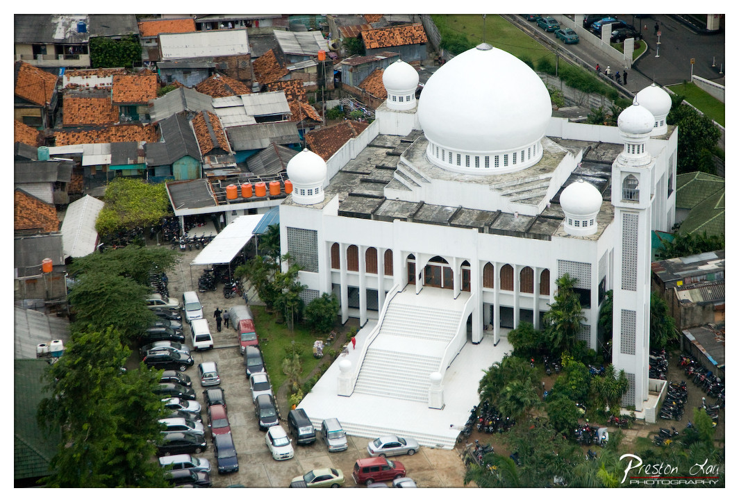

1. Overall Rating (0–10) — 7.5
This aerial view captures the striking contrast between the pristine white mosque and the dense, rustic neighborhood surrounding it, creating a powerful visual narrative of faith amid urban life. The composition draws the eye to the central dome, emphasizing its architectural prominence, while the surrounding chaos of rooftops and vehicles grounds the scene in authenticity. While the image effectively conveys scale and context, it slightly lacks emotional depth due to the impersonal vantage point.
2. Composition (0–10) — 8.0
The high-angle perspective frames the mosque as the dominant focal point, with the surrounding structures and vehicles creating a natural border that guides the viewer’s gaze. The diagonal flow of the parking lot and staircase adds dynamic tension, though the lower-left corner feels slightly cluttered.
3. Lighting (0–10) — 7.0
Even, diffused daylight illuminates the scene without harsh shadows, allowing the white surfaces of the mosque to stand out. The overcast conditions lend a soft, muted quality to the image, enhancing the calm, serene mood of the structure.
4. Color & Tone (0–10) — 7.5
The palette is dominated by the clean white of the mosque, which contrasts beautifully with the earthy reds and browns of the surrounding rooftops and the green of scattered foliage. The tonal range is balanced, with the white elements slightly overexposed but still retaining detail.
5. Creativity (0–10) — 7.0
The juxtaposition of sacred architecture and densely packed urban life offers a compelling narrative, and the aerial perspective provides a fresh vantage point. While the concept is strong, the image leans more toward documentation than conceptual exploration.
6. Technical Quality (0–10) — 8.0
The image is sharp and well-focused, with clear details in both the architectural elements and the surrounding environment. The watermark is subtle and does not detract from the composition.
7. Emotional Impact (0–10) — 6.5
The photograph evokes a sense of reverence and resilience, suggesting a place of peace within a bustling community. However, the distance of the aerial shot tempers the emotional connection, leaving the viewer as an observer rather than an participant.
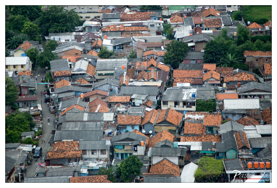

1. Overall Rating (0–10) — 7.0
This aerial view captures the dense, layered fabric of a tropical urban settlement, where tightly packed homes climb the hillside like a living mosaic. The warm terracotta roofs contrast with the gray metal sheets and scattered greenery, creating a visually rich tapestry that speaks to both resilience and organic growth. While the image conveys a strong sense of place, its slightly flat lighting and cluttered arrangement prevent it from achieving a more refined emotional depth.
2. Composition (0–10) — 7.5
The high-angle perspective provides a comprehensive view of the neighborhood’s layout, with the winding street acting as a natural leading line. The distribution of roofs and trees creates a dynamic rhythm, though the lack of a clear focal point slightly dilutes the visual narrative.
3. Lighting (0–10) — 6.0
Diffuse, overcast lighting flattens shadows and reduces contrast, giving the image a muted quality. While it allows for even detail across the scene, it sacrifices the dramatic interplay of light and shadow that could enhance mood.
4. Color & Tone (0–10) — 7.0
The palette is dominated by earthy terracotta, gray metal, and patches of green, creating a cohesive, naturalistic tone. The colors are well-balanced and harmonious, though the overall coolness tempers the warmth one might expect from such a sun-drenched environment.
5. Creativity (0–10) — 7.0
The photograph offers a compelling, almost documentary-like perspective on urban density and adaptation. Its strength lies in its observational power—capturing the quiet complexity of daily life in a densely populated area without staging or manipulation.
6. Technical Quality (0–10) — 8.0
The image is sharp and detailed, with clear focus across the frame. The high resolution allows for the examination of textures and materials, and the exposure is well-managed despite the challenging lighting conditions.
7. Emotional Impact (0–10) — 6.5
The photograph evokes a sense of quiet endurance and community, inviting the viewer to contemplate the lives within this tightly woven neighborhood. While it lacks a strong emotional punch, its authenticity and visual complexity foster a contemplative connection.
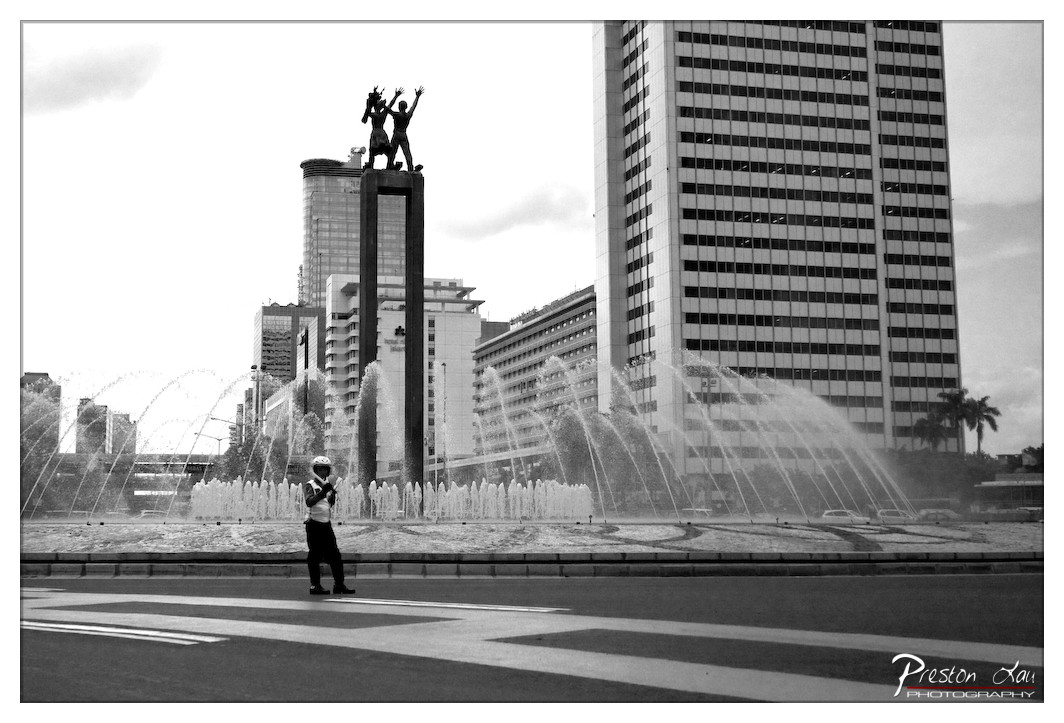

1. Overall Rating (0–10) — 7.0
This black-and-white photograph captures a striking juxtaposition of urban grandeur and human scale, where a solitary figure stands in the foreground against a backdrop of towering architecture and a dynamic fountain. The monochromatic palette lends a timeless, documentary quality to the scene, emphasizing form and contrast over color. While the image effectively conveys a sense of place and movement, the composition’s density and high-key lighting slightly dilute the emotional punch, leaving the viewer with a powerful but somewhat detached impression.
2. Composition (0–10) — 6.5
The central placement of the monument and the fountain creates a balanced, symmetrical composition, but the wide-angle perspective and scattered elements—like the road lines and distant buildings—introduce visual clutter. The lone individual provides a focal point, yet the expansive framing risks diluting their significance.
3. Lighting (0–10) — 6.0
The bright, overcast sky results in flat, diffused lighting that minimizes shadows and depth, flattening the scene’s three-dimensional quality. While this enhances detail across the frame, it also reduces the dramatic interplay of light and shadow that could have heightened the image’s mood.
4. Color & Tone (0–10) — 7.5
The black-and-white treatment enhances tonal contrast, particularly in the white spray of the fountain and the dark silhouette of the monument. The absence of color focuses attention on texture and form, creating a dramatic, almost cinematic atmosphere that suits the urban setting.
5. Creativity (0–10) — 7.0
The choice to render the scene in monochrome is both bold and effective, transforming a busy cityscape into a contemplative visual statement. The juxtaposition of the monumental sculpture, the fountain’s motion, and the solitary figure suggests a narrative of civic identity and individuality, offering a layered interpretation beyond mere documentation.
6. Technical Quality (0–10) — 8.0
The image is sharp and well-focused, with clear details in both the foreground and background. The high level of detail in the fountain and the architectural textures speaks to strong technical execution, though the overexposed sky slightly compromises dynamic range.
7. Emotional Impact (0–10) — 6.5
The photograph evokes a sense of quiet introspection, inviting viewers to consider the relationship between people, place, and public memory. While the emotional resonance is present, the distant perspective and lack of intimate detail prevent a deeper personal connection.
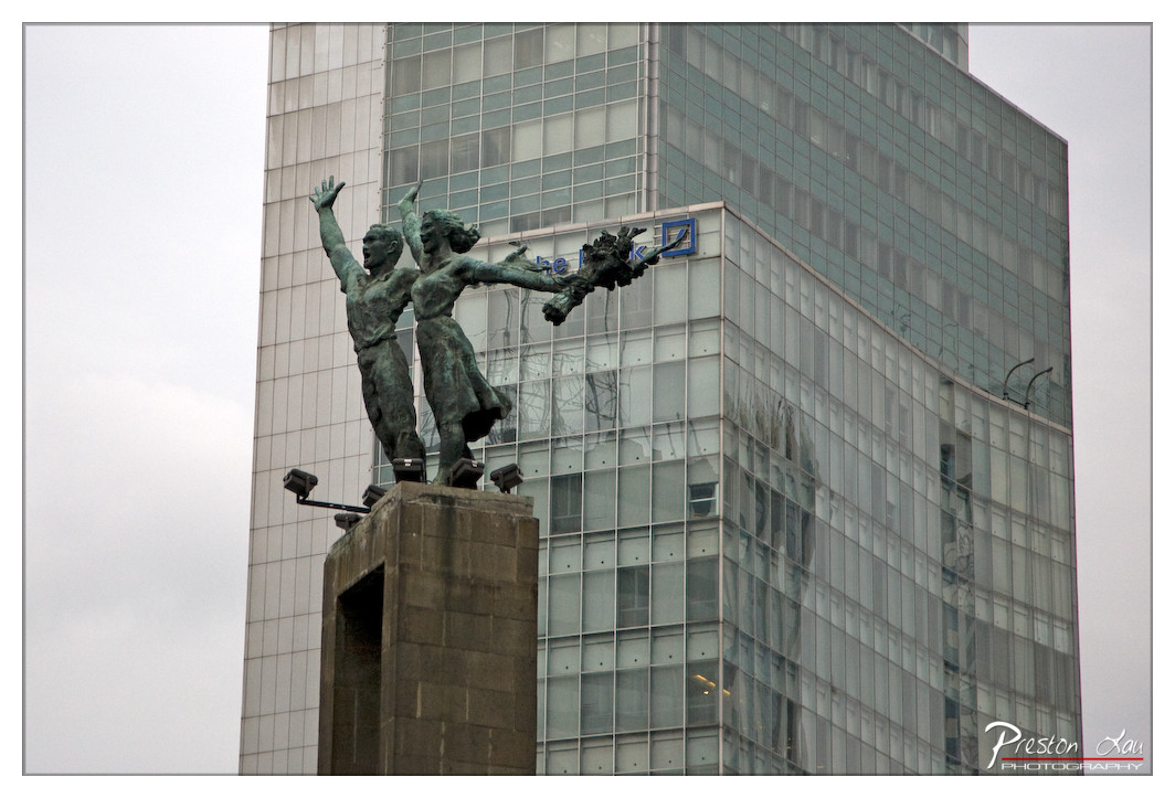

1. Overall Rating (0–10) — 6.0
This photograph juxtaposes a powerful, dynamic sculpture with the cold, reflective geometry of a modern skyscraper, creating a compelling dialogue between past and present. The statue’s upward gesture and sense of movement stand in stark contrast to the rigid, impersonal architecture behind it, suggesting themes of progress and resilience. While the image captures a strong conceptual tension, the overcast lighting and muted tones slightly dampen the emotional resonance, leaving the scene feeling more observational than transformative.
2. Composition (0–10) — 6.5
The statue is positioned slightly off-center, drawing the eye upward and creating a sense of vertical movement. The skyscraper’s grid lines provide a structured backdrop that contrasts with the organic forms of the sculpture, though the composition feels slightly unbalanced due to the heavy presence of the building on the right.
3. Lighting (0–10) — 5.0
The diffuse, overcast light flattens the scene, reducing depth and shadow contrast. While it evenly illuminates the subject, the lack of directional light diminishes the sculptural form’s three-dimensionality and emotional weight.
4. Color & Tone (0–10) — 5.5
The palette is dominated by cool grays and muted greens, reflecting the urban atmosphere and the patina of the bronze. The lack of vibrant color enhances the somber mood but limits visual dynamism.
5. Creativity (0–10) — 7.0
The conceptual contrast between the historic monument and the modern building is well-executed and thought-provoking. The photographer effectively uses juxtaposition to invite reflection on time, progress, and memory.
6. Technical Quality (0–10) — 7.5
The image is sharp and well-focused, with clear detail in both the sculpture and the building’s facade. The framing is deliberate, and the depth of field is appropriate for the subject.
7. Emotional Impact (0–10) — 6.0
The photograph evokes a contemplative mood, suggesting a quiet tension between tradition and modernity. While the emotional pull is restrained by the muted lighting, the symbolic weight of the scene lingers, inviting the viewer to consider the passage of time.
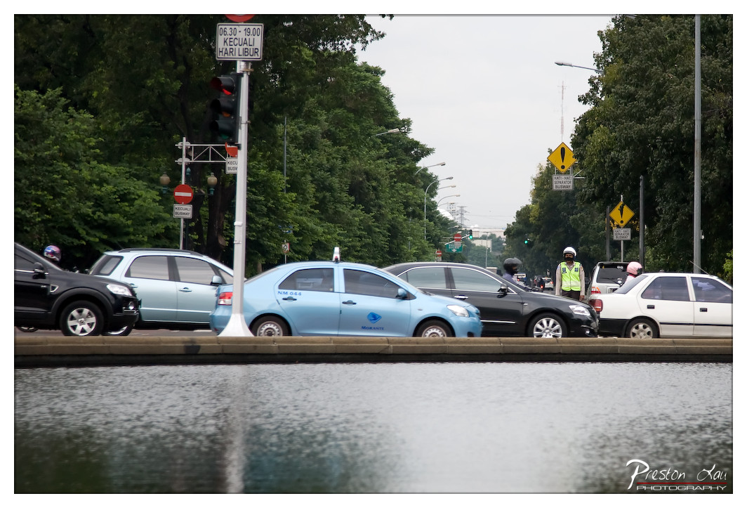

1. Overall Rating (0–10) — 6.0
This photograph captures a moment of urban congestion with a grounded, documentary-like realism, where the rhythm of daily traffic is framed by a calm waterway in the foreground. The juxtaposition of still water and moving cars creates a subtle tension between motion and stillness, while the overcast sky and muted colors lend a contemplative mood. However, the image feels slightly overwhelmed by its elements—traffic signs, vehicles, and foliage compete for attention, diluting the overall impact and making the scene feel more like a snapshot than a composed statement.
2. Composition (0–10) — 6.0
The low vantage point and horizontal waterline create a strong foreground, but the central placement of the traffic jam and the lack of a clear focal point result in a cluttered middle ground. The vertical poles and signs interrupt the visual flow, and the depth is underutilized, with too much visual weight in the midground.
3. Lighting (0–10) — 5.5
The overcast sky produces soft, diffused light that minimizes harsh shadows and allows for even exposure across the scene. However, the flat lighting contributes to a lack of visual drama, leaving the image feeling somewhat dull and unengaging.
4. Color & Tone (0–10) — 5.5
The palette is dominated by cool grays and muted greens, with the light blue taxi offering a slight pop of color. While the tonal harmony is consistent, the overall desaturation weakens the image’s vibrancy and emotional resonance.
5. Creativity (0–10) — 6.0
The photographer’s choice to include the water in the foreground introduces a creative perspective that separates the viewer from the chaos of the street. This compositional strategy adds a layer of visual interest, though the idea is not fully realized due to the lack of narrative cohesion.
6. Technical Quality (0–10) — 7.0
The image is sharp and well-focused, with clear details visible in the cars, signage, and reflections. The exposure is balanced, and there are no obvious technical flaws, though the composition limits its overall effectiveness.
7. Emotional Impact (0–10) — 5.5
The image evokes a sense of urban fatigue and quiet observation, with the still water offering a moment of reflection amid the noise of traffic. While the mood is thoughtful, the lack of a strong emotional hook or narrative depth keeps the viewer from fully connecting with the scene.
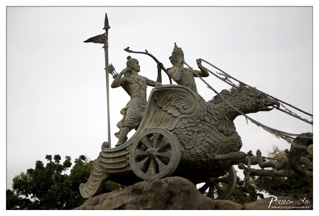

1. Overall Rating (0–10) — 7.0
This photograph captures a powerful and mythic sculpture of a divine chariot, evoking the grandeur of ancient epics with its dynamic composition and symbolic weight. The low-angle perspective enhances the monumentality of the scene, while the overcast sky lends a somber, timeless mood. Though the image is technically sound, the muted lighting and lack of color vibrancy slightly temper its emotional and visual impact.
2. Composition (0–10) — 7.5
The low-angle framing emphasizes the sculpture’s scale and drama, with the chariot and figures angled diagonally to create movement. The placement of the figures and the bird-like creature leads the eye across the frame, though the slightly cluttered lower right edge detracts from the visual flow.
3. Lighting (0–10) — 6.0
The diffuse, overcast light softens the scene, reducing harsh shadows and allowing details of the sculpture to be visible. However, it also flattens the tonal range and diminishes the sense of depth, giving the image a somewhat subdued atmosphere.
4. Color & Tone (0–10) — 6.5
The palette is dominated by cool grays and muted earth tones, which suit the stone sculpture and somber sky. While harmonious, the lack of warmth or contrast limits the image’s visual richness and emotional intensity.
5. Creativity (0–10) — 7.0
The choice to photograph this cultural and mythological monument with a dramatic angle and attention to form reflects thoughtful artistic intent. The image successfully captures the essence of the sculpture’s narrative and scale, blending documentation with storytelling.
6. Technical Quality (0–10) — 7.5
Sharp focus and clean detail are evident throughout the sculpture, with good clarity in the textures of the stone. The exposure is well-balanced, and the image holds up well under close inspection, though minor noise in the sky suggests a high ISO or post-processing adjustment.
7. Emotional Impact (0–10) — 6.5
The sculpture’s mythic grandeur resonates through the image, but the subdued lighting and lack of vivid color keep the emotional connection somewhat restrained. The viewer is invited to reflect on the story, but the image stops short of stirring deep awe or reverence.
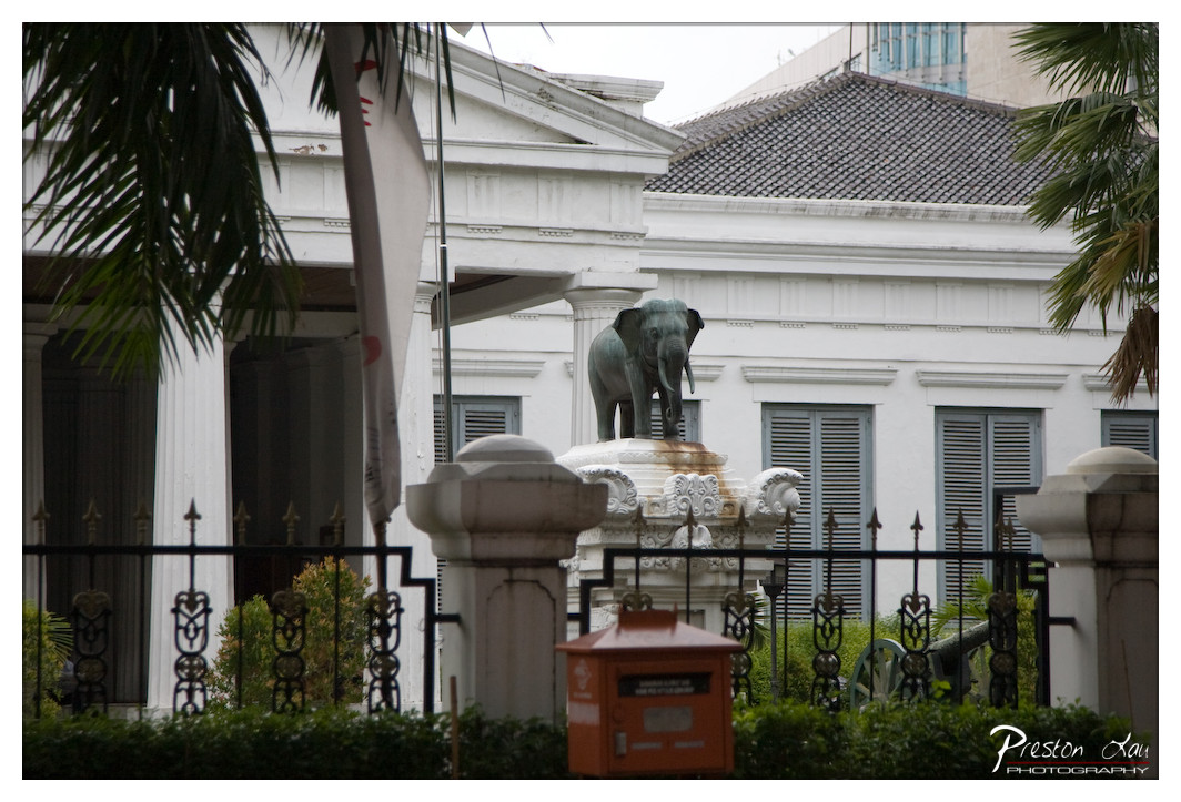

1. Overall Rating (0–10) — 6.0
This photograph captures a quiet, historical moment at a colonial-era building, where the elephant statue stands as a silent sentinel amidst tropical greenery and classical architecture. The framing introduces a layered depth, with the foreground fence and mailbox grounding the scene in everyday life, while the statue and white facade evoke a sense of cultural history. While the mood is contemplative and the subject matter rich in narrative potential, the image feels slightly subdued—its emotional resonance tempered by flat lighting and a lack of visual dynamism.
2. Composition (0–10) — 6.5
The composition is layered effectively, using the fence and mailbox as framing elements that draw the eye toward the central statue and building. However, the off-center placement of the elephant and the intrusion of the flagpole slightly disrupt visual balance.
3. Lighting (0–10) — 5.0
The lighting is flat and diffused, likely due to overcast skies, which results in a lack of contrast and shadow definition. While it evenly illuminates the scene, it diminishes the texture and three-dimensionality of the architecture and statue.
4. Color & Tone (0–10) — 5.5
The palette is muted, dominated by the white of the building, the gray of the roof, and the green of the foliage. The red mailbox provides a subtle pop of color but is not enough to energize the overall tone, which leans toward a somber, neutral aesthetic.
5. Creativity (0–10) — 6.0
The image presents a compelling juxtaposition of colonial architecture, tropical elements, and symbolic sculpture, suggesting a layered cultural narrative. While the concept is strong, the execution remains conventional, with little visual innovation or stylistic flair.
6. Technical Quality (0–10) — 7.0
The image is sharp and well-focused, particularly on the elephant statue and the building facade. The depth of field is appropriate, and there are no noticeable technical flaws such as blur or noise.
7. Emotional Impact (0–10) — 5.5
The photograph evokes a sense of quiet nostalgia and historical weight, but the subdued lighting and lack of dramatic tension keep the emotional impact restrained. It invites contemplation rather than stirring a strong response.
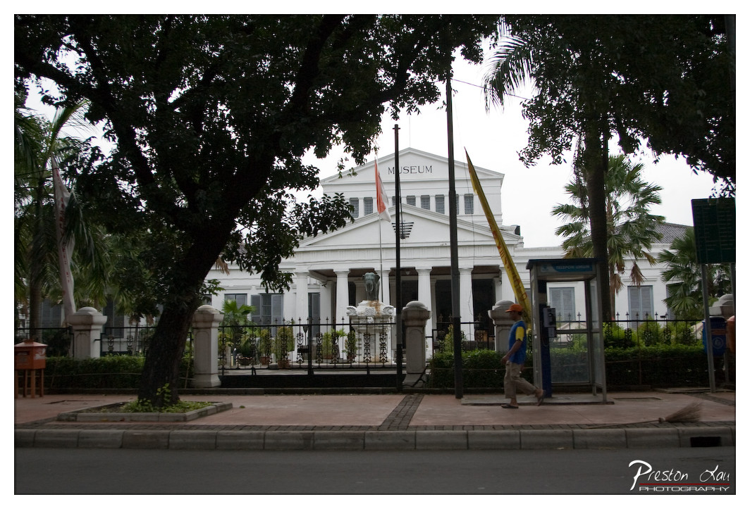

1. Overall Rating (0–10) — 6.0
This photograph captures the quiet dignity of a colonial-era museum framed by lush tropical foliage, evoking a sense of history layered with everyday life. The composition, though slightly cluttered by foreground elements, successfully juxtaposes the grandeur of the building with the casual presence of a pedestrian, grounding the scene in reality. While the lighting and color lack vibrancy, the image conveys a contemplative mood that hints at the cultural weight of the location.
2. Composition (0–10) — 6.0
The framing is balanced but hindered by the large tree on the left, which partially obscures the view. The man walking on the right adds dynamic movement, but his placement feels slightly off-center, disrupting visual harmony.
3. Lighting (0–10) — 5.5
The overcast sky produces soft, diffused light that minimizes shadows and creates a muted atmosphere. While this prevents harsh contrasts, it also flattens the image, reducing the architectural details' depth.
4. Color & Tone (0–10) — 5.0
The palette is dominated by pale whites and greens, with a slightly cool tone that lends a somber mood. The lack of saturation diminishes the visual impact, making the scene feel more documentary than artistic.
5. Creativity (0–10) — 6.5
The juxtaposition of the formal museum with the casual pedestrian and tropical surroundings offers a subtle narrative about time and place. The framing suggests a moment of transition, blending history and modern life.
6. Technical Quality (0–10) — 7.0
The image is sharp and well-focused, with clean details in the building and foreground elements. The exposure is balanced, though the low contrast slightly undermines the overall clarity.
7. Emotional Impact (0–10) — 5.5
The photograph evokes a sense of quiet reflection, but the subdued lighting and lack of color intensity keep the viewer at a distance. It feels more like an observation than an emotional invitation.
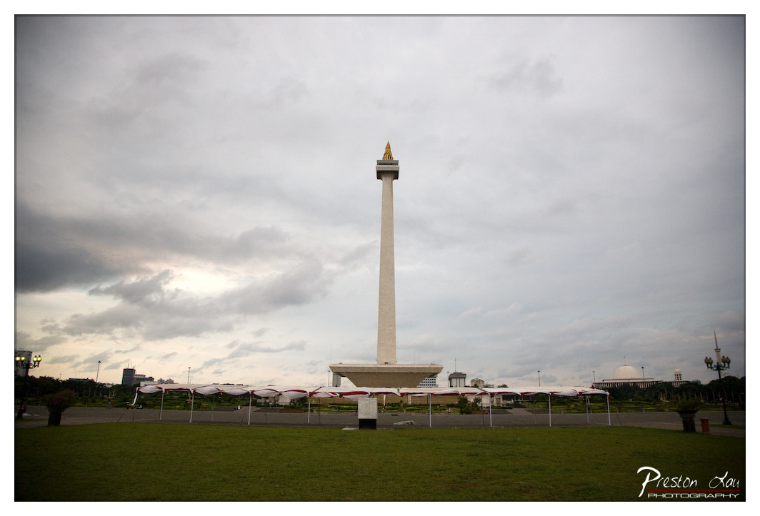

1. Overall Rating (0–10) — 6.8
This photograph captures the solemn grandeur of the National Monument in Jakarta under a brooding, overcast sky, evoking a sense of quiet reverence. The tall, central obelisk draws the eye upward, while the expansive green lawn and distant tents lend a sense of scale and civic purpose. While the mood is atmospheric and the composition is strong, the flat lighting and muted tones slightly dull the monument’s symbolic power, leaving the image more documentary than transcendent.
2. Composition (0–10) — 7.5
The monument is centered and dominates the frame, creating a strong focal point. The low angle and wide perspective emphasize its height, while the horizontal line of tents and the grassy foreground add depth and balance.
3. Lighting (0–10) — 5.5
The overcast sky produces soft, diffused light that minimizes harsh shadows and highlights the monument’s form. However, the lack of directional light and contrast gives the image a flat, gray quality that diminishes visual drama.
4. Color & Tone (0–10) — 6.0
The palette is subdued, with muted greens, grays, and whites dominating. The golden tip of the monument offers a subtle point of warmth, but the overall tonal range is limited, reducing the image’s emotional resonance.
5. Creativity (0–10) — 6.5
The photograph successfully captures a recognizable landmark with a contemplative mood. The choice to shoot under stormy skies adds narrative weight, though the approach remains conventional rather than innovative.
6. Technical Quality (0–10) — 7.0
The image is sharp and well-focused, with clean detail throughout. The exposure is balanced, though some loss of texture in the clouds suggests a slightly underexposed dynamic range.
7. Emotional Impact (0–10) — 6.0
The somber sky and solitary monument evoke a sense of national pride and reflection. While the image is visually grounded and respectful, it lacks the emotional punch to deeply move or unsettle the viewer.
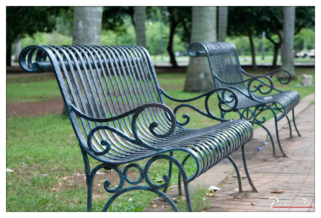

1. Overall Rating (0–10) — 7.5
This photograph captures a quiet, contemplative moment in a park, where the ornate metal benches stand as silent witnesses to time and solitude. The soft focus on the background and the deliberate framing draw attention to the intricate craftsmanship of the benches, evoking a sense of nostalgia and stillness. While the image is visually pleasing and well-composed, it holds back from deeper emotional resonance due to its somewhat passive presentation.
2. Composition (0–10) — 8.0
The diagonal placement of the benches leads the eye naturally through the frame, creating a sense of depth and perspective. The use of negative space and the blurred background effectively isolates the subject, emphasizing the decorative details of the ironwork.
3. Lighting (0–10) — 7.0
The soft, diffused daylight enhances the texture of the metal and the surrounding foliage without creating harsh shadows. The lighting contributes to the calm, serene mood, though it lacks dramatic contrast or warmth.
4. Color & Tone (0–10) — 7.5
The muted green and gray tones of the metal harmonize with the natural environment, creating a cohesive and tranquil palette. The subtle tonal variation adds depth without overwhelming the composition.
5. Creativity (0–10) — 7.0
The image is grounded in a classic, observational style, focusing on form and atmosphere rather than bold artistic experimentation. The choice to highlight the craftsmanship of the benches offers a quiet narrative of urban design and public space.
6. Technical Quality (0–10) — 8.5
Sharp focus on the foreground bench, precise depth of field, and clean detail throughout the image demonstrate strong technical control and a clear vision.
7. Emotional Impact (0–10) — 7.0
The photograph evokes a sense of peace and quiet reflection, inviting the viewer to pause and imagine the stories that might unfold in this space. It is emotionally subtle but resonant, particularly for those who appreciate the poetry of everyday scenes.
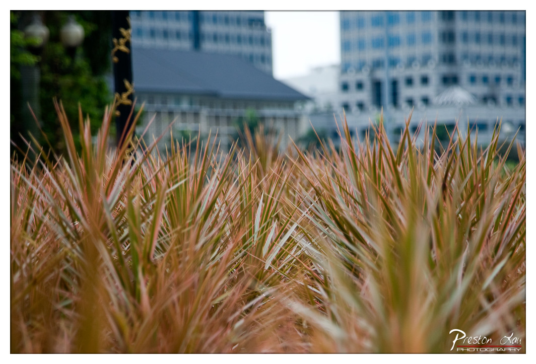

1. Overall Rating (0–10) — 7.0
This photograph captures a quiet tension between nature and urban development, where the vibrant, spiky foliage in the foreground contrasts with the soft, blurred cityscape behind. The shallow depth of field draws the viewer into the texture and motion of the plants, creating a sense of intimacy amid the impersonal backdrop. While the image successfully isolates its subject and evokes a contemplative mood, the muted lighting and lack of strong color contrast slightly temper its visual impact.
2. Composition (0–10) — 7.0
The low-angle framing emphasizes the plant life, creating a dynamic foreground that leads the eye toward the out-of-focus buildings. The diagonal lines of the leaves add energy, though the right side feels slightly more crowded than the left, creating a subtle imbalance.
3. Lighting (0–10) — 6.0
The soft, diffused light suggests an overcast day, which flattens shadows and lends a calm, neutral tone to the scene. While this suits the contemplative mood, it also reduces the vibrancy of the plant’s colors and limits tonal depth.
4. Color & Tone (0–10) — 6.5
The warm, coppery hues of the foliage stand out against the cool, blue-gray tones of the buildings, creating a gentle contrast. However, the overall palette remains subdued, with limited saturation that prevents the colors from truly popping.
5. Creativity (0–10) — 7.5
The juxtaposition of organic form and urban structure is thoughtfully executed, offering a fresh perspective on a familiar cityscape. The use of selective focus transforms a simple plant into a focal point of narrative, inviting reflection on nature’s persistence in concrete environments.
6. Technical Quality (0–10) — 8.0
The image is sharp in the foreground, with precise focus on the plant tips, and the background blur is smooth and well-controlled. The exposure is balanced, with no harsh highlights or crushed shadows, indicating solid technical execution.
7. Emotional Impact (0–10) — 6.5
There’s a quiet melancholy in the image—nature thriving in the margins of a modern world. The viewer is drawn into a moment of stillness, but the emotional resonance is restrained by the lack of dramatic lighting or strong color, leaving the mood contemplative rather than powerful.
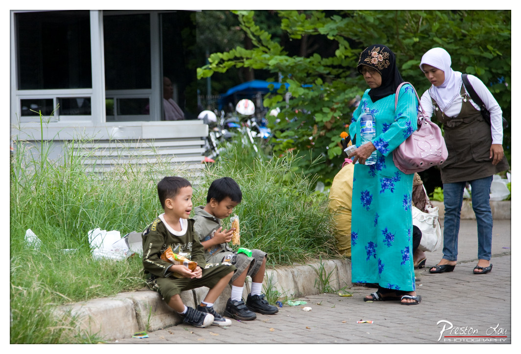

1. Overall Rating (0–10) — 7.0
This photograph captures a candid moment of everyday life, blending quiet intimacy with subtle social contrast. The composition draws the viewer into a scene of quiet interaction between children and adults, where the juxtaposition of casual play and formal attire hints at deeper cultural narratives. While the image feels authentic and unposed, its emotional resonance is slightly diminished by the cluttered background and uneven focus, which distract from the central human connection.
2. Composition (0–10) — 6.5
The framing places the children in the lower left, drawing attention to their candid moment, while the standing women anchor the right side, creating a visual balance. However, the overgrown grass and scattered debris in the foreground disrupt the composition’s flow, and the off-center positioning of the subjects creates a sense of imbalance.
3. Lighting (0–10) — 6.0
Natural daylight illuminates the scene evenly, but the lack of directional light results in flatness and minimal shadow definition. The lighting is functional but lacks the warmth or drama that could elevate the mood and highlight textures in the clothing and foliage.
4. Color & Tone (0–10) — 6.5
The vibrant turquoise of the woman’s dress stands out against the muted greens and grays of the surroundings, creating a focal point. The color palette is harmonious but restrained, with slight oversaturation in the dress that detracts from the naturalism of the scene.
5. Creativity (0–10) — 7.0
The image succeeds in capturing a spontaneous, slice-of-life moment, offering a glimpse into a cultural context without staging or artifice. The contrast between the children’s carefree posture and the women’s more formal demeanor adds narrative depth, suggesting themes of family, tradition, and urban life.
6. Technical Quality (0–10) — 7.5
The photograph is sharp in the mid-ground, with clear focus on the children and the standing women. The depth of field is adequate, though some elements in the background are slightly soft. The image is well-exposed, with no major technical flaws in focus or noise.
7. Emotional Impact (0–10) — 6.5
The scene evokes a sense of quiet observation and subtle connection, inviting viewers to reflect on the dynamics of family and community. While the emotional pull is present, it remains restrained, limited by the distance created by the composition and lighting.
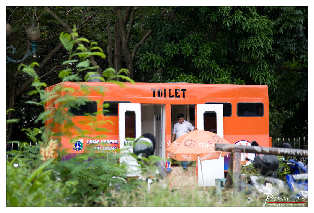

1. Overall Rating (0–10) — 6.0
This photograph captures an unconventional mobile toilet unit in a lush, urban park setting, blending functionality with an unexpected pop of color. The vibrant orange of the structure contrasts sharply with the surrounding greenery, creating a visually arresting focal point. While the scene feels candid and authentic, the framing and composition lack refinement, preventing the image from achieving a stronger aesthetic impact.
2. Composition (0–10) — 5.5
The subject is centrally framed but partially obscured by foreground foliage, creating visual clutter and distracting from the main subject. The inclusion of the umbrella and motorcycle adds narrative context but weakens the compositional balance.
3. Lighting (0–10) — 6.0
Natural daylight provides even illumination, though the shade from the trees creates soft shadows that reduce contrast. The lighting is functional but lacks drama or directional emphasis.
4. Color & Tone (0–10) — 7.0
The bright orange of the toilet unit stands out vividly against the green foliage, creating a bold and engaging color contrast. The muted tones of the man’s shirt and the surrounding environment help the primary subject pop.
5. Creativity (0–10) — 7.0
The concept of a repurposed vehicle as a public restroom is inventive and culturally specific, suggesting a story of urban ingenuity. The framing, while imperfect, adds to the image’s documentary charm.
6. Technical Quality (0–10) — 7.0
The image is sharp and well-focused, with clear details visible on the toilet unit and text. The depth of field is adequate, though the foreground blur slightly compromises clarity.
7. Emotional Impact (0–10) — 5.0
The image evokes curiosity and mild amusement due to its unusual subject matter, but the distance created by the framing and lack of emotional connection to the man limits deeper resonance.
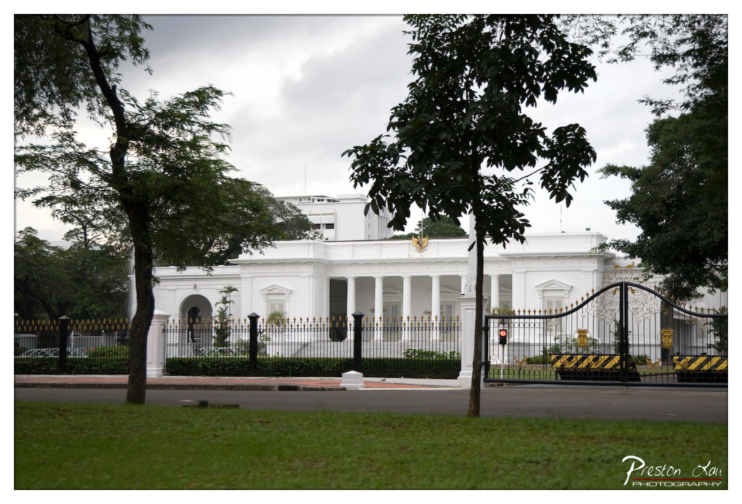

1. Overall Rating (0–10) — 7.0
This photograph presents a stately view of a government building, its classical architecture framed by lush greenery and a cloudy sky. The composition balances natural elements with the formality of the structure, creating a sense of dignified calm. While the image captures the grandeur of the building effectively, the overcast lighting and slightly cluttered foreground limit its visual impact, preventing it from feeling fully cohesive or emotionally resonant.
2. Composition (0–10) — 7.0
The building is centered and framed by trees on both sides, creating a balanced and symmetrical composition. The foreground grass and gate add depth, though the left tree slightly intrudes into the frame, disrupting perfect harmony.
3. Lighting (0–10) — 5.5
The diffuse light from the overcast sky flattens the scene, reducing shadows and depth. While it ensures even exposure, it also mutes the architectural details and gives the image a somewhat somber tone.
4. Color & Tone (0–10) — 6.5
The palette is dominated by muted greens and whites, with the black gate and golden accents providing contrast. The colors are natural but lack vibrancy, contributing to the subdued mood of the photograph.
5. Creativity (0–10) — 6.0
The image is straightforward and documentary in style, emphasizing the building’s form rather than interpreting it artistically. The framing is effective, but the approach is conventional rather than imaginative.
6. Technical Quality (0–10) — 7.5
The image is sharp and well-focused, with clear details in the architecture and foliage. The exposure is balanced, though the dynamic range is limited by the flat lighting.
7. Emotional Impact (0–10) — 6.0
The photograph conveys a sense of quiet authority and institutional permanence, but the lack of dramatic lighting or emotional nuance keeps the viewer at a respectful distance rather than inviting deeper connection.
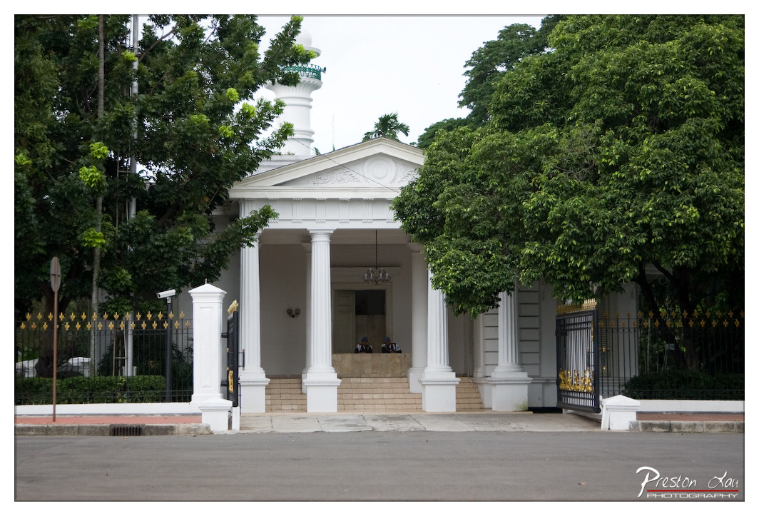

1. Overall Rating (0–10) — 7.0
This photograph captures the dignified presence of a colonial-era building framed by lush greenery, evoking a sense of historical gravity and quiet authority. The white structure stands in striking contrast to the overcast sky and dense foliage, drawing the eye to its classical columns and architectural details. While the composition is balanced and the scene is rich in context, the flat lighting and slightly muted tones keep the image from feeling fully dynamic or emotionally resonant.
2. Composition (0–10) — 7.5
The central placement of the building creates a strong focal point, while the symmetrical arrangement of columns and the framing by trees on either side enhance visual harmony. The inclusion of the gate and steps adds depth, leading the viewer’s eye toward the entrance, though the foreground pavement slightly dilutes the impact.
3. Lighting (0–10) — 6.0
The overcast sky produces soft, diffused light that evenly illuminates the scene without harsh shadows, which suits the subject’s formal tone. However, the lack of directional light reduces texture and dimensionality, giving the image a somewhat flat and neutral quality.
4. Color & Tone (0–10) — 6.5
The dominant white of the building contrasts effectively with the rich greens of the trees and the dark metal of the gate. The muted, desaturated tones contribute to a subdued atmosphere, but the color palette lacks vibrancy, slightly dampening the visual energy.
5. Creativity (0–10) — 6.5
The image succeeds in documenting a culturally significant space with a respectful, observational approach. The framing and subject matter suggest a narrative of heritage and continuity, though the execution remains conventional rather than artistically bold.
6. Technical Quality (0–10) — 7.5
The image is sharp and well-focused, with clear detail visible in the architectural elements and foliage. The exposure is balanced, and the depth of field effectively captures both the foreground and background without distraction.
7. Emotional Impact (0–10) — 6.0
The photograph conveys a sense of stillness and formality, inviting contemplation of history and place. While it is visually engaging and thoughtfully composed, the emotional pull is restrained, partly due to the lack of dramatic lighting and expressive color.
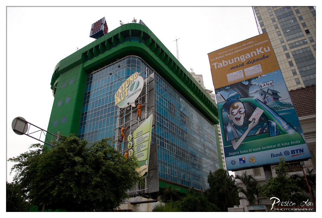

1. Overall Rating (0–10) — 6.0
This photograph captures a dynamic urban moment, juxtaposing modern architecture with the human effort of maintenance workers scaling a building. The green facade of the structure and the vibrant billboard create a visually engaging contrast against the overcast sky. While the image effectively conveys the energy of a bustling city, its composition feels slightly cluttered and lacks a clear focal point, diminishing its overall impact.
2. Composition (0–10) — 5.5
The low-angle perspective emphasizes the height of the building and the scale of the workers, but the framing is uneven, with the billboard and tree partially obstructing the view. The diagonal lines of the scaffolding and signage create visual tension, yet the lack of a central subject weakens the image’s cohesion.
3. Lighting (0–10) — 5.0
The overcast sky provides soft, diffused light that minimizes harsh shadows, allowing for even exposure across the scene. However, the flat lighting diminishes depth and texture, leaving the image somewhat muted and lacking in atmospheric drama.
4. Color & Tone (0–10) — 6.5
The bold green of the building and the bright colors of the billboard stand out against the neutral background, creating a visually striking palette. The cool tones of the glass and sky contrast with the warmer hues of the signage, adding visual interest, though the overall color balance feels slightly unbalanced.
5. Creativity (0–10) — 6.0
The image captures an unusual moment of labor in an urban setting, blending documentary realism with a touch of narrative intrigue. The inclusion of the workers on the scaffolding adds a human element, but the composition lacks a more deliberate artistic vision, relying more on circumstance than intention.
6. Technical Quality (0–10) — 7.0
The image is sharp and detailed, with clear focus on the building and the workers. The exposure is well-managed, and there are no significant technical flaws, though the wide-angle perspective introduces some distortion at the edges.
7. Emotional Impact (0–10) — 5.5
The photograph evokes a sense of everyday urban life and the unseen labor that maintains the city’s appearance. While it prompts curiosity about the workers’ story, the emotional connection remains distant due to the lack of personal engagement and the overwhelming presence of commercial signage.
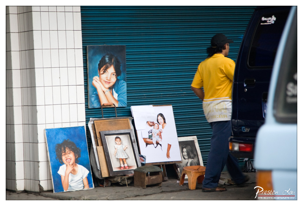

1. Overall Rating (0–10) — 7.0
This photograph captures a quiet moment of urban life, where the personal and the public intersect in a street-side portrait stall. The contrast between the vibrant blue backdrop and the warm yellow shirt draws the eye, while the painted likenesses evoke a sense of memory and identity. Though the scene feels candid and unposed, the composition could benefit from tighter framing and a more deliberate focus to elevate its emotional resonance.
2. Composition (0–10) — 6.5
The subject is placed off-center, creating a dynamic but slightly unbalanced frame. The stacked portraits and the figure in motion add depth, yet the clutter of objects and vehicles slightly disrupts visual flow.
3. Lighting (0–10) — 6.0
Natural daylight provides even illumination, but the flatness of the light undercuts the potential drama of the scene. The shadows are soft, and the highlights on the van detract slightly from the overall tonal harmony.
4. Color & Tone (0–10) — 7.5
The cool blue of the shutter contrasts effectively with the warm yellow of the man’s shirt, creating a visually striking palette. The tones are rich and saturated, enhancing the street-level authenticity of the moment.
5. Creativity (0–10) — 7.0
The juxtaposition of painted portraits with the real-life figure offers a subtle commentary on representation and memory. The scene is both documentary and poetic, capturing a fleeting slice of street culture with quiet intention.
6. Technical Quality (0–10) — 7.5
Sharp focus on the central portraits and the figure, with good detail in the textures of the paint and fabric. The depth of field is appropriate, though the background elements are slightly distracting.
7. Emotional Impact (0–10) — 6.5
The image evokes a sense of nostalgia and quiet dignity, particularly through the painted faces that seem to watch over the street. While it doesn’t immediately pull at the heartstrings, it invites reflection on the lives and stories behind the portraits.
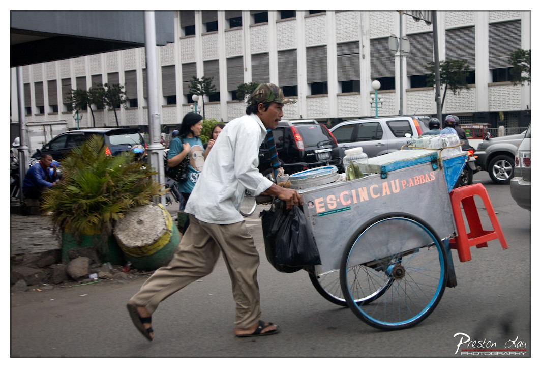

1. Overall Rating (0–10) — 7.0
This photograph captures the energy and rhythm of street life with a candid, documentary feel, highlighting a vendor in motion against the backdrop of a bustling urban environment. The dynamic movement of the man and his cart conveys a sense of urgency and daily struggle, while the muted tones and overcast lighting lend the scene a grounded, unvarnished authenticity. Though compositionally busy, the image succeeds in telling a quiet story of labor and resilience.
2. Composition (0–10) — 6.5
The subject is well-placed in motion, creating a sense of forward momentum, but the cluttered background and uneven framing slightly distract from the central narrative.
3. Lighting (0–10) — 6.0
Diffused, overcast light provides even exposure across the scene, avoiding harsh shadows but also limiting tonal contrast and mood.
4. Color & Tone (0–10) — 6.5
The palette is subdued, dominated by grays and muted earth tones, with the red stool and blue wheels offering subtle pops of color that draw the eye without overpowering.
5. Creativity (0–10) — 7.0
The image captures a slice of everyday life with authenticity and immediacy, offering a narrative that feels both personal and universal.
6. Technical Quality (0–10) — 7.5
The photograph is sharp and clear, with precise focus on the vendor and his cart. The motion blur on the wheels adds dynamism without sacrificing detail.
7. Emotional Impact (0–10) — 7.5
The image evokes empathy and admiration for the vendor’s effort, capturing a moment that feels both fleeting and deeply human.
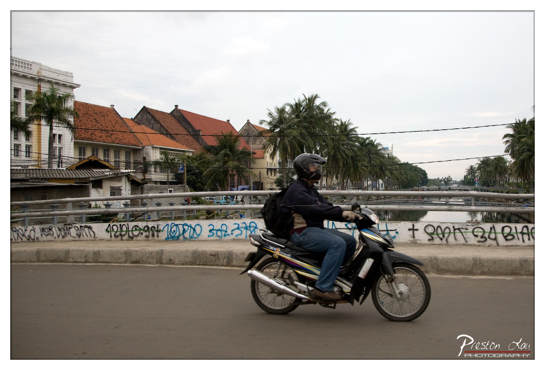

1. Overall Rating (0–10) — 6.8
This photograph captures a candid moment of urban motion, where the rider on a scooter becomes a fleeting figure against a layered backdrop of colonial architecture and tropical greenery. The scene feels authentic and grounded, with the graffiti-laden wall and overcast sky lending a gritty, lived-in quality. While the image conveys a sense of place and daily rhythm, its emotional resonance is tempered by a lack of visual dynamism and slightly flat lighting.
2. Composition (0–10) — 6.5
The rider is placed off-center, creating a sense of movement, but the composition is weighed down by the busy, cluttered wall and uneven background elements. The horizontal lines of the bridge and buildings provide structure, but the visual weight is distributed unevenly.
3. Lighting (0–10) — 5.5
Diffuse, overcast lighting flattens the scene, reducing contrast and depth. While it ensures even exposure, it also diminishes the richness of textures and shadows, contributing to a somewhat muted atmosphere.
4. Color & Tone (0–10) — 6.0
The color palette is subdued, dominated by grays and muted earth tones, with the occasional splash of graffiti adding visual interest. The overall tone is naturalistic, but lacks vibrancy and emotional warmth.
5. Creativity (0–10) — 6.5
The image succeeds in capturing a slice of everyday life with a documentary feel. The juxtaposition of modern scooter culture with colonial-era buildings and tropical palms offers a subtle narrative, though the execution remains more observational than expressive.
6. Technical Quality (0–10) — 7.5
The focus is sharp on the rider, and the image is free of major technical flaws. The clarity of details—such as the motorcycle and helmet—is strong, and the resolution is adequate for the scene.
7. Emotional Impact (0–10) — 6.0
The photograph evokes a quiet sense of urban realism, but the emotional pull is restrained. The viewer is invited to observe rather than feel, with the fleeting nature of the subject and the muted environment keeping the emotional connection at a distance.
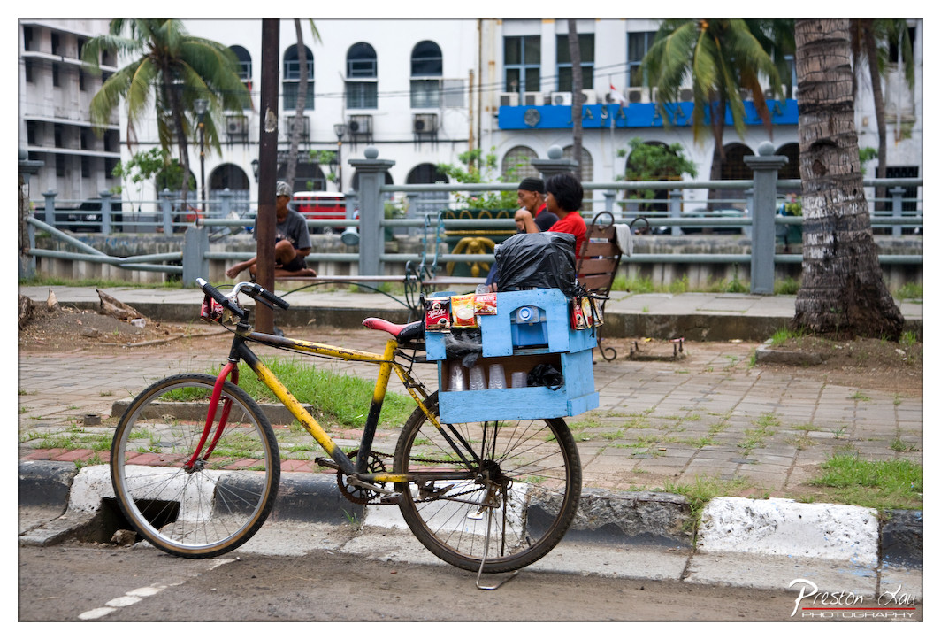

1. Overall Rating (0–10) — 6.8
This photograph captures a quiet moment of urban life, where the vibrant yellow bicycle and makeshift blue cooler stand as symbols of resilience and improvisation. The scene feels authentic and grounded, with a candid energy that reflects the rhythm of daily existence. While the composition and lighting are serviceable, the image's emotional depth is somewhat restrained by a lack of visual cohesion and a slightly flat atmosphere.
2. Composition (0–10) — 6.0
The bicycle is well-framed in the foreground, drawing immediate attention, but the background elements—people, palm trees, and buildings—create a sense of visual clutter. The central placement of the bike, combined with the diagonal lines of the curb and the railing, provides structure, but the depth of field is not strong enough to separate the subject from the busy background.
3. Lighting (0–10) — 5.5
The light is evenly diffused, suggesting an overcast day or midday sun, which minimizes shadows and creates a flat, documentary feel. While it allows for detail across the frame, it lacks the warmth or drama that could elevate the mood and emphasize texture.
4. Color & Tone (0–10) — 6.5
The bright yellow of the bicycle and the blue cooler create a visually engaging contrast against the muted tones of the pavement and buildings. The color palette is natural but slightly desaturated, giving the image a subdued, almost documentary quality that tempers its vibrancy.
5. Creativity (0–10) — 7.0
The image successfully captures a slice of everyday life with a unique narrative—the mobile vendor's bicycle as both transport and storefront. The juxtaposition of utility and color tells a story of resourcefulness, and the informal setup feels authentic and unposed.
6. Technical Quality (0–10) — 7.5
The image is sharp and well-exposed, with clean details visible in the bike, the crate, and the surrounding environment. Focus is correctly placed on the bicycle, and the depth of field is adequate, though slightly too shallow to fully integrate the background context.
7. Emotional Impact (0–10) — 6.0
The photograph evokes a sense of quiet observation, inviting the viewer to reflect on the lives of those who make a living in modest ways. While it conveys authenticity and a touch of humanity, the emotional pull is tempered by the lack of dramatic lighting and a slightly impersonal framing.
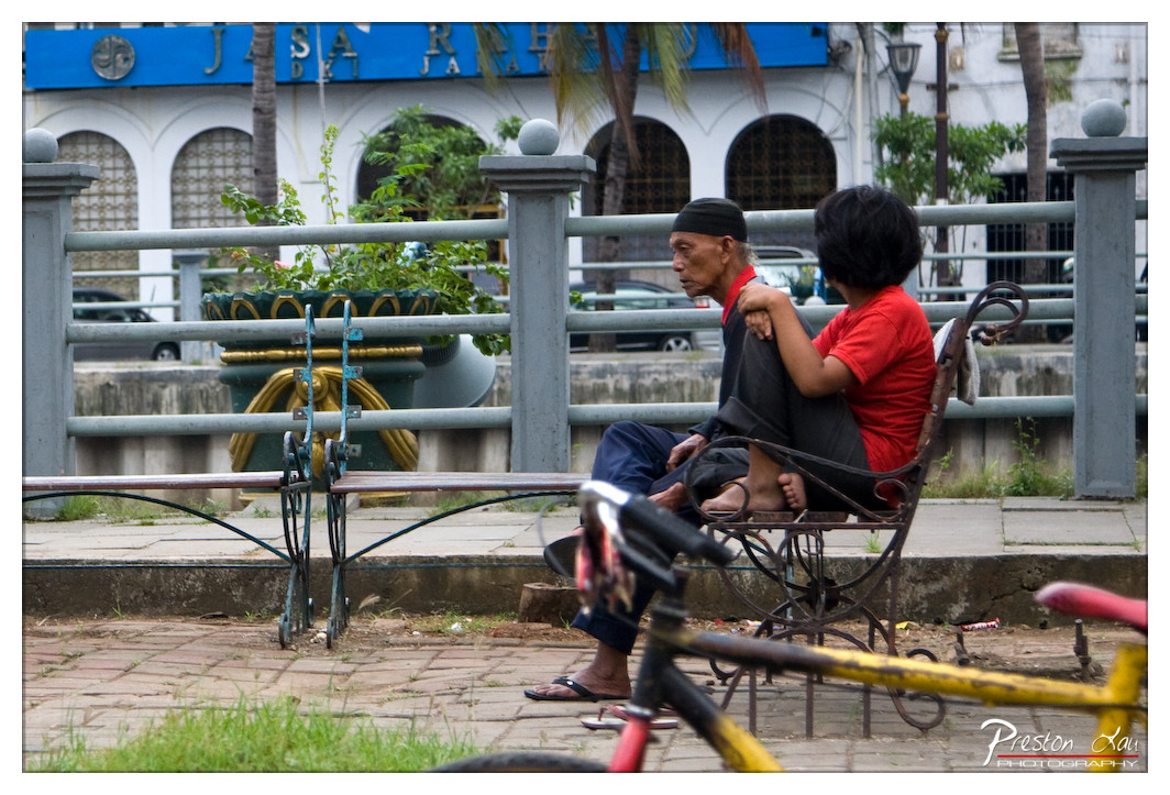

1. Overall Rating (0–10) — 7.0
This photograph captures a quiet, candid moment between two individuals in an urban setting, where stillness and subtle connection contrast with the surrounding activity. The framing and depth of field create a sense of intimacy, drawing the viewer into a personal narrative unfolding in a public space. While the image is grounded in realism, a more dynamic lighting treatment and tighter composition could elevate its emotional resonance.
2. Composition (0–10) — 6.5
The subjects are placed off-center, creating a natural balance with the foreground bicycle and background architecture. However, the cluttered foreground and overlapping elements slightly disrupt visual flow, and the empty bench to the left leaves negative space underutilized.
3. Lighting (0–10) — 6.0
Natural daylight provides even illumination, but the flat, overcast quality diffuses shadows and reduces texture. The lighting is functional rather than expressive, offering clarity without enhancing mood.
4. Color & Tone (0–10) — 6.5
The color palette is subdued, with the red shirt of the younger figure standing out against the muted grays and greens. The blue sign in the background adds a complementary accent, but the overall tone lacks vibrancy and contrast.
5. Creativity (0–10) — 7.0
The image succeeds in capturing a slice of life with authenticity and quiet storytelling. The juxtaposition of the intimate moment against the urban backdrop adds narrative depth, and the candid nature of the scene feels genuine and unposed.
6. Technical Quality (0–10) — 7.5
The focus is sharp on the subjects, and the depth of field effectively isolates them from the background. The image is clean and well-exposed, with no visible technical flaws.
7. Emotional Impact (0–10) — 7.0
There is a palpable sense of companionship and shared silence between the two figures, evoking feelings of nostalgia and human connection. The viewer is invited to speculate on their relationship, lending the image a quiet emotional power.
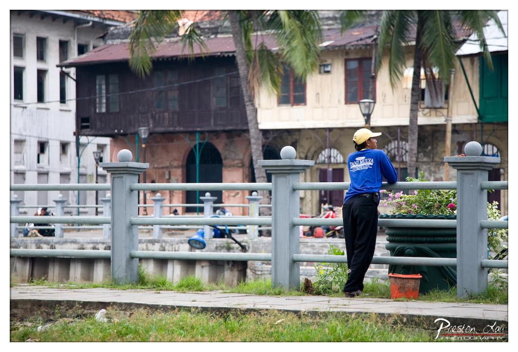

1. Overall Rating (0–10) — 7.0
This photograph captures a quiet, contemplative moment in a tropical urban setting, where the juxtaposition of weathered architecture and daily life creates a sense of lived-in authenticity. The man in the blue shirt, leaning against the railing, becomes a focal point of stillness amid the layered textures and muted tones of the surroundings. While the scene feels genuine and atmospheric, the slightly cluttered background and flat lighting prevent it from achieving a more refined visual harmony.
2. Composition (0–10) — 6.5
The subject is placed off-center, creating a natural balance with the surrounding architecture and palm fronds. The railing acts as a strong horizontal element, guiding the eye toward the figure, though the depth and overlapping layers in the background slightly disrupt the clarity of the focal point.
3. Lighting (0–10) — 6.0
The light is diffused and even, likely from an overcast sky, which softens shadows but also flattens the image’s tonal range. While it suits the subdued mood, the lack of directional light reduces the sense of depth and atmosphere.
4. Color & Tone (0–10) — 6.5
The color palette is restrained, dominated by muted greens, grays, and earthy tones, with the blue shirt providing a subtle pop. The tones feel natural but lack vibrancy, giving the image a slightly washed-out quality.
5. Creativity (0–10) — 7.0
The photograph successfully blends documentary realism with a quiet narrative, capturing a candid moment in a culturally rich environment. The framing and subject placement suggest a deliberate effort to convey a sense of place and time.
6. Technical Quality (0–10) — 7.5
The image is sharp and clear, with good detail in both the foreground and background. The focus is well-placed on the subject, and the exposure is balanced, though slight noise is visible in the darker areas.
7. Emotional Impact (0–10) — 6.5
The scene evokes a sense of quiet reflection and urban solitude, inviting the viewer to imagine the story behind the man and his surroundings. While not emotionally overwhelming, it resonates with a subtle melancholy and authenticity.
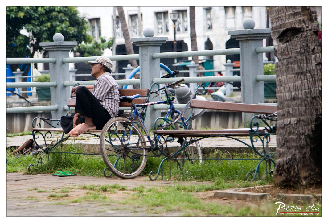

1. Overall Rating (0–10) — 6.0
This photograph captures a quiet, contemplative moment in an urban park, where a man rests on a bench beside his bicycle, exuding a sense of weary stillness. The composition feels candid and unposed, with natural light and a muted palette enhancing the realism of the scene. While the image successfully conveys a slice of everyday life, it lacks visual tension and emotional depth, feeling more like a snapshot than a fully realized portrait.
2. Composition (0–10) — 5.5
The man is placed slightly off-center, with the bicycle and bench creating diagonal lines that lead the eye through the frame. The palm tree on the right partially frames the scene, but its heavy presence disrupts balance. The foreground grass and scattered debris add texture but contribute to a slightly cluttered feel.
3. Lighting (0–10) — 6.0
Natural daylight provides even illumination, though it's slightly overcast, softening shadows and reducing contrast. The light enhances the calm mood but lacks directionality, resulting in a flatness that diminishes depth.
4. Color & Tone (0–10) — 5.5
The palette is subdued, dominated by earthy greens, grays, and muted browns. While cohesive, the colors lack vibrancy, giving the image a somewhat dull and washed-out appearance.
5. Creativity (0–10) — 6.0
The image offers a quiet narrative of urban life, with the man’s posture and bare feet suggesting a story of labor or rest. The composition is observational, but the lack of dramatic framing or unique perspective limits its artistic impact.
6. Technical Quality (0–10) — 7.5
The focus is sharp on the man and the bicycle, with good detail in the textures of the wood, metal, and bark. The exposure is balanced, and the image is free of major flaws like noise or blur.
7. Emotional Impact (0–10) — 5.5
The photograph evokes a sense of solitude and quiet endurance, but the emotional resonance is restrained. The viewer is invited to observe rather than feel, leaving the subject’s inner life largely unexplored.
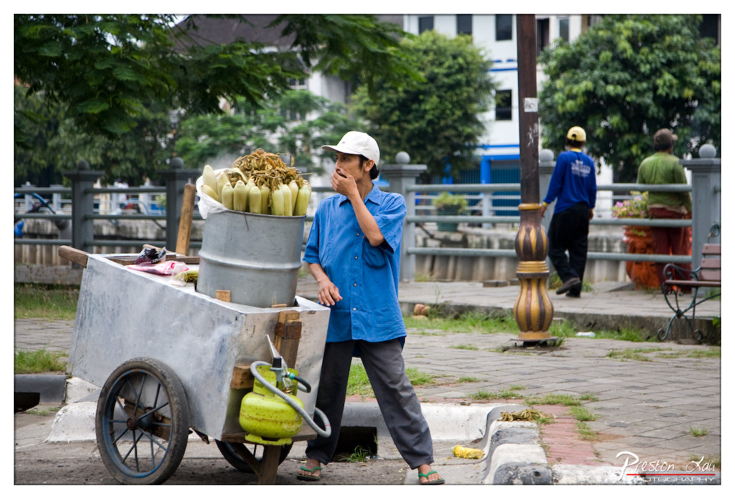

1. Overall Rating (0–10) — 7.0
This photograph captures a candid moment of daily life, where a street vendor pauses to eat, offering a glimpse into the rhythm of urban labor. The composition balances the subject’s quiet introspection with the surrounding movement of the city, creating a narrative that feels both intimate and universal. While the lighting and color are subdued, the image’s strength lies in its authenticity—there’s a raw, unposed quality that makes the scene resonate emotionally.
2. Composition (0–10) — 7.0
The vendor is well-placed off-center, drawing the eye while allowing context to unfold in the background. The cart and the vertical pole create natural leading lines, though the background activity slightly competes for attention.
3. Lighting (0–10) — 6.0
Natural daylight illuminates the scene evenly, but the overcast quality softens shadows and reduces depth. The light is functional, capturing detail without enhancing mood or drama.
4. Color & Tone (0–10) — 6.5
The blue of the vendor’s shirt stands out against the muted greens and grays of the environment, creating a subtle focal point. The palette is naturalistic, with a slight cool cast that underscores the quiet, everyday atmosphere.
5. Creativity (0–10) — 7.5
The image succeeds in capturing a slice of life with a sense of narrative and authenticity. The candid moment—eating while working—adds emotional depth and originality, elevating it beyond a simple street snapshot.
6. Technical Quality (0–10) — 7.5
Sharp focus on the vendor and the cart, with clean detail throughout. The exposure is well-balanced, and the image holds up well in terms of clarity and control.
7. Emotional Impact (0–10) — 7.0
There’s a quiet dignity in the subject’s gesture, evoking empathy and reflection on the unseen labor that sustains urban life. The viewer is invited to pause and consider the story behind the moment.
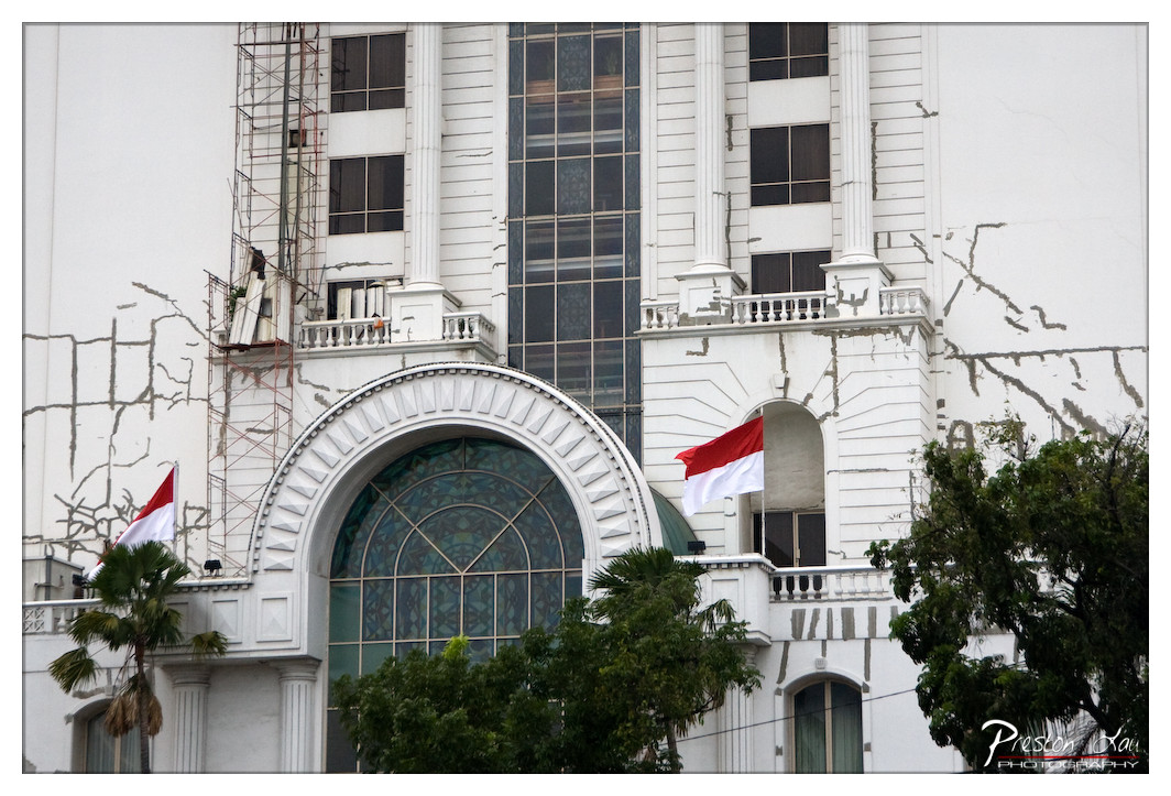

1. Overall Rating (0–10) — 6.8
This photograph captures a striking juxtaposition between architectural grandeur and visible decay, evoking a sense of resilience amid deterioration. The prominent Indonesian flags add a layer of national identity to the scene, while the cracked facade and scaffolding suggest a building clinging to its past. Though the image is compelling in its narrative, the overexposed sky and cluttered framing slightly diminish its visual impact, leaving it more documentary than poetic.
2. Composition (0–10) — 6.0
The central arch draws the eye, but the composition feels unbalanced due to the uneven placement of scaffolding and foliage. The foreground trees partially obscure the lower portion, creating visual clutter that distracts from the building’s architectural details.
3. Lighting (0–10) — 5.5
Harsh, direct daylight flattens the textures and washes out the details of the building’s surface. The overexposed sky creates a loss of detail in the upper frame, while shadows remain too soft to add depth.
4. Color & Tone (0–10) — 6.0
The dominant white and gray tones of the building are contrasted by the bold red and white of the flags, which stand out effectively. However, the overall color palette lacks vibrancy and tonal richness, giving the image a muted, almost faded quality.
5. Creativity (0–10) — 7.0
The contrast between the ornate, classical architecture and the visible signs of aging offers a compelling narrative. The inclusion of the flags adds cultural context, transforming the image into a commentary on heritage, preservation, and national pride.
6. Technical Quality (0–10) — 7.0
The focus is sharp on the central arch and facade, with good detail visible in the stained glass and structural elements. However, the exposure and composition could have been better managed to enhance the image’s overall clarity and aesthetic cohesion.
7. Emotional Impact (0–10) — 6.5
The photograph evokes a quiet melancholy, suggesting a once-majestic structure now weathered by time. The flags inject a note of hope and continuity, creating a bittersweet emotional resonance that invites reflection on loss and endurance.
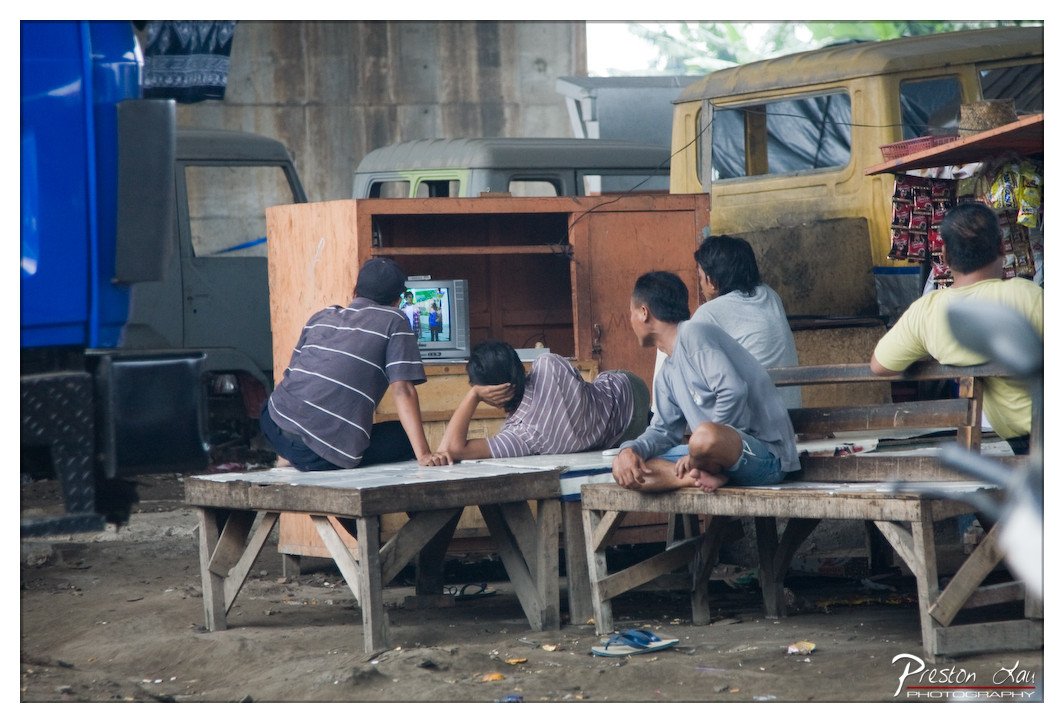

1. Overall Rating (0–10) — 6.8
This photograph captures a candid moment of communal life in a gritty urban setting, where the contrast between hardship and human connection is palpable. The scene—featuring men gathered around a small television in a makeshift outdoor space—feels both authentic and emotionally resonant, with a quiet dignity in the subjects’ engagement. While the image lacks technical polish, its rawness and storytelling power elevate it beyond mere documentation into a slice of everyday resilience.
2. Composition (0–10) — 6.5
The framing centers on the group’s interaction with the TV, creating a natural focal point, though the cluttered background and off-center placement of the television slightly disrupt visual harmony. The diagonal lines of the benches and the truck add dynamic tension, but the composition feels more observational than composed.
3. Lighting (0–10) — 5.5
Natural daylight provides even illumination, but the overcast or shaded conditions flatten the scene’s depth. The lack of strong directional light results in muted shadows and a somewhat flat, documentary quality, limiting the atmospheric impact.
4. Color & Tone (0–10) — 6.0
The palette is dominated by earthy browns and dull grays, punctuated by the blue truck and the green shirt, which add subtle pops of color. The overall tone is desaturated, reflecting the environment’s worn quality, but could benefit from slightly richer saturation to enhance visual engagement.
5. Creativity (0–10) — 7.0
The image succeeds in capturing a unique, unposed moment that speaks to cultural and social dynamics. The juxtaposition of modern media (the TV) within a humble, industrial setting adds a layer of narrative depth, making the scene feel both grounded and thought-provoking.
6. Technical Quality (0–10) — 7.5
The focus is sharp on the central group, and the image is clear and well-exposed. While there’s some softness in the background, the overall technical execution is solid, supporting the photograph’s documentary intent.
7. Emotional Impact (0–10) — 7.0
The image evokes a sense of shared experience and quiet camaraderie, drawing the viewer into a moment of simple human connection. The weariness in the setting contrasts with the focus of the group, creating a poignant emotional undercurrent that lingers.
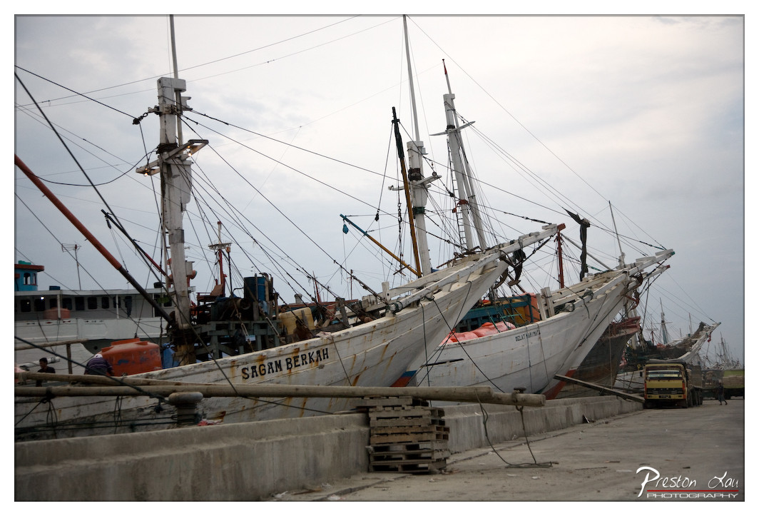

1. Overall Rating (0–10) — 6.0
This photograph captures the rugged authenticity of a working fishing harbor, where weathered boats and tangled rigging tell stories of daily labor. The muted sky and worn vessels evoke a sense of endurance, yet the image feels slightly weighed down by its lack of visual focus and overcast lighting. While the scene is rich in narrative potential, it falls short of cinematic depth, leaving the viewer with a sense of observation rather than immersion.
2. Composition (0–10) — 5.5
The diagonal lines of the boats create a dynamic flow, but the cluttered foreground and uneven framing dilute the visual impact. A tighter crop would better emphasize the boats' weathered forms and their relationship to the dock.
3. Lighting (0–10) — 5.0
Diffuse, overcast light flattens the scene, reducing texture and shadow contrast. While it preserves detail, it also robs the image of dramatic depth and mood.
4. Color & Tone (0–10) — 5.5
The palette is restrained, dominated by grays and faded whites, which aligns with the industrial mood but lacks vibrancy. Subtle hints of orange and blue from the boats provide minimal contrast and fail to elevate the overall tone.
5. Creativity (0–10) — 6.5
The image captures a slice of life with honesty and authenticity, focusing on the rhythm of a working port. While not overtly experimental, it succeeds in documenting a cultural and environmental moment with quiet dignity.
6. Technical Quality (0–10) — 7.0
The focus is sharp across the midground, and the depth of field is well-managed. However, the image lacks a clear focal point, and the slight haze in the background reduces clarity.
7. Emotional Impact (0–10) — 5.5
The photograph conveys a subdued sense of resilience and routine, but the emotional distance created by the flat lighting and crowded composition keeps the viewer from fully connecting with the scene’s human element.
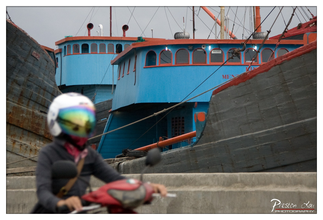

1. Overall Rating (0–10) — 6.8
This photograph captures a moment of urban motion within a bustling fishing harbor, where the contrast between the vibrant blue vessel and the muted surroundings creates a striking visual tension. The blurred figure on the scooter adds a sense of life and movement, while the weathered textures of the boats and concrete speak to the rhythm of daily labor. While the image effectively conveys atmosphere, it is held back by a lack of sharp focus on the subject, softening the emotional and narrative impact.
2. Composition (0–10) — 6.0
The subject is placed off-center with a shallow depth of field, drawing attention to the scooter rider while the boats provide a layered background. However, the overlapping forms and lack of clear focal point create visual clutter, diminishing the image’s compositional clarity.
3. Lighting (0–10) — 5.5
Diffuse, overcast light flattens the scene, reducing shadows and depth. The lack of strong directional light limits tonal contrast and gives the image a muted, almost somber quality.
4. Color & Tone (0–10) — 7.0
The bright blue of the boat stands out against the gray and rust tones of the surrounding vessels and concrete, creating a strong visual anchor. The color palette is restrained but effective, with the reflective visor of the helmet adding a subtle pop of iridescence.
5. Creativity (0–10) — 7.0
The juxtaposition of motion and stillness—of the moving rider against the stationary boats—gives the image a narrative edge. The use of a shallow depth of field to blur the foreground adds a cinematic quality, suggesting a fleeting moment in a larger story.
6. Technical Quality (0–10) — 6.5
The focus is soft on the foreground subject, likely due to motion and depth of field choices. While the image is technically clear, the lack of sharpness on the rider reduces its visual impact.
7. Emotional Impact (0–10) — 6.0
The photograph evokes a sense of quiet resilience and daily routine, capturing a slice of life in a working port. The blurred figure invites projection, allowing the viewer to imagine the rider’s journey, though the lack of emotional clarity keeps the connection at a distance.
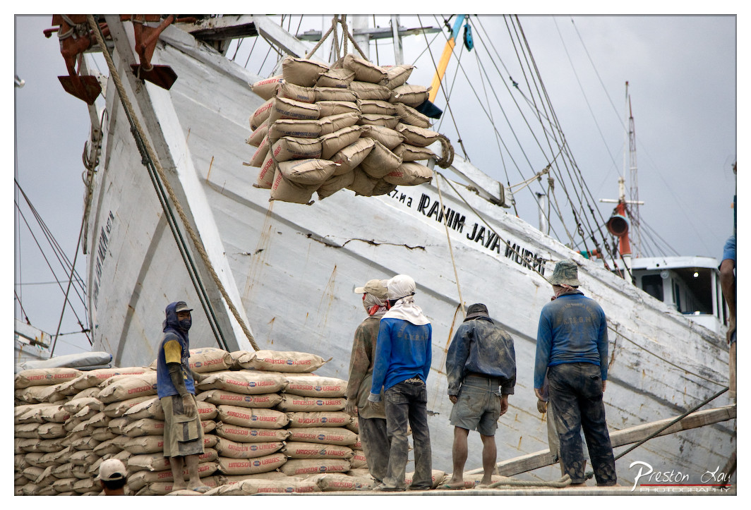

1. Overall Rating (0–10) — 7.0
This photograph captures the raw energy of labor at a working port, where human effort meets the scale of industrial trade. The image’s strength lies in its documentary realism—workers in worn uniforms stand beneath a massive load of sacks being hoisted onto a weathered fishing vessel. While the composition feels slightly crowded and the lighting is flat, the scene conveys a powerful sense of daily struggle and resilience. The authenticity of the moment overshadows technical finesse, making it a compelling glimpse into a world of quiet endurance.
2. Composition (0–10) — 6.0
The subjects are positioned off-center, with the large ship and suspended cargo dominating the frame, creating a sense of scale. However, the foreground clutter of sacks and uneven framing slightly disrupts visual balance, drawing the eye away from the central action.
3. Lighting (0–10) — 5.5
Diffused, overcast light flattens the scene, minimizing shadows and reducing depth. While this allows for even exposure across the frame, it also dulls the emotional intensity and texture of the workers’ faces and clothing.
4. Color & Tone (0–10) — 6.0
The palette is muted, dominated by grays and earth tones, with the blue of the workers’ jackets providing a subtle focal point. The lack of vibrancy reflects the somber mood, though a touch more contrast or warmth could enhance the visual impact.
5. Creativity (0–10) — 7.0
The image succeeds in capturing a moment of everyday life with narrative depth. The juxtaposition of human labor and industrial scale offers a compelling story, and the candid nature of the shot lends it authenticity and emotional weight.
6. Technical Quality (0–10) — 7.5
The focus is sharp throughout, particularly on the workers and sacks, allowing for clear detail. The image is well-exposed, with no significant technical flaws in resolution or clarity.
7. Emotional Impact (0–10) — 7.0
There’s a strong sense of human effort and perseverance, evoked through the workers’ postures and the sheer weight of the cargo. The viewer is drawn into the physical and emotional weight of the labor, creating a quiet but powerful resonance.
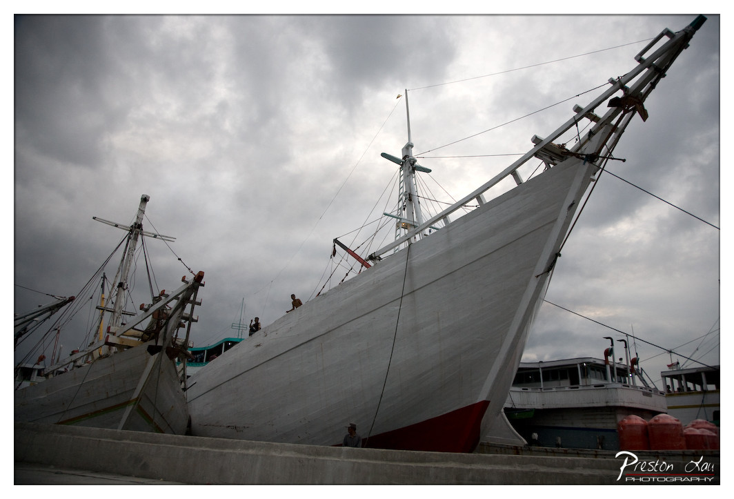

1. Overall Rating (0–10) — 7.0
This photograph captures the imposing presence of traditional fishing vessels under a brooding sky, evoking a sense of resilience and quiet industry. The low-angle perspective emphasizes the scale and weight of the boats, while the overcast atmosphere lends a somber, almost cinematic mood. Though the image is strong in mood and composition, it lacks vibrancy in color and subtle details, slightly dampening its emotional pull.
2. Composition (0–10) — 7.5
The low-angle framing and diagonal lines of the ships create a dynamic, forward-moving structure that draws the eye through the frame. The placement of the vessels creates a layered depth, with the foreground boat leading the viewer’s gaze toward the background. A tighter crop could have reduced the visual clutter, but the current framing maintains a sense of place and context.
3. Lighting (0–10) — 6.5
The diffused, overcast light softens shadows and creates a uniform tone across the scene, enhancing the moodiness of the moment. However, the lack of directional light results in diminished texture and contrast on the boats’ hulls, giving the image a flat quality that slightly weakens its visual impact.
4. Color & Tone (0–10) — 6.0
The palette is dominated by muted grays and whites, with the red keel of the main vessel providing a subtle but effective accent. The overall tonal range is narrow, and while the cool, desaturated tones match the atmosphere, they also limit the image’s energy and richness.
5. Creativity (0–10) — 7.0
The choice to photograph these traditional vessels at a low angle under a dramatic sky suggests a narrative of endurance and cultural continuity. The image moves beyond mere documentation, hinting at the lives connected to these boats, though the expression remains understated.
6. Technical Quality (0–10) — 7.5
The image is sharp and well-focused, particularly on the central ship’s hull and rigging. The exposure is balanced, and there are no distracting artifacts. The slight noise in the darker areas is minimal and acceptable given the lighting conditions.
7. Emotional Impact (0–10) — 6.5
The photograph conveys a contemplative, almost melancholic mood, inviting reflection on the lives of seafarers and the passage of time. While the emotional resonance is present, it remains restrained, leaving the viewer to infer deeper meaning from the visual cues.
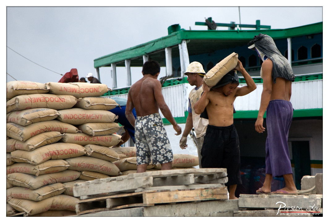

1. Overall Rating (0–10) — 7.0
This photograph captures the raw energy and physicality of labor in a bustling port, where men move heavy sacks of cement under an overcast sky. The composition draws the eye across the frame, emphasizing the rhythm of movement and the weight of daily toil. While the lighting is flat and the colors muted, the image succeeds in conveying a sense of authenticity and endurance, grounding the viewer in a moment of unglamorous but essential work.
2. Composition (0–10) — 7.0
The diagonal stack of sacks leads the eye from the lower left toward the central figures, creating a sense of motion and depth. The placement of the workers in mid-action gives the image dynamism, though the right side feels slightly crowded, pulling focus from the main subject.
3. Lighting (0–10) — 5.0
The overcast sky casts a flat, diffused light that minimizes shadows and softens textures. While this ensures even exposure across the scene, it also reduces contrast and visual drama, giving the image a neutral, documentary feel.
4. Color & Tone (0–10) — 5.5
The palette is dominated by earthy browns, muted greens, and dull grays, reflecting the industrial nature of the scene. The red text on the sacks provides a subtle pop of color, but overall the tone is subdued and lacks vibrancy.
5. Creativity (0–10) — 7.0
The photograph captures a candid, unposed moment that speaks to the dignity of labor. Its strength lies in its storytelling—showing people in action rather than staging a portrait. The visual narrative is compelling, even if the aesthetic choices are restrained.
6. Technical Quality (0–10) — 7.5
The image is sharp and clear, with fine detail visible in the sacks, clothing, and hands. Focus is consistent across the main subjects, and the depth of field appropriately isolates the foreground activity from the background vessel.
7. Emotional Impact (0–10) — 7.5
There is a palpable sense of effort and resilience in the workers’ postures and expressions. The viewer is drawn into the physical strain and collective purpose of the scene, evoking empathy and respect for the unseen labor that sustains everyday life.
Loading map...