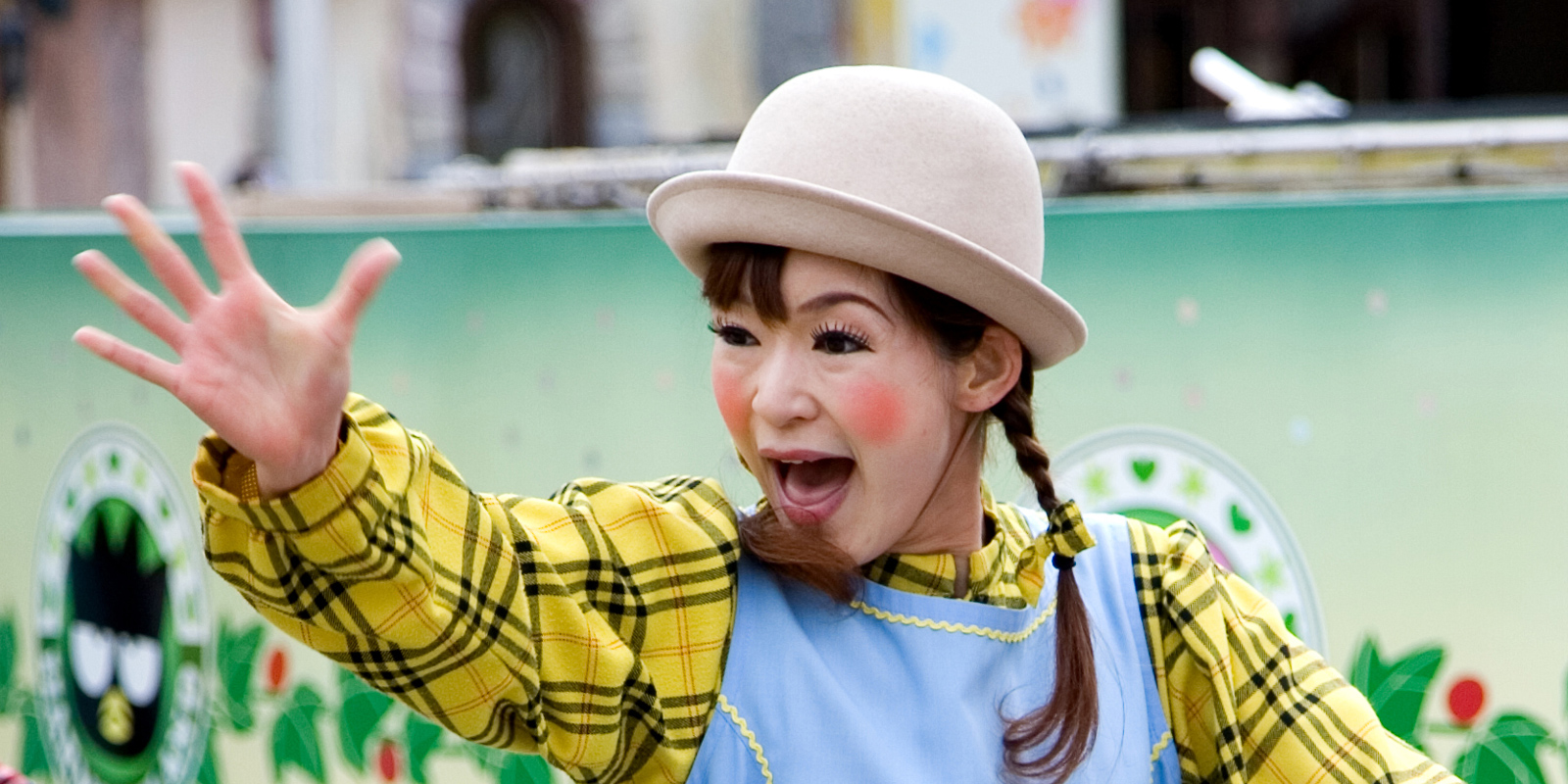
The author visited Beppu, Japan's onsen capital, with its largest volume of hot water and numerous hot spring sources. After visiting hot springs, they went to Harmonyland, an outdoor theme park in Oita Prefecture, featuring Hello Kitty images and attractions like a ferris wheel and roller coasters.


1. Overall Rating (0–10) — 7.0
This photograph captures a warm, candid moment between a child and a costumed mascot, blending joy and cultural symbolism with gentle authenticity. The interaction feels genuine, with the child’s calm curiosity and the mascot’s welcoming embrace creating a narrative of connection. While the image is visually engaging, the crowded background and slightly awkward framing prevent it from achieving greater emotional depth or compositional harmony.
2. Composition (0–10) — 6.0
The central subject is well-framed, but the composition is slightly cluttered by the surrounding figures and uneven framing. The child and mascot dominate the frame, but the presence of a second child in the foreground partially obstructs the view, creating visual distraction.
3. Lighting (0–10) — 6.5
Natural, diffused daylight illuminates the scene evenly, preserving detail in the mascot’s costume and the children’s faces. The soft light avoids harsh shadows and enhances the cheerful mood, though it lacks dramatic contrast or directional emphasis.
4. Color & Tone (0–10) — 7.0
The warm, saturated orange of the mascot contrasts effectively with the cooler tones of the background and the children’s clothing, drawing the eye to the central interaction. The color palette feels lively and playful, supporting the lighthearted tone of the scene.
5. Creativity (0–10) — 7.5
The image captures a unique cultural moment—likely a public event or promotional gathering—where a mascot designed to represent health or community care interacts with children. The juxtaposition of the oversized, friendly character with the quiet, observant child adds narrative intrigue and emotional resonance.
6. Technical Quality (0–10) — 7.5
The focus is sharp on the main subjects, and the image is well-exposed with minimal noise. The depth of field isolates the central figures from the background, though the slight blur in the foreground suggests a shallow aperture was used effectively.
7. Emotional Impact (0–10) — 7.0
The photograph evokes a sense of tenderness and innocence, particularly through the child’s calm gaze and the mascot’s gentle embrace. The emotional connection feels authentic, inviting viewers to reflect on moments of simple joy in public spaces.
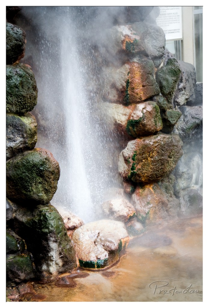

1. Overall Rating (0–10) — 7.0
This photograph captures the raw energy of a steaming geothermal feature, where water bursts from a rocky crevice with a force that feels both natural and primal. The interplay of steam, light, and mineral-stained stones creates a sense of elemental power and mystery. While the image is visually compelling, its emotional resonance is slightly muted by the presence of a distant sign, which disrupts the immersive quality of the scene.
2. Composition (0–10) — 7.0
The vertical framing emphasizes the upward surge of water, drawing the eye along its trajectory. The rocks on either side create a natural frame, though the inclusion of the sign in the upper right edge slightly disrupts the balance and narrative focus.
3. Lighting (0–10) — 6.5
The light is diffused by the steam, creating a soft, ethereal glow that enhances the atmosphere. The backlighting on the water spray adds luminosity, but the overall lighting lacks contrast, giving the image a slightly flat quality.
4. Color & Tone (0–10) — 6.0
The palette is dominated by earthy tones—mossy greens, rust oranges, and gray stones—lending a naturalistic feel. However, the colors are somewhat muted, and the lack of vibrant contrast reduces the visual impact.
5. Creativity (0–10) — 7.5
The image captures a dynamic natural phenomenon with a sense of awe, and the inclusion of the steaming water adds a layer of sensory engagement. The choice to frame it within a man-made structure suggests a thematic tension between nature and civilization, lending it conceptual depth.
6. Technical Quality (0–10) — 7.5
The focus is sharp on the central stream and surrounding rocks, and the detail in the water and steam is well captured. The exposure is balanced, though a slight overexposure in the bright spray area causes minor loss of detail.
7. Emotional Impact (0–10) — 6.5
The photograph evokes a sense of wonder and quiet power, but the presence of the sign and the slightly sterile environment prevent a deeper emotional connection. It feels more like a document of a place than an invitation into a transcendent experience.
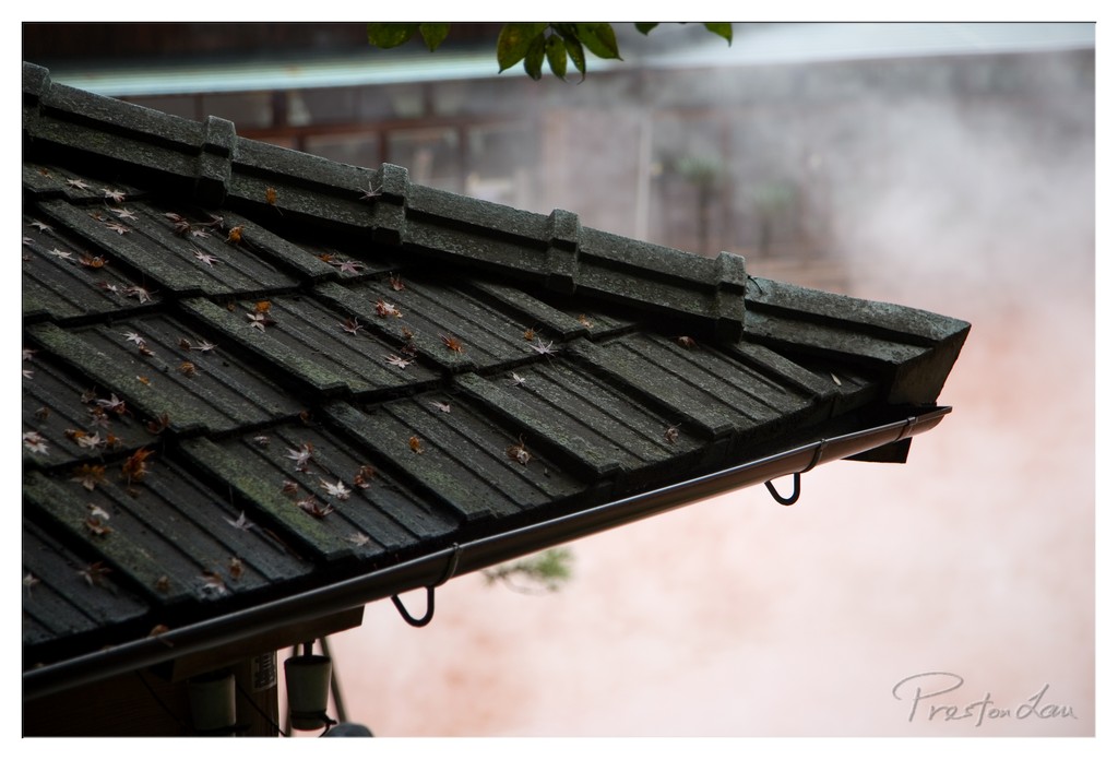

1. Overall Rating (0–10) — 7.5
This photograph captures a quiet, contemplative moment of rain on a traditional tiled roof, where the soft fall of leaves and misty atmosphere evoke a sense of stillness and melancholy. The muted tones and shallow depth of field create a dreamlike quality, drawing the viewer into a meditative space. While the composition is strong and the mood is effectively conveyed, the image’s emotional resonance could be deepened with more intentional use of light and texture.
2. Composition (0–10) — 7.0
The diagonal line of the roof guides the eye across the frame, creating a sense of movement and balance. The placement of the leaves and the soft focus on the background enhance depth, though the slight clutter of the foreground elements slightly detracts from the clean aesthetic.
3. Lighting (0–10) — 6.5
Diffused, overcast lighting softens the scene and enhances the misty atmosphere, but the lack of directional light results in a flat, subdued quality. The soft glow in the background adds a subtle warmth, but could be more pronounced to create contrast.
4. Color & Tone (0–10) — 7.0
The muted palette of greys, earthy browns, and soft pinks lends a serene, almost painterly quality. The tonal range is restrained, but the subtle color harmony supports the tranquil mood without overwhelming the scene.
5. Creativity (0–10) — 7.5
The image successfully captures a quiet, seasonal moment with a contemplative tone, blending natural elements and atmosphere into a cohesive narrative. The use of mist and fallen leaves adds a poetic layer, suggesting the passage of time and seasonal change.
6. Technical Quality (0–10) — 8.0
The focus is sharp on the roof tiles and leaves, with a smooth transition into the blurred background. The image is clean, well-exposed, and free of noise, demonstrating strong technical control.
7. Emotional Impact (0–10) — 8.0
The photograph evokes a deep sense of calm and introspection, inviting the viewer to pause and reflect. The combination of weather, texture, and atmosphere creates a palpable mood of quiet solitude, making the image emotionally resonant.
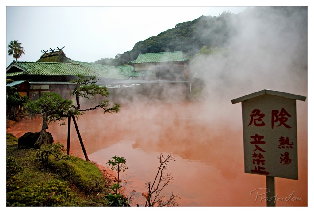

1. Overall Rating (0–10) — 7.0
This photograph captures the mystic allure of a geothermal hot spring, where steam and earthy tones evoke a sense of otherworldly serenity. The reddish water and traditional architecture merge into a scene that feels both ancient and alive, enhanced by the hazy atmosphere and the stark warning sign that adds narrative tension. While the composition leans slightly toward the chaotic, the mood is compelling, and the image succeeds in conveying a place where nature and culture intertwine in quiet drama.
2. Composition (0–10) — 6.5
The sign on the right creates a strong visual anchor, but its placement slightly disrupts the balance, drawing attention away from the central steam-filled pool. The diagonal line of the bonsai tree adds dynamic tension, guiding the eye toward the building, though the left side feels underutilized.
3. Lighting (0–10) — 6.0
Diffuse, overcast light softens the scene and enhances the fog’s ethereal quality, but it also flattens contrast and mutes the vibrant red of the water. The light feels natural and appropriate for the mood, though it lacks the warmth or direction to create depth.
4. Color & Tone (0–10) — 7.0
The dominant orange-red of the water creates a powerful contrast with the green tiles and muted greens of the foliage. The red characters on the sign stand out boldly, reinforcing the image’s tension between danger and beauty. The tonal range is well managed, though the overall palette is slightly desaturated due to the fog and lighting.
5. Creativity (0–10) — 7.5
The juxtaposition of the serene Japanese architecture with the ominous, steaming pool and the warning sign creates a compelling narrative. The image feels both documentary and poetic, suggesting a place of natural wonder and danger—an idea that is effectively communicated through visual storytelling.
6. Technical Quality (0–10) — 7.5
Sharp focus across the scene allows details in the sign, tree, and water to remain clear. The exposure is balanced, with no blown highlights or lost shadows, and the image holds up well under scrutiny, though the fog naturally limits some clarity.
7. Emotional Impact (0–10) — 7.0
The image evokes a quiet awe, tinged with unease due to the warning sign and the unnatural color of the water. It invites the viewer to contemplate the boundary between beauty and peril, creating a lingering sense of reverence for nature’s power.
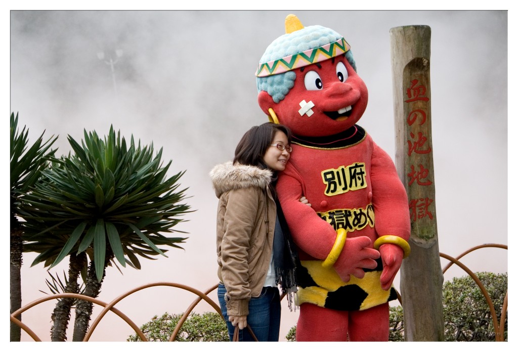

1. Overall Rating (0–10) — 6.8
This photograph captures a warm, playful moment between a woman and a whimsical mascot, evoking the lighthearted charm of a themed attraction. The contrast between the human subject’s genuine smile and the exaggerated, cartoonish figure creates a subtle tension between reality and fantasy. While the image is emotionally engaging and well-composed, the muted lighting and slightly cluttered background reduce its visual impact, holding it back from true artistic distinction.
2. Composition (0–10) — 7.0
The subject is well-centered, with the mascot and woman forming a strong focal point. The diagonal placement of the wooden post and the curved fence lines guide the eye naturally, while the palm-like plant on the left balances the frame.
3. Lighting (0–10) — 5.5
The overcast sky casts a soft, diffused light that minimizes shadows and flattens the scene. While even, the lighting lacks depth and fails to highlight the textures of the costume or the woman’s expression.
4. Color & Tone (0–10) — 6.5
The red of the mascot pops against the muted background, drawing attention, though the overall tone is subdued. The green foliage adds a natural contrast, but the lack of vibrant saturation keeps the image from feeling dynamic.
5. Creativity (0–10) — 7.0
The juxtaposition of a real person with a fictional character adds a layer of narrative curiosity. The choice to include the Japanese text on the post grounds the scene in place, suggesting a specific cultural context that enhances its authenticity.
6. Technical Quality (0–10) — 7.5
The image is sharp and well-focused, with clean detail in both the subject and the background elements. The depth of field is appropriate, keeping the main subjects clear while softly blurring the misty background.
7. Emotional Impact (0–10) — 7.5
The genuine warmth in the woman’s smile and her affectionate pose with the mascot convey a sense of joy and connection. The image feels personal and inviting, evoking nostalgia and the pleasure of shared experiences.
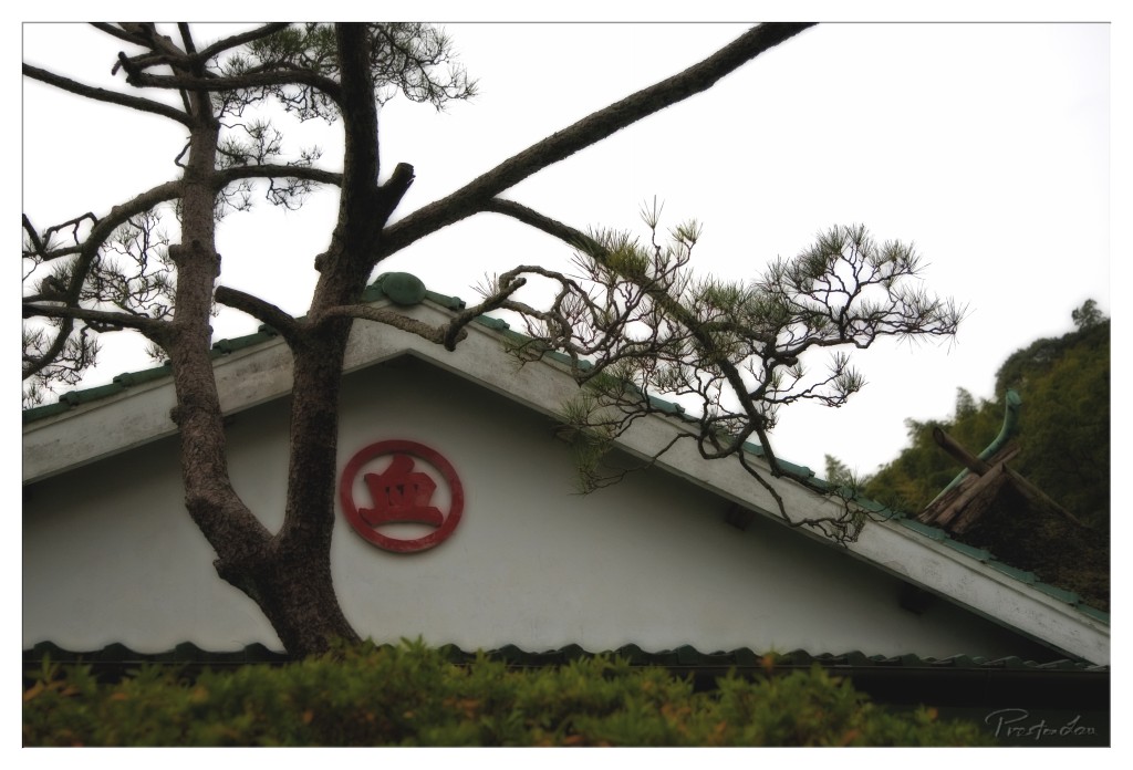

1. Overall Rating (0–10) — 7.0
This photograph captures a quiet, contemplative moment where nature and architecture intertwine with subtle elegance. The gnarled pine tree, with its sprawling branches, frames the traditional building in a way that feels both balanced and organic. The red circular emblem adds a touch of cultural resonance, drawing the eye without overpowering the scene. While the overcast lighting tempers the image’s vibrancy, it enhances the meditative mood, making the composition feel more introspective than dramatic.
2. Composition (0–10) — 7.0
The diagonal sweep of the tree’s branches creates a strong visual path, guiding the eye from the lower left toward the central emblem. The asymmetrical framing adds dynamism, while the low angle grounds the image in its environment. The foliage at the bottom provides a natural border, enhancing depth without distracting from the main subject.
3. Lighting (0–10) — 6.0
The soft, diffused light from an overcast sky creates even illumination with minimal shadows, lending a calm, subdued tone. While this avoids harsh contrasts and preserves detail, it also reduces the image’s overall drama and depth, giving it a slightly flat appearance.
4. Color & Tone (0–10) — 6.5
The muted greens and grays of the natural elements are complemented by the striking red emblem, which serves as a focal point. The limited color palette contributes to a cohesive, harmonious look, though the overall tone leans toward desaturation, slightly dampening the emotional impact.
5. Creativity (0–10) — 7.0
The juxtaposition of the organic, twisting pine against the structured architecture offers a thoughtful narrative of harmony between nature and culture. The use of the emblem as a symbolic anchor adds cultural depth, elevating the image beyond a simple architectural portrait.
6. Technical Quality (0–10) — 7.5
The image is sharp and well-focused, particularly on the tree and the emblem. The exposure is balanced, with no significant loss of detail in highlights or shadows. The watermark is subtle and unobtrusive, indicating careful post-processing.
7. Emotional Impact (0–10) — 7.0
The photograph evokes a sense of stillness and timelessness, inviting reflection on tradition and the quiet beauty of everyday landscapes. The viewer is drawn into a moment of serene observation, where the interplay of form, light, and symbolism creates a quiet emotional resonance.
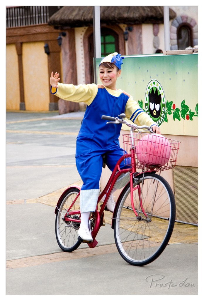

1. Overall Rating (0–10) — 7.0
This photograph captures a vibrant, joyful moment of a performer in a whimsical costume, radiating energy and charm as she rides a red bicycle through a themed park setting. The bright colors and expressive pose convey a sense of playful storytelling, while the backdrop of a stylized building and branded signage anchor the scene in a specific narrative world. While the image is visually engaging and well-composed, its slightly overexposed highlights and lack of depth slightly diminish its overall artistic impact.
2. Composition (0–10) — 7.0
The subject is well-placed along the diagonal, creating a sense of motion and dynamism. The framing captures the full figure and the bicycle, though the background elements slightly compete for attention, adding a touch of visual clutter.
3. Lighting (0–10) — 6.5
Natural daylight provides even illumination, though the sky appears slightly washed out, leading to overexposed highlights on the subject’s face and clothing. The lighting enhances the cheerful mood but lacks subtle modeling or directional depth.
4. Color & Tone (0–10) — 8.0
The palette is rich and saturated, with bold blues, yellows, and the bright red of the bicycle creating a lively, engaging contrast. The soft green and pink tones in the background complement the subject, contributing to the playful, cartoonish atmosphere.
5. Creativity (0–10) — 7.5
The image successfully blends performance, character, and setting into a cohesive narrative. The choice to capture the performer mid-motion adds spontaneity and energy, showcasing creativity in both subject and execution.
6. Technical Quality (0–10) — 7.5
The image is sharp and well-focused, with clean detail in the subject’s costume and bicycle. The lens appears to be of high quality, capturing fine textures and colors accurately, though minor noise is visible in the darker areas.
7. Emotional Impact (0–10) — 8.0
The performer’s radiant smile and animated gesture evoke warmth and happiness, creating an immediate emotional connection. The whimsical setting and character design enhance a sense of nostalgia and childlike wonder, making the image feel inviting and uplifting.
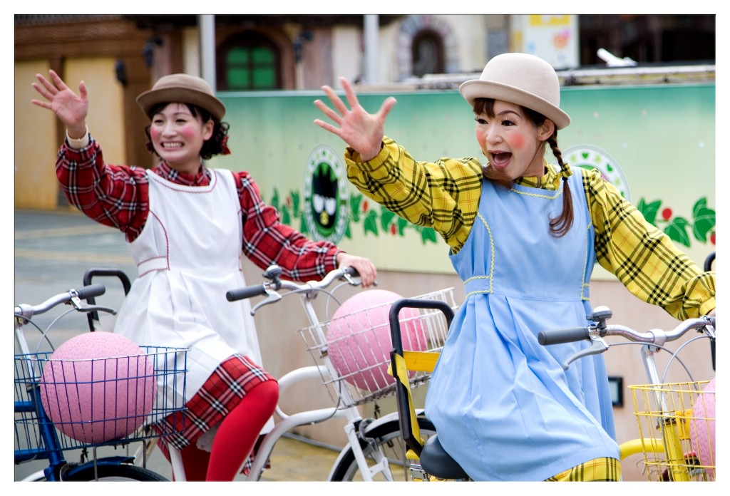

1. Overall Rating (0–10) — 7.5
This photograph bursts with playful energy, capturing two performers in whimsical costumes mid-gesture, their exaggerated expressions radiating joy and theatrical charm. The vibrant colors and lively poses create a sense of movement and fun, though the slightly cluttered background detracts from the focus on the subjects. While the image feels more like a candid moment from a themed entertainment venue than a polished portrait, its infectious enthusiasm and strong character design make it visually engaging and memorable.
2. Composition (0–10) — 6.5
The subjects are well-framed with a balanced placement, though the background elements—particularly the green wall and signage—introduce visual noise. The diagonal lines of the bicycles and arms add dynamism, but the lack of negative space slightly diminishes the impact.
3. Lighting (0–10) — 7.0
Natural daylight illuminates the scene evenly, enhancing the vividness of the costumes and the performers’ expressions. The soft shadows suggest an overcast day, which helps avoid harsh contrasts and keeps the focus on the subjects’ faces and gestures.
4. Color & Tone (0–10) — 8.5
The palette is rich and harmonious, with bold primary and secondary colors—red, yellow, blue, and pink—working together to create a cheerful, storybook-like atmosphere. The use of pastel tones in the hats and aprons adds softness, while the bright pink spheres in the baskets provide playful focal points.
5. Creativity (0–10) — 8.0
The concept is highly original and expressive, blending costume, character, and performance into a single, joyful moment. The performers’ exaggerated poses and makeup suggest a narrative rooted in a larger themed world, inviting viewers into a whimsical, story-driven environment.
6. Technical Quality (0–10) — 7.5
The image is sharp and well-focused, with clean detail in the textures of the fabric and the reflective surfaces of the bicycles. The depth of field is appropriately controlled, keeping both subjects in focus while slightly softening the background.
7. Emotional Impact (0–10) — 8.0
The photograph radiates unbridled happiness and playfulness, evoking a sense of childlike wonder and delight. The performers’ open expressions and animated gestures create an immediate emotional connection, making the viewer feel included in the moment’s infectious joy.
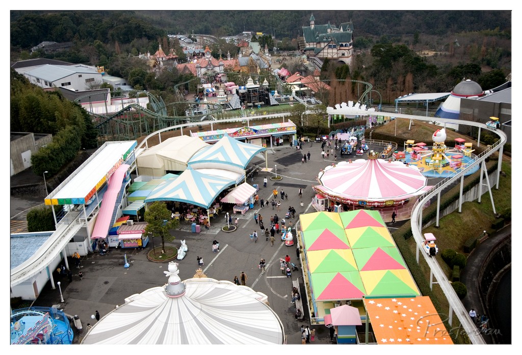

1. Overall Rating (0–10) — 7.0
This aerial view of a vibrant amusement park captures the playful energy and architectural whimsy of a family-friendly destination. The dynamic mix of rides, colorful structures, and scattered visitors creates a lively sense of movement and joy. While the composition is rich with detail, the slightly overcast lighting and dense arrangement of elements reduce the image’s visual clarity and cohesion.
2. Composition (0–10) — 7.5
The high vantage point provides a comprehensive overview, balancing the central walkway with surrounding attractions. The diagonal flow of the roller coaster and the circular forms of the carousel guide the eye naturally through the scene, though the sheer density of structures risks visual clutter.
3. Lighting (0–10) — 5.5
Diffuse, overcast light flattens the scene, muting shadows and reducing depth. While it ensures even exposure across the park, the lack of strong directional light diminishes the dramatic quality and texture of the structures.
4. Color & Tone (0–10) — 7.0
The palette is rich with bright, playful colors—pinks, yellows, and greens—that evoke a sense of fun and nostalgia. However, the overall cool tone and lack of contrast slightly dull the vibrancy, preventing the colors from truly populating the frame.
5. Creativity (0–10) — 7.5
The perspective and subject matter offer a unique blend of amusement and architectural whimsy. The image captures a moment of collective joy in a way that feels both documentary and celebratory, with a strong sense of narrative about shared experience.
6. Technical Quality (0–10) — 8.0
The image is sharp and detailed, with clear focus across the frame. The wide-angle lens allows for an expansive view without significant distortion, and the resolution effectively captures fine textures and patterns.
7. Emotional Impact (0–10) — 6.5
The scene evokes a sense of childhood wonder and communal festivity, but the lack of strong emotional lighting and the impersonal scale keep the viewer at a slight remove, limiting the depth of connection.
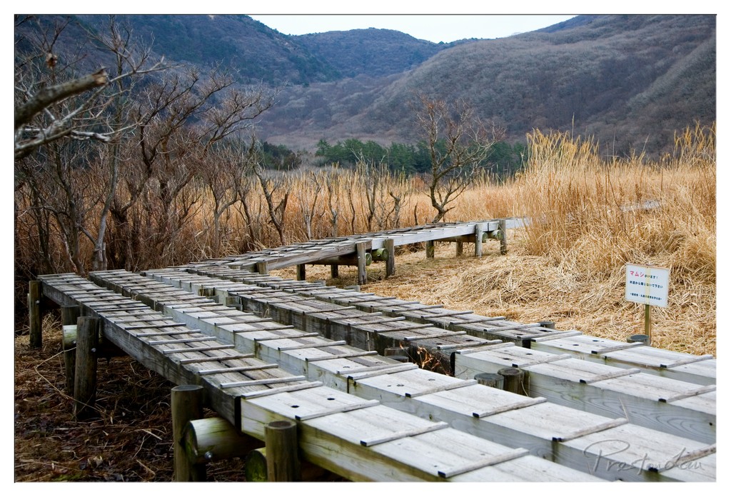

1. Overall Rating (0–10) — 7.0
This photograph captures a quiet, contemplative moment in a natural wetland setting, where man-made walkways gently guide the eye into a landscape of muted winter tones. The weathered wooden planks and dormant reeds evoke a sense of stillness and seasonal transition, while the distant mountains provide a serene backdrop. While the image successfully conveys a calm, almost melancholic atmosphere, it is held back by a slightly flat color palette and a lack of strong focal tension.
2. Composition (0–10) — 7.5
The diagonal lines of the wooden walkway create a strong leading line, drawing the viewer into the scene with a sense of depth and perspective. The placement of the path from the lower left toward the center enhances visual movement, while the bare trees on the left add balance and frame the composition.
3. Lighting (0–10) — 6.5
The soft, diffused light of an overcast day evenly illuminates the scene, avoiding harsh shadows and preserving detail across the landscape. While the lighting is natural and appropriate for the mood, it lacks the warmth or contrast that could add dimension and drama.
4. Color & Tone (0–10) — 6.0
The palette is dominated by earthy browns, tans, and muted grays, reflecting the dormant season. While cohesive, the colors feel somewhat desaturated and lack vibrancy, contributing to a subdued and slightly lifeless tone.
5. Creativity (0–10) — 6.5
The image presents a familiar natural scene with a thoughtful composition, but its strength lies more in documentation than in artistic expression. The inclusion of the sign and the man-made elements adds a layer of narrative, suggesting human interaction with nature, but the concept is understated.
6. Technical Quality (0–10) — 8.0
The photograph is sharp and well-focused throughout, with clean detail in the wood textures and reeds. The exposure is balanced, and the image is free from noticeable flaws, indicating solid technical execution.
7. Emotional Impact (0–10) — 7.0
The image evokes a sense of quiet solitude and introspection, inviting the viewer to imagine walking through this still, transitional landscape. The combination of natural elements and subtle human presence creates a reflective mood, though the emotional resonance is restrained by the muted tonality.
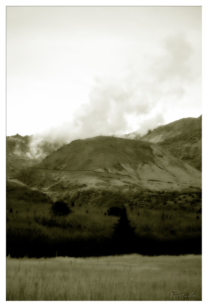

1. Overall Rating (0–10) — 7.0
This sepia-toned landscape evokes a haunting stillness, where the smoky veil rising from the hills suggests both natural power and quiet decay. The muted palette and dramatic cloud formations lend the scene a timeless, almost prehistoric quality, though the lack of strong contrast slightly dampens the visual impact. It succeeds as a contemplative study of nature’s subtle forces, even if it stops short of cinematic grandeur.
2. Composition (0–10) — 6.5
The wide frame captures the expansive terrain, but the central placement of the smoke and hills creates a slightly static balance. The foreground grass and silhouetted trees anchor the image, though the composition feels more observational than dynamic.
3. Lighting (0–10) — 6.0
Diffused, overcast light softens the landscape, minimizing shadows and reducing depth. The light’s even quality supports the somber mood but limits textural definition on the hillsides.
4. Color & Tone (0–10) — 7.5
The monochromatic sepia tone enhances the vintage and melancholic atmosphere, with subtle tonal gradations across the sky and land. The restrained palette feels intentional and cohesive, though it sacrifices vibrancy for mood.
5. Creativity (0–10) — 7.0
The choice to render the scene in sepia transforms a potentially ordinary volcanic landscape into something more poetic and introspective. The smoke’s movement introduces a narrative element, inviting questions about the unseen forces at play.
6. Technical Quality (0–10) — 7.0
Sharp focus and clear detail in the foreground grass and trees demonstrate technical competence. The image is well-exposed, with no obvious flaws in resolution or noise.
7. Emotional Impact (0–10) — 6.5
The photograph elicits a sense of quiet awe and mystery, drawing the viewer into a world where nature’s power is felt more than seen. While not emotionally overwhelming, it lingers with a subtle melancholy that invites reflection.
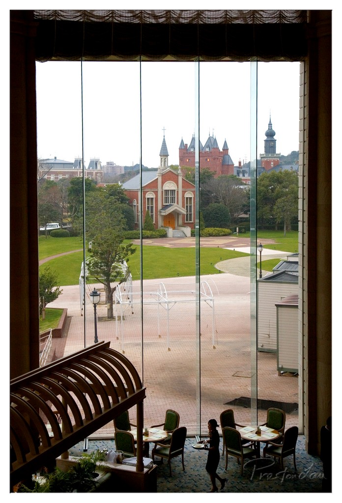

1. Overall Rating (0–10) — 7.0
This photograph captures a serene juxtaposition between the interior warmth of a high-end café and the grandeur of a European-style church visible through expansive glass. The framing from within creates a sense of quiet observation, inviting the viewer to step into a moment of calm contemplation. While the composition is strong and the mood evocative, the flat lighting and muted colors slightly dampen the image’s emotional resonance, keeping it from feeling fully immersive.
2. Composition (0–10) — 7.5
The large window acts as a natural frame, drawing the eye to the distant church and creating a layered depth. The diagonal sweep of the wooden railing in the foreground adds dynamic movement, while the waiter’s silhouette grounds the scene in narrative. The balance between interior and exterior elements is well-handled, though the vertical panes of glass create subtle interruptions in the view.
3. Lighting (0–10) — 6.0
The scene is lit by soft, diffused daylight, which flattens contrast and tempers the visual drama. While the light is even and functional, it lacks the warmth or directional quality that would enhance texture and mood. The overcast sky contributes to a neutral tone, which suits the contemplative atmosphere but reduces atmospheric richness.
4. Color & Tone (0–10) — 6.5
The palette is restrained, dominated by earthy greens, muted reds, and the gray of the pavement and sky. The tonal range is limited, with a lack of deep shadows or vibrant highlights. While the colors are harmonious and reflect the tranquil setting, they feel subdued, missing the chromatic warmth that might elevate the image’s emotional pull.
5. Creativity (0–10) — 7.0
The photographer skillfully blends architecture, interior design, and human presence into a layered narrative. The choice to view the church through the café window suggests a theme of observation and connection across spaces. The image is conceptually strong, using the lens of daily life to frame a moment of architectural beauty.
6. Technical Quality (0–10) — 7.5
The image is sharp and well-exposed, with clean detail throughout the interior and exterior. Focus is consistent, and the depth of field allows both the foreground and background to remain clear. The slight reflections on the glass are minor distractions but do not significantly impair clarity.
7. Emotional Impact (0–10) — 6.5
The photograph evokes a sense of peaceful solitude and quiet observation. The presence of the waiter adds a human touch, suggesting a story unfolding within a larger, timeless setting. While the emotional weight is gentle and understated, it lingers—offering a moment of stillness that feels both personal and universal.
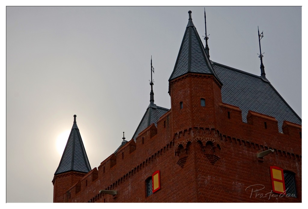

1. Overall Rating (0–10) — 7.5
This photograph captures the imposing silhouette of a brick castle under a moody, overcast sky, with the sun faintly glowing behind one of its turrets, lending an ethereal and almost cinematic quality. The interplay of light and shadow emphasizes the structure’s architectural grandeur, while the warm reds of the brick contrast subtly with the cool gray tones of the sky. Though the image is visually compelling, the subdued lighting and lack of vibrant color limit its emotional resonance, making it more atmospheric than dramatic.
2. Composition (0–10) — 7.0
The low-angle perspective emphasizes the castle’s height and strength, while the placement of the sun behind the left turret creates a natural focal point. The diagonal lines of the roof and towers guide the eye across the frame, though the right side feels slightly more cluttered with multiple turrets and details.
3. Lighting (0–10) — 7.5
The soft, diffused light of the setting or rising sun creates a gentle glow behind the structure, producing a subtle backlight that highlights the silhouette. The light enhances the texture of the brick and the intricate roof details without creating harsh shadows, contributing to the image’s moody atmosphere.
4. Color & Tone (0–10) — 6.5
The palette is dominated by muted reds and grays, with a slight warmth from the sun’s glow. While the colors are harmonious, the overall tonal range is somewhat flat, with a lack of deep contrast that keeps the image from feeling rich or dynamic.
5. Creativity (0–10) — 7.0
The choice to capture the castle in soft, ambient light with the sun partially obscured adds a sense of mystery and timelessness. The composition suggests a narrative of history and endurance, though the image leans more toward traditional architectural documentation than bold artistic interpretation.
6. Technical Quality (0–10) — 8.0
The image is sharp and well-focused, with clean detail visible in the brickwork and roof tiles. The exposure is balanced, avoiding overexposure in the sky while retaining texture in the building’s surface.
7. Emotional Impact (0–10) — 7.0
The photograph evokes a quiet sense of awe and nostalgia, drawing the viewer into a moment of stillness and contemplation. The combination of historic architecture and soft light creates a contemplative mood, inviting reflection on time and legacy.
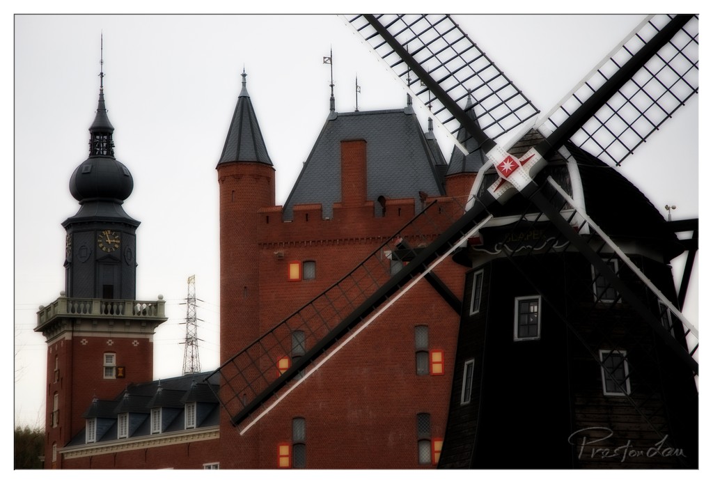

1. Overall Rating (0–10) — 7.0
This photograph captures a striking juxtaposition of historic Dutch architecture and industrial design, where the windmill’s bold diagonal cuts through the frame like a visual pulse. The dark, overcast sky lends a somber mood, while the warm glow from the building’s windows offers a subtle human touch. Though the image is visually compelling, the heavy post-processing and slightly cluttered framing prevent it from achieving a more refined aesthetic.
2. Composition (0–10) — 6.5
The diagonal sweep of the windmill blades creates dynamic tension, drawing the eye across the frame. However, the composition feels slightly unbalanced, with the windmill dominating the right side and the clock tower crowded on the left, creating visual weight that isn’t fully resolved.
3. Lighting (0–10) — 5.5
The diffuse, overcast light flattens the scene’s depth, softening textures and shadows. While the warm interior lights provide contrast, their artificial glow clashes slightly with the cool, muted exterior tones, reducing atmospheric cohesion.
4. Color & Tone (0–10) — 6.0
The image features a restrained palette dominated by red brick, black timber, and gray sky. The tones are heavily saturated, especially in the highlights and shadows, giving the photo a stylized, almost painterly quality that feels intentional but somewhat unnatural.
5. Creativity (0–10) — 7.5
The bold framing and diagonal emphasis lend a dramatic, almost cinematic quality to the scene. The contrast between the traditional windmill and the castle-like structure suggests a narrative of heritage and endurance, showing thoughtful artistic intent.
6. Technical Quality (0–10) — 7.0
The image is sharp and clear, with clean focus across the scene. The post-processing enhances contrast and detail, though some areas show slight over-processing, particularly in the dark tones.
7. Emotional Impact (0–10) — 6.5
There is a quiet sense of timelessness and resilience evoked by the juxtaposition of old and enduring structures. While the mood is contemplative, the heavy editing keeps the viewer at a slight emotional remove, dampening the full resonance of the scene.
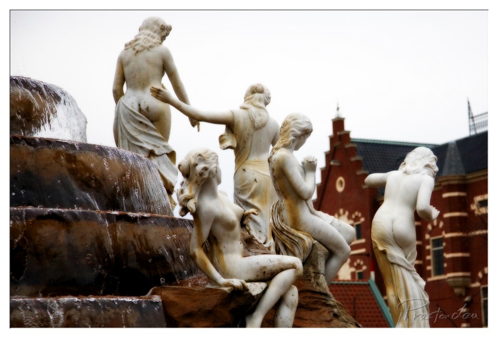

1. Overall Rating (0–10) — 6.8
This photograph captures the quiet elegance of a classical marble fountain, where movement and stillness converge in a harmonious tableau. The statues, weathered yet graceful, are framed against a stark sky and a red-brick building, creating a compelling juxtaposition of art and urban life. While the image succeeds in conveying a sense of time and place, the muted lighting and slightly cluttered background temper its visual impact, leaving the viewer with a sense of potential unfulfilled.
2. Composition (0–10) — 6.5
The statues are arranged diagonally across the frame, creating a dynamic flow from left to right, though the composition feels slightly unbalanced due to the overwhelming presence of the waterfall on the left. The red brick building on the right adds visual weight but disrupts the symmetry, pulling focus away from the central figures.
3. Lighting (0–10) — 5.5
The overcast sky produces soft, diffused light that flattens the image and reduces contrast, muting the textures of the marble and the water. While this creates a subdued, contemplative mood, it also diminishes the sculptural depth and detail.
4. Color & Tone (0–10) — 6.0
The color palette is restrained, dominated by the off-white of the statues and the muted brown of the stone, contrasted by the warm red of the brick building. The tonal range is limited, and the overall coolness of the image, combined with the lack of vibrancy, gives it a somewhat somber tone.
5. Creativity (0–10) — 7.0
The juxtaposition of classical sculpture with an urban backdrop offers a compelling narrative about art in public space. The choice to include the building in the frame suggests a commentary on cultural continuity, though the execution leans more toward observation than bold artistic vision.
6. Technical Quality (0–10) — 7.5
The focus is sharp on the central figures, and the detail in the marble is well-preserved. The depth of field is appropriately controlled, keeping the foreground statues clear while softly blurring the background, though the image appears slightly underexposed.
7. Emotional Impact (0–10) — 6.5
The photograph evokes a sense of nostalgia and quiet contemplation, inviting the viewer to reflect on the passage of time and the endurance of art. However, the emotional resonance is somewhat restrained by the lack of dramatic lighting and the visual distractions in the background.
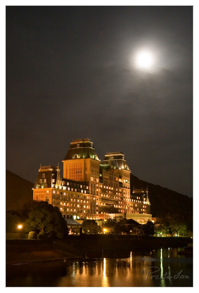

1. Overall Rating (0–10) — 7.5
This nighttime photograph captures a grand, illuminated building under a luminous full moon, evoking a sense of serene elegance and quiet grandeur. The warm glow of the hotel’s lights contrasts beautifully with the cool night sky, while the reflection in the water adds depth and symmetry. Though the composition is strong, the heavy cloud cover slightly diffuses the moonlight, softening the image’s dramatic potential.
2. Composition (0–10) — 8.0
The building is centered and framed by natural elements—trees, hills, and water—creating a balanced, harmonious scene. The reflection in the foreground enhances symmetry and draws the eye toward the structure, though the slightly off-center moon adds a subtle asymmetry that keeps the image from feeling too static.
3. Lighting (0–10) — 7.5
The interplay between the warm artificial lights of the hotel and the cool, diffused moonlight creates a compelling contrast. The moon, though partially veiled by clouds, serves as a strong atmospheric light source, casting a soft glow over the scene. The lighting is moody and intentional, enhancing the image’s nocturnal atmosphere.
4. Color & Tone (0–10) — 7.0
The palette is dominated by warm yellows and oranges from the building’s lights, set against a deep, cool-toned night sky. The reflections in the water amplify the warmth, but the overall tone is slightly muted by the overcast conditions, reducing vibrancy in the sky.
5. Creativity (0–10) — 8.0
The choice to capture the hotel under a full moon with a reflective surface is both visually striking and conceptually poetic. The image blends architecture, nature, and light in a way that feels both timeless and cinematic, suggesting a narrative of quiet luxury and mystery.
6. Technical Quality (0–10) — 8.0
The image is sharp, with clear details in the building’s facade and a well-managed exposure. The long exposure has smoothed the water and captured the moon’s brightness without overexposing. The signature in the corner is subtle and does not detract from the composition.
7. Emotional Impact (0–10) — 8.0
The photograph conveys a tranquil, almost dreamlike mood, inviting contemplation and a sense of wonder. The combination of light, reflection, and scale evokes a feeling of awe and solitude, making the viewer feel both small and enchanted by the scene.
Loading map...