A Journey Through Personal Albums and Exploring the Intersection of Tech and Humanity
Welcome to my personal blog that delves into the intricate tapestry of personal albums and the fascinating intersection of ever-evolving technology and humanity. Come along on a journey with me as we delve into the seamless fusion of creativity, state-of-the-art AI and robotics, intricately interwoven within the tapestry of our shared awareness.
Hover your mouse over the image and see the AI genereated caption and rating. Have fun!
A Glimpse into the Monet's Life in Giverny France
Nestled in the picturesque Normandy region of France, Giverny is a treasure trove for art lovers and nature enthusiasts alike. This charming village, just an hour from Paris, is where Claude Monet, the father of Impressionism, spent the last 43 years of his life.
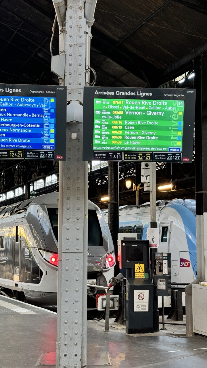
Stationary Life at the Station Rating: 7/10
This photograph captures a typical scene within a French train station, showcasing the functional heart of public transit. Dominating the frame is a sturdy, riveted metal pillar, acting as a vertical divider between two bright digital information boards – one displaying departures in blue and the other arrivals in vibrant green. Behind them, the sleek noses of modern SNCF trains are visible, one with "REGION NORMANDIE" branding, their red tail lights glowing like watchful eyes. The scene feels decidedly functional and structured, reflecting the organized chaos inherent in train travel, yet the trains being parked and the boards static gives it a moment of calm readiness. Pertinent objects like a service pedestal with warning signs ("Nettoyage en Cours" - Cleaning in Progress) and communication equipment add layers of real-world detail to the transit hub.
From a photographic perspective, the composition is heavily influenced by the imposing pillar which, while maybe a necessary structural element, awkwardly bisects the image. It creates a sense of being *right there* in the thick of the station, but perhaps sacrifices a cleaner view of the trains or boards. The lighting is a mix of ambient station light and the intense illumination from the digital screens, which become the brightest and most attention-grabbing elements. The color palette is cool and industrial, with the blues and greens of the displays providing crucial focal points and breaking up the grey monotony of the metalwork and concrete. The style is candid and documentary, capturing the everyday reality of the location without excessive stylization, perhaps a bit too candidly featuring the utilitarian pillar. It’s a solid capture of the subject, though the composition could have benefitted from a step to the left or right to avoid the central column's dominance, allowing either the departure or arrival information, or the trains themselves, to take center stage.
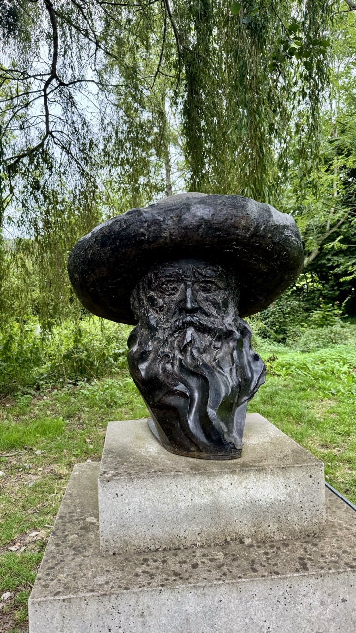
The star of this frame is undoubtedly a captivating bronze bust, an elder statesman of stone wearing a ridiculously oversized, almost fungal-looking hat and a beard that seems to ripple like waves. Rating: 8/10 for sheer character and that magnificent, questionable headwear choice. What's happening here is this wise, possibly magical, figure is holding court atop a sturdy concrete pedestal in what appears to be a lush, green outdoor setting. The mood is one of quiet contemplation mixed with a hint of whimsical eccentricity, like finding a philosophical garden gnome who's had a serious glow-up.
From a photographic perspective, the composition is solid, placing the detailed bust centrally on its base, drawing the viewer directly to the subject. The natural lighting creates soft shadows that highlight the texture of the beard and the weathered lines on the face, adding depth to the sculpture's character. The color palette is dominated by the dark, rich tones of the bust contrasting against the varied greens of the background foliage, which is nicely softened by a pleasing bokeh effect. This blur effectively separates the subject from the environment while still providing context – clearly, this gentleman prefers to ponder surrounded by nature, perhaps judging the local squirrels or offering unsolicited advice to passing garden spiders. It's a straightforward yet effective capture of an intriguing piece of art in its natural habitat.
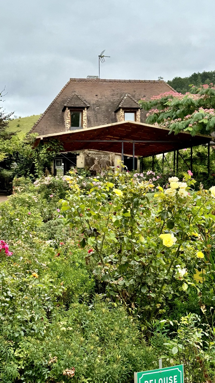
Rustic Garden Retreat
Rating: 7/10
Ah, the classic "pretty house drowning in its own success" shot! Here we have a charming, rustic house, complete with twin dormers and a surprisingly prominent antenna proudly declaring its allegiance to terrestrial signals in this otherwise idyllic scene. It's nestled behind a veritable explosion of greenery, primarily roses – a lovely subject matter, undoubtedly. The composition, however, feels a bit like the garden is staging a friendly takeover, pushing the architectural star further up the frame. While the lush foreground provides a fantastic burst of color, especially those cheerful yellow roses battling for attention, it does make the image feel a tad bottom-heavy. The overcast lighting is a mixed blessing; it's beautifully soft on the flowers, making their colors pop without harsh shadows, but it leaves the sky looking rather uninspired – just a sheet of grey adding little to the mood. It certainly gives the scene a peaceful, slightly contemplative vibe, like a quiet afternoon before the rain.
Peeking under the modern-ish wooden pergola attached to the house, one can just make out some sculptural figures, adding a touch of unexpected artistic flair amidst the foliage and old stone walls. To the left, a gentle, grassy hill provides a simple backdrop, while a denser line of trees defines the horizon on the right. And yes, there's a tantalizing glimpse of a green sign at the very bottom right – is it a warning? An invitation? The mysteries of garden signage! Overall, it's a visually pleasing scene that captures the essence of a thriving, perhaps slightly unruly, garden embracing a traditional dwelling. A bit more breathing room around the house, or a different angle to showcase the architecture more prominently, might have elevated it further for our hypothetical photographer's catalog, but the sheer vibrancy of the garden makes it a cheerful if slightly cluttered image.
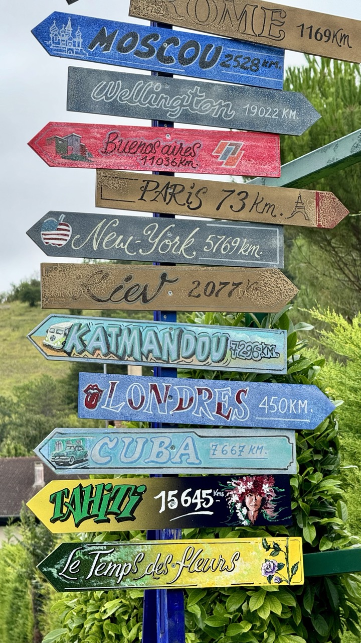
The World's Quirkiest Compass
Rating: 8/10
Talk about wanderlust overload! This photograph captures a wonderfully eccentric stack of hand-painted directional signs, pointing off to destinations as varied as Rome (just 1169km, apparently!) and Tahitii (a cool 15,645km away, complete with a portrait of a floral-crowned figure). It's less of a practical guide and more of a visual wishlist, creating a playful, bohemian, and slightly whimsical mood. Each sign is a mini-artwork, with different fonts, colors, and even small illustrations like a VW van for Kathmandu or a US flag for New York, making the subject matter incredibly rich and engaging. Set against a lush green, slightly blurred background, the vibrant signs pop, creating a dynamic foreground that immediately grabs attention.
From a photography perspective, the composition is strong, utilizing the verticality of the signpost to fill the frame effectively. The different angles and directions of the signs create interesting lines and a sense of movement within the static image. While the lighting appears somewhat soft, perhaps from an overcast day, it evenly illuminates the signs, allowing the detail and color of the hand-painting to be clearly seen. The color palette is intentionally varied and bold, contributing significantly to the folk-art style. The choice to focus sharply on the signs while letting the background fade provides a nice separation, though a slightly wider aperture might have enhanced the background blur further. Overall, it's a charming and well-executed shot of a unique subject that speaks volumes about travel dreams, near and far.
Monet's Home: A Glimpse into the Artist's Life
Upon arriving in Giverny, my first stop was the iconic Claude Monet House, a colorful residence that feels as though the artist just stepped out for a moment. The house, with its pastel walls and lovingly maintained interiors, offers a window into Monet’s personal world. Walking through the rooms, I was struck by the sheer number of Japanese prints adorning the walls. Monet was an avid collector of Japanese art, particularly ukiyo-e woodblock prints. These artworks profoundly influenced his style, and you can see this reflected in his approach to composition and color. The Yellow Dining Room, with its bold walls and blue-and-white porcelain, is a standout, as is the serene Blue Salon.
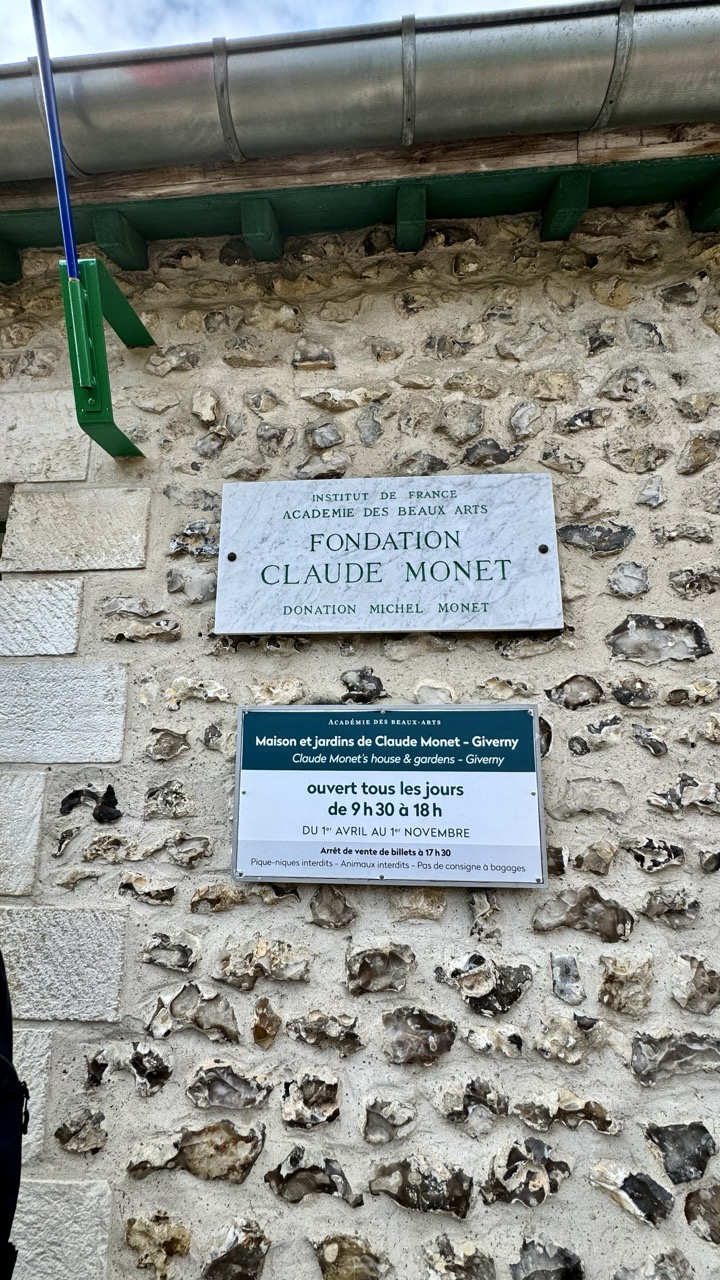
Entry Regulations: Giverny Edition
Rating: 6/10
This image serves as a straightforward, if not particularly glamorous, documentation of the entrance signage for the Claude Monet Foundation in Giverny. The subject, rated a respectable 6/10 for its informational value rather than inherent visual appeal, consists of two prominent signs mounted on a rough, textured stone wall. The upper sign, a clean white marble slab with elegant green text, announces the "FONDATION CLAUDE MONET" under the auspices of the Institut de France and Académie des Beaux Arts, noting the "DONATION MICHEL MONET." Below it, a darker green sign provides crucial visitor information: "Maison et jardins de Claude Monet - Giverny," daily opening hours from 9:30 to 18:00, the seasonal dates (April 1st to November 1st), last ticket sales time, and various prohibitions like picnics, animals, and luggage storage. The composition places these vital directives front and center against the rustic backdrop, with the top portion showing a green wooden structure supporting a metal gutter and part of a blue pole with a green bracket intruding on the left – perhaps the world's least artistic photo bomb.
From a photographic perspective, the lighting is flat and even, typical of an overcast day, which is excellent for sign readability but does little for mood or drama. The color palette is subdued, dominated by the natural greys and beiges of the flint and mortar wall, contrasting with the dark green of the lower sign and architectural elements, and the crisp white marble. While the signs are in sharp focus, the depth of field is sufficient to show the interesting, varied texture of the wall, which arguably has more character than the signs themselves. This image exemplifies a purely functional, documentary style – ensuring all the necessary information is captured clearly. It might lack the sweeping vistas of Monet's gardens or the charm of his house, but it successfully conveys the practicalities of entry, reminding potential visitors that even paradise has rules (and apparently, nowhere to stash your giant backpack). It's the kind of photo that screams "information," not "inspiration," but sometimes, you just need to know when and how you can get in.
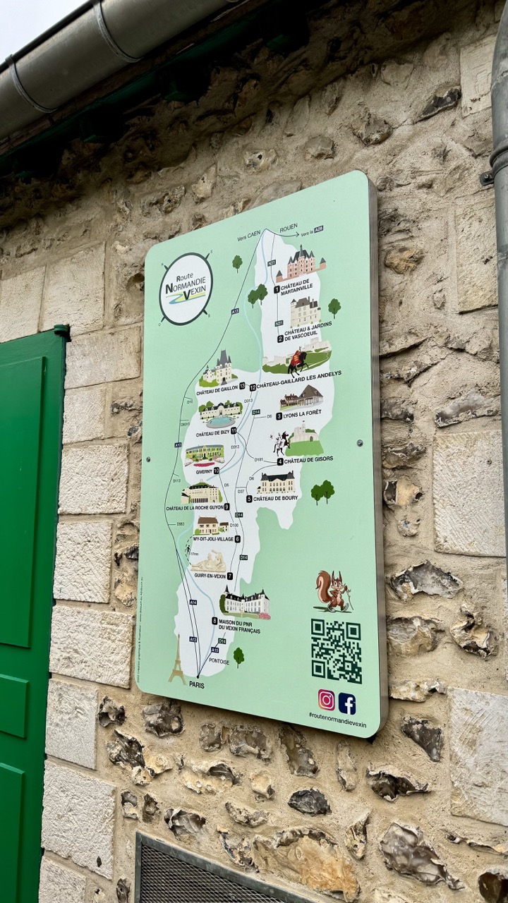
Title: The Squirrel's Scenic Route Rating: 7/10
This photo presents a detailed map for the "Route Normandie Vexin," proudly displayed on an ancient stone wall. The map itself is a vibrant green guide, dotted with charming illustrations of chateaux, towns, and even the Eiffel Tower hinting at its proximity to Paris. A notable feature is the whimsical cartoon squirrel, seemingly pointing the way, adding a touch of playful charm to the historical journey. The rough, textured stone wall provides a strong contrast to the smooth, modern sign, anchoring the tourist information firmly in the region's history, while a green structure on the left adds a pop of bold color to the scene.
Photographically, the composition places the informative sign centrally, allowing the eye to easily follow the illustrated route. The rich texture of the flint-and-mortar wall is beautifully rendered by the even, soft lighting, which avoids harsh shadows – excellent for ensuring the map is perfectly legible, if a little less dramatic. The green gate on the left provides a vibrant but slightly awkward compositional element, feeling a bit cropped. The overall style is documentary, clearly showcasing the sign in its context, offering practical information enhanced by a touch of local character, like our little squirrel friend who seems to be offering a nut-based navigational tip.
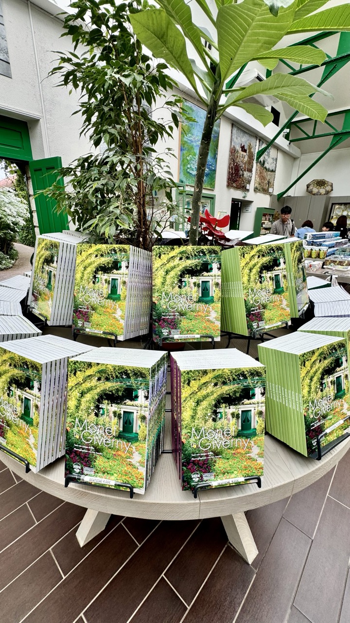
A Literary Garden Display Subject: 8/10
Stepping into what appears to be a sun-drenched museum shop or visitor center, we're greeted by a veritable forest of literature – specifically, stacks upon stacks of books titled "Monet à Giverny." Arranged around a large, light-colored circular table, these books form the central subject, standing upright in metal display racks. The mood is one of quiet anticipation, perhaps before or after a visit to the actual gardens, offering a tangible piece of the experience. The books' covers, depicting the iconic green-doored house nestled within a vibrant, flower-filled archway, promise glimpses into Monet's world, creating a visual echo of the natural beauty outside (or depicted inside). Large, leafy plants frame the scene, reinforcing the garden theme, while bright green doors hint at the world beyond.
From a slightly elevated angle, the photographer has captured the impressive volume of available reading material, showcasing the circular display effectively. The composition draws the eye around the table, highlighting the repetitive yet appealing book cover design. The lighting is fantastic – bright and natural, illuminating the books clearly and hinting at the airy space. Colors are rich, dominated by the lush greens and floral hues of the covers, contrasted with the clean whites and greys of the table and walls. While the background is a bit busy with more plants, artwork (some resembling Monet's work), and people browsing (poor souls, oblivious to the imminent book-buying frenzy!), it provides necessary context, placing the display within its likely environment. It's a straightforward product shot, elevated by the pleasant surroundings and excellent illumination, though one wonders if anyone actually buys the one book or just collapses under the sheer weight of choice.
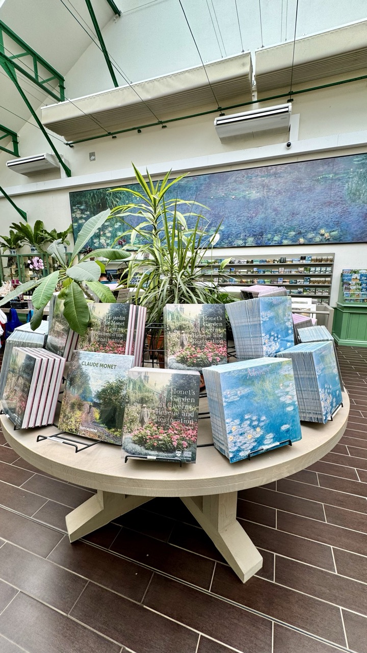
Monet's Garden of Merch
Rating: 8/10
Step right up to the grand bazaar of Impressionism, where the subject is clearly the overwhelming bounty of Monet-themed treasures! This image plunges us into what appears to be a museum gift shop or conservatory, featuring a large round table absolutely groaning under the weight of books, calendars, and stacks of stationery all celebrating Claude Monet and his famous garden at Giverny. Titles like "Jardin de Monet" and "Monet's Garden at Giverny Rescue and Restoration" are prominent, promising delightful dives into horticultural and artistic history. It's a scene brimming with potential impulse buys, set against a backdrop featuring a large reproduction of a Monet water lily painting and shelves packed floor-to-ceiling with yet more artistic delights. The mood is a mix of peaceful artistic appreciation and retail frenzy – perfect for anyone wanting to take a piece of Giverny home (or ten).
From a photographer's perspective, the composition places the overflowing table front and center, although the slightly tilted angle gives it a handheld, spontaneous feel, perhaps captured mid-browse. The wide shot takes in the full context, from the beautiful art on the wall to the rather less romantic but entirely necessary air conditioning units dangling overhead – a subtle reminder that even paradise needs temperature control. The lighting is bright and even, preventing harsh shadows but perhaps flattening the scene slightly. The color palette is rich with garden greens from the plants and the vibrant blues and pinks of Monet's work represented in the merchandise, contrasting nicely with the earthy tones of the table and dark floor tiles. While maybe not a masterclass in compositional finesse, it perfectly captures the sensory overload of a well-stocked, art-themed gift shop, making you want to dive in... or maybe just back away slowly before your wallet cries mercy.
The Beautiful Monet Gardens: A Living Canvas
If Monet's home provides insight into his life, the gardens offer a direct connection to his creative genius. The gardens at Giverny are nothing short of a living masterpiece. Divided into two parts—the Clos Normand flower garden and the Japanese-inspired Water Garden—they are an explosion of color and tranquility.
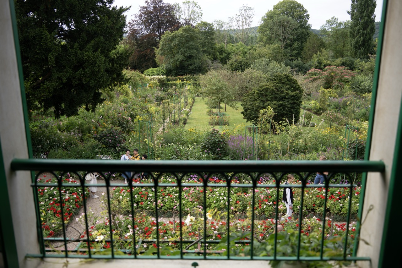
The Garden View from the Balcony Rating: 8/10
Peeking through the bars of a green railing, we find ourselves gazing into a vibrant, lush garden teeming with flowers and greenery. The view is framed by the balcony edge and pillars, creating a specific vantage point onto this horticultural wonderland. Scattered amongst the beds of red, white, and pink blooms, people stroll along the paths, adding life and scale to the scene. The mood is one of peaceful, almost secretive admiration, as if we've stumbled upon this beautiful spot unannounced. It's a classic garden tableau, earning a solid 8/10 for its sheer beauty and inviting atmosphere, despite the slight visual obstruction which, let's be honest, happens when you're trying to capture a scene from a designated viewing spot.
From a photographic perspective, this shot leans heavily on its unique composition. The prominent, slightly out-of-focus green railing in the foreground acts as both a frame and a challenge – capturing a stunning scene *through* something else isn't always easy, but here it adds depth and context, placing the viewer *at* the balcony. The overcast lighting is a blessing, providing soft, even illumination that allows the rich greens of the foliage and the intense colors of the flowers to truly pop without harsh shadows or blown-out highlights. The eye is drawn through the foreground flowers to the paths leading back into the garden, hinting at further delights. The background of wooded hills completes the idyllic setting. While the railing might slightly annoy purists seeking an entirely unobstructed view, it's a deliberate choice that makes this image a personal, intimate look into a grand landscape. It's a well-captured moment, perfectly suited for a photographer's log noting the effect of framing and light on a classic subject.
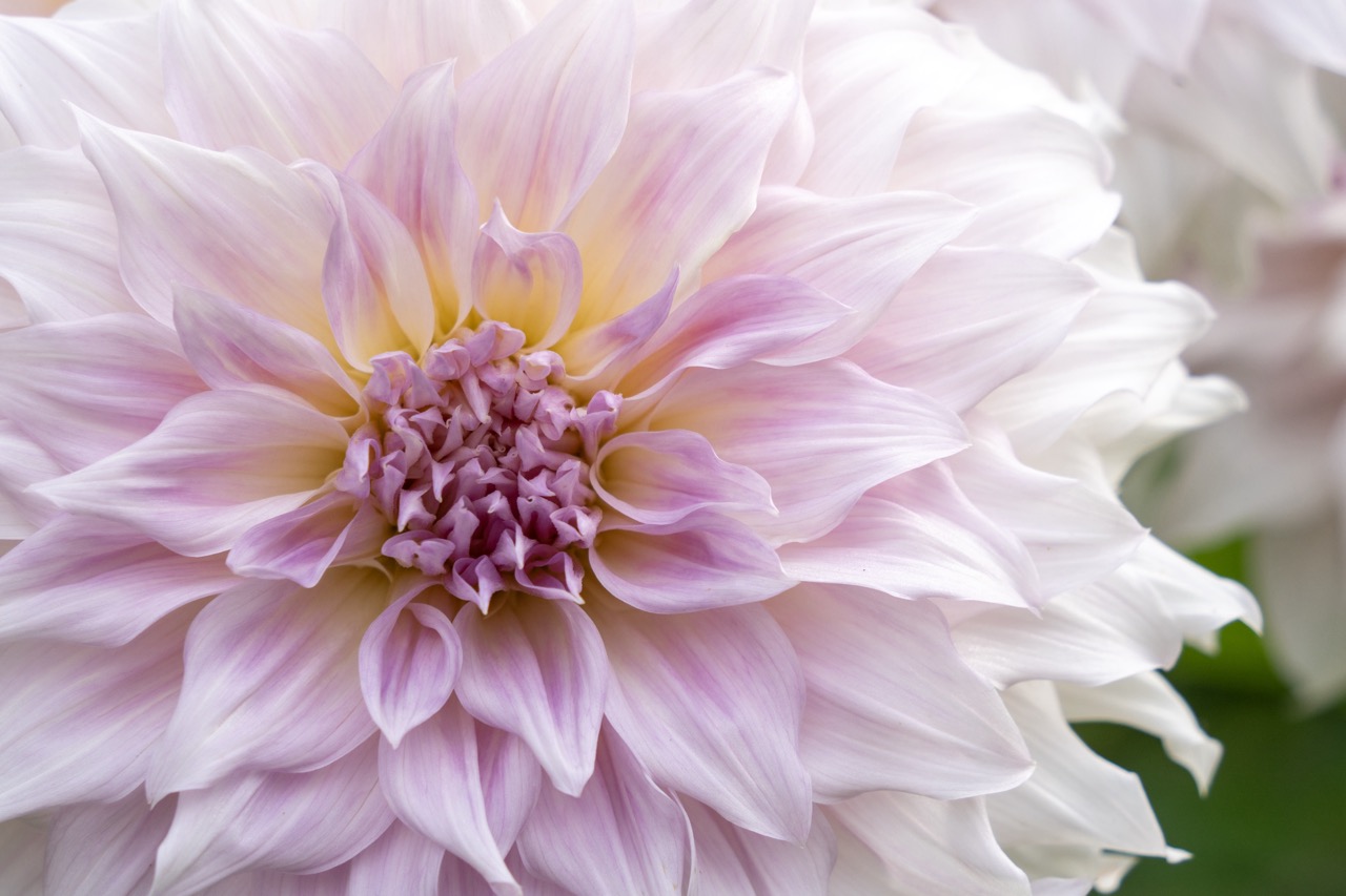
Petal Perfection: A Dahlia's Close-Up Confession
Rating: 9/10
Behold the majestic dahlia, caught mid-bloom in a moment of quiet, intricate drama. Nothing much is "happening" in the traditional sense, unless you count the slow, silent ballet of photosynthesis or perhaps the existential dread of a petal nearing its prime – though I suspect this one is purely basking in its own beauty. The mood is one of delicate serenity and complex natural artistry, inviting you to lean in and appreciate the sheer effort nature puts into making things look this good. The subject matter is undeniably captivating, a symphony of soft gradients and textures, performing exclusively for the camera.
From a photographer's perspective, this is a delightful exercise in capturing detail. The composition employs a tight crop, focusing intensely on the flower's heart and the swirling layers of petals, almost daring you to find a flaw. The lighting is simply divine – soft, diffused light that wraps around each petal, revealing their subtle veins and transitions from translucent white to rosy pink and buttery yellow. It's the kind of light that makes colors sing without shouting. The background, a beautifully rendered soft blur of white and green, ensures the star of the show pops, creating a lovely sense of depth. It's a classic close-up floral shot, executed with precision and a clear love for the subject, proving that sometimes, the simplest subjects demand the most complex appreciation.
The Clos Normand, with its vibrant rows of flowers, feels like walking through a rainbow. Each season brings its own palette, and I was lucky enough to visit in late spring when the tulips and irises were in full bloom. The meticulous layout of the garden showcases Monet’s skill not just as a painter but as a horticulturist.
Busy Bee's Harvest
Rating: 8/10
This capture showcases the tireless work ethic of a fluffy bumblebee (a solid 8/10 subject for any nature enthusiast's lens) as it busily extracts pollen and nectar from the central disk of a vibrant orange flower. The scene is one of peaceful, industrious summer life, portraying the vital dance between insect and blossom. The main players are, of course, the bee itself, with its translucent wings and fuzzy black and yellow stripes, and the striking orange flower, its petals radiating outwards from a dense, textured core of yellow florets. Behind this lively transaction, the background dissolves into a soft, soothing blur of verdant green, hinting at a lush garden or meadow setting while keeping the viewer's focus squarely on the pollinating protagonist and its floral platform. It’s a classic moment of nature frozen in time, highlighting the simple beauty and essential cycles of the ecosystem.
From a photographic perspective, this image is a well-executed example of nature macro photography. The composition places the bee slightly off-center on the flower head, a pleasing arrangement that avoids a static bullseye effect and allows the eye to appreciate both the bee and the surrounding flower structure. The lighting appears soft and diffused, likely natural light on an overcast day or in gentle shade, which beautifully renders the fine detail of the bee's fur and the delicate textures of the petals without harsh shadows or blown-out highlights. The color palette is rich and appealing, with the warm, energetic oranges and yellows of the flower providing a strong contrast against the cooler, calming green background, enhancing the visual pop of the subject. The shallow depth of field is masterfully employed, creating a smooth, creamy bokeh that isolates the bee and the flower's center, drawing attention to the crisp focus on the industrious insect while artistically blurring the less relevant surroundings. It’s a standard, effective style for highlighting small subjects in nature, demonstrating a good understanding of focus and aperture control to create visual separation.
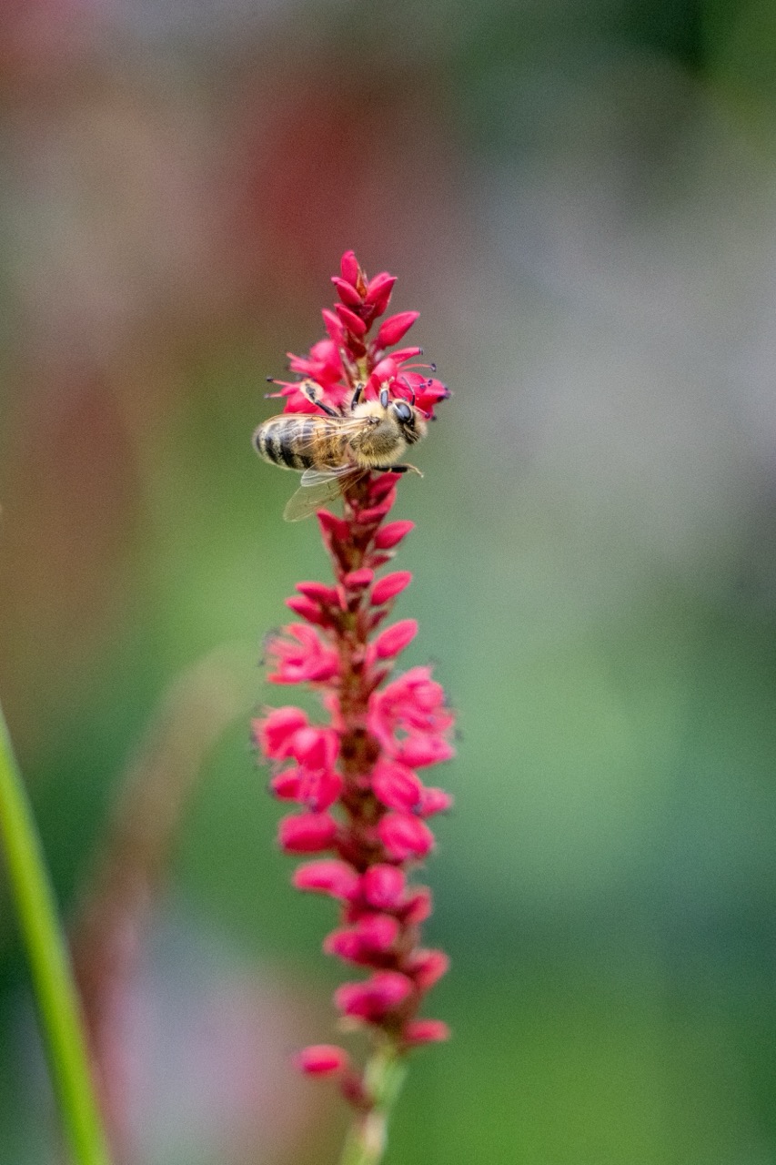
Flight Fueling Station
Subject: A diligent European honey bee, clearly on a mission to single-handedly save the planet (or at least make some honey). Rating: 9.5/10 (Extra points for excellent posing mid-task). Here, we catch our fuzzy pollinator just doing its thing, locked onto a vibrant pink flower spike like it's the last buffet on Earth. The mood is one of focused industry, a tiny moment of natural wonder frozen in time, giving off 'busy bee' vibes in the most literal sense.
From a technical standpoint, this image is a masterclass in subject isolation. The composition uses the strong vertical line of the flower spike effectively, leading the eye straight up to our buzzing star. The bee is positioned nicely near the top, sharp as a tack, thanks to a shallow depth of field that throws the background into a beautifully creamy bokeh. This blurry wash of green and reddish-brown hues is so soft it looks like it was painted with pudding, ensuring zero distractions. The natural light appears to be hitting just right, showcasing the intricate details of the bee's fur and wings, while the flower's bold pink pops vividly against the muted background. It's a classic macro shot, expertly using depth of field and color contrast to make a small subject feel significant and impactful.
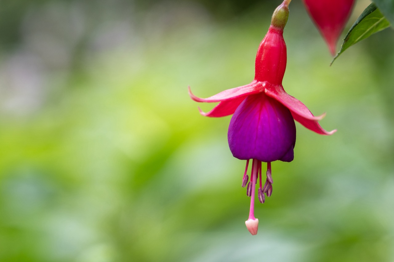
The Dangler of Distinction
Subject Rating: 9/10
Ah, the magnificent fuchsia, nature's very own disco ball earring, suspended elegantly against a backdrop of pure, unadulterated bokeh bliss. Our star today is a single, perfectly formed fuchsia bloom, hanging upside down like a tiny, flamboyant bell or perhaps a ballerina caught mid-twirl. Its top half sports vibrant red sepals flared upwards, revealing a lush, royal purple corolla beneath. Dangling below are the delicate stamens and a single pistil, a final flourish of pinky-white at the tip. There's not much *happening* beyond this flower existing in its magnificent state, but sometimes, just *being* this visually striking is enough. The mood is serene and natural, yet the colors inject a playful vibrance, like finding a hidden gem in a tranquil garden.
From a photographic perspective, this shot nails the essentials. The composition places the flower nicely off-center, utilizing the left side for lovely negative space provided by the blurred green background – a bokeh so creamy and devoid of detail, you might suspect the background was painted on. The lighting is soft and diffused, wrapping gently around the flower and highlighting the different textures and rich colors without blowing out highlights or crushing shadows. The color contrast between the red, purple, and green is punchy and effective, making the subject pop beautifully. The shallow depth of field is key to the style, isolating the fuchsia and making it the undeniable star of the show, proving that sometimes, the most interesting object is just hanging around waiting for its close-up.
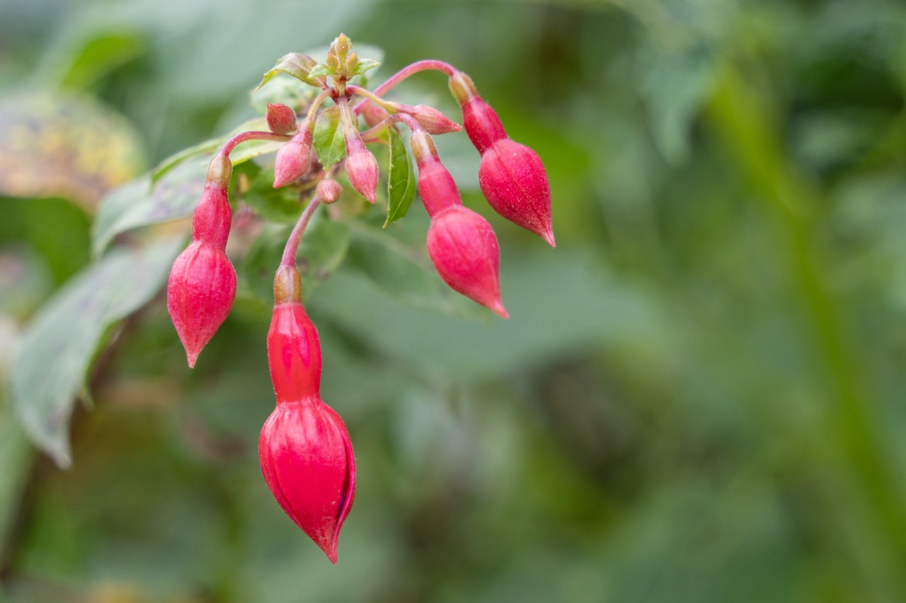
Title: Pre-Bloom Perfection
Rating: 7.5/10
Behold, the fuchsia buds, nature's exquisite little chandeliers, hanging delicately from a stem. These are not just flowers waiting to happen; they are tightly packed parcels of pink potential, promising a future floral fiesta. The scene is one of serene anticipation, a quiet moment before the vibrant performance begins. You can almost hear the tiny buds whispering secrets about their impending bloom against the soft, verdant backdrop of lush, out-of-focus green foliage, which thankfully doesn't try to steal the show. Pertinent objects include the cluster of plump, teardrop-shaped red-pink buds and the supporting stem with nascent leaves.
From a photographer's standpoint, this shot masterfully employs a shallow depth of field, rendering the background into a painterly blur that perfectly isolates the vibrant fuchsia buds. The composition places the main cluster slightly off-center, allowing the eye to follow the graceful hang of the individual buds. Lighting appears soft and diffuse, likely from an overcast sky or open shade, which beautifully highlights the texture of the buds without harsh shadows. The color contrast between the vivid pink/red and the muted greens is visually appealing, though one might quibble that the very tip of the lowest bud could be just a touch sharper. Overall, a clean, well-executed close-up capturing a moment of quiet drama in the garden – proving that even before the main act, the supporting cast can be quite captivating.
Crossing under the iconic green bridge, I entered the Water Garden, home to the famous water lilies that inspired Monet’s most renowned works. The weeping willows and bamboo add an exotic touch, and as I stood there, I could easily imagine Monet setting up his easel to capture the reflections on the pond. The garden is a place where time seems to stand still, and it's easy to see why Monet found endless inspiration here.
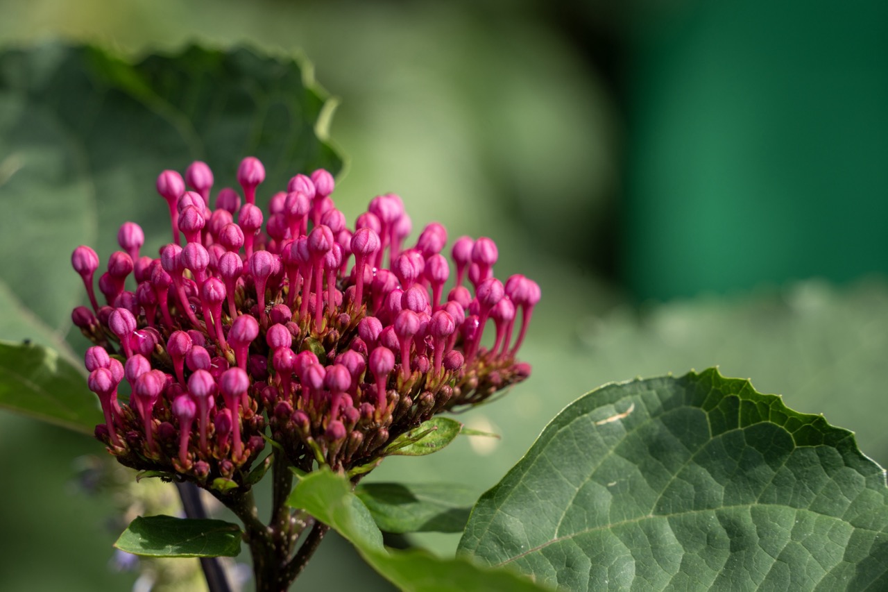
The Pink Pipsqueak Posse
Rating: Subject: 8/10 (Impressive potential, but seriously, let's see some actual flowers!)
Meet the Pink Pipsqueak Posse, a tightly-packed cluster of magenta flower buds holding a rather dramatic pre-bloom huddle. Rated a solid 8/10 for their vibrant color and sheer number, these little guys are clearly getting ready for something big. You can almost hear them whispering motivational chants. The mood is one of quiet anticipation, perhaps slightly tense, like a tiny, colourful army preparing for deployment. The composition places our star subjects slightly left of center, a classic move, but that big green leaf in the foreground on the bottom right is definitely vying for attention – it's the photobomber of the plant world. Another large leaf lurks in the top left background, adding context but staying politely blurred.
The lighting is bright and natural, doing a great job of highlighting the smooth, rounded tips of the buds and making the pink pop against the dominant green. There are even tiny water droplets visible, adding a touch of sparkle – maybe they're crying tears of joy? The depth of field is satisfyingly shallow, giving us that creamy bokeh that melts the background into a pleasant blur of green, effectively isolating our little posse. However, the sharp, solid dark green block on the far right breaks the nice gradient, looking suspiciously like a misplaced garden gnome's hat or the edge of a very large, poorly disguised bin. Overall, a well-captured close-up of a plant moment bursting with potential, proving that sometimes the lead-up is just as compelling as the grand finale, even if slightly interrupted by questionable background choices.
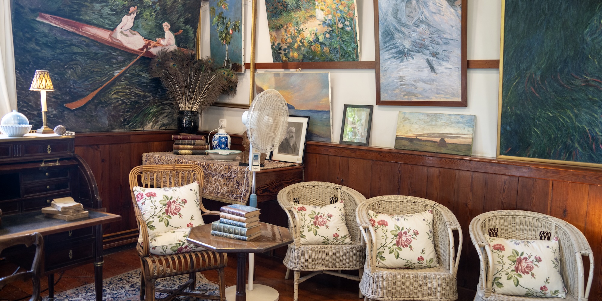
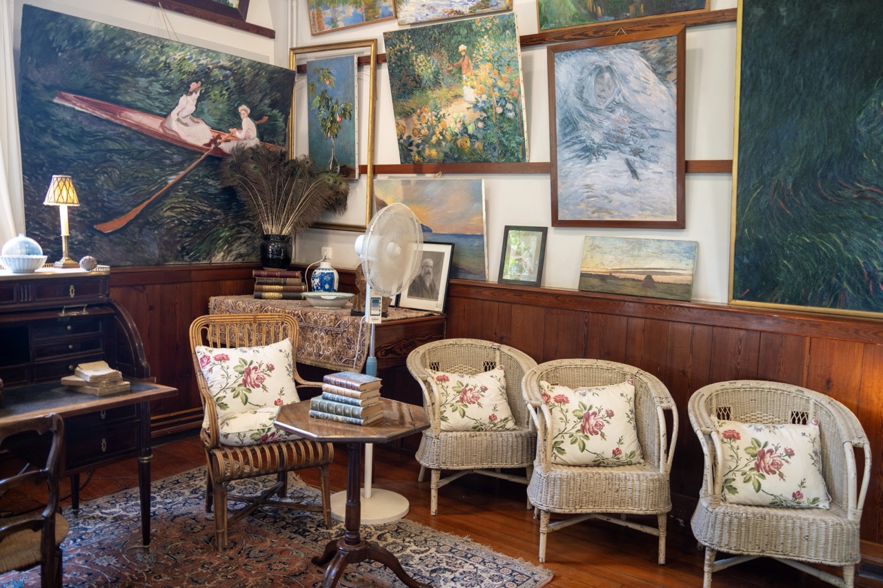
An Artist's Overflowing Study Subject Rating: 8/10
Step into this richly decorated room, which feels less like a curated gallery and more like the passionately cluttered den of an artist or collector who simply ran out of wall space. The scene depicts a corner filled with vintage furniture – a dark wooden writing desk, several wicker chairs with floral cushions, and a small round table – all vying for attention amidst an overwhelming display of framed paintings. The walls are practically wallpapered with art, from a large, striking painting of figures in a boat on the left to impressionistic garden scenes and landscapes scattered higher up. What's 'happening' is less action and more atmosphere – a snapshot of a space deeply lived-in and saturated with a love for art and antiquities. The mood is distinctly vintage, artistic, and perhaps a touch eccentric, with items like a vase of peacock feathers and a modern stand fan adding quirky, anachronistic touches to the otherwise historical aesthetic.
From a photographic standpoint, capturing this scene is a masterclass in managing visual chaos. The composition is incredibly dense and layered, challenging the photographer to find visual anchors amidst the multitude of objects. The large painting on the left serves as a strong focal point, balanced somewhat by the row of chairs on the right. Lighting is soft and natural, likely from unseen windows, creating gentle shadows that highlight the textures of the paintings and the woven furniture, but it struggles slightly with the sheer depth and clutter of the space. The color palette is warm and earthy, dominated by the rich browns of the wood and the greens, blues, and warm tones of the artwork and textiles, contributing heavily to the vintage, cozy, albeit slightly overwhelming, style. The inclusion of everyday items like the fan adds a touch of candid reality to the otherwise museum-like presentation, reminding us this is likely a functional space, even if it looks ready for an art history pop quiz at any moment.
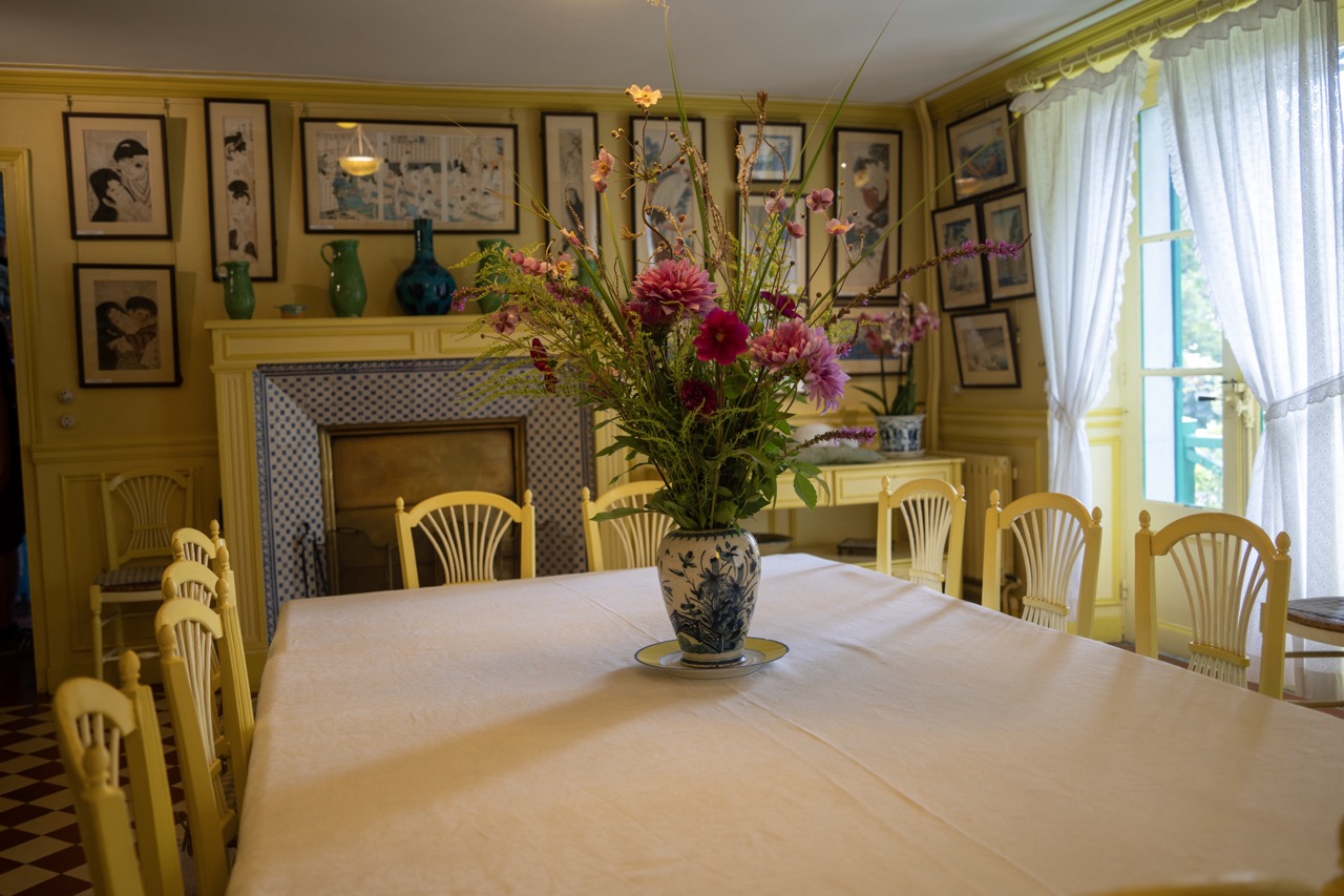
A Symphony in Saffron (and Petals)
Subject: 8/10
Ah, step right into a sunshine explosion! This image captures a vibrant dining room dominated by a rather enthusiastic shade of yellow, featuring a large table draped in white and adorned with a truly magnificent vase brimming with colorful flowers – think deep purples, cheerful pinks, and rich reds, battling it out for attention with all that yellow. The mood is decidedly bright and welcoming, perhaps a little *too* bright if you're prone to migraines, but undeniably cheerful and full of life. It feels like a place designed for lively conversations and perhaps a substantial brunch, with the star of the show being this glorious floral arrangement sitting proudly on its little yellow-rimmed saucer in the foreground, demanding your immediate attention amidst the surrounding yellow frenzy.
From a photographer's perspective, this shot is a study in color saturation and foreground dominance. The composition places the lush floral arrangement front and center, using the expansive white tablecloth as a clean stage, which works well to draw the eye. However, the weight of the foreground feels quite heavy, almost pressing down on the viewer before they get a chance to fully appreciate the busy background. The lighting, coming primarily from the large window on the right, is soft and natural, casting gentle shadows and highlighting the texture of the tablecloth – a nice touch. The background is a feast for the eyes (or perhaps a bit overwhelming, depending on your taste), packed with framed prints – looking suspiciously like Japanese woodblocks, adding an artistic layer – a striking blue and white tiled fireplace, and more yellow chairs than you can shake a stick at. While the explosion of yellow throughout the room is a bold stylistic choice (maybe a bit *too* bold, verging on 'caution tape chic'), the contrast with the cool blues of the fireplace and vase, and the rich tones of the flowers, does create visual interest. It's a busy but captivating scene, capturing the essence of a space clearly loved and lived in, even if it makes you squint a little from all the yellow.
The Impressionist Museum: A Slight Disappointment
After immersing myself in the world of Monet, I decided to visit the nearby Musée des Impressionnismes, a small museum dedicated to the Impressionist movement. Unfortunately, this was the one part of my trip that didn’t quite live up to expectations. The museum, though well-curated, is relatively small, and the collection is limited. If you’re a die-hard fan of Impressionism, it’s worth a quick visit, but for most travelers, I would suggest spending more time in Monet’s house and gardens instead. The museum feels like an afterthought compared to the richness of the other attractions in Giverny.
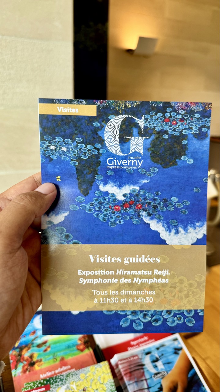
Planning the Sunday Symphony Rating: 7/10
Behold, the sacred text guiding one's cultural pilgrimage! In this shot, a hand proudly displays a brochure for the Musée Giverny Impressionnismes. The main attraction here is an exhibition tantalizingly titled "Exposition Hiramatsu Reiji. Symphonie des Nymphéas," promising a visual feast of water lilies, likely inspired by the master himself. For those seeking enlightenment (or just someone to explain the art), guided visits are conveniently scheduled every Sunday at 11:30 am and 2:30 pm. The background is a charmingly out-of-focus blend of walls and a warm light fixture, hinting at a cozy interior space, while a small mountain range of other potential adventures (or just more brochures) lurks promisingly in the foreground.
From a photography perspective, this is a classic "here's what I'm doing" snapshot. The composition places the hand and brochure front and center, leveraging a decent depth of field to blur away the distracting background – though perhaps a little less clutter in the foreground would have been appreciated; looks like someone needs a brochure de-cluttering service. Lighting is functional, allowing the vibrant blues and golds of the brochure to pop nicely against the softer background palette. While not a masterpiece of photographic art (the hand pose is giving "look, ma, I'm holding a thing!"), it effectively communicates the information. It captures that excited feeling of planning a museum visit, surrounded by the possibility of other adventures hinted at by the colorful stacks below. It's functional, informative, and makes you want to see some Nymphéas!
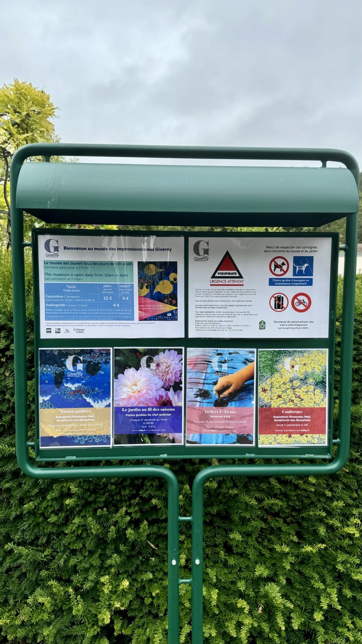
Museum Manifesto
Rating: 6/10
This image captures the essential, if not exactly thrilling, subject of a green metal information board standing stoutly before a wall of vibrant green bushes under a rather indifferent, cloudy sky. What's happening is that someone has paused to document the practicalities of visiting the Impressionism Museum in Giverny, showcasing the hours, ticket prices, rules, and upcoming events like guided tours and workshops – a vital pit stop for any visitor. The mood is purely functional and informative, leavened slightly by the colourful, though somewhat faded, event posters pinned behind the protective plastic. Compositionally, it's a straight-on, eye-level shot centered quite effectively on the board, framed horizontally by the surrounding nature, although the dense bushes consume a significant portion of the frame, giving it a slightly bottom-heavy feel. The overcast lighting is flat and even, which is excellent for readability but does nothing to add drama or depth, rendering the scene in soft, muted colours dominated by the various shades of green.
From a photographic perspective, this is less about artistic expression and more about record-keeping. The style is documentary, prioritizing clarity of information over aesthetic flair. The flat lighting, while practical, strips the scene of texture and highlights, making the green board and bushes blend a little too seamlessly. Pertinent objects include the robust green stand, the large protective plastic cover, and the various A4 posters detailing everything from opening times (open daily from 10 am to 6 pm, last admission 5:30 pm) and ticket prices (General Admission 12€, Reduced 9€) to exhibition details ("Symphonie des Nymphéas") and stern warnings ("Merci de respecter ces consignes") about not letting dogs off leashes (unless guide dogs, naturally) and absolutely no bikes or luggage inside. The VIGIPIRATE "Urgence Attentat" sign adds a serious note to the otherwise pleasant museum visit instructions. The background transitions from the deep green hedge to a bland, featureless grey sky, providing little visual interest but ensuring the top of the board stands out, sort of. While perhaps not a portfolio piece, it's a perfectly adequate capture of a necessary object, proving that even at the home of Impressionism, sometimes you just need a clear, functional shot.
A Fun Fact: Monet's Water Lilies Series
Here’s a fun fact: Did you know that Monet's famous Water Lilies series, which he painted in Giverny, consists of approximately 250 paintings? These works, which were created over the last three decades of his life, were inspired by the very water garden you can visit today. Monet even went so far as to have the pond reshaped and expanded to suit his artistic vision!
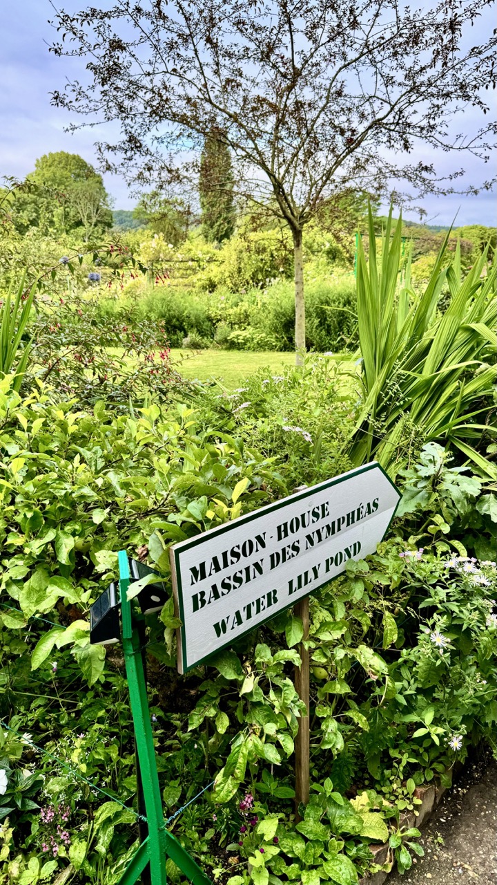
Finding Your Way to Impressionism
Subject Rating: 7/10
Ah, the classic garden signpost – because even in a painter's paradise, you still need to know which way is up (or, in this case, left). This image captures a moment of orientation amidst a riot of lush greenery, pointing us towards two key destinations: the Maison (House) and the Bassin des Nymphéas (Water Lily Pond). If the sheer volume of vibrant foliage hasn't already given it away, the presence of a "Water Lily Pond" sign in both French and English strongly suggests we've landed squarely in the famous gardens of Giverny, the muse to Claude Monet. The mood is one of peaceful, slightly overgrown natural beauty, where the formal instruction of the sign contrasts amusingly with the abundant, untamed growth surrounding it. It's less about getting lost and more about embracing the delightful confusion of being enveloped by such beauty.
From a photographic standpoint, the shot is centered around the directional sign, which is well-exposed and sharp against the softer backdrop. The composition places the sign slightly off-center to the right, pointing left, which creates a visual flow into the dense garden. However, the immediate foreground is a bit cluttered, with the bright green pole and wires detracting slightly from the overall aesthetic; perhaps a lower angle or slight shift would have helped isolate the sign better. The soft, diffused lighting is a strong point, illuminating the vibrant greens and subtle flower colors without harsh shadows, contributing to the serene atmosphere. The background is beautifully blurred, hinting at the scale and depth of the garden beyond, including a glimpse of the distinctive cypress tree. It's a practical shot, effectively communicating the scene and its purpose, but perhaps misses a touch of the artistic flair that the location itself inspires.
Giverny is a magical place where art and nature come together in perfect harmony. While the Impressionist Museum may not be the highlight, the experience of walking through Monet's home and gardens more than makes up for it. Whether you're an art aficionado or simply someone who appreciates beauty, Giverny offers a peaceful retreat into the world of one of history's greatest painters. As I left the village, I couldn't help but feel a deep sense of connection to Monet's work, having seen firsthand the landscapes that so deeply inspired him.
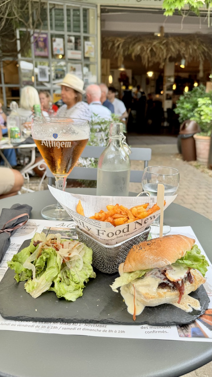
A Table of Temptations Rating: 7/10
Pull up a chair (virtually, of course) and feast your eyes on this delightful spread! The undeniable star of the show is the promise of good food and a refreshing Affligem beer enjoyed al fresco. The scene captures a casual, relaxed mood, inviting you to settle in and forget your worries, perhaps alongside some blurry, happy patrons visible behind the main subject. Laid out on a dark slate plate, we have a tempting burger, a generous portion of fries served in a cool wire basket lined with newspaper-print paper, and a fresh-looking green salad, all ready to be devoured. The amber glow of the beer in its distinctive glass adds a touch of warmth and sophistication to this otherwise laid-back scene, alongside a glass and bottle of water for good measure.
From a photographic perspective, the composition does a decent job of focusing on the meal using a shallow depth of field, nicely blurring out the background buzz of the restaurant. However, it feels a tad cluttered on the table surface; perhaps a different angle or a slightly wider shot might have given the delicious contents a bit more breathing room, though we appreciate getting up close and personal with the food. The natural lighting is soft and flattering, perfect for food photography, though maybe lacking a bit of dramatic contrast. The style is very much a casual snapshot, capturing the moment rather than being overly posed. The blurred background, complete with hints of thatched roofing and other diners enjoying their time, effectively conveys the lively outdoor setting without overly distracting from the main subjects – the food and the glorious beer. A solid capture of a pleasant dining experience, even if it leaves you terribly hungry!
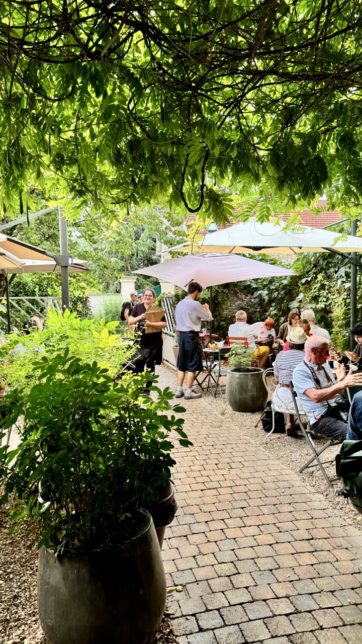
Canopy Cafe Conversations
Rating: 8/10
This shot captures the delightful essence of a leisurely afternoon spent dining outdoors under a verdant canopy. The subject matter – people enjoying a meal and conversation in a charming garden setting – is universally appealing and scores high on the relatable meter. We see diners scattered amongst tables shaded by large white umbrellas, engaged in lively chatter and enjoying the presumably excellent fare. A server carrying wooden trays adds a touch of purpose and activity to the relaxed scene, while another person stands nearby, perhaps observing the flow of the service. The mood is undeniably peaceful, social, and slightly rustic, a perfect escape from the hustle and bustle, truly embodying the spirit of *al fresco* relaxation.
From a technical standpoint, the composition utilizes the overhead foliage effectively, creating a natural, organic frame that filters the light beautifully, though perhaps a *tad* heavy visually. The large potted plant in the foreground makes a bold statement; it adds depth and a strong anchor point, but be mindful it doesn't become the *only* thing the viewer sees. The brick pathway serves as a nice leading line, guiding the eye into the heart of the scene where the human element resides. Lighting is a challenge with dappled light, but the photographer has managed it well, avoiding harsh contrasts and blown-out highlights on the umbrellas while still maintaining detail in the shaded areas. The color palette is dominated by the calming greens and warm earth tones of the patio, perfectly setting the scene for this idyllic garden cafe experience. It's a classic environmental portrait style, capturing both the people and their inviting habitat.